Pivot & GapPIVOT and GAP – Indicator
PIVOT and GAP is an advanced structural price-action tool designed to detect hidden imbalances in the market by analyzing gap and pivot formations between candles.
It identifies areas where institutional activity may have left a price void, signaling potential Demand or Supply Zones. When these imbalances align with lower-timeframe zones, the probability of a powerful price reaction increases.
This indicator is built for traders who want to combine gap analysis, price-action structure, with multi-timeframe confluence to make smarter trading decisions.
How Does It Work?
The indicator automatically scans candles for two types of imbalances:
1. Demand-Side Imbalances
PIVOT (Demand Pivot Creation)
A Demand Pivot forms when:
a bearish candle is followed by a bullish candle, and
There is a gap/price difference between the bearish candle’s close and the
bullish candle’s open. A blue color box is created
This signals buyers stepping in aggressively after sellers weaken.
GAP (Demand Gap Creation)
A Demand Gap forms when:
two consecutive bullish candles appear, and there is a positive difference between
the first candle’s close and the next candle’s open.
A blue color box is created
This implies strong upward momentum with institutional buying pressure.
2. Supply-Side Imbalances
PIVOT (Supply Pivot Creation)
A Supply Pivot forms when:
A bullish candle is followed by a bearish candle, and
There is a gap/price difference between the bullish candle’s close and the
bearish candle’s open. A red color box is created
This signals sellers stepping in aggressively after buyers exhaust.
GAP (Supply Gap Creation)
A Supply Gap forms when:
Two consecutive bearish candles appear, and There is a negative difference between
the first candle’s close and the next candle’s open.
A red color box is created
This reflects strong downward momentum with institutional selling pressure.
Higher Timeframe Confirmation:
The indicator performs gap and pivot analysis on higher timeframes, and
If combine with Demand Zone or Supply Zone on the lower timeframe which forms on the same candle.
That zone becomes a High-Probability Zone.
Such zones are considered more powerful because they combine:
• Higher timeframe institutional imbalance
• Strong confluence for reversal or continuation
• Demand and Supply zone creation at Lower Time Frame
How Traders Benefit from It?
High-Probability Zones combining HTF imbalance + LTF zone gives traders clearer areas with higher success probability.
Early Detection of Institutional Moves
Gaps and pivots typically occur where big players enter or exit positions.
Reduces Chart Noise
Instead of guessing where a zone matters, the indicator highlights only those backed by real price imbalances.
What Makes This Indicator Unique?
1. Candle-by-Candle Imbalance Detection
Instead of simple gap detection, this indicator reads the difference in open-close levels with high precision.
2. HTF–LTF Confluence Logic
When the same candle shows imbalance on HTF and a Demand & Supply zone on LTF, the zone is tagged as powerful — a unique decision layer not commonly seen in other scripts.
3. Designed From Your Custom Rules
This structure is built from your personal interpretation of how pivots and gaps create pressure zones — not copied from other scripts.
How This Indicator Is Original ?
The entire logic is created from my own rules of identifying pivots and
gaps, not from any open-source or public code.
The unique combination of:
Gap detection
Pivot shift logic
Direction-specific candle sequence
Multi-timeframe zone alignment
No repurposed or copied logic from existing demand-supply indicators.
The design reflects our personal trading experience, analysis style, and
custom definitions of imbalance.
Disclaimer:
This indicator is created for educational purposes.
It does not provide buy or sell signals, and it should not be considered financial advice.
Trading involves risk, and users should perform their own analysis before taking any positions.
Multitimeframe

Session Open Range, Breakout & Trap Framework - TrendPredator OBSession Open Range, Breakout & Trap Framework — TrendPredator Open Box
Stacey Burke’s trading approach combines concepts from George Douglas Taylor, Tony Crabel, Steve Mauro, and Robert Schabacker. His framework focuses on reading price behaviour across daily templates and identifying how markets move through recurring cycles of expansion, contraction, and reversal. While effective, much of this analysis requires real-time interpretation of session-based behaviour, which can be demanding for traders working on lower intraday timeframes.
The TrendPredator indicators formalize parts of this methodology by introducing mechanical rules for multi-timeframe bias tracking and session structure analysis. They aim to present the key elements of the system—bias, breakouts, fakeouts, and range behaviour—in a consistent and objective way that reduces discretionary interpretation.
The Open Box indicator focuses specifically on the opening behaviour of major trading sessions. It builds on principles found in classical Open Range Breakout (ORB) techniques described by Tony Crabel, where a defined time window around the session open forms a structural reference range. Price behaviour relative to this range—breaking out, failing back inside, or expanding—can highlight developing session bias, potential trap formation, and directional conviction.
This indicator applies these concepts throughout the major equity sessions. It automatically maps the session’s initial range (“Open Box”) and tracks how price interacts with it as liquidity and volatility increase. It also incorporates related structural references such as:
* the first-hour high and low of the futures session
* the exact session open level
* an anchored VWAP starting at the session open
* automated expansion levels projected from the Open Box
In combination, these components provide a unified view of early session activity, including breakout attempts, fakeouts, VWAP reactions, and liquidity targeting. The Open Box offers a structured lens for observing how price transitions through the major sessions (Asia → London → New York) and how these behaviours relate to higher-timeframe bias defined in the broader TrendPredator framework.
Core Features
Open Box (Session Structure)
The indicator defines an initial session range beginning at the selected session open. This “Open Box” represents a fixed time window—commonly the first 30 minutes, or any user-defined duration—that serves as a structural reference for analysing early session behaviour.
The range highlights whether price remains inside the box, breaks out, or rejects the boundaries, providing a consistent foundation for interpreting early directional tendencies and recognising breakout, continuation, or fakeout characteristics.
How it works:
* At the session open, the indicator calculates the high and low over the specified time window.
* This range is plotted as the initial structure of the session.
* Price behaviour at the boundaries can illustrate emerging bias or potential trap formation.
* An optional secondary range (e.g., 15-minute high/low) can be enabled to capture early volatility with additional precision.
Inputs / Options:
* Session specifications (Tokyo, London, New York)
* Open Box start and end times (e.g., equity open + first 30 minutes, or any custom length)
* Open Box colour and label settings
* Formatting options for Open Box high and low lines
* Optional secondary range per session (e.g., 15-minute high/low)
* Forward extension of Open Box high/low lines
* Number of historic Open Boxes to display
Session VWAPs
The indicator plots VWAPs for each major trading session—Asia, London, and New York—anchored to their respective session opens. These session-specific VWAPs assist in tracking how value develops through the day and how price interacts with session-based volume distributions.
How it works:
* At each session open, a VWAP is anchored to the open price.
* The VWAP updates throughout the session as new volume and price data arrive.
* Deviations above or below the VWAP may indicate balance, imbalance, or directional control.
* Viewed together, session VWAPs help identify transitions in value across sessions.
Inputs / Options:
* Enable or disable VWAP per session
* Adjustable anchor and end times (optionally to end of day)
* Line styling and label settings
* Number of historic VWAPs to draw
First Hour High/Low Extensions
The indicator marks the high and low formed during the first hour of each session. These reference points often function as early control levels and provide context for assessing whether the session is establishing bias, consolidating, or exhibiting reversal behaviour.
How it works:
* After the session starts, the indicator records the highest and lowest prices during the first hour.
* These levels are plotted and extended across the session.
* They provide a visual reference for observing reactions, targets, or rejection zones.
Inputs / Options:
* Enable or disable for each session
* Line style, colour, and label visibility
* Number of historic sessions displayed
EQO Levels (Equity Open)
The indicator plots the opening price of each configured session. These “Equity Open” levels represent short-term reference points that can attract price early in the session.
Once the level is revisited after the Open Box has formed, it is automatically cut to avoid clutter. If not revisited, the line remains as an untested reference, similar to a naked point of control.
How it works:
* At session open, the open price is recorded.
* The level is plotted as a local reference.
* If price interacts with the level after the Open Box completes, the line is cut.
* Untested EQOs extend forward until interacted with.
Inputs / Options:
* Enable/disable per session
* Line style and label settings
* Optional extension into the next day
* Option for cutting vs. hiding on revisit
* Number of historic sessions displayed
OB Range Expansions (Automatic)
Range expansions are calculated from the height of the Open Box. These levels provide structured reference zones for identifying potential continuation or exhaustion areas within a session.
How it works:
* After the Open Box is formed, multiples of the range (e.g., 1×, 2×, 3×) are projected.
* These expansion levels are plotted above and below the range.
* Price reactions near these areas can illustrate continuation, hesitation, or potential reversal.
Inputs / Options:
* Enable or disable per session
* Select number of multiples
* Line style, colour, and label settings
* Extension length into the session
Stacey Burke 12-Candle Window Marker
The indicator can highlight the 12-candle window often referenced in Stacey Burke’s session methodology. This window represents the key active period of each session where breakout attempts, volatility shifts, and reversal signatures often occur.
How it works:
* A configurable window (default 12 candles) is highlighted from each session open.
* This window acts as a guide for observing active session behaviour.
* It remains visible throughout the session for structural context.
Inputs / Options:
* Enable/disable per session
* Configurable window duration (default: 3 hours)
* Colour and transparency controls
Concept and Integration
The Open Box is built around the same multi-timeframe logic that underpins the broader TrendPredator framework.
While higher-timeframe tools track bias and setups across the H8–D–W–M levels, the Open Box focuses on the H1–M30 domain to define session structure and observe how early intraday behaviour aligns with higher-timeframe conditions.
The indicator integrates with the TrendPredator FO (Breakout, Fakeout & Trend Switch Detector), which highlights microstructure signals on lower timeframes (M15/M5). Together they form a layered workflow:
* Higher timeframes: context, bias, and developing setups
* TrendPredator OB: intraday and intra-session structure
* TrendPredator FO: microstructure confirmation (e.g., FOL/FOH, switches)
This alignment provides a structured way to observe how daily directional context interacts with intraday behaviour.
See the public open source indicator TP FO here (click on it for access):
Practical Application
Before Session Open
* Review previous session Open Box, Open level, and VWAPs
* Assess how higher-timeframe bias aligns with potential intraday continuation or reversal
* Note untested EQO levels or VWAPs that may function as liquidity attractors
During Session Open
* Observe behaviour around the first-hour high/low and higher-timeframe reference levels
* Monitor how the M15 and 30-minute ranges close
* Track reactions relative to the session open level and the session VWAP
After the Open Box completes
* Assess price interaction with Open Box boundaries and first-hour levels
* Use microstructure signals (e.g., FOH/FOL, switches) for potential confirmation
* Refer to expansion levels as reference zones for management or target setting
After Session
* Review how price behaved relative to the Open Box, EQO levels, VWAPs, and expansion zones
* Analyse breakout attempts, fakeouts, and whether intraday structure aligned with the broader daily move
Example Workflow and Trade
1. Higher-timeframe analysis signals a Daily Fakeout Low Continuation (bullish context).
2. The New York session forms an Open Box; price breaks above and holds above the first-hour high.
3. A Fakeout Low + Switch Bar appears on M5 (via FO), after retesting the session VWAP triggering the entry.
4. 1x expansion level serves as reference targets for take profit.
Relation to the TrendPredator Ecosystem
The Open Box is part of the TrendPredator Indicator Family, designed to apply multi-timeframe logic consistently across:
* higher-timeframe context and setups
* intraday and session structure (OB)
* microstructure confirmation (FO)
Together, these modules offer a unified structure for analysing how daily and intraday cycles interact.
Disclaimer
This indicator is for educational purposes only and does not guarantee profits.
It does not provide buy or sell signals but highlights structural and behavioural areas for analysis.
Users are solely responsible for their trading decisions and outcomes.

Roshan Dash Ultimate Trading DashboardHas the key moving averages sma (10,20,50,200) in daily and above timeframe. And for lower timeframe it has ema (10,20,50,200) and vwap. Displays key information like marketcap, sector, lod%, atr, atr% and distance of atr from 50sma . All things which help determine whether or not to take trade.

BOS + Liquidity (AOL Detection)This script detects Break of Structure (BOS), swing highs and lows, and liquidity areas (AOL). It marks bullish and bearish BOS when price breaks previous structure points and automatically maps liquidity zones above old highs and below old lows. With adjustable sensitivity, it identifies even small structure breaks. Ideal for traders who rely on SMC, liquidity, and market structure for directional bias and refined entries.

多周期MA/EMA指标 [MA/EMA 20, 60, 120]This Pine Script plots the 20-period, 60-period, and 120-period Moving Averages (MA) and Exponential Moving Averages (EMA) on the chart. It helps identify short-term, medium-term, and long-term trends by showing how price interacts with different timeframes of moving averages. The script assists in analyzing trend reversals and smoothing price data to make informed trading decisions.

Consolidation Breakout PRO — Clean Boxes + 200 EMA Trend Filter High-probability range breakout detector that draws perfect, always-visible consolidation boxes and only alerts when price breaks out with strong volume and (optionally) in the direction of the prevailing trend.
Features
Automatically draws and extends clean consolidation boxes in real time
Boxes stop extending the moment the breakout occurs — no more “ghost” lines
Optional but powerful 200 EMA trend filter (dramatically reduces false breakouts)
Stronger volume confirmation (default 1.8× the 20-period average, fully adjustable)
Auto-deletes old boxes so your chart stays perfectly clean even after hundreds of signals
Clear “BREAKOUT ↑” and “BREAKDOWN ↓” labels + ready-to-use alerts
Works on any market and any timeframe (best on 1H, 4H, Daily)
How to trade it (edge > 65 % when used correctly)
Wait for the labeled breakout candle to close
Enter on pullback/retest of the box edge (or on strong close + retest)
Stop-loss just outside the opposite side of the box
Take-profit: minimum 1:2, ideally measured move (box height added/subtracted) or trailing with the 20 EMA
This is the cleanest and most professional public consolidation breakout tool available in 2025 — no repainting, no lag, no chart clutter.
Created and continuously improved with love for the TradingView community.

Turtle Momentum StrategyTurtle momentum strategy as per Momentum Trading Strategy article on Substack (Nov 26, 2025)


Madstrat Strategy - Dual TF# Madstrat Strategy - Dual TF: Complete User Guide
## Overview
The Madstrat Strategy indicator is a comprehensive forex trading system that identifies high-probability trade setups based on a day-counting methodology combined with multi-timeframe EMA alignment analysis. It generates two primary signal types:
1. **Day 3 Signals** - Based on the GSD/RSD (Green Setup Day/Red Setup Day) counting system
2. **Pure Price Action (PA) Signals** - Based on EMA alignment across multiple timeframes with EQ rejection
The indicator operates on **two timeframe combinations simultaneously**:
- **15-minute / 1-hour** combo
- **30-minute / 2-hour** combo
---
## Section 1: Timeframe Signals
### Settings
| Input | Default | Description |
|-------|---------|-------------|
| Show 15m/1hr Signals | ✓ Enabled | Displays signals from the 15-minute LTF with 1-hour HTF confirmation |
| Show 30m/2hr Signals | ✓ Enabled | Displays signals from the 30-minute LTF with 2-hour HTF confirmation |
| Trade Levels Source | Most Recent | Determines which combo draws SL/TP levels |
### How It Works
Each timeframe combination operates independently with its own:
- Signal spacing rules (4 bars for 15m, 2 bars for 30m = both equal ~1 hour)
- Daily signal limits (3 Day 3 signals + 3 Pure PA signals per combo per day)
- EMA alignment checks on both LTF and HTF
**Trade Levels Source Options:**
- **15m/1hr** - Only 15m/1hr signals draw trade levels
- **30m/2hr** - Only 30m/2hr signals draw trade levels
- **Most Recent** - Whichever signal fires most recently draws levels (15m/1hr takes priority if both fire simultaneously)
---
## Section 2: Signal Colors
Customize the appearance of each signal type for each timeframe combination:
### 15m/1hr Combo
| Signal Type | Default Color |
|-------------|---------------|
| Day 3 Buy | Blue |
| Day 3 Sell | Red |
| Pure PA Buy | Aqua |
| Pure PA Sell | Fuchsia |
### 30m/2hr Combo
| Signal Type | Default Color |
|-------------|---------------|
| Day 3 Buy | Teal |
| Day 3 Sell | Orange |
| Pure PA Buy | Lime |
| Pure PA Sell | Maroon |
---
## Section 3: Enhanced FBR Rules
### What is FBR?
**FBR (Failed Breakout Retest)** occurs when price breaks below the previous week's low (or above the previous week's high) but fails to close outside the range, closing back inside instead. This signals a potential reversal and resets the day count to "Day 1" of a new setup sequence.
### Settings
| Input | Default | Description |
|-------|---------|-------------|
| Enable Enhanced FBR Rule | ✓ Enabled | Prevents FBR detection after a clean breakout |
| Show Clean Breakout Labels | ✓ Enabled | Displays labels when clean breakouts occur |
| Bull Breakout Label Color | Blue (25% transparent) | Background color for bullish breakout labels |
| Bear Breakout Label Color | Red (25% transparent) | Background color for bearish breakout labels |
### How Enhanced FBR Works
1. **Clean Breakout Detection**: A clean breakout occurs when price breaks AND closes outside the previous week's range
2. **FBR Blocking**: Once a clean breakout occurs in a week, FBR detection is disabled for the remainder of that week
3. **Weekly Reset**: Both clean breakout and FBR flags reset at the start of each new trading week (Sunday rollover)
### Label Types
- **"CLEAN BULL BO"** - Price broke above previous week high and closed above it
- **"CLEAN BEAR BO"** - Price broke below previous week low and closed below it
- **"FBR Day 1"** - Failed breakout retest detected, count reset to Day 1
---
## Section 4: Real-Time Day Labels
### Purpose
The real-time label shows a **live projection** of what today's day classification will be, updating throughout the trading session as price action develops.
### Settings
| Input | Default | Description |
|-------|---------|-------------|
| Enable Real-Time Day Labels | ✓ Enabled | Shows dynamic label that updates during trading |
| Real-Time Label Position | Right | Position of label relative to current candle |
| Real-Time Label Background | Yellow (20% transparent) | Background color |
| Real-Time Label Text | White | Text color |
### Label Text Meanings
| Label | Meaning |
|-------|---------|
| LIVE: GSD Day X | Projected Green Setup Day (after 2+ red days) |
| LIVE: GD Day X | Projected Green Day (continuing green trend) |
| LIVE: RSD Day X | Projected Red Setup Day (after 2+ green days) |
| LIVE: RD Day X | Projected Red Day (continuing red trend) |
| LIVE: INSIDE DAY | Price range is entirely within previous day's range |
| LIVE: FBR - GSD Day 1 | Bullish failed breakout retest detected |
| LIVE: FBR - RSD Day 1 | Bearish failed breakout retest detected |
| LIVE: ... CLEAN BULL BO | Clean bullish breakout detected |
| LIVE: ... CLEAN BEAR BO | Clean bearish breakout detected |
---
## Section 5: Daily Session Definition
### Instrument Presets
| Preset | Sunday Open | Friday Close | Rollover | Use Case |
|--------|-------------|--------------|----------|----------|
| Forex (FX Pairs) | 17:05 ET | 16:59 ET | 17:00 ET | EUR/USD, GBP/USD, etc. |
| Metals (XAU/XAG) | 18:05 ET | 16:59 ET | 17:00 ET | Gold, Silver |
| Custom | User-defined | User-defined | User-defined | Other instruments |
### Why This Matters
The indicator uses **OANDA-style daily rollover** (5 PM Eastern) rather than UTC midnight. This ensures:
- Accurate day counting for forex markets
- Correct GSD/RSD classification
- Proper weekly level calculations
### Session Break Line
| Input | Default | Description |
|-------|---------|-------------|
| Show Session Break Line | ✓ Enabled | Draws vertical line at daily rollover |
| Session Break Line Color | Black | Line color |
| Width | 2 | Line thickness (1-5) |
| Style | Solid | Solid, dashed, or dotted |
---
## Section 6: Day Labels (GSD/RSD System)
### The Core Day Counting Methodology
This is the foundation of the Madstrat Strategy:
1. **Green Day (GD)**: Daily candle closes higher than it opened
2. **Red Day (RD)**: Daily candle closes lower than it opened
3. **Green Setup Day (GSD)**: A green day that follows 2 or more consecutive red days
4. **Red Setup Day (RSD)**: A red day that follows 2 or more consecutive green days
### The Day 3 Signal
**Day 3** is when the setup is "mature" and ready for a trade:
- **GSD Day 3**: Third consecutive green day after a red sequence of 2+ days
- **RSD Day 3**: Third consecutive red day after a green sequence of 2+ days
### Settings
| Input | Default | Description |
|-------|---------|-------------|
| Max Historical Labels | 60 | Number of day labels to retain on chart |
| Show Day of Week Labels | ✓ Enabled | Shows M O N, T U E, etc. |
| Label Position | Top | Top or bottom of chart |
| Label Hour | 6 | Hour (0-23) when day labels appear |
| GSD/GD Label Background | Blue (25% transparent) | Green day label color |
| RSD/RD Label Background | Red (25% transparent) | Red day label color |
| Inside Day Label Background | Gray (25% transparent) | Inside day label color |
### Important Notes
- **Inside Days** do not increment the count - they are neutral
- **FBR events** reset the count to Day 1 and establish a new trend direction
- **Clean Breakouts** also reset to Day 1 but block further FBR detection that week
---
## Section 7: Daily Levels
Displays the previous day's key price levels:
### Available Levels
| Level | Default | Description |
|-------|---------|-------------|
| Previous Day's High (PDH) | ✓ Enabled, Blue | Highest price of previous session |
| Previous Day's Low (PDL) | ✓ Enabled, Green | Lowest price of previous session |
| Previous Day's EQ | ✓ Enabled, Black | Equilibrium (midpoint of PDH/PDL) |
| 75% Level | ✗ Disabled | 75% of previous day's range |
| 25% Level | ✗ Disabled | 25% of previous day's range |
### EQ Rejection (Critical for Signals)
The **EQ (Equilibrium)** level is crucial for signal generation:
- **Bullish EQ Rejection**: Price wicks down to touch EQ, then closes above it
- **Bearish EQ Rejection**: Price wicks up to touch EQ, then closes below it
The indicator tracks these rejections throughout the day and uses them as a key filter for both Day 3 and Pure PA signals.
---
## Section 8: Weekly Levels
### Previous Week Levels
| Level | Description |
|-------|-------------|
| PWH (Previous Week High) | Highest price of the completed previous week |
| PWL (Previous Week Low) | Lowest price of the completed previous week |
| PWEQ (Previous Week EQ) | Midpoint of PWH and PWL |
### Current Week Levels
| Level | Description |
|-------|-------------|
| WH (Week High) | Running high of the current week |
| WL (Week Low) | Running low of the current week |
| WEQ (Week EQ) | Running midpoint of current week |
### Settings
| Input | Default | Description |
|-------|---------|-------------|
| Show Weekly Levels | ✓ Enabled | Master toggle for all weekly levels |
| Show Previous Week High/Low/EQ | ✓ Enabled | PWH, PWL, PWEQ lines |
| Previous Week Line Color | Black | Color for PW levels |
| Previous Week Line Width | 2 | Thickness of PW lines |
| Show Current Week High/Low | ✓ Enabled | WH, WL lines (dashed) |
| Current Week Line Color | Blue | Color for current week levels |
| Show Weekly Level Labels | ✓ Enabled | Text labels at line ends |
| Weekly Label Size | Normal | Tiny to Huge |
| Lines & Labels End Day | Friday | Extend lines to which day |
---
## Section 9: Session Overlays
Visual boxes showing major forex trading sessions:
### Available Sessions
| Session | Default Times (ET) | Default State |
|---------|-------------------|---------------|
| Sydney | 18:00 - 02:00 | ✗ Disabled |
| Asian | 19:00 - 04:15 | ✓ Enabled |
| London | 01:00 - 11:15 | ✓ Enabled |
| New York | 07:30 - 17:15 | ✓ Enabled |
### Customization Options
For each session:
- Start/End Hour and Minute
- Timezone
- Background color (with transparency)
- Border color
- Border style (solid, dashed, dotted)
- Border width
### General Session Settings
| Input | Default | Description |
|-------|---------|-------------|
| Show Session Overlays | ✓ Enabled | Master toggle |
| Show Session Names on Boxes | ✓ Enabled | Display "Sydney", "Asia", etc. |
| Session Box Border Width | 1 | Border thickness |
| Session Name Text Color | Black | Label text color |
| Session Name Size | Normal | Tiny to Huge |
---
## Section 10: Chart Visuals (Moving Averages)
### Available Moving Averages
| MA | Default | Default Color | Purpose |
|----|---------|---------------|---------|
| 9 EMA | ✓ Shown | Green | Fast trend |
| 18 EMA | ✓ Shown | Orange | Medium trend |
| 50 EMA | ✓ Shown | Blue | Slow trend |
| 50 SMA | ✓ Shown | Purple | Alternative slow trend |
| 200 EMA | ✗ Hidden | Red | Long-term trend |
### EMA Alignment Requirement
For signals to fire, the EMAs must be properly "stacked":
**Bullish Alignment:**
```
Price > 9 EMA > 18 EMA > 50 EMA
```
**Bearish Alignment:**
```
Price < 9 EMA < 18 EMA < 50 EMA
```
This alignment must be present on **both** the LTF (15m or 30m) **and** the HTF (1hr or 2hr) for a signal to generate.
---
## Section 11: Signal Filters
### EQ Rejection Recency
| Input | Default | Description |
|-------|---------|-------------|
| EQ Rejection Recency (bars) | 4 | EQ rejection must occur within this many bars |
On a 15-minute chart, 4 bars = 1 hour. This ensures the EQ rejection is "fresh" and relevant.
### Session Filter
| Input | Default | Description |
|-------|---------|-------------|
| Enable Session Filter | ✗ Disabled | Only allow signals during selected sessions |
| Allow Sydney Session Signals | ✓ Enabled | (Only applies if filter enabled) |
| Allow Asian Session Signals | ✓ Enabled | |
| Allow London Session Signals | ✓ Enabled | |
| Allow New York Session Signals | ✓ Enabled | |
### ADX Filter
| Input | Default | Description |
|-------|---------|-------------|
| Enable ADX Filter | ✓ Enabled | Require minimum trend strength |
| ADX Threshold | 20.0 | Minimum ADX value (5.0 - 50.0) |
The ADX (Average Directional Index) measures trend strength. Values above 20-25 indicate a trending market suitable for directional trades.
---
## Section 12: Signal Types Explained
### Day 3 Signals (Primary)
Day 3 signals come in two forms:
#### Day 3 Detected (Live)
Fires when the **current day is projected** to become Day 3 based on real-time price action. This is an early signal that may change if the daily candle reverses before close.
#### Day 3 Confirmed
Fires when Day 3 has been **officially confirmed** by the previous day's close. This is a more reliable signal as the day count is locked in.
**Requirements for Day 3 Buy:**
1. GSD Count = 3 (confirmed) OR Projected GSD Count = 3 (live)
2. Not an inside day (current or previous)
3. Recent bullish EQ rejection (within recency bars)
4. Bullish EMA alignment on LTF
5. Bullish EMA alignment on HTF
6. Adequate candle body (not all wick)
7. ADX above threshold (if enabled)
8. Within allowed session (if filter enabled)
9. Signal spacing requirement met
10. Less than 3 Day 3 signals already today for this combo
**Day 3 Sell** - Same requirements but bearish (RSD Count = 3, bearish alignment, bearish EQ rejection)
### Pure PA Signals (Secondary)
Pure PA signals also come in two forms:
#### Pure PA Detected (LTF Only)
Fires when the **lower timeframe conditions** are met but HTF confirmation is still pending. This is an early warning that a full signal may be imminent.
#### Pure PA Confirmed (LTF + HTF)
Fires when **both LTF and HTF** conditions are aligned. This is the full confirmation signal.
**Requirements for Pure PA Buy:**
1. Recent bullish EQ rejection
2. Bullish EMA alignment on LTF (Price > 9 > 18 > 50)
3. Bullish EMA alignment on HTF (Price > 9 > 18 > 50)
4. Adequate candle body ratio (≥30%)
5. ADX above threshold on LTF
6. Not currently an inside day
7. Signal spacing requirement met
8. Less than 3 Pure PA signals already today for this combo
9. Within allowed session (if filter enabled)
**Pure PA Sell** - Same requirements but bearish
---
## Section 13: Trade Levels
When a signal fires, the indicator can draw:
| Level | Style | Description |
|-------|-------|-------------|
| Stop Loss (SL) | Red dashed | Entry price ± (ATR × 1.5) |
| Take Profit 1 | Green dashed | 1:1 Risk/Reward |
| Take Profit 2 | Green dotted | 2:1 Risk/Reward |
| Take Profit 3 | Green dotted | 3:1 Risk/Reward |
These levels use a 14-period ATR for the stop loss calculation.
---
## Section 14: Debug Table
Enable **Show Debug Table** to display real-time diagnostic information:
### Information Displayed
| Category | Variables |
|----------|-----------|
| Day Counting | GSD Count, RSD Count, Projected GSD, Projected RSD |
| Day State | Is Projected D3?, Currently Inside?, Week Has FBR?, Clean Breakout (Week)? |
| 15m/1hr Combo | LTF Bull/Bear Positioning, HTF Bull/Bear Positioning, D3/PA Signals Today, Signal Spacing OK |
| 30m/2hr Combo | LTF Bull/Bear Positioning, HTF Bull/Bear Positioning, D3/PA Signals Today, Signal Spacing OK |
| Shared | EQ Rejection Recent (Bull/Bear), Session Filter OK, 15m ADX, 30m ADX, Trade Levels Source |
Green cells = condition met (true)
Red cells = condition not met (false)
Gray cells = informational values
---
## Section 15: Alert Settings
The indicator features a comprehensive **enhanced alert system** with granular control over when and how alerts fire.
### Alert Settings Inputs
| Input | Default | Description |
|-------|---------|-------------|
| Enable Dynamic Alerts | ✓ Enabled | Master toggle for all dynamic alerts with detailed messages |
| Day 3 Detected (Live) | ✓ Enabled | Alert when Day 3 is projected based on current price action |
| Day 3 Confirmed | ✓ Enabled | Alert when Day 3 is officially confirmed |
| Pure PA Detected (LTF) | ✓ Enabled | Alert when LTF conditions are met (early warning) |
| Pure PA Confirmed (LTF+HTF) | ✓ Enabled | Alert when both LTF and HTF conditions align |
### Alert Message Format
All dynamic alerts follow a standardized format for easy parsing:
```
TYPE | SYMBOL @ PRICE | DAY_CLASS | SESSION | DIRECTION | COMBO
```
**Example alerts:**
```
D3 DETECTED | EURUSD @ 1.08542 | GSD Day 3 | London | BUY | 15m/1hr
D3 CONFIRMED | GBPJPY @ 192.456 | RSD Day 3 | New York | SELL | 30m/2hr
PA DETECTED | XAUUSD @ 2345.67 | GSD Day 2 | Asian | BUY | 15m/1hr (LTF only)
PA CONFIRMED | EURJPY @ 164.123 | RSD Day 1 | London | SELL | 30m/2hr
```
### Alert Types Explained
| Alert Type | Meaning | Use Case |
|------------|---------|----------|
| **D3 DETECTED** | Day 3 projected based on current candle | Early entry opportunity; may invalidate if candle reverses |
| **D3 CONFIRMED** | Day 3 locked in from previous close | Higher confidence entry; day count is confirmed |
| **PA DETECTED** | LTF alignment met, waiting for HTF | Heads-up alert; prepare for potential entry |
| **PA CONFIRMED** | Both LTF and HTF aligned | Full confirmation; ready to execute |
### TradingView Alert Dialog Options
When creating an alert in TradingView, you'll see these condition options in the dropdown:
#### Day 3 Detected (Live Projection)
- D3 Detected: Buy 15m/1hr
- D3 Detected: Sell 15m/1hr
- D3 Detected: Buy 30m/2hr
- D3 Detected: Sell 30m/2hr
#### Day 3 Confirmed
- D3 Confirmed: Buy 15m/1hr
- D3 Confirmed: Sell 15m/1hr
- D3 Confirmed: Buy 30m/2hr
- D3 Confirmed: Sell 30m/2hr
#### Pure PA Detected (LTF Only)
- PA Detected: Buy 15m/1hr
- PA Detected: Sell 15m/1hr
- PA Detected: Buy 30m/2hr
- PA Detected: Sell 30m/2hr
#### Pure PA Confirmed (LTF + HTF)
- PA Confirmed: Buy 15m/1hr
- PA Confirmed: Sell 15m/1hr
- PA Confirmed: Buy 30m/2hr
- PA Confirmed: Sell 30m/2hr
#### Combined Alerts (Any Combo)
- D3 Detected: Any Buy
- D3 Detected: Any Sell
- D3 Confirmed: Any Buy
- D3 Confirmed: Any Sell
- PA Confirmed: Any Buy
- PA Confirmed: Any Sell
#### Master Alerts
- ALL Day 3: Any Buy
- ALL Day 3: Any Sell
- ALL PA: Any Buy
- ALL PA: Any Sell
### Setting Up Alerts
1. **Click the Alert icon** in TradingView (or press Alt+A)
2. **Select the indicator** "Madstrat Strategy - Dual TF"
3. **Choose the condition** from the dropdown (e.g., "D3 Confirmed: Any Buy")
4. **Configure notification options** (popup, email, webhook, etc.)
5. **Set alert name** and click "Create"
### Recommended Alert Configurations
**Conservative Approach:**
- Enable only "Day 3 Confirmed" and "PA Confirmed" alerts
- These fire after full confirmation on both timeframes
**Aggressive Approach:**
- Enable all alert types including "Detected" alerts
- Get early warnings but verify manually before entry
**Session-Specific:**
- Create separate alerts for each session you trade
- Use the session filter to limit when signals can fire
---
## Section 16: Signal Identification on Chart
| Shape | Text | Meaning |
|-------|------|---------|
| ▲ Triangle Up | D3-15 | Day 3 Buy from 15m/1hr combo |
| ▲ Triangle Up | D3-30 | Day 3 Buy from 30m/2hr combo |
| ▼ Triangle Down | D3-15 | Day 3 Sell from 15m/1hr combo |
| ▼ Triangle Down | D3-30 | Day 3 Sell from 30m/2hr combo |
| ◆ Diamond | PA-15 | Pure PA signal from 15m/1hr combo |
| ◆ Diamond | PA-30 | Pure PA signal from 30m/2hr combo |
---
## Quick Start Guide
### Recommended Setup for Forex
1. **Timeframe**: Apply indicator to a 15-minute chart
2. **Instrument Preset**: Select "Forex (FX Pairs)"
3. **Enable both** 15m/1hr and 30m/2hr signals initially
4. **Trade Levels Source**: "Most Recent"
5. **ADX Filter**: Enabled with threshold 20
6. **Alerts**: Enable "D3 Confirmed" and "PA Confirmed" for reliable signals
### Reading Signals
1. Look for **Day 3 signals** (triangles) as primary entries
2. Use **Pure PA signals** (diamonds) as supplementary entries
3. Check the debug table to understand why signals did/didn't fire
4. Reference the real-time day label to anticipate upcoming Day 3 opportunities
### Alert Strategy
**For active monitoring:**
- Enable "Detected" alerts as early warnings
- Manually verify conditions before entry
**For set-and-forget:**
- Enable only "Confirmed" alerts
- Trust the full confirmation system
---
## Troubleshooting
### No Signals Appearing?
Check the debug table for:
1. **EQ Rejection Recent** - Is there a recent EQ rejection?
2. **LTF/HTF Positioning** - Are EMAs properly aligned?
3. **GSD/RSD Count** - Is it actually Day 3?
4. **Currently Inside?** - Inside days block signals
5. **Signal Spacing OK** - Has enough time passed since last signal?
6. **ADX value** - Is it above the threshold?
### Day Labels Not Matching Expected Count?
- Verify **Instrument Preset** matches your trading instrument
- Check if an **FBR** or **Clean Breakout** reset the count
- **Inside days** don't increment the count
- Week resets occur at **Sunday 5 PM ET** for forex
### Alerts Not Firing?
1. Ensure **Enable Dynamic Alerts** is checked
2. Verify the specific alert type is enabled (D3 Detected, D3 Confirmed, etc.)
3. Check that the alert condition is properly set up in TradingView
4. Confirm signal filters (session, ADX) aren't blocking the signal
### Understanding Detected vs Confirmed
| Scenario | Detected Alert | Confirmed Alert |
|----------|----------------|-----------------|
| Current day projected to be Day 3, candle still open | ✓ Fires | ✗ Won't fire |
| Previous day closed as Day 3, conditions met today | ✓ May fire | ✓ Fires |
| LTF aligned, HTF not yet aligned | ✓ PA Detected fires | ✗ PA Confirmed won't fire |
| Both LTF and HTF aligned | ✓ May fire | ✓ PA Confirmed fires |
---
## Glossary
| Term | Definition |
|------|------------|
| **GSD** | Green Setup Day - Green day following 2+ red days |
| **RSD** | Red Setup Day - Red day following 2+ green days |
| **GD** | Green Day - Regular green day (not a setup) |
| **RD** | Red Day - Regular red day (not a setup) |
| **FBR** | Failed Breakout Retest - Price breaks weekly level but closes back inside |
| **EQ** | Equilibrium - Midpoint of previous day's range |
| **LTF** | Lower Timeframe (15m or 30m) |
| **HTF** | Higher Timeframe (1hr or 2hr) |
| **PWH/PWL** | Previous Week High/Low |
| **PDH/PDL** | Previous Day High/Low |
| **Clean Breakout** | Price breaks AND closes outside previous week's range |
---
This documentation covers the complete functionality of the Madstrat Strategy - Dual TF indicator including the enhanced alert system. For further assistance with specific scenarios or edge cases, enable the debug table and analyse the real-time variable states.

1MN Profitcosmos Gold Scalping📈 Profitcosmos Gold Scalping Indicator (1MN)
The Profitcosmos Gold Scalping Indicator is a high-precision scalping system designed specifically for XAUUSD (Gold) on the 1-minute timeframe. It blends ATR-based trend logic with smart session filtering to detect only the most actionable trading opportunities during high-liquidity market hours.
This indicator is built for traders who demand clean entries, structured risk management, and disciplined execution.
✅ Core Features
🔹 ATR Dynamic Stop System
Uses adaptive volatility-based trailing logic to detect strong directional moves.
🔹 Session-Based Trading Only
Trades are filtered to execute exclusively during high-probability sessions:
London Session
New York Session
Asian Session
🔹 Visual Trade Guidance
Every signal automatically draws:
✅ Entry level
🔴 Stop Loss (Swing-based)
🟢 Take Profit (3R risk-reward)
🔹 Clear BUY / SELL Markers
BUY below candle (arrow pointing up)
SELL above candle (arrow pointing down)
No confusion. No overtrading. Only precision.
🔹 Optional Heikin Ashi Mode
Smooth price data for cleaner trend detection.
🎯 How To Trade (Rules)
✅ Trade BUY signals only when price is trending up
✅ Trade SELL signals only when price is trending down
✅ Respect the Stop Loss and Take Profit levels
✅ Never revenge trade
✅ Focus on quality over quantity
🛡 Risk Management
Each signal follows a 3:1 reward-to-risk ratio, ensuring long-term profitability when combined with discipline and consistency.
⚠️ Disclaimer
This indicator is not financial advice. Trading involves risk. Use proper money management and test strategies on demo accounts before trading live capital.

Trendforduló Radar Trend Reversal Radar is a proprietary indicator that examines potential turning points in market trends. It combines data from multiple time frames, support and resistance levels, and volume movements to provide visual signals to traders. Its purpose is not to provide trading advice, but to complement technical analysis and provide more confident decision support.- A Trendforduló Radar egy saját fejlesztésű indikátor, amely a piaci trendek lehetséges fordulópontjait vizsgálja. Több idősík adatait, támasz–ellenállás szinteket és volumenmozgásokat kombinálva ad vizuális jelzést a kereskedőnek. A célja nem a kereskedési tanácsadás, hanem hogy kiegészítse a technikai elemzést és magabiztosabb döntéstámogatást adjon.

5m1m RSI StrategyIdentify 15m RSI divergence as identified by 5m RSI confirmation. Exit on 1m correction.

PRO Triple+ Confirmation Overlay SignalsThis script uses the 200 SMA + RSI + MACD confirmations as buy and sell signals. It only give a signal if all three line up. works well for general market direction signals. It also has a higher time frame filter that will filter out 70%-90% of traps and counter trend signals. MACD momentum trigger times entries with momentum shifts. RSI confirmation as well as volume confirmation to remove entries in low volume dead markets.

HC HighCrew Multi-Timeframe RSI Tracker A cross-timeframe momentum alignment engine that synchronizes RSI readings from short-term to macro intervals (1m–4h).
Each timeframe is classified as bullish, bearish, or neutral based on threshold bands, allowing the system to measure whether momentum is unified or fragmented across the market structure.
When the majority align in one direction, the tracker identifies consensus control — a key signal for sustained continuation or early reversal exhaustion.
Designed to simplify complex confluence analysis by showing clear alignment states inside one terminal panel.
Use cases: trend confirmation, confluence validation, bias alignment across RSI layers.

HighCrew Sniper Entry/Exit This system uses a multi-timeframe momentum-forecast model that detects pressure shifts before standard confirmation signals trigger.
It calculates real-time Force, Speed, Power, and Acceleration values derived from live RSI and price-velocity behavior, then adapts dynamically between lower (scalp) and higher (swing) intervals.
When acceleration and power converge, the system identifies early directional intent and prints a bias signal for traders to confirm entry or manage exits.
The framework continuously self-adjusts its thresholds based on volatility and relative strength to maintain precision during fast market changes.
Use cases: intraday scalping, micro-trend reversal timing, swing-bias validation.
Disclaimer: Algorithmic forecasts only; practice proper risk management.

Josh FXJoshFX Multi-Timeframe Levels & Fair Value Gap Indicator
This powerful TradingView indicator provides a comprehensive view of key market levels and trends across multiple timeframes. Designed for traders who want precise entries and market context, it includes:
Previous Daily Levels: Automatically marks the previous day’s High, Low, and 50% midpoint.
Multi-Timeframe Trend: Displays the trend direction for 5-minute, 15-minute, 1-hour, and 4-hour charts directly on your current chart.
Daily Candle Display: Shows the current daily candle for quick visual reference.
Pivot Points: Accurately marks technical highs and lows (pivot points) to the exact unit on the chart.
Fair Value Gaps (FVGs): Highlights areas of imbalance for potential high-probability trade setups.
JoshFX Telegram Watermark: Includes branding for the JoshFX community.
This all-in-one tool is perfect for traders combining price action, liquidity concepts, and multi-timeframe analysis to find high-quality setups efficiently.

External Range Liquidity by fx4_livingExternal Range Liquidity Indicator
This indicator visualizes the evolving price range boundaries and subdivisions for a user-defined intraday session period on the chart.
It computes and displays the highest and lowest prices observed within the specified session (used as external range liquidity), updating dynamically with each bar, and includes optional midpoint and quartile levels represented by horizontal lines that adjust as the range develops.
Key Features:
Session Range Calculation: Tracks the maximum high and minimum low prices during the active session, refreshing in real-time.
Midpoint Display: Optionally plots a median level between the session high and low, with selectable styles (solid, dotted, or dashed).
Quadrant Display: Optionally segments the range into quarters by displaying levels at 25% and 75% from the low, with customizable line styles.
Color Customization: Allows selection of colors for the high boundary (default blue), low boundary (default red), midpoint (default gray), and quadrants (default gray).
Session Input: User-configurable session timeframe, defaulting to 18:00-16:14 across all weekdays and weekends, using America/New York time zone.
Timeframe Compatibility: Optimized for intraday use on charts of 30 minutes or lower; attempts to apply on higher timeframes will display an error.
Visualization Style: High and low ranges appear as stepped lines with diamond markers indicating external liquidity purges. Midpoint and quadrant lines are horizontal segments without extension for precise session representation.
Settings:
Range: Specifies the session window (e.g., "1800-1614").
High Color: Color for the upper range line.
Low Color: Color for the lower range line.
Show range mid point: Enable/disable the midpoint line.
(Midpoint color and style): Inline choices for color and line type (Solid, Dotted, Dashed).
Show range quadrants: Enable/disable both the 25% and 75% lines.
(Quadrants color and style): choices for color and line type (Solid, Dotted, Dashed).
This tool serves purely for visual analysis of session price dynamics on charts.
It offers no signals, predictions, or guidance for any market actions.
Users are encouraged to perform independent evaluations and align with their own strategies when incorporating charting elements.

Auto Trendline PRO [KEKG]Auto Trendline PRO (KEKG)
Auto Trendline PRO is an automatic trendline indicator that dynamically adapts to your chart timeframe. It detects real market structure using optimized pivot settings and draws clean bullish and bearish trendlines in real time.
This indicator is designed for traders who focus on price action, momentum and market structure across multiple timeframes without needing to manually adjust settings.
✅ Automatic pivot adjustment for M5, M15, H1 and H4
✅ Clean and dynamic trendlines
✅ Noise filtering for better structure clarity
✅ Manual pivot override available
✅ Perfect for scalping, intraday and swing trading
Use it to identify true trend direction, structure shifts and high-probability trading zones with precision.

QLC - Gibaum 1.0 QLC - Gibaum 1.0
Good for Leverage AND Short - 5 to 20 minutes >70%.
Gibaum The Beast
Little Black Guy suffers in america

Arkham ORB Indicator 3.815-Minute ORB Breakout Indicator with Volume Confirmation & Dynamic Risk Management
This closed-source indicator identifies high-probability breakout opportunities during the New York session open (8:30-9:30 AM ET) using a systematic Opening Range Breakout methodology combined with volume validation and adaptive volatility-based risk management.
Core Methodology - How It Works
Opening Range Framework
The indicator establishes the Opening Range by tracking the high and low of the first 15 minutes of the trading session (8:30-8:45 AM ET). This range represents the initial price discovery zone where early participants establish equilibrium. Breakouts above the high or below the low signal potential directional moves as liquidity enters the market during the full NY session.
Volume-Based Breakout Validation
To distinguish genuine breakouts from false moves, the indicator employs a rolling volume analysis system. It calculates a 12-period median of volume and applies a 1.2x threshold multiplier. Only price movements accompanied by volume exceeding this threshold are flagged as valid breakout signals. This approach filters out low-conviction breakouts that often occur in choppy, low-participation conditions and significantly reduces false signals at ORB levels.
Adaptive Volatility-Based Stop Loss Calculation
Unlike fixed-point stop losses, this indicator uses a dynamic calculation based on a 10-day lookback of historical ORB ranges. The stop loss is derived by analyzing recent Opening Range sizes and applying a 0.5x multiplier to the average. This creates three key advantages:
Compression adaptation: When recent ORBs shrink (low volatility), stops automatically tighten to reduce risk exposure
Expansion adaptation: When recent ORBs expand (high volatility), stops widen to prevent premature exits on legitimate moves
Hybrid intelligence: The system detects outlier volatility days by comparing current ORB size to the 10-day average. When divergence exceeds 50%, it recognizes abnormal conditions and adjusts stop placement accordingly rather than blindly using historical averages
Multi-Entry Risk Framework
The indicator recognizes that different traders enter at different points relative to the ORB level. It provides simultaneous risk calculations for three entry strategies:
Direct ORB Entry (0-point offset): Immediate breakout entries at the ORB high/low
Pullback Entry 1 (default 5.5 points): Conservative entries waiting for initial retracements
Pullback Entry 2 (default 11.0 points): Deeper retest entries for very conservative approaches
Each entry type displays independently calculated metrics (stop loss distance, contract sizing, take profit levels) that account for the actual entry point's distance from the ORB level. This ensures accurate position sizing and risk/reward ratios regardless of which entry method you use.
Smart Volatility Detection & Alerts
The indicator continuously compares the current day's ORB size against the 10-day historical average. When divergence exceeds a configurable threshold (default 50%), it alerts you to abnormal market conditions:
Compression warnings: When today's ORB is 50%+ smaller than average (potential low-volatility trap)
Expansion warnings: When today's ORB is 50%+ larger than average (potential news event or unusual volatility)
This allows you to adjust expectations and position sizing based on whether current conditions match your backtested historical environment.
Risk Management Safeguards
Min/Max Stop Loss Caps
To prevent extreme stop placements in unusual conditions:
Minimum stop: 35 points (prevents overly tight stops that get hit by noise)
Maximum stop: 75 points (caps risk exposure during extreme volatility events)
Both caps are fully adjustable and can be toggled on/off
Contract Rounding & Risk Display
The indicator automatically rounds to whole contracts and displays real-time risk metrics including:
Suggested stop loss level (adjusted for entry offset + volatility)
Number of contracts (sized to your account risk parameters)
Suggested take profit level (maintains your configured risk/reward ratio)
Dollar risk and potential profit for each entry type
What Makes This Original
This indicator combines several methodological elements that work together as a cohesive risk management system:
Volume confirmation prevents trading every ORB breakout indiscriminately
Adaptive volatility stops ensure your risk scales with current market conditions, not fixed assumptions
Multi-entry framework provides accurate calculations for various entry styles without requiring separate indicators
Outlier detection warns when today's conditions deviate significantly from your backtested norms
Integrated position sizing removes the mental math from determining contracts and risk/reward
Rather than simply plotting ORB levels or using fixed stops, this system adapts to changing volatility while validating breakouts with participation metrics.
How to Use It
Apply to a 5-minute chart of futures instruments (optimized for MNQ/NQ)
Set your account risk parameters in settings (account size, risk per trade %)
Monitor the ORB formation period (8:30-8:45 AM ET) - levels will be drawn
Watch for breakout signals during 8:45-9:30 AM ET with volume confirmation
Choose your entry style from the three displayed options based on your risk tolerance
Use the suggested stops and targets from the real-time risk table
Pay attention to volatility warnings - adjust position sizing if conditions are abnormal
Fully Customizable Settings
All parameters used in the indicator's calculations are user-adjustable, allowing you to adapt the system to your trading style and risk tolerance:
ORB Configuration
ORB formation period start/end times
Entry offset distances (Entry 1 and Entry 2 point values)
Display toggles for each entry type
Volume Analysis
Volume lookback period (default: 12)
Volume multiplier threshold (default: 1.2x)
Toggle volume filtering on/off
Stop Loss Calculation
Historical lookback period (default: 10 days)
Stop loss multiplier (default: 0.5x)
Calculation method: Historical Average, Current Day ORB, or Hybrid
Minimum stop cap (default: 35 points)
Maximum stop cap (default: 75 points)
Toggle min/max caps on/off
Volatility Alerts
Divergence threshold for outlier detection (default: 50%)
Alert display toggles
Risk Management
Account size
Risk percentage per trade
Risk/reward ratio for take profit calculations
Display Options
Table positions and sizes (compact mode)
Color schemes
Show/hide individual components
This flexibility allows you to backtest different parameter combinations and optimize the indicator for current market conditions or your specific trading approach. You are in full control of the calculations - the indicator simply automates the math based on your inputs.
Ideal For
Futures traders (MNQ/NQ) seeking a systematic, rule-based approach to NY session open breakouts with pre-calculated risk parameters that automatically adapt to changing market volatility. Particularly useful for traders who want to eliminate emotional decision-making around stop placement and position sizing.
Important Disclaimers
No Financial Advice
This indicator is provided for educational and informational purposes only. It does not constitute financial advice, investment advice, trading advice, or any other sort of advice. You should not treat any of the indicator's content, outputs, or signals as such. The author is not a licensed financial advisor.
Risk Warning
Trading futures and derivatives involves substantial risk of loss and is not suitable for all investors. Past performance of any trading system or methodology is not necessarily indicative of future results. You should carefully consider whether trading is appropriate for you in light of your experience, objectives, financial resources, and other relevant circumstances.
No Performance Guarantees
While this indicator is designed to identify high-probability setups based on historical analysis, there is no guarantee of profitable results. Market conditions change, and what worked in backtesting may not work in live trading. Due to the leveraged nature of futures trading, losses can significantly exceed your initial investment.
Use at Your Own Risk
All trading decisions made based on this indicator are your sole responsibility. The author assumes no responsibility for your trading results, losses, or any damages resulting from the use of this indicator. Always use proper risk management and never risk more than you can afford to lose.
Backtesting vs. Live Trading
Results generated from backtesting may not reflect actual trading performance due to factors including but not limited to: slippage, commissions, market liquidity, emotional decision-making, and differences between historical and real-time data.
Not a Guarantee of Accuracy
While efforts have been made to ensure the indicator functions as described, no software is perfect. You are responsible for verifying the indicator's calculations and outputs before making any trading decisions.

Hammer Model [#]Hammer Model - HTF Candle Entry Model
Overview
The Hammer Model is a sophisticated technical indicator that identifies high-probability reversal setups based on Higher Timeframe (HTF) candlestick wick rejection patterns. Unlike traditional hammer pattern indicators that simply flag candle formations, this system provides a complete trading framework with precise entry zones, stop loss placement, and multiple take profit targets calculated using statistical projections.
What Makes This Different
Proprietary Signal Filtering: This indicator uses a proprietary algorithm that analyzes multiple market structure conditions to filter out low-quality hammer patterns. Only the highest-probability setups are displayed, significantly reducing false signals compared to standard pattern recognition tools.
Dynamic Quadrant Mapping: Rather than basic support/resistance levels, the system divides each qualified hammer candle into three distinct zones (Upper Wick, Body, and Lower Wick), with precise .25, .5, and .75 subdivision levels for granular entry and exit planning.
Multi-Standard Deviation Projections: The indicator automatically calculates TP1 and TP2 targets based on the wick's range, along with optional 1-4 standard deviation extension levels for position scaling and profit maximization.
How It Works
Signal Generation @ Candle Close/New Candle Open
The indicator monitors your chart for HTF candles that meet specific criteria:
Bullish Hammer: Lower wick must be significantly larger than the body
Bearish Hammer: Upper wick must be significantly larger than the body
When both wicks qualify, the indicator selects the larger wick as the primary signal, depending on conditions set.
Visual Components
Bullish Setups:
SL: Stop loss level (below lower wick)
ENTRY: Entry zone (candle body range)
.25/.5/.25: Wick quadrant levels for scaling entries
TP1/TP2: First and second take profit targets
1-4STDV: Advanced/Long Range Targets
Bearish Setups:
SL: Stop loss level (above upper wick)
ENTRY: Entry zone (candle body range)
.25/.5/.25: Wick quadrant levels for scaling entries
TP1/TP2: First and second take profit targets
1-4STDV: Advanced/Long Range Targets
HTF Candle Overlay (Optional):
Displays the actual HTF candle that generated the signal
Shows Open, High, Low, and Close lines for context
Trading the Signals
For Bullish Hammers (Long):
Entry is @ HTF Candle Close / New HTF Candle Open (or wait for a .25-.5 wick retrace)
Place stop loss at or 1 tick below the SL level (lower wick low)
Target TP1 (1x wick range above) and TP2 (2x wick range above) and STDV
Use .25/.5/.25 levels to scale into positions or manage partial exits
For Bearish Hammers (Short):
Entry is @ HTF Candle Close / New HTF Candle Open (or wait for a .25-.5 wick retrace)
Place stop loss at or above the SL level (upper wick high)
Target TP1 (1x wick range below) and TP2 (2x wick range below) and STDV
Use .25/.5/.25 levels to scale into positions or manage partial exits
Key Settings
Hammer Model Conditions
Bullish/Bearish: Toggle which direction setups to display
1-2STDV / 3-4STDV: Show extended projection levels
HTF Liquidity Sweep: Filter for setups that swept previous HTF highs/lows (proprietary)
Wick Size: Require larger wick-to-body ratio (1.75x vs 1x)
Time Filters: Isolate setups during specific trading sessions (NY AM/PM, Asia, London)
Hourly Filters: Target setups that form during specific hour segments (useful for lower timeframes)
Display Options
Show Recent Hammer Models: Limit how many setups display on chart (default: 4)
Unlimited: Show all historical setups
Candle Quadrants: Toggle .25, .5, .25 subdivision lines
HTF Candle Overlay: Display the actual HTF candle that generated the signal
Timeframes
1min chart → 15min HTF (scalping)
5min chart → 1H HTF (day trading)
15min chart → 4H HTF (swing trading)
1H chart → Daily HTF (position trading)
The indicator automatically selects appropriate HTF pairs
Why Closed Source
This indicator is closed source to protect proprietary filtering algorithms that determine which hammer patterns qualify as valid signals. These filters analyze specific market structure conditions, liquidity dynamics, and statistical thresholds that have been developed through extensive backtesting, data logging over 1 years time, and represent the core intellectual property of this system. The filtering methodology is what separates this from basic pattern recognition tools and delivers higher-probability setups. To learn how to learn more about this system see Author Notes.
Best Practices
Confluence: Use this indicator alongside trend analysis, key support/resistance levels, or volume profiles
Risk Management: The SL levels provide clear invalidation points - always honor them
Scaling: Use the quadrant levels (.25/.5/.25) to scale into positions rather than entering full size at once
Session Filters: Enable time filters to focus on setups during high-liquidity sessions
Backtesting: Review historical signals on your preferred instruments to understand typical behavior and win rates
Notes
The indicator displays a table in the top-right showing the current chart timeframe and HTF being analyzed
Only charts with sufficient historical data will display all past signals
The "Unlimited" option may cause performance issues on very low timeframes with extensive history
Disclaimer: This indicator is a tool for technical analysis and risk management education and does not guarantee profitable trades. Always practice proper risk management and position sizing. Past performance does not indicate future results

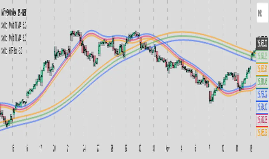
SwRp – HTF Candle Box OverlaySwRp – HTF Candle Box Overlay gives you a clear visual map of higher-timeframe candles directly on your lower-timeframe chart. Instead of switching timeframes, you can see the structure of each HTF candle plotted as colored boxes that update in real time as the candle forms.
Each HTF candle is drawn using two elements:
• A wick box showing the full high-to-low range
• A body box showing the open-to-close move with automatic bull/bear coloring
Both boxes follow the exact HTF open, high, low and close values, and they stay correctly anchored to price using bar-time positioning. You can customize opacity, body/wick visibility, border color, and the number of HTF candles to keep on the chart. The indicator automatically removes older candles when they exceed your set limit, so the chart stays clean.
This tool is ideal for traders who want to see HTF structure, zones, and candle behavior while analyzing entries and exits on smaller timeframes.
Key Features
• Overlay higher-timeframe candles on lower-timeframe charts
• Real-time updating of HTF candle body and wick
• Bull/bear body coloring with full opacity controls
• Independent toggles for body and wick fills
• Automatically remove older HTF candles to keep the chart clean
• Accurate price anchoring using bar-time for all boxes
• No extra lines, labels, or clutter — a clean visual multi-timeframe view
This indicator offers a simple, clear way to track the behavior of higher-timeframe candles without leaving your current chart, helping you combine HTF context with LTF execution more effectively.
EDGE MTF ATR Bias Matrix EDGE MTF ATR BIAS MATRIX - User Guide & Documentation
═════════════════════════════════════════════════════════════
OVERVIEW
The EDGE MTF ATR Bias Matrix is a multi-timeframe directional bias indicator
that displays dynamic support and resistance levels across six timeframes in a
compact corner panel. It uses ATR-based trailing bands to determine trend
direction and highlights key levels you should be watching for potential
entries, exits, or reversals.
Think of it as your "compass" — at a glance, you can see which direction the
market is pointing on the 5m, 15m, 30m, 1H, 4H, and Daily timeframes, along
with the critical price level to watch on each.
─────────────────────────────────────────────────────────────
HOW IT WORKS
The indicator uses a dual-band trailing stop system on each timeframe:
INNER BAND (Tighter/Faster)
• Calculated as: HL2 ± (Inner Multiplier × ATR)
• Default multiplier: 3.0
• Reacts more quickly to price changes
• Defines the "active" trend direction
OUTER BAND (Wider/Slower)
• Calculated as: HL2 ± (Outer Multiplier × ATR)
• Default multiplier: 6.0
• Provides a buffer zone / "cloud" between signals
• Represents major support/resistance levels
The two bands create a "cloud" structure:
• When Inner > Outer → Bullish Cloud (uptrend structure)
• When Inner < Outer → Bearish Cloud (downtrend structure)
Signal Logic:
▲ BULLISH (Green): Price is ABOVE the inner band in a bullish cloud
▼ BEARISH (Red): Price is BELOW the inner band in a bearish cloud
◆ NEUTRAL (Gray): Price is inside the cloud or at an inflection point
─────────────────────────────────────────────────────────────
READING THE PANEL
The panel displays three columns:
TF │ Level │ Δ
────────┼───────────
Daily │ 4,125.50 │
4H │ 4,118.25 │ 3.25
1H │ 4,115.00 │
30m │ 4,112.75 │ 1.50
15m │ 4,110.50 │
5m │ 4,108.25 │ 0.75
COLUMN 1 - TF (Timeframe)
The timeframe being analyzed
COLUMN 2 - Level
The key support/resistance level to watch
• Color indicates bias: Green = Bullish, Red = Bearish, Gray = Neutral
• This is the trailing band level that price is respecting
COLUMN 3 - Δ (Delta/Proximity)
Distance from current price to the key level
• Only appears when price is within the Proximity Threshold
• Yellow color draws attention to nearby levels
• Helps you spot imminent tests of support/resistance
─────────────────────────────────────────────────────────────
WHAT TO LOOK FOR
1. CONFLUENCE OF BIAS
When multiple timeframes show the same color (all green or all red), the
directional bias is strong. Trade with the trend.
Example: Daily, 4H, 1H, and 30m all GREEN = Strong bullish environment
→ Look for long entries on pullbacks to the displayed levels
2. DIVERGENCE BETWEEN TIMEFRAMES
When higher timeframes disagree with lower timeframes, expect choppy
conditions or potential reversals.
Example: Daily RED but 15m and 5m GREEN = Short-term bounce in downtrend
→ Approach longs with caution; these may be counter-trend trades
3. PROXIMITY ALERTS (Δ Column)
When you see a value in the Δ column, price is close to that timeframe's
key level. This is where you should pay attention for:
• Bounces (level holds = continuation)
• Breaks (level fails = potential reversal or acceleration)
4. LEVEL CLUSTERING
When multiple timeframe levels are near each other, that zone becomes
significant. Price often reacts strongly at these areas.
Example: If 1H shows 4,115 and 30m shows 4,114, that 4,114-4,115 zone
is a high-probability reaction area.
5. TREND ALIGNMENT FOR ENTRIES
For highest-probability trades:
• Ensure at least the 1H and 4H (or Daily) agree on direction
• Use lower timeframe (5m/15m) levels for entry timing
• Place stops beyond the next timeframe's level
─────────────────────────────────────────────────────────────
CONFIGURABLE SETTINGS
═══ Color Theme ═══
Bullish Default: Green (#4CAF50, 30% transparency)
Color used when bias is bullish
Bearish Default: Red (#F44336, 0% transparency)
Color used when bias is bearish
Neutral Default: Gray (#ECEFF1, 30% transparency)
Color used when price is in the cloud/neutral zone
═══ Display Settings ═══
Panel Location Default: Top Right
Choose where the panel appears on your chart
Options: Top Left, Top Center, Top Right,
Bottom Left, Bottom Center, Bottom Right
Sort Highest Default: ON (checked)
TF First When ON: Daily at top, 5m at bottom
When OFF: 5m at top, Daily at bottom
Choose based on your trading style preference
Proximity Default: 10.5
Threshold How close price must be to a level before the Δ column
shows the distance
• For index futures (ES, NQ): 10-15 points works well
• For forex: 0.0010-0.0050 (10-50 pips)
• For stocks: Adjust based on typical ATR
• Set to 0 to disable proximity alerts
Text Size Default: Small
Options: Tiny, Small, Normal, Large
Adjust based on your screen size and preference
═══ Algorithm Parameters ═══
ATR Lookback Default: 10
Number of bars used to calculate ATR
• Lower values (5-8): More reactive to recent volatility
• Higher values (14-20): Smoother, less reactive
Range: 1-50
Inner Band Default: 3.0
Multiplier Controls the tighter/faster trailing band
• Lower values: Tighter stops, more signals, more whipsaws
• Higher values: Wider stops, fewer signals, smoother trends
Range: 0.5-10.0 (step 0.5)
Outer Band Default: 6.0
Multiplier Controls the wider/slower trailing band
• Should always be larger than Inner Multiplier
• Creates the "buffer zone" between trend states
• Larger values = bigger neutral zones
Range: 1.0-20.0 (step 0.5)
─────────────────────────────────────────────────────────────
RECOMMENDED CONFIGURATIONS
FOR SCALPING (Fast/Aggressive):
• ATR Lookback: 7
• Inner Multiplier: 2.0
• Outer Multiplier: 4.0
• Proximity Threshold: 5.0
FOR DAY TRADING (Balanced):
• ATR Lookback: 10 (default)
• Inner Multiplier: 3.0 (default)
• Outer Multiplier: 6.0 (default)
• Proximity Threshold: 10.5 (default)
FOR SWING TRADING (Smooth/Patient):
• ATR Lookback: 14
• Inner Multiplier: 4.0
• Outer Multiplier: 8.0
• Proximity Threshold: 20.0
─────────────────────────────────────────────────────────────
TIPS FOR BEST RESULTS
1. Use this indicator as a BIAS tool, not an entry signal
It tells you which direction to favor — you still need price action,
order flow, or another method to time entries.
2. Respect higher timeframe bias
Even if 5m and 15m turn bullish, if Daily is bearish, those longs are
counter-trend. Size smaller and take profits quicker.
3. Watch for color changes on your trading timeframe
A flip from green to gray (or red) is an early warning that momentum
may be shifting.
4. The displayed levels are dynamic
They trail price during trends but lock in during pullbacks. This is
by design — the levels only move in the direction of the trend.
5. Combine with volume or momentum
This indicator shows structure. Pair it with volume analysis or a
momentum oscillator to confirm strength of moves.
─────────────────────────────────────────────────────────────
TIMEFRAMES ANALYZED
The indicator automatically pulls data from these fixed timeframes regardless
of what chart timeframe you're viewing:
• 5 Minute (5m) — Micro structure, scalp timing
• 15 Minute (15m) — Intraday swings
• 30 Minute (30m) — Intraday trend
• 1 Hour (1H) — Day trading bias
• 4 Hour (4H) — Swing trading bias
• Daily (1D) — Overall trend direction
─────────────────────────────────────────────────────────────
TROUBLESHOOTING
Panel not showing?
→ Make sure you're viewing on a timeframe equal to or lower than 5m
→ Check that the panel location isn't obscured by other indicators
All levels showing gray/neutral?
→ This can happen during ranging/consolidating markets
→ The multipliers may need adjustment for the instrument's volatility
Levels seem too far from price?
→ Reduce the Inner and Outer Multipliers
→ The defaults work well for index futures but may need tuning for
lower-volatility instruments
Proximity column never shows values?
→ Increase the Proximity Threshold setting
→ Current default (10.5) may be too tight for your instrument
