NeuroSwarm BTC — Crowd vs Experts Forecast TrackerEnglish:
NeuroSwarm — Crowd vs Experts Forecast Tracker (BTC)
This indicator visualizes monthly forecasts collected from two independent groups:
Crowd – a large sample of retail traders
Experts – a smaller, curated group of analysts and experienced market participants
For each month, the following values are displayed as horizontal levels on the chart:
Median forecast of the Crowd
Average forecast of the Crowd
Median forecast of Experts
Average forecast of Experts
Shaded zones showing the range between median and mean
The values remain fixed throughout each month. This allows traders to compare sentiment dynamics between groups and see how expectations evolve relative to actual market movement.
Purpose:
This indicator is designed for sentiment analysis — NOT for generating trading signals.
It helps identify divergences between retail expectations and expert forecasts, which can be informative during trend transitions.
Data source:
All values come from monthly surveys conducted within the NeuroSwarm project (1–5 of every month).
Crowd and Expert groups are collected separately to avoid bias and to preserve independent aggregation.
Interface language note:
The indicator’s interface may contain non-English labels for ease of use, but full English documentation is provided here in compliance with TradingView House Rules.
Русская версия (optional, allowed only AFTER English):
NeuroSwarm — Мудрость Толпы vs Эксперты (BTC)
Индикатор показывает ежемесячные прогнозы двух групп:
Толпа: медиана и средняя прогнозов
Эксперты: медиана и средняя прогнозов
Значения фиксируются на весь месяц и отображаются на графике горизонтальными уровнями.
Заливка показывает диапазон между медианой и средней.
Цель индикатора — визуализировать настроение толпы и экспертов и сравнить его с реальным движением цены.
Это аналитический инструмент, а не торговая стратегия.
Данные берутся из ежемесячных опросов (1–5 числа), проводимых в рамках проекта NeuroSwarm.
Statistics

TCT - Daylight Saving TimeVisualize Daylight Saving Time (DST) transitions on your charts. This indicator marks the spring forward (2nd Sunday of March) and fall back (1st Sunday of November) dates with vertical lines and optional labels.
Features:
Automatic DST detection for US time zones
Customizable line color, width, and style (solid, dashed, dotted)
Optional date labels on transition days
Multiple timezone support: US Eastern, Central, Mountain, Pacific, London, Paris, Tokyo, Sydney
Extends lines across the chart
Memory-efficient (manages up to 100 lines/labels)
Use Cases:
Identify potential market behavior shifts around DST transitions
Track time changes that may affect trading sessions
Plan trades around known time adjustments
Historical analysis of DST impact on price action
Perfect for traders who want to see when clocks change and how it might affect market dynamics. Customize the appearance to match your chart style.

6-9 session & levels6-9 Session & Levels - Customizable Range Analysis Indicator
Description:
This indicator provides comprehensive session-based range analysis designed for intraday traders. It calculates and displays key levels based on a customizable session period (default 6:00-9:00 AM ET).
Core Features:
Session Tracking
Monitors user-defined session times with timezone support
Displays session open, high, and low levels
Highlights session range with optional box visualization
Shows previous day RTH (Regular Trading Hours: 9:30 AM - 4:00 PM) levels
Range Levels
25%, 50%, and 75% range levels within the session
Range deviations at 0.5x, 1.0x, and 2.0x multiples
Fibonacci extension levels (customizable, default 1.33x and 1.66x)
Optional fill zones between Fibonacci levels
Time Zone Highlighting
Marks the 9:40-9:50 AM period as a potential reversal zone
Vertical lines with shading to identify key time windows
Statistical Analysis
Calculates mean and median extension levels based on historical sessions
Displays statistics table showing current range, average range, range difference, and z-score
Customizable sample size (1-100 sessions) for statistical calculations
Option to anchor extensions from either session open or high/low points
Input Settings Explained:
Session Settings
Levels Session Time: Define your session window in HHMM-HHMM format (default: 0600-0900)
Time Zone: Choose from UTC, America/New_York, America/Chicago, America/Los_Angeles, Europe/London, or Asia/Tokyo
Anchor Settings
Show Session Anchor: Toggle the session anchor line (marks session open price at 6:00 AM)
Anchor Style/Color/Width: Customize appearance (Solid/Dashed/Dotted, color, 1-4 width)
Show Anchor Label: Display price label for the anchor
Session Open Line: Similar options for the session open reference line
Range Box Settings
Show Range Box: Display a shaded rectangle highlighting the session high-to-low range
Range Box Color: Set the box background color and transparency
Range Levels (25%/50%/75%)
Show Range Levels: Toggle all three intermediate levels on/off
Individual Level Styling: Each level (25%, 50%, 75%) has its own color, style, and width settings
Show Range Level Labels: Display price labels for each level
Range Deviations
Show Range Deviations: Toggle deviation levels on/off
0.5x/1.0x/2.0x Settings: Each deviation multiplier can be customized with its own color, line style (Solid/Dashed/Dotted), and width
Show Range Deviation Labels: Display labels showing the deviation price levels
Previous Day RTH Levels
Show Previous RTH Levels: Display yesterday's regular trading hours high and low
RTH High/Low Styling: Separate color, style, and width settings for each level
Show Previous RTH Labels: Toggle price labels for RTH levels
Time Zones
Show 9:40-9:50 AM Zone: Highlight this specific time period with vertical lines and shading
Zone Color: Set the background fill color for the time zone
Zone Label Color/Text: Customize the label appearance and text
Fibonacci Extension Settings
Show Fibonacci Extensions: Toggle Fib levels on/off
Fib Extension Color/Style/Width: Customize line appearance
Show Fib Extension Labels: Display price labels
Fib Ext Level 1/2: Set custom multipliers (default 1.33 and 1.66, range 0-5 in 0.1 increments)
Show Fibonacci Fills: Display shaded zones between Fib levels
Fib Fill Color: Customize the fill color and transparency
Session High/Low Settings
Show Session High/Low Lines: Display the actual session extremes
Style/Color/Width: Customize line appearance
Show Labels: Toggle price labels for high/low levels
Extension Stats Settings
Show Statistical Levels on Chart: Display mean and median extension levels based on historical data
Extension Anchor Point: Choose whether to anchor from "Open" or "High/Low" of the session
Number of Sessions for Statistics: Set sample size (1-100, default 60) for calculating averages
Mean/Median High Extension: Separate styling for each statistical level (color, style, width)
Mean/Median Low Extension: Separate styling for downside statistical levels
Tables
Show Statistics Table: Display a summary table with current range, average range, difference, z-score, and sample size
Table Position: Choose from 9 positions (Bottom/Middle/Top + Center/Left/Right)
Table Text Size: Select from Auto, Tiny, Small, Normal, Large, or Huge
Display Settings
Projection Offset: Number of bars to extend lines forward (default 24)
Label Size: Choose from Tiny, Small, Normal, or Large
Price Decimal Precision: Set decimal places for price labels (0-6)
How It Works:
The indicator tracks the specified session period and calculates the session's open, high, low, and range. At the end of the session (9:00 AM by default), it projects all configured levels forward for the trading day. The statistical features analyze the last N sessions (you choose the number) to calculate typical extension behavior from either the session open or the session high/low points.
The z-score calculation helps identify whether the current session's range is normal, expanded, or contracted compared to recent history, allowing traders to adjust expectations for the rest of the day.
Use Case:
This indicator helps traders identify key support and resistance levels based on early session price action, understand current range context relative to historical averages, and spot potential reversal zones during specific time periods.
Note: This indicator is for informational purposes only and does not constitute investment advice. Always perform your own analysis before making trading decisions.

Auto Seasonality Scanner by Novatrix CapitalThe Auto Seasonality Scanner analyzes historical daily price data to identify recurring seasonal patterns in the market. It highlights periods over the last 10 years where certain price movements have historically occurred. This indicator is designed for the DAILY (1D) timeframe only.
Key Features:
Visualizes historical entry and exit points for Long and Short patterns using vertical lines.
Option to exclude specific years (e.g., 2020) from the analysis.
Optional filter by US election cycles.
Calculates average returns, win rates, trade lengths, and number of trades for each pattern.
Displays results in a customizable table with color-coded Long and Short patterns.
This tool is for educational and informational purposes only. It provides a visual guide to potential recurring seasonal trends and does not constitute financial advice or trading recommendations.

AI Probabilistic OrderFlow Scalper⭐ Description:
📌 AI Probabilistic OrderFlow Scalper
This script combines Order Flow, Auction Market Theory, Volume Imbalance, Market Structure (HH/LL), RSI bias filtering, and a probability-based direction model inspired by AI and statistics.
It produces high-precision scalping entries designed for fast markets such as Futures, while remaining compatible with all markets (indices, crypto, forex, metals).
This is not a typical indicator — it is a probabilistic predictive model engineered to provide sniper entries, a tick-based Take Profit, a volatility-adaptive ATR Stop Loss, and optional Value Area levels (VAH/VAL/POC).
⭐ Main Features:
🔥 Directional probability model (AI-style weighted scoring)
📊 Order Flow imbalance (delta-like logic)
📈 HH/LL market structure detection
🎯 Smart RSI bias filter
🚀 One signal per trend shift (anti-spam)
🎯 Tick-based Take Profit (perfect for NQ / futures)
🛡️ ATR-based dynamic Stop Loss
📉 Value Area display: VAH, VAL, POC
🔊 Volume confirmation filter
📡 Directional probability plot
✔️ Works for Futures, Crypto, Forex, Indices
🧠 Probabilistic AI Approach
The model uses a 3-factor scoring system:
Order Flow imbalance
Market structure (HH/LL)
RSI trend bias
Each validated condition = 1 point.
The total score is converted into Buy/Sell probabilities, and the higher-probability direction is selected.
When probability exceeds the threshold (e.g. 80%), the system triggers a high-confidence sniper signal.
This mirrors Revenue Management logic:
→ Only take a decision when probability of success is maximized.
🎯 Buy/Sell Signals (Sniper Entries)
🔵 Green triangle under the candle = high-probability Buy
🔴 Red triangle above the candle = high-probability Sell
✔️ Only one signal per directional shift
✔️ Signals appear only when all strict filters are satisfied
📌 Automatic TP / SL
TP: fixed tick-based (e.g. 100 ticks for NQ scalping)
SL: ATR-based, adapts to volatility
TP/SL display can be enabled or disabled
Perfectly calibrated for high-speed scalping.
📘 How to Use
Use on every timeframe
Adjust probability threshold (75–90 recommended)
Enable strict mode for maximum precision
Let the model filter entries automatically
Choose a TP suitable for your market
Optionally display VAH/VAL/POC for Auction Theory context
Always test using backtesting before going live
🏆 Advantages
Extremely fast for scalping
High win-rate potential via probabilistic filtering
Clean signals (no noise or spam)
Combines the strongest trading frameworks:
Order Flow
Market Structure
Statistical modeling
Volume profiling
Automated risk management

AI Probabilistic OrderFlow Scalper⭐ Main Name
AI Probabilistic OrderFlow Scalper
⭐Description:
📌 AI Probabilistic OrderFlow Scalper — Predictive Auction Theory Model for Futures
This script combines Order Flow, Auction Market Theory, Volume Imbalance, Market Structure (HH/LL), RSI bias filtering, and a probability-based direction model inspired by AI and Revenue Management.
It produces high-precision scalping entries designed for fast markets such as Nasdaq Futures (NQ), while remaining compatible with all markets (indices, crypto, forex, metals).
This is not a typical indicator — it is a probabilistic predictive model engineered to provide sniper entries, a tick-based Take Profit, a volatility-adaptive ATR Stop Loss, and optional Value Area levels (VAH/VAL/POC).
⭐ Main Features
🔥 Directional probability model (AI-style weighted scoring)
📊 Order Flow imbalance (delta-like logic)
📈 HH/LL market structure detection
🎯 Smart RSI bias filter
🚀 One signal per trend shift (anti-spam)
🎯 Tick-based Take Profit (perfect for NQ / futures)
🛡️ ATR-based dynamic Stop Loss
📉 Value Area display: VAH, VAL, POC
🔊 Volume confirmation filter
📡 Directional probability plot
✔️ Works for Futures, Crypto, Forex, Indices
🧠 Probabilistic AI Approach
The model uses a 3-factor scoring system:
Order Flow imbalance
Market structure (HH/LL)
RSI trend bias
Each validated condition = 1 point.
The total score is converted into Buy/Sell probabilities, and the higher-probability direction is selected.
When probability exceeds the threshold (e.g. 80%), the system triggers a high-confidence sniper signal.
This mirrors Hight probability decision:
→ Only take a decision when probability of success is maximized.
🎯 Buy/Sell Signals (Sniper Entries)
🔵 Green triangle under the candle = high-probability Buy
🔴 Red triangle above the candle = high-probability Sell
✔️ Only one signal per directional shift
✔️ Signals appear only when all strict filters are satisfied
📌 Automatic TP / SL
TP: fixed tick-based (e.g. 100 ticks for NQ scalping)
SL: ATR-based, adapts to volatility
TP/SL display can be enabled or disabled
Perfectly calibrated for high-speed scalping.
📘 How to Use
Use any timeframe
Adjust probability threshold (75–90 recommended)
Enable strict mode for maximum precision
Let the model filter entries automatically
Choose a TP suitable for your market
Optionally display VAH/VAL/POC for Auction Theory context
Always test using backtesting before going live
🏆 Advantages
Extremely fast for scalping
High win-rate potential via probabilistic filtering
Clean signals (no noise or spam)
Combines the strongest trading frameworks:
Order Flow
Market Structure
Statistical modeling
Volume profiling
Automated risk management

Position Size Calculator - Fixed Risk Per BarThis indicator calculates the max contracts allowed per bar based on your determined fixed risk.

Dual Account Position Size CalculatorA quick and easy to use position sizing calculator for use on the daily TF only. inputs for two different account sizes and risk %. Calculates risk to low of day (plus a small buffer which can be changed based on ATR). Shows # of shares to buy, stop loss, portfolio %.
Will show on smaller timeframes , but be aware that the stop level will no longer be low of day, so it will not calculate properly. Always use on the daily.

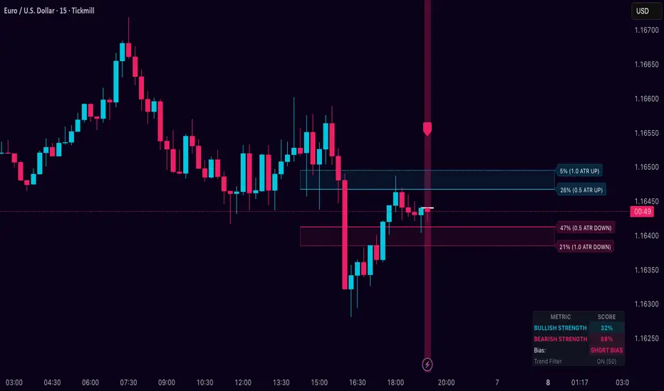
Dynamic Breakout Odds [RayAlgo]█ OVERVIEW
Dynamic Breakout Odds is a probability-based breakout tool that uses ATR and pattern matching to estimate how likely price is to expand up or down from the current candle.
Instead of guessing, the indicator scans historical candles that look like the current one and measures how often price broke above or below by a volatility-based amount.
It then projects those probabilities forward as clean levels and a bias dashboard on your chart.
Use it to quickly answer:
• “Is the next move statistically more likely up or down?”
• “How far does price typically travel from here, in ATR terms?”
█ CONCEPTS
Candle Profile Matching
The script builds a “profile” of the current setup using two elements:
• The color of the previous candle (bullish close vs bearish close)
• The trend environment (above/below EMA, if the filter is enabled)
Only historical candles with the same profile are used for statistics. This keeps the probabilities specific to the current context instead of mixing all market conditions together.
ATR-Based Expansion
For every matching historical candle, the script checks how far price moved away from the open using ATR:
• Upward move thresholds
• Moderate expansion (≈ 0.5 ATR above the open)
• Stronger expansion (≈ 1.0 ATR above the open)
• Downward move thresholds
• Moderate expansion (≈ 0.5 ATR below the open)
• Stronger expansion (≈ 1.0 ATR below the open)
It counts how often each expansion happened, then converts those counts into probabilities.
Normalized Probability Scores
The indicator doesn’t just show raw percentages; it normalizes them so that all scenarios together form a consistent probability set.
Internally it tracks four outcomes for similar candles:
• Chance of a moderate move upward
• Chance of a strong move upward
• Chance of a moderate move downward
• Chance of a strong move downward
These are then normalized so the total is roughly 100%. From this, two main metrics are derived:
• Bullish Strength = combined normalized odds of upside moves
• Bearish Strength = combined normalized odds of downside moves
Whichever side has the higher score defines the current directional bias .
█ WHAT YOU SEE ON THE CHART
1. Breakout Projection Levels
Four horizontal levels are projected around the open of the current bar:
• Two upside levels
• Nearer upside expansion (~0.5 ATR above the open)
• Further upside expansion (~1.0 ATR above the open)
• Two downside levels
• Nearer downside expansion (~0.5 ATR below the open)
• Further downside expansion (~1.0 ATR below the open)
Each line extends a configurable number of bars into the future, so you visually see a breakout “corridor” above and below price.
2. Probability Labels
At the right edge of each line, you’ll see a label such as:
• “X% – near upside”
• “Y% – further downside”
These labels tell you how frequently similar candles in the chosen lookback reached that expansion. You immediately know which scenario has been more common historically.
3. Breakout Zones
Between the paired upside lines and the paired downside lines, shaded “probability zones” can be shown:
• The upper shaded band highlights the typical upside expansion range
• The lower shaded band highlights the typical downside expansion range
These zones visually group probable target areas instead of just single lines.
4. Background Tint
The background behind price is softly tinted towards:
• Bullish color when Bullish Strength > Bearish Strength
• Bearish color when Bearish Strength > Bullish Strength
The stronger the statistical imbalance between the two, the more pronounced the tint. This gives you an instant feel for whether conditions lean more Long, more Short, or are nearly Neutral.
5. Directional Bias Arrow
On the last bar the script can plot a clean arrow:
• Up-arrow below price when bullish odds dominate
• Down-arrow above price when bearish odds dominate
The arrow is positioned beyond all projection lines, making it easy to see even on cluttered charts and reminding you of the current statistical bias without text.
6. Origin Marker
A small horizontal mark is drawn at the open of the current candle.
This acts as the “starting point” from which all ATR-based expansions above and below are measured.
7. Dashboard Panel
A compact dashboard is drawn in a corner of the chart (location configurable). It displays:
• Bullish Strength – combined normalized probability for upside expansions
• Bearish Strength – combined normalized probability for downside expansions
• Bias – “Long Bias”, “Short Bias”, or “Neutral”
• Trend Filter – shows whether EMA-based filtering is ON or OFF and which length is used
This gives you a quick, text-based summary of the current statistical environment.
█ SETTINGS
Analysis Lookback Period
• Controls how many historical bars the script inspects when searching for similar candles.
• Larger values = more history, smoother statistics, slower adaptation.
• Smaller values = faster adaptation, but more noise and less stability.
ATR Length
• The period used to compute ATR volatility.
• Defines how “big” 0.5 ATR and 1.0 ATR moves are on your current symbol and timeframe.
Trend Filter (EMA)
• Filter by Trend?
• When ON, only historical candles in a similar trend regime are used.
• When OFF, all past candles with similar color are considered, regardless of trend.
• Trend EMA Length
• EMA period used to classify trend.
• Price above EMA → uptrend environment.
• Price below EMA → downtrend environment.
This filter helps you separate behavior in uptrends from downtrends, which can significantly change breakout dynamics.
Visual Settings
• Projection Width (bars)
• How far the lines and zones extend into the future.
• Show Probability Zones
• Toggle shaded bands between each pair of levels.
• Label Size
• Choose smaller or larger text for the probability labels on the right.
• Tint Background by Bias
• Turn the bias-based background on or off.
• Show Bias Marker on Last Candle
• Toggle the up/down arrow marker.
• Dashboard Location
• Select top/bottom left/right corner for the panel.
█ HOW TO USE IT
1. Start With the Dashboard
Look at Bullish Strength vs Bearish Strength:
• If bullish is clearly larger → environment statistically favors upside expansion.
• If bearish is clearly larger → environment statistically favors downside expansion.
• If they are close → treat the situation as Neutral; consider reducing position size or waiting for more clarity.
2. Use Levels as Dynamic Targets
The projected lines and zones can serve as:
• Profit targets based on typical expansion distance
• Logical regions for scaling out
• Areas where you expect price behavior to change (e.g., loss of momentum)
Short-term traders often focus on the nearer expansion levels, while swing traders may use the farther levels as extended targets.
3. Align With Trend (Optional)
With the trend filter ON:
• Prefer Long setups when price is above the EMA and bullish probabilities dominate.
• Prefer Short setups when price is below the EMA and bearish probabilities dominate.
With the filter OFF, you get pure color-plus-pattern statistics across the whole lookback, which can be useful if you deliberately trade counter-trend or range conditions.
4. Combine With Your Existing System
Dynamic Breakout Odds is best used as a confirmation and targeting layer :
• Combine it with structure (support/resistance, supply/demand, order blocks).
• Combine it with volume or orderflow tools if you use them.
• Use the probability zones to validate whether your planned target is realistic relative to recent volatility.
It is not designed to be a standalone “buy/sell” signal generator, but a statistical map around your entries.
█ PRACTICAL EXAMPLES
Example A – Bullish, Moderate Expansion Frequently Hit
• Bullish Strength significantly higher than Bearish Strength.
• The nearer upside level shows a strong historical hit rate.
Interpretation: similar setups often produce at least a moderate push upward before failing.
Use case: trade pullbacks in the direction of the bias, targeting the nearer upside projection as an initial take-profit.
Example B – Bearish, Deeper Downside Often Reached
• Bearish Strength clearly dominant.
• Both the nearer and farther downside levels show decent probabilities.
Interpretation: similar conditions historically saw follow-through to the downside.
Use case: use rallies against the direction of the bias to position into shorts, planning partial exits around the first downside projection and runners toward the second.
Example C – Neutral, Balanced Probabilities
• Bullish and Bearish Strength scores are close.
• Background tint is very light or absent.
Interpretation: the market is statistically indecisive; expansions up or down are similarly likely.
Use case: consider range trading tactics, mean-reversion ideas, or simply standing aside until a clearer skew develops.
█ BEST PRACTICES
• Use on liquid symbols and reasonable timeframes to avoid distorted ATR behavior.
• Don’t overfit lookback length to a single instrument; test across markets.
• Let the indicator provide context, not absolute certainty.
• Always combine with proper risk management (position sizing, max loss per trade, etc.).
• Be cautious with very small sample sizes (e.g., very short lookbacks on low-volume assets).
█ LIMITATIONS & NOTES
• All probabilities are based on historical behavior ; markets can change regime.
• ATR distances are relative to recent volatility and may shrink/expand over time.
• The script intentionally does not guarantee any direction or target; it only reports what has been most common in similar past situations.
█ DISCLAIMER
This tool is for educational and informational purposes only.
It does not constitute financial advice or a guarantee of performance.
Always do your own research, test on demo or historical data, and use appropriate risk management when trading live capital.
Monthly DCA & Last 10 YearsThis Pine Script indicator simulates a Monthly Dollar Cost Averaging (DCA) strategy to help long-term investors visualize historical performance. Instead of complex timing, the script automatically executes a hypothetical fixed-dollar purchase (e.g., $100) on the first trading day of every month. It visually marks entry points with green "B" labels and plots a dynamic yellow line representing your Global Break-Even Price, allowing you to instantly see if the current price is above or below your average cost basis. To provide deep insight, it generates a detailed performance table in the bottom-right corner that breaks down metrics year-by-year—including total capital invested, shares/coins accumulated, and Profit/Loss percentage—along with a grand total summary of the entire investment period.

Weekly DCA & Yearly TableThis Pine Script indicator simulates a Weekly Dollar Cost Averaging (DCA) strategy directly on your TradingView chart. It automatically calculates a hypothetical portfolio where a fixed dollar amount (default $100) is invested every Friday (or the last trading day of the week) starting from a user-defined year. Visually, it marks every purchase with a green "B" label and plots a yellow line representing your Global Break-Even Price, allowing you to see exactly where your average entry lies relative to current price action. To track performance, it generates a detailed table in the bottom-right corner that breaks down your investment year-by-year, showing total capital invested, "coins" or shares accumulated, average buy price per year, current value, and profit/loss percentage, along with a grand total summary for the entire period.

Multi-Timeframe Liquidity ZonesXUAUSD 流动性清扫图 关闭自动调整参数,要求收盘回另一侧,重生流动性检测。高点回溯周期5
阈值0.03 数量50
XAUUSD Liquidity Sweep Chart: Disable automatic parameter adjustment, require closing on the opposite side, and regenerate liquidity detection. High point lookback period: 5. Threshold: 0.03. Quantity: 50.

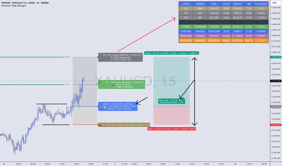
Precision Trade Manager🔥Precision Trade Manager is a complete execution - planning and trade-management system for TradingView.
It gives you full control over entry, stop-loss, position sizing, risk %, multi-TP planning (1–5), live tracking, realized profit, floating P&L, RR, and account % change — all directly on your chart.
Because this tool has many features and workflows, the TradingView description is too short to explain everything properly.
For that reason, please read the two PDF guides below before using the indicator.
They explain exactly how the tool works, how to set it up correctly, and how to avoid mistakes when planning or managing trades.
📘 PDF 1 — Quick Start Guide (Read First)
drive.google.com
This guide explains the core workflow step-by-step:
✔ How to add the tool to the chart
✔ How to configure assets, contract size, account balance, and trading costs
✔ How to set Entry, SL, and your risk %
✔ How to set TP1–TP5 using RR mode or manual mode
✔ How partials work
✔ How LIVE TRACKING mode works
✔ How to reset and prepare your next trade
This PDF teaches you the correct operational flow, so you understand how Precision Trade Manager behaves on the chart and why certain features exist.
Reading this first prevents confusion and ensures you use the tool correctly.
📙 PDF 2 — Feature Overview & Visual Examples
drive.google.com
This PDF gives a full breakdown of everything the tool is capable of:
✔ Real-time dashboard metrics (pips, lots, RR, profit, % account)
✔ Partial TP tracking with green checkmarks and locked profit
✔ Floating vs. locked mode
✔ Pip/point/currency conversions across Gold, Forex, Indices, and Crypto
✔ Example charts for US30, EURUSD, and XAUUSD
✔ A direct comparison against the TradingView Long/Short tool
This document is visual. It shows real examples of the tool in action so you understand what to expect once you’re using it live on your chart.

It is highly recommended to look through this PDF before your first trade. It will help you understand the dashboard, interpret every metric, and recognize the benefits versus the default TradingView tools.
(The tool has many (!) tooltips, hower mouse over each. To get a clear description of what each function/button/box do)
JRien Position Sizer (Real-Time) — ATR / LOD / Manual % $ RiskReal time position sizing based on real time potential entry price and calculations based on max risk. Usable on multi timeframes. You can also input manually your entry and stop based on your own discretion. I usually use a spreadsheet to calculate these things but wanted a way to see this in real time without needing to type out Entry, ATR, Stops, etc - TradingView has all this information already so why not just have it automatically update!
4 Stop Types:
ATR Based Stop
Based on the stocks ATR (mainly used on daily charts but options if you use other timeframe ATR) and uses a multiple of that ATR to base the plot. Many traders use less than 0.6ATR to base your stop as a rule and max entry 60% from LOD as another rule.
Manual Percent Stop
You're able to input your desired % stop and this will dynamically move with the current entry (last) price.
Manual Price Stop
You're able to input your desired price $ stop and this will dynamically move with the current entry (last) price.
Low of Day (LOD) Stop
Calculates your position based on if you were to have your stop at LOD and also calculates % of ATR away from LOD. Many swing traders use LOD for their stop so this moving dynamically with the current LOD and automatically calculating this is useful.
Calculates:
Entry (Last)
ATR (14 | D)
ATR Stop Price
Manual Stop Percent
Manual Stop Price
Final Stop
Risk per Share ($)
Shares by Risk
Shares by Stake
Final Shares
Final Position Cost
Potential Stop Loss
LOD Price
Loss at LOD
LOD Risk % of Account
LOD dist as % of ATR
Customizable table - can hide items, change color and size.
Also an option to hide historical data - so plots start at market open!
Let me know if any calculations are incorrect, good luck!
- JRien

Yong Fin Growth on ChartBridge the gap between Fundamental Analysis and Technical Price Action.
Yong Fin Growth on Chart is the ultimate tool for "Hybrid Traders" and investors who need to visualize financial performance directly alongside price movements. Stop switching tabs between news sites and your charts—get the full context of why a stock is moving, right where it happens.
This indicator overlays key financial metrics onto your chart, triggered precisely by Earnings Announcements. It allows you to instantly correlate price reactions with fundamental catalysts like Revenue Growth, Margin Expansion, or EPS surprises.
Key Features:
🔹 1. Smart Earnings Trigger The indicator automatically detects Earnings Announcement dates and plots a data label on the exact bar.
Stocks: Aligns with the specific earnings release date to show immediate price reaction.
Funds/ETFs: Supports Fiscal Period End dates for broader instrument analysis.
Includes a vertical line option to visually separate fiscal periods for easy backtesting.
🔹 2. 5 Fully Customizable Data Slots Configure up to 5 independent slots to track the metrics that matter to your strategy. Choose from a comprehensive list including:
Growth: Revenue, Net Income, EBITDA, EPS.
Efficiency: Gross Margin (GPM), Net Margin (NPM), ROE, ROA.
Valuation: P/E, P/S, P/BV, EV/EBITDA, and Implied P/E.
Health: Cash, Debt, Net Debt, Free Cash Flow (FCF).
🔹 3. Dynamic Growth Coloring & Thresholds Instantly identify trend changes with intelligent color coding.
Comparison Modes: Toggle between YoY (Year-over-Year) or QoQ (Quarter-over-Quarter) growth logic.
Custom Thresholds: Define your own standards. For example, set the label to turn Green only if growth exceeds +15%, or Red if it falls below -5%. This helps filter out noise and highlights significant fundamental shifts.
🔹 4. Flexible Period Selection Analyze data across different timeframes to suit your trading style:
FQ: Fiscal Quarter (Short-term momentum)
FY: Fiscal Year (Long-term trend)
TTM: Trailing Twelve Months (Ideal for smooth Valuation ratios)
FH: Fiscal Half (For securities reporting semi-annually)
How to Use:
Add to Chart: Apply the indicator to any stock symbol.
Configure Slots: Go to settings and select the 5 metrics you want to monitor (e.g., Rev, Net Profit, GPM, NPM, P/E).
Set Color Logic: Choose whether you want to color-code based on YoY or QoQ growth.
Analyze: Look for the labels.
Are margins expanding while price is consolidating?
Did the price drop despite a "Green" label? (Market expectations vs. Reality)
Use the vertical lines to see how the trend changed after previous earnings reports.
"Stop guessing. Let the fundamentals guide your technical entries."
Disclaimer: This tool is for educational and analytical purposes only. Past performance does not guarantee future results. Please conduct your own due diligence.
---------------------------------
เชื่อมช่องว่างระหว่างการวิเคราะห์ปัจจัยพื้นฐาน (Fundamental) และกราฟราคาทางเทคนิค (Technical Price Action)
Yong Fin Growth on Chart คือเครื่องมือที่ดีที่สุดสำหรับ "นักลงทุนสายผสม (Hybrid Traders)" และนักลงทุนที่ต้องการเห็นผลประกอบการทางการเงินซ้อนทับไปกับการเคลื่อนไหวของราคาโดยตรง หยุดเสียเวลาสลับหน้าจอไปมาระหว่างเว็บข่าวและกราฟของคุณ—รับรู้บริบททั้งหมดว่าทำไมหุ้นถึงวิ่ง ได้ทันทีบนหน้าจอนี้
อินดิเคเตอร์นี้จะวางค่าทางการเงินที่สำคัญลงบนกราฟ โดยถูกกระตุ้น (Trigger) อย่างแม่นยำด้วย วันประกาศงบ (Earnings Announcements) ช่วยให้คุณเชื่อมโยงปฏิกิริยาของราคา เข้ากับปัจจัยพื้นฐานที่เป็นตัวขับเคลื่อนได้ทันที เช่น การเติบโตของรายได้, การขยายตัวของอัตรากำไร (Margin), หรือกำไรต่อหุ้น (EPS) ที่เซอร์ไพรส์ตลาด
ฟีเจอร์หลัก:
🔹 1. Smart Earnings Trigger (ตัวระบุวันงบออกอัจฉริยะ) อินดิเคเตอร์จะตรวจจับวันประกาศงบอัตโนมัติและพลอตป้ายข้อมูล (Label) ลงบนแท่งเทียนนั้นเป๊ะๆ
หุ้นรายตัว: ตรงกับวันประกาศผลประกอบการจริง เพื่อดูปฏิกิริยาราคาทันที
กองทุน/ETFs: รองรับวันปิดรอบบัญชี (Fiscal Period End) สำหรับการวิเคราะห์สินทรัพย์ประเภทอื่นๆ
มีออปชั่นเส้นแนวตั้ง เพื่อแบ่งช่วงเวลางบแต่ละรอบ ให้ดูย้อนหลัง (Backtest) ได้ง่าย
🔹 2. 5 Fully Customizable Data Slots (ช่องข้อมูลปรับแต่งได้ 5 ช่อง) ตั้งค่าได้ถึง 5 ช่องอิสระ เพื่อติดตามตัวเลขที่สำคัญต่อกลยุทธ์ของคุณ เลือกจากรายการที่ครอบคลุม เช่น:
การเติบโต (Growth): Revenue, Net Income, EBITDA, EPS
ประสิทธิภาพ (Efficiency): Gross Margin (GPM), Net Margin (NPM), ROE, ROA
มูลค่า (Valuation): P/E, P/S, P/BV, EV/EBITDA, และ Implied P/E (ค่าพิเศษที่คุณใส่สูตรไว้)
สุขภาพการเงิน (Health): Cash, Debt, Net Debt, Free Cash Flow (FCF)
🔹 3. Dynamic Growth Coloring & Thresholds (ระบบสีและการตั้งเกณฑ์) ระบุการเปลี่ยนเทรนด์ได้ทันทีด้วยรหัสสีอัจฉริยะ
โหมดเปรียบเทียบ: เลือกสลับได้ระหว่าง YoY (เทียบปีก่อน) หรือ QoQ (เทียบไตรมาสก่อน)
เกณฑ์ที่กำหนดเอง (Custom Thresholds): กำหนดมาตรฐานของคุณเอง ตัวอย่างเช่น ตั้งค่าให้ป้ายเป็น สีเขียว เฉพาะเมื่อโตเกิน +15% หรือเป็น สีแดง เมื่อต่ำกว่า -5% สิ่งนี้ช่วยกรอง Noise และเน้นเฉพาะการเปลี่ยนแปลงพื้นฐานที่มีนัยสำคัญ
🔹 4. Flexible Period Selection (เลือกช่วงเวลาได้ยืดหยุ่น) วิเคราะห์ข้อมูลในกรอบเวลาที่แตกต่างกันตามสไตล์การเทรด:
FQ: รายไตรมาส (Fiscal Quarter) - ดูโมเมนตัมระยะสั้น
FY: รายปี (Fiscal Year) - ดูเทรนด์ระยะยาว
TTM: 12 เดือนย้อนหลัง (Trailing Twelve Months) - เหมาะสำหรับดูค่า Valuation Ratio ให้สมูท
FH: ครึ่งปี (Fiscal Half) - สำหรับหลักทรัพย์ที่ส่งงบแบบครึ่งปี
วิธีใช้งาน:
Add to Chart: ใส่อินดิเคเตอร์ลงในกราฟหุ้นตัวใดก็ได้
Configure Slots: ไปที่การตั้งค่าและเลือก 5 ค่าที่คุณต้องการเฝ้าดู (เช่น Rev, Net Profit, GPM, NPM, P/E)
Set Color Logic: เลือกตรรกะสี ว่าจะให้อิงตามการเติบโตแบบ YoY หรือ QoQ
Analyze: สังเกตป้ายข้อมูล
อัตรากำไร (Margin) ขยายตัวในขณะที่ราคากำลังพักตัวอยู่หรือเปล่า?
ราคาดิ่งลงทั้งๆ ที่ป้ายเป็น "สีเขียว" หรือไม่? (ความคาดหวังตลาด vs ความจริง)
ใช้เส้นแนวตั้งเพื่อดูว่าเทรนด์เปลี่ยนไปอย่างไรหลังจากงบออกในรอบก่อนๆ
"เลิกเดา ให้ปัจจัยพื้นฐานนำทางจุดเข้าซื้อทางเทคนิคของคุณ"
คำเตือน: เครื่องมือนี้มีไว้เพื่อการศึกษาและวิเคราะห์ข้อมูลเท่านั้น ผลการดำเนินงานในอดีตไม่การันตีผลลัพธ์ในอนาคต โปรดศึกษาข้อมูลด้วยตนเอง

ASR / ADR by Vanya_zvwey
🇺🇦 Детальний Опис та Інструкція Користувача Індикатора ASR/ADR Grid
Цей індикатор є інструментом для візуалізації волатильності, який використовує історичні дані для прогнозування потенційних цінових рівнів розширення та корекції. Він будує сітки на основі середнього діапазону сесії (ASR) та середнього денного діапазону (ADR).
🔑 Ключові Концепції
ASR (Average Session Range): Середній діапазон High-Low, який зазвичай досягається протягом обраної торгової сесії (Азія, Лондон, Нью-Йорк) за останні N днів.
ADR (Average Daily Range): Середній діапазон High-Low, досягнутий протягом цілого 24-годинного торгового дня за останні N днів.
Синхронізація Часового Поясу: На відміну від багатьох індикаторів, цей індикатор залежить від введеного саме вами Session Timezone. Він гарантує, що ваші сесії та денні відкриття розраховуються правильно, незалежно від часового поясу вашого графіку.
⚙️ Посібник із Налаштування (Вхідні Параметри)
Налаштування згруповані для зручності:
1. General Settings (Загальні Налаштування)
Session Timezone: Виберіть часовий пояс, який використовуватиметься як єдиний орієнтир для всіх часів Start/End. Це може бути "UTC+2", "America/New_York" тощо.
Lookback Period (Days): Кількість днів, що використовується для обчислення середнього значення ASR та ADR.
Grid Direction:
"Up": Сітки будуються від поточного Low сесії/дня і розширюються вгору.
"Down": Сітки будуються від поточного High сесії/дня і розширюються вниз.
Grid Step %: Крок для внутрішніх ліній сітки (наприклад, 25% дасть лінії 25%, 50%, 75%).
2. Session Settings (Asia, London, New York)
Show : Увімкнення/вимкнення відображення сітки для конкретної сесії.
Start Time (HH:MM) / End Time (HH:MM): Час початку та кінця сесії, який відповідає вибраному вами Session Timezone.
3. ADR (Daily) Grid (Сітка Денного Діапазону)
Show ADR Grid: Увімкнення/вимкнення сітки, що охоплює весь день.
ADR Anchor: Визначає, від якої ціни починається відлік ADR (0%):
"Day Open": Як якір використовується ціна відкриття дня (00:00 у вашому часовому поясі).
"Day Low/High": Як якір використовується поточний денний екстремум (Low, якщо напрямок "Up", або High, якщо напрямок "Down").
📈 Використання та Інтерпретація
Сітка складається з рівнів від 0% до 100%, які візуалізують, наскільки далеко ціна просунулася щодо середнього історичного діапазону.
Структура Сітки
0% Рівень (Границя): Це якірна точка (High або Low) поточної сесії/дня, з якої починається розрахунок. Лінія суцільна.
100% Рівень (Границя): Це ціновий рівень, що дорівнює 0% Якір + ASR/ADR. Це статистично очікуваний максимальний рух. Лінія суцільна.
Внутрішні Рівні (Grid Step): Пунктирні лінії (25%, 50%, 75% тощо), які показують проміжні цілі або зони корекції.
Торгова Інтерпретація
Рух до 50%: Ціна досягла половини середнього діапазону.
Досягнення 100%: Ціна досягла "середнього" діапазону волатильності. Це часто служить хорошою ціллю для фіксації прибутку або точкою, де можна очікувати корекції/розвороту, оскільки рух вже відповідає історичним нормам.
Рух за межі 100% (Екстремум): Рух, що перевищує 100% ASR/ADR, вважається нетипово сильним або екстремальним.
🇬🇧 Detailed Description and User Guide for the ASR/ADR Grid Indicator
This indicator is a robust volatility visualization tool designed to project potential price extension and retracement levels based on historical data. It constructs price grids using the Average Session Range (ASR) and the Average Daily Range (ADR).
🔑 Key Concepts
ASR (Average Session Range): The average High-to-Low range typically achieved during a selected trading session (Asia, London, New York) over the last N days
ADR (Average Daily Range): The average High-to-Low range achieved during the entire 24-hour trading day over the last N days.
Timezone Synchronization: This is critical. The indicator relies on a single Session Timezone input to correctly calculate all session start/end times and daily opens, ensuring accuracy regardless of your charting platform's native exchange time.
⚙️ Setup Guide (Input Parameters)
The settings are organized into logical groups:
1. General Settings
Session Timezone: Select the timezone that will serve as the single reference point for all Start/End times below (e.g., "UTC+2", "America/New_York").
Lookback Period (Days): The number of preceding days used to compute the average ASR and ADR values.
Grid Direction:
"Up": The grids are anchored at the current session/day's Low and extend upwards.
"Down": The grids are anchored at the current session/day's High and extend downwards.
Grid Step %: The percentage increment for the inner grid lines (e.g., 25% will plot lines at 25%, 50%, 75%).
2. Session Settings (Asia, London, New York)
Show : Toggles the visibility of the grid for that specific session.
Start Time (HH:MM) / End Time (HH:MM): The start and end times for the session, which must correspond to your chosen Session Timezone. The script supports overnight sessions (e.g., starting at 22:00 and ending at 02:00 the next day).
3. ADR (Daily) Grid
Show ADR Grid: Toggles the visibility of the grid covering the entire trading day.
ADR Anchor: Determines the price point from which the ADR (0%) is measured:
"Day Open": The anchor is the day's opening price (at 00:00 in your chosen timezone).
"Day Low/High": The anchor is the current day's extreme (Low if Direction is "Up", or High if Direction is "Down").
📈 Usage and Interpretation
The grid levels, ranging from 0% to 100%, visualize how far the price has traveled relative to the average historical volatility for that specific period.
Grid Structure
0% Level (Border): This is the anchor point (High or Low) of the current session/day, serving as the starting reference for the calculation. This line is solid.
100% Level (Border): This is the price level equal to the 0% Anchor + ASR/ADR. It represents the statistically expected average maximum move. This line is also solid.
Inner Levels (Grid Step): These dotted lines (25%, 50%, 75%, etc.) serve as intermediate targets or potential zones for pullback.
Trading Interpretation
Reaching 50%: The price has achieved half of the average range.
Reaching 100%: The price has fulfilled the "average" volatility range. This level often acts as an excellent profit target or a point where you might expect correction or reversal, as the move has met historical norms.
Moving Beyond 100% (Extreme): A price move that exceeds 100% ASR/ADR is considered unusually strong or extreme volatility.

Nq/ES daily CME risk intervalNQ/ES Daily CME Range Indicator: Description and Usage
What the Indicator Does
Reverse engineering the risk interval for CME (Chicago Mercantile Exchange) products based on margin requirements involves understanding the relationship between margin requirements, volatility, and the risk interval (price movement assumed for margin calculation)
The CME uses a methodology called SPAN (Standard Portfolio Analysis of Risk) to calculate margins. At a high level, the initial margin is derived from:
Initial Margin = Risk Interval × Contract Size × Volatility Adjustment Factor
This indicator creates daily risk intervals for NQ/ES futures contracts based on volatility measurements given the fact that the CME volatility adjustment factor is not public.
The indicator draws horizontal lines on your chart that represent expected price movement ranges based on:
Your specified maintenance margin requirements
Current and historical volatility calculations
Contract lifecycle and rollover detection
The indicator automatically detects when futures contracts roll over to a new contract month, dynamically adjusts volatility calculations throughout the contract lifecycle, and displays the intervals as horizontal lines that extend from the previous day's close. These intervals give you a visual representation of likely price ranges for the current trading session.
How to Use the Indicator
To use this indicator effectively:
Add it to your NQ or ES futures chart (works on continuous contracts or individual contract months)
Set your maintenance margin amount in the risk interval settings (product margins page from the CME website. I tend to use the maintenance short margin)
The indicator will automatically draw horizontal lines at 18:00 ET each day
Use these lines as potential profit targets in volatile days
Monitor the information table for details on volatility, risk interval size, and contract lifecycle
The indicator helps you visualize expected price movement based on market volatility and your specified risk parameters, allowing you to make more informed trading decisions about position sizing and potential profit targets.
Additionally, when the market moves on news/events you will notice it will most often move exactly the risk interval value.
Why These Settings Work as Defaults
First Month Vol Period (30): The first 30 days after contract rollover typically have different volatility characteristics. This setting ensures accurate volatility measurements during this period when contract behaviour may be less stable.
Enable Volatility Floor (Checked): This prevents volatility from falling below historical levels, ensuring your risk intervals don't become too narrow during artificially calm periods. Research shows that protracted low volatility can lead to a build-up of leverage and risk, making the system vulnerable.
Volatility Floor % (0.7): The 0.7 setting works better than higher values because it better accounts for how equity volatility behaves at lower bounds. It allows for natural mean reversion while still providing protection against underestimating risk during low volatility periods.
Transition Period (30 days): This creates a smooth transition from the first month volatility period to the actual days since rollover calculation, preventing abrupt changes in your risk intervals.
Annual Trading Days (252): 252 is the standard number of trading days in a year used in financial calculations. This value is used for properly annualizing volatility measurements.
Long-Term Volatility Period (504): A 504-day period (approximately 2 years of trading days) provides several advantages over the standard 252-day setting. It better captures full market cycles including both bull and bear markets, provides more stable volatility estimates across regime changes, and results in more reliable risk intervals. Research shows this longer timeframe produces better volatility forecasts for futures markets, as it captures a more comprehensive range of market conditions while smoothing out anomalous periods.
The combination of these settings—particularly the 504-day long-term period with the 0.7 volatility floor—creates more stable and reliable risk intervals that adapt appropriately to changing market conditions without becoming overly sensitive to short-term fluctuations or too sluggish during genuine market shifts.

Pair Correlation Master [Macro]The Main Idea
Trading represents a constant battle between Systemic Flows (the whole market moving together) and Idiosyncratic Moves (one specific asset moving on its own).
This tool allows you to monitor a "basket" of 4 assets simultaneously (e.g., the major USD pairs). It answers the most important question in forex and multi-asset trading: "Is this move happening because the Dollar is weak, or because the Euro is strong?"
It separates the "Signal" (the unique move) from the "Noise" (the herd movement).
1. The Chart Lines: The "Race" (Macro Trend)
Think of the lines on your chart as a long-distance race. They visualize the performance of all 4 assets over the last 200 candles (adjustable).
- Bunched Together: If all lines are moving in the same direction, the market is highly correlated. (e.g., "The Dollar is selling off everywhere").
- Fanning Out: If the lines are spreading apart, specific currencies are outperforming others.
- The Zero Line: This is the starting line.
--- Above 0: The pair is in a macro uptrend.
--- Below 0: The pair is in a macro downtrend.
2. The Dashboard: The "Health Check" (Micro Data)
The table in the top right gives you the immediate statistics for right now.
- A. The Z-Score (The Rubber Band)
This measures how "stretched" price is compared to its normal behavior.
- White (< 2.0): Normal trading activity.
- Orange (> 2.0): The price is stretching. Warning sign.
- Red (> 3.0): Critical Stretch. The rubber band is pulled to its limit. Statistically, a pullback or pause is highly likely.
B. The Star (★)
The script automatically calculates the average behavior of your group. If one asset is behaving completely differently from the rest, it marks it with a Star (★).
- Example: EURUSD, GBPUSD, and NZDUSD are flat, but AUDUSD is rallying hard. AUDUSD gets the ★. This is where the unique opportunity lies.
🎯 Best Uses: 4H & Daily Timeframes
This indicator is tuned for "Macro" analysis. It works best on the "4-Hour" and "Daily" charts to filter out intraday noise and capture swing trading moves.
- Strategy 1: The "Rubber Band" Snap (Mean Reversion)
- Setup: Look for a Z-Score in the RED (> 3.0) on the Daily timeframe.
- Action: This indicates an unsustainable move. Look for reversals or exhaustion patterns to trade against the trend back toward the mean.
- Strategy 2: The "Lone Wolf" (Trend Following)
- Setup: Look for the asset with the Star (★).
- Action: If the whole basket is flat (Balanced), but the Star asset is breaking out, that creates a high-quality trend trade because that specific currency has its own catalyst (News/Earnings).
- Strategy 3: Systemic Flows (Basket Trading)
- Setup: The dashboard footer says "⚠️ SYSTEMIC MOVE."
- Action: This means everything is moving together (e.g., a massive USD crash). Don't look for unique setups; just join the trend on the strongest pair.
Dashboard Footer Key
The bottom of the table summarizes the current state of the market for you:
- Balanced / Rangebound: The market is quiet. Good for range trading.
- Focus: : Trade this specific pair. It is moving independently.
- Systemic Move: The whole basket is moving violently. Trade the momentum.
p.s. Suggestion - apply and use on the chart rather than an oscillator.

Range-scannerThis indicator shows you the range of the chart based on your specifications in minutes. For example, if you set 30 minutes, the indicator will show you the range of the last 30 minutes in real time, as well as the high and low prices for the same period.

NeuralFlow Forecast Engine™ | SPY Weekly NeuralFlow Forecast Engine™ | SPY Weekly
AI-adaptive market equilibrium & expansion mapping. NeuralFlow doesn’t forecast by direction — it forecasts by where markets prefer to stabilize.
NeuralFlow Forecast Engine™ is a proprietary Artificial Intelligence framework trained to identify where price is statistically inclined to rebalance and where expansion zones historically exhaust rather than extend.
What the Bands Represent
Band Layer Meaning
AI Equilibrium (white core) Primary weekly balance zone where price is most likely to mean-revert
Predictive Rails (aqua / purple) High-confidence corridor of institutional flow containment
Outer Zones (green / red) Expansion limits where continuation historically decays
Extreme Zones (top/bottom) Rare deviation envelope where auction completion is statistically favored
NeuralFlow operates on proprietary, institution-grade Artificial Intelligence models trained specifically to map statistical rebalancing behavior, not trader predictions or sentiment. No discretionary drawing. No correlations. No lagging overlays.
This engine updates only when underlying structure changes — not when candles fluctuate intraday.
⚠ Risk & Use Notice
NeuralFlow Forecast Engine™ provides AI-derived structural zones, not trade signals or financial advice.
Markets can behave outside modeled distributions, especially during macro catalysts, thin liquidity, or surprise volatility events.
By loading or using this indicator, the user acknowledges full responsibility for any trades or outcomes based on its interpretation.
Educational & analytical use only. Not financial advice.

Optimal Trading ReplayOptimal Trading Replay
---------------------------------------------------------
This indicator helps you visualize your executed trades directly on the TradingView chart.
// Features:
// - Imports your trade list (CSV-style text input)
// - Plots entries, exits, and direction arrows
// - Draws P&L summary boxes on chart
// - Useful for replay, journaling, and verification

NQ H1 Stats+NQ H1 Stats - Detailed Prob & Excursion Indicator
Overview
NQ H1 Stats - Detailed Prob & Excursion is a specialized statistical overlay indicator for TradingView, tailored for the Nasdaq futures (NQ) on a 1-hour timeframe. It provides real-time insights into the probability of price returning to the hourly open after sweeping the previous hour's high (PHH) or low (PHL), based on historical data segmented by hour and 20-minute intervals. The indicator visualizes these sweeps with lines, labels, circles, background fills, and "excursion zones" (also called "Magic Boxes") that highlight median/mean extensions post-sweep, along with percentile lines (75th, 90th, 95th) for gauging potential "pain" or extreme moves. This tool is designed for intraday traders focusing on liquidity sweeps, or mean-reversion setups, helping to quantify edge based on empirical probabilities and volatility excursions.
The data is hardcoded from extensive historical analysis of NQ behavior (e.g., probabilities range from ~7% to ~91%, with sample sizes up to 2000+ per segment), making it a backtested reference rather than dynamic learning. It emphasizes visual clarity during active hours, with options to filter for Regular Trading Hours (RTH: 09:00–15:59 ET) or high-probability (>70%) events only. Note: This is an educational tool for analyzing market structure; it does not predict future performance or provide trading signals/advice. Past data does not guarantee future results, and users should backtest on current conditions (as of December 2025 data availability) and use at their own risk, in compliance with TradingView's house rules.
Key Features
• Sweep Detection & Probability Labels: Identifies when price breaks PHH (upside) or PHL (downside), displaying a centered label with probability of returning to the hourly open, sample size (N), time of sweep, and a checkmark (✅) if the open is retested post-sweep.
• Visual Lines & Markers: Draws hourly open (h.o.), PHH, and PHL lines with customizable styles/colors; adds small circles on sweep bars for quick spotting.
• Breakout→Open Background Fill: Shaded zone from sweep bar until price returns to open, visualizing extension duration and retracement.
• Excursion (Pain) Zone - "Magic Box": Post-sweep box showing median/mean extension percentages, colored dynamically by probability (green high, orange mid, red low); includes dashed lines for 75th/90th/95th percentiles to mark statistical extremes.
• Time-Segmented Data: Probabilities and excursions vary by hour (0-23) and 20-min segments (0-19 min: _0, 20-39: _1, 40-59: _2), capturing intraday nuances (e.g., higher probs in early/late hours).
• Filters for Focus: RTH-only mode hides non-session elements; high-prob-only shows >70% events to reduce noise.
• Alerts: Triggers on PHH/PHL sweeps with messages for chart checks.
How It Works
• Data Foundation: Uses pre-computed maps for probabilities (prob_high_taken/prob_low_taken), sample sizes, and excursions (mean, median, p75/p90/p95 as percentages of open). Data is initialized on the first bar via f_init_high_data() and f_init_low_data(), covering 24 hours with 3 segments each (e.g., key "9_1" for 09:20-09:39). Probabilities represent historical likelihood of price returning to open after sweep; excursions quantify average/rare extensions (e.g., 0.156% mean = 0.156% of open price).
• Period Detection: On new 1H bars (new_period_bar), resets visuals, draws lines for open/PHH/PHL extending 1 hour forward, and labels if enabled. Uses request.security on standard ticker for real OHLC, bypassing chart transformations (e.g., Heikin Ashi).
• Sweep Logic: On each bar, checks if real high > PHH or real low < PHL. If so, fetches segment-specific data (hour + floor(minute/20)), displays probability label centered mid-hour. Skips if filtered (RTH-only or <70% prob).
• Excursion Visualization: If enabled, draws "Magic Box" from 1-min to 58-min into the hour, bounded by mean/median levels (top/bottom adjusted for high/low sweep). Adds percentile lines with labels (e.g., "75%") at right end. Box color reflects prob strength for quick bias assessment.
• Retest Check: Monitors for open retest post-sweep (high/low cross open, or gap scenarios from prev bar). Adds ✅ to label if hit on subsequent bars (skips sweep bar to avoid false positives). Stops background fill on retest or at 58-min mark.
• Background Fill: Activates on sweep, shades until retest, using user color.
• Cleanup & Performance: Manages labels in arrays, clears on new periods; no excess drawing beyond max counts (500 lines/labels/boxes).
This setup "meshes" statistical backtesting with real-time visualization: Hardcoded data provides empirical probabilities/excursions (reducing subjectivity in breakouts), while dynamic elements (lines, fills, boxes) overlay structure on the chart. It helps traders assess if a sweep is "high-edge" (e.g., >70% prob of revert) or likely to run (low prob, high excursion), blending historical context with current price action for informed decisions.
Settings and Customization
Inputs are grouped for ease:
1. Settings:
o Show RTH Only (9:00-15:59): Restricts to main session (default: false; tooltip: for RTH-focused stats).
o Show High Prob Only (>70%): Filters low-prob sweeps visually (default: false; tooltip: highlights confidence).
2. Visuals:
o Show Line Labels: Toggle "h.o."/ "phh"/ "phl" (default: true).
o Period Open Line Color: Gray 50% (default).
o Previous High/Low Line Colors: Gray 100% (default).
o Open Line Style/Width: Dotted/1 (default; options: Solid/Dotted/Dashed).
3. Breakout→Open Background:
o Show Breakout→Open Background: Toggle fill (default: true).
o Fill Color: Teal 85% (default).
4. Breakout Circles:
o Show Breakout Circles: Toggle (default: true).
o PHH/PHL Break Circle Colors: White 20% (default).
5. Info Label Style:
o Text Size: Small (default; options: Auto/Tiny/Normal/Large/Huge).
o Label Text Color: White (default).
o Low/Mid/High Probability Colors: Red 20%/Orange 20%/Green 20% (default).
6. Excursion (Pain) Zone:
o Show Excursion Zone: Toggle Magic Box (default: true).
o Excursion Box Color: Gray 75% (default; dynamic overrides).
o 75th/90th/95th Percentile Lines: Orange 30%/Red 30%/Dark Red 100% (default).
No additional tables/plots; all elements are lines/labels/boxes for overlay focus.
Usage Tips
• Breakout Trading: Watch for sweeps with high prob (>70%, green label) as potential fades back to open; low prob (red) may signal runs—use excursion box for targets (e.g., exit at 90th percentile for extremes).
• Time Awareness: Probabilities peak in open hours (e.g., 09:00 ~90%+ for initial sweeps) and drop in off-hours; segments capture momentum shifts (e.g., _2 often lower prob).
• RTH Focus: Enable for cleaner stats during high-liquidity sessions; disable for 24/7 view.
• Visual Filtering: Use high-prob-only in volatile conditions to avoid noise; combine with volume or other indicators for confirmation.
• Alerts Integration: Set TradingView alerts on sweeps; check label for prob/N before acting.
• Chart Setup: Best on 1H or lower NQ charts; adjust text size for readability on mobiles.
• Backtesting: Manually review historical sweeps against data maps to validate; update hardcoded values if new data emerges (as of 2025).
Limitations
• Fixed Data: Hardcoded stats may not reflect recent market changes (e.g., post-2025 volatility shifts); not adaptive.
• Reactive Only: Detects sweeps after they occur; no predictive signals.
• Timeframe Specific: Locked to 1H logic; may not translate to other assets/TFs without recoding data.
• Visual Clutter: On busy charts, labels/boxes may overlap—toggle off selectively.
• No Live Stats: Sample sizes are historical; real-time N/prob not updated.
• Gaps & Extremes: Handles gaps in retest logic, but rare events (e.g., news) may exceed 95th percentile.
Disclaimer
This indicator is for informational and educational purposes only. Trading involves significant risk of loss and is not suitable for all investors. The hardcoded data represents past NQ performance and does not guarantee future outcomes. No claims of profitability are made—results depend on market conditions, user strategy, and risk management. Consult a financial advisor before trading, and backtest extensively. Abiding by TradingView rules, this tool provides no investment recommendations.
