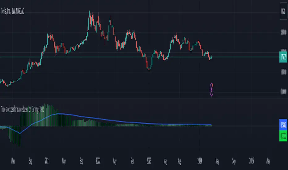
True stock performance based on EY Bar divergenceI created this indicator to be used in conjunction with my other indicator "True stock performance based on Earnings Yield". I've detailed in that description how true performance is calculated. In short it measures how much EY is moving in relation to the stock price. The theory is that if stock price is moving heavily while EY isn't you have a sentiment driven trend and the stock isn't traded on fundamentals.
This indicators marks bars when stock performance divergences from true performance.
Green upward triangle = The true performance closes lower than previous while stock price is closing higher. This indicates a optimistic sentiment as stock price is pushed up even though price based on EY is moving down.
Red downward triangle = The true performance closes higher than previous while stock price closing lower. This indicates a negative sentiment as stock price is pushed down even though price based on EY is moving up.
How do I use it?
I use it to confirm when sentiment has taken taken over a stock. If you have a fair uptrend (when both stock performance and true performance are doing higher highs), optimistic divergencies are welcome. I've used NVIDIA from 2017 to 2019 to demonstrate.
But if true performance starts to make lower highs while stock performance keeps going up and you see optimistic divergencies, you can tell that the market is getting overoptimistic.
When the stock had crashed it eventually bottomed and started to make higher lows together with an uptrend of true performance, which I count as a fair uptrend. Regardless of that you start to see some negative divergencies indicating that people are scared that the stock will drop again and oversell. These opportunities can be good places to buy more.
But i don't care about earnings, I'm a technical trader. Do i have any use for it?
You possibly could, yes. If you want to follow the crowd, optimistic divergencies confirms that the market is still interested in the stock and may keep pushing the price up. But be careful. Negative divergencies almost never marks any tops, it often confirms downtrends and may indicate bottoms. Often the optimistic divergencies marks the top so don't buy more blindly using this indicator.
Einnahmen

True stock performance based on Earnings YieldThe whole basis of the stock market is that you invest your money into a business that can use that money to increase it's earnings and pay you back for that investment with dividends and increased stock value. But because we are human the market often overbuy stocks that cant keep up their earnings with the current inflow of investments. We can also oversell a stock that is keeping up with earnings in regards to the stock price but we don't care because of the sentiment we have.
Earnings Yield is simply the percentage of Earnings Per Share in relation to the stock price. Alone, it's a great fundamental indicator to analyze a company. But I wanted to use it in another way and got tired of using the calculator all the time so that's why I made this indicator.
The goal is to see if the STOCK price is moving accordingly to the BUSINESS earnings. It works by calculating the difference of EY (TTM) previous close (1 bar) to the close thereafter. It then calculates the stock performance of the latest bar and divides that to get decimal form instead of percent. Then it divides the stock performance in decimal form with the difference of EY calculated before. The result shows how much the stock prices moves in relation to how much EY is moving. The theory is that if EY barely moves but the stock price moves heavily, you have a sentiment driven trend.
Example: Week 1 EY = 1.201. Week 2 EY = 1.105.
1.201 - 1.105 = 0.096
Week 2 performed a 11,2% increase in stock price. = 0.112 in decimal form.
0.112 / 0.096 = 1.67
1.67 is the multiple that plots this indicator.
Here is an good example of a stock that's currently in a highly sentiment driven trend, NVIDIA! (Posted 2024-03-30)
Here is an example of a Swedish stock that retail investors flocked to that have been blowned out completely.
When do I buy and sell?
This indicator is not meant to give exact entries or exits. The purpose is to scout the current and past sentiment, possible divergencies and see if a stock is over or under valued. I did add a 50 EMA to get some form of mean plotted. One could buy when true performance is low and sell when true performance drops below the 50 EMA. You could also just sell a part of your position and set a trailing exit with a ordinary 50 EMA or something like that. Often the sentiment will keep driving the price up. But if it last for 1 month or 1 year is impossible to tell.
Try it out and learn how it works and use it as you like. Cheers!
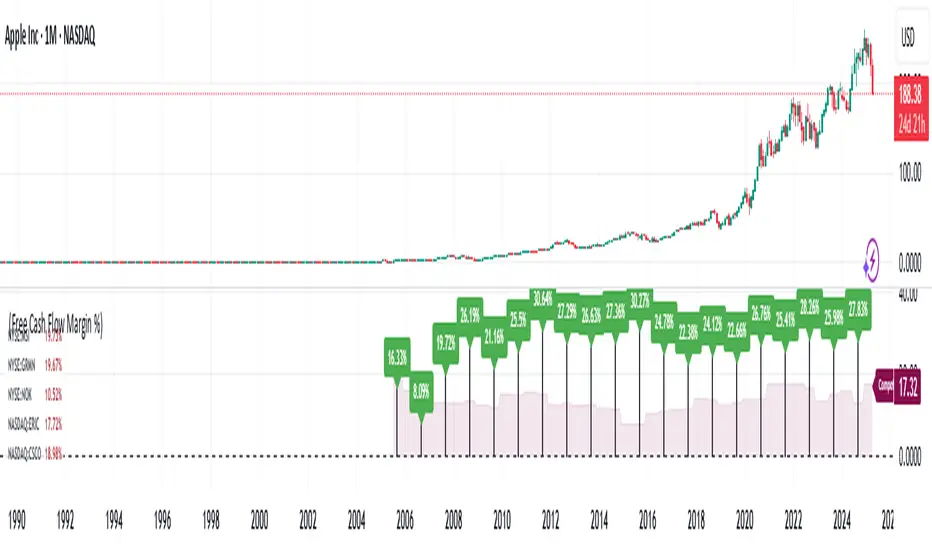
Financial Ratio Analysis (with / without Competitors)What Is Financial Ratio Analysis?
Financial Ratio Analysis is a quantitative technique used to assess a company's liquidity, operational efficiency, and profitability by examining its financial statements, including the balance sheet, income statement, and cash flow statement. It provides valuable insights into a company's performance over time and allows for comparisons with other companies within the same industry or sector.
What Are the Uses of Financial Ratio Analysis?
Analysis of financial ratios serves two main purposes:
1. Track company performance
Determining individual financial ratios per period and tracking the change in their values over time is done to spot trends that may be developing in a company.
Current Ratio for Adobe Inc. NASDAQ:ADBE
2. Make comparative judgments regarding company performance
Comparing financial ratios with those of major competitors enables the identification of whether a company is performing better or worse than the industry average. This comparative analysis aids in understanding the company's competitive position and potential areas for improvement.
For comparison, the script would automatically select a maximum of 5 competitors from the US markets based on the ticker's industry. This ensures a relevant comparison with industry peers to evaluate performance and assess competitive positioning.
To compare the Free Cash Flow Margin of Apple Inc. NASDAQ:AAPL with its competitors.
To compare the Free Cash Flow Margin of Apple Inc. NASDAQ:AAPL with its competitors’ average.
Customized competitors list
To customize your own competitors list, you can specify the companies or tickers you want to include in the comparison. This allows for a tailored analysis based on your specific preferences and industry knowledge.
Example:
To compare PayPal NASDAQ:PYPL with NASDAQ:MELI , NASDAQ:DLO , and NYSE:PAY , users can input the following text into the competitors list:
NASDAQ:MELI,NASDAQ:DLO,NASDAQ:PYPL,NYSE:PAY;
This will ensure that the comparison includes these specific companies alongside PayPal.
Financial ratios are grouped into the following categories:
Liquidity ratios
Leverage ratios
Efficiency ratios
Profitability ratios
Market value ratios
Liquidity Ratios
Liquidity ratios are financial ratios that measure a company’s ability to repay both short-term and long-term obligations.
Current Ratio measures a company’s ability to pay off short-term liabilities with current assets:
Current ratio = Total current assets / Total current liabilities
Cash To Debt Ratio measures a company’s ability to pay off short-term liabilities with cash and cash equivalents. A high ratio indicates a company can pay off its debt and remain solvent into the foreseeable future. In addition, it also means that if necessary, the company can take on a larger amount of debt because it has the cash to support that.
Cash to debt ratio = Cash and Short Term Investments / Total debt
Leverage Financial Ratios
Leverage ratios measure the amount of capital that comes from debt. In other words, leverage financial ratios are used to evaluate a company’s debt levels.
Debt To Assets Ratio measures the relative amount of a company’s assets that are provided from debt. This indicator is a measure of assets that are growing at the expense of debt. Because of this, you can see how a company acquired its assets over time. It can be used to assess a company's ability to meet its current debt obligations.
Debt to assets ratio = Total debt / Total assets
Debt To Equity Ratio calculates the weight of total debt and financial liabilities against shareholders’ equity:
Debt to equity ratio = Total liabilities / Shareholder’s equity
Interest Coverage Ratio shows how easily a company can pay its interest expenses:
Interest coverage ratio = Operating income / Interest expense
Efficiency Ratios
Efficiency ratios, also known as activity financial ratios, are used to measure how well a company is utilizing its assets and resources.
Research & Development (R&D) Expense to Revenue Ratio measures the percentage of sales that is allocated to R&D expenditures.
R&D to revenue ratio = Research and development expense / Total revenue * 100%
Asset Turnover Ratio measures a company’s ability to generate sales from assets. The higher it is, the more efficient the company is, since higher ratios mean that the company generates more income per dollar of assets. Conversely, if the company has a low Asset turnover, this indicates that it is inefficiently using its assets.
Asset turnover ratio = Revenue / Average total assets for two periods
Inventory Turnover shows how quickly a company sells its stock. A low turnover can mean weak sales, while a high one can mean good sales or insufficient stock. Inventory turnover is an important indicator of a company's performance.
Inventory turnover = Cost of goods sold / Total inventories
Days Sales Outstanding measures the average number of days it takes for a company to collect cash from credit purchases.
Days sales outstanding = Average Accounts Receivable / Revenue x 365 Days
Days Inventory shows the time in days that is spent turning a company's inventory into sales. This metric is an indicator of a company's inventory management. Low values are preferred for Days Inventory, which means items are selling faster and there is a quick turnaround. Large values indicate that a company has invested too much in stocks and does not have time to sell them.
Days inventory = Average inventories / Cost of goods sold * Days in period
Profitability Ratios
Profitability ratios measure a company’s ability to generate income relative to revenue, balance sheet assets, operating costs, and equity.
Gross Margin compares the gross profit of a company to its net sales to show how much profit a company makes after paying its cost of goods sold:
Gross margin % = Gross income / Total revenue * 100
Operating Margin , sometimes known as the return on sales ratio, compares the operating income of a company to its net sales to determine operating efficiency:
Operating margin = Operating income / Revenue * 100%
Free Cash Flow Margin is a profitability ratio that compares a company's free cash flow to its revenue to understand the proportion of revenue that becomes free cash flow. The higher the percentage, the more cash is available from sales. A company that shows an increasing cash flow margin from year to year is certainly getting stronger with time. This is a good indicator of its probability for long-term success.
Free cash flow margin = Free Cash Flow / Total Revenue
Return On Assets measures how efficiently a company is using its assets to generate profit. A high ROA indicates that a company successfully converts invested money into income.
Return on assets = Net income before discontinued operations / Total average assets
Return On Equity measures how efficiently a company is using its equity to generate profit:
Return on equity = Net income / Shareholder’s equity
Revenue Growth refers to the increase in a company’s total revenue or income over a specific period
Revenue growth = (Current period revenue - previous period revenue) / Previous period revenue * 100%
Earnings Per Share Growth illustrates the growth of earnings per share over time.
Earnings per share growth = ( Current period EPS - previous period EPS ) / Previous period EPS * 100%
Operating Cash Flow Growth is the long term rate of growth of operating cash, the money that is actually coming into the bank from business operations.
Operating cash flow growth = ( Current period operating cash flow - previous period operating cash flow) / Previous period operating cash flow* 100%
Market Value Ratios
Market value ratios are used to evaluate the share price of a company’s stock.
Book Value Per Share calculates the per-share value of a company based on the equity available to shareholders. In case of the company liquidation, the book value per share shows the monetary value remaining for common shareholders after all assets are sold and all debt is paid. If a company’s Book value per share is higher than a market price of its share, then the stock may be considered undervalued.
Book value per share = Total common equity / Total common shares outstanding
Dividend Yield measures the amount of dividends attributed to shareholders relative to the market value per share:
Dividend yield = Dividends TTM for the primary issue excluding special dividends / Price of the primary issue
Diluted Earnings per Share (Diluted EPS)
EPS stands for earnings per share. Investors use EPS to measure how much money a company makes for every outstanding share the company has. Diluted EPS is slightly different in that it measures the earnings per share for a company if all convertible securities (such as preferred stocks, convertible debt instruments, stock options and warrants) were used to calculate the metric.
Earnings Line+Growth stock investors are concerned with Earnings per share that is growing, Sales (Revenue) that is growing and Increasing gross margins. This indicator helps view each of these parameters.
On the chart is Tesla (TSLA) gross margin (blue line) on a 12 trailing months basis (TTM). As you can see, TSLA's margins appear to be eroding.
The user selects one of the following parameters to display from the input drop down menu:
"EARNINGS_PER_SHARE_BASIC", "TOTAL_REVENUE", or "GROSS_MARGIN".
The value axis for your selection will appear on the left side of the chart.
The user also selects one of the following periods: "FY", "FQ" or "TTM" (Fiscal year, fiscal quarter or 12-trailing months). You have an option to display the inputs by checking the box. This is useful as a reminder but can be removed if the label is in the way.
The chart will render on any chart time scale, however longer time scales will probably be of more value. Weekly charts work well.
It is not possible to display more than one line simultaneously because of axis incompatibilities. However, it is possible to load this indicator multiple times and select different items in each. In this case additional left-side scales will be shown as well as additional lines. Common pairings are Revenue (Sales) and Earnings, or, Revenue and Gross Margin.
@ jmikes

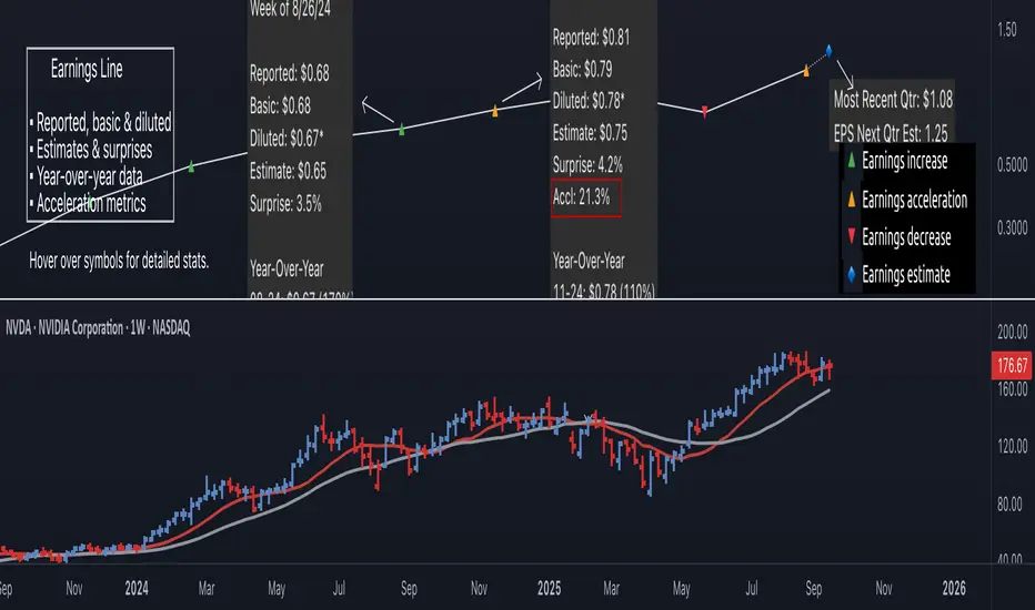
Earnings Line Pro - EPS Tracker [LevelUp]Earnings Line Pro plots quarterly earnings data, including earnings surprises and estimates, while also highlighting earnings acceleration. It allows you to track and visualize the trend of earnings across daily, weekly, and monthly timeframes.
🔹—— Key Features ——🔹
▪ Quarterly earnings per share, surprises and estimates.
▪ View earnings based on type: reported (non-GAAP), basic or diluted.
▪ Visualize the estimated trajectory of the next quarter earnings estimate.
▪ Year-Over-Year (YOY) data is included for each quarterly earnings summary.
▪ Visualize earnings acceleration, quarter over quarter.
▪ Plot on daily, weekly and monthly timeframes.
🔹—— Earnings Data ——🔹
Earnings are a foundational concept in stock analysis, often exerting a significant influence on a company's long-term performance. By visualizing earnings data as a plot rather than just a table of statistics, investors can more easily spot patterns of acceleration or deceleration. For instance, a steep upward slope between earnings releases — or a sequence of progressively higher earnings — signals a robust earnings trajectory. The sharper the acceleration, the greater the likelihood that the stock will outperform the broader market.
Historical studies show that top-performing companies consistently deliver steady earnings growth. Whether your focus is short-term trading or long-term investing, recognizing the direction and rate of earnings growth is essential for evaluating potential price movement.
While quarterly earnings data remains consistent across all timeframes, the perspective shifts depending on your goals. A monthly chart highlights multi-year growth and is ideal for investors with a buy-and-hold mindset. In contrast, weekly or daily charts have fewer data points, making them better suited for traders focused on positions lasting weeks or months.
🔹—— Choose Earnings Type ——🔹
With the Earnings Line indicator, you can view reported (non-GAAP), basic and/or diluted earnings.
▪ Reported (non-GAAP) earnings typically refer to a company’s net income as disclosed in its financial statements. This figure represents overall profitability after accounting for all expenses, taxes, and adjustments.
▪ Basic earnings per share (EPS) is calculated by dividing net income by the weighted average number of common shares outstanding during the reporting period. It provides a straightforward measure of earnings attributable to each existing share.
▪ Diluted earnings per share (EPS) goes a step further by incorporating the potential impact of additional shares from convertible securities, stock options, or warrants. This presents a more conservative, “what-if” scenario that assumes all possible dilution has occurred.
Reviewing these various types is important as they provide a bigger picture view of company performance: reported earnings show overall profitability, basic EPS reflects earnings per existing share, and diluted EPS highlights the potential impact of share dilution.
In the Settings dialog, select your preference on the earnings type. Check the box "Show Data For All Earnings Types" to view all types when hovering over an earnings data point.
🔹—— Year-Over-Year Data ——🔹
Viewing year-over-year (YOY) data for earnings is essential because it provides a clear picture of a company's growth trajectory by comparing current earnings to the same period in the prior year, helping to identify sustainable trends rather than short-term anomalies.
This metric helps eliminate seasonal fluctuations, offering a more accurate assessment of operational performance and efficiency improvements over time. Additionally, consistent YOY earnings growth can signal a company's competitive strength and potential for stock price appreciation, aiding in informed investment decisions.
🔹—— Earnings Acceleration ——🔹
Looking for earnings acceleration — where the rate of earnings growth is increasing — helps identify companies with strengthening momentum. This often reflects improving business operations, market expansion, or competitive advantages that can drive outsized returns. Viewing acceleration data can help you spot potential leaders early while avoiding stocks with flat or slowing earnings that may underperform the market.
🔹—— Visualize Earnings Estimate ——🔹
At a glance, view the next-quarter estimate to gauge the likely direction of the earnings trend. These forward-looking insights provide an early view of a company’s expected financial performance and can help anticipate potential stock price movements depending on whether actual results meet, exceed, or miss expectations.
The estimates — often based on analyst consensus — reflect market sentiment and can highlight both growth opportunities and risks.
🔹—— Plot Earnings Line On Main Chart ——🔹
By default, earnings data is plotted in a separate pane below the main chart. Follow the steps below to plot the earnings line on the main chart.
▪ Click on the indicator name on left side of the chart.
▪ Select the "..." option.
▪ Use the "Move-to" option to change the location of the earnings line.
▪ To hide the EPS scale on the left, select the "..." option.
▪ In "Pin to scale" select the "No scale (fullscreen)" option.
🔹—— Best Practices ——🔹
▪ Compare year-over-year, not just quarter-over-quarter as YOY changes help filter out seasonality.
▪ Positive surprises can spark strong price reactions, recurring surprises strengthen confidence.
▪ Look for divergence. If earnings accelerate but price lags, it may signal an early opportunity.
▪ Review daily, weekly, and quarterly charts to align short and long-term trends.
▪ Combine fundamentals with technicals, including volume analysis.
▪ Always define risk before entering a trade — know where you’ll exit.
▪ Size positions based on volatility and conviction, not emotion.
▪ Be patient — trends take time to develop.
Bezahltes Script
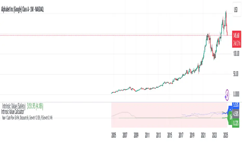
Intrinsic Value Calculator - Earnings/Dividend Yield (%)
This Intrinsic Value Calculator is a stock valuation Calculator that uses proven and science-based valuation methods to automatically estimate the intrinsic value of stocks.
What Is Intrinsic Value?
Intrinsic value is a measure of what a company's stock is worth. Intrinsic value is different from the current market price of a stock. However, comparing it to that current price can give investors an idea of whether the stock is undervalued or overvalued.
How to Calculate Intrinsic Value
To calculate the intrinsic value of a stock, we use two valuation methods: Discounted Cash Flow (DCF) Valuation and Relative Valuation. We take the average of these two methods to estimate the intrinsic value as accurately as possible.
Using Discounted Cash Flow (DCF) analysis, cash flows are estimated based on how a business may perform in the future. Those cash flows are then discounted to today’s value to obtain the company's intrinsic value. The discount rate we used is a risk-free rate of return (Fixed Deposit Interest Rate).
While intrinsic valuation models see to value a business by looking only at the company on its own, relative valuation models seek to value a business by comparing the company to other Low-Risk investment opportunities, Fixed Deposit Return.
Line Graph : Earnings Yield vs Fixed Deposit Interest Rate vs Dividend Yield
Other than automatically estimating the intrinsic value of a stock, this script would plot the Earnings Yield, Fixed Deposit Interest, and Dividend Yield of a stock.
Investors should monitor Earnings Yield, Fixed Deposit Interest, and Dividend Yield of a stock for a few key reasons:
Earnings Yield:
Earnings Yield is a crucial metric that provides insight into a company's profitability. It is calculated by dividing the company's earnings per share (EPS) by the current stock price. A higher Earnings Yield indicates that the company is generating more profit for each dollar invested by shareholders. This metric is particularly useful when comparing a company's profitability against other investment options, such as fixed deposits, bonds, or other stocks.
Fixed Deposit Interest:
The Fixed Deposit Interest Rate, also known as the risk-free rate, is the return an investor can expect from investing in a risk-free asset such as a government bond or a fixed deposit. This rate serves as a benchmark for evaluating the returns offered by other investments, including stocks.
Dividend Yield:
Dividend Yield is a measure of the annual dividend income received by an investor relative to the stock price. It is calculated by dividing the annual dividend per share by the current stock price. Dividend-paying stocks often appeal to income-oriented investors seeking regular cash flow.
Monitoring these metrics can help investors make informed decisions about their investments, assess the relative attractiveness of different investment options, and manage their investment portfolios effectively.
Key Financial Ratio display
Key investment ratios play a crucial role in helping investors make informed investment decisions. By providing valuable insights into a company's financial health, ratios such as the Gross Margin, R&D Ratio, Net Margin, Return on Equity (ROE) Ratio allow investors to quickly assess a company's profitability, liquidity, and financial stability.
Gross margin is the percentage of a company's revenue that it retains after direct expenses, such as labor and materials, have been subtracted. Gross margin is an important profitability measure that looks at a company's gross profit compared to its revenue.
The Research & Development (R&D) to Sales Ratio is a measure to compare the effectiveness of R&D expenditures between companies in the same industry. It is calculated as R&D expenditure divided by Total Sales.
The net profit margin, or simply Net Margin , measures how much net income or profit is generated as a percentage of revenue. It is the ratio of net profits to revenues for a company or business segment.
The Return on Equity (ROE) Ratio is a measure of a company's profitability and efficiency in using its shareholders' investments to generate profits. It's calculated by dividing a company's net income by its shareholder's equity. This ratio is a reflection of how well a company is utilizing its shareholders' capital to generate returns.
The Operating Cash to Debt Ratio measures the percentage of a company's total debt that is covered by its operating cash flow for a given accounting period. If the company’s ratio were higher, it would indicate a strong fiscal position, considering its cash flow from operations is higher than its total debt.
Free Cash Flow Margin is a significant financial metric that measures a company's ability to generate cash from its operations after accounting for capital expenditures. It evaluates the percentage of free cash flow relative to total revenue. A high Free Cash Flow margin suggests that a company is efficient at converting its revenue into cash flow.
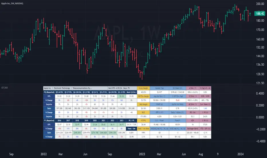
(CF|360) Caruso Financial DashboardThe Caruso Financial 360 Dashboard (CF|360) revolutionizes your TradingView charts by seamlessly integrating comprehensive Fundamental, Statistical, Technical, Performance, and Event information into an intuitively organized dashboard. This empowers users to make informed investment decisions effortlessly, eliminating the need to switch between pages or applications.
The dashboard is strategically divided into five distinct sections, each color-coded for user-friendly navigation. A quick glance at the dark blue "Fundamentals" table reveals two years of quarterly EPS and Sales data, YoY % change, and Surprise %, complete with report dates. Users can explore eight years of annual data and choose between Non-GAAP EPS, Diluted EPS, and Basic EPS for versatile analysis. Opting for Non-GAAP EPS also unveils next quarter estimates. The Fundamentals section further encompasses P/E and P/S data, alongside TTM dividend and dividend yield information.
In the yellow "Extended Fundamentals" section, users gain insights into Gross, EBITDA, and Net margins for easy profitability comparisons within the same industry group. Return on Equity data and Free Cashflow per share provide perspectives on profitability, efficiency, and financial flexibility.
The light blue "Statistics" section furnishes essential statistical measures for a rapid grasp of a company's trading characteristics. Metrics such as Market Cap, Average Volume per day (Shares and $ value), VWAP, Up/Down volume ratio, ATR%, Alpha, Beta, Shares Outstanding & Float, 52-week High/Low, and % distance from the 52-week high are presented. Additionally, market breadth is depicted through Nasdaq and NYSE 52-week high/low data.
The purple "Technical & Performance" section seamlessly integrates both Technical Analysis data and Performance statistics, enabling users to assess the stock's technical context and performance against the market over different periods. Technical indicators, including three customizable moving average types, RSI, ADX, Bollinger Band, Keltner Band, and daily and weekly closing ranges, are featured.
The grey top "Events" section offers a quick overview of the next earnings release date, countdown, and associated color changes as the date approaches. Company name, sector, and industry details are also presented.
To enhance information visibility, record EPS and Sales data are highlighted, emphasizing new records, along with highlights for new 52-week highs and lows.
The CF|360 offers customization options , including three display styles for Desktops, Desktop Slim, and Mobile devices.
Users can also tailor the lengths of technical indicators to suit their preferences. International market enthusiasts will appreciate that the CF|360 provides financial and market data for various regions, including the US, EU, Canada, and beyond.
88 Metrics Included:
Fundamentals Section (Dark Blue Group)
EPS (Adjusted Non-GAAP, Diluted, Basic)
- Quarterly, YoY % Chg, Surprise, Report Date, Next Quarter Estimate (Adjusted EPS only)
- Annual, YoY % Chg
Sales
- Quarterly, YoY % Chg, Surprise, Report Date, Next Quarter Estimate
- Annual, YoY % Chg
P/E ratio
P/S ratio
Dividend TTM
Dividend TTM Yield
Fundamentals Extended (Yellow Group)
Gross Margin
EBITDA Margin
Net Margin
Return on Equity (ROE)
Free Cashflow per Share (FCFPS)
Debt to Equity (Debt)
Effective Interest Rate (Int Rate)
Statistics (Light Blue Group)
Market Cap
Average Daily Volume (Shares)
Average Daily Volume (Dollar Value)
VWAP (Daily)
Average True Range Percent
Shares Outstanding
Shares in Float
Percentage of Share in Float
52-Week High
52-Week Low
% off of 52-Week High
Up / Down Volume Ratio
Beta
Alpha
Nasdaq Net 52-Week High/Lows
Nasdaq 52-Week Highs
Nasdaq 52-Week Lows
NYSE Net 52-Week High/Lows
NYSE 52-Week Highs
NYSE 52-Week Lows
Technical & Performance (Purple Group)
Moving Average Value (3 different averages)
Distance from Moving Average (3 different averages)
Relative Strength Index (RSI)
Average Directional Index (ADX)
Bollinger Band Value (Upper/Lower)
%b
Keltner Band Value (Upper/Lower)
%k
Percentage Changes Since Today’s Open
Daily Closing Range (DCR)
Weekly Closing Range (WCR)
Current Week % Change
1 Month % Change
3 Month % Change
6 Month % Change
1 Year % Change
3 Year % Change
YTD % Change
S&P 500 YTD % Change
Name, Group, & Events (Grey Section)
Company Name
Sector
Industry
Next Earnings Date
Days Until Next Earnings Date
Event Highlights
Record EPS (Quarterly/Annual)
Record Sales (Quarterly/Annual)
52-Week High
52-Week Low
Layout Types
Desktop
Get the full experience with the Desktop view.
Desktop Slim
Save screen real estate with a slim version of the dashboard.
Mobile
Take the most vital metrics with you on your mobile device. For the best experience, view in landscape mode.
Earnings CountdownSince TradingView for some reason removed the small UI element in the symbol details window showing the amount of days left til a company releases its next earnings report, I decided to make my own.
A simple script with options for choosing the position and at what amount of days left the displayed color should change to red (mimicking the old feature).
I would suggest placing the indicator somewhere else than the main price chart, since it will be difficult to place it somewhere where it doesn't obscure something. Default is bottom and right since I place it on a separate volume indicator where the number is clearly visible.

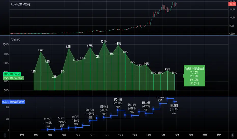
Free cash flow yieldThis script shows
- FCF Yield Net based on enterprise value. See reference: www.investopedia.com
- FCF Yield Diluted: which reduced CFC net by dilution amount.
- FCF % change.
This should give you a good overview on how well the company is at growing FCF and how efficiently they are creating FCF.
Earnings_MFCThe Earnings_MFC indicator displays statistical information of the price movement of the selected asset as follows:
TAGS: Label on each "earning day" with information on the movement that the price has made from the close of the day before the announcement to:
the opening of the next day (Close to Open - GAP)
the close of the next day (Close to Close - CTC)
HISTOGRAM: Histogram of the times the price has moved in each price band (number of configurable bands).
Each movement has been taken and represented in histogram format, so that visually you can see the number of times the price has exceeded a certain value. Within each band is numbered the number of times the price has reached that area
The histogram has two overlapping data:
....+ A main histogram (red/green stripes)
....+ A secondary histogram (black stripes)
....+ This is so that you can configure which data to see in each one: the GAP movement data or the CTC movement data
The maximum and minimum movement has been indicated (for the main histogram)
It has been indicated, both for positive and negative movements, which is their first (gray) and second (red/green) standard deviation (for the main histogram)
TABLE: A table is included with the following information (you can hide this table):
Summary of statistical data:
....+ Number of samples
....+ Maximum UP movement and average (for both CAP and CTC)
....+ Maximum DOWN movement and average (for both CAP and CTC)
....+ Maximum movement UP or DOWN and average (both for CAP and CTC)
List of all past Earnings (according to the history available in the chart) with their movements
HOW TO USE:
For Options traders it can come in handy to position themselves with Sell PUTs / Sell CALLs / Spreads or Iron Condors. Considering the probabilities of the movement (taking into account that past movements do not ensure future movements), this indicator can help in the decision making for sell strikes.
REMARKS:
Use only in Daily timeframe
Depending on the history of the asset (whether the user is PRO or not FREE) there will be more data

The Strat with Continuity [starlord_xrp]This indicator shows entry and exit points for The Strat as well as potential setups. It also has full time frame continuity detection.

Earnings Yield SpreadThe Earnings Yield Spread might offer an investor some insight into areas of value.
Earnings yield is the ratio of Diluted earnings per share over the trailing twelve months (TTM) to the company’s share price. Earnings yield shows how much the company has earned per share as a percentage of its share price. It shows investors how much yield they are getting in earnings in return for owning the stock at its current share price. (Thank you, TradingView)
One might wonder how the earnings yield on their investment compares to the yield on a US 10 year treasury bond. The Earnings Yield Spread indicator will read above zero if the stock in question earnings yield is higher than US10Y and will read below zero if the stock in question earnings yield is lower than the US10Y.
Earnings yield is relative to the stock in question, so comparisons should be drawn to its own historical reading and not to other symbols.

Quarterly EarningsThis script displays quarterly earnings per share (EPS) and sales data, and their year-on-year percentage change.
The script builds upon the Volume Price and Fundamentals script by Mohit_Kakkar08 and improves upon the array functions to keep the code light-weight & the output as accurate as possible. This script uses diluted EPS data for calculating the quarterly earnings. New quarters are auto-generated by the script as the earnings data gets updated in Tradingview every quarter.
Features:
⦿ View quarterly earnings per share (EPS) and sales data.
⦿ The percentage change is a YoY (year on year) comparison of the current quarter to the same quarter of the previous year.
⦿ Option to change the data from Quarterly (FQ) to Yearly (FY) .
⦿ Long mode : Option to increase the number of previous quarters displayed in the table (default is the past 4 quarters) to any number.
⦿ Location & size of the table can be changed.
⦿ Option for a 1-click dark mode
⦿ Option for a ' Mini mode ' where the values are replaced by traffic lights for a quick visual:
🟢 or 🔵 YoY increase in earnings/sales
🔴 or 🟣 YoY decrease in earnings/sales
🟡 or 🟠 YoY earnings/sales unchanged
⚪️ No data available
⦿ The top-left cell has the option to display either the free float (FF) or the marketcap (Mcap) of the stock.
Please note that sometimes the Tradingview data reflected in the script output might differ a bit from MarketSmith. Also make sure you are viewing the 'consolidated' data there.
This script was developed as a collaboration between me & @EquityCraze .
ATR profit and loss linesWhat is ATR?
Taking a candlestick, the following 3 transactions are calculated:
1-The difference between the high of the day and the low of the day
2-The difference between today's high and yesterday's close
3-The difference between today's low and yesterday's close
Atr takes the average of these 14-day candlesticks after making their calculations and it predicts how high or low a candle can go and these give us support and resistance helps with points
If you have noticed a rise in your chart and have no idea how high it will go, you can use Atr profit and loss lines.
The red zone is the stop point, the blue zones are the snow zones.
Must be used with macd. macd is validator.
There is an increase in your chart, you opened the atr profit and loss lines upwards and if macd gives you an increase, it is recommended that you enter the trade at that time. It is recommended to increase your loss line 1 step in the direction of profit every 2 profit breaks on atr profit and loss lines.
ATR Nedir?
Bir mum barı ele alınarak şu 3 işlem hesaplanır:
1-Günün yükseği ile günün düşüğü farkı
2-Günün yükseği ile dünün kapanışının farkı
3-Günün düşüğü ile dünkü kapanışın farkı
ATR ise 14 günlük bu mum barlarının hesaplarını yaptıktan sonra ortalamasını alır ve bir mumum ne kadar yükselip düşebileceği konusunda tahmin verir ve bunlar bize destek ve direnç noktaları konusunda yardımcı olur
Eğer grafiğinizde bir yükseliş farketmişseniz ne kadar yükseleceği konusunda fikriniz yoksa Atr kar zarar çizgilerini kullanabilirsiniz.
Kırmızı bölge durdurma noktası,mavi bölgeler kar bölgeleridir.
Macd ile birlikte kullanılmalıdır.macd doğrulayıcıdır.
Grafiğinizde yükseliş var,atr kar zarar çizgilerini yukarı yönlü açtınız ve macd size yükseliş veriyorsa işte o sırada işleme girmeniz tavsiye edilir.atr kar zarar çizgilerinde her 2 kar kırılımında bir zarar çizginizi kar yönünde 1 kademe arttırmanız önerilir

Joel Greenblatt Magic FormulaJoel Greenblatt Magic Formula. I always wanted to make this.
The Indicator shows 3 values.
ROC,EY,SUM.
ROC= Return On Capital.
EY=Earnings Yield
SUM= Addition of Two.
Formula:
ROC=EBIT / (Net Working Capital + Net Fixed Assets).
EY = EBIT / Enterprise value
Enterprise Value=(Market value of equity + Net Interest-bearing debt)
To implement the strategy, investors start by identifying a universe of stocks, typically large-cap or mid-cap companies that trade on a major stock exchange. Next, they rank the stocks based on their ROC and EY. The companies with the best combination of these two metrics are considered the best investments (based on this ranking).
For example, a stock that ranks 10th on EY and 99th on ROIC gets a value of 109. The two ranks are simply added together and all stocks are ranked on the sum of the two ranks. The stocks with the lowest values are best.
All credits to "The Little Book That Beats The Market" by Joel Greenblatt
The Magic Formula strategy is a stock selection method popularized by Joel Greenblatt’s book The Little Book That Beats the Market.
It involves ranking companies based on Two factors:
A high return on capital and A high Earnings Yield.
The companies with the best combination of these two metrics are considered the best investments. The strategy aims to find undervalued companies with strong financials that have the potential for high returns over the long term.


Fundamental ScreenerThis indicator is designed to compare the year-over-year earnings and sales growth, as well as the P/E ratio of up to 10 stocks simultaneously .
This provides valuable insights into the fundamental performance of multiple stocks at the same time, allowing traders to quickly identify which stocks are outperforming or underperforming their peers.
The earnings and sales growth figures are calculated on a year-over-year basis , comparing the most recent quarter to the same quarter 1 year ago.
The P/E ratio is a valuation metric that measures a company's stock price relative to its trailing twelve months earnings per share.
By comparing these three key metrics across multiple stocks, traders can quickly identify which stock in a group has superior fundamentals.
Customization
Chose to compare 5 or 10 symbols
Table position, color, and size
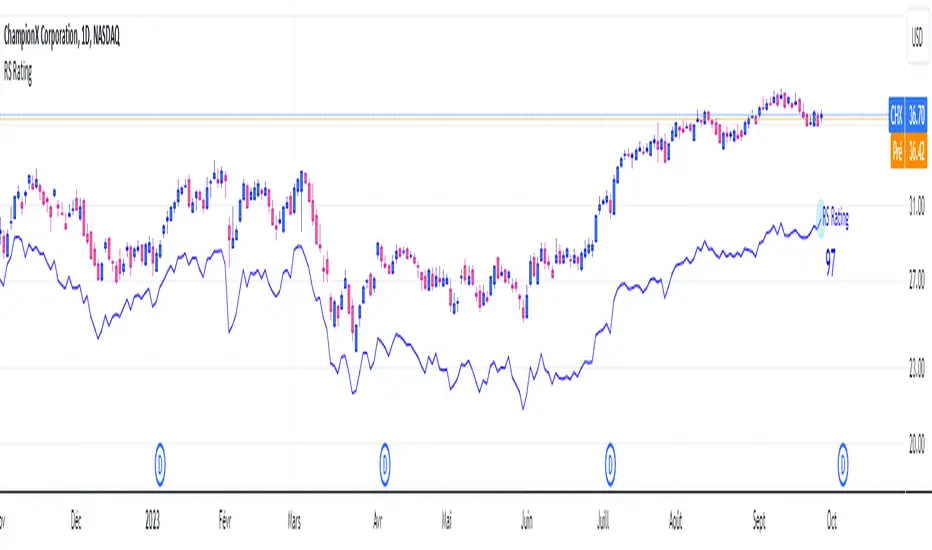
RS RatingHello everyone.
The RS Rating (or Relative Strenght Rating) is a metric that tracks a stock's price performance relative to the rest of the market. Specifically, it looks at a stock's relative strength over the last 52 weeks.
It allows you to identify at a glance stocks that are outperforming the market and may be poised for further gains.
Designed for break-out traders, trend follower, value investors, the RS Rating can help you identify promising opportunities and make informed investment decisions.
The Rating stands as follow:
- From 1 (worst) to 99 (best)
- 99 rating means the stock is outperforming 99% of all stocks in terms of relative share price performance over the last 52 weeks.
The RS Rating is accompanied by the RS line which is a representation of the progress of the asset against the comparative symbol. (Here SP500)
Of course this script is inspired by the IBD rating system.
The results may be equivalent but it is not guaranteed.
This indicator proposes a scoring system in the style of the one proposed by IBD.
Indeed for an optimal result, it would be necessary to compare the relative performance of all actions, which is not yet possible on PineScript.
Here is the formula for calculating the score:
RS Score = 40% * P3 + 20% * P6 + 20% * P9 + 20% * P12
With
P3 = Performance over the last 3 months
P6 = Performance over the last 6 months
P9 = Performance over the last 9 months
P12 = Performance over the last 12 months
There is no equivalent solution for the moment on TradingView.
The rating score will only appear on the daily timeframe.
For now it's my pleasure to share!
Kitti-Playbook request.earnings R0.0Date: Feb 5 2023
Objective :
Display Earnings per share
Calculation :
Get Earning value by use Function "request.earnings "
Display :
Plot Earnings Data
Earnings History Tab

CONTRACT Rolling APYThese are the annualized returns for quarters' futures contract.
The returns are generated from buying spot and shorting futures contracts, and sometimes the rolling yields reflect the market sentiment.
Please select spot symbol, it will display rolling APY, which supports all quarterly contract coins, and supports exchanges BINANCE, BYBIT, KRAKEN.
It only needs to be updated once a year, and the unsupported coins and quarters delisted will automatically not be displayed.
----
季度期貨合約的年化收益,收益來自購買現貨和做空期貨合約,有時可反映市場情緒。
symbol選擇現貨(有季度合約的),就會顯示Rolling APY,支援所有季度合約的幣,
支援交易所 BINANCE, BYBIT, KRAKEN.
一年只要更新一次,不支援的幣跟下架的季度會自動無法顯示。

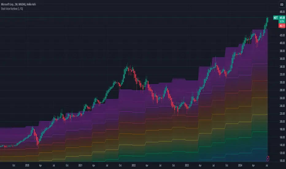
Valuation RainbowValuation Rainbow
© danny_peanuts
Stock value based on Book Value, Earnings, Dividends and Money Multiplier
SV = (BVPS + EPS + DPS) * MM
BVPS = Book Value Per Share
EPS = Earnings Per Share
DPS = Dividends Per Share
MM = Money Multiplier - Integer Number from 1,2,3, ... ,7
There are multiple ways of valuing the stock. Book value is traditionally used as the basic valuation since it's calculate the total asset value minus the liabilities of any company. There are valuation based on multiplication of book value, there are valuation based on multiplication of earnings, and valuation based on multiplication of dividends. Here I'm proposing valuation based on all of these combined. So this indicator is measuring stock value based on multiplication of book value plus earning plus dividend per share. Since the money supply could have an multiplication effect so does the stock value could have a multiplication effect. Also notes that some blue chips stock tends to value higher than startup stock due to money is not equally distributed. So for simplicity I will use simple integer number to represent this multiplication effect as rainbow color plots, thus it can be applied to any stock at any given countries. The higher the stock price on valuation bands the most expensive it is and the lower the price on valuation bands the cheaper it is.
Markets vs Inflation [x7.am]Markets vs Inflation(CPI US) also known as Inflation-Adjusted Return.
The inflation-adjusted return is the measure of return that takes into account the time period's inflation rate. The purpose of the inflation-adjusted return metric is to reveal the return on an investment after removing the effects of inflation.
Removing the effects of inflation from the return of an investment allows the investor to see the true earning potential of the security without external economic forces. The inflation-adjusted return is also known as the real rate of return or required rate of return adjusted for inflation. It is a more accurate measure of investment performance than the nominal rate of return.
The inflation-adjusted return accounts for the effect of inflation on an investment's performance over time.
Also known as the real return, the inflation-adjusted return provides a more realistic comparison of an investment's performance.
Inflation will lower the size of a positive return and increase the magnitude of a loss.
Assume you have saved $10,000 to buy a car but decide to invest the money for a year before buying to ensure that you have a small cash cushion left over after getting the car. Earning 5% interest, you have $10,500 after 12 months. However, because prices increased by 3% during the same period due to inflation, the same car now costs $10,300.
Consequently, the amount of money that remains after you buy the car—which represents your increase in purchasing power—is $200, or 2% of your initial investment. This is your real rate of return, as it represents the amount that you gained after accounting for the effects of inflation.
Markets vs Inflation indicators use in 1 months interval
SP:SPX , INDEX:BTCUSD , TVC:GOLD , TVC:DJI

(CF|DB) Caruso Financial DashboardThe Caruso Financial Dashboard brings a rich amount of company financial data straight to your TradingView chart along with additional vital stock-related information. At a glance, you can see EPS (Diluted), Sales, growth rates, and EPS/Sales surprises either quarter by quarter on the daily chart or for Fiscal Years on the weekly chart.
On the daily chart, the financial table also has helpful highlights to visually display if a quarter’s EPS or Sales are higher than the same quarter a year ago. Also, EPS and Sales data has a helpful green shading when a new record high number has been achieved for the metric. Additional stock-based metrics include the stock’s Up/Down volume ratio, Beta, Average Daily Volume in terms of shares traded or dollar value traded, the percentage distance to a moving average of choice, as well as the stock’s 52-week high and low.
The weekly chart shows financial data for fiscal years. It also has additional stock-based metrics from those available on the daily chart. These include; Market Cap, Shares in Float and the Float as a percentage of all shares outstanding, the distance from the stock’s 52-week high, the distance to a moving average of choice (10 sma by default), the P/E and P/S ratios.
To further help an investor understand a company’s growth rates, the CF|DB allows a user to hide all or part of the table and plot EPS, EPS TTM (Trailing Twelve Months), and Sales TTM lines on the chart. This can be applied to either the daily or weekly chart.
The CF|DB provides financial and market data for international markets (US, EU, Canada, Australia, Hong Kong, Japan, and more), making its applicability global.
Features On Daily Chart
· Quarterly EPS
· Quarterly EPS growth rate YoY
· Quarterly EPS Surprise vs consensus estimate
· Quarterly Sales
· Quarterly Sales growth rate YoY
· Quarterly Sales Surprise vs consensus estimate
· Green/Red dot highlighting YoY growth or decline
· EPS/Sales green highlight for 8 quarter high or record high numbers
· Up/Down Volume Ratio
· Beta
· Average Daily Volume (shares trade). Period for the average can be configured
· Average Daily Volume (dollar value traded). Period for the average can be configured
· Distance to a moving average. The average can be configured. 21 ema by default
· 52-week high and low
· New 52-week highs and lows are highlighted by a red or green box shading
· Ability to plot EPS, EPS TTM, Sales lines
· Ability to hide part or all of the financial data table
Features On Weekly Chart
· FY EPS
· FY EPS growth rate YoY
· FY EPS Surprise vs consensus estimate
· FY Sales
· FY Sales growth rate YoY
· FY Sales Surprise vs consensus estimate
· EPS/Sales green highlight for 8-year high or record high numbers
· Market Cap
· Shares in float
· Share in float as a percentage of all shares outstanding
· Distance to new 52-week highs
· Distance to a moving average. The average can be configured. 10 sma by default
· Ability to plot EPS, EPS TTM, Sales lines
· Ability to hide part or all of the financial data table
