Rainbow Road [kingthies]Rainbow Road
Rainbow Road is a trend-structure and momentum visualization tool built around a cascading chain of smoothed simple moving averages. Instead of plotting independent moving averages on price, each line is progressively smoothed from the prior one using the same length, creating a layered “road” that reveals trend strength, direction, and transition with exceptional clarity.
OVERVIEW
Rainbow Road visualizes trend quality using a spectrum of fast-to-slow moving averages derived from one another. Because each average is smoothed from the prior line, the indicator forms a continuous structure rather than a collection of unrelated signals. This makes trend alignment, momentum expansion, and compression immediately visible.
HOW IT WORKS
The first average is a Simple Moving Average of price
Each subsequent average is an SMA of the previous average using the same length
This creates a cascading chain of averages with increasing smoothness
Colors progress from red (fastest) to purple (slowest) to represent trend hierarchy
HOW TO READ IT
Strong Trend : All averages are aligned and expanding in the same direction
Acceleration : Spacing between averages increases
Deceleration : Spacing narrows while direction remains intact
Consolidation : Averages converge and overlap
Reversal Risk : Faster averages cross back through the slowest average
TREND CONTEXT
The optional fill between the fastest and slowest averages visualizes overall trend pressure. Expanding fill suggests strengthening momentum, while contracting fill highlights compression and potential regime change.
USE CASES
Trend confirmation and directional bias
Momentum expansion vs compression analysis
Identifying trend exhaustion and early reversal zones
Contextual filtering for entries and exits
WHY RAINBOW ROAD
Traditional moving average stacks often produce clutter and redundant signals. Rainbow Road focuses on structure and flow, helping traders evaluate the quality of a trend rather than reacting to individual crossovers.
BEST USED WITH
Price action and market structure
Support and resistance
Volatility or range-based tools
Higher-timeframe trend bias
Rainbow Road is designed to sit quietly on your chart and clearly communicate whether the market is flowing, stalling, or preparing to turn.
Volatilität

RSI Monitor (High/Low) + MTF & Time FilterDual-Source RSI: Calculates RSI on the candle High (to detect selling pressure/overbought) and Candle Low (to detect buying pressure/oversold) rather than just the Close.
Multi-Timeframe (MTF) Dashboard: An on-screen table displays the Real-Time RSI High and Low values for your current chart plus two user-defined higher timeframes (e.g., 1H, 4H).
Session-Based Alerts: A built-in time filter restricts alerts to a specific trading window (e.g., 09:30–16:00), effectively blocking signals during low-volume overnight sessions.
Independent Alert Timeframe: You can configure alerts to monitor a specific timeframe (e.g., 60-min) regardless of the timeframe you are currently viewing.
Real-Time Execution: Alerts trigger immediately when levels are crossed (no bar-close confirmation required), ensuring you catch moves as they happen.

RSI Dual-Source DashboardRelative Strength Index
Table with adjustable positions
Shows:
RSI, 14 Source High (on given TF)
RSI, 14 Source Low (on given TF)

ITCP ATR BB RSI Stoch SignalsThis indicator generates BUY/SELL signals when price stretches outside Bollinger Bands during elevated volatility, confirmed by RSI, a Stochastic crossover, and a volume filter. To reduce counter-trend entries, it applies a macro trend filter using the Daily SMA 200: it looks for longs only above the SMA 200 and shorts only below it.
It tends to perform best in Forex, especially on liquid pairs, because market conditions (liquidity, continuous sessions, and relatively stable spreads on major pairs) often suit this confirmation-based approach. That said, it can be adapted to other markets (indices, commodities, or crypto) by tuning parameters such as Bollinger length/deviation, RSI/Stoch thresholds, and ATR settings (multipliers/factors) to fit the asset’s volatility.
It also plots ATR-based stop-loss reference levels (configurable smoothing) and includes webhook-ready alerts with a JSON payload (action, symbol, price, stop_loss, time, and interval) for external automation. The goal is to support rules-based execution and reduce impulsive trades: if conditions don’t align, there’s no signal.
If you manage to improve it, discover better settings, or build a more robust solution inspired by this, I’d really appreciate it if you share it back (even if it’s just feedback or an idea). I’m open to collaborating and iterating together to create stronger versions over time.

MarketMind LITEM🜁rketMind LITE ────────────────────
Essential Market Awareness, Reduced to Its Core
M🜁rketMind LITE is a lightweight market awareness tool designed to display essential situational context .
It provides basic orientation and movement awareness without interpretation, risk framing, diagnostics, or decision guidance.
This script is designed as a standalone awareness layer. It does not evaluate trade quality, issue signals, or influence decision-making.
WHAT IT DOES ────────────────────
M🜁rketMind LITE presents a minimal, static view of current market conditions focused entirely on awareness rather than analysis.
The system displays only essential context, allowing traders to stay oriented without introducing judgment, noise, or implied direction.
The script provides visibility into:
Time-of-day session context
Basic market regime classification (trending, range-bound, mixed)
Short-term momentum direction only (up, down, neutral)
A clean, static HUD display
M🜁rketMind LITE also includes a minimal visual state indicator that reflects recent price responsiveness, intended to be observed over time alongside the trader’s own experience.
The goal is to support awareness without influence .
HOW TO USE IT ────────────────────
M🜁rketMind LITE is not a signal generator.
It is designed to remain visible in the background of any chart, offering quiet orientation while traders rely entirely on their own process for analysis and execution.
Common use cases include:
Maintaining session awareness
Preserving context during focused trading periods
Reducing cognitive load while monitoring markets
M🜁rketMind LITE does not evaluate risk, alignment, or opportunity.
It simply shows what is happening.
DESIGN PHILOSOPHY ────────────────────
M🜁rketMind LITE is intentionally minimal.
It includes only essential awareness elements and excludes all interpretive or evaluative logic:
Situational context only
Directional momentum (up / down / neutral)
No diagnostics, confidence, or conviction framing
No process, risk, or quality assessment
Presentation controls only (HUD on/off, size, position)
Nothing is inferred.
Nothing is suggested.
This script shows market state without interpretation.
WHO IT IS FOR ────────────────────
M🜁rketMind LITE is suited for traders who:
Want passive situational awareness
Prefer minimal on-chart information
Already operate with a defined decision process
It is not designed for:
Analytical or diagnostic use
Risk evaluation or context synthesis
Traders seeking guidance or confirmation
IMPORTANT NOTES ────────────────────
M🜁rketMind LITE does not provide financial advice
No system can predict future price behavior
This tool is designed for awareness only
Used appropriately, M🜁rketMind LITE helps traders stay oriented without interference.

Gemini Scalping Strategy [Pro Dash]Description: Gemini Scalping Strategy is a comprehensive monitoring system designed for high-frequency trading and scalping on lower timeframes (1m to 15m). This tool combines a fast-response Trailing Stop based on Average True Range (ATR) with a professional, real-time multi-factor Dashboard to provide a complete view of market structure and momentum.
Key Features:
Reactive ATR Trailing Stop: Provides immediate Buy/Sell signals based on volatility expansion and price breakouts. The trail line dynamically changes color to reflect volatility health.
Contextual Dashboard:
Choppiness Index (Corrected): Identifies whether the market is in a Trending phase (below 38.2) or a Sideways phase (above 61.8), helping to avoid "noise" in flat markets.
RSI Control Logic: Uses the 50-level pivot to define market control (Bull Control vs. Bear Control) instead of simple overbought/oversold levels.
ADX Strength: Measures trend intensity to filter out weak breakouts.
ATR Expansion: Monitors whether current volatility is above its average to confirm entry momentum.
How to use:
Entry: Primary signals are generated by the ATR triangles.
Confirmation: Use the Dashboard to verify market quality. High-probability trades occur when ATR signals align with "TREND" status on the CHOP and "BULL/BEAR CONTROL" on the RSI.
Customization: All dashboard elements (position, size, transparency, and theme) are fully customizable via the settings menu.
Disclaimer: This indicator is for educational and analytical purposes only. Trading involves significant risk, and past performance is not indicative of future results.

Apex Trend & Liquidity Master V2.1The Apex Trend & Liquidity Master is a hybrid trading system designed to align traders with the dominant market trend while identifying key structural price levels. Unlike simple moving average crossovers or standalone support/resistance tools, this script integrates a volatility-adaptive "Trend Cloud" with a "Smart Liquidity" engine.
This integration allows the script to offer unique filtering capabilities, such as hiding counter-trend liquidity zones to reduce chart noise and focus on high-probability continuations.
How It Works
Adaptive Trend Cloud The backbone of the system is the Trend Cloud, calculated using a Hull Moving Average (HMA) base with ATR bands. The cloud expands and contracts based on market volatility.
Green Cloud: Bullish Regime. The market is trending up; look for long opportunities.
Red Cloud: Bearish Regime. The market is trending down; look for short opportunities.
Smart Liquidity Zones (with Integration) The script automatically detects Pivot Highs and Lows to draw Supply (Resistance) and Demand (Support) zones. These zones persist until price breaks through them (mitigation).
Integration Feature: A "Filter Zones by Trend" option is included in the settings. When enabled, this feature connects the Trend Cloud to the Liquidity Engine:
It will only display Demand zones when the Trend Cloud is Bullish.
It will only display Supply zones when the Trend Cloud is Bearish.
Note on Lag: Zones are based on pivots (default lookback: 10). A zone appears on the chart 10 bars after the pivot forms. These are historical structural levels.
Signal Filters Buy and Sell labels are generated when the Trend Cloud changes color, but they are filtered to ensure quality:
Volume Filter: Signals only appear if the current volume is higher than the 20-period average.
RSI Filter: Prevents buying when RSI is overbought (>70) or selling when oversold (<30).
Live HUD An on-chart dashboard provides real-time data on:
Trend Bias: Direction of the cloud.
Momentum: RSI strength (Weak/Neutral/Strong).
Volume: High vs. Low activity.
Usage Guide
Identify the Trend: Use the background fill color to determine if you should be looking for longs (Green) or shorts (Red).
Wait for Structure: Look for price to pull back into a "Smart Liquidity" zone. For example, in a Green Trend, wait for price to touch a Green Demand box.
Confirm with Momentum: Check the Dashboard. Ideally, you want to see "Strong" momentum aligning with your trade direction.
Settings: If the chart is too cluttered, enable "Filter Zones by Trend" in the settings menu to hide counter-trend boxes.
Credits & Attribution This script combines original integration logic with adapted open-source concepts:
Smart Liquidity Logic: The method for generating Supply/Demand boxes via Pivot Highs/Lows and array management is adapted from open-source logic commonly used in Smart Money Concepts (SMC) indicators, notably popularized by LuxAlgo and the broader Pine community.
Trend Logic: The volatility cloud utilizes standard Hull Moving Average (HMA) and ATR formulas.
Disclaimer This indicator is provided for educational and informational purposes only. It does not constitute financial advice. Past performance of pivot levels or trend signals does not guarantee future results.

Market Pressure Regime [Interakktive]The Market Pressure Regime (MPR) is a 4-state market classifier that models how structural forces create "pressure zones" — regions where price movement is either supported (Release) or suppressed (Pinned) by market microstructure.
It combines compression analysis, follow-through efficiency, and stress detection into a composite pressure score, classifying markets into Release, Suppressed, Transition, or Trap states — helping traders understand WHY price is moving (or not moving) in the current environment.
█ USAGE
MPR addresses a core question traders face: Is the market in a regime where directional moves are likely to follow through, or is it structurally pinned?
For swing traders, MPR identifies Release phases where momentum strategies work best, and Suppressed phases where mean reversion dominates.
For day traders, it highlights Trap conditions — high effort with no follow-through — where reversals are probable and trend entries fail.
🔹 The 4-State Model
The indicator classifies markets into four distinct regimes:
• Release (Teal): Pressure score ≥ +5. Directional flow dominates. Price moves efficiently with follow-through. Favor trend continuation.
• Suppressed (Grey): Pressure score ≤ -5. Compression dominates. Price is range-bound or pinned. Fade extremes, expect reversion.
• Transition (Amber): Score between thresholds OR instability detected. Regime is uncertain — wait for confirmation before committing.
• Trap (Magenta): High stress + low follow-through. Effort without result. Expect reversals.
🔹 Reading the Pressure Histogram
The histogram displays the composite Pressure Score (range approximately -100 to +100):
• Positive values: Follow-through exceeds compression. Market is "releasing" — directional moves are supported.
• Negative values: Compression exceeds follow-through. Market is "suppressed" — price movement is constrained.
• Color reflects confirmed state: The histogram uses persistence filtering — a state must hold for N bars before the color changes, preventing false signals from noise.
🔹 The 5-Stage Calculation
MPR synthesizes five analytical stages into the final state:
1. Compression Score: Measures how tight the current range is relative to ATR. High compression suggests structural forces are pinning price.
2. Follow-Through Score: Measures price path efficiency (MER-style). Efficient moves indicate genuine directional flow, not chop.
3. Stress Score: Detects effort-without-result (ERD-style). High volume or range with no price progress = absorption.
4. Composite Pressure: Combines follow-through and compression into a single directional score.
5. Persistence Filter: Requires states to hold for configurable bars before confirming, eliminating flickering.
█ SETTINGS
Core Settings
• ATR Length: Period for volatility normalization. Default 14.
• Baseline Lookback: Period for compression and efficiency baselines. Default 20.
• Volume Average Length: Period for stress calculation baseline. Default 20.
State Classification
• Release Threshold: Pressure score above this = Release. Default +5.
• Suppressed Threshold: Pressure score below this = Suppressed. Default -5.
• Trap Threshold: Stress score above this (with low follow-through) = Trap. Default 30.
• Persistence Bars: Bars required to confirm state change. Default 3.
• Stability Lookback: Period for stability calculation. Default 20.
• Stability Threshold: Below this = forced Transition state. Default 0.5.
Visual Settings
• Show Pressure Histogram: Display the main pressure score histogram.
• Show Zero Line: Display the zero reference line.
• Show Background Tint: Subtle background color by state (default OFF).
Data Window
• Show Data Window Values: Export all calculated scores for analysis.
█ INTERPRETATION GUIDE
When to Use Trend Strategies (Release):
• Histogram tall and positive
• Teal coloring confirmed
• Price making efficient higher highs or lower lows
When to Use Mean Reversion (Suppressed):
• Histogram flat or negative
• Grey coloring confirmed
• Price oscillating without follow-through
When to Wait (Transition):
• Amber coloring
• Mixed signals — don't force trades
• Wait for state to resolve
When to Expect Reversals (Trap):
• Magenta coloring
• High volume moves that don't stick
• Often occurs at structural inflection points
█ COMPLEMENTARY TOOLS
MPR pairs well with:
• Volatility State Index (VSI) — Confirms whether volatility is expanding into the pressure regime
• Effort-Result Divergence (ERD) — Provides bar-by-bar absorption/vacuum detection
• Market Efficiency Ratio (MER) — Validates follow-through quality
█ SUITABLE MARKETS
Works across all liquid markets:
• Equities: SPY, QQQ, liquid single stocks
• Futures: ES, NQ, CL, GC
• Crypto: BTC, ETH
• Forex: Major pairs
Works on any timeframe, but 1H–Daily provides cleanest regime classification. Intraday (5m–15m) useful for session-level tactical decisions.
█ OPEN SOURCE
This indicator is open-source for educational purposes. Review the code to understand the full calculation methodology.
█ DISCLAIMER
This indicator is for educational and informational purposes only. It does not constitute financial advice. Past performance does not guarantee future results. Always conduct your own analysis and use proper risk management.

GC1 Orderflow Engine - sudoTLDR
This indicator measures relative buying and selling pressure by comparing GC1! futures returns against XAU price returns, normalized by their own volatility and weighted by GC1! volume. The result is a pressure histogram and line that show whether futures orderflow is leading, lagging, or diverging from spot gold in real time.
What this indicator does
The Orderflow Engine is designed to answer one core question:
Is GC1! futures orderflow applying net pressure in the same direction as XAU, or pushing against it?
It does this by isolating relative strength and weakness between futures and spot, rather than looking at price direction alone.
How the pressure calculation works
1. GC1! futures returns and XAU returns are calculated bar by bar
2. Each return is normalized by its own recent volatility
3. The normalized XAU return is subtracted from the normalized GC1! return
This creates a relative pressure value:
Positive pressure - GC1! futures are outperforming XAU
Negative pressure - GC1! futures are underperforming XAU
Near zero - futures and spot are moving in balance
To emphasize meaningful activity:
GC1! volume is converted into a normalized score
Higher-than-normal futures volume increases the weight of the pressure
Low-volume pressure is naturally dampened
The final output is clamped to keep the scale stable across different market conditions.
Visual output
Histogram
Green bars - positive futures pressure
Red bars - negative futures pressure
Gray bars - neutral or minimal pressure
Pressure line
A smoother view of the same pressure data
Useful for spotting momentum shifts and divergence
Zero line
Represents balance between futures and spot
Crosses often mark changes in orderflow control
Optional annotations
Regime shift markers based on futures participation
Optional percent-change labels for studying pressure acceleration
How to use it
-Confirm whether price moves are supported by futures orderflow
-Spot early divergence between GC1! and XAU
-Identify absorption , distribution , or initiative behavior
-Filter entries by trading only when pressure aligns with your bias
-This tool is best used as confirmation and context, not as a standalone signal generator.
Design philosophy
-Self-normalizing across sessions and volatility regimes
-No fixed thresholds that break over time
-Focused on relative behavior, not prediction
-Built to pair naturally with the Participation Regime indicator

GC1 Participation Regime - sudoThis indicator analyzes COMEX GC1! futures activity and maps it directly onto your XAU price chart, allowing you to see when gold futures participation meaningfully increases or fades - without cluttering your workflow.
Here is the TLDR version of the description (below):
The "regime" is calculated by measuring how active GC1! futures are, compared to their own recent history. On each bar, the indicator looks at two things - volume (how much trading occurred) and true range (how much price actually moved). Each of these is compared to its recent average using a normalized score, which simply answers whether today’s activity is higher, normal, or lower than usual. Those two normalized values are then combined into a single participation score , optionally smoothed to reduce noise. That score is compared against user-defined thresholds and classified into one of four regimes - Low, Normal, High, or Extreme participation . In short, the regime shows whether current GC1! futures activity is unusually quiet or unusually active relative to its own recent behavior , without making any directional assumptions.
What this indicator does
-Measures GC1! futures volume and true range relative to their own historical behavior using z-scores
-Combines those metrics into a single participation score
-Classifies the market into four participation regimes
Low
Normal
High
Extreme
Projects those regimes directly onto the XAU price chart
Visual elements
Background shading
-Gray - Low participation
-Blue - Normal participation
-Green - High participation
-Orange - Extreme participation
Regime shift markers
-Upward triangle below price when participation increases
-Downward triangle above price when participation decreases
Volume-informed candle coloring (optional)
-High GC volume + bullish candle
-High GC volume + bearish candle
-Low GC volume + bullish candle
-Low GC volume + bearish candle
These visuals help you instantly identify whether price movement is occurring with real futures participation or during thinner conditions.
How to use it
-Identify high-quality environments for execution when participation is elevated
-Filter breakouts, trends, and reversals based on whether GC futures are involved
-Avoid overconfidence during low-participation regimes, where price moves are more prone to failure
-Use regime transitions as context , not signals!!
-This indicator is designed to be contextual , not predictive .
Customization
-Adjustable lookback lengths for volume and range
-Fully tunable regime thresholds
-Optional background shading
-Optional regime shift markers
-Optional candle recoloring based on GC volume behavior
Everything can be dialed up or down depending on how visually minimal you want your chart to be.
Notes
-Built specifically around COMEX GC1! futures
-Designed to disappear if GC data is unavailable
-Works on all intraday and higher timeframes

Friday Statistical Zones - Last 30 Fridays Only BTC 📊 Friday Statistical Zones (Pre / Dump / After)
This indicator highlights statistical risk zones for Fridays, based on the last 30 completed Fridays.
It analyzes historical price and volume behavior to determine:
• When a Pre-Dump phase typically starts
• When selling pressure statistically peaks
• When the After-Dump phase usually occurs
The result is a time-based overlay with three zones:
🟡 Pre-Dump · 🔴 Dump · 🟡 After-Dump
⚠️ This is not a signal indicator.
It does not predict price direction.
It provides risk-timing context only.
Best used for risk management and situational awareness on Fridays, not as a standalone trading strategy.

Market Efficiency DashboardDescription
This indicator is an analytical tool designed to visualize the relationship between price action and market efficiency. Based on the Choppiness Index (CI), this indicator identifies whether the market is in a state of Range Contraction (Consolidation) or Range Expansion (Trending) . This implementation introduces a unique 50-pivot baseline to better differentiate between these two market characters, providing traders with an objective view of volatility cycles.
Key Features
Volatility Cycle Logic: A refined implementation of the Choppiness Index that assists in filtering market noise during low-volatility periods.
Pivot-50 Visualization: A custom geometric layout that separates range contraction from trend expansion for faster visual interpretation.
Multi-Timeframe (MTF) Data Handling: Enables the monitoring of higher-timeframe efficiency cycles without switching charts.
Trend Context Filter: Integrates a 200-period EMA to provide a directional baseline relative to the current market state.
Real-Time Status Dashboard: A real-time data table providing a summary of current market efficiency and trend bias.
Signal Refinement: Includes optional smoothing (EMA/SMA/WMA) to reduce calculation "jitter" and provide clearer structural signals.
Inputs Overview
Choppiness Length: Sets the lookback period for the efficiency calculation (Default: 14).
Calculation Timeframe: Allows the user to select the source timeframe for the index data.
Smoothing Method: Users can choose between multiple moving average types to filter the raw index output.
Threshold Levels: Customizable Fibonacci-based levels (61.8 and 38.2) used to define the boundaries of "Choppy" and "Trending" environments.
EMA Filter: Toggle for the 200-period Exponential Moving Average used for directional bias.
How to Use
Context Identification: Observe the histogram’s position relative to the 50-pivot. Bars expanding upward toward the 61.8 level indicate the market is coiling/congested.
Trend Confirmation: Bars expanding downward toward the 38.2 level indicate the market is moving efficiently in a specific direction.
Bias Alignment: When the Trend Bias is Bullish and the state is Trending, price discovery is likely occurring to the upside. Conversely, a Bearish bias in a Trending state suggests efficient movement to the downside.
Risk Management: Rising choppiness levels often precede a period of trend exhaustion or reversal, signaling a potential time to reduce exposure.
How it Helps
This tool is designed to assist in objective decision-making by identifying the current "market character." By distinguishing between trending and non-trending environments, it helps traders select the appropriate strategy for the current context—avoiding trend-following entries during sideways markets and identifying when a market has entered a period of price expansion.
Alerts
Trend Starting: Triggers when the index crosses below the lower threshold, suggesting a transition into an efficient trend.
Squeeze/Consolidation: Notifies the user when the index crosses above the upper threshold, indicating range contraction.
Midpoint Cross: Signals when the index crosses the 50-level, marking a shift in market momentum.
⚠️ Disclaimer:
This script/indicator is not endorsed by, affiliated with, sponsored by, or connected to TradingView in any manner. The author is not a TradingView partner.
This script/indicator and all related content are provided “as is” and “as available,” without any warranties of any kind, express or implied. The content is strictly for educational and informational purposes and does not constitute financial, investment, trading, or legal advice.
The author makes no representations or guarantees regarding accuracy, reliability, profitability, or future performance. Use of this script/indicator is entirely at the user’s own risk, and the author assumes no liability for any losses, damages, or financial consequences arising from its use.

Volatility State Index [Interakktive]The Volatility State Index (VSI) classifies market volatility into three behavioral states: Expansion, Decay, and Transition. It answers one question visually: Is volatility supporting price movement, withdrawing, or unstable?
Unlike traditional volatility indicators that show levels or bands, VSI diagnoses the current volatility regime so traders can adapt their approach accordingly.
█ WHAT IT DOES
• Classifies volatility into three states: Expansion (teal), Decay (grey), Transition (amber)
• Measures volatility momentum as a percentage rate-of-change
• Applies stability filtering to detect unstable/choppy conditions
• Uses persistence logic to prevent state flickering
• Exports state data for use in alerts and strategies
█ WHAT IT DOES NOT DO
• NO buy/sell signals
• NO entry/exit recommendations
• NO alerts (v1 is diagnostic only)
• NO performance claims
This is a volatility diagnostic tool, not a trading system.
█ HOW IT WORKS
The VSI processes volatility through a five-stage pipeline:
STAGE 1 — Base Volatility
Calculates ATR as the foundation for volatility measurement.
STAGE 2 — Smoothing
Applies EMA smoothing to reduce noise in the volatility series.
STAGE 3 — Volatility Momentum
Computes the percentage rate-of-change of smoothed volatility:
Volatility Momentum (%) = ((Current ATR - Previous ATR) / Previous ATR) × 100
Positive values indicate expanding volatility; negative values indicate contracting volatility.
STAGE 4 — Stability Filter
Tracks how frequently volatility momentum changes direction. Frequent sign changes indicate unstable, choppy conditions.
Stability Score = 1 - (Average Flip Rate)
Low stability forces the Transition state regardless of momentum level.
STAGE 5 — State Classification
Combines momentum thresholds and stability to determine the final state:
• Expansion: Momentum ≥ +5% (default threshold)
• Decay: Momentum ≤ -5% (default threshold)
• Transition: Between thresholds OR low stability
A persistence filter requires states to hold for multiple bars before confirming, preventing visual noise.
█ INTERPRETATION
EXPANSION (Teal)
Volatility is increasing in a sustained way. Price moves are becoming larger.
What it suggests:
• Breakouts are more likely to follow through
• Stops may need wider placement
• Trend-following approaches tend to work better
• Mean-reversion weakens
DECAY (Grey)
Volatility is decreasing. Price is compressing into tighter ranges.
What it suggests:
• Breakouts are more likely to fail
• Ranges tend to hold
• Trend-following underperforms
• Mean-reversion strengthens
TRANSITION (Amber)
Volatility behavior is unclear or unstable. This is NOT neutral — it is uncertainty.
What it suggests:
• Mixed signals — one bar huge, next bar dead
• Higher whipsaw risk
• Reduced conviction in either direction
• Consider waiting for clarity
The key insight: Amber is a warning, not a middle ground. It appears when volatility cannot decide what it wants to do.
█ VISUAL DESIGN
The indicator uses a state-first histogram design:
• Histogram height shows volatility momentum percentage
• Histogram color shows the classified state
• Zero line provides visual anchor
• Optional momentum line for confirmation
• Optional background tint (default OFF for clean charts)
The visual hierarchy prioritizes instant state recognition. A trader should understand the volatility environment in under one second without reading numbers.
█ INPUTS
Core Settings
• ATR Length: Base volatility measurement period (default: 14)
• Smoothing Length: EMA smoothing applied to ATR (default: 10)
• Momentum Length: Rate-of-change lookback (default: 10)
State Classification
• Expansion Threshold (%): Momentum above this = Expansion (default: 5.0)
• Decay Threshold (%): Momentum below this = Decay (default: -5.0)
• Persistence Bars: Bars required to confirm state change (default: 3)
• Stability Lookback: Window for stability calculation (default: 20)
• Stability Threshold: Below this = forced Transition (default: 0.5)
Visual Settings
• Show State Histogram: Toggle main display (default: ON)
• Show Momentum Line: Thin confirmation line (default: OFF)
• Show Zero Line: Baseline reference (default: ON)
• Show Background Tint: Subtle state coloring (default: OFF)
█ DATA WINDOW EXPORTS
When enabled, the following values are exported:
• ATR (Raw)
• ATR (Smoothed)
• Volatility Momentum (%)
• Stability Score (0-1)
• State (-1/0/1): Decay = -1, Transition = 0, Expansion = 1
• Is Expansion (0/1)
• Is Decay (0/1)
• Is Transition (0/1)
These exports allow VSI to be used as a filter in Pine Script strategies or alert conditions.
█ ORIGINALITY
While ATR and volatility indicators are common, VSI is original because it:
1. Classifies volatility into behavioral states rather than showing raw levels
2. Applies momentum analysis to volatility itself (rate-of-change of ATR)
3. Uses stability filtering to detect genuinely unstable conditions
4. Implements persistence logic to prevent state flickering
5. Provides a state-first visual design optimized for instant recognition
VSI is state-first: it classifies volatility regimes (Expansion/Decay/Transition) rather than plotting volatility level alone, using momentum and stability to reduce false regime reads.
This is not a modified ATR or Bollinger Band — it is a volatility regime classifier.
█ SUITABLE MARKETS
Works on: Stocks, Futures, Forex, Crypto
Timeframes: All timeframes — state classification adapts accordingly
Best on: Instruments with consistent volatility patterns
█ RELATED
• Market Efficiency Ratio — measures price path efficiency
• Effort-Result Divergence — compares volume effort to price result
█ DISCLAIMER
This indicator is for educational purposes only. It does not constitute financial advice. Past performance does not guarantee future results. Always conduct your own analysis before making trading decisions.

CVD & Big Trade Detector By HKOverview The CVD & Big Trade Detector By HK offers a unique perspective on Cumulative Volume Delta (CVD). This indicator utilizes Floating Bars (Candles) to visualize the cumulative buying and selling pressure. This design allows you to clearly see the net delta of each specific candle relative to the cumulative trend.
Additionally, it integrates the "Big Trade" algorithm to highlight statistically significant volume anomalies (Whale activity) directly on the CVD bars.
How it Works Since standard volume data does not always provide buy/sell splitting, this script estimates intrabar pressure using price action logic:
Buying Pressure: Calculated based on the push from the Low to the Close.
Selling Pressure: Calculated based on the push from the High to the Close.
The indicator then calculates the Delta (Buy Vol - Sell Vol) and accumulates it.
Floating Bars: Instead of plotting from the zero-line, each bar opens at the previous CVD value and closes at the new cumulative value.
Teal/Green Bar: Net buying in the current period (CVD increased).
Maroon/Red Bar: Net selling in the current period (CVD decreased).
Key Features
Floating CVD Structure: Prevents the "barcode effect" common in histogram CVDs. It provides a clean, candle-like view of momentum accumulation.
Whale Detection:
The script calculates the moving average and standard deviation (Sigma) of the buying/selling volume.
Green Dots: Appear when buying volume exceeds the statistical threshold (Signifying a "Big Buy").
Red Dots: Appear when selling volume exceeds the statistical threshold (Signifying a "Big Sell").
Precise Positioning: Whale markers are plotted exactly at the closing value of the CVD bar, showing you exactly where the volume spike impacted the delta.
How to Use
Divergences: Look for situations where Price makes a Higher High, but the CVD Bars fail to make a new high (bearish divergence).
Absorption: If you see a Large Whale Dot on a very small CVD bar (doji-like), it indicates massive volume fighting for direction with little net result—often a sign of absorption or a pending reversal.
Trend Confirmation: Strong floating bars in the direction of the trend, accompanied by Whale Dots, confirm smart money participation.
Settings
Lookback Period: Defines the baseline for the statistical volume calculation (default: 50).
Sensitivity (Sigma): Adjusts how strict the "Whale" detection is (default: 3.0). Higher values = fewer, more significant signals.
Colors: Fully customizable colors for Up/Down bars and Buy/Sell markers.
Built with Pine Script™ v6

Bollinger Bands + MA 50/100/200📊 Bollinger Bands + MA 50 / 100 / 200 Indicator
This indicator combines Bollinger Bands with key Moving Averages (50, 100, 200) to help you spot trend direction, volatility, and potential reversal zones in one clean view.
🔹 Bollinger Bands
* Customizable length & MA type (SMA, EMA, RMA, WMA, VWMA)
* Visualizes market volatility
* Upper & lower bands help identify overbought / oversold conditions
🔹 Moving Averages
* MA 50 → Short-term trend
* MA 100 → Medium-term trend
* MA 200 → Long-term trend & major support/resistance
* Easy toggle on/off for clean charting
💡 How to use
* Price near upper band + strong MA trend → possible continuation
* Price near lower band → watch for bounce or breakdown
* MA alignment (50 > 100 > 200) → bullish trend
* MA cross & BB squeeze → potential breakout incoming
⚠️ Best used with price action & risk management
📌 Works on stocks, crypto, forex, indices

Price Contraction / Expansion1. Introduction
The Price Contraction / Expansion indicator highlights areas of market compression and volatility release by analyzing candle body size and volume behavior. It provides a fast, color-coded visualization to identify potential breakout zones, accumulation phases, or exhaustion movements.
This tool helps traders recognize when price action is tightening before a volatility expansion — a common precursor to strong directional moves.
2. Key Features
Dynamic body analysis: Compares each candle’s body size with a moving average to detect contraction (small bodies) and expansion (large bodies).
Volume confirmation: Measures whether volume is unusually high or low compared to its recent average, helping filter false breaks.
Color-coded system for clarity:
Yellow: Contraction with high volume (potential accumulation or strong activity).
Blue: Contraction with normal volume or expansion with low volume (neutral/reduced participation).
Green: Expansion in bullish candle (buyer dominance).
Red: Expansion in bearish candle (seller dominance).
Customizable parameters: Adjust body and volume averaging periods and thresholds to fit different market conditions or timeframes.
3. How to Use
Identify contraction zones: Look for blue or yellow bars to locate areas of price compression — these often precede breakouts or large movements.
Wait for expansion confirmation: A shift to green or red bars with increasing volume indicates that volatility is expanding and momentum is building.
Combine with context: Use this indicator alongside trend tools, liquidity zones, or moving averages to confirm directional bias and filter noise.
Adapt thresholds: In highly volatile markets, increase the “Threshold multiplier” to reduce false contraction signals.
This indicator is most effective for traders who focus on volatility behavior, market structure, and timing potential breakout opportunities.

Market Efficiency Ratio [Interakktive]The Market Efficiency Ratio decomposes price movement into two components: net progress vs wasted movement. This tool exposes the underlying math that most traders never see, helping you understand when price is moving efficiently versus chopping sideways.
Unlike simple trend indicators, this shows you WHY price movement matters — not just whether it's up or down, but how much of that movement was useful directional progress versus noisy oscillation.
█ WHAT IT DOES
• Calculates Efficiency Ratio (0–1 or 0–100) measuring directional progress
• Exposes Net Displacement (how far price actually moved)
• Exposes Path Length (total distance price traveled)
• Calculates Chop Cost (wasted movement)
• Visual zones for high/mid/low efficiency states
█ WHAT IT DOES NOT DO
• NO signals, NO entries/exits, NO buy/sell
• NO performance claims
• NO predictions — purely diagnostic
• This is a tool for understanding price behavior
█ HOW IT WORKS
The efficiency ratio answers one question: "Of all the movement price made, how much was useful progress?"
🔹 THE MATH
Over a lookback period of N bars:
Net Displacement = |Close - Close |
Path Length = Σ |Close - Close | for all bars
Efficiency Ratio = Net Displacement / Path Length
🔹 INTERPRETATION
• Efficiency = 1.0 (100%): Price moved in a straight line — every tick was progress
• Efficiency = 0.5 (50%): Half the movement was wasted in back-and-forth chop
• Efficiency = 0.0 (0%): Price ended exactly where it started — all movement was noise
🔹 CHOP COST
This is the "wasted movement" — how much price traveled without making progress:
Chop Cost = Path Length - Net Displacement
Chop % = Chop Cost / Path Length
High chop cost means lots of effort for little result — a warning sign for trend traders.
█ VISUAL GUIDE
Three efficiency zones:
• GREEN (≥70): High efficiency — strong directional movement
• YELLOW (30-70): Mixed efficiency — some progress, some chop
• RED (<30): Low efficiency — mostly noise, little progress
█ INPUTS
Lookback Length (default: 14)
Number of bars to calculate efficiency over. Higher values produce smoother readings but respond slower to changes.
Smoothing Length (default: 5)
EMA smoothing applied to the output. Reduces noise in the efficiency reading.
Apply Smoothing (default: true)
Toggle EMA smoothing on/off.
Scale Mode (default: 0–100)
Display as percentage (0-100) or decimal ratio (0-1).
Show Reference Bands (default: true)
Display the high/low efficiency threshold lines.
Low/High Efficiency Level (default: 30/70)
Thresholds for classifying efficiency zones.
Overlay Effect (default: None)
• None: No overlay
• Background Tint: Subtle chart background color in high/low zones
• Bar Highlight: Color bars during low efficiency periods
Show Data Window Values (default: true)
Export all raw values (Net Displacement, Path Length, Efficiency, Chop Cost, Chop %) to the data window for analysis.
█ USE CASES
This indicator helps traders understand:
• Why some trends are "clean" and others are "messy"
• When price is consolidating vs trending (without using volume)
• The relationship between movement and progress
• Why high-chop environments are difficult to trade
This is the foundational concept behind more advanced regime detection systems.
█ SUITABLE MARKETS
Works on: Stocks, Futures, Forex, Crypto
Timeframes: All timeframes
Note: This is a price-only indicator — no volume required
█ DISCLAIMER
This indicator is for informational and educational purposes only. It does not constitute financial advice. It does not generate trading signals. Past performance does not guarantee future results. Always conduct your own analysis.

AKILLI ANALIZ TERMINALI (V20-REVIZE)SMART ANALYSIS TERMINAL (V20-ULTIMATE)
This indicator is a professional-grade analysis terminal designed for both strategic daily analysis (Swing Trade) and real-time intraday trading (Scalp/Day Trade). It allows you to perform a complete technical X-ray of the market on a single dashboard.
CORE FEATURES:
- Dual-Mode Hybrid Engine: Choose between "NIGHT (ANALYSIS)" or "IN-DAY (AGGRESSIVE)" modes in settings. Mathematical periods and target levels update automatically.
- Smart Scoring System: Blends RSI, MACD, EMA, ADX, and Volume data to produce 5 distinct signals from "VERY POSITIVE" to "VERY NEGATIVE."
- Symmetrical Visual Panel: Left panel displays Live Signal, Pivot Balance, Money Flow, and Target/Support; right panel focuses on RSI, Trend, Momentum, and Volume confirmation.
- Money Flow Algorithm: Detects institutional accumulation (Entry) or distribution (Exit) by analyzing price-volume correlation.
USER GUIDE:
1. NIGHT MODE: Use for evening analysis to plan for the next day. Based on EMA 20/50 and standard MACD values.
2. IN-DAY MODE: Use during live sessions on 5m and 15m charts. Catch instant momentum shifts with EMA 9/21 and aggressive settings.

Professional 3SD Institutional Rejection
This indicator identifies institutional "liquidity grab" and "momentum exhaustion" zones using the statistical extremes of 3 Standard Deviations (3SD) on Bollinger Bands. Unlike standard strategies, it doesn't just look for band touches; it confirms price "wicking" outside the 3SD and closing back inside the 2SD band (rejection), while ensuring the Money Flow Index (MFI) shows signs of exhaustion. It is highly effective on 1H, 4H, and Daily timeframes for mean-reversion setups targeting the median line.

GME Warrant Tracker [theUltimator5]The GME Warrant Tracker was designed to be used for GME warrants tracking. The theory behind this indicator is that warrants are priced similarly to options and generally follow the same Greeks. With that assumption, we can break down the price of the warrants by using known Greeks to estimate either the theoretical price, or even estimate Implied Volatility (IV).
The base settings for this indicator plot the calculated IV, the theoretical price (there are multiple methods of calculation which I will discuss later) and the current warrant price.
You can toggle on or off all of these plots to display only what you want to track.
For example, you can simply track the difference between the theoretical price and the current price to see if warrants are trading at a premium or a discount vs what the indicator calculates it to be.
Calculating implied volatility is extremely difficult and must be approximated.
The theoretical warrant price produced by this indicator depends primarily on the volatility input (σ) used in the Black–Scholes pricing model.
This script supports five distinct methods for approximating σ, each extracting different information from the market.
1) Close-to-Close Historical Volatility
Close-to-Close computes the standard deviation of daily close-to-close returns and uses a lookback window scaled to time-to-expiry. As the expiration approaches, the lookback window tightens, giving a more responsive volatility approximation relative to time-to-expiry.
This option produces conservative approximations for volatility, and may lag actual volatility intraday.
2) Parkinson High-Low Volatility
Parkinson High-Low volatility uses daily high and low prices to calculate intraday trading range for a more responsive estimation to volatility. It ignores opening and close gaps, so overnight volatility is not accounted for.
This option produces higher theoretical volatility during choppy price action and can over estimate actual volatility.
3) Garman–Klass Volatility
Garman–Klass volatility is a way to estimate how much price is fluctuating by using the open, high, low, and close for each period. Because it draws on multiple intraperiod price points (not just the range or close-to-close moves), it typically produces a tighter, more informative volatility estimate than simpler approaches. It’s often most helpful when gaps occur and when the open and close carry meaningful information about the session’s trading.
4)Yang–Zhang Volatility
The Yang–Zhang volatility estimator is designed to account for both opening jumps and price drift. It estimates volatility by combining overnight (close-to-open) variance, intraday (open-to-close) variance, and a weighted Rogers–Satchell component using OHLC data, often yielding a more robust measure than simpler close-to-close style estimators.
5) Option price
By default, the indicator uses the call option strike dated closest to the warrant expiration date. Since the Greeks for both the warrants and the
options are assumed to be equivalent with a minor difference in theta (time-to-expiry), the theoretical price of the warrants closely matches the trade price of the call strike chosen.
There is a table that can be enabled (off by default because it is large and fills entire screen on mobile) which shows all the configuration settings and Greeks.
You can also manually adjust the "dilution" factor for the warrants, which shifts the number of active warrants and moves the count into the shares outstanding for the underlying (GME). The reason for this is that as warrants get exercised, the total quantity of warrants in circulation decreases and the the total quantity of shares outstanding increases.
Since this indicator was built around the single warrant, ticker NYSE: GME/W, it is only meant to be used with NYSE:GME. Any other ticker will not work properly with this indicator.

BK AK-IED💥 Introducing BK AK-IED — Volatility Ignition / Expansion / Detonation 💥
A pressure-to-release weapon system for traders who want timing, not noise.
Markets don’t move clean because they “feel like it.” They load, they ignite, and then they detonate into expansion. BK AK-IED is built to expose that sequence in real time—so you stop trading randomness and start trading regime shifts.
⚔️ What BK AK-IED is
BK AK-IED is a 3-speed VWMA energy oscillator that blends price movement + volume into a single pressure readout:
Fast (5) = ignition energy (range-driven)
Medium (21) = core pressure engine
Slow (55) = structural volatility backdrop
It’s not a “direction oracle.” It’s an energy meter that tells you when the market is coiling, when it’s waking up, and when it’s breaking out with force.
🧠 Core Weapon Systems
✅ Dynamic Scaling
Keeps the oscillator readable across symbols (no ridiculous y-axis blowouts).
✅ Volatility State Bar (Bottom Strip) — Your War Room
🟨 CONTRACTION = VWMA convergence / coil / pressure loading
🟩 EXPANSION = energy spike begins
🟥 BREAKOUT = expansion without contraction (release phase)
⬜ NEUTRAL = dead zone, don’t force it
✅ Breakout Peak Icons (Crown markers)
Crowns print only when there’s true breakout energy and the move hits major peak territory versus recent extremes. Translation:
tighten risk, scale-out, stop getting greedy. These are exhaustion warnings—not automatic reversals.
Timeframe-adaptive peak filtering is built in:
< 1H: stricter peak requirement
≥ 1H: more realistic swing threshold
🧭 How to use it (execution, not opinions)
1) 🟨 Contraction = don’t bleed.
This is the chop factory. You wait. You map levels. You stalk.
2) 🟩 Expansion = prepare.
Start aligning with structure: trend framework, VWAP, key levels, HTF bias.
3) 🟥 Breakout = engage.
This is where moves pay. Trade the direction your structure supports and manage risk like a professional.
4) 👑 Peak during breakout = harvest / protect.
Scale. Tighten stops. Don’t turn winners into donations.
🧱 Inputs that matter (what you’re actually tuning)
Amplitude Multiplier = how aggressive the energy read is
VWMA Spread Contraction Threshold = how tight “coil” must be to count
Scale Lookback = how far back the dynamic scaling references
Peak Thresholds = how selective peaks are (auto-switches based on timeframe)
The “AK” in the name is an acknowledgment of my mentor A.K. His standards (patience, precision, clarity, and emotional control) are a major reason I build tools with structure instead of hype.
And above all: all praise to Gd — the true source of wisdom, restraint, and right timing.
👑 King Solomon Lens — ZENITH Discipline
Solomon didn’t build greatness by impulse. He built it by measure, order, and restraint.
When the Temple was built, the stones were prepared away from the site—so the structure went up with precision, not chaos. That is the market lesson: the decisive moment is loud, but the preparation is silent. If you only show up for the noise, you will always arrive late.
BK AK-IED is that Solomon blueprint on a chart:
🟨 Contraction is the quarry.
The market is cutting the stones in silence. This is where the undisciplined burn money “doing something.” The wise do the opposite: they reduce noise, define levels, and wait.
🟩 Expansion is the line being set.
Pressure starts to move. This is where you bring structure online—bias, levels, risk plan. Not excitement.
🟥 Breakout is the placement.
The stone drops into position. This is the only phase where aggression is righteous—because it’s backed by a real shift, not hope.
👑 Peak icons are ZENITH—crown-of-the-move logic.
Zenith is where force and momentum reach their highest point before decay begins. The crown is not “celebrate and add.” The crown is govern yourself: harvest, tighten, protect. Solomon’s edge wasn’t prediction—it was rule over the self. That’s what separates profit from punishment.
This is what wisdom looks like in trading: not guessing the future—governing your exposure when the present is telling you the truth. And may Gd bless your restraint as much as your entries, because restraint is where survival becomes power.
✅ Final
BK AK-IED is your volatility weapon for market warfare:
Load → Ignite → Detonate.
Use it with structure. Use it with discipline. And give praise to Gd for every protected loss, every clean entry, and every moment you didn’t force a trade. 🙏

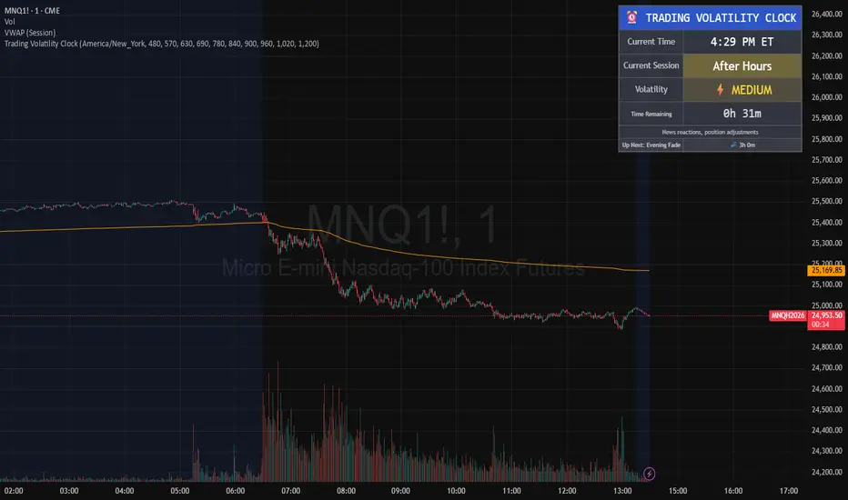
Trading Volatility Clock⏰ TRADING VOLATILITY CLOCK - Know When the Action Happens (Anywhere in the World)
A real-time session tracker with multi-timezone support for active traders who need to know when US market volatility strikes - no matter where they are in the world. Perfect for day traders, scalpers, and anyone trading liquid US markets.
══════════════════════════════════════════════════════
📊 WHAT IT DOES
This indicator displays a live clock showing:
- Current time in YOUR selected timezone (10 major timezones supported)
- Active US market session with color-coded volatility levels
- Countdown timer showing time remaining in current session
- Preview of the next upcoming session
- Optional alerts when entering high-volatility periods
══════════════════════════════════════════════════════
🌍 MULTI-TIMEZONE SUPPORT
SESSIONS ALWAYS TRACK US MARKET HOURS (Eastern Time):
No matter which timezone you select, the sessions always trigger at the correct US market times. Perfect for international traders who want to:
• See their local time while tracking US market sessions
• Know exactly when US volatility hits in their timezone
• Plan their trading day around US market hours
SUPPORTED TIMEZONES:
• America/New_York (ET) - Eastern Time
• America/Chicago (CT) - Central Time
• America/Los_Angeles (PT) - Pacific Time
• Europe/London (GMT) - Greenwich Mean Time
• Europe/Berlin (CET) - Central European Time
• Asia/Tokyo (JST) - Japan Standard Time
• Asia/Shanghai (CST) - China Standard Time
• Asia/Hong_Kong (HKT) - Hong Kong Time
• Australia/Sydney (AEDT) - Australian Eastern Time
• UTC - Coordinated Universal Time
EXAMPLE: A trader in Tokyo selects "Asia/Tokyo"
• Clock shows: 11:30 PM JST
• Session shows: "Opening Drive" 🔥 HIGH
• They know: US market just opened (9:30 AM ET in New York)
══════════════════════════════════════════════════════
🎯 WHY IT'S USEFUL
Whether you trade futures, high-volume stocks, or ETFs, volatility isn't constant throughout the day. Knowing WHEN to expect movement is critical:
🔥 HIGH VOLATILITY (Red):
• Opening Drive (9:30-10:30 AM ET) - Highest volume of the day
• Power Hour (3:00-4:00 PM ET) - Second-highest volume, final push
⚡ MEDIUM VOLATILITY (Yellow):
• Pre-Market (8:00-9:30 AM ET) - Building momentum
• Lunch Return (1:00-2:00 PM ET) - Traders returning
• Afternoon Session (2:00-3:00 PM ET) - Trend continuation
• After Hours (4:00-5:00 PM ET) - News reactions
💤 LOW VOLATILITY (Gray):
• Overnight Grind (12:00-8:00 AM ET) - Thin volume
• Mid-Morning Chop (10:30-11:30 AM ET) - Ranges form
• Lunch Hour (11:30 AM-1:00 PM ET) - Dead zone
• Evening Fade (5:00-8:00 PM ET) - Volume dropping
══════════════════════════════════════════════════════
⚙️ CUSTOMIZATION OPTIONS
TIMEZONE SETTINGS:
• Select from 10 major timezones worldwide
• Clock automatically displays in your local time
• Sessions remain locked to US market hours
SESSION TIME CUSTOMIZATION:
• Every session boundary is adjustable (in minutes from midnight ET)
• Perfect for traders who define sessions differently
• Advanced users can create custom volatility schedules
DISPLAY OPTIONS:
• Toggle next session preview on/off
• Enable/disable high volatility alerts
• Clean, unobtrusive table display in top-right corner
══════════════════════════════════════════════════════
💡 HOW TO USE
1. Add indicator to any chart (works on all timeframes)
2. Select your timezone in Settings → Timezone Settings
3. Set your chart to 1-minute timeframe for real-time updates
4. Customize session times if needed (Settings → Session Time Customization)
5. Watch the top-right corner for live session tracking
TRADING APPLICATIONS:
• Avoid trading during dead zones (lunch hour, mid-morning chop)
• Increase position size during high volatility windows
• Set alerts for Opening Drive and Power Hour
• Plan your trading day around US market volatility schedule
• International traders can track US sessions in their local time
══════════════════════════════════════════════════════
🎓 EDUCATIONAL VALUE
This indicator teaches traders:
• Market microstructure and volume patterns
• Why certain times produce better opportunities
• How institutional flows create intraday patterns
• The importance of timing in active trading
• How to adapt US market trading to any timezone
══════════════════════════════════════════════════════
⚠️ IMPORTANT NOTES
- Works best on 1-minute charts for frequent updates
- Sessions are ALWAYS based on US Eastern Time (ET)
- Timezone selection only changes the clock display
- Clock updates when new bar closes (not tick-by-tick)
- Alerts trigger once per bar when enabled
- Perfect for international traders tracking US markets
══════════════════════════════════════════════════════
📈 BEST USED WITH
- High-volume US stocks: TSLA, NVDA, AAPL, AMD, META
- Major US ETFs: SPY, QQQ, IWM, DIA
- US Futures: ES, NQ, RTY, YM, MES, MNQ
- Any liquid US instrument with clear intraday volume patterns
══════════════════════════════════════════════════════
🌏 FOR INTERNATIONAL TRADERS
This tool is specifically designed for traders outside the US who need to:
• Track US market sessions in their local timezone
• Know when to be at their desk for US volatility
• Avoid waking up for low-volatility periods
• Maximize trading efficiency around US market hours
No more timezone confusion. No more missing the opening bell. Just set your timezone and trade with confidence.
══════════════════════════════════════════════════════
This is an open-source educational tool. Feel free to modify and adapt to your trading style!
Happy Trading! 🚀
FVG Heatmap [Hash Capital Research]FVG Map
FVG Map is a visual Fair Value Gap (FVG) mapping tool built to make displacement imbalances easy to see and manage in real time. It detects 3-candle FVG zones, plots them as clean heatmap boxes, tracks partial mitigation (how much of the zone has been filled), and summarizes recent “fill speed” behavior in a small regime dashboard.
This is an indicator (not a strategy). It does not place trades and it does not publish performance claims. It is a market-structure visualization tool intended to support discretionary or systematic workflows.
What this script detects
Bullish FVG (gap below price)
A bullish FVG is detected when the candle from two bars ago has a high below the current candle’s low.
The zone spans from that prior high up to the current low.
Bearish FVG (gap above price)
A bearish FVG is detected when the candle from two bars ago has a low above the current candle’s high.
The zone spans from the current high up to that prior low.
What makes it useful
Heatmap zones (clean, readable FVG boxes)
Bullish zones plot below price. Bearish zones plot above price.
Partial fill tracking (mitigation progress)
As price trades back into a zone, the script visually shows how much of the zone has been filled.
Mitigation modes (your definition of “filled”)
• Full Fill: price fully trades through the zone
• 50% Fill: price reaches the midpoint of the zone
• First Touch: price touches the zone one time
Optional auto-cleanup
Optionally remove zones once they’re mitigated to keep the chart clean.
Fill-Speed Regime Dashboard
When zones get mitigated, the script records how many bars it took to fill and summarizes the recent environment:
• Average fill time
• Median fill time
• % fast fills vs % slow fills
• Regime label: choppy/mean-revert, trending/displacement, or mixed
How to use
Use FVG zones as structure, not guaranteed signals.
• Bullish zones are often watched as potential support on pullbacks.
• Bearish zones are often watched as potential resistance on rallies.
The fill-speed dashboard helps provide context: fast fills tend to appear in more rotational conditions, while slow fills tend to appear in stronger trend/displacement conditions.
Alerts
Bullish FVG Created
Bearish FVG Created
Notes
FVGs are not guaranteed reversal points. Fill-speed/regime is descriptive of recent behavior and should be treated as context, not prediction. On realtime candles, visuals may update as the bar forms.
