UpDown Advanced [DivineTrade]English version below
Описание индикатора UpDown Advanced (Pump & Damp Strategy)
UpDown Advanced это улучшенная версия индикатора для поиска резких импульсных движений цены, известных как Pump & Dump. Индикатор анализирует состояние рынка на выбранном таймфрейме и формирует сигналы, когда цена совершает аномальное движение за короткий промежуток времени и одновременно выполняет фильтры, указанные пользователем.
Короткое резюме
UpDown Advanced помогает:
• находить резкие импульсы на графике
• фильтровать их по RSI, тренду и таймфреймам
• контролировать частоту сигналов
• выстраивать собственные сценарии под любую стратегию
Подробное описание
Индикатор идеально подходит для Pump & Dump логики, но может использоваться и как универсальный детектор импульсных движений.
Основная логика работы
1. Анализ выбранного таймфрейма
Индикатор работает строго на том таймфрейме, который открыт на графике.
Все расчёты, сигналы и фильтры привязаны именно к текущему ТФ.
2. Поиск импульса каждые N свечей
В настройке Bars for pump / damp указывается количество последних свечей, в пределах которых индикатор будет искать резкий скачок цены.
Например:
Bars for pump/damp = 5
→ индикатор проверяет, на сколько % цена изменилась за последние 5 свечей.
3. Пороговый размер пампа/дампа
Параметр Signal trigger, % задаёт нужное изменение цены для возникновения сигнала.
Если изменение цены превышает указанное значение, этот критерий считается выполненным.
4. Система фильтров по таймфреймам
Индикатор поддерживает несколько независимых фильтров, каждый из которых включает:
• выбор таймфрейма
• длину RSI
• верхнюю/нижнюю границу RSI
• анализ тренда (вверх / вниз / оба варианта)
Все таймфреймы, отмеченные галочками, используются для фильтрации сигнала.
Сигнал появится только если выполнены условия по каждому выбранному фильтру.
Это позволяет создавать сложные сценарии, например:
• RSI перегрет на 1ч и 4ч
• тренд совпадает
• памп на основном ТФ составляет +7%
• импульс произошёл в пределах заданного окна свечей
5. Контроль частоты сигналов
Чтобы индикатор не спамил уведомлениями, есть два механизма:
1. Alerts frequency: once per bar close — сигнал формируется только по закрытию свечи.
2. Interval between signals, minutes — минимальный промежуток между сигналами.
Например:
Интервал = 30 минут → повторный сигнал появится не раньше, чем через 30 минут после предыдущего.
Пример настройки №1 (сигнал на 5-минутный памп)
Цель:
Получать сигнал, если:
• памп +7%
• произошёл за последние 5 свечей
• RSI перегрет на 1ч и 4ч (83+)
• сигнал не чаще 1 раза в 30 минут
Настройки:
• Alerts frequency: once per bar close
• Interval between signals: 30
• Bars for pump/damp: 5
• Signal trigger: 7%
Timeframe #1:
• RSI Length: 14
• Timeframe: 1H
• RSI Upper Band: 83
• RSI Lower Band: 0
• Trend: Both
Timeframe #2:
• RSI Length: 14
• Timeframe: 4H
• RSI Upper Band: 83
• RSI Lower Band: 0
• Trend: Both
Пример настройки №2 (сигнал на 15-минутный памп)
Всё как выше, но:
• Bars for pump/damp: 15
Индикатор позволяет создавать столько фильтров, сколько нужно под стиль трейдера.
__________________________________________________________________________________
English version
UpDown Advanced (Pump & Damp Strategy) – Indicator Description
UpDown Advanced is an improved version of the indicator designed to detect sharp impulsive price movements, commonly known as Pump & Dump events. The indicator analyzes the market on the currently opened timeframe and generates signals when a strong price impulse appears within a short period, while simultaneously meeting all user-defined filters.
Summary
UpDown Advanced allows traders to:
• detect sharp pump/dump movements
• filter signals using RSI, trend, and multi-timeframe conditions
• control alert frequency
• build custom scenarios for any trading style
It is ideal for Pump & Dump trading logic but also works as a universal impulse-detection tool.
Core Logic
1. Analysis of the selected timeframe
The indicator works strictly on the timeframe opened on the chart.
All calculations, triggers, and filters are tied to this timeframe.
2. Searching for impulses every N bars
The setting Bars for pump / damp defines how many recent bars the indicator evaluates for a rapid price move.
Example:
Bars for pump/damp = 5
→ the indicator checks how much the price changed over the last 5 bars.
3. Pump/Dump threshold
The parameter Signal trigger, % sets the minimum percentage change required to trigger a signal.
If the price movement exceeds this value, the first condition is met.
4. Multi-timeframe filter system
The indicator supports multiple independent filters, each including:
• chosen timeframe
• RSI length
• RSI upper/lower bands
• trend direction filter (up / down / both)
Only timeframes with checkmarks enabled are used for filtering.
A signal will appear only if ALL selected filters pass.
This allows building advanced logic, such as:
• RSI strongly overheated on 1H and 4H (83+)
• trend confirmation
• pump of +7% on the main timeframe
• impulse detected within N bars
• signals limited to a specific time interval
5. Signal frequency control
To prevent excessive alerts, the indicator provides:
1. Alerts frequency: once per bar close – signals only on candle close
2. Interval between signals (minutes) – minimum time gap between alerts
Example:
Interval = 30 minutes → the next signal will not appear earlier than 30 minutes after the previous one.
Example Setup #1 (5-bar pump detection)
Goal:
Receive a signal if:
• pump = +7%
• within the last 5 bars
• RSI overheated on 1H and 4H (83+)
• no more than 1 signal every 30 minutes
Settings:
• Alerts frequency: once per bar close
• Interval between signals: 30 minutes
• Bars for pump/damp: 5
• Signal trigger: 7%
Timeframe #1:
• RSI Length: 14
• Timeframe: 1H
• RSI Upper Band: 83
• RSI Lower Band: 0 (long signals disabled for now)
• Trend: Both
Timeframe #2:
• RSI Length: 14
• Timeframe: 4H
• RSI Upper Band: 83
• RSI Lower Band: 0
• Trend: Both
Example Setup #2 (15-bar pump detection)
All settings remain the same, but:
• Bars for pump/damp: 15
The indicator allows creating any number of filter combinations to match your trading logic.
Unterstützung und Widerstand

Session Opening Range Breakout (ORBO)This strategy automates a classic Opening Range Breakout (ORBO) approach: it builds a price range for the first minutes after the market opens, then looks for strong breakouts above or below that range to catch early directional moves.
Concept
The idea behind ORBO is simple:
The first minutes after the session open are often highly informative.
Price forms an “opening range” that acts as a mini support/resistance zone.
A clean breakout beyond this zone can lead to high-momentum moves.
This script turns that logic into a fully backtestable strategy in TradingView.
How the strategy works
Opening Range Session
Default session: 09:30–09:50 (exchange time)
During this window, the script tracks:
orHigh → highest high within the session
orLow → lowest low within the session
This forms your Opening Range for the day.
Breakout Logic (after the window ends)
Once the defined session ends:
Long Entry:
If the close crosses above the Opening Range High (orHigh),
→ strategy.entry("OR Long", strategy.long) is triggered.
Short Entry:
If the close crosses below the Opening Range Low (orLow),
→ strategy.entry("OR Short", strategy.short) is triggered.
Only one opening range per day is considered, which keeps the logic clean and easy to interpret.
Daily Reset
At the start of a new trading day, the script resets:
orHigh := na
orLow := na
A fresh Opening Range is then built using the next session’s 09:30–09:50 candles.
This ensures entries are always based on today’s structure, not yesterday’s.
Visuals & Inputs
Inputs:
Opening range session → default: "0930-0950"
Show OR levels → toggle visibility of OR High / Low lines
Fill range body → optional shaded zone between OR High and OR Low
Chart visuals:
A green line marks the Opening Range High.
A red line marks the Opening Range Low.
Optional yellow fill highlights the entire OR zone.
Background shading during the session shows when the range is currently being built.
These visuals make it easy to see:
Where the OR sits relative to current price
How clean / noisy the breakout was
How often price respects or rejects the opening zone
Backtesting & Optimization
Because this is written as a strategy():
You can use TradingView’s Strategy Tester to view:
Win rate
Net profit
Drawdown
Profit factor
Equity curve
Ideas to experiment with:
Change the session window (e.g., 09:15–09:45, 10:00–10:30)
Apply to different:
Markets: indices, FX, crypto, stocks
Timeframes: 1m / 5m / 15m
Add your own:
Stop Loss & Take Profit levels
Time filters (only trade certain days / times)
Volatility filters (e.g., ATR, range size thresholds)
Higher-timeframe trend filter (e.g., only take longs above 200 EMA)

AliceTears GridAliceTears Grid is a customizable Mean Reversion system designed to capitalize on market volatility during specific trading sessions. Unlike standard grid bots that place blind limit orders, this strategy establishes a daily or session-based "Baseline" and looks for price over-extensions to fade the move back to the mean.
This strategy is best suited for ranging markets (sideways accumulation) or specific forex sessions (e.g., Asian Session or NY/London overlap) where price tends to revert to the opening price.
🛠 How It Works
1. The Baseline & Grid Generation At the start of every session (or the daily open), the script records the Open price. It then projects visual grid lines above and below this price based on your Step % input.
Example: If the Open is $100 and Step is 1%, lines are drawn at $101, $102, $99, $98, etc.
2. Entry Logic: Reversal Mode This script features a "Reversal Mode" (enabled by default) to filter out "falling knives."
Standard Grid: Buys immediately when price touches the line.
AliceTears Logic: Waits for the price to breach a grid level and then close back inside towards the mean. This confirms a potential rejection of that level before entering.
3. Exit Logic
Target Profit: The primary target is the previous grid level (Mean Reversion).
Trailing Stop: If the price continues moving in your favor, a trailing stop activates to maximize the run.
Stop Loss: A manual percentage-based stop loss is available to prevent deep drawdowns in trending markets.
⚙️ Key Features
Visual Grid: Automatically draws entry levels on the chart for the current session, helping you visualize where the "math" is waiting for price.
Timezone & Session Control: Includes a custom Timezone Offset tool. You can trade specific hours (e.g., 09:30–16:00) regardless of your chart's UTC setting.
Grid Management: Independent logic for Long and Short grids with pyramiding capabilities.
Safety Filters: Options to force-close trades at the end of the session to avoid overnight gaps.
⚠️ Risk Warning
Please Read Before Using: This is a Counter-Trend / Grid Strategy.
Pros: High win rate in sideways/ranging markets.
Cons: In strong trending markets (parabolic pumps or crashes), this strategy will add to losing positions ("catch a falling knife").
Recommendation: Always use the Stop Loss and Date Filter inputs. Do not run this on highly volatile assets without strict risk management parameters.
Settings Guide
Entry Reversal Mode: Keep checked for safer entries. Uncheck for aggressive limit-order style execution.
Grid Step (%): The distance between lines. For Forex, use lower values (0.1% - 0.5%). For Crypto, use higher values (1.0% - 3.0%).
UTC Offset: Adjust this to align the Session Hours with your target market (e.g., -5 for New York).
This script is open source. Feel free to use it for educational purposes or modify it to fit your trading style.

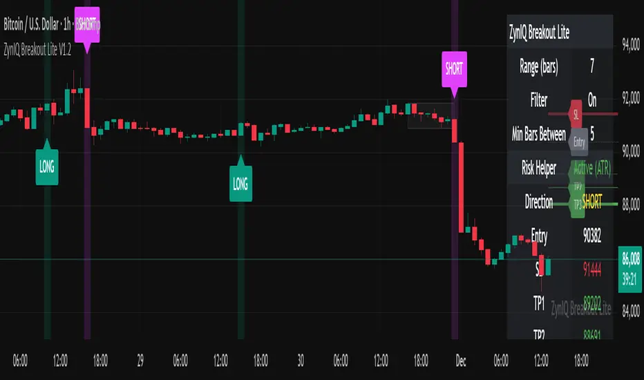
ZynIQ Breakout Lite v1.2 - (Lite Pack)Overview
ZynIQ Breakout Lite v1.2 provides a streamlined breakout framework designed to highlight expansion moves from short-term consolidation. It focuses on clarity and simplicity, making it suitable for intraday and swing trading.
Key Features
• Breakout range detection based on a configurable lookback period
• Optional minimum candle-range filter
• Simple signal spacing to reduce clustered signals
• Direction-aware breakout triggers (non-repainting)
• Optional ZynIQ Risk Helper for structured SL/TP planning
• Optional HUD panel showing current settings and breakout context
Use Cases
• Identifying range breakouts
• Highlighting directional shifts
• Quickly assessing breakout structure with lightweight visuals
Notes
This tool assists with breakout structure and risk planning. It is not a trading system by itself. Use with your preferred confirmation tools and risk management.
Diff Price (Future - Spot)Diff Line (Future – Spot) plots a grid of spot-price levels derived from the current futures price.
It rounds the current futures price up to the nearest price block (e.g. every 25 points), then subtracts a user‑defined Diff (Future – Spot) to find the main spot level and draws that as the central line. Additional lines are plotted above and below at equal block distances, with labels showing both Future and Spot values (e.g. 4250 (4215)), plus a compact diff info box for quick reference.

APEX-SIGNAL PRO STMDescription:
APEX-SIGNAL PRO is a comprehensive trading system designed for traders who prioritize consistency and risk management. Unlike traditional indicators, APEX integrates Smart Money Concepts (SMC), Liquidity Sweeps, and Volatility analysis into a single, clean interface.
The core philosophy of this system is the "No-Ruin Protocol" — a built-in risk engine that ensures you never over-leverage, helping you survive in the market long-term while capturing high R:R setups.
Key Features:
💎 Snipe Mode (Tier A): High-probability entry signals based on Liquidity Sweeps + Reversal Candles.
🌊 Flow Mode (Tier B): Trend-following logic for capturing momentum.
🛡️ No-Ruin Dashboard: Real-time position sizing and risk calculator displayed directly on your chart.
📊 Smart Structure: Automatically identifies Supply/Demand zones and Order Blocks.
🚫 100% Non-Repaint: All signals are permanent once the candle closes. No disappearing arrows.
How to Use:
Identify Trend: Use the dashboard to check the current market bias (Bullish/Bearish).
Wait for Signal: Look for the GREEN (Buy) or RED (Sell) labels.
Confirm Structure: Ensure the price is reacting to a valid Supply/Demand zone shown on the chart.
Manage Risk: Follow the TP/SL levels and Lot Size recommended by the dashboard.
⚠️ Disclaimer: Trading financial markets involves risk. This tool is designed to assist in analysis and does not guarantee profits. Past performance is not indicative of future results.
🔓 Access: This is an Invite-Only script. To request access, stm29112025@gmail.com

Viprasol Elite Advanced Pattern Scanner# 🚀 Viprasol Elite Advanced Pattern Scanner
## Overview
The **Viprasol Elite Advanced Pattern Scanner** is a sophisticated technical analysis tool designed to identify high-probability double bottom (DISCOUNT) and double top (PREMIUM) patterns with unprecedented accuracy. Unlike basic pattern detectors, this elite scanner employs an AI-powered quality scoring system to filter out false signals and highlight only the most reliable trading opportunities.
## 🎯 Key Features
### Advanced Pattern Detection
- **DISCOUNT Patterns** (Double Bottoms): Identifies bullish reversal zones where price may bounce
- **PREMIUM Patterns** (Double Tops): Detects bearish reversal zones where price may decline
- Multi-point validation system (5-point structure)
- Symmetry analysis with customizable tolerance
### 🤖 AI Quality Scoring System
Each pattern receives a quality score (0-100) based on:
- **Symmetry Analysis** (32% weight): How closely the two bottoms/tops match
- **Trend Context** (22% weight): Strength of the preceding trend using ADX
- **Volume Profile** (22% weight): Volume confirmation at key points
- **Pattern Depth** (16% weight): Significance of the pattern's price range
- **Structure Quality** (16% weight): Overall pattern formation quality
Quality Grades:
- ⭐ **ELITE** (88-100): Highest probability setups
- ✨ **VERY STRONG** (77-87): Strong trade opportunities
- ✓ **STRONG** (67-76): Valid patterns with good potential
- ○ **VALID** (65-66): Acceptable patterns meeting minimum criteria
### 🎯 Intelligent Target System
Three target modes per pattern direction:
- **Conservative**: 0.618 Fibonacci extension (safer, closer targets)
- **Balanced**: 1.0 extension (moderate risk/reward)
- **Aggressive**: 1.618 extension (higher risk/reward)
Targets automatically adjust based on pattern quality score.
### 🔧 Advanced Filtering Options
- **Volatility Filter (ATR)**: Excludes patterns during extreme volatility
- **Momentum Filter (ADX)**: Ensures sufficient trend strength
- **Liquidity Filter (Volume)**: Confirms adequate trading volume
### 📊 Pattern Lifecycle Management
- Real-time neckline tracking with extension multiplier
- Pattern invalidation after extended wait period
- Breakout/breakdown confirmation
- Reversal detection (pattern failure scenarios)
- Target achievement tracking
### 🌈 Premium Visual System
- Color-coded quality levels
- Cyber-themed color scheme (Neon Green/Hot Pink/Purple/Cyan)
- Transparent fills for pattern zones
- Dynamic labels with pattern information
- Elite dashboard showing live pattern stats
## 📈 How To Use
### Basic Setup
1. Add indicator to your chart
2. Enable desired patterns (DISCOUNT and/or PREMIUM)
3. Adjust quality threshold (default: 65) - higher = fewer but better signals
4. Set your preferred target mode
### Trading DISCOUNT Patterns (Bullish)
1. Wait for pattern detection (labeled points 1-4)
2. Check quality score on dashboard
3. Entry on breakout above neckline (point 5)
4. Stop loss below the lowest bottom
5. Target shown automatically based on your mode
6. ⚠️ Watch for pattern failure (break below bottoms = SHORT signal)
### Trading PREMIUM Patterns (Bearish)
1. Wait for pattern detection (labeled points 1-4)
2. Check quality score on dashboard
3. Entry on breakdown below neckline (point 5)
4. Stop loss above the highest top
5. Target shown automatically based on your mode
6. ⚠️ Watch for pattern failure (break above tops = LONG signal)
## ⚙️ Input Settings Guide
### 🔍 Detection Engine
- **Left/Right Pivots**: Higher = fewer but cleaner patterns (default: 6/4)
- **Min Pattern Width**: Minimum bars between bottoms/tops (default: 12)
- **Symmetry Tolerance**: Max % difference allowed between levels (default: 1.8%)
- **Extension Multiplier**: How long to wait for breakout (default: 2.2x pattern width)
### ⭐ Quality AI
- **Min Quality Score**: Only show patterns above this score (default: 65)
- **Weight Distribution**: Customize what matters most (symmetry/trend/volume/depth/structure)
### 🔧 Filters
- **Volatility Filter**: Avoid choppy markets (recommended: ON)
- **Momentum Filter**: Ensure trend strength (recommended: ON)
- **Liquidity Filter**: Volume confirmation (recommended: ON)
### 💎 Target System
- Choose target aggression for each pattern type and direction
- Higher quality patterns get adjusted targets automatically
## 🎨 Visual Customization
- Adjust colors for DISCOUNT/PREMIUM patterns
- Set quality-based color coding
- Customize label sizes
- Toggle dashboard visibility and position
- Show/hide historical patterns
## 🚨 Alert System
Set up TradingView alerts for:
- 🚀 **LONG Signals**: DISCOUNT breakout, PREMIUM failure
- 📉 **SHORT Signals**: PREMIUM breakdown, DISCOUNT failure
- ✅ **Target Achievement**: When price hits your target
## 💡 Pro Tips
1. **Higher Timeframes = Better Signals**: Patterns on 4H, Daily, Weekly are more reliable
2. **Quality Over Quantity**: Focus on ELITE and VERY STRONG grades
3. **Combine with Trend**: DISCOUNT in uptrend, PREMIUM in downtrend = best results
4. **Watch Pattern Failures**: Failed patterns often provide strong counter-trend signals
5. **Adjust for Your Style**: Intraday traders use Conservative, swing traders use Aggressive
## 🔒 Pattern Invalidation
Patterns become invalid if:
- No breakout/breakdown within extension period
- Support/resistance levels are broken prematurely
- Pattern shown in faded colors = no longer active
## ⚠️ Risk Disclaimer
This indicator is a tool for technical analysis and does not guarantee profitable trades. Always:
- Use proper risk management
- Combine with other analysis methods
- Never risk more than you can afford to lose
- Past performance does not indicate future results

Advanced S&D Engine | ZikZak-Trader30About This Script
This is a fully custom-built Supply & Demand Zone detection engine for TradingView written by ZikZak-Trader30 (Kotdwar, UK). The script identifies potential key supply and demand zones based on market structure and pattern logic widely used by professional traders.
Detected Patterns:
RBR (Rally-Base-Rally, demand)
DBD (Drop-Base-Drop, supply)
RBD (Rally-Base-Drop, supply)
DBR (Drop-Base-Rally, demand)
Features Highlight
Detailed configurable zone filtering (freshness, gap detection, time spent, width, Fibonacci confluence, etc.)
Fair and adjustable scoring system for zone strength
Automatic management/removal of old or retested/violated zones
Optional Fibonacci level confluence and dynamic labeling
Transparency Statement
How It Works:
This script uses well-known price action concepts and compares candles’ movement, consolidation, and breakout patterns to mark S&D zones.
There are no repaints or future leaks: all logic is based entirely on historical and current bars.
Parameters and variables are fully described in the script inputs. The zone scoring and removal logic is also visible in the code for transparency.
IMPORTANT: Usage & Fair-Use Policy
This script is provided for educational and informational purposes only.
It should not be considered as financial advice or a trading signal.
Trading/investing involves risk—always do your own research or consult a financial advisor before making trading decisions.
Past performance or backtest results are not necessarily indicative of future results.
License & Fair Use
The code is original, written by ZikZak-Trader30.
All logic and comments are visible for users to study, adapt, or improve for personal, non-commercial use within TradingView.
You may NOT resell, repackage, or repost this script as your own.
If you fork or publicly remix/adapt the script, please credit "ZikZak-Trader30" and do not remove this disclosure section.
If you use ideas or snippets, kindly reference this script and author.
Absolutely NO plagiarized or resold code is permitted. This script is not for re-sale.
Acknowledgements
This indicator was inspired by years of price action study and usage of public S&D scripts. While the pattern logic is classic in nature, the version and scoring are original.
No proprietary datasets or paid logic from other sources are included.
Minor ideas on zone freshness and Fibonacci blending are common in the TradingView S&D community and have been custom-implemented here.

KVS-Ultimate FVG & iFVG System [MTF + Distance Filter]Description: This indicator identifies Fair Value Gaps (FVG) and Inversion FVGs (iFVG) across multiple timeframes (MTF) with an advanced visualization system. Unlike standard FVG indicators, this script solves the "chart clutter" problem with a unique Distance Filter and offers a customizable Split Label System.
Key Features:
1. Unique Distance Filter (Clean Screen Mode):
When enabled, the script only shows the closest FVGs to the current price within a user-defined limit.
Keeps your chart clean while focusing on relevant price action levels.
2. Split Label System (Tabular Design):
Completely customizable label positioning, sizing, and coloring.
Separate controls for Normal FVGs and iFVGs.
Smart Label Logic: If you hide the FVG box, its label automatically hides. If an FVG breaks and becomes an iFVG (or fades), the label logic switches automatically to the iFVG settings.
3. Strict Mode Filtering:
Enabled: Checks if the candle closing price effectively breaks the previous structure (High/Low of the 1st candle), ensuring high-quality gaps.
Disabled: Detects all gaps between wicks (Standard calculation).
4. Multi-Timeframe (MTF) Support:
Monitor FVGs from up to 5 different timeframes simultaneously on a single chart.
5. Dynamic Interaction:
Choose how the script reacts when an FVG is broken: Turn it into an iFVG (Inversion) or simply fade the color (Ghost/Fade mode).
How to Use:
Use the "Distance Filter" checkbox in settings to clean up old/far blocks.
Adjust "TF1" to "TF5" to set up your multi-timeframe analysis.
Customize the Label Panel to align text perfectly with your chart style.
Disclaimer: This tool is for educational purposes and support for technical analysis.

Magic Equity Trend & PivotsMagic Equity Trend & Pivots is a robust technical analysis engine designed specifically for equity and index traders. It serves as a comprehensive "Trend & Level" companion, combining institutional Pivot Points with a proprietary EMA trend filtering system to identify high-probability setups.
How the Magic Works
This indicator simplifies complex market data into a clear visual workflow:
1. The Magic Equity Trend (Trend Identification) The script uses a weighted system to determine the dominant market direction:
Bullish Trend: Price holds above the primary Trend SMA + a Volatility Buffer (Green Zone).
Bearish Trend: Price is rejected below the Trend SMA - Buffer (Red Zone).
No-Trade Zone: When the price is trapped inside the buffer (Gray Channel), the trend is considered weak or ranging.
2. Institutional Pivot Points Price often reacts at hidden levels. This tool calculates and overlays these levels automatically:
Multi-Type Support: Choose between Traditional, Fibonacci, Woodie, Classic, DM, and Camarilla pivots.
Timeframe Smart-Switching: Use fixed timeframes (e.g., Weekly Pivots on a Daily chart) or let the "Auto" mode decide the best reference period for your current view.
Historical Mode: Unlike standard pivots, these can be back-tested visually to see how prices respected levels in the past.
3. Precision Entry & Exit Logic Trade signals are not random; they are based on a strict confluence of "Magic" factors:
Entry Signal: Requires Trend Alignment + Fast/Slow EMA Crossover + RSI Strength (>60) + Relative Volume Spike.
Top-Up (Add-on): Detects low-risk opportunities to add to a position when price pulls back to the EMA10/20 during a strong trend.
Two-Stage Exit: Secures profits using either an ATR Trailing Stop or an Intraday RSI Breakdown, depending on your settings.
4. Divergence & Momentum
RSI Divergence: Automatically plots Regular Bullish and Bearish divergences to warn of potential reversals at tops or bottoms.
Darvas Boxes: Visualizes consolidation ranges to help identify breakouts.
5. Performance Dashboard A data table provides a snapshot of the asset's health:
Mean Reversion: Measures the % distance from key EMAs (10, 20, 50).
RVOL & ADR: Displays Relative Volume and Average Daily Range to gauge volatility.
Performance Tracker: A theoretical summary table showing how the trend signals have performed over the last 1W, 1M, and 1Y periods.
Settings & Customization
Visuals: Fully customizable colors for the Trend Cloud, Pivots, and Backgrounds.
Filters: Toggle specific filters (Volume, RSI, Trend Buffer) to adapt the sensitivity to different asset classes.
Disclaimer: This tool is for educational purposes and technical analysis assistance only. Past performance displayed in the dashboard does not guarantee future results.

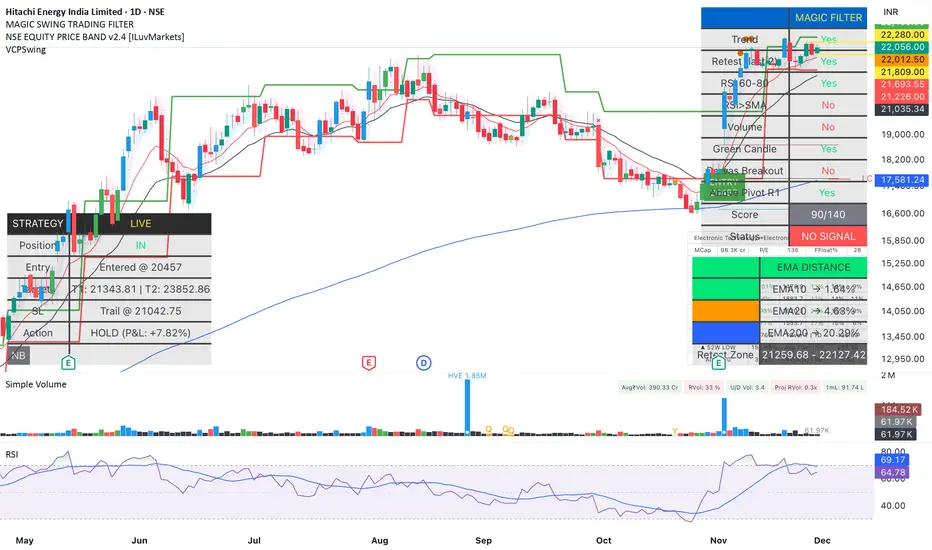
Magic Swing Suite: Trend, Pullback & Risk DashboardMagic Swing Suite: Trend, Pullback & Risk Dashboard
This indicator is a complete Swing Trading System designed to identify high-probability trend continuation setups. It combines classic trend-following principles with a unique "3-Bar Retest" logic and provides a real-time Strategy Dashboard to help you manage positions without needing a separate strategy script.
How it Works:
The system looks for a "Confluence" of factors before generating a signal. It scores every bar out of 140 points based on the following criteria:
Trend Alignment: Price must be above EMA 10, and EMA 10 must be above EMA 20.
Momentum (RSI): RSI must be in the "Bullish Control Zone" (60-80) and above its SMA.
Volume: Volume must be significantly higher than the average (1.5x by default).
The "Magic" Retest: The script checks the last 2-5 bars to see if the price has pulled back to "kiss" the EMA 10. This ensures we are buying a dip in a trend, not chasing a top.
Breakout Confirmation: Checks for Darvas Box breakouts and price position relative to Pivot R1.
Features:
🎯 Virtual Strategy Dashboard: A table that mimics a strategy tester. It tracks Entry, Stop Loss (Trailing), Target 1, and Target 2 in real-time.
📊 Confluence Scorecard: A detailed table showing exactly why a signal was (or wasn't) generated (Trend, Retest, RSI, Volume, etc.).
🛡️ Risk Management: automatically calculates a Trailing Stop (EMA 10) and fixed Risk:Reward targets based on recent highs.
📉 Multi-Layered Overlays: Includes Auto-Pivots (Traditional, Fib, Woodie, etc.) and Darvas Boxes to identify support/resistance levels.
How to Use:
Wait for a Signal:
"FULL BUY SIGNAL" (Green): All conditions are met, including a recent retest of the EMA. This is the highest probability setup.
"BUY - NO RETEST" (Orange): Trend and momentum are strong, but price hasn't pulled back recently. Use caution, as this may be a breakout trade.
Monitor the Dashboard: Once a trade is active, the dashboard will change to "IN POSITION." Follow the "Action" row.
If the trend weakens, the Trailing Stop (EMA 10) will move up to protect profits.
Targets:
T1: Previous Swing High (or 5% if no high found).
T2: 1:1.6 Risk/Reward extension.
Settings:
Volume Spike Factor: Adjust how much volume is needed to confirm a move. Default is 1.2.
Retest Tolerance: Adjust how close the price needs to get to the EMA 10 to count as a "retest."
Dashboard Toggles: You can hide the tables if you prefer a clean chart.
Pivot Timeframes: customizable lookback for S/R levels.
FAQ:
Does this repaint?
No. All signals trigger only on confirmed bars.
Can I use this intraday?
Yes. Works great from 5m to 1D.
Are exits manual or automated?
The indicator tracks SL, T1, and T2, and marks them on the chart.
Does retest affect the buy signal?
Retest is optional. The buy logic does not require it, but adds weight to the score.
Disclaimer: This tool is for educational purposes only. The "Strategy Dashboard" is a simulation based on script calculations and does not execute real trades. Always manage your own risk.
Ghost Cipher [Bit2Billions]Ghost Cipher — Adaptive Market Flow Engine
*A structured, intelligence-driven framework that decodes market flow using smoothing, liquidity distribution, volatility behavior, and range-based logic.*
Ghost Cipher translates complex price action into a clean, intuitive visual environment. It combines multiple analytical modules—including adaptive smoothing, liquidity mapping, volatility profiling, and CRT range-theory detection—into a cohesive, rule-based system. Each component is designed to complement the others: smoothing reduces noise for clearer trend detection, liquidity mapping identifies imbalance zones for potential reversals, and range theory structures intra-day and multi-timeframe price dynamics.
This integration provides traders with a streamlined, actionable view of market flow from micro swings to macro transitions, supporting both decision-making and workflow efficiency.
Why This Script Is Original and Useful
* Ghost Cipher is not a simple mashup: each module is developed with proprietary logic and integrates dynamically with others.
* Classic elements like moving averages, volatility bands, and order blocks are adapted and enhanced, not copied from public scripts.
* Closed-source design ensures that traders see what the script does (trend, liquidity, range signals) without exposing full underlying code.
* All visual and analytical outputs are designed to add tangible value over existing indicators, reducing manual analysis and improving clarity.
Key Features & Components
1. Candles & Visualization
* Custom Heikin-Ashi–style candle coloring for a clean chart.
* Multi-timeframe overlays to highlight higher-timeframe influence.
2. Smoothed Trend Processin g
* Proprietary smoothing for noise-reduced trend detection.
* Zero-Lag Multi-Ribbon: layered momentum ribbon with gradient shading for lag-free directional assessment.
3. Liquidity & Institutional Mapping
* Real-time liquidity depth visualization.
* Detection of pockets, imbalance zones, and resting liquidity clusters.
* Smart Bullish & Bearish Order Blocks with mitigation-focused logic.
4. Dynamic Demand & Supply Engine
* Auto-detection of institutional demand/supply zones.
* Adaptive boundaries respond to volatility, displacement, and liquidity conditions.
5. Volatility & Channel Tools
* Adaptive Bollinger-style volatility bands.
* Macro trendlines, break structures, and volumetric channel mapping.
6. Intelligent Market Flow Tools
* Dynamic Magic Line: adapts to real-time volatility, range compression, and volume shifts.
* CRT Candle Range Theory: detects ranges, equilibrium zones, and breakout/reaction signals.
7. Market Sessions
* Highlights bull/bear sessions for directional bias and structural insight.
Dashboard Metrics
* Volume Delta Dashboard: aggregated BTC delta across major exchanges; multi-asset pairing for comparison.
* Market Overview Panel: current bias, trend regime, and structured analyst notes.
Chart Clarity & Design Standards
* Only essential real-time labels displayed; historical labels hidden.
* Organized visuals with consistent colors, line types, and modular design for quick interpretation.
How to Use / What Traders Gain
* Reduces manual charting and repetitive analysis.
* Speeds workflow using rule-based, automated visualization.
* Cuts through market noise for consistent, structured insights.
* Supports multi-timeframe and multi-market analysis.
Inputs & Settings
* Default settings pre-configured
* Simple Show/Hide toggles for modules
* Minimal exposed fields for ease of use
Recommended Timeframes & Markets
* Works best on 15M, 1H, 4H, Daily, and higher
* Suitable across forex, crypto, indices, and liquid equities
* Pivot-based modules may show noise on illiquid assets
Performance & Limitations
* May draw many objects → disable unused modules for speed
* Refresh the chart if historical buffer issues occur
* TradingView platform limitations handled internally
License & Legal
* Proprietary © 2025
* Redistribution, resale, or disclosure prohibited
* Independently developed with proprietary extensions
* Any resemblance to other tools may result from public-domain concepts
Respect & Transparency
* Built on widely recognized public trading concepts.
* Developed with respect for the TradingView community.
* Any overlaps or similarities can be addressed constructively.
Disclaimer
* Educational purposes only
* Not financial advice
* Trading carries risk — always use paper testing and proper risk management
FAQs
* Source code is not public
* Works best on 15m, 1H, 4H, Daily, Weekly charts
* Modules can be hidden/shown with toggles
* Alerts can be set up manually by users
* Supports multiple markets: forex, crypto, indices, and equities
About Ghost Trading Suite
Author: BIT2BILLIONS
Project: Ghost Trading Suite © 2025
Indicators: Ghost Matrix, Ghost Protocol, Ghost Cipher, Ghost Shadow
Strategies: Ghost Robo, Ghost Robo Plus
Pine Version: V6
The Ghost Trading Suite is designed to simplify and automate many aspects of chart analysis. It helps traders identify market structure, divergences, support and resistance levels, and momentum efficiently, reducing manual charting time.
The suite includes several integrated tools — such as Ghost Matrix, Ghost Protocol, Ghost Cipher, Ghost Shadow, Ghost Robo, and Ghost Robo Plus — each combining analytical modules for enhanced clarity in trend direction, volatility, pivot detection, and momentum tracking.
Together, these tools form a cohesive framework that assists in visualizing market behavior, measuring momentum, detecting pivots, and analyzing price structure effectively.
This project focuses on providing adaptable and professional-grade tools that turn complex market data into clear, actionable insights for technical analysis.
Crafted with 💖 by BIT2BILLIONS for Traders. That's All Folks!
Changelog
v1.0 Core Release
* Custom Heikin-Ashi Candles: Clean, visually intuitive candle designs for effortless chart reading.
* Smoothed Moving Averages: Advanced smoothing algorithms for precise trend tracking and confirmation.
* Liquidity Depth Visualization: Real-time insight into liquidity levels, depth pockets, and imbalance zones.
* Dynamic Demand & Supply Mapping: Automatic detection of institutional demand and supply zones with adaptive boundaries.
* High-Timeframe Candle Zones (HTF): Dual HTF candle overlays for macro-level trend context and control over candle count.
* Trend Lines & Channels: Macro and aggressive volumetric trendlines for structured market flow analysis.
* Zero-Lag Moving Average Ribbon: Layered ribbon with shaded gradients for smoother, lag-free momentum visualization.
* Volatility Bands: Adaptive Bollinger-style bands for dynamic range analysis.
* Dynamic Magic Line: Self-adjusting line responding to real-time volatility and volume shifts.
* CRT Candle Range Theory: Automatic detection and visualization of CRT candle ranges and range-based signals.
* Bull & Bear Sessions: Highlights key market sessions to identify directional bias and volatility shifts.
* Order Blocks: Smart detection of bullish and bearish institutional order blocks.
* Dashboard Module:
* Volume Delta Dashboard: Aggregated delta volume from all major exchanges for BTC, with the ability to pair up to 4 additional assets.
* Market Overview Panel: Displays current bias, trend insights, and actionable analyst notes.

Trade Assist (D4 & D4a) v1Trade Assist - Professional Trading Setup Validator
Overview
Trade Assist is a comprehensive systematic trading indicator designed for forex traders who follow disciplined, rule-based approaches. This indicator eliminates subjectivity by providing clear setup validation with visual confirmations and real-time alerts.
Key Features
Dual Strategy System
- D4 Strategy: Conservative approach for higher-probability setups
- D4a Strategy: Aggressive variant for increased trading opportunities
- Simple dropdown selector to switch between strategies
Real-Time Setup Validation
Trade Assist analyses multiple market conditions simultaneously and provides instant feedback on whether a valid trading setup exists. The indicator displays clear visual signals:
- 🟢 Valid Buy/Sell - All criteria met, setup confirmed
- ⚠️ Check 1:1 - Valid setup with caution flag (requires additional verification)
- ❌ No Valid Setup - Specific failure reason displayed
Intelligent Filtering System
The indicator applies multiple validation layers to filter out low-quality setups:
- Trend confirmation requirements
- Range position analysis
- Candle structure validation
- Support/Resistance clearance checks
- Weekly level awareness
Visual Trading Aids
- SL/TP Guide: Dynamic bands showing optimal stop loss and take profit zones
- Pip Counter: Real-time pip distance calculations adjusted for JPY and non-JPY pairs
- Trend Display: Clear bullish/bearish trend identification
Smart Alerts
Integrated TradingView alert system notifies you the moment a valid setup appears:
- Instant notifications to mobile/desktop
- Customizable alert messages showing pair and direction
- "Only Once" frequency recommended to avoid alert spam
Grey Zone Protection
Automatically detects when price action becomes unclear or choppy, protecting you from marginal trades during uncertain market conditions.
Position Grading System
Not all valid setups are equal. Trade Assist grades entry positions:
- Clean Zone: Optimal entry location within range
- Warning Zone: Valid but less ideal positioning
- No Trade Zone: Entry location fails risk/reward criteria
Designed For
- Systematic forex traders on 4-hour timeframes
- Traders who value mechanical rules over discretion
- Anyone seeking to eliminate emotional decision-making
- Traders managing multiple currency pairs (optimized for 28 major pairs)
What You Get
✅ Objective setup validation - no guesswork
✅ Clear entry signals with specific failure reasons when criteria aren't met
✅ Automated pip calculations for SL/TP planning
✅ Multi-strategy flexibility in a single indicator
✅ Real-time alerts for valid setups
✅ Risk management guidance through visual zones
Important Notes
- This is a setup validation tool, NOT A SIGNAL SERVICE
- Designed for traders who understand price action and risk management
- Works best when combined with proper trading plan and money management
- Optimized for forex pairs (28 majors including JPY crosses)
- Recommended timeframe: 4H
Customization Options
- Strategy selection (D4/D4a)
- SL/TP band colours
- Display positions for tables
- Optional 50% ATR display
- Pip counter toggle
- Visual element customization
---
Access: Invite-only
Best For: Disciplined systematic traders
Markets: Forex (optimized)
Timeframes: 4H
Trade Assist brings clarity to your trading decisions by providing objective, rule-based validation for every potential setup. Stop guessing, start trading with confidence.

SPY Key LevelsUse Case
Do you belong to a group of traders that post key levels based on their technical analysis to be utilized for trading opportunities? The goal of this indicator is to reduce your daily prep time by allowing you to paste in the actual level values instead of trying to manually create each of the horizontal lines.
How it works
Simply enter the values of the key levels that you would like to plot horizontal lines for
Settings
You can enable/disable any of the levels
You can change the colors of the levels
You can add Previous Day High and Previous Day Low levels to the chart
Limitations
Currently the levels (besides PDH/PDL) are hardcoded to only display for the SPY security "AMEX:SPY"
// Terms \\
Feel free to use the script, If you do use the script could you please just tag me as I am interested to see how people are using it. Good Luck!

Tomo's Pivots // last W, last M, last Q, last30d, last90d.These are pivots that you can use to look back at various time periods to find magnetic Price points of support and resistance. There are: weekly, last 30 days, last month, last 90 days, and last quarter. You can change the color and style of every indicator and its label. So if it happens to be November 29 today, you will see the last 90 days representing 90 days before November 29. But you will also see last quarter which represents from July 1 to September 30. These values are fair value equilibrium price point by averaging the high low and close of that time period. Weekly is great for intraday trading and the last 30 is great for momentum. Consider using the monthly for swing trading. Stay in the green.

@DARKPOOL Magnet - MEMEDescription:
The @DARKPOOL Magnet indicator identifies and displays significant price levels where institutional buying and selling activity has created persistent support and resistance zones. The indicator focuses on three primary types of institutional footprints:
Pin Zone Detection: Identifies price levels where multiple pin bars (high volume, narrow range candles) have clustered within a specified tolerance, indicating repeated institutional defense of those levels.
Whale Footprint Detection: Detects absorption events where significant volume occurs with minimal net price movement, suggesting large institutional orders being filled without allowing substantial directional movement.
Dark Pool Detection: Identifies potential dark pool prints characterized by unexplained price gaps that occur without visible tape activity, indicating off-exchange institutional transactions.
The indicator draws horizontal lines at these identified institutional price levels and highlights areas where multiple detection methods converge, creating confluence zones that represent higher probability support and resistance levels.
Confluence lines are displayed when multiple independently identified institutional levels occur within a user-specified proximity, providing visual emphasis on price levels with the strongest institutional interest.

AG Pro Dynamic Channels PremiumAG Pro Dynamic Channels Premium
The Gold Standard in Automated Market Structure.
AG Pro Dynamic Channels Premium is the culmination of advanced algorithmic development, designed specifically for professional traders who refuse to compromise on chart clarity.
While standard indicators flood your screen with noise, this Premium edition employs a proprietary "Smart Filtering Engine" to identify, validate, and project only the most statistically significant support and resistance channels. It transforms chaos into a clear, actionable roadmap.
🏆 Why Go Premium?
This is not just an update; it is a complete overhaul of the trend detection logic.
1. 🧠 Smart Quality Control (Exclusive) The core difference in the Premium version is its ability to "think" before it draws.
Volatility Filtering: The script analyzes the slope of every potential trend. It automatically rejects unsustainable "pump/dump" moves and flat ranges, keeping only tradeable structures.
Wick Exclusion Logic: An advanced algorithm that ignores extreme volatility spikes (wicks), drawing channels based on candle body consolidation for higher precision.
2. 🏷️ Intelligent Labeling System Instant situational awareness. Every channel is auto-labeled (e.g., Mj Ext Up), so you know exactly which market phase (Major or Minor, Internal or External) you are trading in without guessing.
3. ⚡ Zero-Lag Optimization The code has been refactored for maximum efficiency, ensuring faster load times and smoother performance even on lower timeframes.
💎 Key Features
Dual-Layer Architecture: Simultaneously tracks Major Trends (for bias) and Minor Trends (for entries).
Dynamic Support & Resistance: The dotted midline acts as a high-probability reversal zone.
Institutional Grade Alerts: Fully customizable alerts for Breakouts and Reactions, complete with metadata for automated trading systems.
Auto-Tuning: Default settings are optimized for a balance of sensitivity and reliability, but fully customizable for specific assets (Crypto, Forex, Indices).
⚙️ Methodology (How It Works)
To comply with TradingView House Rules, here is the technical logic behind the script:
Pivot Detection: The script scans price action using a highly sensitive lookback period to find raw Pivot Highs and Lows.
Structure Mapping: It processes these points to define the Market Structure (HH, LL, LH, HL).
Validation Layer: Before rendering, the Smart Filter calculates the channel's duration and slope coefficient. If the channel is too short or too steep (violating the user-defined Max Slope threshold), it is discarded as "Market Noise."
Projection: Validated channels are drawn with dynamic extensions and fill zones.
🔒 How to Get Access
This is an Invite-Only script. Access is restricted to authorized users.
To Request Access: Please send me a private message on TradingView or check the links in my profile signature for more information.
Existing Members: If you have active access, the script will load automatically.
Disclaimer: Technical analysis tools are for educational purposes. Past performance does not guarantee future results.
Developed by Ali Gurtuna (AG Pro Series).

🎯 APEX-SIGNAL PROAPEX-SIGNAL PRO System
This is a private indicator for members only. อินดิเคเตอร์นี้เป็นระบบปิดสำหรับสมาชิก APEX-SIGNAL PRO เท่านั้น
Features:
High accuracy trend following system.
Support & Resistance calculation.
Easy to use for beginners and professionals.
Access / วิธีการเข้าใช้งาน: Please contact admin for access permissions. กรุณาติดต่อแอดมินเพื่อขอสิทธิ์การใช้งาน Contact:
คำแนะนำ: หลังจากวางข้อความแล้ว กด Continue -> หน้าถัดไปอย่าลืมเลือก "Invite-only script" นะครับ!

Support & Resistance Pro by 🅰🅻🅿Support & Resistance Pro by 🅰🅻🅿
A Multi-Layer Market Structure Engine for Professional Price Analysis
Support & Resistance Pro is a next-generation price structure algorithm designed to identify the most meaningful support and resistance levels across any market or timeframe.
Instead of relying on simple fractals, random pivots, or fixed-distance lines, this script analyzes the way price interacts with historical levels — including wick reactions, close rejections, structural pivots, retests, and liquidity sweeps.
The result is a clean, intelligent, and highly accurate market structure map that adapts to every style of trading.
🚀 Key Features
1. Multi-Layer S/R Engine (Up to 20 Dynamic Levels)
The algorithm computes and ranks up to 20 unique levels , from strongest to weakest.
Each level is scored using:
Structural pivot strength
Number of historical touches
Closeness of each interaction
Market memory & reaction weight
Breakout and retest behavior
This produces an objective hierarchy of price levels — ideal for scalping, day trading, or swing analysis.
2. Smart Strength Filter
To remove noise, the Smart Strength Filter evaluates how often price has interacted with each level and hides the ones that lack significance.
You can customize:
Lookback range
Minimum touch count
Touch tolerance sensitivity
This ensures your chart displays only the most relevant and reliable structural zones for the current environment.
3. Heat Map Intensity Coloring
Levels automatically change opacity based on their strength:
More touches → stronger color
Fewer touches → lighter color
This creates a natural visual heat map that highlights where market memory is strongest — perfect for identifying high-probability breakout or reversal zones.
4. Multi-Timeframe Compatibility
Project higher timeframe S/R onto lower timeframe charts to enhance confluence:
Day traders: render 4H levels on 5m–15m
Swing traders: render 1D levels on 1H
Scalpers: render 1H levels on 1m–3m
This gives you powerful structural awareness without switching charts.
5. Clean Visual Design
Every element has been designed to stay out of your way:
Choose your preferred level count (8–20)
Adjustable line thickness
Label sizing and offset controls
Optional price tags
Light or dark color-friendly styling
The visual layout is clean, modern, and tailored for long chart sessions.
6. Profile Presets for Every Trader
Four built-in trading profiles are included:
Scalp Mode
Reactive levels
Tight tolerance
Best for 1m–5m
Day Trade Mode
Balanced structure
Ideal for 5m–1H
Swing Mode
Broad pivots
Higher significance
Perfect for 4H–1D
Custom Mode
Full control over every parameter.
🎯 How Traders Use This
Identify major reversal zones
Find liquidity pockets before they form
Improve breakout accuracy
Locate fair-value areas for entries
Combine HTF structure with LTF setups
Simplify noise-heavy charts
Whether you’re looking for scalping precision or long-term structure, the indicator adapts instantly.
⚠️ Disclaimer
This script is intended for market analysis and educational purposes only.
It does not constitute financial advice.
Always backtest and verify settings before trading live markets.
🅐🅛🅟 – Author
Created with care, precision, and countless hours of testing by alpprofitmax.
Licensed under the Mozilla Public License 2.0.

Adaptive Support & Resistance ProAdaptive Support & Resistance Pro – Description
Adaptive Support & Resistance Pro is an advanced S/R tool designed to automatically identify key support and resistance zones based on a combination of RSI, CMO dynamics, and pivot logic. This indicator provides precise and reactive levels that form only when specific technical conditions are met, filtering out noise and delivering more reliable S/R signals.
It is ideal for technical traders who want to understand where price naturally pauses, reverses, or consolidates—without the need to manually draw lines on every chart.
🔍 Key Features
1. Automatic Support & Resistance Detection
The indicator uses:
RSI (9)
CMO logic based on HMA
Pivot structure (len = 2)
to generate valid Support and Resistance zones.
A level is drawn only when all required conditions align, preventing false or weak signals.
2. Multi-Timeframe Analysis (MTF)
You can view the chart on one timeframe (e.g., 5m)
and display Support/Resistance levels from another timeframe (e.g., 1H, 4H, D) at the same time.
This allows for:
viewing higher-timeframe structures on lower charts,
better planning of entries and exits,
avoiding trades inside strong zones that may not be visible on the current timeframe.
All of this is controlled through the input:
S/R Timeframe
3. Adjustable Line Thickness (visual enhancement)
Using the input:
Line Width
you can increase the thickness of support/resistance lines to:
make important zones more visible,
improve chart readability,
emphasize S/R levels according to your visual preference.
This is especially useful on fast markets (Forex, Crypto) and on higher timeframes where clarity of levels is essential.
4. Clear distinction between Support and Resistance
Support lines have their own customizable color (default: green)
Resistance lines have their own customizable color (default: red)
You can freely adjust the colors to match your personal TradingView layout or theme.
5. Alerts (Notification System)
The built-in alert:
"New S/R line"
triggers whenever a new support or resistance level is detected.
This helps you:
monitor important levels without constantly watching the chart,
react quickly to new structure signals,
stay aware of market changes in real time.
🎯 How to Use the Indicator
Support levels often indicate potential reversals or long-entry opportunities.
Resistance levels highlight areas where price may reverse downward or form short setups.
The best performance is achieved when combining this indicator with:
price action,
EMA structure,
confirmation zones,
breakout logic,
trend filters.
MTF usage is highly recommended:
Analyze higher-timeframe S/R while trading lower-timeframe setups.
⚠️ Disclaimer
This indicator does not generate direct buy or sell signals.
Its purpose is to assist in market analysis and highlight areas where price is likely to react.
📌 Conclusion
Adaptive Support & Resistance Pro combines the strongest elements of automated S/R mapping: precision, reduced noise, multi-timeframe flexibility, and advanced logic based on RSI, CMO, and pivot structure.
It is perfect for traders who want:
clean and accurate S/R levels,
higher-timeframe insight while trading lower charts,
customizable and visually enhanced structure mapping.

Just SetupJust Setup — Modular Multi-Timeframe MA + Intraday Levels
Just Setup is a modular multi-timeframe tool that combines customizable Moving Averages with key intraday market levels.
It is designed for traders who need a flexible, clean and highly configurable structure that adapts naturally to any trading style — intraday or swing.
🎛️ Main Features
1️⃣ Four Fully Independent MA Groups
Each MA group includes:
On/Off toggle
Independent visibility range (Min TF / Max TF)
Up to 3 MA lines per group
10+ MA types (EMA, SMA, HMA, TEMA, DEMA, VWMA, WMA, SMMA, ZLEMA, LSMA)
Custom period, color and width
Dynamic labels with automatic text contrast
All MAs are calculated directly on the active chart (no request.security), meaning no repainting or sliding values.
2️⃣ Automatic MA Labels
Shows MA type + length
Adjusts text color based on background for maximum readability
Appears only on the last candle to keep charts clean
3️⃣ Previous Day High & Low (PDH / PDL)
Automatically detects previous day’s high & low
Extends levels across the current session
Optional labels
Supports multi-day history
Useful for identifying reactive liquidity zones and structural S/R context.
4️⃣ Premarket High & Low (PMH / PML)
Detects premarket range (04:00–09:30 ET)
Locks levels at market open
Extends lines throughout the trading day
Optional labels
Automatic session reset
5️⃣ All-Time High (ATH) Line
Automatically tracks and updates ATH
Clean visual line with optional label
No history shifting or distortion
⚙️ Ideal Use Cases
Multi-TF trend context
MA confluence framework
Intraday levels (PDH/PDL, PMH/PML)
Higher timeframe swing structure
Clean, configurable chart layouts
System building and backtesting environments
🚫 Disclaimer
This indicator does not generate buy/sell signals and should not be considered financial advice. It is a visual analysis tool meant to support independent decision-making.

PyraTime Intraday Cycles**Concept and Methodology**
PyraTime Intraday Cycles is a technical analysis tool designed to introduce the concept of **Temporal Cycle Projection**. While most indicators analyze price action (Y-axis), this tool focuses exclusively on the X-axis (Time).
By anchoring to a specific "Origin Pivot" (a user-defined High or Low), the script projects harmonic time intervals into the future. These vertical vectors serve as a grid, helping traders identify moments where time-based cycles may align with price structure.
**Technical Features**
This edition is optimized for **Multi-Timeframe Harmonic Flows**, utilizing a fixed algorithm for key intervals:
* **Anchor Point Logic:** The user manually selects a significant market pivot. The script calculates forward projections from this exact timestamp.
* **Standard Rhythms:** This version renders the **5-minute**, **15-minute**, **1-hour**, and **Daily** harmonic sequences. This allows for analysis across scalping, intraday, and swing trading structures.
* **Visual Confluence:** The indicator draws vertical lines to highlight potential zones of temporal exhaustion or acceleration.
**How to Use**
1. **Identify a Pivot:** Locate a significant High or Low on the chart.
2. **Set the Origin:** Open the settings and input the date/time of that pivot.
3. **Analyze Confluence:** Watch how price behaves when it approaches a vertical line. If price hits a key support/resistance level *at the same time* it hits a PyraTime vertical line, this is considered a high-probability "Time/Price" intersection.
**Version Comparison**
This script represents the foundational layer of the Great Pyramid system (PyraTime Apex).
* **PyraTime Intraday Cycles (This Script):** Focuses on Standard Timeframes (5m, 15m, 1h, Daily).
* **GPM Architecture (Advanced):** The full methodology extends these calculations to Esoteric Sequences (33, 144, 108), includes 3x Cycle Extensions, and features a Predictive Dashboard for complex multi-timeframe analysis.
**Disclaimer**
This tool is for educational and analytical purposes only. It identifies time cycles, not price direction. Past performance of a time cycle does not guarantee future results.

Gamma Levels w/AlertsPlots Gamma Levels for identifying Market Positioning. Has alert function on the specific levels.
---To apply to different tickers You Must:
1. apply to chart layout
2. input ticker specific levels
3. Save as an INDICATOR TEMPLATE titled same as ticker (check the remember symbol box)
Now when switching to different tickers, simply open that template
