ATR SL Band (No-Repaint, Multi-Timeframe) + Risk per ContractThis indicator draws a non-repainting band for ATR-based Stoploss placement.
If used on Futures, it shows the distance + risk from the previous candle close, as well as from the current price.
The risk value is automatically calculated for the following symbols:
(Micro) ES (S&P 500)
(Micro) NQ (NASDAQ 100)
(Micro) YM (Dow Jones Industrial Average / US30)
The timeframe can be set individually. It is not recommended to use a lower timeframe than the chart timeframe as values differ from the actual timeframe's ATR SL in this case.
Statistics

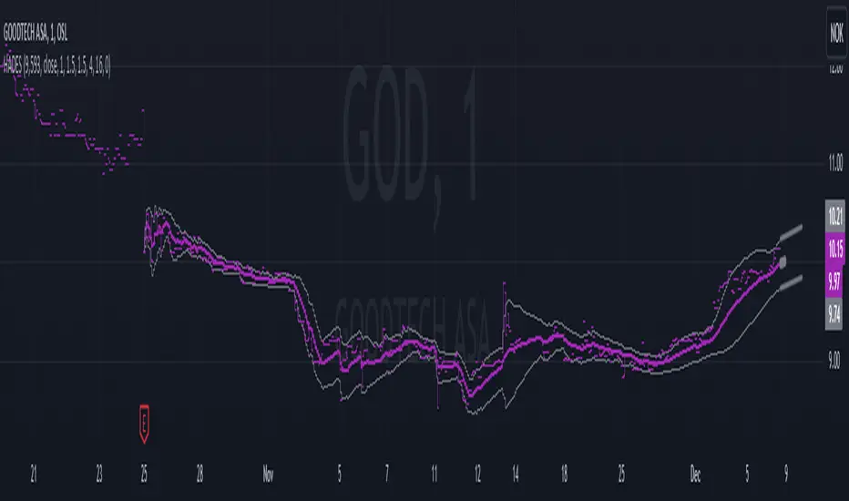
Hybrid Adaptive Double Exponential Smoothing🙏🏻 This is HADES (Hybrid Adaptive Double Exponential Smoothing) : fully data-driven & adaptive exponential smoothing method, that gains all the necessary info directly from data in the most natural way and needs no subjective parameters & no optimizations. It gets applied to data itself -> to fit residuals & one-point forecast errors, all at O(1) algo complexity. I designed it for streaming high-frequency univariate time series data, such as medical sensor readings, orderbook data, tick charts, requests generated by a backend, etc.
The HADES method is:
fit & forecast = a + b * (1 / alpha + T - 1)
T = 0 provides in-sample fit for the current datum, and T + n provides forecast for n datapoints.
y = input time series
a = y, if no previous data exists
b = 0, if no previous data exists
otherwise:
a = alpha * y + (1 - alpha) * a
b = alpha * (a - a ) + (1 - alpha) * b
alpha = 1 / sqrt(len * 4)
len = min(ceil(exp(1 / sig)), available data)
sig = sqrt(Absolute net change in y / Sum of absolute changes in y)
For the start datapoint when both numerator and denominator are zeros, we define 0 / 0 = 1
...
The same set of operations gets applied to the data first, then to resulting fit absolute residuals to build prediction interval, and finally to absolute forecasting errors (from one-point ahead forecast) to build forecasting interval:
prediction interval = data fit +- resoduals fit * k
forecasting interval = data opf +- errors fit * k
where k = multiplier regulating intervals width, and opf = one-point forecasts calculated at each time t
...
How-to:
0) Apply to your data where it makes sense, eg. tick data;
1) Use power transform to compensate for multiplicative behavior in case it's there;
2) If you have complete data or only the data you need, like the full history of adjusted close prices: go to the next step; otherwise, guided by your goal & analysis, adjust the 'start index' setting so the calculations will start from this point;
3) Use prediction interval to detect significant deviations from the process core & make decisions according to your strategy;
4) Use one-point forecast for nowcasting;
5) Use forecasting intervals to ~ understand where the next datapoints will emerge, given the data-generating process will stay the same & lack structural breaks.
I advise k = 1 or 1.5 or 4 depending on your goal, but 1 is the most natural one.
...
Why exponential smoothing at all? Why the double one? Why adaptive? Why not Holt's method?
1) It's O(1) algo complexity & recursive nature allows it to be applied in an online fashion to high-frequency streaming data; otherwise, it makes more sense to use other methods;
2) Double exponential smoothing ensures we are taking trends into account; also, in order to model more complex time series patterns such as seasonality, we need detrended data, and this method can be used to do it;
3) The goal of adaptivity is to eliminate the window size question, in cases where it doesn't make sense to use cumulative moving typical value;
4) Holt's method creates a certain interaction between level and trend components, so its results lack symmetry and similarity with other non-recursive methods such as quantile regression or linear regression. Instead, I decided to base my work on the original double exponential smoothing method published by Rob Brown in 1956, here's the original source , it's really hard to find it online. This cool dude is considered the one who've dropped exponential smoothing to open access for the first time🤘🏻
R&D; log & explanations
If you wanna read this, you gotta know, you're taking a great responsability for this long journey, and it gonna be one hell of a trip hehe
Machine learning, apprentissage automatique, машинное обучение, digital signal processing, statistical learning, data mining, deep learning, etc., etc., etc.: all these are just artificial categories created by the local population of this wonderful world, but what really separates entities globally in the Universe is solution complexity / algorithmic complexity.
In order to get the game a lil better, it's gonna be useful to read the HTES script description first. Secondly, let me guide you through the whole R&D; process.
To discover (not to invent) the fundamental universal principle of what exponential smoothing really IS, it required the review of the whole concept, understanding that many things don't add up and don't make much sense in currently available mainstream info, and building it all from the beginning while avoiding these very basic logical & implementation flaws.
Given a complete time t, and yet, always growing time series population that can't be logically separated into subpopulations, the very first question is, 'What amount of data do we need to utilize at time t?'. Two answers: 1 and all. You can't really gain much info from 1 datum, so go for the second answer: we need the whole dataset.
So, given the sequential & incremental nature of time series, the very first and basic thing we can do on the whole dataset is to calculate a cumulative , such as cumulative moving mean or cumulative moving median.
Now we need to extend this logic to exponential smoothing, which doesn't use dataset length info directly, but all cool it can be done via a formula that quantifies the relationship between alpha (smoothing parameter) and length. The popular formulas used in mainstream are:
alpha = 1 / length
alpha = 2 / (length + 1)
The funny part starts when you realize that Cumulative Exponential Moving Averages with these 2 alpha formulas Exactly match Cumulative Moving Average and Cumulative (Linearly) Weighted Moving Average, and the same logic goes on:
alpha = 3 / (length + 1.5) , matches Cumulative Weighted Moving Average with quadratic weights, and
alpha = 4 / (length + 2) , matches Cumulative Weighted Moving Average with cubic weghts, and so on...
It all just cries in your shoulder that we need to discover another, native length->alpha formula that leverages the recursive nature of exponential smoothing, because otherwise, it doesn't make sense to use it at all, since the usual CMA and CMWA can be computed incrementally at O(1) algo complexity just as exponential smoothing.
From now on I will not mention 'cumulative' or 'linearly weighted / weighted' anymore, it's gonna be implied all the time unless stated otherwise.
What we can do is to approach the thing logically and model the response with a little help from synthetic data, a sine wave would suffice. Then we can think of relationships: Based on algo complexity from lower to higher, we have this sequence: exponential smoothing @ O(1) -> parametric statistics (mean) @ O(n) -> non-parametric statistics (50th percentile / median) @ O(n log n). Based on Initial response from slow to fast: mean -> median Based on convergence with the real expected value from slow to fast: mean (infinitely approaches it) -> median (gets it quite fast).
Based on these inputs, we need to discover such a length->alpha formula so the resulting fit will have the slowest initial response out of all 3, and have the slowest convergence with expected value out of all 3. In order to do it, we need to have some non-linear transformer in our formula (like a square root) and a couple of factors to modify the response the way we need. I ended up with this formula to meet all our requirements:
alpha = sqrt(1 / length * 2) / 2
which simplifies to:
alpha = 1 / sqrt(len * 8)
^^ as you can see on the screenshot; where the red line is median, the blue line is the mean, and the purple line is exponential smoothing with the formulas you've just seen, we've met all the requirements.
Now we just have to do the same procedure to discover the length->alpha formula but for double exponential smoothing, which models trends as well, not just level as in single exponential smoothing. For this comparison, we need to use linear regression and quantile regression instead of the mean and median.
Quantile regression requires a non-closed form solution to be solved that you can't really implement in Pine Script, but that's ok, so I made the tests using Python & sklearn:
paste.pics
^^ on this screenshot, you can see the same relationship as on the previous screenshot, but now between the responses of quantile regression & linear regression.
I followed the same logic as before for designing alpha for double exponential smoothing (also considered the initial overshoots, but that's a little detail), and ended up with this formula:
alpha = sqrt(1 / length) / 2
which simplifies to:
alpha = 1 / sqrt(len * 4)
Btw, given the pattern you see in the resulting formulas for single and double exponential smoothing, if you ever want to do triple (not Holt & Winters) exponential smoothing, you'll need len * 2 , and just len * 1 for quadruple exponential smoothing. I hope that based on this sequence, you see the hint that Maybe 4 rounds is enough.
Now since we've dealt with the length->alpha formula, we can deal with the adaptivity part.
Logically, it doesn't make sense to use a slower-than-O(1) method to generate input for an O(1) method, so it must be something universal and minimalistic: something that will help us measure consistency in our data, yet something far away from statistics and close enough to topology.
There's one perfect entity that can help us, this is fractal efficiency. The way I define fractal efficiency can be checked at the very beginning of the post, what matters is that I add a square root to the formula that is not typically added.
As explained in the description of my metric QSFS , one of the reasons for SQRT-transformed values of fractal efficiency applied in moving window mode is because they start to closely resemble normal distribution, yet with support of (0, 1). Data with this interesting property (normally distributed yet with finite support) can be modeled with the beta distribution.
Another reason is, in infinitely expanding window mode, fractal efficiency of every time series that exhibits randomness tends to infinitely approach zero, sqrt-transform kind of partially neutralizes this effect.
Yet another reason is, the square root might better reflect the dimensional inefficiency or degree of fractal complexity, since it could balance the influence of extreme deviations from the net paths.
And finally, fractals exhibit power-law scaling -> measures like length, area, or volume scale in a non-linear way. Adding a square root acknowledges this intrinsic property, while connecting our metric with the nature of fractals.
---
I suspect that, given analogies and connections with other topics in geometry, topology, fractals and most importantly positive test results of the metric, it might be that the sqrt transform is the fundamental part of fractal efficiency that should be applied by default.
Now the last part of the ballet is to convert our fractal efficiency to length value. The part about inverse proportionality is obvious: high fractal efficiency aka high consistency -> lower window size, to utilize only the last data that contain brand new information that seems to be highly reliable since we have consistency in the first place.
The non-obvious part is now we need to neutralize the side effect created by previous sqrt transform: our length values are too low, and exponentiation is the perfect candidate to fix it since translating fractal efficiency into window sizes requires something non-linear to reflect the fractal dynamics. More importantly, using exp() was the last piece that let the metric shine, any other transformations & formulas alike I've tried always had some weird results on certain data.
That exp() in the len formula was the last piece that made it all work both on synthetic and on real data.
^^ a standalone script calculating optimal dynamic window size
Omg, THAT took time to write. Comment and/or text me if you need
...
"Versace Pip-Boy, I'm a young gun coming up with no bankroll" 👻
∞
Historical High/Lows Statistical Analysis(More Timeframe interval options coming in the future)
Indicator Description
The Hourly and Weekly High/Low (H/L) Analysis indicator provides a powerful tool for tracking the most frequent high and low points during different periods, specifically on an hourly basis and a weekly basis, broken down by the days of the week (DOTW). This indicator is particularly useful for traders seeking to understand historical behavior and patterns of high/low occurrences across both hourly intervals and weekly days, helping them make more informed decisions based on historical data.
With its customizable options, this indicator is versatile and applicable to a variety of trading strategies, ranging from intraday to swing trading. It is designed to meet the needs of both novice and experienced traders.
Key Features
Hourly High/Low Analysis:
Tracks and displays the frequency of hourly high and low occurrences across a user-defined date range.
Enables traders to identify which hours of the day are historically more likely to set highs or lows, offering valuable insights into intraday price action.
Customizable options for:
Hourly session start and end times.
22-hour session support for futures traders.
Hourly label formatting (e.g., 12-hour or 24-hour format).
Table position, size, and design flexibility.
Weekly High/Low Analysis by Day of the Week (DOTW):
Captures weekly high and low occurrences for each day of the week.
Allows traders to evaluate which days are most likely to produce highs or lows during the week, providing insights into weekly price movement tendencies.
Displays the aggregated counts of highs and lows for each day in a clean, customizable table format.
Options for hiding specific days (e.g., weekends) and customizing table appearance.
User-Friendly Table Display:
Both hourly and weekly data are displayed in separate tables, ensuring clarity and non-interference.
Tables can be positioned on the chart according to user preferences and are designed to be visually appealing yet highly informative.
Customizable Date Range:
Users can specify a start and end date for the analysis, allowing them to focus on specific periods of interest.
Possible Uses
Intraday Traders (Hourly Analysis):
Analyze hourly price action to determine which hours are more likely to produce highs or lows.
Identify intraday trading opportunities during statistically significant time intervals.
Use hourly insights to time entries and exits more effectively.
Swing Traders (Weekly DOTW Analysis):
Evaluate weekly price patterns by identifying which days of the week are more likely to set highs or lows.
Plan trades around days that historically exhibit strong movements or price reversals.
Futures and Forex Traders:
Use the 22-hour session feature to exclude the CME break or other session-specific gaps from analysis.
Combine hourly and DOTW insights to optimize strategies for continuous markets.
Data-Driven Trading Strategies:
Use historical high/low data to test and refine trading strategies.
Quantify market tendencies and evaluate whether observed patterns align with your strategy's assumptions.
How the Indicator Works
Hourly H/L Analysis:
The indicator calculates the highest and lowest prices for each hour in the specified date range.
Each hourly high and low occurrence is recorded and aggregated into a table, with counts displayed for all 24 hours.
Users can toggle the visibility of empty cells (hours with no high/low occurrences) and adjust the table's design to suit their preferences.
Supports both 12-hour (AM/PM) and 24-hour formats.
Weekly H/L DOTW Analysis:
The indicator tracks the highest and lowest prices for each day of the week during the user-specified date range.
Highs and lows are identified for the entire week, and the specific days when they occur are recorded.
Counts for each day are aggregated and displayed in a table, with a "Totals" column summarizing the overall occurrences.
The analysis resets weekly, ensuring accurate tracking of high/low days.
Code Breakdown:
Data Aggregation:
The script uses arrays to store counts of high/low occurrences for both hourly and weekly intervals.
Daily data is fetched using the request.security() function, ensuring consistent results regardless of the chart's timeframe.
Weekly Reset Mechanism:
Weekly high/low values are reset at the start of a new week (Monday) to ensure accurate weekly tracking.
A processing flag ensures that weekly data is counted only once at the end of the week (Sunday).
Table Visualization:
Tables are created using the table.new() function, with customizable styles and positions.
Header rows, data rows, and totals are dynamically populated based on the aggregated data.
User Inputs:
Customization options include text colors, background colors, table positioning, label formatting, and date ranges.
Code Explanation
The script is structured into two main sections:
Hourly H/L Analysis:
This section captures and aggregates high/low occurrences for each hour of the day.
The logic is session-aware, allowing users to define custom session times (e.g., 22-hour futures sessions).
Data is displayed in a clean table format with hourly labels.
Weekly H/L DOTW Analysis:
This section tracks weekly highs and lows by day of the week.
Highs and lows are identified for each week, and counts are updated only once per week to prevent duplication.
A user-friendly table displays the counts for each day of the week, along with totals.
Both sections are completely independent of each other to avoid interference. This ensures that enabling or disabling one section does not impact the functionality of the other.
Customization Options
For Hourly Analysis:
Toggle hourly table visibility.
Choose session start and end times.
Select hourly label format (12-hour or 24-hour).
Customize table appearance (colors, position, text size).
For Weekly DOTW Analysis:
Toggle DOTW table visibility.
Choose which days to include (e.g., hide weekends).
Customize table appearance (colors, position, text size).
Select values format (percentages or occurrences).
Conclusion
The Hourly and Weekly H/L Analysis indicator is a versatile tool designed to empower traders with data-driven insights into intraday and weekly market tendencies. Its highly customizable design ensures compatibility with various trading styles and instruments, making it an essential addition to any trader's toolkit.
With its focus on accuracy, clarity, and customization, this indicator adheres to TradingView's guidelines, ensuring a robust and valuable user experience.

CauchyTrend [InvestorUnknown]The CauchyTrend is an experimental tool that leverages a Cauchy-weighted moving average combined with a modified Supertrend calculation. This unique approach provides traders with insight into trend direction, while also offering an optional ATR-based range analysis to understand how often the market closes within, above, or below a defined volatility band.
Core Concepts
Cauchy Distribution and Gamma Parameter
The Cauchy distribution is a probability distribution known for its heavy tails and lack of a defined mean or variance. It is characterized by two parameters: a location parameter (x0, often 0 in our usage) and a scale parameter (γ, "gamma").
Gamma (γ): Determines the "width" or scale of the distribution. Smaller gamma values produce a distribution more concentrated near the center, giving more weight to recent data points, while larger gamma values spread the weight more evenly across the sample.
In this indicator, gamma influences how much emphasis is placed on values closer to the current price versus those further away in time. This makes the resulting weighted average either more reactive or smoother, depending on gamma’s value.
// Cauchy PDF formula used for weighting:
// f(x; γ) = (1/(π*γ)) *
f_cauchyPDF(offset, gamma) =>
numerator = gamma * gamma
denominator = (offset * offset) + (gamma * gamma)
pdf = (1 / (math.pi * gamma)) * (numerator / denominator)
pdf
A chart showing different Cauchy PDFs with various gamma values, illustrating how gamma affects the weight distribution.
Cauchy-Weighted Moving Average (CWMA)
Using the Cauchy PDF, we calculate normalized weights to create a custom Weighted Moving Average. Each bar in the lookback period receives a weight according to the Cauchy PDF. The result is a Cauchy Weighted Average (cwm_avg) that differs from typical moving averages, potentially offering unique sensitivity to price movements.
// Summation of weighted prices using Cauchy distribution weights
cwm_avg = 0.0
for i = 0 to length - 1
w_norm = array.get(weights, i) / sum_w
cwm_avg += array.get(values, i) * w_norm
Supertrend with a Cauchy Twist
The indicator integrates a modified Supertrend calculation using the cwm_avg as its reference point. The Supertrend logic typically sets upper and lower bands based on volatility (ATR), and flips direction when price crosses these bands.
In this case, the Cauchy-based average replaces the usual baseline, aiming to capture trend direction via a different weighting mechanism.
When price closes above the upper band, the trend is considered bullish; closing below the lower band signals a bearish trend.
ATR Stats Range (Optional)
Beyond the fundamental trend detection, the indicator optionally computes ATR-based stats to understand price distribution relative to a volatility corridor centered on the cwm_avg line:
Volatility Range:
Defined as cwm_avg ± (ATR * atr_mult), this range creates upper and lower bands. Turning on atr_stats computes how often the daily close falls: Within the range, Above the upper ATR boundary, Below the lower ATR boundary, Within the range but above cwm_avg, Within the range but below cwm_avg
These statistics can help traders gauge how the market behaves relative to this volatility envelope and possibly identify if the market tends to revert to the mean or break out more often.
Backtesting and Performance Metrics
The code is integrated with a backtesting library that allows users to assess strategy performance historically:
Equity Curve Calculation: Compares CauchyTrend-based signals against the underlying asset.
Performance Metrics Table: Once enabled, displays key metrics such as mean returns, Sharpe Ratio, Sortino Ratio, and more, comparing the strategy to a simple Buy & Hold approach.
Alerts and Notifications
The indicator provides Alerts for key events:
Long Alert: Triggered when the trend flips bullish.
Short Alert: Triggered when the trend flips bearish.
Customization and Calibration
Important: The default parameters are not optimized for any specific instrument or time frame. Traders should:
Adjust the length and gamma parameters to influence how sharply or broadly the cwm_avg reacts to price changes.
Tune the atr_len and atr_mult for the Supertrend logic to better match the asset’s volatility characteristics.
Experiment with atr_stats on/off to see if that additional volatility distribution information provides helpful insights.
Traders may find certain sets of parameters that align better with their preferred trading style, risk tolerance, or asset volatility profile.
Disclaimer: This indicator is for educational and informational purposes only. Past performance in backtesting does not guarantee future results. Always perform due diligence, and consider consulting a qualified financial advisor before trading.

Scatter PlotThe Price Volume Scatter Plot publication aims to provide intrabar detail as a Scatter Plot .
🔶 USAGE
A dot is drawn at every intrabar close price and its corresponding volume , as can seen in the following example:
Price is placed against the white y-axis, where volume is represented on the orange x-axis.
🔹 More detail
A Scatter Plot can be beneficial because it shows more detail compared with a Volume Profile (seen at the right of the Scatter Plot).
The Scatter Plot is accompanied by a "Line of Best Fit" (linear regression line) to help identify the underlying direction, which can be helpful in interpretation/evaluation.
It can be set as a screener by putting multiple layouts together.
🔹 Easier Interpretation
Instead of analysing the 1-minute chart together with volume, this can be visualised in the Scatter Plot, giving a straightforward and easy-to-interpret image of intrabar volume per price level.
One of the scatter plot's advantages is that volumes at the same price level are added to each other.
A dot on the scatter plot represents the cumulated amount of volume at that particular price level, regardless of whether the price closed one or more times at that price level.
Depending on the setting "Direction" , which sets the direction of the Volume-axis, users can hoover to see the corresponding price/volume.
🔹 Highest Intrabar Volume Values
Users can display up to 5 last maximum intrabar volume values, together with the intrabar timeframe (Res)
🔹 Practical Examples
When we divide the recent bar into three parts, the following can be noticed:
Price spends most of its time in the upper part, with relative medium-low volume, since the intrabar close prices are mostly situated in the upper left quadrant.
Price spends a shorter time in the middle part, with relative medium-low volume.
Price moved rarely below 61800 (the lowest part), but it was associated with high volume. None of the intrabar close prices reached the lowest area, and the price bounced back.
In the following example, the latest weekly candle shows a rejection of the 45.8 - 48.5K area, with the highest volume at the 45.8K level.
The next three successive candles show a declining maximum intrabar volume, after which the price broke through the 45.8K area.
🔹 Visual Options
There are many visual options available.
🔹 Change Direction
The Scatter Plot can be set in 4 different directions.
🔶 NOTES
🔹 Notes
The script uses the maximum available resources to draw the price/volume dots, which are 500 boxes and 500 labels. When the population size exceeds 1000, a warning is provided ( Not all data is shown ); otherwise, only the population size is displayed.
The Scatter Plot ideally needs a chart which contains at least 100 bars. When it contains less, a warning will be shown: bars < 100, not all data is shown
🔹 LTF Settings
When 'Auto' is enabled ( Settings , LTF ), the LTF will be the nearest possible x times smaller TF than the current TF. When 'Premium' is disabled, the minimum TF will always be 1 minute to ensure TradingView plans lower than Premium don't get an error.
Examples with current Daily TF (when Premium is enabled):
500 : 3 minute LTF
1500 (default): 1 minute LTF
5000: 30 seconds LTF (1 minute if Premium is disabled)
🔶 SETTINGS
Direction: Direction of Volume-axis; Left, Right, Up or Down
🔹 LTF
LTF: LTF setting
Auto + multiple: Adjusts the initial set LTF
Premium: Enable when your TradingView plan is Premium or higher
🔹 Character
Character: Style of Price/Volume dot
Fade: Increasing this number fades dots at lower price/volume
Color
🔹 Linear Regression
Toggle (enable/disable), color, linestyle
Center Cross: Toggle, color
🔹 Background Color
Fade: Increasing this number fades the background color near lower values
Volume: Background color that intensifies as the volume value on the volume-axis increases
Price: Background color that intensifies as the price value on the price-axis increases
🔹 Labels
Size: Size of price/volume labels
Volume: Color for volume labels/axis
Price: Color for price labels/axis
Display Population Size: Show the population size + warning if it exceeds 1000
🔹 Dashboard
Location: Location of dashboard
Size: Text size
Display LTF: Display the intrabar Lower Timeframe used
Highest IB volume: Display up to 5 previous highest Intrabar Volume values

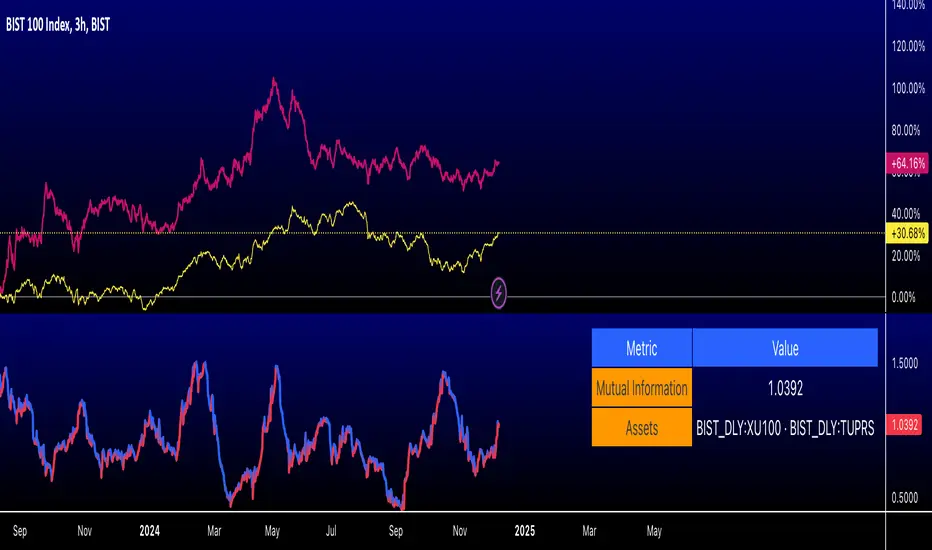
Romantic Information CoefficientThis script calculates the Mutual Information (MI) between the closing prices of two assets over a defined lookback period. Mutual Information is a measure of the shared information between two time-series datasets. A higher MI indicates a stronger relationship between the two assets.
Key Features:
Ticker Inputs: You can select the tickers for two assets. For example, SPY (S&P 500 ETF) and AAPL (Apple stock) can be compared.
Lookback Period: Choose the number of bars to look back and calculate the Mutual Information. A larger lookback period incorporates more data, but may be less responsive to recent price changes.
Bins for Discretization: Control the level of granularity for discretizing the asset prices. More bins result in a more detailed MI calculation but can also reduce the signal-to-noise ratio.
Color Coded MI: The MI plot dynamically changes color to provide visual feedback on whether the relationship between the two assets is strengthening (red) or weakening (blue).
Only for educational purposes. Not in anyway, investment advice.
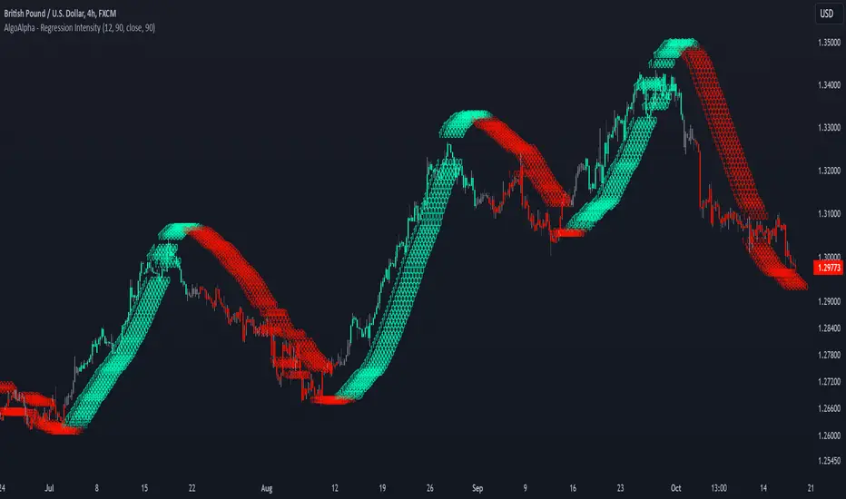
Linear Regression Intensity [AlgoAlpha]Introducing the Linear Regression Intensity indicator by AlgoAlpha, a sophisticated tool designed to measure and visualize the strength of market trends using linear regression analysis. This indicator not only identifies bullish and bearish trends with precision but also quantifies their intensity, providing traders with deeper insights into market dynamics. Whether you’re a novice trader seeking clearer trend signals or an experienced analyst looking for nuanced trend strength indicators, Linear Regression Intensity offers the clarity and detail you need to make informed trading decisions.
Key Features:
📊 Comprehensive Trend Analysis: Utilizes linear regression over customizable periods to assess and quantify trend strength.
🎨 Customizable Appearance: Choose your preferred colors for bullish and bearish trends to align with your trading style.
🔧 Flexible Parameters: Adjust the lookback period, range tolerance, and regression length to tailor the indicator to your specific strategy.
📉 Dynamic Bar Coloring: Instantly visualize trend states with color-coded bars—green for bullish, red for bearish, and gray for neutral.
🏷️ Intensity Labels: Displays dynamic labels that represent the intensity of the current trend, helping you gauge market momentum at a glance.
🔔 Alert Conditions: Set up alerts for strong bullish or bearish trends and trend neutrality to stay ahead of market movements without constant monitoring.
Quick Guide to Using Linear Regression Intensity:
🛠 Add the Indicator: Simply add Linear Regression Intensity to your TradingView chart from your favorites. Customize the settings such as lookback period, range tolerance, and regression length to fit your trading approach.
📈 Market Analysis: Observe the color-coded bars to quickly identify the current trend state. Use the intensity labels to understand the strength behind each trend, allowing for more strategic entry and exit points.
🔔 Set Up Alerts: Enable alerts for when strong bullish or bearish trends are detected or when the trend reaches a neutral zone. This ensures you never miss critical market movements, even when you’re away from the chart.
How It Works:
The Linear Regression Intensity indicator leverages linear regression to calculate the underlying trend of a selected price source over a specified length. By analyzing the consistency of the regression values within a defined lookback period, it determines the trend’s intensity based on a percentage tolerance. The indicator aggregates pairwise comparisons of regression values to assess whether the trend is predominantly upward or downward, assigning a state of bullish, bearish, or neutral accordingly. This state is then visually represented through dynamic bar colors and intensity labels, offering a clear and immediate understanding of market conditions. Additionally, the inclusion of Average True Range (ATR) ensures that the intensity visualization accounts for market volatility, providing a more robust and reliable trend assessment. With customizable settings and alert conditions, Linear Regression Intensity empowers traders to fine-tune their strategies and respond swiftly to evolving market trends.
Elevate your trading strategy with Linear Regression Intensity and gain unparalleled insights into market trends! 🌟📊
IU VaR (Value at Risk) Historical MethodThis Pine Script indicator calculates the **Value at Risk (VaR)** using the **Historical Method** to help traders understand potential losses during a given period( Chart Timeframe) with a specific level of confidence.
What is Value at Risk (VaR) ?
Value at Risk (VaR) is a measure used in finance to estimate the potential loss in value of an asset, portfolio, or investment over a specific time period, given normal market conditions, and at a certain confidence level.
Example:
Suppose you invest ₹1,00,000 in stocks. A VaR of 5% at a 95% confidence level means:
- There is a **95% chance** that you won’t lose more than **₹5,000** in a day.
- Conversely, there is a **5% chance** that your loss could exceed ₹5,000 in a day.
VaR is a helpful tool for understanding risk and making informed investment decisions!
How It Works:
1. The indicator calculates the percentage difference between consecutive bars.
2. The differences are sorted, and the VaR is determined based on the assurance level you specify.
3. A label displays the VaR value on the chart, indicating the potential maximum loss with the selected assurance level within one period eg - ( 1h, 4h , 1D, 1W, 1M etc as per your chart timeframe )
Key Features:
- Customizable Assurance Level:
Set the confidence level (e.g., 95%) to determine the probability of loss.
-Historical Approach:
Uses the past percentage changes in price to calculate the risk.
-Clear Insights:
Displays the calculated VaR value on the chart with an informative tooltip explaining the risk.
Use this tool to better understand your market exposure and manage risk!

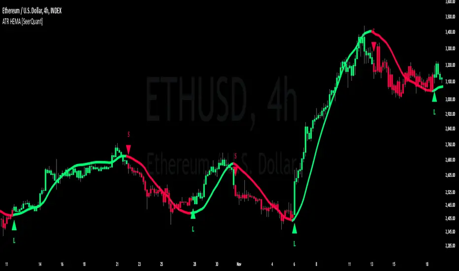
ATR HEMA [SeerQuant]What is the ATR Holt Moving Average (HEMA)?
The ATR Holt Moving Average (HEMA) is an advanced smoothing technique that incorporates the Holt exponential smoothing method. Unlike traditional moving averages, HEMA uses two smoothing factors (alpha and gamma) to forecast both the current trend and the trend change rate. This dual-layer approach improves the responsiveness of the moving average to both stable trends and volatile price swings.
When paired with the Average True Range (ATR), the HEMA becomes even more powerful. The ATR acts as a volatility filter, defining a "neutral zone" where minor price fluctuations are ignored. This allows traders to focus on significant market movements while reducing the impact of noise.
⚙️ How the Code Works
The ATR Holt Moving Average (HEMA) combines trend smoothing with volatility filtering to provide traders with dynamic signals. Here's how it functions step by step:
User Inputs and Customization:
Traders can customize the lengths for HEMA's smoothing factors (alphaL and gammaL), the ATR calculation length, and the neutral zone multiplier (atrMult).
The src input allows users to choose the price source for calculations (e.g., hl2), while the col input offers various color themes (Default, Modern, Warm, Cool).
Holt Exponential Moving Average (HEMA) Calculation:
Alpha and Gamma Smoothing Factors:
alpha controls how much weight is given to the current price versus past prices.
gamma smooths the trend change rate, reducing noise. The HEMA formula combines the current price, the previous HEMA value, and a trend adjustment (via the b variable) to create a smooth yet responsive average. The b variable tracks the rate of change in the HEMA over time, further refining the trend detection.
ATR-Based Neutral Zone:
If the change in HEMA (hemaChange) falls within the neutral zone, it is considered insignificant, and the trend color remains unchanged.
Color and Signal Detection:
Bullish Trend: The color is set to bull when HEMA rises above the neutral zone.
Bearish Trend: The color is set to bear when HEMA falls below the neutral zone.
Neutral Zone: The color remains unchanged, signalling no significant trend.
🚀 Summary
This indicator enhances traditional moving averages by combining the Holt smoothing method with ATR-based volatility filtering. The HEMA adapts to market conditions, detecting trends and transitions while filtering out insignificant price changes. The result is a versatile tool for:
The ATR Holt Moving Average (HEMA) is ideal for traders seeking a balance between responsiveness and stability, offering precise signals in both trending and volatile markets.
📜 Disclaimer
The information provided by this script is for educational and informational purposes only and does not constitute financial, investment, or trading advice. Past performance of any trading system or indicator, including this one, is not indicative of future results. Trading and investing in financial markets involve risk, and it is possible to lose your entire investment.
Users are advised to perform their own due diligence and consult with a licensed financial advisor before making any trading or investment decisions. The creator of this script is not responsible for any trading or investment decisions made based on the use of this script.
This script complies with TradingView's guidelines and is provided as-is, without any guarantee of accuracy, reliability, or performance. Use at your own risk.
Levy Flight Relative Strength Index [SeerQuant]Lévy Flight Relative Strength Index
A nuanced improvement on the classic RSI, the Lévy Flight RSI leverages the Lévy Flight model to calculate dynamic weighted gains and losses, offering improved responsiveness and smoothness in trend detection compared to the regular RSI. Ideal for traders seeking a balance between precision and adaptability, the Lévy Flight RSI is packed with customizable features and a sleek, modern aesthetic.
-----------------------------------------------------------------
🧠 What is Lévy Flight Modelling?
Lévy Flight modelling is a concept derived from probability theory and fractal mathematics, widely applied in fields such as finance and physics. In trading, Lévy Flights describe a random walk process characterized by small, frequent movements interspersed with larger, less frequent movements. This behaviour reflects real-world price dynamics, where markets often exhibit periods of relative calm followed by sharp, volatile movements. The Lévy Flight model introduces a weighting mechanism that amplifies extreme price changes while smoothing smaller ones, providing a more nuanced view of market trends.
In the context of the Lévy Flight RSI, this model enhances traditional RSI calculations by dynamically weighting price changes (gains and losses) based on their magnitude. This results in an RSI that is more responsive to significant price movements, making it ideal for detecting shifts in momentum and market direction.
-----------------------------------------------------------------
🌟 Key Features:
- Dynamic Lévy Flight Modelling: Adjust alpha (1 to 2) for responsive or smooth signals, making it perfect for varying market conditions.
- Custom RSI Smoothing: Choose from multiple moving average types, including TEMA, DEMA, HMA, ALMA, and more, to match your trading style.
- Visually Intuitive: Neon-inspired gradient colours and centered histogram provide instant insights into market conditions.
- Customizable Overbought/Oversold Levels: Clearly defined thresholds, with additional shaded regions for strength identification.
-----------------------------------------------------------------
⚙️ How the Code Works
The Lévy Flight RSI enhances the traditional RSI calculation by incorporating two primary elements:
Dynamic Weighting Using Lévy Flight:
The code calculates the price change (change) on each bar and applies a power function (alpha) to these changes. Gains are raised to the power of alpha (for positive price changes), and losses are similarly transformed (for negative price changes).
The parameter alpha (ranging from 1 to 2) determines the sensitivity of the weighting. Lower values emphasize responsiveness, while higher values smooth out signals.
Enhanced Moving Averages:
The weighted gains and losses are smoothed using a customizable moving average. Options include traditional averages like SMA and EMA, and more advanced ones like TEMA, HMA, and ALMA. These smoothed values are used to calculate the final RSI value.
-----------------------------------------------------------------
📈 Why Use Lévy Flight RSI?
This unique RSI indicator captures price momentum with enhanced sensitivity to market dynamics. Whether you’re trend-following, scalping, or identifying reversals, the Lévy Flight RSI provides robust insights to refine your trading decisions.
-----------------------------------------------------------------
🔧 Inputs:
RSI Settings: Control RSI length, calculation source, and smoothing type.
Lévy Flight Settings: Adjust alpha to tune the indicator's responsiveness.
Style Customization: Tailor the appearance with different colour themes and gradients.
-----------------------------------------------------------------

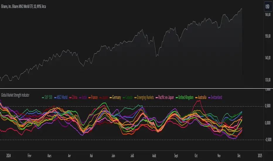
Global Market Strength IndicatorThe Global Market Strength Indicator is a powerful tool for traders and investors. It helps compare the strength of various global markets and indices. This indicator uses the True Strength Index (TSI) to measure market strength.
The indicator retrieves price data for different markets and calculates their TSI values. These values are then plotted on a chart. Each market is represented by a different colored line, making it easy to distinguish between them.
One of the main benefits of this indicator is its comprehensive global view. It covers major indices and country-specific ETFs, giving users a broad perspective on global market trends. This wide coverage allows for easy comparison between different markets and regions.
The indicator is highly customizable. Users can adjust the TSI smoothing period to suit their preferences. They can also toggle the visibility of individual markets. This feature helps reduce chart clutter and allows for more focused analysis.
To use the indicator, apply it to your chart in TradingView. Adjust the settings as needed, and observe the relative positions and movements of the TSI lines. Lines moving higher indicate increasing strength in that market, while lines moving lower suggest weakening markets.
The chart includes reference lines at 0.5 and -0.5. These help identify potential overbought and oversold conditions. Markets with TSI values above 0.5 may be considered strong or potentially overbought. Those below -0.5 may be weak or potentially oversold.
By comparing the movements of different markets, users can identify which markets are leading or lagging. They can also spot potential divergences between related markets. This information can be valuable for identifying sector rotations or shifts in global market sentiment.
A dynamic legend automatically updates to show only the visible markets. This feature improves chart readability and makes it easier to interpret the data.
The Global Market Strength Indicator is a versatile tool that provides valuable insights into global market performance. It helps traders and investors identify trends, compare market performances, and make more informed decisions. Whether you're looking to spot emerging global trends or identify potential trading opportunities, this indicator offers a comprehensive solution for global market analysis.
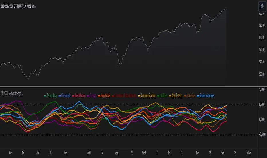
S&P 500 Sector StrengthsThe "S&P 500 Sector Strengths" indicator is a sophisticated tool designed to provide traders and investors with a comprehensive view of the relative performance of various sectors within the S&P 500 index. This indicator utilizes the True Strength Index (TSI) to measure and compare the strength of different sectors, offering valuable insights into market trends and sector rotations.
At its core, the indicator calculates the TSI for each sector using price data obtained through the request.security() function. The TSI, a momentum oscillator, is computed using a user-defined smoothing period, allowing for customization based on individual preferences and trading styles. The resulting TSI values for each sector are then plotted on the chart, creating a visual representation of sector strengths.
To use this indicator effectively, traders should focus on comparing the movements of different sector lines. Sectors with lines moving higher are showing increasing strength, while those with descending lines are exhibiting weakness. This comparative analysis can help identify potential investment opportunities and sector rotations. Additionally, when multiple sector lines move in tandem, it may signal a broader market trend.
The indicator includes dashed lines at 0.5 and -0.5, serving as reference points for overbought and oversold conditions. Sectors with TSI values above 0.5 might be considered overbought, suggesting caution, while those below -0.5 could be viewed as oversold, potentially indicating buying opportunities.
One of the key advantages of this indicator is its flexibility. Users can toggle the visibility of individual sectors and customize their colors, allowing for a tailored analysis experience. This feature is particularly useful when focusing on specific sectors or reducing chart clutter for clearer visualization.
The indicator's ability to provide a comprehensive overview of all major S&P 500 sectors in a single chart is a significant benefit. This consolidated view enables quick comparisons and helps in identifying relative strengths and weaknesses across sectors. Such insights can be invaluable for portfolio allocation decisions and in spotting emerging market trends.
Moreover, the dynamic legend feature enhances the indicator's usability. It automatically updates to display only the visible sectors, improving chart readability and interpretation.
By leveraging this indicator, market participants can gain a deeper understanding of sector dynamics within the S&P 500. This enhanced perspective can lead to more informed decision-making in sector allocation strategies and individual stock selection. The indicator's ability to potentially detect early trends by comparing sector strengths adds another layer of value, allowing users to position themselves ahead of broader market movements.
In conclusion, the "S&P 500 Sector Strengths" indicator is a powerful tool that combines technical analysis with sector comparison. Its user-friendly interface, customizable features, and comprehensive sector coverage make it an valuable asset for traders and investors seeking to navigate the complexities of the S&P 500 market with greater confidence and insight.
ETF-Benchmark AnalyzerHave you ever wondered which ETF performs the best? Which one is the most volatile, or which one has the smallest drawdown?
This Pine Script™ "ETF-Benchmark Analyzer" compares the performance of an ETF (such as SPY, the S&P 500 ETF) against a benchmark, which can also be adjusted by the user. It provides several key financial metrics, such as:
Performance (%): Displays the total return over a specified lookback period (e.g., 1 year). It compares the performance of the ETF against the benchmark and shows the difference.
Alpha (%): Measures the excess return of the ETF over the expected return, which is calculated using the benchmark’s return. Positive alpha indicates that the ETF has outperformed the benchmark, while negative alpha suggests underperformance. This metric is important because it isolates performance that cannot be explained by exposure to the benchmark's movements.
Sharpe Ratio: A risk-adjusted measure of return. It is calculated by dividing the excess return of the ETF (above the risk-free rate) by its standard deviation (volatility). A higher Sharpe ratio indicates better risk-adjusted returns. The Sharpe ratio is calculated for both the ETF and the benchmark, and their difference is displayed as well.
Drawdown: The percentage decrease from the highest price to the lowest price over the lookback period. This is a critical measure of risk, as it shows the largest potential loss an investor might face during a specific period.
Beta: Measures the ETF’s sensitivity to movements in the benchmark. A beta of 1 means the ETF moves in line with the benchmark; greater than 1 means it is more volatile, while less than 1 means it is less volatile.
These metrics provide a holistic view of the ETF’s performance compared to the benchmark, allowing traders to assess the risk and return profile more effectively.
Scientific Sources
Sharpe Ratio: Sharpe, W. F. (1994). The Sharpe Ratio. Journal of Portfolio Management, 21(1), 49-58. This paper defines and develops the Sharpe ratio as a measure of risk-adjusted return.
Alpha and Beta: Jensen, M. C. (1968). The Performance of Mutual Funds in the Period 1945–1964. The Journal of Finance, 23(2), 389-416. This paper discusses the concepts of alpha and beta in the context of mutual fund performance.

Kalman PredictorThe **Kalman Predictor** indicator is a powerful tool designed for traders looking to enhance their market analysis by smoothing price data and projecting future price movements. This script implements a Kalman filter, a statistical method for noise reduction, to dynamically estimate price trends and velocity. Combined with ATR-based confidence bands, it provides actionable insights into potential price movement, while offering clear trend and momentum visualization.
---
#### **Key Features**:
1. **Kalman Filter Smoothing**:
- Dynamically estimates the current price state and velocity to filter out market noise.
- Projects three future price levels (`Next Bar`, `Next +2`, `Next +3`) based on velocity.
2. **Dynamic Confidence Bands**:
- Confidence bands are calculated using ATR (Average True Range) to reflect market volatility.
- Visualizes potential price deviation from projected levels.
3. **Trend Visualization**:
- Color-coded prediction dots:
- **Green**: Indicates an upward trend (positive velocity).
- **Red**: Indicates a downward trend (negative velocity).
- Dynamically updated label displaying the current trend and velocity value.
4. **User Customization**:
- Inputs to adjust the process and measurement noise for the Kalman filter (`q` and `r`).
- Configurable ATR multiplier for confidence bands.
- Toggleable trend label with adjustable positioning.
---
#### **How It Works**:
1. **Kalman Filter Core**:
- The Kalman filter continuously updates the estimated price state and velocity based on real-time price changes.
- Projections are based on the current price trend (velocity) and extend into the future (Next Bar, +2, +3).
2. **Confidence Bands**:
- Calculated using ATR to provide a dynamic range around the projected future prices.
- Indicates potential volatility and helps traders assess risk-reward scenarios.
3. **Trend Label**:
- Updates dynamically on the last bar to show:
- Current trend direction (Up/Down).
- Velocity value, providing insight into the expected magnitude of the price movement.
---
#### **How to Use**:
- **Trend Analysis**:
- Observe the direction and spacing of the prediction dots relative to current candles.
- Larger spacing indicates a potential strong move, while clustering suggests consolidation.
- **Risk Management**:
- Use the confidence bands to gauge potential price volatility and set stop-loss or take-profit levels accordingly.
- **Pullback Detection**:
- Look for flattening or clustering of dots during trends as a signal of potential pullbacks or reversals.
---
#### **Customizable Inputs**:
- **Kalman Filter Parameters**:
- `lookback`: Adjusts the smoothing window.
- `q`: Process noise (higher values make the filter more reactive to changes).
- `r`: Measurement noise (controls sensitivity to price deviations).
- **Confidence Bands**:
- `band_multiplier`: Multiplies ATR to define the range of confidence bands.
- **Visualization**:
- `show_label`: Option to toggle the trend label.
- `label_offset`: Adjusts the label’s distance from the price for better visibility.
---
#### **Examples of Use**:
- **Scalping**: Use on lower timeframes (e.g., 1-minute, 5-minute) to detect short-term price trends and reversals.
- **Swing Trading**: Identify pullbacks or continuations on higher timeframes (e.g., 4-hour, daily) by observing the prediction dots and confidence bands.
- **Risk Assessment**: Confidence bands help visualize potential price volatility, aiding in the placement of stops and targets.
---
#### **Notes for Traders**:
- The **Kalman Predictor** does not predict the future with certainty but provides a statistically informed estimate of price movement.
- Confidence bands are based on historical volatility and should be used as guidelines, not guarantees.
- Always combine this tool with other analysis techniques for optimal results.
---
This script is open-source, and the Kalman filter logic has been implemented uniquely to integrate noise reduction with dynamic confidence band visualization. If you find this indicator useful, feel free to share your feedback and experiences!
---
#### **Credits**:
This script was developed leveraging the statistical principles of Kalman filtering and is entirely original. It incorporates ATR for dynamic confidence band calculations to enhance trader usability and market adaptability.

BTC Price Percentage Difference( Bitfinex - Coinbase)Introduction:
The BTC Price Percentage Difference Histogram Indicator is a powerful tool designed to help traders visualize and capitalize on the price discrepancies of Bitcoin (BTC) between two major exchanges: Bitfinex and Coinbase. By calculating the real-time percentage difference of BTC-USD prices and displaying it as a color-coded histogram, this indicator enables you to quickly spot potential arbitrage opportunities and gain deeper insights into market dynamics.
Features:
• Real-Time Percentage Difference Calculation:
• Computes the percentage difference between BTC-USD prices on Bitfinex and Coinbase.
• Color-Coded Histogram Visualization:
• Green Bars: Indicate that the BTC price on Bitfinex is higher than on Coinbase.
• Red Bars: Indicate that the BTC price on Bitfinex is lower than on Coinbase.
• User-Friendly and Intuitive:
• Simple setup with no additional inputs required.
• Automatically adapts to the chart’s timeframe for seamless integration.
Why Bitfinex Whales Matter:
Bitfinex is renowned for hosting some of the largest Bitcoin traders, often referred to as “whales.” These influential players have the capacity to move the market, and historically, they’ve demonstrated a high success rate in buying at market bottoms and selling at market tops. By tracking the price discrepancies between Bitfinex and other exchanges like Coinbase, you can gain valuable insights into the sentiment and actions of these key market participants.

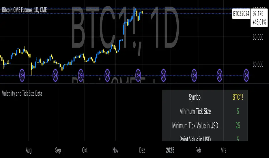
Volatility and Tick Size DataThis indicator, titled "Tick Information & Standard Deviation Table," provides detailed insights into market microstructure, including tick size, point value, and standard deviation values calculated based on the True Range. It helps visualize essential trading parameters that influence transaction costs, risk management, and portfolio performance, including volatility measures that can guide investment strategies.
Why These Data Points Are Important for Portfolio Management
Tick Size and Point Value:
Tick size refers to the smallest possible price movement in a given asset. It defines the granularity of the price changes, affecting how precise the market price can be at any moment. Point value reflects the monetary value of a single price movement (one tick). These two data points are essential for understanding transaction costs and for evaluating how much capital is at risk per price movement. Smaller tick sizes may lead to more efficient pricing in high-frequency trading strategies (Hasbrouck, 2009).
Reference: Hasbrouck, J. (2009). Empirical Market Microstructure. Foundations and Trends® in Finance, 3(4), 169-272.
Standard Deviations and Volatility:
Standard deviation measures the variability or volatility of an asset's price over a set period. This data point is critical for portfolio management, as it helps to quantify risk and predict potential price movements. True Range and its standard deviations provide a more comprehensive measure of market volatility than just price fluctuations, as they include gaps and extreme price changes. Investors use volatility data to assess the potential risk and adjust portfolio allocations accordingly (Ang, 2006).
Reference: Ang, A. (2006). Asset Management: A Systematic Approach to Factor Investing. Oxford University Press.
Risk Management:
The ability to quantify risk through metrics like the 1st, 2nd, and 3rd standard deviations of the true range is essential for implementing risk controls within a portfolio. By incorporating volatility data, portfolio managers can adjust their strategies for different market conditions, potentially reducing exposure to high-risk environments. These volatility measures help in setting stop-loss levels, optimizing position sizes, and managing the portfolio’s overall risk-return profile (Black & Scholes, 1973).
Reference: Black, F., & Scholes, M. (1973). The Pricing of Options and Corporate Liabilities. Journal of Political Economy, 81(3), 637-654.
Portfolio Diversification and Hedging:
Understanding asset volatility and transaction costs is critical when constructing a diversified portfolio. By using the standard deviations from this indicator, investors can better identify assets that may provide diversification benefits, potentially reducing the overall portfolio risk. Moreover, the point values and tick sizes help assess the cost-effectiveness of various assets, enabling portfolio managers to implement more efficient hedging strategies (Markowitz, 1952).
Reference: Markowitz, H. (1952). Portfolio Selection. The Journal of Finance, 7(1), 77-91.
Conclusion
The Tick Information & Standard Deviation Table provides critical market data that informs the risk management, diversification, and pricing strategies used in portfolio management. By incorporating tick size, point value, and volatility metrics, investors can make more informed decisions, better manage risk, and optimize the returns on their portfolios. The data serves as an essential tool for aligning asset selection and portfolio allocations with the investor's risk tolerance and market conditions.
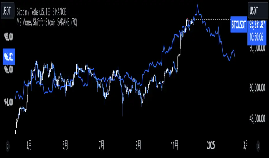
M2 Money Shift for Bitcoin [SAKANE]M2 Money Shift for Bitcoin was developed to visualize the impact of M2 Money, a macroeconomic indicator, on the Bitcoin market and to support trade analysis.
Bitcoin price fluctuations have a certain correlation with cycles in M2 money supply.In particular, it has been noted that changes in M2 supply can affect the bitcoin price 70 days in advance.Very high correlations have been observed in recent years in particular, making it useful as a supplemental analytical tool for trading.
Support for M2 data from multiple countries
M2 supply data from the U.S., Europe, China, Japan, the U.K., Canada, Australia, and India are integrated and all are displayed in U.S. dollar equivalents.
Slide function
Using the "Slide Days Forward" setting, M2 data can be slid up to 500 days, allowing for flexible analysis that takes into account the time difference from the bitcoin price.
Plotting Total Liquidity
Plot total liquidity (in trillions of dollars) by summing the M2 supply of multiple countries.
How to use
After applying the indicator to the chart, activate the M2 data for the required country from the settings screen. 2.
2. adjust "Slide Days Forward" to analyze the relationship between changes in M2 supply and bitcoin price
3. refer to the Gross Liquidity plot to build a trading strategy that takes into account macroeconomic influences.
Notes.
This indicator is an auxiliary tool for trade analysis and does not guarantee future price trends.
The relationship between M2 supply and bitcoin price depends on many factors and should be used in conjunction with other analysis methods.
N-Degree Moment-Based Adaptive Detection🙏🏻 N-Degree Moment-Based Adaptive Detection (NDMBAD) method is a generalization of MBAD since the horizontal line fit passing through the data's mean can be simply treated as zero-degree polynomial regression. We can extend the MBAD logic to higher-degree polynomial regression.
I don't think I need to talk a lot about the thing there; the logic is really the same as in MBAD, just hit the link above and read if you want. The only difference is now we can gather cumulants not only from the horizontal mean fit (degree = 0) but also from higher-order polynomial regression fit, including linear regression (degree = 1).
Why?
Simply because residuals from the 0-degree model don't contain trend information, and while in some cases that's exactly what you need, in other cases, you want to model your trend explicitly. Imagine your underlying process trends in a steady manner, and you want to control the extreme deviations from the process's core. If you're going to use 0-degree, you'll be treating this beautiful steady trend as a residual itself, which "constantly deviates from the process mean." It doesn't make much sense.
How?
First, if you set the length to 0, you will end up with the function incrementally applied to all your data starting from bar_index 0. This can be called the expanding window mode. That's the functionality I include in all my scripts lately (where it makes sense). As I said in the MBAD description, choosing length is a matter of doing business & applied use of my work, but I think I'm open to talk about it.
I don't see much sense in using degree > 1 though (still in research on it). If you have dem curves, you can use Fourier transform -> spectral filtering / harmonic regression (regression with Fourier terms). The job of a degree > 0 is to model the direction in data, and degree 1 gets it done. In mean reversion strategies, it means that you don't wanna put 0-degree polynomial regression (i.e., the mean) on non-stationary trending data in moving window mode because, this way, your residuals will be contaminated with the trend component.
By the way, you can send thanks to @aaron294c , he said like mane MBAD is dope, and it's gonna really complement his work, so I decided to drop NDMBAD now, gonna be more useful since it covers more types of data.
I wanned to call it N-Order Moment Adaptive Detection because it abbreviates to NOMAD, which sounds cool and suits me well, because when I perform as a fire dancer, nomad style is one of my outfits. Burning Man stuff vibe, you know. But the problem is degree and order really mean two different things in the polynomial context, so gotta stay right & precise—that's the priority.
∞

AadTrend [InvestorUnknown]The AadTrend indicator is an experimental trading tool that combines a user-selected moving average with the Average Absolute Deviation (AAD) from this moving average. This combination works similarly to the Supertrend indicator but offers additional flexibility and insights. In addition to generating Long and Short signals, the AadTrend indicator identifies RISK-ON and RISK-OFF states for each trade direction, highlighting areas where taking on more risk may be considered.
Core Concepts and Features
Moving Average (User-Selected Type)
The indicator allows users to select from various types of moving averages to suit different trading styles and market conditions:
Simple Moving Average (SMA)
Exponential Moving Average (EMA)
Hull Moving Average (HMA)
Double Exponential Moving Average (DEMA)
Triple Exponential Moving Average (TEMA)
Relative Moving Average (RMA)
Fractal Adaptive Moving Average (FRAMA)
Average Absolute Deviation (AAD)
The Average Absolute Deviation measures the average distance between each data point and the mean, providing a robust estimation of volatility.
aad(series float src, simple int length, simple string avg_type) =>
avg = // Moving average as selected by the user
abs_deviations = math.abs(src - avg)
ta.sma(abs_deviations, length)
This provides a volatility measure that adapts to recent market conditions.
Combining Moving Average and AAD
The indicator creates upper and lower bands around the moving average using the AAD, similar to how the Supertrend indicator uses Average True Range (ATR) for its bands.
AadTrend(series float src, simple int length, simple float aad_mult, simple string avg_type) =>
// Calculate AAD (volatility measure)
aad_value = aad(src, length, avg_type)
// Calculate the AAD-based moving average by scaling the price data with AAD
avg = switch avg_type
"SMA" => ta.sma(src, length)
"EMA" => ta.ema(src, length)
"HMA" => ta.hma(src, length)
"DEMA" => ta.dema(src, length)
"TEMA" => ta.tema(src, length)
"RMA" => ta.rma(src, length)
"FRAMA" => ta.frama(src, length)
avg_p = avg + (aad_value * aad_mult)
avg_m = avg - (aad_value * aad_mult)
var direction = 0
if ta.crossover(src, avg_p)
direction := 1
else if ta.crossunder(src, avg_m)
direction := -1
A chart displaying the moving average with upper and lower AAD bands enveloping the price action.
Signals and Trade States
1. Long and Short Signals
Long Signal: Generated when the price crosses above the upper AAD band,
Short Signal: Generated when the price crosses below the lower AAD band.
2. RISK-ON and RISK-OFF States
These states provide additional insight into the strength of the current trend and potential opportunities for taking on more risk.
RISK-ON Long: When the price moves significantly above the upper AAD band after a Long signal.
RISK-OFF Long: When the price moves back below the upper AAD band, suggesting caution.
RISK-ON Short: When the price moves significantly below the lower AAD band after a Short signal.
RISK-OFF Short: When the price moves back above the lower AAD band.
Highlighted areas on the chart representing RISK-ON and RISK-OFF zones for both Long and Short positions.
A chart showing the filled areas corresponding to trend directions and RISK-ON zones
Backtesting and Performance Metrics
While the AadTrend indicator focuses on generating signals and highlighting risk areas, it can be integrated with backtesting frameworks to evaluate performance over historical data.
Integration with Backtest Library:
import InvestorUnknown/BacktestLibrary/1 as backtestlib
Customization and Calibration
1. Importance of Calibration
Default Settings Are Experimental: The default parameters are not optimized for any specific market condition or asset.
User Calibration: Traders should adjust the length, aad_mult, and avg_type parameters to align the indicator with their trading strategy and the characteristics of the asset being analyzed.
2. Factors to Consider
Market Volatility: Higher volatility may require adjustments to the aad_mult to avoid false signals.
Trading Style: Short-term traders might prefer faster-moving averages like EMA or HMA, while long-term traders might opt for SMA or FRAMA.
Alerts and Notifications
The AadTrend indicator includes built-in alert conditions to notify traders of significant market events:
Long and Short Alerts:
alertcondition(long_alert, "LONG (AadTrend)", "AadTrend flipped ⬆LONG⬆")
alertcondition(short_alert, "SHORT (AadTrend)", "AadTrend flipped ⬇Short⬇")
RISK-ON and RISK-OFF Alerts:
alertcondition(risk_on_long, "RISK-ON LONG (AadTrend)", "RISK-ON LONG (AadTrend)")
alertcondition(risk_off_long, "RISK-OFF LONG (AadTrend)", "RISK-OFF LONG (AadTrend)")
alertcondition(risk_on_short, "RISK-ON SHORT (AadTrend)", "RISK-ON SHORT (AadTrend)")
alertcondition(risk_off_short, "RISK-OFF SHORT (AadTrend)", "RISK-OFF SHORT (AadTrend)")
Important Notes and Disclaimer
Experimental Nature: The AadTrend indicator is experimental and should be used with caution.
No Guaranteed Performance: Past performance is not indicative of future results. Backtesting results may not reflect real trading conditions.
User Responsibility: Traders and investors should thoroughly test and calibrate the indicator settings before applying it to live trading.
Risk Management: Always use proper risk management techniques, including stop-loss orders and position sizing.

COT Report Indicator with Selectable Data TypeOverview
The COT Report Indicator with Selectable Data Types is a powerful tool for traders who want to gain deeper insights into market sentiment using the Commitment of Traders (COT) data. This indicator allows you to visualize the net positions of different participant categories—Commercial, Noncommercial, and Nonreportable—directly on your chart.
The indicator is fully customizable, allowing you to select the type of data to display, sync with your chart's timeframe, or choose a custom timeframe. Whether you're analyzing gold, crude oil, indices, or forex pairs, this indicator adapts seamlessly to your trading needs.
Features
Dynamic Data Selection:
Choose between Commercial, Noncommercial, or Nonreportable data types.
Analyze the net positions of market participants for more informed decision-making.
Flexible Timeframes:
Sync with the chart's timeframe for quick analysis.
Select a custom timeframe to view COT data at your preferred granularity.
Wide Asset Coverage:
Supports various assets, including gold, silver, crude oil, indices, and forex pairs.
Automatically adjusts to the ticker you're analyzing.
Clear Visual Representation:
Displays Net Long, Net Short, and Net Difference (Long - Short) positions with distinct colors for easy interpretation.
Error Handling:
Alerts you if the symbol is unsupported, ensuring you know when COT data isn't available for a specific asset.
How to Use
Add the Indicator:
Click "Indicators" in TradingView and search for "COT Report Indicator with Selectable Data Types."
Add it to your chart.
Customize the Settings:
Data Type: Choose between Commercial, Noncommercial, or Nonreportable positions.
Data Source: Select "Futures Only" or "Futures and Options."
Timeframe: Sync with the chart's timeframe or specify a custom one (e.g., weekly, monthly).
Interpret the Data:
Green Line: Net Long Positions.
Red Line: Net Short Positions.
Black Line: Net Difference (Long - Short).
Supported Symbols:
Gold, Silver, Crude Oil, Natural Gas, Forex Pairs, S&P 500, US30, NAS100, and more.
Who Can Benefit
Trend Followers: Identify the buying/selling trends of Commercial and Noncommercial participants.
Sentiment Analysts: Understand shifts in sentiment among major market players.
Long-Term Traders: Use COT data to confirm or contradict your fundamental analysis.
Example Use Case
For example, if you're trading gold (XAUUSD) and select Noncommercial Positions, you’ll see the long and short positions of speculators. An increase in net long positions may signal bullish sentiment, while an increase in net short positions may indicate bearish sentiment.
If you switch to Commercial Positions, you'll get insights into how hedgers and institutions are positioning themselves, helping you confirm or counterbalance your current trading strategy.
Limitations
The indicator only works with supported symbols (COT data availability is limited to specific assets).
The COT data is updated weekly, so it is not suitable for short-term intraday trading.

Weekly H/L DOTWThe Weekly High/Low Day Breakdown indicator provides a detailed statistical analysis of the days of the week (Monday to Sunday) on which weekly highs and lows occur for a given timeframe. It helps traders identify recurring patterns, correlations, and tendencies in price behavior across different days of the week. This can assist in planning trading strategies by leveraging day-specific patterns.
The indicator visually displays the statistical distribution of weekly highs and lows in an easy-to-read tabular format on your chart. Users can customize how the data is displayed, including whether the table is horizontal or vertical, the size of the text, and the position of the table on the chart.
Key Features:
Weekly Highs and Lows Identification:
Tracks the highest and lowest price of each trading week.
Records the day of the week on which these events occur.
Customizable Table Layout:
Option to display the table horizontally or vertically.
Text size can be adjusted (Small, Normal, or Large).
Table position is customizable (top-right, top-left, bottom-right, or bottom-left of the chart).
Flexible Value Representation:
Allows the display of values as percentages or as occurrences.
Default setting is occurrences, but users can toggle to percentages as needed.
Day-Specific Display:
Option to hide Saturday or Sunday if these days are not relevant to your trading strategy.
Visible Date Range:
Users can define a start and end date for the analysis, focusing the results on a specific period of interest.
User-Friendly Interface:
The table dynamically updates based on the selected timeframe and visibility of the chart, ensuring the displayed data is always relevant to the current context.
Adaptable to Custom Needs:
Includes all-day names from Monday to Sunday, but allows for specific days to be excluded based on the user’s preferences.
Indicator Logic:
Data Collection:
The indicator collects daily high, low, day of the week, and time data from the selected ticker using the request.security() function with a daily timeframe ('D').
Weekly Tracking:
Tracks the start and end times of each week.
During each week, it monitors the highest and lowest prices and the days they occurred.
Weekly Closure:
When a week ends (detected by Sunday’s daily candle), the indicator:
Updates the statistics for the respective days of the week where the weekly high and low occurred.
Resets tracking variables for the next week.
Visible Range Filter:
Only processes data for weeks that fall within the visible range of the chart, ensuring the table reflects only the visible portion of the chart.
Statistical Calculations:
Counts the number of weekly highs and lows for each day.
Calculates percentages relative to the total number of weeks in the visible range.
Dynamic Table Display:
Depending on user preferences, displays the data either horizontally or vertically.
Formats the table with proper alignment, colors, and text sizes for easy readability.
Custom Value Representation:
If set to "percentages," displays the percentage of weeks a high/low occurred on each day.
If set to "occurrences," displays the raw count of weekly highs/lows for each day.
Input Parameters:
High Text Color:
Color for the text in the "Weekly High" row or column.
Low Text Color:
Color for the text in the "Weekly Low" row or column.
High Background Color:
Background color for the "Weekly High" row or column.
Low Background Color:
Background color for the "Weekly Low" row or column.
Table Background Color:
General background color for the table.
Hide Saturday:
Option to exclude Saturday from the analysis and table.
Hide Sunday:
Option to exclude Sunday from the analysis and table.
Values Format:
Dropdown menu to select "percentages" or "occurrences."
Default value: "occurrences."
Table Position:
Dropdown menu to select the table position on the chart: "top_right," "top_left," "bottom_right," "bottom_left."
Default value: "top_right."
Text Size:
Dropdown menu to select text size: "Small," "Normal," "Large."
Default value: "Normal."
Vertical Table Format:
Checkbox to toggle the table layout:
Checked: Table displays days vertically, with Monday at the top.
Unchecked: Table displays days horizontally.
Start Date:
Allows users to specify the starting date for the analysis.
End Date:
Allows users to specify the ending date for the analysis.
Use Cases:
Day-Specific Pattern Recognition:
Identify if specific days, such as Monday or Friday, are more likely to form weekly highs or lows.
Seasonal Analysis:
Use the start and end date filters to analyze patterns during specific trading seasons.
Strategy Development:
Plan day-based entry and exit strategies by identifying recurring patterns in weekly highs/lows.
Historical Review:
Study historical data to understand how market behavior has changed over time.
TradingView TOS Compliance Notes:
Originality:
This script is uniquely designed to provide day-based statistics for weekly highs and lows, which is not a common feature in other publicly available indicators.
Usefulness:
Offers practical insights for traders interested in understanding day-specific price behavior.
Detailed Description:
Fully explains the purpose, features, logic, input settings, and use cases of the indicator.
Includes clear and concise details on how each input works.
Clear Input Descriptions:
All input parameters are clearly named and explained in the script and this description.
No Redundant Functionality:
Focused specifically on tracking weekly highs and lows, ensuring the indicator serves a distinct purpose without unnecessary features.
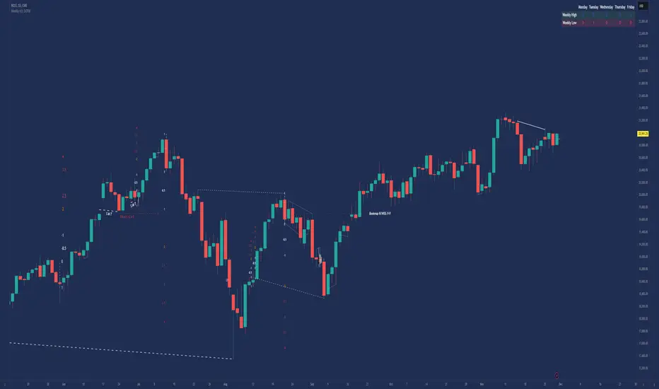
Simple Decesion Matrix Classification Algorithm [SS]Hello everyone,
It has been a while since I posted an indicator, so thought I would share this project I did for fun.
This indicator is an attempt to develop a pseudo Random Forest classification decision matrix model for Pinescript.
This is not a full, robust Random Forest model by any stretch of the imagination, but it is a good way to showcase how decision matrices can be applied to trading and within Pinescript.
As to not market this as something it is not, I am simply calling it the "Simple Decision Matrix Classification Algorithm". However, I have stolen most of the aspects of this machine learning algo from concepts of Random Forest modelling.
How it works:
With models like Support Vector Machines (SVM), Random Forest (RF) and Gradient Boosted Machine Learning (GBM), which are commonly used in Machine Learning Classification Tasks (MLCTs), this model operates similarity to the basic concepts shared amongst those modelling types. While it is not very similar to SVM, it is very similar to RF and GBM, in that it uses a "voting" system.
What do I mean by voting system?
How most classification MLAs work is by feeding an input dataset to an algorithm. The algorithm sorts this data, categorizes it, then introduces something called a confusion matrix (essentially sorting the data in no apparently order as to prevent over-fitting and introduce "confusion" to the algorithm to ensure that it is not just following a trend).
From there, the data is called upon based on current data inputs (so say we are using RSI and Z-Score, the current RSI and Z-Score is compared against other RSI's and Z-Scores that the model has saved). The model will process this information and each "tree" or "node" will vote. Then a cumulative overall vote is casted.
How does this MLA work?
This model accepts 2 independent variables. In order to keep things simple, this model was kept as a three node model. This means that there are 3 separate votes that go in to get the result. A vote is casted for each of the two independent variables and then a cumulative vote is casted for the overall verdict (the result of the model's prediction).
The model actually displays this system diagrammatically and it will likely be easier to understand if we look at the diagram to ground the example:
In the diagram, at the very top we have the classification variable that we are trying to predict. In this case, we are trying to predict whether there will be a breakout/breakdown outside of the normal ATR range (this is either yes or no question, hence a classification task).
So the question forms the basis of the input. The model will track at which points the ATR range is exceeded to the upside or downside, as well as the other variables that we wish to use to predict these exceedences. The ATR range forms the basis of all the data flowing into the model.
Then, at the second level, you will see we are using Z-Score and RSI to predict these breaks. The circle will change colour according to "feature importance". Feature importance basically just means that the indicator has a strong impact on the outcome. The stronger the importance, the more green it will be, the weaker, the more red it will be.
We can see both RSI and Z-Score are green and thus we can say they are strong options for predicting a breakout/breakdown.
So then we move down to the actual voting mechanisms. You will see the 2 pink boxes. These are the first lines of voting. What is happening here is the model is identifying the instances that are most similar and whether the classification task we have assigned (remember out ATR exceedance classifier) was either true or false based on RSI and Z-Score.
These are our 2 nodes. They both cast an individual vote. You will see in this case, both cast a vote of 1. The options are either 1 or 0. A vote of 1 means "Yes" or "Breakout likely".
However, this is not the only voting the model does. The model does one final vote based on the 2 votes. This is shown in the purple box. We can see the final vote and result at the end with the orange circle. It is 1 which means a range exceedance is anticipated and the most likely outcome.
The Data Table Component
The model has many moving parts. I have tried to represent the pivotal functions diagrammatically, but some other important aspects and background information must be obtained from the companion data table.
If we bring back our diagram from above:
We can see the data table to the left.
The data table contains 2 sections, one for each independent variable. In this case, our independent variables are RSI and Z-Score.
The data table will provide you with specifics about the independent variables, as well as about the model accuracy and outcome.
If we take a look at the first row, it simply indicates which independent variable it is looking at. If we go down to the next row where it reads "Weighted Impact", we can see a corresponding percent. The "weighted impact" is the amount of representation each independent variable has within the voting scheme. So in this case, we can see its pretty equal, 45% and 55%, This tells us that there is a slight higher representation of z-score than RSI but nothing to worry about.
If there was a major over-respresentation of greater than 30 or 40%, then the model would risk being skewed and voting too heavily in favour of 1 variable over the other.
If we move down from there we will see the next row reads "independent accuracy". The voting of each independent variable's accuracy is considered separately. This is one way we can determine feature importance, by seeing how well one feature augments the accuracy. In this case, we can see that RSI has the greatest importance, with an accuracy of around 87% at predicting breakouts. That makes sense as RSI is a momentum based oscillator.
Then if we move down one more, we will see what each independent feature (node) has voted for. In this case, both RSI and Z-Score voted for 1 (Breakout in our case).
You can weigh these in collaboration, but its always important to look at the final verdict of the model, which if we move down, we can see the "Model prediction" which is "Bullish".
If you are using the ATR breakout, the model cannot distinguish between "Bullish" or "Bearish", must that a "Breakout" is likely, either bearish or bullish. However, for the other classification tasks this model can do, the results are either Bullish or Bearish.
Using the Function:
Okay so now that all that technical stuff is out of the way, let's get into using the function. First of all this function innately provides you with 3 possible classification tasks. These include:
1. Predicting Red or Green Candle
2. Predicting Bullish / Bearish ATR
3. Predicting a Breakout from the ATR range
The possible independent variables include:
1. Stochastics,
2. MFI,
3. RSI,
4. Z-Score,
5. EMAs,
6. SMAs,
7. Volume
The model can only accept 2 independent variables, to operate within the computation time limits for pine execution.
Let's quickly go over what the numbers in the diagram mean:
The numbers being pointed at with the yellow arrows represent the cases the model is sorting and voting on. These are the most identical cases and are serving as the voting foundation for the model.
The numbers being pointed at with the pink candle is the voting results.
Extrapolating the functions (For Pine Developers:
So this is more of a feature application, so feel free to customize it to your liking and add additional inputs. But here are some key important considerations if you wish to apply this within your own code:
1. This is a BINARY classification task. The prediction must either be 0 or 1.
2. The function consists of 3 separate functions, the 2 first functions serve to build the confusion matrix and then the final "random_forest" function serves to perform the computations. You will need all 3 functions for implementation.
3. The model can only accept 2 independent variables.
I believe that is the function. Hopefully this wasn't too confusing, it is very statsy, but its a fun function for me! I use Random Forest excessively in R and always like to try to convert R things to Pinescript.
Hope you enjoy!
Safe trades everyone!
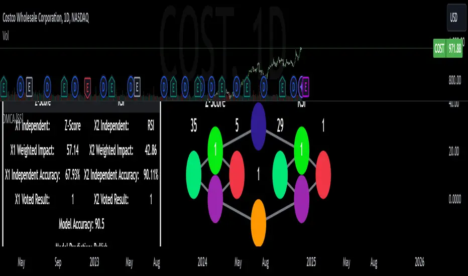
Moment-Based Adaptive DetectionMBAD (Moment-Based Adaptive Detection) : a method applicable to a wide range of purposes, like outlier or novelty detection, that requires building a sensible interval/set of thresholds. Unlike other methods that are static and rely on optimizations that inevitably lead to underfitting/overfitting, it dynamically adapts to your data distribution without any optimizations, MLE, or stuff, and provides a set of data-driven adaptive thresholds, based on closed-form solution with O(n) algo complexity.
1.5 years ago, when I was still living in Versailles at my friend's house not knowing what was gonna happen in my life tomorrow, I made a damn right decision not to give up on one idea and to actually R&D it and see what’s up. It allowed me to create this one.
The Method Explained
I’ve been wandering about z-values, why exactly 6 sigmas, why 95%? Who decided that? Why would you supersede your opinion on data? Based on what? Your ego?
Then I consciously noticed a couple of things:
1) In control theory & anomaly detection, the popular threshold is 3 sigmas (yet nobody can firmly say why xD). If your data is Laplace, 3 sigmas is not enough; you’re gonna catch too many values, so it needs a higher sigma.
2) Yet strangely, the normal distribution has kurtosis of 3, and 6 for Laplace.
3) Kurtosis is a standardized moment, a moment scaled by stdev, so it means "X amount of something measured in stdevs."
4) You generate synthetic data, you check on real data (market data in my case, I am a quant after all), and you see on both that:
lower extension = mean - standard deviation * kurtosis ≈ data minimum
upper extension = mean + standard deviation * kurtosis ≈ data maximum
Why not simply use max/min?
- Lower info gain: We're not using all info available in all data points to estimate max/min; we just pick the current higher and lower values. Lol, it’s the same as dropping exponential smoothing with alpha = 0 on stationary data & calling it a day.
You can’t update the estimates of min and max when new data arrives containing info about the matter. All you can do is just extend min and max horizontally, so you're not using new info arriving inside new data.
- Mixing order and non-order statistics is a bad idea; we're losing integrity and coherence. That's why I don't like the Hurst exponent btw (and yes, I came up with better metrics of my own).
- Max & min are not even true order statistics, unlike a percentile (finding which requires sorting, which requires multiple passes over your data). To find min or max, you just need to do one traversal over your data. Then with or without any weighting, 100th percentile will equal max. So unlike a weighted percentile, you can’t do weighted max. Then while you can always check max and min of a geometric shape, now try to calculate the 56th percentile of a pentagram hehe.
TL;DR max & min are rather topological characteristics of data, just as the difference between starting and ending points. Not much to do with statistics.
Now the second part of the ballet is to work with data asymmetry:
1) Skewness is also scaled by stdev -> so it must represent a shift from the data midrange measured in stdevs -> given asymmetric data, we can include this info in our models. Unlike kurtosis, skewness has a sign, so we add it to both thresholds:
lower extension = mean - standard deviation * kurtosis + standard deviation * skewness
upper extension = mean + standard deviation * kurtosis + standard deviation * skewness
2) Now our method will work with skewed data as well, omg, ain’t it cool?
3) Hold up, but what about 5th and 6th moments (hyperskewness & hyperkurtosis)? They should represent something meaningful as well.
4) Perhaps if extensions represent current estimated extremums, what goes beyond? Limits, beyond which we expect data not to be able to pass given the current underlying process generating the data?
When you extend this logic to higher-order moments, i.e., hyperskewness & hyperkurtosis (5th and 6th moments), they measure asymmetry and shape of distribution tails, not its core as previous moments -> makes no sense to mix 4th and 3rd moments (skewness and kurtosis) with 5th & 6th, so we get:
lower limit = mean - standard deviation * hyperkurtosis + standard deviation * hyperskewness
upper limit = mean + standard deviation * hyperkurtosis + standard deviation * hyperskewness
While extensions model your data’s natural extremums based on current info residing in the data without relying on order statistics, limits model your data's maximum possible and minimum possible values based on current info residing in your data. If a new data point trespasses limits, it means that a significant change in the data-generating process has happened, for sure, not probably—a confirmed structural break.
And finally we use time and volume weighting to include order & process intensity information in our model.
I can't stress it enough: despite the popularity of these non-weighted methods applied in mainstream open-access time series modeling, it doesn’t make ANY sense to use non-weighted calculations on time series data . Time = sequence, it matters. If you reverse your time series horizontally, your means, percentiles, whatever, will stay the same. Basically, your calculations will give the same results on different data. When you do it, you disregard the order of data that does have order naturally. Does it make any sense to you? It also concerns regressions applied on time series as well, because even despite the slope being opposite on your reversed data, the centroid (through which your regression line always comes through) will be the same. It also might concern Fourier (yes, you can do weighted Fourier) and even MA and AR models—might, because I ain’t researched it extensively yet.
I still can’t believe it’s nowhere online in open access. No chance I’m the first one who got it. It’s literally in front of everyone’s eyes for centuries—why no one tells about it?
How to use
That’s easy: can be applied to any, even non-stationary and/or heteroscedastic time series to automatically detect novelties, outliers, anomalies, structural breaks, etc. In terms of quant trading, you can try using extensions for mean reversion trades and limits for emergency exits, for example. The market-making application is kinda obvious as well.
The only parameter the model has is length, and it should NOT be optimized but picked consciously based on the process/system you’re applying it to and based on the task. However, this part is not about sharing info & an open-access instrument with the world. This is about using dem instruments to do actual business, and we can’t talk about it.
∞
