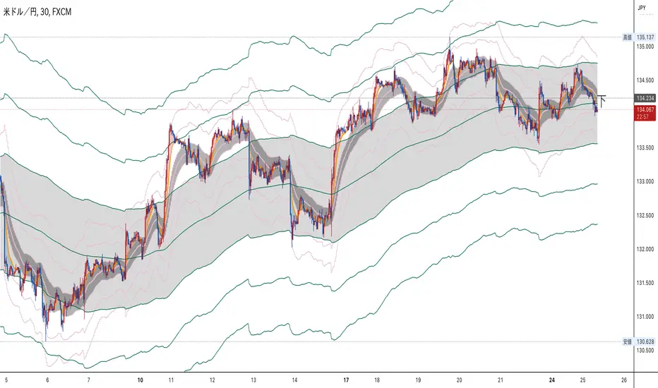
LIZ-ATR-Based EMA EnvelopesThis envelope has an "auto band adjustment function" that reflects the most recent volatility in the band width by ATR.
This makes it easy to handle without the need to change the band width according to the volatility of the stocks to be displayed.
The time periods and colors of each time frame that can be displayed and the central band of the envelope are as follows.
Monthly: 2-year line (light blue)
Weekly: 3-month line (black)
Daily: 1 month line (blue)
4-hourly: 1-week line (green)
1 hour: 24 hour line (purple)
30-minute: 12-hour line (light purple)
15-minute: 4-hour line (orange)
5min:2hr (skin color)
1 minute: 30 minute line (gray-blue)
30 seconds: 10 minute line (blue-purple)
15-seconds: 7.5-minute line (sky blue)
10-seconds: 5-minute line (brown)
5-seconds: 2-minute line (emerald green)
Depending on where the price resides in the band, the following situations can be identified
・When inside the first band: Trendless
・Between the first and second band: Normal trend
・Between the 2nd and 3rd band: Strong trend
・When the third line is exceeded: Overheat condition
The first range is painted in gray and encourages not to follow the trend. In addition, the "up" sign will automatically light up when the price is above this gray zone, the "middle" sign when the price is in the middle of the gray zone, and the "down" sign when the price is below the gray zone.
このエンベロープは直近のボラティリティーをATRによってバンド幅に反映させる、「オートバンド調整機能」を搭載しています。
そのため、表示させる銘柄のボラティリティーに合わせてバンド幅を変更する必要がなく扱いやすいです。
表示できる各時間足と、エンベロープの中心バンドの期間・色は、以下の通りです。
月足:2年線(水色)
週足:3ヶ月線(黒)
日足:1ヶ月線(青)
4時間足:1週間線(緑)
1時間足:24時間線(紫)
30分足:12時間線(薄紫)
15分足:4時間線(オレンジ)
5分足:2時間線(肌色)
1分足:30分線(グレーブルー)
30秒足:10分線(青紫)
15秒足:7.5分線(スカイブルー)
10秒足:5分線(茶色)
5秒足:2分線(エメラルドグリーン)
価格がバンドのどこに存在するかによって以下の状況がわかります。
・1本目のバンド内側にある時:トレンドレス
・1本目から2本目の間にある時:ノーマルトレンド
・2本目から3本目の間にある時:強いトレンド
・3本目をオーバーしている時:過熱状態
1本目の範囲はグレーで塗られ、トレンドフォローしない事を促します。また、このグレーゾーンの上に価格がある時は「上」、中にある時は「中」、下にあるときは「下」の文字サインが自動点灯します。
In den Scripts nach "weekly" suchen
TriexDev - SuperBuySellTrend (PLUS+)Minimal but powerful.
Have been using this for myself, so thought it would be nice to share publicly. Of course no script is correct 100% of the time, but this is one of if not the best in my basic tools. (This is the expanded/PLUS version)
Github Link for latest/most detailed + tidier documentation
Base Indicator - Script Link
TriexDev - SuperBuySellTrend (SBST+) TradingView Trend Indicator
---
SBST Plus+
Using the "plus" version is optional, if you only want the buy/sell signals - use the "base" version.
## What are vector candles?
Vector Candles (inspired to add from TradersReality/MT4) are candles that are colour coded to indicate higher volumes, and likely flip points / direction changes, or confirmations.
These are based off of PVSRA (Price, Volume, Support, Resistance Analysis).
You can also override the currency that this runs off of, including multiple ones - however adding more may slow things down.
PVSRA - From MT4 source:
Situation "Climax"
Bars with volume >= 200% of the average volume of the 10 previous chart TFs, and bars
where the product of candle spread x candle volume is >= the highest for the 10 previous
chart time TFs.
Default Colours: Bull bars are green and bear bars are red.
Situation "Volume Rising Above Average"
Bars with volume >= 150% of the average volume of the 10 previous chart TFs.
Default Colours: Bull bars are blue and bear are blue-violet.
A blue or purple bar can mean the chart has reached a top or bottom.
High volume bars during a movement can indicate a big movement is coming - or a top/bottom if bulls/bears are unable to break that point - or the volume direction has flipped.
This can also just be a healthy short term movement in the opposite direction - but at times sets obvious trend shifts.
## Volume Tracking
You can shift-click any candle to get the volume of that candle (in the pair token/stock), if you click and drag - you will see the volume for that range.
## Bollinger Bands
Bollinger Bands can be enabled in the settings via the toggle.
Bollinger Bands are designed to discover opportunities that give investors a higher probability of properly identifying when an asset is oversold (bottom lines) or overbought (top lines).
>There are three lines that compose Bollinger Bands: A simple moving average (middle band) and an upper and lower band.
>The upper and lower bands are typically 2 standard deviations +/- from a 20-day simple moving average, but they can be modified.
---
Base Indicator
## What is ATR?
The average true range (ATR) is a technical analysis indicator, which measures market volatility by decomposing the entire range of an asset price for that period.
The true range indicator is taken as the greatest of the following:
- current high - the current low;
- the absolute value of the current high - the previous close;
- and the absolute value of the current low - the previous close.
The ATR is then a moving average, generally using 10/14 days, of the true ranges.
## What does this indicator do?
Uses the ATR and multipliers to help you predict price volatility, ranges and trend direction.
> The buy and sell signals are generated when the indicator starts
plotting either on top of the closing price or below the closing price. A buy signal is generated when the ‘Supertrend’ closes above the price and a sell signal is generated when it closes below the closing price.
> It also suggests that the trend is shifting from descending mode to ascending mode. Contrary to this, when a ‘Supertrend’ closes above the price, it generates a sell signal as the colour of the indicator changes into red.
> A ‘Supertrend’ indicator can be used on equities, futures or forex, or even crypto markets and also on daily, weekly and hourly charts as well, but generally, it will be less effective in a sideways-moving market.
Thanks to KivancOzbilgic who made the original SuperTrend Indicator this was based off
---
## Usage Notes
Two indicators will appear, the default ATR multipliers are already set for what I believe to be perfect for this particular (double indicator) strategy.
If you want to break it yourself (I couldn't find anything that tested more accurately myself), you can do so in the settings once you have added the indicator.
Basic rundown:
- A single Buy/Sell indicator in the dim colour; may be setting a direction change, or just healthy movement.
- When the brighter Buy/Sell indicator appears; it often means that a change in direction (uptrend or downtrend) is confirmed.
---
You can see here, there was a (brighter) green indicator which flipped down then up into a (brighter) red sell indicator which set the downtrend. At the end it looks like it may be starting to break the downtrend - as the price is hitting the trend line. (Would watch for whether it holds above or drops below at that point)
Another example, showing how sometimes it can still be correct but take some time to play out - with some arrow indicators.
Typically I would also look at oscillators, RSI and other things to confirm - but here it held above the trend lines nicely, so it appeared to be rather obvious.
It's worth paying attention to the trend lines and where the candles are sitting.
Once you understand/get a feel for the basics of how it works - it can become a very useful tool in your trading arsenal.
Also works for traditional markets & commodities etc in the same way / using the same ATR multipliers, however of course crypto generally has bigger moves.
---
You can use this and other indicators to confirm likeliness of a direction change prior to the brighter/confirmation one appearing - but just going by the 2nd(brighter) indicators, I have found it to be surprisingly accurate.
Tends to work well on virtually all timeframes, but personally prefer to use it on 5min,15min,1hr, 4hr, daily, weekly. Will still work for shorter/other timeframes, but may be more accurate on mid ones.
---
This will likely be updated as I go / find useful additions that don't convolute things. The base indicator may be updated with some limited / toggle-able features in future also.

SSS50 StatusSSS50 Status Box with Auto Chart Levels and Labels
I made this indicator due to receiving a lot of messages on how to use my other SSS50% indicators. This indicator helps you learn and understand the Sara Strat Snipers 50 Percent Rule. Remember this indicator does not tell you when to buy or sell this is a guide on the setup ONLY.
You Must Use Rob Smith's The Strat Principles and Remember we need TIME in our favour. Ideally we want to see setups go In-Force early on during the candles lifespan (Timeframe).
Using the indicator logic, the SSS50% Rule has FOUR Conditions:
1. SSS50 INVALID = No Trade = The Candle is currently an Inside Bar OR a Green 2UP OR a Red 2DOWN.
2. SSS50 STANDBY = Failed 2* = The Candle is currently a Failed 2UP (Red 2UP) OR a Failed 2DOWN (Green 2DOWN).
3. SSS50 ACTIVE = Outside Bar Possible = The Candle is currently a Failed 2 and has crossed over the Previous Candles 50% level.
4. SSS50 COMPLETE = Outside Bar Complete = The Candle is now an Outside Bar.
How to Use this Indicator?
Add Indicator to your chart and open up the Indicator's Settings.
1. Select Indicators Timeframe.
- Chart = SSS50% rules will be applied to whichever timeframe chart you open.
- Single Timeframe = SSS50% rules will be only applied to one fixed timeframe when viewing on other timeframe charts. For Example: if you select Weekly. The Indicator's Status and Levels/Labels will only be displayed on your chart if the Weekly Candle has a SSS50 Standby, Active or Complete condition.
2. Select Status Box On/Off. If ON - Select View Type.
- Normal View = Detailed View with Price Targets.
- Compact View = Condensed View to reduce chart clutter.
3. Select AUTO or MANUAL Chart Levels/Labels. Select ONE type only or leave both off for no level/label display.
- AUTO = When an SSS50 STANDBY, ACTIVE or COMPLETE Condition occurs the related High, Low and 50% Levels will be displayed.
- MANUAL = When AUTO is OFF, MANUAL will display High, Low and 50% Levels always regardless of SSS50 Conditions.
4. Select AUTO Features.
- Display High/Low and/or 50% Price Labels when using AUTO Chart Mode.
4.1 Select AUTO Colors if required. Default to Traffic Light System.
- INVALID = Red
- STANDBY = Orange
- ACTIVE or COMPLETE = GREEN
5. Select MANUAL Features if AUTO Chart Mode is OFF.
- Display High/Low and/or 50% Price Labels when using MANUAL Chart Mode.
5.1 Select MANUAL Colors if required.
6. Additional Features. Title OR Timeframe available is Normal View. Title AND Timeframe BOTH available in Compact View.
- Show SSS50 Title next to Status Box.
- Show the indicators selected Timeframe next to Status Box. Timeframe will be displayed next to Status Box Only when ONE Individual Timeframe is selected.
7. Color Settings.
- Match your chart's current Background Color to this color.
8. Additional Settings
- Customise Label Offset Locations, Line Types and Line Types.
- Any issues let me know.
- Note I removed the price tags (used in my previous SSS50 indicators) from the right of the line to avoid clutter. Now you can see the current price move through the High, Low and 50% level lines.
- No alerts setup within script, just manually click the plus sign on each level if you wish to add alerts.

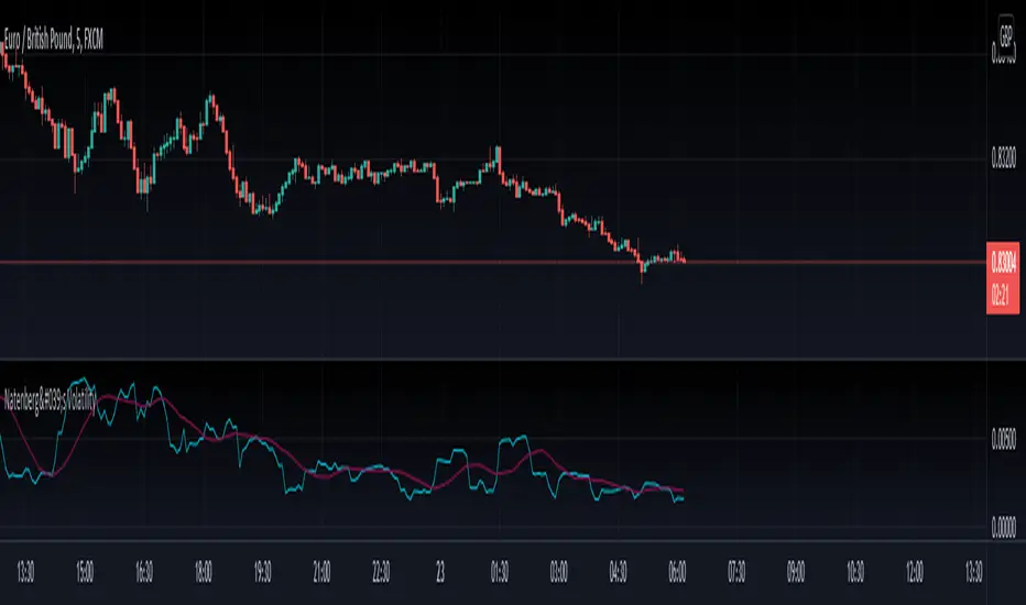
Natenberg's VolatilityThis indicator is historical volatility indicator created by Sheldon Natenberg , as the standard deviation of the logarithmic price changes measured at regular intervals of time.
In Mr. Natenberg's book, Option Volatility & Pricing, he covers volatility in detail and gives the formula for computing historical volatility.
My changes :
I didn't changed formula, i just added smooth version of volatility it can be used as trigger when cross(over/under) non-smoothed volatility.
Note:
There is two formulas for daily and weekly. Indicator showing only daily formula !
Who wants to display the weekly formula change line 17, namely remove "//"
Enjoy!
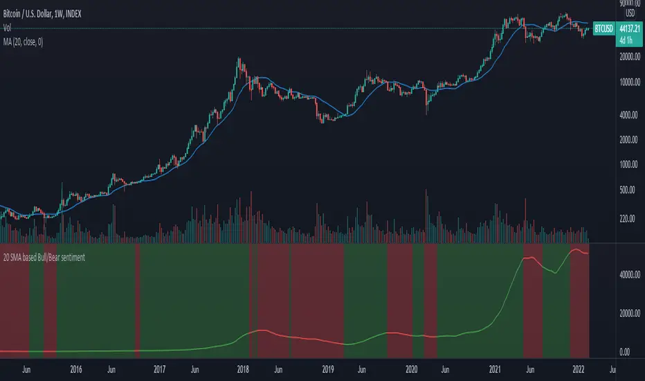
20 SMA based Bull/Bear sentiment indicatorThis script is only doing one thing, plots the 20 SMA and based on whether the asset's price is above or below of the SMA it changes the color of the SMA and the background's color.
Helping it to visualize whether from the 20 SMA's point of view we are in a Bull or a Bear trend.
I created this because I myself use this SMA with Bitcoin on the weekly time frame to identify the macro trend on the weekly.
IMO this is a good crypto market sentiment indicator.
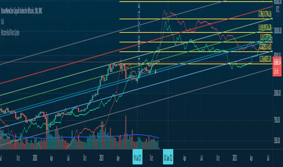
Bitcoin Bull Runs Mid Cycle Aligned This script plots 2 lines which are the 2013 and 2016 bull run. The plots are aligned on their mid cycles to the 2021 mid cycle.
Settings:
You can move the plots on the x and y axis in the settings for the Daily, Weekly and Monthly TFs.
The plot is weird on the Monthly TF, best to use the Daily and Weekly.
If it doesn't load at first you have to zoom out fully and go back to 2013 for it to load. Then it will load.
Anti-Volume Stop LossFINALLY!
As everyone who tried to create, understand, or even find the Buff Pelz Dormeier Anti-volume stop-loss indicator knows that - it's not easy. Personally, I have partially, or perhaps completely figured out, the tips Buff had given in Investing with Volume Analysis book.
AVSL now is ready.
Please do some test and give me a feedback how it works in your trade strategy.
Anti-Volume stop loss - AVSL
from Investing with Volume Analysis book CHAPTER 20 • RISKY BUSINESS 253-256:
"It is important in any risk-management process to predetermine an objective decision point level (a stop loss) to exit, thereby protecting principal in case you are wrong. My objective sell point is determined by using a quantitative formula I refer to as Anti-Volume Stop Loss (AVSL). Having a quantitative, yet intelligent sell point eliminates the emotional struggles involved in deciding when to exit a position.
AVSL is a technical methodology that incorporates the concepts of support, volatility, and, most importantly, the inverse relationship between price and volume. The AVSL combines the concepts of the VPCI (Volume Price Confirmation Indicator) and John Bollinger’s Bollinger Bands to create a trailing stop loss.
AVSL = Lower Bollinger Band – (Price, Length, Standard Deviation)
Where:
Length = Round (3 + VPCI)
Price = Average (Lows × 1 / VPC × 1 / VPR, Length)
Standard Deviation = 2 × (VPCI × VM)
One of the most difficult decisions is determining what one’s maximum loss threshold should be. Some say 2 percent; others say 20 percent. I believe the more volatile a security, the looser the stop should be. A nonvolatile security, such as Coca-Cola, might move 7 percent a year, while a volatile security such as Google might move 7 percent in a day. If you use a 7 percent stop for Coca-Cola, it might take a year to be stopped out while the security underperforms.
However, if you use 7 percent for Google, you can be stopped out intraday, not allowing the investment an opportunity to develop. By using the lower Bollinger Band of the securities lows, the AVSL considers each individual security’s own volatility. Thus, a volatile security would be granted more room of the stocks low while a stable security would have a tighter leash (see Figure 20.7).
The next important step is employing the price-volume relationship into the calculation. Volume gauges the power behind price moves. In accounting for this, when a security is in an uptrend and has positive volume characteristics, it is given more room. However, if the security exhibits contracting volume characteristics, then the stop is tightened. In this way, if a negative news event affects an unhealthy security, the stop is tighter, thus preserving more of your profits.
However, if the negative news event affects a security whose price-volume relationship is healthy, the stop has been loosened, avoiding the temporary whipsaw of an otherwise strong position. In these ways, AVSL lets the market decide when to exit your position.
AVSL tailors each security for support, volatility, and the pricevolume relationship based on an investor’s time frame as calculated from the chart data. For example, my portfolio positions are continually re-evaluated with this AVSL methodology, which yields the possibility of raising the decision point threshold periodically based on the time frame of my investment objective. With my short-term Giddy-up portfolios, I use daily chart data and seek to raise my maximum loss stop on a daily basis.
My intermediate ETF and stock positions are calculated off of weekly data and then re-evaluated weekly. With my longer term stock portfolios, the decision point is calculated off data revised monthly. This analytical approach that uses measurable facts over emotion or gut instincts allows me to maintain my objectivity. Thus objectivity, not emotion, informs my investment decisions."
How look mine AVSL:
Price component = low × 1/VPC × 1/VPR : for VPC > 1 and VPC < -1 | low × 1 × 1/VPR : for 1 > VPC > 0 | low × -1 × 1/VPR : for 0 > VPC > -1
AVSL Price = sma((low × 1/VPC × 1/VPR) , length) / 100
length = round : for VPCI > 0 | round [ absolute ] : for VPCI < 0 | 3 : for VPCI=0
Standard Deviation = mult × VPCI × VM)
AVSL = sma(Actual low price - AWSL Price + Standard Deviation, 26)
It's hard to say is it the same as in Buff Pelz Dormeier book, but I encourage you to modify the script for better results.

[co.n.g] LeathermanThis is a modest approach of assembling my most favorite strategies into a single indicator script!
I extended the functionality of the ART to the maximum in this piece of price action and volume analysis.
The original "Average Range Targets" - though by default turned off t due to heavily re-scaling the chart -
and the previous day's high and low.
What I've added:
high and low of the actual week
high and low of the previous week
open of the day
close of the previous day
VWAP of the daily session - adjustable to any length
VWAP of the weekly session
opening range / inital balance of the session -fixed to 15 Minutes
I've decluttered the chart as good as possible.
KNOWN BUGS:
Sometimes the plotting is incorrect due to rescaling or zooming in and out of the chart.
How to use - a quick price action guide:
The breakout of the open range is often indicating the trend of the day, a false breakout is often seen as a reversal sign.
A price below the VWAP is seen as cheap, a price above as expensive. In contrary to others, I personally prefer to see a rising price on a rising VWAP ;
additionally, I like bounces off or spikes and reversals through the VWAP , either the daily or the weekly.
The highs and lows of the days and weeks are seen as support and resistance . Trade preferably long above and short below those levels.
The ADR is an indication not working perfectly, especially with stocks.
!!! WARNING !!!
Don't rely solely on a single script nor a single indicator!
Always consider the price action, the trend, the overall market and especially the volume.
There is no "Get-Rich-Quick"-scheme, learn to read the chart and trade accordingly.
Enjoy and make money!
Yours,
Constantine
p.s.:
If you like to show your gratitude for my work:
CHEER!

Moving Average Over Timea simple moving average and an exponential moving average that change periods along with temporality: WEEKLY: MA48, EMA24; DAILY: MA21, EMA11; H4: MA30, EMA15; H1: MA120, EMA30.

Trend AnalyzerA simple script that plots difference between 2 moving averages and depicts convergance/divergance in color coded format.
Anything <= 0 is red and shows a bearish trend whereas > 0 is green and shows bullish trend.
Adjust the input parameters as following for your preferred time frame :
4-Hr: Exponential, 15, 30
Daily: Exponential, 10, 20
Weekly: Exponential, 5, 10
Higher Timeframe EMA @ silenThunderrThe Script is Used for Exponential Moving Average which are fixed for Daily and Weekly.
Can Be used in any Timeframe but EMA are fixed to Daily and Weekly only.
One option of Open EMA is kept which can be modified in settings.
Turn On/OFF various EMA's and enjoy the play of EMA's
Its can change colours if selected in the Settings.
OFFSET is also available.
Upslope is White and Downwards is Yellow. (I use Dark Theme hence White u can change the colour to what ever u wish )
All in settings

stoch pop and RSI2 strategyI have combined stochsatic POP and RSI2 strategy.
Go Long on stochstaic > 80 and RSI2 pulled back to 30 (note when you are entering Long, check that stochsatic is still above 80 )
Close Long when stochastic crossing down 55
I have back tested this on SPY weekly. It has less trades but high profitable with very less draw down.
Other time frames you have more signals but , not great winning rate.
Since this is weekly setup, good for investing ... long waiting to close , patience required :-)

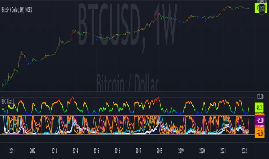
Bitcoin Risk Long Term indicatorOBJECTIVE:
The purpose of this indicator is to synthesize via an average several indicators from a wide choice with in order to simplify the reading of the bitcoin price and that on a long term vision.
Useful for those who want to see things simply, typically to make a smart DCA based on risk.
I originally used this script as a sandbox to understand and test the usefulness of several indicators, and to develop my PineScript skills, but finally the Risk Indicator output seems relevant so I decided to share it.
USAGE:
The selected indicators are the ones that I think give the best market bottoms, but the idea here is that anyone can try and use any set of indicators based on those preferences (post in comments if you find a relevant config)
Most of the indicator inputs are configurable. And some are not taken into account in the calculation of the Risk indicator because I consider them not relevant, this script is also a test more than a final version.
NOTES :
If you have any idea of adding an indicator, modification, criticism, bug found: share them, it is appreciated!
In the future I will create another more versatile Risk indicator that will not be focused on bitcoin in weekly. (this indicator is still usable on other assets and timeframe)
THANKS:
to Benjamin Cowen for inspiring me with his Bitcoin Risk metric
to Lazybear for his Wavetrend Indicator and all the scripts he shares
to Mabonyi for his Bitcoin Logarithmic Growth Curves & Zones script
to VuManChu for his VMC Cypher B Divergence
to the Trading view team for developing TV and PineScript
And to all the community for all the published codes that allowed me to progress and create this script
---- FR ----
OBJECTIF :
L'objectif de cet indicateur est de synthétiser via une moyenne plusieurs indicateurs parmi un large choix avec afin de simplifier la lecture du cours de bitcoin et cela sur une vision longue terme.
Utile pour ceux qui veulent voir les choses simplement, typiquement faire un DCA intelligent en fonction du risque.
À la base j'ai utilisé ce script comme un bac à sable pour comprendre puis tester l'utilité de plusieurs indicateurs, et développer mes compétences PineScript, mais finalement l'output Risk Indicateur me semble pertinent donc autant le partager.
UTILISATION :
Les indicateurs sélectionnés sont ceux qui permettent selon moi d'avoir les meilleurs point bas de marché, mais l'idée ici est que chacun puisse essayer et utiliser n'importe quel ensemble d'indicateur en fonction de ces préférences (poster en commentaire si vous trouvez une configuration pertinente)
La plupart des inputs indicateurs sont paramétrables. Et certains ne sont pas pris en compte dans le calcul du Risk indicateur car je les estime non pertinent, ce script est aussi un essai plus qu'une version finale.
NOTES :
Si vous avez la moindre idée d'ajout d'indicateur, modification, critique, bug trouvé : partagez-les, c'est apprécié !
à l'avenir je créerais un autre Risk indicator plus polyvalent qui ne sera pas focalisé sur bitcoin en weekly. (cet indicateur est tout de même utilisable sur d'autre actif et timeframe)
REMERCIEMENT :
à Benjamin Cowen pour m'avoir inspiré avec son Bitcoin Risk metric
à Lazybear pour son Wavetrend Indicator et globalement tout les scripts qu'il partage
à Mabonyi pour son script Bitcoin Logarithmic Growth Curves & Zones
à VuManChu pour son VMC Cypher B Divergence
à l'équipe Trading view pour avoir développé TV et PineScript
Et à toute la communauté pour tous les codes publiés qui m'ont permis de progresser et de créer ce script
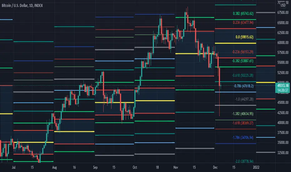
[MF] Auto Fibonacci LevelsDescription:
Automatically draw Fibonacci Pivot levels based on the previous (day's, week's or month's)
Range ( High-Low ). The HLC3 is used as the default Pivot level.
Unlike the "Auto Fibonacci Levels", this variation does not update
Levels on current day even if the price goes past the R3/S3 levels.
Timeframes: 1D, 1W, 1M
Range = (High - Low) - From previous Day, Week or month.
FIB LEVELS:
- Yellow = Pivot and Pivot Zone (HLC3 by default)
- red = R1,S1 Levels 0.236 * Range
- Green = R2,S2 Levels 0.368 * Range
- Lime = R3,S3 Levels 0.618 * Range
- Blue = R4,S4 Levels 0.786 * Range
- Gray = R5,S5 Levels 1.000 * Range
- Lime = R6,S6 Levels 1.236 * Range
- Red = R7,S7 Levels 1.382 * Range
- Blue = R8,S8 Levels 1.618 * Range
- Green = R9,S9 Levels 2.000 * Range
CLASSIC LEVELS:
- Yellow = Pivot and Pivot Zone (HLC3)
- Green = R1,S1 Levels (Pivot*2 - Low), (Pivot*2 - High)
- Lime = R2,S2 Levels ( Pivot + Range), ( Pivot - Range)
- Lime = R3,S3 Levels (High + 2*( Pivot - Low)), (Low - 2*(High - Pivot ))
- Blue = R4,S4 Levels (High + 3*( Pivot - Low)), (Low - 3*(High - Pivot ))
Refrences:
- Auto Daily Fib Levels R3.0 by JustUncleL
- Auto Fib by TheYangGuizi
- Monthly Dynamic Range Levels (Fibonaci) V0 by RicardoSantos
Modifications:
- Added next FIB Levels. (changes during the current cycle)
- Added FIB 0.236 Levels
- Added Option to change the colors of the Fib Levels
- Changed Default colors to the colors of Tradingview
- Upgraded to Version4 Pinescript
Market Sessions — FOREXSOM Editionding for chart screenshots and videos.
Cleaner Interface: Organized settings into clear groups for a smoother user experience.
Bug Fixes: Improved “Only Last…” logic for more stable plotting.
Why I Use and Recommend It:
Easily spot active trading sessions with visual clarity.
Identify key institutional price levels in real time.
Ideal for day traders, swing traders, and anyone applying Smart Money Concepts.
Fully customizable colors and styles to fit any personal workflow.

Simple Trader - LevelsThis indicator plots the below levels in the chart.
Note: This is not a buy/sell recommendation. Reach Simple Trader to understand how to trade these levels.
Current day open,
Prev. day close,
Prev. day high,
Prev. day low.
Prev. week high,
Prev. week low,
Prev. month high,
Prev. month low.

Multi Range VWAP PivotsMulti Range VWAP Pivots turned out to be one of my most accurate pivot indicators to date!
Multi Range VWAP Pivots works by recognizing the high and low of the timeframe selected (D, W, M, 6M, and 12M) and plotting range high to VWAP averages and range low to VWAP averages.
After further examination of each completed range, I came to the conclusion that due to the nature of averages, high and low respectively would need to be completed within the current range, for the averages to actually display pivots correctly. This means that if all averages appear to be "pivoting" correctly after or during a break lower of higher, then we can only assume the most recent break higher or lower could be exhaustion and price will be reverted to the mean (VWAP). OR, this could be the most accurate hindsight indicator on the planet.
*DISCLAIMER*: This indicator repaints. DO NOT backtest or set alerts with this indicator.

Privious Day and Week ValuesThis indicator is designed for price action. It divides the price range in to four zones based on last week values. Besides, it shows yesterday highest and lowest values. The price usually shows reactions to the drawn horizontal lines!
SterlCore FX Matrix [JOAT]
SterlCore FX Matrix is a multi-timeframe forex indicator that integrates market structure analysis, central bank policy proxies, currency strength correlation, session-based liquidity tracking, and volatility diagnostics into a single overlay system.
Note: This script is published as invite-only. Access requires authorization through the script's access control settings.
Why Invite-Only: The source code is protected to preserve proprietary calculation methods, composite scoring algorithms, and multi-module integration logic. The indicator combines several analytical approaches in a specific configuration that represents significant development effort. Invite-only access allows controlled distribution while maintaining the integrity of the implementation.
This Script has so much custom settings you can choose upon, to make it even more organized and tailored to your needs!
Custom settings with HeatMap and signals tailored to the daily timeframe and currency pair
## Core Functionality
This indicator addresses the challenge of synthesizing multiple analytical dimensions in forex trading. Currency markets operate across multiple timeframes simultaneously, with central bank policy shifts, cross-pair correlations, and session-specific liquidity patterns all influencing price action. Most indicators focus on a single dimension; this script attempts to integrate several.
What This Script Does:
Multi-timeframe structure analysis using synchronized EMAs across strategic (daily), tactical (4-hour), and execution (hourly) timeframes
Central bank policy pressure assessment through normalized currency index proxies
Real-time currency strength matrix tracking eight major currencies (USD, EUR, GBP, JPY, AUD, CAD, CHF, NZD)
Cross-pair correlation monitoring using configurable reference pairs
Session-based VWAP calculations with drift and range metrics for Asia, Europe, and US trading windows
Market structure detection including break-of-structure (BOS) confirmation, liquidity sweep identification, and RSI-based divergence alerts
Composite macro confluence score combining all modules with configurable weights
---
## Technical Architecture
### Multi-Timeframe Structure Lattice
The indicator calculates exponential moving averages (EMAs) across three timeframes:
Strategic EMA (default: Daily timeframe, 96-period EMA) — Anchors to longer-term monetary drift and macro flows
Tactical EMA (default: 4-hour timeframe, 55-period EMA) — Captures rotational pressure during positioning for economic data or policy events
Execution EMA (default: 1-hour timeframe, 21-period EMA) — Tracks microstructure in real time
An adaptive ATR-based channel surrounds the execution EMA to define a "value corridor" for entry consideration. Break-of-structure (BOS) logic requires price to close beyond prior swing highs/lows by a configurable ATR percentage threshold to reduce false breakouts.
### Policy Gradient & Carry Intelligence
The script uses currency index proxies (defaults: FX_IDC:EURUSD and FX_IDC:USDJPY ) to approximate central bank policy pressure. These proxies are smoothed via EMA and normalized over a lookback period.
The carryComposite calculation blends:
Normalized policy spread between base and quote currency proxies
Policy drift (difference between tactical and macro timeframe policy spreads)
Carry acceleration (rate of change in policy spread)
Carry opportunity signals appear when the composite exceeds a threshold and aligns with structure bias and currency strength dispersion.
### Currency Strength Matrix
Eight currency baskets are tracked using configurable symbol inputs (defaults use $FX_IDC pairs). Each currency's strength is normalized to a -1 to +1 scale relative to its lookback range. The heatmap table displays which currencies are dominating, allowing quick assessment of broad market moves before they appear in individual pair price action.
### Correlation Intelligence Grid
Three reference pairs (defaults: FX_IDC:EURUSD , FX_IDC:GBPUSD , FX_IDC:USDJPY ) are monitored on a higher timeframe. The script calculates correlation coefficients and assigns qualitative descriptors: "Lockstep +", "Aligned +", "Loose", "Aligned -", or "Lockstep -". A correlation consensus value feeds into the macro confluence calculation, dampening signals when reference pairs show conflicting behavior.
### Momentum, Volatility & Liquidity Stack
Dual ROC momentum — Fast and slow rate-of-change calculations prevent whipsaw from single-length oscillators
Volatility pulse — Compares current ATR to a slower baseline; signals require volatility above a floor threshold
Volatility forecast slope — Uses linear regression to project ATR 21 bars ahead, warning of imminent expansion or contraction
Liquidity pulse — Compares current volume to smoothed average; low participation is visually indicated via background tinting
### Session Awareness & Performance Console
Asia, Europe, and US trading sessions are tracked with configurable UTC windows. Each session maintains:
Live VWAP that resets at session open
Drift score quantifying price deviation from VWAP in ATR terms
Range percentage showing session expansion relative to VWAP
Session bias composite feeds into macro confluence to reduce signal aggression when all sessions are mean-reverting.
### Liquidity & Market Structure Suite
Liquidity sweeps — Detects stop hunts above prior highs or below prior lows within a configurable lookback
RSI divergence — Identifies momentum divergences using confirmed pivot points only
Supply/demand zones — Automatically generated from pivot highs/lows and projected forward for a set number of bars
### Macro Alignment Engine
The macroConfluence score combines:
Structure score (weighted average of strategic/tactical/execution EMAs)
Carry composite
Currency strength spread (base minus quote)
Momentum score
Liquidity modifier
Session bias composite
Correlation consensus
Long/short alignment signals require:
Macro confluence exceeding configurable threshold (default: 0.55)
Volatility pulse above floor threshold
Optional: Price above/below tactical EMA (execution filter toggle)
---
## Visual Elements
Candle Coloring: Candles are recolored based on macro confluence: teal for bullish alignment, magenta for bearish alignment, neutral gray for distribution phases.
Background Tint: Volatility intensity modulates chart background; bold colors indicate elevated ATR, washed-out tones suggest choppy conditions.
Labels:
Macro Align Long/Short — Primary entry signals when confluence exceeds threshold
BOS↑/↓ — Break-of-structure confirmation
Sweep↑/↓ — Liquidity sweep detection
RSI Bull/Bear Div — Momentum divergence alerts
Carry Bias± — Policy-strength alignment flags
Session Overlays: Transparent background shading indicates active trading sessions (Asia, Europe, US) with configurable opacity.
Session VWAPs: Each region's VWAP is plotted in a distinct color (teal for Asia, blue for Europe, purple for US).
## Dashboard Tables
The indicator includes several configurable information tables:
Intelligence Dashboard (top-right, default) — Displays strategic/tactical/execution bias, policy pressure, currency spread, volatility pulse, policy impulse, session drift, correlation, and macro state
Currency Heatmap (bottom-right, default) — Shows normalized strength values for all tracked currencies
Correlation Grid (bottom-left, default) — Lists reference pairs with correlation coefficients and qualitative states
Session Performance Panel (bottom-center, default) — Displays drift scores and range percentages for each session
Diagnostics Table (top-left, optional) — Additional session range metrics and liquidity pulse values
All table positions are configurable via input settings to avoid overlap with TradingView UI elements.
---
## Configuration Parameters
Multi-Timeframe Structure: All EMA timeframes and lengths are adjustable. Default strategic timeframe is Daily; tactical is 4-hour; execution is 1-hour.
Policy Proxies: Base and quote currency policy proxy symbols are user-configurable. Defaults use $FX_IDC pairs for broad compatibility.
Currency Strength: Each currency's tracking can be toggled on/off. Symbol inputs allow substitution of alternative data sources if default indices are unavailable.
Correlation References: Three reference pair symbols, timeframe, and lookback period are all configurable.
Signal Thresholds: Macro alignment trigger, volatility pulse floor, and carry opportunity threshold are adjustable to match different trading styles.
Visual Controls: Label visibility, zone display, session overlays, VWAP plotting, and all dashboard tables can be toggled independently.
---
## Technical Implementation Notes
Pine Script v6 compliant
All request.security calls use lookahead_off to prevent historical repainting
BOS, divergence, and sweep detection rely on confirmed pivot points only
Session VWAP calculations reset strictly on session boundaries
Zone objects are automatically capped and managed to respect TradingView resource limits
All calculations include division-by-zero guards and NA handling for real-time stability
---
## Usage Considerations
Timeframe Selection: The indicator is designed for forex pairs. Default timeframes (D/4H/1H) are optimized for swing and intraday trading. Scalpers may prefer shorter execution timeframes; position traders may extend strategic to weekly.
Pair Compatibility: Tested on major pairs ( FX:EURUSD , FX:GBPUSD , FX:USDJPY , OANDA:USDCHF , OANDA:AUDUSD , OANDA:USDCAD , OANDA:NZDUSD ), cross-pairs, and FX-derived CFDs. Policy proxy symbols should be adjusted to match your data feed availability.
Session Windows: Default UTC windows (Asia: 22:00-06:00, Europe: 06:00-13:00, US: 13:00-21:00) can be customized. Adjust for daylight saving time transitions as needed.
Signal Interpretation: Macro alignment signals indicate confluence across multiple dimensions but do not guarantee profitable outcomes. Use in conjunction with risk management and market context. The indicator is a tool for analysis, not a standalone trading system.
Resource Usage: With all features enabled, the script operates within TradingView's resource budgets. Disable unused modules (currency tracking, correlation grid, diagnostics) if running multiple instances on a single layout.
---
## Limitations & Compromises
Policy proxies are approximations using currency indices; actual central bank policy requires external economic analysis
Correlation calculations use price-based correlation, which may lag during regime shifts
Session VWAPs reset at session boundaries; overlapping sessions (e.g., London/NY) may show conflicting signals
Supply/demand zones are generated from pivots; false zones may appear during ranging markets
Macro confluence is a composite score; individual components may conflict, requiring discretionary interpretation
The indicator is optimized for trending and rotational markets. Performance may degrade during extended consolidation or during major economic event volatility when multiple central banks act simultaneously.
---
## Alert System
The script includes four alert conditions:
SterlCore FX Bullish Alignment — Fires when macro confluence exceeds threshold with volatility and EMA filters satisfied
SterlCore FX Bearish Alignment — Mirror of bullish logic
SterlCore FX Carry Long — Fires when carry composite, currency spread, and structure align for long bias
SterlCore FX Carry Short — Mirror of carry long logic
---
## Why This Approach
Forex markets require analysis across multiple dimensions simultaneously. A single timeframe or single indicator cannot capture the interplay between central bank policy expectations, cross-pair correlations, session-specific liquidity, and market structure. This script attempts to synthesize these elements into actionable signals while maintaining transparency about its limitations.
The composite scoring system allows traders to see when multiple factors align, reducing reliance on single-signal systems that may fail during regime changes. The modular design enables users to disable components that don't fit their trading style while retaining core functionality.

Systemic Net Liquidity (Macro Fuel for Crypto & Stocks)This indicator tracks Systemic Net Liquidity, the single most important macro factor for determining the long-term trend of risk assets like Bitcoin (BTC) and major indices (S&P 500). It measures the amount of actual cash available in the financial system to chase speculative assets, distinguishing between money that is circulating and money that is locked up at the Federal Reserve.
Mechanism (What It Measures)
The script uses direct data from the FRED (Federal Reserve Economic Data) to calculate the true state of market funding:
\text{Net Liquidity} = \text{Fed Assets (WALCL)} - \text{Treasury General Account (TGA)} - \text{Reverse Repo (RRP)}
1. Fed Assets (WALCL): The total balance sheet of the Fed (The overall supply of money).
2. Treasury General Account (TGA): Funds the US Treasury collects via bond issuance. When the TGA rises, liquidity is actively drained from the banking system (A major bearish pressure).
3. Overnight Reverse Repo (RRP): Cash parked by banks and money market funds at the Fed, effectively frozen and not contributing to market activity.
How to Interpret Signals
Treat the Net Liquidity line as the market's "Fuel Gauge":
📈 BULLISH SIGNAL (Liquidity Injection): When the Net Liquidity line is rising, money is flowing back into the system, signalling a tailwind for risk assets.
📉 BEARISH SIGNAL (Liquidity Drain): When the line is falling (often due to high TGA balances), cash is being removed. This signals major friction and pressure on price action.
⚠️ DIVERGENCE WARNING: A strong signal is generated when Price (e.g., BTC) rises, but Net Liquidity falls. This macro divergence strongly suggests a major trend reversal or correction is imminent.
Important Notes
Data Source: Data is directly sourced from FRED and updates daily/weekly. This tool is best used for macro analysis and identifying high-level cycles, not short-term scalping.
Disclaimer: Use this indicator as a confirmation tool within your broader strategy. It is not a standalone trading signal.

Smart RSI Money Flow - Core Bands V1.01SMART RSI – Money Flow Bands (Technical Overview)
1. Background: RSI and Its Behavior on Lower Timeframes
The Relative Strength Index (RSI) originally is a momentum oscillator calculated from average gains and losses over a selected period. In its standard form, RSI is derived solely from price changes; it does not incorporate volume data or order-flow information in its formula.
Because RSI is price-based, its interpretation depends strongly on the timeframe:
• On higher timeframes, each bar aggregates more trading activity, and RSI tends to behave more smoothly.
• On lower timeframes (1-hour down to intraday scalping intervals), price fluctuations are quicker, and RSI becomes more sensitive to short-term noise.
This does not imply that RSI becomes invalid, but that its signals on fast charts can be more reactive and may benefit from additional context such as volume behavior or structural information.
2. Purpose of This Indicator
This indicator extends the classical RSI by adding information that RSI does not include:
• Mapping RSI values into price-based bands instead of the 0–100 oscillator space.
• Retrieving lower timeframe volume data and separating it into buy and sell components.
• Comparing the slope (angle) of price movement with the slope of buy and sell volume.
The goal is to provide a structural interpretation of where price sits relative to RSI conditions and how volume is behaving on a lower timeframe.
3. Technical Differences Compared to Classical RSI
A) Classical RSI
• Input: price only (usually close).
• Output: normalized oscillator between 0 and 100.
• Does not incorporate intra-bar volume distribution.
• Does not separate buy/sell volume.
B) SMART RSI – Money Flow Bands
1) RSI-to-Price Mapping
Converts RSI values into upper/lower price bands using recent price extremes.
2) Lower Timeframe Volume Decomposition
Retrieves LTF data and splits each bar’s volume into buy (close>open) and sell (close

RSI Crypto Strength (Asset vs BTC)The "RSI Crypto Strength" is an advanced analysis tool built on a fundamental pillar of the cryptocurrency market: for an altcoin to achieve exponential bullish performance, it must invariably be and remain stronger than Bitcoin itself.
The primary objective of this indicator is to quantify and reinforce this thesis. It provides a clear and immediate view of the relative strength of any cryptocurrency in direct comparison with the market leader, Bitcoin. This relative strength can be identified on any timeframe. This also reinforces a scenario where a cryptocurrency that is weaker than Bitcoin is prone to sideways movements and downturns.
Key Features
This indicator combines multiple tools into a single solution:
> Dual RSI Plot: Simultaneously visualizes the RSI of the asset on the chart (dynamic) and the RSI of Bitcoin (blue line).
> Strength Delta (Asset vs. BTC): The heart of the indicator. A panel displays the exact difference (Asset RSI - Bitcoin RSI).
- Green: The asset has more RSI strength than Bitcoin.
- Red: The asset has less RSI strength than Bitcoin.
> Dynamic Coloring and Area Fill: The asset's RSI line and the background area automatically change color to highlight critical zones:
- Green (Overbought): RSI above 70.
- Red (Oversold): RSI below 30.
- Orange (Neutral): RSI between 30 and 70.
> Integrated Moving Average: A Moving Average line (gray) is plotted directly on the asset's RSI, serving as a signal line or to smooth momentum. The type (SMA, EMA, WMA, etc.) and period are fully customizable.
> Multi-Timeframe (MTF) Support: You can configure the indicator to display data from a higher timeframe (e.g., "1H") while analyzing a lower timeframe chart (e.g., "5m").
> Customizable Panel and Labels:
- A Delta Panel that can be enabled/disabled and moved to any of the four corners of the indicator.
- Labels at the end of the lines (Asset, BTC, MA) for easy identification, which can also be enabled/disabled.
> Alert-Ready: The indicator exposes the 4 main data sources for creating alerts.
How to Use
> Thesis Validation (Higher Timeframes): This is the primary use. Before looking for entries, use the indicator on timeframes like the H4, Daily, or Weekly. Confirm that the Asset (orange/green line) is consistently above Bitcoin (blue line) and that the Delta is positive. This is your structural strength validation, confirming the asset has potential for an exponential rally.
> Delta Analysis: The "Delta (Asset - BTC)" panel is your immediate strength metric. A positive and rising value indicates the asset is outperforming Bitcoin. A negative and falling value indicates relative weakness.
> Line Crossovers (Timing): On lower timeframes, watch for crossovers between the Asset line and the Bitcoin line. A cross of the Asset line above the Bitcoin line is a clear sign that the asset's momentum is gaining strength.
> Signal Confluence: Look for high-probability scenarios. For example: The Asset's RSI crosses above the Bitcoin RSI while the Delta also crosses above 0.
> Market Extremes: Use the area fill to quickly identify when the asset reaches extreme overbought (>70) or oversold (<30) levels, regardless of what Bitcoin is doing.
Alerts
This indicator is fully prepared for alert creation. When setting up an alert in TradingView, you can select the following data sources from this indicator:
> RSI Asset: Alerts on the RSI value of the asset on the chart.
> RSI Bitcoin: Alerts on the RSI value of Bitcoin.
> Moving Average: Alerts on the value of the Moving Average.
> RSI Delta: Allows creating alerts based on the difference between the two. (e.g., "Alert if RSI Delta crosses above Value 0").
Settings (Inputs)
The indicator offers full customization:
> RSI Length: The calculation period for both RSIs (default 14).
> Indicator Timeframe: Enables Multi-Timeframe functionality.
> Bitcoin Ticker: Allows changing the Bitcoin reference ticker.
> MA Settings: Choose the MA Type (SMA, EMA, WMA, VWMA, etc.) and its period.
> Panels and Labels: Toggles to enable/disable the Delta Panel and Line Labels, plus a selector for the panel's location.
> Colors: All line and highlight colors are fully customizable in the settings.
DISCLAIMER: This script is an analysis tool and does not provide financial advice. All trades carry risk. Use this tool as part of a broader trading strategy and always practice good risk management.
