Moving 50% Level TrackerIntroducing the Moving 50% Midpoint Indicator – A Game-Changer for Your Trading Strategy!
Are you looking for a simple yet powerful tool to enhance your trading? The Moving 50% Midpoint Indicator is designed to dynamically track the fair value of the market, giving you an edge in identifying key areas of support and resistance.
🔹 How It Works:
- This indicator calculates the midpoint between the daily high and low and only updates when a new high or low is formed.
- It resets at the start of each trading day, ensuring fresh and relevant levels.
- The line acts as a dynamic equilibrium, showing where buyers and sellers agree on price.
🔹 Why Use It?
Identify Premium & Discount Zones – When price is above the line, the market is in premium, indicating a potential sell zone. When price is below, it's in discount, signaling a potential buy zone.
Reliable Support & Resistance – The midpoint naturally serves as strong support/resistance, helping traders anticipate reversals and trend continuations.
Works in Any Market – Whether you trade stocks, forex, crypto, or futures, this indicator is a must-have for price action traders.
💡 Stop guessing where the market is balanced! Use the Moving 50% Midpoint Indicator to refine your entries, exits, and overall market bias.
In den Scripts nach "track" suchen

HTF FVG and Wick Fill trackingImbalances in the charts are some of the clearest and most traded price areas. Two of the best and most used are fair value gaps FVGs and large candle wicks. In both of these price appears to move in such a way that most are left behind having 'missed' the move. But in reality price will often come back to these price points to re-balance and absorb the liquidity that was left behind.
This indicator takes these areas and makes viewing and tracking them clearer than ever. It does this, by first allowing the user to overlay a higher timeframe candle on the current chart. This in itself provides an in depth look at a higher timeframe candle both as it forms and in its final form.
Next the indicator identifies either the FVG or large wicks, on the chosen higher timeframe, all while the chart remains on a lower timeframe. As seen here the fair value gaps are clearly highlighted, taken from a 4 hour timeframe, while the actual chart is on 15 minutes. This allows the user even greater accuracy in identifying their key trading areas.
Utilizing the indicators unique feature, these areas can optionally be extended forward to the current timeframe and 'filled' in realtime. Areas that are filled to the users defined level, will be removed from the chart.
With supplementary settings for how much history to show, how large of a wick should be highlighted and complete control over the colour scheme, users will be able to track and understand the filling of imbalances like never before.

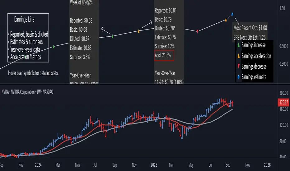
Earnings Line Pro - EPS Tracker [LevelUp]Earnings Line Pro plots quarterly earnings data, including earnings surprises and estimates, while also highlighting earnings acceleration. It allows you to track and visualize the trend of earnings across daily, weekly, and monthly timeframes.
🔹—— Key Features ——🔹
▪ Quarterly earnings per share, surprises and estimates.
▪ View earnings based on type: reported (non-GAAP), basic or diluted.
▪ Visualize the estimated trajectory of the next quarter earnings estimate.
▪ Year-Over-Year (YOY) data is included for each quarterly earnings summary.
▪ Visualize earnings acceleration, quarter over quarter.
▪ Plot on daily, weekly and monthly timeframes.
🔹—— Earnings Data ——🔹
Earnings are a foundational concept in stock analysis, often exerting a significant influence on a company's long-term performance. By visualizing earnings data as a plot rather than just a table of statistics, investors can more easily spot patterns of acceleration or deceleration. For instance, a steep upward slope between earnings releases — or a sequence of progressively higher earnings — signals a robust earnings trajectory. The sharper the acceleration, the greater the likelihood that the stock will outperform the broader market.
Historical studies show that top-performing companies consistently deliver steady earnings growth. Whether your focus is short-term trading or long-term investing, recognizing the direction and rate of earnings growth is essential for evaluating potential price movement.
While quarterly earnings data remains consistent across all timeframes, the perspective shifts depending on your goals. A monthly chart highlights multi-year growth and is ideal for investors with a buy-and-hold mindset. In contrast, weekly or daily charts have fewer data points, making them better suited for traders focused on positions lasting weeks or months.
🔹—— Choose Earnings Type ——🔹
With the Earnings Line indicator, you can view reported (non-GAAP), basic and/or diluted earnings.
▪ Reported (non-GAAP) earnings typically refer to a company’s net income as disclosed in its financial statements. This figure represents overall profitability after accounting for all expenses, taxes, and adjustments.
▪ Basic earnings per share (EPS) is calculated by dividing net income by the weighted average number of common shares outstanding during the reporting period. It provides a straightforward measure of earnings attributable to each existing share.
▪ Diluted earnings per share (EPS) goes a step further by incorporating the potential impact of additional shares from convertible securities, stock options, or warrants. This presents a more conservative, “what-if” scenario that assumes all possible dilution has occurred.
Reviewing these various types is important as they provide a bigger picture view of company performance: reported earnings show overall profitability, basic EPS reflects earnings per existing share, and diluted EPS highlights the potential impact of share dilution.
In the Settings dialog, select your preference on the earnings type. Check the box "Show Data For All Earnings Types" to view all types when hovering over an earnings data point.
🔹—— Year-Over-Year Data ——🔹
Viewing year-over-year (YOY) data for earnings is essential because it provides a clear picture of a company's growth trajectory by comparing current earnings to the same period in the prior year, helping to identify sustainable trends rather than short-term anomalies.
This metric helps eliminate seasonal fluctuations, offering a more accurate assessment of operational performance and efficiency improvements over time. Additionally, consistent YOY earnings growth can signal a company's competitive strength and potential for stock price appreciation, aiding in informed investment decisions.
🔹—— Earnings Acceleration ——🔹
Looking for earnings acceleration — where the rate of earnings growth is increasing — helps identify companies with strengthening momentum. This often reflects improving business operations, market expansion, or competitive advantages that can drive outsized returns. Viewing acceleration data can help you spot potential leaders early while avoiding stocks with flat or slowing earnings that may underperform the market.
🔹—— Visualize Earnings Estimate ——🔹
At a glance, view the next-quarter estimate to gauge the likely direction of the earnings trend. These forward-looking insights provide an early view of a company’s expected financial performance and can help anticipate potential stock price movements depending on whether actual results meet, exceed, or miss expectations.
The estimates — often based on analyst consensus — reflect market sentiment and can highlight both growth opportunities and risks.
🔹—— Plot Earnings Line On Main Chart ——🔹
By default, earnings data is plotted in a separate pane below the main chart. Follow the steps below to plot the earnings line on the main chart.
▪ Click on the indicator name on left side of the chart.
▪ Select the "..." option.
▪ Use the "Move-to" option to change the location of the earnings line.
▪ To hide the EPS scale on the left, select the "..." option.
▪ In "Pin to scale" select the "No scale (fullscreen)" option.
🔹—— Best Practices ——🔹
▪ Compare year-over-year, not just quarter-over-quarter as YOY changes help filter out seasonality.
▪ Positive surprises can spark strong price reactions, recurring surprises strengthen confidence.
▪ Look for divergence. If earnings accelerate but price lags, it may signal an early opportunity.
▪ Review daily, weekly, and quarterly charts to align short and long-term trends.
▪ Combine fundamentals with technicals, including volume analysis.
▪ Always define risk before entering a trade — know where you’ll exit.
▪ Size positions based on volatility and conviction, not emotion.
▪ Be patient — trends take time to develop.
Bezahltes Script
Multi-Timeframe RSI Tracker by Ox_kaliThis script, is trend Tracker that serves as an analytical tool for assessing market trends through the lens of the Relative Strength Index (RSI) across multiple timeframes. It caters to individuals who require a detailed examination of market dynamics, leveraging the RSI to gauge the strength and direction of market momentum.
Functionality Overview:
Multi-Timeframe Analysis: The script evaluates the RSI across an array of timeframes, from 1 minute up to 1 week. This diverse range allows for a comprehensive view of market trends, accommodating strategies that span from intraday to long-term analysis.
RSI Trend Interpretation: It utilizes the RSI to determine market trends. Specifically, an RSI value above 50 signals a bullish trend, indicating that positive momentum is prevailing. Conversely, an RSI below 50 suggests a bearish trend, marking a period of negative momentum. This simple yet effective method provides a quick way to assess the market’s direction.
Customization and Flexibility: Users can customize the appearance of trend lines with different colors to distinguish between bullish and bearish trends easily. Furthermore, the script includes options to select which timeframes are displayed, allowing users to tailor the analysis to their specific needs.
Average Trend Indicator: A important feature is the calculation of an average trend across all selected timeframes. This aggregated trend gives a summarized view of the overall market direction, offering an additional layer of insight.
Adjustments and Enhancements:
User-Controlled Settings: Beyond the pre-defined color themes (Normal, Modern, Classic, Robust, Accented, Monochrome), the script introduces a user-defined option for maximum customization. This feature empowers users to set their preferred colors for various trend conditions.
Label Positioning and RSI Period Customization: The script provides inputs for adjusting label positions and setting the RSI period, enabling a personalized and clear charting experience.
Detailed Timeframe Analysis: The inclusion of a wide range of timeframes ensures that users can conduct a detailed examination of market behaviors, facilitating informed decision-making.
Operational Note:
The Multi-Timeframe RSI Tracker is a tool designed to supplement market analysis within a comprehensive trading strategy. It is crucial for users to integrate this tool within a framework that includes risk management and to familiarize themselves with its functionalities through testing and practice. By offering a detailed perspective on market trends through RSI analysis, this script by Ox_kali provides valuable insights, aiding users in navigating the complexities of the financial markets with an informed approach.
Please note that the MTEMA-Tracker is not a guarantee of future market performance and should be used in conjunction with proper risk management. Always ensure that you have a thorough understanding of the indicator’s methodology and its limitations before making any investment decisions. Additionally, past performance is not indicative of future results.

EntryPrice Gain&Loss IndicatorThis indicator takes (1) an entry price or average position price and (2) position size (denominator) to calculate current gain or loss and returns those as well as the position change in percent. It will also draw into the Chart and show relevant data in a table.
It is mainly supposed to help tracking an (average) spot position easily.
It is recommended to switch it to invisible when switching to other charts.
You can also use several instances of the indicator to track your positions in different assets.
Features:
- table position and text size can be adjusted
- colors can be changed
(recommending 25% opacity for plot backgrounds)
- several instances possible
(recommended to tuen indicator invisible when switching to other charts or analyzing
Version 1.0
Vortex Trend Tracker 2.0 + RSIThe Vortex Indicator may seem complex, but it is essentially composed of an uptrend line and a downtrend line. It can be used to track trend strength, anticipate reversals, and generate entry and exit signals. The calculation for the indicator is provided in the open-source code below.
To minimize false signals produced by the indicator, we incorporated an Exponential Moving Average of vmPlus and vmNegative values with a default length of 10. Reducing this length would result in a more responsive vortex, but at the cost of increased false signals.
The chart displays the absolute value of the difference between the uptrend and downtrend lines as the main histogram. If the uptrend line surpasses the downtrend line (indicating positive movement), the histogram bars will be either light green or dark green. Dark green bars indicate that the uptrend has just crossed over the downtrend line or is increasing in strength. If the uptrend line is greater than the downtrend line but decreasing, then the bars will be light green. This indicates that the upward trend is losing strength.
Conversely, if the downtrend line is greater than the uptrend line, indicating a negative trend, the bars will be either red or light red. A red bar signifies that the downtrend line has only recently crossed the uptrend line or is increasing in value. Light red bars indicate that the downtrend is weakening despite being greater than the uptrend line.
One way to trade using the Vortex is to go long when the bar color changes from red to light red, suggesting that the downtrend is weakening and an upward reversal is likely to occur soon. Traders can then exit their long position when the bars change from dark green to light green since that implies that the uptrend is losing momentum and prices are unlikely to continue rising.
Traders can also choose to have the uptrend and downtrend lines plotted in the input menu to facilitate visualizing the Vortex's usefulness in identifying reversals.

RockIt Algo Profit Track X (Add-on to RockIT Algo)The RockIT Algo Profit / Loss Tracker is an add-on for the RockIT Algo Indicator. It provides the profit / loss realized for each buy or sell signal. This way you can visually view the performance and make profitable decisions.
The RockIT Algo Indicator is designed to generate buy (Long) / sell (Short) signals & is developed using statistical analysis & forecasting techniques. The algorithm takes into consideration different dynamic variables of short, medium and long term price actions and high probability patterns to project future direction. It is suited for all types of trading and can be used for any stocks, forex pairs and crypto.
Disclaimer
TheStreetATM is not registered as financial or investment advisors. You take the responsibility of making the final decision based on the tools, education and information we provide. Trading stocks can lead to very large losses, and we strongly recommend to consult any registered financial advisor before making any decision based on information provided by “RockIT” Algo®. Thank you. We strongly advice to paper trade before making real trading decisions.

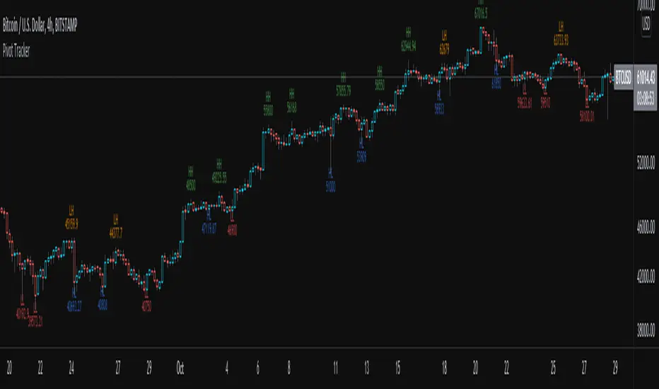
Pivot TrackerThis script finds swing lows and swing highs based on input criteria for lookback and lookforward periods, and plots letters accordingly.
Helps identify trend or lacktherof
HH = higher high
LH = lower high
HL = higher low
LL = lower low
Profit/Loss Live trackerI small script to track the current active trade live.
**HOW IT WORKS**
change inputs in parameter
- Entry price
- Invested capital
- Comission fees

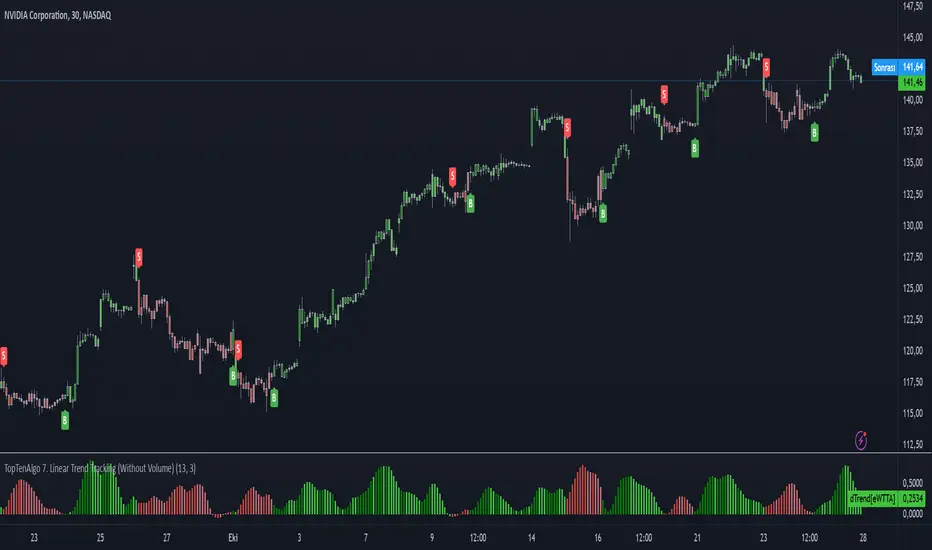
TopTenAlgo 7. Linear Trend Tracking (Without Volume & Coloring)EN:
Dogrusal Trend Takipcisi is used in conjunction with Gosterge Trend. Both indicators are for approval of each other. While the Indicator looks at Logarithmic to prices, It looks at Linear. Although its mathematical function is stuck between two trend lines like Gösterge Trend, the Dogrusal Trend Takipcisi can also be used as the main histogram, the absolute value of the difference between the trend and the down trend line .
If the uptrend line is larger than the downtrend, histogram bars are light green or dark green areas. When the bullish trend line now crosses the down trend line , the bar is dark green. When the up trend line is larger than the down trend line and the up trend line increases, the bars also become dark green. This tendency starts to keep getting stronger. If the bullish trend line is larger than the bearish trend line but decreases, the bars are light green. This is when the bullish trend loses strength, So, Uptrend is weakening.
If the downtrend line is larger than the bullish trend line , a negative occur, and the bars become red or light red. If the bearish trend line has exceeded the bullish trend line or the value is increasing, the bar is in red. If the bearish trend line is larger than the bullish trend line but the value is decreasing, the bars are light red. This comes when the downward trend is losing power. So, Downtrend is weakening. For symbols for which the Volume Indicator cannot be read.
This algorithm is prepared with @Top10Algo ...
TR: Doğrusal Trend Takipçisi Gösterge Trendle ile beraber kullanılır. Her iki göstergede birbirinin onayını almak içindir. Gösterge Trend fiyatlara logaritmik bakarken, Doğrusal Tren Takipçisi Linear bakar. Matematiksel fonsiyonu Gösterge Trend gibi iki trend çizgisi arasına sıkışmış olsada Doğrusal Trend Takipçisi ayrıca ana histogram olarak gösterilen yukarı trend ve aşağı trend çizgisi arasındaki farkın mutlak değerini linear olarak hesaplayarak momentumun gücünü ölçer ve size zayıflayan trendleri haber eder.gösterir.
Yukarı trend çizgisi aşağı trendden büyükse (bu nedenle pozitif hareketi gösterir), histogram çubukları açık yeşil veya koyu yeşil olacaktır. Artış trendi çizgisi şimdi aşağı trend çizgisini geçtiğinde, çubuk koyu yeşil olacaktır. Yukarı trend çizgisi aşağı trend çizgisinden daha büyük olduğunda ve yukarı trend çizgisi arttığında çubuklar da koyu yeşil olur. Bu eğilimin güçlenmeye devam ettiği anlamına geliyor. Yükseliş trendi çizgisi düşüş trendi çizgisinden büyükse ancak azalıyorsa, çubuklar açık yeşil olacaktır. Bu yükseliş eğiliminin güç kaybettiği anlamına gelir.Yani yükseliş trendi zayıflıyordur.
Düşüş trendi çizgisi yükseliş trendi çizgisinden büyükse, olumsuz bir eğilim oluşur ve çubuklar kırmızı veya açık kırmızı olur. Düşüş trendi çizgisi yükseliş trendi çizgisini aştıysa veya değer artıyorsa, çubuk kırmızı olacaktır. Düşüş trendi çizgisi yükseliş trendi çizgisinden büyükse, ancak değer azalıyorsa, çubuklar açık kırmızı olacaktır. Bu düşüş eğiliminin güç kaybettiği anlamına gelir. Yani düşüş trendi zayıflıyordur. Hacim Göstergesinin okunamadığı semboller içindir.
Bu algoritma @Top10Algo ile beraber hazırlanmıştır...
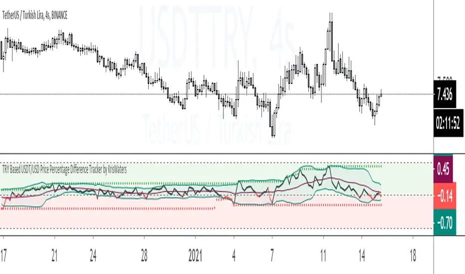
TRY Based USDT/USD Price Percentage Difference TrackerIndicator helps you that track the price percentage difference between USDT/TRY and USD/TRY market pairs.
[A618] Liquidity Tracker and Iceberg Detector V2 ProIntroduction
We all know markets and market makers work over liquidity concepts, Liquidity is what makes market cyclic and drives it!
The aim of this experimental Indicator is to identify the liquidation points and levels where the big players are actually playing.
When you’re trading financial markets, liquidity needs to be considered before every position is opened or closed. This is because a lack and increase of liquidity is often associated with increased risk.
You need to be able to put probabilities in your favour, understanding liquidity levels in the market is always a good to know thing for one to judge / estimate whether the market is behaving according to the analysis or not.
How Can you Get this Indicator
Just send me up a private message, (Please use comment box only for constructive comments, and community improvement)
What are icebergs
If you see the DOM data, you will see lots of orders on both side (buyers/sellers), Its just the tip of the iceberg that we are able to see in the order flow, the aim of the iceberg detection concept over here is to estimate when a large order is executed and in what direction.
What is the Use of Trendlines
Trendlines basic configuration is 50 back pivot levels, you can also configure it to 20, 10 depending on how fast you wanna track things
Use trendlines to detect the icebergs happening above and below it conjure it with your study.
Provision for Alerts
You can configure alerts over iceberg detection
Which market it will work and on what timeframes
This indicator will work for any liquid market,
Stocks, forex, Bitcoins etc
Since the order flow dynamics remains pretty much the same everywhere,
For efficient utilisation, use these timeframes
15s, 30s, 1 min, 3 min, 5 min, 15 min, 30 min, 1Hr

Tether Market Cap - {Cross-Exchange} Tether Market Cap Indicator
Keep track of tether movements cross exchange & total market cap in real-time.
Never miss a movement in the Tether market.
How it works
Starts by selecting the security "CRYPTOCAP:USDT" with, period, close,
The script will then call on each exchange listed to get the usdt_supply from each exchange.
It will then print the data to the indicator as such:
Yellow = Total Tether Market Cap
Orange = Kraken Supply USDT
Red = Poloniex Supply USDT
Green = Bitfinex Supply USDT

Volume Price ROC Tracker and Shadow CandlesWhen price goes up on negative volume, then market is telling there is doubts in investors mind.
The SPX upside recent month was a on. Lower volume so, the rally in my view will not last. Read my articles on current market.
This very simple scripts shows if price drop or gain was on a upside volume or down side. It is a visual track on the candle reflecting the volume ROC overlapped as a price movement on the actual candle. So don't mistake it with a moving average. Red means volume was down even if price has gone up. Basically if a price goes up on a increase ROC volume then you can trust it. Otherwise it is likely that it won't last.
If you can improve on this idea, it would be great. I think there is not enough volume related scripts that diggs a bit deeper to describe the market behaviour in the future. After all all technical analysis are supposed to tell us about future price not just how it was in the past.

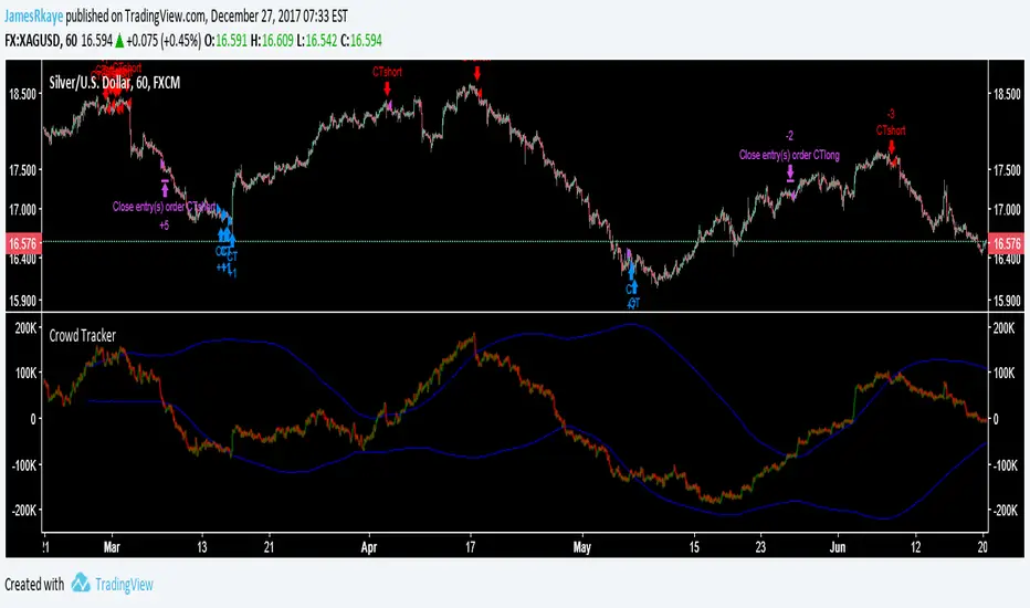
Crowd Tracker (work in progress)This indicator/strategy should be used similarly to how you would analyse sentiment data, when the crowd is bullish look to be short, when the crowd is bearish look to be long. It is also is inspired by Elliott wave, as it is looking for ending waves. The crowd tracker uses volume and price data to estimate how many people went long or short in a candle, then adds the candles over a 500 candle period together. A spike in bullishness on the indicator indicates that a bull trend may be over because ending Elliott waves, for example 5s and Cs, are when the crowd are most on board with the trend. The blue lines are a standard deviation (Bollinger Band), between these lines is where a healthy trend would be found. When the Crowd Tracker leaves and re-enters the blue lines this is a sign of a change in trader psychology, as they have reached their maximum confidence in a trend then reversed.
This is still work in progress because I want to find a better way to find the tops and bottoms of the Crowd Tracker, so it is set to invite only, after I have completed it I will probably release it in protected so follow me if you want to use it later on :) It is good at spotting entries for cryptos and stock indexes however the exits still need work.
ICT Macro Tracker - Study Version (Original by toodegrees)This indicator is a modified study version of the ICT Algorithmic Macro Tracker by toodegrees, based on the original open-source script available at The original indicator plots ICT Macro windows on the chart, corresponding to specific time [ periods when the Interbank Price Delivery Algorithm undergoes checks/instructions (aka "macros") for the price engine to reprice to an area of liquidity or inefficiency.
This study version adds functionality to hide bars outside macro periods. When enabled, the indicator draws boxes that cover the full chart height during non-macro periods, obscuring those bars so only macro periods are visible. This helps focus on macro-only price action. The feature is configurable, allowing users to enable or disable it and customize the box color. All original functionality remains intact.

Red to Green / Green to Red Tracker# Red to Green / Green to Red Tracker - Quick Reference
## Core Concept
```
PRIOR CLOSE = Yesterday's closing price = The "zero line" for today
Above Prior Close = 🟢 GREEN (profitable for yesterday's buyers)
Below Prior Close = 🔴 RED (losing for yesterday's buyers)
```
---
## The Two Key Moves
### 🟢 Red to Green (R2G)
```
OPEN: Below prior close (RED)
↓
CROSS: Price moves above prior close
↓
RESULT: Now GREEN - Bullish signal
```
**Why it matters:**
- Bears who shorted get squeezed
- Creates FOMO buying
- Momentum often continues
---
### 🔴 Green to Red (G2R)
```
OPEN: Above prior close (GREEN)
↓
CROSS: Price moves below prior close
↓
RESULT: Now RED - Bearish signal
```
**Why it matters:**
- Longs who bought get trapped
- Triggers stop losses
- Panic selling follows
---
## Signals Explained
| Signal | Shape | Location | Meaning |
|--------|-------|----------|---------|
| R2G | ▲ Green Triangle | Below bar | Crossed to green |
| G2R | ▼ Red Triangle | Above bar | Crossed to red |
---
## Level Lines
| Line | Color | Style | What It Is |
|------|-------|-------|------------|
| Prior Close | Orange | Solid | KEY R2G/G2R level |
| Prior High | Green | Dashed | Yesterday's high |
| Prior Low | Red | Dashed | Yesterday's low |
| Today Open | White | Dotted | Gap reference |
---
## Info Table Reference
| Field | What It Shows |
|-------|---------------|
| Status | 🟢 GREEN / 🔴 RED / ⚪ FLAT |
| Day Change | % change from prior close |
| Prior Close | The key level price |
| Distance | How far from prior close |
| Opened | Did today open green or red |
| R2G | R2G status + price if triggered |
| G2R | G2R status + price if triggered |
| Rel Vol | Current relative volume |
| Prior High | Yesterday's high + distance |
| Prior Low | Yesterday's low + distance |
---
## Trading R2G (Long Setup)
### Entry Checklist
- Stock opened RED (below prior close)
- R2G cross signal triggered (green triangle)
- Volume confirmation (1.5x+ preferred, 2x+ ideal)
- Price holding above prior close
- Overall market not tanking
### Entry Method
1. **Aggressive:** Enter immediately on R2G cross
2. **Conservative:** Wait for pullback to prior close (now support)
### Stop Loss
- Below the R2G cross candle low
- OR below prior close (tighter)
### Target
- Prior day high (first target)
- 2:1 risk-reward minimum
---
## Trading G2R (Short Setup)
### Entry Checklist
- Stock opened GREEN (above prior close)
- G2R cross signal triggered (red triangle)
- Volume confirmation
- Price staying below prior close
- Overall market not ripping
### Entry Method
1. **Aggressive:** Enter immediately on G2R cross
2. **Conservative:** Wait for bounce to prior close (now resistance)
### Stop Loss
- Above the G2R cross candle high
- OR above prior close (tighter)
### Target
- Prior day low (first target)
- Gap fill (if gapped up)
---
## Signal Quality
### High Quality R2G ✓
- Opened significantly red (-2% or more)
- Strong volume on cross (2x+)
- First R2G of the day
- Market trending up
- News catalyst present
### Low Quality R2G ✗
- Opened barely red (-0.5%)
- Low volume cross
- Multiple R2G/G2R already today (choppy)
- Fighting market direction
- No clear catalyst
---
## Common Patterns
### Clean R2G (Best)
```
Open red → Steady climb → Cross prior close → Continue higher
```
### Failed R2G (Avoid/Exit)
```
Open red → Cross to green → Immediately fail back to red
```
### Choppy R2G/G2R (Avoid)
```
Multiple crosses back and forth = Indecision, no clear direction
```
---
## First Cross Rule
**The FIRST R2G or G2R of the day is usually the most significant.**
Why?
- Catches traders off guard
- Largest reaction from market
- Sets tone for rest of day
If you miss the first cross, be more selective on subsequent crosses.
---
## Volume Guide
| Rel Volume | Quality | Action |
|------------|---------|--------|
| < 1.0x | Weak | Skip or small size |
| 1.0-1.5x | Average | Standard position |
| 1.5-2.0x | Good | Full position |
| 2.0x+ | Strong | High conviction |
---
## Settings Recommendations
### Default (Balanced)
```
Require Opposite Open: ON
Require Volume: ON (1.5x)
Candle Close Confirm: OFF
Min Cross %: 0
```
### Conservative (Fewer, Better Signals)
```
Require Opposite Open: ON
Require Volume: ON (2.0x)
Candle Close Confirm: ON
Min Cross %: 0.5
```
### Aggressive (More Signals)
```
Require Opposite Open: OFF
Require Volume: OFF
Candle Close Confirm: OFF
Min Cross %: 0
```
---
## Alert Setup
### Essential Alerts
1. **First R2G of Day** - Highest value alert
2. **R2G with Strong Volume** - High conviction
### How to Set
1. Right-click chart → Add Alert
2. Condition: R2G/G2R Tracker
3. Select alert type
4. Set notification method
---
## Combining with Other Indicators
| Indicator | How to Use |
|-----------|------------|
| **Gap & Go** | R2G on gap-down stock = strong reversal |
| **Bull Flag** | Look for bull flag after R2G confirmation |
| **Float Rotation** | R2G + high rotation = explosive potential |
| **VWAP** | R2G above VWAP = strongest setup |
---
## Common Mistakes
❌ **Chasing late R2G**
- If price is already 3-5% green, you missed the move
- Wait for pullback or next setup
❌ **Ignoring volume**
- Low volume R2G often fails
- Always check relative volume
❌ **Fighting the market**
- R2G in a tanking market often fails
- G2R in a ripping market often fails
❌ **No stop loss**
- Failed R2G can reverse hard
- Always have a defined stop
❌ **Overtrading choppy stocks**
- Multiple R2G/G2R = no clear direction
- Skip stocks that keep crossing back and forth
---
## Quick Decision Framework
```
1. Did it open opposite color? (Red for R2G, Green for G2R)
- NO → Lower probability, be cautious
- YES → Continue
2. Is volume confirming? (1.5x+ relative volume)
- NO → Skip or small size
- YES → Continue
3. Is this the first cross of the day?
- YES → Higher probability
- NO → Be more selective
4. Is market direction supportive?
- NO → Skip
- YES → Take the trade
5. Can you define risk? (Clear stop level)
- NO → Skip
- YES → Execute
```
---
## Key Takeaways
1. **Prior close is THE key level** - everyone watches it
2. **First cross matters most** - sets daily tone
3. **Volume confirms** - low volume crosses often fail
4. **Failed crosses reverse hard** - always use stops
5. **Don't overtrade choppy action** - multiple crosses = stay out
---
Happy Trading! 🟢🔴

Automatic -Market Cycle & Exposure Tracker**Market Exposure Tracker — Visual Cycle & Risk Management Tool**
Market Exposure Tracker is a dynamic position sizing and cycle awareness indicator created for traders and investors who want a clear, actionable visual on market strength and risk without complex settings. It is designed to help you confidently navigate trending phases, transitions, and breakouts—tailored to your style.
**How it works:**
- **Trading Style Selection:** Choose from Intraday, Swing, Positional, or Investor profiles. The indicator immediately adapts to reflect the most relevant cycle signals, so you get information suited to your unique timeframe and decision-making rhythm.
- **Cycle Visualization:** Colored histogram bars represent the intensity and persistence of trend cycles. As bullish or bearish moves extend, the bars dynamically adjust in height and shade, giving you immediate at-a-glance feedback about market momentum.
- **Breakout Signals:** The first three bars of a new upward phase are highlighted with white dots, making it easy to spot emerging uptrends and breakout points. This intuitive marking system helps you act decisively when cycles shift.
- **Risk Management Table:** Stay informed with a streamlined dashboard showing your trading style, the current market cycle, bar counts, and risk suggestions—all designed for fast reference and practical decision support.
**Why use this indicator?**
- No need for manual configuration: Everything adapts automatically as you select your trading profile.
- Quickly identify the start and persistence of bullish and bearish market phases.
- Easily spot fresh momentum and breakout opportunities.
- Receive visual cues for when to adjust risk and exposure during prolonged trends.
- Maintain clarity with a clean dashboard—only showing what you need.
This tool is ideal for anyone seeking to add structure, discipline, and visual clarity to trading decisions, whether managing short-term trades or long-term investments.
*(This indicator does not provide buy/sell signals or financial advice. Use for informational and educational purposes.)*

[PRO] Dual Options Price Tracker – Visualize Call & Put StrikesDescription:
This is the PRO version of all ready free available indicator on tradingview
Dual Options Price Tracker – Visualize Call & Put Strikes
In vesrion you will get fast AFMA and also alert when any of price cross there respective
AFMA.
This innovative indicator provides a unique, real-time visualization of both Call and Put option prices for the same strike price directly on your TradingView chart. Designed for active options traders, it simplifies the analysis of price action for specific strikes, helping you quickly identify significant levels and potential shifts in market interest.
important : choose only put strike call strike automatically plot on chart
This indicator works with Indian market (nifty , banknifty ,sensex ,crudeoil , naturalgas )
Key Features:
Integrated Call & Put Prices: Clearly displays the prices of both Call and Put options for a user-defined strike price within the same indicator pane, offering an immediate side-by-side comparison.
Real-time Data: Plots live option price updates, allowing you to monitor the dynamic interplay between Calls and Puts throughout the trading session.
Intuitive Visualization: Transforms complex options data into easily digestible lines on your chart, making it easier to spot trends, relative strength, and support/resistance levels at crucial strikes.
User-Friendly Inputs: Simple input fields allow you to easily select the underlying symbol, expiry date, and the specific strike price you wish to monitor.
Enhanced Options Analysis: A valuable tool for gauging market participants' expectations and positioning at key psychological or technical levels.
How to Use:
Add the "Dual Options Price Tracker" to your chart.
1. Hide symbol chart for Better visualization
2. Select any put strike , call strike Plot autpmatically
3. Use also in indexs ( nifty , banknifty ,sensex ,crudeoil , naturalgas , bitcoin )
4. For indian market
The indicator will then plot the corresponding Call and Put prices on your chart in real time.
Important Note:
This indicator provides a visual tool for options analysis and does not constitute financial advice.
Options trading involves significant risk and may not be suitable for all investors.
Users are encouraged to combine this tool with their own comprehensive analysis and risk management strategies.

Nick2k Trend Tracker MT botNick2k Trend Tracker MT bot
Type: Indicator (signals + PineConnector alerts for EAs)
Markets: Designed for XAUUSD (gold), adaptable to other symbols
Timeframes: Optimized for M5/M15
---
What it does
Nick2k Trend Tracker MT bot identifies trend flips using a percentile-normalized SMA slope with hysteresis, then applies a multi-layer filter suite to avoid false signals in low-quality conditions.
It can optionally auto-manage trades via PineConnector:
Send open orders with SL/TP (ATR- or pip-based)
Breakeven activation
Dual trailing stops (pip-based or ATR-based)
Staged partial closes (up to 3 levels)
The indicator also:
Highlights chop zones in the background
Provides diagnostic labels showing which filters passed/failed
Lets you disable all alerts with one checkbox (visual testing mode)
---
Core logic (simplified)
Trend Engine: SMA slope normalized by a rolling percentile; flips with hysteresis at +0.1/–0.1.
Filters: optional checks for slope strength, ADX, narrow range ratio, ATR squeeze, higher-timeframe slope.
Sessions: entry/management can be gated to London, NY, Tokyo, Sydney sessions and weekdays.
Chop highlight: background shading when ranges/low-volatility are detected for consecutive bars.
---
Visuals
Colored SMA line (gradient by slope)
BUY/SELL labels at valid flip bars
Chop background (yellow overlay)
Filter score/diagnostic label (optional)
---
Alerts & PineConnector integration
Open orders: sent at valid BUY/SELL flips with embedded SL/TP + BE/trailing if enabled
Partial closes: 3 configurable milestones (ATR or pip based, % or fixed lots)
Master toggle: switch all alerts ON/OFF instantly
Alerts are formatted in PineConnector EA syntax for compatibility with MetaTrader auto-trading.
---
Inputs (organized by group)
SMA & Theme (length, colors)
Auto Trading (license, symbol, lots, master toggle)
SL/TP Target Type (prices vs pips)
ATR SL/TP (length, multipliers, rounding)
Breakeven (trigger/offset)
Pip Trailing (trigger/dist/step)
ATR Trailing (TF, period, multiplier, trigger)
Partial Closes (mode, lots or %)
Time Filters (sessions, weekdays)
Filters (Slope, ADX, NRR, ATR squeeze, HTF confirm)
Chop Zone Highlight (on/off, hold bars, color)
---
Why this script is unique (and closed-source)
This is not a simple moving-average crossover. It combines several custom-built methods that are rarely seen in public scripts:
Normalized SMA slope with hysteresis: avoids whipsaws, adapts to volatility regimes.
Multi-filter confirmation: ADX, NRR, ATR squeeze, HTF slope — stacked to improve quality.
Chop detection with persistence: custom counter/hold logic to highlight ranging markets.
Integrated trade management: PineConnector-ready messages with SL/TP, breakeven, dual trailing stops, staged partial closes.
EA-compatible syntax: formatted exactly for PineConnector EAs, including safety toggles.
This represents a full trading framework designed for semi-automated gold scalping, not just a “signal indicator.”
The source is protected to prevent clones and preserve development effort invested in unique logic and PineConnector integration.
---
Recommended starting settings (XAUUSD M5/M15)
Pip size: 0.10
Slope threshold: 0.20 (M5), 0.16–0.20 (M15)
ADX min: 18–22
NRR floor: 2.0–2.4
ATR ratio: 0.65–0.75
ATR SL/TP: SL = 1.5×ATR, TP = 2.5×ATR
Sessions: London & NY
---
Limitations & disclaimer
Not financial advice. Test on demo before live trading.
Performance depends on broker symbols, spread, and volatility regime.
Auto-trading requires PineConnector EA set up correctly.
---
Changelog
v1.0 – Initial release (trend engine, filters, sessions, chop highlight, PineConnector alerts, BE/trailing, partial closes, diagnostics)

Simple NASDAQ TrackerNasdaq Tracker, is an indicator to use while trading nasdaq stocks.
It uses the chart as a market tracker too know what the overall blue chip market is doing, if it trades above the moving average, it indicates the the overall market is going upp or down.

Volume Delta Pressure Tracker by GSK-VIZAG-AP-INDIA📢 Title:
Volume Delta Pressure Tracker by GSK-VIZAG-AP-INDIA
📝 Short Description (for script title box):
Real-time volume pressure tracker with estimated Buy/Sell volumes and Delta visualization in an Indian-friendly format (K, L, Cr).
📃 Full Description
🔍 Overview:
This indicator estimates buy and sell volumes using candle structure (OHLC) and displays a real-time delta table for the last N candles. It provides traders with a quick view of volume imbalance (pressure) — often indicating strength behind price moves.
📊 Features:
📈 Buy/Sell Volume Estimation using the candle’s OHLC and Volume.
⚖️ Delta Calculation (Buy Vol - Sell Vol) to detect pressure zones.
📅 Time-stamped Table displaying:
Time (HH:MM)
Buy Volume (Green)
Sell Volume (Red)
Delta (Color-coded)
🔢 Indian Number Format (K = Thousands, L = Lakhs, Cr = Crores).
🧠 Fully auto-calculated — no need for tick-by-tick bid/ask feed.
📍 Neatly placed bottom-right table, customizable number of rows.
🛠️ Inputs:
Show Table: Toggle the table on/off
Number of Bars to Show: Choose how many recent candles to include (5–50)
🎯 Use Cases:
Identify hidden buyer/seller strength
Detect volume absorption or exhaustion
✅ Compatibility:
Works on any timeframe
Ideal for intraday instruments like NIFTY, BANKNIFTY, etc.
Ideal for volume-based strategy confirmation.
🖋️ Developed by:
GSK-VIZAG-AP-INDIA

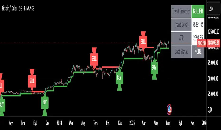
Trend Tracker ProTrend Tracker Pro - Advanced Trend Following Indicator
Overview
Trend Tracker Pro is a sophisticated trend-following indicator that combines the power of Exponential Moving Average (EMA) and Average True Range (ATR) to identify market trends and generate precise buy/sell signals. This indicator is designed to help traders capture trending moves while filtering out market noise.
🎯 Key Features
✅ Dynamic Trend Detection
Uses EMA and ATR-based bands to identify trend direction
Automatically adjusts to market volatility
Clear visual trend line that changes color based on market direction
✅ Precise Signal Generation
Buy signals when trend changes to bullish
Sell signals when trend changes to bearish
Reduces false signals by requiring actual trend changes
✅ Visual Clarity
Green trend line: Bullish trend
Red trend line: Bearish trend
Gray trend line: Sideways/neutral trend
Triangle arrows for buy/sell signals
Clear BUY/SELL text labels
✅ Customizable Settings
Trend Length: Adjustable period for EMA and ATR calculation (default: 14)
ATR Multiplier: Controls sensitivity of trend bands (default: 2.0)
Show/Hide Signals: Toggle signal arrows on/off
Show/Hide Labels: Toggle text labels on/off
✅ Built-in Information Panel
Real-time trend direction display
Current trend level value
ATR value for volatility reference
Last signal information
✅ TradingView Alerts
Buy signal alerts
Sell signal alerts
Customizable alert messages
🔧 How It Works
Algorithm Logic:
1.
Calculate EMA: Uses exponential moving average for trend baseline
2.
Calculate ATR: Measures market volatility
3.
Create Bands: Upper band = EMA + (ATR × Multiplier), Lower band = EMA - (ATR × Multiplier)
4.
Determine Trend:
Price above upper band → Bullish trend (trend line = lower band)
Price below lower band → Bearish trend (trend line = upper band)
Price between bands → Continue previous trend
5.
Generate Signals: Signal occurs when trend direction changes
📊 Best Use Cases
✅ Trending Markets
Excellent for capturing strong directional moves
Works well in both bull and bear markets
Ideal for swing trading and position trading
✅ Multiple Timeframes
Effective on all timeframes from 15 minutes to daily
Higher timeframes provide more reliable signals
Can be used for both scalping and long-term investing
✅ Various Asset Classes
Stocks, Forex, Cryptocurrencies, Commodities
Particularly effective in volatile markets
Adapts automatically to different volatility levels
⚙️ Recommended Settings
Conservative Trading (Lower Risk)
Trend Length: 20
ATR Multiplier: 2.5
Best for: Long-term positions, lower frequency signals
Balanced Trading (Default)
Trend Length: 14
ATR Multiplier: 2.0
Best for: Swing trading, moderate frequency signals
Aggressive Trading (Higher Risk)
Trend Length: 10
ATR Multiplier: 1.5
Best for: Day trading, higher frequency signals
🎨 Visual Elements
Trend Line: Main indicator line that follows the trend
Signal Arrows: Triangle shapes indicating buy/sell points
Text Labels: Clear "BUY" and "SELL" text markers
Information Table: Real-time status panel in top-right corner
Color Coding: Intuitive green/red color scheme
⚠️ Important Notes
Risk Management
Always use proper position sizing
Set stop-losses based on ATR values
Consider market conditions and volatility
Not recommended for ranging/sideways markets
Signal Confirmation
Consider using with other indicators for confirmation
Pay attention to volume and market structure
Be aware of major news events and market sessions
Backtesting Recommended
Test the indicator on historical data
Optimize parameters for your specific trading style
Consider transaction costs in your analysis