SterlCore FX [JOATSterlCore FX Matrix is a multi-timeframe forex indicator that integrates market structure analysis, central bank policy proxies, currency strength correlation, session-based liquidity tracking, and volatility diagnostics into a single overlay system.
Note: This script is published as an invite-only INDICATOR. It does not generate backtesting results or automated trade execution. Access requires authorization through the script's access control settings.
## Why This Script Merits Invite-Only Protection
This indicator combines multiple analytical dimensions that individually exist as separate tools across the trading community. The value proposition lies in the specific integration methodology and composite scoring system that synthesizes:
Multi-timeframe EMA lattice with adaptive ATR channels for structure analysis
Central bank policy pressure assessment using normalized currency index calculations
Real-time currency strength matrix across eight major currencies with correlation intelligence
Session-specific VWAP calculations with drift metrics and range analysis
Composite macro confluence scoring that weights and combines all analytical modules
The proprietary elements include the mathematical weighting system for the macro confluence score, the specific normalization methods for currency strength calculations, and the integration logic that prevents conflicting signals across modules. While individual components like EMAs and RSI are standard, their specific combination, the composite scoring methodology, and the multi-module integration represent original development work that justifies source code protection.
---
## How Components Work Together
The indicator's value comes from how its modules interact, not from any single component:
Data Flow:
1. Multi-timeframe EMAs establish directional bias across strategic, tactical, and execution timeframes
2. Currency strength matrix identifies which currencies are strengthening/weakening across the broader market
3. Policy proxies assess central bank pressure differentials between base and quote currencies
4. Session VWAPs track intraday institutional positioning and drift
5. Correlation grid monitors whether related pairs confirm or contradict the current pair's signals
6. Momentum and volatility filters ensure signals only fire during favorable market conditions
Integration Logic:
Each module produces a normalized score (-1 to +1). These scores are weighted and combined into the macroConfluence composite:
Structure score receives highest weight (50%) as the primary trend filter
Carry composite (30%) captures policy-driven flows
Currency strength spread (20%) validates pair-specific momentum
Momentum, liquidity, session drift, and correlation act as modifiers that can dampen or amplify signals
Why This Integration Matters:
A standard EMA crossover might signal "buy" while currency strength shows the base currency weakening, session VWAP shows price below fair value, and correlation pairs are diverging. The composite scoring system catches these conflicts and reduces signal confidence accordingly. This multi-dimensional validation is what separates this indicator from simple mashups that display multiple indicators without integration.
---
## Core Functionality
This indicator addresses the challenge of synthesizing multiple analytical dimensions in forex trading. Currency markets operate across multiple timeframes simultaneously, with central bank policy shifts, cross-pair correlations, and session-specific liquidity patterns all influencing price action. Most indicators focus on a single dimension; this script attempts to integrate several.
What This Script Does:
Multi-timeframe structure analysis using synchronized EMAs across strategic (daily), tactical (4-hour), and execution (hourly) timeframes
Central bank policy pressure assessment through normalized currency index proxies
Real-time currency strength matrix tracking eight major currencies (USD, EUR, GBP, JPY, AUD, CAD, CHF, NZD)
Cross-pair correlation monitoring using configurable reference pairs
Session-based VWAP calculations with drift and range metrics for Asia, Europe, and US trading windows
Market structure detection including break-of-structure (BOS) confirmation, liquidity sweep identification, and RSI-based divergence alerts
Composite macro confluence score combining all modules with configurable weights
---
## Technical Architecture
### Multi-Timeframe Structure Lattice
The indicator calculates exponential moving averages (EMAs) across three timeframes:
Strategic EMA (default: Daily timeframe, 96-period EMA) — Anchors to longer-term monetary drift and macro flows
Tactical EMA (default: 4-hour timeframe, 55-period EMA) — Captures rotational pressure during positioning for economic data or policy events
Execution EMA (default: 1-hour timeframe, 21-period EMA) — Tracks microstructure in real time
An adaptive ATR-based channel surrounds the execution EMA to define a "value corridor" for entry consideration. Break-of-structure (BOS) logic requires price to close beyond prior swing highs/lows by a configurable ATR percentage threshold to reduce false breakouts.
### Policy Gradient & Carry Intelligence
The script uses currency index proxies (defaults: FX_IDC:EURUSD and FX_IDC:USDJPY ) to approximate central bank policy pressure. These proxies are smoothed via EMA and normalized over a lookback period.
The carryComposite calculation blends:
Normalized policy spread between base and quote currency proxies
Policy drift (difference between tactical and macro timeframe policy spreads)
Carry acceleration (rate of change in policy spread)
Carry opportunity signals appear when the composite exceeds a threshold and aligns with structure bias and currency strength dispersion.
### Currency Strength Matrix
Eight currency baskets are tracked using configurable symbol inputs (defaults use $FX_IDC pairs). Each currency's strength is normalized to a -1 to +1 scale relative to its lookback range. The heatmap table displays which currencies are dominating, allowing quick assessment of broad market moves before they appear in individual pair price action.
### Correlation Intelligence Grid
Three reference pairs (defaults: FX_IDC:EURUSD , FX_IDC:GBPUSD , FX_IDC:USDJPY ) are monitored on a higher timeframe. The script calculates correlation coefficients and assigns qualitative descriptors: "Lockstep +", "Aligned +", "Loose", "Aligned -", or "Lockstep -". A correlation consensus value feeds into the macro confluence calculation, dampening signals when reference pairs show conflicting behavior.
### Momentum, Volatility & Liquidity Stack
Dual ROC momentum — Fast and slow rate-of-change calculations prevent whipsaw from single-length oscillators
Volatility pulse — Compares current ATR to a slower baseline; signals require volatility above a floor threshold
Volatility forecast slope — Uses linear regression to project ATR 21 bars ahead, warning of imminent expansion or contraction
Liquidity pulse — Compares current volume to smoothed average; low participation is visually indicated via background tinting
### Session Awareness & Performance Console
Asia, Europe, and US trading sessions are tracked with configurable UTC windows. Each session maintains:
Live VWAP that resets at session open
Drift score quantifying price deviation from VWAP in ATR terms
Range percentage showing session expansion relative to VWAP
Session bias composite feeds into macro confluence to reduce signal aggression when all sessions are mean-reverting.
### Liquidity & Market Structure Suite
Liquidity sweeps — Detects stop hunts above prior highs or below prior lows within a configurable lookback
RSI divergence — Identifies momentum divergences using confirmed pivot points only
Supply/demand zones — Automatically generated from pivot highs/lows and projected forward for a set number of bars
### Macro Alignment Engine
The macroConfluence score combines:
Structure score (weighted average of strategic/tactical/execution EMAs)
Carry composite
Currency strength spread (base minus quote)
Momentum score
Liquidity modifier
Session bias composite
Correlation consensus
Long/short alignment signals require:
Macro confluence exceeding configurable threshold (default: 0.55)
Volatility pulse above floor threshold
Optional: Price above/below tactical EMA (execution filter toggle)
---
## Visual Elements
Candle Coloring: Candles are recolored based on macro confluence: teal for bullish alignment, magenta for bearish alignment, neutral gray for distribution phases.
Background Tint: Volatility intensity modulates chart background; bold colors indicate elevated ATR, washed-out tones suggest choppy conditions.
Labels:
Macro Align Long/Short — Primary entry signals when confluence exceeds threshold
BOS↑/↓ — Break-of-structure confirmation
Sweep↑/↓ — Liquidity sweep detection
RSI Bull/Bear Div — Momentum divergence alerts
Carry Bias± — Policy-strength alignment flags
Session Overlays: Transparent background shading indicates active trading sessions (Asia, Europe, US) with configurable opacity.
Session VWAPs: Each region's VWAP is plotted in a distinct color (teal for Asia, blue for Europe, purple for US).
---
## Dashboard Tables
The indicator includes several configurable information tables:
Intelligence Dashboard (top-right, default) — Displays strategic/tactical/execution bias, policy pressure, currency spread, volatility pulse, policy impulse, session drift, correlation, and macro state
Currency Heatmap (bottom-right, default) — Shows normalized strength values for all tracked currencies
Correlation Grid (bottom-left, default) — Lists reference pairs with correlation coefficients and qualitative states
Session Performance Panel (bottom-center, default) — Displays drift scores and range percentages for each session
Diagnostics Table (top-left, optional) — Additional session range metrics and liquidity pulse values
All table positions are configurable via input settings to avoid overlap with TradingView UI elements.
---
## Configuration Parameters
Multi-Timeframe Structure: All EMA timeframes and lengths are adjustable. Default strategic timeframe is Daily; tactical is 4-hour; execution is 1-hour.
Policy Proxies: Base and quote currency policy proxy symbols are user-configurable. Defaults use $FX_IDC pairs for broad compatibility.
Currency Strength: Each currency's tracking can be toggled on/off. Symbol inputs allow substitution of alternative data sources if default indices are unavailable.
Correlation References: Three reference pair symbols, timeframe, and lookback period are all configurable.
Signal Thresholds: Macro alignment trigger, volatility pulse floor, and carry opportunity threshold are adjustable to match different trading styles.
Visual Controls: Label visibility, zone display, session overlays, VWAP plotting, and all dashboard tables can be toggled independently.
---
## Technical Implementation Notes
Pine Script v6 compliant
All request.security calls use lookahead_off to prevent historical repainting
BOS, divergence, and sweep detection rely on confirmed pivot points only
Session VWAP calculations reset strictly on session boundaries
Zone objects are automatically capped and managed to respect TradingView resource limits
All calculations include division-by-zero guards and NA handling for real-time stability
---
## Usage Considerations
Timeframe Selection: The indicator is designed for forex pairs. Default timeframes (D/4H/1H) are optimized for swing and intraday trading. Scalpers may prefer shorter execution timeframes; position traders may extend strategic to weekly.
Pair Compatibility: Tested on major pairs ( FX:EURUSD , FX:GBPUSD , FX:USDJPY , OANDA:USDCHF , OANDA:AUDUSD , OANDA:USDCAD , OANDA:NZDUSD ), cross-pairs, and FX-derived CFDs. Policy proxy symbols should be adjusted to match your data feed availability.
Session Windows: Default UTC windows (Asia: 22:00-06:00, Europe: 06:00-13:00, US: 13:00-21:00) can be customized. Adjust for daylight saving time transitions as needed.
Signal Interpretation: Macro alignment signals indicate confluence across multiple dimensions but do not guarantee profitable outcomes. Use in conjunction with risk management and market context. The indicator is a tool for analysis, not a standalone trading system.
Resource Usage: With all features enabled, the script operates within TradingView's resource budgets. Disable unused modules (currency tracking, correlation grid, diagnostics) if running multiple instances on a single layout.
---
## Limitations & Compromises
Policy proxies are approximations using currency indices; actual central bank policy requires external economic analysis
Correlation calculations use price-based correlation, which may lag during regime shifts
Session VWAPs reset at session boundaries; overlapping sessions (e.g., London/NY) may show conflicting signals
Supply/demand zones are generated from pivots; false zones may appear during ranging markets
Macro confluence is a composite score; individual components may conflict, requiring discretionary interpretation
The indicator is optimized for trending and rotational markets. Performance may degrade during extended consolidation or during major economic event volatility when multiple central banks act simultaneously.
---
## Alert System
The script includes four alert conditions:
SterlCore FX Bullish Alignment — Fires when macro confluence exceeds threshold with volatility and EMA filters satisfied
SterlCore FX Bearish Alignment — Mirror of bullish logic
SterlCore FX Carry Long — Fires when carry composite, currency spread, and structure align for long bias
SterlCore FX Carry Short — Mirror of carry long logic
All alerts fire once per bar at bar close.
-Made with passion by officialjackofalltrades
M-forex

CryptoFlux Dynamo [JOAT]CryptoFlux Dynamo: Velocity Scalping Strategy
WHAT THIS STRATEGY IS
CryptoFlux Dynamo is an open-source Pine Script v6 strategy designed for momentum-based scalping on cryptocurrency perpetual futures. It combines multiple technical analysis methods into a unified system that adapts its behavior based on current market volatility conditions.
This script is published open-source so you can read, understand, and modify the complete logic. The description below explains everything the strategy does so that traders who cannot read Pine Script can fully understand how it works before using it.
HOW THIS STRATEGY IS ORIGINAL AND WHY THE INDICATORS ARE COMBINED
This strategy uses well-known indicators (MACD, EMA, RSI, MFI, Bollinger Bands, Keltner Channels, ATR). The originality is not in the individual indicators themselves, but in the specific way they are integrated into a regime-adaptive system. Here is the detailed justification for why these components are combined and how they work together:
The Problem Being Solved:
Standard indicator-based strategies use fixed thresholds. For example, a typical MACD strategy might enter when the histogram crosses above zero. However, in cryptocurrency markets, volatility changes dramatically throughout the day and week. A MACD crossover during a low-volatility consolidation period has very different implications than the same crossover during a high-volatility trending period. Using the same entry thresholds and stop distances in both conditions leads to either:
Too many false signals during consolidation (if thresholds are loose)
Missing valid opportunities during expansion (if thresholds are tight)
Stops that are too tight during volatility spikes (causing premature exits)
Stops that are too wide during compression (giving back profits)
The Solution Approach:
This strategy first classifies the current volatility regime using normalized ATR (ATR as a percentage of price), then dynamically adjusts ALL other parameters based on that classification. This creates a context-aware system rather than a static threshold comparison.
How Each Component Contributes to the System:
ATR-Based Regime Classification (The Foundation)
The strategy calculates ATR over 21 periods, smooths it with a 13-period EMA to reduce noise from wicks, then divides by price to get a normalized percentage. This ATR% is classified into three regimes:
- Compression (ATR% < 0.8%): Market is consolidating, breakouts are more likely but false signals are common
- Expansion (ATR% 0.8% - 1.6%): Normal trending conditions
- Velocity (ATR% > 1.6%): High volatility, larger moves but also larger adverse excursions
This regime classification then controls stop distances, profit targets, trailing stop offsets, and signal strength requirements. The regime acts as a "meta-parameter" that tunes the entire system.
EMA Ribbon (8/21/34) - Trend Structure Detection
The three EMAs establish trend direction and structure. When EMA 8 > EMA 21 > EMA 34, the trend structure is bullish. The slope of the middle EMA (21) is calculated over 8 bars and converted to degrees using arctangent. This slope measurement quantifies trend strength, not just direction.
Why these specific periods? The 8/21/34 sequence follows Fibonacci-like spacing and provides good separation on 5-minute cryptocurrency charts. The fast EMA (8) responds to immediate price action, the mid EMA (21) represents the short-term trend, and the slow EMA (34) acts as a trend filter.
The EMA ribbon works with the regime classification: during compression regimes, the strategy requires stronger ribbon alignment before entry because false breakouts are more common.
MACD (8/21/5) - Momentum Measurement
The MACD uses faster parameters (8/21/5) than the standard (12/26/9) because cryptocurrency markets move faster than traditional markets. The histogram is smoothed with a 5-period EMA to reduce noise.
The key innovation is the adaptive histogram baseline. Instead of using a fixed threshold, the strategy calculates a rolling baseline from the smoothed absolute histogram value, then multiplies by a sensitivity factor (1.15). This means the threshold for "significant momentum" automatically adjusts based on recent momentum levels.
The MACD works with the regime classification: during velocity regimes, the histogram baseline is effectively higher because recent momentum has been stronger, preventing entries on relatively weak momentum.
RSI (21 period) and MFI (21 period) - Independent Momentum Confirmation
RSI measures momentum using price changes only. MFI (Money Flow Index) measures momentum using price AND volume. By requiring both to confirm, the strategy filters out price moves that lack volume support.
The 21-period length is longer than typical (14) to reduce noise on 5-minute charts. The trigger threshold (55 for longs, 45 for shorts) is slightly offset from 50 to require momentum in the trade direction, not just neutral readings.
These indicators work together: a signal requires RSI > 55 AND MFI > 55 for longs. This dual confirmation reduces false signals from price manipulation or low-volume moves.
Bollinger Bands (1.5 mult) and Keltner Channels (1.8 mult) - Squeeze Detection
When Bollinger Bands contract inside Keltner Channels, volatility is compressing and a breakout is likely. This is the "squeeze" condition. When the bands expand back outside the channels, the squeeze "releases."
The strategy uses a 1.5 multiplier for Bollinger Bands (tighter than standard 2.0) and 1.8 for Keltner Channels. These values were chosen to identify meaningful squeezes on 5-minute cryptocurrency charts without triggering too frequently.
The squeeze detection works with the regime classification: squeeze releases during compression regimes receive additional signal strength points because breakouts from consolidation are more significant.
Volume Impulse Detection - Institutional Participation Filter
The strategy calculates a volume baseline (34-period SMA) and standard deviation. A "volume impulse" is detected when current volume exceeds the baseline by 1.15x OR when the volume z-score exceeds 0.5.
This filter ensures entries occur when there is meaningful market participation, not during low-volume periods where price moves are less reliable.
Volume impulse is required for all entries and adds points to the composite signal strength score.
Cycle Oscillator - Trend Alignment Filter
The strategy calculates a 55-period EMA as a cycle basis, then measures price deviation from this basis as a percentage. When price is more than 0.15% above the cycle basis, the cycle is bullish. When more than 0.15% below, the cycle is bearish.
This filter prevents counter-trend entries. Long signals require bullish cycle alignment; short signals require bearish cycle alignment.
BTC Dominance Filter (Optional) - Market Regime Filter
The strategy can optionally use BTC.D (Bitcoin Dominance) as a market regime filter. When BTC dominance is rising (slope > 0.12), the market is in "risk-off" mode and long entries on altcoins are filtered. When dominance is falling (slope < -0.12), short entries are filtered.
This filter is optional because the BTC.D data feed may lag during low-liquidity periods.
How The Components Work Together (The Mashup Justification):
The strategy uses a composite scoring system where each signal pathway contributes points:
Trend Break pathway (30 points): Requires EMA ribbon alignment + positive slope + price breaks above recent structure high
Momentum Surge pathway (30 points): Requires MACD histogram > adaptive baseline + MACD line > signal + RSI > 55 + MFI > 55 + volume impulse
Squeeze Release pathway (25 points): Requires BB inside KC (squeeze) then release + momentum bias + histogram confirmation
Micro Pullback pathway (15 points): Requires shallow retracement to fast EMA within established trend + histogram confirmation + volume impulse
Additional modifiers:
+5 points if volume impulse is present, -5 if absent
+5 points in velocity regime, -2 in compression regime
+5 points if cycle is aligned, -5 if counter-trend
A trade only executes when the composite score reaches the minimum threshold (default 55) AND all filters agree (session, cycle bias, BTC dominance if enabled).
This scoring system is the core innovation: instead of requiring ALL conditions to be true (which would generate very few signals) or ANY condition to be true (which would generate too many false signals), the strategy requires ENOUGH conditions to be true, with different conditions contributing different weights based on their reliability.
HOW THE STRATEGY CALCULATES ENTRIES AND EXITS
Entry Logic:
1. Calculate current volatility regime from ATR%
2. Calculate all indicator values (MACD, EMA, RSI, MFI, squeeze, volume)
3. Evaluate each signal pathway and sum points
4. Check all filters (session, cycle, dominance, kill switch)
5. If composite score >= 55 AND all filters pass, generate entry signal
6. Calculate position size based on risk per trade and regime-adjusted stop distance
7. Execute entry with regime name as comment
Position Sizing Formula:
RiskCapital = Equity * (0.65 / 100)
StopDistance = ATR * StopMultiplier(regime)
RawQuantity = RiskCapital / StopDistance
MaxQuantity = Equity * (12 / 100) / Price
Quantity = min(RawQuantity, MaxQuantity)
Quantity = round(Quantity / 0.001) * 0.001
This ensures each trade risks approximately 0.65% of equity regardless of volatility, while capping total exposure at 12% of equity.
Stop Loss Calculation:
Stop distance is ATR multiplied by a regime-specific multiplier:
Compression regime: 1.05x ATR (tighter stops because moves are smaller)
Expansion regime: 1.55x ATR (standard stops)
Velocity regime: 2.1x ATR (wider stops to avoid premature exits during volatility)
Take Profit Calculation:
Target distance is ATR multiplied by regime-specific multiplier and base risk/reward:
Compression regime: 1.6x ATR * 1.8 base R:R * 0.9 regime bonus = approximately 2.6x ATR
Expansion regime: 2.05x ATR * 1.8 base R:R * 1.0 regime bonus = approximately 3.7x ATR
Velocity regime: 2.8x ATR * 1.8 base R:R * 1.15 regime bonus = approximately 5.8x ATR
Trailing Stop Logic:
When adaptive trailing is enabled, the strategy calculates a trailing offset based on ATR and regime:
Compression regime: 1.1x base offset (looser trailing to avoid noise)
Expansion regime: 1.0x base offset (standard)
Velocity regime: 0.8x base offset (tighter trailing to lock in profits during fast moves)
The trailing stop only activates when it would be tighter than the initial stop.
Momentum Fail-Safe Exits:
The strategy closes positions early if momentum reverses:
Long positions close if MACD histogram turns negative OR EMA ribbon structure breaks (fast EMA crosses below mid EMA)
Short positions close if MACD histogram turns positive OR EMA ribbon structure breaks
This prevents holding through momentum reversals even if stop loss hasn't been hit.
Kill Switch:
If maximum drawdown exceeds 6.5%, the strategy disables new entries until manually reset. This prevents continued trading during adverse conditions.
HOW TO USE THIS STRATEGY
Step 1: Apply to Chart
Use a 5-minute chart of a high-liquidity cryptocurrency perpetual (BTC/USDT, ETH/USDT recommended)
Ensure at least 200 bars of history are loaded for indicator stabilization
Use standard candlestick charts only (not Heikin Ashi, Renko, or other non-standard types)
Step 2: Understand the Visual Elements
EMA Ribbon: Three lines (8/21/34 periods) showing trend structure. Bullish when stacked upward, bearish when stacked downward.
Background Color: Shows current volatility regime
- Indigo/dark blue = Compression (low volatility)
- Purple = Expansion (normal volatility)
- Magenta/pink = Velocity (high volatility)
Bar Colors: Reflect signal strength divergence. Brighter colors indicate stronger directional bias.
Triangle Markers: Entry signals. Up triangles below bars = long entry. Down triangles above bars = short entry.
Dashboard (top-right): Real-time display of regime, ATR%, signal strengths, position status, stops, targets, and risk metrics.
Step 3: Interpret the Dashboard
Regime: Current volatility classification (Compression/Expansion/Velocity)
ATR%: Normalized volatility as percentage of price
Long/Short Strength: Current composite signal scores (0-100)
Cycle Osc: Price deviation from 55-period EMA as percentage
Dominance: BTC.D slope and filter status
Position: Current position direction or "Flat"
Stop/Target: Current stop loss and take profit levels
Kill Switch: Status of drawdown protection
Volume Z: Current volume z-score
Impulse: Whether volume impulse condition is met
Step 4: Adjust Parameters for Your Needs
For more conservative trading: Increase "Minimum Composite Signal Strength" to 65 or higher
For more aggressive trading: Decrease to 50 (but expect more false signals)
For higher timeframes (15m+): Increase "Structure Break Window" to 12-15, increase "RSI Momentum Trigger" to 58
For lower liquidity pairs: Increase "Volume Impulse Multiplier" to 1.3, increase slippage in strategy properties
To disable short selling: Uncheck "Enable Short Structure"
To disable BTC dominance filter: Uncheck "BTC Dominance Confirmation"
STRATEGY PROPERTIES (BACKTEST SETTINGS)
These are the exact settings used in the strategy's Properties dialog box. You must use these same settings when evaluating the backtest results shown in the publication:
Initial Capital: $100,000
Justification: This amount is higher than typical retail accounts. I chose this value to demonstrate percentage-based returns that scale proportionally. The strategy uses percentage-based position sizing (0.65% risk per trade), so a $10,000 account would see the same percentage returns with 10x smaller position sizes. The absolute dollar amounts in the backtest should be interpreted as percentages of capital.
Commission: 0.04% (commission_value = 0.04)
Justification: This reflects typical perpetual futures exchange fees. Major exchanges charge between 0.02% (maker) and 0.075% (taker). The 0.04% value is a reasonable middle estimate. If your exchange charges different fees, adjust this value accordingly. Higher fees will reduce net profitability.
Slippage: 1 tick
Justification: This is conservative for liquid pairs like BTC/USDT on major exchanges during normal conditions. For less liquid altcoins or during high volatility, actual slippage may be higher. If you trade less liquid pairs, increase this value to 2-3 ticks for more realistic results.
Pyramiding: 1
Justification: No position stacking. The strategy holds only one position at a time. This simplifies risk management and prevents overexposure.
calc_on_every_tick: true
Justification: The strategy evaluates on every price update, not just bar close. This is necessary for scalping timeframes where waiting for bar close would miss opportunities. Note that this setting means backtest results may differ slightly from bar-close-only evaluation.
calc_on_order_fills: true
Justification: The strategy recalculates immediately after order fills for faster response to position changes.
RISK PER TRADE JUSTIFICATION
The default risk per trade is 0.65% of equity. This is well within the TradingView guideline that "risking more than 5-10% on a trade is not typically considered viable."
With the 12% maximum exposure cap, even if the strategy takes multiple consecutive losses, the total risk remains manageable. The kill switch at 6.5% drawdown provides additional protection by halting new entries during adverse conditions.
The position sizing formula ensures that stop distance (which varies by regime) is accounted for, so actual risk per trade remains approximately 0.65% regardless of volatility conditions.
SAMPLE SIZE CONSIDERATIONS
For statistically meaningful backtest results, you should select a dataset that generates at least 100 trades. On 5-minute BTC/USDT charts, this typically requires:
2-3 months of data during normal market conditions
1-2 months during high-volatility periods
3-4 months during low-volatility consolidation periods
The strategy's selectivity (requiring 55+ composite score plus all filters) means it generates fewer signals than less filtered approaches. If your backtest shows fewer than 100 trades, extend the date range or reduce the minimum signal strength threshold.
Fewer than 100 trades produces statistically unreliable results. Win rate, profit factor, and other metrics can vary significantly with small sample sizes.
STRATEGY DESIGN COMPROMISES AND LIMITATIONS
Every strategy involves trade-offs. Here are the compromises made in this design and the limitations you should understand:
Selectivity vs. Opportunity Trade-off
The 55-point minimum threshold filters many potential trades. This reduces false signals but also misses valid setups that don't meet all criteria. Lowering the threshold increases trade frequency but decreases win rate. There is no "correct" threshold; it depends on your preference for fewer higher-quality signals vs. more signals with lower individual quality.
Regime Classification Lag
The ATR-based regime detection uses historical data (21 periods + 13-period smoothing). It cannot predict sudden volatility spikes. During flash crashes or black swan events, the strategy may be classified in the wrong regime for several bars before the classification updates. This is an inherent limitation of any lagging indicator.
Indicator Parameter Sensitivity
The default parameters (MACD 8/21/5, EMA 8/21/34, RSI 21, etc.) are tuned for BTC/ETH perpetuals on 5-minute charts during 2024 market conditions. Different assets, timeframes, or market regimes may require different parameters. There is no guarantee that parameters optimized on historical data will perform similarly in the future.
BTC Dominance Filter Limitations
The CRYPTOCAP:BTC.D data feed may lag during low-liquidity periods or weekends. The dominance slope calculation uses a 5-bar SMA, adding additional delay. If you notice the filter behaving unexpectedly, consider disabling it.
Backtest vs. Live Execution Differences
TradingView backtesting does not replicate actual broker execution. Key differences:
Backtests assume perfect fills at calculated prices; real execution involves order book depth, latency, and partial fills
The calc_on_every_tick setting improves backtest realism but still cannot capture sub-bar price action or order book dynamics
Commission and slippage settings are estimates; actual costs vary by exchange, time of day, and market conditions
Funding rates on perpetual futures are not modeled in backtests and can significantly impact profitability over time
Exchange-specific limitations (position limits, liquidation mechanics, order types) are not modeled
Market Condition Dependencies
This strategy is designed for trending and breakout conditions. During extended sideways consolidation with no clear direction, the strategy may generate few signals or experience whipsaws. No strategy performs well in all market conditions.
Cryptocurrency-Specific Risks
Cryptocurrency markets operate 24/7 without session boundaries. This means:
No natural "overnight" risk reduction
Volatility can spike at any time
Liquidity varies significantly by time of day
Exchange outages or issues can occur at any time
WHAT THIS STRATEGY DOES NOT DO
To be straightforward about limitations:
This strategy does not guarantee profits. Past backtest performance does not indicate future results.
This strategy does not predict the future. It reacts to current conditions based on historical patterns.
This strategy does not account for funding rates, which can significantly impact perpetual futures profitability.
This strategy does not model exchange-specific execution issues (partial fills, requotes, outages).
This strategy does not adapt to fundamental news events or black swan scenarios.
This strategy is not optimized for all market conditions. It may underperform during extended consolidation.
IMPORTANT RISK WARNINGS
Past performance does not guarantee future results. The backtest results shown reflect specific historical market conditions and parameter settings. Markets change constantly, and strategies that performed well historically may underperform or lose money in the future. A single backtest run does not constitute proof of future profitability.
Trading involves substantial risk of loss. Cryptocurrency derivatives are highly volatile instruments. You can lose your entire investment. Only trade with capital you can afford to lose completely.
This is not financial advice. This strategy is provided for educational and informational purposes only. It does not constitute investment advice, trading recommendations, or any form of financial guidance. The author is not a licensed financial advisor.
You are responsible for your own decisions. Before using this strategy with real capital:
Thoroughly understand the code and logic by reading the open-source implementation
Forward test with paper trading or very small positions for an extended period
Verify that commission, slippage, and execution assumptions match your actual trading environment
Understand that live results will differ from backtest results
Consider consulting with a qualified financial advisor
No guarantees or warranties. This strategy is provided "as is" without any guarantees of profitability, accuracy, or suitability for any purpose. The author is not responsible for any losses incurred from using this strategy.
OPEN-SOURCE CODE STRUCTURE
The strategy code is organized into these sections for readability:
Configuration Architecture: Input parameters organized into logical groups (Core Controls, Optimization Constants, Regime Intelligence, Signal Pathways, Risk Architecture, Visualization)
Helper Functions: calcQty() for position sizing, clamp01() and normalize() for value normalization, calcMFI() for Money Flow Index calculation
Core Indicator Engine: EMA ribbon, ATR and regime classification, MACD with adaptive baseline, RSI, MFI, volume analytics, cycle oscillator, BTC dominance filter, squeeze detection
Signal Pathway Logic: Trend break, momentum surge, squeeze release, micro pullback pathways with composite scoring
Entry/Exit Orchestration: Signal filtering, position sizing, entry execution, stop/target calculation, trailing stop logic, momentum fail-safe exits
Visualization Layer: EMA plots, regime background, bar coloring, signal labels, dashboard table
You can read and modify any part of the code. Understanding the logic before deployment is strongly recommended.
- Made with passion by officialjackofalltrades

Trend Strength Matrix [JOAT]Trend Strength Matrix — Multi-Timeframe Confluence Analysis System
This indicator addresses a specific analytical challenge: how to efficiently compare multiple technical measurements across different timeframes while accounting for their varying scales and interpretations. Rather than managing separate indicator windows with different scales, this tool normalizes four distinct analytical approaches to a common -1 to +1 scale and presents them in a unified matrix format.
Why This Combination Adds Value
The core problem this indicator solves is analytical fragmentation. Traders often use multiple indicators but struggle with:
1. **Scale Inconsistency**: RSI ranges 0-100, MACD has no fixed range, ADX ranges 0-100 but measures strength not direction
2. **Timeframe Coordination**: Checking multiple timeframes requires switching between charts or cramming multiple indicators
3. **Cognitive Load**: Processing different indicator types simultaneously creates mental overhead
4. **Confluence Assessment**: Determining when multiple approaches agree requires manual comparison
This indicator specifically addresses these issues by creating a standardized analytical framework where different measurement approaches can be directly compared both within and across timeframes.
Originality and Technical Innovation
While the individual components (RSI, MACD, ADX, Moving Average) are standard, the originality lies in:
1. **Unified Normalization System**: Each component is mathematically transformed to a -1 to +1 scale using component-specific normalization that preserves the indicator's core characteristics
2. **Multi-Timeframe Weighting Algorithm**: Higher timeframes receive proportionally more weight (40% current, 25% next, 20% third, 15% fourth) based on the principle that longer timeframes provide more significant context
3. **Real-Time Confluence Scoring**: The composite calculation provides an instant assessment of how much the different analytical approaches agree
4. **Adaptive Visual Encoding**: The heatmap format allows immediate pattern recognition of agreement/disagreement across both indicators and timeframes
How the Components Work Together
Each component measures a different aspect of market behavior, and their combination provides a more complete analytical picture:
**Momentum Component (RSI-based)**: Measures the velocity of price changes by comparing average gains to losses
**Trend Component (MACD-based)**: Measures the relationship between fast and slow moving averages, indicating trend acceleration/deceleration
**Strength Component (ADX-based)**: Measures trend strength regardless of direction, then applies directional bias
**Position Component (MA-based)**: Measures price position relative to a reference average
The mathematical relationship between these components creates a comprehensive view:
- When all four agree (similar colors), it suggests multiple analytical approaches are aligned
- When they disagree (mixed colors), it highlights analytical uncertainty or transition periods
- The composite score quantifies the degree of agreement numerically
Detailed Component Analysis
**1. Momentum Oscillator Component**
This component transforms RSI into a centered oscillator by subtracting 50 and dividing by 50, creating a -1 to +1 range where 0 represents equilibrium between buying and selling pressure.
// Momentum calculation normalized to -1 to +1 scale
float rsi = ta.rsi(close, rsiLength)
float rsiScore = (rsi - 50) / 50
// Result: 0 at equilibrium, +1 at extreme overbought, -1 at extreme oversold
**2. Moving Average Convergence Component**
MACD is normalized by its own volatility (standard deviation) to create a bounded oscillator. This prevents the unbounded nature of MACD from dominating the composite calculation.
// MACD normalized by its historical volatility
= ta.macd(close, macdFast, macdSlow, macdSignal)
float macdStdev = ta.stdev(macdLine, 100)
float macdScore = macdStdev != 0 ? math.max(-1, math.min(1, macdLine / (macdStdev * 2))) : 0
**3. Directional Movement Component**
This combines ADX (strength) with directional movement (+DI vs -DI) to create a directional strength measurement. ADX alone shows strength but not direction; this component adds directional context.
// ADX-based directional strength
= calcADX(adxLength)
float adxStrength = math.min(adx / 50, 1) // Normalize ADX to 0-1
float adxDirection = plusDI > minusDI ? 1 : -1 // Direction bias
float adxScore = adxStrength * adxDirection // Combine strength and direction
**4. Price Position Component**
This measures price deviation from a moving average, weighted by the magnitude of deviation to distinguish between minor and significant displacements.
// Price position relative to moving average
float ma = ta.sma(close, maLength)
float maDirection = close > ma ? 1 : -1
float maDeviation = math.abs(close - ma) / ma * 10 // Percentage deviation scaled
float maScore = math.max(-1, math.min(1, maDirection * math.min(maDeviation, 1)))
Multi-Timeframe Integration Logic
The multi-timeframe system uses a weighted average that gives more influence to higher timeframes:
// Timeframe weighting system
float currentTF = composite * 0.40 // Current timeframe: 40%
float higherTF1 = composite_tf2 * 0.25 // Next higher: 25%
float higherTF2 = composite_tf3 * 0.20 // Third higher: 20%
float higherTF3 = composite_tf4 * 0.15 // Fourth higher: 15%
float multiTFComposite = currentTF + higherTF1 + higherTF2 + higherTF3
This weighting reflects the principle that higher timeframes provide more significant context for market direction, while lower timeframes provide timing precision.
What the Dashboard Shows
The heatmap displays a grid where:
Each row represents a timeframe
Each column shows one component's normalized reading
Colors indicate the value: green shades for positive, red shades for negative, gray for neutral
The rightmost column shows the composite average for that timeframe
Visual Elements
Moving Average Line — A simple moving average plotted on the price chart
Background Tint — Subtle coloring based on the composite score
Shift Labels — Markers when the composite crosses threshold values
Dashboard Table — The main heatmap display
Inputs
Calculation Parameters:
Momentum Length (default: 14)
MACD Fast/Slow/Signal (default: 12/26/9)
Directional Movement Length (default: 14)
Moving Average Length (default: 50)
Timeframe Settings:
Enable/disable multi-timeframe analysis
Select additional timeframes to display
How to Read the Display
Similar colors across a row indicate the components are showing similar readings
Mixed colors indicate the components are showing different readings
The composite percentage shows the average of all four components
Alerts
Composite crossed above/below threshold values
Strong readings (above 50% or below -50%)
Important Limitations and Realistic Expectations
This indicator displays current analytical conditions—it does not predict future price movements
Agreement between components indicates current analytical alignment, not future price direction
All four components are based on historical price data and inherently lag price action
Market conditions can change rapidly, making current readings irrelevant
Different parameter settings will produce different readings and interpretations
No combination of technical indicators can reliably predict future market behavior
Strong readings in one direction do not guarantee continued movement in that direction
The composite score reflects mathematical relationships, not market fundamentals or sentiment
This tool should be used as one input among many in a comprehensive analytical approach
Appropriate Use Cases
This indicator is designed for:
- Analytical organization and efficiency
- Multi-timeframe confluence assessment
- Pattern recognition in indicator relationships
- Educational study of how different analytical approaches relate
- Supplementary analysis alongside other methods
This indicator is NOT designed for:
- Standalone trading signals
- Guaranteed profit generation
- Market timing precision
- Replacement of fundamental analysis
- Automated trading systems
— Made with passion by officialjackofalltrades

Session Volume Analyzer [JOAT]
Session Volume Analyzer — Global Trading Session and Volume Intelligence System
This indicator addresses the analytical challenge of understanding market participation patterns across global trading sessions. It combines precise session detection with comprehensive volume analysis to provide insights into when and how different market participants are active. The tool recognizes that different trading sessions exhibit distinct characteristics in terms of participation, volatility, and volume patterns.
Why This Combination Provides Unique Analytical Value
Traditional session indicators typically only show time boundaries, while volume indicators show raw volume data without session context. This creates analytical gaps:
1. **Session Context Missing**: Volume spikes without session context provide incomplete information
2. **Participation Patterns Hidden**: Different sessions have different participant types (retail, institutional, algorithmic)
3. **Comparative Analysis Lacking**: No easy way to compare volume patterns across sessions
4. **Timing Intelligence Absent**: Understanding WHEN volume occurs is as important as HOW MUCH volume occurs
This indicator's originality lies in creating an integrated session-volume analysis system that:
**Provides Session-Aware Volume Analysis**: Volume data is contextualized within specific trading sessions
**Enables Cross-Session Comparison**: Compare volume patterns between Asian, London, and New York sessions
**Delivers Participation Intelligence**: Understand which sessions are showing above-normal participation
**Offers Real-Time Session Tracking**: Know exactly which session is active and how current volume compares
Technical Innovation and Originality
While session detection and volume analysis exist separately, the innovation lies in:
1. **Integrated Session-Volume Architecture**: Simultaneous tracking of session boundaries and volume statistics creates comprehensive market participation analysis
2. **Multi-Session Volume Comparison System**: Real-time calculation and comparison of volume statistics across different global sessions
3. **Adaptive Volume Threshold Detection**: Automatic identification of above-average volume periods within session context
4. **Comprehensive Visual Integration**: Session backgrounds, volume highlights, and statistical dashboards provide complete market participation picture
How Session Detection and Volume Analysis Work Together
The integration creates a sophisticated market participation analysis system:
**Session Detection Logic**: Uses Pine Script's time functions to identify active sessions
// Session detection based on exchange time
bool inAsian = not na(time(timeframe.period, asianSession))
bool inLondon = not na(time(timeframe.period, londonSession))
bool inNY = not na(time(timeframe.period, nySession))
// Session transition detection
bool asianStart = inAsian and not inAsian
bool londonStart = inLondon and not inLondon
bool nyStart = inNY and not inNY
**Volume Analysis Integration**: Volume statistics are calculated within session context
// Session-specific volume accumulation
if asianStart
asianVol := 0.0
asianBars := 0
if inAsian
asianVol += volume
asianBars += 1
// Real-time session volume analysis
float asianAvgVol = asianBars > 0 ? asianVol / asianBars : 0
**Relative Volume Assessment**: Current volume compared to session-specific averages
float volMA = ta.sma(volume, volLength)
float volRatio = volMA > 0 ? volume / volMA : 1
// Volume classification within session context
bool isHighVol = volRatio >= 1.5 and volRatio < 2.5
bool isVeryHighVol = volRatio >= 2.5
This creates a system where volume analysis is always contextualized within the appropriate trading session, providing more meaningful insights than raw volume data alone.
Comprehensive Session Analysis Framework
**Default Session Definitions** (customizable based on broker timezone):
- **Asian Session**: 1800-0300 (exchange time) - Represents Asian market participation including Tokyo, Hong Kong, Singapore
- **London Session**: 0300-1200 (exchange time) - Represents European market participation
- **New York Session**: 0800-1700 (exchange time) - Represents North American market participation
**Session Overlap Analysis**: The system recognizes and highlights overlap periods:
- **London/New York Overlap**: 0800-1200 - Typically the highest volume period
- **Asian/London Overlap**: 0300-0300 (brief) - Transition period
- **New York/Asian Overlap**: 1700-1800 (brief) - End of NY, start of Asian
**Volume Intelligence Features**:
1. **Session-Specific Volume Accumulation**: Tracks total volume within each session
2. **Cross-Session Volume Comparison**: Compare current session volume to other sessions
3. **Relative Volume Detection**: Identify when current volume exceeds historical averages
4. **Participation Pattern Analysis**: Understand which sessions show consistent high/low participation
Advanced Volume Analysis Methods
**Relative Volume Calculation**:
float volMA = ta.sma(volume, volLength) // Volume moving average
float volRatio = volMA > 0 ? volume / volMA : 1 // Current vs average ratio
// Multi-tier volume classification
bool isNormalVol = volRatio < 1.5
bool isHighVol = volRatio >= 1.5 and volRatio < 2.5
bool isVeryHighVol = volRatio >= 2.5
bool isExtremeVol = volRatio >= 4.0
**Session Volume Tracking**:
// Cumulative session volume with bar counting
if londonStart
londonVol := 0.0
londonBars := 0
if inLondon
londonVol += volume
londonBars += 1
// Average volume per bar calculation
float londonAvgVol = londonBars > 0 ? londonVol / londonBars : 0
**Cross-Session Volume Comparison**:
The system maintains running totals for each session, enabling real-time comparison of participation levels across different global markets.
What the Display Shows
Session Backgrounds — Colored backgrounds indicating which session is active
- Pink: Asian session
- Blue: London session
- Green: New York session
Session Open Lines — Horizontal lines at each session's opening price
Session Markers — Labels (AS, LN, NY) when sessions begin
Volume Highlights — Bar coloring when volume exceeds thresholds
- Orange: High volume (1.5x+ average)
- Red: Very high volume (2.5x+ average)
Dashboard — Current session, cumulative volume, and averages
Color Scheme
Asian — #E91E63 (pink)
London — #2196F3 (blue)
New York — #4CAF50 (green)
High Volume — #FF9800 (orange)
Very High Volume — #F44336 (red)
Inputs
Session Times:
Asian Session window (default: 1800-0300)
London Session window (default: 0300-1200)
New York Session window (default: 0800-1700)
Volume Settings:
Volume MA Length (default: 20)
High Volume threshold (default: 1.5x)
Very High Volume threshold (default: 2.5x)
Visual Settings:
Session colors (customizable)
Show/hide backgrounds, lines, markers
Background transparency
How to Read the Display
Background color shows which session is currently active
Session open lines show where each session started
Orange/red bars indicate above-average volume
Dashboard shows cumulative volume for each session today
Alerts
Session opened (Asian, London, New York)
High volume bar detected
Very high volume bar detected
Important Limitations and Realistic Expectations
Session times are approximate and depend on your broker's server timezone—manual adjustment may be required for accuracy
Volume data quality varies significantly by broker, instrument, and market type
Cryptocurrency and some forex markets trade continuously, making traditional session boundaries less meaningful
High volume indicates participation level only—it does not predict price direction or market outcomes
Session participation patterns can change over time due to market structure evolution, holidays, and economic conditions
This tool displays historical and current market participation data—it cannot predict future volume or price movements
Volume spikes can occur for numerous reasons unrelated to directional price movement (news, algorithmic trading, etc.)
Different instruments exhibit different session sensitivity and volume patterns
Market holidays and special events can significantly alter normal session patterns
Appropriate Use Cases
This indicator is designed for:
- Market participation pattern analysis
- Session-based trading schedule planning
- Volume context and comparison across sessions
- Educational study of global market structure
- Supplementary analysis for session-based strategies
This indicator is NOT designed for:
- Standalone trading signal generation
- Volume-based price direction prediction
- Automated trading system triggers
- Guaranteed session pattern repetition
- Replacement of fundamental or sentiment analysis
Understanding Session Analysis Limitations
Session analysis provides valuable context but has inherent limitations:
- Session patterns can change due to economic conditions, holidays, and market structure evolution
- Volume patterns may not repeat consistently across different market conditions
- Global events can override normal session characteristics
- Different asset classes respond differently to session boundaries
- Technology and algorithmic trading continue to blur traditional session distinctions
— Made with passion by officialjackofalltrades

Volume Profile Lite [JOAT]
Volume Profile Lite — Simplified Volume-at-Price Analysis
Volume Profile Lite creates a histogram showing volume distribution across price levels using a proprietary lightweight calculation method. It identifies the Point of Control (POC), Value Area High, and Value Area Low—key concepts from auction market theory—in an optimized, easy-to-read format that won't slow down your charts.
Why This Script is Protected
This script is published as closed-source to protect the proprietary volume distribution algorithm and the optimized Value Area calculation methodology from unauthorized republishing. The specific implementation of volume allocation across price rows, the buy/sell volume separation logic, and the efficient POC detection system represents original work that provides a unique lightweight alternative to standard volume profile implementations.
What Makes This Indicator Unique
Unlike heavy volume profile indicators that can slow down charts, Volume Profile Lite:
Uses an optimized algorithm designed for performance
Separates buying and selling volume for additional insight
Provides clean visual presentation without chart clutter
Includes extending reference lines for key levels
Features a dashboard with price position relative to POC
What This Indicator Does
Distributes volume across price rows to create a visual profile histogram
Identifies the Point of Control (highest volume price level)
Calculates Value Area (where specified percentage of volume traded)
Separates buying and selling volume for each price level
Extends key levels as reference lines on the chart
Highlights the POC row with a distinct border
Core Methodology
The indicator uses a proprietary approach to volume-at-price analysis:
Price Row Division — The lookback range is divided into configurable price rows (default: 24 rows)
Volume Distribution — Each bar's volume is allocated to the price rows it touches. If a bar spans multiple rows, volume is distributed proportionally.
Buy/Sell Separation — Volume is classified based on bar direction (close >= open = buying volume, close < open = selling volume)
POC Detection — The row with maximum accumulated volume is identified as the Point of Control
Value Area Calculation — Starting from POC, expands outward (alternating up and down) until target volume percentage is captured
Key Concepts Explained
Point of Control (POC) — The price level with the highest volume concentration. Often acts as a magnet for price and represents "fair value" for the analyzed period. Price tends to return to POC.
Value Area High (VAH) — Upper boundary of the value area zone. Acts as resistance when price is below, support when price is above.
Value Area Low (VAL) — Lower boundary of the value area zone. Acts as support when price is above, resistance when price is below.
Value Area — Price range containing specified percentage (default 70%) of total volume. This is where most trading activity occurred.
Visual Features
Volume Histogram — Horizontal bars showing volume at each price level
Buy/Sell Coloring — Green portions show buying volume, red shows selling volume
POC Highlight — The POC row has a distinct orange border and fill
POC Line — Horizontal line extending from POC (optional extension to right)
Value Area Lines — Dashed blue lines at VAH and VAL
Value Area Fill — Subtle blue fill between VAH and VAL
Color Scheme
Up Volume Color — Default: #26A69A (teal) — Buying volume
Down Volume Color — Default: #EF5350 (red) — Selling volume
POC Color — Default: #FF9800 (orange) — Point of Control
Value Area Color — Default: #2196F3 (blue) — VAH/VAL lines and fill
Dashboard Information
The on-chart table (bottom-right corner) displays:
POC price level
Value Area High price level
Value Area Low price level
Current price position relative to POC (ABOVE POC, BELOW POC, or AT POC)
Distance from current price to POC as percentage
Inputs Overview
Calculation Settings:
Lookback Period — Number of bars to analyze (default: 100, range: 20-500)
Number of Rows — Price level divisions for the profile (default: 24, range: 10-50)
Value Area % — Percentage of volume for value area calculation (default: 70%, range: 50-90%)
Visual Settings:
Up/Down Volume Colors — Customizable buy/sell colors
POC Color — Point of Control highlighting
Value Area Color — VAH/VAL line and fill color
Profile Width — Visual width of histogram in bars (default: 30, range: 10-100)
Show POC Line — Toggle POC horizontal line
Show Value Area — Toggle VAH/VAL lines and fill
Show Dashboard — Toggle the information table
Extend Lines — Project POC and VA lines further right
How to Use It
For Support/Resistance:
Use POC as a potential support/resistance reference point
Price often gravitates back to POC (mean reversion)
VAH acts as resistance when approaching from below
VAL acts as support when approaching from above
For Trend Analysis:
Price above POC suggests bullish control
Price below POC suggests bearish control
Breaking out of Value Area often leads to trending moves
Returning to Value Area suggests failed breakout
For Entry/Exit:
Enter longs near VAL with stops below
Enter shorts near VAH with stops above
Target POC for mean-reversion trades
Use POC as a trailing stop reference in trends
Alerts Available
VPL Cross Above POC — Price crosses above Point of Control
VPL Cross Below POC — Price crosses below Point of Control
VPL Cross Above VAH — Price breaks above Value Area High
VPL Cross Below VAL — Price breaks below Value Area Low
Best Practices
Use longer lookback periods for more significant levels
Increase row count for more precise level identification
POC from higher timeframes is more significant
Combine with other indicators for confirmation
This indicator is provided for educational purposes. It does not constitute financial advice. Past performance does not guarantee future results. Always conduct your own analysis and use proper risk management before making trading decisions.
— Made with passion by officialjackofalltrades

Futures Ultra CVD (Pure )Futures Ultra CVD (Pure)
Futures Ultra CVD (Pure) is a volume-driven Cumulative Volume Delta (CVD) indicator designed to expose real buying and selling pressure behind price movement. Unlike price-only indicators, this script analyzes how volume is distributed within each bar to determine whether aggressive buyers or sellers are in control, then tracks how that pressure evolves over time.
This version is intentionally pure and ungated: it does not rely on external symbols, market filters, session bias, or macro confirmation. All signals are derived strictly from price, volume, and delta behavior of the active chart, making it suitable for futures, equities, crypto, and FX.
Core Concept: How CVD Is Calculated
For each bar, volume is split into buying pressure and selling pressure using the bar’s price position:
Buying volume increases as price closes closer to the high
Selling volume increases as price closes closer to the low
The difference between buying and selling volume forms Delta:
Positive delta = net aggressive buying
Negative delta = net aggressive selling
This delta is then accumulated into Cumulative Volume Delta (CVD) using one of three user-selectable modes:
Total – running cumulative sum of all delta values
Periodic – rolling sum over a fixed lookback period
EMA – smoothed cumulative delta using an exponential average
This flexibility allows traders to choose between raw order-flow tracking or smoother, trend-like behavior depending on timeframe and instrument.
Visual Structure & Histogram Logic
The CVD is displayed as a column histogram, not a line, to emphasize momentum and pressure shifts.
Enhanced coloring provides additional context:
Brighter green/red bars indicate increasing momentum
Muted colors indicate stalling or weakening pressure
Optional footprint-style highlights appear when buy or sell volume overwhelms the opposite side by a user-defined imbalance factor
This allows traders to visually distinguish:
Strength vs weakness
Continuation vs exhaustion
Absorption and aggressive participation
Built-In Order Flow Signals
The script automatically detects and labels key order-flow events:
Strong Delta
Triggered when delta exceeds a user-defined threshold, highlighting unusually aggressive buying or selling.
Delta Surge
Detects sudden expansion in delta compared to the prior bar, often associated with breakout attempts or liquidation events.
Zero-Line Crosses
Marks transitions between net bullish and bearish participation as CVD crosses above or below zero.
CVD Continuation Logic (Trend Confirmation)
Beyond raw delta, the script evaluates CVD structure to identify continuation conditions:
A bullish continuation requires:
Positive and rising CVD
Strong buy delta
Confirmation from at least one of the following:
CVD above its EMA and SMA
Bullish price expansion
Sustained positive delta pressure
Bearish continuation follows the inverse logic.
These continuation signals are designed to confirm participation strength, not predict reversals.
Conflict Detection (Divergence Warning)
The indicator also flags conflict conditions, where:
Strong buying occurs while CVD remains negative
Strong selling occurs while CVD remains positive
These scenarios often precede failed breakouts, absorption zones, or short-term reversals and can be used as cautionary signals.
Alerts & Practical Use
All major events include built-in alerts:
Strong delta
Delta surge
CVD continuations
Zero-line crosses
Buy/sell imbalances
Conflict signals
Alerts can be set to trigger on bar close or intrabar in real time, depending on trader preference.
How Traders Typically Use This Indicator
Confirm breakouts with delta participation
Validate trends using CVD continuation instead of price alone
Identify absorption or exhaustion via conflicts and imbalances
Combine with price structure, VWAP, or market profile tools
This script is not a trading system by itself. It is a decision-support tool designed to reveal what price alone cannot: who is actually in control of the market.
On-Chart Symbols & What They Mean
This script uses a small number of visual symbols to communicate order-flow events clearly and consistently. All symbols are derived directly from the Cumulative Volume Delta calculations described above.
Δ+ (Green Up Arrow)
Strong Buy Delta
Indicates that buying pressure on the current bar exceeded the Strong Delta Threshold
Represents aggressive market buying dominating selling volume
Often appears during breakouts, trend acceleration, or initiative buying
This symbol does not imply direction by itself; it only confirms strong buyer participation.
Δ− (Red Down Arrow)
Strong Sell Delta
Indicates that selling pressure on the current bar exceeded the Strong Delta Threshold
Represents aggressive market selling dominating buying volume
Often appears during breakdowns, liquidation events, or initiative selling
Like Δ+, this symbol measures participation strength, not trade direction.
↑ (Green Label Up)
CVD Bullish Continuation
Appears when all of the following are present:
CVD is positive and increasing
Strong buy delta is detected
At least one confirmation condition is met:
CVD is above its EMA and SMA
Price shows bullish expansion
Consecutive positive delta bars (sustained buying pressure)
This symbol highlights trend continuation supported by volume, not a reversal signal.
↓ (Red Label Down)
CVD Bearish Continuation
Appears when:
CVD is negative and decreasing
Strong sell delta is detected
At least one confirmation condition is met:
CVD is below its EMA and SMA
Price shows bearish expansion
Consecutive negative delta bars (sustained selling pressure)
This indicates bearish continuation with participation confirmation.
Cyan / Orange Histogram Bars
Footprint-Style Volume Imbalance
Cyan bars indicate buy volume exceeds sell volume by the imbalance factor
Orange bars indicate sell volume exceeds buy volume by the imbalance factor
These bars highlight areas where one side is overwhelming the other, often associated with absorption, initiative moves, or failed auctions.
Bright vs Muted Histogram Colors
CVD Momentum State
Bright colors = CVD increasing in the direction of its current bias
Muted colors = CVD losing momentum or stalling
This allows quick visual identification of strengthening vs weakening participation.
Conflict Alerts (No Symbol by Default)
Delta vs CVD Disagreement
These conditions trigger alerts (but no fixed chart icon):
Strong buying while CVD remains negative
Strong selling while CVD remains positive
Conflicts often signal absorption, trap conditions, or short-term exhaustion.
Important Usage Notes
All symbols are informational, not trade entries.
Signals are calculated from price-based volume distribution, not true bid/ask data.
Results depend on the quality of volume data provided by the exchange and TradingView.

RegimeLens [JOAT]RegimeLens — Market Regime Detection and Classification
RegimeLens identifies whether the market is in a Trending, Ranging, or Volatile state using a proprietary combination of trend strength analysis, volatility measurement, and percentile-based classification. Understanding the current market regime helps traders adapt their approach to current conditions—because the strategy that works in a trend will fail in a range.
Why This Script is Protected
This script is published as closed-source to protect the proprietary regime classification algorithm and the specific threshold calibration methodology from unauthorized republishing. The unique combination of ADX analysis, Bollinger Band width percentiles, ATR percentile ranking, and the transition zone logic represents original work that goes beyond standard regime detection approaches.
What Makes This Indicator Unique
Unlike simple trend indicators, RegimeLens:
Classifies markets into four distinct regimes, not just "trending" or "not trending"
Uses percentile-based volatility analysis for more adaptive classification
Includes a transition zone logic to prevent rapid regime flip-flopping
Tracks regime duration and strength for additional context
Provides visual regime changes with on-chart labels
What This Indicator Does
Classifies market into four regimes: Trend Up, Trend Down, Ranging, or Volatile
Displays Bollinger Bands colored according to current regime
Marks regime changes with on-chart labels
Colors price bars according to detected regime
Tracks regime duration and strength metrics
Provides comprehensive dashboard with all regime metrics
Core Methodology
The indicator analyzes multiple market dimensions to determine the current regime:
Trend Strength Analysis (ADX) — Measures directional movement strength regardless of direction. High ADX indicates trending; low ADX indicates ranging.
Directional Bias (DI+ vs DI-) — Determines whether bullish or bearish forces dominate when a trend is detected.
Volatility Expansion/Contraction (BB Width) — Tracks Bollinger Band width relative to historical norms using percentile ranking.
ATR Percentile Ranking — Compares current ATR to its historical distribution to identify abnormally high volatility conditions.
Regime Definitions
Trend Up (Green) — ADX above trending threshold with DI+ > DI- and price above basis. Strong directional movement with bullish bias confirmed.
Trend Down (Red) — ADX above trending threshold with DI- > DI+ and price below basis. Strong directional movement with bearish bias confirmed.
Ranging (Yellow) — ADX below ranging threshold indicating sideways consolidation. Low directional strength suggests mean-reversion strategies may work better.
Volatile (Purple) — Both ATR percentile AND BB width percentile above the high volatility threshold. Indicates unstable, potentially dangerous conditions where normal strategies may fail.
The classification uses a priority system where high volatility conditions take precedence, followed by trend strength evaluation, with ranging as the default state for low-activity periods.
Regime Strength Calculation
Each regime has an associated strength score (0-100%) that indicates how firmly the market is in that state:
For trends: Based on ADX relative to threshold plus BB percentile
For ranging: Based on inverse ADX plus inverse BB percentile
For volatile: Based on ATR percentile
This helps identify when regime transitions may be approaching—declining strength often precedes regime changes.
Visual Features
Regime-Colored Bollinger Bands — Upper, basis, and lower bands all colored by current regime
Band Fill — 85% transparent fill between bands in regime color
Background Highlighting — Optional 90% transparent background in regime color
Regime Change Labels — On-chart markers when regime changes (arrows for trends, diamond for range, X for volatile)
Bar Coloring — Optional price bar coloring by regime
Color Scheme
Trend Up Color — Default: #00C853 (bright green)
Trend Down Color — Default: #FF1744 (bright red)
Range Color — Default: #FFD600 (yellow)
Volatile Color — Default: #AA00FF (purple)
Dashboard Information
The on-chart table (top-right corner) displays:
Current regime name with color coding
ADX value (highlighted if above trend threshold)
DI+ / DI- comparison with directional coloring
Bollinger Band width percentage
Volatility percentile (highlighted if above volatile threshold)
Regime strength percentage
Duration in bars since last regime change
Inputs Overview
Detection Settings:
ADX Length — Period for ADX/DI calculation (default: 14, range: 5-50)
BB Length — Period for Bollinger Bands (default: 20, range: 10-100)
BB Multiplier — Standard deviation multiplier (default: 2.0, range: 1.0-4.0)
ATR Length — Period for ATR calculation (default: 14, range: 5-50)
Thresholds:
Trending ADX Threshold — ADX level above which market is considered trending (default: 25, range: 15-50)
Ranging ADX Threshold — ADX level below which market is considered ranging (default: 20, range: 10-40)
High Volatility Percentile — Percentile above which volatile regime is triggered (default: 75, range: 50-95)
Visual Settings:
Trend Up/Down/Range/Volatile Colors — Fully customizable color scheme
Show Background — Toggle regime-colored background
Show Regime Bands — Toggle Bollinger Bands display
Show Dashboard — Toggle the information table
Color Price Bars — Toggle bar coloring by regime
How to Use It
Strategy Selection:
Trend Up/Down — Use trend-following strategies (breakouts, pullbacks, moving average systems)
Ranging — Use mean-reversion strategies (support/resistance bounces, oscillator extremes)
Volatile — Reduce position size, widen stops, or stay flat until conditions stabilize
For Regime Change Trading:
Watch for regime change labels as potential entry points
Trend regime starting often signals breakout opportunity
Ranging regime starting after trend may signal consolidation before continuation
Volatile regime is a warning to be cautious
For Risk Management:
Increase position size during strong trend regimes
Decrease position size during volatile or ranging regimes
Use regime strength to gauge conviction
Monitor duration—very long regimes may be due for change
Alerts Available
MRD Trend Up — Market regime changed to trending bullish
MRD Trend Down — Market regime changed to trending bearish
MRD Ranging — Market regime changed to sideways consolidation
MRD Volatile — Market regime changed to high volatility state
MRD Any Change — Notification on any regime transition
Best Practices
Don't fight the regime—adapt your strategy to current conditions
Volatile regime is a warning sign, not a trading signal
Use regime strength to gauge how established the current state is
Combine with other indicators appropriate for the detected regime
This indicator is provided for educational purposes. It does not constitute financial advice. Past performance does not guarantee future results. Always conduct your own analysis and use proper risk management before making trading decisions.
— Made with passion by officialjackofalltrades

ADX + DI Trend Gate PROADX + DI Trend Gate PRO is a trend filter and signal tool built around DMI (DI+ / DI-) and ADX. It helps you avoid choppy conditions by requiring real trend strength and DI separation before allowing signals.
Key features:
AUTO presets for 5m / 15m (optimized for fast intraday use)
Optional MTF confirmation (5m → 15m, 15m → 1H)
Adaptive DI Gap (volatility-based adjustment using ATR/Close)
Confirm on bar close option (no repaint mode)
Signal modes: DI Cross (classic) or Gate Flip (more responsive)
Optional filters: ATR volatility filter and Volume filter
Exit signals when trend weakens (ADX weakening / DI convergence / DI flip)
Info panel with active parameters, AUTO vs MANUAL, MTF diff, and adjustable panel font size
How to use (practical):
For cleaner signals, keep AUTO presets ON and enable Confirm on bar close.
For stricter filtering, enable MTF confirmation and/or Require ADX rising.
Volume filter is best on instruments with meaningful volume; on Forex (tick volume) it’s often better OFF.
Disclaimer : This indicator is a trend filter and timing tool, not financial advice. Always backtest and use proper risk management.

Liquidity Maxing [JOAT]Liquidity Maxing - Institutional Liquidity Matrix
Introduction
Liquidity Maxing is an open-source strategy for TradingView built around institutional market structure concepts. It identifies structural shifts, evaluates trades through multi-factor confluence, and implements layered risk controls.
The strategy is designed for swing trading on 4-hour timeframes, focusing on how institutional order flow manifests in price action through structure breaks, inducements, and liquidity sweeps.
Core Functionality
Liquidity Maxing performs three primary functions:
Tracks market structure to identify when control shifts between buyers and sellers
Scores potential trades using an eight-factor confluence system
Manages position sizing and risk exposure dynamically based on volatility and user-defined limits
The goal is selective trading when multiple conditions align, rather than frequent entries.
Market Structure Engine
The structure engine tracks three key events:
Break of Structure (BOS): Price pushes beyond a prior pivot in the direction of trend
Change of Character (CHoCH): Control flips from bullish to bearish or vice versa
Inducement Sweeps (IDM): Market briefly runs stops against trend before moving in the real direction
The structure module continuously updates strong highs and lows, labeling structural shifts visually. IDM markers are optional and disabled by default to maintain chart clarity.
The trade engine requires valid structure alignment before considering entries. No structure, no trade.
Eight-Factor Confluence System
Instead of relying on a single indicator, Liquidity Maxing uses an eight-factor scoring system:
Structure alignment with current trend
RSI within healthy bands (different ranges for up and down trends)
MACD momentum agreement with direction
Volume above adaptive baseline
Price relative to main trend EMA
Session and weekend filter (configurable)
Volatility expansion/contraction via ATR shifts
Higher-timeframe EMA confirmation
Each factor contributes one point to the confluence score. The default minimum confluence threshold is 6 out of 8, but you can adjust this from 1-8 based on your preference for trade frequency versus selectivity.
Only when structure and confluence agree does the strategy proceed to risk evaluation.
Dynamic Risk Management
Risk controls are implemented in multiple layers:
ATR-based stops and targets with configurable risk-to-reward ratio (default 2:1)
Volatility-adjusted position sizing to maintain consistent risk per trade as ranges expand or compress
Daily and weekly risk budgets that halt new entries once thresholds are reached
Correlation cooldown to prevent clustered trades in the same direction
Global circuit breaker with maximum drawdown limit and emergency kill switch
If any guardrail is breached, the strategy will not open new positions. The dashboard clearly displays risk state for transparency.
Market Presets
The strategy includes configuration presets optimized for different market types:
Crypto (BTC/ETH): RSI bands 70/30, volume multiplier 1.2, enhanced ATR scaling
Forex Majors: RSI bands 75/25, volume multiplier 1.5
Indices (SPY/QQQ): RSI bands 70/30, volume multiplier 1.3
Custom: Default values for user customization
For crypto assets, the strategy automatically applies ATR volatility scaling to account for higher volatility characteristics.
Monitoring and Dashboards
The strategy includes optional monitoring layers:
Risk Operations Dashboard (top-right):
Trend state
Confluence score
ATR value
Current position size percentage
Global drawdown
Daily and weekly risk consumption
Correlation guard state
Alert mode status
Performance Console (top-left):
Net profit
Current equity
Win rate percentage
Average trade value
Sharpe-style ratio (rolling 50-bar window)
Profit factor
Open trade count
Optional risk tint on chart background provides visual indication of "safe to trade" versus "halted" state.
All visualization elements can be toggled on/off from the inputs for clean chart viewing or full telemetry during parameter tuning.
Alerts and Automation
The strategy supports alert integration with two formats:
Standard alerts: Human-readable messages for long, short, and risk-halt conditions
Webhook format: JSON-formatted payloads ready for external execution systems (optional)
Alert messages are predictable and unambiguous, suitable for manual review or automated forwarding to execution engines.
Built-in Validation Suite
The strategy includes an optional validation layer that can be enabled from inputs. It checks:
Internal consistency of structure and confluence metrics
Sanity and ordering of risk parameters
Position sizing compliance with user-defined floors and caps
This validation is optional and not required for trading, but provides transparency into system operation during development or troubleshooting.
Strategy Parameters
Market Presets:
Configuration Preset: Choose between Crypto (BTC/ETH), Forex Majors, Indices (SPY/QQQ), or Custom
Market Structure Architecture:
Pivot Length: Default 5 bars
Filter by Inducement (IDM): Default enabled
Visualize Structure: Default enabled
Structure Lookback: Default 50 bars
Risk & Capital Preservation:
Risk:Reward Ratio: Default 2.0
ATR Period: Default 14
ATR Multiplier (Stop): Default 2.0
Max Drawdown Circuit Breaker: Default 10%
Risk per Trade (% Equity): Default 1.5%
Daily Risk Limit: Default 6%
Weekly Risk Limit: Default 12%
Min Position Size (% Equity): Default 0.25%
Max Position Size (% Equity): Default 5%
Correlation Cooldown (bars): Default 3
Emergency Kill Switch: Default disabled
Signal Confluence:
RSI Length: Default 14
Trend EMA: Default 200
HTF Confirmation TF: Default Daily
Allow Weekend Trading: Default enabled
Minimum Confluence Score (0-8): Default 6
Backtesting Considerations
When backtesting this strategy, consider the following:
Commission: Default 0.05% (adjustable in strategy settings)
Initial Capital: Default $100,000 (adjustable)
Position Sizing: Uses percentage of equity (default 2% per trade)
Timeframe: Optimized for 4-hour charts, though can be tested on other timeframes
Results will vary significantly based on:
Market conditions and volatility regimes
Parameter settings, especially confluence threshold
Risk limit configuration
Symbol characteristics (crypto vs forex vs equities)
Past performance does not guarantee future results. Win rate, profit factor, and other metrics should be evaluated in context of drawdown periods, trade frequency, and market conditions.
How to Use This Strategy
This is a framework that requires understanding and parameter tuning, not a one-size-fits-all solution.
Recommended workflow:
Start on 4-hour timeframe with default parameters and appropriate market preset
Run backtests and study performance console metrics: focus on drawdown behavior, win rate, profit factor, and trade frequency
Adjust confluence threshold to match your risk appetite—higher thresholds mean fewer but more selective trades
Set realistic daily and weekly risk budgets appropriate for your account size and risk tolerance
Consider ATR multiplier adjustments based on market volatility characteristics
Only connect alerts or automation after thorough testing and parameter validation
Treat this as a risk framework with an integrated entry engine, not merely an entry signal generator. The risk controls are as important as the trade signals.
Strategy Limitations
Designed for swing trading timeframes; may not perform optimally on very short timeframes
Requires sufficient market structure to identify pivots; may struggle in choppy or low-volatility environments
Crypto markets require different parameter tuning than traditional markets
Risk limits may prevent entries during favorable setups if daily/weekly budgets are exhausted
Correlation cooldown may delay entries that would otherwise be valid
Backtesting results depend on data quality and may not reflect live trading with slippage
Design Philosophy
Many indicators tell you when price crossed a moving average or RSI left oversold. This strategy addresses questions institutional traders ask:
Who is in control of the market right now?
Is this move structurally significant or just noise?
Do I want to add more risk given what I've already done today/week?
If I'm wrong, exactly how painful can this be?
The strategy provides disciplined, repeatable answers to these questions through systematic structure analysis, confluence filtering, and multi-layer risk management.
Technical Implementation
The strategy uses Pine Script v6 with:
Custom types for structure, confluence, and risk state management
Functional programming approach for reusable calculations
State management through persistent variables
Optional visual elements that can be toggled independently
The code is open-source and can be modified to suit individual needs. All important logic is visible in the source code.
Disclaimer
This script is provided for educational and informational purposes only. It is not intended as financial, investment, trading, or any other type of advice or recommendation. Trading involves substantial risk of loss and is not suitable for all investors. Past performance, whether real or indicated by historical tests of strategies, is not indicative of future results.
No representation is being made that any account will or is likely to achieve profits or losses similar to those shown. In fact, there are frequently sharp differences between backtested results and actual results subsequently achieved by any particular trading strategy.
The user should be aware of the risks involved in trading and should trade only with risk capital. The authors and publishers of this script are not responsible for any losses or damages, including without limitation, any loss of profit, which may arise directly or indirectly from use of or reliance on this script.
This strategy uses technical analysis methods and indicators that are not guaranteed to be accurate or profitable. Market conditions change, and strategies that worked in the past may not work in the future. Users should thoroughly test any strategy in a paper trading environment before risking real capital.
Commission and slippage settings in backtests may not accurately reflect live trading conditions. Real trading results will vary based on execution quality, market liquidity, and other factors not captured in backtesting.
The user assumes full responsibility for all trading decisions made using this script. Always consult with a qualified financial advisor before making investment decisions.
Enjoy - officialjackofalltrades

RunRox - Pairs Screener📊 Pairs Screener is part of our premium suite for pair trading.
This indicator is designed to scan and rank the most profitable and optimal pairs for the Pairs Strategy. The screener can backtest multiple metrics on deep historical data and display results for many pairs against one base asset at the same time.
This allows you to quickly detect market inefficiencies and select the most promising pairs for live trading.
HOW DOES THIS STRATEGY WORK⁉️
The core idea of the strategy is described in detail in our main indicator Pairs Strategy from the same product line.
There you can find a full explanation of the concept, the math behind pair trading, and the internal logic of the engine.
The Pairs Screener is built on top of the same core technology as the main indicator and uses the same internal logic and calculations.
It is designed as a key companion tool to the main strategy: it helps you find tradeable pairs, evaluate current deviations, sort and filter lists of candidates, and much more. All of these features will be described in this post.
✅ KEY FEATURES
More than 400+ assets available for scanning
Forex assets
Crypto assets
Lower Timeframe Backtester Strategy support
Invert signals mode
Hedge Coefficient (position size balancing between both legs)
6 hedge modes
Stop Loss support
Take Profit support
Whitelist with your own custom asset list
Blacklist to exclude unwanted assets
Custom filters
12 tracking metrics for pair evaluation
Customizable alerts
And many other tools for fine-tuning your search
The screener runs backtests simultaneously across a large number of assets and calculates metrics automatically.
This helps you very quickly find pairs with strong structural relationships or current inefficiencies that can be used as the basis for your pair trading strategies.
⚙️ MAIN SETTINGS
The first section controls the core parameters of the screener: Score, correlation, asset groups for scanning, and other base settings. All major crypto and forex symbols are embedded directly into the screener.
Since there are more than 400 assets, it is technically impossible to analyze everything at once, so we grouped them into batches of 40 assets per group.
The workflow is simple:
Open the chart of the asset you want to use as the base ticker.
In the screener settings choose the market (Crypto or Forex).
Select a Group (for example, Group 1) and the indicator will scan all assets inside that group against your base ticker.
Then you switch to Group 2, Group 3, etc., and repeat the scan.
Embedded universe:
400+ assets total
350+ Crypto – split into 10 groups
70+ Forex – split into 3 groups
Below is a description of each setting.
🔸 Exclude Dates
Allows you to specify a period that should be excluded from analysis.
Useful for removing abnormal spikes, news events, or any non-typical segments that distort the statistics for your pairs.
🔸 Market
Defines which universe will be used to build pairs with the current main asset:
Crypto – 350+ crypto symbols
Forex – 70+ FX symbols
Whitelist – your own custom list of assets
🔸 Group
Selects the asset group to scan.
As mentioned above, assets are split into groups of about 40 instruments:
350+ Crypto → 10 groups
70+ Forex → 3 groups
The screener will calculate all metrics only for the group you select.
🔸 Lower Timeframe
This option enables deep history analysis.
Each TradingView plan has a limit on the number of visible bars (for example, 5,000 bars on the basic plan). In standard mode you would only get statistics for the last 5,000 bars of your current timeframe.
If you want a deeper backtest on a lower timeframe, you can do the following:
Suppose your target timeframe for analysis is 5 minutes.
Switch your chart to a 30-minute timeframe.
Enable Lower Timeframe in the indicator.
Select 5 minutes as the lower timeframe inside the screener.
In this mode the screener can reconstruct and analyze up to 99,000 bars of data for your assets. This allows you to evaluate pairs on a much deeper history and see whether the results are stable over a larger sample.
🔸 Method
Here you choose the deviation model:
preferred Z-Score or S-Score for your analysis,
plus you can enable Invert to search for negatively correlated pairs and calculate their profit correctly.
🔸 Period
This is the lookback period for Z/S Score.
It defines how many bars are used to calculate the deviation metric for each pair.
🔸 Correlation Period
This is the number of bars used to calculate correlation between the base asset and each candidate in the group.
The resulting correlation value is also displayed in the results table.
🔀 HEDGE COEFFICIENT
The next block of settings is related to the hedge coefficient.
This defines how much margin is allocated to each leg of the pair.
The classic approach in pair trading is to split the position equally between both assets.
For example, if you allocate 100 USD to a trade , the standard model would open 50 USD long on one asset and 50 USD short on the other.
This works well for pairs with similar volatility , such as BTCUSDT / ETHUSDT
However, if you use a pair like BTCUSDT / DOGEUSDT , the volatility of these assets is very different.
They can still be correlated, but their amplitude is not the same. While Bitcoin might move 2% , Dogecoin can move 10% over the same period.
Because of that, for pairs with strongly different volatility, we can use a hedge coefficient and, for example, enter with 30 USD on one leg and 70 USD on the other, taking the volatility difference into account.
This is the main idea behind the Hedge Coefficient section and its primary use.
The indicator includes 6 methods of calculating the coefficient:
Cumulative RMA
Beta OLS
Beta TLS
Beta EMA
RMA Range
RMA Delta
Each method uses a different formula to compute the hedge coefficient and to size the position based on different metrics of the assets.
We leave it to the trader to decide which algorithm works best for their specific pair and style.
Below are the settings inside this section:
🔹 Method
When Auto Hedge is enabled, you can select which method to use from the list above.
The chosen method will automatically calculate the hedge coefficient between the two legs.
🔹 Hedge Coefficient
This is the manual hedge ratio per trade when Auto Hedge is disabled.
By default it is set to 1, which means the position is opened 50/50 between the two assets.
🔹 Min Allowed Hedge Coef.
This is the minimum allowed hedge coefficient.
By default it is 0.2, which means the model will not go below a 20% / 80% split between the legs.
🔹 MA Length
For methods that use moving averages (for example Beta EMA), this parameter sets the period used to calculate the hedge coefficient.
💰 STRATEGY SETTINGS
This section defines the base backtesting settings for all assets in the screener.
Here you configure entries, exits, Stop Loss, and other parameters used to find the most optimal pairs for your strategy. 🔸 Commission %
In this field you set your broker’s fee percentage per trade.
The indicator automatically calculates the correct commission for each leg of every trade. You only need to input the real commission rate that your broker charges for volume. No additional manual calculations are required.
🔸 Qty $
The margin amount used for backtesting across all assets in the screener.
This margin is split between both legs of the pair either equally or according to the selected hedge coefficient.
🔸 Entry
The Z/S Score deviation level at which the backtest opens a trade for each pair.
🔸 Exit
The Z/S Score level at which the backtest closes trades for the tested assets.
🔸 Stop Loss
PnL threshold at which a trade is force-closed during the historical test.
🔸 Cooldown
Number of bars the strategy will wait after a Stop Loss before opening the next trade.
This block gives you flexible control over how your strategy is tested on 400+ assets, helping you standardize the rules and compare pairs under the exact same conditions.
🗒️ WHITELIST
In this section you can define your own custom list of assets for monitoring and backtesting.
This is useful if you want to work with symbols that are not included in the built-in lists, such as exotic crypto from smaller exchanges, specific stocks, or any custom universe 🔹 Exchange Prefix
Enter the exchange prefix used for your tickers.
Example: BINANCE, OANDA, etc.
🔹 Ticker Postfix
Enable this option if the tickers require a postfix.
Example 1: .P for Binance Futures perpetual contracts.
Example 2: USDT if you only provide the base asset in the ticker list.
🔹 Ticker List
Enter a comma-separated list of tickers to analyze.
Example 1: BTCUSDT, ETHUSDT, BNBUSDT (when the exchange prefix is set).
Example 2: BTC, ETH, BNB (when using postfix USDT).
Example 3: BINANCE:BTCUSDT.P, OANDA:EURUSD (when different exchanges are used and the prefix option is disabled).
This gives you full flexibility to build a screener universe that matches exactly the assets you trade.
⛔ BLACKLIST
In this section you can enable a blacklist of unwanted assets that should be skipped during analysis. Enter a comma-separated list of tickers to exclude from the screener:
Example 1: BTCUSDT, ETHUSDT
Example 2: BTC, ETH (all tickers that contain these symbols will be excluded)
This helps you quickly remove illiquid, noisy, or unwanted instruments from the results without changing your main groups or whitelist.
📈 DASHBOARD
This section controls the results dashboard: table position, style, and sorting logic.
Here is what you can configure:
Result Table – position of the results table on the chart.
Background / Text – colors and opacity for the table background and text.
Table Size – overall size of the results table (from 0 to 30).
Show Results – how many rows (pairs) to display in the table.
Sort by (stat) – which metric to use for sorting the results.
Available options: Profit Factor, Profit, Winrate, Correlation, Score.
This lets you quickly focus on the most interesting pairs according to the exact metric that matters most for your strategy.
📎 FILTER SETTINGS
This section lets you filter the results table by metric values.
For example, you can show only pairs with a minimum correlation of 0.8 to focus on more stable relationships. 🔸 Min Correlation
Minimum allowed correlation between the two assets over the selected lookback period.
🔸 Min Score
Minimum absolute Score (Z-Score or S-Score) required to include a pair in the results.
For example, 2.0 means only pairs with Score >= 2.0 or <= -2.0 will be displayed.
🔸 Min Winrate
Minimum win rate percentage for a pair to be included in the table.
🔸 Min Profit Factor
Minimum profit factor required for a pair to stay in the results. These filters help you quickly narrow the list down to pairs that meet your quality criteria and match your risk profile.
📌 COLUMN SELECTION
This section lets you fully customize which metrics are displayed in the results table.
You can enable or hide any column to focus only on the data you need to identify the best pairs for trading. The screener allows you to show up to 12 metrics at the same time, which gives a detailed view of pair quality. Available columns:
🔹 Exchange Prefix
Show the exchange prefix in the ticker.
🔹 Correlation
Correlation between the two assets’ prices over the lookback period.
🔹 Score
Current Score value (Z-Score or S-Score).
On lower timeframe research, Score is not displayed.
🔹 Spread
Shows spread as % change since entry.
Positive value = profit on the main position.
🔹 Unrealized PnL
Shows unrealized PnL as a $ value based on current prices.
🔹 Profit
Total profit from all trades: Gross Profit − Gross Loss.
🔹 Winrate
Percentage of profitable trades out of all executed trades.
🔹 Profit Factor
Gross Profit / Gross Loss.
🔹 Trades
Total number of trades.
🔹 Max Drawdown
Maximum observed loss from peak to trough before a new peak is made.
🔹 Max Loss
Largest loss recorded on a single trade.
🔹 Long/Short Profit
Separate profit/loss for long trades and short trades.
🔹 Avg. Trade Time
Average duration of trades.
All these metrics are designed to help you quickly identify the strongest pairs for your strategy.
You can change colors, opacity, and hide any columns that are not relevant to your workflow.
🔔 ALERT
The alert system in this screener works in a specific way.
Alerts are tied directly to the filters you set in the Filter Settings section:
Minimum Correlation
Minimum Score
Minimum Winrate
Minimum Profit Factor
You can configure alerts to trigger when a new pair appears that matches all your filter conditions. 💡 Example
You set:
Minimum Score = 3
Then you create an alert based on the screener.
When any pair reaches a Score greater than +3 or less than −3, you will receive a notification.
This is how alerts work in this screener.
The idea is to deliver the most relevant information about the current market situation without forcing you to watch the screener all the time.
Supported placeholders for alert messages: {{ticker_1}} – main ticker (the one on the chart).
{{ticker_2}} – the paired ticker listed in the table.
{{corr}} – correlation value.
{{score}} – Score value (Z-Score or S-Score).
{{time}} – bar open time (UTC).
{{timenow}} – alert trigger time (UTC). You can use these placeholders to build alert text or JSON payloads in any format required by your tools.
The screener is designed to significantly enhance your pair trading workflow: it helps you quickly identify working pairs and current market inefficiencies, and with the alert system you can react to opportunities without constantly sitting in front of the screen.
Always remember that past performance does not guarantee future results.
Use the screener data within a risk-controlled trading system and adjust position sizing according to your own risk management rules.

RunRox - Pairs Strategy🧬 Pairs Strategy is a new indicator by RunRox included in our premium subscription.
It is a specialized tool for trading pairs, built around working with two correlated instruments at the same time.
The indicator is designed specifically for pair trading logic: it helps track the relationship between two assets, identify statistical deviations, and generate signals for opening and managing long/short combinations on both legs of the pair.
Below in this description I will go through the core functions of the indicator and the main concepts behind the strategy so you can clearly understand how to apply it in your trading.
📌 CONCEPT
The core idea of pair trading is to find and trade correlated instruments that usually move in a similar way.
When these two assets temporarily diverge from each other, a trading opportunity appears.
In such moments, the relatively overvalued asset is sold (short leg), and the relatively undervalued asset is bought (long leg).
When the spread between them narrows and both instruments revert back toward their typical relationship (mean), the position is closed and the trader captures the profit from this convergence.
In practice, one leg of the pair can end up in a loss while the other generates a larger profit.
Due to the difference in performance between the two assets, the combined result of the pair trade can still be positive.
✅ KEY FEATURES:
2 deviation types (Z-Score and S-Score)
Invert signals mode
Hedge Coefficient (position size balancing between both legs)
6 hedge modes
Entries based on Score or RSI
Extra entries based on Score or Spread
Stop Loss
Take Profit
RSI Filter
RSI Pivot Mode
Built-in Backtester Strategy
Lower Timeframe Backtester Strategy
Live trade panel for current position
Equity curve chart
21 performance metrics in the backtester
2 alert types
*And many more fine-tuning options for pair trading
🔗 SCORE
Score is the core deviation metric between the two assets in the pair.
For example, if you are trading ETHUSDT/BTCUSDT, the indicator analyzes the relationship ETH/BTC, and when one leg temporarily diverges from the other, this difference is reflected in the Score value.
In other words, Score shows how much the current spread between the two instruments deviates from its typical state and is used as the main signal source for pair entries and exits.
In the screenshot above you can see how Score looks in our indicator.
Depending on how large the difference is between the two assets, the Score value can move in a range from −N to +N
When Score is in the −N zone, this is a 🟢 long zone for the first asset and a short zone for the second.
Using the ETH/BTC example: when Score is deeply negative, you open a long on ETH and a short on BTC at the same time, then close both legs when Score returns back to the 0 zone (balance between the two assets).
When Score is in the +N zone, this is a 🔴 short zone for the first asset and a long zone for the second.
In the same ETH/BTC example: when Score is strongly positive, you short ETH and long BTC, and again close both positions when Score comes back to the neutral 0 zone.
☯️ Z/S SCORE
Inside the indicator we added two different formulas for calculating the spread between the two legs of the pair: Z-Score and S-Score.
These approaches measure deviation in different ways and can produce slightly different signals depending on the chosen pair and its behavior.
This allows you to switch between Z-Score and S-Score and choose the method that gives more stable and cleaner signals for your specific instruments.
As you can see in the screenshot above, we used the same pair but applied different Score types to measure the spread and deviation from the norm.
🟣 Z-Score – generated 9 entry signals .
It reacts to price fluctuations more smoothly and usually stays within a range of approximately −8 to +8 .
🟠 S-Score – generated 5 entry signals .
It reacts to price changes more aggressively and produces wider deviations, often reaching −15 to +15 .
This gives traders the choice between a more sensitive but smoother model (Z-Score) and a more selective, stronger-deviation model (S-Score)
⁉️ HOW DOES THE STRATEGY WORK
Here is a basic example of how you can trade this pair trading strategy using our indicator and its signals.
In the classic approach the trade consists of one initial entry and several scale-ins (averaging) if the spread continues to move against the position.
The first entry is opened when Score reaches a standard deviation of −2 or +2.
If price does not revert to the mean and moves further against the position so that Score expands to −3 or +3, the strategy performs the first scale-in.
If Score extends to −4 or +4, a second scale-in is added.
If the spread grows even more and Score reaches −5 or +5, a third scale-in is executed.
In our indicator the number of averaging steps can be up to 4 scale-ins .
After that the position waits until Score returns back to the 0 level , where the whole pair position is closed.
This is the standard model of classical pair trading.
However there are many variations:
using Stop Loss and Take Profit,
exiting earlier or later than the 0 zone,
scaling in not by Score but by Spread, since Score is not linear while Spread is linear,
entering when RSI on both tickers shows opposite extremes, for example RSI 20 on one asset and RSI 80 on the other, and so on.
The number of possible trading styles for this strategy is very large.
We designed the indicator to cover as many of these variations as possible and added flexible tools so you can build your own pair trading logic on top of it.
Below is an example of a classic pair trade with two entries: one main entry and one extra entry (scale-in) .
The pair SUIUSDT / PENGUUSDT shows a high correlation, and on one of the trades the sequence looked like this:
A −2 Score deviation occurred into the long zone and triggered the Main Entry .
🔹 Main Entry
Long SUIUSDT – Margin: 5,000 USD, Entry price: 1.5708
Short PENGUUSDT – Margin: 5,000 USD, Entry price: 0.011793
Price then moved further against the position, Score went deeper into deviation, and the strategy added one extra entry.
🔸 Extra Entry
Long SUIUSDT – Margin: 5,000 USD, Entry price: 1.5938
Short PENGUUSDT – Margin: 5,000 USD, Entry price: 0.012173
The trade was closed when Score reverted back toward the 0 zone (mean reversion of the spread):
❎ Exit
SUIUSDT P&L: −403.34 USD, Exit price: 1.5184
PENGUUSDT P&L: +743.73 USD, Exit price: 0.011089
✅ Total P&L: +340.39 USD
With a total margin of 10,000 USD used per side (20,000 USD combined), this trade yielded around +1.7% on the deployed margin.
On different assets the size and speed of the spread movement will vary, but the principle remains the same.
This is just one example to illustrate how the strategy works in practice using simplified theoretical balances.
⚙️ MAIN SETTINGS
After explaining how the strategy works, we can move to the indicator settings and their logic.
The first block is Main Settings, which controls how the pair is built, how the spread is calculated, and how the backtest is performed.
The core idea of the indicator is to backtest historical data, generate entry signals, show open-position parameters, and provide all necessary metrics for both discretionary and algorithmic trading.
This is a complete framework for analyzing a pair of assets and building a trading system around them. Below I will go through the main parameters one by one.
🔹 Exclude Dates
Allows you to exclude abnormal periods in the pair’s history to remove outlier trades from the backtest.
This is useful when the market experienced extreme news events, listing spikes, or other non-typical situations that distort statistics.
🔹 Pair
Here you select the second asset for your pair.
For example, if your main chart is BTCUSDT, in this field you choose a correlated asset such as ETHUSDT, and the working pair becomes BTCUSDT / ETHUSDT.
The indicator then calculates spread, Score, and all related metrics based on this asset combination.
🔹 Lower Timeframe
This is a special mode for backtesting on a lower timeframe while using a higher timeframe chart to extend the history limit.
For example, if your TradingView plan provides only 5,000 bars of history on the current timeframe, you can switch your chart to a higher timeframe and select a lower timeframe in this setting.
The indicator will then reconstruct the pair logic using up to 99,000 bars of lower timeframe data for backtesting.
This allows you to test the pair on a much longer historical period and find more stable combinations of assets.
🔹 Method
Here you choose which deviation model you want to use: Z-Score or S-Score.
Both methods calculate spread deviation but use different formulas, which can give different signal behavior depending on the pair.
Examples of these two methods are shown earlier in this description.
🔹 Period
This parameter defines how many bars are used to calculate the average deviation for the pair.
If you set Period = 300, the indicator looks back 300 bars and calculates the typical spread deviation over that window.
For example, if the average deviation over 300 bars is around 1%, then a move to 2% or more will push Z/S Score closer to its boundary levels, since such a deviation is considered abnormal for that lookback period.
A larger Period means that only bigger deviations will be treated as anomalies.
A smaller Period makes the model more sensitive and treats smaller deviations as anomalies.
This allows you to tune how aggressive or conservative your pair trading signals should be.
🔹 Invert
This setting is used for negatively correlated pairs.
Some instruments have a positive correlation in the range from +0.8 to +1.0 (strong positive correlation), while others show a negative correlation from −0.8 to −1.0, meaning they usually move in opposite directions.
A classic example is the pair EURUSD and DXY.
As shown in the screenshot above, these instruments often have strong negative correlation due to macro factors and typically move in opposite directions: when EURUSD is rising, DXY is falling, and vice versa.
Such pairs can also be traded with our indicator.
To do this, we use the Invert option, which effectively flips one of the assets (as shown in the screenshot below). After inversion, both instruments are brought to a “same-direction” behavior from the model’s point of view.
From there, you trade the pair in the same way as a positively correlated one:
you open both legs in the same direction (both long or both short) depending on the spread and Score, and then wait for the spread between the inverted pair to converge back toward its mean.
🔀 HEDGE COEFFICIENT
The next block of settings is related to the hedge coefficient.
This defines how much margin is allocated to each leg of the pair.
The classic approach in pair trading is to split the position equally between both assets.
For example, if you allocate 100 USD to a trade , the standard model would open 50 USD long on one asset and 50 USD short on the other.
This works well for pairs with similar volatility , such as BTCUSDT / ETHUSDT
However, if you use a pair like BTCUSDT / DOGEUSDT , the volatility of these assets is very different.
They can still be correlated, but their amplitude is not the same. While Bitcoin might move 2% , Dogecoin can move 10% over the same period.
Because of that, for pairs with strongly different volatility, we can use a hedge coefficient and, for example, enter with 30 USD on one leg and 70 USD on the other, taking the volatility difference into account.
This is the main idea behind the Hedge Coefficient section and its primary use.
The indicator includes 6 methods of calculating the coefficient:
Cumulative RMA
Beta OLS
Beta TLS
Beta EMA
RMA Range
RMA Delta
Each method uses a different formula to compute the hedge coefficient and to size the position based on different metrics of the assets.
We leave it to the trader to decide which algorithm works best for their specific pair and style.
Below are the settings inside this section:
🔹 Method
When Auto Hedge is enabled, you can select which method to use from the list above.
The chosen method will automatically calculate the hedge coefficient between the two legs.
🔹 Hedge Coefficient
This is the manual hedge ratio per trade when Auto Hedge is disabled.
By default it is set to 1, which means the position is opened 50/50 between the two assets.
🔹 Min Allowed Hedge Coef.
This is the minimum allowed hedge coefficient.
By default it is 0.2, which means the model will not go below a 20% / 80% split between the legs.
🔹 MA Length
For methods that use moving averages (for example Beta EMA), this parameter sets the period used to calculate the hedge coefficient.
🛠️ STRATEGY SETTINGS
The next important block is Strategy Settings .
Here you define the core parameters used for backtesting: trading commission, position size, entry / exit logic, Stop Loss, Take Profit, and other rules that describe how you want the strategy to operate.
Below are all parameters with a detailed explanation.
🔸 Commission %
In this field you set your broker’s fee percentage per trade .
The indicator automatically calculates the correct commission for each leg of every trade. You only need to input the real commission rate that your broker charges for volume. No additional manual calculations are required.
🔸 Main Entry Mode
There are two options for the main entry:
Score - This is the primary entry method based on Z/S Score.
When Score reaches the deviation level defined in the settings below, the strategy opens the first position.
For example, if you set “Entry at 2 deviations”, the trade will be opened when Score hits ±2.
RSI Only - Alternative entry method based on RSI divergence between the two assets.
The exact RSI levels are defined in the RSI settings section below.
For example, if you set the entry threshold at 30, then when one asset has RSI below 30 and the second one has RSI above 70, the first entry will be triggered.
🔸 Extra Entries Mode
This defines how scale-ins (averaging) are executed. There are two modes:
Score - Works the same way as the main entry, but for additional entries.
For example, the main entry can be at 2 deviations, the first scale-in at 3, the second at 4, etc.
Spread - This mode uses the Spread (difference between the two assets) starting from the main entry moment.
As the spread continues to widen, the strategy can add extra entries based on spread growth rather than Score.
Since Score is a non-linear metric and Spread is linear, in some configurations averaging by Spread can produce better results than averaging by Score. This is pair- and strategy-dependent. 🔸 Entry parameters
Deviation / Spread threshold
Entry size
Main Entry – first field (deviation / spread), second field (position size)
Entry 2 – first field (deviation / spread), second field (position size)
Entry 3 – first field (deviation / spread), second field (position size)
Entry 4 – first field (deviation / spread), second field (position size)
This allows you to define up to four scaling steps with different triggers and different sizing.
🔸 Exit Level
This parameter defines at what Score level you want to exit the trade.
By default it is 0, which means the backtester closes the position when Score returns to the neutral (0) zone.
You can also use positive or negative values. Example:
Assume your main entry is configured at a 3 deviation.
You can exit at the 0 level, or you can set Exit Level = 2.
If your initial entry was at −3, the position will be closed when Score reaches +2.
If your initial entry was at +3, the position will be closed when Score reaches −2.
This approach can increase the profit per trade due to a larger captured spread, but it may also increase the holding time of the position.
🔸 Stop Loss
Here you define the maximum loss per trade in PnL units.
If a trade reaches the negative PnL value specified in this field and the Stop Loss option is enabled, the indicator will close the trade at a loss.
The Cooldown parameter sets a pause after a losing trade:
the strategy will wait a specified number of bars before opening the next trade.
🔸 Take Profit
Works similar to Stop Loss but for profit targets.
You set the desired PnL value you want to reach.
The trade will be closed when either the Take Profit target is hit or when Score reaches the exit level defined in the settings, whichever occurs first (depending on your configuration).
🔸 Show Qty in currency
When enabled, trade size is displayed in currency (USD) instead of token quantity.
This is useful for quickly understanding position size in monetary terms.
You will see this in the Current Trade panel, which is described later.
🔸 Size Rounding
Controls how many decimal places are used when rounding position size (from 0 to 10 digits after the decimal).
This is also used for the Current Trade panel so you can adjust how detailed or compact the size display should be.
📊 RSI FILTERS
This section is used for additional trade filtering.
RSI can be used in two ways:
as a primary entry signal,
or as an extra filter for entries based on Z/S Score.
If in the Strategy Settings the Main Entry Mode is set to RSI, then RSI becomes the main trigger for opening a position.
In this case a trade is opened when the RSI of the two assets reaches opposite zones.
Example:
If the threshold is set to 30, then:
when one asset has RSI below 30, and
the second asset has RSI above 70 (100 − 30),
the strategy opens the first entry.
All extra entries after that will be executed either by Spread or by Z/S Score, depending on your Extra Entries Mode.
Below are the parameters in this block:
RSI Length – standard RSI period setting.
RSI Pivot Mode – when enabled, RSI is used as an additional filter together with Z/S Score. The indicator looks for a reversal pattern on RSI (pivot behavior). If RSI forms a reversal structure, the trade is allowed to open. If not, the signal is skipped until a proper RSI pivot is formed.
Entry RSI Filter – here you define the RSI thresholds used for RSI-based entries. These are the same boundary levels described in the example above.
Overall, this section helps filter out lower-quality trades using additional RSI conditions or lets you build RSI-only entry logic based on extreme levels.
🎨 MAIN CHART STYLING
This section controls the visual appearance of trades on the main chart.
You can customize how the second asset line is drawn, as well as the icons for entries, scale-ins, and exits, including their size and style.
▫️ Price Line
This is the line that shows the price of the second asset and the relative difference between the two instruments.
You can adjust the line thickness and color to make it more readable on your chart.
▫️ Adjust Price Line by Hedge Coefficient
When this option is enabled, the second asset’s line is normalized by the hedge coefficient.
If you turn it off, the hedge coefficient will not be applied to the second asset’s line, and it will be displayed in raw form.
▫️ Entry Label
Here you can customize how the entry markers look:
choose the color, icon style, and size of the label that marks each trade entry and scale-in on the chart.
▫️ Exit Label
Similarly, you can define the color, icon style, and size of the label used for exits.
This helps visually separate entries and exits and makes it easier to read the trade history directly from the chart.
🎯 INDICATOR PANEL
This section controls the settings of the indicator panel, which works like an oscillator and allows you to visualize multiple metrics in one place.
You can flexibly enable, style, and scale each parameter.
🔹 Score
Displays the main deviation metric between the two assets.
You can customize the color and line thickness of the Score plot.
🔹 Spread
Shows the spread between the two assets.
It starts calculating from the moment the trade is opened.
You can adjust its color and thickness for better visibility.
🔹 Total Profit
Displays the cumulative profit for this pair and strategy as a line that grows (or falls) over time.
Color, opacity, and line thickness can be customized.
🔹 Unrealized PNL
Once a trade is opened, this line shows the current PnL of the active position.
It also lets you see historical drawdowns on the pair.
Color and thickness can be adjusted.
🔹 Released PNL
Shows the realized PnL of each closed trade as bars.
Useful for quickly evaluating the result of every individual trade in the backtest.
🔹 Correlation
Plots the correlation coefficient between the two assets as a graph, so you can visually track how stable or unstable the relationship between them is over time.
🔹 Hedge Coefficient
Shows the hedge coefficient as a line, which helps understand how the model is rebalancing exposure between the two legs depending on their behavior.
For each metric there is also a 📎 Stretch option.
Stretch allows you to compress or expand the scale of a specific line to visually align metrics with different ranges on the same panel and make the chart easier to read.
📈 PROFIT CHART
Since TradingView does not natively support proper backtesting for pair trading, this indicator includes its own profit curve for the pair.
You can visually see how the strategy performed over historical data: whether there were deep drawdowns, abnormal profit spikes, or stable equity growth over time. This makes it much easier to evaluate the quality of the pair and the strategy on history.
In the settings of this section you can flexibly customize how the profit chart is displayed:
labels, position of the panel, padding, and other visual details.
Everything depends on your personal preferences, so we give full control over styling:
you can adjust the look of the profit chart to match your layout or completely hide it from the chart if you do not need it.
📌 CURRENT TRADE
This section controls the current trade table.
When there is an active trade on the chart, the panel displays all key information for the open position:
direction for each ticker (long or short),
required position size for each leg,
entry price for both assets,
and real-time PnL for each leg separately,
so you always have a clear view of the current situation.
The main thing you can do with this table is customize its appearance:
you can change the size, position on the chart, background and text colors, as well as separate coloring for positive / negative PnL and different colors for long and short positions.
📅 BACKTEST RESULTS
The next key block is Backtest Results.
This results table with detailed metrics gives you an extended view of how the pair and strategy perform: win rate, profit factor, long/short breakdown, and more than 20 additional stats that help you evaluate the potential of your setup.
⚠️ First of all, it is important to note ⚠️
past performance does not guarantee future results.
Every trader must keep this in mind and factor these risks into their strategy.
The table shows metrics in three cuts:
All Entries
Main Entries
Extra Entries (scale-ins)
Core metrics:
Profit – total profit for each entry type.
Winrate – win rate for this pair.
Profit Factor – ratio of gross profit to gross loss for the strategy.
Trades – number of trades in the backtest.
Wins – number of winning trades.
Losses – number of losing trades.
Long Profit – profit generated by long positions.
Short Profit – profit generated by short positions.
Longs – total number of long trades.
Shorts – total number of short trades.
Avg. Time – average time spent in a trade.
Additional metrics for a deeper evaluation of the pair:
Correlation – current correlation between the two assets in the pair.
Bars Processed – number of bars used in the analysis.
Max Drawdown – maximum historical drawdown of the strategy.
Biggest Loss – the largest single losing trade in the backtest.
Recommended Hedge – recommended hedge coefficient based on historical behavior.
Max Spread – maximum positive spread observed in history.
Min Spread – maximum negative spread observed in history.
Avg. Max Spread – average of positive extreme spread values (above 0).
Avg. Min Spread – average of negative extreme spread values (below 0).
Avg Positive Spread – average positive spread across all trades (only values above 0).
Avg Negative Spread – average negative spread across all trades (only values below 0).
Current Spread – current spread between the assets when a trade is open.
These metrics together allow you to quickly assess how stable the pair is, how the risk/return profile looks, and whether the strategy parameters are suitable for live trading. You can fully customize this results table to fit your workflow:
hide metrics you don’t need, change colors, opacity, and other visual styles, and reorder the focus of the stats according to your trading style.
This way the backtest block can show only the metrics that matter to you most and remain clean and readable during analysis.
📣 ALERTS
The next section is dedicated to alerts.
Here you can configure all signals you need, both for manual trading and for full automation of this pair trading strategy. This block is designed to cover most practical use cases. The indicator supports two alert modes:
Single Alert – one universal custom alert for all events.
Two Alerts – separate alerts for each ticker so you can receive different messages per asset.
Available alert events:
Main Entry – when the main entry is triggered.
Entry 2 – when the first scale-in is executed.
Entry 3 – when the second scale-in is executed.
Entry 4 – when the third scale-in is executed.
Exit Alert – when the position is closed.
StopLoss Alert – when Stop Loss is hit.
TakeProfit Alert – when Take Profit is hit.
All alerts are fully customizable and support a set of placeholders for building structured messages or JSON payloads.
🔹1 Alert Type
List of supported placeholders: {{event}} – trigger name ('Entry 1', 'Exit').
{{dir_1}} – 'Long' or 'Short' for the main ticker.
{{dir_2}} – 'Long' or 'Short' for the other ticker.
{{action_1}} – 'Buy', 'Sell' or 'Close' for the main ticker.
{{action_2}} – 'Buy', 'Sell' or 'Close' for the other ticker.
{{price_1}} – price for the main ticker.
{{price_2}} – price for the other ticker.
{{qty_1}} – order size for the main ticker.
{{qty_2}} – order size for the other ticker.
{{ticker_1}} – main ticker (e.g. 'BTCUSD').
{{ticker_2}} – other ticker (e.g. 'ETHUSD').
{{time}} – candle open time in UTC.
{{timenow}} – signal time in UTC.
🔹2 Alert Type
List of supported placeholders: {{event}} – trigger name ('Entry 1', 'Exit', 'SL', 'TP').
{{action}} – 'Buy', 'Sell' or 'Close'.
{{price}} – order price.
{{qty}} – order size.
{{ticker}} – ticker (e.g. 'BTCUSD').
{{time}} – candle open time in UTC.
{{timenow}} – signal time in UTC. You can use these placeholders to build any JSON structure or custom alert text required by your trading bot, exchange API, or automation service.
In this post I’ve explained how the indicator works, the core concept behind this pair trading strategy, and shown practical examples of trades together with a detailed breakdown of each unique feature inside the tool.
We have invested a lot of work into building this indicator and we truly hope it will help you trade pair strategies more efficiently and more profitably by giving you structured, strategy-specific information that is difficult to obtain in any other way.
⚠️ Please also remember that past performance does not guarantee future results.
Always evaluate the risks, the robustness of your setup, and your own risk tolerance before entering any position, and make independent, well-considered decisions when using this or any other strategy.

Arbitrage Detector [LuxAlgo]The Arbitrage Detector unveils hidden spreads in the crypto and forex markets. It compares the same asset on the main crypto exchanges and forex brokers and displays both prices and volumes on a dashboard, as well as the maximum spread detected on a histogram divided by four user-selected percentiles. This allows traders to detect unusual, high, typical, or low spreads.
This highly customizable tool features automatic source selection (crypto or forex) based on the asset in the chart, as well as current and historical spread detection. It also features a dashboard with sortable columns and a historical histogram with percentiles and different smoothing options.
🔶 USAGE
Arbitrage is the practice of taking advantage of price differences for the same asset across different markets. Arbitrage traders look for these discrepancies to profit from buying where it’s cheaper and selling where it’s more expensive to capture the spread.
For begginers this tool is an easy way to understand how prices can vary between markets, helping you avoid trading at a disadvantage.
For advanced traders it is a fast tool to spot arbitrage opportunities or inefficiencies that can be exploited for profit.
Arbitrage opportunities are often short‑lived, but they can be highly profitable. By showing you where spreads exist, this tool helps traders:
Understand market inefficiencies
Avoid trading at unfavorable prices
Identify potential profit opportunities across exchanges
As we can see in the image, the tool consists of two main graphics: a dashboard on the main chart and a histogram in the pane below.
Both are useful for understanding the behavior of the same asset on different crypto exchanges or forex brokers.
The tool's main goal is to detect and categorize spread activity across the major crypto and forex sources. The comparison uses data from up to 19 crypto exchanges and 13 forex brokers.
🔹 Forex or Crypto
The tool selects the appropriate sources (crypto exchanges or forex brokers) based on the asset in the chart. Traders can choose which one to use.
The image shows the prices and volumes for Bitcoin and the euro across the main sources, sorted by descending average price over the last 20 days.
🔹 Dashboard
The dashboard displays a list of all sources with four main columns: last price, average price, volume, and total volume.
All four columns can be sorted in ascending or descending order, or left unsorted. A background gradient color is displayed for the sorted column.
Price and volume delta information between the chart asset and each exchange can be enabled or disabled from the settings panel.
🔹 Histogram
The histogram is excellent for visualizing historical values and comparing them with the asset price.
In this case, we have the Euro/U.S. Dollar daily chart. As we can see, the unusual spread activity detected since 2016, with values at or above 98%, is usually a good indication of increased trader activity, which may result in a key price area where the market could turn around.
By default, the histogram has the gradient and smoothing auto features enabled.
The differences are visible in the chart above. On top is an adaptive moving average with higher values for unusual activity. At the bottom is an exponential moving average with a length of 9.
The differences between the gradient and solid colors are evident. In the first case, the colors are in sync with the data values, becoming more yellow with higher values and more green with lower values. In the second case, the colors are solid and only distinguish data above or below the defined percentiles.
🔶 SETTINGS
Sources: Choose between crypto exchanges, forex brokers, or automatic selection based on the asset in the chart.
Average Length: Select the length for the price and volume averages.
🔹 Percentiles
Percentile Length: Select the length for the percentile calculation, or enable the use of the full dataset. Enabling this option may result in runtime errors due to exceeding the allotted resources.
Unusual % >: Select the unusual percentile.
High % >: Select the high percentile.
Typical % >: Select the typical percentile.
🔹 Dashboard
Dashboard: Enable or disable the dashboard.
Sorting: Select the sorting column and direction.
Position: Select the dashboard location.
Size: Select the dashboard size.
Price Delta: Show the price difference between each exchange and the asset on the chart.
Volume Delta: Show the volume difference between each exchange and the asset on the chart.
🔹 Style
Unusual: Enable the plot of the unusual percentile and select its color.
High: Enable the plot of the high percentile and select its color.
Typical: Enable the plot of the typical percentile and select its color.
Low: Select the color for the low percentile.
Percentiles Auto Color: Enable auto color for all plotted percentiles.
Histogram Gradient: Enable the gradient color for the histogram.
Histogram Smoothing: Select the length of the EMA smoothing for the histogram or enable the Auto feature. The Auto feature uses an adaptive moving average with the data percent rank as the efficiency ratio.

3 EMA with Alerts 2025This indicator plots three key EMAs (20, 50, and 200) directly on the chart, making it easy to track short-, medium-, and long-term trends. A color-coded table is displayed in the top-right corner for quick reference.
The script also includes smart alerts that trigger only when the state changes:
• 🔵 EMA 20 crossing above EMA 50 & EMA 200 → Bullish signal
• 🔴 EMA 20 crossing below EMA 50 & EMA 200 → Bearish signal
This tool is designed for traders who want clean visuals, reliable alerts, and simplified trend recognition in 2025 markets.
INSTITUTIONAL MOMENTUM [@Ash_TheTrader]⚡ The Impulse Engine: Institutional Velocity & Smart Structure System
Subtitle/Short Description: Stop looking at just Open and Close. Visualize the speed of price action, detect institutional footprints, and trade off dynamic "living" market structure that flips and burns automatically. Developed by @Ash_TheTrader.
The Hidden Dimension of Price Action
Most traders look at a standard candlestick and see four data points: Open, High, Low, and Close.
But this hides the most critical information: The struggle.
Did the buyers step in aggressively in the first 5 minutes, pushing price to highs instantly? (Institutional buying)
Or did it take 59 minutes of slow, grinding effort to reach that high? (Retail exhaustion/Trap)
Standard candles look identical in both scenarios. The Impulse Engine, developed by @Ash_TheTrader, solves this by visualizing the "Speed of Price" (Velocity) directly onto your chart, combined with a state-of-the-art, dynamic market structure system.
It’s not just an indicator; it’s a complete market X-ray.
1. The Velocity Painter: See the Speed ⚡
The core of this system is the Velocity Engine. It looks "inside" your current timeframe bar (using lower timeframe data) to calculate how fast price traveled to its extremes.
It paints the bars based on institutional urgency, allowing you to ignore the noise and focus on the momentum.
The Visual Code:
⚡ NEON CYAN (Bullish Impulse) : Aggressive buying. Price ripped from the open to the high very quickly. This is where the smart money is stepping on the gas.
⚡ NEON MAGENTA (Bearish Impulse): Aggressive selling. Price crashed from the open to the low immediately.
💤 FADED GREY (Exhaustion/Trap): The "grind." Price took a long time to reach its extremes. These are often low-momentum environments or potential traps waiting to reverse.
STANDARD GREEN/RED: Normal market flow with no significant velocity extremes.
"Trade the Neon, Ignore the Grey." — @Ash_TheTrader
2. Smart Structure: "Living" Levels 🏗️
Old-school pivot indicators clutter your chart with endless historical lines that are no longer relevant. The Impulse Engine uses a "Living Structure" algorithm that manages the lifecycle of every support and resistance level.
It only shows you the two most relevant Resistance levels (R1, R2) above price, and the two most relevant Support levels (S1, S2) below price.
Risk-Based Classification:
You choose the structure based on your trading style in the settings:
Scalp Mode: Detects short-term, 5-bar swings. (Thin dotted lines).
Trend Mode: Detects standard trend swings (21-bar). (Dashed lines).
Major Swing: Detects deep, major structural points (60-bar). (Thick solid lines).
The "Flip & Burn" Mechanic (Viral Feature) 🔥
This is where the system gets smart. It understands market mechanics:
The Flip (Role Reversal): If a Resistance level is broken by a candle close, it automatically turns Gold and becomes Support (Flip). The same applies to Support turning into Resistance. You no longer need to guess if an old level will hold from the other side.
The Burn (Auto-Cleaning): If a "Flipped" level is broken again, the system recognizes it has lost its structural integrity. The line is instantly "burned" (removed from the chart).
This ensures your chart only ever shows levels that are active and respected.
3. Whale Signs: The Footprint of Big Money 🐋
Sometimes, velocity isn't enough. You need to see raw power.
The Whale Sign feature detects massive expansions in volatility. It flags any candle whose range is significantly larger (default 2x) than the average of the previous two candles.
💚 Green Triangle + $ (Below Bar): A massive bullish expansion candle. A "Wake Up" call for longs.
❤️ Red Triangle + $ (Above Bar): A massive bearish expansion candle. A warning sign for shorts.
These often precede sustained velocity moves.
4. The Pro HUD (Heads-Up Display) 💻
In the bottom right corner, the dynamic HUD gives you a real-time health check of the current candle.
Status Header: Instantly tells you if the current candle is IMPULSE, EXHAUSTION, or NORMAL.
Live Velocity %: The exact speed score. The text color changes to Neon during impulses and fades to grey during exhaustion.
Mode Info: Reminds you which risk setting you are currently using (e.g., Mode: ).
Signature: The official @Ash_TheTrader stamp of quality.
How to Trade With The Impulse Engine
This system is designed for confluence. Never trade a signal in isolation.
📈 Strategy 1 : The "Velocity Bounce" (Trend Continuation)
Ensure the market is trending (e.g., making higher highs).
Wait for price to pull back to a Smart Support level (Cyan dashed line or Gold "Flip" line).
Trigger: Look for a Neon Cyan Impulse Candle to form right off that support level. This confirms institutions are defending the structure with speed.
📉 Strategy 2: The "Whale Breakout"
Identify a consolidation zone below a Smart Resistance level.
Trigger: A Whale Sign ($) appears on a candle that successfully closes above the Resistance level.
Confirmation: The very next candle should ideally be a Neon Impulse candle continuing the move.
Conclusion
The markets are moved by aggression and speed. By obscuring this data, standard charts put you at a disadvantage.
The Impulse Engine brings this hidden data to the forefront, combining institutional velocity detection with smart, automated market structure that reacts to price just like a professional trader would.
Trade faster, trade smarter.
Developed by @Ash_TheTrader.
(Disclaimer: This tool is for informational purposes only and does not constitute financial advice. Always manage your risk.)

VWAP Flow ParmezanThe "Official Bank Flow VWAP" is a comprehensive trading suite designed for institutional Forex traders.
This indicator solves the problem of chart clutter by combining two critical components of liquidity: Price (Value) and Time (Sessions). It is specifically optimized for EUR/USD and GBP/USD on intraday timeframes (M5, M15), helping you identify high-probability setups where "Fair Value" meets "Volatility."
Key Features
1. Multi-Timeframe VWAP Hierarchy Unlike standard indicators, this tool visualizes the interaction between three distinct timeframes:
Daily VWAP (Dynamic Color): Your primary trend filter. Green when Bullish (Price > VWAP), Red when Bearish (Price < VWAP).
Weekly VWAP (Orange Dots): Represents the medium-term balance. Acts as a magnet for mean reversion mid-week.
Monthly VWAP (Purple Line): The institutional "line in the sand." Major support/resistance level.
2. Standard Deviation Bands (Market Balance) The indicator plots SD1 and SD2 bands around the Daily VWAP:
Inner Zone (SD1): Represents the "Fair Value" area.
Outer Bands (SD2): Represents overbought/oversold conditions. Useful for identifying mean reversion plays back to the center.
3. Official Exchange Sessions (Time) Forget confusing "killzones." This tool highlights the Official Open times for major exchanges, adjusted for Daylight Savings via New York time:
London Open (08:00 LDN): The start of European volume.
New York Open (08:00 NY): The injection of US liquidity.
London Close/Fix: The daily overlap close, often marking trend reversals.
Note: Sessions are visualized with non-intrusive black "shadow" backgrounds to keep your chart clean.
4. "Ghost" Levels (Previous VWAP) A unique feature that plots the closing VWAP level of the previous day. Institutional algorithms often target these "untested" levels as Take Profit targets or liquidity pools.
How to Use
Trend Following: If Price is above the Daily VWAP (Green) during the London Open, look for Long entries targeting the SD1/SD2 upper bands.
Mean Reversion: If Price hits the SD2 Band while far away from the Weekly VWAP, look for a reversal back to the mean.
Confluence: The strongest signals occur when price touches a key VWAP level (e.g., Weekly VWAP) specifically during the highlighted Session Start times.
Settings
Timezone: Defaults to America/New_York to automatically handle DST shifts for London/NY opens.
Visuals: Fully customizable colors and transparency. Default is set to a "Dark Mode" friendly professional palette.

VCAI Stochastic RSI+VCAI Stoch RSI+ is a cleaned-up Stochastic RSI built with V-Core colours for faster, clearer momentum reads and more reliable OB/OS signals.
What it shows:
Purple %K line → bearish momentum strengthening
Yellow %D line → bullish momentum building and smoothing
Soft purple/yellow background bands → OB/OS exhaustion zones, not just raw 80/20 triggers
Midline at 50 → balance point where momentum shifts between bull- and bear-side control
Optional HTF mode → run Stoch RSI from any timeframe while viewing it on your current chart
How to read it:
Both lines rising out of OS → early bullish shift; pullbacks that hold direction favour continuation
Both lines falling from OB → early bearish shift; bounces into the purple OB zone can become fade setups
Lines stacked and moving together → strong, cleaner momentum
Lines crossing repeatedly → low-conviction, choppy conditions
OB/OS shading highlights exhaustion so you focus on moves with context, not every 80/20 tick
Why it’s different:
Classic Stoch RSI is hyper-sensitive and mostly noise.
VCAI Stoch RSI+ applies V-Core’s colour-driven regime logic, controlled OB/OS shading, and optional HTF smoothing so you see momentum structure instead of clutter — making it easier to judge when momentum is genuinely shifting and when it’s just another wiggle.

VCAI RSI Divergence +VCAI RSI Divergence+ is an RSI that shows trend, momentum, and divergence using V-CoresAI colour logic instead of a single white line.
What it shows:
Yellow RSI line → bullish momentum (RSI above its MA; buy-side pressure in control)
Purple RSI line → bearish momentum (RSI below its MA; sell-side pressure in control)
Thin blue line → fast RSI moving average that drives the colour flips
Dashed 70/30 lines → classic OB/OS zones
Background bands → soft purple in OB, soft yellow in OS to mark exhaustion areas
How to read it:
Yellow & rising → momentum shifting bullish; pullbacks into yellow OS band can be accumulation zones
Purple & falling → momentum shifting bearish; pushes into purple OB band can be distribution/sell zones
Hard colour flips (yellow ↔ purple) mark trend regime changes, not minor RSI noise
Divergence mode (on/off)
The divergence engine scans RSI and price pivot structure:
Bullish divergence (yellow) → price lower low + RSI higher low
Bearish divergence (purple) → price higher high + RSI lower high
Lines and tags appear only where a meaningful disagreement between price and RSI exists, giving early context for potential reversals or fade setups.
Together, the momentum colours + optional divergence mapping give a far clearer market read than a standard RSI, with zero clutter and no guesswork.

VCAI Volume LiteVCAI Volume Lite is a clean, modern take on volume analysis designed for traders who want a clearer read on participation without loading multiple indicators.
This Lite edition focuses on the essentials:
real activity vs dead sessions
expansion vs contraction
momentum shifts around breakouts and pullbacks
No hype, no filters, no hidden logic — just a straightforward volume tool rebuilt with the VCAI visual framework.
Use it to quickly spot:
stronger moves backed by genuine participation
weak pushes running on low volume
areas where momentum may stall or accelerate
Part of the VCAI Lite Series.

DeM Trend Bias Strength with Alerts (RB Trading)This tool is built to help users understand trend direction, exhaustion, and momentum shifts on the daily timeframe. It highlights when a market is transitioning from weakness to strength or strength to weakness by displaying color-coded bias bars. The script does not forecast future outcomes and should be used as an analytical aid.
Intended Usage
• Timeframe: Daily
• Instruments: Works on most FX pairs and liquid markets
• Style: Trend and bias evaluation
• Purpose: Identify early signs of momentum recovery within ongoing trends
How It Works
Bias Rotation Engine
The script measures directional pressure and smooths it into a bar display that changes color as conditions shift.
• Green bars show rising strength conditions
• Red bars show declining strength conditions
• Transitional periods often appear near market turning points and consolidation zones
This helps users visually separate healthy directional trends from weakening phases.
Trend Alignment Filter
The bars are designed to be interpreted alongside moving averages or broader trend tools. When the bars turn higher while price respects an upward structure, it often supports continuation themes. When the bars weaken during downward phases, it highlights potential areas where the trend retains control.
Identifying Exhaustion and Recovery
Repeated cycles in the bar display can highlight areas where:
• Downside pressure is fading before an upswing
• Upside pressure is fading before a pullback
• Consolidation is forming before a breakout
These transitions tend to align with moments shown in the image where the arrows mark bias shifts occurring before price acceleration.
How to Use It
• Wait for a clear color rotation before making any decisions
• Confirm with the daily trend and price structure
• Avoid using the tool by itself for entries
• Combine with support and resistance, moving averages, and candle structure
• Not intended for scalping or intraday signals
Why Daily Chart Works Best
The daily timeframe smooths out noise and gives the strength bars enough data to reveal genuine trend transitions. Higher timeframes also reduce false rotations that are common in lower timeframes.
Notes
The script does not predict or guarantee price movement. It processes historical inputs to help the user understand directional conditions. Each trader should apply their own risk plan and confirm levels before acting on any idea.
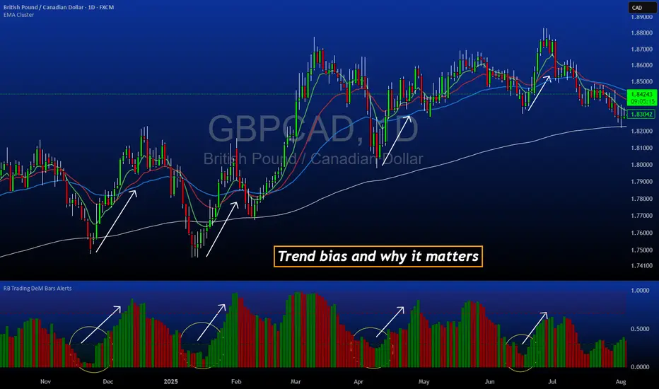
FVG Maxing - Fair Value Gaps, Equilibrium, and Candle Patterns
What this script does
This open-source indicator highlights 3-candle fair value gaps (FVGs) on the active chart timeframe, draws their midpoint ("equilibrium") line, tracks when each gap is mitigated, and optionally marks simple candle patterns (engulfing and doji) for confluence. It is intended as an educational tool to study how price interacts with imbalances.
3-candle bullish and bearish FVG zones drawn as forward-extending boxes.
Equilibrium line at 50% of each gap.
Different styling for mitigated vs unmitigated gaps.
Compact statistics panel showing how many gaps are currently active and filled.
Optional overlays for bullish/bearish engulfing patterns and doji candles.
1. FVG logic (3-candle gaps)
The script focuses on a strict 3-candle definition of a fair value gap:
Three consecutive candles with the same body direction.
The wick of candle 3 is separated from the wick of candle 1 (no overlap).
A bullish gap is created when price moves up fast enough to leave a gap between candle 1 and 3. A bearish gap is the mirror case to the downside.
In Pine, the core detection looks like this:
// Three candles with the same body direction
bull_seq = close > open and close > open and close > open
bear_seq = close < open and close < open and close < open
// Wick gap between candle 1 and candle 3
bull_gap = bull_seq and low > high
bear_gap = bear_seq and high < low
// Final FVG flags
is_bull_fvg = bull_gap
is_bear_fvg = bear_gap
For each detected FVG:
Bullish FVG range: from high up to low (gap below current price).
Bearish FVG range: from low down to high (gap above current price).
Each zone is stored in a custom FVGData structure so it can be updated when price later trades back inside it.
2. Equilibrium line (0.5 of the gap)
Every FVG box gets an optional equilibrium line plotted at the midpoint between its top and bottom:
eq_level = (top + bottom) / 2.0
right_index = extend_boxes ? bar_index + extend_length_bars : bar_index
bx = box.new(bar_index - 2, top, right_index, bottom)
eq_ln = line.new(bar_index - 2, eq_level, right_index, eq_level)
line.set_style(eq_ln, line.style_dashed)
line.set_color(eq_ln, eq_color)
You can use this line as a neutral “fair value” reference inside the zone, or as a simple way to think in terms of premium/discount within each gap.
3. Mitigation rules and styling
Each FVG stays active until price trades back into the gap:
Bullish FVG is considered mitigated when the low touches or moves below the top of the gap.
Bearish FVG is considered mitigated when the high touches or moves above the bottom of the gap.
When that happens, the script:
Marks the internal FVGData entry as mitigated.
Softens the box fill and border colors.
Optionally updates the label text from "BULL EQ / BEAR EQ" to "BULL FILLED / BEAR FILLED".
Can hide mitigated zones almost completely if you only want to see unfilled imbalances.
This allows you to distinguish between current areas of interest and zones that have already been traded through.
4. Candle pattern overlays (engulfing and doji)
For additional confluence, the script can mark simple candle patterns on top of the FVG view:
Bullish engulfing — current candle body fully wraps the previous bearish body and is larger in size.
Bearish engulfing — current candle body fully wraps the previous bullish body and is larger in size.
Doji — candles where the real body is small relative to the full range (high–low).
The detection is based on basic body and range geometry:
curr_body = math.abs(close - open)
prev_body = math.abs(close - open )
curr_range = high - low
body_ratio = curr_range > 0 ? curr_body / curr_range : 1.0
bull_engulfing = close > open and close < open and open <= close and close >= open and curr_body > prev_body
bear_engulfing = close < open and close > open and open >= close and close <= open and curr_body > prev_body
is_doji = curr_range > 0 and body_ratio <= doji_body_ratio
On the chart, they appear as:
Small triangle markers below bullish engulfing candles.
Small triangle markers above bearish engulfing candles.
Small circles above doji candles.
All three overlays are optional and can be turned on or off and recolored in the CANDLE PATTERNS group of inputs.
5. Inputs overview
The script organizes settings into clear groups:
DISPLAY SETTINGS : Show bullish/bearish FVGs, show/hide mitigated zones, box extension length, box border width, and maximum number of boxes.
EQUILIBRIUM : Toggle equilibrium lines, color, and line width.
LABELS : Enable labels, choose whether to label unmitigated and/or mitigated zones, and select label size.
BULLISH COLORS / BEARISH COLORS : Separate fill and border colors for bullish and bearish gaps.
MITIGATED STYLE : Opacity used when a gap is marked as mitigated.
STATISTICS : Toggle the on-chart FVG statistics panel.
CANDLE PATTERNS : Show engulfing patterns, show dojis, colors, and the body-to-range threshold that defines a doji.
6. Statistics panel
An optional table in the corner of the chart summarizes the current state of all tracked gaps:
Total number of FVGs still being tracked.
Number of bullish vs bearish FVGs.
Number of unfilled vs mitigated FVGs.
Simple fill rate: percentage of tracked FVGs that have been marked as mitigated.
This can help you study how a particular market tends to treat gaps over time.
7. How you might use it (examples)
These are usage ideas only, not recommendations:
Study how often your symbol mitigates gaps and where inside the zone price tends to react.
Use higher-timeframe context and then refine entries near the equilibrium line on your trading timeframe.
Combine FVG zones with basic candle patterns (engulfing/doji) as an extra visual anchor, if that fits your process.
Hope you enjoy, give your feedback in the comments!
- officialjackofalltrades

VectorCoresAI SMA + Bollinger Fusion v1VectorCoresAI — SMA + Bollinger Fusion (Free)
A clean, modern visual tool combining four key SMAs with an adaptive Bollinger structure.
This script merges two of the most widely used charting concepts into one simple, readable view:
Included
✔ SMA 21
✔ SMA 50
✔ SMA 100
✔ SMA 200
✔ Bollinger Bands with adjustable length + multiplier
✔ Adaptive “Fusion Squeeze” shading to highlight compression phases
✔ Optional visibility toggles for each SMA
✔ Lightweight, non-intrusive overlay
What this indicator is designed for
This tool helps traders quickly understand:
Trend alignment using the 21/50/100/200 SMAs
Volatility conditions around the Bollinger midline
Price compression and expansion
Early awareness of breakout environments
Clean visual structure without clutter
Everything is intentionally simple and transparent.
No predictions, no signals, no trading advice — just clean chart structure.
Why this version is unique
Instead of using standard Bollinger visuals, this Fusion edition uses subtle adaptive shading to show when the bands contract.
This makes compression zones instantly visible without overwhelming the chart.
The SMAs are fixed to widely-used trend levels, giving consistent readings across all markets and timeframes.
Who this is for
Newer traders who want a clear introduction to SMAs + Bollinger Bands
Experienced traders who want a lightweight visual tool
Anyone building structure-based strategies
Users of the VectorCoresAI suite who want a simple companion tool
Notes
This indicator is part of the VectorCoresAI Free Tools collection.
All logic is open-source and educational only.
More tools coming soon.

Universal Lot Size Calculator (Forex, Index, Metals)Multi-functional lot size calculator with support for various instruments
🎯 MAIN FEATURES:
Universal — works with Forex, indices, metals, and custom instruments
Auto-detect — automatically detects instrument type by ticker
Precise position sizing - considering risk and currency conversions
Currency conversion — automatic conversion between deposit currencies
Advanced visualization — entry, stop-loss, take-profit lines
Smart table — convenient display of all parameters
⚙️ SETTINGS GROUPS:
📈 Instrument Settings
Instrument Type — selection: Auto, Forex, Index, Metals, Custom
Custom Contract Size — manual contract size configuration
Use Manual Exchange Rate — manual rate for currency conversion
💰 Account & Risk Settings
Deposit Currency — account currency (USD, EUR, GBP, CHF, JPY)
Account Size — deposit amount
Risk in % — risk percentage from deposit
🎯 Price Levels
Entry Price — entry price
Stop Price — stop-loss price
Target Price — take-profit price
Color settings for each line
📊 Risk/Reward Settings
Manual Target Price — manual TP setting
Show R Levels — display profit levels in R multiples
Show only last R level — show only the last R level
Number of R Levels — number of R levels (1-10)
🎨 Line Styles & Table Appearance
Line style settings (solid, dashed, dotted)
Line width
Table position and size
Color schemes
📈Supported instrument types:
Forex — standard lot 100,000
Indices — E-mini futures (US100=20, SP500=50, US30=5, DAX=25)
Metals — Gold=100 oz, Silver=5000 oz
Custom — user-defined contract size
📱 KEY FEATURES:
- Auto instrument detection:
Indices: US100, SP500, US30, DAX
Metals: XAUUSD (Gold), XAGUSD (Silver)
Forex: all currency pairs
- Smart table with key parameters:
Instrument type and contract size
Account size and risk
Entry/exit prices
Calculated lot size
- Visual elements:
Dynamic level lines
Labels with profit/loss calculations
R-levels for target prices
- Currency conversion:
Automatic rate fetching
Support for USD, EUR, GBP, CHF, JPY
Manual rate setting when needed
⚠️ IMPORTANT NOTES:
Contract sizes may vary between brokers
For CFD brokers use Custom type with Contract Size = 1
During weekends currency rates may be unavailable — use manual rate
When trading in different currencies verify conversion accuracy
🚀 HOW TO USE:
Select instrument type (Auto for auto-detection)
Set deposit size and account currency
Define risk percentage (1-100%)
Specify prices for entry, stop-loss, and take-profit
Use calculated lot to open positions
⚠️ RESETTING CALCULATIONS:
To reuse the calculator with new price levels, you need to:
Right-click on the indicator's table/chart
Select "Reset Points" from the context menu
OR manually update all three price levels (Entry, Stop Loss, Take Profit) in the settings

Currency Strength Meter (8 Majors) — invincible3
📊 Currency Strength Meter (8 Majors) — Description
The Currency Strength Meter (8 Majors) calculates the relative performance of the major global currencies — USD, EUR, GBP, JPY, AUD, NZD, CAD, CHF — using aggregated logarithmic returns across all major FX pairs. Strength values are normalized on every bar, allowing users to quickly identify the strongest and weakest currencies at any moment in time.
Each currency’s strength is computed from a basket of 7 related currency pairs, smoothed with EMA, converted into z-scores, and finally normalized to a 0–100 scale for easy comparison.
A built-in table displays the real-time strength for all currencies, along with bar-to-bar delta and directional arrows.
🔶 SETTINGS
General
Broker Prefix
Select the broker symbol prefix used for pair requests (e.g., OANDA:, FX_IDC:).
Calculation Timeframe
Timeframe used to calculate the log returns of currency pairs.
Higher timeframes reduce noise, lower timeframes increase sensitivity.
Lookback Bars
Number of bars (on the calculation timeframe) used to measure logarithmic performance.
Smoothing (EMA)
Smooths currency strength with an EMA of selectable length.
Plot Lines
Option to display the normalized strength of each currency (0–100) directly on the chart.
🔹 Strength Meter Table
Show Table
Enables the on-chart strength meter table.
Show ▲▼ Delta Arrows
Displays directional arrows indicating bar-over-bar momentum:
▲ increasing strength
▼ decreasing strength
• neutral
Size
Controls the table text size (Tiny → Huge).
Layout
Shows:
Currency name & flag
Strength (0–100)
Delta (current – previous bar)
🔶 USAGE
This indicator helps traders quickly determine which currencies are strong and which are weak , and how that strength evolves over time.
Because currencies are evaluated relative to one another , trend strength becomes easier to identify across FX pairs.
Use cases include:
Finding strong vs. weak currency pair combinations
Confirming trend continuation or exhaustion
Identifying momentum shifts through the delta column
Spotting early reversals when strength begins to diverge
Comparing currency performance over multiple timeframes
📈 Example Interpretation
If the USD shows:
Strength = 82
Delta = +3 (▲)
…USD is not only strong, but also getting stronger relative to the previous bar.
If AUD shows:
Strength = 22
Delta = -5 (▼)
…AUD is weak and weakening further.
This makes strong/weak pairing intuitive:
Prefer strong vs weak pairs (e.g., USD/AUD if USD strong & AUD weak)
Avoid neutral or mixed-strength pairs
🔶 DETAILS
Currency Strength Calculation
For each currency pair, the indicator calculates the log-return over the selected lookback window.
Each currency aggregates 7 major related pairs to form a composite strength value.
The aggregated value is smoothed using EMA.
All 8 currencies are converted into z-scores, then normalized to a 0–100 scale for cross-sectional comparison.
A bar-to-bar delta is computed to reveal strengthening or weakening momentum.
This structure ensures the indicator remains stable, consistent, and highly responsive for intraday and higher-timeframe trading.