Peter Lynch Value (Dynamic Growth)This indicator implements Peter Lynch's core valuation principle: Fair Price = Earnings Per Share (EPS) * Growth Rate.
It provides a dynamic "fair value" line overlaid on the price chart, allowing traders and investors to quickly assess whether a stock's current price is trading above or below its intrinsic value according to the Lynch method.
Key Features
1. Dynamic Growth Rate Calculation
The indicator uses a custom algorithm to calculate the critical EPS Growth Rate, making it robust against missing data from standard financial fields.
Methodology: It fetches historical TTM Diluted EPS reports (EARNINGS_PER_SHARE_DILUTED, TTM) and calculates the Year-over-Year (YoY) Growth Percentage from the current TTM value versus the TTM value 4 periods prior.
Reliability: This custom calculation ensures the value line appears even when TradingView's pre-calculated growth metrics are unavailable (na).
2. Multiplier Control
P/E Cap: You can enforce a maximum P/E multiplier (maxPE, default 25), preventing the fair value from becoming unrealistically high for extremely fast-growing companies (as Lynch suggested).
Fallback P/E: If insufficient financial history is available to calculate the growth rate, the indicator automatically switches to a user-defined fallbackPE (default 15) and highlights the line in orange as a warning.
3. Smoothing (Optional)
To reduce the volatility often seen in valuation metrics, you can apply an optional Simple Moving Average (SMA) to the Fair Value line. This helps visualize the underlying trend of intrinsic value.
4. Forward Estimate (Optional)
Display an optional projection (circles) based on the analysts' next Fiscal Year EPS Estimate (EARNINGS_ESTIMATE, FY). This shows the potential fair value if the company meets future expectations.
5. Diagnostic Table
A table in the corner provides transparency on the calculation:
Green/Red: Confirms if TTM EPS and Calculated Growth are found.
Final P/E Used: Shows the exact multiplier used (calculated growth or the manual fallback).
Disclaimer: This tool is for informational and educational purposes only and should not be considered financial advice.
Entwicklung

PEAD ScreenerPEAD Screener - Post-Earnings Announcement Drift Scanner
═══════════════════════════════════════════════════════════════
WHY EARNINGS ANNOUNCEMENTS CREATE OPPORTUNITY
═══════════════════════════════════════════════════════════════
The days immediately following an earnings announcement are among the noisiest periods for any stock. Within hours, the market must digest new information about a company's profits, revenue, and future outlook. Analysts scramble to update their models. Institutions rebalance positions. Retail traders react to headlines.
This chaos creates a well-documented phenomenon called Post-Earnings Announcement Drift (PEAD): stocks that beat expectations tend to keep rising, while those that miss tend to keep falling - often for weeks after the initial announcement. Academic research has confirmed this pattern persists across decades and markets.
But not every earnings surprise is equal. A company that beats estimates by 5 cents might move very differently than one that beats by 5 cents with unusually high volume, or one where both earnings AND revenue exceeded expectations. Raw numbers alone don't tell the full story.
═══════════════════════════════════════════════════════════════
HOW "STANDARDIZED UNEXPECTED" METRICS CUT THROUGH THE NOISE
═══════════════════════════════════════════════════════════════
This screener uses a statistical technique to measure how "surprising" a result truly is - not just whether it beat or missed, but how unusual that beat or miss was compared to the company's own history.
The core idea: convert raw surprises into Z-scores.
A Z-score answers the question: "How many standard deviations away from normal is this result?"
- A Z-score of 0 means the result was exactly average
- A Z-score of +2 means the result was unusually high (better than ~95% of historical results)
- A Z-score of -2 means the result was unusually low
By standardizing surprises this way, we can compare apples to apples. A small-cap biotech's $0.02 beat might actually be more significant than a mega-cap's $0.50 beat, once we account for each company's typical variability.
This screener applies this standardization to three dimensions: earnings (SUE), revenue (SURGE), and volume (SUV).
═══════════════════════════════════════════════════════════════
THE 9 SCREENING CRITERIA
═══════════════════════════════════════════════════════════════
─────────────────────────────────────────
1. SUE (Standardized Unexpected Earnings)
─────────────────────────────────────────
WHAT IT IS:
SUE measures how surprising an earnings result was, adjusted for the company's historical forecast accuracy.
Calculation: Take the earnings surprise (actual EPS minus analyst estimate), then divide by the standard deviation of past forecast errors. This uses a rolling window of the last 8 quarters by default.
Formula: SUE = (Actual EPS - Estimated EPS) / Standard Deviation of Past Errors
HOW TO INTERPRET:
- SUE > +2.0: Strongly positive surprise - earnings beat expectations by an unusually large margin. These stocks often continue drifting higher.
- SUE between 0 and +2.0: Modest positive surprise - beat expectations, but within normal range.
- SUE between -2.0 and 0: Modest negative surprise - missed expectations, but within normal range.
- SUE < -2.0: Strongly negative surprise - significant miss. These stocks often continue drifting lower.
For long positions, look for SUE values above +2.0, ideally combined with positive SURGE.
─────────────────────────────────────────
2. SURGE (Standardized Unexpected Revenue)
─────────────────────────────────────────
WHAT IT IS:
SURGE applies the same standardization technique to revenue surprises. While earnings can be manipulated through accounting choices, revenue is harder to fake - it represents actual sales.
Calculation: Take the revenue surprise (actual revenue minus analyst estimate), then divide by the standard deviation of past revenue forecast errors.
Formula: SURGE = (Actual Revenue - Estimated Revenue) / Standard Deviation of Past Errors
HOW TO INTERPRET:
- SURGE > +1.5: Strongly positive revenue surprise - the company sold significantly more than expected.
- SURGE between 0 and +1.5: Modest positive surprise.
- SURGE < 0: Revenue missed expectations.
The most powerful signals occur when BOTH SUE and SURGE are positive and elevated (ideally SUE > 2.0 AND SURGE > 1.5). This indicates the company beat on both profitability AND top-line growth - a much stronger signal than either alone.
When SUE and SURGE diverge significantly (e.g., high SUE but negative SURGE), treat with caution - the earnings beat may have come from cost-cutting rather than genuine growth.
─────────────────────────────────────────
3. SUV (Standardized Unexpected Volume)
─────────────────────────────────────────
WHAT IT IS:
SUV detects unusual trading volume after accounting for how volatile the stock is. More volatile stocks naturally have higher volume, so raw volume comparisons can be misleading.
Calculation: This uses regression analysis to model the expected relationship between price volatility and volume. The "unexpected" volume is the residual - how much actual volume deviated from what the model predicted. This residual is then standardized into a Z-score.
In plain terms: SUV asks "Given how much this stock typically moves, is today's volume unusually high or low?"
HOW TO INTERPRET:
- SUV > +2.0: Exceptionally high volume relative to the stock's volatility. This often signals institutional activity - big players moving in or out.
- SUV between +1.0 and +2.0: Elevated volume - above normal interest.
- SUV between -1.0 and +1.0: Normal volume range.
- SUV < -1.0: Unusually quiet - less activity than expected.
High SUV combined with positive price movement suggests accumulation (buying). High SUV combined with negative price movement suggests distribution (selling).
─────────────────────────────────────────
4. % From D0 Close
─────────────────────────────────────────
WHAT IT IS:
This measures how far the current price has moved from the closing price on its initial earnings reaction day (D0). The "reaction day" is the first trading day that fully reflects the earnings news - typically the day after an after-hours announcement, or the announcement day itself for pre-market releases.
Calculation: ((Current Price - D0 Close) / D0 Close) × 100
HOW TO INTERPRET:
- Positive values: Stock has gained ground since earnings. The higher the percentage, the stronger the post-earnings drift.
- 0% to +5%: Modest positive drift - earnings were received well but momentum is limited.
- +5% to +15%: Strong drift - buyers continue accumulating.
- > +15%: Exceptional drift - significant institutional interest likely.
- Negative values: Stock has given back gains or extended losses since earnings. May indicate the initial reaction was overdone, or that sentiment is deteriorating.
This metric is most meaningful within the first 5-20 trading days after earnings. Extended drift (maintaining gains over 2+ weeks) is a stronger signal than a quick spike that fades.
─────────────────────────────────────────
5. # Pocket Pivots
─────────────────────────────────────────
WHAT IT IS:
Pocket Pivots are a volume-based pattern developed by Chris Kacher and Gil Morales. They identify days where institutional buyers are likely accumulating shares without causing obvious breakouts.
Calculation: A Pocket Pivot occurs when:
- The stock closes higher than it opened (up day)
- The stock closes higher than the previous day's close
- Today's volume exceeds the highest down-day volume of the prior 10 trading sessions
The screener counts how many Pocket Pivots have occurred since the earnings announcement.
HOW TO INTERPRET:
- 0 Pocket Pivots: No detected institutional accumulation patterns since earnings.
- 1-2 Pocket Pivots: Some institutional buying interest - worth monitoring.
- 3+ Pocket Pivots: Strong accumulation signal - institutions appear to be building positions.
Pocket Pivots are most significant when they occur:
- Immediately following earnings announcements
- Near moving average support (10-day, 21-day, or 50-day)
- On above-average volume
- After a period of price consolidation
Multiple Pocket Pivots in a short period suggest sustained institutional demand, not just a one-day event.
─────────────────────────────────────────
6. ADX/DI (Trend Strength and Direction)
─────────────────────────────────────────
WHAT IT IS:
ADX (Average Directional Index) measures trend strength regardless of direction. DI (Directional Indicator) shows whether the trend is bullish or bearish.
Calculation: ADX uses a 14-period lookback to measure how directional (trending) price movement is. Values range from 0 to 100. The +DI and -DI components compare upward and downward movement.
The screener shows:
- ADX value (trend strength)
- Direction indicator: "+" for bullish (price trending up), "-" for bearish (price trending down)
HOW TO INTERPRET:
- ADX < 20: Weak trend - the stock is moving sideways, choppy. Not ideal for momentum trading.
- ADX 20-25: Trend is emerging - potentially starting a directional move.
- ADX 25-40: Strong trend - clear directional movement. Good for momentum plays.
- ADX > 40: Very strong trend - powerful move in progress, but may be extended.
The direction indicator (+/-) tells you which way:
- "25+" means ADX of 25 with bullish direction (uptrend)
- "25-" means ADX of 25 with bearish direction (downtrend)
For post-earnings plays, ideal setups show ADX rising above 25 with positive direction, confirming the earnings reaction is developing into a sustained trend rather than a one-day spike.
─────────────────────────────────────────
7. Institutional Buying PASS
─────────────────────────────────────────
WHAT IT IS:
This proprietary composite indicator detects patterns consistent with institutional accumulation at three stages after earnings:
EARLY (Days 0-4): Looks for "large block" buying on the earnings reaction day (exceptionally high volume with a close in the upper half of the day's range) combined with follow-through buying on the next day.
MID (Days 5-9): Checks for sustained elevated volume (averaging 1.5x the 20-day average) combined with positive drift and consistent upward price movement (more up days than down days).
LATE (Days 10+): Detects either visible accumulation (positive drift with high volume) OR stealth accumulation (positive drift with unusually LOW volume - suggesting smart money is quietly building positions without attracting attention).
HOW TO INTERPRET:
- Check mark/value of '1': Institutional buying pattern detected. The stock shows characteristics consistent with large players accumulating shares.
- X mark/value of '0': No institutional buying pattern detected. This doesn't mean institutions aren't buying - just that the typical footprints aren't visible.
A passing grade here adds conviction to other bullish signals. Institutions have research teams, information advantages, and long time horizons. When their footprints appear in the data, it often precedes sustained moves.
Important: This is a pattern detection tool, not a guarantee. Always combine with other analysis.
─────────────────────────────────────────
8. Strong ATR Drift PASS
─────────────────────────────────────────
WHAT IT IS:
This measures whether the stock has drifted significantly relative to its own volatility. Instead of asking "did it move 10%?", it asks "did it move more than 1.5 ATRs?"
ATR (Average True Range) measures a stock's typical daily movement. A volatile stock might move 5% daily, while a stable stock might move 0.5%. Using ATR normalizes for this difference.
Calculation:
ATR Drift = (Current Close - D0 Close) / D0 ATR in dollars
The indicator passes when ATR Drift exceeds 1.5 AND at least 5 days have passed since earnings.
HOW TO INTERPRET:
- Check mark/value of '1': The stock has drifted more than 1.5 times its average daily range since earnings - a statistically significant move that suggests genuine momentum, not just noise.
- X mark/value of '0': The drift (if any) is within normal volatility bounds - could just be random fluctuation.
Why wait 5 days? The immediate post-earnings reaction (days 0-2) often includes gap fills and noise. By day 5, if the stock is still extended beyond 1.5 ATRs from the earnings close, it suggests real buying pressure, not just a reflexive gap.
A passing grade here helps filter out stocks that "beat earnings" but haven't actually moved meaningfully. It focuses attention on stocks where the market is voting with real capital.
─────────────────────────────────────────
9. Days Since D0
─────────────────────────────────────────
WHAT IT IS:
Simply counts the number of trading days since the earnings reaction day (D0).
HOW TO INTERPRET:
- Days 0-5 (Green): Fresh earnings - the information is new, institutional repositioning is active, and momentum trades are most potent. This is the "sweet spot" for PEAD strategies.
- Days 6-10 (Neutral): Mid-period - some edge remains but diminishing. Good for adding to winning positions, less ideal for new entries.
- Days 11+ (Red): Extended period - most of the post-earnings drift has typically played out. Higher risk that momentum fades or reverses.
Research shows PEAD effects are strongest in the first 5-10 days after earnings, then decay. Beyond 20-30 days, the informational advantage of the earnings surprise is largely priced in.
Use this to prioritize: focus on stocks with strong signals that are still in the early window, and be more selective about entries as days accumulate.
═══════════════════════════════════════════════════════════════
PUTTING IT ALL TOGETHER
═══════════════════════════════════════════════════════════════
You can use this screener in the chart view or in the Screener.
One combination of the above filters to develop a shortlist of positive drift candidates may be:
- SUE > 2.0 (significant earnings beat)
- SURGE > 1.5 (significant revenue beat)
- Positive % From D0 Close (price confirming the good news)
- Institutional Buying PASS (big players accumulating)
- Strong ATR Drift PASS (statistically significant movement)
- Days Since D0 < 10 (still in the active drift window)
No single indicator is sufficient. The power comes from convergence - when multiple independent measures all point the same direction.
═══════════════════════════════════════════════════════════════
SETTINGS
═══════════════════════════════════════════════════════════════
Key adjustable parameters:
- SUE Method: "Analyst-based" uses consensus estimates; "Time-series" uses year-over-year comparison
- Window Size: Number of quarters used for standardization (default: 8)
- ATR Drift Threshold: Minimum ATR multiple for "strong" classification (default: 1.5)
- Institutional Buying thresholds: Adjustable volume and CLV parameters
═══════════════════════════════════════════════════════════════
DISCLAIMER
═══════════════════════════════════════════════════════════════
This screener is a research tool, not financial advice. Past patterns do not guarantee future results. Always conduct your own due diligence and manage risk appropriately. Post-earnings trading involves significant uncertainty and volatility. The 'SUE' in this indicator does not represent a real person; any similarity to actual Sue's (or Susans for that matter) living or dead is quite frankly ridiculous, not to mention coincidental.

Scalp Boost LONG✦ Overview
Scalp Boost LONG is a visual tool designed to highlight potential short-term upward impulses.
A signal is generated only when multiple market conditions align at the candle close, combining momentum dynamics, local probability shifts, and abnormal volume behavior.
The indicator does not repaint.
✦ Concept
The tool focuses on selective situations where the market shows signs of micro-breakout potential.
If all internal conditions are confirmed — a LONG event is displayed.
If not — the chart remains clean.
This builds a low-noise signal model, prioritizing quality over frequency.
✦ Signal Logic
The LONG signal requires confirmation of all core conditions:
• Local impulse dynamics
Identifies short-term acceleration suggesting a breakout from a compressed price structure.
• Probability beyond a statistical zone
Uses relative breakout probability instead of fixed levels, checking whether price exceeds expected local ranges.
• Abnormal volume activity
Highlights candles with monetary flow above a custom threshold, signaling increased market interest.
• Anti-overheat filter
Conditions avoiding exhausted or low-momentum phases where continuation is less likely.
Only when all filters are aligned a LONG marker appears.
✦ Visual Structure
The chart display is intentionally minimal:
• ROC Curve
Subdued line, showing short-term momentum without distraction.
• LONG Marker
Green triangle below the candle on confirmed events.
• Candle Highlight
Soft background highlight on the signal bar.
• Volume Marker
Small red dot at the bottom of candles with abnormal monetary flow.
All visual elements appear only on candle close.
✦ Alerts
A clean event structure is available for notifications:
LONG Signal
This allows receiving alerts during chart analysis or in automated workflows while keeping full control over decision-making.
✦ Notes & Guidelines
This tool:
is not a trading system,
does not provide targets or stops,
may trigger against the dominant trend,
should be combined with the user’s own methodology.
Signals are rare by design.
Do not interpret each event as a trend continuation — it highlights conditions, not outcomes.
✦ Suggested Use
-(Non-mandatory ideas for advanced users)
-identifying potential micro-breakouts,
-timing entries around volume spikes,
-adding context to scalping models,
-filtering impulsive moves from noise.
-suitable for a 5-minute timeframe
The indicator can be helpful as a confirmation layer, not a standalone decision tool.

Yong Fin Growth on ChartBridge the gap between Fundamental Analysis and Technical Price Action.
Yong Fin Growth on Chart is the ultimate tool for "Hybrid Traders" and investors who need to visualize financial performance directly alongside price movements. Stop switching tabs between news sites and your charts—get the full context of why a stock is moving, right where it happens.
This indicator overlays key financial metrics onto your chart, triggered precisely by Earnings Announcements. It allows you to instantly correlate price reactions with fundamental catalysts like Revenue Growth, Margin Expansion, or EPS surprises.
Key Features:
🔹 1. Smart Earnings Trigger The indicator automatically detects Earnings Announcement dates and plots a data label on the exact bar.
Stocks: Aligns with the specific earnings release date to show immediate price reaction.
Funds/ETFs: Supports Fiscal Period End dates for broader instrument analysis.
Includes a vertical line option to visually separate fiscal periods for easy backtesting.
🔹 2. 5 Fully Customizable Data Slots Configure up to 5 independent slots to track the metrics that matter to your strategy. Choose from a comprehensive list including:
Growth: Revenue, Net Income, EBITDA, EPS.
Efficiency: Gross Margin (GPM), Net Margin (NPM), ROE, ROA.
Valuation: P/E, P/S, P/BV, EV/EBITDA, and Implied P/E.
Health: Cash, Debt, Net Debt, Free Cash Flow (FCF).
🔹 3. Dynamic Growth Coloring & Thresholds Instantly identify trend changes with intelligent color coding.
Comparison Modes: Toggle between YoY (Year-over-Year) or QoQ (Quarter-over-Quarter) growth logic.
Custom Thresholds: Define your own standards. For example, set the label to turn Green only if growth exceeds +15%, or Red if it falls below -5%. This helps filter out noise and highlights significant fundamental shifts.
🔹 4. Flexible Period Selection Analyze data across different timeframes to suit your trading style:
FQ: Fiscal Quarter (Short-term momentum)
FY: Fiscal Year (Long-term trend)
TTM: Trailing Twelve Months (Ideal for smooth Valuation ratios)
FH: Fiscal Half (For securities reporting semi-annually)
How to Use:
Add to Chart: Apply the indicator to any stock symbol.
Configure Slots: Go to settings and select the 5 metrics you want to monitor (e.g., Rev, Net Profit, GPM, NPM, P/E).
Set Color Logic: Choose whether you want to color-code based on YoY or QoQ growth.
Analyze: Look for the labels.
Are margins expanding while price is consolidating?
Did the price drop despite a "Green" label? (Market expectations vs. Reality)
Use the vertical lines to see how the trend changed after previous earnings reports.
"Stop guessing. Let the fundamentals guide your technical entries."
Disclaimer: This tool is for educational and analytical purposes only. Past performance does not guarantee future results. Please conduct your own due diligence.
---------------------------------
เชื่อมช่องว่างระหว่างการวิเคราะห์ปัจจัยพื้นฐาน (Fundamental) และกราฟราคาทางเทคนิค (Technical Price Action)
Yong Fin Growth on Chart คือเครื่องมือที่ดีที่สุดสำหรับ "นักลงทุนสายผสม (Hybrid Traders)" และนักลงทุนที่ต้องการเห็นผลประกอบการทางการเงินซ้อนทับไปกับการเคลื่อนไหวของราคาโดยตรง หยุดเสียเวลาสลับหน้าจอไปมาระหว่างเว็บข่าวและกราฟของคุณ—รับรู้บริบททั้งหมดว่าทำไมหุ้นถึงวิ่ง ได้ทันทีบนหน้าจอนี้
อินดิเคเตอร์นี้จะวางค่าทางการเงินที่สำคัญลงบนกราฟ โดยถูกกระตุ้น (Trigger) อย่างแม่นยำด้วย วันประกาศงบ (Earnings Announcements) ช่วยให้คุณเชื่อมโยงปฏิกิริยาของราคา เข้ากับปัจจัยพื้นฐานที่เป็นตัวขับเคลื่อนได้ทันที เช่น การเติบโตของรายได้, การขยายตัวของอัตรากำไร (Margin), หรือกำไรต่อหุ้น (EPS) ที่เซอร์ไพรส์ตลาด
ฟีเจอร์หลัก:
🔹 1. Smart Earnings Trigger (ตัวระบุวันงบออกอัจฉริยะ) อินดิเคเตอร์จะตรวจจับวันประกาศงบอัตโนมัติและพลอตป้ายข้อมูล (Label) ลงบนแท่งเทียนนั้นเป๊ะๆ
หุ้นรายตัว: ตรงกับวันประกาศผลประกอบการจริง เพื่อดูปฏิกิริยาราคาทันที
กองทุน/ETFs: รองรับวันปิดรอบบัญชี (Fiscal Period End) สำหรับการวิเคราะห์สินทรัพย์ประเภทอื่นๆ
มีออปชั่นเส้นแนวตั้ง เพื่อแบ่งช่วงเวลางบแต่ละรอบ ให้ดูย้อนหลัง (Backtest) ได้ง่าย
🔹 2. 5 Fully Customizable Data Slots (ช่องข้อมูลปรับแต่งได้ 5 ช่อง) ตั้งค่าได้ถึง 5 ช่องอิสระ เพื่อติดตามตัวเลขที่สำคัญต่อกลยุทธ์ของคุณ เลือกจากรายการที่ครอบคลุม เช่น:
การเติบโต (Growth): Revenue, Net Income, EBITDA, EPS
ประสิทธิภาพ (Efficiency): Gross Margin (GPM), Net Margin (NPM), ROE, ROA
มูลค่า (Valuation): P/E, P/S, P/BV, EV/EBITDA, และ Implied P/E (ค่าพิเศษที่คุณใส่สูตรไว้)
สุขภาพการเงิน (Health): Cash, Debt, Net Debt, Free Cash Flow (FCF)
🔹 3. Dynamic Growth Coloring & Thresholds (ระบบสีและการตั้งเกณฑ์) ระบุการเปลี่ยนเทรนด์ได้ทันทีด้วยรหัสสีอัจฉริยะ
โหมดเปรียบเทียบ: เลือกสลับได้ระหว่าง YoY (เทียบปีก่อน) หรือ QoQ (เทียบไตรมาสก่อน)
เกณฑ์ที่กำหนดเอง (Custom Thresholds): กำหนดมาตรฐานของคุณเอง ตัวอย่างเช่น ตั้งค่าให้ป้ายเป็น สีเขียว เฉพาะเมื่อโตเกิน +15% หรือเป็น สีแดง เมื่อต่ำกว่า -5% สิ่งนี้ช่วยกรอง Noise และเน้นเฉพาะการเปลี่ยนแปลงพื้นฐานที่มีนัยสำคัญ
🔹 4. Flexible Period Selection (เลือกช่วงเวลาได้ยืดหยุ่น) วิเคราะห์ข้อมูลในกรอบเวลาที่แตกต่างกันตามสไตล์การเทรด:
FQ: รายไตรมาส (Fiscal Quarter) - ดูโมเมนตัมระยะสั้น
FY: รายปี (Fiscal Year) - ดูเทรนด์ระยะยาว
TTM: 12 เดือนย้อนหลัง (Trailing Twelve Months) - เหมาะสำหรับดูค่า Valuation Ratio ให้สมูท
FH: ครึ่งปี (Fiscal Half) - สำหรับหลักทรัพย์ที่ส่งงบแบบครึ่งปี
วิธีใช้งาน:
Add to Chart: ใส่อินดิเคเตอร์ลงในกราฟหุ้นตัวใดก็ได้
Configure Slots: ไปที่การตั้งค่าและเลือก 5 ค่าที่คุณต้องการเฝ้าดู (เช่น Rev, Net Profit, GPM, NPM, P/E)
Set Color Logic: เลือกตรรกะสี ว่าจะให้อิงตามการเติบโตแบบ YoY หรือ QoQ
Analyze: สังเกตป้ายข้อมูล
อัตรากำไร (Margin) ขยายตัวในขณะที่ราคากำลังพักตัวอยู่หรือเปล่า?
ราคาดิ่งลงทั้งๆ ที่ป้ายเป็น "สีเขียว" หรือไม่? (ความคาดหวังตลาด vs ความจริง)
ใช้เส้นแนวตั้งเพื่อดูว่าเทรนด์เปลี่ยนไปอย่างไรหลังจากงบออกในรอบก่อนๆ
"เลิกเดา ให้ปัจจัยพื้นฐานนำทางจุดเข้าซื้อทางเทคนิคของคุณ"
คำเตือน: เครื่องมือนี้มีไว้เพื่อการศึกษาและวิเคราะห์ข้อมูลเท่านั้น ผลการดำเนินงานในอดีตไม่การันตีผลลัพธ์ในอนาคต โปรดศึกษาข้อมูลด้วยตนเอง


MarketSurge EPS Line [tradeviZion]MarketSurge EPS Line
EPS trend line overlay for TradingView charts, inspired by the IBD MarketSurge (formerly MarketSmith) EPS line style.
Comparison: Left side shows IBD MarketSurge EPS line as reference. Right side shows this TradingView script producing similar output with interactive tooltips. The left side image is for reference only to demonstrate similarity - it is not part of the TradingView script.
Features:
Displays EPS trend line on price charts
Uses 4-quarter earnings moving average
Shows earnings momentum over time
Works with actual, estimated, or standardized earnings data
Customizable line color and width
Interactive tooltips with detailed earnings information
Custom symbol analysis support
How to Use:
Add script to chart
EPS line appears automatically
Adjust color and width in settings if needed
Hover over line for earnings details
Settings Explained:
Display Settings:
Show EPS Line: Toggle to show or hide the EPS trend line
EPS Line Color: Choose the color for the EPS trend line and labels
EPS Line Width: Adjust the thickness of the EPS trend line (1-5 pixels)
Symbol Settings:
By default, the indicator analyzes the EPS data for the symbol currently displayed on your chart. The Custom Symbol feature allows you to:
Analyze EPS data for a different symbol without changing your chart
Compare earnings trends of related stocks or competitors
View EPS data for one symbol while analyzing price action of another
To use Custom Symbol:
Enable "Use Custom Symbol" checkbox
Click on "Custom Symbol" field to open TradingView's symbol picker
Search and select the symbol you want to analyze
The indicator will fetch and display EPS data for the selected symbol
Note: The chart will still show price action for your current symbol, but the EPS line will reflect the custom symbol's earnings data.
Data Settings:
EPS Field: Choose which earnings data source to use:
Actual Earnings: Reported earnings from company financial statements (default). Use this to analyze historical performance based on what companies actually reported.
Estimated Earnings: Analyst consensus forecasts for future quarters. Use this to see what analysts expect and compare expectations with actual results.
Standardized Earnings: Earnings adjusted for comparability across companies. Use this when comparing multiple stocks as it normalizes accounting differences.
Display Scale:
For the indicator to display correctly on the existing chart, it uses its own axis (right scale) by default. However, you can change this, but the view will not look the same. The right scale is recommended for optimal visibility as it allows the EPS line to be clearly visible alongside price action without compression.
Example: EPS line on separate right scale (recommended) - hover over labels to view detailed earnings tooltips
Example: EPS line pinned to Scale A (not recommended - appears as straight line due to small EPS range compared to price)
Example: EPS line displayed in separate pane below price chart
Methodology Credits:
This indicator implements the EPS line visualization methodology developed by Investor's Business Daily (IBD) for their MarketSurge platform (formerly known as MarketSmith). The EPS line concept helps visualize earnings momentum alongside price action, providing a fundamental overlay for technical analysis.
Technical Details:
Designed for daily, weekly, and monthly timeframes
Minimum 4 quarters of earnings data required
Uses TradingView's built-in earnings data
Automatically handles missing or invalid data
This indicator helps you visualize earnings trends alongside price action, providing a fundamental overlay for your technical analysis.

Stock Valuation & Analysis (Zeiierman)█ Overview
Stock Valuation & Analysis (Zeiierman) is a hybrid fundamental–technical framework that delivers a complete company valuation system directly inside TradingView. Instead of manually digging through years of financial statements, the system automates the full valuation process, allowing traders and investors to understand a stock’s true value, fair price, and risk-adjusted opportunity at a glance.
The script projects intrinsic value zones directly onto the price chart, then layers trend structure, signals, and exhaustion regimes around them to create a unified decision-making environment.
At its core, the system builds a quantitative valuation backbone using several coordinated models:
an adaptive DCF engine that updates fair value based on changing fundamentals
sector-aligned valuation models that compare earnings, sales, enterprise value, and book metrics
smart handling for unusual balance-sheet structures such as cash-heavy or early-stage companies
stabilized value floors based on liquidity and cash-per-share dynamics
an automated financial processor that organizes multi-year statements into a consistent valuation framework
On top of this valuation, the script overlays:
visual valuation zones (Premium, Fair, Discounted, Undervalued)
a rolling ZVWAP line showing where trading activity is anchored
a multi-mode adaptive trend engine
a non-linear signal generator
an overbought and oversold regime detector
an analyst-consensus summary panel
Note: This tool is designed specifically for stocks on the daily timeframe. If used on unsupported markets or timeframes, it will display a clear warning.
⚪ Why This One Is Unique
Most valuation tools stop at static multiples or a single DCF pass. This script instead uses a more intelligent, multi-layered valuation architecture that adapts to the underlying asset and market context.
It:
Uses multiple forms of discounted cash flow analysis and automatically selects the most suitable valuation approach for the stock. When traditional DCF is not optimal, the system applies alternative but comparable valuation methods. This adaptive behavior is the basis for the “Intelligent” designation.
Uses valuation multiples as the basis for fair value assessments.
Projects valuation into dynamic chart zones that expand or contract relative to your chosen margin of safety, producing premium, fair, discounted, and deeply undervalued bands that evolve as conditions change.
Adds a Rolling ZVWAP that adjusts to shifting volume distributions and recent price drift, helping to identify where aggregate positioning and cost basis may be clustering.
Includes an adaptive trend core capable of self-tuning across a range of sensitivities, selecting the configuration that historically performed most reliably, and using that as a live trend intelligence layer.
Wraps everything in a regime-aware OB/OS engine and a unified alert router, enabling valuation, positioning, trend, and signal events to flow through one consolidated alert stream for simpler automation.
█ Main Features
⚪ 1. Dual Valuation Engine With Intelligent Chart Projection
The indicator evaluates a company’s fair value using two coordinated valuation models, then projects the result directly onto the price chart as adaptive valuation zones.
Intelligent DCF Valuation Engine
Builds a forward-looking free-cash-flow profile using earnings power, cash generation, capital intensity, working-capital behavior, and tax structure. It then projects these flows, applies terminal adjustments, and converts the result into an equity fair value.
Adaptive Multiples-Based Valuation
Tracks the most commonly used valuation metrics. Each metric provides its own fair-value projection, and the engine identifies the one most consistent with the company’s fundamental profile — delivering the best match to intrinsic value.
Margin of Safety Control
A dedicated slider widens or tightens valuation outcomes based on your preferred risk profile, enabling more conservative or aggressive interpretations with a single adjustment.
Dynamic Valuation Zones (Premium → Undervalued)
Once the valuation is finalized, the script constructs four intelligent price regions:
Premium, Fair Value, Discounted, and Undervalued. These zones scale with your Margin of Safety and are drawn as translucent, forward-projected price bands. The result is a clear, evolving valuation map that updates with each new bar and visually anchors price within its current fundamental context.
⚪ 2. ZVWAP — Zeiierman Volume-Weighted Anchor Price
This enhanced VWAP model distinguishes between institutional-style flows and retail-style activity, offering a deeper look into capital positioning. It adapts continuously, revealing where dominant buying or selling pressure may be anchored. Depending on your setting, it can emphasize institutional-style flows or a blend of retail and institutional movement. This line helps you quickly see whether the price is trading above or below the dominant executed volume over the recent window.
⚪ 3. Trend and Price-Movement Intelligence
A multi-mode trend engine ensures flexibility and robustness across different trading styles:
Intelligent Trend: Runs a series of internal trend models, gauges their historical stability and responsiveness, and automatically promotes the best-performing configuration as the trend line.
Percentage Trend: Flips trend when price moves a fixed percentage from a reference, ideal for swing-style regime detection.
MA Trend: A classic moving-average trend line that switches bias on crossovers.
⚪ 4. Signal Framework (Buy / Sell / Trend Signals)
A dedicated signal engine analyzes price extremes and internal oscillations to produce actionable signals. Frequency settings (Frequent, Quick, Fast, Moderate, Long-Term) determine how selective the engine becomes. Signals can operate independently or in alignment with the active trend filter.
⚪ 5. Overbought / Oversold Regime Zones
A volatility-aware OB/OS engine transforms price movement into a smooth internal oscillator. It highlights extended regimes using semi-transparent zones labeled “Overbought” or “Oversold,” expanding and contracting with volatility. Zones automatically clear once conditions normalize, avoiding stale signals.
⚪ 6. Analyst Ratings & Price Target Panel
A structured table displays external analyst expectations, including:
Highest and lowest price targets
Average or consensus rating (Buy, Sell, Weak Buy, Weak Sell, Neutral)
Color-graded rating and target fields for immediate clarity
This adds an external benchmark to complement the internal valuation system.
█ How to Use
⚪ Intrinsic Value Estimation
Quickly determine whether a stock is undervalued or overvalued based on DCF and Multiple models.
Valuation Models
Intelligent DCF: Best for fundamentally driven companies where earnings quality, cash flow, and balance sheet strength matter.
Multiple Valuation: Ideal for faster, relative pricing using sector-aware multiples.
Risk-Adjusted Investing: Apply the Margin of Safety to find entries that match your preferred risk level.
Valuation Zones
Premium: Price is above intrinsic value. Common area to lock in gains, tighten stops, or avoid new longs.
Fair Value: Neutral territory. Suitable for monitoring or gradual accumulation.
Discounted: Below fair value. Potential opportunity zone when trend and technical conditions begin to improve.
Undervalued: Deep discount. High-interest area when valuation, trend improvement, oversold conditions, and signals start aligning.
⚪ Professional-Level Price Analysis
Use ZVWAP and trend tools to time entries with institutional buying pressure by visualizing where the majority of recent trading volume is anchored.
Price above ZVWAP + bullish trend → strong institutional support, trend continuation setups.
Price below ZVWAP + bearish trend → strong institutional selling pressure, trend continuation.
Price crossings relative to ZVWAP often act as:
pullback completion points.
early signs of shifting value zones.
⚪ Timing Your Entries
1. Choose a Trend Mode
Intelligent Trend: Runs several trend configurations, evaluates their past stability, and selects the most reliable one as the active trend.
Percentage Trend: Flips trend only when price moves by a defined percentage.
MA Trend: Classic moving average for straightforward trend mapping.
2. Use Signals in Sync With the Trend
Set Trend Signals to ensure entries match the active trend:
In an uptrend → Long signals highlight continuation setups.
In a downtrend → Short signals highlight continuation setups.
Adjust frequency based on style:
Frequent / Quick for active traders
Moderate / Longterm for swing and position traders
⚪ Overbought / Oversold Zones
Overbought zones identify where upside movement is stretched, often aligning with Premium or upper Fair Value regions. These areas can signal trend maturity, potential pullbacks, or moments where taking partial profits becomes prudent.
Oversold zones highlight areas where downside momentum is becoming exhausted, especially when price is already trading within Discounted or Undervalued valuation regions. These zones can mark early stages of a potential reversal or simply the lower boundary of a strong trend where buyers might step back in.
Because both conditions can appear during strong trends, investors should monitor price behavior closely:
In strong uptrends, overbought zones can indicate trend strength rather than immediate reversal. Traders may choose to ride the trend while managing risk.
In downtrends, oversold zones can serve as continuation points or emerging reversal signals depending on how the price reacts.
Both zones can be used as entry or exit timing aids, especially when combined with valuation zones, ZVWAP behavior, and trend direction.
⚪ A nalyst Comparison
Use the built-in analyst ratings and target prices to validate or challenge your valuation. When your intrinsic estimate aligns with analyst consensus, conviction strengthens; when it diverges, it highlights potential opportunities or risks worth investigating.
█ How It Works
⚪ Intelligent Valuation
Uses multiple forms of discounted cash flow analysis and automatically selects the most appropriate valuation approach for each stock. When a traditional DCF is not the best fit, the system switches to alternative but comparable valuation models. This adaptive process is what defines it as an “Intelligent” system.
⚪ Multiples Framework
When using multiple-based valuation, the engine evaluates a set of evolving market multiples and aligns them with sector expectations. Historical ranges, peer context, and balance-sheet components help anchor each metric, allowing identical ratios to be interpreted differently across industries. The system then chooses the estimate that best reflects the company and how the market has recently valued similar conditions.
⚪ ZVWAP
The Rolling ZVWAP line acts as a dynamic, volume-weighted anchor that reacts to shifts in participation intensity. It highlights where capital is clustering, whether flows lean toward institutional or retail, and how price behaves around these anchor points. This produces a clearer view of positioning pressure and trend strength than traditional VWAP lines.
⚪ Adaptive Trend Framework
The trend system provides three complementary modes:
Percentage Mode reacts to meaningful percentage-based displacements,
MA Mode tracks equilibrium through a moving-average backbone, and
Intelligent Trend evaluates multiple internal configurations, promotes the historically most stable one, and uses it as the active trend reference. This multi-engine design ensures that trend direction reflects the most reliable behavior for the current market environment.
⚪ Signal Engine
The signal layer continuously interprets price structure, curvature, and momentum to identify high-quality long and short opportunities. Signals can run independently or be filtered through the active trend for cleaner, regime-aligned entries. Frequency modes allow you to tune selectivity from rapid responses to high-conviction, slower-moving signals.
⚪ Overbought / Oversold Regime Zones
The OB/OS engine identifies volatility-adjusted exhaustion zones that highlight where price is stretched or depleted. These regions can mark early reversal points, continuation areas in strong trends, or places where investors monitor price closely to decide whether to hold, trim, or add exposure. They integrate naturally with valuation, trend, ZVWAP, and signals to refine timing and risk management.
⚪ Analyst Sentiment
The Analyst Ratings layer collects analyst recommendations and target prices, normalizes them into a weighted sentiment index, and displays the result as a color-graded panel. This gives you an immediate sense of how professional research is positioning itself relative to the system’s intrinsic valuation baseline.
-----------------
Disclaimer
The content provided in my scripts, indicators, ideas, algorithms, and systems is for educational and informational purposes only. It does not constitute financial advice, investment recommendations, or a solicitation to buy or sell any financial instruments. I will not accept liability for any loss or damage, including without limitation any loss of profit, which may arise directly or indirectly from the use of or reliance on such information.
All investments involve risk, and the past performance of a security, industry, sector, market, financial product, trading strategy, backtest, or individual's trading does not guarantee future results or returns. Investors are fully responsible for any investment decisions they make. Such decisions should be based solely on an evaluation of their financial circumstances, investment objectives, risk tolerance, and liquidity needs.

Stock Fundamentals (Zeiierman)█ Overview
Stock Fundamentals (Zeiierman) is designed for investors who want a clear, visual, and efficient way to understand a company’s overall fundamental profile directly on the chart. Instead of digging through dozens of ratios or scanning multiple websites, the tool combines fundamental data, price behavior, and analyst expectations into a single intuitive visual system that can be understood at a glance.
A multi-axis “fundamental spider chart” presents the company across six core dimensions: value, quality, financial health, future prospects, dividend strength, performance, and volatility behavior. Each axis represents a structural aspect of company quality, allowing you to see strengths, weaknesses, and imbalances in one immediate view.
Alongside the spider chart, a compact PE and Return panel shows where current valuation and analyst expectations sit within their historical ranges, giving context for whether the stock is cheap, expensive, stretched, or positioned for growth.
The goal is simple: make fundamental analysis accessible, fast, and insightful for every investor, from beginner to advanced. Stock Fundamentals (Zeiierman) transforms dense data into a structured visual profile suited for stocks on the daily timeframe, allowing you to interpret company quality as easily as you read price action.
Important: This script is designed for STOCK symbols on the DAILY timeframe. On anything else, it will show an explicit warning instead of a spider chart.
⚪ Why This One Is Unique
Most fundamental overlays rely on static ratios or simple tables, but this script takes a far more comprehensive approach. It builds a multi-dimensional scoring system across Value, Health, Future, Dividend, Performance, and Volatility, then maps these dimensions into a geometric spider chart with clearly labeled axes so you can interpret company quality visually rather than through scattered numbers.
An Overall Score from 0 to 10 is computed by aggregating these dimensions and is displayed using a smooth gradient from your selected color palette. Performance scoring is based on yearly return statistics such as returns, volatility, Sharpe ratio, max drawdown, and alpha versus a benchmark, giving the score a foundation in real multi-year behavior rather than short-term noise.
Dividend quality is evaluated through yield, growth, payout behavior, free-cash-flow coverage, leverage, and the company’s EPS trend, creating a deeper view of dividend strength than raw yield alone. Future expectations are incorporated through a forward-looking model that compares projected earnings and revenue paths to the current price using a nonlinear scoring method.
A dedicated PE Sentiment and Return Estimate panel places the stock’s PE, current price, and analyst targets along a graded strip, helping you see valuation and expected upside or downside in a meaningful context.
█ Main Features
⚪ 1. Company Overview Score
Stock Fundamentals (Zeiierman) evaluates a company across six core dimensions: Value, Health, Future, Dividend, Performance, and Volatility. Each dimension is scored individually and combined into a single Overall Score (0–10) displayed beside the spider chart. The score cell uses a smooth gradient to reflect weak-to-strong company quality at a glance.
⚪ 2. Fundamental spider chart Visualization
The individual scores are mapped into a six-axis polygon, known as the fundamental spider chart. Each arm of the spider chart represents one of the core dimensions:
Dividend – quality, growth, coverage, and stability
Performance – multi-year risk-adjusted returns
Volatility – long-term price stability
Value – earnings yield, ROIC, and valuation appeal
Health – solvency, balance-sheet strength, and overall safety
Future – forward growth potential relative to current price
The axes extend from weak at the center to strong at the outer boundary, creating a color-filled shape that makes strengths, weaknesses, and imbalances instantly visible. The spider chart and the overall score work together to provide a fast, intuitive snapshot of company fundamentals.
⚪ 3. PE Sentiment Bar
A horizontal PE Sentiment bar shows where the company’s current P/E sits within its historical low-to-high range. The bar is color-graded to indicate whether the valuation leans cheap or expensive, with a marker precisely showing today’s position.
⚪ 4. Return Estimate Bar
The Return Estimate bar compares the current price against analyst expectations:
lowest target
highest target
average target
current price marker
A percentage estimate displays potential upside or downside to the average target. The bar is visually graded using the same palette for fast interpretation.
█ How to Use
⚪ Quick Stock Screening
Investors can rapidly assess company quality before deep research, saving significant time.
⚪ Comparing Opportunities
Easily compare two or more companies using their overall scores and key sentiment visuals.
⚪ Portfolio Reassessment
Use the Stock Fundamentals to monitor existing holdings and identify potential risks or strong performers.
⚪ Sentiment-Based Entries
Combine PE Sentiment and Return Estimate data to evaluate whether a stock is currently undervalued or overextended.
█ How It Works
⚪ Fundamental Dimensions and Scoring
Stock Fundamentals (Zeiierman) evaluates a company across six primary dimensions: Value, Health, Future, Dividend, Performance, and Volatility. Each dimension is assessed through its underlying behaviors rather than a single ratio, producing a more balanced and realistic view of company strength.
Value reflects how attractive the company is relative to its earnings power and capital efficiency.
Health measures balance-sheet strength, operational resilience, and the company’s ability to withstand financial stress.
Future estimates the growth potential implied by projected business expansion versus current pricing.
Dividend evaluates reliability, sustainability, and the stability of historical payouts.
Performance summarizes long-term return quality and risk-adjusted behavior.
Volatility indicates the consistency of price behavior, highlighting stability versus choppiness.
Each category is converted into a normalized score and combined into an overall weighted score (0–10), providing a fast yet reliable snapshot of company quality.
⚪ Value Engine
The Value dimension reflects both the company’s earnings attractiveness and how effectively it uses capital. Instead of relying on a single valuation ratio, the engine blends multiple valuation signals with an estimate of capital efficiency, producing a stable value intensity score. This approach rewards companies that combine strong earnings power with efficient capital use, while preventing extreme outliers from dominating.
⚪ Health Engine
The Health dimension evaluates how structurally sound the business is. It draws from indicators that capture financial resilience, balance-sheet strength, stability, and operational robustness. For financial institutions or bank-like profiles, the system shifts toward metrics that emphasize asset efficiency and solvency buffers. The result is a single robustness score that adapts to the company’s business model.
⚪ Performance Engine
Performance is based on long-term behavior rather than short-term swings. The system evaluates multi-year return characteristics, consistency, risk-adjusted efficiency, and resilience during adverse market periods. Each of these behaviors is transformed into a smooth score, then combined into a single Performance dimension that reflects “quality of returns,” not just raw gains.
⚪ Dividend Engine
The Dividend dimension assesses both reward and reliability. It considers payout behavior over several years, historical stability, growth tendencies, coverage strength, and overall sustainability. It also evaluates whether the company’s financial structure supports long-term dividends rather than simply rewarding high yield. All of these factors combine into a dividend score that balances attractiveness with durability.
⚪ Future Growth Engine
The Future dimension estimates how well the company’s projected business expansion aligns with current price levels. It builds a simplified projection of growth potential and assesses whether that trajectory reasonably supports the stock’s valuation. The closer the company appears to “growing into” its price, the higher the future score. This dimension effectively acts as a growth runway estimator.
⚪ Volatility Node
The Volatility dimension reflects how stable or turbulent the stock has been over a broad timeframe. Its purpose is descriptive rather than judgmental: a high volatility score indicates choppy behavior, while a lower score suggests consistency. Although this measurement is displayed as part of the spider chart, it is intentionally excluded from the Overall Score to avoid penalizing growth-oriented or cyclical companies unfairly.
⚪ PE Sentiment
The company’s current P/E ratio is placed within its historical low-to-high range. The panel uses a smooth gradient from “cheap” to “expensive,” with a clear marker showing exactly where today’s valuation sits relative to past conditions.
⚪ Return Estimate
Analyst expectations are displayed on a similar range-based strip. Markers show the lowest, highest, and average analyst targets, alongside a marker for the current price. A projected percentage return is calculated relative to consensus expectations, offering a simple visual cue for whether analysts see meaningful upside or downside.
-----------------
Disclaimer
The content provided in my scripts, indicators, ideas, algorithms, and systems is for educational and informational purposes only. It does not constitute financial advice, investment recommendations, or a solicitation to buy or sell any financial instruments. I will not accept liability for any loss or damage, including without limitation any loss of profit, which may arise directly or indirectly from the use of or reliance on such information.
All investments involve risk, and the past performance of a security, industry, sector, market, financial product, trading strategy, backtest, or individual's trading does not guarantee future results or returns. Investors are fully responsible for any investment decisions they make. Such decisions should be based solely on an evaluation of their financial circumstances, investment objectives, risk tolerance, and liquidity needs.

EPS & Sales - MarketSmith/MarketSurge StyleThe EPS & Sales indicator is designed for traders and investors who rely on earnings power and revenue growth as key components of their decision-making process. Inspired by the style and structure of MarketSmith and MarketSurge, this script brings a complete fundamental snapshot directly onto your chart, allowing you to analyze quarterly performance without leaving the TradingView platform. Instead of switching between data sources or relying on disconnected tools, this indicator consolidates multiple layers of information—EPS, sales, estimates, growth rates, surprises, gross margin, ROE, and more—into one integrated visual framework.
At the core of the script is its ability to detect each earnings report by observing changes in TradingView’s earnings data. Once an earnings event is identified, the indicator captures the new EPS and sales values, fetches historical data, and organizes it into a structured quarterly timeline. In doing so, it reconstructs up to eight quarters of earnings and revenue progression, letting you follow a company’s financial trajectory at a glance. The script distinguishes between actual EPS and standardized EPS, intelligently compensating for missing data by back-filling where appropriate. This blended approach results in a data representation closer to the conventions used by IBD/MarketSmith.
One of the signature components of the indicator is its Weekly Earnings Table. This panel displays EPS values, EPS growth both year-over-year and quarter-over-quarter, EPS surprises relative to analysts’ estimates, and revenue figures scaled dynamically into millions or billions. It also includes sales growth rates, sales surprises, and optional rows for gross margin and return on equity. The table is color-formatted using alternating bands for improved readability, and users may choose between a classic bordered table and a more modern “HeadBand” style. Thematic presets allow the display to mimic either the MarketSmith legacy look or the newer MarketSurge aesthetic.
For daily charts, the indicator provides a streamlined HeadBand Table focused on the most recent four quarters. This condensed version shows EPS versus the same quarter a year ago, EPS percentage change, sales and sales growth, and optional ROE or gross margin. It also highlights the next scheduled earnings date, making this tool particularly useful for traders managing risk around upcoming reports.
In addition to the tables, the script can annotate the price chart itself. At each earnings bar, it may draw an arrow or numeric label indicating the EPS percentage change, with the option to include sales percentage change as well. These annotations adopt intuitive color coding, using green for positive numbers and red for negative ones, and they follow the same ±999% cap used by MarketSmith to manage extreme values. Users looking for a cleaner chart can disable the arrow graphics entirely and show only the percentage digits.
The script also includes a series of safeguards to handle the messy realities of earnings data. It mitigates issues caused by irregular reporting schedules, addresses TradingView data gaps, corrects duplicated values, and handles negative EPS figures with an optional “#” prefix indicating calculations based on negative-to-positive transitions. Users may choose to remove this prefix or force the indicator to always display percentage changes even when the company is unprofitable.
Overall, the EPS & Sales indicator is not a trading system but a research and visualization tool. It is built for traders who follow growth-oriented strategies—especially those influenced by CANSLIM or Mark Minervini’s SEPA approach—and who want to see fundamental acceleration alongside price movement. By embedding quarterly financial performance directly into the chart, the script enables faster, more informed analysis and brings the essential components of fundamental evaluation into the heart of technical workflow.

Quantum Portfolio vs S&P 500 (Base: May 2, 2021)This script compares the performance of a custom Quantum Portfolio — a weighted basket of quantum computing, semiconductor, and cybersecurity stocks — against the S&P 500 Index, with both series rebased to 100 on May 2 2021.
It provides a clear, normalized view of cumulative returns, allowing you to visualize portfolio outperformance or underperformance relative to the broader market benchmark.

Quantum Portfolio vs NASDAQ (Base: May 2, 2021)This custom Pine Script indicator tracks and compares the cumulative performance of a multi-asset “Quantum Portfolio” against the NASDAQ 100 benchmark, rebased to a common starting point on May 2, 2021.
Both series are normalized to a base value of 100 on that date, allowing direct visual comparison of percentage growth or decline over time.

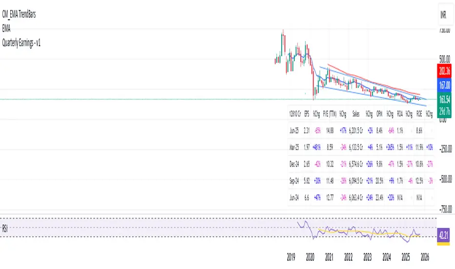
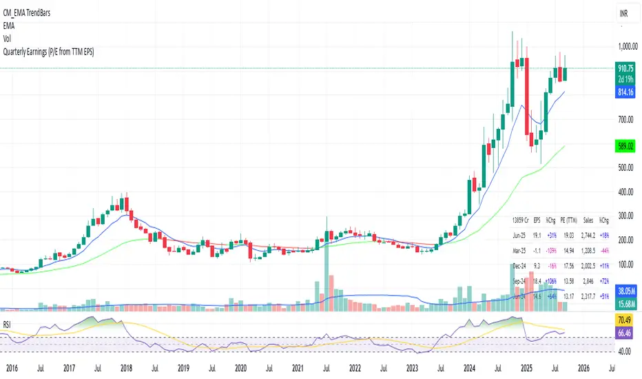
Quarterly Earnings - v1This script shows company fundamentals in a TradingView table: Earnings Per Share (EPS), Price-to-Earnings Ratio (P/E, TTM), Sales (in Crores), Operating Margin (OPM %), Return on Assets (ROA %), and Return on Equity (ROE %).
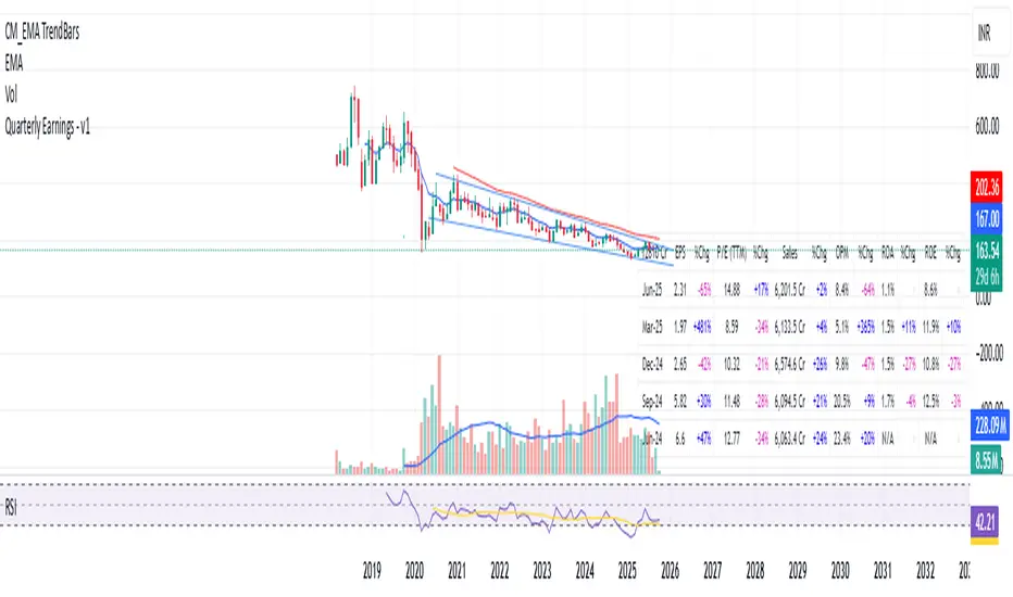
Quarterly Earnings - v1This script shows company fundamentals in a TradingView table: Earnings Per Share (EPS), Price-to-Earnings Ratio (P/E, TTM), Sales (in Crores), Operating Margin (OPM %), Return on Assets (ROA %), and Return on Equity (ROE %).
12Q PerformanceShows a table of 12 quarters with Revenue, Net Income, and Net Profit Margin. Highlights QoQ changes in green/red and places the table at bottom-right for quick performance glance.

Quarterly EarningsEarnings Per Share (EPS), Price-to-Earnings Ratio (P/E, TTM), Sales (in Crores), Operating Margin (OPM %), Return on Assets (ROA %), and Return on Equity (ROE %). Each metric includes its absolute value and quarter-over-quarter or year-over-year percentage change.

Quarterly EarningsEarnings Per Share (EPS), Price-to-Earnings Ratio (P/E, TTM), Sales (in Crores), Operating Margin (OPM %), Return on Assets (ROA %), and Return on Equity (ROE %). Each metric includes its absolute value and quarter-over-quarter or year-over-year percentage change.

Quarterly EarningsThis Pine script shows quarterly EPS, Sales, and P/E (TTM-based) in a styled table.
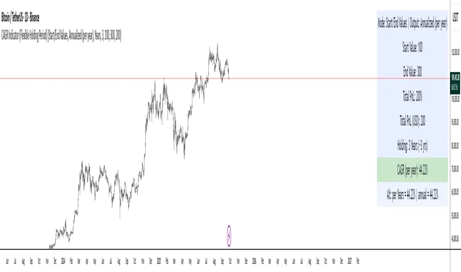
CAGR Indicator (Flexible Holding Period)CAGR Indicator (Flexible Holding Period)
The CAGR Indicator (Flexible Holding Period) is designed to convert any cumulative investment outcome into a standardized, annualized growth rate that can be compared across assets, strategies, and time horizons. Its core metric is the compound annual growth rate, which represents the constant yearly rate that, if compounded smoothly, transforms an initial value into a final value over a specified horizon. By annualizing returns, the indicator removes distortions caused by unequal test lengths and allows direct comparison with benchmarks such as index returns or risk-free rates.
Conceptually, the indicator proceeds in two stages: measuring growth and normalizing time. Growth is summarized by the growth multiple, which is the ratio of ending value to starting value when concrete values are provided, or equivalently 1 plus total percentage return divided by 100 when only a cumulative percent is known. Time is normalized by converting the user’s holding period into a year-equivalent, so that a 45-day, 30-week, 18-month, or multi-year interval can all be mapped onto a common annual scale. The conversions use widely accepted approximations: days divided by 365.25, weeks divided by approximately 52.1429, and months divided by 12, while years are used as entered.
Once growth and time are expressed in compatible units, the indicator applies the standard compounding identity: CAGR = (Growth Multiple)^(1/T) − 1, where T is the year-equivalent holding period. This transformation inverts the compounding process and yields the geometric mean rate of return per year. Because the geometric mean is path-independent, the CAGR summarizes start-to-finish performance without reference to the sequence of gains and losses. The output therefore reflects the constant annual rate that would have produced the observed terminal value from the initial value if returns had been smooth.
The indicator admits two data entry modes to accommodate common reporting practices. In Start/End Values mode, the user supplies initial and final portfolio values; the indicator computes the growth multiple as end divided by start and also displays absolute profit or loss in currency terms to aid practical interpretation. In Total PnL (%) mode, the user supplies a cumulative return percentage; the indicator converts this to a growth multiple and estimates a corresponding ending value for display, while the CAGR computation itself relies only on the multiple and the time horizon.
Validity checks ensure that reported numbers are meaningful. The growth multiple must be strictly positive; cumulative losses at or below minus one hundred percent make the multiple nonpositive and render the CAGR undefined. The holding period must be positive and convertible to a year-equivalent. In Start/End mode, the starting value must exceed zero to avoid division by zero and degenerate ratios. When these conditions are not met, the indicator withholds a numeric result and signals that the quantity is not well defined.
Interpreting the output requires recognizing both its strengths and its limits. The CAGR is a concise, comparable measure of long-run performance that abstracts from timing and volatility. It is particularly useful for benchmarking strategies of different durations, setting policy targets for funds, communicating results to stakeholders, and aligning outcomes with hurdle rates. However, because it is path-independent, the CAGR does not reflect interim drawdowns, variance, or tail risk. It also presumes a lump-sum investment with no intermediate cash flows; when deposits or withdrawals occur, internal rate of return methods such as IRR or XIRR are more appropriate.
Typical applications include comparing backtests with unequal sample lengths, reporting consolidated results from discrete projects on a common annual basis, and translating short-horizon event outcomes (for example, a multi-week campaign) into an annualized figure for decision-making. The indicator’s auxiliary displays, such as total profit or loss in currency and the explicit statement of the original holding period alongside its year-equivalent, improve transparency and auditability of the transformation.
Users should remain mindful of several caveats. Time conversions rely on conventional averages and may differ from calendar-exact counts by small amounts, which is usually immaterial but worth noting for edge cases. Selection bias can inflate reported CAGRs if intervals are cherry-picked; robust practice involves rolling windows, out-of-sample tests, and sensitivity analysis. Most importantly, the CAGR should be paired with risk and stability measures—such as maximum drawdown, Sharpe or Sortino ratios, downside deviation, or ulcer index—to form a complete assessment of a strategy’s quality.
In sum, the indicator operationalizes a simple but powerful idea: separate the measurement of growth from the normalization of time, then apply the compounding identity to express outcomes as a consistent per-year rate. By combining flexible period inputs with a rigorous geometric transformation, it enables fair, intelligible comparisons while encouraging the complementary use of risk diagnostics to avoid over-reliance on a single summary statistic.
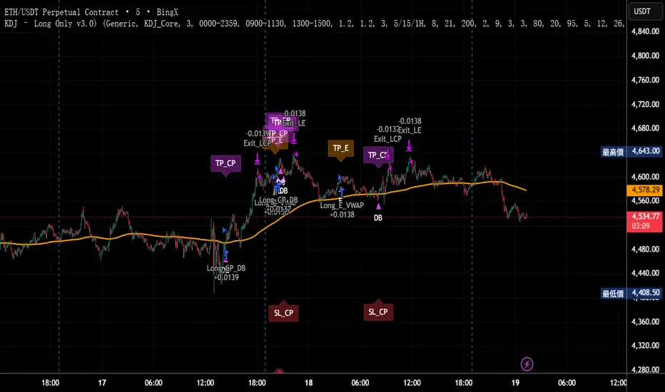
KDJ – Long Only v3.0 (TradingView Strategy)
Overview|概覽
EN
A research strategy that automates long-only entries using a KDJ-centric core with multi-layer confirmations and volatility-aware exits. Default preset targets ETH 5m; other symbols/timeframes can be tuned.
中文
研究用策略,透過 KDJ 核心與多層確認來自動化只做多進場,並以隨波動調整的出場邏輯運作。預設為 ETH 5 分鐘;其他商品/週期可自行調參。
Backtest (hypothetical) example: ETHUSDT.P, 5m, 2024-09-18→2025-09-18, fee 0.05%, slippage 1 tick.(僅示意,屬假設性回測)
What it does|做什麼
EN
Signals are organized into channels:
A KDJ trend core
B OB/FVG touch pullback
CP Double-bottom (buffered neckline)
SR Support/Resistance bounce with rejection/zone checks
D EMA pullback (long EMA length)
E VWAP reclaim (lower-band pierce & recapture)
F Prior-low sweep & reclaim
中文
訊號分成多通道:
A KDJ 順勢核心
B OB/FVG 回踩觸價
CP 雙底(頸線含緩衝)
SR 支撐/阻力觸價不破(含拒絕與區域檢查)
D EMA 回踩(長週期 EMA)
E VWAP 收復(下緣穿越後收回)
F 前低掃回
High-level logic|高層級原理
HTF/Mid-TF context:內建 5/15/1H 或 15/60/4H 組合;以簡化趨勢線/區域提供觸價參考
Trend & structure:本階 EMA(8/21/200) 結構;Structure Breakout(近期高低點 ±ATR 緩衝)/EMA8/21 回踩
Momentum/volume:MACD、KDJ 金叉與低區偵測、量能驗證
Regime:ADX 閘(趨勢/盤整門檻)、EMA 帶寬過濾震盪、Peak Guard 避免過度延伸
No look-ahead:入場不使用前視;樞紐/趨勢線僅作情境參考
Inputs & Features|參數與功能
Market Preset:Generic / ETH(ETH 預設收緊若干門檻,開箱即用)
Entry Mode:KDJ_Core / CandleOnly / KDJ_and_Candle
Session Filter:最多三段交易時窗
Lite Filters:過度延伸、實體大小、DI 差距
S/R 模組:拒絕條件、KDJ 覆核、區域要求、即時 R:R 檢核
OrderBlock/FVG:近棒位移掃描
Chart Pattern:雙底 W,ATR 容差與頸線緩衝
Plotting:EMA200、通道字母標記、可選 TP/SL 標籤
Automation via Alerts(generic)|快訊自動化(通用)
EN
On entries/exits the strategy emits JSON through alert_message. Create alerts with “Any alert() function call” and route them to your own webhook/bridge. Symbol mapping, sizing mode, and user info are configurable in inputs.
中文
進出場時透過 alert_message 輸出 JSON。建立快訊時選 “Any alert() function call”,再由你的 webhook/橋接服務轉單;輸入面板可設定商品代碼、下單型式與使用者資訊。
提示:調整參數後,請重建快訊,並將訊息欄設為 {{strategy.order.alert_message}}。
Position sizing|部位大小
base / quote / percent_local / percent(percent_local 以本地 USD 估值計算)
可選「按數量模式」以便與本地部位同步(position_size sync)
Risk & Exits|風險與出場
SL:ATR / Swing / ATR_or_Swing;TP Cap 以 ATR 或 % 限制上限
Breakeven & Trailing:達指定 R:R 啟動保本;之後以 最高價回看 − ATR×k 追蹤
Same-bar exits:可允許/禁止同根觸發 TP/SL
Pyramiding:pyramiding=2,最多兩筆多單可同時存在(淨倉交易所請留意整體倉位的平倉行為)
Suggested workflow|建議流程
回測目標市場/週期 → 設定時段/濾網與門檻 → 微調 TP/SL 與部位大小 → 建立快訊({{strategy.order.alert_message}})→ 監看執行日誌
Notes & Disclaimer|注意與免責
回測結果仰賴時間框解析與成交規則;棒內路徑與實盤可能不同
僅供研究/教育;非投資建議
本頁無廣告、無外部連結或聯絡資訊
Release Notes|版本說明
2025-09-19
新增:One-shot Force Flat(一鍵清倉僅一次)— 於下一根收盤執行,完成後自動失效
Webhook:進/出場皆輸出 JSON;提醒更新參數後重建快訊
行為澄清:pyramiding=2,允許同圖表最多兩筆多單並存;同棒出場可設定
2025-09-18
Netted venue 說明:在淨倉模式下,出場會影響同商品的整體淨多倉;請留意手動單與策略單的互動
2025-08-28
修正小數顯示;預設優化(ETH/5m);保留隨波動的 RR/SL 邏輯
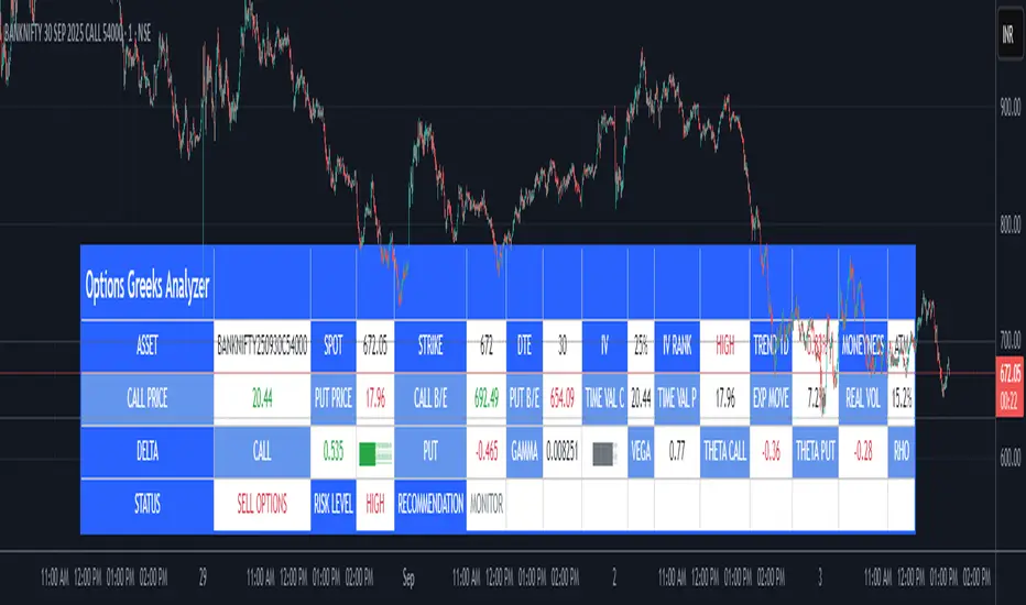
Options Greeks AnalyzerOptions Greeks Analyzer (Training & Learning Guide)
________________________________________
1. Introduction
Options trading is advanced compared to regular stock trading, and one of the most important aspects is Options Greeks. Greeks are mathematical values that measure how the price of an option will react to changes in various factors such as the underlying asset’s price, volatility, interest rates, and time to expiry.
This Options Greeks Analyzer tool is built using TradingView Pine Script v5. It serves as a real time training and analysis dashboard that helps learners visualize how options greeks behave, how option prices change, and how traders can make informed decisions.
📌 Educational Disclaimer:
This tool is only for training and learning purposes. It is not a financial advice tool nor to be used for live trading decisions. The data shown is theoretical Black Scholes model calculations, which may differ from actual option market prices.
________________________________________
2. How the Tool Works
The Options Greeks Analyzer is divided into different modules. Below is a step by step walkthrough:
________________________________________
Step 1: User Inputs
• Implied Volatility (IV%) — You can manually enter volatility, which is the most important factor in option pricing. Higher IV = higher option premium.
• Expiry Selection — Choose from preset durations like 7D, 14D, 30D etc. Days to expiry directly affect time decay (Theta).
• Strike Price Mode — You can select either:
o ATM (At-the-Money = Current price of stock/index)
o Custom strike (Enter your own strike price)
• Risk-Free Rate (%) — A small interest rate factor (like government bond yield) used for theoretical valuation.
• Table Customization — Choose table size, position, and whether to show price lines for easy visibility.
________________________________________
Step 2: Market Data & Volatility
• The tool takes the current market price (Spot Price) as input.
• It calculates realized volatility from historical price fluctuations (using past 30 bars/log returns).
• Implied Volatility (manual input) is then compared to realized vol:
o If IV > Historical Volatility → Market pricing is “expensive” (HIGH IV RANK).
o If IV < Historical Volatility → Market is “cheap” (LOW IV RANK).
o Otherwise, it’s MEDIUM.
📌 Why it matters?
Traders can decide whether buying or selling options is favorable. Beginners learn that timing entry with volatility is more critical than just looking at market direction.
________________________________________
Step 3: Black-Scholes Formula
The core engine uses the Black-Scholes model, a mathematical formula widely used to compute option fair prices.
It uses the following inputs:
• Current price (Spot)
• Strike Price
• Time to Expiry (T)
• Risk Free Rate (r)
• Implied Volatility (σ)
This produces:
• Call Option Price
• Put Option Price
📌 This teaches learners how premiums are derived theoretically and why the same strike can have different values depending on IV and time.
________________________________________
Step 4: Option Greeks Calculation
The tool computes the first order Greeks:
• Delta → Measures how much the option price changes when the underlying stock moves by 1 point.
(Call Delta ranges 0–1, Put Delta ranges -1 to 0).
• Gamma → Sensitivity of Delta to price change. A measure of volatility risk.
• Theta → Time decay. Shows how much value option loses as each day passes. Calls and Puts have negative Theta (decay).
• Vega → Measures how sensitive option price is to volatility changes.
• Rho → Interest rate sensitivity. Mostly minor in equity options but important for training.
📌 New traders learn how each factor impacts profits/losses. Instead of random guessing, they see mathematical impact in numbers.
________________________________________
Step 5: Dashboard & Visualization
The tool builds a professional dashboard table on the chart.
It shows categories such as:
1. Asset Info — Spot, Strike, DTE (days to expiry), IV%, IV Rank, 1-Day Trend, Moneyness (ATM/OTM/ITM).
2. Option Prices — Call, Put, Break-even levels, Time Value, Expected Move (%), Realized vs Implied Vol.
3. Greeks with Visual Progress Bars — Easily shows Delta, Gamma, Vega, Theta, Rho in intuitive graphical representations.
4. Status Bar — Suggests theoretical bias like:
o HIGH IV → Favor Option Selling
o LOW IV → Favor Option Buying
o MEDIUM → Neutral observation
5. Recommendation Line — Offers training-based suggestions like “Buy Straddles”, “Sell Call Spreads”, etc. These are not signals, but scenarios to learn strategies.
________________________________________
3. How It Helps Beginners
1. Learn Greeks in Action:
Beginners often memorize formulas but never see real-time changes. This dashboard updates every bar to show how Greeks change dynamically.
2. Compare Volatilities:
Traders understand difference between historical vs implied volatility and why option premiums behave differently.
3. Understand Risk Levels:
The tool highlights when Gamma risk is high (danger for sellers) or when Theta is most favorable.
4. Training Mode for Strategies:
Helps beginners experiment by changing IV, strike, expiry and seeing how straddles, spreads, naked options would behave theoretically.
5. Prepares Before Live Trading:
Safe environment to practice option analysis without risking capital.
________________________________________
4. Educational Use Cases
• Scenario 1: Change expiry from 7D to 30D — see how Theta becomes slower for longer expiries.
• Scenario 2: Increase IV from 25% to 80% — watch how option premiums inflate, and recommendation changes from “Buy” to “Sell”.
• Scenario 3: Select OTM vs ITM strikes — check how delta moves from near 0 to near 1.
By running these scenarios, learners understand why professional traders hedge Greeks instead of directional gambling.
________________________________________
5. Disclaimer
This Options Greeks Analyzer is built strictly for educational and training purposes.
• It uses theoretical formulas (Black-Scholes) that may not match actual option market prices.
• The recommendations are for learning strategy logic only, not real-world execution signals.
• Trading in options carries significant risks and may result in capital loss.
📌 Always consult with a financial advisor before applying real strategies.
________________________________________
✅ Summary
This Options Greeks Analyzer:
• Teaches how Greeks, IV, and premiums work.
• Provides a real-time interactive dashboard for training.
• Helps beginners practice option scenarios safely.
• Is meant strictly for learning and not live trading execution.
________________________________________
________________________________________
Disclaimer from aiTrendview
This script and its trading signals are provided for training and educational purposes only. They do not constitute financial advice or a guaranteed trading system. Trading involves substantial risk, and there is the potential to lose all invested capital. Users should perform their own analysis and consult with qualified financial professionals before making any trading decisions. aiTrendview disclaims any liability for losses incurred from using this code or trading based on its signals. Use this tool responsibly, and trade only with risk capital.
Extended CANSLIM Indicator❖ Extended CANSLIM Indicator.
The Extended CANSLIM indicator is an indicator that concentrates all the tools usually used by CANSLIM traders.
It shows a table where all the stock fundamental information is shown at once first for the last quarter and then up to 5 years back.
The fundamental data is checked against well known CANSLIM validation criteria and is shown over 4 state levels.
1. Good = Value is CANSLIM Compliant.
2. Acceptable = Value is not CANSLIM compliant but still good. value is shown with a lighter background color.
3. Warning = Value deserves special attention. Value is shown over orange background color.
3. Stop = Value is non CANSLIM compliant or indicates a stop trading condition. Value is shown over red background color.
The indicator has also a set of technical tools calculated on price or index and shown directly on the chart.
❖ Fundamental data shown in the table.
The table is arranged in 4 sets of data:
1. Table Header, showing Indicator and Company data.
2. CANSLIM.
3. 3Rs: RS Rating, Revenue and ROE.
4. Extra Data: Piotroski score, ATR, Trend Days, D to E, Avg Vol and Vol today.
Sets 3 and 4 can be hidden from the table.
❖ Indicator and Compay Data.
The table header shows, Indicator name and version.
It then displays Company Name, sector and industry, human size and its capitalization.
❖ CANSLIM Data.
Displays either genuine CANSLIM data from TradinView or custom data as best effort when that data cannot be obtained in TV.
C = EPS diluted growth, Quarterly YoY.
>= 25% = Good, >= 0% = Acceptable, < 0% = Stop
A = EPS diluted growth, Annual YoY.
>= 25% = Good, >= 0% = Acceptable, < 0% = Stop
N = New High as best effort (Cust).
Always Good
S = Float shares as best effort.
Always Good
L = One year performance relative to S&P 500 (Cust),
Positive : 0% .. 50% = Neutral, 50%+ = Leader, 80%+ = Leader+, 100%+ = Leader++
Negative : 0% .. -10% = Laggard, -10% .. -30% = Laggard+, -30%+ = Laggard++
>= 50% = Good, >= 0% = Acceptable, >= -10% Warning, < -10% = Stop
I = Accumulation/Distribution days over last 25 days as a clue for institutional support (Cust).
A delta is calculated by subtracting Distribution to Accumulation days.
> 0 = Good, = 0 = Acceptable, < 0 = Warning, < -5 = Stop
M = Market direction and exposure measured on S&500 closing between averages (Cust).
Varies from 0% Full Bear to 100% Full Bull
>= 80% = Good, >= 60% = Acceptable, >= 40% = Warning, < 40% = Stop
❖ Extra non CANSLIM Data.
RS = RS Rating.
>= 90 = Good, >= 80 = Accept, >= 50 = Warning, < 50 = Stop
Rev. = Revenue Growth Quarterly YoY.
>= 0% = Good, <0% = Stop
ROE = Return on Equity, Quarterly YoY.
>= 17% = Good, >= 0% = Acceptable, < 0% = Stop
Piotr. = Piotroski Score, www.investopedia.com (TV)
>= 7 = Good, >= 4 = Acceptable, < 4 = Stop
ATR = Average True Range over the last 20 days (Cust).
0% - 2% = Acceptable, 2% - 4% = Ideal, 4% - 6% = Warning, 5%+ = Stop.
Trend Days = Days since EMA150 is over EMA200 (Cust).
Always Good
D. to E. = Days left before Earnings. Maybe not a good idea buying just before earnings (Cust).
>= 28 = Good, >= 21 = Acceptable, >= 14 = Warning, < 14 = Stop
Avg Vol. = 50d Average Volume (Cust).
>= 100K = Good, < 100K = Acceptable
Vol. Today = Today's percentage volume compared to 50d average (Cust).
Always Good.
❖ Historical Data.
Optionally selectable historical data can be displayed for C, A, Revenue and ROE up to 20 quarters if available.
Quarterly numbers can also be displayed for A, C and Revenue.
Information can be shown in Chronological or Reverse Chronological order (default).
Increasing growth quarters are shown in white, while diminuing ones are shown in Yellow.
Transition from Losing to Profitable quarters are shown with an exclamation mark ‘!’
Finally, losing quarters are shown between parenthesis.
❖ MAs on chart.
Displays 200, 100, 50 and 20 days MAs on chart.
The MAs are also automatically scaled in the 1W time frame.
❖ New 52 Week High on chart.
A sun is shown on the chart the first time that a new 52 week high is reached.
The N cell shows a filled sun when a 52 week high is no older than a month, an lighter sun when it’s no older than a quarter or a moon otherwise.
❖ Pocket Pivots on chart.
Small triangles below the price are signaling pocket pivots.
❖ Bases on chart, formerly Darvas Boxes.
Draw bases as defined by Darvas boxes, both top or bottom of bases can be selected to be shown in order to only show resistance or support.
❖ Market exposure/direction indicator.
When charting S&P500 (SPX), Nasdaq 100 Index (NDX), Nasdaq composite (IXIC) or Dow Jownes Index (DJIA), the indicator switches to Market Exposure indicator, showing also Accumulation/Distribution days when volume information is available. This indication which varies from 0% to 100% is what is shown under the M letter in the CANSLIM table which is calculated on the S&P500.
❖ Follow Through Days indicator.
If you are an adept of the Low-cheat entry, then you will be highly interested by the Follow Through days indicator as measured in the S&P 500 and shown as diamonds on the chart.
The follow-through days are calculated on S&P500 but shown in current stock chart so you don’t need to chart the S&P 500 to know that a follow through day occurred.
Follow Through days show correctly on Daily time frame and most are also shown on the Weekly time frame as well.
They are also classified according to the market zone in which they occur:
0%-5% from peak = Pullback : FT day is not shown.
5%-10% from peak = Minor Correction : Minor FT days is shown.
10%-20% from peak = Correction : Intermediate FT days us shown
20+% from peak = Bear Market : Makor FT days is shown
❖ RS Line and Rating indicator.
A RS Line and Rating indicator can be added to the chart.
Relative Strength Rating Accuracy.
Please note that the RS Rating is not 100% accurate when compared to IBD values.
❖ Earning Line indicator.
An Earning Line indicator can be added to the chart.
❖ ATR Bands and ATR Trade calculator.
The motivation for this calculator came from my own need to enter trades on volatile stocks where the simple 7% Stop Loss rule doest not work.
It simply calculates the number of shares you can buy at any moment based on current stock price and using the lower ATR band as a stop loss.
A few words about the ATR Bands.
On this indicator the ATR bands are not drawn as a classical channel that follows the price.
The lower band is drawn as a support until it’s broken on a closing basis. It can’t be in a down trend.
The upper band is drawn as a resistance until it’s broken on a closing basis. It can’t be in an up trend.
The idea is that when price starts to fall down from a peak, it should not violate its lower band ATR and that means that we can use that level as a Stop Loss.
You must look back for the stock volatility and find out which ATR multiplier works well meaning that the ATR bands are not violated on normal pullbacks. By default, the indicator uses 5x multiplier.
❖ Extra things, visual features and default settings.
The first square cell of current quarter displays a check mark ‘V’ if the CANSLIM criteria is OK or acceptable or a cross ‘X’ otherwise.
The first square cell of historical C and Rev show respectively the count of last consecutive positive quarters.
There are different color themes from “Forest” to “Space” you can chose from to best fit your eyes.
You also have different table sizes going from “Micro” to “Huge” for better adjustment to the size of your display.
The default settings view show: Pocket Pivots, FT Days, MA50, RS Line and ATR Bands.
That's all, Enjoy!

Trading bot gridsGuide: Price Lines – Arithmetic vs. Geometric
This script draws horizontal price lines (grids) between a start price and an end price.
You can choose whether the lines are distributed evenly (arithmetic) or by percentage (geometric).
🔧 Inputs
Start Price → Lower or upper boundary of the price range.
End Price → Opposite boundary of the price range.
Number of Lines → Total number of lines to be drawn between the start and end prices.
Distribution →
Arithmetic: Fixed USDT distance between each line.
Geometric: Fixed percentage distance between each line.
Grid Color → Color of the drawn lines.
📈 How it Works
The script calculates the lower (lo) and upper (hi) boundaries, regardless of which is entered first.
Arithmetic distribution: Each line is spaced by a fixed amount in USDT.
Geometric distribution: Each line is spaced by the same percentage difference from the previous one.
Lines are created only once at the first bar and remain on the chart.
All lines are extended across the entire visible chart.
💡 Tips
Useful for Grid Bot backtesting or visualizing price zones.
Works for both long and short price ranges.
In geometric mode, lines appear closer together near the lower price range and farther apart toward the upper range.

ETH/SOL 1D Dynamic Trend Core - STRATEGY v 45Overview
The Dynamic Trend Core is a sophisticated, multi-layer trading engine designed to identify high-probability, trend-following opportunities. Its core philosophy is rooted in confluence, meaning it requires multiple conditions across trend, momentum, and volume to align before generating a signal. This approach aims to filter out market noise and provide a clearer view of the underlying trend.
The script includes a comprehensive backtesting engine for strategy optimization and a rich, intuitive visual interface for real-time analysis.
How It Works: Core Logic
The engine validates signals through several sequential layers:
Primary Trend Analysis (SAMA): The foundation is a Self-Adjusting Moving Average (SAMA) that dynamically determines the primary market direction (Bullish, Bearish, or Consolidation).
Momentum Confirmation: Signals are then qualified using a blend of the Natural Market Slope and a Cyclic RSI to ensure momentum is firmly aligned with the established trend.
Advanced Filtering Suite: A suite of optional filters provides robust confirmation and allows for deep customization:
Volume & ADX: Confirms that trades are supported by sufficient market participation and trend strength.
Market Regime: Gauges broad market health (e.g., using TOTAL market cap) to avoid trading against the entire market.
Multi-Timeframe (MTF) Analysis: Aligns signals with the dominant trend on a higher timeframe (e.g., Weekly).
BTC Cycle Analysis: Positions trades within the context of historical Bitcoin cycles using models like the Halving Cycle or Mayer Multiple.
On-Chart Visuals & Features
The script provides full transparency into its logic with a powerful on-chart interface.
IMPORTANT: For the live visual elements to function correctly, you must enable "Recalculate on every tick" in the script's settings (Settings > Properties).
Power Core Gauge: Located at the bottom-center of the chart, this gauge is the heart of the system. It displays the number of filter conditions currently met (e.g., 5/6) and "powers up" by glowing brighter as more conditions align, indicating a fully confirmed signal is ready.
Live Conditions Panel: This panel in the bottom-right corner acts as a real-time pre-flight checklist. It shows the status (pass/fail) of every individual filter, so you know exactly why a signal is, or is not, being generated.
Energized Trendline: The primary SAMA trendline changes color and intensity based on the strength and direction of the trend, offering immediate visual context.
BTC Halving Cycle Visualizer: Provides a background color guide to the different phases of the Bitcoin halving cycle for macro context.
How to Use & Configure
Select Operation Mode:
Backtest Mode: Use this to test different settings on historical data and find optimal configurations for a specific asset and timeframe.
Alerts-Only Mode: Use this for live trading to generate alert signals without cluttering the chart with backtest data. (Contact publisher for access to this version)
Configure Your Filters:
Start with the default filter settings.
If a potential setup is missed, check the Live Conditions Panel to see which specific filter blocked the signal.
Enable, disable, or adjust filters in the script's settings to match your trading style and the asset's characteristics.
Manage Your Risk:
Go to the "Risk & Exit" settings to configure your Stop Loss and Take Profit parameters to match your personal risk tolerance.
Disclaimer: This script is for educational and informational purposes only. It is not financial advice. All trading involves risk, and past performance is not indicative of future results. Please conduct your own research and backtesting before making any trading decisions.
