Arbitrage Detector [LuxAlgo]The Arbitrage Detector unveils hidden spreads in the crypto and forex markets. It compares the same asset on the main crypto exchanges and forex brokers and displays both prices and volumes on a dashboard, as well as the maximum spread detected on a histogram divided by four user-selected percentiles. This allows traders to detect unusual, high, typical, or low spreads.
This highly customizable tool features automatic source selection (crypto or forex) based on the asset in the chart, as well as current and historical spread detection. It also features a dashboard with sortable columns and a historical histogram with percentiles and different smoothing options.
🔶 USAGE
Arbitrage is the practice of taking advantage of price differences for the same asset across different markets. Arbitrage traders look for these discrepancies to profit from buying where it’s cheaper and selling where it’s more expensive to capture the spread.
For begginers this tool is an easy way to understand how prices can vary between markets, helping you avoid trading at a disadvantage.
For advanced traders it is a fast tool to spot arbitrage opportunities or inefficiencies that can be exploited for profit.
Arbitrage opportunities are often short‑lived, but they can be highly profitable. By showing you where spreads exist, this tool helps traders:
Understand market inefficiencies
Avoid trading at unfavorable prices
Identify potential profit opportunities across exchanges
As we can see in the image, the tool consists of two main graphics: a dashboard on the main chart and a histogram in the pane below.
Both are useful for understanding the behavior of the same asset on different crypto exchanges or forex brokers.
The tool's main goal is to detect and categorize spread activity across the major crypto and forex sources. The comparison uses data from up to 19 crypto exchanges and 13 forex brokers.
🔹 Forex or Crypto
The tool selects the appropriate sources (crypto exchanges or forex brokers) based on the asset in the chart. Traders can choose which one to use.
The image shows the prices and volumes for Bitcoin and the euro across the main sources, sorted by descending average price over the last 20 days.
🔹 Dashboard
The dashboard displays a list of all sources with four main columns: last price, average price, volume, and total volume.
All four columns can be sorted in ascending or descending order, or left unsorted. A background gradient color is displayed for the sorted column.
Price and volume delta information between the chart asset and each exchange can be enabled or disabled from the settings panel.
🔹 Histogram
The histogram is excellent for visualizing historical values and comparing them with the asset price.
In this case, we have the Euro/U.S. Dollar daily chart. As we can see, the unusual spread activity detected since 2016, with values at or above 98%, is usually a good indication of increased trader activity, which may result in a key price area where the market could turn around.
By default, the histogram has the gradient and smoothing auto features enabled.
The differences are visible in the chart above. On top is an adaptive moving average with higher values for unusual activity. At the bottom is an exponential moving average with a length of 9.
The differences between the gradient and solid colors are evident. In the first case, the colors are in sync with the data values, becoming more yellow with higher values and more green with lower values. In the second case, the colors are solid and only distinguish data above or below the defined percentiles.
🔶 SETTINGS
Sources: Choose between crypto exchanges, forex brokers, or automatic selection based on the asset in the chart.
Average Length: Select the length for the price and volume averages.
🔹 Percentiles
Percentile Length: Select the length for the percentile calculation, or enable the use of the full dataset. Enabling this option may result in runtime errors due to exceeding the allotted resources.
Unusual % >: Select the unusual percentile.
High % >: Select the high percentile.
Typical % >: Select the typical percentile.
🔹 Dashboard
Dashboard: Enable or disable the dashboard.
Sorting: Select the sorting column and direction.
Position: Select the dashboard location.
Size: Select the dashboard size.
Price Delta: Show the price difference between each exchange and the asset on the chart.
Volume Delta: Show the volume difference between each exchange and the asset on the chart.
🔹 Style
Unusual: Enable the plot of the unusual percentile and select its color.
High: Enable the plot of the high percentile and select its color.
Typical: Enable the plot of the typical percentile and select its color.
Low: Select the color for the low percentile.
Percentiles Auto Color: Enable auto color for all plotted percentiles.
Histogram Gradient: Enable the gradient color for the histogram.
Histogram Smoothing: Select the length of the EMA smoothing for the histogram or enable the Auto feature. The Auto feature uses an adaptive moving average with the data percent rank as the efficiency ratio.
Zyklen

BK AK-Zenith💥 Introducing BK AK-ZENITH — Adaptive Rhythm RSI for Peak/Valley Warfare 💥
This is not another generic RSI. This is ZENITH: it measures where momentum is on the scale, then tells you when it’s hitting extremes, when it’s turning, and when price is lying through its teeth with divergence.
At its core, ZENITH does one thing ruthlessly well:
it matches the oscillator’s period to the market’s current rhythm—adaptive when the market is fast, adaptive when the market is slow—so your signals stop being “late because the settings were wrong.”
🎖 Full Credit — Respect the Origin (AlgoAlpha)
The core RSI architecture in this form belongs to AlgoAlpha—one of the best introducers and coders on TradingView. They originated this adaptive/Rhythm-RSI framework and the way it’s presented and engineered.
BK AK-ZENITH is my enhancement layer on top of AlgoAlpha’s foundation.
I kept the spine intact, and I added tactical systems: clearer Peak/Valley warfare logic, pivot governance (anti-spam), divergence strike markers, momentum flip confirmation, and a war-room readout—so it trades like a weapon, not a toy.
Respect where it started: AlgoAlpha built the engine. I tuned it for battlefield use.
🧠 What Exactly is BK AK-ZENITH?
BK AK-ZENITH is an Adaptive Period RSI (or fixed if you choose), designed to read momentum like a range of intent rather than a single overbought/oversold gimmick.
Core Systems Inside ZENITH
✅ Adaptive Period RSI (Rhythm Engine)
Automatically adjusts its internal RSI length to match current market cadence.
(Optional fixed length mode if you want static.)
✅ Optional HMA Smoothing
Cleaner shape without turning it into a laggy moving average.
✅ Peak / Valley Zones (default 80/20)
Hard boundaries that define “true extremes” so you stop treating every wiggle like a signal.
✅ Pivot-Based BUY/SELL Triangles + Cooldown
Signals are governed by pivots and a cooldown so it doesn’t machine-gun trash.
✅ Momentum Flip Diamonds (◇)
Shows when the oscillator’s slope flips—clean confirmation for “engine change.”
✅ Divergence Lightning (⚡)
Exposes when price is performing confidence while momentum is quietly breaking.
✅ War-Room Table / Meter
Bias, zone, reading, and adaptive period printed so you don’t “interpret”—you execute.
✅ Alerts Suite
Pivots, divergences, zone entries—so the chart calls you, not your emotions.
🎯 How to use it (execution rules)
1) Zones = permission
Valley (≤ Valley level): demand territory. Stalk reversal structure; stop chasing breakdown candles.
Peak (≥ Peak level): supply territory. Harvest, tighten, stop adding risk at the top.
2) Pivot triangles = the shot clock
Your ▲/▼ signals are pivot-confirmed with a cooldown. That’s intentional.
This is designed to force patience and prevent overtrading.
3) Divergence = truth serum
When price makes the “confident” high/high or low/low but ZENITH disagrees, you’re seeing internal change before the crowd does.
Treat divergence as warning + timing context, not a gambling button.
4) Meter/Table = discipline
If you can’t summarize the state in one glance, you’ll overtrade. ZENITH prints the state so your brain stops inventing stories.
🔧 Settings that actually matter
Adaptive Period ON (default): the whole point of ZENITH
Peak/Valley levels: how strict extremes must be
Pivot strength + Cooldown: your anti-spam governor
Divergence pivot length: controls how “major” divergence must be
The “AK” in the name is an acknowledgment of my mentor A.K. His standards—patience, precision, clarity, emotional control—are why this tool is built with governors instead of hype.
And above all: all praise to Gd—the true source of wisdom, restraint, and right timing.
👑 King Solomon Lens — ZENITH Discernment
Solomon asked Gd for something most people never ask for: not wealth, not victory—discernment. The ability to separate what looks true from what is true.
That is exactly what momentum work is supposed to do.
1) Honest weights, honest measures.
In Solomon’s world, crooked scales were an abomination because they disguised reality. In trading, the crooked scale is your own excitement: you see one green candle and call it strength. ZENITH forces an honest measure—0 to 100—so you deal in degree, not drama. A Peak is not “bullish.” A Peak is “momentum priced in.” A Valley is not “bearish.” A Valley is “selling pressure reaching exhaustion.”
2) Wisdom adapts to seasons.
Solomon’s order wasn’t chaos—there was a time to build, a time to harvest, a time to wait. Markets have seasons too: trend seasons, chop seasons, compression seasons, expansion seasons. Fixed-length RSI pretends every season is the same. ZENITH does not. It listens for rhythm and adjusts its internal timing so your read stays relevant to today’s market tempo—not last month’s.
3) The sword test: revealing what’s hidden.
Solomon’s most famous judgment wasn’t about theatrics—it was about revealing the truth beneath appearances. Divergence is that same test in markets: price can perform strength while the engine quietly weakens, or perform weakness while momentum secretly repairs. The ⚡ is not a prophecy. It’s a revelation: “what you see on price is not the full story.”
That’s ZENITH discipline: measure → discern → execute.
And may Gd bless your judgment to act only when the measure is clean.
⚔️ Final
BK AK-ZENITH is a momentum fire-control system: adaptive rhythm + extreme zones + pivot timing + divergence truth.
Use it to stop feeling trades and start weighing them. Praise to Gd always. 🙏

Druckenmiller Alpha-Physics [Dual-Core]Stop trading in a vacuum. Start trading like a Macro Fund Manager.
The Druckenmiller Alpha-Physics engine is a professional-grade dashboard designed to solve the single biggest problem in trading: Context. Most traders buy a "dip" only to realize it was a crash, or sell a "rip" only to watch it fly higher.
This tool solves this by synthesizing Market Physics (Velocity & Acceleration) across two distinct timeframes (Weekly Macro & Daily Tactical) and filtering every signal through a Global Liquidity Shield.
It is engineered based on the trading philosophy of Stanley Druckenmiller: “I don’t care about the news. I care about the liquidity and the acceleration of the trend.”
How It Works (The Dual-Core Logic)
The engine runs 27 distinct sector assets through a dual-loop physics processor:
The Macro Core (Weekly): Analyzes the 18-month trend. Is the "Tide" coming in or going out?
The Tactical Core (Daily): Analyzes the 3-day price action. Is the "Wave" crashing or rising?
It then synthesizes these two data streams into a single Action Signal.
The Signals (How to Read)
The dashboard tells you exactly what to do based on the conflict between Macro and Micro:
🟢 BUY PULLBACK (The "Alpha" Trade):
Logic: Macro is RIPPING (Bullish) + Tactical is TOP/CRASH (Bearish).
Meaning: You are buying a long-term leader on a short-term discount.
🔵 STINK BID (The "Bottom" Trade):
Logic: Macro is TURNING UP + Tactical is CRASHING.
Meaning: The physics have shifted positive, but price is still dumping. Place limit orders -5% lower to catch the panic bottom.
🔴 SELL RIP (The "Trap" Trade):
Logic: Macro is TOPPING (Bearish) + Tactical is RIPPING (Bullish).
Meaning: The long-term trend is dead. Sell into this short-term rally immediately.
⚪ HOLD: All systems go. Sit on your hands and ride the trend.
The "Invisible" Liquidity Shield
The most dangerous time to buy is when the Fed is draining liquidity. This script monitors the 10-Year Treasury Yield (TNX) and VIX in real-time.
If Liquidity is OK (Navy Header): Signals are valid. Green means Go.
If Liquidity is TIGHT (Maroon Header): The entire dashboard enters "Defense Mode." Buy signals are tinted Maroon to warn you that you are fighting the Fed.
Included Universe (The "Ultimate" List)
Includes 27 institutional-grade tickers covering every corner of the market:
Growth: XLK, SMH, IGV, GRID, QTUM
Cyclical: JETS, XHB, KRE, XLI, XLF
Commodities: GDX, URA, XLE, XLB, TAN
Risk/Safety: IBIT, TLT, XLV, XLP
Note: This script uses dynamic request handling optimized for Pine Script v6. It is designed for Premium/Ultimate plans due to the high volume of data processing (54+ simultaneous streams).

GS Tactical Overlay (SMC + Squeeze)designed to sit atop the 6 pillar commander. it will tell you signs for puts and calls

Monthly High/Low - [JTCAPITAL]Monthly High/Low Probability Table - is a modified way to use historical monthly high and low tracking combined with probabilistic analysis for bullish and bearish months to detect potential patterns in monthly price behavior.
The indicator works by calculating in the following steps:
Variable Declaration
Persistent variables ( var ) are used to store monthly highs, lows, open and close prices, and the days on which highs and lows occurred. Separate arrays track bullish and bearish month statistics for highs and lows ( highBull, lowBull, highBear, lowBear ). Counters ( bullCount, bearCount ) store the number of bullish and bearish months recorded.
New Month Detection
The script detects the start of a new month by comparing the current bar’s month to the previous bar’s month. If a new month is detected, the script proceeds to update statistics for the previous month.
Monthly High/Low Recording and Classification
At the start of each new month, the previous month’s high, low, open, and close are evaluated:
If monthClose > monthOpen , the month is classified as bullish.
If monthClose < monthOpen , the month is classified as bearish.
The arrays ( highBull, lowBull, highBear, lowBear ) are updated at the respective high and low days of the month by incrementing counts, which allows the script to keep track of the frequency of monthly highs and lows occurring on specific days.
Monthly High/Low Tracking
During the month, the script continuously updates monthHigh and monthLow if the current bar’s high exceeds monthHigh or the low is below monthLow . The days on which these highs and lows occur are recorded ( highDay and lowDay ). The monthClose variable is continuously updated to the latest closing price.
Probability Calculation
Once monthly data is accumulated, the script calculates probabilities for each day of the month:
bullHighProb and bullLowProb represent the probability (in percentage) that a bullish month’s high or low occurred on a given day.
bearHighProb and bearLowProb represent the probability for bearish months.
These probabilities are calculated by dividing the count of high or low occurrences on each day by the total number of bullish or bearish months, then multiplying by 100. This probabilistic approach allows traders to see recurring patterns for highs and lows across multiple months.
Gradient Coloring Function
The helper function gradientRelative computes a color gradient between lowColor and highColor based on the relative probability value. Higher probabilities are colored closer to highColor , and lower probabilities closer to lowColor . This visual representation allows for quick identification of the most probable days for highs and lows in bullish or bearish months.
Dynamic Updates
As new bars are processed, the table is updated in real-time with new probabilities reflecting the most recent month’s data. This dynamic behavior ensures that the table remains accurate and responsive to the latest market information.
Buy and Sell Conditions:
This indicator does not provide direct buy or sell signals. Instead, it provides probabilistic information about historical patterns for bullish and bearish months. Traders can use the table to:
Identify days in the month where highs or lows are statistically more likely to occur.
Combine with other trend-following or reversal strategies to optimize entry and exit points.
For example, if a trader notices that bullish month highs frequently occur around day 15, they may plan trades around that period when other indicators align.
Features and Parameters:
Dynamic Probability Table : Updates in real-time as new monthly data becomes available.
Historical Pattern Tracking : Maintains arrays for highs and lows in bullish and bearish months.
Gradient Visualization : Uses color interpolation to quickly highlight higher probability days.
Specifications:
Monthly High/Low Tracking
Tracks the highest and lowest prices within each month. This is the foundation of the probability calculations. It allows traders to understand when significant price events historically occur.
Bullish/Bearish Month Classification
Each month is classified based on the relationship between monthClose and monthOpen . This provides context for the high/low occurrences: whether they happened in bullish or bearish months.
High/Low Occurrence Arrays
Four arrays ( highBull, lowBull, highBear, lowBear ) store the count of high and low occurrences for each day of the month. These arrays are the core of the statistical analysis.
Probability Calculation
Divides the count of occurrences for each day by the total number of months in that category (bullish/bearish). Multiplying by 100 converts this to a percentage probability, giving traders a numerical sense of recurrence.
Real-Time Updates
The table and probabilities are recalculated and refreshed with each new bar. This ensures that traders have the most current information available without manual recalculation.
User-Centric Visualization
By showing probabilities for both bullish and bearish months separately, traders gain a deeper understanding of market tendencies and recurring monthly patterns, which can be leveraged for improved timing and strategy alignment.
Important:
There is a misalign in percentages due to not all months having the same amount of days.

Gold Sniper MGC1! - M30 Precision vPOCThis Pine Script, titled "Gold Sniper MGC1! - M30 Precision vPOC," is a high-precision intraday trading tool designed specifically for Micro Gold (MGC1!) futures. It integrates Market Profile and Volume Profile logic to identify key institutional levels across various trading sessions.
Core Functionality
The script identifies and plots the Volume Point of Control (vPOC)—the price level with the highest traded volume—for specific time windows:
P.vPOC (Previous vPOC): Calculated using a Daily VWAP sync to align perfectly with institutional data from the previous day.
vPOC Today: Tracks the developing Point of Control for the current global session (18:00 - 17:00).
Killzone vPOCs: Specifically isolates the highest volume price levels for the Asia (02h-08h), London (08h-14h), and New York (14h-17h) sessions.
Key Technical Features
Institutional Alignment: By utilizing request.security and hl2 median price calculations on a 30-minute basis, the script filters out market noise and aligns with the structural levels used by "Smart Money".
Dynamic Labels (Vignettes): Each level is projected to the right of the price action with a color-coded label. These labels dynamically display both the Level Name and the Exact Price (to two decimal places), facilitating rapid order entry.
Visual Hierarchy:
Black (Solid): Previous Day's Value (P.vPOC).
White (Dotted): Current Day's Developing Value.
Gold/Cyan/Orange: Specific Killzone session values.
Strategic Application
This script serves as the "Map" for the Gold Sniper MGC1! strategy. Traders use these levels to identify Liquidity Sweeps or Market Structure Shifts (MSS). When the price interacts with these vPOCs, it often signals institutional rejection or acceptance, providing high-probability entry points for intraday "Sniper" setups.

Power Law of Diminishing Returns for BTC:USDTThis is a script to see if the Law of Diminshining Returns is applicable to BTC/USD

30-Point Price RaysThis indicator plots 2 lines 30 points away from the current price.
This indicates where to place your limit orders pre news.
A simple tool just to help and not something to be used outside of evaluations.

HMA vs Candle True CloudHMA vs Candle – Trend Cloud Indicator (Brief Note)
This indicator compares price (candle source) with a long-period Hull Moving Average (HMA) to identify trend direction, momentum shifts, and regime changes.
The HMA, being momentum-sensitive, reacts to changes in price speed, while price itself represents real-time market action.
A dynamic two-way cloud is drawn between price and HMA:
Green cloud when price is above HMA → bullish dominance and accumulation
Red cloud when price is below HMA → bearish control and distribution
The width of the cloud reflects the strength of momentum:
Narrow cloud → compression / consolidation
Expanding cloud → impulse move or trend acceleration
This setup is especially effective on short timeframes with long HMA periods, where it filters noise while preserving early trend signals.
Overall, the indicator acts as a visual trend-momentum framework, highlighting early warnings, trend confirmation, and exhaustion zones in a single view.

ADX&DIThis is an enhanced version of the classic ADX and Directional Movement Index (DMI). It is designed to filter out ranging markets and visually highlight trend strength.
Key Features:
Dual Threshold System:
Level 1 (Default 20): Signals the start of a trend. The background fill appears with high transparency.
Level 2 (Default 25): Signals a strong trend. The background fill becomes more opaque/solid to indicate momentum.
Visual Clarity: The area between DI+ and DI- is only filled when the ADX is above your defined thresholds. This helps you ignore noise in low-volatility environments.
Clean Settings: The logic is optimized so you can easily adjust colors and transparency directly in the "Style" tab without cluttered input menus.

Sistema Neutro GOULART HUD Regime Radar ORB VWAPSistema Neutro GOULART is an advanced visual trading indicator that integrates:
• A unified HUD displaying session status, ORB, VWAP, risk and market bias
• A Regime Radar heatmap (GO / WAIT / NO) designed to provide clarity without chart clutter
• ORB with straight daily lines and a clean zone limited to the current session
• Direction filtering using VWAP and VWAP slope
• Condition assessment based on risk and overall market context
• A harmonized visual design focused on objective decision-making
⚠️ This indicator does NOT generate trade signals.
It provides market context, regime classification, and quality assessment to support discretionary trading decisions.
Ideal for:
• Futures markets (ES, NQ, YM)
• Day trading using ORB + VWAP
• Traders who prioritize context, discipline, and structure over signals
For educational purposes only.

AlphaTrend_TC// This source code is subject to the terms of the Mozilla Public License 2.0 at mozilla.org
// author © KivancOzbilgic
// developer © KivancOzbilgic
// I'm just playing with it.... Jake Ryan
//@version=5
indicator('AlphaTrend', shorttitle='AT', overlay=true, format=format.price, precision=2, timeframe='')
coeff = input.float(1, 'Multiplier', step=0.1)
AP = input(14, 'Common Period')
ATR = ta.sma(ta.tr, AP)
src = input(close)
showsignalsk = input(title='Show Signals?', defval=true)
novolumedata = input(title='Change calculation (no volume data)?', defval=false)
upT = low - ATR * coeff
downT = high + ATR * coeff
AlphaTrend = 0.0
AlphaTrend := (novolumedata ? ta.rsi(src, AP) >= 50 : ta.mfi(hlc3, AP) >= 50) ? upT < nz(AlphaTrend ) ? nz(AlphaTrend ) : upT : downT > nz(AlphaTrend ) ? nz(AlphaTrend ) : downT
color1 = AlphaTrend > AlphaTrend ? #00E60F : AlphaTrend < AlphaTrend ? #80000B : AlphaTrend > AlphaTrend ? #00E60F : #80000B
k1 = plot(AlphaTrend, color=color.new(#0022FC, 0), linewidth=3)
k2 = plot(AlphaTrend , color=color.new(#FC0400, 0), linewidth=3)
fill(k1, k2, color=color1)
buySignalk = ta.crossover(AlphaTrend, AlphaTrend )
sellSignalk = ta.crossunder(AlphaTrend, AlphaTrend )
// Calculate Bollinger Bands around AlphaTrend
length = input(20, title="Bollinger Bands Length")
mult = input(2.0, title="Bollinger Bands Multiplier")
basis = ta.sma(AlphaTrend, length)
dev = mult * ta.stdev(AlphaTrend, length)
upperBand = basis + dev
lowerBand = basis - dev
// Plot Bollinger Bands
plot(upperBand, color=#2962FF, linewidth=1, title="Upper Bollinger Band")
plot(lowerBand, color=#2962FF, linewidth=1, title="Lower Bollinger Band")
// Rest of the code remains the same for generating signals and plotting arrows
K1 = ta.barssince(buySignalk)
K2 = ta.barssince(sellSignalk)
O1 = ta.barssince(buySignalk )
O2 = ta.barssince(sellSignalk )
plotshape(buySignalk and showsignalsk and O1 > K2 ? AlphaTrend * 0.9999 : na, title='BUY', text='BUY', location=location.absolute, style=shape.labelup, size=size.tiny, color=color.new(#0022FC, 0), textcolor=color.new(color.white, 0))
plotshape(sellSignalk and showsignalsk and O2 > K1 ? AlphaTrend * 1.0001 : na, title='SELL', text='SELL', location=location.absolute, style=shape.labeldown, size=size.tiny, color=color.new(color.maroon, 0), textcolor=color.new(color.white, 0))
alertcondition(buySignalk and O1 > K2, title='Potential BUY Alarm', message='BUY SIGNAL!')
alertcondition(sellSignalk and O2 > K1, title='Potential SELL Alarm', message='SELL SIGNAL!')
alertcondition(buySignalk and O1 > K2, title='Confirmed BUY Alarm', message='BUY SIGNAL APPROVED!')
alertcondition(sellSignalk and O2 > K1, title='Confirmed SELL Alarm', message='SELL SIGNAL APPROVED!')
alertcondition(ta.cross(close, AlphaTrend), title='Price Cross Alert', message='Price - AlphaTrend Crossing!')
alertcondition(ta.crossover(low, AlphaTrend), title='Candle CrossOver Alarm', message='LAST BAR is ABOVE ALPHATREND')
alertcondition(ta.crossunder(high, AlphaTrend), title='Candle CrossUnder Alarm', message='LAST BAR is BELOW ALPHATREND!')
alertcondition(ta.cross(close , AlphaTrend ), title='Price Cross Alert After Bar Close', message='Price - AlphaTrend Crossing!')
alertcondition(ta.crossover(low , AlphaTrend ), title='Candle CrossOver Alarm After Bar Close', message='LAST BAR is ABOVE ALPHATREND!')
alertcondition(ta.crossunder(high , AlphaTrend ), title='Candle CrossUnder Alarm After Bar Close', message='LAST BAR is BELOW ALPHATREND!')
//from AlphaTrend

SMA vs Candle True CloudSMA vs Candle – Trend Cloud Indicator (Brief Note)
This indicator compares price (candle source) with a long-period Hull Moving Average (SMA) to identify trend direction, momentum shifts, and regime changes.
The SMA, being momentum-sensitive, reacts to changes in price speed, while price itself represents real-time market action.
A dynamic two-way cloud is drawn between price and SMA:
Green cloud when price is above SMA → bullish dominance and accumulation
Red cloud when price is below SMA → bearish control and distribution
The width of the cloud reflects the strength of momentum:
Narrow cloud → compression / consolidation
Expanding cloud → impulse move or trend acceleration
This setup is especially effective on short timeframes with long SMA periods, where it filters noise while preserving early trend signals.
Overall, the indicator acts as a visual trend-momentum framework, highlighting early warnings, trend confirmation, and exhaustion zones in a single view.

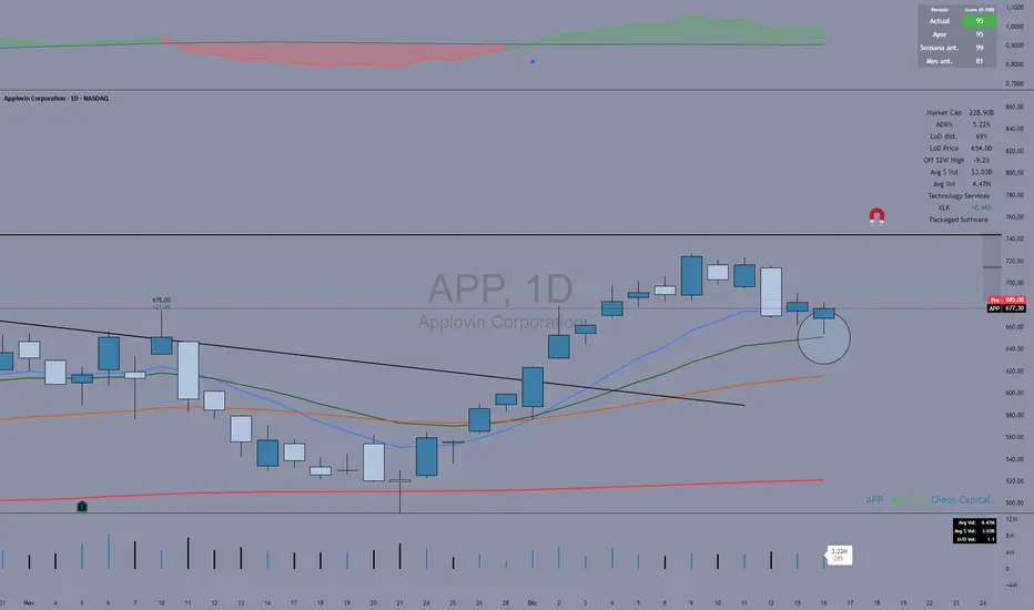
Fuerza Relativa vs SPY (Oleos Capital) RS Rating shaded, blue arrow when a crossover with the black line (SPY) occurs and the RS rating according to the period above right to see the evolution of the asset.
Goldbach Timing Model This indicator is designed as a simple visual framework rather than a rigid signal system. It highlights time-based structure and key alignment zones to help identify when price behavior is more likely to be active or responsive. The logic is intentionally flexible, allowing the user to apply their own discretion instead of relying on strict conditions. Its primary value is visual clarity and context, not automatic entries or exits.

History Trading SessionsThis indicator helps visually structure the trading day by highlighting custom time zones on the chart.
It is designed for historical analysis, trading discipline, and clear separation between analysis time, active trading, and no-trade periods.
Recommended to use on 4h and below time frames.

AI PRE-MARKET PRO - True/Fake Gap Classification-Version 1.0## **AI PRE-MARKET PRO: QUICK START GUIDE**
This indicator classifies market gaps by comparing the **Current Price** to yesterday’s **High (PDH)**, **Low (PDL)**, and **Close (PDC)**.
### **1. GAP CLASSIFICATIONS**
* **🔥 TRUE GAPS (High Momentum)**
* **True Gap Up:** Price is above PDH. The market is in "Discovery Mode." High probability of trend continuation.
* **True Gap Down:** Price is below PDL. Significant bearish sentiment. High probability of further selling.
* **⚠️ FAKE GAPS (Mean Reversion)**
* **Fake Gap Up:** Above PDC but below PDH. Price is "trapped" in yesterday's value. Often reverts to the Close (PDC).
* **Fake Gap Down:** Below PDC but above PDL. Price is "trapped." Often bounces back toward the Close (PDC).
### **2. TRADING STRATEGY CHEAT SHEET**
| Scenario | Primary Play | Entry Logic |
| --- | --- | --- |
| **True Gap Up** | **Continuation** | Wait for a pullback to **PDH**; buy the hold. |
| **True Gap Down** | **Continuation** | Wait for a rally to **PDL**; short the rejection. |
| **Fake Gap Up** | **Fade/Range** | Short the rejection of **PDH** or **ONH**; target **PDC**. |
| **Fake Gap Down** | **Fade/Range** | Buy the bounce at **PDL** or **ONL**; target **PDC**. |
### **3. CRITICAL LEVELS ON YOUR CHART**
* **PDH / PDL:** The "Line in the Sand." Breaking these turns a Fake Gap into a True Gap.
* **ONH / ONL:** Overnight High/Low. These are your immediate support/resistance targets for the first 30 minutes of trading.
* **PDC:** Previous Day Close. The "Magnet." If the market doesn't trend, it usually returns here.
### **4. HOW TO READ THE AI TABLES**
* **Left Table:** Shows real-time distance (RT Δ) to key levels and whether they have been hit yet (**Mitigated**).
* **Bottom Tables:** Provide a probability-based "Game Plan" and specific execution rules (e.g., "Wait for 15-minute confirmation").
---
**Next Step:** Would you like me to show you how to set up an alert for when the price crosses the **PDH** or **PDL** to catch a True Gap breakout?

Momentum & Breakout Confirmationwatch momentum build in real time on the current candle so you can confirm weather a breakout is indeed a breakout or will be a fake out. This is what it does
This is a Momentum & Breakout Confirmation (MBC) indicator that analyzes the current candle in real-time to determine if it's a strong continuation move or possible reversal. Here's the breakdown:
What It Measures:
Momentum Strength - How much % the candle moved:
STRONG = >0.5% move
MEDIUM = 0.2-0.5%
WEAK = <0.2%
Direction - Simply bullish (green candle) or bearish (red candle)
Four Confirmation Factors:
Volume Surge - Is volume 1.5x above the 20-period average?
Move Size - Is the candle body larger than 0.5x ATR (significant)?
Body Strength - Is the body >60% of total candle range (strong conviction, minimal wicks)?
Trend Aligned - Does it align with 9/21 MA trend direction?
The Scoring System:
Adds 1 point for each confirmation factor met (max 4 points)
3-4 points = "STRONG CONTINUATION" 🚀
2 points = "LIKELY CONTINUATION"
1 point = "WEAK SIGNAL"
0 points = "POSSIBLE REVERSAL" ⚠️
Key Difference from TPC:
TPC uses multi-timeframe SuperTrend for strategic entries
MBC focuses on the current candle only - it's asking "Is THIS candle showing real momentum or is it weak/fake?"
Practical Use:
Great for confirming if a breakout or move is "real" with strong conviction behind it, or if it's low-volume/weak-bodied and likely to fail. The table updates live so you can watch momentum build during the candle formation.
Hope it helps. if you guys have any ideas for any indicators you want made please feel free to dm me as i like a good challenge lol ill sit here and try to code anything now im not saying i will be 100 percent successful but i will try for you, thanks for all the support from all you guys i def do appreciate it.

ADX Coloreado por AO + DI DifferenceKey ComponentsADX line: Measures overall trend strength (non-directional).
+DI line: Strength of upward movement.
-DI line: Strength of downward movement.
Trend direction is determined by which DI line is dominant:+DI > -DI: Bullish trend (upward pressure).
-DI > +DI: Bearish trend (downward pressure).
Crossovers between +DI and -DI can signal potential trend changes, but they are most reliable when ADX confirms sufficient strength.ADX Trend Strength Levels (Common Interpretations)ADX Value
Trend Strength
Recommendation
0–20
Weak or no trend (ranging/sideways market)
Avoid trend-following strategies; consider range-bound or oscillator-based trades.
20–25
Emerging or moderate trend (gray zone)
Monitor for confirmation; potential start of trend.
25–50
Strong trend
Ideal for trend-following strategies (e.g., moving averages, breakouts).
50–75
Very strong trend
High momentum; good for riding trends, but watch for exhaustion.
75–100
Extremely strong trend (rare)
Often overextended; risk of reversal or correction.
Rising ADX: Trend is strengthening.
Falling ADX: Trend is weakening (even if still high).

Nifty Hierarchical Macro GuardOverview
The Nifty Hierarchical Macro Guard is a "Market Compass" indicator specifically designed for Indian equity traders. It locks its logic to the Nifty 50 Index (NSE:NIFTY) and applies a strict hierarchy of trend analysis. The goal is simple: prioritize the long-term trend (Monthly/Weekly) to decide if you should even be in the market, then use the short-term trend (Daily) for precise exit timing.
This script ensures you never ignore a macro "crash" signal while trying to trade minor daily fluctuations.
The Color Hierarchy (Priority Logic)
The indicator uses a "Top-Down" filter. Higher timeframe signals override lower timeframe signals:
Level 1: Monthly (Ultra-Macro) — Deep Maroon
Condition: Nifty 10 EMA is below the 20 EMA on the Monthly chart.
Action: This is the highest priority. The background will turn Deep Maroon, overriding all other colors. This is your "Forget Trading" signal. The long-term structural trend is broken.
Level 2: Weekly (Macro Warning) — Dark Red
Condition: Monthly is Bullish, but Nifty 10 EMA is below the 20 EMA on the Weekly chart.
Action: The background turns Dark Red. This indicates a significant macro correction. You should stay out of fresh positions and protect capital.
Level 3: Daily (Tactical) — Light Red / Light Green
Condition: Both Monthly and Weekly are Bullish (Green).
Action: The background will now react to the Daily 10/20 EMA cross.
Light Green: Nifty is healthy; safe for fresh positions.
Light Red: Tactical exit signal. Nifty is seeing short-term weakness; exit positions quickly.
Key Features
Symbol Locked: No matter what stock you are viewing (Reliance, HDFC, Midcaps), the background only reacts to NSE:NIFTY.
Clean Interface: No messy lines or labels on the price chart. The information is conveyed purely through background color shifts.
Customizable: Change the MA types (EMA/SMA) and lengths (e.g., 10/20 or 20/50) in the settings.
Macro Dashboard: A small, transparent table in the top-right corner displays exactly which timeframe is currently controlling the background color.
How to Use for Nifty Strategy
Stay Out: If the chart is Deep Maroon or Dark Red, do not look for "buying the dip." Wait for the macro health to return.
Take Exits: If the background is Light Green and suddenly turns Light Red, it means the Daily Daily 10/20 cross has happened. Exit your Nifty-sensitive positions immediately.

Yearly VWAPIn this update, I’ve enhanced the Yearly VWAP script so that it now works reliably on all timeframes starting from the 5-minute chart and higher. Previously, the monthly reset logic caused inconsistencies on lower timeframes. Now, the indicator uses a yearly reset based on the calendar year, ensuring stable and accurate VWAP calculations without issues.
In short, you can confidently apply this Yearly VWAP to any timeframe from 5 minutes upwards and get consistent results.

BTC Gann Harmonics Weighted + Phase + EMA OptimizedBTC Gann Harmonics Weighted + Phase + EMA Optimized

MGC1! Sniper Levels [NY Midnight + PDH/PDL + VWAP]This script, titled "MGC1! Sniper Levels ," is a specialized institutional-grade technical indicator designed for intraday trading on Micro Gold (MGC1!) futures. It merges Time & Price theory with Statistical Volatility to create a comprehensive roadmap for high-probability "Sniper" entries.
Core Technical Components
NY Midnight Pivot: Automatically identifies and plots the New York Midnight opening price. This level serves as the "True Open" for the daily session, helping traders determine whether the market is in a Premium or Discount zone relative to the daily start.
Previous Day Structure (PDH/PDL): Displays the Previous Day’s High and Low using a background security call. These levels are primary targets for Liquidity Sweeps (trapping retail traders) before a reversal occurs.
Advanced Session VWAP: Calculates the Volume Weighted Average Price starting from the session open. Unlike a standard moving average, VWAP represents the true fair value based on actual capital commitment.
Standard Deviation Extensions (SD 1, 2, 3): Plots three layers of volatility bands based on the variance of price and volume.
SD1 & SD2: Act as dynamic support and resistance within normal market conditions.
SD3 (Extreme Zones): Highlights the "Extreme Long" and "Extreme Short" zones, representing areas where 99.7% of price action is statistically contained, often leading to sharp mean-reversion moves.
Key Features & Interface
Customizable Labels: Includes a specific toggle to show or hide Standard Deviation labels. This allows for a cleaner chart when focusing on ICT/SMC price action while maintaining the colored "Zones" for visual context.
Real-Time Vignettes: High-contrast labels appear at the right edge of the price action, providing the exact numerical value of every key level (VWAP, PDH, NY Midnight) for immediate order execution.
Previous VWAP Close: Plots the final VWAP value from the prior session. This level often acts as a magnetic "fair value" target during the current session's open.
Strategic Trading Application
The script is built for the Gold Sniper MGC1! persona to identify "Smart Money" reversals. A typical setup involves waiting for price to reach an SD3 Extreme Zone that coincides with the PDH or PDL. Once the price "sweeps" these levels and shows a Market Structure Shift (MSS) back toward the VWAP, a high-probability trade is triggered.
