Ehlers Band-Pass FilterHeyo,
This indicator is an original translation from Ehlers' book "Cycle Analytics for Traders Advanced".
First, I describe the indicator as usual and later you can find a very insightful quote of the book.
Key Features
Signal Line: Represents the output of the band-pass filter, highlighting the dominant cycle in the data.
Trigger Line: A leading indicator derived from the signal line, providing early signals for potential market reversals.
Dominant Cycle: Measures the dominant cycle period by counting the number of bars between zero crossings of the band-pass filter output.
Calculation:
The band-pass filter is implemented using a combination of high-pass and low-pass filters.
The filter's parameters, such as period and bandwidth, can be adjusted to tune the filter to specific market cycles.
The signal line is normalized using an Automatic Gain Control (AGC) to provide consistent amplitude regardless of price swings.
The trigger line is derived by applying a high-pass filter to the signal line, creating a leading
waveform.
Usage
The indicator is effective in identifying peaks and valleys in the market data.
It works best in cyclic market conditions and may produce false signals during trending periods.
The dominant cycle measurement helps traders understand the prevailing market cycle length, aiding in better decision-making.
Quoted from the Book
Band-Pass Filters
“A little of the data narrowly passed,” said Tom broadly.
Perhaps the least appreciated and most underutilized filter in technical analysis is the band-pass filter. The band-pass filter simultaneously diminishes the amplitude at low frequencies, qualifying it as a detrender, and diminishes the amplitude at high frequencies, qualifying it as a data smoother.
It passes only those frequency components from input to output in which the trader is interested. The filtering produced by a band-pass filter is superior because the rejection in the stop bands is related to its bandwidth. The degree of rejection of undesired frequency components is called selectivity. The band-stop filter is the dual of the band-pass filter. It rejects a band of frequency components as a notch at the output and passes all other frequency components virtually unattenuated. Since the bandwidth of the deep rejection in the notch is relatively narrow and since the spectrum of market cycles is relatively broad due to systemic noise, the band-stop filter has little application in trading.
Measuring the Cycle Period
The band-pass filter can be used as a relatively simple measurement of the dominant cycle.
A cycle is complete when the waveform crosses zero two times from the last zero crossing. Therefore, each successive zero crossing of the indicator marks a half cycle period. We can establish the dominant cycle period as twice the spacing between successive zero crossings.
When we measure the dominant cycle period this way, it is best to widen the pass band of the band-pass filter to avoid distorting the measurement simply due to the selectivity of the filter. Using an input bandwidth of 0.7 produces an octave-wide pass band. For example, if the center period of the filter is 20 and the relative bandwidth is 0.7, the bandwidth is 14. That means the pass band of the filter extends from 13-bar periods to 27-bar periods.
That is, roughly an octave exists because the longest period is twice the shortest period of the pass band. It is imperative that a high-pass filter is tuned one octave below the half-bandwidth edge of the band-pass filter to ensure a nominal zero mean of the filtered output. Without a zero mean, the zero crossings can have a substantial error.
Since the measurement of the dominant cycle can vary dramatically from zero crossing to zero
crossing, the code limits the change between measurements to be no more than 25 percent.
While measuring the changing dominant cycle period via zero crossings of the band-pass waveform is easy, it is not necessarily the most accurate method.
Best regards,
simwai
Good Luck with your trading! 🙌
Zentrische Oszillatoren
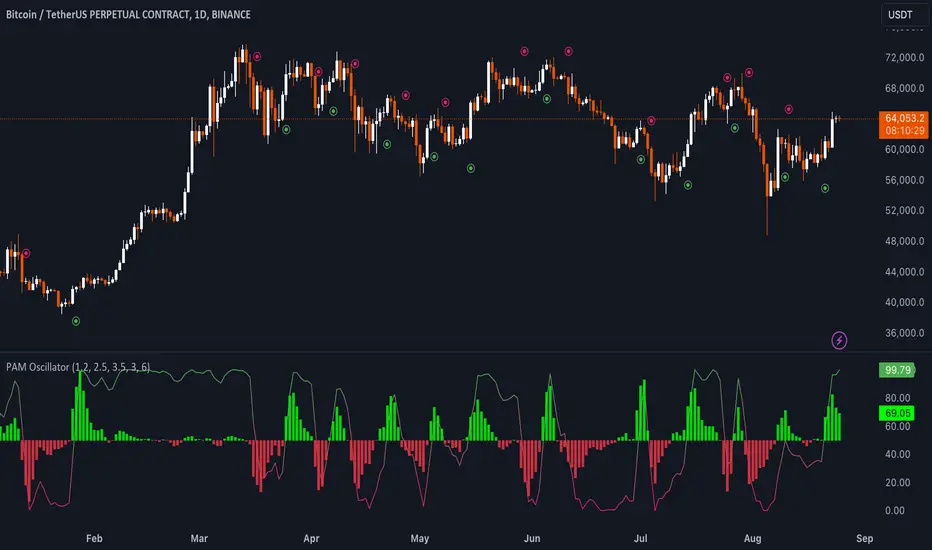
Uptrick: Price Action Momentum Oscillator### Detailed Description of the Indicator: "Uptrick: Price Action Momentum Oscillator (PAM Oscillator)"
The "Uptrick: Price Action Momentum Oscillator" (PAM Oscillator) is a highly customized and sophisticated trading indicator designed to provide traders with a multi-dimensional analysis of market momentum across varying timeframes. It stands out due to its comprehensive approach, combining price action analysis with cycle detection to deliver insights into potential trend reversals, continuations, and market strength or weakness. The PAM Oscillator is not just another momentum oscillator; its design incorporates both the granular details of price swings and broader cyclical trends, offering a unique blend of short-term agility and long-term reliability.
#### 1. **Input Settings**
- **PAM Oscillator Settings:**
- **Enable PAM Oscillator:** This feature allows traders to toggle the main oscillator on or off, making it versatile for different trading setups or when combining with other indicators.
- **Short-Term Influence (Default: 1.2):** This parameter controls how much weight short-term price movements have on the overall oscillator. The ability to adjust this weight provides traders with the flexibility to fine-tune the sensitivity of the indicator to short-term fluctuations.
- **Mid-Term Influence (Default: 2.5):** The mid-term weight balances the oscillator by adding a medium-term perspective, essential for capturing sustained price movements without getting swayed by short-term noise.
- **Long-Term Influence (Default: 3.5):** The long-term weight adds stability to the oscillator, ensuring that the indicator reflects broader market trends, which is crucial for long-term traders or when trading in higher timeframes.
- **Oscillator Smoothing (Default: 3):** This parameter allows traders to smooth the oscillator output, reducing the effect of market noise and making the indicator more reliable by filtering out minor price fluctuations.
- **Bullish Trend Color (Default: Green - #4caf50):** The color customization for bullish trends enables traders to visually distinguish market conditions quickly.
- **Bearish Trend Color (Default: Red - #e91e63):** Similarly, the bearish trend color customization aids in quickly identifying market downturns.
- **Enable Oscillator Signals:** This setting allows for the plotting of explicit buy and sell signals, helping traders who prefer clear, actionable insights rather than interpreting raw oscillator values.
- **Bullish Signal Color (Default: Green - #4caf50):** The ability to customize signal colors enhances the clarity of the signals, allowing them to stand out on the chart.
- **Bearish Signal Color (Default: Red - #e91e63):** Like the bullish signal color, this ensures that bearish signals are easily distinguishable.
- **Cycle Analysis Settings:**
- **Enable Cycle Analysis Histogram:** This feature introduces an additional layer of analysis by displaying a histogram that represents cyclical market behavior. It's particularly useful for traders looking to understand the underlying cyclical trends in momentum.
- **Cycle Length (Default: 6):** Adjusting the cycle length allows traders to tailor the cycle detection to different market conditions or asset classes, making the PAM Oscillator adaptable across different markets.
- **Cycle Bullish Color (Default: Light Green - #8bc34a):** The histogram's color customization for bullish cycles aids in quickly identifying periods of positive market momentum.
- **Cycle Bearish Color (Default: Orange - #ff5722):** The bearish cycle color helps in visualizing negative momentum phases.
- **Enable Cycle Signals:** This option allows traders to generate additional buy and sell signals based on the cycle histogram, offering further opportunities to enter or exit trades based on cyclic trends.
- **Cycle Bullish Signal Color (Default: Light Green - #8bc34a):** Customizable signal colors for cycle-based bullish signals improve the indicator's usability by making important signals more visible.
- **Cycle Bearish Signal Color (Default: Orange - #ff5722):** Similarly, bearish signal colors ensure that traders can quickly identify when the market is potentially entering a downtrend.
#### 2. **Custom Types and Functions**
- **PriceData Structure:** The `PriceData` structure encapsulates essential price information (open, high, low, close) along with the bar index. This structure is fundamental for the accurate calculation of swings and trends, ensuring that the oscillator is grounded in precise and up-to-date market data.
- **SwingData Structure:** This structure manages the market's swing points (highs and lows) and their respective indices. It is crucial for detecting and updating the oscillator with significant price levels, helping to identify key turning points in the market.
- **detectSwing Method:** The `detectSwing` method is a core component that determines whether a significant swing (high or low) has occurred. This detection is pivotal for the oscillator, as it triggers the update of the swing data, marking crucial levels where momentum may shift.
- **updateSwing Method:** This method updates the `SwingData` structure when new swing points are detected. It resets the structure's state, ensuring that the most recent price action is accurately reflected in the oscillator.
- **normalizeOsc Function:** The `normalizeOsc` function standardizes the oscillator values between 0 and 100, ensuring consistency across different timeframes and smoothing the data to emphasize genuine momentum changes. This normalization makes the oscillator easier to interpret and more reliable, especially when comparing across different assets or timeframes.
#### 3. **Core Calculations for the Oscillator**
- **Short-Term Oscillator Calculation:**
- This calculation focuses on recent price action to detect short-term trends or reversals. It updates the swing structures based on new highs and lows, determining whether the market is currently bullish or bearish on a short-term basis.
- This feature is particularly useful for traders who need to react quickly to market changes, such as scalpers or day traders.
- **Multi-Term Oscillator Calculation:**
- This function handles the mid-term and long-term oscillators, combining data from these timeframes to produce a comprehensive view of market momentum. It detects and updates swing points across these periods, offering a more robust trend analysis.
- By focusing on multiple timeframes, this calculation helps in filtering out noise and identifying more sustained market trends.
- **Oscillator Data Collection:**
- The `collectOscData` function aggregates oscillator values from short-term, mid-term, and long-term analyses. This comprehensive approach ensures that the final oscillator value reflects a balanced view of the market, taking into account different time horizons and their respective weights.
- The weighted average calculation of the oscillator values allows traders to customize the importance of each timeframe, tailoring the indicator to their specific trading style or strategy.
#### 4. **Plotting the Oscillator and Cycle Histogram**
- **Oscillator Plot:**
- The main oscillator is plotted on the chart, providing a color-coded visualization of market momentum. The gradient from bearish to bullish colors helps traders quickly assess the current market condition.
- Buy and sell signals are plotted based on the oscillator's crossing of the 50 line, offering clear entry and exit points for traders. This feature is particularly beneficial for those who prefer straightforward signals over interpreting complex data.
- **Cycle Histogram Plot:**
- The cycle histogram adds another layer of analysis, highlighting the cyclical nature of market momentum. By displaying the difference between the oscillator value and its smoothed cycle, traders can visualize the strength and direction of cyclical trends.
- The histogram is color-coded to differentiate between bullish and bearish cycles, making it easier to identify periods of rising or falling momentum.
- **Cycle Signal Plot:**
- If cycle signals are enabled, the indicator plots additional buy and sell signals based on the cycle histogram. This feature provides further opportunities for traders to act on cyclical trends, potentially capturing profits from both major and minor market cycles.
### Uniqueness of the PAM Oscillator
The PAM Oscillator is unique in its approach to blending multiple timeframes and cyclical analysis into a single, cohesive indicator. Unlike traditional oscillators that focus on a single aspect of price action, the PAM Oscillator integrates short-term, mid-term, and long-term price data, giving traders a more holistic view of market momentum. Its ability to adjust the influence of different timeframes and the inclusion of cycle analysis makes it exceptionally versatile, catering to a wide range of trading strategies.
- **Comprehensive Multi-Term Analysis:** The PAM Oscillator doesn't just focus on a single timeframe; it aggregates data across short, mid, and long-term horizons, providing a nuanced and adaptable view of market conditions.
- **Integrated Cycle Analysis:** By incorporating a cycle histogram, the PAM Oscillator allows traders to understand and act on the cyclical nature of markets, something that is often overlooked in standard momentum indicators.
- **Customizable Weighting System:** The ability to adjust the weighting of different timeframes and customize colors and signals makes the PAM Oscillator adaptable to different trading environments and preferences, offering a level of customization that is rare among other indicators.
- **Signal Clarity:** The indicator not only visualizes market momentum but also provides clear buy and sell signals based on oscillator and cycle data, making it user-friendly and effective for traders at all levels.
### How Different Traders May Use the PAM Oscillator
1. **Scalpers:**
- **Short-Term Focus:** Scalpers will primarily use the short-term oscillator to identify quick momentum changes for intraday trades. The oscillator’s responsiveness to recent price swings allows them to catch rapid price movements and capitalize on brief market opportunities.
- **Cycle Avoidance:** The cycle histogram can help scalpers avoid periods of low momentum, ensuring they only trade when the market is actively trending, thereby enhancing their profitability.
2. **Day Traders:**
- **Multi-Term Strategy:** Day traders can leverage both the short-term and mid-term oscillators to confirm trend directions before entering trades. This dual-layered approach minimizes the chances of getting
caught in false breakouts, improving trade accuracy.
- **Signal-Based Entries:** The buy/sell signals generated by the oscillator crossing the 50 line offer clear entry and exit points, making it easier for day traders to make quick decisions.
3. **Swing Traders:**
- **Long-Term Influence:** Swing traders might emphasize the long-term oscillator to identify major trend reversals. By smoothing out noise and focusing on longer-term price action, they can hold positions through minor corrections and capitalize on larger market movements.
- **Cycle Confirmation:** The cycle histogram can serve as a confirmation tool, helping swing traders stay in trades during strong cycles and exit when momentum starts to weaken.
4. **Position Traders:**
- **Cycle Dominance:** Position traders can use the cycle histogram to identify macro trends, holding positions for extended periods based on long-term cyclical analysis. This approach is particularly useful in markets with clear cyclical patterns.
- **Multi-Term Validation:** These traders can use the multi-term oscillator to ensure that all timeframes are aligned with their long-term trading strategy, providing greater confidence in maintaining positions through periods of short-term volatility.
### In Summary
The PAM Oscillator is not just an indicator; it’s a comprehensive toolkit for understanding and trading market momentum across different timeframes and cycles. Its unique combination of customizable weighting, multi-term analysis, and integrated cycle detection makes it a powerful tool for traders of all styles, from scalpers to long-term investors. Whether you're looking to capitalize on short-term price movements or identify long-term trends, the PAM Oscillator provides the insights and flexibility needed to navigate the complexities of modern trading.
---------------------------------------------------------------------------------
This indicator's code will soon be available on: discord.gg
long&short signal Smart Money Concepts (SMC) with MACD Signals Smart Money Concepts (SMC) with MACD Signals
Advanced SMC and MACD Integration for Precision Trading
The "Smart Money Concepts (SMC) with MACD Signals" indicator is a powerful and versatile tool designed to enhance trading strategies by integrating two highly effective technical analysis methods into a single, cohesive indicator. This advanced script combines the Smart Money Concepts (SMC) methodology with the Moving Average Convergence Divergence (MACD) indicator to provide traders with a comprehensive trading solution that identifies key market trends and potential trading opportunities.
What It Does:
Smart Money Concepts (SMC):
The SMC component of this indicator identifies significant price levels and zones where market participants, particularly institutional investors, may be active. It calculates high and low anchor levels based on historical price data, creating zones that help traders understand where price action may encounter support or resistance. These anchor levels are used to plot background colors on the chart, highlighting critical areas of interest where price might react, and generating buy (long) and sell (short) signals based on price interactions with these levels.
MACD (Moving Average Convergence Divergence):
The MACD component provides insights into market momentum and trend strength. By calculating the difference between two moving averages and comparing it to a signal line, the MACD indicator helps traders identify potential changes in trend direction. The script plots the MACD line, signal line, and histogram, offering a clear visual representation of market momentum. Buy (long) and sell (short) signals are generated when the MACD line crosses above or below the signal line, providing timely alerts to potential trading opportunities.
Why It’s Special:
This indicator stands out for its dual functionality, combining the price level analysis of SMC with the momentum-based insights of MACD. The integration allows traders to benefit from both trend and price level analysis, offering a more robust and accurate trading tool. The SMC component highlights critical price zones and provides context for price action, while the MACD component confirms the strength and direction of market trends.
By using this combined approach, traders can make more informed decisions based on comprehensive market analysis. The indicator not only helps in identifying significant price levels and potential market reversals but also provides real-time signals to capitalize on these opportunities. Whether you are a day trader or a swing trader, the "Smart Money Concepts (SMC) with MACD Signals" indicator is designed to enhance your trading strategy with precision and clarity.
This unique combination of SMC and MACD offers a powerful toolset for traders looking to refine their trading strategies and improve their market analysis. With its user-friendly visualizations and signal generation, this indicator is an essential addition to any trader’s toolkit.

Uptrick: Momentum Channel Indicator
### 🌟 **Uptrick: Momentum Channel Indicator (MC_Ind)** 🌟
The **"Uptrick: Momentum Channel Indicator"** is a powerful tool designed to help traders gauge market momentum and identify potential overbought or oversold conditions. Whether you're a day trader, swing trader, or long-term investor, this indicator can be your compass 🧭 in the complex world of trading.
### 🎯 **Purpose of the Indicator**
The primary goal of the **Momentum Channel Indicator** is to measure the deviation of price from its moving average (the mid-point) and to smooth this deviation to identify momentum shifts. By plotting overbought and oversold levels, the indicator helps traders spot potential reversal points where the market might change direction, offering valuable entry or exit signals.
### 🔧 **Inputs & Parameters**
Let's break down the input parameters that you can adjust to tailor the indicator to your trading style:
1. **`length1` (Channel Length) 📏**: This is the period over which the moving average (mid-point) and price deviation are calculated. The default value is 14, meaning the last 14 bars are considered for calculations.
2. **`length2` (Smoothing Length) 🧘**: This parameter controls the smoothing of the channel index, with a default value of 28. The higher the value, the smoother the momentum line, reducing noise and making trends more visible.
3. **`overbought1` & `overbought2` (Overbought Levels) 🔴**: These levels, set at 70 and 65 by default, represent the threshold above which the market is considered overbought, potentially signaling a selling opportunity.
4. **`oversold1` & `oversold2` (Oversold Levels) 🟢**: Similarly, these levels, set at -70 and -65, mark the threshold below which the market is considered oversold, indicating a potential buying opportunity.
### 🛠️ **How the Indicator Works**
Now, let's dive into the mechanics of the Momentum Channel Indicator:
1. **Mid-Point Calculation 🏁**: The mid-point is calculated using a simple moving average (SMA) of the closing prices over the `length1` period. This mid-point acts as a reference line from which deviations are measured.
2. **Price Deviation 📊**: The price deviation is the absolute difference between the closing price and the mid-point, smoothed over the same period (`length1`). This represents the typical price movement away from the mid-point.
3. **Channel Index 📉**: The channel index is calculated by dividing the price deviation by a fraction (0.01) of the mid-point, providing a normalized measure of how far the price has deviated from the average.
4. **Smoothing of the Channel Index 🌊**: The smoothed index (`mci1`) is calculated by applying a smoothing filter (SMA) over the channel index using the `length2` parameter. This helps reduce noise and highlight the true momentum of the market.
5. **Momentum Lines 📈**:
- **`mci1`**: The main momentum line, representing the smoothed channel index.
- **`mci2`**: A secondary momentum line, which is a further smoothed version of `mci1` using a 6-period SMA.
6. **Signal Lines 🚦**:
- **Overbought & Oversold Levels**: Horizontal lines plotted at `overbought1`, `overbought2`, `oversold1`, and `oversold2` levels serve as visual cues for overbought and oversold conditions.
- **Zero Line**: A central reference line at 0, indicating neutral momentum.
### 📈 **How to Use the Indicator**
#### 1. **Day Traders ⚡**
For day traders, the Momentum Channel Indicator can be a quick signal generator for short-term trades. Here's how you can use it:
- **Identify Entry Points 🎯**: Look for a **bullish crossover** when `mci1` crosses above `mci2` from below the `oversold1` level. This signals a potential upward reversal.
- **Spot Exit Points 🏁**: Watch for a **bearish crossunder** when `mci1` crosses below `mci2` from above the `overbought1` level. This could indicate a downward reversal.
- **Scalping 🔄**: In a fast-moving market, use the indicator to scalp by entering and exiting trades at these crossover points, with a tight stop-loss strategy.
#### 2. **Swing Traders 🎢**
Swing traders benefit from using the Momentum Channel Indicator to identify potential reversal points over a longer period:
- **Trend Confirmation 📊**: Use the smoothing effect of `mci2` to confirm trends. If `mci2` remains consistently above 0, it indicates a strong bullish trend, and vice versa.
- **Overbought/Oversold Reversals 🚀**: Enter trades when the price approaches the overbought or oversold levels (`overbought1`, `oversold1`). Combine this with other indicators, such as RSI, for more reliable signals.
- **Hold Positions 🧗**: Let the momentum lines guide your hold strategy. If the momentum lines stay aligned (both `mci1` and `mci2` are moving in the same direction), consider holding the position until a crossover or reversal signal appears.
#### 3. **Long-Term Investors 🏦**
For long-term investors, the Momentum Channel Indicator helps in fine-tuning entry and exit points based on broader market momentum:
- **Divergence Analysis 📐**: Look for divergence between the price and the momentum lines. If the price makes new highs but the momentum lines do not, it could signal a weakening trend and a potential reversal.
- **Strategic Entry/Exit 🏹**: Use the `overbought2` and `oversold2` levels to strategically enter or exit positions. These secondary levels provide an early warning before the market reaches extreme conditions.
- **Risk Management 🛡️**: The indicator can also be used as part of a risk management strategy by identifying when to reduce exposure in overbought markets or increase exposure in oversold markets.
### 🖼️ **Visualization & Interpretation**
The Momentum Channel Indicator is visually intuitive, with each component providing key insights:
1. **Momentum Lines (MCI1 & MCI2) 📈**:
- **Blue Line (`mci1`)**: Represents the main momentum line, providing immediate insights into market direction.
- **Orange Line (`mci2`)**: A secondary momentum line, further smoothed to confirm trends.
2. **Overbought/Oversold Levels 🔴🟢**:
- **Solid & Dashed Lines**: These lines highlight overbought and oversold regions, guiding traders on when to consider entering or exiting trades.
3. **MCI Difference (Purple Area) 🌌**:
- **Shaded Area**: The difference between `mci1` and `mci2`, shaded in purple, helps visualize the strength of the momentum. The larger the shaded area, the stronger the momentum.
### 🚀 **Advanced Tips & Tricks**
For those looking to maximize the potential of the Momentum Channel Indicator, here are some advanced strategies:
1. **Combine with Volume Indicators 📊**: Use volume indicators like OBV (On-Balance Volume) or Volume Oscillator to confirm momentum signals. For instance, a bullish crossover combined with increasing volume can reinforce a buy signal.
2. **Multiple Timeframe Analysis 🕒**: Apply the Momentum Channel Indicator across multiple timeframes (e.g., daily and weekly) to get a more comprehensive view of the market. This can help in aligning short-term trades with long-term trends.
3. **Adjusting Parameters 🔄**: Depending on market conditions, tweak the `length1` and `length2` parameters. In a highly volatile market, shorter lengths might provide quicker signals, whereas in a stable market, longer lengths could smooth out noise.
4. **Divergence & Convergence 📐**: Watch for divergence between price and momentum lines as a leading indicator of potential reversals. Convergence (when the price and momentum move in sync) can confirm the strength of the trend.
### **Conclusion**
The **Uptrick: Momentum Channel Indicator** is a versatile tool that can be customized for various trading styles and market conditions. Whether you're trading in fast-paced environments or analyzing long-term trends, this indicator offers a clear and intuitive way to gauge market momentum, identify potential reversals, and make informed trading decisions.
By understanding and applying the principles outlined above, you can harness the full power of this indicator, transforming your trading strategy from good to great! 🌟

Uptrick: MultiTrend Squeeze System**Uptrick: MultiTrend Squeeze System Indicator: The Ultimate Trading Tool for Precision and Versatility 📈🔥**
### Introduction
The MultiTrend Squeeze System is a powerful, multi-faceted trading indicator designed to provide traders with precise buy and sell signals by combining the strengths of multiple technical analysis tools. This script isn't just an indicator; it's a comprehensive trading system that merges the power of SuperTrend, RSI, Volume Filtering, and Squeeze Momentum to give you an unparalleled edge in the market. Whether you're a day trader looking for short-term opportunities or a swing trader aiming to catch longer-term trends, this indicator is tailored to meet your needs.
### Key Features and Unique Aspects
1. **SuperTrend with Dynamic Adjustments 📊**
- **Adaptive SuperTrend Calculation:** The SuperTrend is a popular trend-following indicator that adjusts dynamically based on market conditions. It uses the Average True Range (ATR) to calculate upper and lower bands, which shift according to market volatility. This script takes it further by combining it with the RSI and Volume filtering to provide more accurate signals.
- **Direction Sensitivity:** The SuperTrend here is not static. It adjusts based on the direction of the previous SuperTrend value, ensuring that the indicator remains relevant even in choppy markets.
2. **RSI Integration for Overbought/Oversold Conditions 💹**
- **RSI Calculation:** The Relative Strength Index (RSI) is incorporated to identify overbought and oversold conditions, adding an extra layer of precision. This helps in filtering out false signals and ensuring that trades are taken only in optimal conditions.
- **Customizable RSI Settings:** The RSI settings are fully customizable, allowing traders to adjust the RSI length and the overbought/oversold levels according to their trading style and market.
3. **Volume Filtering for Enhanced Signal Confirmation 📉**
- **Volume Multiplier:** This unique feature integrates volume analysis, ensuring that signals are only generated when there is sufficient market participation. The Volume Multiplier can be adjusted to filter out weak signals that occur during low-volume periods.
- **Optional Volume Filtering:** Traders have the flexibility to turn the volume filter on or off, depending on their preference or market conditions. This makes the indicator versatile, allowing it to be used across different asset classes and market conditions.
4. **Squeeze Momentum Indicator (SMI) for Market Pressure Analysis 💥**
- **Squeeze Detection:** The Squeeze Momentum Indicator detects periods of market compression and expansion. This script goes beyond the traditional Bollinger Bands and Keltner Channels by incorporating true range calculations, offering a more nuanced view of market momentum.
- **Customizable Squeeze Settings:** The lengths and multipliers for both Bollinger Bands and Keltner Channels are customizable, giving traders the flexibility to fine-tune the indicator based on their specific needs.
5. **Visual and Aesthetic Customization 🎨**
- **Color-Coding for Clarity:** The indicator is color-coded to make it easy to interpret signals. Bullish trends are marked with a vibrant green color, while bearish trends are highlighted in red. Neutral or unconfirmed signals are displayed in softer tones to reduce noise.
- **Histogram Visualization:** The primary trend direction and strength are displayed as a histogram, making it easy to visualize the market's momentum at a glance. The height and color of the bars provide immediate feedback on the strength and direction of the trend.
6. **Alerts for Real-Time Trading 🚨**
- **Custom Alerts:** The script is equipped with custom alerts that notify traders when a buy or sell signal is generated. These alerts can be configured to send notifications through various channels, including email, SMS, or directly to the trading platform.
- **Immediate Reaction:** The alerts are triggered based on the confluence of SuperTrend, RSI, and Volume signals, ensuring that traders are notified only when the most robust trading opportunities arise.
7. **Comprehensive Input Customization ⚙️**
- **SuperTrend Settings:** Adjust the ATR length and factor to control the sensitivity of the SuperTrend. This allows you to adapt the indicator to different market conditions, whether you're trading a volatile cryptocurrency or a more stable stock.
- **RSI Settings:** Customize the RSI length and thresholds for overbought and oversold conditions, enabling you to tailor the indicator to your specific trading strategy.
- **Volume Settings:** The Volume Multiplier and the option to toggle the volume filter provide an additional layer of customization, allowing you to fine-tune the indicator based on market liquidity and participation.
- **Squeeze Momentum Settings:** The lengths and multipliers for Bollinger Bands and Keltner Channels can be adjusted to detect different levels of market compression, providing flexibility for both short-term and long-term traders.
### How It Works: A Deep Dive Into the Mechanics 🛠️
1. **SuperTrend Calculation:**
- The SuperTrend is calculated using the ATR, which measures market volatility. The indicator creates upper and lower bands around the price, adjusting these bands based on the current level of market volatility. The direction of the trend is determined by the position of the price relative to these bands.
- The script enhances the standard SuperTrend by ensuring that the bands do not flip-flop too quickly, reducing the chances of false signals in a choppy market. The direction is confirmed by checking the position of the close relative to the previous band, making the trend detection more reliable.
2. **RSI Integration:**
- The RSI is calculated over a customizable length and compared to user-defined overbought and oversold levels. When the RSI crosses below the oversold level, and the SuperTrend indicates a bullish trend, a buy signal is generated. Conversely, when the RSI crosses above the overbought level, and the SuperTrend indicates a bearish trend, a sell signal is triggered.
- The combination of RSI with SuperTrend ensures that trades are only taken when there is a strong confluence of signals, reducing the chances of entering trades during weak or indecisive market phases.
3. **Volume Filtering:**
- The script calculates the average volume over a 20-period simple moving average. The volume filter ensures that buy and sell signals are only valid when the current volume exceeds a multiple of this average, which can be adjusted by the user. This feature helps filter out weak signals that might occur during low-volume periods, such as just before a major news event or during after-hours trading.
- The volume filter is particularly useful in markets where volume spikes are common, as it ensures that signals are only generated when there is significant market interest in the direction of the trend.
4. **Squeeze Momentum:**
- The Squeeze Momentum Indicator (SMI) adds a layer of market pressure analysis. The script calculates Bollinger Bands and Keltner Channels, detecting when the market is in a "squeeze" — a period of low volatility that typically precedes a significant price move.
- When the Bollinger Bands are inside the Keltner Channels, the market is in a squeeze (compression phase). This is often a precursor to a breakout or breakdown. The script colors the histogram bars black during this phase, indicating a potential for a strong move. Once the squeeze is released, the bars are colored according to the direction of the SuperTrend, signaling a potential entry point.
5. **Integration and Signal Generation:**
- The script brings together the SuperTrend, RSI, Volume, and Squeeze Momentum to generate highly accurate buy and sell signals. A buy signal is triggered when the SuperTrend is bullish, the RSI indicates oversold conditions, and the volume filter confirms strong market participation. Similarly, a sell signal is generated when the SuperTrend is bearish, the RSI indicates overbought conditions, and the volume filter is met.
- The combination of these elements ensures that the signals are robust, reducing the likelihood of entering trades during weak or indecisive market conditions.
### Practical Applications: How to Use the MultiTrend Squeeze System 📅
1. **Day Trading:**
- For day traders, this indicator provides quick and reliable signals that can be used to enter and exit trades multiple times within a day. The volume filter ensures that you are trading during the most liquid times of the day, increasing the chances of successful trades. The Squeeze Momentum aspect helps you catch breakouts or breakdowns, which are common in intraday trading.
2. **Swing Trading:**
- Swing traders can use the MultiTrend Squeeze System to identify longer-term trends. By adjusting the ATR length and factor, you can make the SuperTrend more sensitive to catch longer-term moves. The RSI and Squeeze Momentum aspects help you time your entries and exits, ensuring that you get in early on a trend and exit before it reverses.
3. **Scalping:**
- For scalpers, the quick signals provided by this system, especially in combination with the volume filter, make it easier to take small profits repeatedly. The histogram bars give you a clear visual cue of the market's momentum, making it easier to scalp effectively.
4. **Position Trading:**
- Even position traders can benefit from this indicator by using it to confirm long-term trends. By adjusting the settings to less sensitive parameters, you can ensure that you are only entering trades when a strong trend is confirmed. The Squeeze Momentum indicator will help you stay in the trade during periods of consolidation, waiting for the next big move.
### Conclusion: Why the MultiTrend Squeeze System is a Game-Changer 🚀
The MultiTrend Squeeze System is not just another trading indicator; it’s a comprehensive trading strategy encapsulated within a single script. By combining the power
of SuperTrend, RSI, Volume Filtering, and Squeeze Momentum, this indicator provides a robust and versatile tool that can be adapted to various trading styles and market conditions.
**Why is it Unique?**
- **Multi-Dimensional Analysis:** Unlike many other indicators that rely on a single data point or calculation, this script incorporates multiple layers of analysis, ensuring that signals are based on a confluence of factors, which increases their reliability.
- **Customizability:** The vast range of input settings allows traders to tailor the indicator to their specific needs, whether they are trading forex, stocks, cryptocurrencies, or commodities.
- **Visual Clarity:** The color-coded bars, labels, and signals make it easy to interpret the market conditions at a glance, reducing the time needed to make trading decisions.
Whether you are a novice trader or an experienced market participant, the MultiTrend Squeeze System offers a powerful toolset to enhance your trading strategy, reduce risk, and maximize your potential returns. With its combination of trend analysis, momentum detection, and volume filtering, this indicator is designed to help you trade with confidence and precision in any market condition.

Volume-Weighted RSI with HMA SmoothingThis script combines a Volume-Weighted RSI, smoothed with a custom Hull Moving Average (HMA), with a modified MACD based on normalized net volume.
Volume-Weighted RSI: It is calculated by adjusting the closing price with a normalized On-Balance Volume (OBV) and then applying an RSI. This approach weights the RSI according to volume, providing a more accurate measure of the strength of the price movement.
Modified HMA: A Hull Moving Average (HMA) is used to smooth the Volume-Weighted RSI, enhancing the ability to identify market trend changes.
Possible Reversal from Oversold:
The Volume-Weighted RSI crosses above the oversold level.
It is displayed as an upward green triangle at the bottom of the chart, indicating that the market might be exhausting its oversold conditions and potentially starting an upward reversal.
Possible Reversal from Overbought:
The Volume-Weighted RSI crosses below the overbought level.
It is displayed as a downward red triangle at the top of the chart, indicating that the market might be exhausting its overbought conditions and potentially starting a downward reversal.
Confirmation with the Modified MACD: For a more robust interpretation, the behavior of the modified MACD can be observed alongside the RSI cross.
The MACD is also modified, using normalized net volume (calculated as the cumulative change in the closing price multiplied by volume) as the input instead of the standard closing price.
The direction and color change of the MACD bars indicate the market's momentum.
Alerts: Alerts are set to trigger automatically when the modified RSI crosses the oversold or overbought levels.
Español:
Este script combina un RSI ponderado por volumen, suavizado con un Hull Moving Average (HMA) personalizado, con un MACD modificado basado en volumen neto normalizado.
RSI Ponderado por Volumen: Se calcula ajustando el precio de cierre con un OBV (On-Balance Volume) normalizado y luego aplicando un RSI. Este enfoque pondera el RSI según el volumen, proporcionando una medida más precisa de la fuerza del movimiento del precio.
HMA Modificado: Se utiliza un Hull Moving Average (HMA) para suavizar el RSI Ponderado por Volumen, mejorando la capacidad de identificar cambios en la tendencia del mercado.
Posible Reversión desde Sobreventa:
El RSI Ponderado por Volumen cruza por encima del nivel de sobreventa.
Se muestra como un triángulo verde hacia arriba en la parte inferior del gráfico, indicando que el mercado podría estar agotando las condiciones de sobreventa y comenzar una posible reversión al alza.
Posible Reversión desde Sobrecompra:
El RSI Ponderado por Volumen cruza por debajo del nivel de sobrecompra.
Se muestra como un triángulo rojo hacia abajo en la parte superior del gráfico, indicando que el mercado podría estar agotando las condiciones de sobrecompra y comenzar una posible reversión a la baja.
Confirmación con el MACD Modificado: Para una interpretación más robusta, se puede observar el comportamiento del MACD modificado junto con el cruce del RSI.
El MACD también está modificado, utilizando el volumen neto normalizado (calculado como el cambio acumulativo en el precio de cierre multiplicado por el volumen) como entrada en lugar del precio de cierre estándar.
La dirección y el cambio de color de las barras del MACD indican el impulso del mercado.
Alertas: Las alertas están configuradas para activarse automáticamente cuando el RSI modificado cruza los niveles de sobreventa o sobrecompra.

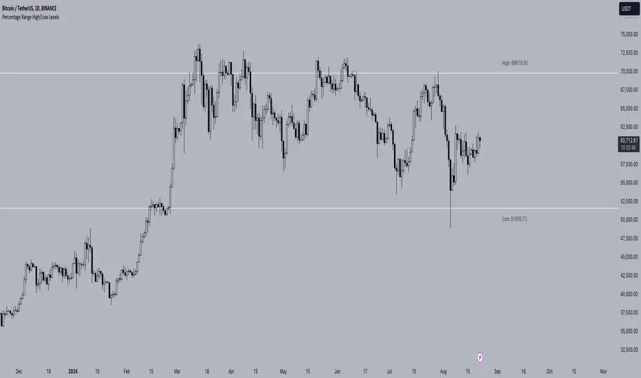
Percentage Range High/Low LevelsPercentage Range High/Low Levels Indicator
Overview
The "Percentage High/Low Levels" indicator is a versatile tool designed to help traders visualize key price levels that are a certain percentage away from the current price. Instead of using traditional volatility measures like the Average True Range (ATR), this script allows traders to plot lines above and below the current price based on a user-defined percentage. These levels can act as potential support and resistance zones, helping traders in decision-making processes such as setting targets, stop-losses, or identifying overbought and oversold conditions.
How It Works
Percentage-Based Calculation:
The script calculates two levels: a high level and a low level. These are determined by adding and subtracting a specified percentage from the current price. For example, if you set the percentage to 1%, the script will plot a line 1% above the current price (high level) and another line 1% below the current price (low level).
Timeframe Selection:
You can choose the timeframe over which the percentage levels are calculated. This means that the levels can be based on different timeframes, such as daily, weekly, or monthly data, depending on your trading strategy.
Customization Options:
Line Extension: The lines can be extended to the left, right, both directions, or neither, depending on your preference.
Colors: You can customize the colors of both the high and low lines and their respective labels.
Label Size: The size of the labels can be adjusted, allowing you to tailor the visibility of the levels to your charting needs.
Label Placement and Styling:
The labels indicating the price levels are placed above the lines to keep your chart clean and readable. The labels are transparent and do not have a background, ensuring they don't obscure any important chart information. You can also adjust the distance of the labels from the current bar using the label offset feature.
How to Use
Selecting the Percentage:
Choose a percentage that aligns with your trading strategy. A smaller percentage might be useful for intraday trading, while a larger percentage could be more appropriate for swing or position trading.
Choosing the Timeframe:
Set the timeframe to match the period over which you are analyzing the market. For example, if you are trading on a daily chart, you might want to select the daily timeframe.
Customizing Visuals:
Use the input options to adjust the colors, label sizes, and line extensions according to your preference. This helps in maintaining a chart setup that is both functional and visually appealing.
Interpreting the Levels:
The high and low levels can act as dynamic support and resistance levels. If the price approaches one of these levels, it may either reverse or break through, depending on the market conditions. Traders can use these levels to set stop-loss orders, take-profit targets, or even enter new positions based on price action around these zones.
Concepts Underlying the Calculation
The indicator is based on the concept of price percentage levels, which are straightforward yet powerful tools in technical analysis. Unlike volatility-based indicators that adapt to changing market conditions, percentage levels provide fixed reference points, allowing traders to gauge potential price movements in a consistent manner. This can be particularly useful in trending markets, where the price often respects certain percentage-based levels as it progresses in its direction.
By offering a clear, customizable approach to plotting these levels, the "Percentage High/Low Levels" indicator becomes a valuable addition to any trader's toolkit, regardless of the market or timeframe they are working with.
Best Practices
Testing and Validation: Before using this indicator in live trading, it is advisable to test it on historical data or in a demo environment to understand how it behaves in different market conditions.
Combination with Other Indicators: For enhanced accuracy, consider using this indicator in combination with trend indicators (like moving averages) or momentum oscillators (like RSI) to confirm potential reversal points or breakouts.
This indicator is suitable for traders looking to incorporate a systematic approach to identifying key price levels that are easy to interpret and adjust according to market conditions.
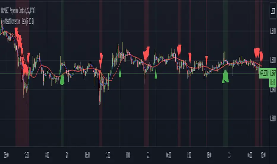
Heartbeat Momentum Strategy BetaHeartbeat Momentum Strategy Beta
Overview
The Heartbeat Momentum Strategy is an innovative approach to market analysis that draws inspiration from the rhythmic patterns of a heartbeat. This strategy aims to identify significant momentum shifts in the market by comparing short-term and long-term moving averages, analogous to detecting irregularities in a heartbeat.
Key Concepts
Market Heartbeat: The difference between short-term and long-term moving averages, representing the market's current 'pulse'.
Heartbeat Volatility: Measured by the standard deviation of the market heartbeat.
Momentum Signals: Generated when the heartbeat deviates significantly from its normal range.
How It Works
Calculates a short-term moving average (default 5 periods) and a long-term moving average (default 20 periods) of the closing price.
Computes the 'heartbeat' by subtracting the long-term MA from the short-term MA.
Measures the volatility of the heartbeat using its standard deviation over the long-term period.
Generates buy signals when the heartbeat exceeds 2 standard deviations above its mean.
Generates sell signals when the heartbeat falls 2 standard deviations below its mean.
Indicator Components
Blue Line: Short-term moving average
Red Line: Long-term moving average
Green Triangles: Buy signals
Red Triangles: Sell signals
Background Color: Light green during buy signals, light red during sell signals
Strategy Parameters
Short MA Window: The period for the short-term moving average (default: 5)
Long MA Window: The period for the long-term moving average (default: 20)
Standard Deviation Threshold: The number of standard deviations to trigger a signal (default: 2.0)
Interpretation
Buy Signal: Indicates a potential strong upward momentum shift. Consider opening long positions or closing short positions.
Sell Signal: Suggests a potential strong downward momentum shift. Consider opening short positions or closing long positions.
No Signal: The market is moving within its normal rhythm. Maintain current positions or look for other entry opportunities.
Customization
Users can adjust the strategy parameters to suit different assets, timeframes, or trading styles:
Decrease the MA windows for more frequent signals (more suitable for shorter timeframes).
Increase the MA windows for fewer, potentially more significant signals (better for longer timeframes).
Adjust the Standard Deviation Threshold to fine-tune sensitivity (lower for more signals, higher for fewer but potentially stronger signals).
Risk Management
While this strategy can provide valuable insights into market momentum, it should not be used in isolation:
Always use stop-loss orders to manage potential losses.
Consider the overall market context and other technical/fundamental factors.
Be aware of potential false signals, especially in ranging or highly volatile markets.
Backtest and forward-test the strategy with different parameters before live trading.
Conclusion
The Heartbeat Momentum Strategy offers a unique perspective on market movements by treating price action like a heartbeat. By identifying significant deviations from the normal market rhythm, it aims to capture strong momentum shifts while filtering out market noise. As with any trading strategy, use it as part of a comprehensive trading plan and always practice sound risk management.
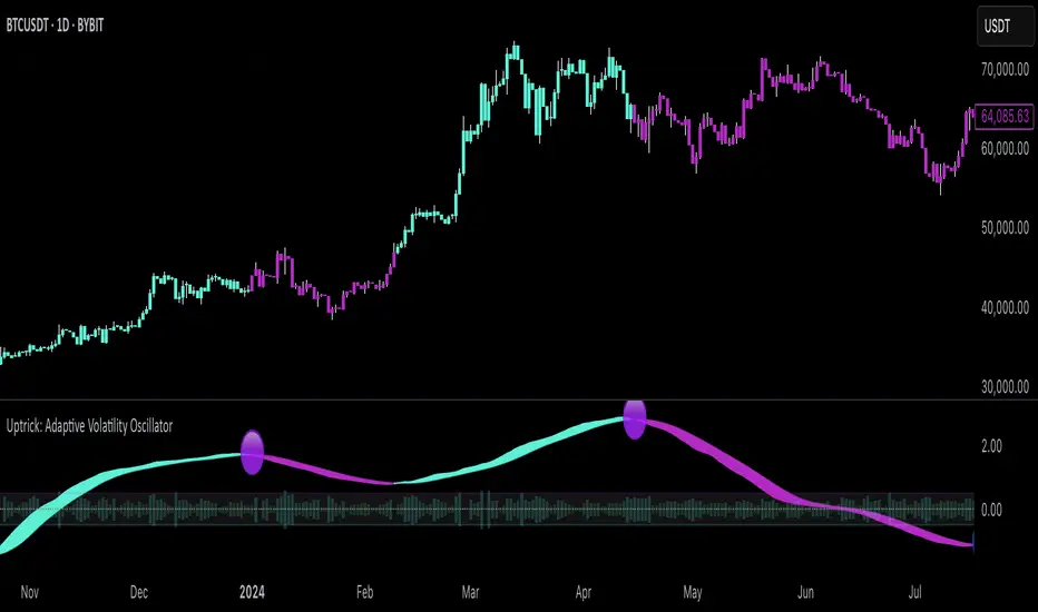
Uptrick: Adaptive Volatility Oscillator### **Overview and Purpose**
The **"Uptrick: Adaptive Volatility Oscillator"** is a sophisticated technical analysis tool designed to identify and visualize volatility trends within the financial markets. This indicator is particularly useful for traders and analysts who seek to understand the market's underlying momentum by analyzing the relationship between volume and price changes. It adapts to changing market conditions, providing a dynamic way to gauge overbought and oversold levels, identify potential reversals, and track the strength of market movements.
### **Core Components**
1. **Volume Oscillator Calculation**:
- **Purpose**: The volume oscillator is at the heart of this indicator. It measures the directional momentum of volume by comparing current volume levels with those of previous periods.
- **How It Works**: The oscillator calculates the difference between current and past volume levels, determining whether the market is experiencing buying or selling pressure. This is normalized to ensure the oscillator's values are comparable across different time frames and market conditions.
- **Normalized Oscillator**: To make the oscillator's readings more meaningful, the values are normalized by adjusting for standard deviation over a long period (150 bars). This step helps in smoothing out the noise and highlights significant shifts in market activity.
2. **Adaptive Filter Calculation**:
- **Purpose**: The adaptive filter refines the raw oscillator data to create a smoother signal that is responsive to market changes without being overly reactive to minor fluctuations.
- **Adaptive Coefficient**: This coefficient, set by the user, controls the sensitivity of the filter. A higher coefficient makes the filter more sensitive to recent changes, while a lower coefficient gives more weight to past data.
- **How It Works**: The filter applies a weighted average to the oscillator values, where recent data is given more importance. This creates a dynamic signal that adapts to the market's changing conditions, highlighting significant trends and potential turning points.
3. **Signal Line**:
- **Purpose**: The signal line serves as a benchmark for the filtered oscillator values, providing a basis for comparison to determine the current trend's strength.
- **Smoothing**: The signal line is smoothed over a user-defined period to ensure it represents the underlying trend accurately. This smoothing process reduces the noise and allows traders to focus on the more meaningful movements.
4. **Overbought/Oversold Zones**:
- **Purpose**: These zones help traders identify when the market is potentially overstretched and due for a correction. They are crucial for timing entry and exit points.
- **Thresholds**: The user-defined thresholds represent levels where the oscillator values are considered extreme. When the oscillator crosses these levels, it signals that the market may be overbought or oversold.
- **Visual Cues**: The indicator plots these zones on the chart, making it easy for traders to see when the market enters these critical areas. This visualization is vital for spotting potential reversals or continuations in the trend.
5. **Histogram Visualization**:
- **Purpose**: The histogram provides a visual representation of the volatility in the market, making it easier to interpret the oscillator's readings.
- **Color Coding**: The histogram bars are color-coded based on the filtered oscillator's relationship with the signal line. Green bars indicate a positive momentum (bullish), while red bars indicate negative momentum (bearish). This color-coding helps traders quickly assess the market's current state.
- **Intensity of Movement**: The height and color intensity of the histogram bars reflect the strength of the underlying trend. Higher bars with more intense colors signify stronger market movements.
6. **Buy and Sell Signals**:
- **Purpose**: The indicator provides explicit buy and sell signals based on the oscillator's interaction with the signal line and the overbought/oversold thresholds.
- **Buy Signal**: A buy signal is generated when the filtered oscillator crosses above the signal line while in the oversold zone. This suggests that the market may be reversing upwards from an oversold condition.
- **Sell Signal**: Conversely, a sell signal is generated when the filtered oscillator crosses below the signal line while in the overbought zone, indicating a potential downward reversal from an overbought condition.
- **Visual Representation**: These signals are visually represented on the chart with specific symbols, such as green circles for buy signals and red circles for sell signals, making them easy to spot.
### **Usefulness and Applications**
1. **Trend Identification**:
- The indicator is highly effective in identifying the current trend and its strength. By analyzing the relationship between the oscillator and the signal line, traders can determine whether the market is in an uptrend, downtrend, or ranging. The adaptive nature of the filter ensures that the trend signals remain relevant even as market conditions change.
2. **Volatility Analysis**:
- Understanding market volatility is crucial for risk management and strategy development. This indicator provides a clear view of how volatility is evolving, helping traders adjust their strategies accordingly. For example, higher volatility might suggest the need for tighter stop losses or more conservative position sizes.
3. **Overbought/Oversold Detection**:
- The overbought and oversold zones are essential for identifying potential reversal points. These zones can be used to time entries and exits, particularly in markets that are prone to mean reversion. The visual cues provided by the indicator make it easier to spot when the market might be overstretched.
4. **Adaptive Filtering**:
- The adaptive filter is a significant advantage of this indicator. Unlike static filters, which might lag or react too quickly to noise, the adaptive filter adjusts to the market's pace. This makes the indicator versatile, suitable for different market conditions, and less prone to giving false signals.
5. **Visual Clarity**:
- The indicator is designed with visual clarity in mind. The color-coded bars and overbought/oversold zones make it easy to interpret the market's current state at a glance. This is particularly useful for traders who rely on quick decision-making or need to monitor multiple assets simultaneously.
6. **Customizability**:
- The indicator offers several user inputs that allow traders to customize it according to their trading style and market of interest. This includes the length of the volume period, the sensitivity of the adaptive filter, and the thresholds for overbought/oversold conditions. Such flexibility makes it a valuable tool for both short-term traders and long-term investors.
### **Conclusion**
The "Uptrick: Adaptive Volatility Oscillator" is a powerful and versatile indicator that blends volume analysis with adaptive filtering to provide a nuanced view of market trends and volatility. Its ability to identify overbought and oversold conditions, coupled with its adaptive nature, makes it an indispensable tool for traders looking to gain an edge in the markets. Whether you're aiming to spot trend reversals, confirm the strength of ongoing trends, or manage risk through volatility analysis, this indicator offers the insights needed to make informed trading decisions. Its clear visual signals and customizable parameters further enhance its utility, making it suitable for a wide range of trading strategies and market environments.
Multiple EMA Indicator [Pineify]TradingView Multiple EMA Indicator: A Comprehensive Trend Analysis Tool
The TradingView Multiple EMA Indicator is a powerful and versatile tool designed to provide traders with a comprehensive view of market trends across multiple timeframes. By incorporating five Exponential Moving Averages (EMAs) with customizable lengths and sources, this indicator offers a nuanced approach to trend analysis, suitable for both novice and experienced traders.
Key Features:
Five customizable EMAs for multi-timeframe analysis
Flexible source inputs for each EMA
Color-coded plots for easy visual interpretation
Overlay functionality for direct price action comparison
How It Works:
This indicator calculates and displays five separate EMAs on your chart, each with its own customizable length and source. The EMAs are color-coded for easy identification:
EMA-1: Red
EMA-2: Light Green
EMA-3: Light Blue
EMA-4: Purple
EMA-5: Yellow
By default, the indicator uses the following settings:
EMA-1: 10-period EMA of close price
EMA-2: 20-period EMA of close price
EMA-3: 50-period EMA of close price
EMA-4: 100-period EMA of close price
EMA-5: 200-period EMA of close price
However, users can easily adjust these settings to suit their specific trading strategies and preferences.
Trading Ideas and Insights:
The Multiple EMA Indicator offers several ways to analyze market trends and generate trading signals:
Trend Identification: The alignment of the EMAs can help identify the overall trend. When shorter-term EMAs are above longer-term EMAs, it suggests an uptrend, and vice versa for a downtrend.
Dynamic Support and Resistance: Each EMA can act as a dynamic support or resistance level. Price bouncing off these levels can indicate potential entry or exit points.
Crossovers: When a shorter-term EMA crosses above a longer-term EMA, it may signal a bullish trend change. Conversely, a bearish signal may occur when a shorter-term EMA crosses below a longer-term EMA.
Trend Strength: The spacing between the EMAs can indicate trend strength. Wide spacing suggests a strong trend, while narrow spacing or intertwining EMAs may indicate consolidation or a weakening trend.
Multi-Timeframe Analysis: By using different EMA lengths, traders can gain insights into short-term, medium-term, and long-term trends simultaneously.
How to Use the Indicator:
Add the indicator to your chart and adjust the input parameters as needed.
Observe the relative positions of the EMAs to identify the overall trend direction.
Look for potential entry signals when price or shorter-term EMAs cross above or below longer-term EMAs.
Use the EMAs as dynamic support and resistance levels for setting stop-loss and take-profit orders.
Combine the Multiple EMA Indicator with other technical analysis tools, such as oscillators or volume indicators, for more comprehensive trading decisions.
Customization Options:
The indicator offers extensive customization options, allowing traders to tailor it to their specific needs:
Adjust the length of each EMA to focus on different timeframes
Change the source of each EMA (e.g., close, open, high, low, HL2, HLC3, OHLC4)
Modify the color and line thickness of each EMA for better visibility
Conclusion:
The TradingView Multiple EMA Indicator is a versatile and powerful tool for trend analysis and trade decision-making. By providing a multi-faceted view of market trends, it enables traders to make more informed decisions based on a comprehensive understanding of price action across various timeframes.
Remember that while this indicator can be a valuable tool in your trading arsenal, it should not be used in isolation. Always combine it with other forms of analysis and proper risk management techniques for the best results.
We hope this indicator enhances your trading experience and contributes to your success in the markets. Happy trading!

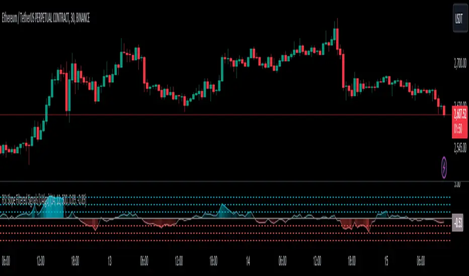
RSI Slope Filtered Signals [UAlgo]The "RSI Slope Filtered Signals " is a technical analysis tool designed to enhance the accuracy of RSI (Relative Strength Index) signals by incorporating slope analysis. This indicator not only considers the RSI value but also analyzes the slope of the RSI over a specified number of bars, providing a more refined signal that accounts for the momentum and trend strength. By utilizing both positive and negative slope arrays, the indicator dynamically adjusts its thresholds, ensuring that signals are responsive to changing market conditions. This tool is particularly useful for traders looking to identify overbought and oversold conditions with a higher degree of precision, filtering out noise and providing clear visual cues for potential market reversals.
🔶 Key Features
Dynamic Slope Analysis: Measures the slope of RSI over a customizable number of bars, offering insights into the momentum and trend direction.
Adaptive Thresholds: Uses historical slope data to calculate dynamic thresholds, adjusting signal sensitivity based on market conditions.
Normalized Slope Calculation: Normalizes the slope values to provide a consistent measure across different market conditions, making the indicator more versatile.
Clear Signal Visualization: The indicator plots both positive and negative normalized slopes with color gradients, visually representing the strength of the trend.
Overbought and Oversold Signals: Plots overbought and oversold signals directly on the chart when the calculated value reaches the user-specified threshold, helping traders identify potential reversal points.
Customizable Settings: Allows users to adjust the RSI length, slope measurement bars, and lookback periods, providing flexibility to tailor the indicator to different trading strategies.
🔶 Interpreting the Indicator
The "RSI Slope Filtered Signals " indicator is designed to be easy to interpret. Here's how you can use it:
Normalized Slope: The indicator plots the normalized slope of the RSI, with values above zero indicating positive momentum and values below zero indicating negative momentum. A higher positive slope suggests a strong upward trend, while a deeper negative slope indicates a strong downward trend.
Reversal Signals: The indicator plots several horizontal lines at different thresholds (+3, +2, +1, 0, -1, -2, -3). These levels are used to gauge the strength of the momentum based on the normalized slope. For example, a normalized slope crossing above the +2 threshold may indicate a strong bullish trend, while crossing below the -2 threshold may suggest a strong bearish trend. These thresholds help in understanding the intensity of the current trend and provide context for interpreting the indicator's signals.
This indicator generates overbought and oversold signals not solely based on the RSI entering extreme levels (above 70 for overbought and below 30 for oversold), but also by considering the behavior of the normalized slope relative to specific thresholds. Specifically, the Overbought Signal (🔽) is triggered when the RSI is above 70 and the normalized slope from the previous bar is greater than or equal to the upper threshold, with the current slope being lower than the previous slope, indicating a potential bearish reversal as momentum may be slowing down.
Similarly, the Oversold Signal (🔼) is generated when the RSI is below 30 and the normalized slope from the previous bar is less than or equal to the lower threshold, with the current slope being higher than the previous slope, signaling a potential bullish reversal as the downward momentum may be weakening.
Area Plots: The indicator also plots the positive and negative slopes as filled areas, providing a quick visual cue for the strength and direction of the trend. Green areas represent positive slopes (upward momentum), while red areas represent negative slopes (downward momentum).
By combining these elements, the "RSI Slope Filtered Signals " provides a comprehensive view of the market's momentum, helping traders make more informed decisions by filtering out false signals and focusing on the significant trends.
🔶 Disclaimer
Use with Caution: This indicator is provided for educational and informational purposes only and should not be considered as financial advice. Users should exercise caution and perform their own analysis before making trading decisions based on the indicator's signals.
Not Financial Advice: The information provided by this indicator does not constitute financial advice, and the creator (UAlgo) shall not be held responsible for any trading losses incurred as a result of using this indicator.
Backtesting Recommended: Traders are encouraged to backtest the indicator thoroughly on historical data before using it in live trading to assess its performance and suitability for their trading strategies.
Risk Management: Trading involves inherent risks, and users should implement proper risk management strategies, including but not limited to stop-loss orders and position sizing, to mitigate potential losses.
No Guarantees: The accuracy and reliability of the indicator's signals cannot be guaranteed, as they are based on historical price data and past performance may not be indicative of future results.
Average of CBO and CBO divergence histogramShort Description:
This indicator combines a Custom Bias Oscillator (CBO) with its Divergence Histogram and computes their average for use to assess the market's bias based on candlestick analysis, from the aforementioned CBO indicator.
Full Description:
Overview:
This indicator integrates two powerful analytical tools into a single script: a Custom Bias Oscillator (CBO) and its Divergence Histogram. This indicator provides traders with a comprehensive view of market bias and divergence between price movements and volume, enhanced by an optional signal line derived from the combined average of these metrics.
Key Features:
Custom Bias Oscillator (CBO):
The CBO is calculated based on the body and wick biases of candlesticks, normalized by the Average True Range (ATR) to account for market volatility.
The CBO is scaled by the divergence between the Rate of Change (ROC) of volume and the ROC of the adjusted bias, ensuring it reflects potential reversals or continuations in the market.
Divergence Histogram:
The Divergence Histogram is derived from the difference between the CBO and its signal line.
This difference is normalized and plotted to provide visual cues for potential divergences, which may indicate trend exhaustion or the beginning of a new trend.
Combined Average with Signal Line:
The indicator calculates the average of the CBO and the normalized divergence, creating a combined signal that offers a more rounded perspective on market conditions.
A signal line, generated by smoothing the combined average, is plotted to help traders identify potential buy or sell signals based on crossovers.
Customization:
The indicator includes customizable parameters for the periods of the oscillator, signal line, ATR, ROC, and the combined signal line, allowing traders to tailor the indicator to different market conditions and timeframes.
How to Use:
Buy Signal: Consider a long position when the combined average crosses above the signal line, indicating potential bullish momentum.
Sell Signal: Consider a short position when the combined average crosses below the signal line, indicating potential bearish momentum.
Divergence Analysis: Use the Divergence Histogram to identify areas where price movements may be diverging from volume, signaling potential reversals or corrections.
Disclaimer:
This indicator is designed for educational and informational purposes only. It is not financial advice. Always perform your own analysis before making any investment decisions. Past performance is not indicative of future results.

[KVA] KMACDKMACD Indicator: Advanced Market Analysis Through Central Tendency Metrics
The KMACD (KAMVIA Moving Average Convergence Divergence) indicator is an advanced, multi-dimensional tool designed to provide traders and analysts with a deeper understanding of market dynamics. By integrating the classical MACD framework with statistical measures of central tendency, KMACD offers a sophisticated approach to identifying trends, reversals, and potential trading opportunities.
Key Features of the KMACD Indicator:
1. Enhanced MACD Calculation :
- The KMACD employs dual moving averages (fast and slow) of user-defined types (SMA, EMA, WMA) to calculate the MACD line, which represents the difference between these moving averages. This traditional approach is further enhanced by customizable signal smoothing, allowing users to fine-tune the sensitivity of the indicator.
2. Central Tendency Metrics :
- The indicator integrates additional statistical measures, such as Mean, Median, Mode, Standard Deviation, and Variance, calculated over a rolling window. These metrics provide insights into the central tendencies of the MACD values, helping traders understand the overall trend direction and the dispersion of price movements around the trend.
3. RSI-Like Oscillator :
- A unique RSI-like value derived from the MACD line is included to highlight overbought and oversold conditions. This offers a dual-layered perspective, combining the power of MACD and RSI methodologies, to signal potential market extremes with greater precision.
4. Customizable Visual Elements :
- KMACD allows users to toggle the visibility of the MACD line, Signal line, and Histogram, providing flexibility in how the data is presented. The histogram dynamically changes color—green when above zero, indicating bullish momentum, and red when below zero, indicating bearish momentum.
5. Horizontal Line Customization :
- The indicator includes customizable horizontal lines for the zero level, overbought, and oversold thresholds. These lines serve as visual cues to identify key price levels and market conditions.
6. Adaptive to Various Market Conditions :
- KMACD's comprehensive features make it adaptable to various market conditions, from trending markets to sideways consolidations. Whether you're looking to capture momentum shifts or identify potential reversal points, KMACD provides the analytical power needed to make informed trading decisions.
How to Use KMACD:
- Trend Identification : Use the MACD line in conjunction with central tendency measures (Mean, Median, Mode) to gauge the overall market trend and its strength. A rising MACD line, supported by higher mean and median values, typically indicates an uptrend.
- Momentum Analysis : The histogram and RSI-like value help in identifying the momentum behind price movements. Positive histogram bars suggest increasing bullish momentum, while negative bars suggest increasing bearish momentum.
- Overbought/Oversold Conditions : Monitor the RSI-like oscillator and the overbought/oversold levels to detect when the market may be poised for a reversal.
- Divergence Detection : Look for divergences between the MACD line and price action, supported by the central tendency measures, to spot potential reversal points.
Conclusion
The KMACD indicator is more than just a traditional MACD; it’s a comprehensive tool designed to cater to both novice and experienced traders. By incorporating central tendency metrics and customizable features, KMACD stands out as a versatile and powerful indicator that enhances market analysis and trading strategies. Whether you're navigating volatile markets or steady trends, KMACD offers the precision and depth needed to stay ahead.

ELMo HeatmapA heatmap display of the Entropy, Liquidity, and Momentum (ELMo) strategy status across a group of tickers.
Background color indicates ELMo's opinion of that row(green - bull, red - bear). White dots indicate bullish signals and black are bearish signals.
Top row is current ticker, remaining 7 rows are each a configurable ticker. The defaults are:
SPY
QQQ
DIA
IWM
BTCUSD
GLD
TLT
If you have appropriate data feeds, I also like the following ticker list:
ES1!
NQ1!
YM1!
RTY1!
BTC1!
GC1!
VX1!

MACD with 1D Stochastic Confirmation Reversal StrategyOverview
The MACD with 1D Stochastic Confirmation Reversal Strategy utilizes MACD indicator in conjunction with 1 day timeframe Stochastic indicators to obtain the high probability short-term trend reversal signals. The main idea is to wait until MACD line crosses up it’s signal line, at the same time Stochastic indicator on 1D time frame shall show the uptrend (will be discussed in methodology) and not to be in the oversold territory. Strategy works on time frames from 30 min to 4 hours and opens only long trades.
Unique Features
Dynamic stop-loss system: Instead of fixed stop-loss level strategy utilizes average true range (ATR) multiplied by user given number subtracted from the position entry price as a dynamic stop loss level.
Configurable Trading Periods: Users can tailor the strategy to specific market windows, adapting to different market conditions.
Higher time frame confirmation: Strategy utilizes 1D Stochastic to establish the major trend and confirm the local reversals with the higher probability.
Trailing take profit level: After reaching the trailing profit activation level scrip activate the trailing of long trade using EMA. More information in methodology.
Methodology
The strategy opens long trade when the following price met the conditions:
MACD line of MACD indicator shall cross over the signal line of MACD indicator.
1D time frame Stochastic’s K line shall be above the D line.
1D time frame Stochastic’s K line value shall be below 80 (not overbought)
When long trade is executed, strategy set the stop-loss level at the price ATR multiplied by user-given value below the entry price. This level is recalculated on every next candle close, adjusting to the current market volatility.
At the same time strategy set up the trailing stop validation level. When the price crosses the level equals entry price plus ATR multiplied by user-given value script starts to trail the price with EMA. If price closes below EMA long trade is closed. When the trailing starts, script prints the label “Trailing Activated”.
Strategy settings
In the inputs window user can setup the following strategy settings:
ATR Stop Loss (by default = 3.25, value multiplied by ATR to be subtracted from position entry price to setup stop loss)
ATR Trailing Profit Activation Level (by default = 4.25, value multiplied by ATR to be added to position entry price to setup trailing profit activation level)
Trailing EMA Length (by default = 20, period for EMA, when price reached trailing profit activation level EMA will stop out of position if price closes below it)
User can choose the optimal parameters during backtesting on certain price chart, in our example we use default settings.
Justification of Methodology
This strategy leverages 2 time frames analysis to have the high probability reversal setups on lower time frame in the direction of the 1D time frame trend. That’s why it’s recommended to use this strategy on 30 min – 4 hours time frames.
To have an approximation of 1D time frame trend strategy utilizes classical Stochastic indicator. The Stochastic Indicator is a momentum oscillator that compares a security's closing price to its price range over a specific period. It's used to identify overbought and oversold conditions. The indicator ranges from 0 to 100, with readings above 80 indicating overbought conditions and readings below 20 indicating oversold conditions.
It consists of two lines:
%K: The main line, calculated using the formula (CurrentClose−LowestLow)/(HighestHigh−LowestLow)×100 . Highest and lowest price taken for 14 periods.
%D: A smoothed moving average of %K, often used as a signal line.
Strategy logic assumes that on 1D time frame it’s uptrend in %K line is above the %D line. Moreover, we can consider long trade only in %K line is below 80. It means that in overbought state the long trade will not be opened due to higher probability of pullback or even major trend reversal. If these conditions are met we are going to our working (lower) time frame.
On the chosen time frame, we remind you that for correct work of this strategy you shall use 30min – 4h time frames, MACD line shall cross over it’s signal line. The MACD (Moving Average Convergence Divergence) is a popular momentum and trend-following indicator used in technical analysis. It helps traders identify changes in the strength, direction, momentum, and duration of a trend in a stock's price.
The MACD consists of three components:
MACD Line: This is the difference between a short-term Exponential Moving Average (EMA) and a long-term EMA, typically calculated as: MACD Line=12-period EMA−26-period
Signal Line: This is a 9-period EMA of the MACD Line, which helps to identify buy or sell signals. When the MACD Line crosses above the Signal Line, it can be a bullish signal (suggesting a buy); when it crosses below, it can be a bearish signal (suggesting a sell).
Histogram: The histogram shows the difference between the MACD Line and the Signal Line, visually representing the momentum of the trend. Positive histogram values indicate increasing bullish momentum, while negative values indicate increasing bearish momentum.
In our script we are interested in only MACD and signal lines. When MACD line crosses signal line there is a high chance that short-term trend reversed to the upside. We use this strategy on 45 min time frame.
ATR is used to adjust the strategy risk management to the current market volatility. If volatility is low, we don’t need the large stop loss to understand the there is a high probability that we made a mistake opening the trade. User can setup the settings ATR Stop Loss and ATR Trailing Profit Activation Level to realize his own risk to reward preferences, but the unique feature of a strategy is that after reaching trailing profit activation level strategy is trying to follow the trend until it is likely to be finished instead of using fixed risk management settings. It allows sometimes to be involved in the large movements.
Backtest Results
Operating window: Date range of backtests is 2023.01.01 - 2024.08.01. It is chosen to let the strategy to close all opened positions.
Commission and Slippage: Includes a standard Binance commission of 0.1% and accounts for possible slippage over 5 ticks.
Initial capital: 10000 USDT
Percent of capital used in every trade: 30%
Maximum Single Position Loss: -4.79%
Maximum Single Profit: +20.14%
Net Profit: +2361.33 USDT (+44.72%)
Total Trades: 123 (44.72% win rate)
Profit Factor: 1.623
Maximum Accumulated Loss: 695.80 USDT (-5.48%)
Average Profit per Trade: 19.20 USDT (+0.59%)
Average Trade Duration: 30 hours
These results are obtained with realistic parameters representing trading conditions observed at major exchanges such as Binance and with realistic trading portfolio usage parameters.
How to Use
Add the script to favorites for easy access.
Apply to the desired timeframe between 30 min and 4 hours and chart (optimal performance observed on 45 min BTC/USDT).
Configure settings using the dropdown choice list in the built-in menu.
Set up alerts to automate strategy positions through web hook with the text: {{strategy.order.alert_message}}
Disclaimer:
Educational and informational tool reflecting Skyrex commitment to informed trading. Past performance does not guarantee future results. Test strategies in a simulated environment before live implementation

DIVERGENCE SPOT X P.FUTURES (BYBIT and BINANCE) [GUSLM]Author's note:
When I searched the Trading View libraries, I didn't find what I was looking for. I noticed that the crypto market currently uses a lot more derivatives called "Perpetual" Futures, while the price is always formulated based on the spot price, or the real coin.
I wanted something that would mark the difference in real time between the spot price and the perpetual futures, creating a bar history. Since the relationship between them generates algorithms on exchanges to formulate payment rates for the lowest side, and to formulate the "market price" of the perpetual futures (without expiration), which are not the value of the last trade. I found several scripts that try to show the relationship between the funding rate and the rate, or the increase in these over time. But they don't show the direct action of the two prices in real time, nor a history of this difference.
The usefulness of this script is that at times you will see jumps in the price difference and can make assessments from this. Associated with another funding rate script it becomes even more interesting. I also didn't find coverage for the two brokers that my friends and I operate with, so I enabled it for use on these two brokers.
Function:
It works for the BYBIT and BINANCE exchanges. In coins that have both markets (Spot and Perpetual futures).
It shows in bars the real-time activity of the two markets, the difference between them. A configurable historical average, and bars for each candle. The last one is in real time.
How it works:
The script will detect which coin you are looking at, and will use its algorithm to detect if there is an opposite pair. If it is spot, it will identify and look for the perpetual future, and if it is future, it will find the spot prices. It will calculate the difference between them in %, using 0.05 as the default threshold - normally used by brokers as "zero". The futures on average are currently 0.05 higher than the spot in price. And it will show this difference in a bar, green and upwards if the futures are higher, and red if they are lower. and its respective normalized value in %(100)
Example of use:
1: you can check for possible movement patterns in relation to the expectation of future prices and spot, over time.
2. Main: you will notice at times normally prior to larger price movements, the indicator will pulse, indicating changes in the price difference of perpetual futures in relation to spot. - e.g.: in large purchases in spot that pull the price up by buying more positions in the order book, you will see a downward pulse in the indicator bar. as well as in the opposite direction, being an upward pulse.
3. The movement may sometimes be in futures, so you will see the opposite happening, it may be useful to add the opposite currency pair as an additional price, to identify with certainty who is "pulling" whether it is spot or perpetual. But in both cases the possible interpretation is the same. the expectation of futures in relation to the spot price is higher or lower than the average, and there are or are not pulses in one direction or another.
Summary: by following this indicator you can see the real-time vision of large purchases in spot, for example. Someone with great market power may have a future position, and is triggering purchases or ignition in the direction of their position in spot, for example.
Warning: many other indicators and market insights are needed to have a view of the whole and interpret these signals and bar movements. Use and observation lead to an understanding for future actions. But it should always be based on a global context. This is not an indicator to be used alone.
Warning 2: if the opposite pair is not available (exchange only has a spot market, for example) nothing will appear in the indicator. And if it is an exchange other than BYBIT or BINANCE, nothing will probably appear either.