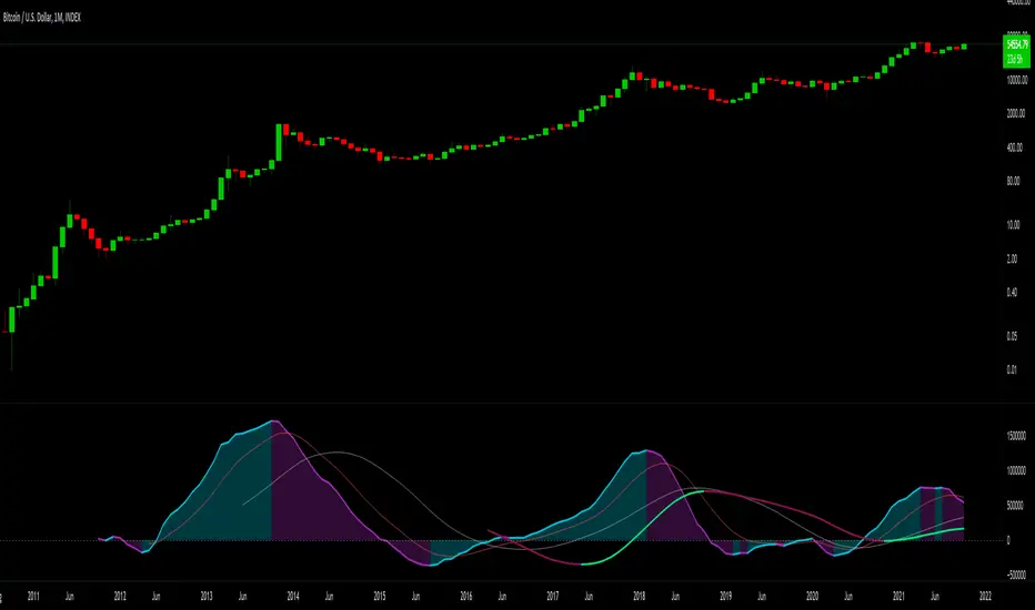
True Accumulation/Distribution (TG fork)An accumulation/distribution indicator that works better against gaps and with trend coloring.
Accumulation/Distribution was developed by Marc Chaikin to provide insight into strength of a trend by measuring flow of buy and sell volume .
The fact that A/D only factors current period's range for calculating the volume multiplier causes problem with price gaps. They are ignored or even misinterpreted.
True Accumulation/Distribution solves the problem by using True Range instead of only relying on current period's high and low.
Most of the time, True A/D reverts to producing the same values as the original A/D. The difference between True A/D and original A/D can be better seen when a gap has occurred, True A/D has handles it better than Accumulation/Distribution which a bearish close in period's range cause it to misinterpret the strong buy pressure as sell volume
The Moving Average Cloud is simply the filling between the moving average and the True A/D. This feature was inspired by D7R ACC/DIST closed-source indicator, kudos to D7R for making such neat visual indicators (but unfortunately all closed source!).
This indicator was made to extend the original work by adding MTF support and a moving average cloud and coloring.
If you like this indicator, please show the original author RezzaHmt some love:
Accumulation-distribution
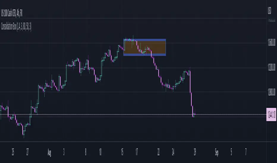
Consolidation BoxThis script aims to help identify sideways markets. Once price leaves the Box the market will usually start a trending phase. Users can set a percent range to detect markets moving sideways within the range.
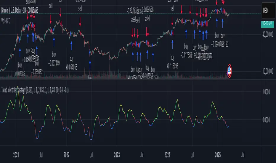
Trend Identifier StrategyTrend Identifier Strategy for 1D BTC.USD
The indicator smoothens a closely following moving average into a polynomial like plot and assumes 4 staged cycles based on the first and the second derivatives. This is an optimized strategy for long term buying and selling with a Sortino Ratio above 3. It is designed to be a more profitable alternative to HODLing. It can be combined with 'Accumulation/Distribution Bands & Signals' and 'Exponential Top and Bottom Finder'.
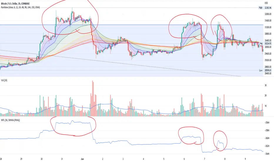
Money Flow LineWhat is this? The Money Flow Line (MFL) indicator is at its core a more even-tempered version of the Price-Volume-Trend (PVT). The primary difference is the usage of `hlc3` ((high + low + close) / 3) rather than `close` to use the "typical price" that it critical to the calculation of the Money Flow Index (MFI). Other similar indicators include the Accumulation Distribution Line (ADL) and the On Balance Volume (OBV) indicators. The purpose of all of these indicators is to attempt to measure the strength of the money flow by combining price and volume into a rolling measurement that can be compared over time to look for confirmations and divergences.
The indicator also includes an optional averaging (smoothing) line that can be enabled in the display settings. Enabling this smoothing line with a desired period allows for simpler trend comparisons and also allows the user to view how far the line has diverged from the mean. This creates an indicator very similar to Elder's Force Index (EFI), which is also a `close * volume` style indicator.
Why is this important? After an extreme movement or volume spike the MFI will "snap back" sharply as that bar eventually exits the set period. This produces a result that is meaningless and skews the indicator away from the market structure. Because of this behavior, range clamping, and the loss of comparative history I prefer to shy away from oscillator style indicators. The Money Flow Line instead gives you all of the history so you may compare and see the broader trend without sharp snaps in history based on an arbitrary period setting.
Why is this better? This produces a no-lag indicator that isn't subject to the harsh skewing produced by they Money Flow Index's period calculation. It doesn't lose history like MFI or EFI, is clear about the trend direction, and prefers a "typical price" (averaging the entire range of each bar) rather than whatever happens to be the closing price for a given bar.
How can I use it? The indicator is attempting to measure supply and demand in the markets. No indicator is perfect, but we can use all of the information we have available to make our best predictions. There are only 3 pieces of data the market gives us:
1. Price (action)
2. Volume
3. Time
The Money Flow Line combines all of these data points into a readable rolling data set that attempts to show subtle balance of power shifts based on changes in volume and "smart money" (or "big money") stepping in and out of the picture. Much like PVT, we look for the same things:
- Trend Identification: an up or down trend appears in the MFL
- Confirmations: the MFL agrees with price action in direction and magnitude
- Divergence: the MFL disagrees with price action, indicating a reversal may be coming soon
When applying the smoothing line we can also look for similar things we would with EFI. The primary case would be to look for the MFL to jump very far away from the mean (a high magnitude movement) which indicates that price may be reverting towards the mean soon (a "mean reversion"). On the other hand, it may indicate strength in the current price direction. All of these predictions depend heavily on price action and market structure. Good luck!
Trend IdentifierTrend Identifier for 1D BTC.USD
It smoothens a closely following moving average into a polynomial like plot.
And assumes 4 stage cycles based on the first and second derivatives.
Green: Bull / Exponential Rise
Yellow: Distribution
Red: Bear / Exponential Drop
Blue: Accumulation
Red --> Blue --> Green: indicates the start of a bull market
Green --> Yellow --> Red: indicates the start of a bear market
Green --> Yellow: Start of a distribution phase, take profits
Red --> Blue: Start of a accumulation phase, DCA

Treat Sideways👉 What is this indicator ?
Understanding the Sideways Trend is the best trading method, and we have written this script intending to make you a better sideways filter indicator. Treat Sideways helps you understand the sideways trend and trade in a risk free manner.
👉 On which coins can this indicator be used ?
This indicator is best used on all cryptocurrencies, stocks , forex markets
👉 How work this indicator ?
We understand the trend using our secret logic and price action, and After that, we mark the sideways movement in a box. The moving average line helps us to construct this indicator.
👉 Default Coin and Time Frame ?
XRPUSDT
Time Frame : 1 min
MA Line Color Details 👇
The Blue color of the MA line indicates the Sideways Trend
The Red color of the MA line indicates the Down Trend
The Green color of the MA line indicates the Up Trend
Indicator Settings 👇
Box Height : This setting can be used to set the size of the Sideways trend
Time Gap : This option is used to control unexpected down trend and up trend
Up Down Threshold : This option should be adjusted according to the time frame and voltality
Color :
Option to change the color of the box that appears in the sideways trend
Border Color : Option to change the color of the box border that appears in the sideways trend
Opacity : Option to change the opacity of the box border that appears in the sideways trend
Line Width : You can adjust the width of the MA line with this option

Breakout Accumulation/DistributionBasic modification of my SFP Momentum Indicator showing accumulation/distribution patterns based on breakouts above previous anchor points.
Candles are colored based on whether accumulation or distribution was last.
Best if used at HTF then confirmed at LTF.
Accumulation Distribution Volume Oscillator (ADVO) [JoseMetal]============
ENGLISH
============
- Description:
This indicator has 2 features (currently):
It shows the net volume in a histogram (buy volume in the upper part, sell volume in the bottom part).
Also calculates the difference between accumulation / distribution in a fast vs slow period to plot 2 moving averages and trigger crossovers.
It has an option to ignore the wicks, which sometimes makes it more accurate.
- Visual:
So first of all is the net volume, in the upper part of the histogram the buy volume is printed in green, if the volume keeps going up the histogram bars gets lighter, darker if the volume goes down.
Similarly, we have the sell volume in the bottom part, in red, it also gets lighter if the sell volume increases, and otherwise it gets darker.
And then we have 2 lines, one for the fast and other for the slow period, both shows the DIFFERENCE of the accumulation vs distribution, which can gives us clues about how the market is heading.
The background color changes depending on the status and crossovers:
Fast moving average crossovers the slow = GREEN, if the opposite happens = RED.
The rest of the time it depends on the position of the moving averages and if the fast is above or below the 0 line:
GREEN: FAST > SLOW and FAST > 0
OLIVE: FAST > SLOW but FAST < 0
RED: FAST < SLOW and FAST < 0
ORANGE: FAST < SLOW but FAST > 0
- Usage and recommendations:
Depending on the timeframe, the default 12 and 26 periods (fast / slow) are good, but i noticed that checking lower timeframes with higher settings it gives a better direction of the higher timeframe, example: you want to trade in 1h, but you check the 5 min timeframe with 25 / 100 periods.
That's because the smaller timeframe gives you a more "realistic" volume, more "detailed" volume I'd say.
In fact, in the real testings, I took a wonderful short by checking the 1 minute timeframe with 50 and 200 periods to decide if the 4h was making an accumulation or distribution.
Finally, there's an option to ignore wicks for the moving averages, sometimes it shows better results because ignoring volume within the wicks gives faster results, but I recommend checking both with and without.
- Customization:
So almost everything is customizable, colors, periods... there's an option for the histogram color scheme, but you can change every single color if you want.
You can also pick the moving average type, sometimes WMA is better, but I got better results with the EMA (which is the default).
============
ESPAÑOL
============
- Descripción:
Este indicador tiene 2 características (actualmente):
Muestra el volumen neto en un histograma (volumen de compra en la parte superior, volumen de venta en la parte inferior).
También calcula la diferencia entre acumulación/distribución en un periodo rápido vs lento para trazar 2 medias móviles y generar cruces.
Tiene una opción para ignorar las mechas, lo que a veces lo hace más preciso.
- Visual:
En primer lugar está el volumen neto, en la parte superior del histograma se muestra en verde el volumen de compra, si el volumen sigue subiendo las barras del histograma se hacen más claras, más oscuras si el volumen baja.
Del mismo modo, tenemos el volumen de venta en la parte inferior, en rojo, también se aclara si el volumen de venta aumenta, y de lo contrario se oscurece.
Y luego tenemos 2 líneas, una para el periodo rápido y otro para el lento, ambos muestran la DIFERENCIA entre la acumulación y distribución en su período, que nos puede dar pistas sobre la dirección del mercado.
El color del fondo cambia según el estado y los cruces:
La media móvil rápida cruza la lenta = VERDE, si ocurre lo contrario = ROJO.
El resto del tiempo depende de la posición de las medias móviles y de si la rápida está por encima o por debajo del punto 0:
VERDE: RÁPIDO > LENTO y RÁPIDO > 0
OLIVA: RÁPIDO > LENTO pero RÁPIDO < 0
ROJO: RÁPIDO < LENTO y RÁPIDO < 0
NARANJA: RÁPIDO < LENTO pero RÁPIDO > 0
- Uso y recomendaciones:
Dependiendo del marco de tiempo, los 12 y 26 períodos por defecto (rápido / lento) van bien, pero me di cuenta de que vigilar temporalidades más bajas con períodos más largos da una mejor dirección de la temporalidad superior, ejemplo: queremos operar en 1h, pero miramos el de 5 min con 25 / 100 períodos.
Eso es porque el marco de tiempo más pequeño le da un volumen más "realista", más "detallado" en mi opinión.
De hecho, en las pruebas reales, operé un estupendo short comprobando el marco de tiempo de 1 minuto con 50 y 200 períodos para decidir si el 4h estaba haciendo una acumulación o distribución.
Por último, hay una opción para ignorar las mechas para las medias móviles, a veces muestra mejores resultados ya que ignorar el volumen dentro de las mismas da resultados más rápidos, pero recomiendo comprobar el indicador de ambas formas para hacernos una idea general.
- Personalización:
Casi todo es personalizable, los colores, los periodos... hay una opción para el esquema de colores del histograma, pero puedes cambiar todos los colores si quieres.
También puedes elegir el tipo de media móvil, a veces es mejor la WMA, pero yo obtuve mejores resultados con la EMA (que es la que viene por defecto).
Accumulation_&_Distribution_Aka_ConsolidationZone - BasicDear Traders,
It so happens to the traders that once in their lifetime journey they be sure to here the below statement.
1. I got struck in the consolidation zone
2. Signals from technical indicators failed because prices were consolidating.
3. Its pretty tuff to detect consolidation zone. (programmatically)
I don't know about other but I have heard this throughout my trading journey. Hence I started to debug the above 3 statements and came up with this indicator which detects consolidation zones in the chart.
there are 3 inputs settings
1. ATR multiplier = can be used to filter the consolidation box height. higher the value bigger the box (vertical view) and smaller the value smaller the box height.
2. Show Last No of Zones = set the No of previous zones you would like to see.
3. Consolidation Size = If set to small. all kind of sizes will be plotted ( majorly works for day trading) if set to wide, script looks for major consolidation zones (majorly works for higher timeframes). if set to medium, script looks medium size to wide size zones majorly for timeframe with more than 30 min.
What's this indicator is taking into account?
1. Moving Averages
2. Linear Regression curves
3. ATR
4. BB
5. BBW
6. Couple of Math calculation to support the zone identification.
Note: Plz do suggest for any kind of improvements or feedbacks.
Regards

[UPRIGHT Trading] OrderZones - Supply & Demand (Predictive) (cc)Hello Traders,
This is one that I've been working on a very, Very long time. As easy as it is to draw after the fact, as someone well versed in Supply and Demand; it's a bit more difficult to create all the calculations to show them, code them out, and then I went a step further — attempting to predict future ones as well.
Let's talk about what Supply & Demand Zones are. They are a pattern and technical analysis technique used in day and swing trading. Demand zone represents the area with strongest buying pressure and Supply zone represents selling pressure. Often these zones will show Institutional/Large buyers and sellers executing their orders causing price to move up or down very quickly, creating a long wick on a small and sometimes momentum that feeds into the larger timeframes. Therefore, in the simplest terms, the Supply and Demand Orderzones are the zones the price often gets rejected from or returned to; when Demand exceeds Supply, price jumps up and vice versa.
Unlike lines of support and resistance , these are zones more closely than precise lines, but can help gauge Support and Resistance on the fly.
Richard Wykoff was one of the first market analysts to explain the interaction of these phases, giving them four labels. It is in the understanding of Wyckoff's explanation of market price action, that supply and demand zones are also known as Accumulation and Distribution zones (Accumulation, Markup, Distribution, Markdown).
Shows potential entries on break from zone. Pivots. Large breakdowns or breakouts signalling possible trend change.
Super Fast Real-time Orderzone creation. Resistance line at Supply, shows multiple dimensions of each zone when large enough.
Different calculation, line, transparency settings
Minimalist mode with autobox
Features:
Multiple calculation modes with different lengths and displays.
AutoBox (Predictive Orderzones).
Buy/Sell Highlights.
UPRIGHT – Ultimate Reversals (Support/Resistance version).
Breakouts/Breakdowns + Signals.
Pivot Labels (HH, HL, etc).
Pivot Bar.
Pivot Buy /Sell Signals.
Fully Customizable—Change line types, transparency, colors, etc).
I am still working on the calculations for one more addition, but as it is, this should help anyone automate their S/D technical analysis.
Please see author instructions for access.
Cheers,
Mike
(UPRIGHT Trading)

SFP MomentumCustom swing fail detector with levels and breakouts both major and minor plus colored candles based on SFP momentum.
IBP_AccDistThis indicator plots distribution / accumulation.
Distribution is when price falls by 0.2% and volume is 1.25 times the 20 day average volume.
Opposite is accumulation.
If there are 5 distibution days in a span of 20 days then market direction is confirmed down.
William O Neils method. Parameters tweaked based on Indian markets and my experience.

Average Dollar VolumeDollar volume is simply the volume traded multiplied times the cost of the stock.
Dollar volume is an extremely important metric for finding stocks with enough liquidity for market makers to position themselves in. Market Liquidity is defined as market's feature whereby an individual or firm can quickly purchase or sell an asset without causing a drastic change in the asset's price. The key concept you want to understand is that these big instructions with billions of dollars need liquidity in a stock in order to even think about buying it, and therefore these institutions will demand a large dollar volume. A good dollar volume amount, that represents a pretty liquid name, is typically above 100 million $ average. Why are institutions important? Simple because they are the ones who make stocks move, and I mean really move. If you want to see large growth from a stock in a short amount of time, you need institutions wielding billions of dollars to be fighting one another to buy more shares. Institutions are the ones who make or break a stock, this is why we call them market makers.
My script calculates average dollar volume using four averages: the 50, the 30, the 20, and the 10 period. I use multiple averages in order to provide the accurate and up to date information to you. It then selects the minimum of these averages and divides this value by 1 million and displays this number to you.
TL;DR? If you want monster moves from your stocks, you need to pick names with average high liquidity(dollar volume >= $100 million). The number presented to you is in millions of whatever currency the name is traded in.

Up/Down Volume RatioUp/Down Volume Ratio is calculated by summing volume on days when it closes up and divide that total by the volume on days when the stock closed down.
High volume up days are typically a sign of accumulation(buying) by big players, while down days are signs of distribution(selling) by big market players. The Up Down volume ratio takes this assumption and turns it into a tangible number that's easier for the trader to understand. My formula is calculated using the past 50 periods, be warned it will not display a value for stocks with under 50 periods of trading history. This indicator is great for identify accumulation of growth stocks early on in their moves, most of the time you would like a growth stocks U/D value to be above 2, showing institutional sponsorship of a stock.
Up/Down Volume value interpretation:
U/D < 1 -> Bearish outlook, as sellers are in control
U/D = 1 -> Sellers and Buyers are equal
U/D > 1 -> Bullish outlook, as buyers are in control
U/D > 2 -> Bullish outlook, significant accumulation underway by market makers
U/D >= 3 -> MONSTER STOCK ALERT, market makers can not get enough of this stock and are ravenous to buy more
U/D values greater than 2 are rare and typically do not last very long, and U/D >= 3 are extremely rare one example I kind find of a stock's U/D peaking above 3 was Google back in 2005.
MAKE SURE TO HIT THE SETTINGS WHEEL AND CHECK THE BOX NEXT TO PLOT IN ORDER TO GET RID OF THE PLOTTED LINE.
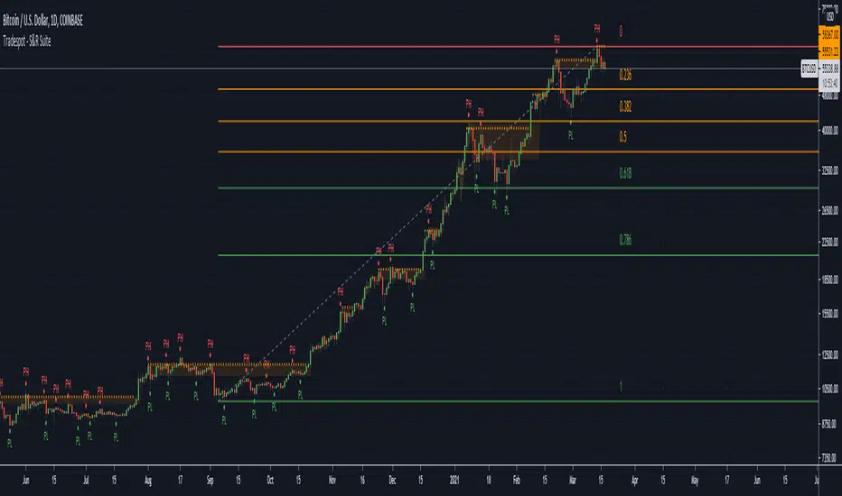
Tradespot - S&R SuiteTradespot - S&R Suite
No configuration needed, works out the box
Dynamically created S&R lines & zones based on ongoing price action
Dynamically created fibonnaci retracement lines to create your trading range
Completely open to building a core trading strategy upon
Want to know more or have questions? Come join the Tradespot community, or send me a message on TradingView.
Volume Buzz 2.0Volume Buzz/Volume Run Rate as seen on TC2000 and MarketSmith respectively.
Basically, the volume buzz tells you what percentage over average(100 time period moving average) the volume traded was. You can use this indicator to more readily identify above-average trading volume and accumulation days on charts. The percentage will show up in the top left corner, make sure to click the settings button and uncheck the second box(left of plot) in order to get rid of the chart line.
Pictured above, a chart with the volume on the bottom along with the 50-day moving average applied to volume. As you can see in the top left it will tell you the "volume buzz" of that day, telling you what days were on above-average volume and how above-average those days were.

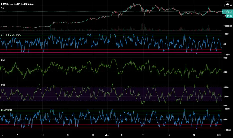
Accumulation and Distribution MomentumThis applies Chande Momentum to Accumulation and Distribution index as a means to changes.
Experimental oscillator.
Compare it to both Money Flows, Acc/Dis and Chande and you notice it has elements of all of them. Could potentially replace other volume based momentum indicators in your strategy.
It is a little more volatile, reaching from side to side, while having a tendency to lean towards the side that gets the most action over a longer period of time.
It also tends to reach and hang in oversold regions BEFORE a pump - something I noticed.
Could be used as an early warning sign as well as for overall trend analysis.
A/D + 21/200EMASimple Accumulation & Distribution indicator with the 21 and 200EMA plotted on it. Might be a useful tool in your arsenal.

Chaikin Oscillator (ADL Oscillator) [UTS]The Chaikin Oscillator is basically an oscillator version of the Accumulation / Distribution Index, also known as ADL Indicator.
General Usage
The indicator runs both above and below zero, made to denote whether an asset is in a bullish (above zero) or bearish (below zero) trend.
It can be used to confirm trends, as well as spot possible trading signals due to divergences.
A benefit of the oscillator version is that it can produce LONG or SHORT signals on zero line cross.
Moving Averages
4 different Moving Averages are available:
EMA (Exponential Moving Average)
SMA (Simple Moving Average)
VWMA (Volume Weighted Moving Average)
WMA (Weighted Moving Average)
ADL - Accumulation Distribution Line [UTS]an underlying asset.
It is determined by the changes in price and volume. The volume acts as a weighting coefficient at the change of price — the higher the coefficient (the volume) is the greater the contribution of the price change (for this period of time) will be in the value of the indicator. The indicator is also known as Accumulation / Distribution Index.
Common known variants of this type of indicator are the On Balance Volume, Chaikin Oscillator or Chaikin Money Flow.
Based on www.metatrader5.com
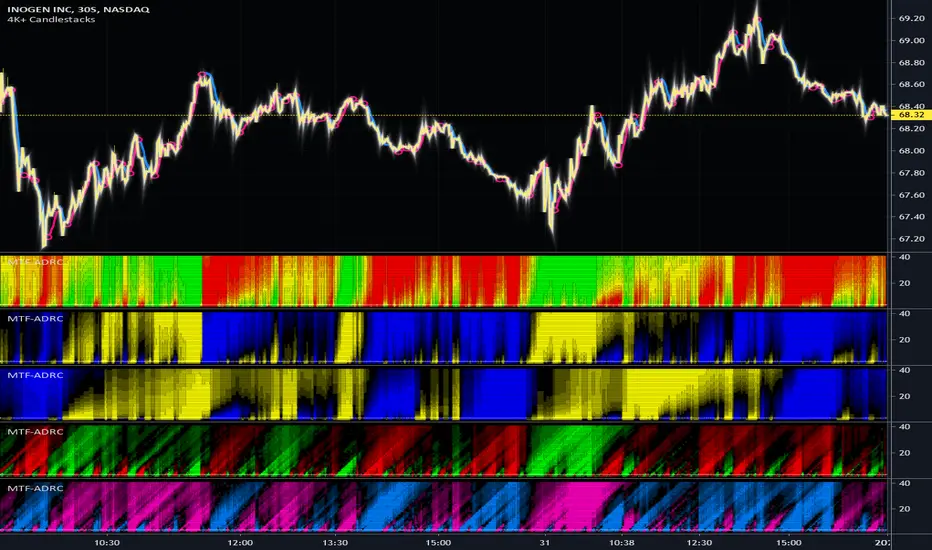
MTF Accumulation/Distribution RasterChart (Spectrogram/HeatMap)As my first published indicator for year 2020, I present my revolutionary "MTF Accumulation/Distribution RasterChart" employing PSv4.0. This is probably a world's first all-in-one multi-timeframe, multi-algorithm heatmap indicator with multiple color schemes. I decided to release this multicator now, because it has been a year long journey for me to develop spectrogram technology with abilities John Ehlers didn't include with his original heatmaps. I would like to personally thank Dr. John Ehlers for inspiring me to ponder into the realm of heatmap technology and all it has to offer. Thank you! You're a divine inspiration to the algorithmic trading community and forever shall be.
Each of the algorithms use "volume" and "price" data in their calculations to provide a unique spectrogram for either algorithm chosen, hence the accumulation/distribution attributed to the title of this indicator. The MTF capabilities include seconds, minutes, and days. If the time frame settings are shorter in time than the current sampling interval, a warning will be appropriately displayed. Also, when volume data is not applicable to an asset, the indicator will become completely red. I included so many color scheming techniques I couldn't demonstrate all of them above. This indicator has what I would term as "predator" vision. For those of you who have seen these movies, you will understand what I have built.
The use of this indicator is just like any of my other RasterCharts or heatmap indicators found on the internet, except it has much more versatility. This indicator has so many uses, I really haven't discovered all of it's characteristics yet. Anyhow, this is one of my most beautiful indicators I have created so far, but I feel there is still more room for enhancements with a possibility of more sibling algorithms to incorporate later. Lastly, I couldn't have done this without the computing power/wizardry provided by ALL Tradingview staff. They deserve a HUGE and proper, THANK YOU!!! Happy New Year 2020 everyone...
Features List Includes:
MTF controls for seconds, minutes, and days
Multiple volume weighted algorithms to choose from
Gain control for algorithm #1
Adjustable horizontal rule to differentiate between more reactive aspects of turning point fluctuations in the lower portion of the chart (visible above)
Adjustable heatmap brightness control
Visual color scheme techniques (a few of many are displayed above)
Color inversion control
"NO VOLUME" detection (indicator becomes red)
This is not a freely available indicator, FYI. To witness my Pine poetry in action, properly negotiated requests for unlimited access, per indicator, may ONLY be obtained by direct contact with me using TV's "Private Chats" or by "Message" hidden in my member name above. The comments section below is solely just for commenting and other remarks, ideas, compliments, etc... regarding only this indicator, not others. When available time provides itself, I will consider your inquiries, thoughts, and concepts presented below in the comments section, should you have any questions or comments regarding this indicator. When my indicators achieve more prevalent use by TV members, I may implement more ideas when they present themselves as worthy additions. As always, "Like" it if you simply just like it with a proper thumbs up, and also return to my scripts list occasionally for additional postings. Have a profitable future everyone!
Screener - Multi Timeframe [WYCKOFF ARSENAL]Screener - Multi Timeframe WYCKOFF ARSENAL
The general idea of The Wyckoff Method is that the trader can see the market as well-structured periods of Accumulation , Markup , Distribution and Markdown .
The price of an asset depends on its supply and demand .
There is more than one stock available for trading, and there is more than just Bitcoin on the Cryptocurrency market.
This means that one may choose to trade more than one asset and this perspective opens up a world of opportunities in which Supply and Demand are the masters.
For example, you have invested some money in a cryptocurrency, and you wait for it to Markup already.
But it is still in a long period of accumulation - it doesn't move much.
You should leave it and find another crypto that is moving.
To aid in the discovery of such opportunities, a Market Screener is available.
Method used: The Wyckoff Method of course.
The indicators used:
• Optimism Pessimism
• Force
• Technometer
• Momentum
The Wyckoff Arsenal Indicators can be used individually, and they are very useful when trading a single pair.
But the Market Screener can scan for opportunities in a wide range of pairs, or same asset but different trading platforms.
The indicators are based on volume, so the symbols must have volume data for the Screener to work.
Multiple indicator instances can be used to track a specific asset, like Bitcoin.
This way, all Bitcoin data available on TradingView could be used instead of data coming from a single trading platform.
Alerts: Overbought/Oversold conditions, Bollinger Bands crossings, Divergence detection.

Hashem Accumulation/Distribution (V2)Hashem Accumulation/Distribution. Accumulative Net Delta.
Accumulation/Distribution Line with the Histogram of it. Basically shows the buyers and sellers on a move and trend.
Can analyze it to verify if the volume in a trend is confirming it or not.
Added markers when it cross the 0 Line in a Distribution. (after Accumulation) and Vice Versa.
Can be used for the Histogram Divergences and the A/D Line Slope logic for identifying a trend that is supported by the Volume.