Effort & Result (normalized)It is recommended to use a column display. This indicator measures the relationship between the body of the candlestick and the volume. Therefore, it measures the relationship between effort (volume) and result (price). It is still necessary to contextualize the price and not use the indicator without considering structure or relevant zones.
As we can see, this is an oscillator that ranges from 100 to -100 and helps visualize Volume Spread Analysis.
It can indicate three different types of relationships between candlesticks and volume:
1. Absorption : This is a significant discrepancy that shows that despite considerable effort in terms of volume, there has not been an adequate price result. High volume and little price movement. It can be detected when the indicator values are negative, and the closer to -100, the more pronounced the absorption. It indicates strong aggressive participation, but equally strong passive participation. It should be interpreted as an opposite signal; if the candlestick closes long with absorption, then it is likely that the bullish movement will not continue.
2. Absence of Resistance : This is a discrepancy that occurs when, despite low volumetric effort, there is a significant price movement. This is due to the absence of passive orders and is exactly the opposite of absorption. It is measured when the indicator value is positive. It means that a wide buy candlestick with low volume has not encountered resistance from passive sellers during its path, and vice versa for a sell candlestick. It should be interpreted as a "green light"; therefore, a buy candlestick that closes with a positive value in the indicator signals a likely price increase shortly thereafter.
3. Congruence : When the indicator value is close to 0, a situation of congruence occurs, where the result (price) is adequate to the effort (volumes). This indicates an efficient market with balanced participation from sellers and buyers, both passive and aggressive.
The pattern shown in the figure illustrates in the first line a sell candlestick with a very small body but a very high volumetric effort. Indeed, the corresponding column in the indicator shows negative values ("Absorption"). The second line shows how, after a few minutes, an "Absence of Resistance" situation occurs, this time for a buy candlestick that, despite low volumes, closed with a very wide body, in fact the indicator shows positive values. This specific pattern should be read as a long signal since sellers have been absorbed by passive buyers, and buyers have not encountered resistance from passive sellers. This indicates greater coordination and participation from both aggressive and passive buyers.
VSA

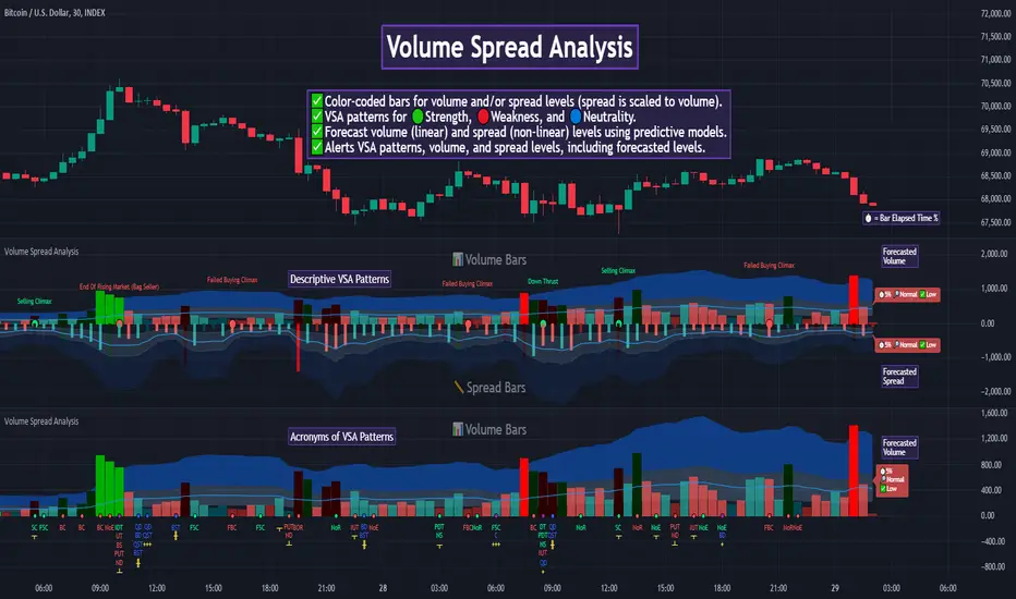
Volume Spread Analysis [TANHEF]Volume Spread Analysis: Understanding Market Intentions through the Interpretation of Volume and Price Movements.
█ Simple Explanation:
The Volume Spread Analysis (VSA) indicator is a comprehensive tool that helps traders identify key market patterns and trends based on volume and spread data. This indicator highlights significant VSA patterns and provides insights into market behavior through color-coded volume/spread bars and identification of bars indicating strength, weakness, and neutrality between buyers and sellers. It also includes powerful volume and spread forecasting capabilities.
█ Laws of Volume Spread Analysis (VSA):
The origin of VSA begins with Richard Wyckoff, a pivotal figure in its development. Wyckoff made significant contributions to trading theory, including the formulation of three basic laws:
The Law of Supply and Demand: This fundamental law states that supply and demand balance each other over time. High demand and low supply lead to rising prices until demand falls to a level where supply can meet it. Conversely, low demand and high supply cause prices to fall until demand increases enough to absorb the excess supply.
The Law of Cause and Effect: This law assumes that a 'cause' will result in an 'effect' proportional to the 'cause'. A strong 'cause' will lead to a strong trend (effect), while a weak 'cause' will lead to a weak trend.
The Law of Effort vs. Result: This law asserts that the result should reflect the effort exerted. In trading terms, a large volume should result in a significant price move (spread). If the spread is small, the volume should also be small. Any deviation from this pattern is considered an anomaly.
█ Volume and Spread Analysis Bars:
Display: Volume and/or spread bars that consist of color coded levels. If both of these are displayed, the number of spread bars can be limited for visual appeal and understanding, with the spread bars scaled to match the volume bars. While automatic calculation of the number of visual bars for auto scaling is possible, it is avoided to prevent the indicator from reloading whenever the number of visual price bars on the chart is adjusted, ensuring uninterrupted analysis. A displayable table (Legend) of bar colors and levels can give context and clarify to each volume/spread bar.
Calculation: Levels are calculated using multipliers applied to moving averages to represent key levels based on historical data: low, normal, high, ultra. This method smooths out short-term fluctuations and focuses on longer-term trends.
Low Level: Indicates reduced volatility and market interest.
Normal Level: Reflects typical market activity and volatility.
High Level: Indicates increased activity and volatility.
Ultra Level: Identifies extreme levels of activity and volatility.
This illustrates the appearance of Volume and Spread bars when scaled and plotted together:
█ Forecasting Capabilities:
Display: Forecasted volume and spread levels using predictive models.
Calculation: Volume and Spread prediction calculations differ as volume is linear and spread is non-linear.
Volume Forecast (Linear Forecasting): Predicts future volume based on current volume rate and bar time till close.
Spread Forecast (Non-Linear Dynamic Forecasting): Predicts future spread using a dynamic multiplier, less near midpoint (consolidation) and more near low or high (trending), reflecting non-linear expansion.
Moving Averages: In forecasting, moving averages utilize forecasted levels instead of actual levels to ensure the correct level is forecasted (low, normal, high, or ultra).
The following compares forecasted volume with actual resulting volume, highlighting the power of early identifying increased volume through forecasted levels:
█ VSA Patterns:
Criteria and descriptions for each VSA pattern are available as tooltips beside them within the indicator’s settings. These tooltips provide explanations of potential developments based on the volume and spread data.
Signs of Strength (🟢): Patterns indicating strong buying pressure and potential market upturns.
Down Thrust
Selling Climax
No Effort → Bearish Result
Bearish Effort → No Result
Inverse Down Thrust
Failed Selling Climax
Bull Outside Reversal
End of Falling Market (Bag Holder)
Pseudo Down Thrust
No Supply
Signs of Weakness (🔴): Patterns indicating strong selling pressure and potential market downturns.
Up Thrust
Buying Climax
No Effort → Bullish Result
Bullish Effort → No Result
Inverse Up Thrust
Failed Buying Climax
Bear Outside Reversal
End of Rising Market (Bag Seller)
Pseudo Up Thrust
No Demand
Neutral Patterns (🔵): Patterns indicating market indecision and potential for continuation or reversal.
Quiet Doji
Balanced Doji
Strong Doji
Quiet Spinning Top
Balanced Spinning Top
Strong Spinning Top
Quiet High Wave
Balanced High Wave
Strong High Wave
Consolidation
Bar Patterns (🟡): Common candlestick patterns that offer insights into market sentiment. These are required in some VSA patterns and can also be displayed independently.
Bull Pin Bar
Bear Pin Bar
Doji
Spinning Top
High Wave
Consolidation
This demonstrates the acronym and descriptive options for displaying bar patterns, with the ability to hover over text to reveal the descriptive text along with what type of pattern:
█ Alerts:
VSA Pattern Alerts: Notifications for identified VSA patterns at bar close.
Volume and Spread Alerts: Alerts for confirmed and forecasted volume/spread levels (Low, High, Ultra).
Forecasted Volume and Spread Alerts: Alerts for forecasted volume/spread levels (High, Ultra) include a minimum percent time elapsed input to reduce false early signals by ensuring sufficient bar time has passed.
█ Inputs and Settings:
Display Volume and/or Spread: Choose between displaying volume bars, spread bars, or both with different lookback periods.
Indicator Bar Color: Select color schemes for bars (Normal, Detail, Levels).
Indicator Moving Average Color: Select schemes for bars (Fill, Lines, None).
Price Bar Colors: Options to color price bars based on VSA patterns and volume levels.
Legend: Display a table of bar colors and levels for context and clarity of volume/spread bars.
Forecast: Configure forecast display and prediction details for volume and spread.
Average Multipliers: Define multipliers for different levels (Low, High, Ultra) to refine the analysis.
Moving Average: Set volume and spread moving average settings.
VSA: Select the VSA patterns to be calculated and displayed (Strength, Weakness, Neutral).
Bar Patterns: Criteria for bar patterns used in VSA (Doji, Bull Pin Bar, Bear Pin Bar, Spinning Top, Consolidation, High Wave).
Colors: Set exact colors used for indicator bars, indicator moving averages, and price bars.
More Display Options: Specify how VSA pattern text is displayed (Acronym, Descriptive), positioning, and sizes.
Alerts: Configure alerts for VSA patterns, volume, and spread levels, including forecasted levels.
█ Usage:
The Volume Spread Analysis indicator is a helpful tool for leveraging volume spread analysis to make informed trading decisions. It offers comprehensive visual and textual cues on the chart, making it easier to identify market conditions, potential reversals, and continuations. Whether analyzing historical data or forecasting future trends, this indicator provides insights into the underlying factors driving market movements.
sVPSA - standardized Volume Price Spread AnalysisDear Analysts and Traders,
I want to introduce my new indicator - sVPSA - standardized Volume Price Spread Analysis. For me, this script is helpfully in Technical Analysis mainly with Wyckoff and VSA methodologies. Maybe You are in circle of people who used my previous script - normalized Volume Price Spread Analysis. I work with him a lot of time, but I come to a conclusion that I can do better...
Theory concept...
What is a big volume? How big was this spread? It was extreme high or just high? How to do an answer for this and a lot other questions related to this subject? My thoughts was directed to statistics. In my first script I used to x/max normalized data. It was good, but susceptible for high deviation events. So, I choose standardization method with smaller sensitivity on violent events - z-Score standardization Description of z-Score formula:
Z = (x-mean)/standard deviation
Probability of event are descriptive by probability density function - The Normal Distribution.
en.wikipedia.org
en.Wikipedia.org
This is base of script methodology, let’s go deeper in indicator.
X axis is time, date. Y axis is standard deviation. Narrow bar represent price spread, wide one is volume. Colors are corresponding to deviation, blue < sigma, green > sigma, red > 2*sigma and fuchsia > 3*sigma. Appearance is full editable.
Data collection starts from left to right. There is two possibilities to use, constans number of bars or visible data range, also indicator permit to overscore linear regression from data. There is a possibility to set an alert.
Short introduction how put an interpretation on visualized data.
For this example I used constans value of data collection, 52 bars. So, from left I see great, fuchsia volume bar with low spread. This record respond Celsius withdrawals pause. This is bar with the biggest volume on presented chart, more than four sigmas. Spread value is near one sigma. I should consider this via one of Wyckoffs laws - effort vs result. I see a three bars in turn, they tenor tells me that bear market is possible near end. Accumulation structure near new year, spring test and bullish momentum bar near march are approval of this idea. Next high spread bars have volume near mean value. Effort is low but result is great. Interesting is last bar, with -2,8 deviation of volume. I see the lowest volume value on chart, so he’s deviation is strong to negative side. This script require a little of practise and can be a potent tool in Technical Analysis.
If You have a concept how to improve my script or You experience bug, please, send me feedback.
I hope that You consider my work as useful.
I wish You great trades and faultless analysis.
CatTheTrader
RS for VPAThis is a supporting Indicator for the Volume Price Analysis Script VPA 5.0.
Purpose
To indicate the performance of the stock compared to an Index or any other selected stock. It also provides an idea about the strength of the Reference Index as well.
Description
The indicator is an unbound oscillator moving around a zero line. If the stock is strong then the values are positive and if it is weak the values are negative. If the stock is performing better (Stronger) than the Index the indicator is positive and colored green. If the stock is weaker than the Index it is negative and is colored Red.
The background indicates the strength of the Reference Index/Stock. Bullishness/up trend of the Index/Stock is indicated by yellow colour. Short term uptrend, Mid term uptrend and Long term trends are indicated by different shades of yellow varying from light to Dark. The bearishness / down trend is indicated by blue back ground.
How it Works
The relative strength is calculated by using the formula
RS = Gain of the stock / (Gain of the Ref. Index -1)
= (Stock Price today / Stock Price (N period ago)) /
(Index Price today / Index price (N period ago)) – 1
The Index strength is calculated as below
Short term trend up = 5 ema > 22 ema
Mid Term trend up = 22 ema > 60 ema
Long term trend up = 60 ema > 130 ema
Trend down = 5 ema < 22 ema
How to use
Use this indicator to assist your Price Action Analysis using VPA 5.0. When the Price action and volume indicates Bullishness, you can check if the relative strength is also supporting (Positive and in green Territory). This adds credibility to the Price action. Also check if the index is also positive (the Back ground is yellow). This makes the Price action even stronger. Ideally both the stock and index should be strong. Many time you would find the that the stock is in green territory but the index is in blue territory. This calls for some caution in evaluating the Price Action.
When the price action is positive but the relative strength is negative then one should be cautious and wait for the relative strength to turn positive before any entry decision.
Option for the Indicator
One can select the following from the setting for the indicator
1. Index or reference stock – Default is CNX 500
2. Relative Strength Calculation period – Default is 22
3. The EMA periods for the Index/Reference stock strength calculation

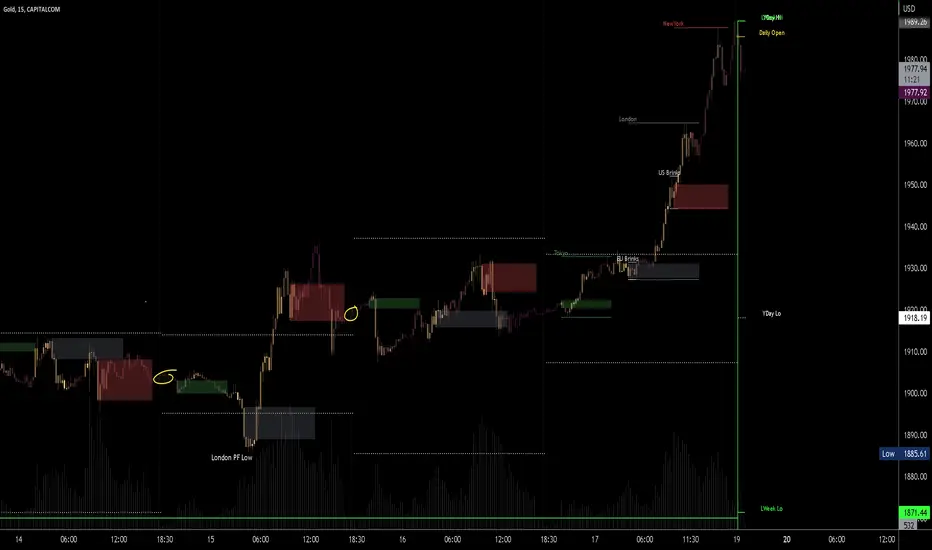
Candle volume analysis The indicator is designed for traders who are more interested in market structures and price action using volumes. Volume analysis can help traders build a clearer understanding of zones of buyer and seller interest, as well as places to capture liquidity (traders' stop levels).
Key Features:
The indicator highlights candle volumes in selected colors, where the volume is greater individually than the volumes of the trader's chosen number of preceding candles. Or the volume that is greater than the sum of volumes of the trader's chosen number of preceding candles.

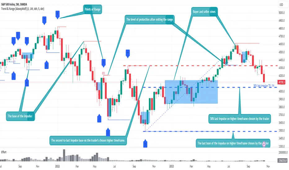
Advanced VSA: Trend and Range LevelsThe indicator is designed for traders who are more interested in market structures and price action using volumes. Analyzing volumes, key market levels, market phases (trend or range/sideways), and multiple timeframes can help the trader build a clearer and more comprehensive view of the market. The data analysis algorithm is developed based on VSA methods, elements of the ICT concept, and the results of my research to assist trader in gaining a better understanding of the market and uncovering information that might go unnoticed.
The key idea is to consider multiple timeframes in trading. Understanding larger market movements from higher timeframes can provide a deeper context when making trading decisions, aiming to assist in more effective entries and exits. This is achieved by identifying the trend and its support levels on multiple timeframes, identifying ranges and their current boundaries, as well as buyer and seller interest zones.
Key Features
Trend Identification: The indicator determines the trend and its current support level. All significant price &movements occur in the form of impulses (either by sellers or buyers). An impulse consists of one or several consecutive candlesticks, at least one of which has a closing price beyond the boundaries of the previous impulse. The indicator displays the base of the impulse and/or the entire impulse. The base of the impulse represents the trend's support level.
Range Identification: The indicator can identify ranges and their current boundaries. Institutional traders take positions within price ranges, and many market reversals occur after flats. A range is a sequential price movement up and down within a specific price range. A range is formed by a minimum of 4 points, 2 above and 2 below, and is defined by its boundaries. The indicator detects ranges based on two (two consecutive impulses in one direction) or three impulses (the first and third in one direction, and the second in the opposite direction). The indicator displays the current boundary points of the range and the level of protection after exiting the range and initiating a trend.
Buyer and seller zones within impulses: After the impulse ends, a correction occurs. It is advisable to look for entry points during this correction in the direction of the impulse from the zone of interest of the owner of the impulse: the buyer's zone for a long impulse and the seller's zone for a short impulse. A zone consists of a series of consecutive candlesticks grouped on the chart in a specific manner.
Multi-Timeframe Trend Identification: The indicator also identifies the trend on two higher timeframes and displays the two latest bases of impulses from those higher timeframes on the chart.
Additional Features
Identification of Test Levels and Effort. A test is the price's return to a zone or to a candle of effort, followed by a continuation in the direction of the initial price movement. It is characterized by the test level. An effort or effort candle is a single candle that is individually larger in volume than the previous 2.
Example Use Cases
You can display the base levels of impulses from a 4-hour time frame and a daily time frame on a 15-minute chart to keep track of important levels from higher timeframes.
By exploring different timeframes, you can identify consolidations (range/sideways movements) and trade within them in the direction of the trend from higher timeframes.
If the market is in a trending phase (the presence of a trend is determined by two consecutive impulses in the same direction), look for trades in the direction of the impulse, following these priorities:
When the impulse base level is protected by the host of the impulse.
During corrections, look for buy trades in the buyer's zone for an uptrend and sell trades in the seller's zone for a downtrend.
During corrections, look for buy trades from a buyer's effort candle for an uptrend and sell trades from a seller's effort candle for a downtrend.
If the market is in a consolidation phase (range), look for trades:
When the current or maximum/minimum historical boundaries of the consolidation (range) are protected, look for trades towards the opposite current boundary.
If the price exits the consolidation/range (closes outside all consolidation boundaries, including both current and historical boundaries), then during corrections, look for trades in the direction of the exit.
Settings
Trend: Display base levels of impulses and/or the entire impulse. Sideways Ranges (Sideways Markets): Display the required number of sideways ranges on the chart, along with protection levels for exiting the sideways range. There are two modes for finding sideways ranges. The first mode requires touching points. The second mode (advanced) does not require precise touching of points if there are increased volumes at the extreme points of the sideways range. Touching these volumes is sufficient for the price.
Zones: Display zones on the chart. Choose the types of displayed zones and their colors. They are divided into three types. The first type is the most promising for finding trades. Type 3 represents more aggressive trades.
Test Levels: Display test levels for zones and efforts on the chart. There are three types of test levels. The first type is the most promising for finding trades. Type 3 is not recommended for finding trades as it represents the most aggressive trades.
Higher Time Frames: Choose 2 timeframes and the types of displayed impulse base lines.
Omega OscillatorThe Omega Oscillator is a toolkit designed to help both experienced and new traders with their trading decisions.
This indicator is a part of the omega toolkit, and his creation method is based on the concept that every trading strategy should have a way to determine the trend, or the bias, that answers the question “long or short?”; the location, which identifies the best price level to enter into a position and to exit, both in profit and in loss, and that will decide the final risk-to-reward ratio of the trade you take; the signal, which is useful to determine the best moment to enter into a position and that if paired with the trend point, his purpose is to identify when the large trend picture is in confluence with the small term; and last but not least the filter point, the filter is used to have another way to have an additional confluence with the trade you want to take, and it’s important to reduce the number of false signals and to increase the win rate.
This tool aims to help traders with the identification of the filter, to allow traders to judge their trades with other tools that can reduce false signals. It’s important to note that indicator and technical analysis is only one of the several different ways to analyze an asset.
One of the main things to keep in mind when working with the financial markets is that not every asset, every historical phase, and every market condition is the same, this is why this tool can be highly personalized and adjustable and provide different overlay tools in order to allow traders to choose the best settings considering these variables and your backtests.
The Oscillator can potentially work on any timeframe and any market thanks to these characteristics, and contains several different unique features:
- Optimization for the perception length parameter, used to analyze data.
- Optimization for the analysis length parameter, used to display data.
- Faculty to personalize the aesthetics of the indicators with the colors and the line width of the main line.
- 5 different tools to let the user choose the optimal way to filter out false signals and analyze the markets.
This script contains several different oscillators, each one precisely designed to remove false signals of different methods of trade.
The first one, called “Omega” is a combination of the best functionality of the other indicator. It contains the “Pendulum” advanced stochastic lines and overbought and oversold lines to analyze reversals, a long-term smoothed histogram to analyze the trend direction based on the “Pullback” formula, and the excess in the volume of the “Interest” oscillator.
The second one is called “Efficiency” and it aims to be the optimal tool to combine with the popular volume spread analysis. His purpose is to analyze the efficiency that the volume has to move the price and this means that when the oscillator is positive, either for the short term with the separated colored lines or the histograms that show the difference between the two lines in the middle-long term trend, this means that the volume has more strength compared to the opposite site volume. The usage of this indicator is to filter out bad signals in the area you are evaluating to take a trade. Be aware that using this oscillator at the beginning of open sessions can lead to false results.
The third one is called “Interest” and it does not include the price in his calculation, but only the volume. It has both the main line and the histogram that like other indicators display respectively the short and the medium-long-term trend. His usage, with the deviation bands automatically displayed, is to detect if there is more strength in the positive candle volume or in the negative candles, to use the volume strength analysis, it’s great to predict reversal and to analyze divergences.
The fourth one is called “Pendulum” and it displays an advanced formula of the popular stochastic oscillator that includes volume, with the oversold and overbought formula that if crossed origin the colored area that you see at the opposite levels, his usage is to determine potential reversal and trend direction, occasionally you can also use the cross of the two lines as a signal to enter a trade.
Additionally, this tool has a histogram that displays the true momentum of the asset you are trading.
The fifth and last one is the Pullback oscillator, and it contains several unique features. This tool will show you the price, displayed as standard candles, of the price. This oscillator can be used both for trend following and for mean reversal trading analysis. The middle area and the smoothed line that you can see aim to be potential support and resistance zones for the price. Note that the price on the moving average of the oscillator is based on volume pressure, and the color of the middle zone area is on the direction of the large trend.
This oscillator also has reversal zones that can help traders identify potential trend exhaustion and reversal price levels, that dynamically change based on the trend situation and adapt their width to the price volatility.
Risk Disclaimer:
All content and scripts provided are purely for informational & educational purposes only and do not constitute financial advice or a solicitation to buy or sell any securities of any type. Past performance does not guarantee future results. Trading can lead to a loss of the invested capital in the financial markets. I will not accept liability for any loss or damage, including without limitation any loss of profit, which may arise directly or indirectly from the use of or reliance on such information. All investments involve risk, and the past performance of a security, industry, sector, market, financial product, trading strategy, backtest, or individual's trading does not guarantee future results or returns. Investors are fully responsible for any investment decisions they make. Such decisions should be based solely on an evaluation of their financial circumstances, investment objectives, risk tolerance, and liquidity needs.
nVPSA - Normalized Volume-Price Spread AnalysisNormalized volume-price spread analysis indicator can be helpfully tool in Tom's William metodology - VSA.
The indicator use normalized data by y/x(max) operation, where x(max) is the biggest value in range. Indicator separate spread to four levels - standard divation is separator.
The indicator graphically shows:
- normalized volume, visualized by wide column,
- normalized price spread, visualized by narrow column,
- linear regression calculated from normalized volume, visualised by crosses,
- linear regression from normalized price spread, visualized by circles.
Columns are marked by five colors according to standard deviation:
- blue xsecond deviation, xfourth deviation,
- gold when volume or price spread achive new maximum in analysis range.
Linear regression uses three colors:
- green when volume/spread is up bar by bar,
- red when volume/spread is down bar by bar,
- black when volume/spread is down two times bar by bar.
Additionally, it is posible to use alarm on Golden Bar. Colors and range values are editable from indicator settings.

Volumen Salvatierra
The "Salvatierra Volume" Indicator is an indicator based and created in homage to Tom Williams (author of "Master The Markets") . It helps to interpret the volume and movements of the market, in a simple way. Its benefits are:
Helps identify climatic volumes
Helps identify if there are or not strong hands in the market
Shows if a trend is being driven by volume and if the volume is strong
Red Volume:
Weak hands only
Green Volume:
Strong Hands Testing or guiding the price
Black Volume:
volume is normal
White Candles:
Sail with very little volume
Black Candles:
candle with a lot of volume
El Indicador de "Volumen Salvatierra" es un indicador basado y creado en homenaje a Tom Williams (autor de "Master The Markets") . Ayuda a interpretar el volumen y los movimientos del mercado, de una manera sencilla. Sus beneficios son:
Ayuda a identificar los volúmenes climáticos
Ayuda a identificar los momentos en los que no hay manos fuertes en el mercado
Muestra si una tendencia esta siendo guiada por el volumen y si el volumen es fuerte
Volumen Rojo:
Solo manos débiles
Volumen Verde:
Manos Fuertes Testeando o guiando el precio
Volumen Negro:
El volumen es normal
Velas blancas:
Vela con muy poco volumen
Velas Negras:
Vela con mucho volumen

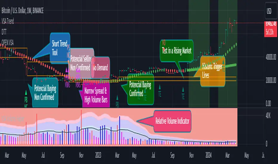
Open VsaVsa Trend is a tool that utilizes the principles of Volume Spread Analysis (VSA) to identify potential trading opportunities. This tool highlights several principles such as PB, PBNC, PS, PSNC, TE, ND, Short Trend Tool, Trigger Lines, and Multiple Alignment of Trends.
These principles assist in identifying potential buy and sell opportunities based on the relative volume of bullish and bearish bars in different trend scenarios. The Short Trend Tool is used to compare the trend and closing price to determine the color of the trend. Trigger Lines are key support and resistance levels based on PB, PBNC, PS, and PSNC bars.
The Multiple Alignment of Trends feature allows users to select between different modes such as NO, Scalping, Day Trading, and Position Trading to help identify multiple trends across various timeframes.
The Confirmation Beginning Alert feature provides users with confirmation alerts based on various filters such as ND/TE, ND/TE & Short Trend, and ND/TE & Short Trend & Trend Alignment. Using this tool in combination with an AVWAP tool can enhance its effectiveness in identifying potential trading opportunities.
-Vsa Trend is a tool that applies the principles of Volume Spread Analysis (VSA) to identify potential trading opportunities.
-The Short Trend Tool is used to compare the trend and closing price to determine the color of the trend.
-The Multiple Alignment of Trends feature enables users to choose between different modes such as NO, Scalping, Day Trading, and Position Trading to detect multiple trends across various timeframes.
-The Confirmation Beginning Alert feature provides users with confirmation alerts based on various filters such as ND/TE, ND/TE & Short Trend, and ND/TE & Short Trend & Trend Alignment.
1-PB (Potential buy confirmed. In bearish trend, a bearish bar of high relative volume with the following bullish bar)
2-PBNC (Potential buy not confirmed. In bearish trend, a bearish bar of high relative volume with the following bearish bar)
3-PS (Potential sell confirmed. In an uptrend, a bullish bar of high relative volume with the next bearish bar)
4-PSNC (Potential unconfirmed sell. In an uptrend, a bullish bar of high volume relative to the next bullish bar)
5-TE (Test confirmed. In an uptrend, a bearish bar with lower volume than the previous 2 bars, with the next bullish on average volume)
6-ND (No Confirmed Demand. In a downtrend, a bullish bar with lower volume than the previous 2 bars, with the next bearish on average volume)
7-Short Trend Tool (It is an SMA that compares its trend and the closing price to define its color
8-Trigger Lines (They are the maximum and minimum values of a PB, PBNC, PS, or PSNC bar) The idea is to look for a TEST confirmation on or NO DEMAND under that area. The above areas are also important support and resistance levels, which is why they are charted.
9-The PS/PSNC/PB/PBNC principles are always graphed as it helps us to keep in mind a possible setup in VSA. You can choose if you want to receive alerts when a principle is presented.
10. Multiple Alignment of Trends (Allows you to select between 3 modes. NO/Scalping/Day Trading and Position Trading) According to this, the "Short Trend Tool" is taken in several timeframes and when it has alignment in its trend color, it will change from color the corresponding background.
11. Confirmation Beginning Alert: Allows you to decide if you want to receive TEST or NO DEMAND Confirmation alerts under 3 filters
-ND/TE: Only the beginning is required with no short-term trend
-ND/TE & Short Trend: In addition to the principle, it takes into account the Color of the current short-term trend.
-ND/TE & Short Trend & Trend Alignment: In addition to the above, the color of the multiple alignment is taken into account to trigger an alert.
-It work better if you use in combination with a Daily VWAP tool
ADX Volume Trend
Thie indicator is a modified and upgraded version of the popular ADX tool.
ADX is used to determine the strength of a trend, and also to determine the direction in which the trend is likely to go.
With this script, I have added in the formula the usage of volume, leading to the following functionality.
The length is used to determine the period to calculate the trend strength and direction, and the average is used to then determine the oscillator and to confront the previous line.
The volume average determines how many volumes bars the indicator should use to determine if a volume bar is above or below average if volume mode is selected.
With the volume mode on, you'll get the DI+ and DI- lines, which are by default displayed as a histogram that calculates the difference between the two lines, called "Directional difference", are calculated using also the volume in the formula, multiplying the normal output by the volume multiplier. I suggest using this mode in high-volume markets.
The trend strength difference is the area calculated using the difference between the ADX line and his moving average and can be used to analyze divergences in the swing points.
It has a lot of improvements and new functionalities, like:
- Histogram to show the output at best
- Averages to compare the data
- The option to include the volume inside of the formula
- Other options and esthetic changes
This indicator is created to improve the usability of the popular ADX indicator, including the very important variable of the volumes, in fact, it's the best to use for the Volume Spread Analysis.

Volume Spread Analysis IchimokuThis version of the popular Ichimoku indicator is modified to let the user choose between his classic mode and the volume-weighted mode.
Every line of the indicator is customizable with this function.
The Kijun and Tenkan lines are choosable from:
1. The normal version, so the average of the high and the low of the selected period
2. The volume mode, so the average price of the selected input ponderated to the volume
The Senkau Span A is the average from the Kijun (fast line) and the Tenkan (slow line) lines and it's choosable from:
1. The normal price version
2. The volume mode
3. The average between points 1 and 2
4. The automatic average between the two fast lines that you've chosen
The Senkau Span B is the slowest line of the indicator, used to determine the long-term trend, and can be chosen from:
1. The normal average price between the high and the low of the selected period
2. The volume average price, using the Volume Weighted Moving Average
The Trama Backline is the popular "LUX Algo" T.R.A.M.A. indicator, which I'm thankful for, and can be fantastically used to display the current trend strength and condition. This line is readable in the following way:
- If the line is moving sideways, the trend may be in a consolidation phase
- If the line is moving upwards or downwards, the trend may be in a trend phase

Volume Spread AnalyzerThis indicator is unseen on Tradingview and wants to be the number 1 indicator for the volume spread analysis. Its formula, as simple as useful, compares the effort (volume) of the candle with the results, or the price movement.
This way it's possible to apply the famous Volume Spread Analysis with a simple and complete indicator that's 100% objective.
This indicator can be used on almost any market, but it gives the best results on markets which has constant and high volume, like forex markets, for example.
There are 4 different modes that you can choose from, and all of the use different approaches and techniques to measure the same concept: the efficiency of the price compared to the effort of buyers and sellers:
1. The first one analyzes the formula for ONLY buy candles and ONLY for sell candles, and then plots the column oscillator to show the difference.
2. The second function shows the same formula but applied to any candle, and then confronts the two lines generated by the effort of the positive candle and the negative one as an area. You also have a single-step line on the chart that shows the real-time single-candle effort to result from efficiency.
3. Comparison between the single candle effort and the average efficiency, useful to filter out bad entry candles that could lead to a stop loss.
4. Absorbion analyzer: with this option, you can choose between the single candle and multi-candle mode.
4.1: Single candle mode display, as a pink circle on the oscillator, the candles that are more likely an absorption.
4.2: Multi-candle mode display the summation of the single candle value, to analyze the entire movement and identify the part of the trend that can be absorbed when compared to the other.
For almost any function o the indicator, the fast line input changes the fast line that you see on the chart (i suggest not increasing it above 3 for optimal results), and the slow line changes the moving average or the area that shows the difference between the other lines, you can set the slow line to 1 to have as a result the simple difference of the other lines, or you can set it to a higher value like 50 to show the middle or long term bias.

VSA ResistanceThis indicator shows a "resistance" encountered by the price in relation with volumes. If a bar is big, the price encountered much resistance to plot the bar, if it's small the price encountered low resistance.
This informations help taking better decisions based on VSA ( Volume Spread Analysis), making the spread between bar volume and bar extension clearer to read.
If you see some very large bars and all the others quite small try to use the "threshold" param, especially on lower timeframes. On indexes (nasdaq, dax , dow jones) I found that setting threshold to 5 is good for M1 too, but feel free to try other values to find the right one for you.
Feedbacks are more than welcomed!

Volume Density w/barcolorOpacity limit set to 70 min & barcolor overlay
The transparency of each candle is based on volume density.
Volume density is calculated as follows.
Volume density = Volume / Price range
Price range uses true range "max(high - low, abs(high - close), abs(low - close))".
Since volume density varies drastically by stock or time, the transparency is calculated based on the deviation rate from the average volume density.
VSA | Volume Spread Analysis [Kintsugi Trading]What is the VSA | Volume Spread Analysis Indicator?
I created this premium volume indicator to find and place high probability forex trades as a part of the Kintsugi Trading 3LS | 3 Line Strike Strategy .
Originally developed by Tom Williams who is considered the father of Volume Spread Analysis, this tool is an amazing indicator and would make a great addition to any trading strategy.
You are free to customize all the inputs:
• 30 | Moving Average-1 Multiplier (Average Volume)
• 0.5 | Moving Average-1 Multiplier (Below Average Volume)
• 1.5 | Moving Average-2 Multiplier (High Volume)
• 3.0 | Moving Average-3 Multiplier (Ultra High Volume)
**Note The default inputs are based on my research and analysis.
Components of The Volume Spread Analysis:
1. The Volume (i.e. activity)
2. The Spread (i.e. range of the price bar)
3. The Close (the closing price of the current bar)
Volume: Volume is the activity of the frequency of transaction of the price change during a specified period of time.
Spread: Spread is the difference between opening and closing price.
Close: Close price tells us where the balance point is at the end of the period.
At Kintsugi Trading we strongly believe that we cannot beat or outperform institutional traders, instead, we have to trade along with them. With that in mind, we follow the footprints of smart players who leave behind trails.
I have designed this indicator so that it is capable of giving signals for all the phenomena explained in Tom William's book.
This Indicator is successful at visualizing the following phenomenon:
• Trapped Buyers
• Trapped Sellers
• Stopping Volume (long)
• Buying Climax
• Selling Climax
Good luck with your trading!

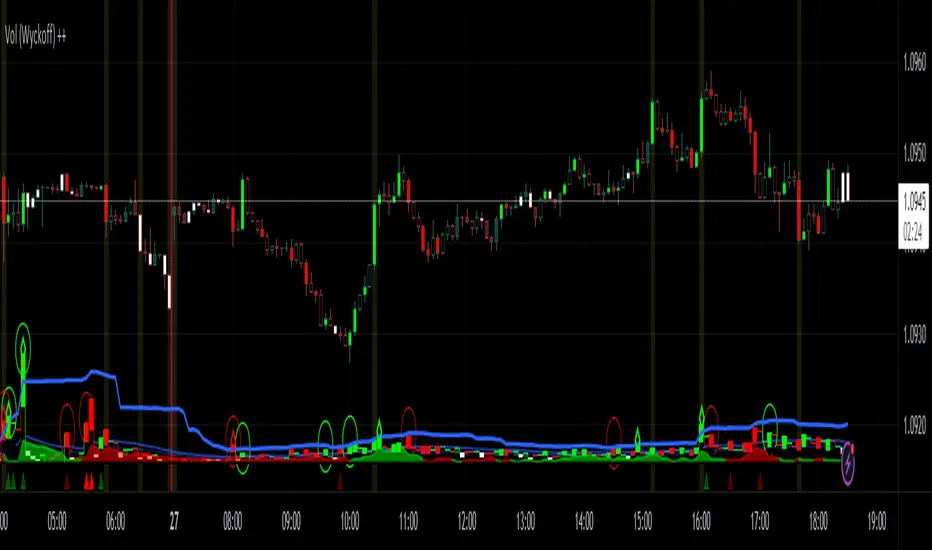
Vol (Wyckoff)I like TradingView Built-in Volume indicator, because it is overlay with price chart, and has appropriate scale.
I made similar style volume indicator and added concept of Laws of Wyckoff.
caution : You need {Chart settings} → {Appearance} → {Bottom margin} is set 0 %, to make chart look good.
: You need {Chart settings} → {Symbol} → {body} ,{Borders} and {Wick} are set dark color, to easier to identify the color of candles.
This 3 Laws of Wyckoff are my interpretation, not the original.
///////// The Law of Supply and Demand //////////
I define the Demand as volume that is larger than the previous volume and has close > open bar.
I define the Supply as volume that is larger than the previous volume and has close <= open bar.
Volume Flow is value difference between Demand MA and Supply MA.
I imitate the idea of "Volume Flow v3" by oh92.
///////// The Law of Cause and Effect //////////
Enough volume(Cause) makes reliable price movement(Effect).
If there is not enough volume, its price movement is suspicious.
I define enough volume as volume that is larger than previous volume.
I define large volume as volume that is larger than previous volume and over volume MA(using all volume).
I define "not enough volume" as volume that is smaller than previous volume.
I borrowed the idea from "The Lie Detector" by LucF.
Enough volume(increasing volume) is painted by dark color and Large volume(increasing volume and over volume MA) is painted by light color.
"Not enough volume"(decreasing volume) is painted by empty color(default is black).
This coloring are reflected to price candles.
So, you need {Chart settings} → {Symbol} → {body} ,{Borders} and {Wick} are set dark color, to easier to identify the color of candles.
///////// The Law of Effort and Result //////////
If volume (effort) cannot move price (result), it may be Absorption(potential reversal).
"Factor of Volume Density" determines the threshold of Absorption.
Small Absorption is displayed by gray square at bottom.
Large Absorption is displayed by white square at bottom.
///////// Volume Spike //////////
Volume Spike sometimes precede or confirm trend direction.
"Factor of Volume Spike" determines the threshold of Volume Spike.
Volume Spike is displayed by light bulb.
Volume spread analysis V1 (RT)Volume Spread Analysis is a method used by professional traders to identify the Smart money's activities (Institutional Traders) in the markets based on Price and Volume data. and it is considered to be one of the best technical analysis compared to all forms of trading since it is not prone to smart money manipulation but the method itself is to identify the smart money's activity in any markets.
Volume plays an important role in trading since it is used to identify the Smart trader's activity in the markets and it can play a crucial role when it comes to identifying accurate Chart patterns and levels with entries and exits.
Important Features included in this indicator:-
1. Volume Spread Analysis signals to identify SOS (Signal of strength) and SOW (Signal of weakness).
2. Potential Volume zones to identify important levels of Smart money.
3. Gap up and Gap Down Levels to identify the irregular gaps and corrections in the markets.
4. Added Historic signals and other parameter options in the settings.
5. Effort VS Result Option included.
6. Volume Waves, Also known as Cumulative Volume to identify Effort vs result and Buyers/Seller's Activity in the markets.
7. Multiple Options to change the colors of various indicators included.
8. The indicator also consists VWAP option which can be used as POC on Day Trading.
Please note that this indicator will be developed with time as we will constantly be adding more VSA signals in the upcoming days and we are constantly working on the quality of the indicator.
YouTube:- www.youtube.com
Feel Free to reach us via our WhatsApp number +91 9964982366 and provide us with your valuable feedback and ideas for the development of our indicators.
[VC] Cumulative Delta PLUS It is a Merged Version of our following two indicators.
V.C Box Chart Histogram
&
V.C Cumulative Delta Histogram.
We merged them at the user's request & convenience. This merged version also helps to save space for other indicators.
Description & Usage
Description & Usage will remain the same as described in individual descriptions of the above-mentioned parent indicators. Only one additional input is added to adjust the scale, named "Scale_Setting''.
Because now it's a merged version of 2 different indicators & both indicators have their different scale levels. To bring both indicators on an equal scale so that they can be visualised better, we have added scale adjustment settings that are easy to understand. Let's elaborate it.
Scale adjustment settings belong to the Cumulative length of the ' 'Cumulative Delta Indicator'' . Keep in mind that the best scale setting is keeping the scale setting values near or equal to cumulative length.
For example:
If you set cumulative length 20, the scale setting value should also be 20 or near 20 (like 17, 18, 19 etc.). (It depends on you, how large cumulative columns you want to see relative to Box chart Histogram)
Note: Any scale setting value can be used, it only affects visuals, not the actual calculations.
Disclaimer Note:
V.C Cumulative Delta Histogram It is purely Volume, Delta, Demand & Supply imbalance and comparative analysis-based tool. Before applying this Indicator to your study, you should clear your concepts about Volume, Delta & Spread, Demand & Supply, and Aggressive & Passive behaviour of buyers/sellers.
Some basic understanding of Sir Richerd Wyckoff's Theory can also be helpful.

[VC] Cumulative Delta Histogram V1.0The V.C Cumulative Delta Histogram shows the market's ongoing Buying/Selling pressure. It helps to determine whether Supply or Demand is dominating and in control.
➤If the Cumulative Delta Increases, the buyers are in control.➚
➤If the Cumulative Delta Decreases, the sellers are in control.➘
The use cases for this Indicator are vast and correlated with our other Delta Indicators. The following examples will explain how to use this Indicator.
Example 1 EUR / USD
In the above example, Negative Cumulative Delta Decreased & Turned into Positive Cumulative Delta. That indicates that sellers are losing control & buyers are getting power.
As a confirmation on the ' 'Box Chart Histogram'' it is evident that Demand is also increasing.
And on ''Wave Chart Index'' as a 3rd confirmation, you can see that the Delta has also increased compared to previous waves.
Example 2
Positive Delta on Cumulative Delta Histogram is decreasing & Negative Delta started increasing.
On the Box Chart Histogram , Demand is decreasing & Supply is increasing.
Additionally, on the Wave Chart Index , the Delta of the wave is also decreasing.
(in short, besides ''Cumulative Delta Histogram," Box chart Histogram & Wave Chart Index is also adding additional confirmation)
Note: Two types of Delta sources are included in this Cumulative Delta Indicator.
Type A: Simple Delta
Type B: Delta %
Simple Delta is the difference between Net Buying - Selling pressure.
Delta % also works in the same calculation, but a Volume weighted algorithm is applied on it.
You may use any of them that suits your analysis.
VC Cumulative Delta Histogram Settings & Inputs
Source:
Allows you to choose the source, Between Simple Delta & Delta %.
Cumulative Length:
Allows you to Change the cumulative length.
Positive & Negative Color:
It allows you to change the colors.
Style Menue
Allows you to change the style & color of the histogram.
Disclaimer Note:
V.C Cumulative Delta Histogram It is purely Volume , Delta, Demand & Supply imbalance and comparative analysis-based tool. Before applying this Indicator to your study, you should know about Volume , Delta & Spread, Demand & Supply, and Aggressive & Passive behaviour of buyers/sellers.
Some basic understanding of Sir Richerd Wyckoff's Theory can also be helpful.

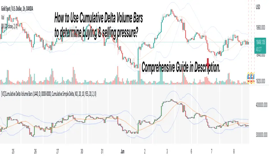
[VC] Cumulative Delta Volume BarsLet's first learn what is Delta & How to Use Cumulative Delta Volume Bars?
Cumulative Delta Volume Bars is one of the leading indicators that you can use when trading order flow. It gives you an instant snapshot of the buying and selling pressure in a market.
After reading the detailed description of "Cumulative Delta Volume Bars," you will understand how volume delta provides a critical edge by allowing you to spot significant potential reversals in the market. You will also learn to use this Cumulative Delta indicator in depth. (including rest session usability features)
What is Delta Volume?
Delta Volume is the difference between Buying and Selling Power. Delta Volume is calculated by taking the difference between the volume traded at the offer price and the volume traded at the bid price. (in simple words, the difference between buying pressure & selling pressure)
If delta volume is more than zero, you have more buying pressure than selling & vice versa, and if delta volume is less than zero, you have more selling pressure than buying.
In Order-Flow Analysis , traders used Cumulative Delta to measure the relationship between the Buying & Selling pressure Vs Price.
Cumulative delta volume takes the delta values for every bar and successively adds them together to provide a graph, as seen below visually.
Let me demonstrate by giving examples of how cumulative Delta can help measure the buying or selling pressure relative to the price move.
★ Trading Absorption & Exhaustion concepts with Delta
See the chart below & try to analyze the next possible move on the basses on the analysis mentioned on the chart.
➽➽ If you said Short, you were correct. ✅
Till Point A , both price & cumulative were aligned. (means there were no imbalances between Delta & Price).
But on Point B , the Cumulative Delta broke the previous resistance clearly and moved even further away from the resistance level, but the Price couldn't break the last resistance. It interprets that buyers applied a lot of buying pressure but no result. (Aggressive buying pressure absorbed by Passive sellers)
Due to this vast effort or failed attempt, buyers were exhausted and had no more strength to pull the Price up. That's why the Price reversed from Point B . See below image
★ Cumulative Delta Volume Bars is helpful when determining buying or selling pressure at different key price levels, such as swing highs or lows.
Let's recap on swing highs and swing lows.
➽ A swing high (S.H) is formed when the high reaches higher than the price action around it. Once the Price moves above a prior swing high and begins to retrace, a new swing high is formed.
➽ A swing low (S.L) is formed when the low reaches lower than price action around it. Once the Price moves below a prior swing low and begins to retrace, a new swing low is formed.
➽ When the Price makes higher highs and higher lows, a market is considered an uptrend.
➽ When the Price is making lower lows followed by lower highs, a market is considered a downtrend.
When evaluating Delta, it's beneficial to compare delta values at swing lows or swing highs to determine the amount of selling or buying pressure and how the market reacts.
The actual Power of Delta is revealed when we use it to determine the market's reaction to powerful buying or selling. We want to see if the market has reacted as we would expect or not.
In the above Example, you will notice that every time price breaks a swing, Delta does as well.
It makes sense as it takes selling pressure to break a swing low or buying pressure to break a swing high. In simple words, we can say that there is no anomaly between delta direction & price direction.
In simple words (No Absorption or Exhaustion)
But what's occurring when this isn't the case, and we have divergence between Price and Delta? Let's analyze it with real examples.
★ Understanding Delta Divergence.
(Lack of Harmony in Buying/Selling Pressure & Price Move)
Notice how the Price breaks out of the previous resistance level on the above chart, but the Delta didn't yet reach even close to its last resistance level. It's a clear divergence between Price and Delta. Buyers may be slightly exhausted at the previous resistance level, and Price & Delta may retrace slightly. But in a broader view, it reflects a strong bullish signal.
See the above chart & see when and why the Price moved. I hope it will help you understand the underlying relation & story between Price & Delta.
Cumulative Delta & Trade Management
Delta will help you spot significant reversals, but it can also be used to help manage your open trade. You want to see a high correlation between Delta and Price when in a long or short position.
Suppose you're short while the Price is breaking a new low. You want to see Delta breaking low if sellers aren't interested in selling at the recent lows, represented by Delta not breaking lows. The probability of a short term reversal or a significant retrace increases.
When in a position, always be on the lookout for exhaustion and absorption, signalling a reversal potential.
What Includes in V.C Cumulative Delta Volume Bars Indicator
Inputs & Settings
Reset accumulation on new session:
Allows you to rest accumulation at the start of each session (you may choose your customized starting & ending time as well by enabling ''Customize Rest Session Time''
Start/End of Session & During Session:
Allows you to show/hide & choose the background color & separator of each session
''Customize Rest Session Time''
When this setting is enabled, your customized given time will be applied, which can be set from the below box. Note: set your time in minutes. For Example, if you want to reset the session after every hour, you need to put 60. If you're going to reset after every 8 hours, you need to put 480. Additionally, your chart time frame must be lower than your customized rest time.
Reset Each Minutes:
Allows you to put your desired rest time in minutes. For Example, for 1 hour 60, for 8 hours 480. (8x60)
Reset Each:
Allows you to choose rest time from the drop-down menu. Note: To apply this setting, don't enable the ''CUSTOMIZE RESET SESSION TIME''.
Select Session:
Allows you to set customized starting & ending times of the session instead of the exchange's default time. For Example, the exchange reset time is 20:00, but if you want 22:00, first, you need to set your chart time as an exchange from the right bottom of the chart, and then you need to put 22:00 22:00 in both fields. Note: Put the same starting & ending time. In simple words, it should not be greater than or less than 24 hours.
Type:
It allows you to select Delta type. (there are two delta types you can choose from, 1st Simple Delta, 2nd Delta % or Volume Weighted Delta)
Candle Colors:
Allows you to change the color of candles.
Envelope Indicator:
Allows you to apply to Envelop Indicator on the delta candle. (all default settings of the Envelop Indicator can be customized as well)
See the below chart with Envelop applied to Delta Candles & Price Candles. (can be used to measure the Delta & Price movement at the micro-level)
Bollinger Bands Indicator:
Allows you to apply to Bollinger Bands Indicator on the delta candle. (all default settings of the Bollinger Bands Indicator can be customized as well)
See the below chart with Bollinger Bands applied to Delta Candles & Price Candles. (can be used to measure the Delta & Price movement at the micro-level)
Start/End of Session on Chart
Allows you to change the first & last candle of the session.
Style Settings:
Allows you to control all the visual settings of delta candles, Envelop & Bollinger bands.
-------------------------------------------------
➽Conclusion:
Cumulative Volume Delta Bars is one of the leading indicators you can include as an order flow trader in your arsenal. It gives you an inside look at buying and selling pressure and how the market reacts.
But Keep in mind, in trading & technical analysis, nothing is 100% certain. No indicator can give you a 100% success rate. There is no holy grail in the financial market. As a trader, with the help of technical & fundamental indicators, our goal is to find an edge over the market. A simple definition of an edge is: Anything that adds a few points to the winning side of an equation builds an edge that lasts a lifetime. A trading edge defines your technical or strategic advantage in the highly competitive market environment. Traders can establish multiple edges by starting with popular strategies and customizing rules to lower the risk of getting trapped with the emotional crowd.
Disclaimer Note:
V.C Cumulative Delta Volume Bars It is purely Volume, Delta, Demand & Supply imbalance and comparative analysis based tool. Before applying this Indicator to your study, you should know about Volume, Delta & Spread, Demand & Supply, and Aggressive & Passive behaviour of buyers/sellers.
Some basic understanding of Sir Richerd Wyckoff's Theory can also be helpful.
[VC] Effort & Result Index V1.0V.C. Effort & Result Index draws the Price change, Volume, Delta & Delta % as a histogram. On the positive side of the histogram, it marks the price change & on the negative side of the histogram, it marks volume, delta & delta %. And the best part of the indicator is that it allows you to see all the mentioned data types simultaneously.
See the below chart for a comprehensive understanding.
Before moving further, understand the below analogy first.
Volume & Delta = Fule or Effort
Price Movement = Result
Think of Volume & Delta as FULE or EFFORT and Price Movement as Result.
If the price travels a significant distance with less fule & effort, it indicates that no barriers or inverse forces are stopping the price movement.
On the other hand, if the price is travelling a less distance & consuming comparatively more fule & effort, it indicates some barriers or inverse forces stopping the price movement.
V.C. Effort & Result Index empowers you to read, compare & analyse Volume, Delta & Price effortlessly. It helps to measure the relative price change in different combinations. Such as, you can compare the price change with total volume, delta volume & delta percentage.
See the below relative comparison analysis by using Price Change, Volume Change & Delta Change.
In the above example, you can see that on candle A, there is a very significant price move with a small volume & delta. But on the next candle B, there is a minor price move compared to the previous candle A, but the volume is relatively high & delta is almost the same. In simple words, the same effort was applied to candle B but got fewer results than candle A. It indicates that buyers applied the same effort but failed to get the same results. It reveals that sellers are taking control, leading to a trend reversal.
This comparative analysis method & approach can add an extra edge to your analysis spacially on key levels & breakouts.
V.C Effort & Result Index Settings & Inputs
Price Change:
Allow you to show/hide the price change bars on the positive side of the histogram.
Volume:
Allow you to show/hide the total volume on the negative side of the histogram.
Delta%:
Allow you to show/hide the delta % on the negative side of the histogram.
Delta:
Allow you to show/hide the delta on the negative side of the histogram.
Style Settings
The Style section allows you to change the colors & the view format of all data types.
Disclaimer Note:
V.C Effort & Result Index is not a BUY/SELL signal based indicator or a holy grail trading system.
It is purely Volume, Delta, Demand & Supply imbalance and comparative analysis based tool kit. Before applying this indicator to your analysis, you should know about Volume, Delta & Spread, and Demand & Supply.
Some basic understanding of Sir Richerd Wyckoff's Theory can also be helpful.

[VC] Box Chart Histogram V1.0V.C Box Chart Histogram draws the cumulative delta that correlates to another indicator named ''V.C Box Chart Index'' .
(In other words, ''V.C Box Chart Histogram'' & ''V.C Box Chart Index'' are correlated.)
V.C Box Chart Histogram draws the cumulative delta as histogram based on ''V.C Box Chart Index''. Combining these two indicators empowers you to see the cumulative demand & supply / cumulative buying & selling quantity of each box.
You can also switch from cumulative delta mode to cumulative delta % from input settings. See the difference between simple delta & delta % mode from these examples.
Simple Delta Mode (Cumulative Demand & Supply)
In the above example, green & red boxes on the histogram show the cumulative delta of each box from the main chart. In simple words, these boxes show the cumulative net demand & supply of the corresponding box from the main chart. In this example, Big green boxes indicate demand is increasing, whereas small red boxes indicate that supply is decreasing.
Delta % Mode (Cumulative Volume-Weighted Demand & Supply)
Similar to the simple delta mode, in the above example, blue & red boxes on the histogram show the cumulative delta % of each box from the main chart. In simple words, these boxes show the cumulative & volume-weighted demand & supply of the corresponding box from the main chart.
In this example, Big blue boxes indicate that demand is increasing, whereas small red boxes indicate that supply is decreasing.
V.C Box Chart Histogram Properties & Settings
Inputs
Choose Your Source:
Allow you to switch from simple delta to delta %
Choose color of the box on simple delta:
Allow you to change the color of the box
Choose color of the box on delta %:
Allow you to change the color of the box
Style
Positive & Negative Simple Delta:
Allow you to see the simple delta in the column format.
Positive & Negative Delta %:
Allow you to see the delta % in the column format.
Boxes:
Allow you to show/hide the boxes
NOTE: You can also see both delta formats in dual view mode. (in column & box at the same time to have a more precise & detailed look)
See Below Example
Disclaimer Note:
V.C Box Chart Histogram is not a Buy/Sell signal based indicator or a holy grail trading system. It is purely a leading indicator that can help you to analyse demand & supply and buying & selling forces of the market in a smart & effortless way. Before applying this indicator to your analysis, you should have some basic knowledge about volume, delta, & supply & demand. Some basic understanding of Sir Richerd Wyckoff's Theory can also be helpful.
