Market Internals Dashboard: Trend, Breadth, Volume PressureOverview
The Market Internals Dashboard Pro is a professional-grade toolkit modeled after what prop firms and institutional desks use to understand real intraday market conditions.
Instead of relying solely on price, this indicator analyzes three critical internal forces:
USI:TICK : Microstructure buying/selling pressure
USI:ADD : Market breadth participation (advancers vs decliners proxy)
USI:VOLD : Volume pressure (buying vs selling volume)
These internals determine whether the market is:
Trending or ranging
Bullish or bearish
Likely to follow through or mean-revert
Favoring continuation trades or fade setups
The script also produces a Market Environment Score (–3 to +3) and a real-time Trade Recommendation Table that updates every bar. This helps answer the single most important question in intraday trading: “What type of trades should I be taking right now given current market conditions?”
1. TICK Proxy: Microstructure Pressure
Measures buying vs. selling aggressiveness across the market This proxy simulates the NYSE TICK index by evaluating whether bars close above or below the prior bar.
Positive TICK → Buyers lifting offers
Negative TICK → Sellers hitting bids
Neutral TICK → No microstructure conviction
Why it matters:
Strong TICK is often the earliest sign of:
Trend initiation
Algorithmic buy/sell programs
Shifts in short‑term sentiment
Weak or choppy TICK often signals:
Range conditions
Failed breakouts
Low‑quality trend attempts
2. ADD Proxy: Market Breadth Strength
Shows how many stocks are participating in a move Because real USI:ADD data isn't available for all users, this script uses a self-contained breadth approximation built from:
Price slope
Volatility expansion
Volume‑weighted directional pressure
Why it matters? Breadth reveals whether the move is:
Broad and healthy → likely to continue
Narrow and weak → vulnerable to reversal
Strong trends require strong breadth. Weak breadth often precedes:
Failed breakouts
Reversal setups
Chop (ewww)
3. VOLD Proxy: Volume Pressure
The most important internal of all. This proxy measures whether trading volume is flowing into up bars or down bars.
Positive VOLD → Net buying pressure
Negative VOLD → Net selling pressure
Why it matters:
VOLD is considered the "truth serum" of the tape:
Strong VOLD drives trend days
Negative VOLD kills long setups
Mixed VOLD creates chop
You should rarely trend trade against VOLD.
4. Market Environment Score (–3 to +3)
The Environment Score combines the three internals into a single view:
|| Score || Interpretation || Market Type ||
| +3 | Strong Bull | Trend Day (Long) |
| +2 | Bull | Pullback Buys / Breakout Continuation |
| +1 | Mild Bull | Conservative Long Scalps |
| 0 | Neutral | CHOP – VWAP Reversions / Fades |
| -1 | Mild Bear | Short Failed Breakouts |
| -2 | Bear | Trend Shorts / Breakdown Continuation |
| -3 | Strong Bear | Trend Day (Short) |
Why it matters:
The market behaves differently depending on internal alignment. This score prevents traders from:
Forcing trend trades on chop days
Chasing breakouts when breadth is weak
Fading strong directional days
It tells you in real time whether conditions favor:
Trend following
Mean reversion
Breakout continuation
Liquidity grabs
Or sitting out
5. Trade Recommendation Engine
Based on the Environment Score, the indicator outputs a real-time playbook recommending which trade types have the highest probability of success right now.
Examples:
Score = 0 (Neutral)
VWAP Reversions
Liquidity Grabs
Failed Breakouts
Quick Scalps
Score = +2/+3 (Strong Bull)
Pullback Buys
Breakout Continuation
Trend Longs
Score = -2/-3 (Strong Bear)
Pullback Shorts
Breakdown Continuation
Trend Shorts Only
This turns the internals into a trade selection engine, not just a data display.
Why Market Internals Matter
Most indicators look only at price, but price is the result, not the cause.
Market internals show:
Where volume is flowing
Whether buying is aggressive or passive
How many stocks are participating
Whether algorithms are supporting or fighting the move
This dashboard helps traders:
Avoid chop
Stay out of low‑quality setups
Time entries with institutional flows
Improve win rate by trading the right setups at the right times
Final Notes
Works on any symbol or timeframe
Fully customizable colors
Two clean visual tables: Internals + Trade Playbook
Ideal for futures, ETFs, and options day traders
If you enjoy this tool, please like, comment, or follow. More enhancements are coming.
Trade smart.
Volumen

LiquidityPulse Multi-Timeframe Volume Zones/ LevelsLiquidityPulse Multi-Timeframe Volume Zones/ Levels
Non-repainting: levels appear on bar close and do not change.
What This Indicator Does
This indicator scans lower-timeframe price action to identify bars where volume and candle behaviour suggest that a notable price interaction occurred. When all conditions align, the script extracts a precise price level from that bar, plots it on your higher-timeframe chart, and extends it forward so you can observe whether the market interacts with it again later.
Each selected timeframe is processed independently. For every timeframe you enable, the script looks for the following criteria:
1. A shift in candle direction between the previous bar and the current bar
2. A close-to-open body alignment , helping filter out irregular or noisy movement
3. A volume increase relative to the recent average , based on a user-selected multiplier
If these conditions are met, the script marks the corresponding price level on the chart. You can enable up to seven lower timeframes at once, each with its own independent settings, colours, strength filters, and display capacity. This allows you to build a layered, multi-timeframe view of the levels/ zones.
How It Works
1. Candle Behaviour Shift
The script checks whether the previous bar and the current bar show opposing directional behaviour. This helps highlight moments that may reflect a shift in directional behaviour or a change in price movement characteristics.
2. Body Alignment
The previous bar’s close must closely align with the current bar’s open. This requirement reduces random noise and focuses detection on areas where structure between candles is unusually clean.
3. Volume Requirement
The combined volume of the current bar and the previous bar must exceed the recent average by a multiplier you choose.
Lower multiplier - more levels
Higher multiplier - only the most significant activity spikes qualify
This filters for bars with above-average participation (volume).
4. Price Level Identification
If all conditions are met, a price edge is defined:
Bearish pressure: upper edge
Bullish pressure: lower edge
This edge marks the price level where the qualifying candle behaviour occurred.
5. Zone Drawing
Each qualifying event produces:
A horizontal line marking the level
A (optional) shaded box around the level
A label showing the timeframe and the exact volume multiplier amount detected
The level then extends forward so you can monitor future interactions.
Key Settings
Zone Strength (Volume Multiplier)
Determines how selective the volume filter is.
Lower settings show more frequent activity
Higher settings restrict detection to only the strongest activity (volume) increases
Multi-Timeframe Framework
Enable/disable per timeframe
Custom source timeframe (e.g., 1m, 5m, 15m, etc.)
Strength threshold per timeframe
How many recent levels to display per timeframe (Show Last N Zones.)
You can display a single timeframe or stack several to highlight clustering.
How traders can use this indicator
This script is not a buy/sell signal generator. It is best used as a structural overlay that helps you identify:
Where candle behaviour abruptly shifted with increased volume
Whether multiple timeframes highlight similar levels
Comparing how frequently these conditions appear across different timeframes
How price behaves when revisiting areas of prior activity (levels)
Why this type of detection can be informative
Higher-timeframe charts compress a large amount of lower-timeframe activity. By identifying where the script found notable changes in direction, structure, and relative volume on a lower timeframe, it provides a way to reference points in the price history where behaviour differed from nearby bars. Displaying these levels on a higher timeframe allows traders to see how these conditions align with their broader analysis.
Disclaimer
This indicator does not measure true liquidity or order flow. It uses candle structure and relative-volume comparisons as interpretive tools, and the plotted levels do not represent signals or predictions. All analysis is user-interpreted, and past behaviour does not imply future behaviour.
Volume Intelligence LITE [Abusuhil]📊 Volume Intelligence LITE - Professional Scalping Tool
🎯 English Description
Professional Volume Analysis Indicator for Smart Traders
Volume Intelligence LITE is a comprehensive, real-time volume analysis tool designed specifically for scalpers and day traders who need instant volume insights. This professional-grade indicator combines multiple volume metrics, pressure analysis, and intelligent signal generation in a clean, fully customizable interface.
✨ Key Features
📊 Advanced Volume Analysis
Real-time volume monitoring with moving average comparison
Dynamic volume ratio calculation (Current vs Average)
Instant percentage change tracking
Multi-level spike detection system (Weak, Medium, Strong, Extreme)
Customizable spike thresholds for different market conditions
💹 Buy/Sell Pressure System
Real-time buy vs sell pressure percentage calculation
Market dominance indicator (Buyers/Sellers/Neutral)
Weighted Delta analysis for precise pressure measurement
Multi-timeframe pressure lookback (up to 20 bars)
Historical pressure pattern recognition
📈 Integrated Technical Indicators
VWMA (Volume Weighted Moving Average) - Identifies price position relative to volume-weighted levels
OBV (On Balance Volume) - Trend detection with built-in divergence alerts (Bullish/Bearish)
MFI (Money Flow Index) - Smart money flow direction and strength analysis
🤖 Intelligence & Scoring System
Entry Power Score - Combines volume ratio with price movement magnitude
Trend & Volume Alignment - Identifies strong trending markets with volume support
Comprehensive Volume Score - Multi-factor analysis incorporating all metrics
Confidence Level - Percentage-based signal strength indicator (0-100%)
Final Signal - Clear Bullish/Bearish/Neutral market assessment
🎨 Full Customization Options
Bilingual Interface - Complete English & Arabic support
Modular Display - Show/Hide any section independently (8 sections)
Flexible Positioning - 9 table position options (corners, sides, center)
Size Control - Three size options (Tiny, Small, Normal)
Color Themes - Customizable background and text colors
No Chart Clutter - Clean overlay design without background interference
🔧 Detailed Settings
Volume Configuration
Volume MA Length: 5-50 bars (default: 20)
Weak Spike Threshold: 1.5x average
Medium Spike Threshold: 2.0x average
Strong Spike Threshold: 2.5x average
Extreme Spike Threshold: 3.0x average
Technical Indicators
VWMA Length: 5-100 bars (default: 20)
OBV Smoothing: 5-50 bars (default: 14)
MFI Length: 5-50 bars (default: 14)
Pressure Analysis
Lookback Period: 5-20 bars (default: 10)
Automatic pressure calculation for last N bars
Display Controls
Show/Hide Volume Section
Show/Hide Spike Detection Section
Show/Hide Pressure Analysis Section
Show/Hide VWMA Section
Show/Hide OBV Section
Show/Hide MFI Section
Show/Hide Intelligence Section
Show/Hide Final Signal
📱 Ideal For
✅ Scalpers - Quick volume confirmations for rapid trading decisions
✅ Day Traders - Intraday volume pattern analysis and trend confirmation
✅ Swing Traders - Volume-based entry/exit point identification
✅ Smart Money Followers - Institutional volume detection and tracking
✅ Breakout Traders - Volume spike confirmation for breakout validation
✅ All Timeframes - Works on 1m to Daily charts
🚀 How to Use
Setup
Add indicator to your chart
Select your preferred language (English/Arabic)
Customize table position and size
Toggle sections based on your trading style
Adjust volume thresholds for your market
Trading Workflow
Monitor Volume Ratio - Look for spikes above 1.5x
Check Pressure - Confirm buy/sell dominance
Verify Technical Alignment - VWMA, OBV, MFI confirmation
Review Intelligence Score - Volume Score and Confidence Level
Execute on Final Signal - 🟢 Bullish or 🔴 Bearish confirmation
📊 Signal Interpretation Guide
Volume Score System
+30 to +100 🟢 Strong Bullish Volume (High buy pressure, strong uptrend)
-30 to +30 ⚪ Neutral Zone (Wait for confirmation, range-bound)
-100 to -30 🔴 Strong Bearish Volume (High sell pressure, strong downtrend)
Confidence Levels
60%+ 🔥 High Confidence (Strong signal, optimal entry conditions)
30-60% ⚡ Medium Confidence (Moderate signal, use additional confirmation)
Below 30% ⚪ Low Confidence (Weak signal, wait for better setup)
Spike Detection
🔥 Extreme Spike (3.0x+) - Major institutional activity, potential reversal
💪 Strong Spike (2.5-3.0x) - Significant volume, trend acceleration
⚡ Medium Spike (2.0-2.5x) - Above average activity, watch closely
⚠ Weak Spike (1.5-2.0x) - Mild increase, early signal
💡 Trading Tips & Best Practices
For Best Results:
Use on liquid markets (major forex pairs, popular stocks, top cryptocurrencies)
Combine with price action analysis for maximum accuracy
Higher confidence levels (>60%) indicate stronger, more reliable signals
Watch for pressure shifts from sellers to buyers (or vice versa) for reversal signals
Extreme volume spikes often precede major price movements
OBV divergences are powerful reversal indicators
Risk Management:
Never rely on volume alone - always use proper stop losses
Higher confidence doesn't mean guaranteed profit
Volume analysis works best in trending markets
Adjust thresholds based on asset volatility
🌐 Language Support
Full Bilingual Interface
Complete English interface
كامل باللغة العربية (Complete Arabic interface)
Easy toggle in settings
All labels, metrics, and signals translated
⚠️ Important Disclaimer
This indicator is provided for educational and informational purposes only. It is not financial advice. Trading involves substantial risk of loss. Always:
Practice proper risk management
Never risk more than you can afford to lose
Test on demo accounts before live trading
Understand that past performance doesn't guarantee future results
🔄 Updates & Support
Regular updates and improvements. For questions, suggestions, or support, please comment below!
🎯 الوصف بالعربية
مؤشر تحليل الفوليوم الاحترافي للمتداولين الأذكياء
مؤشر Volume Intelligence LITE هو أداة شاملة لتحليل الفوليوم في الوقت الفعلي، مصمم خصيصاً للمضاربين والمتداولين اليوميين الذين يحتاجون إلى رؤى فورية للفوليوم. هذا المؤشر الاحترافي يجمع بين مقاييس الفوليوم المتعددة، تحليل الضغط، وتوليد الإشارات الذكية في واجهة نظيفة وقابلة للتخصيص بالكامل.
✨ المميزات الرئيسية
📊 تحليل متقدم للفوليوم
مراقبة الفوليوم في الوقت الفعلي مع مقارنة المتوسط المتحرك
حساب نسبة الفوليوم الديناميكية (الحالي مقابل المتوسط)
تتبع النسبة المئوية للتغيير الفوري
نظام كشف الانفجارات متعدد المستويات (ضعيف، متوسط، قوي، شديد)
عتبات انفجار قابلة للتخصيص لظروف السوق المختلفة
💹 نظام ضغط الشراء والبيع
حساب نسبة ضغط الشراء مقابل البيع في الوقت الفعلي
مؤشر سيطرة السوق (المشترون/البائعون/محايد)
تحليل الدلتا المرجح لقياس الضغط الدقيق
مراجعة ضغط متعدد الأطر الزمنية (حتى 20 شمعة)
التعرف على أنماط الضغط التاريخية
📈 مؤشرات تقنية متكاملة
VWMA (المتوسط المتحرك المرجح بالحجم) - يحدد موقع السعر بالنسبة للمستويات المرجحة بالحجم
OBV (حجم التوازن) - كشف الاتجاه مع تنبيهات التباعد المدمجة (صعودي/هبوطي)
MFI (مؤشر تدفق الأموال) - تحليل اتجاه وقوة تدفق الأموال الذكية
🤖 نظام الذكاء والتقييم
درجة قوة الدخول - يجمع بين نسبة الفوليوم وحجم حركة السعر
توافق الاتجاه والفوليوم - يحدد الأسواق ذات الاتجاه القوي مع دعم الفوليوم
درجة الفوليوم الشاملة - تحليل متعدد العوامل يتضمن جميع المقاييس
مستوى الثقة - مؤشر قوة الإشارة بالنسبة المئوية (0-100٪)
الإشارة النهائية - تقييم واضح للسوق (صعودي/هبوطي/محايد)
🎨 خيارات تخصيص كاملة
واجهة ثنائية اللغة - دعم كامل للإنجليزية والعربية
عرض معياري - إظهار/إخفاء أي قسم بشكل مستقل (8 أقسام)
موضع مرن - 9 خيارات لموقع الجدول (الزوايا، الجوانب، الوسط)
التحكم في الحجم - ثلاثة خيارات للحجم (صغير جداً، صغير، عادي)
سمات الألوان - خلفية ونصوص قابلة للتخصيص
لا فوضى في الرسم البياني - تصميم نظيف بدون تداخل في الخلفية
🔧 إعدادات تفصيلية
تكوين الفوليوم
طول المتوسط المتحرك للفوليوم: 5-50 شمعة (افتراضي: 20)
عتبة الانفجار الضعيف: 1.5 ضعف المتوسط
عتبة الانفجار المتوسط: 2.0 ضعف المتوسط
عتبة الانفجار القوي: 2.5 ضعف المتوسط
عتبة الانفجار الشديد: 3.0 ضعف المتوسط
المؤشرات التقنية
طول VWMA: 5-100 شمعة (افتراضي: 20)
تنعيم OBV: 5-50 شمعة (افتراضي: 14)
طول MFI: 5-50 شمعة (افتراضي: 14)
تحليل الضغط
فترة المراجعة: 5-20 شمعة (افتراضي: 10)
حساب تلقائي للضغط لآخر N شمعة
عناصر التحكم في العرض
إظهار/إخفاء قسم الفوليوم
إظهار/إخفاء قسم كشف الانفجار
إظهار/إخفاء قسم تحليل الضغط
إظهار/إخفاء قسم VWMA
إظهار/إخفاء قسم OBV
إظهار/إخفاء قسم MFI
إظهار/إخفاء قسم الذكاء
إظهار/إخفاء الإشارة النهائية
📱 مثالي لـ
✅ المضاربون - تأكيدات فوليوم سريعة لقرارات التداول السريع
✅ المتداولون اليوميون - تحليل أنماط الفوليوم اليومية وتأكيد الاتجاه
✅ المتداولون المتأرجحون - تحديد نقاط الدخول/الخروج المبنية على الفوليوم
✅ متتبعو الأموال الذكية - كشف وتتبع الفوليوم المؤسسي
✅ متداولو الاختراق - تأكيد انفجارات الفوليوم للتحقق من الاختراق
✅ جميع الأطر الزمنية - يعمل من 1 دقيقة إلى الرسوم البيانية اليومية
🚀 كيفية الاستخدام
الإعداد
أضف المؤشر إلى الرسم البياني الخاص بك
اختر لغتك المفضلة (إنجليزي/عربي)
خصص موقع وحجم الجدول
قم بتبديل الأقسام بناءً على أسلوب التداول الخاص بك
اضبط عتبات الفوليوم لسوقك
سير عمل التداول
راقب نسبة الفوليوم - ابحث عن الانفجارات فوق 1.5 ضعف
تحقق من الضغط - أكد سيطرة الشراء/البيع
تحقق من التوافق التقني - تأكيد VWMA، OBV، MFI
راجع درجة الذكاء - درجة الفوليوم ومستوى الثقة
نفذ على الإشارة النهائية - تأكيد 🟢 صعودي أو 🔴 هبوطي
📊 دليل تفسير الإشارات
نظام درجة الفوليوم
+30 إلى +100 🟢 فوليوم صعودي قوي (ضغط شراء عالي، اتجاه صاعد قوي)
-30 إلى +30 ⚪ منطقة محايدة (انتظر التأكيد، محدود النطاق)
-100 إلى -30 🔴 فوليوم هبوطي قوي (ضغط بيع عالي، اتجاه هابط قوي)
مستويات الثقة
60٪+ 🔥 ثقة عالية (إشارة قوية، ظروف دخول مثالية)
30-60٪ ⚡ ثقة متوسطة (إشارة معتدلة، استخدم تأكيداً إضافياً)
أقل من 30٪ ⚪ ثقة منخفضة (إشارة ضعيفة، انتظر إعداداً أفضل)
كشف الانفجار
🔥 انفجار شديد (3.0 ضعف +) - نشاط مؤسسي كبير، انعكاس محتمل
💪 انفجار قوي (2.5-3.0 ضعف) - فوليوم كبير، تسارع الاتجاه
⚡ انفجار متوسط (2.0-2.5 ضعف) - نشاط فوق المتوسط، راقب عن كثب
⚠ انفجار ضعيف (1.5-2.0 ضعف) - زيادة خفيفة، إشارة مبكرة
💡 نصائح التداول وأفضل الممارسات
للحصول على أفضل النتائج:
استخدمه في الأسواق السائلة (أزواج الفوركس الرئيسية، الأسهم الشعبية، العملات المشفرة الأعلى)
ادمجه مع تحليل حركة السعر لأقصى دقة
مستويات الثقة الأعلى (> 60٪) تشير إلى إشارات أقوى وأكثر موثوقية
راقب تحولات الضغط من البائعين إلى المشترين (أو العكس) لإشارات الانعكاس
انفجارات الفوليوم الشديدة غالباً ما تسبق حركات السعر الكبيرة
تباعدات OBV هي مؤشرات انعكاس قوية
إدارة المخاطر:
لا تعتمد على الفوليوم وحده أبداً - استخدم دائماً وقف الخسائر المناسبة
الثقة الأعلى لا تعني ربحاً مضموناً
تحليل الفوليوم يعمل بشكل أفضل في الأسواق ذات الاتجاه
اضبط العتبات بناءً على تقلب الأصل
🌐 دعم اللغات
واجهة ثنائية اللغة كاملة
واجهة إنجليزية كاملة
واجهة عربية كاملة
تبديل سهل في الإعدادات
جميع التسميات والمقاييس والإشارات مترجمة
⚠️ إخلاء مسؤولية هام
يتم توفير هذا المؤشر لأغراض تعليمية وإعلامية فقط. إنه ليس نصيحة مالية. ينطوي التداول على مخاطر كبيرة للخسارة. دائماً:
مارس إدارة المخاطر المناسبة
لا تخاطر بأكثر مما يمكنك تحمل خسارته
اختبر على حسابات تجريبية قبل التداول المباشر
افهم أن الأداء السابق لا يضمن النتائج المستقبلية
🔄 التحديثات والدعم
تحديثات وتحسينات منتظمة. للأسئلة أو الاقتراحات أو الدعم، يرجى التعليق أدناه!
Developed by Abusuhil | تطوير عبدالرحمن أبوسهيل
Tags: #Volume #Scalping #DayTrading #VolumeAnalysis #OrderFlow #SmartMoney #TradingIndicator #PineScript #الفوليوم #المضاربة #التداول_اليومي #تحليل_الفوليوم

OBV + WaveTrend Volume Scalper [GratefulFutures]This script is a combination script of three different strategies that provides buy and sell signals based on the change of volume with momentum confirmations.
Sources used:
This script relies on the outstanding scripts of the great script writer LazyBear: LazyBear
The following scripts were used in this publication:
1. A modified "On-Balance Volume Oscillator" modified from LazyBear's original script:
2. Wavetrend Oscillator with crosses, Author: LazyBear
3. Squeeze Momentum Oscillator, Author: LazyBear
This script functions based on the following criteria being true:
1. On balance volume oscillator turning from negative to positive (buy) or positive to negative (sell)
2. Squeeze Momentum value is increasing (buy) or decreasing (sell)
3. Wavetrend 1 (wt1) is greater than wavetrend 2 (wt2) (buy)/ Wavetrend 1 (wt1) is less than wavetrend 2 (wt2) (sell)
By combining these factors the indicator is able to signal exactly when net buying turns to net selling (OBV) and when this change is most advantageous to continue based on the momentum and price action of the underlying asset (SQMOMO and Wavetrend).
This allows you to pair volume and price action for a powerful tool to identify where price will reverse or continue providing exceptional entries for short term trades, especially when combined with other aspects such as support and resistance, or volume profile.
How to use:
Simply adjust the settings to your preference and read the given signals as generated.
Settings
There are multiple ways to tune the signals generated. It is set standard for my preferred use on a 1 minute chart.
OBV Oscillator Settings
The first 4 dropdowns in the Inputs section tune the On Balance Volume Oscillator (OBVO) portion of the indicator. You can choose if you want it to calculate based on close, open, high, low, or other value.
The most impactful in the entire settings is going to be the length and smoothing of the OBVO EMA. Making this number lower increasing the sensitivity to changes in volume, making the signals come quicker but is more susceptible to quick fluctuations. A value of between (5-20) is reasonable for the OBVO EMA length. There is a separate smoothing factor titled OBV Smoothing Length and below that, OBV Smoothing Type , a value of (2) is standard with "SMA" for smoothing type with a value of between 2-10 being reasonable. You may also play with these values to see what you like for your trading style.
Wavetrend Settings
The next 3 options are to modify the wavetrend portion of the indicator. I do not modify these from standard, and feel that they work appropriately on all time frames at the following values: n1 length (10), n2 length (20), Wavetrend Signal SMA length (4)
Squeeze Momentum Settings
The following 5 options through the end modify the Squeeze momentum portion of the indicator. The only one that modifies the signals generated is the KC Length , Making this number lower increasing the sensitivity to changes in price action, making the signals come quicker but is more susceptible to quick fluctuations. A value of between (18-25) is reasonable for KC Length .
Style Setting
You may select if you want to see the buy and sell signals. The following 5 options Raw OBV Osc through Squeeze Momentum allow you to see where each specific requirement was met, posted as a vertical line, but for live use it is recommended to turn all of these vertical lines off and only use the buy and sell signals.
Time Frames:
While this script is most effective on shorter time frames (1 minute for scalping and daytrading) it is also viable to use it on longer timeframes, due to the nature of its components being independent of time frame.
Examples of use - (Green and red vertical lines are for visualization purpose and are not part of the script)
SPY 1 Minute (Factory Settings):
SPX 15 minutes (Factory Settings):
Considerations
This script is meant primarily for short term trading, trades on the basis of seconds to minutes primarily. While they can be a good indication of volume lining up with momentum, it is always wise to use them in combination with other factors such as support, resistance, market structure, volume levels, or the many other techniques out there...
As Always... Happy Trading.
-Not_A_Mad_Scientist (GreatfulFutures Trade University)

NC-ALPHA INDEX [Pro Pane] - Smart Money Flow01. THE PROBLEM: MARKET CAP IS A LAGGING INDICATOR
Standard crypto indices (like Coin50 or Total Market Cap) are weighted by capitalization. This is a flawed model for active traders because it prioritizes "Dino Coins"—older assets with massive supplies but very little active volume or price discovery. They are heavy, slow, and hide the real story.
02. THE SOLUTION: VOLUME-VELOCITY WEIGHTING
The NC-ALPHA INDEX is designed for SMC (Smart Money Concepts) traders who need to see where the real liquidity is flowing right now.
Instead of static weighting, this script dynamically adjusts the influence of each asset based on its Real-Time Dollar Volume.
High Volume = High Impact: If a specific asset (e.g., SOL, HYPE, or PEPE) is attracting massive liquidity inflow, its weight in the index increases instantly.
Low Volume = Low Impact: Assets with no volume ("Zombie coins") have minimal impact on the index line, preventing false signals.
03. THE "MARKET DRIVERS" BASKET
The index tracks a curated basket of 10 high-velocity assets representing the current market meta:
1 - Kings: BTC, ETH
2 - Market Leaders: SOL, BNB
3 - High Beta / L1s: SUI
Sector Proxies: DOGE (Memes), HYPE (DEX/Perps), AAVE (DeFi), LINK (Infra), XRP.
04. HOW TO TRADE WITH IT
A. The Divergence (Trap Detector) If Bitcoin is making a Higher High (HH) at a Key Resistance, but the NC-ALPHA Index is making a Lower High (LH) or stagnating:
Signal: The pump is unsupported by broad liquidity. It is likely a "Fake Pump" driven by wash trading or isolated manipulation. High probability of an SFP (Swing Failure Pattern).
B. The HUD (Heads-Up Display) The dashboard on the chart shows you exactly what is moving the market.
Look at the "W%" (Weight) column.
Signal: If an Altcoin (like SUI or HYPE) suddenly exceeds 15-20% weight, a Sector Rotation is occurring. Stop watching BTC and focus on that asset.
05. TECHNICAL NOTES
Crash Proof: Built with advanced nz() data handling to prevent the "disappearing line" bug common in composite indices.
Usage Rule: For accurate calculation, use this indicator on 24/7 Crypto Charts (BTC, ETH, SOL) rather than Traditional Finance charts (VIX, SPX) to avoid weekend data gaps.
Built by KheopsCrypto for the SMC Community.

mrD-Volume Profile HeatmapThis indicator combines advanced volume analysis with institutional-grade visualization techniques to provide traders with a comprehensive view of market structure and liquidity zones.
WHAT MAKES THIS UNIQUE:
• Proprietary bidirectional volume profiling algorithm that separates buying and selling pressure using VWAP deviation analysis, not standard volume bars
• Custom heatmap visualization engine with adaptive gradient calculation based on volume-weighted price distribution across multiple timeframes
• Integrated Weekly VWAP with hlc3 weighting for institutional reference levels
• Dynamic POC (Point of Control) detection with fixed-height text boxes for clarity
• Optimized rendering system that handles 500+ bars efficiently without lag
HOW IT WORKS:
The algorithm analyzes volume distribution at each price level within the lookback period, applying a proprietary weighting system that considers:
1. Volume-weighted average price (VWAP) deviation to classify volume as bullish/bearish
2. Price levels are binned into customizable rows (bins) for granular analysis
3. Volume bars extend bidirectionally: positive volume (green) extends left, negative volume (red) extends right
4. Heatmap overlay uses multi-level gradient mapping (6-color spectrum) to highlight high volume nodes
5. Weekly VWAP provides macro trend reference with session-based reset logic
VOLUME PROFILE MECHANICS:
• Calculates volume distribution across price levels using a grid-based binning system
• Each bin accumulates volume when the price touches that level
• Positive/negative classification based on VWAP position (above = bullish, below = bearish)
• POC automatically identifies the price level with maximum volume concentration
• Display shows volume intensity through color gradients and bar lengths
HEATMAP VISUALIZATION:
• Uses exponential gradient multiplier (default 1.9) for enhanced contrast
• Color transitions: Dark Blue (low volume) → Cyan → Green → Yellow (high volume)
• Transparency-adjusted overlays ensure chart readability
• Real-time updates as new volume data arrives
WEEKLY VWAP INTEGRATION:
• Resets at the start of each trading week (request.security logic)
• Uses hlc3 (typical price) as the volume-weighted source
• Provides institutional reference level for swing traders
• Yellow color (#FFEB3B) for easy identification
KEY PARAMETERS:
• Period: Lookback window for volume calculations (default: 500 bars)
• Bins: Number of price levels for volume distribution (default: 150 rows)
• Offset: Horizontal positioning of volume bars (default: 50)
• Heatmap Rows: Granularity of heatmap overlay (default: 250)
• POC displays actual volume numbers for transparency
TRADING APPLICATIONS:
→ Identify high-volume nodes as support/resistance zones
→ Detect liquidity clusters where institutional orders concentrate
→ Spot low-volume areas where price may move quickly (thin zones)
→ Use bidirectional volume to assess buying vs selling pressure
→ Combine with Weekly VWAP for multi-timeframe confluence
→ POC levels often act as price magnets (mean reversion targets)
TECHNICAL IMPLEMENTATION NOTES:
• Optimized for intraday to swing timeframes (1m to Daily charts)
• Volume calculations use session-based accumulation (no future data)
• Box rendering is limited to 500 objects for performance
• Gradient calculations use mathematical power functions for smooth transitions
• VWAP calculation follows institutional standard (volume-weighted hlc3)
RESTRICTIONS:
This is a proprietary algorithm. Redistribution, modification, or commercial use is strictly prohibited. The logic and methods contained herein are confidential and protected intellectual property.
═══════════════════════════════════════════
DISCLAIMER & RISK WARNING
This indicator is provided solely for educational and informational purposes. It is designed to help traders understand market structure, volume distribution, and price action analysis. This tool should be used as part of a comprehensive trading education program.
NOT FINANCIAL ADVICE:
The information and signals provided by this indicator DO NOT constitute financial advice, investment advice, trading advice, or any other sort of advice. You should not treat any of the indicators' content, outputs, or signals as such. Nothing contained in this indicator constitutes a solicitation, recommendation, endorsement, or offer to buy or sell any securities or other financial instruments in this or in any other jurisdiction.
NO GUARANTEED RESULTS:
Past performance is NOT indicative of future results. The historical backtesting results, volume patterns, and statistical data shown by this indicator do not guarantee future performance or success. Market conditions change constantly, and what worked in the past may not work in the future. Trading and investing involve substantial risk of loss.
MARKET VOLATILITY:
Financial markets are inherently volatile and unpredictable. Volume patterns, support/resistance levels, and other technical indicators can fail at any time. No indicator can predict market movements with certainty. Always use proper risk management and position sizing.
By using this indicator, you acknowledge that you have read, understood, and agree to this disclaimer in its entirety. If you do not agree with any part of this disclaimer, you should not use this indicator.

MFI Volume Profile [Kodexius]The MFI Volume Profile indicator blends a classic volume profile with the Money Flow Index so you can see not only where volume traded, but also how strong the buying or selling pressure was at those prices. Instead of showing a simple horizontal histogram of volume, this tool adds a money flow dimension and turns the profile into a price volume momentum heat map.
The script scans a user controlled lookback window and builds a set of price levels between the lowest and highest price in that period. For every bar inside that window, its volume is distributed across the price levels that the bar actually touched, and that volume is combined with the bar’s MFI value. This creates a volume weighted average MFI for each price level, so every row of the profile knows both how much volume traded there and what the typical money flow condition was when that volume appeared.
On the chart, the indicator plots a stack of horizontal boxes to the right of current price. The length of each box represents the relative amount of volume at that price, while the color represents the average MFI there. Levels with stronger positive money flow will lean toward warmer shades, and levels with weaker or negative money flow will lean toward cooler or more neutral shades inside the configured MFI band. Each row is also labeled in the format Volume , so you can instantly read the exact volume and money flow value at that level instead of guessing.
This gives you a detailed map of where the market really cared about price, and whether that interest came with strong inflow or outflow. It can help you spot areas of accumulation, distribution, absorption, or exhaustion, and it does so in a compact visual that sits next to price without cluttering the candles themselves.
Features
Combined volume profile and MFI weighting
The indicator builds a volume profile over a user selected lookback and enriches each price row with a volume weighted average MFI. This lets you study both participation and money flow at the same price level.
Volume distributed across the bar price range
For every bar in the window, volume is not assigned to a single price. Instead, it is proportionally distributed across all price rows between the bar low and bar high. This creates a smoother and more realistic profile of where trading actually happened.
MFI based color gradient between 30 and 70
Each price row is colored according to its average MFI. The gradient is anchored between MFI values of 30 and 70, which covers typical oversold, neutral and overbought zones. This makes strong demand or distribution areas easier to spot visually.
Configurable structure resolution and depth
Main user inputs are the lookback length, the number of rows, the width of the profile in bars, and the label text size. You can quickly switch between coarse profiles for a big picture and higher resolution profiles for detailed structure.
Numeric labels with volume and MFI per row
Every box is labeled with the total volume at that level and the average MFI for that level, in the format Volume . This gives you exact values while still keeping the visual profile clean and compact.
Calculations
Money Flow Index calculation
currentMfi is calculated once using ta.mfi(hlc3, mfiLen) as usual,
Creation of the profileBins array
The script creates an array named profileBins that will hold one VPBin element per price row.
Each VPBin contains
volume which is the total volume accumulated at that price row
mfiProduct which is the sum of volume multiplied by MFI for that row
The loop;
for i = 0 to rowCount - 1 by 1
array.push(profileBins, VPBin.new(0.0, 0.0))
pre allocates a clean structure with zero values for all rows.
Finding highest and lowest price across the lookback
The script starts from the current bar high and low, then walks backward through the lookback window
for i = 0 to lookback - 1 by 1
highestPrice := math.max(highestPrice, high )
lowestPrice := math.min(lowestPrice, low )
After this loop, highestPrice and lowestPrice define the full price range covered by the chosen lookback.
Price range and step size for rows
The code computes
float rangePrice = highestPrice - lowestPrice
rangePrice := rangePrice == 0 ? syminfo.mintick : rangePrice
float step = rangePrice / rowCount
rangePrice is the total height of the profile in price terms. If the range is zero, the script replaces it with the minimum tick size for the symbol. Then step is the price height of each row. This step size is used to map any price into a row index.
Processing each bar in the lookback
For every bar index i inside the lookback, the script checks that currentMfi is not missing. If it is valid, it reads the bar high, low, volume and MFI
float barTop = high
float barBottom = low
float barVol = volume
float barMfi = currentMfi
Mapping bar prices to bin indices
The bar high and low are converted into row indices using the known lowestPrice and step
int indexTop = math.floor((barTop - lowestPrice) / step)
int indexBottom = math.floor((barBottom - lowestPrice) / step)
Then the indices are clamped into valid bounds so they stay between zero and rowCount - 1. This ensures that every bar contributes only inside the profile range
Splitting bar volume across all covered bins
Once the top and bottom indices are known, the script calculates how many rows the bar spans
int coveredBins = indexTop - indexBottom + 1
float volPerBin = barVol / coveredBins
float mfiPerBin = volPerBin * barMfi
Here the total bar volume is divided equally across all rows that the bar touches. For each of those rows, the same fraction of volume and volume times MFI is used.
Accumulating into each VPBin
Finally, a nested loop iterates from indexBottom to indexTop and updates the corresponding VPBin
for k = indexBottom to indexTop by 1
VPBin binData = array.get(profileBins, k)
binData.volume := binData.volume + volPerBin
binData.mfiProduct := binData.mfiProduct + mfiPerBin
Over all bars in the lookback window, each row builds up
total volume at that price range
total volume times MFI at that price range
Later, during the drawing stage, the script computes
avgMfi = bin.mfiProduct / bin.volume
for each row. This is the volume weighted average MFI used both for coloring the box and for the numeric MFI value shown in the label Volume .

8-Hours Overnight Volume Profile @MaxMaserati 3.08-Hours Overnight Volume Profile MaxMaserati 3.0
The 8-Hours Overnight Volume Profile indicator provides comprehensive volume distribution analysis for overnight trading sessions, helping traders understand institutional accumulation patterns and key price levels developed during low-liquidity periods.
Core Functionality
This indicator analyzes volume distribution across overnight sessions (default: 1:00 AM - 9:00 AM EST) to identify critical price levels where the most trading activity occurred. By utilizing lower timeframe data for accurate volume calculations, it maintains consistency across all chart timeframes while providing detailed profile resolution.
Key Features & Educational Value
Volume Profile Components:
POC (Point of Control): Identifies the price level with highest traded volume, representing the fairest price acceptance during the session
Fair Value Area (FVA): Highlights the price range containing the specified percentage of total volume (default 40%), indicating the primary area of value
High Volume Nodes (HVN): Shows areas of strong price acceptance and potential support/resistance
Low Volume Nodes (LVN): Reveals areas of price rejection that may act as continuation zones
Market Bias Table:
The integrated bias analysis table provides educational context for price action relative to overnight value areas:
Bullish Bias: Close above FVA suggests upside continuation potential
Bearish Bias: Close below FVA indicates downside pressure
P-Shaped or Top-Heavy : Price rallied above FVA but closed inside, suggesting potential rejection
B-Shaped or Bottom-Heavy: Price dropped below FVA but closed inside, indicating potential support
Neutral: Price remained within FVA, suitable for range-based strategies
Professional Customization
Multiple Color Themes: Professional Blue, Dark Gold, Neon, Minimal Gray, or Custom
Visual Styles: Choose between Solid, 3D, or Outlined bar styles
Gradient Effects: Optional gradient intensity for enhanced visual depth
Flexible Display: Adjustable profile width, resolution, and session count
Trading Applications
This tool serves educational purposes by helping traders:
Understand where overnight institutional activity established value
Identify potential support/resistance levels based on volume acceptance
Recognize bias shifts when price moves beyond established value areas
Plan entries based on value area relationships and market structure
Technical Implementation
The indicator uses multi-timeframe analysis to ensure accurate volume calculation regardless of your chart timeframe, providing reliable profile data from lower timeframe consolidation. The session-based approach isolates overnight activity, making it particularly useful for traders analyzing pre-market and early regular session dynamics.
This indicator is designed for educational purposes to enhance understanding of volume profile analysis and overnight market structure. All trading decisions should be made based on comprehensive analysis and proper risk management.

[longshorti] Auto Fibonacci Grid (Long/Short) 🌟 Auto Fibonacci Grid (Long/Short) — Smart Retracement Tool
The Auto Fibonacci Grid (Long/Short) is an advanced trading utility designed to automate the process of identifying key Fibonacci retracement levels for both bullish and bearish swings. This indicator provides traders with precise zones for potential entries during market corrections.
✨ Key Features and Originality:
True Auto-Detection: The script automatically analyzes the market impulse within the lookback window to determine if the current grid should be calculated for a Bullish (Long) or Bearish (Short) scenario.
Impulse Filtered Alerts: A custom alert system triggers only when the price enters your designated key zone and when the underlying market impulse exceeds a user-defined Minimum Impulse Percentage. This is crucial for filtering out false signals generated by weak, consolidating movements.
Dynamic Correction Zones: Define any range of Fibonacci levels (e.g., 0.5 to 0.618) to be highlighted as your Key Zone (Buy or Sell Zone), with dedicated color schemes for Long and Short setups.
Visual Tracking: Fills between levels dynamically change color to indicate the impulse direction and track which zones have already been successfully tested by the price action.
🧠 How It Works:
The indicator scans the last N bars (Fixed Window Lookback) to identify the Low and High of the swing. It then compares the bar indices to determine the final direction. The calculateFibPrice function internally adapts to project correction levels from the High down (for Long) or from the Low up (for Short), ensuring the grid is always applied correctly to the impulse.
⚙️ Settings Overview:
The script includes comprehensive settings for:
Grid Mode: Auto Detect, Force Bullish, or Force Bearish.
Impulse Filter: Set the minimum percentage (0% = Off) required for alerts to trigger.
MFI/RSI Settings: Used for additional signal confirmation (internal logic).
Display & Style: Full control over line colors, fill colors, and text sizes.

SMC Statistical Liquidity Walls [PhenLabs]📊 SMC Statistical Liquidity Walls
Version: PineScript™ v6
📌 Description
The SMC Statistical Liquidity Walls indicator is designed to visualize market volatility and potential reversal zones using advanced statistical modeling. Unlike traditional Bollinger Bands that use simple lines, this script utilizes an “Inverted Sigmoid” opacity function to create a “fog of war” effect. This visualizes the density of liquidity: the further price moves from the equilibrium (mean), the “harder” the liquidity wall becomes.
This tool solves the problem of over-trading in low-probability areas. By automatically mapping “Premium” (Resistance) and “Discount” (Support) zones based on Standard Deviation (SD), traders can instantly see when price is overextended. The result is a clean, intuitive overlay that helps you identify high-probability mean reversion setups without cluttering your chart with manual drawings.
🚀 Points of Innovation
Inverted Sigmoid Logic: A custom mathematical function maps Standard Deviation to opacity, creating a realistic “wall” density effect rather than linear gradients.
Dynamic “Solidity”: The indicator is transparent at the center (Equilibrium) and becomes visually solid at the edges, mimicking physical resistance.
Separated Directional Bias: distinct Red (Premium) and Green (Discount) coding helps SMC traders instantly recognize expensive vs. cheap pricing.
Smart “Safe” Deviation: Includes fallback logic to handle calculation errors if deviation hits zero, ensuring the indicator never crashes during data gaps.
🔧 Core Components
Basis Calculation: Uses a Simple Moving Average (SMA) to determine the market’s equilibrium point.
Standard Deviation Zones: Calculates 1SD, 2SD, and 3SD levels to define the statistical extremes of price action.
Sigmoid Alpha Calculation: Converts the SD distance into a transparency value (0-100) to drive the visual gradient.
🔥 Key Features
Automated Premium/Discount Zones: Red zones indicate overbought (Premium) areas; Green zones indicate oversold (Discount) areas.
Customizable Density: Users can adjust the “Steepness” and “Midpoint” of the sigmoid curve to control how fast the walls become solid.
Integrated Alerts: Built-in alert conditions trigger when price hits the “Solid” wall (2SD or higher), perfect for automated trading or notifications.
Visual Clarity: The center of the chart remains clear (high transparency) to keep focus on price action where it matters most.
🎨 Visualization
Equilibrium Line: A gray line representing the mean price.
Gradient Fills: The space between bands fills with color that increases in opacity as it moves outward.
Premium Wall: Upper zones fade from transparent red to solid red.
Discount Wall: Lower zones fade from transparent green to solid green.
📖 Usage Guidelines
Range Period: Default 20. Controls the lookback period for the SMA and Standard Deviation calculation.
Source: Default Close. The price data used for calculations.
Center Transparency: Default 100 (Clear). Controls how transparent the middle of the chart is.
Edge Transparency: Default 45 (Solid). Controls the opacity of the outermost liquidity wall.
Wall Steepness: Default 2.5. Adjusts how aggressively the gradient transitions from clear to solid.
Wall Start Point: Default 1.5 SD. The deviation level where the gradient shift begins to accelerate.
✅ Best Use Cases
Mean Reversion Trading: Enter trades when price hits the solid 2SD or 3SD wall and shows rejection wicks.
Take Profit Targets: Use the Equilibrium (Gray Line) as a logical first target for reversal trades.
Trend Filtering: Do not initiate new long positions when price is deep inside the Red (Premium) wall.
⚠️ Limitations
Lagging Nature: As a statistical tool based on Moving Averages, the walls react to past price data and may lag during sudden volatility spikes.
Trending Markets: In strong parabolic trends, price can “ride” the bands for extended periods; mean reversion should be used with caution in these conditions.
💡 What Makes This Unique
Physics-Based Visualization: We treat liquidity as a physical barrier that gets denser the deeper you push, rather than just a static line on a chart.
🔬 How It Works
Step 1: The script calculates the mean (SMA) and the Standard Deviation (SD) of the source price.
Step 2: It defines three zones above and below the mean (1SD, 2SD, 3SD).
Step 3: The custom `get_inverted_sigmoid` function calculates an Alpha (transparency) value based on the SD distance.
Step 4: Plot fills are colored dynamically, creating a seamless gradient that hardens at the extremes to visualize the “Liquidity Wall.”
💡 Note
For best results, combine this indicator with Price Action confirmation (such as pin bars or engulfing candles) when price touches the solid walls.

PurpleAlgo: Execution ModuleThis indicator is based on the Smart Money Concept. It analyzes price and volume data to identify the current trend direction.

Custom MTF VWAP 5x This is a combination of all VWAPs I use to find high probability trade setups and targets by only taking trades when different VWAPs align

Volume essential parameters overlayVolume EPO – Essential Volume Parameters Overlay
1. Motivation and design philosophy
Volume EPO is designed as a conceptual overlay rather than a self contained trading system. The main idea behind this script is to take complex, foundational market concepts out of heavy, menu driven strategies and express them as lightweight, independent layers that sit on top of any chart or indicator.
In many TradingView scripts, a single strategy tries to handle everything at once: signal logic, risk settings, visual cues, multi timeframe controls, and conceptual explanations. This usually leads to long input menus, performance issues, and difficult maintenance. The architectural approach behind Volume EPO is the opposite: keep the core strategy lean, and move the explanation and measurement of key concepts into dedicated overlays.
In this framework, Volume EPO is the base layer for the concept of volume. It does not decide anything about entries or exits. Instead, it exposes and clarifies how different definitions of volume behave candle by candle. Other layers or strategies can then build on top of this understanding.
2. What Volume EPO does
Volume EPO focuses on four essential volume parameters for each bar:
- Buy volume - Sell volume - Total volume - Delta volume (the difference between buy and sell volume)
The script presents these parameters in a compact heads up display (HUD) table that can be positioned anywhere on the chart. It is designed to be visually minimal, language aware, and usable on top of any other indicator or price action without cluttering the view.
The indicator does not output signals, alerts, arrows, or strategy entries. It is a descriptive and educational tool that shows how volume is distributed, not a prescriptive tool that tells the trader what to do.
3. Two definitions of volume
A central theme of this script is that there is more than one way to define and interpret “volume” inside a single candle. Volume EPO implements and clearly separates two different approaches:
- A geometric, candle based approximation that uses only OHLC and volume of the current bar. - An intrabar, data driven definition that uses lower timeframe up and down volume when it is available.
The user can switch between these modes via the calculation method input. The mode is prominently shown inside the on chart table so that the context is always explicit.
3.1 Geometry mode (Source File, approximate)
In Geometry mode, Volume EPO works only with the current bar’s OHLC values and total volume. No lower timeframe data is required.
The candle’s range is defined as high minus low. If the range is positive, the position of the close inside that range is used as a simple model for how volume might have been distributed between buyers and sellers:
- The closer the close is to the high, the more of the total volume is attributed to the buying side. - The closer the close is to the low, the more of the total volume is attributed to the selling side. - In a rare case where the bar has no price range (for example a flat or doji bar), total volume is split evenly between buy and sell volume.
From this model, the script derives:
- Buy volume (approximated) - Sell volume (approximated) - Total volume (as reported by the bar) - Delta volume as the difference between buy and sell volume
This approach is intentionally labeled as “Geometry (Approx)” in the HUD. It is a theoretical reconstruction based solely on the candle’s geometry and total volume, and it is always available on any market or timeframe that provides OHLCV data.
3.2 Intrabar mode (Precise)
In Intrabar mode, Volume EPO uses the TradingView built in library for up and down volume on a user selected lower timeframe. Instead of inferring volume from the shape of the candle, it reads the underlying lower timeframe data when that data is accessible.
The script requests up and down volume from a lower timeframe such as 15 seconds, using the official TA library functions. The results are then interpreted as follows:
- Buy volume is taken as the absolute value of the up volume. - Sell volume is taken as the absolute value of the down volume. - Total volume is the sum of buy and sell volume. - Delta volume is provided directly by the library as the difference between up and down volume.
If valid lower timeframe data exists for a bar, the bar is counted as covered by Intrabar data. If not, that bar is marked as invalid for this precise calculation and is excluded from the covered count.
This mode is labeled “Precise” in the HUD, together with the selected lower timeframe, because it is anchored in actual intrabar data rather than in a geometric model. It provides a closer view of how buying and selling pressure unfolded inside the bar, at the cost of requiring more data and being dependent on the availability of that data.
4. Coverage, lookback, and what the numbers mean
The top part of the HUD reports not only which volume definition is active, but also an additional line that describes the effective coverage of the data.
In Intrabar (Precise) mode, the script displays:
- “Scanned: N Bars”
Here, N counts how many bars since the indicator was loaded have successfully received valid lower timeframe delta data. It is a measure of how much of the visible history has been truly covered by intrabar information, not a lookback window in the sense of a rolling calculation.
In Geometry mode, the script displays:
- “Lookback: L Bars”
In this extracted layer, the lookback value L is purely descriptive. It does not change how the current bar’s volume is computed, and it is not used in any iterative or statistical calculation inside this script. It is meant as a conceptual label, for example to keep the volume layer consistent with a broader framework where lookback length is a structural parameter.
Summarizing these two fields:
- Scanned tells you how many bars have been processed using real intrabar data. - Lookback is a descriptive parameter in Geometry mode in this specific overlay, not a direct driver of the computations.
5. The HUD layout on the chart
The on chart table is intentionally compact and structured to be read quickly:
- Header: a title identifying the overlay as Volume EPO. - Mode line: explicitly states whether the script is in Precise or Geometry mode, and for Precise mode also shows the lower timeframe used. - Coverage line: - In Precise mode, it shows “Scanned: N Bars”. - In Geometry mode, it shows “Lookback: L Bars”. - Volume block: - A line for buy and sell volume, marked with clear directional symbols. - A line for total volume and the absolute delta, accompanied by the sign of the delta. - Numeric formatting uses human friendly suffixes (for example K, M, B) to keep the display readable. - Footer: the current symbol and a time stamp, adjusted by a user selectable timezone offset so that the HUD can be aligned with the trader’s local time reference.
The table can be positioned anywhere on the chart and resized via inputs, and it supports multiple color themes and languages in order to integrate cleanly into different chart layouts.
6. How to use Volume EPO in practice
Volume EPO is meant to be read together with price action and other tools, not in isolation. Typical uses include:
- Studying how often a strong directional candle is actually supported by dominant buy or sell volume. - Comparing the behavior of delta volume between Geometry and Intrabar definitions. - Building a personal intuition for how intrabar data refines or contradicts the simple candle based approximation. - Feeding these insights into separate, lean strategy scripts that do not need to carry the full explanatory logic of volume inside them.
Because it is an overlay layer, Volume EPO can be stacked with other custom indicators without adding new signals or complexity to their logic. It simply adds a clear and consistent view of volume behavior on top of whatever the trader is already watching.
7. Educational and non signalling nature
Finally, it is important to stress that Volume EPO is not a trading system, not a signal generator, and not financial advice. The script does not tell the user when to enter or exit. It only reports how different definitions of volume describe the current bar.
Deciding whether to trade, how to trade, and which risk parameters to use remains entirely with the user and with their own strategy. Volume EPO provides context and clarity around the concept of volume so that those decisions can be informed by a better understanding of how buying and selling pressure is structured inside each candle.
Note: Even on lower timeframes, every reconstruction of volume remains an approximation, except at the true single tick level. However, the closer the chosen lower timeframe is to a one tick stream, the more accurately it can reflect the underlying order flow and balance between buying and selling pressure.

BTC Spot vs Perpetual CVD Divergence + Delta Confirm + Band FillThis indicator detects real market turning points by comparing Spot vs Perpetual CVD flows to identify forced positioning changes, leverage clean-ups, and true spot absorption.
It tracks normalized CVD for both Spot and Perps, calculates the divergence between them, and applies a dynamic volatility-based threshold to filter noise. Signals only trigger at confirmed pivot points, ensuring accuracy over early false reversals. An optional Delta confirmation layer further validates setups by requiring aggressive market flow in the direction of the pivot reversal.
This tool is not designed for blind entries — it highlights high-probability reversal zones. Best used in combination with VWAP, HTF structure, OI, and funding rate analysis to time optimal entries via pullbacks and momentum confirmation.
✅ Ideal for:
• Identifying local tops & bottoms
• Tracking spot vs leverage dominance
• Trading mean reversion and squeeze setups
• Flow-based scalping
❌ Not intended for:
• Chasing breakouts
• Standalone entry signals without price structure

Scalping 4D+ Engine (Advanced Entry Modes {SMC})Scalping 4D+ Engine (Advanced Entry Modes {SMC}) is a next-generation quantitative trading model engineered for traders who want fewer but higher-probability signals.
This system combines Smart Money Concepts (SMC), quantitative volume analysis, volatility regime modeling, and momentum confirmation into a unified scoring engine that filters out noise and highlights only the strongest directional opportunities.
Unlike conventional indicators that rely on a single trigger (EMA crosses, RSI oversold, MACD flips), the SMC 4D+ engine evaluates multiple market dimensions simultaneously, allowing it to track the true underlying state of the market before issuing a BUY or SELL signal.

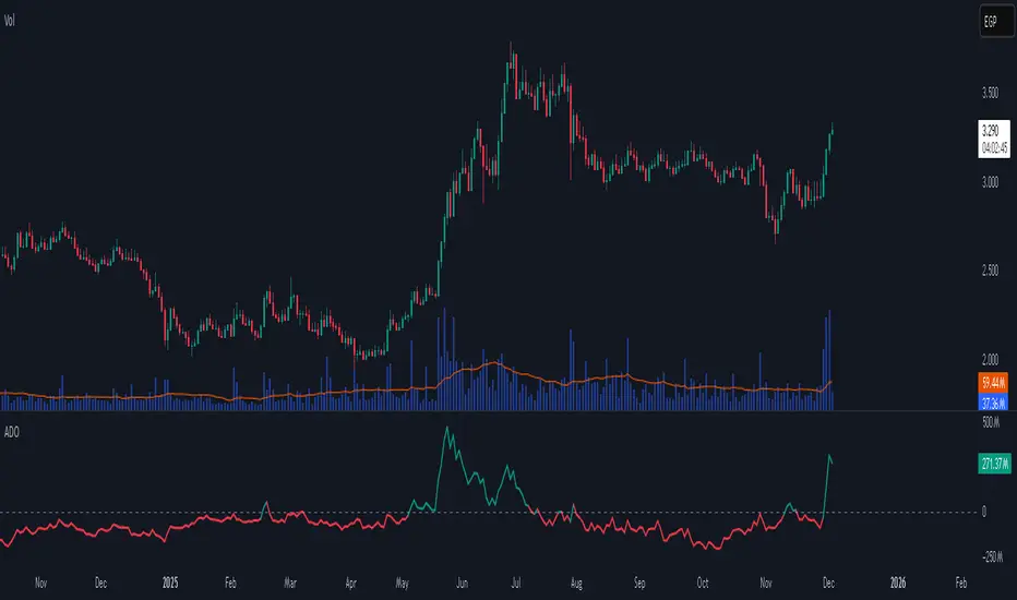
Accumulation/Distribution Oscillator# Short description
A clean, volume-weighted Accumulation/Distribution Oscillator (ADO) that highlights buying/selling pressure by comparing cumulative AD to its EMA — ideal for confirming trends, spotting divergences, and timing entries with volume context.
# Full description
**Overview**
The Accumulation/Distribution Oscillator (ADO) measures the relationship between price and volume by taking a cumulative Accumulation/Distribution value and subtracting its exponential moving average. The resulting oscillator emphasizes recent shifts in accumulation (buying) and distribution (selling), making it easier to spot momentum changes and volume-driven confirmations or divergences.
**How it works (brief)**
* Computes the standard accumulation/distribution contribution each bar using price position within the range and multiplies it by volume.
* Builds a cumulative AD series and smooths it with an EMA.
* The oscillator = cumulative AD − EMA(cumulative AD). Positive values indicate rising accumulation relative to the trend, negative values indicate rising distribution.
**Inputs**
* `length` — EMA smoothing period (default: 20). Adjust to tune sensitivity: lower values = faster signals, higher values = smoother trend.
**Interpretation & signals**
* **Above zero**: recent accumulation momentum — bullish bias.
* **Below zero**: recent distribution momentum — bearish bias.
* **Crosses of zero**: simple entry/exit trigger (cross above = potential long, cross below = potential short).
* **Divergences**: price making new highs while ADO fails to make new highs → bearish divergence (sell signal). Price making new lows while ADO fails to make new lows → bullish divergence (buy signal).
* **Slope and magnitude**: steep, growing positive readings suggest strong buying pressure; steep, growing negative readings suggest strong selling pressure.
**Suggested usage**
* Use ADO to confirm breakout strength: a price breakout with ADO rising above zero has higher probability.
* Combine with trend filters (e.g., moving averages) to trade in the direction of the main trend.
* Use divergence with price action or candles for higher-probability reversal setups.
* Best applied on intraday and swing timeframes where volume data is reliable. May be less effective on low-volume or synthetic data.
**Alert examples (copy into TradingView alert message)**
* `ADO Bullish: Oscillator crossed above 0`
* `ADO Bearish: Oscillator crossed below 0`
* `ADO Momentum Up: Oscillator turned positive and rising`
* `ADO Divergence: Price made new high but ADO did not — check for potential reversal`
**Practical tips**
* Shorten `length` (e.g., 8–12) for more responsive signals on lower timeframes; lengthen (e.g., 30–50) for smoother, long-term signals.
* Confirm signals with volume profile or volume spike filters to avoid false breakouts.
* Always validate with support/resistance and manage risk with stops sized to your strategy.
**Disclaimer**
This indicator is a technical tool intended to assist analysis — not a standalone trading system. Backtest and paper-trade any strategy before using real capital. The author and publisher are not responsible for trading outcomes.
MACD Momentum Structure & Volume Profile Sniper [MTF]**Description and Methodology**
This script offers a unique approach to Market Structure by moving away from traditional fractal-based highs and lows (which can be noisy). Instead, it utilizes **MACD Momentum Swings** to identify significant structural points, combined with an automated Fixed Range Volume Profile to pinpoint high-probability entry zones.
**1. Why MACD Structure? (The Core Concept)**
Traditional "ZigZag" or Fractal indicators rely solely on price action, often leading to fake-outs during low-volume consolidation.
* This script defines a "Swing High" only when the MACD Histogram crosses below zero (Momentum shifts Bearish).
* This script defines a "Swing Low" only when MACD crosses above zero (Momentum shifts Bullish).
By linking structure to momentum, we filter out weak price movements and focus on the true "heartbeat" of the trend.
**2. The "Mashup" Synergy: Structure + Volume + Logic**
This is not a random combination of indicators. Each component serves a specific step in the trading execution sequence:
* **Step 1 (Structure):** The script identifies a Change of Character (CHoCH) based on the MACD peaks described above.
* **Step 2 (Liquidity/Value):** When a CHoCH occurs, the script *automatically* draws a **Fixed Range Volume Profile (FRVP)** specifically covering the impulse leg that caused the break. This reveals the "Point of Control" (POC)—the hidden price level where the most volume occurred during the move.
* **Step 3 (The Sniper Entry):** The script creates a "Zone" around that POC. It then waits for Price to retrace into this zone.
* **Step 4 (Confirmation):** Once the zone is touched, the script monitors a lower timeframe (User selectable, default M1) for a fresh MACD crossover to trigger the final entry signal.
**Features**
* **Multi-Timeframe Dashboard:** Monitor the MACD Trend direction across 4 different timeframes simultaneously.
* **Dynamic Trendlines:** Automatically connects confirmed MACD peaks to visualize trend integrity.
* **Fibo Time Zones:** Projects potential future pivot points based on the duration of the previous swing.
* **Alert System:** Integrated alerts for Zone Touches and "Sniper" entries (Zone Touch + LTF Momentum Confirmation).
**How to Use**
1. **Identify Trend:** Look for the CHoCH labels. Green indicates a shift to Bullish, Red to Bearish.
2. **Wait for Pullback:** Do not chase the break. Wait for price to return to the Yellow POC Zone generated by the Volume Profile.
3. **Entry Trigger:** Watch for the "BUY" or "SELL" marks. These appear only when price hits the zone AND the lower-timeframe momentum aligns with the trade direction.
**Settings & Inputs**
* **Global MACD:** Adjust the sensitivity of the swing detection (Default 12, 26, 9).
* **Sniper Entry:** Select the timeframe used for the final confirmation (e.g., use M1 confirmation for an H1 chart structure).
* **VP Settings:** Customize how the Volume Profile looks on the chart.
*Disclaimer: This script is intended for educational purposes and market analysis. It does not provide financial advice.*

Delta+CVD&CVD CandlesDelta + CVD & CVD Candles
Order-flow indicator combining Delta (Ask–Bid), Cumulative Volume Delta (CVD), and a unique CVD-based synthetic candle system. Shows buy/sell pressure, volume aggressiveness, and momentum shifts with optional Delta histogram, CVD line, and CVD+Delta combined candles. Useful for scalping, intraday trading, divergence detection, and understanding buyer/seller dominance.
________________________________________
📘 Overview
The Delta + CVD & CVD Candles Indicator combines multiple order-flow tools into one clean visual package. It displays:
• Delta (Ask–Bid) to measure aggressive buying/selling
• Cumulative Volume Delta (CVD) to track accumulated pressure
• Combined CVD Candles showing synthetic candles built entirely from order-flow data
This indicator helps traders read market intent, find momentum shifts, and detect absorption or hidden buying/selling without needing Level-2 data.
________________________________________
📊 Features
1. Delta (Ask-Bid) Histogram
Shows buying vs selling pressure per candle.
• Green = Buyers (Ask > Bid)
• Red = Sellers (Bid > Ask)
2. CVD (Cumulative Delta) Line
Tracks whether buyers or sellers dominate over time.
Useful for spotting divergences and trend strength.
3. Delta + CVD Combined Candles
Synthetic candles built from order-flow:
• Candle body = change in CVD
• Wicks = size of Delta imbalance
• Colors = green (bullish), red (bearish)
These candles reveal aggressive buying/selling much more clearly than price candles.
________________________________________
🛠 Inputs & Options
• Show/Hide Delta Histogram
• Show/Hide CVD Line
• Show/Hide Combined CVD Candles
• Bull Color
• Bear Color
• CVD Line Color
________________________________________
📈 How to Trade With It
• Rising CVD + bullish Delta → Strong up momentum
• Falling CVD + bearish Delta → Strong down momentum
• Price HH but CVD failing → Bearish divergence
• Price LL but CVD not making LL → Bullish divergence
• Long wick in combined candle → High imbalance (aggressive buyers/sellers)
Great for scalping, day trading, and momentum confirmation.
________________________________________
⚠️ Notes
• Uses TradingView’s volume feed (not Level-2 depth).
• Works on all markets and timeframes.
• Volume accuracy depends on exchange data.
________________________________________
✔️ Recommended Use-Cases
• Intraday trading
• Volume/Delta analysis
• Divergence trading
• Identifying exhaustion and absorption
• Understanding buyer/seller strength visually
________________________________________
👤 Credits
Paraskumarpatel5026@gmail.com
________________________________________

Key Levels + 15M ORBWhat this gives you? (“Key Levels”)
15m ORB High/Low
Clean horizontal lines across full RTH session, only drawn after first 15 minutes complete.
Premarket High/Low (PMH/PML)
Dashed lines; optional labels if you want them.
Previous Day Zones (PDH/PDL)
Wick→body zones for prior RTH session.
Optional zone fill to visualize where prior day got rejected/accepted.
Optional PDH/PDL labels.

Volume based liquidity This indicator finds area where the price moves relatively mildly compared to the size of the volume, the target area. It also finds weak areas, that have low volume in a relatively large price movement. Larger and more recent target areas are much more useful in finding liquidity. the weak areas could be a tell for when price will reverse into a target area. Make sure a target area hasn't already had its liquidity swept.

Macros+AMD [NW]Macros + AMD - Daily & Weekly Time-Based Analysis
Multi-timeframe AMD (Accumulation, Manipulation, Distribution) visualization with ICT Macro timing windows for time-based market analysis.
Overview
This indicator visualizes the AMD (Accumulation, Manipulation, Distribution) framework on both daily and weekly timeframes, combined with ICT Macro timing windows. It is designed as an educational tool to help traders study time-based market structure and algorithmic price delivery concepts.
The AMD model is based on the idea that markets move through distinct phases within each trading period:
Accumulation (A) - Initial range formation, liquidity building
Manipulation (M) - False moves to trap traders, liquidity sweeps
Distribution (D) - True directional move, price delivery to targets
What This Indicator Displays
Daily AMD Phases
Displays the intraday AMD cycle based on New York trading hours:
A Phase (Blue): 4:00 AM - 8:35 AM EST — Morning accumulation, Asian/London overlap
M Phase (Red): 8:35 AM - 11:25 AM EST — NY session manipulation, news events
D Phase (Green): 11:25 AM - 4:00 PM EST — Afternoon distribution and price delivery
Weekly AMD Phases
Displays the weekly AMD cycle from Monday to Monday:
A Phase: Monday 00:00 - Tuesday 21:56 EST — Weekly high/low formation begins
M Phase: Tuesday 21:56 - Thursday 02:04 EST — Mid-week reversal zone
D Phase: Thursday 02:04 - Monday 00:00 EST — Weekly price delivery
Inner M Phase Fibs
When enabled, subdivides the M (Manipulation) phase using Fibonacci levels:
0.382 level — Inner accumulation ends
0.500 level — Mid-point of manipulation
0.618 level — Inner distribution begins
This helps identify potential reversal points within the manipulation phase.
ICT Macro Windows
Horizontal lines marking the XX:42 to XX:15 macro periods (33-minute windows):
2:42 - 3:15 AM
3:42 - 4:15 AM (London)
7:42 - 8:15 AM
8:42 - 9:15 AM
9:42 - 10:15 AM (Prime AM session)
10:42 - 11:15 AM
11:42 - 12:15 PM
12:42 - 1:15 PM
1:42 - 2:15 PM
2:42 - 3:15 PM
These windows represent times when algorithmic price delivery is more likely to occur.
How To Use
Understanding the AMD Framework
During the A Phase:
Observe range formation and initial liquidity pools
Note the high and low established during this phase
Wait for manipulation before committing to direction
During the M Phase:
Watch for false breakouts and stop hunts
Look for reversal patterns after liquidity sweeps
The inner fibs (0.382, 0.5, 0.618) can help time entries within this phase
Mid-week (Wednesday) often sees key reversals on weekly AMD
During the D Phase:
This is typically when the true move occurs
Price tends to deliver toward draw on liquidity targets
The direction is often opposite to the manipulation move
Using the Macro Windows
The XX:42 to XX:15 windows are times to pay attention to price action:
These 33-minute periods often see increased algorithmic activity
Look for displacement, fair value gaps, or order blocks forming
The 9:42-10:15 AM window is considered particularly significant for NY session
Weekly Day Labels
Monday/Tuesday: "H/L of Week" — Watch for weekly high or low formation
Wednesday: "Reversal Day" — Mid-week reversal probability increases
Thursday/Friday: "Reversal Day" — Continuation or secondary reversal
Settings Guide
Main Settings
Timezone: Set to your broker's timezone or preferred timezone
Macros On Top: Toggle macro lines above or below AMD boxes
Show All Text Labels: Master toggle for all text (turn off for clean charts on HTF)
Daily/Weekly AMD
Show: Enable/disable the AMD visualization
Opacity: Adjust transparency of the phase boxes (higher = more transparent)
AMD Colors
Customize colors for each phase (A, M, D)
Default: Blue (A), Red (M), Green (D)
Inner M Style
Customize the inner M phase fib lines and text colors
Default: Black lines for clean visibility
Macro Settings
Adjust macro line color and thickness
Toggle individual macro windows on/off
Important Notes
This indicator is for educational purposes and time-based analysis
It does not provide buy/sell signals
Always use in conjunction with proper price action analysis
Past price behavior during these time windows does not guarantee future results
The AMD framework is one lens for viewing market structure — use it as part of a complete methodology
Credits
This indicator is based on concepts taught by ICT (Inner Circle Trader) and the broader Smart Money Concepts community. The AMD framework, macro timing windows, and weekly profile concepts are derived from this educational methodology.
Timeframe Recommendations
Best viewed on 1-minute to 15-minute charts
Text labels automatically hide on 9-minute and higher timeframes for cleaner visualization
Indicator hides completely on 1-hour and higher timeframes
Changelog
v1.0 - Initial release
Daily AMD phases (4am-4pm EST)
Weekly AMD phases (Monday-Monday)
Inner M phase Fibonacci subdivisions
10 ICT Macro timing windows
Full customization options
Automatic 9-day cleanup

WMA SupertrendVWMA Supertrend for identifying good entry points
Divides the slow VWMA and fast VWMA and multiplies by the close price to give a mountain-style price showing possible entries.

Delta Magnet Zone Extended – Selective HideLiquidity Zone Reversal — Description 🔍📊
This indicator automatically identifies liquidity zones where price previously grabbed orders, swept highs/lows, or created strong reaction points. Instead of plotting thin lines, this version converts those levels into zones, giving traders a clearer view of where the market has unfinished business and where future reactions are likely to occur.
These zones act as institutional magnets — areas where liquidity providers, algos, and larger players commonly enter or exit positions.
How It Works ⚙️💡
The script scans recent price action and detects local swing highs and lows. It then builds rectangular liquidity zones around these levels, extending them forward so you can see:
🟥 Bearish liquidity sweep zones
🟩 Bullish liquidity sweep zones
🔁 Areas where price previously failed, rejected, or consolidated
🎯 Potential reversal targets on both sides of the market
These zones update automatically as new structure forms, giving you an always-current map of market memory.
Why the 9-Day Look-Back Is Powerful (My Default) 📅✨
I personally keep the look-back set to 9 days by default because:
✔️ It captures the entire previous trading week
✔️ It maps out where SPY/QQQ/ES has already tapped liquidity
✔️ It shows the true zones institutions defended
✔️ It reveals where price is most likely to react again moving forward
Using a 9-day window gives you a clean, high-signal map of:
Last week’s highs & lows
Prior liquidity sweeps
Rejection zones
Imbalance cleanup levels
This keeps the chart minimal, powerful, and hyper-relevant to current order flow.
How Traders Use These Zones 🎯📈
Here are the most common ways traders use these liquidity zones:
1️⃣ Identify High-Probability Reversal Areas 🔄
Price often reacts strongly when returning to a past liquidity zone — especially if it previously swept stops there.
2️⃣ Confirm Breakouts or Failures 🚪➡️
Break above a bearish zone?
Momentum continuation is likely.
Reject inside a zone?
Reversal or range expansion often follows.
3️⃣ Set Targets & Stop Placement 🎯🛡️
Zones give logical:
Profit targets
Trend exhaustion points
Areas to avoid entering new trades
4️⃣ Time 0DTE Scalps With Precision ⚡
Liquidity zones tighten your expectations for:
Where SPY/QQQ will bounce
Where reversals start
Where liquidity magnets pull price by end of day
Why This Indicator Matters 🧠🔥
Liquidity drives markets.
Not indicators.
Not moving averages.
Not random levels.
This tool shows you where actual orders exist, where they were previously swept, and where institutions are most likely to step in again.
It gives you:
Cleaner charts
Higher confidence
Better strike selection
More precise entries
Stronger exits
All without noise.
