Non-Repainting Dynamic EMA SystemDynamic EMA System - Detailed Explanation
Overview
This indicator creates four adaptive Exponential Moving Averages (EMAs) that automatically adjust their periods based on current market conditions. Unlike traditional fixed-period EMAs, these lines dynamically become faster or slower to better match the market's behavior.
Core Components
1. Base EMA Lengths (Starting Points)
EMA 1: Base period of 10 (fastest)
EMA 2: Base period of 20 (fast-medium)
EMA 3: Base period of 30 (medium)
EMA 4: Base period of 200 (trend identifier)
These base values are not fixed—they serve as starting points that get multiplied by various market condition factors.
Market Analysis Features
The indicator analyzes 12 different market characteristics to understand current conditions:
Technical Indicators Used:
RSI (Relative Strength Index)
Measures momentum and overbought/oversold conditions
Normalized to 0-1 scale
ADX (Average Directional Index)
Measures trend strength
Higher values = stronger trends
Bollinger Bands Position
Shows where price sits relative to volatility bands
Indicates potential reversals or breakouts
VWAP (Volume Weighted Average Price)
Institutional trading benchmark
Signals if price is above/below average weighted price
Ichimoku Cloud
Japanese indicator showing support/resistance
Tenkan-Kijun relationship indicates trend direction
TRAMA (Triangular Moving Average)
Advanced adaptive moving average
Responds to genuine price movements
Volume Analysis
Compares current volume to 20-period average
Higher volume = more significant moves
ATR-Based Volatility
Weighted by volume for accuracy
Adjusts EMAs to market speed
Shannon Entropy
Measures market randomness vs. order
High entropy = choppy; Low entropy = trending
Price Correlation (Short-term)
How consistent price movements are
Detects momentum shifts
Price Correlation (Long-term)
Broader trend consistency
Confirms regime stability
Volume Strength
Normalized volume ratio
Validates price movements
How Length Adaptation Works
Market Regimes Identified:
The system identifies 4 distinct market conditions based on the 12 features:
Regime 1 (Green): Calm, ranging market → Shorter EMAs (more responsive)
Regime 2 (Blue): Strong trending market → Medium-length EMAs (balance speed/noise)
Regime 3 (Red): High volatility/choppy → Longer EMAs (filter noise)
Regime 4 (Gray): Transitional/neutral → Moderate EMAs (adaptive middle ground)
Adaptation Formula:
Each EMA length is calculated as:
Final Length = Base Length × Regime Multiplier × Volatility Adjustment × Momentum Adjustment × Entropy Adjustment
Where:
Regime Multiplier: 0.3x to 2.5x depending on market type
Volatility Adjustment: Increases length during high volatility (filters noise)
Momentum Adjustment: Based on RSI - extreme readings adjust sensitivity
Entropy Adjustment: Lower entropy (trending) = tighter EMAs
Key Adaptive Features
1. Volatility Response
When market volatility increases:
EMAs lengthen automatically to avoid whipsaws
Calculated using ATR weighted by volume
2. Volume Integration
Higher volume makes the system:
React faster to price changes
Increase learning rate
Trust the current move more
3. Correlation Analysis
Short-term correlation: Detects immediate momentum
Long-term correlation: Confirms overall trend stability
Adjusts EMA sensitivity accordingly
4. Entropy Monitoring
Measures market "disorder"
Trending markets → Tighter EMAs (follow trend)
Choppy markets → Wider EMAs (reduce noise)
Non-Repainting Design
Critical Safety Features:
Confirmed Data Only
All calculations use close , high , low , etc.
Current bar data is only used if barstate.isconfirmed
Locked Updates
EMA lengths only change when bar closes
Variables prefixed with confirmed_ store locked values
No Look-Ahead
System learns from past bars only
Future data cannot influence current values
Historical Consistency
Once a bar closes, its EMA values never change
Alerts and signals are reliable
Visual Interpretation
Background Colors:
Green: Calm/ranging market (Regime 1)
Blue: Strong trend (Regime 2)
Red: High volatility/choppy (Regime 3)
Gray: Transitional state (Regime 4)
Color transparency indicates confidence:
Solid color = High confidence in regime identification
Faint color = Lower confidence, potential transition
EMA Lines:
Red EMA (fastest): Short-term momentum
Orange EMA: Medium-term trend
Yellow EMA: Intermediate trend confirmation
Blue EMA: Long-term trend direction
Information Dashboard
The top-right table displays:
Metric Purpose
Regime Strength How strongly current conditions match the identified regime (0-1)
Silhouette Score Quality of regime identification (>0.5 = Excellent, >0.2 = Good)
EMA Values & Lengths Current price level and adaptive period for each EMA
Vol Volatility Volume-weighted volatility measure
Entropy Market randomness level (0 = trending, 1 = random)
Volume Strength Current volume relative to average
Learning Rate How quickly the system adapts (higher = faster adaptation)
Trading Applications
Trend Following:
EMAs aligned in order (1 > 2 > 3 > 4) = Strong uptrend
EMAs aligned reversed = Strong downtrend
Use EMA 4 as major trend filter
Entry Signals:
Fast EMA crosses medium EMA in trend direction
Price pullback to EMA 3 in trending regime
All EMAs converging in ranging regime
Exit Signals:
Fast EMA crosses below medium EMA
Regime change (background color shift)
Silhouette score drops (poor quality)
Regime-Based Strategy:
Green Background: Range trading, fade extremes
Blue Background: Trend following, ride momentum
Red Background: Reduce position size, wait for clarity
Gray Background: Cautious, potential regime shift
Advantages Over Standard EMAs
Automatic Adjustment: No manual tweaking needed for different markets
Context Aware: Understands if market is trending, ranging, or volatile
Volume Integration: Respects institutional involvement
Multi-Factor Analysis: Uses 12 indicators, not just price
Quality Metrics: Silhouette score shows when to trust signals
Non-Repainting: Reliable for backtesting and live trading
Best Practices
Do:
Wait for bar close before acting on signals
Check Silhouette score (>0.2 is reliable)
Use regime color as risk filter
Combine with your trading system
Don't:
Trade against EMA 4 in strong trends
Ignore regime changes
Use in extremely low liquidity
Expect perfection in all conditions
Summary
This is an intelligent, self-adjusting EMA system that reads 12 different market characteristics to automatically optimize its speed. It identifies whether the market is trending, ranging, volatile, or transitional, then adjusts all four EMAs accordingly. The non-repainting design ensures historical accuracy, while the quality metrics (Silhouette score, regime strength) tell you when to trust the signals most.
Volumen

Algo & Dark Pool Activity - Find Hidden LiquidityThe script is designed to highlight potential algorithmic buying pressure and dark pool accumulation proxies on a TradingView chart. It overlays signals directly on price bars so you can visually spot when unusual activity may be occurring.

Volume Delta + Bandas de Bollinger📊 Volume Delta + Bollinger Bands Indicator
Characteristics
• Volume Delta Histogram
• Shows the difference between buying and selling pressure.
• Green bars indicate positive delta (buyers dominating).
• Red bars indicate negative delta (sellers dominating).
• The histogram oscillates around the zero line, which represents balance between buyers and sellers.
• Bollinger Bands applied to Delta
• A moving average (basis line) of the delta is calculated.
• Upper and lower bands are plotted using standard deviation.
• These bands highlight periods when the delta moves to statistically extreme levels.
• Helps identify unusual buying or selling pressure compared to recent history.
• Zero Line Reference
• A horizontal line at zero shows equilibrium.
• Crossing above zero suggests net buying pressure.
• Crossing below zero suggests net selling pressure.
How to Use
• Identify Buyer/Seller Dominance
• Green histogram bars above zero → buyers are stronger.
• Red histogram bars below zero → sellers are stronger.
• Spot Extremes with Bollinger Bands
• When delta touches or exceeds the upper band, it signals unusually strong buying pressure.
• When delta touches or exceeds the lower band, it signals unusually strong selling pressure.
• These extremes can precede reversals or mark continuation if confirmed by price action.
• Combine with Price Analysis
• Use delta signals together with price trends and support/resistance levels.
• For example, if price is at resistance and delta spikes into the upper band, it may indicate exhaustion of buyers.
• If price is at support and delta spikes into the lower band, it may indicate exhaustion of sellers.
• Trading Strategy Ideas
• Reversal setups: Look for delta extremes against key price levels.
• Trend confirmation: Sustained delta above zero supports bullish trends; sustained delta below zero supports bearish trends.
• Volatility filter: Bollinger Bands help filter out normal fluctuations and highlight significant imbalances.
👉 In short, this indicator combines order flow pressure (delta) with volatility context (Bollinger Bands), making it useful for spotting moments when buying or selling activity becomes unusually strong compared to recent history.

Triple ATR Adaptive MAs + VWAP Option + Clouds + Candle Trend V2Another one of my experiences ... combining things...
📘 Indicator Description – Triple ATR Adaptive Moving Averages with VWAP Influence
This indicator plots three adaptive moving averages whose behavior changes dynamically based on market volatility (ATR) and optionally VWAP deviation.
Because they adapt in real time to both volatility and VWAP pressure, their movement, slope, and reaction speed differ significantly from traditional moving averages.
🔶 1. ATR-Adaptive Moving Averages
Each of the three MAs uses a custom adaptive formula:
ATR (Average True Range) is measured over a chosen period.
Higher ATR → more volatility → the MA becomes more reactive and moves closer to price.
Lower ATR → stable market → the MA becomes smoother and slower.
This creates a volatility-aware smoothing factor, making the MA expand, contract, and respond to market conditions in ways a classic SMA, EMA, or HMA cannot.
🔷 2. Optional VWAP Influence
Each MA has an independent toggle allowing it to be influenced by VWAP.
When enabled:
The MA is gently “pulled” toward VWAP.
The strength of this attraction is determined by the VWAP Influence parameter (0–1).
This causes the moving averages to behave differently from normal MAs:
In trending markets, the ATR and price push the MA away from VWAP.
In mean-reverting or balanced conditions, VWAP pulls the MA back toward fair value.
The result is an MA that reflects both trend pressure and fair-value pressure.
🔶 3. Visual Behavior: Non-Traditional Movement
Because each MA is simultaneously influenced by volatility, trend magnitude, and VWAP deviation, their shape is often very distinct from normal moving averages.
They may:
Respond faster during high volatility
Flatten out earlier during consolidation
Curve toward VWAP when price becomes extended
Separate or compress depending on ATR strength
This is intentional and essential, since the goal is to show:
✔ Volatility expansion
✔ Trend exhaustion
✔ Overextended price relative to VWAP
✔ Dynamic trend confirmation
Rather than simply smoothing past price.
🔷 4. Three Independent Adaptive Lines
Each of the three moving averages has:
Its own ATR length
Its own sensitivity multiplier
Its own optional VWAP influence
Its own color and trail
This allows the user to combine:
a fast volatility-adaptive trend line
a mid-range adaptive baseline
a slow adaptive long-trend MA
All adapting independently to volatility and VWAP conditions.
🔶 5. Optional Candle Coloring
The indicator can color candles according to trend strength derived from the fast/slow MAs.
Stronger trends produce more vivid colors. Neutral or conflicting trends produce softer colors.
This adds a visual layer to identify:
Trend direction
Trend strength
Volatility state
Market compression
at a glance.
📌 Summary
This indicator does not behave like standard SMAs or EMAs because each line dynamically adapts to:
🔸 ATR (volatility)
🔸 VWAP (fair value)
This makes the indicator extremely responsive to market conditions while still reducing noise during stable phases.
It provides a more realistic, context-aware, and intelligent representation of price behavior compared to traditional moving averages.

SMAs TimePortalPlots 5× SMAs from 3 different timeframes - plus current chart timeframe
Plots 2× VWAPs with bands.
Meant for personal use, but maybe you can find it useful too.
Disclaimer: Beware I might update this with big changes in the future.

Volume with High-Volume Highlight + ThresholdThis indicator highlights true high-volume candles without guessing.
It compares the current bar’s volume to the average volume over the last X candles and highlights bars that exceed your chosen threshold (ex: 1.5× the average).
Features
Automatic high-volume detection
Customizable volume multiplier
Bull/bear color coding
Average volume line
Threshold line (shows exactly where “high volume” begins)
Optional on-chart label showing the required volume level
Alert for any high-volume bar
What It’s Used For
Identifying breakout strength
Confirming bounce setups at key levels
Spotting real buyers/sellers stepping in
Avoiding fake moves with weak volume
Simple Rule
If volume is greater than (Average × Multiplier) → the bar is highlighted.

Regime Filter [BigBeluga] Modified by Claude to move tableThis is a copy of Regime Filter that has been modified by Anthropic's Claude to move the overlay table to different positions.

KIMATIX VWAP/EMA System (by ASCE)**KIMATIX VWAP/EMA System (by ASCE)**
A precision-built intraday framework for momentum, structure, and liquidity timing.
**Why this indicator exists**
Most traders see movement, but not context. They enter too late, chase momentum, or fade reversals without understanding where institutional players react.
This tool solves that problem by combining two of the most powerful structural concepts in intraday price discovery:
Trend alignment through EMAs
Liquidity reaction zones through VWAPs
Together, they provide directional clarity, timing, and trade location.
**Core Components**
**Three Trend EMAs**
• **EMA 7** – Microtrend and momentum speed
• **EMA 23** – Intraday trend leadership
• **EMA 50** – Higher-timeframe structure anchor
This trio shows how price accelerates, slows, flips bias, or compresses.
**Three Volume-Weighted Average Prices**
• **Daily VWAP** – Primary scalper reference point
• **Weekly VWAP** – Bias filter and intermediate balance zone
• **Monthly VWAP** – High-impact “magnet” where major reactions occur
VWAP represents the fair value where volume is distributed.
When price taps, rejects, or reclaims these levels, liquidity flow shifts — ideal for scalp-to-swing entries.
**What it helps you see**
• When price is aligned with or diverging from trend
• Where momentum will expand or fail
• Which levels larger participants defend
• Where the highest-probability reaction zones form
This is not a signal tool — it is a structure and decision-making framework used by professional intraday traders.
**How to use it**
1. **Trade with VWAP alignment** – expect reactions at daily/weekly/monthly VWAPs
2. **Follow EMA flow** – when EMAs compress or flip, momentum changes
3. **Look for price interaction** – rejection, reclaim, or breakthrough of a VWAP often leads to fast moves
Ideal for scalping, day-trading, futures, FX, indices, crypto, and metals.
**Customization**
Colors for each EMA and each VWAP can be personalized, allowing alignment with your charting workflow.
**Final Notes**
This system gives you the *context* most traders miss — where trend meets liquidity.
Use it as a roadmap to understand where price *should* react and when momentum is likely to shift.

Luxy VWAP Magic - MTF Projection EngineThis indicator transforms the classic VWAP into a comprehensive trading system. Instead of switching between multiple indicators, you get everything in one place: multi-timeframe analysis, statistical bands, momentum detection, volume profiling, session tracking, and divergence signals.
What Makes This Different
Traditional VWAP indicators show a single line. This tool treats VWAP as a foundation for complete market analysis. The indicator automatically detects your asset type (stocks, crypto, forex, futures) and adjusts its behavior accordingly. Crypto traders get 24/7 session tracking. Stock traders get proper market hours handling. Everyone gets institutional-grade analytics.
Anchor Period Options
The anchor period determines when VWAP resets and recalculates. You have three categories of options:
Time-Based Anchors:
Session - Resets at market open. Best for intraday stock trading where you want fresh VWAP each day.
Day - Resets at midnight UTC. Standard option for most traders.
Week / Month / Quarter / Year - Longer reset periods for swing traders and position traders who want broader context.
Rolling Window Anchors:
Rolling 5D - A sliding 5-day window that never resets. Solves the Monday problem where weekly VWAP equals daily VWAP on first day of week.
Rolling 21D - Approximately one month of trading data in continuous calculation. Excellent for crypto and forex markets that trade 24/7 without clear session breaks.
Event-Based Anchors:
Dividends - Resets on ex-dividend dates. Track institutional cost basis from dividend events.
Splits - Resets on stock split dates. Useful for analyzing post-split trading behavior.
Earnings - Resets on earnings report dates. See where volume-weighted trading occurred since last quarterly report.
Standard Deviation Bands
Three sets of bands surround the main VWAP line:
Band 1 (Aqua) - Plus and minus one standard deviation. Approximately 68% of price action occurs within this range under normal distribution. Touches suggest minor extension.
Band 2 (Fuchsia) - Plus and minus two standard deviations. Only 5% of trading should occur outside this range statistically. Touches here indicate significant overextension and high probability of mean reversion.
Band 3 (Purple) - Plus and minus three standard deviations. Touches are rare (0.3% probability) and represent extreme conditions. Often marks climax moves or panic selling/buying.
Each band can be toggled independently. Most traders show Band 1 by default and add Band 2 and 3 for specific setups or volatile instruments.
Multi-Timeframe VWAP System
The MTF section plots previous period VWAPs as horizontal support and resistance levels:
Daily VWAP - Previous day's final VWAP value. Key intraday reference level.
Weekly VWAP - Previous week's final VWAP. Important for swing traders.
Monthly VWAP - Previous month's final VWAP. Institutional benchmark level.
Quarterly VWAP - Previous quarter's final VWAP. Major support/resistance for position traders.
Previous Day VWAP - Yesterday's closing VWAP specifically, separate from current daily calculation.
The Confluence Zone percentage setting determines how close multiple VWAPs must be to trigger a confluence alert. When two or more timeframe VWAPs converge within this threshold, you get a high-probability support/resistance zone.
Session VWAPs for Global Markets
For forex, crypto, and futures traders who operate in 24/7 markets, the indicator tracks three major global sessions:
Asia Session - UTC 21:00 to 08:00. Gold colored line. Typically lower volatility, range-bound action that sets overnight levels.
London Session - UTC 08:00 to 17:00. Orange colored line. Often determines daily direction with high volume European participation.
New York Session - UTC 13:00 to 22:00. Blue colored line. Highest volume session globally. Sharp directional moves common.
Previous session VWAP values display as horizontal lines when each session closes, acting as intraday support and resistance. The table shows which sessions are currently active with checkmarks.
On-Chart Labels and Signals
The indicator plots several types of labels directly on price action when significant events occur:
Volume Spike Labels
Fire when current bar volume exceeds configurable thresholds relative to both the previous bar and the 20-bar average. Default settings require 300% of previous bar AND 200% of average volume. Green labels indicate bullish candles. Red labels indicate bearish candles. These spikes often mark institutional entry points.
Momentum Shift Labels
Appear when VWAP acceleration changes direction. The Slowing label warns when an active trend loses steam, often preceding reversal. The Accelerating label confirms trend continuation or potential bottom during downtrends. Filters available to show only reversal signals in existing trends.
VWAP Squeeze Labels
Detect when standard deviation bands contract relative to ATR (Average True Range). Low volatility compression often precedes explosive breakout moves. When the squeeze fires (releases), a label appears with directional prediction based on VWAP slope.
Divergence Labels
Mark price/volume divergences using CVD (Cumulative Volume Delta) analysis:
Bullish divergence: Price makes lower low, but CVD makes higher low. Hidden accumulation despite price weakness.
Bearish divergence: Price makes higher high, but CVD makes lower high. Hidden distribution despite price strength.
Dynamic VWAP Coloring
The main VWAP line changes color based on its slope direction:
Green - VWAP is rising. Institutional buying pressure. Volume-weighted price increasing.
Red - VWAP is falling. Institutional selling pressure. Volume-weighted price decreasing.
Gray - VWAP is flat. Consolidation or balance between buyers and sellers.
This coloring can be disabled for a static blue line if you prefer cleaner visuals. The VWAP label next to the line shows the current trend direction and delta percentage.
Calculated Projection Cone
One of the most powerful features is the Calculated Projection Cone. Unlike traditional extrapolation methods that simply extend a trend line forward, this system analyzes what actually happened in similar market conditions throughout the chart's history.
How It Works:
The system classifies each bar into one of 27 unique market states:
Z-Score Level - LOW (oversold), MID (fair value), or HIGH (overbought) based on configurable thresholds
Trend Direction - DOWN, FLAT, or UP based on VWAP slope
Volume Profile - LOW (below 80%), NORMAL (80-150%), or HIGH (above 150%) relative volume
When you look at the current bar, the indicator:
1. Identifies the current market state (e.g., LOW Z-Score + UP Trend + HIGH Volume)
2. Searches through all historical bars on the chart that had the same state
3. Calculates what happened in those bars X bars later (where X is your projection horizon)
4. Shows you the probability of up/down and the average move size
Visual Elements:
Probability Cone - Colored green (bullish probability above 55%), red (bearish below 45%), or gold (neutral). The cone width represents the historical range of outcomes (roughly the 20th to 80th percentile).
Center Line - Shows the average expected price based on historical outcomes in similar conditions.
Probability Label - Displays direction probability and average move. Example: "67% UP (+0.8%)" means 67% of similar past cases moved up, averaging 0.8% gain.
Fallback System:
When the exact 27-state match has insufficient historical data:
First fallback: Uses Z-Score plus Trend only (9 broader states, ignoring volume)
Second fallback: Uses Z-Score only (3 states)
When fallback is active, confidence automatically adjusts
Settings:
Projection Horizon - How many bars forward to analyze outcomes (5, 10, 15, or 20 bars, default 10)
Lookback Period - Historical data window in days (30-252, default 60)
Minimum Samples - Cases needed before using fallback (5-30, default 10)
Z-Score Threshold - Bucket boundary for LOW/MID/HIGH classification (1.0, 1.5, or 2.0 sigma)
Cloud Transparency - Adjust visibility (50-95%)
Colors - Customize bullish, bearish, and neutral cone colors
Confidence Levels:
HIGH - 30 or more similar historical cases found
MEDIUM - 15-29 similar cases
LOW - Fewer than 15 cases (more uncertainty)
IMPORTANT DISCLAIMER:
The Calculated Projection is based on past patterns only. It is NOT a price prediction or financial advice. Similar market states in the past do not guarantee similar outcomes in the future. The probability shown is historical frequency, not a guarantee. Always combine with other analysis and never rely solely on projections for trading decisions.
Alert Conditions
The indicator includes over 20 pre-built alert conditions:
Price vs VWAP:
Price crosses above VWAP
Price crosses below VWAP
Band Touches:
Price touches plus or minus one sigma band
Price touches plus or minus two sigma band (extreme)
Price touches plus or minus three sigma band (very extreme)
Z-Score Extremes:
Z-Score crosses above plus two (overbought extreme)
Z-Score crosses below minus two (oversold extreme)
Momentum and Trend:
Momentum slowing
Momentum accelerating
Trend turns bullish/bearish/neutral
Volume:
Volume spike detected
CVD Direction:
Buyers take control
Sellers take control
High Probability Signals:
Bullish reversal signal (oversold plus accelerating momentum)
Bearish reversal signal (overbought plus slowing momentum)
MTF and Special:
MTF confluence zone entry
VWAP squeeze fired
Bullish/Bearish divergence detected
Any significant signal (catch-all)
All signals use confirmed bar data to prevent false alerts from incomplete candles.
Settings Overview
Settings are organized into logical groups:
VWAP Settings
Anchor Period selection
Show/Hide VWAP line
Dynamic coloring toggle
VWAP label visibility
Bands Visibility
Toggle each of three bands independently
Info Table
Show/Hide table
Table position (9 options)
Text size
Volume spike label settings with adjustable thresholds
Momentum label settings with filters
Signal labels limited to 5 most recent (auto-managed)
Probability engine lookback period
Multi-Timeframe VWAP
Enable/Disable MTF system
Show MTF in table
Show MTF lines on chart
Individual timeframe toggles
Confluence zone threshold
Squeeze detection toggle
Session VWAPs
Enable/Disable session tracking
Apply to all assets option
Show session labels
Divergence Detection
Enable/Disable divergence
Pivot lookback period
Show divergence labels
Calculated Projection
Enable/Disable projection cone
Projection horizon (5, 10, 15, or 20 bars)
Lookback period in days (30-252)
Minimum samples threshold
Z-Score classification threshold (1.0, 1.5, or 2.0 sigma)
Cloud transparency adjustment
Bullish, bearish, and neutral colors
The Info Table - Your Trading Dashboard
The right side of your chart displays a compact table with up to twelve metrics.
Row-by-Row Breakdown:
Asset and Period - Shows what the indicator detected (US Stock, Crypto, Forex, etc.) and your selected anchor period. The detection happens automatically based on exchange data, so VWAP resets and calculations match your actual trading instrument.
Delta Percentage - How far current price sits from VWAP, expressed as a percentage. Positive means price trades above fair value. Negative means below. Large delta values (beyond 1-2%) often precede mean reversion moves. Day traders watch this for overextension.
Z-Score - Statistical deviation from VWAP measured in standard deviations. Unlike raw delta, Z-Score accounts for volatility. A 2% move in a volatile biotech stock differs from 2% in a stable utility. Z-Score normalizes this. Values beyond plus or minus two sigma occur only 5% of the time statistically.
Trend Direction - Whether VWAP itself is rising, falling, or flat. Rising VWAP means the volume-weighted average price is increasing, which indicates institutional accumulation. Falling VWAP suggests distribution. This differs from price trend since it weights by volume.
Momentum State - Is the trend accelerating or slowing down? This measures the rate of change in VWAP slope. When an uptrend shows slowing momentum, it often precedes reversal. Accelerating momentum in a downtrend can signal capitulation and potential bottom.
Relative Volume - Current bar volume compared to the 20-bar average, shown as percentage. Values above 150% indicate above-average activity. Spikes above 200-300% often mark institutional involvement. Low volume (below 80%) warns of potential fake moves.
MTF Bias - Four checkmarks or X marks showing whether price sits above or below Daily, Weekly, Monthly, and Quarterly VWAP. Four checkmarks means strong bullish alignment across all timeframes. Four X marks indicates bearish alignment. Mixed readings suggest consolidation or transition.
Band Probabilities - Historical statistics showing how often price touched each standard deviation band over your lookback period. This helps you understand if mean reversion or trend following works better for your specific instrument.
Session Status - Which global trading sessions are currently active (Asia, London, New York). Shows checkmarks for active sessions. Important for forex and crypto traders who need to know when major liquidity windows open and close.
Divergence State - Whether the indicator detects bullish or bearish divergence between price and cumulative volume delta. Bullish divergence occurs when price makes lower lows but buying pressure (CVD) makes higher lows, suggesting hidden accumulation.
Confidence Score - A weighted composite of all factors displayed as a progress bar and percentage. Combines MTF alignment, Z-Score, trend direction, volume delta, momentum, and relative volume into a single 0-100 score. Higher scores indicate stronger conviction setups.
Calculated Projection - When the Projection Cone is enabled, shows the historical probability of price direction and expected move. For example: "▲ 67% (+0.8%)" means in similar market states historically, price moved up 67% of the time with an average gain of 0.8%. The system analyzes 27 unique market states based on Z-Score, Trend, and Volume conditions.
Recommended Use Cases
Day Trading Stocks:
Use Session anchor with Band 1 visible. Watch for price returning to VWAP after morning move. Volume spikes near VWAP often mark institutional accumulation zones.
Swing Trading:
Use Weekly or Rolling 21D anchor. Enable MTF lines for Daily and Weekly levels. Trade pullbacks to these levels in direction of MTF bias.
Crypto and Forex:
Enable Session VWAPs. Use Rolling anchors to avoid artificial resets. Monitor session transitions for breakout opportunities.
Mean Reversion:
Focus on Z-Score reaching plus or minus two. Add Band 2 visibility. Combine with slowing momentum for highest probability reversals.
Trend Following:
Watch MTF bias alignment. Four checkmarks plus accelerating momentum plus high volume confirms trend continuation setups.
Projection Planning:
Enable the Calculated Projection to see what happened historically in similar market conditions. Use 5-10 bars for intraday setups, 15-20 bars for swing trade planning. Focus on high probability readings (above 60%) with HIGH confidence (30 or more samples). The cone shows the probable range of outcomes based on actual historical data. Combine with other factors like MTF alignment and volume for higher conviction setups.
Important Notes
The indicator does not repaint. MTF values use previous period's confirmed data.
Rolling VWAP works best on 15-minute timeframes and above due to bar lookback requirements.
Session VWAPs apply to global markets by default (forex, crypto, futures). Enable the all-assets option for stocks if desired.
Volume data for forex represents tick volume, not actual traded volume.
All alert conditions fire only on confirmed (closed) bars to prevent false signals.
The Calculated Projection updates each bar as market state changes. This is expected behavior. The projection shows probabilities based on similar past conditions, not a fixed prediction.
Q AND A
Q: Does this indicator repaint?
A: No. The main VWAP calculation uses standard TradingView VWAP methodology. Multi-timeframe values use previous period's confirmed data with appropriate lookahead settings. All alert signals require bar confirmation.
Q: Why does my Rolling VWAP look different on 1-minute versus 15-minute charts?
A: Rolling VWAP calculates across a fixed number of trading days. On very short timeframes, the bar lookback may hit TradingView limits. For best Rolling VWAP accuracy, use 15-minute or higher timeframes.
Q: Can I use this on any instrument?
A: Yes. The indicator automatically detects asset type and adjusts behavior. Stocks use standard market hours. Crypto uses 24/7 calculations. Forex uses tick volume. Everything adapts automatically.
Q: What does the Confidence Score actually measure?
A: The score combines six weighted factors: MTF alignment (25%), Z-Score position (20%), Trend direction (20%), CVD pressure (15%), Momentum state (10%), and Relative volume (10%). Higher scores indicate more factors aligned in one direction.
Q: Why are Session VWAPs not showing on my stock chart?
A: Session VWAPs apply to 24-hour markets by default (forex, crypto, futures). For stocks, enable the Use for All Assets option in Session VWAP settings.
Q: The Divergence labels appear delayed. Is this a bug?
A: Divergence detection requires pivot confirmation, which needs bars on both sides of the pivot point. The label appears at the actual pivot location (several bars back) once confirmed. This is intentional and prevents false signals.
Q: Can I change the band colors?
A: Yes. Each of the three bands has its own color input setting. You can customize Band 1, Band 2, and Band 3 colors to match your preferences. The defaults are Aqua, Fuchsia, and Purple. The main VWAP line color adapts dynamically based on slope direction or can be set to static blue.
Q: How do I set up alerts?
A: Right-click on the chart, select Add Alert, choose this indicator, and select your desired condition from the dropdown. All conditions include descriptive alert messages with relevant data.
Q: What is the Probability Engine lookback period?
A: This setting determines how many trading days the indicator analyzes to calculate band touch rates and mean reversion statistics. Default is 60 days (approximately 3 months). Longer periods provide more stable statistics but may miss recent behavior changes.
Q: Why do I see fewer labels than expected?
A: Signal labels (Volume, Momentum, Squeeze, Divergence) are limited to 5 most recent labels on the chart to keep it clean. When a new label appears, the oldest one is automatically removed. Additionally, momentum labels have several filters: check the slope multiplier setting (higher values require stronger trends) and the Only Reversal Signals option (when enabled, labels only appear for potential reversals, not trend confirmations).
Q: What is the Calculated Projection and how accurate is it?
A: The Calculated Projection analyzes what happened in past market conditions similar to the current state. It classifies each bar by Z-Score level, Trend direction, and Volume profile (27 unique states), then shows the historical probability of up vs down and the average move size. It is NOT a price prediction or guarantee. The probability shown is how often similar conditions led to up/down moves historically, not a future guarantee. Always use it as one input among many.
Q: Why does the Projection probability change?
A: The projection updates on each bar as market state changes. If Z-Score moves from LOW to MID, or trend shifts from UP to FLAT, the system looks up a different historical category. This is expected behavior. The projection shows what happened in similar past conditions to the current bar's state.
Q: The Projection shows LOW confidence. What does that mean?
A: Confidence levels indicate sample size: HIGH means 30 or more historical cases found, MEDIUM means 15-29 cases, LOW means fewer than 15 cases. When sample size is low, the system uses a fallback: first aggregating by Z-Score plus Trend only (ignoring volume), then by Z-Score only. LOW confidence means less statistical reliability, so weight other factors more heavily in your decision.
Q: Why does the cone sometimes show 50/50 probability?
A: A 50/50 reading means that in similar past market states, price moved up roughly half the time and down half the time. This indicates a neutral or balanced condition where historical patterns provide no directional edge. Consider waiting for a higher probability setup or using other analysis methods.
CREDITS AND ACKNOWLEDGMENTS
Methodology Foundation:
VWAP (Volume Weighted Average Price) - Standard institutional benchmark calculation, widely used since the 1980s for algorithmic execution and fair value assessment
Standard Deviation Bands - Statistical volatility measurement applying normal distribution principles to price deviation from mean
Z-Score Analysis - Classic statistical normalization technique for comparing values across different volatility regimes
Cumulative Volume Delta (CVD) - Order flow analysis concept measuring aggressive buying versus selling pressure
Concept Integration:
Mean reversion probability engine - Custom historical statistics tracking for band touch rates
Momentum acceleration detection - Second derivative analysis of VWAP slope changes
VWAP Squeeze - Volatility compression concept adapted from TTM Squeeze methodology applied to VWAP bands versus ATR
Confidence scoring system - Weighted composite scoring combining multiple technical factors
Calculated Projection Cone - Probability-based projection using 27-state market classification (Z-Score, Trend, Volume) with historical outcome analysis and weighted fallback system
All calculations use standard public domain formulas and TradingView built-in functions. No proprietary third-party code was used.
For questions, feedback, or feature requests, please comment below or send a private message.
Happy Trading!

Volume profilerMulti-Range Volume Analysis & Absorption Detection
This tool visualises market activity through multi-range volume profiling and absorption signal detection. It helps you quickly identify where volume expands, compresses, or diverges from expected behaviour.
What it does
Volume Profiler plots four volume EMAs (short / mid / long / longer) so you can gauge how current volume compares to different market regimes.
It also highlights structural volume extremes:
• Low-volume bars (liquidity withdrawal)
These are potential signs of exhaustion, pauses, or low liquidity environments.
• High-volume + Low-range absorption
A classic footprint-style signal where aggressive volume fails to move price.
Often seen during:
absorption of one side of the book
liquidity collection
failed breakouts
institutional accumulation/distribution
You can choose:
which EMA defines “high volume”
how to measure candle range (High-Low, True Range, or Body)
how to define baseline volatility (ATR or average range)
Alerts are included so you can monitor absorption automatically.
Features
Multi-range volume EMAs (10 / 50 / 100 / 300 by default)
Low-volume bar flags
Absorption detection based on custom thresholds
Customisable volatility baseline
Optional bar colouring
Labels displayed directly in the volume pane
Alert conditions for absorption events
How to use
This indicator is valuable for:
confirming trend strength or weakness
detecting absorption before reversal or breakout continuation
finding low-liquidity pauses
identifying volume expansion across different time horizons
footprint-style behavioural confirmation without needing order-flow data
Works across all markets and timeframes.
Notes
This script is intended for educational and analytical use.
It does not repaint.

Volume Flow IndicatorVolume flow analysis
This indicator measures volume-weighted money flow by comparing price changes against a volatility-based threshold, then smoothing the result - when VFI is above zero (green cloud) it suggests accumulation/buying pressure, while below zero (red cloud) indicates distribution/selling pressure.

Regular Volume Indicator with 30-Day Average PointsRegular Volume Indicator with past 30-days average lines.
If the day's trading volume is more than that, it will have a dot pop out.

Levels v14 BetaCombination of all the important levels that you could possibly need.
Vwap
Daily / Weekly / Monthly - Settlements
Daily / Weekly / Monthly - Openings
Lows / Highs
Pivot Points
ORB
EMA
Recommended to turn off labels to avoid having too many price labels and keeping it clean.
In the settings - style turn off :
Labels on price scale
Values in status line
Inputs in status line
For the ORB setting change the UTC value depending on your time zone

RSI Volume Order BlocksOverview
This script builds structured order blocks using a combination of RSI pivots, price structure, and optional volume/ATR-based scaling.
It is designed to create a clean, explainable map of support/resistance levels that respond only to meaningful momentum shifts rather than small, insignificant oscillations.
Core Idea
Traditional order blocks rely solely on price highs/lows, which often produces excessive or noisy zones.
This model instead:
Detects pivot highs/lows on the RSI (controlled by RSI Length and Sensitivity).
Generates bearish order blocks from RSI pivot highs and bullish order blocks from RSI pivot lows.
Allows the user to choose whether blocks are based on candle bodies or the full candle range.
Optionally filters blocks so that:
bearish OBs form only when RSI is above an overbought threshold,
bullish OBs form only when RSI is below an oversold threshold.
The resulting zones represent areas of momentum exhaustion and imbalance rather than random price fluctuations.
Volume–ATR Height Mode
The script offers two approaches for block height:
1. Price Candle Mode
Block height equals either:
the candle body, or
the full high–low range of the pivot bar.
2. Volume–ATR Mode
Block height is adaptively scaled using:
ATR (ATR Length for Height),
relative volume compared to a baseline (Volume Baseline Length),
a global height multiplier.
This makes zones thicker when the pivot candle had both higher volatility and above-average volume, and thinner when market participation was lower.
Lifespan and Mitigation
Each block extends forward in time until price mitigates it.
Mitigation Method: Close
Bearish OB is removed when a candle closes above its top.
Bullish OB is removed when a candle closes below its bottom.
Mitigation Method: Wick
Bearish OB is removed when a wick breaks above the top.
Bullish OB is removed when a wick breaks below the bottom.
Additional controls:
Maximum number of stored OBs per side.
Maximum number of displayed OBs per side.
Overlap filtering to avoid redundant zone stacking.
Main Inputs (Summary)
RSI Length – standard RSI lookback.
RSI OB Sensitivity – pivot aggressiveness (higher = fewer, stronger pivots).
Overbought/Oversold Levels – thresholds for optional filters.
RSI Filter –
bearish OB only if RSI > overbought,
bullish OB only if RSI < oversold.
Order Block Style – candle body or full range.
Mitigation Method – close-based or wick-based.
OB Height Mode – price candle or volume–ATR scaling.
Volume Baseline Length, ATR Length for Height, Height Scale – parameters for adaptive height mode.
Show Bullish / Bearish OBs – toggles for each side.
Color settings for zone visualization.
How to Use
Typical workflows include:
Using higher-timeframe OB zones as structural support/resistance, then refining entries on lower timeframes.
Watching for price reactions inside thick Volume–ATR zones, which may indicate areas of strong participation.
Combining this tool with trend filters, volume metrics, or price action confirmation (e.g., rejection wicks or engulfing patterns).
This script does not generate automated entries/exits; it is a contextual mapping tool designed to highlight where meaningful imbalance likely originated and where reactions may occur.
Notes
Works on any symbol and timeframe available on TradingView.
Most effective when combined with disciplined risk management and a defined trading plan.
Provided for research, chart analysis, and backtesting.
Disclaimer
This tool is for educational and informational purposes only.
It does not constitute financial advice or a recommendation to buy or sell any asset.
Always perform your own analysis and manage risk appropriately.

AR-Volume ProfileAR-Volume Profile plots two volume profiles on your chart at the same time:
• Daily Volume Profiles (multiple days back, always visible)
• Hourly Volume Profiles (last N hours, designed for ≤ 15m timeframes)
It’s built to stay clean, readable, and performance-safe, while still letting you see where volume built up across recent structure.
________________________________________
What You See On Chart
- Daily Profiles (Multi-day) Increased using Polylines
• Shows Volume Profile histograms for the last X days back (you choose).
• Each day is drawn as a horizontal histogram inside that day’s session.
• Color logic:
o Base (all volume)
o Value Area (VA)
o POC (Point of Control)
- Daily Levels (POC / VAH / VAL)
• Adds optional horizontal levels:
o POC
o VAH
o VAL
• You can choose whether to draw these:
o Today only, or
o Past days too (if enabled in your version)
• Levels can optionally extend to the right to act like HTF references.
- Hourly Profiles (Intraday context)
• Shows profiles for the last N hours (you choose).
• Meant to be used on 15m and below for clean intraday mapping.
• Optional hourly level lines are available too.
________________________________________
How It Calculates Volume
This is a bar-based approximation of a volume profile:
• Each candle’s volume is distributed across its price range based on overlap with bins.
• Flat candles (very small range) are placed into the nearest bin.
• This gives a reliable “where volume accumulated” view without needing exchange order-by-order data.
________________________________________
Key Inputs Explained
Daily Profile (Always Visible)
• Days back to show (Daily)
How many previous daily profiles you want displayed.
• Daily bins
Higher bins = more detail (but higher object usage).
• Daily Value Area %
Default 70% like traditional VP.
• Daily profile width (% of day)
Controls how wide the histogram is inside the day.
• Daily profile side
Left or Right inside each day.
• Show Daily POC/VAH/VAL lines
Enable level lines.
• Extend Daily levels to the right
Makes daily levels act like forward HTF liquidity/targets.
Hourly Profile (15m and below)
• How many hours
Number of hourly profiles to display.
• Hourly bins
• Hourly profile width (% of hour)
• Hourly profile side
• Show Hourly POC/VAH/VAL lines
________________________________________
Best Use Cases
- Intraday trading (scalping + day trading)
- Mapping premium/discount volume build-ups
- Pairing with:
• liquidity sweeps
• order blocks
• HTF levels
• session ranges
• breaker / mitigation concepts
________________________________________
Recommended Settings (Practical)
If you want more daily history, you must balance line budget.
Example setups:
“Clean Daily Focus” (more days)
• Daily bins: 60–80
• Days back: 10–20
• Hours: 0–4 (or lower)
• Budget mode: Daily First
“Intraday Heavy” (more hourly detail)
• Hourly bins: 30–50
• Hours: 8–12
• Days back: 3–7
• Budget mode: Hourly First
________________________________________
Notes / Limitations
• Hourly profiles are designed for ≤ 15m timeframes.
• This uses approximate volume distribution from candle ranges (not exchange tick VP).
• If volume data is missing on the symbol/broker, results will be less meaningful.
• Visual output depends on instrument liquidity + chart zoom.

ADX with Customisable LevelsADX with Customisable Levels.
25 for strong trend
50 for Very strong trend
75 for unsustainable strong trend.

Global Session MarkerA pinescript-coded indicator intended for TradingView that indicates US/EU/AS sessions, namely 16:00 closes for American equity and how that can impact cryptocurrency ETFs that are designed to deliver a multiple of the daily performance of their underlying benchmark.

Session VWAPs [cryptalent]This indicator provides a more granular and timely analysis of market structure compared to traditional daily Volume Weighted Average Price (VWAP). It splits the 24-hour trading day into four distinct, customizable sessions (T1, T2, T3, T4), calculating an independent Session VWAP and Standard Deviation Bands for each segment.
🌟 Key Features and Functionality
1. Segmented VWAP Calculation
Purpose: To track the true Volume Weighted Average Price (Fair Value) specific to the participants and trading activities within different global market sessions (e.g., Asian, European, US sessions).
Design: By default, the 24 hours (based on UTC time) are divided into T1 (00:00-06:00), T2 (06:00-12:00), T3 (12:00-20:00), and T4 (20:00-00:00).
Mechanism: The VWAP calculation resets at the start of each designated session, offering a clearer, segment-specific view of market consensus and volume absorption.
2. Standard Deviation Bands
Calculation: Each Session VWAP line is accompanied by upper and lower standard deviation bands.
Control: The width of these bands is controlled by the user input "Band Multiplier" (default is 1.0, representing one standard deviation).
Application: These bands measure the Volume-Weighted Volatility and define the expected "normal" trading range for the current session.
- Price within the bands suggests consolidation or a normal auction process.
- Price breaking out of the bands indicates strong directional momentum or an extreme/overbought/oversold condition for that specific session.
3. High Customization (User Inputs)
Session Timing: All four session start and end times (in UTC) are customizable, allowing traders to align the indicator with specific market hours or individual trading strategies.
Price Source: The source price used for the VWAP calculation is selectable (default is close).
💡 Trading Applications
1. Fair Value Identification: The VWAP line serves as the "Fair Value" or "Volume-Weighted Consensus Cost" for the active session.
Price above VWAP: Buyers are in control during that session.
Price below VWAP: Sellers are in control during that session.
2. Dynamic Support & Resistance: Both the VWAP and the Standard Deviation Bands often act as reliable dynamic support and resistance levels.
3. Volatility Assessment: The width of the bands reflects the volume-weighted volatility of the current session. Narrow bands suggest range-bound trading; wide bands imply strong directional activity.
4. Trend Strength: Sustained price action outside of the standard deviation bands is a key measure of the strength and commitment behind a current trend.

LiquidTradeRoom Auto Zones1. Finds Swing Highs and Swing Lows
It looks for pivot highs and lows using a user-chosen length.
Swing highs = possible supply
Swing lows = possible demand
These swings help the indicator understand the market structure.
2. Automatically Creates Supply & Demand Zones
When a new swing high or low is found:
🔴 Supply zone (after a swing high)
Draws a box above price
Slight buffer added using ATR
Extends the box forward to the right
🔵 Demand zone (after a swing low)
Draws a box below price
ATR buffer
Extends the box to the right
The boxes act as “areas price may react from.”
3. Stops Overlapping Zones
Before creating a new zone, the script checks:
If the new zone is too close to an existing one → it does not draw it.
This avoids clutter & duplicate zones.
4. Draws POI Labels
Within each supply/demand box it draws a small “POI” label showing the midpoint.
This marks the "most important part" of the zone.
5. Marks BOS (Break of Structure) Automatically
If price breaks above a supply zone top or below a demand zone bottom, the indicator:
Converts that zone into a BOS marker
Draws a line showing where structure was broken
Removes the old supply/demand box
This helps identify trend changes.
6. Extends Active Zones
Existing zones are constantly pushed further right so they stay visible on the chart.
7. Optional Zig-Zag
The script can draw a zig-zag line to help visualize:
Higher highs
Higher lows
Lower highs
Lower lows
But you can turn it on or off.
8. Optional Swing Labels
If enabled, it prints:
HH (Higher High)
HL (Higher Low)
LH (Lower High)
LL (Lower Low)
This visually shows market structure.
✨ In summary
This script automatically builds a full “Smart Money Concepts” structure map including:
✔ Swing points
✔ Supply & demand zones
✔ POIs
✔ Break of structure (BOS)
✔ Zig-zag structure
✔ Market structure labels (HH, HL, LH, LL)

VectorCoresAI SMA + Bollinger Fusion v1VectorCoresAI — SMA + Bollinger Fusion (Free)
A clean, modern visual tool combining four key SMAs with an adaptive Bollinger structure.
This script merges two of the most widely used charting concepts into one simple, readable view:
Included
✔ SMA 21
✔ SMA 50
✔ SMA 100
✔ SMA 200
✔ Bollinger Bands with adjustable length + multiplier
✔ Adaptive “Fusion Squeeze” shading to highlight compression phases
✔ Optional visibility toggles for each SMA
✔ Lightweight, non-intrusive overlay
What this indicator is designed for
This tool helps traders quickly understand:
Trend alignment using the 21/50/100/200 SMAs
Volatility conditions around the Bollinger midline
Price compression and expansion
Early awareness of breakout environments
Clean visual structure without clutter
Everything is intentionally simple and transparent.
No predictions, no signals, no trading advice — just clean chart structure.
Why this version is unique
Instead of using standard Bollinger visuals, this Fusion edition uses subtle adaptive shading to show when the bands contract.
This makes compression zones instantly visible without overwhelming the chart.
The SMAs are fixed to widely-used trend levels, giving consistent readings across all markets and timeframes.
Who this is for
Newer traders who want a clear introduction to SMAs + Bollinger Bands
Experienced traders who want a lightweight visual tool
Anyone building structure-based strategies
Users of the VectorCoresAI suite who want a simple companion tool
Notes
This indicator is part of the VectorCoresAI Free Tools collection.
All logic is open-source and educational only.
More tools coming soon.

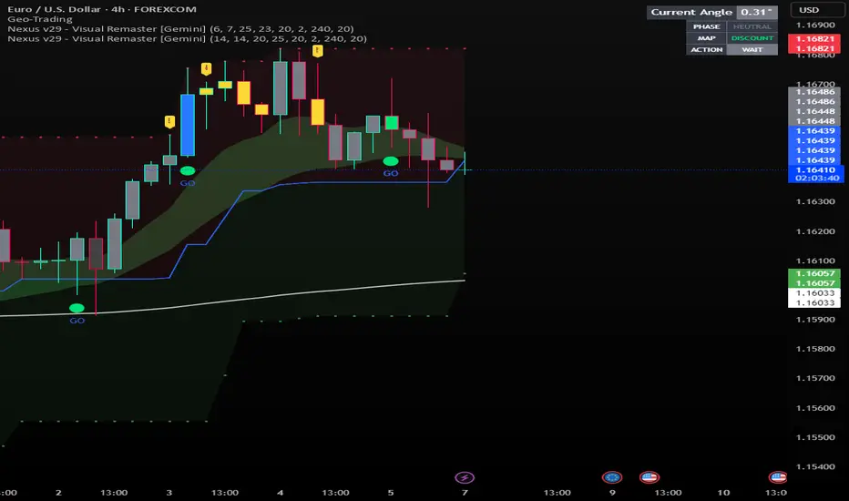
Nexus v29 - Visual Remaster- The Unified Physics EngineTitle: Nexus v29 - Visual Remaster :The Unified Physics Engine
Description:
The Physics of Price Movement
Most indicators fail because they look at only one dimension of the market. They might show you price direction (RSI) or activity (Volume), but they rarely tell you if the move has actual power behind it.
Nexus v29 is built on a "Unified Physics" philosophy. Just as an object in the physical world needs Mass, Acceleration, and Energy to move effectively, a price trend needs Volume, Force, and Trend Strength to sustain a run.
This indicator visualizes the "Life Cycle" of a trend, filtering out the noise (churn) to highlight only the high-probability explosion points where physics aligns in your favor.
How It Works: The 3 Components
1. The Energy (ADX Filter)
The White Line: This is your master switch. It measures the total energy in the system.
The Logic: When the white line is below the threshold (25), the market is in a "Dead Zone." No matter how good the candle looks, there is no kinetic energy to sustain a move. We stay flat.
The Signal: When the line crosses above 25, the engine is on.
2. The Mass (Volume Fuel)
The Background Bars: These represent the market participation.
Grey Bars: Wasted fuel. High volume in a low-energy market is just churn/absorption.
Silver/Blue Bars: Active fuel. Volume that is successfully converting into price movement.
3. The Vector (Force Histogram)
The Colored Bars: This represents the immediate directional force (Momentum).
Lime Green: Explosion. Price is pushing up, Volume is supporting it, and ADX confirms the energy. This is a valid Long environment.
Red: Crash. Price is pushing down with supported volume and high energy. This is a valid Short environment.
Orange/Maroon: Fakeout/Churn. Divergences where price and volume disagree.
The "Equation" Strategy
This script is not just a visualizer; it implements a strict "Physics Equation" to filter trades. A signal is only valid if ALL of the following conditions are met simultaneously:
Trend Alignment: Price must be on the correct side of the 200 SMA (Long > 200, Short < 200).
Volatility Gate: The market must be expanding (ATR > Baseline).
Force Threshold: The momentum impulse must be significant (Force Histogram > 100), ensuring we are catching a runaway train, not a bicycle.
Active Energy: ADX must be > 25.
How to Trade It
Entry: Wait for a Lime Green (Long) or Red (Short) bar that breaks out while the White Line (ADX) is rising. This confirms "Unified Physics"—Mass, Force, and Energy are all aligned.
The Lifecycle Exit: Do not wait for the trend to reverse. Exit when the "physics" break.
Look for the Force Histogram bars to start shrinking for 2 consecutive candles. This indicates momentum is fading (deceleration).
Exit immediately on the close of the second shrinking bar to capture the bulk of the impulsive move (The "Meat" of the trade) before the inevitable pullback.
Indicator Settings
RSI Length: Standard 14 (The Speed).
Volume Lookback: 100 (For relative scaling).
ADX Threshold: 25 (The "Go/No-Go" Line).
Trend Filter: 200 Period SMA.
Disclaimer: Trading involves high risk. This tool helps visualize market conditions based on historical physics but does not guarantee future performance. Always use proper risk management.
Sniper PRO: The "Institutional X-Ray" [Visual Trend System]"The stock market is a device for transferring money from the impatient to the patient." — Warren Buffett
Stop gambling. Stop guessing. Start hunting.
Most traders get slaughtered because they look at Price. The top 1% make fortunes because they look at Money Flow.
Sniper PRO gives you that unfair advantage. It is a complete, visual trading system designed to act as an "Institutional X-Ray" for your charts. It ignores the retail noise and tracks the only thing that moves markets: Big Institutional Volume.
🔥 Why is this the "Holy Grail" for Swing Traders?
You know that feeling when you get stopped out, only to watch the stock rocket to the moon without you? It ends today.
This system introduces the "VFI Absolute Shield" technology.
The Secret: Even if price breaks your support, the algorithm checks the Dark Pools and Institutional Volume.
The Result: If the Whales are still holding, The Shield holds. You stay in the trade while everyone else panics. This is how you catch the 100%+ runners.
🦁 Visual Beast Mode: What you see
We stripped away the confusing numbers and gave you a Heads-Up Display (HUD):
The Trend Snake 🐍
The EMA 50 comes alive. It changes color dynamically.
Lime Green: Bull Market (Accumulation).
Blood Red: Bear Market (Distribution).
Blue/Orange: Stay Away (The Trap Zone).
Smart Signals (No Repaint)
🚀 Rocket: High-confidence Long entry confirmed by volume.
🩸 Drop: High-confidence Short entry (or hedge).
💀 Skull Markers: Honest, transparent loss markers so you can learn from every move.
The "Sleep Well" Stop Loss
See that dotted line? That’s your safety net.
When the 🛡️ SHIELD icon appears, you know you are protected by Smart Money flow, even if the price dips.
🏆 How to trade like a Hedge Fund
Timeframes: Best on 1H, 4H, Daily (Swing Trading).
Assets: Optimized for Stocks (NVDA, TSLA, AAPL) & Crypto (BTC, ETH).
Strategy: Wait for the Snake to turn Green + Rocket signal. Ride it until the Shield breaks.
Stop being the liquidity. Be the Sniper.
Disclaimer: This is a powerful analysis tool. Always manage your risk.
