BTC x M2 Divergence (Weekly)### Why the "M2 Money Supply vs BTC Divergence with Normalized RSI" Indicator Should Work
IMPORTANT
- Weekly only indicator
- Combine it with BTC Halving Cycle Profit for better results
The "M2 Money Supply vs BTC Divergence with Normalized RSI" indicator leverages the relationship between macroeconomic factors (M2 money supply) and Bitcoin price movements, combined with technical analysis tools like RSI, to provide actionable trading signals. Here's a detailed rationale on why this indicator should be effective:
1. **Macroeconomic Influence**:
- **M2 Money Supply**: Represents the total money supply, including cash, checking deposits, and easily convertible near money. Changes in M2 reflect liquidity in the economy, which can influence asset prices, including Bitcoin.
- **Bitcoin Sensitivity to Liquidity**: Bitcoin, being a digital asset, often reacts to changes in liquidity conditions. An increase in money supply can lead to higher asset prices as more money chases fewer assets, while a decrease can signal tightening conditions and lower prices.
2. **Divergence Analysis**:
- **Economic Divergence**: The indicator calculates the divergence between the percentage changes in M2 and Bitcoin prices. This divergence can highlight discrepancies between Bitcoin's price movements and broader economic conditions.
- **Market Inefficiencies**: Large divergences may indicate inefficiencies or imbalances that could lead to price corrections or trends. For example, if M2 is increasing (indicating more liquidity) but Bitcoin is not rising proportionately, it might suggest a potential upward correction in Bitcoin's price.
3. **Normalization and Smoothing**:
- **Normalized Divergence**: Normalizing the divergence to a consistent scale (-100 to 100) allows for easier comparison and interpretation over time, making the signals more robust.
- **Smoothing with EMA**: Applying Exponential Moving Averages (EMAs) to the normalized divergence helps to reduce noise and identify the underlying trend more clearly. This double-smoothed divergence provides a clearer signal by filtering out short-term volatility.
4. **RSI Integration**:
- **RSI as a Momentum Indicator**: RSI measures the speed and change of price movements, indicating overbought or oversold conditions. Normalizing the RSI and incorporating it into the divergence analysis helps to confirm the strength of the signals.
- **Combining Divergence with RSI**: By using RSI in conjunction with divergence, the indicator gains an additional layer of confirmation. For instance, a bullish divergence combined with an oversold RSI can be a strong buy signal.
5. **Dynamic Zones and Sensitivity**:
- **Good DCA Zones**: Highlighting zones where the divergence is significantly positive (good DCA zones) indicates periods where Bitcoin might be undervalued relative to economic conditions, suggesting good buying opportunities.
- **Red Zones**: Marking zones with extremely negative divergence, combined with RSI confirmation, identifies potential market tops or bearish conditions. This helps traders avoid buying into overbought markets or consider selling.
- **Peak Detection**: The sensitivity setting for detecting upside down peaks allows for early identification of potential market bottoms, providing timely entry points for traders.
6. **Visual Cues and Alerts**:
- **Clear Visualization**: The plots and background colors provide immediate visual feedback, making it easier for traders to spot significant conditions without deep analysis.
- **Alerts**: Built-in alerts for key conditions (good DCA zones, red zones, sell signals) ensure traders can act promptly based on the indicator's signals, enhancing the practicality of the tool.
### Conclusion
The "M2 Money Supply vs BTC Divergence with Normalized RSI" indicator integrates macroeconomic data with technical analysis to offer a comprehensive view of Bitcoin's market conditions. By analyzing the divergence between M2 money supply and Bitcoin prices, normalizing and smoothing the data, and incorporating RSI for momentum confirmation, the indicator provides robust signals for identifying potential buying and selling opportunities. This holistic approach increases the likelihood of capturing significant market movements and making informed trading decisions.
In den Scripts nach "足球日本vs中国" suchen

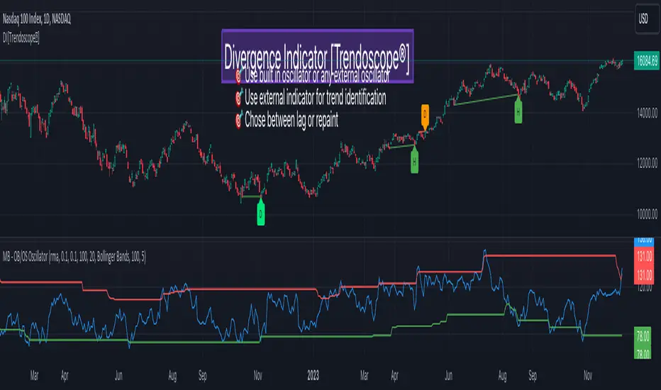
Divergence Indicator [Trendoscope®]🎲 New Divergence Indicator by Trendoscope
Our latest Divergence Indicator revolutionizes the way traders identify market trends and potential reversals. Built upon the robust foundation of the Zigzag Trend Divergence Detector and inline with our recent implementation of the Divergence Goggles indicator, this tool is designed to be intuitive yet powerful, making it an essential addition to any trader's toolkit.
We received several queries on extending the Divergence Goggles to last N bars instead of using an interactive widget. Though it is possible, we thought the better approach is to enable the indicator to use any oscillator and trend indicator in order to define the divergence.
🎯 Key Features
Flexible Oscillator Integration : Choose from a wide range of built-in oscillators or import your own, including options like the innovative Multiband Oscillator. This versatility extends to using volume indicators like OBV for divergence calculations, broadening the scope of analysis.
Trend Identification Versatility : Utilize built-in methods like Zigzag and MA Difference, or integrate external trend indicators. Our system adapts to various methods, ensuring you have the right tools for precise trend identification.
Customizable Zigzag Sensitivity : Adjust the Zigzag based on your chosen oscillator's sensitivity to ensure divergence lines are accurate and visually coherent.
Repainting vs. Delayed Signals : Tailor the indicator to your strategy by choosing between immediate repainting signals and slightly delayed but more stable signals.
🎯 Understanding Divergence: Key Rules
Bullish Divergence
Happens only in downtrend
Observed on Pivot Lows
Price makes lower low whereas oscillator makes higher low, indicating weakness and possible reversal
Bearish Divergence
Happens only in uptrend
Observed on Pivot Highs
Price makes higher high whereas oscillator makes lower high, indicating weakness and possible reversal
Bullish Hidden Divergence
Happens only in uptrend
Observed on Pivot Lows
Price makes higher low, whereas indicator makes lower low due to price consolidation. In bullish trend, this is considered as bullish as the price gets a breather and get ready to surge further.
Bearish Hidden Divergence
Happens only in downtrend
Observed on Pivot Highs
Price makes lower high whereas oscillator makes higher high due to price consolidation. In bearish trend, this is considered as bearish as the price gets a breather and get ready to fall further.
🎯 Visual Insights: Divergence and Hidden Divergence
For a clearer understanding, refer to our visual guides:
🎲 Using the Divergence Indicator: A Step-by-Step Guide
🎯 Step 1 - Selecting the Oscillator
Customize your analysis by choosing from a variety of oscillators or importing your preferred one. Options are available to select a range of built-in oscillators and the loopback length. However, if the oscillator that user want to use is not in the list, they can simply load the oscillator from the indicator library and use it as an external signal.
In our current example, we are using a custom oscillator called - Multiband Oscillator
This also means, the indicator option is not limited to oscillators. Users can even make use of volume indicators such as OBV for the calculation of divergence.
🎯 Step 2 - Choosing the Trend Identification Method
Select from our built-in methods or integrate an external indicator to accurately identify market trends. Trend is one of the key parameters of divergence type identification. Trend can be identified mathematically by various methods. Some of them are as simple as above or below 200 moving average and some can follow trend based indicators such as supertrend and others can be very complex.
To cater for a wider audience, here too we have provided the option to use an external trend indicator. The simple condition for the external trend indicator is that it should return positive value for uptrend and negative value for downtrend.
Other than that, we also have 2 built in trend identification methods.
Zigzag - The trend is defined by the starting pivot of divergence line. If the starting pivot is Higher High or Higher Low, then it is considered uptrend. And if the starting pivot is either Lower Low or Lower High, then we consider it as downtrend.
MA Difference - In this case, the difference between the moving average of pivots joining the divergence line will determine the trend. It is considered uptrend if the moving average increased from starting pivot to ending pivot of the divergence line, and it is considered downtrend if the moving average decreased from starting pivot to the ending pivot of the divergence line.
🎯 Step 3 - Adjusting Zigzag Sensitivity
Fine-tune the Zigzag to match the oscillator's sensitivity, ensuring divergence lines are accurate and visually coherent.
🎯 Step 4 - Managing Repainting
Understand the implications of repainting in the last pivot of the Zigzag and choose between immediate or delayed signals based on your trading strategy. The last pivot of the zigzag repaint by design. This is not necessarily a bad thing. Users can just choose not to use the last pivot, but instead use the last but one for all the calculations. But, this also means, the signals will be delayed.
Indicator provides option to use repainting signal vs delayed signal. If you select the repaint option, the signals are shown immediately as and when they occur. But, there is a possibility that these signals change when the new price candles change zigzag pivot.
If you chose not to select the repaint option, then the divergence signals may lag by a few bars.
RVol LabelThis Code is update version of Code Provided by @ssbukam, Here is Link to his original Code and review the Description
Below is Original Description
1. When chart resolution is Daily or Intraday (D, 4H, 1H, 5min, etc), Relative Volume shows value based on DAILY. RVol is measured on daily basis to compare past N number of days.
2. When resolution is changed to Weekly or Monthly, then Relative Volume shows corresponding value. i.e. Weekly shows weekly relative volume of this week compared to past 'N' weeks. Likewise for Monthly. You would see change in label name. Like, Weekly chart shows W_RVol (Weekly Relative Volume). Likewise, Daily & Intraday shows D_RVol. Monthly shows M_RVol (Monthly Relative Volume).
3. Added a plot (by default hidden) for this specific reason: When you move the cursor to focus specific candle, then Indicator Value displays relative volume of that specific candle. This applies to Intraday as well. So if you're in 1HR chart and move the cursor to a specific candle, Indicator Value shows relative volume for that specific candlestick bar.
4. Updating the script so that text size and location can be customized.
Changes to Updated Label by me
1. Added Today's Volume to the Label
2. Added Total Average Volume to the Label
3. Comparison vs Both in Single Line and showing how much volume has traded vs the average volume for that time of the day
4. Aesthetic Look of the Label
How to Use Relative Volume for Trading
Using Relative Volume (RVol) in trading can be a valuable tool to help you identify potential trading opportunities and gain insight into market behavior. Here are some ways to use RVol in your trading strategy:
Identifying High-Volume Breakouts: RVol can help you spot potential breakouts when the volume surges significantly above its average. High RVol during a breakout suggests strong market interest, increasing the probability of a sustained move in the direction of the breakout.
Confirming Trends and Reversals: RVol can act as a confirmation tool for trends and reversals. A trend accompanied by rising RVol indicates a strong and sustainable move. Conversely, a trend with declining RVol might suggest a weakening trend or potential reversal.
Spotting Volume Divergence: When the price is moving in one direction, but RVol is declining or not confirming the move, it may indicate a divergence. This discrepancy could suggest a potential reversal or trend change.
Support and Resistance Confirmation: High RVol near key support or resistance levels can indicate potential price reactions at those levels. This confirmation can be valuable in determining whether a level is likely to hold or break.
Filtering Trade Signals: Incorporate RVol into your existing trading strategy as a filter. For example, you might consider taking trades only if RVol is above a certain threshold, ensuring that you focus on high-impact trading opportunities.
Avoiding Low-Volume Traps: Low RVol can indicate a lack of interest or participation in the market. In such situations, price movements may be erratic and less reliable, so it's often wise to avoid trading during low RVol periods.
Monitoring News Events: Around significant news events or earnings releases, RVol can help you gauge the market's reaction to the information. High RVol during such events can present trading opportunities but be cautious of increased volatility and potential gaps.
Adjusting Trade Size: During periods of extremely high RVol, it might be prudent to adjust your position size to account for higher risk.
Using Relative Volume in Morning Session
If the Volume traded in first 15 minute to 30 Minutes is already at 50% or 100% depending upon the ticker, it means that it is going to have very high Volume vs average by end of the day.
This gives me conviction for Long or Short Trades
Remember that RVol is not a standalone indicator; it works best when used in conjunction with other technical and fundamental analysis tools. Additionally, RVol's effectiveness may vary across different markets and trading strategies. Therefore, backtesting and validating the use of RVol in your trading approach is essential.
Lastly, risk management is crucial in trading. While RVol can provide valuable insights, it cannot guarantee profitable trades. Always use appropriate risk management strategies, such as setting stop-loss levels, and avoid overexposing yourself to the market based solely on RVol readings.
Market Structure & Liquidity: CHoCHs+Nested Pivots+FVGs+Sweeps//Purpose:
This indicator combines several tools to help traders track and interpret price action/market structure; It can be divided into 4 parts;
1. CHoCHs, 2. Nested Pivot highs & lows, 3. Grade sweeps, 4. FVGs.
This gives the trader a toolkit for determining market structure and shifts in market structure to help determine a bull or bear bias, whether it be short-term, med-term or long-term.
This indicator also helps traders in determining liquidity targets: wether they be voids/gaps (FVGS) or old highs/lows+ typical sweep distances.
Finally, the incorporation of HTF CHoCH levels printing on your LTF chart helps keep the bigger picture in mind and tells traders at a glance if they're above of below Custom HTF CHoCH up or CHoCH down (these HTF CHoCHs can be anything from Hourly up to Monthly).
//Nomenclature:
CHoCH = Change of Character
STH/STL = short-term high or low
MTH/MTL = medium-term high or low
LTH/LTL = long-term high or low
FVG = Fair value gap
CE = consequent encroachement (the midline of a FVG)
~~~ The Four components of this indicator ~~~
1. CHoCHs:
•Best demonstrated in the below charts. This was a method taught to me by @Icecold_crypto. Once a 3 bar fractal pivot gets broken, we count backwards the consecutive higher lows or lower highs, then identify the CHoCH as the opposite end of the candle which ended the consecutive backwards count. This CHoCH (UP or DOWN) then becomes a level to watch, if price passes through it in earnest a trader would consider shifting their bias as market structure is deemed to have shifted.
•HTF CHoCHs: Option to print Higher time frame chochs (default on) of user input HTF. This prints only the last UP choch and only the last DOWN choch from the input HTF. Solid line by default so as to distinguish from local/chart-time CHoCHs. Can be any Higher timeframe you like.
•Show on table: toggle on show table(above/below) option to show in table cells (top right): is price above the latest HTF UP choch, or is price below HTF DOWN choch (or is it sat between the two, in a state of 'uncertainty').
•Most recent CHoCHs which have not been met by price will extend 10 bars into the future.
• USER INPUTS: overall setting: SHOW CHOCHS | Set bars lookback number to limit historical Chochs. Set Live CHoCHs number to control the number of active recent chochs unmet by price. Toggle shrink chochs once hit to declutter chart and minimize old chochs to their origin bars. Set Multi-timeframe color override : to make Color choices auto-set to your preference color for each of 1m, 5m, 15m, H, 4H, D, W, M (where up and down are same color, but 'up' icon for up chochs and down icon for down chochs remain printing as normal)
2. Nested Pivot Highs & Lows; aka 'Pivot Highs & Lows (ST/MT/LT)'
•Based on a seperate, longer lookback/lookforward pivot calculation. Identifies Pivot highs and lows with a 'spikeyness' filter (filtering out weak/rounded/unimpressive Pivot highs/lows)
•by 'nested' I mean that the pivot highs are graded based on whether a pivot high sits between two lower pivot highs or vice versa.
--for example: STH = normal pivot. MTH is pivot high with a lower STH on either side. LTH is a pivot high with a lower MTH on either side. Same applies to pivot lows (STL/MTL/LTL)
•This is a useful way to measure the significance of a high or low. Both in terms of how much it might be typically swept by (see later) and what it would imply for HTF bias were we to break through it in earnest (more than just a sweep).
• USER INPUTS: overall setting: show pivot highs & lows | Bars lookback (historical pivots to show) | Pivots: lookback/lookforward length (determines the scale of your pivot highs/lows) | toggle on/off Apply 'Spikeyness' filter (filters out smooth/unimpressive pivot highs/lows). Set Spikeyness index (determines the strength of this filter if turned on) | Individually toggle on each of STH, MTH, LTH, STL, MTL, LTL along with their label text type , and size . Toggle on/off line for each of these Pivot highs/lows. | Set label spacer (atr multiples above / below) | set line style and line width
3. Grade Sweeps:
•These are directly related to the nested pivots described above. Most assets will have a typical sweep distance. I've added some of my expected sweeps for various assets in the indicator tooltips.
--i.e. Eur/Usd 10-20-30 pips is a typical 'grade' sweep. S&P HKEX:5 - HKEX:10 is a typical grade sweep.
•Each of the ST/MT/LT pivot highs and lows have optional user defined grade sweep boxes which paint above until filled (or user option for historical filled boxes to remain).
•Numbers entered into sweep input boxes are auto converted into appropriate units (i.e. pips for FX, $ or 'handles' for indices, $ for Crypto. Very low $ units can be input for low unit value crypto altcoins.
• USER INPUTS: overall setting: Show sweep boxes | individually select colors of each of STH, MTH, LTH, STL, MTL, LTL sweep boxes. | Set Grade sweep ($/pips) number for each of ST, MT, LT. This auto converts between pips and $ (i.e. FX vs Indices/Crypto). Can be a float as small or large as you like ($0.000001 to HKEX:1000 ). | Set box text position (horizontal & vertical) and size , and color . | Set Box width (bars) (for non extended/ non-auto-terminating at price boxes). | toggle on/off Extend boxes/lines right . | Toggle on/off Shrink Grade sweeps on fill (they will disappear in realtime when filled/passed through)
4. FVGs:
•Fair Value gaps. Represent 'naked' candle bodies where the wicks to either side do not meet, forming a 'gap' of sorts which has a tendency to fill, or at least to fill to midline (CE).
•These are ICT concepts. 'UP' FVGS are known as BISIs (Buyside imbalance, sellside inefficiency); 'DOWN' FVGs are known as SIBIs (Sellside imbalance, buyside inefficiency).
• USER INPUTS: overall setting: show FVGs | Bars lookback (history). | Choose to display: 'UP' FVGs (BISI) and/or 'DOWN FVGs (SIBI) . Choose to display the midline: CE , the color and the line style . Choose threshold: use CE (as opposed to Full Fill) |toggle on/off Shrink FVG on fill (CE hit or Full fill) (declutter chart/see backtesting history)
////••Alerts (general notes & cautionary notes)::
•Alerts are optional for most of the levels printed by this indicator. Set them via the three dots on indicator status line.
•Due to dynamic repainting of levels, alerts should be used with caution. Best use these alerts either for Higher time frame levels, or when closely monitoring price.
--E.g. You may set an alert for down-fill of the latest FVG below; but price will keep marching up; form a newer/higher FVG, and the alert will trigger on THAT FVG being down-filled (not the original)
•Available Alerts:
-FVG(BISI) cross above threshold(CE or full-fill; user choice). Same with FVG(SIBI).
-HTF last CHoCH down, cross below | HTF last CHoCH up, cross above.
-last CHoCH down, cross below | last CHoCH up, cross above.
-LTH cross above, MTH cross above, STH cross above | LTL cross below, MTL cross below, STL cross below.
////••Formatting (general)::
•all table text color is set from the 'Pivot highs & Lows (ST, MT, LT)' section (for those of you who prefer black backgrounds).
•User choice of Line-style, line color, line width. Same with Boxes. Icon choice for chochs. Char or label text choices for ST/MT/LT pivot highs & lows.
////••User Inputs (general):
•Each of the 4 components of this indicator can be easily toggled on/off independently.
•Quite a lot of options and toggle boxes, as described in full above. Please take your time and read through all the tooltips (hover over '!' icon) to get an idea of formatting options.
•Several Lookback periods defined in bars to control how much history is shown for each of the 4 components of this indicator.
•'Shrink on fill' settings on FVGs and CHoCHs: Basically a way to declutter chart; toggle on/off depending on if you're backtesting or reading live price action.
•Table Display: applies to ST/MT/LT pivot highs and to HTF CHoCHs; Toggle table on or off (in part or in full)
////••Credits:
•Credit to ICT (Inner Circle Trader) for some of the concepts used in this indicator (FVGS & CEs; Grade sweeps).
•Credit to @Icecold_crypto for the specific and novel concept of identifying CHoCHs in a simple, objective and effective manner (as demonstrated in the 1st chart below).
CHoCH demo page 1: shifting tweak; arrow diagrams to demonstrate how CHoCHs are defined:
CHoCH demo page 2: Simplified view; short lookback history; few CHoCHs, demo of 'latest' choch being extended into the future by 10 bars:
USAGE: Bitcoin Hourly using HTF daily CHoCHs:
USAGE-2: Cotton Futures (CT1!) 2hr. Painting a rather bullish picture. Above HTF UP CHoCH, Local CHoCHs show bullish order flow, Nice targets above (MTH/LTH + grade sweeps):
Full Demo; 5min chart; CHoCHs, Short term pivot highs/lows, grade sweeps, FVGs:
Full Demo, Eur/Usd 15m: STH, MTH, LTH grade sweeps, CHoCHs, Usage for finding bias (part A):
Full Demo, Eur/Usd 15m: STH, MTH, LTH grade sweeps, CHoCHs, Usage for finding bias, 3hrs later (part B):
Realtime Vs Backtesting(A): btc/usd 15m; FVGs and CHoCHs: shrink on fill, once filled they repaint discreetly on their origin bar only. Realtime (Shrink on fill, declutter chart):
Realtime Vs Backtesting(B): btc/usd 15m; FVGs and CHoCHs: DON'T shrink on fill; they extend to the point where price crosses them, and fix/paint there. Backtesting (seeing historical behaviour):

Support Bands indicatorSupport Band to follow Trends.
We can see clear where price is Trading. Observe how moving averages are developing or aligning to change trend or continuation.
Green up trend vs Red Down Trend
Band 1
8EMA Green Line vs 10SMA Light blue Line
Band 2
21EMA Orange Line vs 30 SMA Brown Line
Also includes
1 SMA Gray line for closing when you're looking at weakly charts.
40 SMA darker Gray
50 SMA Blue
100 SMA White
150 SMA Pink
200 SMA Yellow
300 SMA Dark Red
I hope it helps you to see when price is trending up and a set correctly your stop.

CVD - Cumulative Volume Delta Candles█ OVERVIEW
This indicator displays cumulative volume delta in candle form. It uses intrabar information to obtain more precise volume delta information than methods using only the chart's timeframe.
█ CONCEPTS
Bar polarity
By bar polarity , we mean the direction of a bar, which is determined by looking at the bar's close vs its open .
Intrabars
Intrabars are chart bars at a lower timeframe than the chart's. Each 1H chart bar of a 24x7 market will, for example, usually contain 60 bars at the lower timeframe of 1min, provided there was market activity during each minute of the hour. Mining information from intrabars can be useful in that it offers traders visibility on the activity inside a chart bar.
Lower timeframes (LTFs)
A lower timeframe is a timeframe that is smaller than the chart's timeframe. This script uses a LTF to access intrabars. The lower the LTF, the more intrabars are analyzed, but the less chart bars can display CVD information because there is a limit to the total number of intrabars that can be analyzed.
Volume delta
The volume delta concept divides a bar's volume in "up" and "down" volumes. The delta is calculated by subtracting down volume from up volume. Many calculation techniques exist to isolate up and down volume within a bar. The simplest techniques use the polarity of interbar price changes to assign their volume to up or down slots, e.g., On Balance Volume or the Klinger Oscillator . Others such as Chaikin Money Flow use assumptions based on a bar's OHLC values. The most precise calculation method uses tick data and assigns the volume of each tick to the up or down slot depending on whether the transaction occurs at the bid or ask price. While this technique is ideal, it requires huge amounts of data on historical bars, which usually limits the historical depth of charts and the number of symbols for which tick data is available.
This indicator uses intrabar analysis to achieve a compromise between the simplest and most precise methods of calculating volume delta. In the context where historical tick data is not yet available on TradingView, intrabar analysis is the most precise technique to calculate volume delta on historical bars on our charts. Our Volume Profile indicators use it. Other volume delta indicators in our Community Scripts such as the Realtime 5D Profile use realtime chart updates to achieve more precise volume delta calculations, but that method cannot be used on historical bars, so those indicators only work in real time.
This is the logic we use to assign intrabar volume to up or down slots:
• If the intrabar's open and close values are different, their relative position is used.
• If the intrabar's open and close values are the same, the difference between the intrabar's close and the previous intrabar's close is used.
• As a last resort, when there is no movement during an intrabar and it closes at the same price as the previous intrabar, the last known polarity is used.
Once all intrabars making up a chart bar have been analyzed and the up or down property of each intrabar's volume determined, the up volumes are added and the down volumes subtracted. The resulting value is volume delta for that chart bar.
█ FEATURES
CVD Candles
Cumulative Volume Delta Candles present volume delta information as it evolves during a period of time.
This is how each candle's levels are calculated:
• open : Each candle's' open level is the cumulative volume delta for the current period at the start of the bar.
This value becomes zero on the first candle following a CVD reset.
The candles after the first one always open where the previous candle closed.
The candle's high, low and close levels are then calculated by adding or subtracting a volume value to the open.
• high : The highest volume delta value found in intrabars. If it is not higher than the volume delta for the bar, then that candle will have no upper wick.
• low : The lowest volume delta value found in intrabars. If it is not lower than the volume delta for the bar, then that candle will have no lower wick.
• close : The aggregated volume delta for all intrabars. If volume delta is positive for the chart bar, then the candle's close will be higher than its open, and vice versa.
The candles are plotted in one of two configurable colors, depending on the polarity of volume delta for the bar.
CVD resets
The "cumulative" part of the indicator's name stems from the fact that calculations accumulate during a period of time. This allows you to analyze the progression of volume delta across manageable chunks, which is often more useful than looking at volume delta cumulated from the beginning of a chart's history.
You can configure the reset period using the "CVD Resets" input, which offers the following selections:
• None : Calculations do not reset.
• On a fixed higher timeframe : Calculations reset on the higher timeframe you select in the "Fixed higher timeframe" field.
• At a fixed time that you specify.
• At the beginning of the regular session .
• On a stepped higher timeframe : Calculations reset on a higher timeframe automatically stepped using the chart's timeframe and following these rules:
Chart TF HTF
< 1min 1H
< 3H 1D
<= 12H 1W
< 1W 1M
>= 1W 1Y
The indicator's background shows where resets occur.
Intrabar precision
The precision of calculations increases with the number of intrabars analyzed for each chart bar. It is controlled through the script's "Intrabar precision" input, which offers the following selections:
• Least precise, covering many chart bars
• Less precise, covering some chart bars
• More precise, covering less chart bars
• Most precise, 1min intrabars
As there is a limit to the number of intrabars that can be analyzed by a script, a tradeoff occurs between the number of intrabars analyzed per chart bar and the chart bars for which calculations are possible.
Total volume candles
You can choose to display candles showing the total intrabar volume for the chart bar. This provides you with more context to evaluate a bar's volume delta by showing it relative to the sum of intrabar volume. Note that because of the reasons explained in the "NOTES" section further down, the total volume is the sum of all intrabar volume rather than the volume of the bar at the chart's timeframe.
Total volume candles can be configured with their own up and down colors. You can also control the opacity of their bodies to make them more or less prominent. This publication's chart shows the indicator with total volume candles. They are turned off by default, so you will need to choose to display them in the script's inputs for them to plot.
Divergences
Divergences occur when the polarity of volume delta does not match that of the chart bar. You can identify divergences by coloring the CVD candles differently for them, or by coloring the indicator's background.
Information box
An information box in the lower-left corner of the indicator displays the HTF used for resets, the LTF used for intrabars, and the average quantity of intrabars per chart bar. You can hide the box using the script's inputs.
█ INTERPRETATION
The first thing to look at when analyzing CVD candles is the side of the zero line they are on, as this tells you if CVD is generally bullish or bearish. Next, one should consider the relative position of successive candles, just as you would with a price chart. Are successive candles trending up, down, or stagnating? Keep in mind that whatever trend you identify must be considered in the context of where it appears with regards to the zero line; an uptrend in a negative CVD (below the zero line) may not be as powerful as one taking place in positive CVD values, but it may also predate a movement into positive CVD territory. The same goes with stagnation; a trader in a long position will find stagnation in positive CVD territory less worrisome than stagnation under the zero line.
After consideration of the bigger picture, one can drill down into the details. Exactly what you are looking for in markets will, of course, depend on your trading methodology, but you may find it useful to:
• Evaluate volume delta for the bar in relation to price movement for that bar.
• Evaluate the proportion that volume delta represents of total volume.
• Notice divergences and if the chart's candle shape confirms a hesitation point, as a Doji would.
• Evaluate if the progress of CVD candles correlates with that of chart bars.
• Analyze the wicks. As with price candles, long wicks tend to indicate weakness.
Always keep in mind that unless you have chosen not to reset it, your CVD resets for each period, whether it is fixed or automatically stepped. Consequently, any trend from the preceding period must re-establish itself in the next.
█ NOTES
Know your volume
Traders using volume information should understand the volume data they are using: where it originates and what transactions it includes, as this can vary with instruments, sectors, exchanges, timeframes, and between historical and realtime bars. The information used to build a chart's bars and display volume comes from data providers (exchanges, brokers, etc.) who often maintain distinct feeds for intraday and end-of-day (EOD) timeframes. How volume data is assembled for the two feeds depends on how instruments are traded in that sector and/or the volume reporting policy for each feed. Instruments from crypto and forex markets, for example, will often display similar volume on both feeds. Stocks will often display variations because block trades or other types of trades may not be included in their intraday volume data. Futures will also typically display variations.
Note that as intraday vs EOD variations exist for historical bars on some instruments, differences may also exist between the realtime feeds used on intraday vs 1D or greater timeframes for those same assets. Realtime reporting rules will often be different from historical feed reporting rules, so variations between realtime feeds will often be different from the variations between historical feeds for the same instrument. The Volume X-ray indicator can help you analyze differences between intraday and EOD volumes for the instruments you trade.
If every unit of volume is both bought by a buyer and sold by a seller, how can volume delta make sense?
Traders who do not understand the mechanics of matching engines (the exchange software that matches orders from buyers and sellers) sometimes argue that the concept of volume delta is flawed, as every unit of volume is both bought and sold. While they are rigorously correct in stating that every unit of volume is both bought and sold, they overlook the fact that information can be mined by analyzing variations in the price of successive ticks, or in our case, intrabars.
Our calculations model the situation where, in fully automated order handling, market orders are generally matched to limit orders sitting in the order book. Buy market orders are matched to quotes at the ask level and sell market orders are matched to quotes at the bid level. As explained earlier, we use the same logic when comparing intrabar prices. While using intrabar analysis does not produce results as precise as when individual transactions — or ticks — are analyzed, results are much more precise than those of methods using only chart prices.
Not only does the concept underlying volume delta make sense, it provides a window on an oft-overlooked variable which, with price and time, is the only basic information representing market activity. Furthermore, because the calculation of volume delta also uses price and time variations, one could conceivably surmise that it can provide a more complete model than ones using price and time only. Whether or not volume delta can be useful in your trading practice, as usual, is for you to decide, as each trader's methodology is different.
For Pine Script™ coders
As our latest Polarity Divergences publication, this script uses the recently released request.security_lower_tf() Pine Script™ function discussed in this blog post . It works differently from the usual request.security() in that it can only be used at LTFs, and it returns an array containing one value per intrabar. This makes it much easier for programmers to access intrabar information.
Look first. Then leap.

Numbers RenkoRenko with Volume and Time in the box was developed by David Weis (Authority on Wyckoff method) and his student.
I like this style (I don't know what it is officially called) because it brings out the potential of Wyckoff method and Renko, and looks beautiful.
I can't find this style Indicator anywhere, so I made something like it, then I named "Numbers Renko" (数字 練行足 in Japanese).
Caution : This indicator only works exactly in Renko Chart.
////////// Numbers Renko General Settings //////////
Volume Divisor : To make good looking Volume Number.
ex) You set 100. When Volume is 0.056, 0.05 x 100 = 5.6. 6 is plotted in the box (Decimal are round off).
Show Only Large Renko Volume : show only Renko Volume which is larger than Average Renko Volume (it is calculated by user selected moving average, option below).
Show Renko Time : "Only Large Renko Time" show only Renko Time which is larger than Average Renko Time (it is calculated by user selected moving average, option below).
EMA period for calculation : This is used to calculate Average Renko Time and Average Renko Volume (These are used to decide Numbers colors and Candles colors). Default is EMA, You can choice SMA.
////////// Numbers Renko Coloring //////////
The Numbers in the box are color coded by compared the current Renko Volume with the Average Renko Volume.
If the current Renko Volume is 2 times larger than the ARV, Color2 will be used. If the current Renko Volume is 1.5 times larger than the ARV, Color1.5 will be used. Color1 If the current Renko Volume is larger than the ARV . Color0.5 is larger than half Athe RV and Color0 is less than or equal to half the ARV. Color1, Color1.5 and Color2 are Large Value, so only these colored Numbers are showed when use "Show Only ~ " option.
Default is Renko Volume based Color coding, You can choice Renko Time based Color coding. Therefore you can use two type coloring at the same time. ex) The Numbers Colors are Renko Volume based. Candle body, border and wick Colors are Renko Time based.
////////// Weis Wave Volume //////////
Show Effort vs Result : Weis Wave Volume divided by Wave Length.
ex) If 100 Up WWV is accumulated between 30 Up Renko Box, 100 / 30 = 3.33... will be 3.3 (Second decimal will be rounded off).
No Result Ratio : If current "Effort vs Result" is "No Result Ratio" times larger than Average Effort vs Result, Square Mark will be show. AEvsR is calculated by 5SMA.
ex) You set 1.5. If Current EvsR is 20 and AEvsR is 10, 20 > 10 x 1.5 then Square Mark will be show.
If the left and right arrows are in the same direction, the right arrow is omitted.
Show Comparison Marks : Show left side arrow by compare current value to previous previous value and show right side small arrow by compare current value to previous value.
ex) Current Up WWV is 17 and Previous Up WWV (previous previous value) is 12, left side arrow is Up. Previous Dn WWV is 20, right side small arrow is Dn.
Large Volume Ratio : If current WWV is "Large Volume Ratio" times larger than Average WWV, Large WWV color is used.
Sample layout

DailyDeviationLibrary "DailyDeviation"
Helps in determining the relative deviation from the open of the day compared to the high or low values.
hlcDeltaArrays(daysPrior, maxDeviation, spec, res) Retuns a set of arrays representing the daily deviation of price for a given number of days.
Parameters:
daysPrior : Number of days back to get the close from.
maxDeviation : Maximum deviation before a value is considered an outlier. A value of 0 will not filter results.
spec : session.regular (default), session.extended or other time spec.
res : The resolution (default = '1440').
Returns: Where OH = Open vs High, OL = Open vs Low, and OC = Open vs Close
fromOpen(daysPrior, maxDeviation, comparison, spec, res) Retuns a value representing the deviation from the open (to the high or low) of the current day given number of days to measure from.
Parameters:
daysPrior : Number of days back to get the close from.
maxDeviation : Maximum deviation before a value is considered an outlier. A value of 0 will not filter results.
comparison : The value use in comparison to the current open for the day.
spec : session.regular (default), session.extended or other time spec.
res : The resolution (default = '1440').
Modified ATR Indicator [KL]Modified Average True Range (ATR) Indicator
This indicator displays the ATR with relative highs and relative lows statistically determined.
What is ATR:
To know what ATR is, we need to understand what a True Range (TR) is.
- TR at a given bar is the highest distance between points: a) High vs low, b) High vs Close, and c) Low vs Close.
- ATR is the moving average of TRs over a predefined lookback period; 14 is the most commonly used.
- ATR can be mathematically expressed as:
Why is ATR Important
ATR often used to measure volatility; high volatility is indicated by high ATR, vice versa for low. This is a versatile tool allowing traders to determine entry/exit points, as well as the size of stop losses and when to take profits relative to it.
This is an opinion: Through observations, I have noticed that ATR can also indirectly tell us the levels of relative volume. This intuitively makes sense because in order to increase length of TR, high amounts of capital inflow/outflow is required (graphically speaking, high volume is required in order to make lengths of candle sticks longer). The relationship between ATR and relative volume should hold unless the market is illiquid to the extreme that there is no relationship between volume and price.
That said, knowing the relative lows/highs of ATR is very useful. It can be interpreted as:
- Relative high = high volatility, usually during sell offs
- Relative low = decreasing volume, could indicate price consolidation
Instead of arbitrarily determining whether ATR is high/low, this indicator will determine relative highs and relative lows using a simple statistical model.
How relative high/low is determined by this model
This indicator applies two-tailed hypothesis testing to test whether ATR (ie. say lookback of 14) has greatly deviated from a larger sample size (ie. lookback of 50). Assuming ATR is normally distributed and variance is known, then test statistic (z) can be used to determine whether ATR14 is within the critical area under Null Hypothesis: ATR14 == ATR50. If z falls below/above the left/right critical values (ie. 1.645 for a 90% confidence interval), then this is shown by the indicator through using different colors to plot the ATR line.
Volume X-ray [LucF]█ OVERVIEW
This tool analyzes the relative size of volume reported on intraday vs EOD (end of day) data feeds on historical bars. If you use volume data to make trading decisions, it can help you improve your understanding of its nature and quality, which is especially important if you trade on intraday timeframes.
I often mention, when discussing volume analysis, how it's important for traders to understand the volume data they are using: where it originates, what it includes and does not include. By helping you spot sizeable differences between volume reported on intraday and EOD data feeds for any given instrument, "Volume X-ray" can point you to instruments where you might want to research the causes of the difference.
█ CONCEPTS
The information used to build a chart's historical bars originates from data providers (exchanges, brokers, etc.) who often maintain distinct historical feeds for intraday and EOD timeframes. How volume data is assembled for intraday and EOD feeds varies with instruments, brokers and exchanges. Variations between the two feeds — or their absence — can be due to how instruments are traded in a particular sector and/or the volume reporting policy for the feeds you are using. Instruments from crypto and forex markets, for example, will often display similar volume on both feeds. Stocks will often display variations because block trades or other types of trades may not be included in their intraday volume data. Futures will also typically display variations. It is even possible that volume from different feeds may not be of the same nature, as you can get trade volume (market volume) on one feed and tick volume (transaction counts) on another. You will sometimes be able to find the details of what different feeds contain from the technical information provided by exchanges/brokers on their feeds. This is an example for the NASDAQ feeds . Once you determine which feeds you are using, you can look for the reporting specs for that feed. This is all research you will need to do on your own; "Volume X-ray" will not help you with that part.
You may elect to forego the deep dive in feed information and simply rely on the figure the indicator will calculate for the instruments you trade. One simple — and unproven — way to interpret "Volume X-ray" values is to infer that instruments with larger percentages of intraday/EOD volume ratios are more "democratic" because at intraday timeframes, you are seeing a greater proportion of the actual traded volume for the instrument. This could conceivably lead one to conclude that such volume data is more reliable than on an instrument where intraday volume accounts for only 3% of EOD volume, let's say.
Note that as intraday vs EOD variations exist for historical bars on some instruments, there will typically also be differences between the realtime feeds used on intraday vs 1D or greater timeframes for those same assets. Realtime reporting rules will often be different from historical feed reporting rules, so variations between realtime feeds will often be different from the variations between historical feeds for the same instrument. A deep dive in reporting rules will quickly reveal what a jungle they are for some instruments, yet it is the only way to really understand the volume information our charts display.
█ HOW TO USE IT
The script is very simple and has no inputs. Just add it to 1D charts and it will calculate the proportion of volume reported on the intraday feed over the EOD volume. The plots show the daily values for both volumes: the teal area is the EOD volume, the orange line is the intraday volume. A value representing the average, cumulative intraday/EOD volume percentage for the chart is displayed in the upper-right corner. Its background color changes with the percentage, with brightness levels proportional to the percentage for both the bull color (% >= 50) or the bear color (% < 50). When abnormal conditions are detected, such as missing volume of one kind or the other, a yellow background is used.
Daily and cumulative values are displayed in indicator values and the Data Window.
The indicator loads in a pane, but you can also use it in overlay mode by moving it on the chart with "Move to" in the script's "More" menu, and disabling the plot display from the "Settings/Style" tab.
█ LIMITATIONS
• The script will not run on timeframes >1D because it cannot produce useful values on them.
• The calculation of the cumulative average will vary on different intraday timeframes because of the varying number of days covered by the dataset.
Variations can also occur because of irregularities in reported volume data. That is the reason I recommend using it on 1D charts.
• The script only calculates on historical bars because in real time there is no distinction between intraday and EOD feeds.
• You will see plenty of special cases if you use the indicator on a variety of instruments:
• Some instruments have no intraday volume, while on others it's the opposite.
• Missing information will sometimes appear here and there on datasets.
• Some instruments have higher intraday than EOD volume.
Please do not ask me the reasons for these anomalies; it's your responsibility to find them. I supply a tool that will spot the anomalies for you — nothing more.
█ FOR PINE CODERS
• This script uses a little-known feature of request.security() , which allows us to specify `"1440"` for the `timeframe` argument.
When you do, data from the 1min intrabars of the historical intraday feed is aggregated over one day, as opposed to the usual EOD feed used with `"D"`.
• I use gaps on my request.security() calls. This is useful because at intraday timeframes I can cumulate non- na values only.
• I use fixnan() on some values. For those who don't know about it yet, it eliminates na values from a series, just like not using gaps will do in a request.security() call.
• I like how the new switch structure makes for more readable code than equivalent if structures.
• I wrote my script using the revised recommendations in the Style Guide from the Pine v5 User Manual.
• I use the new runtime.error() to throw an error when the script user tries to use a timeframe >1D.
Why? Because then, my request.security() calls would be returning values from the last 1D intrabar of the dilation of the, let's say, 1W chart bar.
This of course would be of no use whatsoever — and misleading. I encourage all Pine coders fetching HTF data to protect their script users in the same way.
As tool builders, it is our responsibility to shield unsuspecting users of our scripts from contexts where our calcs produce invalid results.
• While we're on the subject of accessing intrabar timeframes, I will add this to the intention of coders falling victim to what appears to be
a new misconception where the mere fact of using intrabar timeframes with request.security() is believed to provide some sort of edge.
This is a fallacy unless you are sending down functions specifically designed to mine values from request.security() 's intrabar context.
These coders do not seem to realize that:
• They are only retrieving information from the last intrabar of the chart bar.
• The already flawed behavior of their scripts on historical bars will not improve on realtime bars. It will actually worsen because in real time,
intrabars are not yet ordered sequentially as they are on historical bars.
• Alerts or strategy orders using intrabar information acquired through request.security() will be using flawed logic and data most of the time.
The situation reminds me of the mania where using Heikin-Ashi charts to backtest was all the rage because it produced magnificent — and flawed — results.
Trading is difficult enough when doing the right things; I hate to see traders infected by lethal beliefs.
Strive to sharpen your "herd immunity", as Lionel Shriver calls it. She also writes: "Be leery of orthodoxy. Hold back from shared cultural enthusiasms."
Be your own trader.
█ THANKS
This indicator would not exist without the invaluable insights from Tim, a member of the Pine team. Thanks Tim!
Relative StrengthThis indicator is called Relative Strength and is no way related to RSI ( Relative strength indicator).
It is simply a ratio of asset A to asset B plotted. Usually it is used to look for strength vs a particular index. Since it is a ratio, all the trendlines work on it. The default index is NIFTY. You can change it any index/script you want to compare:
1. Script vs Index
2. Index vs Index

Market BuySell RatioA script using 1m small candle size (configurable) to compute the volume of buy (up) vs sell (down) candles (instead of actual market buy vs sell orders which are not available in pine script).
It then plots the buy vs sell ratio as an oscillator below the cart.
This gives traders an idea of current order flow in the market.
To compute the small candles this script uses the "Smart Volume" script which can be found here:

Aggression Bulbs v3.1 (Sessions + Bias, fixed)EYLONAggression Bulbs v3.2 (Sessions + Bias + Volume Surge)
This indicator highlights aggressive buy and sell activity during the London and New York sessions, using volume spikes and candle body dominance to detect institutional momentum.
⚙️ Main Logic
Compares each candle’s volume vs average volume (Volume Surge).
Checks body size vs full candle range to detect strong directional moves.
Uses an EMA bias filter to align signals with the current trend.
Displays green bubbles for aggressive buyers and red bubbles for aggressive sellers.
🕐 Sessions
London: 08:00–12:59 UTC+1
New York: 14:00–18:59 UTC+1
(Backgrounds: Yellow = London, Orange = New York)
📊 How to Read
🟢 Green bubble below bar → Aggressive BUY candle (strong demand).
🔴 Red bubble above bar → Aggressive SELL candle (strong supply).
Bubble size = relative strength (volume × candle dominance).
Use in confluence with key POI zones, volume profile, or delta clusters.
⚠️ Tips
Use on 1m–15m charts for scalping or intraday analysis.
Combine with your session bias or FVG zones for higher accuracy.
Set alerts when score ≥ threshold to catch early momentum.

NS ND - EVR - Daily Bias - TRFxVolume & Price Action Signals
What It Does
Combines three proven trading methodologies: Effort vs Result (EVR), No Supply/No Demand (NS/ND), and Daily Bias tracking for intraday traders.
Features
Effort vs Result (EVR)
- **Bullish**: Green triangle below bar when price sweeps previous low with high volume and significant wick
- **Bearish**: Red triangle above bar when price sweeps previous high with high volume and significant wick
- Identifies potential reversals where volume doesn't match price movement
No Supply / No Demand (NS/ND)
- **No Demand (Red dot)**: Up-candle with declining volume - buyers weakening
- **No Supply (Green dot)**: Down-candle with declining volume - sellers weakening
- Grey dots = unconfirmed, colored dots = confirmed within lookahead period
- Based on Volume Spread Analysis (VSA) principles
Daily Bias Label
Top-right corner shows market direction:
- **BULLISH ↑** - Closed above Previous Day High
- **BEARISH ↓** - Closed below Previous Day Low
- **BULLISH/BEARISH REV** - Swept level but closed back inside
- **RANGE ↔** - Trading between PDH/PDL
## Settings
- **EVR**: Toggle on/off, volume multiplier, wick %, inside bars, transparency
- **NS/ND**: Toggle on/off, lookahead bars (default: 10)
- **Daily Bias**: Toggle label display
## Best For
✓ Intraday trading (1m-1h timeframes)
✓ Reversal setups
✓ Volume analysis
✓ Confluence trading (all signals align)
How to Use
1. Enable components you want (all can be toggled independently)
2. Trade EVR signals in direction of Daily Bias
3. Look for NS/ND confirmation at key levels
4. Wait for colored dots (confirmed signals) over grey (unconfirmed)
**Note**: Works on intraday timeframes only. NS/ND signals may repaint during confirmation period.

Reversal Nexus Pro Suite — Smart Scalper/Swing Trader/Hybrid 📝 Description
The Reversal Suite (5–15m) is a dynamic price-action-driven indicator built for scalpers and intraday traders who want to catch high-probability reversals with precision.
This system combines SFP (Swing Failure Patterns), Volume Climax filters, EMA bias, and momentum confirmation logic — all customizable to match your personal trading style.
The default configuration is tuned for NASDAQ futures (NQ1!) and similar indices on 5–15-minute charts, but it can adapt seamlessly to crypto, forex, and equities.
⚙️ How It Works
The indicator looks for exhaustion points in price where:
Volume Climax confirms liquidity sweeps,
EMA bias determines directional filters (single or dual-EMA),
Reclaim and rejection mechanics confirm structure shifts,
Momentum thrust ensures strength on reversal confirmation.
Each setup requires multi-factor alignment to reduce noise and increase signal precision.
🧩 Default Custom Settings (Recommended Start)
Setting Value Description
Mode Custom Enables full manual control
Signals must align within N bars 6 Forces confluence across recent bars
TP1 / TP2 (R-Multiples) 1.5 / 2.5 Default reward zones
RSI Divergence Enabled Adds secondary reversal confirmation
Volume Climax Enabled Detects high-volume exhaustion
Vol SMA Length 21 Volume baseline calculation
Climax ≥ k × SMA 7 Strength multiplier for volume spikes
EMA Length 200 Trend bias reference
Bias Both Allows both long and short setups
Dual EMA Bias Enabled Uses fast (21) vs slow (100) bias tracking
Min Distance from EMA Bias 2.55% Filter to avoid signals too close to MAs
Reclaim Buffer After Sweep 0.22% Ensures valid break-and-reclaim setups
Max Bars for Retest 1 Tight retest condition
Momentum Thrust Confirm Enabled Ensures volume and price thrust
Body ≥ ATR -6 Controls candle thrust sizing
TR SMA Length 20 Measures dynamic volatility
Body ≥ k × TR-SMA -4.4 Confirms structure-based rejection
Opposite-Signal Exit Enabled Auto-clears opposite signals
Opposite Signal Window 5 bars Short-term conflict filter
Swing Lookback (SFP) 2 Finds recent liquidity highs/lows
Cooldown Bars After Signal 8 Prevents over-triggering
🟢 Inputs are fully adjustable, so traders can optimize for:
Scalping (lower EMA, smaller swing lookback)
Swing trading (higher EMA, larger retest window)
Aggressive vs conservative confirmations
🧭 Recommended Use
Works best on 5m–15m timeframes
Pair with VWAP or EMA cloud overlays for directional context
Use Trend Guard to align only with higher-timeframe trend
Ideal for indices, forex majors, and large-cap stocks
🚀 Highlights
✅ Smart confluence-based reversal detection
✅ Built-in retest and rejection logic
✅ Dual EMA and volume climax filters
✅ Customizable momentum thrust confirmation
✅ Optimized for scalpers and intraday swing traders
🧱 Suggested Layout
Chart type: Candlestick
Timeframe: 5m or 15m
Overlay: VWAP / EMA Cloud / ORB Zone
Optional filters: ATR Bands, Volume Profile (VPVR), Session Boxes
⚠️ Disclaimer
The Reversal Nexus Pro indicator is provided for educational and informational purposes only. It is not financial advice and should not be interpreted as a recommendation to buy, sell, or trade any financial instrument.
Trading involves significant risk and may not be suitable for all investors. Past performance does not guarantee future results. Always perform your own analysis and use proper risk management before placing any trades.
The author of this script is not responsible for any financial losses or decisions made based on the use of this tool.
By using this indicator, you acknowledge that you understand these terms and accept full responsibility for your own trading results.
© 2025. All rights reserved. Redistribution or resale of this indicator, in full or in part, is strictly prohibited without the author’s written consent.

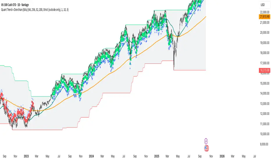
Quant Trend + Donchian (Educational, Public-Safe)What this does
Educational, public-safe visualization of a quant regime model:
• Trend : EMA(64) vs EMA(256) (EWMAC proxy)
• Breakout : Donchian channel (200)
• Volatility-awareness : internal z-scores (not plotted) for concept clarity
Why it’s useful
• Shows when trend & breakout align (clean regimes) vs conflict (chop)
• Helps explain why volatility-aware systems size up in smooth trends and scale down in noise
How to read it
• EMA64 above EMA256 with price near/above Donchian high → trend-following alignment
• EMA64 below EMA256 with price near/below Donchian low → bearish alignment
• Inside channel with EMAs tangled → range/chop risk
Notes
• Indicator is educational only (no orders).
• Built entirely with TradingView built-ins.
• For consistent visuals: enable “Indicator values on price scale” and disable “Scale price chart only” in Settings → Scales .
Volume Aggregated Spot & Futures -- Crypto (by plyst & more)📊 Volume Aggregated Spot & Futures - Enhanced Edition
🎯 Overview
Advanced volume aggregation indicator that combines spot and perpetual futures volume across the top 10 cryptocurrency exchanges. This enhanced version builds upon the original work by @HALDRO Project with optimized calculations and expanded functionality.
✨ Key Features
- 📈 Real-time aggregated volume from 10 major exchanges (Binance, Bybit, OKX, Coinbase, Bitget, KuCoin, Kraken, MEXC, Gate.io, HTX)
- 🔄 Multiple visualization modes: Volume, Delta, Cumulative Delta, Spot vs Perp analysis, Liquidations, OBV, and MFI
- 💱 Multi-currency support: Display volume in COIN, USD, or EUR
- 🎨 Clean, single-color bar chart showing total cumulative volume
- 📊 Multiple calculation methods: SUM, AVG, MEDIAN, VARIANCE
- 🎯 Separate spot (USDT, USD, USDC, etc.) and perpetual futures (.P contracts) tracking
🔧 Technical Improvements
✓ Corrected MFI formula for accurate money flow calculations
✓ Optimized volume aggregation logic with proper NA handling
✓ Support for 10 exchanges (up from 9)
✓ Streamlined codebase for better performance
✓ Updated perpetual contract naming conventions (.P format)
📖 Usage
Perfect for analyzing total market volume, identifying liquidation events, tracking buyer/seller pressure through delta analysis, and understanding the spot vs futures market dynamics.
🙏 Credits
Original concept and framework by @HALDRO Project. This version includes mathematical corrections, code optimizations, and expanded exchange support.
⚠️ Note
Aggregated volume is calculated from external exchange data using request.security(). Ensure your plan supports the necessary security calls for optimal performance.

WaveTrend Oscillator v3 [JopAlgo]WaveTrend Oscillator v3 — reversal focus with confirmation, not guesswork
Core idea
WaveTrend (WT) gives you a smoothed oscillator pair (WT1 and WT2) with overbought/oversold rails and a momentum histogram. This v3 adds two filters so reversals are earned, not guessed:
Heikin-Ashi trend check → only take crosses with candle bias
Reversal Confidence Score (RCS) → only fire when momentum vs ATR is strong enough
Add an optional divergence check so you only act when price and oscillator disagree into extremes.
What you’ll see
WT1 (green) and WT2 (red)
Histogram = WT1 − WT2 (gray columns)
Rails: Overbought = +60, Oversold = −60, and the Zero line
Labels when all conditions align → Smart Buy (below) or Smart Sell (above)
Read it fast → Are we near +60/−60? Did WT1 cross WT2? Is the histogram expanding in that direction? Did a Smart label print?
How the signals are built
A signal prints only if all are true:
Cross → Bull: WT1 crosses up WT2; Bear: WT1 crosses down WT2
Extreme → Bull: WT1 below −60; Bear: WT1 above +60
RCS filter → |WT1 − WT2| scaled by ATR must be > threshold (default 80)
Heikin-Ashi agreement → HA close vs open points the same way as the cross
Divergence (lookback N) → Bull: oscillator makes lower low while price doesn’t; Bear: oscillator higher high while price doesn’t
Result → a reversal-grade setup, not a continuation ping.
How to use it (simple playbook)
Direction filter
If you want a pure reversal tool, keep the default rails (+60/−60) → you’ll wait for true extremes.
If you want more frequency, relax the rails (e.g., +50/−50) or lower RCS (e.g., 70 → 65). More signals → more noise.
Entry logic
Long reversal template
→ Price drives down into a value area edge (VAL/LVN)
→ WT1 < −60, WT1 ↗ WT2, RCS > threshold, HA bias up, bullish divergence
→ Enter on reclaim of the level or on the first higher-low after the cross
Short reversal template
→ Price pushes into VAH/HVN
→ WT1 > +60, WT1 ↘ WT2, RCS > threshold, HA bias down, bearish divergence
→ Enter on rejection and lower-high after the cross
Location first (always)
Use Volume Profile v3.2 (VAH/VAL/POC/LVNs) for where to act
Use Anchored VWAP (session/weekly/event) for who has control
No level → no trade. A WT flip into a level is better than one mid-range.
Risk & targets
Stops → beyond the sweep extreme or beyond the reclaimed level
Targets → ladder to next Fib/VP nodes (POC/HVNs, VA mid), then trail behind swings or the WT zero-line reclaim
Settings that matter (and how to tune)
WT Length (default 10) → core smoothing of the channel
→ Lower = faster turns; higher = calmer oscillator
WT EMA Smoothing (default 21) and Signal Smoothing (default 3)
→ Increase to reduce chop; decrease to react earlier
Overbought / Oversold (default +60/−60)
→ Tighten to +50/−50 for more frequent reversals; widen to +70/−70 for only the strongest
RCS Threshold (default 80)
→ Down to 70 for earlier triggers; up to 90 for only the punchiest turns
Divergence Lookback (default 5)
→ Shorter finds more local divs; longer finds bigger swings
Starter presets
Intraday (15m–1H) → WT 10/21, signal 3, rails ±60, RCS 80, div 5
Swing (2H–4H) → WT 14/28, signal 3–5, rails ±60/±70, RCS 85–90, div 7–9
Pattern cheat sheet
Double-dip divergence → oscillator prints a lower low near −60 while price holds a higher low → high-quality long if RCS/HA agree
Zero-line reclaim after a smart long → momentum shift; use it to trail stops or add on retest
Failure signal → cross fires but RCS < threshold or histogram shrinks back toward 0 into a level → stand down or cut quick
Overbought drift → WT pinned near +60/+70 without cross down → trend grind; don’t fade blindly
Best combos (kept simple)
Volume Profile v3.2 → take WT reversals at VAH/VAL/LVNs; target POC/HVNs
Anchored VWAP → WT cross with an AVWAP reclaim/reject is higher quality
CVDv1 (optional) → prefer flows that align with the reversal; avoid if absorption is fighting you
Common mistakes this helps you avoid
Fading every spike without RCS/HA confirmation
Taking reversals mid-range, far from levels
Treating divergence as timing (it’s context; you still need the cross + filter)
Ignoring the zero-line behavior after entry (weak follow-through)
Disclaimer
This indicator and write-up are for education only, not financial advice. Trading involves risk; results vary by market, venue, and settings. Test first, act at defined levels, and manage risk. No guarantees or warranties are provided.

TTM Squeeze v5.1 [JopAlgo]TTM Squeeze v5.1 — compression → expansion, with a directional read
Core idea
This blends Bollinger Bands and Keltner Channels to detect volatility compression (a “squeeze”), then uses a momentum histogram to suggest which way the release may travel.
Squeeze On → BB is inside KC → quiet, pressure building
Squeeze Off → BB exits KC → expansion likely starting
Momentum histogram → direction and pace of the expansion
Read it as: compression → expansion and let momentum tell you up or down.
What you’ll see
Momentum histogram (centered at 0):
Above 0 → bullish tilt
Below 0 → bearish tilt
Rising vs falling bars → acceleration vs deceleration
Zero-line dots colored by squeeze state:
Red at 0 → Squeeze On (BB inside KC)
Green at 0 → Squeeze Off (no compression)
Quick scan → Is the dot red or green? Is the histogram above or below 0? Are the bars growing or shrinking?
How to use it (simple playbook)
1) Detect the setup
Dot turns red → Squeeze On → build your plan at key levels (no trade by itself).
While red, map entry levels and invalidations using your price tools.
2) Trade the release
First green after a red run → Squeeze Off → look for entry with momentum direction:
Histogram above 0 and rising → long bias
Histogram below 0 and falling → short bias
3) Location first (always)
Execute at objective references:
Volume Profile v3.2 → VAH / VAL / POC / LVNs
Anchored VWAP → session / weekly / event anchors
No level → no trade. A squeeze release into a level is better than one mid-range.
4) Confirmation stack (optional but strong)
If you also use CVDv1 → prefer Alignment OK and avoid entries where Absorption is against your side.
Entries, exits, risk
Break + retest (trend release)
Condition → Dot flips green, histogram crosses/expands on the same side of 0, price breaks a mapped level.
Entry → On the first retest/hold of that level after the flip.
Stop → Beyond the level or last swing.
Targets → Next VP node (POC/HVNs) → then trail.
Range edge release (rotation to value)
Condition → Dot flips green at a range boundary (e.g., VAL/VAH), histogram aligns with the break.
Entry → On reclaim/reject confirmation at that boundary.
Invalidation → Quick loss of the boundary and histogram roll against you.
Stand down
Dot green but histogram flat near 0 → noisy release, skip or size down.
Green release into a major opposite level with shrinking bars → take partials early.
Settings that matter (and how to tune)
BB/KC Length (default 21) → the lookback for both envelopes.
Shorter → faster squeezes, more signals. Longer → fewer, larger moves.
BB Multiplier (default 1.0 here)
Higher (e.g., 2.0) → fewer, cleaner squeezes (classic TTM style).
Lower (e.g., 1.0–1.5) → more frequent “tight” squeezes.
KC Multiplier (default 1.5)
Higher → wider KC → easier for BB to sit inside → more squeeze-on periods.
Lower → fewer squeeze-on periods.
Momentum Length (default 20) for the histogram (linreg on close − KC mid):
Shorter → earlier but noisier direction reads.
Longer → steadier but slower.
Practical combos
Classic feel → BB 2.0, KC 1.5, Length 20–21, Momentum 20
Intraday fast → BB 1.5, KC 1.5, Length 14–20, Momentum 14–18
Swing calm → BB 2.0, KC 1.5–1.8, Length 21–34, Momentum 20–30
Pattern cheat sheet
Red cluster → Green + histogram expansion above 0 → upside release → buy the retest of the breakout level → trail.
Red cluster → Green + histogram expansion below 0 → downside release → sell the retest → trail.
Green but histogram crosses back toward 0 quickly → failed release → avoid or scratch.
Multiple red↔green flips near 0 → volatility churn → wait for a clear level break with follow-through.
Best combos (kept simple)
Volume Profile v3.2 → Plan the squeeze while red; trigger on green at VAH/VAL/LVN/POC.
Anchored VWAP → A release that reclaims/rejects an AVWAP with histogram expansion is higher quality.
CVDv1 (optional) → Prefer releases with taker flow; skip if Absorption fights your side.
Common mistakes this helps you avoid
Entering during the red squeeze with no price trigger.
Chasing a green flip mid-range, far from levels.
Ignoring direction when the histogram is below 0 for longs (or above 0 for shorts).
Holding when the histogram shrinks back toward 0 into your target—take profits.
Disclaimer
This indicator and write-up are for education only, not financial advice. Trading carries risk; results vary by market, venue, and settings. Test first, act at defined levels, and manage risk. No guarantees or warranties are provided.

Trend-Fib-Pivot Sweep [JopAlgo]Trend-Fib-Pivot Sweep — trend rails + Fib touch rules + sweep logic
Core idea
This tool blends two trend MAs, a rolling Fibonacci grid, and pivot sweep tags so you can do three things quickly:
Trend → MA1 vs MA2 stack and slope
Location → Fib touch/bounce/reject rules
Triggers → sweep → reclaim or trend pullback → continuation
Use the MAs for bias, the Fib levels for where price should react, and the sweeps to spot traps and entries after liquidity grabs.
What you’ll see
MA 1 (default 21, purple) and MA 2 (default 50, gray)
Fib lines from the highest/lowest of your lookback: 0.236 (light blue), 0.382 (green), 0.5 (white), 0.618 (orange), 0.786 (red)
Sweep markers: triangle above = high sweep; triangle below = low sweep
Background: soft green when MA1 > MA2, soft red when MA1 < MA2
Read it fast → Trend (background + MA stack)? Which Fib are we near? Any sweep and reclaim?
How the Fib levels work (and what to do at each)
0.236 → shallow pullback in a strong trend
→ Expect quick bounce continuation.
→ If price closes through 0.236 and stalls, momentum may be cooling; look to 0.382.
0.382 → standard trend pullback
→ In a bullish trend, tests here often bounce and continue.
→ Entry idea: touch/bounce at 0.382 with MA1 above MA2 and rising, then a higher-low and push back above 0.382 → enter.
0.5 → midline / fair value
→ Often the “decision” level.
→ Clean continuation if 0.5 holds; deeper rotation if we accept below (for longs).
0.618 (“golden”) → deep pullback / last line for trend
→ Best risk-defined continuation entries come from rejects/reclaims here.
→ For longs: wick below 0.618, then reclaim 0.618 → long with stop under the sweep low.
0.786 → exhaustive pullback / trap zone
→ If trend is truly alive, 0.786 rejects and snaps back.
→ If we accept beyond 0.786 (closes), expect a full range rotation or trend change.
Touch/bounce rule of thumb
You want to see price interact: touch → reject (wick) → reclaim the level.
A close back above the Fib after a downside probe (or below after an upside probe) is a stronger confirmation than intrabar wicks.
What the MAs do (and how to use them)
MA1 (fast) vs MA2 (slow) define bias and momentum.
MA1 above MA2 and both rising (↗) → bullish regime.
MA1 below MA2 and both falling (↘) → bearish regime.
Flat / crossing often → balance; lean on sweeps and the deeper Fibs (0.5/0.618/0.786).
Interaction with Fibs
Highest quality: Fib level + MA confluence (e.g., 0.382 near MA1).
When MA1 = dynamic trigger: reclaim MA1 at a Fib → continuation signal.
When MA2 = last defense: lose MA2 at 0.5/0.618 → expect deeper rotation.
Sweep logic (why it matters and how to execute)
High sweep = current bar’s high takes out the recent high then fails → liquidity grab above.
Low sweep = current bar’s low takes the recent low then fails → liquidity grab below.
Execution idea
Longs: low sweep into 0.5/0.618/0.786, then reclaim the Fib and, ideally, MA1 → enter; stop under sweep low.
Shorts: high sweep into 0.5/0.382/0.236, then reclaim below the Fib and MA1 → enter; stop above sweep high.
Repaint note
If you enable Lag-Confirmed Pivot Mode, sweep labels are stricter and may “finalize” later (can appear as repaint).
For signals/alerts, prefer non-repaint mode; for review/training, lag-confirmed is fine.
How to trade it (simple playbook)
Direction filter (use MAs first)
Bullish bias → MA1 > MA2 and not flat → look for longs at 0.236/0.382/0.5.
Bearish bias → MA1 < MA2 → look for shorts at 0.236/0.382/0.5 from above.
Entries (two clean templates)
Trend pullback → continuation
→ In bull regime: price pulls to 0.382 or 0.5, shows rejection wick, then reclaims level and MA1 → enter long.
→ In bear regime: mirror with short from above.
Sweep → reclaim
→ Downside sweep through 0.618/0.786, then close back above the Fib and through MA1 → enter long.
→ Upside sweep through 0.382/0.236, then close back below and under MA1 → enter short.
Risk & targets
Stops → beyond the sweep extreme or below/above the reclaimed Fib (structure-based).
Targets → next Fib ladder (e.g., long from 0.5 → target 0.382 → 0.236), or obvious POC/HVNs if you use Volume Profile.
Settings that matter (and how to tune)
MA Types/Lengths
EMA (default fast) = responsive trend read.
SMA/HMA = smoother backbone.
21/50 is a solid default; swing traders can run 34/89.
Fib Lookback
Shorter lookback = tighter range, more sensitive levels;
Longer = broader swing map, fewer interactions but stronger signals.
Sweeps
Sweep Detection Range controls how “recent” the pivot must be (default 10).
Lag-Confirmed mode reduces false sweeps but can finalize later.
Starter presets
Intraday (15m–1H) → MA1 21 EMA, MA2 50 SMA, Fib lookback 100–150, Sweeps 10
Swing (4H) → MA1 34 EMA, MA2 89 SMA, Fib lookback 150–250, Sweeps 10–14
Pattern cheat sheet
0.382 kiss & go (trend day) → quick tag and bounce in bull regime → continuation.
0.5 decision → hold = trend resumes; failure = rotate to 0.618.
0.618 sweep + reclaim → high-quality continuation with tight risk.
0.786 trap → deep flush then snapback; if acceptance persists, expect full rotation.
MA pinch → break → MA1 and MA2 compress, then price breaks and holds a Fib → expansion leg.
Best combos (kept simple)
Volume Profile v3.2 → use VAH/VAL/POC/LVNs as concrete targets; look for Fib + VP confluence.
Anchored VWAP → reclaims/rejections at anchored lines with Fib reaction and MA agreement improve timing.
Common mistakes this helps you avoid
Buying into 0.618/0.786 without a reclaim (catching falling knives).
Fading a 0.236 pullback when MAs are strongly ↗ (fighting trend).
Taking sweeps without a reclaim/confirmation.
Ignoring the MA stack when choosing direction.
Disclaimer
This indicator and write-up are for education only, not financial advice. Trading involves risk; results vary by market, venue, and settings. Test first, act at defined levels, and manage risk. No guarantees or warranties are provided.

Rate of Change Indicator [JopAlgo] (ROCI)Rate of Change Indicator (ROCI) — see impulse early, skip the dead moves
What it is (one line):
ROCI tells you how fast price changed vs N bars ago , in percent. It’s a clean momentum gauge:
Above 0 → price is higher than N bars ago (bullish momentum).
Below 0 → price is lower than N bars ago (bearish momentum).
Further from 0 → stronger impulse.
The default +5 / −5 bands highlight strong thrust . Zero-line crosses flag momentum shifts.
What you’ll see
Blue line = ROCI.
Orange dotted line = 0 (bull/bear divider).
White dotted lines = ±Strong Momentum levels (default ±5).
Green/red panel tint when ROCI lives above +5 or below −5.
Read in 3 seconds: Which side of 0? How far? Growing or fading vs last bar?
How to use it (simple playbook)
Direction filter
Trade longs only while ROCI > 0.
Trade shorts only while ROCI < 0.
Timing
Breakouts: prefer breaks where ROCI pushes through +5/−5 and holds on the first retest.
Pullbacks in trend: in an uptrend, let ROCI dip toward 0 and then turn back up → entry. (Mirror for downtrends.)
Do less in chop
If ROCI whips around near 0, you’re in balance. Only act at objective levels.
Rule of thumb: Zero cross = heads-up. ±5 hold = go-with.
Entries, exits, risk (use this, keep it tight)
Continuation entry (trend):
Bias up at your level (e.g., VAL/AVWAP). ROCI stays > 0 and turns up from a shallow dip → enter long.
Stop: under structure/level. Targets: POC/HVNs or next swing.
Breakout entry:
Break through a level with ROCI > +5 (or < −5 for shorts). Enter on the retest that holds while ROCI remains outside the band.
Invalidation: quick fall back inside the band and under 0 → stand down.
Exit/trim:
On longs, repeated lower ROCI peaks into your target (momentum fading) → take profits or tighten.
Timeframe guide
1–5m (scalps) : ROC Period 10–20, Strong 6–10. Many signals; require level + confirmation.
15m–1H (intraday): ROC Period 14–34, Strong 4–7. Sweet spot.
2H–4H (swing): ROC Period 20–50, Strong 3–6. Cleaner legs, fewer flips.
1D+ (position): ROC Period 50–100, Strong 2–5. Use for backdrop; trigger on lower TF.
Settings that actually matter (and how to tune)
ROC Period (default 32) : lookback for comparison.
Shorter = earlier signals, more noise.
Longer = steadier bias, slower turns.
Strong Momentum Threshold (default 5) : where you say “this is real thrust.”
Pick it by history: scroll back, mark thrusts that ran, and note their typical ROCI. Set the band slightly inside that value so you see the start of good moves.
Pattern cheatsheet
Impulse leg : ROCI above 0 making higher peaks → trend leg in progress.
Healthy pullback : ROCI dips toward 0 but doesn’t flip negative, then turns up → add/entry with trend.
Weak breakout / likely fail: Price pokes level but ROCI stays near 0 or rolls over quickly.
Divergence (lightweight): Price makes a higher high, ROCI peaks lower → momentum thinning; trail tight into HVNs.
Best combos (kept simple)
Volume Profile v3.2 : Use VAH/VAL/LVNs/POC for where. ROCI tells you if the break has juice.
Anchored VWAP : Reclaim/reject AVWAP with ROCI on the correct side of 0 for higher quality.
CVDv1 :
Yes: ROCI thrust + CVD Alignment OK + no Absorption → higher odds the move sticks.
No: ROCI thrust but Absorption red → don’t chase; wait for the fail/reclaim.
(Optional add: RVOL—high participation + strong ROCI is the A+ combo for breaks.)
Common mistakes this avoids
Buying a breakout while ROCI sits near 0 (no impulse).
Shorting a strong trend when ROCI is firmly > 0 (or > +5).
Treating every zero cross as a trade (it’s a heads-up, not an entry by itself).
Quick defaults to start
ROC Period: 32
Strong Threshold: 5
Process: Level → ROCI side/strength → (optionally) CVD quality → Execute with structure-based risk
Screenshots tip: show a level break where ROCI pushes through +5 and a pullback where ROCI turns up from ~0.
Mini-disclaimer
Educational tool, not financial advice. Test first, size sensibly, and always anchor decisions to levels, flow, and risk.

Round Number Analyzer v3Round Number Analyzer v3 is an indicator designed to analyze how price interacts with round number levels (levels spaced at fixed intervals in points or pips).
The indicator does not generate entry/exit signals, but provides detailed statistics to better understand market dynamics around these key levels.
✨ Key Features
Cross Counting: detects every time the price crosses a round number level (up = Long, down = Short).
Continuations & Reversals: classifies each cross as:
Continuation: the move continues in the same direction as the previous sequence.
Reversal: the move changes direction compared to the previous sequence.
Sequence Classification (L1…L5+): each level is labelled based on its position within the consecutive cross sequence:
L1 = first level of the sequence,
L2 = second consecutive,
…
L5+ = fifth or higher.
Comprehensive Stats Table (top right corner):
Total crosses (Long, Short, Totals).
Total continuations + breakdown by L1…L5+.
Total reversals + breakdown by L1…L5+.
Percentages calculated against the proper denominator, displayed directly inside the cells next to the absolute values.
Date range of analysis (user-defined).
Customizable Step: Works in both points and pips, making the indicator suitable for indices and forex.
⚙️ Main Inputs
Start date / End date → sets the analysis period.
Step mode → Points or Pips.
Step value → distance between round levels.
Pip size → pip size (default = 0.0001, typical for forex).
📈 How to Interpret
A high continuation percentage after L1–L2 suggests the market tends to extend multiple times beyond the first breakout levels.
Higher reversal percentages at advanced levels (L4–L5+) may signal trend exhaustion.
The analysis helps estimate the probability of continuation or reversal depending on how many consecutive levels have already been crossed.
🔎 Practical Applications
Support for breakout or mean-reversion strategies.
Comparative analysis across different markets (e.g. indices vs forex) or different time periods.
📝 Notes
The indicator is timeframe-robust, as it accounts for multiple steps within the same candle, ensuring results do not depend on the selected timeframe (except for TradingView’s historical data limits).
It does not provide automatic trading signals, but serves as a quantitative analysis tool to refine your strategies.
---
Round Number Analyzer v3 è un indicatore pensato per analizzare come il prezzo interagisce con i livelli di round number (livelli a distanza fissa in punti o pips).
L’indicatore non genera segnali di ingresso/uscita, ma fornisce statistiche dettagliate utili per comprendere la dinamica del mercato attorno a questi livelli.
✨ Funzionalità principali
Conteggio dei Cross: rileva ogni volta che il prezzo attraversa un livello round (verso l’alto = Long, verso il basso = Short).
Continuations & Reversals: classifica ogni attraversamento come:
Continuation: il movimento prosegue nella stessa direzione della sequenza precedente.
Reversal: il movimento inverte la direzione rispetto alla sequenza precedente.
Classificazione per sequenza (L1…L5+): ogni livello è etichettato in base alla sua posizione nella sequenza di cross consecutivi:
L1 = primo livello della sequenza,
L2 = secondo consecutivo,
…
L5+ = quinto o superiore.
Statistiche complete in tabella (in alto a destra):
Cross totali (Long, Short, Totals).
Continuations totali + breakdown per L1…L5+.
Reversals totali + breakdown per L1…L5+.
Percentuali calcolate sul denominatore corretto, mostrate direttamente dentro le celle accanto ai valori assoluti.
Date range di analisi (impostabile dall’utente).
Step personalizzabile: puoi lavorare sia in punti che in pips, così l’indicatore è adatto sia per indici che per forex.
⚙️ Input principali
Start date / End date → imposta l’intervallo temporale di analisi.
Step mode → punti o pips.
Step value → ampiezza tra i livelli round.
Pip size → dimensione del pip (default = 0.0001, tipico per il forex).
📈 Come interpretarlo
Una percentuale di continuation molto alta dopo L1–L2 indica che il mercato tende a proseguire più volte oltre i primi livelli di breakout.
Percentuali di reversal più elevate nei livelli avanzati (L4–L5+) possono suggerire esaurimento della spinta.
L’analisi permette di stimare la probabilità che un movimento in corso continui o si inverta in base a quanti livelli sono già stati attraversati consecutivamente.
🔎 Applicazioni pratiche
Supporto per strategie di breakout o mean reversion.
Analisi comparativa tra mercati (es. indici vs forex) o tra periodi temporali diversi.
📝 Note
L’indicatore è timeframe-robust: il conteggio tiene conto di multipli step dentro la stessa candela, così i risultati non dipendono dal timeframe scelto (salvo i limiti di caricamento storico di TradingView).
Non fornisce segnali operativi automatici, ma è un tool di analisi quantitativa per affinare le proprie strategie.

FRAMA Channel [JopAlgo]FRAMA Channel — let the market tell you how fast to move
Most moving averages make you pick a speed and hope it fits every regime. FRAMA (Fractal Adaptive Moving Average, popularized by John Ehlers) does the opposite: it adapts its smoothing to market structure. When price action is “trendy” (more directional, less jagged), FRAMA speeds up; when it’s choppy (more fractal noise), FRAMA slows down and filters the rubble.
FRAMA Channel wraps that adaptive core with a volatility channel and clean color logic so you can read trend, mean-reversion windows, and breakouts in one glance—on any timeframe.
What you’re seeing (plain-English tour)
FRAMA midline (Filt): the adaptive average. It’s computed from a fractal dimension of price over Length (N).
Trendy tape → lower fractal dimension → FRAMA tracks price tighter.
Choppy tape → higher fractal dimension → FRAMA smooths harder.
Channel bands (Filt ± distance × volatility): the “breathing room.” Volatility here is a long lookback average of (high − low).
Upper band = potential resistance in down/neutral or trend-walk path in uptrends.
Lower band = mirror logic for shorts.
Color logic (simple and strict):
Green when price breaks above the upper band → bullish regime (momentum present).
Red when price breaks below the lower band → bearish regime.
White when price crosses the FRAMA midline → neutral/reset.
Optional candle coloring: toggle Color Candles to tint the chart itself with the regime color—handy for quick reads.
(When you add screenshots: image #1 should label FRAMA, bands, and the three colors in a small trend + pullback. Image #2 can show a “squeeze → expansion” sequence: channel tightens, then price breaks and walks the band.)
How it’s built (without the jargon)
The script measures three ranges over your Length (N): two half-windows and the full window.
It converts those into a fractal dimension (Dimen). That number says “how zig-zaggy” price is right now.
It turns Dimen into an alpha (smoothing factor): alpha = exp(−4.6 × (Dimen − 1)), clamped so it never explodes or flatlines.
It updates FRAMA each bar using that alpha.
It builds bands using a long average of (high − low) multiplied by your Bands Distance setting.
It changes color only on confirmed bar events:
hlc3 crosses above the upper band → green
hlc3 crosses below the lower band → red
close crosses the midline → white
Result: a channel that tightens in balance, widens in trend, and doesn’t flicker on partial bars.
How to use FRAMA Channel on any timeframe
Same framework everywhere. Your job is to choose where to act (objective levels) and let FRAMA tell you trend/mean-reversion context and breakout quality.
Scalping (1–5m)
Pullback-to-midline (trend): When color is green, buy pullbacks that hold at/above the midline; when red, short pullbacks that fail at/below it.
Invalidation: a white flip (midline cross back) right after entry → tighten or bail.
Squeeze → break: A narrowing channel often precedes a move. Only chase the break if color flips to green/red and the first pullback holds the band/midline.
Intraday (15m–1H)
Trend rides: In green/red, expect price to walk the outer band. Entries on midline kisses are cleaner than chasing the band itself.
Balance fades: In white (neutral) with a tight channel, fade outer band → midline—but only at a real level (see “Pairing” below).
Swing (2H–4H)
Regime compass: Color changes that stick (several bars) often mark swing regime shifts. Combine with Weekly/Event AVWAP and composite VP levels.
Add/Trim: In an uptrend, add on midline holds; trim as the channel widens and price spikes beyond the upper band into HVNs.
Position (1D–1W)
Context first: A persistent green weekly channel is constructive; a persistent red is distributive.
Patience: Wait for midline retests at higher-TF levels rather than chasing outer-band prints.
Entries, exits, and risk (keep it simple)
Continuation entry (trend):
Color already green/red.
Price pulls back to FRAMA midline (or shallowly toward it) and holds.
Take the trend side.
Stop: beyond the opposite side of the midline or behind local structure.
Targets: your Volume Profile HVN/POC or prior swing, not the band alone.
Breakout entry:
Channel had tightened; price breaks a key level.
Color flips green/red and the first retest holds.
Enter with the break.
Avoid: breaks that flip color but immediately white-flip on the next bar.
Mean-reversion entry (balance):
Color white and channel tight.
At a VP edge (VAL/VAH), fade outer band → midline.
Stop: just outside the band; Exit: at midline/POC.
Settings that actually matter (and how to tune them)
Length (N) — default 26
Controls how FRAMA “reads” structure.
Shorter (14–20): faster, more responsive (good for scalps/intraday), more flips in chop.
Longer (30–40): steadier (good for swings/position), slower to acknowledge new trends.
Bands Distance — default 1.5
Scales the channel width.
If you’re constantly tagging bands, increase slightly (1.7–2.0).
If nothing ever reaches the band, decrease (1.2–1.4) to make context meaningful.
Color Candles — on/off
Great for quick regime reads. If your chart feels too busy, leave bands colored and turn candle coloring off.
Warm-up note: FRAMA references N bars. Right after switching timeframes or symbols, give it N–2N bars to settle before you judge the current state.
(You may see an input named “Signals Data” in this version; it’s reserved for future enhancements.)
What to look for (pattern cheat sheet)
Walk-the-band: After a green/red flip, price hugs the outer band while the midline slopes. Ride pullbacks to the midline, don’t fade the band.
Squeeze → Expansion: Channel pinches, then color flips and bands widen—that’s the move. The first midline retest is your best entry.
False break tell: Brief color flip to green/red that immediately reverts to white on the next bar—skip chasing; plan for a reclaim.
Midline reclaims: In chop, repeated white↔green/white↔red flips say “mean reversion”; stay tactical and target the midline/POC.
Pairing FRAMA Channel with other tools
Cumulative Volume Delta v1 (CVDv1):
FRAMA tells you trend/mean-reversion context; CVDv1 tells you flow quality.
Breakout quality: FRAMA flips green and CVDv1 ALIGN = OK, Imbalance strong, Absorption ≠ red → higher odds the break sticks.
If Absorption is red on a FRAMA green flip, do not chase—wait for retest or look for a fail/reclaim.
Volume Profile v3.2:
Use VAH/VAL/LVNs/POC for where.
Green + VAL retest → rotate toward POC/HVN.
Red + VAH rejection → rotate back to POC.
LVN + green flip → expect fast travel toward the next HVN; set targets there.
Anchored VWAP :
Treat AVWAP as fair-value rails.
AVWAP reclaim + FRAMA green → excellent trend-resume entry.
AVWAP rejection + FRAMA red → high-quality short; use midline as your risk guide.
Common pitfalls this helps you avoid
Chasing every poke: FRAMA’s white → green/red state change helps you wait for confirmation (or a retest) instead of reacting to the first wick.
Fading a real trend: A sloped midline with price walking the band is telling you not to fight it.
Stops too tight: In expansion, give the trade room to the midline or local structure, not just inside the channel.
Practical defaults to start with
Length: 26
Bands Distance: 1.5
Color Candles: on (turn off if your chart is busy)
Timeframes: works out of the box on 15m–4H; for 1–5m try Length=20; for daily swings try Length=34–40.
Open source & disclaimer
This indicator is published open source so traders can learn, tweak, and build rules they trust. No tool guarantees outcomes; risk management is essential.
Disclaimer — Not Financial Advice.
The “FRAMA Channel ” indicator and this description are provided for educational purposes only and do not constitute financial or investment advice. Trading involves risk, including possible loss of capital. makes no warranties and assumes no responsibility for any trading decisions or outcomes resulting from the use of this script. Past performance is not indicative of future results.
Use FRAMA Channel for context (trend vs balance, squeeze vs expansion), Volume Profile v3.2 and Anchored VWAP for locations, and CVDv1 for flow quality. That trio keeps your trades selective and your rules consistent on any timeframe.
