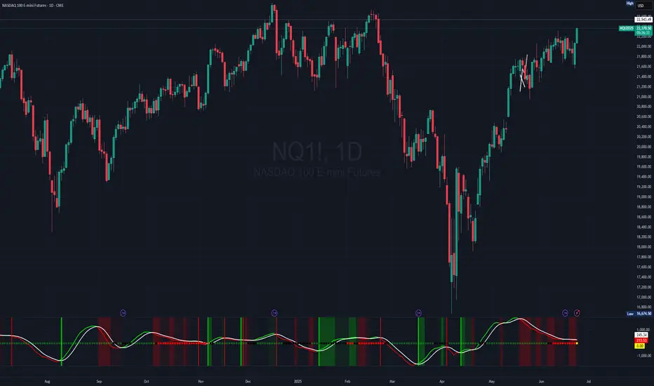
[JHF] SQZMOMPRO SQZMOMPRO is a sophisticated, momentum-based technical indicator designed for traders seeking to identify potential trend reversals, momentum shifts, and periods of market consolidation (squeezes) across multiple timeframes. By combining a momentum oscillator, Bollinger Bands, Keltner Channels, and a Percentage Volume Oscillator (PVO), it provides a comprehensive view of price momentum and volume dynamics.
Overview
The SQZMOMPRO indicator is a powerful tool that integrates momentum analysis, volatility-based squeeze detection, and volume confirmation to help traders identify high-probability trading opportunities. It combines:
A momentum oscillator based on price deviations from a linear regression and moving average.
Bollinger Bands and Keltner Channels to detect periods of low volatility (squeezes), signaling potential breakouts.
A Percentage Volume Oscillator (PVO) to confirm momentum signals with volume trends.
A Rate of Change (ROC) line to highlight the speed of momentum shifts.
Visual cues like reversal signals and confluence backgrounds for actionable insights.
This indicator is ideal for swing traders, day traders, and those analyzing trends across multiple timeframes (hourly, 4-hour, daily, weekly, monthly). It is plotted below the price chart (non-overlay) and includes customizable alerts for key conditions.
Key Features
Multi-Timeframe Support: Automatically adjusts parameters for hourly, 4-hour, daily, weekly, and monthly charts, ensuring optimal settings for each timeframe.
Squeeze Detection: Identifies periods of low volatility (squeezes) using Bollinger Bands and Keltner Channels, categorized as Wide, Normal, Narrow, or Very Narrow.
Momentum Oscillator: Tracks price momentum relative to a baseline, with a signal line to highlight trend reversals.
PVO Confluence: Optionally integrates the Percentage Volume Oscillator to confirm momentum signals with volume trends.
Rate of Change (ROC): Displays the smoothed rate of change of momentum for enhanced readability.
Visual Cues: Includes color-coded squeeze dots, momentum/signal lines, reversal markers, and optional confluence backgrounds.
Alerts: Configurable alerts for squeeze conditions, trend reversals, and volume-confirmed signals.
How It Works
1. Momentum Oscillator
The momentum oscillator is calculated as follows:
Source: Closing price.
Baseline: A combination of the midpoint of the highest high and lowest low over a specified period, adjusted by a simple moving average (SMA).
Momentum: Linear regression of the price deviation from this baseline over a timeframe-specific period (shorter for smaller timeframes to be more responsive).
Signal Line: A 5-period SMA of the momentum value, used to identify crossovers.
Interpretation:
Momentum > Signal: Bullish momentum (plotted in green by default).
Momentum < Signal: Bearish momentum (plotted in red by default).
Crossovers: Momentum crossing above the signal line suggests a bullish reversal; crossing below suggests a bearish reversal.
2. Squeeze Detection
Squeezes occur when volatility contracts, often preceding significant price moves. The indicator compares:
Bollinger Bands: Calculated using an SMA and 2 standard deviations of the closing price.
Keltner Channels: Calculated using an SMA and multiples of the Average True Range (ATR) for different squeeze thresholds (Wide, Normal, Narrow, Very Narrow). This method steers away from the likes of classical SQZPRO which only uses an approximation of the Average True Range and heavily affects the squeeze sensitivity due to the way they calculate their Keltner Channel (our Keltner Channel are true to the way they are supposed to be calculated).
Squeeze Conditions:
Wide Squeeze: Bollinger Bands are inside Keltner Channels with a high ATR multiplier.
Normal Squeeze: Bollinger Bands are inside Keltner Channels with a moderate ATR multiplier.
Narrow Squeeze: Bollinger Bands are inside Keltner Channels with a low ATR multiplier.
Very Narrow Squeeze: Bollinger Bands are inside Keltner Channels with a very low ATR.
No Squeeze: Bollinger Bands are outside Keltner Channels, indicating higher volatility.
Depending on the timeframe, each squeeze level has been manually tweaked to gain an edge, whether you're scalping, in swings or in Leaps.
Visuals: Squeeze conditions are plotted as colored dots on the zero line:
Green: No Squeeze
Black: Wide Squeeze
Red: Normal Squeeze
Yellow: Narrow Squeeze
Purple: Very Narrow Squeeze
3. Percentage Volume Oscillator (PVO)
The PVO measures volume momentum, similar to the MACD but applied to volume through a 14 and 28 ema with volume as the srouce.
Interpretation:
PVO > 0: Increasing volume momentum (bullish).
PVO < 0: Decreasing volume momentum (bearish).
When enabled (Show PVO Confluence), the indicator highlights periods where momentum and PVO align (e.g., bullish momentum with PVO > 0).
4. Rate of Change (ROC)
Formula: Smoothed difference between momentum and signal line, multiplied by a user-defined factor (ROC Multiplier).
Purpose: Enhances readability of momentum shifts, plotted as a blue (positive) or orange (negative) line when enabled.
5. Reversal Signals
Bullish Reversal: Momentum crosses above the signal line, optionally confirmed by PVO > 0. Marked with a green vertical line.
Bearish Reversal: Momentum crosses below the signal line, optionally confirmed by PVO < 0. Marked with a red vertical line.
6. Confluence Background
When Show PVO Confluence is enabled, the background is colored to highlight alignment:
Bullish Confluence: Momentum > Signal and PVO > 0 (green background, darker if ROC is positive).
Bearish Confluence: Momentum < Signal and PVO < 0 (red background, darker if ROC is negative).
Inputs
Basic Configuration:
Display Reversals: Show/hide reversal markers for momentum/signal crossovers (default: true).
Show PVO Confluence: Enable/disable background coloring for momentum and PVO alignment (default: false).
Rate of Change:
Show Rate of Change Line: Display the ROC line (default: false).
ROC Smoothing Length: Smoothing period for ROC (default: 1, min: 1).
ROC Multiplier: Scales ROC for readability (default: 1, min: 1).
Plotline Colors:
Bullish Momentum: Green (default: RGB(0, 255, 0)).
Bearish Momentum: Red (default: RGB(255, 0, 0)).
Signal Line: White (default: RGB(255, 255, 255)).
Squeeze Colors:
No Squeeze: Green.
Wide Squeeze: Black.
Normal Squeeze: Red.
Narrow Squeeze: Yellow.
Very Narrow Squeeze: Purple.
Timeframe-Specific Parameters
The indicator adapts to the chart’s timeframe, using predefined settings.
Hourly, 4-Hour, Daily, Weekly and Monthly (and everything in between) all have custom, tweaked momentum length, ATR length, and squeeze multiplier threshold to suit the sensitivity needed for the current timeframe.
Trading Applications
Squeeze Breakouts:
A transition from a Very Narrow or Narrow Squeeze to No Squeeze often signals a breakout. Combine with momentum crossovers for confirmation.
Example: Enter a long position when a Narrow Squeeze (yellow dots) turns to No Squeeze (green dots) and momentum crosses above the signal line.
Trend Reversals:
Bullish reversal (green line) with PVO > 0 confirms strong buying volume, increasing the likelihood of a sustained uptrend.
Bearish reversal (red line) with PVO < 0 suggests strong selling pressure.
Confluence Trading:
Use confluence backgrounds to trade only when momentum and volume align, reducing false signals.
Example: A bullish confluence (green background) with positive ROC indicates a high-probability long setup.
Divergences:
Look for divergences between price and momentum or PVO. For instance, a higher low in momentum/PVO with a lower low in price suggests a bullish reversal.
Trend Confirmation:
Use the momentum oscillator and ROC to confirm price trends. A rising momentum and positive ROC validate an uptrend.
Alerts
Squeeze Alerts:
🟢 No Squeeze: Volatility is expanding.
⚫ Low Squeeze: Wide squeeze detected.
🔴 Normal Squeeze: Moderate squeeze detected.
🟡 Tight Squeeze: Narrow squeeze detected.
🟣 Very Tight Squeeze: Very narrow squeeze detected.
Reversal Alerts:
🐂 Bullish Trend Reversal: Momentum crosses above signal.
🐻 Bearish Trend Reversal: Momentum crosses below signal.
🐂 Bullish Trend Reversal + 📊 PVO Confluence: Momentum crossover with PVO > 0.
🐻 Bearish Trend Reversal + 📊 PVO Confluence: Momentum crossover with PVO < 0.
Limitations
Lagging Nature: The momentum oscillator and PVO rely on moving averages, which may lag sudden price or volume spikes.
False Signals: Squeezes and crossovers can occur in choppy markets, leading to whipsaws. Confirm with price action or other indicators.
Timeframe Sensitivity: Results vary by timeframe; test settings for your trading style (e.g., shorter lengths for day trading).
How to Use
Add to Chart: Apply the indicator to any TradingView chart (non-overlay).
Customize Settings:
Enable Display Reversals for crossover markers.
Enable Show PVO Confluence for volume confirmation.
Adjust ROC Smoothing and ROC Multiplier for clearer ROC visuals.
Customize colors for better visibility.
Interpret Signals:
Monitor squeeze dots for volatility changes.
Watch for momentum/signal crossovers and confluence backgrounds.
Use ROC to gauge momentum strength.
Set Alerts: Configure alerts for squeezes, reversals, or confluence signals to stay informed.
Example Scenario
Setup: A stock in a Very Narrow Squeeze (purple dots) on the daily chart, with momentum below the signal line and PVO < 0.
Signal: Momentum crosses above the signal line, PVO turns positive, and the squeeze transitions to No Squeeze (green dots).
Action: Enter a long position, targeting the next resistance level, with a stop-loss below recent support. The green confluence background and positive ROC confirm the trade.
Conclusion
The SQZMOMPRO indicator is a versatile tool for traders seeking to capitalize on momentum, volatility, and volume trends. Its multi-timeframe adaptability, visual clarity, and robust alert system make it suitable for various trading strategies. Combine with price action, support/resistance, or other indicators for optimal results. For feedback or suggestions, feel free to leave a comment.
In den Scripts nach "weekly" suchen
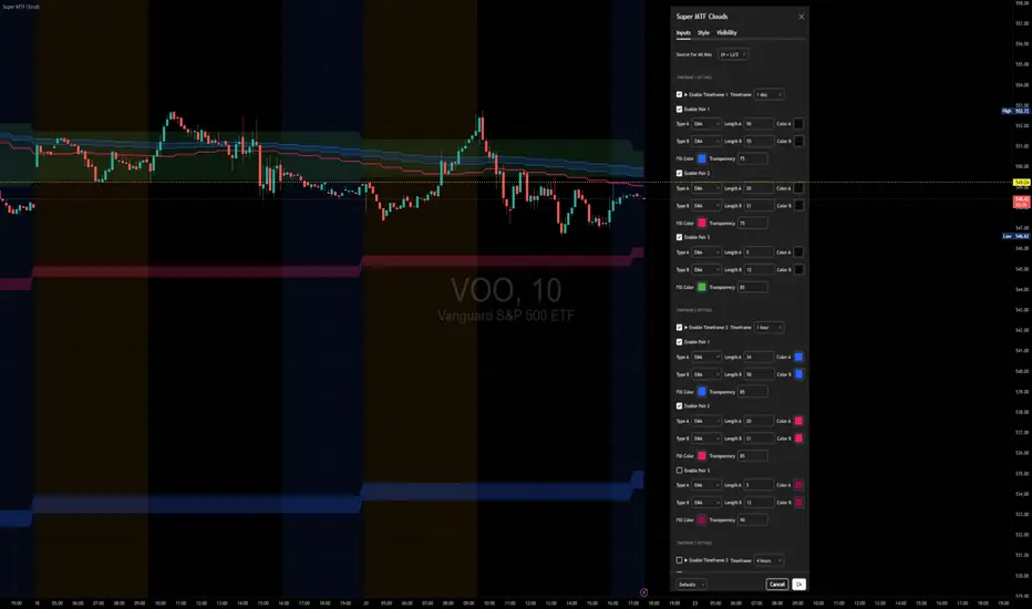
Super MTF Clouds (4x3 Pairs)Overview:
This script is based on Ripster's MTF clouds, which transcends the standard moving average cloud indicator by offering a powerful and deeply customizable Multi-Timeframe (MTF) analysis. Instead of being limited to the moving averages of your current charts from the current timeframe, this tool allows you to project and visualize the trend and key support/resistance zones from up to 4 different timeframes simultaneously. User can input up to 6 different EMA values which will form 3 pairs of EMA clouds, for each of the timeframes.
The primary purpose is to provide traders with immediate confluence. By observing how price interacts with moving average clouds from higher timeframes (e.g., Hourly, Daily, Weekly), you can make more informed decisions on your active trading timeframe (e.g., 10 Minute). It's designed as a complete MTF Cloud toolkit, allowing you to display all necessary MTFs in a single script to build a comprehensive view of the market structure without having to flick to different timeframe to look for cloud positions.
Key features:
Four Independent Multi-Timeframe Slots: Each slot can be assigned any timeframe available on TradingView (e.g., D, W, M, 4H).
Three MA Pairs Per Timeframe: For each timeframe, configure up to three separate MA clouds (e.g., a 9/12 EMA pair, a 20/50 EMA pair, and a 100/200 SMA pair).
Complete Customisation: For every single moving average (24 in total), you can independently control:
MA Type: Choose between EMA or SMA.
Length: Any period you require.
Line Color: Full colour selection.
Line Thickness: Adjust the visual weight of each line.
Cloud Control: For every pair (12 in total), you can set the fill colour and transparency.
How To Use This Script:
This tool is best used for confirmation and context. Here are some practical strategies that one can adopt:
Trend Confluence: Before taking a trade based on a signal on your current timeframe, glance at the higher timeframe clouds. If you see a buy signal on the 15-minute chart and the price is currently trading above a thick, bullish Daily cloud, the probability of that trade succeeding is significantly higher. Conversely, shorting into strong HTF support is a low-probability trade.
Dynamic Support & Resistance: The edges of the higher timeframe clouds often act as powerful, dynamic levels of support and resistance. A pullback to the 4-Hour 50 EMA on your 15-minute chart can be a prime area to look for entries in the direction of the larger trend.
Gauging Market Regimes: Use the toggles in the settings to quickly switch between different views. You can have a "risk-on" view with short-term clouds and a "macro" view with weekly and monthly clouds. This helps you adapt your trading style to the current market conditions.
Key Settings:
1. Global Setting
Source For All MAs: This determines the price data point used for every single moving average calculation.
Default: hl2 (an average of the High and Low of each bar). This gives a smooth midpoint price.
Options: You can change this to Close (the most common method), Open, High, Low, or ohlc4 (an average of the open, high, low, and close), among others.
Recommendation: For most standard trend analysis, the default hl2 is the common choice.
2. The Timeframe Group Structure
The rest of the settings are organized into four identical, collapsible groups: "Timeframe 1 Settings" through "Timeframe 4 Settings". Each group acts as a self-contained control panel for one multi-timeframe view.
Within each timeframe group, you have two master controls:
Enable Timeframe: This is the main power switch for the entire group. Uncheck this box to instantly hide all three clouds and lines associated with this timeframe. This is perfect for quickly decluttering your chart or focusing on a different set of analyses.
Timeframe: This dropdown menu is the heart of the MTF feature. Here, you select the higher timeframe you want to analyse (e.g., 1D for Daily, 1W for Weekly, 4H for 4-Hour). All calculations for the three pairs within this group will be based on the timeframe you select here.
3. Pair-Specific Controls
Inside each timeframe group, there are three sections for "Pair 1", "Pair 2", and "Pair 3". These control each individual moving average cloud.
Enable Pair: Just like the master switch for the timeframe, this checkbox turns a single cloud and its two MA lines on or off.
For each pair, the settings are further broken down:
Moving Average Lines (A and B): These two rows control the two moving averages that form the cloud. 'A' is typically used for the shorter-period MA and 'B' for the longer-period one.
Type (A/B): A dropdown menu to select either EMA (Exponential Moving Average) or SMA (Simple Moving Average). EMAs react more quickly to recent price changes, while SMAs are smoother and react more slowly.
Length (A/B): The lookback period for the moving average (e.g., 21, 50, 200).
Color (A/B): Sets the specific colour of the MA line itself on your chart.
Cloud Fill Settings
Fill Color: This controls the colour of the shaded area (the "cloud") between the two moving average lines. For a consistent look, you can set this to the same colour as your shorter MA line.
Transparency: Controls how see-through the cloud is, on a scale of 0 to 100. 0 is a solid, opaque colour, while 100 is completely invisible. The default of 85 provides a light, "cloud-like" appearance that doesn't obscure the price action.
----------------------------------------------------------------------
If anything is not clear please let me know!
Luma DCA Simulator (BTC only)Luma DCA Simulator – Guide
What is the Luma DCA Simulator?
The Luma DCA Tracker shows how regular Bitcoin investments (Dollar Cost Averaging) would have developed over a freely selectable period – directly in the chart, transparent and easy to follow.
Settings Overview
1. Investment amount per interval
Specifies how much capital is invested at each purchase (e.g. 100).
2. Start date
Defines the point in time from which the simulation begins – e.g. 01.01.2020.
3. Investment interval
Determines how frequently investments are made:
– Daily
– Weekly
– Every 14 days
– Monthly
4. Language
Switches the info box display between English and German.
5. Show investment data (optional)
If activated, the chart will display additional values such as total invested capital, BTC amount, current value, and profit/loss.
What the Chart Displays
Entry points: Each DCA purchase is marked as a point in the price chart.
Average entry price: An orange line visualizes the evolving DCA average.
Info box (bottom left) with a live summary of:
– Total invested capital
– Total BTC acquired
– Average entry price
– Current portfolio value
– Profit/loss in absolute terms and percentage
Note on Accuracy
This simulation is for illustrative purposes only.
Spreads, slippage, fees, and tax effects are not included.
Actual results may vary.
Technical Note
For daily or weekly intervals, the chart timeframe should be set to 1 day or lower to ensure all purchases are accurately included.
Larger timeframes (e.g. weekly or monthly charts) may result in missed investments.
Currency Handling
All calculations are based on the selected chart symbol (e.g. BTCUSD, BTCEUR, BTCUSDT).
The displayed currency is automatically determined by the chart used.

LiquidEdge Original1️⃣ Why Most Traders Miss Key Market Turning Points
Most traders (you) struggle to identify true market pivots THE REAL TOP and BOTTOMS where reversals begin.
❌ You enter too early or too late because price alone doesn’t give enough confirmation
❌ You follow price blindly, unaware of the volume pressure building underneath
❌ You get caught in sideways markets, not realizing they’re often accumulation or distribution zones
❌ You can’t tell if momentum is building or fading, which leads to low confidence and inconsistent results
👉 LiquidEdge helps solve this by tracking volume momentum through a modified MFI slope and scoring system. It highlights potential pivots with real context, so you can see where smart money might be entering or exiting before price makes it obvious.
2️⃣ What LiquidEdge Actually Does and How
LiquidEdge helps solve common trading problems by adding structure and clarity to volume analysis.
✅ It builds on the classic Money Flow Index (MFI), but instead of just showing overbought/oversold levels, it calculates the slope of MFI to track real-time changes in volume momentum
✅ Each setup is scored based on a combination of factors: divergence strength, trend alignment using EMA, and whether the signal occurs inside a liquidity zone
✅ Hidden accumulation or distribution is revealed when volume pressure increases or fades while price remains flat or moves slightly, a sign of smart money positioning
✅ Divergences are only flagged when they occur near pivot zones and align with overall trend conditions, helping reduce false signals
✅ Potential pivots are identified when multiple factors overlap such as a liquidity zone breach, volume slope shift, and valid divergence which often signals entry or exit points for institutional players
👉 The result is a structured interpretation of price and volume flow, helping traders read momentum shifts and potential reversals more clearly in both trending and ranging markets.
3️⃣ What Makes LiquidEdge Different
LiquidEdge is built on top of the classic Money Flow Index (MFI), but adds structure that transforms it from a basic momentum tool into a decision-support system.
Instead of simply showing highs and lows, it scores each potential setup based on:
✅ The steepness and direction of the MFI slope (used to measure volume pressure)
✅ Whether the setup aligns with the broader trend using an EMA filter (default: 200 EMA)
✅ Whether the signal appears inside predefined liquidity zones (MFI above 80 or below 20)
👉 This scoring system reduces noise and helps you focus only on high-probability setups.
👉 It also checks volume pressure across multiple timeframes using MFI slope on 5M, 15M, 1H, 4H, and Daily charts. This reveals whether short-term moves are backed by longer-term volume momentum.
Color changes in the line and histogram are not decorative they reflect real shifts in volume pressure. Every visual cue is linked to live market logic.
What Makes It Stand Out
👉 Setup Scoring That Makes Sense
Each setup is scored by combining:
Signal strength (MFI slope intensity and stability)
Trend direction (via customizable EMA)
Liquidity zone relevance (MFI range filtering)
This structured scoring means you spend less time second-guessing and more time reading clean signals.
👉 Flow That Follows Real Momentum
The slope of the MFI tracks whether volume pressure is rising or falling:
🟢 Green = increasing inflow (buying pressure)
🔴 Red = increasing outflow (selling pressure)
👉 Multi-Timeframe Volume Context
LiquidEdge calculates flow direction independently on each major timeframe. You’ll know if short-term setups are confirmed by higher timeframe volume or going against it.
👉 Smart Divergence Filtering
Unlike simple divergence tools that compare price highs/lows directly, LiquidEdge filters divergences based on:
Local pivot zones (defined by lookback periods)
Trend confirmation (to eliminate countertrend noise)
4️⃣ How LiquidEdge Works (Under the Hood)
LiquidEdge tracks directional momentum using the slope of the Money Flow Index (MFI) giving you a real-time read on buying and selling pressure.
When the slope rises, it means buyers are stepping in and volume is supporting the move.
When it falls, sellers are taking control and volume outflow is increasing.
This slope acts like a pressure gauge for the market, helping you spot when a trend has strength or when it's starting to fade.
💡 Quick Comparison
RSI = momentum from price
MFI = momentum from price + volume
LiquidEdge takes it one step further by calculating the rate of change (slope) in MFI. That’s where the pressure signal comes from not just value, but directional flow.
Core Calculations (Simplified)
Typical Price = (High + Low + Close) ÷ 3
Raw Money Flow = Typical Price × Volume
MFI = 100 −
MFI ranges from 0 to 100.
High = strong buying volume
Low = growing selling pressure
LiquidEdge then calculates the slope of this MFI over time to track volume momentum dynamically.
Divergence Engine
LiquidEdge detects divergence by comparing price pivots with the direction of MFI slope.
❌ If price makes a higher high but MFI slope turns down, it’s a bearish divergence
✅ If price makes a lower low but MFI slope rises, it’s a bullish divergence
Divergences are only confirmed when they occur:
Near local pivot zones (defined by configurable lookback windows)
And, optionally, in alignment with the broader trend using an EMA filter
This filtering helps reduce false positives and keeps you focused on clean setups.
Structured Confidence Scoring
Each signal is visually scored based on:
➡️ Whether a valid divergence is detected
➡️ Whether the signal occurs inside a liquidity zone (MFI > 80 or < 20)
➡️ Whether the setup aligns with the overall trend direction (EMA filter)
More confluence = higher confidence
The scoring system helps prioritize setups that meet multiple criteria, not just one.
Liquidity Zones
Above 80: Signals possible buying exhaustion 👉 risk of reversal
Below 20: Indicates potential selling exhaustion 👉 watch for a bounce
Zones are shaded directly on the chart to highlight pressure extremes in real time.
Price + Volume Fusion
LiquidEdge blends price action with volume pressure using MFI slope and histogram behavior. It doesn’t just show you where price is moving. it shows whether the move is backed by real volume.
This lets you see:
Whether volume is confirming or fading behind a move
If a reversal is building even before price confirms it
Visual Feedback That Speaks Clearly
🟢 Green slope = increasing buying pressure
🔴 Red slope = increasing selling pressure
5️⃣ When Price Is Flat but LiquidEdge Moves: Volume Tells the Truth
One of the most useful things LiquidEdge can do is reveal pressure shifts when price looks neutral.
If price is moving sideways but the MFI slope or histogram rises, it may suggest that buying pressure is quietly increasing possibly pointing to early accumulation.
If price stays flat while the volume slope or histogram drops, this could indicate distribution, where sellers are exiting without moving the market noticeably.
These changes don’t guarantee a breakout or breakdown, but they often precede key moves especially when combined with other confluences like trend alignment or liquidity zones.
👉 LiquidEdge helps spot these setups by measuring volume momentum shifts beneath price action.
It doesn’t predict the future, but it gives you additional context to evaluate what may be developing before it’s visible on price alone.
6️⃣ Multi-Timeframe Flow Table
LiquidEdge includes a real-time table that tracks volume pressure across multiple timeframes including 5-minute, 15-minute, 1-hour, 4-hour, and daily charts.
Each row reflects the direction of the MFI slope on that timeframe, indicating whether volume pressure is increasing (inflow) or decreasing (outflow).
🟢 A rising slope suggests that buying momentum is building
🔴 A falling slope suggests selling pressure may be increasing
👉 This lets traders quickly assess whether short-term setups are aligned with higher timeframe volume trends a useful layer of confirmation for both intraday and swing strategies.
Rather than flipping between charts, the table gives you a snapshot of flow strength across the board, helping you stay focused on opportunities that align with broader market pressure.
7️⃣ Timeframes & Assets
Where LiquidEdge Works Best:
✅ Crypto: Supports major coins and high-volume altcoins (BTC, ETH, Top 100)
✅ Stocks: Effective on large-cap and mid-cap equities with consistent volume
✅ Futures: Tested on instruments like NQ, MNQ, ES, and MES
✅ Any liquid market where volume data is reliable and stable
For best results, use LiquidEdge on assets with consistent trading volume. It’s not recommended for ultra-low volume crypto pairs or micro-cap stocks, where irregular volume can distort signals.
Recommended Timeframes:
👉 Intraday trading: Works well on 3-minute, 5-minute, 15-minute, and 1-hour charts
👉 Swing trading: Performs reliably on 4-hour, daily, and weekly charts
👉 Ultra short-term (1-minute or less): Not recommended due to high noise and low reliability
LiquidEdge adapts to various trading styles from scalping short-term momentum shifts to analyzing broader volume trends across swing and positional setups. The key is choosing assets and timeframes with reliable volume flow for the tool to work effectively.
8️⃣ Common Mistakes to Avoid When Using LiquidEdge
❌ Using It in Isolation
LiquidEdge offers valuable context, but it’s not designed to function as a standalone trading system. Always combine it with key tools such as trendlines, support/resistance zones, chart structure, or fundamental data. The more supporting evidence you have, the stronger your analysis becomes.
❌ Relying on a Single Indicator
No indicator, including LiquidEdge, can account for every market condition. It’s important to use it alongside other forms of confirmation to avoid making decisions based on limited data.
❌ Misinterpreting Divergences as Reversals
A divergence between price and volume pressure doesn't always signal the end of a trend. If the broader direction remains strong (based on EMAs or higher timeframe volume flow), a divergence could reflect temporary consolidation rather than reversal.
❌ Ignoring Trend Alignment and Confidence Scoring
LiquidEdge includes confidence scoring to help validate signals. Disregarding this structure can lead to reacting to weak or out-of-context divergences, especially in choppy or low-volume environments.
❌ Using It on Second-Based or Tick Charts
Very low timeframes introduce too much noise, which can distort volume slope and divergence signals. For intraday analysis, start with 3-minute charts or higher. For swing trading, use 4H and up for clearer, more reliable structure.
9️⃣ LiquidEdge Settings Overview
A quick breakdown of what you can customize in the indicator and how each option affects what you see:
➡️ LiquidEdge Length
Controls how sensitive the indicator is to changes in volume pressure (via MFI slope).
Shorter values = faster response, more frequent signals
Longer values = smoother output, less noise
👉 Default: 14
➡️ EMA Trend Filter
Determines overall trend direction based on EMA slope. Used to filter out signals that go against the broader move.
Helps reduce countertrend entries
Adjustable to suit your strategy
👉 Recommended: 200 EMA
➡️ Pivot Lookback (Left & Right)
Defines how many bars the system looks back and forward to identify swing highs/lows for divergence detection.
Narrow: more responsive but can be noisy
Wide: slower but more stable pivot zones
👉 Default: 5 left / 5 right
➡️ Histogram Toggle
Enables a visual histogram showing how volume pressure deviates from its recent average.
Useful for spotting shifts in flow intensity
👉 Optional for added visual detail
➡️ Liquidity Zones
Highlights potential exhaustion zones based on MFI value:
Above 80 = potential distribution (buying pressure peaking)
Below 20 = possible accumulation (selling pressure fading)
👉 Zones are fully customizable (color, opacity, background)
➡️ Custom Threshold Zones
Set your own upper/lower boundaries for liquidity extremes helpful when adapting to different markets or asset classes.
👉 Especially useful outside of crypto/forex
➡️ Show LiquidEdge Line
Toggle the main MFI slope line. When turned off, liquidity zones and levels also disappear.
👉 Use if you prefer to focus only on histogram/divergences
➡️ Style Settings
Customize line colors, histogram appearance, and background shading
👉 Helps tailor visuals to your chart layout
➡️ Simplified Mode
Removes all colors and replaces visuals with a clean, grayscale output.
👉 Ideal for minimalist or distraction-free charting
➡️ Signal Score Label
Displays the confidence score of the current setup, based on:
Divergence presence
Liquidity zone positioning
Trend alignment (EMA)
👉 Tooltip explains how the score is calculated
➡️ Divergence Labels
Shows “Bullish” or “Bearish” labels at divergence points.
Optional Filters based on trend if EMA filter is active
➡️ Multi-Timeframe Flow Table
Shows directional flow (based on MFI slope) across: 5M, 15M, 1H, 4H, 1D
Color-coded (faded green/red) for clarity
👉 Table position is customizable on your chart
➡️ Alerts
Get notified when any of these conditions are met:
✅ Bullish or bearish divergence detected
✅ Price enters high/low liquidity zones
✅ Signal score reaches a defined value
➡️ Visibility Settings
Control which timeframes display the LiquidEdge indicator
👉 Best used on 3-minute and above
⚠️ Not recommended on ultra-low or second-based charts due to noise
🔟 Q&A – What Traders Usually Ask
➡️ Can this help reduce bad trades?
To a degree, yes. LiquidEdge is built to highlight areas where price may react, based on volume pressure, liquidity zones, and divergence patterns. It can offer clarity in sideways or messy markets, helping traders avoid impulsive or poorly timed entries.
That said, it’s not predictive or guaranteed. It works best when used with broader context including structure, support/resistance, trend, and volume-based confluence.
👉 Reminder: LiquidEdge is not a signal tool. It’s a decision-support framework designed to help you assess potential shifts, not replace judgment or trading rules.
➡️ Is this just another flashy signal tool?
No. LiquidEdge doesn’t give buy/sell alerts. Instead, it visualizes volume shifts using MFI slope, divergence filtering, and trend-based scoring. It’s built to help you understand why price action may be changing not just react to a one-dimensional signal.
You’re seeing how volume pressure evolves across timeframes, which gives added context to what’s unfolding in the market.
➡️ How do I know this isn’t just another overhyped tool?
LiquidEdge is based on real trading logic: volume pressure (via MFI slope), price behavior, and divergence within trend and liquidity zones. It was developed and tested by traders, not packaged by marketers.
No performance is guaranteed. It’s designed to support your decisions not promise results.
➡️ Will this work with my trading style?
If you trade any market with volume crypto, stocks, or futures LiquidEdge can add value.
✔️ Scalpers: Best from 3-minute and up
✔️ Swing traders: Works well on 4H, Daily, Weekly
✔️ Investors: Weekly charts show pressure buildup over time
⚠️ Avoid ultra-low timeframes (under 1M) or illiquid markets, as noise and irregular data can reduce reliability.
➡️ Can I trust the signals?
These are not buy/sell signals. LiquidEdge offers confidence-weighted insights based on:
✔️ Valid divergence
✔️ Zone positioning (above 80 / below 20)
✔️ Optional trend alignment (via EMA)
Each setup is scored visually to reflect how much confluence exists. You can combine that information with structure, price action, or your existing tools to evaluate opportunities.
👉 Think of LiquidEdge as a decision filter not a trigger.
It’s meant to slow down impulsive trades and help you make more context-aware decisions.
1️⃣1️⃣ Limitations – Know When It’s Less Effective
LiquidEdge performs best in stable, high-volume markets where volume data is consistent and structure is visible.
It’s not recommended for:
❌ Low-volume tokens
❌ Micro-cap or penny stocks
❌ Newly listed assets with limited trading history
These types of markets often show inconsistent or erratic volume behavior, making it difficult for LiquidEdge to accurately assess pressure or identify reliable divergences.
⚠️ During major news events or sudden volatility spikes, volume and price behavior can become disconnected or extreme. This may distort MFI slope calculations and reduce the accuracy of divergence or confidence scoring.
LiquidEdge is built to read structured volume flow. When market conditions become highly erratic or unpredictable, it's best to:
Wait for structure to return
Use it alongside other filters for additional confirmation
This isn't a flaw it's simply the nature of tools that rely on consistency in price and volume data.
1️⃣2️⃣ Real Chart Examples – See It in Action
Now that you’ve seen how LiquidEdge works, here are real-world chart examples from various asset classes
including:
✅ Crypto
✅ Stocks
✅ Futures
✅ Commodities
These examples demonstrate how LiquidEdge behaves under different conditions, and how both the line (MFI slope) and histogram (volume deviation) can be used to interpret market flow.
In each walkthrough, you’ll see:
How the histogram can highlight potential momentum shifts
When the slope line provides stronger directional clarity
Examples of possible hidden accumulation or distribution (before price responds)
What to watch out for such as weak volume, false divergences, or conflicting flow signals
👉 These are real examples based on live market data not theoretical setups. They’re meant to help you recognize how LiquidEdge reacts across multiple styles and timeframes.
Let’s walk through each one and break down the logic step by step, so you can understand how to evaluate setups using structure, volume behavior, and context-driven confluence.
Example: Microsoft (MSFT) – Possible Hidden Accumulation
In this setup, price was moving lower within a short-term downtrend. However, LiquidEdge began showing signs of increasing inflow pressure a common characteristic of accumulation, where volume rises even as price declines.
This divergence suggested that buying interest may have been increasing behind the scenes, despite weak price action on the surface.
Step-by-step breakdown:
👉 Trend context – Price was clearly trending down at the time
👉 Volume divergence – Price made lower lows, but LiquidEdge slope was rising = possible bullish divergence
👉 Accumulation clue – The rising slope, despite falling price, pointed to volume inflow often seen during quiet accumulation
👉 Histogram support – Volume pressure (via the histogram) also increased, confirming the flow shift
👉 Anticipating reaction – When liquidity pressure rises ahead of price, it can signal potential reversal interest
In this case, price later moved sharply higher. While not guaranteed, setups like this illustrate how divergence + volume flow may help highlight early accumulation zones before price confirms the shift.
Same Setup – Focusing on the Histogram Alone
Here, we’re revisiting the Microsoft setup but this time focusing only on the histogram, without the MFI slope line.
Even without the directional slope, the histogram showed rising volume pressure while price continued to drift lower. This visual pattern may indicate that buying interest was quietly increasing, despite weak price movement.
This is where the histogram adds value: it helps visualize the intensity of volume flow over time. When volume pressure builds during a flat or declining price phase, it can be consistent with accumulation where larger participants begin positioning before the market responds.
This example highlights how the histogram alone can provide early insight into underlying volume dynamics even before price shifts noticeably.
Filtering with EMA and why It Matters
Here, we revisit the Microsoft example this time applying the 200 EMA filter, which helps define the broader trend.
Once enabled, LiquidEdge automatically removed any bullish or bearish divergence signals that were against the prevailing trend. This helped reduce noise and focus only on setups aligned with market structure.
✅ The EMA acts as a contextual filter.
For example, if a bullish divergence occurs during a confirmed downtrend, LiquidEdge suppresses that signal helping you avoid setups that may carry more risk.
This filtering mechanism is especially useful in fast or choppy markets, where not all divergences are meaningful.
Want More Flexibility? Adjust the Filter
If you're a more aggressive trader or prefer shorter-term signals, you can reduce the EMA length (e.g., to 150, 50, or even 25). This increases the number of setups shown but also raises the importance of additional context and confirmation.
⚠️ Keep in mind:
❌ More signals doesn’t always mean better outcomes
✅ Focused, context-aware signals tend to be more consistent with broader market pressure
If you’re using this in combination with strategies like options trading, this filter can help refine your entry zones especially when paired with other structure or volatility tools.
Distribution Example and Bitcoin Setup Before a Major Drop
In this example, Bitcoin was trading in a relatively tight range while price continued to push upward. However, LiquidEdge began to show signs of volume outflow, which can suggest potential distribution.
Here’s what was observed:
🔴 Price was moving up inside a horizontal range
🔴 LiquidEdge’s slope indicated declining volume pressure
🔴 Several bearish divergence signals appeared during this consolidation phase
🔴 The histogram also showed weakening flow, even before price broke down
These overlapping signals pointed to a possible distribution phase, where buying momentum was fading despite price still holding up.
🧭 Signs to Watch for in Potential Distribution:
1️⃣ Price holding flat or rising slightly within a tight range
2️⃣ Volume pressure (line or histogram) sloping downward
3️⃣ Repeated bearish divergences forming at the highs
4️⃣ Lack of follow-through on bullish setups signaling hesitation in demand
While LiquidEdge can’t predict market outcomes, this scenario demonstrates how a combination of divergence, outflow, and failure to break out may serve as early warnings that momentum is shifting beneath the surface.
Failed Auction Example – Volume Shift Before a Breakdown
In this example, price attempted to break out above a recent high, creating the appearance of a bullish continuation. However, LiquidEdge began to signal volume outflow, despite the upward price move a potential sign of a failed auction.
Here’s what was observed:
👉 Price made a new high, appearing to break resistance
👉 LiquidEdge slope and histogram both showed declining liquidity
👉 The indicator formed lower lows, even as price pushed higher
👉 This divergence suggested that volume wasn’t supporting the breakout
Shortly after, price reversed and returned back inside the range which is a common characteristic of failed auction behavior.
🧭 Spotting a Potential Failed Auction with LiquidEdge:
1️⃣ Price breaks above a recent high
2️⃣ Volume flow (line + histogram) shows outflow, not inflow
3️⃣ Indicator forms lower lows while price makes higher highs (bearish divergence)
4️⃣ Market reverts back into the previous range without follow-through
While no tool can predict outcomes, this setup demonstrated how volume pressure and divergence can help identify moments where a breakout may lack real support offering context before price action confirms the shift.
Reading the Histogram - Spotting Pressure Fades
In this example, price was still rising but the LiquidEdge histogram showed falling volume pressure. This type of divergence between price and volume can serve as a potential early signal that momentum may be fading.
🔻 Histogram levels declined while price continued higher
🔻 This suggested that buying pressure was weakening, even though price hadn’t turned
🔻 Volume flow behavior didn’t support the continuation possibly indicating buyer exhaustion
Just before the peak, the histogram nearly reached its lower threshold, despite price still being near its highs.
💡 How to Read It:
When volume pressure (shown by the histogram) starts to fade while price is still rising, it can indicate that momentum is weakening. This may precede a pullback or reversal particularly if other factors like divergence or zone exhaustion are also present.
Conversely, rising histogram values during a price drop may suggest potential accumulation.
👉 Use the histogram as a volume intensity gauge, not a signal on its own especially when evaluating whether a move is supported by actual flow, or just price momentum.
The Table – Fast, Visual Multi-Timeframe Flow Insight
The multi-timeframe flow table in LiquidEdge provides a consolidated view of volume momentum across several key timeframes so you don’t need to switch between charts to compare flow strength.
👉 Instead of flipping from 5-minute to 15M, 1H, 4H, and Daily, the table displays flow direction on all of them at a glance.
Example layout:
🔼 Daily: Up
🔽 1H: Down
🔼 15M: Up
🔽 5M: Down
This setup gives you a quick read on whether volume momentum is aligned across multiple timeframes or diverging which can help frame your trade approach.
🧠 Why It’s Useful:
✅ Supports timeframe alignment
If higher timeframes show strong inflow while lower ones are mixed, you may interpret it as a swing-based opportunity. If short timeframes show pressure but higher frames are flat, it might suggest short-term setups with caution.
✅ Improves context awareness
Instead of interpreting a move in isolation, the table helps you assess whether short-term signals are part of a broader shift or going against higher timeframe flow.
💡 Pro Tip: Use the table as a starting point in your analysis. It’s a simple but effective snapshot of current liquidity pressure across the board helping you plan trades with broader context, rather than reacting chart-by-chart.
🔚 Final Thoughts
If you're focused on trading with better clarity and structure, LiquidEdge is designed to help you interpret what’s happening beneath the surface not just follow price movement.
While many tools highlight price alone, LiquidEdge combines volume pressure, divergence filtering, and trend-based context to help identify potential areas of accumulation, distribution, or momentum shifts even before they become obvious on a chart.
👉 This isn’t just another signal tool. It’s a framework to support smarter decision-making:
✔️ One that helps you filter out noise
✔️ One that scores setups using multiple layers of confirmation
✔️ One that brings volume context into every trade idea
Whether you're scalping on a 5-minute chart or managing a longer-term swing trade, LiquidEdge is built to help you stay aligned with volume-driven behavior not just react to price alone.
If you've struggled with late entries, unreliable setups, or second-guessing trades, this tool was designed to bring more structure to your process. It won’t remove all uncertainty but it can help you stay more selective, confident, and intentional.
✅ Trade with clarity
✅ Stay process-driven
✅ Focus on structure, not noise
LiquidEdge is not meant to replace your strategy. It’s here to enhance it.
In this chart, the 200 EMA filter was applied. As a result, only signals that aligned with the dominant trend direction were displayed helping to reduce distractions and focus on setups with stronger context.
💡 Using a higher EMA setting like 200 can reduce the number of signals shown, but may help you focus on higher-conviction opportunities.
That said, every trader is different:
Longer EMAs = fewer signals, but more trend-filtered setups
Shorter EMAs = more signals, faster entries but with potentially more noise
👉 Adjust the filter based on your trading style. Use a 200 EMA for swing trading, or reduce it to 50, 25, or even 5 if you're trading more aggressively or intraday.
LiquidEdge adapts to you not the other way around.
🔁 Adjusting EMA for Your Trading Style
Personal Tip: When trading more aggressively, I often use a 5 EMA filter especially when combining histogram strength with other tools. This increases signal responsiveness and may help highlight short-term flow shifts more quickly.
Below are visual examples that show how different EMA lengths impact the behavior of LiquidEdge:
50 EMA ON
25 EMA ON
5 EMA ON
Lower EMA Example – Gold with the 5 EMA
In this example, the 5 EMA filter was applied to Gold. As expected, more signals were plotted compared to higher EMA settings. The tool became more responsive to rapid shifts in volume momentum, making it more suitable for fast-paced trading environments.
This setting can help traders who prefer early entries but it also introduces more sensitivity, so context and additional confirmation become even more important.
Each setting affects signal frequency and filtering:
Higher EMA → fewer signals, more trend-confirmed setups
Lower EMA → more signals, quicker responses, but with more potential for noise
Choose what fits your approach:
Long-term swing → Stick with 200 EMA
Intraday or scalping → Consider shorter EMAs (50, 25, or 5)
💡 Reminder: EMA filtering is fully adjustable. LiquidEdge doesn’t lock you into one trading style it’s meant to adapt to your process, whether you’re swing trading or scalping short-term moves.
But There’s a Catch…
Using a lower EMA setting (like 5) opens up faster, more frequent signals but it also increases the need for precision and stronger trade management.
❗ More signals = More responsiveness
❗ Faster setups mean quicker decisions
❗ Risk control becomes even more important
💡 Lower Timeframes = More Detail, Less Margin for Error
A short EMA (like 5) can help you:
✅ Identify early momentum shifts
✅ Respond before traditional trend-followers
✅ Highlight short-term divergence and volume changes
But it also comes with tradeoffs:
❌ Greater signal noise
❌ Higher potential for misreads or fakeouts
❌ Requires clear structure and disciplined entries
🚩 Watch Out for Liquidity Grabs
In lower timeframes, a common trap is the liquidity grab where price pushes beyond recent highs or lows, triggers stops, then quickly reverses.
📌 These moves can look like breakouts, but often reverse quickly possibly reflecting institutional order placement or low-liquidity manipulation.
🧭 How to Approach It Smartly
✅ Use structure: Mark support and resistance to frame moves
✅ Confirm volume behavior: Is histogram strength rising or fading?
✅ Avoid chasing: Look for confluence, not just a single signal
✅ Be intentional with stops: Place them with structure in mind to avoid being swept out
NASDAQ Futures Example – Low Timeframe Setups with LiquidEdge
In this example, we look at how LiquidEdge was used to identify both short and long setups on the NASDAQ Futures (NQ) particularly on a low timeframe (5M), where quick decision-making and volume precision matter most.
⚠️ A Note on Futures and Volume
When trading futures, especially on intraday charts, it’s important to separate overnight volume from regular session activity.
🕒 Overnight Volume ≠ Real Volume Context
Overnight price action is informative, but the volume data itself may not reflect true market participation. In LiquidEdge, histogram and pressure calculations emphasize regular session flow helping avoid skewed signals that could come from low-volume overnight moves.
Using the Histogram to Spot Potential Shifts
One of the key cues I use is color transition in the histogram:
🔴 A flip from strong green to red can signal fading buying pressure, sometimes marking the beginning of a potential short setup.
🟢 A shift from red to green may indicate that buyers are returning, suggesting possible accumulation.
These shifts serve as early visual cues of changing pressure especially when confirmed by other tools or context.
🔁 Adding Context with the Line + Structure
After spotting a histogram shift, I look at:
1️⃣ Slope Line – Is it confirming the same directional pressure?
2️⃣ Support/Resistance – Are we near a meaningful zone?
3️⃣ Additional Tools – This includes trendlines, VWAP, EMAs, and overall price structure.
On lower timeframes like 5M, these pieces become even more important. LiquidEdge gives directional insight, but your full setup provides confirmation and execution logic.
⚠️ Disclaimer
LiquidEdge is not a signal tool. It’s a visual representation of market pressure and flow designed to help you make more informed trading and investing decisions. It shows you what’s happening beneath the price action but you are still responsible for your decisions.
Always combine LiquidEdge with your own strategy, research, and supporting tools. That includes trend analysis, support/resistance levels, chart patterns, and fundamentals (like P/E ratios, price-to-sales, debt ratios, etc.).
This tool should never be used alone or treated as financial advice.
Some content may include AI-powered enhancements for clarity or formatting.
Always do your own research. For personal financial guidance, speak with a licensed financial advisor.

TBL HTF Highs&LowsThis script plots the previous Daily, Weekly, and Monthly High and Low levels directly on your chart, helping you identify key higher-timeframe support and resistance zones.
Features:
Daily, Weekly, Monthly Lines: Toggle visibility for each timeframe's high/low levels.
Customization Options:
Choose color, style (Solid, Dashed, Dotted), width, and transparency for each line type.
Automatic Updates: Lines update at the start of each new session (day, week, or month).
Summary Table: Displays the latest Pre-Daily High/Low (PDH/PDL), Pre-Weekly High/Low (PWH/PWL), and Pre-Monthly High/Low (PMH/PML) in the top-right corner of the chart.
Configurable Table Font Size: Choose between Tiny, Small, Medium, or Large text.
Use Case:
Ideal for traders who rely on key higher-timeframe levels for confluence, breakout trading, or mean-reversion strategies. The visual lines and summary table provide instant context without cluttering your chart.

COT Commitment of Traders IndexOVERVIEW
Commitment of Traders (COT) Indicator is a trading tool which designed to visualise net positions/commitment of traders that is reported weekly basis to the commissions.
CONCEPTS
The Indicator help you understand the position of long or short trades by market participants relative to their historical positioning. The change in position will help you in analysing the medium-to-long term market trend.
The commercial traders represents producers or consumers of the commodity that usually positions as hedgers in the market, protecting their asset over market fluctuation risk. The non-commercial traders represents fund or money managers that the goal is speculate and take profit from the market fluctuations. Non-reportable represents small or retail traders.
Understand the relative of those all traders will give better insight of how to positions ourselves in the market.
DETAILS & EXAMPLE OF HOW TO USE
An example of Gold Future chart (GC1!) to demonstrate the indicator in real market scenario.
Blue graph indicate the Commercial Index, showing on the extreme low under 20 level. Commercial traders as a hedgers indicate the turning point over an asset in extreme value. This showing the potential change in market direction the upside.
On the same time, Orange graph indicate the Non-Commercial Index, showing an extreme high level above 80. Non-Commercial traders will most of the time trade with the trend. This showing the potential continuation of market direction to the upside.
Base on those information, combine with other technical strategy on the same timeframe or even lower timeframe. For example using Supply & Demand to find the entry.
The result is a massive push to the upside in the long term direction.
FEATURES
3 Index in 1 indicator
Customisable historical period and threshold
LIMITATIONS
The Indicator is best applied on weekly, due to the weekly release of COT data.
Not intended as a stand-alone signal, but should be as part of long-term strategy analysis.
Should be combined with other lower-timeframe technical tools like supply and demand.

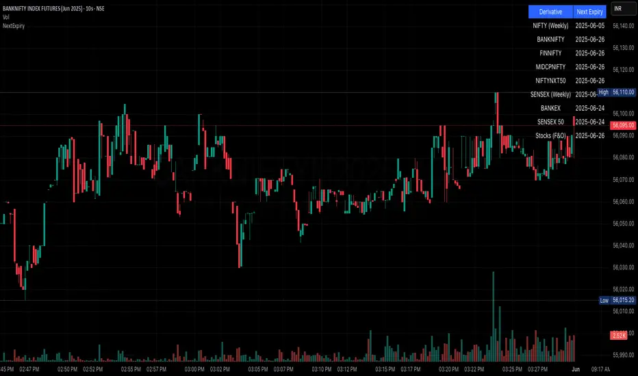
NSE/BSE Derivative - Next Expiry Date With HolidaysNSE & BSE Expiry Tracker with Holiday Adjustments
This Pine Script is a TradingView indicator that helps traders monitor upcoming expiry dates for major Indian derivative contracts. It dynamically adjusts these expiry dates based on weekends and holidays, and highlights any expiry that falls on the current day.
⸻
Key Features
1. Tracks Expiry Dates for Major Contracts
The script calculates and displays the next expiry dates for the following instruments:
• NIFTY (weekly expiry every Thursday)
• BANKNIFTY, FINNIFTY, MIDCPNIFTY, NIFTYNXT50 (monthly expiry on the last Thursday of the month)
• SENSEX (weekly expiry every Tuesday)
• BANKEX and SENSEX 50 (monthly expiry on the last Tuesday of the month)
• Stocks in the F&O segment (monthly expiry on the last Thursday)
2. Holiday Awareness
Users can input a list of holiday dates in the format YYYY-MM-DD,YYYY-MM-DD,.... If any calculated expiry falls on one of these holidays or a weekend, the script automatically adjusts the expiry to the previous working day (Monday to Friday).
3. Customization Options
The user can:
• Choose the position of the expiry table on the chart (e.g. top right, bottom left).
• Select the font size for the expiry table.
• Enable or disable the table entirely (if implemented as an input toggle).
4. Visual Expiry Highlighting
If today is an expiry day for any instrument, the script highlights that instrument in the display. This makes it easy to spot significant expiry days, which are often associated with increased volatility and trading volume.
⸻
How It Works
• The script calculates the next expiry for each index using built-in date/time functions.
• For weekly expiries, it finds the next occurrence of the designated weekday.
• For monthly expiries, it finds the last Thursday or Tuesday of the month.
• Each expiry date is passed through a check to adjust for holidays or weekends.
• If today matches the adjusted expiry date, that row is visually emphasized.
⸻
Use Case
This script is ideal for traders who want a quick glance at which instruments are expiring soon — especially those managing options, futures, or expiry-based strategies.
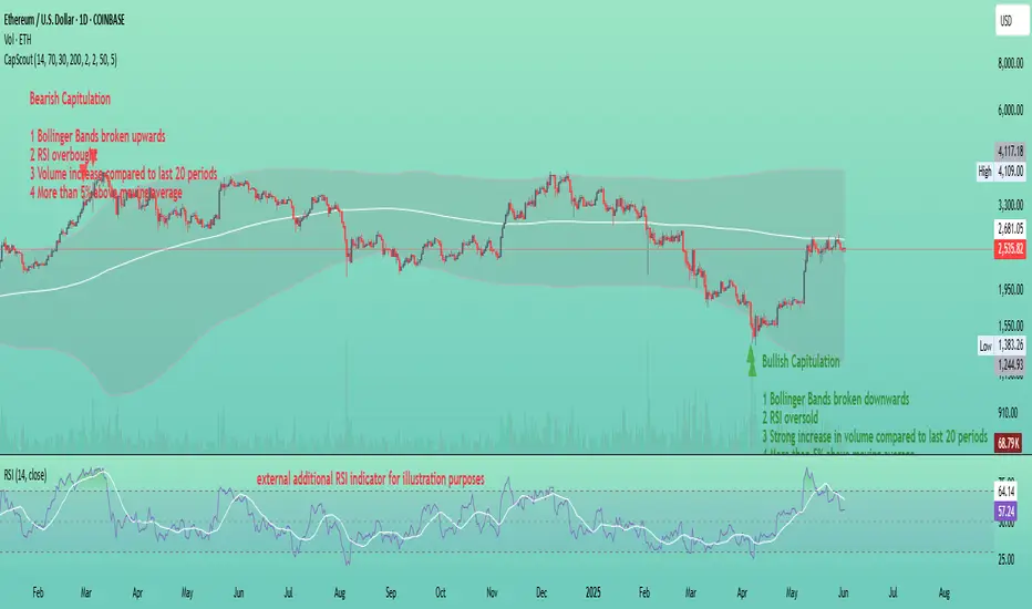
Capitulation ScoutCapitulation Scout - Description
Overview
The Capitulation Scout is a streamlined technical indicator designed to identify potential market reversals by spotting moments of "capitulation" – extreme fear ( bearish capitulation ) or euphoria ( bullish capitulation ). It combines two independent filter groups to provide reliable reversal signals: an Extremes Filter (RSI + Bollinger Bands) and a Confirmation Filter (Volume Spike + MA Deviation). The indicator dynamically adapts to the current chart timeframe, making it versatile for day traders and long-term investors alike.
How It Works
This indicator uses two filter groups to detect capitulation, which can be enabled or disabled individually:
1. Extremes Filter (RSI + Bollinger Bands) : Identifies overbought (default: RSI > 70) or oversold (default: RSI < 30) conditions combined with price breaking through the Bollinger Bands (default: 200-period, 2x multiplier), indicating an extreme price movement.
2. Confirmation Filter (Volume Spike + MA Deviation) : Requires both a significant volume increase (default: 2x the 20-period average volume on lower timeframes, dynamically adjusted on higher timeframes) and a significant price deviation from a moving average (default: 5% deviation from a 50-period SMA) to confirm the capitulation event.
A signal is generated if at least one filter is enabled and all enabled filters meet their respective conditions.
Signals
- Bearish Capitulation : Marked with a red downward triangle (customizable in the "Style" tab) above the candle. Occurs when the enabled filters detect a potential top, e.g., overbought RSI and price above the upper Bollinger Band (if Extremes Filter enabled), and/or a volume spike combined with a significant upward deviation from the MA (if Confirmation Filter enabled).
- Bullish Capitulation : Marked with a green upward triangle (customizable in the "Style" tab) below the candle. Occurs when the enabled filters detect a potential bottom, e.g., oversold RSI and price below the lower Bollinger Band (if Extremes Filter enabled), and/or a volume spike combined with a significant downward deviation from the MA (if Confirmation Filter enabled).
Note : At least one filter must be enabled to generate signals. If both filters are disabled, no signals will be shown.
How to Use
1. Add the Capitulation Scout to your chart.
2. Look for red downward triangles ( bearish capitulation ) at market tops or green upward triangles ( bullish capitulation ) at market bottoms as potential reversal signals.
3. Use the signals in conjunction with other technical analysis tools (e.g., support/resistance levels, trendlines) to confirm trades.
4. Set up alerts for bearish or bullish capitulation signals to get real-time notifications.
5. Adjust the settings to suit your trading style and timeframe. For smaller timeframes (e.g., 5M or 15M), consider reducing the Bollinger Bands length for more sensitivity.
Settings
- Extremes Filter Settings
- Use Extremes Filter (RSI + Bollinger Bands) : Enable/disable the RSI and Bollinger Bands filter (default: enabled).
- RSI Length : Period for RSI calculation (default: 14 periods, relative to the chart timeframe).
- RSI Overbought/Oversold Levels : Thresholds for overbought/oversold conditions (default: 70/30).
- Bollinger Bands Length/Multiplier : Settings for Bollinger Bands (default: 200 periods, 2x multiplier).
- Confirmation Filter Settings
- Use Confirmation Filter (Volume Spike + MA Deviation) : Enable/disable the combined Volume Spike and MA Deviation filter (default: enabled). When enabled, both a volume spike and a significant MA deviation are required to meet the filter condition.
- Volume Spike Threshold (Base Multiplier) : Multiplier for detecting volume spikes on lower timeframes (default: 2x the 20-period average). On higher timeframes (e.g., weekly or monthly), the threshold is dynamically reduced to be more sensitive (e.g., 1.5x on weekly, 1x on monthly).
- Moving Average Length : Period for the SMA (default: 50 periods, relative to the chart timeframe).
- MA Deviation Threshold (%) : Percentage deviation from the MA to consider the price stretched (default: 5%).
Features
- MA Deviation Filter Visualization : The moving average used for the MA deviation filter can be enabled in the "Style" tab under "MA for Deviation Filter (Optional)" and is displayed in blue by default. It is disabled by default and must be manually enabled in the "Style" tab. Its color, line width, and style can be customized in the "Style" tab.
- Customizable Visuals : In the "Style" tab, you can toggle the visibility of signal markers and customize their colors, sizes, and styles.
- Alerts : Set up alerts for bearish or bullish capitulation signals to get real-time notifications.
Notes
- The indicator automatically adapts to the current chart timeframe (e.g., 1M, 15M, 1H, 1D, etc.). On smaller timeframes, consider reducing the RSI Length, Bollinger Bands Length, and Volume Period for better sensitivity. For example, on a 5-minute chart, a Bollinger Bands Length of 200 covers 1,000 minutes (over 16 hours), which might be too long – try lowering it to 50 or 100.
- Capitulation events are generally more reliable on higher timeframes (e.g., 1H, 4H, 1D), but the indicator can be used on any timeframe with proper adjustments. On weekly or monthly timeframes, the volume spike threshold is dynamically reduced to detect capitulation events more effectively.
- You can enable any combination of filters to generate signals. For example, disabling the Extremes Filter and enabling only the Confirmation Filter will generate signals based solely on volume spikes combined with MA deviation.
- Always combine with other analysis methods to reduce false signals.
- Test the indicator on your preferred markets (stocks, ETFs, crypto, etc.) and tweak the settings as needed.
Example
The thumbnail shows the Capitulation Scout on a daily chart of ETHUSD on Coinbase. Two red downward triangles ( bearish capitulation ) marked a major local top in early 2024, and from there, the ETH price started to correct. Two green upward triangles ( bullish capitulation ) marked a major bottom in April 2025, followed by a significant rally. For more examples, follow my account – I’ll aim to share and track such signals with you in the future.
Grid Trade Helper📌 Grid Trade Helper – Range-Based Grid Planning Tool
This tool is designed for range-based traders and manual grid strategy operators, providing a framework to balance execution efficiency and risk exposure.
By referencing historical weekly volatility, it helps estimate a reasonable grid width, visualizes key levels, and supports position management with quantitative guidance.
🧭 Design Philosophy:
In multi-entry systems like grid trading, there's always a tradeoff:
"Tighter grids improve opportunity density but increase risk; wider grids reduce risk but lower efficiency."
This tool seeks to provide a dynamic equilibrium between the two, using past volatility to determine practical grid intervals and suggest safe leverage thresholds.
✨ Core Features:
Weekly open level tracking (custom time + time zone support)
Volatility-based suggestions for grid width and safe grid count
Visual range plotting with optional stop-line overlay
Compact live table showing key metrics: average range, grid width, grid count, leverage cap
🔧 Customizable Parameters:
Time zone and custom weekly open hour
Max number of visual elements (lines, boxes)
Color and line style options
📈 Suggested Use Cases:
Planning manual grid structures with volatility-adjusted intervals
Visual support for range-bound or sideways market strategies
Estimating leverage exposure and grid density for better position control
⚠️ This indicator is intended as a strategic support tool and does not constitute financial advice. Use according to your own risk framework and market understanding.

AxisAxis Indicator: Dynamic Trend Lines & Support/Resistance with Trading Mode Presets
Overview
The Axis indicator is a powerful, all-in-one tool for traders, designed to identify key trend lines and support/resistance (S&R) levels across various trading strategies. With 11 predefined trading modes—Scalping, Day Trading, Swing Trading, Long-Term, Position Trading, Breakout Trading, Mean Reversion, Trend Following, Range Trading, Volatility Trading, and Counter-Trend Trading—Axis adapts to your trading style by automatically adjusting parameters like volume Moving Average (MA) periods, fractal lookbacks, and alert proximity. Built-in timeframe validation ensures you’re using the optimal chart timeframe for your selected mode, with a warning label displayed if the timeframe is unsuitable. Whether you’re a scalper chasing quick moves or a position trader eyeing long-term trends, Axis provides precise, volume-filtered signals to enhance your trading decisions.
How It Works
Axis plots two sets of trend lines (A and B) and two sets of S&R levels (A and B) on your chart, each tailored to the selected trading mode:
Trend Lines (A & B): Identifies uptrend and downtrend lines using pivot highs/lows with mode-specific lookback periods. Lines are drawn only when volume exceeds the mode’s volume MA, ensuring high-probability signals.
Support/Resistance (A & B): Plots horizontal S&R levels based on pivot highs/lows, filtered by volume to highlight significant price levels.
Volume MA: Uses a mode-specific MA type (SMA, EMA, WMA, HMA, or VWMA) to validate pivots. MA periods are scaled by timeframe (e.g., 1m, 1h, Daily) and capped at 5,000 candles to prevent errors.
Timeframe Validation: Checks if the chart’s timeframe matches the mode’s recommended range (e.g., 5m–1h for Volatility Trading). If not, a yellow warning label appears (e.g., “Timeframe may not suit Scalping”).
Alerts: Triggers alerts for new trend lines, S&R levels, and price crosses, allowing real-time trade monitoring.
Trading Modes & Recommended Timeframes
Each mode is preconfigured with optimized settings for specific strategies and timeframes:
Scalping (1m–15m): Fast signals with short lookbacks (1–3 bars) and tight alerts (0.2%) for intraday scalps.
Day Trading (15m–1h): Intraday focus with moderate lookbacks (2–4 bars) and 0.3% alert proximity.
Swing Trading (1h–4h): Multi-day/week trades with balanced settings (2–5 bars, 0.5% alerts).
Long-Term (Daily–Weekly): Major trends with longer lookbacks (3–7 bars, 1.0% alerts).
Position Trading (Weekly–Monthly): Long-term moves with robust settings (4–20 bars, 1.5% alerts).
Breakout Trading (30m–4h): Detects breakouts with sensitive settings (1–4 bars, 0.25% alerts).
Mean Reversion (1h–Daily): Targets reversals with moderate settings (3–8 bars, 0.7% alerts).
Trend Following (4h–Weekly): Captures trends with longer lookbacks (4–18 bars, 1.2% alerts).
Range Trading (1h–4h): Optimized for consolidation with balanced settings (2–6 bars, 0.4% alerts).
Volatility Trading (5m–1h): High-volatility markets with ultra-sensitive settings (1–2 bars, 0.15% alerts).
Counter-Trend Trading (4h–Daily): Contrarian reversals with robust settings (3–9 bars, 0.9% alerts).
Key Features
11 Trading Modes: Preconfigured settings for diverse strategies, eliminating manual tuning.
Dynamic Volume MA: Supports SMA, EMA, WMA, HMA, and VWMA, scaled by timeframe for accuracy.
Timeframe Validation: Warns if the chart timeframe doesn’t suit the mode, preventing suboptimal setups.
Customizable Visuals: Adjust line widths and colors for trend lines and S&R levels.
Comprehensive Alerts: Alerts for new trend lines, S&R levels, and price crosses, integrable with TradingView’s alert system.
Performance Optimized: MA periods capped at 5,000 candles to avoid errors and ensure smooth operation.
How to Use
Add to Chart: Apply the Axis indicator to your TradingView chart.
Select Trading Mode: Choose a mode from the “Trading Mode” dropdown in the indicator settings (e.g., Volatility Trading for crypto on 5m).
Check Timeframe: Ensure your chart’s timeframe matches the mode’s recommended range (e.g., 5m–1h for Volatility Trading). A yellow warning label appears if the timeframe is unsuitable.
Customize Visuals: Adjust line widths and colors for trend lines (A & B) and S&R (A & B) in the settings.
Set Alerts: Create alerts for new trend lines, S&R levels, or price crosses via TradingView’s alert menu.
Trade Signals:
Trend Lines: Use uptrend/downtrend lines for trend confirmation or breakout setups.
S&R Levels: Trade bounces or breaks at support/resistance, confirmed by volume.
Alerts: Act on price cross alerts for entries/exits based on your strategy.
Tips for Best Results
Match Timeframe to Mode: Stick to recommended timeframes (e.g., 1h–4h for Swing Trading) to maximize signal accuracy. Heed warning labels for timeframe mismatches.
Test Across Assets: Volatility Trading shines in crypto during news events, while Range Trading suits forex/stocks in consolidation.
Backtest Strategies: Convert Axis to a strategy (e.g., enter on S&R cross, exit after X bars) to validate performance.
Optimize for Performance: If lag occurs on low timeframes, reduce the MA cap to 2,500 (edit math.min(..., 2500) in the code).
Combine with Other Tools: Pair Axis with indicators like RSI or MACD for confluence.
Why Choose Axis?
Axis simplifies technical analysis by offering a single indicator that adapts to your trading style. Its mode-based presets, volume-filtered signals, and timeframe validation make it ideal for traders of all levels, from scalpers to long-term investors. Whether you’re trading crypto, forex, or stocks, Axis delivers actionable insights with minimal setup.
Feedback & Support
If you have questions, suggestions, or need help customizing Axis, feel free to comment or contact me via TradingView. Your feedback helps improve the indicator for the community!

VWAP Indicator Channel | Multi Timeframe by Osbrah📊 Multi-Timeframe VWAP Indicator (Session / Weekly / Monthly)
This powerful indicator plots the Volume Weighted Average Price (VWAP) across multiple timeframes: intraday session, weekly, and monthly. It's designed to give traders a clear understanding of the market’s fair value over different horizons.
Key Features:
* Display Session VWAP (resets daily)
* Enable Weekly and Monthly VWAPs for broader market context
* Customize colors, styles, and visibility for each VWAP
* Toggle between standard VWAP or anchored to session opens
Use Cases:
* Identify value zones where price tends to gravitate
* Spot institutional levels of interest and potential reversal points
* Align entries with VWAP bounces or breaks
* Combine with EMAs or price action for high-probability setups
Perfect for day traders, swing traders, and institutional-style strategies, this VWAP tool helps you stay aligned with volume-based price dynamics across all market phases.

CoT-Mike-Long&Short Quantile CoT-Mike-Long&Short visualizes the weekly net positions of commercial traders (Commitments of Traders, COT) for both long and short sides. The indicator calculates the highest and lowest values of commercial long and short positions over a user-defined lookback period (default: 208 weeks) and plots customizable quantile lines (default: 75% and 25%) for both sides.
By default, only the short side is displayed, but you can enable the long side in the settings.
The 25% and 75% quantile lines are used to identify extreme positioning of commercials. When commercial positions reach these extreme levels, it often signals potential market turning points, as commercials are considered the "smart money" and tend to act against the prevailing market trend. These quantile levels help traders spot overbought or oversold conditions and filter out less significant signals, supporting a more disciplined and contrarian trading approach.
Features:
• Weekly-based calculation, independent of the chart timeframe
• Customizable lookback period (in weeks)
• Adjustable quantile levels (e.g. 75%/25%, 80%/20%, etc.)
• Option to display only shorts, only longs, or both
• Visualizes key levels for both long and short positions
• Useful for identifying extreme positioning and potential market turning points
How to use:
Add the indicator to your chart
Adjust the lookback period and quantile levels if needed
Enable or disable the display of long/short positions as desired
Use the quantile lines to spot overbought/oversold conditions in commercial positioning
Note: The data is always calculated on a weekly basis, regardless of your current chart timeframe.

BooRSI📘 BooRSI – Multi-Dimensional RSI Framework with Advanced Visual Context
BooRSI is not just another RSI overlay. It is a multi-layered momentum framework that blends traditional RSI dynamics with a set of enhanced visual and structural components to help traders identify market imbalances, momentum shifts, and confluence zones across multiple timeframes. The indicator was designed to assist both discretionary and systematic traders in spotting RSI-based inflection points with greater clarity and context.
🔍 What Makes BooRSI Different?
Unlike standard RSI tools, BooRSI provides a modular visualization layer that lets you:
View RSI in both candle format and classic line mode, making intrabar momentum shifts visible.
Plot dynamic or static Fibonacci retracement levels directly on the RSI scale — useful for identifying confluence between RSI pullbacks and trend continuation zones.
Activate a weekly RSI vs weekly RSI MA crossover highlight, enabling long-term trend filters directly within the intraday or daily RSI window.
Apply subtle gradient band fills to the 30–50–70 zones to enhance zone memory without overwhelming the visual space.
Toggle a custom RSI Moving Average for smoother signal interpretation.
🧠 Underlying Logic & Structure
RSI Calculation: Classic RSI with adjustable OHLC input (default: close). When in “Candle Mode,” it uses RSI(Open), RSI(High), RSI(Low), RSI(Close) to form OHLC candles for intrabar detail.
RSI MA Filter: A secondary SMA (default: 14) smooths RSI values to assist in trend determination.
Fibonacci Mapping: Based on a fixed or dynamic length (default: 55), key Fib levels (38.2%, 50%, 61.8%, etc.) are plotted on the RSI window to map out overreaction or pullback zones.
Multi-Timeframe Context: The system calculates weekly RSI and its moving average, then uses background highlights to show whether the current trend aligns with the higher timeframe momentum direction.
⚙️ Default Settings
Parameter Default Description
RSI Length 14 Base RSI period
RSI MA Length 14 SMA on RSI for trend filtering
Fibonacci Lookback 55 Length for Fibo level projections
Show 30/50/70 Bands True Gradient fill zones for RSI decision zones
Show Fibonacci Levels False Optional – static/dynamic Fib lines on RSI
Candle Mode False Switch between RSI line and RSI OHLC candles
Fibo Style Toggle True Switch between solid, dashed or dotted lines
🎯 Best Use Cases
Momentum Filters: For trend-based strategies, use RSI-MA and HTF background for filter alignment.
Reversal Signals: Use RSI candles to spot strong rejection patterns inside extreme zones.
Mean-Reversion Timing: Combine Fibonacci levels with 30–70 bands to fine-tune entries.
⚠️ Important Note
This is a closed-source indicator due to proprietary RSI candle mapping logic and unique Fibonacci interaction methods. However, this description fully discloses how the tool works and how it adds value beyond a basic RSI implementation.
BooRSI – Çok Katmanlı RSI Çerçevesi
BooRSI, klasik RSI göstergesini birden fazla katmanda zenginleştirerek momentum değişimlerini, aşırı alım/aşırı satım bölgelerini ve farklı zaman dilimi trendlerini daha net görmenizi sağlar:
Çubuk ve Çizgi Modu: RSI’yı hem OHLC mumları hem de klasik çizgi olarak gösterebilir, böylece intrabar hareketleri de izlenebilir.
RSI MA Filtreleme: RSI üzerine uygulanan SMA (varsayılan 14) trend yönünü belirlemenize yardımcı olur.
Fibonacci Seviyeleri: RSI ölçeği üzerinde dinamik veya sabit Fibonacci retracement çizgileri (38.2%, 50%, 61.8% vb.) ekleyerek dönüş ve devam bölgelerini tespit eder.
Haftalık Konteks: Günlük veya daha kısa zaman diliminde, haftalık RSI ve haftalık RSI MA kesişimlerini arka plan rengiyle vurgular.
Gradient 30/50/70 Bantları: Karar bölgelerini boğucu olmayan degradelerle öne çıkarır.
Bu kapalı kaynak gösterge, RSI mum haritalama ve Fib etkileşimindeki özgün mantığı nedeniyle gizlidir; açıklama ise nasıl çalıştığını tam olarak ortaya koyar.

Base Detector Pro [AletheiaTradeLab]This custom Trading View indicator combines William O’Neal “Base” patterns with several complementary tools—David Ryan’s ANT indicator, key pivot‐based price levels, index and earnings lines, relative strength (RS) line, and moving averages—to help you pinpoint base formations and validate whether each one merits a trade.
1. Bases (William O'Neal)
A “base” is simply a period of price consolidation following a significant run-up. During this phase, a stock moves mostly sideways within a defined trading range, forming clear support and resistance lines.
Key Criteria for a Valid Base
- Prior Uptrend
Before a base begins, the stock should already have a healthy advance—typically at least a 30% gain.
- Shapes of Bases
Bases can form in several distinct geometric patterns, each signaling a different kind of consolidation and potential breakout:
Flat Base
Shape : A horizontal rectangle bounded by nearly parallel support (bottom) and resistance (top) trendlines.
Minimum Length : 5 weeks
Maximum Length : 65 weeks
Depth : < 15%
Pivot Point : Left-side high of base
i.ibb.co i.ibb.co
Cup Base
Shape : A smooth, rounded “U” curve.
Minimum Length : 6 weeks
Maximum Length : 65 weeks
Minimum Depth : 8%
Maximum Depth : 50%
Pivot Point : Left-side high of base
i.ibb.co i.ibb.co
Sauce Base
Shape : A very gradual, broad “U” curve, often taking more length than cup bases.
Minimum Length : 6 weeks
Maximum Length : 65 weeks
Minimum Depth : 8%
Maximum Depth : 50%
Pivot Point : Left-side high of base
i.ibb.co i.ibb.co
Cup with Handle Base
Shape : A “U”‐shaped cup followed by a smaller downward-sloping flag or channel (the handle).
Minimum Length : 6 weeks
Maximum Length : 65 weeks
Minimum Depth : 8%
Maximum Depth : 50%
Pivot Point : High of the handle
i.ibb.co i.ibb.co
Saucer with Handle Base
Shape : Similar to cup with handle, but cup looks like the saucer base.
Minimum Length : 6 weeks
Maximum Length : 65 weeks
Minimum Depth : 8%
Maximum Depth : 50%
Pivot Point : High of the handle
i.ibb.co
Ascending Base
Shape : An upward-sloping channel or wedge with 3 pullbacks. Each pullback low should be higher than the previous one. It needs around 20% increase from a base to the other.
Minimum Length : 8 weeks
Maximum Length : 16 weeks
Minimum Depth : 8%
Maximum Depth : 50%
Pivot Point : Left-side high of third base
i.ibb.co i.ibb.co
Consolidation Base
Shape : Similar to flat base, but wider and fails to form any of the above bases.
Minimum Length : 8 weeks
Maximum Length : 16 weeks
Minimum Depth : 8%
Maximum Depth : 50%
Pivot Point : Left-side high of base
i.ibb.co i.ibb.co
- Base Stages
Once a stock has completed its initial 30% run-up and formed its first base, that pattern is labeled Stage 1.
After a breakout from Stage N, the stock must rally at least 20% above the Stage N pivot (the base’s resistance point). If it does, the next valid base becomes Stage N + 1.
When a breakout fails to advance at least 20% a base on base forms. This is considered an extension for the current base stage, and a letter is assigned after the stage number.
When a breakout fails and the price undercuts the low for the previous base, the base stages reset, and a rally of 30% will be needed to form a new stage 1 base.
Note that for IPO stocks, a 30% increase is not required to form the first base. As soon as it meets any of the shape of any of the available bases, it will be drawn.
- Base statistics
To help you determine how healthy is a base, some statistics are available when you hover on the small dot shown above the high-left side of each base.
i.ibb.co
Base : The specific pattern type (Flat, Cup, Sauce, etc.).
Stage : The stage number of the base (1, 2, 3 …) and, in parentheses, how many distinct bases have formed since the very first base (including base-on-base like 1a, 1b, etc.).
Pivot : The resistance level that defines the top of the base. A close above this price often signals a valid breakout and a potential entry point.
Length : The number of bars (days on a daily chart; weeks on a weekly chart) between the start of the base and the bar immediately before breakout. (The initial bar and the breakout bar themselves are not counted.)
Depth : How far, in percentage terms, the low of the base has fallen below its left-side high.
Prior Uptrend : The percent gain from the pivot of the previous base up to the start of the current base.
Blue/Red Count : The number of up days (Blue) and down days (Red) during the base where volume was above the 50-period moving average.
Price % : The percent change from the close at the end of the base to the close at the breakout bar.
Volume % : The percent difference between the volume on the breakout bar and the 50-period average volume at the end of the base.
2. ANT Indicator (David Ryan)
The ANT indicator, developed by David Ryan, is a momentum-based signal used to identify high-potential breakout candidates during a stock’s run-up phase. It complements the base patterns by flagging moments of unusually strong price and volume activity within an uptrend, helping confirm emerging strength before or during a base formation.
i.ibb.co
3. Key Price Levels (Pivots)
Plots recent pivot-based support and resistance levels.
i.ibb.co
4. Index Line Overlay
Overlays a chosen index (e.g. SPX) on the top portion of the chart to compare relative performance.
i.ibb.co
5. Relative Strength (RS) Line
Plots the price ratio of the symbol vs. an index (e.g. SPX) to identify outperformance.
i.ibb.co
6. Moving Averages (SMA & RS-MA)
Allows up to four simple (or exponential) moving averages on price (daily/weekly) and three on the RS line.
7. Earnings Line & EPS Change
Marks earnings events on daily/weekly charts and optionally plots YoY EPS change in a lower portion of the chart. The earnings line also shows a projection to estimated earnings. To maintain alignment with the price chart, the line and YoY EPS data are limited to the most recent 28 quarters on weekly charts and 8 quarters on daily charts. For analyzing older data, you can use the replay feature.
i.ibb.co
8. Bars
Since Trading View displays very thin bars when zoomed out, I added 2-pixel-wide vertical lines over the bars to make them easier to see.
9. Dark Theme
I added this for a quick workaround to adapt colors for dark theme. Enabling this overrides any custom settings. Uncheck to customize colors.
i.ibb.co

True Seasonal Pattern [tradeviZion]True Seasonal Pattern: Uncover Hidden Market Cycles
Markets have rhythms and patterns that repeat with surprising regularity. The True Seasonal Pattern indicator reveals these hidden cycles across different timeframes, helping you anticipate potential market movements based on historical seasonal tendencies.
What This Indicator Does
The True Seasonal Pattern analyzes years of historical price data to identify recurring seasonal trends. It then plots these patterns on your chart, showing you both the historical pattern and future projection based on past seasonal behavior.
Automatic Timeframe Detection: Works with Monthly, Weekly, and Daily charts
Historical Pattern Analysis: Analyzes up to 100 years of data (customizable)
Future Projection: Projects the seasonal pattern ahead on your chart
Smart Smoothing: Applies appropriate smoothing based on your timeframe
How to Use This Indicator
Add the indicator to a Daily, Weekly, or Monthly chart (not designed for intraday timeframes)
The indicator automatically detects your chart's timeframe
The blue line shows the historical seasonal pattern
Watch for potential turning points in the pattern that align with other technical signals
Seasonal patterns work best as a supporting factor in your analysis, not as standalone trading signals. They are particularly effective in markets with well-established seasonal influences.
Best Applications
Futures Markets: Commodities and futures often show strong seasonal tendencies due to production cycles, weather patterns, and economic factors
Stock Indices: Many stock markets demonstrate regular seasonal patterns (like the "Sell in May" phenomenon)
Individual Stocks: Companies with seasonal business cycles often show predictable price patterns
Practical Applications
Identify potential turning points based on historical seasonal patterns
Plan entries and exits around seasonal tendencies
Add seasonal context to your existing technical analysis
Understand why certain months or periods might show consistent behavior
Pro Tip: For best results, use this tool on instruments with at least 5+ years of historical data. Longer timeframes often reveal more reliable seasonal patterns.
Important Notes
This indicator works best on Daily, Weekly, and Monthly timeframes - not intraday charts
Seasonal patterns are tendencies, not guarantees
Always combine seasonal analysis with other technical tools
Past patterns may not repeat exactly in the future
// Sample of the seasonal calculation approach
float yearHigh = array.max(currentYearHighs)
float yearLow = array.min(currentYearLows)
// Calculate seasonality for each period
for i = 0 to array.size(currentYearCloses) - 1
float periodClose = array.get(currentYearCloses, i)
if not na(periodClose) and yearHigh != yearLow
float seasonality = (periodClose - yearLow) / (yearHigh - yearLow) * 100
I developed this indicator to help traders incorporate seasonal analysis into their trading approach without the complexity of traditional seasonal tools. Whether you're analyzing agricultural commodities, energy futures, or stock indices, understanding the seasonal context can provide valuable insights for your trading decisions.
Remember: Markets don't always follow seasonal patterns, but when they do, being aware of these tendencies can give you a meaningful edge in your analysis.
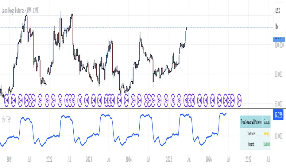
Cup & Handle Post-Breakout Correction FinderWhat This Script Tries to Do (Simple Summary)
Finds a Specific Setup: It looks for stocks that might be getting ready to move up again after a specific sequence:
A big "Cup & Handle" breakout happened 1-3 years ago.
The stock then pulled back (corrected) for at least a few months (~4 months by default) without crashing too hard (less than 35% drop by default).
The main weekly moving averages are now tightly bunched together (suggesting a pause or "squeeze").
The price just crossed above its 200-day moving average (a potential positive sign).
The price hasn't already broken above the high point of the recent pullback.
The Signal: If all these conditions are met, it places a small, bright green circle below the price bar on your chart.
Reference Line: It also shows the 200-period moving average (usually the 200-week, as this script is best on Weekly charts) as a red line.
Best Way to Use It (Simple Guide)
Use on Daily or Weekly Charts: The script's settings (like pullback in weeks) make it more suitable for the Weekly timeframe.
Look for the Green Circle: This is the main signal that the script found a potential setup matching all its rules.
Don't Trade Blindly! The green circle is just an alert, not a guaranteed buy signal. It means "This stock might fit the pattern, check it out!".
Confirm with Your Eyes & Other Tools:
Does the chart look like the pattern the script is searching for (past breakout, recent pullback, current tightening)?
Switch to the Daily chart to see how the cross above the 200-day EMA looks. Is it clean?
Check the volume. Is buying interest picking up as the signal appears? (Good sign).
Consider the overall market trend. Is it a good time to be buying stocks?
Customize (Optional): You can adjust the settings (gear icon ⚙️) to make the rules stricter or looser (e.g., change the pullback duration, allowed drop percentage, EMA tightness).
Manage Risk: If you decide to trade based on this signal (after confirming it), always know where you'll place your stop-loss in case the pattern fails.
MACD Multi-Timeframe x4 (Custom Params)■About this indicator
・This indicator can display 4 MACD lines for different time frames. (Multi-time framework)
・The color of the MACD line changes when the MACD has a golden or dead cross.
All MACDs can be set individually for long time period, short time period, and signal smoothing.
All MACDs can show/hide MACD lines, signal lines, histograms, and select colors.
■Explanation of effective usage
By displaying MACDs in multiple time frames, you can time the push.
For example, let's say you have three MACDs: one weekly, one daily, and one hour.
With the weekly and daily MACDs continuing to golden cross, the timing for the hourly MACD to golden cross is considered a push opportunity.
An example chart is attached below for your reference.
The area circled vertically is a push-buying opportunity.
Yellow-green: Weekly Green: Daily Light blue: Hourly
-------------------------------------------------------------------------------------------------------------
■このインジケーターについて
・このインジケーターは別の時間軸の4本のMACDを表示させることが出来ます。(マルチタイムフレームワーク)
・MACDがゴールデンクロス・デッドクロスした場合にMACDラインの色が変化します。
・全てのMACDについて個別に長期の期間・短期の期間・シグナルの平滑化を設定できます。
・全てのMACDはMACDライン・シグナルライン・ヒストグラムの表示/非表示、色の選択ができます。
■有効な使い方の説明
マルチタイムフレームでMACDを表示することで、押し目のタイミングを計ることが出来ます。
例えば、3本のMACDを1週間・1日・1時間とします。
週足と日足のMACDがゴールデンクロスを継続した状態で、1時間足のMACDがゴールデンクロスしてくるタイミングは押し目買いのチャンスと考えられます。
以下に例題のチャートを付けますので、参考にしてください。
縦に囲った辺りが押し目買いのチャンスになります。
黄緑:週足 緑:日足 水色:1時間足

Multi-Timeframe Closures with Signals month week dayMulti-Timeframe Price Anchoring Indicator (Monthly, Weekly, Daily)
This indicator provides a powerful visual framework for analyzing price action across three major timeframes: monthly, weekly, and daily. It plots the closing prices of each timeframe directly on the chart to help traders assess where current price stands in relation to significant historical levels.
🔍 Core Features:
Monthly, Weekly, and Daily Close Lines: Automatically updated at the start of each new period.
Color-coded Price Anchors: Each timeframe is visually distinct for fast interpretation.
Multi-timeframe Awareness: Helps you identify trend alignment or divergence across different time horizons.
Long & Short Bias Signals: The script can optionally display long or short suggestions based on where the current price stands relative to the anchored closing prices.
📈 How to Use:
Trend Confirmation: If price is consistently above all three levels, it signals a strong bullish trend (potential long bias). If it’s below, the opposite applies (short bias).
Reversal or Pullback Zones: When price becomes extended far above/below the monthly and weekly closes, it may suggest overbought/oversold conditions and the possibility of a reversal or retracement.
Intraday Alignment: Useful for traders who want to enter positions on lower timeframes while being aware of higher timeframe trends.
This indicator is ideal for swing traders, day traders, and position traders who want to anchor their decisions to meaningful multi-timeframe reference points.
MTF Analysis Panel [Invesmate]MTF Analysis Panel
This indicator provides a compact Multi-Timeframe (MTF) view of trend and momentum conditions directly on the chart. It combines EMA trend checks, RSI momentum checks, and optional Relative Strength analysis to offer an intuitive overview of market structure across intraday, daily, weekly, and monthly timeframes.
Trend and Momentum Analysis
The script uses two primary methods for assessing the market:
Trend Detection: Based on price relation to a user-selected EMA for each timeframe.
Momentum Detection: Based on whether RSI is above or below 50 for each timeframe.
Users can independently toggle these modules through inputs to customize the panel for different analysis needs.
Trend and momentum are calculated separately to avoid bias, helping traders capture the real state of the market across multiple timeframes.
Relative Strength (Optional)
If enabled, when either Weekly or Monthly timeframes are selected, the panel will display Relative Strength (RS ) data.
RS measures the stock's performance relative to a benchmark symbol (like NSE:NIFTY).
This value shows the percent outperformance or underperformance over a user-defined period (default 55 days), allowing deeper market strength analysis.
Table and Display Logic
The indicator draws a neat panel on the chart using TradingView’s table functionality.
Each selected timeframe (15m, 1h, 4h, 1D, 1W, 1M) will display:
Trend (EMA): Green for bullish trend (Price > EMA), Red for bearish trend (Price < EMA), Gray if neutral or not applicable.
Momentum (RSI): Green if RSI > 50, Red if RSI < 50, Gray if neutral.
Symbols for trend and momentum can be customized between:
Emoji mode (e.g., 🟢, 🔴, 🟦, 🟥)
Text mode (e.g., UP, DOWN, NEUTRAL)
The panel is customizable for position (Top Left, Top Right, Bottom Left, Bottom Right) to fit user preference.
Color Codes
Strong Bullish: All selected timeframes are trending up and momentum is rising — shown with a light green background.
Strong Bearish: All selected timeframes are trending down and momentum is falling — shown with a light red background.
Mixed: Any mixed state (some up, some down) — shown with a neutral gray background.
This helps traders instantly recognize overall market sentiment without manually checking individual timeframes.
Summary Labels
At the bottom of the panel, two powerful summaries are displayed:
Trend Summary: Overall trend aggregation across selected timeframes ("STRONG BULLISH", "STRONG BEARISH", or "MIXED").
Momentum Summary: Overall momentum aggregation ("MOMENTUM UP", "MOMENTUM DOWN", or "MOMENTUM MIXED").
When Relative Strength is available (Weekly or Monthly enabled), it is also shown separately at the bottom, providing a complete strength-versus-benchmark view.
Input Controls
Enable EMA Trend Check: Toggle EMA-based trend detection.
Enable RSI Momentum Check: Toggle RSI-based momentum detection.
Timeframes to Display: 15m, 1h, 4h, 1D, 1W, 1M can be independently turned on or off.
EMA Length per Timeframe: Customize EMA lengths for different timeframes.
RSI Length: Set RSI calculation period.
Comparative Symbol: Select the benchmark symbol for Relative Strength calculations.
RS Period: Choose the lookback period for Relative Strength.
Emoji Display Toggle: Switch between emoji-based or text-based display styles.
Table Location: Choose where the analysis panel appears on the chart.
Special Features
Realtime Updating: The panel updates dynamically as bars close, maintaining real-time relevance.
Maximum Label Control : Designed to respect TradingView's maximum label limits to avoid runtime errors.
Optimized for Performance: Uses conditional requests and security calls efficiently, minimizing script execution load.
Known Limitations
Request.security limitations: Relative Strength is only calculated on Daily data for stability; lower timeframe RS is not implemented.
TradingView Table Size: On some screen sizes or with many timeframes selected, table may overlap candles. Adjust panel location accordingly.

Flow State Model [TakingProphets]🧠 Indicator Purpose:
The "Flow State Model" by Taking Prophets is a precision-built trading framework based on the Inner Circle Trader (ICT) methodology. This script implements and automates the Flow State Model, a highly effective multi-timeframe trading system created and popularized by ITS Johnny.
It is designed to help traders systematically align higher timeframe liquidity draws with lower timeframe confirmation patterns, offering a clear roadmap for catching institutional moves with high confidence.
🌟 What Makes This Indicator Unique:
This is not a simple liquidity indicator or a basic FVG plotter. The Flow State Model executes a full multi-step process:
Higher Timeframe PD Array Detection: Automatically identifies and displays Fair Value Gaps (FVGs) from Daily, Weekly, and Monthly timeframes.
Liquidity Sweep Monitoring: Tracks swing highs and lows to detect Buyside or Sellside Liquidity sweeps into the HTF PD Arrays.
CISD Detection: Waits for a Change in State of Delivery (CISD) by monitoring bullish or bearish displacement after a sweep.
Full Trade Checklist: Visual checklist ensures all critical conditions are met before signaling a completed Flow State setup.
Sensitivity Control: Adapt detection strictness (High, Medium, Low) based on market volatility.
⚙️ How the Indicator Works (Detailed):
Fair Value Gap Mapping:
The indicator constantly scans higher timeframes (4H, Daily, Weekly) for valid bullish or bearish Fair Value Gaps that are large enough (based on ATR multiples) and not weekend gaps.
These FVGs are displayed on the current timeframe with full extension logic and mitigation handling (clearing when invalidated).
Liquidity Sweep Detection:
Swing highs and lows are identified using pivot logic (3-bar pivots). When price sweeps beyond a recent liquidity point into an active FVG, it flags the potential for a Flow State setup.
Change in State of Delivery (CISD) Confirmation:
After a sweep, the script monitors price action for a sequence of bullish or bearish candles followed by displacement (break in delivery).
Only after displacement closes beyond the initiating sequence does a CISD level plot, confirming the market's new delivery state.
Execution Checklist:
An optional table tracks whether critical components are present:
Higher Timeframe PD Array.
Aligned Timeframe Bias.
Liquidity Sweep into FVG.
SMT Divergence (optional manual confirmation).
CISD Confirmation.
Dynamic Management:
Active gaps are extended automatically.
Cleared gaps and mitigated CISDs are deleted to keep charts clean.
Distance-to-FVG prioritization keeps only the nearest active setups visible.
🎯 How to Use It:
Step 1: Identify the bias by locating active higher timeframe FVGs.
Step 2: Wait for a Liquidity Sweep into a PD Array (active FVG).
Step 3: Watch for a CISD event (the Flow State confirmation).
Step 4: Once all conditions are checked off, execute trades based on retracements to CISD levels or continuation after displacement.
Best Timing:
During ICT Killzones: London Open, New York AM.
After daily or weekly liquidity events.
🔎 Underlying Concepts:
Liquidity Theory: Markets seek to engineer liquidity for real institutional entries.
Fair Value Gaps: Imbalances where price is expected to react or rebalance.
Change in State of Delivery (CISD): Confirmation that the market's delivery mechanism has shifted, validating bias continuation.
Flow State Principle: Seamlessly aligning higher timeframe liquidity draws with lower timeframe confirmation to maximize trade probability.
🎨 Customization Options:
Adjust sensitivity (High / Medium / Low) for volatile or calm conditions.
Customize FVG visibility, CISD display, labels, line colors, and sizing.
Set checklist visibility and manual tracking of SMT or aligned bias.
✅ Recommended for:
Traders studying Inner Circle Trader (ICT) models.
Intraday scalpers and swing traders seeking confluence-driven setups.
Traders looking for a structured, checklist-based execution process.
ZenAlgo - RangerThe core of the indicator is the daily range, anchored around the 1-minute timeframe VWAP (volume-weighted average price), with ±2 standard deviations defining the upper and lower bounds. This range dynamically forms throughout the day and then gets “locked” at 23:59 each day to establish historical reference values.
The indicator calculates this locked VWAP and standard deviation per day, which serves two primary purposes:
Drawing today's real-time evolving range , updated each minute.
Plotting previous daily ranges , based on historical locked VWAPs and standard deviations, providing visual reference boxes on the chart.
This design enables the trader to identify mean-reversion zones and persistent directional biases based on volume-weighted price consensus.
Multiple Standard Deviation Layers
Beyond the ±2.0 deviation bounds, optional lines are available at half-step increments (e.g., ±0.5, ±1.5, ..., ±4.5) and full-step levels beyond ±2.0 (±3.0, ±4.0, ±5.0). These provide a customizable grid to visualize price extremes, tail behavior, or potential breakout zones relative to volume-adjusted price equilibrium.
Users can enable only the levels they need, offering flexibility depending on their strategy (e.g., scalping versus swing trading).
Historical Range Retention
The script stores up to 70 previous daily VWAP + standard deviation values (adjustable). For each, it draws a full range box and standard deviation lines in the past. This historical context helps in understanding how current price interacts with prior days’ balance zones.
These boxes are always drawn from 00:00 to 23:59 UTC , ensuring consistent alignment across instruments and avoiding session-based discrepancies.
Monday Range Reference (Drawn on Tuesdays)
On Tuesdays, the indicator plots the previous Monday's VWAP-based range across the rest of the week. This serves as a persistent contextual anchor for traders watching weekly unfolding behavior. The range is defined identically (VWAP ±2σ) and drawn from Monday 00:00 through the following Monday.
This method assumes Monday often sets the tone or structure for the week, and tracking this level through time may highlight support/resistance confluence or range expansion scenarios.
Each Monday range is extended over 7 days and includes dashed lines at the 25%, 50%, and 75% marks within the range. These midrange markers help traders assess microstructure behaviors (e.g., reversion to median, failure to hold midpoint, etc.).
Daily Volume Delta via 4H Candles
The indicator also integrates daily buy/sell volume deltas , derived from 4-hour candles of the regular session (non-Heikin Ashi). The logic categorizes volume as:
Buy volume when candle closes above the previous close.
Sell volume when it closes below.
Even split when the candle closes flat.
These volumes accumulate each day to derive net delta (buy - sell). This delta is recorded for each day and can optionally be displayed. A similar process tracks the delta for each Monday range on an ongoing basis.
This information quantifies the market’s aggressive buying vs. selling , correlating with price positions inside or outside the VWAP ranges. A strong delta in one direction may justify a price sustaining above/below VWAP, or diverging from the previous range.
Interpretation and Best Usage Practices
VWAP±2σ Range : Considered a high-probability area for consolidation or reversal. Mean-reverting strategies can benefit from signals within this area.
VWAP±3.0 and beyond : Extreme deviations may signal exhaustion or breakout potential, but are less frequent.
Previous Range Overlap : Overlap of today’s price with past VWAP zones may indicate support/resistance zones.
Monday Range on Tuesday : Persistent levels where the week may repeatedly pivot. Best used on instruments that exhibit weekly cyclical behavior (e.g., indices, forex).
Delta Behavior : Sharp positive or negative delta combined with price outside VWAP bands may suggest initiative participation and potential trend continuation.
Added Value Over Free Alternatives
While many free VWAP tools exist, this script differs in several specific and factual ways:
Anchored 1-minute VWAP lock at a consistent daily timestamp (23:59 UTC), enabling historical analysis.
Historical storage of previous VWAP ranges , with adjustable memory depth and visual continuity.
Flexible standard deviation plotting , down to 0.5 increments, tailored to the user's strategy needs.
Dedicated Monday range analysis , not common in freely available scripts.
Volume delta tracking per day and per Monday range , offering a directional volume view unavailable in standard VWAP implementations.
Persistent and visual interpretation framework using extended boxes and dashed lines for easier contextual navigation.
Each of these additions increases the script’s utility for methodical traders relying on volume-weighted statistics, without requiring additional configuration or external calculations.
Limitations and Disclaimers
VWAP based on 1-minute resolution : The indicator uses minute-level data to calculate daily VWAP and standard deviation. This offers high fidelity on liquid instruments but may produce noisy or unreliable levels on illiquid assets or during periods of low volume. For example, microcap stocks or thinly traded altcoins might not yield stable VWAP centers.
Inferred buy/sell volume : Volume delta is estimated using price movement from one candle to the next (close-to-close logic), rather than actual trade-level aggressor data (which is not accessible via TradingView). This approximation may misclassify volume in choppy or low-volatility environments, especially in assets where price changes do not correlate well with order flow (e.g., crypto during low-volume weekends).
Non-continuous markets and price gaps : For assets that do not trade continuously (e.g., stocks, futures), the VWAP calculation starts fresh every day at 00:00 UTC, regardless of the instrument’s official session start. As a result:
Pre-market/post-market trades may be included in VWAP when analyzing equities, even though they are often excluded in professional VWAP tools.
Opening gaps in equities and futures may distort early VWAP values due to lack of volume context, especially if the previous day's session was already closed when new data begins accumulating.
Weekend gaps in crypto, although less frequent due to 24/7 trading, can still influence delta accumulation if abrupt moves happen during low liquidity periods.
Daily session alignment : The VWAP anchoring and box drawing uses 00:00 UTC to 23:59 UTC windows. For instruments with different official session timings (e.g., US equities, CME futures), this may cause mismatches between expected session VWAPs and the ones shown in this script.
Conclusion
The ZenAlgo – Ranger script offers a systematic visualization of volume-adjusted price behavior, combining statistical VWAP ranges with volume delta overlays. By integrating daily and weekly reference zones, this tool supports structured decision-making in various market environments, particularly for traders prioritizing mean reversion, range expansion, or trend confirmation.

[Tradevietstock] Market Cycle Detector_Quantum Flux Best technical indicator to detect market cycles - Quantum Flux
Hello folks, it's Tradevietstock again! Today, I will introduce you to Quantum Flux Indicator, which can help you identify market cycle and find your best entry/exit effectively.
i. Overview
1. What is Market Cycle Detector_Quantum Flux?
The Quantum Flux Indicator is developed specifically to analyze and detect market cycles across a variety of asset classes. Whether you trade stocks, crypto, forex, or commodities, this indicator provides a consistent framework to track trends and time your positions.
2. Supported Markets:
Stock Market
Crypto Market
Commodities
Forex
You can apply the same cycle-based strategy across all these markets using QFI.
Depending on the platform you're using, here’s how you can start using Quantum Flux:
TradingView Users:
Once your invite is approved, the indicator will be added to your TradingView account. You can access it directly through the Indicators tab.
MT5 / Amibroker Users:
After your payment is completed, we will send you the QFI script. You can then import it manually into your MT5 or Amibroker trading platform.
ii. Setting Up the Indicator
1. Choose Your Setup
There are two ways to configure the Quantum Flux - The best indicator to detect market cycles
Default Setup (Recommended)
This includes both the Quantum Aroon and some of the Premium MACD signals. This full setup is ideal for traders who want a complete view of the market cycle with detailed signals. You just need to turn off the Premium MACD_Components as the image below
MACD-Only Setup
In this mode, the Quantum Aroon module is disabled. The indicator will rely solely on the Premium MACD Setting to generate signals. While this option is available, we recommend using the full setup for the most accurate performance.
2. Recognize the Market Cycle Phases
According to Tradevietstock’s theory , every trading asset typically moves through four distinct phases in a complete cycle:
Bearish Phase - Bear Market
First Bullish Wave - The Recovery
Strong Correction Phase
Final Bullish Wave
Quantum Flux generates visual and data-driven signals to help you time your trades accurately.
Green Dots: MACD crossover → Potential buy signal
Red Dots: MACD crossunder → Potential sell signal
Quantum Aroon Crossover: Confirms bullish trend or Buy Signals
Quantum Aroon Crossunder: Confirms bearish trend or Exit Signals
Green background: Extreme Bullish Phase
Red background: Extreme Bearish Phase
The Extreme Bullish/Bearish Phase is a unique feature of our system that enhances trading signals by capturing moments when the market moves aggressively—either in a strong uptrend or downtrend. This phase often represents the peak of Greed in bullish markets and Fear in bearish ones, offering a way to gauge market sentiment visually. The intensity of the background color helps interpret this: a bolder green indicates a more extreme bull market, while a deeper red signals an extreme bear market.
It's important to note that the Extreme Bullish/Bearish Phases are not direct entry or exit signals. Instead, they serve as enhancement signals that help traders make more informed decisions. These phases provide insight into whether it's wise to wait for additional confirmation before entering a trade, or to hold existing positions longer until clearer exit signals—like red dots or crosses—appear. By identifying the market's most intense emotional points, these signals help traders better align with momentum rather than react prematurely.
=> In summary, the Extreme Bullish/Bearish Phase provides valuable insight into market sentiment by highlighting emotional extremes, helping traders navigate aggressive trends with greater confidence. However, like all features in the indicator, its purpose is to complement, not replace, the core entry and exit signals—which are still based on crosses and dots. As always, green indicates bullish conditions, and red indicates bearish, but sentiment alone doesn't drive the trades—signals do.
3. The logic of the indicator and its trading strategy
Many traders are familiar with Wyckoff's theory, which, while foundational, can feel outdated and inefficient for real-life trading in today's fast-paced markets. It takes time to apply and may not be the most practical approach. That’s why many turn to day trading, but without the right tools and strategy, it can lead to account blow-ups.
The traditional market cycle consists of four stages: accumulation, markup, distribution, and markdown. While this is accurate, it's not always sufficient for modern trading. We need something more practical.
According to Tradevietstock's theory, the market cycle can be broken into four stages: a bear market, recovery, correction wave, and a bull market (the strongest uptrend). This new approach offers a shorter and more efficient timeline compared to Wyckoff's or other older cycle theories, making it a safer and more practical alternative to intraday trading.
To trade with market cycles, you need to remember these four stages:
Bearish Phase - Bear Market
First Bullish Wave - The Recovery
Strong Correction Phase
Final Bullish Wave
The logic for BUY/SELL (Entry/Exit) signals is built on a combination of crossover and crossunder events from the Quantum Aroon and Premium MACD indicators. Our Quantum Aroon is an enhanced version that applies a custom zero-lag smoothing function, making its trend signals more responsive and accurate than the traditional Aroon. It also includes a signal line for crossover alerts, along with visual enhancements like color-coded backgrounds, arrows, and gradient fills to highlight different market phases. Integrated with normalized MACD and RSI, it helps confirm signals and identify overbought or oversold conditions. Most importantly, it's aligned with Tradevietstock’s 4-phase market cycle—Bear Market, Recovery, Correction, and Bull Market—making it especially practical for real-world trading.
The Premium MACD differs from the standard version by introducing several key improvements. It normalizes the MACD line, signal line, and histogram for consistent interpretation across assets and timeframes, improving visual clarity. It also supports multi-timeframe analysis, allowing users to choose between the current chart resolution or a custom timeframe. The indicator includes color-coded histogram bars to show momentum changes and uses large dynamic circles to highlight crossover points.
=> These enhancements improve signal accuracy and make trend reversals easier to spot. Paired with the Quantum Aroon, it serves as a powerful confirmation tool within the Tradevietstock cycle framework.
4. Get to practice
In the example of NVDA, you can observe all four phases in action. For medium- to long-term traders, Phase 2 and Phase 4 usually present the strongest buying opportunities. Phase 1 and Phase 3 are accumulation phases — where prices are lower and preparations are made for the next bullish leg.
We can examine the following example to better understand Phase 1: The Bear Market . This phase only begins after a prior uptrend in the stock price . It’s crucial to remember that Phase 1 is not the start of the overall trend—it marks the reversal following a bullish run.
For instance, take the LMT stock: after a 50% rise, Quantum Flux displays a green background, indicating an 'Extreme Bullish Phase.' Once this bullish phase concludes, it sets the stage for a valid Phase 1—the beginning of the Bear Market.
The stock price declines sharply, triggering Quantum Flux to display a red background as the Aroon line crosses below the signal line.
Phase 1 concludes when we observe multiple crossover signals—most notably when the Aroon line crosses above the Signal line—and the red background, which signifies the Extreme Bearish Phase, disappears. Let's take a look at the image below:
Let’s move on to Phase 2: The Recovery. This phase follows the Bear Market—Phase 1. After a significant decline in the stock price, a recovery or pullback is expected.
Our signals for this phase include green dots and crosses, along with the confirmation signals that mark the end of Phase 1. This combination provides valid Buy signals and presents opportunities for mid-term investment strategies.
Phase 3 is a correction wave after the recovery . We also incorporate the cross and dot signals during this phase. In Phase 2, the strategy involves preparing to sell or take profits once the recovery phase matures. Whenever red dots or red crosses appear, they serve as indicators to consider taking profits, signaling the potential end of the upward move.
In Phase 3, known as the correction wave, the key objective is to take profits before the price begins to decline. This phase represents a temporary pullback following the recovery. Importantly, the end of Phase 3 often presents a strong buying opportunity—just before the onset of Phase 4, which is the strongest bullish wave. Whenever green dots and crosses appear at this stage, they serve as clear Buy signals, allowing us to position early for the upcoming bullish momentum.
Phase 4 is the strongest bullish wave—one that investors definitely don’t want to miss. Having entered at the end of Phase 3, the goal in Phase 4 is to maximize gains by targeting the highest highs.
During this phase, we closely monitor our exit signals, which include the appearance of red dots and red crosses, as well as the disappearance of the Extreme Bullish Phase indicator (green background). These signals help us lock in profits at the peak of the bullish momentum.
iii. Brief Conclusion on the Signals
End of Phase 1:
As Phase 1 nears completion, green dots start to appear. These serve as early entry signals, offering an opportunity to buy at lower prices before the trend reversal begins.
Phase 2 – Recovery:
Momentum begins to build during this phase. As it approaches its peak, red dots and Aroon line crossunders emerge—signaling that it's time to exit or reduce exposure in anticipation of a correction.
Phase 3 – Correction:
The indicator typically shows a red background, reflecting a bearish environment. This is a waiting phase—traders should remain cautious and avoid entering until green signals reappear.
Phase 4 – Strong Bullish Wave:
With the return of bullish signals (green dots, crosses, and green background), Phase 4 begins. After entering, the position is held to ride the strong momentum. Profit-taking signals include the appearance of red dots, red crosses, and the disappearance of the green background.
iv. Optimal Use by Market Type
Here’s how we suggest using QFI depending on what you trade:
Stocks: Best used on the Daily or Weekly chart for swing trades.
Cryptocurrency: Works well on BTC, ETH, or major altcoins using Daily and Weekly charts. Great for catching larger trend reversals.
CFDs and Forex: QFI is built for higher timeframes (H4, D1, W1), where it produces cleaner and more reliable signals.
Best Ways to Use It
🟢 Stocks
Works well on Weekly and Daily charts for swing entries
🟡 Crypto
Works best on Weekly and Daily charts
Good for trend-catching on BTC, ETH, or altcoins
🔴 CFDs
Designed with precision in mind — works on bigger timeframes, like H4, D1, and W1
The Quantum Flux Indicator is a flexible and powerful tool for anyone looking to navigate the full market cycle — from bottom to top and back again. With its ability to highlight key phases and generate timely signals, it becomes easier to plan your entries, hold through trends, and exit with confidence.
If you're serious about understanding market structure and improving your timing, Quantum Flux, the best Indicator to detect market cycles, can become a central part of your strategy — no matter what market you're in.

Aurora Flow Oscillator [QuantAlgo]The Aurora Flow Oscillator is an advanced momentum-based technical indicator designed to identify market direction, momentum shifts, and potential reversal zones using adaptive filtering techniques. It visualizes price momentum through a dynamic oscillator that quantifies trend strength and direction, helping traders and investors recognize momentum shifts and trading opportunities across various timeframes and asset class.
🟢 Technical Foundation
The Aurora Flow Oscillator employs a sophisticated mathematical approach with adaptive momentum filtering to analyze market conditions, including:
Price-Based Momentum Calculation: Calculates logarithmic price changes to measure the rate and magnitude of market movement
Adaptive Momentum Filtering: Applies an advanced filtering algorithm to smooth momentum calculations while preserving important signals
Acceleration Analysis: Incorporates momentum acceleration to identify shifts in market direction before they become obvious
Signal Normalization: Automatically scales the oscillator output to a range between -100 and 100 for consistent interpretation across different market conditions
The indicator processes price data through multiple filtering stages, applying mathematical principles including exponential smoothing with adaptive coefficients. This creates an oscillator that dynamically adjusts to market volatility while maintaining responsiveness to genuine trend changes.
🟢 Key Features & Signals
1. Momentum Flow and Extreme Zone Identification
The oscillator presents market momentum through an intuitive visual display that clearly indicates both direction and strength:
Above Zero: Indicates positive momentum and potential bullish conditions
Below Zero: Indicates negative momentum and potential bearish conditions
Slope Direction: The angle and direction of the oscillator provide immediate insight into momentum strength
Zero Line Crossings: Signal potential trend changes and new directional momentum
The indicator also identifies potential overbought and oversold market conditions through extreme zone markings:
Upper Zone (>50): Indicates strong bullish momentum that may be approaching exhaustion
Lower Zone (<-50): Indicates strong bearish momentum that may be approaching exhaustion
Extreme Boundaries (±95): Mark potentially unsustainable momentum levels where reversals become increasingly likely
These zones are displayed with gradient intensity that increases as the oscillator moves toward extremes, helping traders and investors:
→ Identify potential reversal zones
→ Determine appropriate entry and exit points
→ Gauge overall market sentiment strength
2. Customizable Trading Style Presets
The Aurora Flow Oscillator offers pre-configured settings for different trading approaches:
Default (80,150): Balanced configuration suitable for most trading and investing situations.
Scalping (5,80): Highly responsive settings for ultra-short-term trades. Generates frequent signals and catches quick price movements. Best for 1-15min charts when making many trades per day.
Day Trading (8,120): Optimized for intraday movements with faster response than default settings while maintaining reasonable signal quality. Ideal for 5-60min or 4h-12h timeframes.
Swing Trading (10,200): Designed for multi-day positions with stronger noise filtering. Focuses on capturing larger price swings while avoiding minor fluctuations. Works best on 1-4h and daily charts.
Position Trading (14,250): For longer-term position traders/investors seeking significant market trends. Reduces false signals by heavily filtering market noise. Ideal for daily or even weekly charts.
Trend Following (16,300): Maximum smoothing that prioritizes established directional movements over short-term fluctuations. Best used on daily and weekly charts, but can also be used for lower timeframe trading.
Countertrend (7,100): Tuned to detect potential reversals and exhaustion points in trends. More sensitive to momentum shifts than other presets. Effective on 15min-4h charts, as well as daily and weekly charts.
Each preset automatically adjusts internal parameters for optimal performance in the selected trading context, providing flexibility across different market approaches without requiring complex manual configuration.
🟢 Practical Usage Tips
1/ Trend Analysis and Interpretation
→ Direction Assessment: Evaluate the oscillator's position relative to zero to determine underlying momentum bias
→ Momentum Strength: Measure the oscillator's distance from zero within the -100 to +100 range to quantify momentum magnitude
→ Trend Consistency: Monitor the oscillator's path for sustained directional movement without frequent zero-line crossings
→ Reversal Detection: Watch for oscillator divergence from price and deceleration of movement when approaching extreme zones
2/ Signal Generation Strategies
Depending on your trading approach, multiple signal strategies can be employed:
Trend Following Signals:
Enter long positions when the oscillator crosses above zero
Enter short positions when the oscillator crosses below zero
Add to positions on pullbacks while maintaining the overall trend direction
Countertrend Signals:
Look for potential reversals when the oscillator reaches extreme zones (±95)
Enter contrary positions when momentum shows signs of exhaustion
Use oscillator divergence with price as additional confirmation
Momentum Shift Signals:
Enter positions when oscillator changes direction after establishing a trend
Exit positions when oscillator direction reverses against your position
Scale position size based on oscillator strength percentage
3/ Timeframe Optimization
The indicator can be effectively applied across different timeframes with these considerations:
Lower Timeframes (1-15min):
Use Scalping or Day Trading presets
Focus on quick momentum shifts and zero-line crossings
Be cautious of noise in extreme market conditions
Medium Timeframes (30min-4h):
Use Default or Swing Trading presets
Look for established trends and potential reversal zones
Combine with support/resistance analysis for entry/exit precision
Higher Timeframes (Daily+):
Use Position Trading or Trend Following presets
Focus on major trend identification and long-term positioning
Use extreme zones for position management rather than immediate reversals
🟢 Pro Tips
Price Momentum Period:
→ Lower values (5-7) increase sensitivity to minor price fluctuations but capture more market noise
→ Higher values (10-16) emphasize sustained momentum shifts at the cost of delayed response
→ Adjust based on your timeframe (lower for shorter timeframes, higher for longer timeframes)
Oscillator Filter Period:
→ Lower values (80-120) produce more frequent directional changes and earlier response to momentum shifts
→ Higher values (200-300) filter out shorter-term fluctuations to highlight dominant market cycles
→ Match to your typical holding period (shorter holding time = lower filter values)
Multi-Timeframe Analysis:
→ Compare oscillator readings across different timeframes for confluence
→ Look for alignment between higher and lower timeframe signals
→ Use higher timeframe for trend direction, lower for earlier entries
Volatility-Adaptive Trading:
→ Use oscillator strength to adjust position sizing (stronger = larger)
→ Consider reducing exposure when oscillator reaches extreme zones
→ Implement tighter stops during periods of oscillator acceleration
Combination Strategies:
→ Pair with volume indicators for confirmation of momentum shifts
→ Use with support/resistance levels for strategic entry and exit points
→ Combine with volatility indicators for comprehensive market context
