FPT - DCA ModelFPT - DCA Model is a simple but powerful tool to backtest a weekly “buy the dip” DCA plan with dynamic position sizing and partial profit-taking.
🔹 Core Idea
- Invest a fixed amount every week (on Friday closes)
- Buy more aggressively when price trades at a discount from its 52-week high
- Take partial profits when price stretches too far above the daily EMA50
- Track the performance of your DCA plan vs a simple buy-and-hold from the same start date
⚙ How it works
1. Weekly DCA (on Daily timeframe)
- On each Friday after the Start Date:
- Add the “Weekly contribution” to the cash pool.
- If the close is below the “Discount from 52W high” level:
→ FULL DCA: use the full weekly contribution + an extra booster from your stash (up to “Max extra stash used on dip”).
→ Marked on the chart with a small green triangle under the bar.
- Otherwise:
→ HALF DCA: invest only 50% of the weekly contribution and keep the other 50% as stash (uninvested cash).
→ Marked with a small blue triangle under the bar.
2. 52-Week High Discount Logic
- The script computes the 52-week high as the highest daily high of the last 252 trading days.
- The “discount level” is: 52W high × (1 – Discount%).
- When price is at or below this level, dips are treated as buying opportunities and the model allocates more.
3. Selling Logic (Partial Take Profit)
- When the close is above the daily EMA50 by the selected percentage:
→ Sell the given “Sell portion of qty (%)” of your current holdings.
→ Marked with a small red triangle above the bar.
- This behaves like a gradual profit-taking system: if price stays extended above EMA50, multiple partial sells can occur over time.
📊 Panel (top-right)
The panel summarizes the state of your DCA plan:
- Weeks: number of DCA weeks since Start Date
- Total deposit: total money contributed (sum of all weekly contributions)
- Shares qty: total number of shares accumulated
- Avg price: volume-weighted average entry price
- Shares value: current market value of all shares (qty × close)
- Cash: uninvested cash (including saved stash)
- Total equity: Shares value + Cash
- DCA % PnL: performance of the DCA plan vs total deposits
- Stock % since start: performance of the underlying asset since the Start Date
✅ Recommended Use
- Timeframe: Daily (the DCA engine is designed to run on daily bars and Friday closes).
- Works best on stocks, ETFs or indices where a 52-week high is a meaningful reference.
- You can tune:
- Weekly contribution
- Discount from 52W high
- Booster amount
- EMA50 extension threshold and sell portion
⚠ Notes & Disclaimer
- This script is a backtesting and educational tool. It does not place real orders.
- Past performance does not guarantee future results.
- Always combine DCA and risk management with your own research and judgment.
Built by FPT (Funded Pips Trading) for long-term, rules-based DCA planning.
In den Scripts nach "weekly" suchen

Minervini VCP Pattern -Indian ContextThis script implements Mark Minervini's Trend Template and VCP (Volatility Contraction Pattern) pattern, specifically adapted for Indian stock markets (NSE). It helps identify stocks that are in strong uptrends and ready to break out.
Core Concepts Explained
1. What is the Minervini Trend Template?
Mark Minervini's method identifies stocks in Stage 2 uptrends - the sweet spot where institutional money is accumulating and stocks show the strongest momentum. Think of it as finding stocks that are "leaders" rather than "laggards."
2. What is VCP (Volatility Contraction Pattern)?
A VCP occurs when:
Stock price consolidates (moves sideways) after an uptrend
Price swings get tighter and tighter (like a coiled spring)
Volume dries up (fewer people trading)
Then it breaks out with force.
You can customize the strategy settings without editing code.
Key Settings:
Minimum Price (₹50): Filters out penny stocks that are too volatile
Min Distance from 52W Low (30%): Stock should be at least 30% above its yearly low
Max Distance from 52W High (25%): Stock should be within 25% of its yearly high (showing strength)
Moving Average Periods: 10, 50, 150, 200 days (industry standard)
Minimum Volume (100,000 shares): Ensures the stock is liquid enough to trade
Indian Market Adaptation: The default values (₹50 minimum, volume thresholds) are adjusted for NSE stocks, which behave differently than US markets.
The script pulls weekly chart data even when you're viewing daily charts.
Why it matters: Weekly trends are more reliable than daily noise. Professional traders use weekly charts to confirm the bigger picture.
What are Moving Averages (MAs)?
Simple averages of closing prices over X days
They smooth out price action to show trends
Think of them as the "average cost" of buyers over different time periods
The 4 Key MAs:
10 MA (Fast): Very short-term trend
50 MA: Short to medium-term trend
150 MA: Medium to long-term trend
200 MA: Long-term trend (the "grandfather" of all MAs)
Why Weekly MAs?
The script also calculates 10 and 50 MAs on weekly data for additional confirmation of the bigger trend.
The script Finds the highest and lowest prices over the past 52 weeks (1 year).
Why it matters:
Stocks near 52-week highs are showing strength (institutions buying)
Stocks far from 52-week lows have "room to run" upward
This is a psychological level that influences trader behaviour.
What is Volume here ?
The number of shares traded each day
High volume = many traders interested (conviction)
Low volume = lack of interest (weakness or consolidation)
Volume in VCP:
During consolidation (sideways movement), volume should dry up - this shows sellers are exhausted and buyers are holding. When volume spikes on a breakout, it confirms the move.
NSE Context: Indian stocks often have different volume patterns than US stocks, so the 50-day average is used as a baseline.
Relative Strength vs Nifty:
Example:
If your stock is up 20% and Nifty is up 10%, your stock has strong RS
If your stock is up 5% and Nifty is up 15%, your stock has weak RS (avoid it!)
Why it matters: The best performing stocks almost always have strong relative strength before major moves.
The 13 Minervini Conditions:-
Condition 1: Price > 50/150/200 MA
Meaning: Current price must be above ALL three major moving averages.
Why: This confirms the stock is in a clear uptrend. If price is below these MAs, the stock is weak or in a downtrend.
Condition 2: MA 50 > 150 > 200
Meaning: The moving averages themselves must be in proper order.
Analogy: Think of this like layers in a cake - short-term on top, long-term at bottom. If they're tangled, the trend is unclear.
Condition 3: 200 MA Rising (1 Month)
Meaning: The 200 MA today must be higher than it was 20 days ago.
Why: This confirms the long-term trend is UP, not flat or down. The means "20 bars ago."
Condition 4: 50 MA Rising
Meaning: The 50 MA today must be higher than 5 days ago.
Why: Confirms short-term momentum is accelerating upward.
Condition 5: Within 25% of 52-Week High
Meaning: Current price should be within 25% of its 1-year high.
Example:
52-week high = ₹1000
Current price must be above ₹750 (within 25%)
Why: Strong stocks stay near their highs. Weak stocks fall far from highs.
Condition 6: 30%+ Above 52-Week Low (OPTIONAL)
Meaning: Stock should be at least 30% above its yearly low.
Note: The script marks this as "SECONDARY - Optional" because the other conditions are more important. However, it's still a good confirmation.
Condition 7: Price > 10 MA
Meaning: Very short-term strength - price above the 10-day moving average.
Why: Ensures the stock hasn't just rolled over in the immediate term.
Condition 8: Price >= ₹50
Meaning: Filters out stocks below ₹50.
Why: In Indian markets, stocks below ₹50 tend to be penny stocks with poor liquidity and higher manipulation risk.
Condition 9: Weekly Uptrend
Meaning: On the weekly chart, price must be above both weekly MAs, and they must be properly aligned.
Why: Confirms the bigger picture trend, not just daily fluctuations.
Condition 10: 150 MA Rising
Meaning: The 150 MA is trending upward over the past 10 days.
Why: Another confirmation of medium-term trend health.
Condition 11: Sufficient Volume
Meaning: Average volume must exceed 100,000 shares (or your custom setting).
Why: Ensures you can actually buy/sell the stock without moving the price too much (liquidity).
Condition 12: RS vs Nifty Strong
Meaning: The stock's relative strength vs Nifty must be improving.
Why: You want stocks that are outperforming the market, not underperforming.
Condition 13: Nifty in Uptrend
Meaning: The Nifty 50 index itself must be above its 50 MA.
Why: "A rising tide lifts all boats." It's easier to make money in individual stocks when the overall market is bullish.
VCP Requirements:
Volatility Contracting: Price swings getting tighter (coiling spring)
Volume Drying Up: Fewer shares trading + trending lower
The Setup: When volatility contracts and volume dries up WHILE all 13 trend conditions are met, you have a VCP setup ready to explode.
What You See on Chart:
Colored Lines: 10 MA (green), 50 MA (blue), 150 MA (orange), 200 MA (red)
Blue Background: Trend template conditions met (watch zone)
Green Background: Full VCP setup detected (buy zone)
↟ Symbol Below Price: New VCP buy signal just triggered
Information Table:
What it does: Creates a checklist table on your chart showing the status of all conditions.
Table Structure:
Column 1: Condition name
Column 2: Status (✓ green = met, ✗ red = not met)
Final Row: Shows "BUY" (green) or "WAIT" (red) based on full VCP setup status.
Dos:
Example:
Account size: ₹5,00,000
Risk per trade: 1% = ₹5,000
Entry: ₹1000
Stop loss: ₹920 (8% below)
Distance to stop: ₹80
Shares to buy: ₹5,000 / ₹80 = 62 shares
Exit Strategy:
Sell 1/3 at +20% profit
Sell another 1/3 at +40% profit
Let the final 1/3 run with a trailing stop
Always exit if price closes below 10 MA on heavy volume
What This Script Does NOT Do:
Guarantee profits - No strategy works 100% of the time
Account for news events - Earnings, regulatory changes, etc.
Consider fundamentals - Company financials, debt, management quality
Adapt to market crashes - Works best in bull markets
Best Market Conditions:
✅ Nifty in uptrend (above 50 MA)
✅ Market breadth positive (more stocks advancing)
✅ Sector rotation happening
❌ Avoid in bear markets or high volatility periods
References:
Trade Like a Stock Market Wizard by Mark Minervini
Think & Trade Like a Champion by Mark Minervini
Chart attached: AU Small Finance Bank as on EoD dated 28/11/25
This script is a powerful tool for educational purpose only, remember: It's a tool, not a crystal ball. Use it to find high-probability setups, then apply proper risk management and patience. Good luck!

Madstrat Strategy - Dual TF# Madstrat Strategy - Dual TF: Complete User Guide
## Overview
The Madstrat Strategy indicator is a comprehensive forex trading system that identifies high-probability trade setups based on a day-counting methodology combined with multi-timeframe EMA alignment analysis. It generates two primary signal types:
1. **Day 3 Signals** - Based on the GSD/RSD (Green Setup Day/Red Setup Day) counting system
2. **Pure Price Action (PA) Signals** - Based on EMA alignment across multiple timeframes with EQ rejection
The indicator operates on **two timeframe combinations simultaneously**:
- **15-minute / 1-hour** combo
- **30-minute / 2-hour** combo
---
## Section 1: Timeframe Signals
### Settings
| Input | Default | Description |
|-------|---------|-------------|
| Show 15m/1hr Signals | ✓ Enabled | Displays signals from the 15-minute LTF with 1-hour HTF confirmation |
| Show 30m/2hr Signals | ✓ Enabled | Displays signals from the 30-minute LTF with 2-hour HTF confirmation |
| Trade Levels Source | Most Recent | Determines which combo draws SL/TP levels |
### How It Works
Each timeframe combination operates independently with its own:
- Signal spacing rules (4 bars for 15m, 2 bars for 30m = both equal ~1 hour)
- Daily signal limits (3 Day 3 signals + 3 Pure PA signals per combo per day)
- EMA alignment checks on both LTF and HTF
**Trade Levels Source Options:**
- **15m/1hr** - Only 15m/1hr signals draw trade levels
- **30m/2hr** - Only 30m/2hr signals draw trade levels
- **Most Recent** - Whichever signal fires most recently draws levels (15m/1hr takes priority if both fire simultaneously)
---
## Section 2: Signal Colors
Customize the appearance of each signal type for each timeframe combination:
### 15m/1hr Combo
| Signal Type | Default Color |
|-------------|---------------|
| Day 3 Buy | Blue |
| Day 3 Sell | Red |
| Pure PA Buy | Aqua |
| Pure PA Sell | Fuchsia |
### 30m/2hr Combo
| Signal Type | Default Color |
|-------------|---------------|
| Day 3 Buy | Teal |
| Day 3 Sell | Orange |
| Pure PA Buy | Lime |
| Pure PA Sell | Maroon |
---
## Section 3: Enhanced FBR Rules
### What is FBR?
**FBR (Failed Breakout Retest)** occurs when price breaks below the previous week's low (or above the previous week's high) but fails to close outside the range, closing back inside instead. This signals a potential reversal and resets the day count to "Day 1" of a new setup sequence.
### Settings
| Input | Default | Description |
|-------|---------|-------------|
| Enable Enhanced FBR Rule | ✓ Enabled | Prevents FBR detection after a clean breakout |
| Show Clean Breakout Labels | ✓ Enabled | Displays labels when clean breakouts occur |
| Bull Breakout Label Color | Blue (25% transparent) | Background color for bullish breakout labels |
| Bear Breakout Label Color | Red (25% transparent) | Background color for bearish breakout labels |
### How Enhanced FBR Works
1. **Clean Breakout Detection**: A clean breakout occurs when price breaks AND closes outside the previous week's range
2. **FBR Blocking**: Once a clean breakout occurs in a week, FBR detection is disabled for the remainder of that week
3. **Weekly Reset**: Both clean breakout and FBR flags reset at the start of each new trading week (Sunday rollover)
### Label Types
- **"CLEAN BULL BO"** - Price broke above previous week high and closed above it
- **"CLEAN BEAR BO"** - Price broke below previous week low and closed below it
- **"FBR Day 1"** - Failed breakout retest detected, count reset to Day 1
---
## Section 4: Real-Time Day Labels
### Purpose
The real-time label shows a **live projection** of what today's day classification will be, updating throughout the trading session as price action develops.
### Settings
| Input | Default | Description |
|-------|---------|-------------|
| Enable Real-Time Day Labels | ✓ Enabled | Shows dynamic label that updates during trading |
| Real-Time Label Position | Right | Position of label relative to current candle |
| Real-Time Label Background | Yellow (20% transparent) | Background color |
| Real-Time Label Text | White | Text color |
### Label Text Meanings
| Label | Meaning |
|-------|---------|
| LIVE: GSD Day X | Projected Green Setup Day (after 2+ red days) |
| LIVE: GD Day X | Projected Green Day (continuing green trend) |
| LIVE: RSD Day X | Projected Red Setup Day (after 2+ green days) |
| LIVE: RD Day X | Projected Red Day (continuing red trend) |
| LIVE: INSIDE DAY | Price range is entirely within previous day's range |
| LIVE: FBR - GSD Day 1 | Bullish failed breakout retest detected |
| LIVE: FBR - RSD Day 1 | Bearish failed breakout retest detected |
| LIVE: ... CLEAN BULL BO | Clean bullish breakout detected |
| LIVE: ... CLEAN BEAR BO | Clean bearish breakout detected |
---
## Section 5: Daily Session Definition
### Instrument Presets
| Preset | Sunday Open | Friday Close | Rollover | Use Case |
|--------|-------------|--------------|----------|----------|
| Forex (FX Pairs) | 17:05 ET | 16:59 ET | 17:00 ET | EUR/USD, GBP/USD, etc. |
| Metals (XAU/XAG) | 18:05 ET | 16:59 ET | 17:00 ET | Gold, Silver |
| Custom | User-defined | User-defined | User-defined | Other instruments |
### Why This Matters
The indicator uses **OANDA-style daily rollover** (5 PM Eastern) rather than UTC midnight. This ensures:
- Accurate day counting for forex markets
- Correct GSD/RSD classification
- Proper weekly level calculations
### Session Break Line
| Input | Default | Description |
|-------|---------|-------------|
| Show Session Break Line | ✓ Enabled | Draws vertical line at daily rollover |
| Session Break Line Color | Black | Line color |
| Width | 2 | Line thickness (1-5) |
| Style | Solid | Solid, dashed, or dotted |
---
## Section 6: Day Labels (GSD/RSD System)
### The Core Day Counting Methodology
This is the foundation of the Madstrat Strategy:
1. **Green Day (GD)**: Daily candle closes higher than it opened
2. **Red Day (RD)**: Daily candle closes lower than it opened
3. **Green Setup Day (GSD)**: A green day that follows 2 or more consecutive red days
4. **Red Setup Day (RSD)**: A red day that follows 2 or more consecutive green days
### The Day 3 Signal
**Day 3** is when the setup is "mature" and ready for a trade:
- **GSD Day 3**: Third consecutive green day after a red sequence of 2+ days
- **RSD Day 3**: Third consecutive red day after a green sequence of 2+ days
### Settings
| Input | Default | Description |
|-------|---------|-------------|
| Max Historical Labels | 60 | Number of day labels to retain on chart |
| Show Day of Week Labels | ✓ Enabled | Shows M O N, T U E, etc. |
| Label Position | Top | Top or bottom of chart |
| Label Hour | 6 | Hour (0-23) when day labels appear |
| GSD/GD Label Background | Blue (25% transparent) | Green day label color |
| RSD/RD Label Background | Red (25% transparent) | Red day label color |
| Inside Day Label Background | Gray (25% transparent) | Inside day label color |
### Important Notes
- **Inside Days** do not increment the count - they are neutral
- **FBR events** reset the count to Day 1 and establish a new trend direction
- **Clean Breakouts** also reset to Day 1 but block further FBR detection that week
---
## Section 7: Daily Levels
Displays the previous day's key price levels:
### Available Levels
| Level | Default | Description |
|-------|---------|-------------|
| Previous Day's High (PDH) | ✓ Enabled, Blue | Highest price of previous session |
| Previous Day's Low (PDL) | ✓ Enabled, Green | Lowest price of previous session |
| Previous Day's EQ | ✓ Enabled, Black | Equilibrium (midpoint of PDH/PDL) |
| 75% Level | ✗ Disabled | 75% of previous day's range |
| 25% Level | ✗ Disabled | 25% of previous day's range |
### EQ Rejection (Critical for Signals)
The **EQ (Equilibrium)** level is crucial for signal generation:
- **Bullish EQ Rejection**: Price wicks down to touch EQ, then closes above it
- **Bearish EQ Rejection**: Price wicks up to touch EQ, then closes below it
The indicator tracks these rejections throughout the day and uses them as a key filter for both Day 3 and Pure PA signals.
---
## Section 8: Weekly Levels
### Previous Week Levels
| Level | Description |
|-------|-------------|
| PWH (Previous Week High) | Highest price of the completed previous week |
| PWL (Previous Week Low) | Lowest price of the completed previous week |
| PWEQ (Previous Week EQ) | Midpoint of PWH and PWL |
### Current Week Levels
| Level | Description |
|-------|-------------|
| WH (Week High) | Running high of the current week |
| WL (Week Low) | Running low of the current week |
| WEQ (Week EQ) | Running midpoint of current week |
### Settings
| Input | Default | Description |
|-------|---------|-------------|
| Show Weekly Levels | ✓ Enabled | Master toggle for all weekly levels |
| Show Previous Week High/Low/EQ | ✓ Enabled | PWH, PWL, PWEQ lines |
| Previous Week Line Color | Black | Color for PW levels |
| Previous Week Line Width | 2 | Thickness of PW lines |
| Show Current Week High/Low | ✓ Enabled | WH, WL lines (dashed) |
| Current Week Line Color | Blue | Color for current week levels |
| Show Weekly Level Labels | ✓ Enabled | Text labels at line ends |
| Weekly Label Size | Normal | Tiny to Huge |
| Lines & Labels End Day | Friday | Extend lines to which day |
---
## Section 9: Session Overlays
Visual boxes showing major forex trading sessions:
### Available Sessions
| Session | Default Times (ET) | Default State |
|---------|-------------------|---------------|
| Sydney | 18:00 - 02:00 | ✗ Disabled |
| Asian | 19:00 - 04:15 | ✓ Enabled |
| London | 01:00 - 11:15 | ✓ Enabled |
| New York | 07:30 - 17:15 | ✓ Enabled |
### Customization Options
For each session:
- Start/End Hour and Minute
- Timezone
- Background color (with transparency)
- Border color
- Border style (solid, dashed, dotted)
- Border width
### General Session Settings
| Input | Default | Description |
|-------|---------|-------------|
| Show Session Overlays | ✓ Enabled | Master toggle |
| Show Session Names on Boxes | ✓ Enabled | Display "Sydney", "Asia", etc. |
| Session Box Border Width | 1 | Border thickness |
| Session Name Text Color | Black | Label text color |
| Session Name Size | Normal | Tiny to Huge |
---
## Section 10: Chart Visuals (Moving Averages)
### Available Moving Averages
| MA | Default | Default Color | Purpose |
|----|---------|---------------|---------|
| 9 EMA | ✓ Shown | Green | Fast trend |
| 18 EMA | ✓ Shown | Orange | Medium trend |
| 50 EMA | ✓ Shown | Blue | Slow trend |
| 50 SMA | ✓ Shown | Purple | Alternative slow trend |
| 200 EMA | ✗ Hidden | Red | Long-term trend |
### EMA Alignment Requirement
For signals to fire, the EMAs must be properly "stacked":
**Bullish Alignment:**
```
Price > 9 EMA > 18 EMA > 50 EMA
```
**Bearish Alignment:**
```
Price < 9 EMA < 18 EMA < 50 EMA
```
This alignment must be present on **both** the LTF (15m or 30m) **and** the HTF (1hr or 2hr) for a signal to generate.
---
## Section 11: Signal Filters
### EQ Rejection Recency
| Input | Default | Description |
|-------|---------|-------------|
| EQ Rejection Recency (bars) | 4 | EQ rejection must occur within this many bars |
On a 15-minute chart, 4 bars = 1 hour. This ensures the EQ rejection is "fresh" and relevant.
### Session Filter
| Input | Default | Description |
|-------|---------|-------------|
| Enable Session Filter | ✗ Disabled | Only allow signals during selected sessions |
| Allow Sydney Session Signals | ✓ Enabled | (Only applies if filter enabled) |
| Allow Asian Session Signals | ✓ Enabled | |
| Allow London Session Signals | ✓ Enabled | |
| Allow New York Session Signals | ✓ Enabled | |
### ADX Filter
| Input | Default | Description |
|-------|---------|-------------|
| Enable ADX Filter | ✓ Enabled | Require minimum trend strength |
| ADX Threshold | 20.0 | Minimum ADX value (5.0 - 50.0) |
The ADX (Average Directional Index) measures trend strength. Values above 20-25 indicate a trending market suitable for directional trades.
---
## Section 12: Signal Types Explained
### Day 3 Signals (Primary)
Day 3 signals come in two forms:
#### Day 3 Detected (Live)
Fires when the **current day is projected** to become Day 3 based on real-time price action. This is an early signal that may change if the daily candle reverses before close.
#### Day 3 Confirmed
Fires when Day 3 has been **officially confirmed** by the previous day's close. This is a more reliable signal as the day count is locked in.
**Requirements for Day 3 Buy:**
1. GSD Count = 3 (confirmed) OR Projected GSD Count = 3 (live)
2. Not an inside day (current or previous)
3. Recent bullish EQ rejection (within recency bars)
4. Bullish EMA alignment on LTF
5. Bullish EMA alignment on HTF
6. Adequate candle body (not all wick)
7. ADX above threshold (if enabled)
8. Within allowed session (if filter enabled)
9. Signal spacing requirement met
10. Less than 3 Day 3 signals already today for this combo
**Day 3 Sell** - Same requirements but bearish (RSD Count = 3, bearish alignment, bearish EQ rejection)
### Pure PA Signals (Secondary)
Pure PA signals also come in two forms:
#### Pure PA Detected (LTF Only)
Fires when the **lower timeframe conditions** are met but HTF confirmation is still pending. This is an early warning that a full signal may be imminent.
#### Pure PA Confirmed (LTF + HTF)
Fires when **both LTF and HTF** conditions are aligned. This is the full confirmation signal.
**Requirements for Pure PA Buy:**
1. Recent bullish EQ rejection
2. Bullish EMA alignment on LTF (Price > 9 > 18 > 50)
3. Bullish EMA alignment on HTF (Price > 9 > 18 > 50)
4. Adequate candle body ratio (≥30%)
5. ADX above threshold on LTF
6. Not currently an inside day
7. Signal spacing requirement met
8. Less than 3 Pure PA signals already today for this combo
9. Within allowed session (if filter enabled)
**Pure PA Sell** - Same requirements but bearish
---
## Section 13: Trade Levels
When a signal fires, the indicator can draw:
| Level | Style | Description |
|-------|-------|-------------|
| Stop Loss (SL) | Red dashed | Entry price ± (ATR × 1.5) |
| Take Profit 1 | Green dashed | 1:1 Risk/Reward |
| Take Profit 2 | Green dotted | 2:1 Risk/Reward |
| Take Profit 3 | Green dotted | 3:1 Risk/Reward |
These levels use a 14-period ATR for the stop loss calculation.
---
## Section 14: Debug Table
Enable **Show Debug Table** to display real-time diagnostic information:
### Information Displayed
| Category | Variables |
|----------|-----------|
| Day Counting | GSD Count, RSD Count, Projected GSD, Projected RSD |
| Day State | Is Projected D3?, Currently Inside?, Week Has FBR?, Clean Breakout (Week)? |
| 15m/1hr Combo | LTF Bull/Bear Positioning, HTF Bull/Bear Positioning, D3/PA Signals Today, Signal Spacing OK |
| 30m/2hr Combo | LTF Bull/Bear Positioning, HTF Bull/Bear Positioning, D3/PA Signals Today, Signal Spacing OK |
| Shared | EQ Rejection Recent (Bull/Bear), Session Filter OK, 15m ADX, 30m ADX, Trade Levels Source |
Green cells = condition met (true)
Red cells = condition not met (false)
Gray cells = informational values
---
## Section 15: Alert Settings
The indicator features a comprehensive **enhanced alert system** with granular control over when and how alerts fire.
### Alert Settings Inputs
| Input | Default | Description |
|-------|---------|-------------|
| Enable Dynamic Alerts | ✓ Enabled | Master toggle for all dynamic alerts with detailed messages |
| Day 3 Detected (Live) | ✓ Enabled | Alert when Day 3 is projected based on current price action |
| Day 3 Confirmed | ✓ Enabled | Alert when Day 3 is officially confirmed |
| Pure PA Detected (LTF) | ✓ Enabled | Alert when LTF conditions are met (early warning) |
| Pure PA Confirmed (LTF+HTF) | ✓ Enabled | Alert when both LTF and HTF conditions align |
### Alert Message Format
All dynamic alerts follow a standardized format for easy parsing:
```
TYPE | SYMBOL @ PRICE | DAY_CLASS | SESSION | DIRECTION | COMBO
```
**Example alerts:**
```
D3 DETECTED | EURUSD @ 1.08542 | GSD Day 3 | London | BUY | 15m/1hr
D3 CONFIRMED | GBPJPY @ 192.456 | RSD Day 3 | New York | SELL | 30m/2hr
PA DETECTED | XAUUSD @ 2345.67 | GSD Day 2 | Asian | BUY | 15m/1hr (LTF only)
PA CONFIRMED | EURJPY @ 164.123 | RSD Day 1 | London | SELL | 30m/2hr
```
### Alert Types Explained
| Alert Type | Meaning | Use Case |
|------------|---------|----------|
| **D3 DETECTED** | Day 3 projected based on current candle | Early entry opportunity; may invalidate if candle reverses |
| **D3 CONFIRMED** | Day 3 locked in from previous close | Higher confidence entry; day count is confirmed |
| **PA DETECTED** | LTF alignment met, waiting for HTF | Heads-up alert; prepare for potential entry |
| **PA CONFIRMED** | Both LTF and HTF aligned | Full confirmation; ready to execute |
### TradingView Alert Dialog Options
When creating an alert in TradingView, you'll see these condition options in the dropdown:
#### Day 3 Detected (Live Projection)
- D3 Detected: Buy 15m/1hr
- D3 Detected: Sell 15m/1hr
- D3 Detected: Buy 30m/2hr
- D3 Detected: Sell 30m/2hr
#### Day 3 Confirmed
- D3 Confirmed: Buy 15m/1hr
- D3 Confirmed: Sell 15m/1hr
- D3 Confirmed: Buy 30m/2hr
- D3 Confirmed: Sell 30m/2hr
#### Pure PA Detected (LTF Only)
- PA Detected: Buy 15m/1hr
- PA Detected: Sell 15m/1hr
- PA Detected: Buy 30m/2hr
- PA Detected: Sell 30m/2hr
#### Pure PA Confirmed (LTF + HTF)
- PA Confirmed: Buy 15m/1hr
- PA Confirmed: Sell 15m/1hr
- PA Confirmed: Buy 30m/2hr
- PA Confirmed: Sell 30m/2hr
#### Combined Alerts (Any Combo)
- D3 Detected: Any Buy
- D3 Detected: Any Sell
- D3 Confirmed: Any Buy
- D3 Confirmed: Any Sell
- PA Confirmed: Any Buy
- PA Confirmed: Any Sell
#### Master Alerts
- ALL Day 3: Any Buy
- ALL Day 3: Any Sell
- ALL PA: Any Buy
- ALL PA: Any Sell
### Setting Up Alerts
1. **Click the Alert icon** in TradingView (or press Alt+A)
2. **Select the indicator** "Madstrat Strategy - Dual TF"
3. **Choose the condition** from the dropdown (e.g., "D3 Confirmed: Any Buy")
4. **Configure notification options** (popup, email, webhook, etc.)
5. **Set alert name** and click "Create"
### Recommended Alert Configurations
**Conservative Approach:**
- Enable only "Day 3 Confirmed" and "PA Confirmed" alerts
- These fire after full confirmation on both timeframes
**Aggressive Approach:**
- Enable all alert types including "Detected" alerts
- Get early warnings but verify manually before entry
**Session-Specific:**
- Create separate alerts for each session you trade
- Use the session filter to limit when signals can fire
---
## Section 16: Signal Identification on Chart
| Shape | Text | Meaning |
|-------|------|---------|
| ▲ Triangle Up | D3-15 | Day 3 Buy from 15m/1hr combo |
| ▲ Triangle Up | D3-30 | Day 3 Buy from 30m/2hr combo |
| ▼ Triangle Down | D3-15 | Day 3 Sell from 15m/1hr combo |
| ▼ Triangle Down | D3-30 | Day 3 Sell from 30m/2hr combo |
| ◆ Diamond | PA-15 | Pure PA signal from 15m/1hr combo |
| ◆ Diamond | PA-30 | Pure PA signal from 30m/2hr combo |
---
## Quick Start Guide
### Recommended Setup for Forex
1. **Timeframe**: Apply indicator to a 15-minute chart
2. **Instrument Preset**: Select "Forex (FX Pairs)"
3. **Enable both** 15m/1hr and 30m/2hr signals initially
4. **Trade Levels Source**: "Most Recent"
5. **ADX Filter**: Enabled with threshold 20
6. **Alerts**: Enable "D3 Confirmed" and "PA Confirmed" for reliable signals
### Reading Signals
1. Look for **Day 3 signals** (triangles) as primary entries
2. Use **Pure PA signals** (diamonds) as supplementary entries
3. Check the debug table to understand why signals did/didn't fire
4. Reference the real-time day label to anticipate upcoming Day 3 opportunities
### Alert Strategy
**For active monitoring:**
- Enable "Detected" alerts as early warnings
- Manually verify conditions before entry
**For set-and-forget:**
- Enable only "Confirmed" alerts
- Trust the full confirmation system
---
## Troubleshooting
### No Signals Appearing?
Check the debug table for:
1. **EQ Rejection Recent** - Is there a recent EQ rejection?
2. **LTF/HTF Positioning** - Are EMAs properly aligned?
3. **GSD/RSD Count** - Is it actually Day 3?
4. **Currently Inside?** - Inside days block signals
5. **Signal Spacing OK** - Has enough time passed since last signal?
6. **ADX value** - Is it above the threshold?
### Day Labels Not Matching Expected Count?
- Verify **Instrument Preset** matches your trading instrument
- Check if an **FBR** or **Clean Breakout** reset the count
- **Inside days** don't increment the count
- Week resets occur at **Sunday 5 PM ET** for forex
### Alerts Not Firing?
1. Ensure **Enable Dynamic Alerts** is checked
2. Verify the specific alert type is enabled (D3 Detected, D3 Confirmed, etc.)
3. Check that the alert condition is properly set up in TradingView
4. Confirm signal filters (session, ADX) aren't blocking the signal
### Understanding Detected vs Confirmed
| Scenario | Detected Alert | Confirmed Alert |
|----------|----------------|-----------------|
| Current day projected to be Day 3, candle still open | ✓ Fires | ✗ Won't fire |
| Previous day closed as Day 3, conditions met today | ✓ May fire | ✓ Fires |
| LTF aligned, HTF not yet aligned | ✓ PA Detected fires | ✗ PA Confirmed won't fire |
| Both LTF and HTF aligned | ✓ May fire | ✓ PA Confirmed fires |
---
## Glossary
| Term | Definition |
|------|------------|
| **GSD** | Green Setup Day - Green day following 2+ red days |
| **RSD** | Red Setup Day - Red day following 2+ green days |
| **GD** | Green Day - Regular green day (not a setup) |
| **RD** | Red Day - Regular red day (not a setup) |
| **FBR** | Failed Breakout Retest - Price breaks weekly level but closes back inside |
| **EQ** | Equilibrium - Midpoint of previous day's range |
| **LTF** | Lower Timeframe (15m or 30m) |
| **HTF** | Higher Timeframe (1hr or 2hr) |
| **PWH/PWL** | Previous Week High/Low |
| **PDH/PDL** | Previous Day High/Low |
| **Clean Breakout** | Price breaks AND closes outside previous week's range |
---
This documentation covers the complete functionality of the Madstrat Strategy - Dual TF indicator including the enhanced alert system. For further assistance with specific scenarios or edge cases, enable the debug table and analyse the real-time variable states.

AbundanceThis tool is purpose-built for the Indian market landscape.
Tailored for dedicated long-term market participants, this indicator assists with investment decisions in both shares and ETFs. The script harnesses a blend of technical elements—Super Trend, RSI, multiple EMAs, and their dynamic relationships (for example, a 50 EMA positioned above 200 EMA indicates bullish momentum).
Through actionable notifications and buy cues on daily charts, the indicator supports anyone aiming to build a resilient portfolio. The indicator caters both high risk and risk averse investors.
Every mechanism is intended to deliver an actionable perspective, ensuring a comprehensive approach for those seeking effective capital growth.
Designed specifically for the daily timeframe , this indicator places buy signals as color-coded arrows exclusively on daily candles.
The tool functions as an all-inclusive solution for both stock and ETF investors, applying tailored accumulation logic to each asset category.
Some context of the Indicator used and what they imply:
• 50 EMA (Daily) – Measures intermediate trends
• 200 EMA (Daily) – Gauges long-term direction
• Daily timeframe – Identifies short-term movement
• Weekly timeframe – Assesses intermediate perspective
• Monthly timeframe – Reveals long-term context
ETF Module
ETF Selection Logic: The script implements explicit screening for ETFs, allowing users to operate with greater nuance through four unique accumulation intensity levels.
• Purple Arrow: Signals mild accumulation opportunities for aggressive dip-buyers—triggered when the 50 EMA is above the 200 EMA (i.e., uptrend), daily RSI drops below 40, the ETF price closes between the two EMAs, and weekly RSI remains above 50. If weekly RSI fails this threshold, signals are withheld to maintain trend integrity.
• Green Arrow: Indicates moderate accumulation, appearing in downtrends (200 EMA above 50 EMA) when daily RSI is in the oversold area and the price dips below 200 EMA.
• Blue Arrow: Represents strong accumulation. Both daily and weekly RSIs fall below 40 and the script’s close is under 200 EMA. Optimized for patient investors looking to accumulate during medium-term weakness.
• Red Arrow: Marks rare, very strong accumulation zones. RSIs across daily, weekly, and monthly timeframes must all read oversold with the price below 200 EMA, signifying potential long-term undervaluation but also substantial weakness. Patience is vital, as recovery may require extended periods.
Stock Module
Ideal for application on stocks within the Nifty 200—a universe proven through liquidity and market record. Stock accumulation signals come in two calibrated levels:
• Level 1 – Purple Arrow (early, mild accumulation): Suited for investors who have missed prior reversal zones or want additional entries in ongoing uptrends. Requires weekly and monthly RSI values above 50—i.e., no medium or long-term weakness. Accumulation signals occur when the stock trades below its 50 EMA but above its 200 EMA (with 50 EMA above 200 EMA indicating a healthy uptrend), and ADX reads below 22 (confirming the decline is not part of an accelerating downtrend).
• Level 2 – High conviction, Potential Reversal: Designed for risk-averse users, this level targets stocks that have corrected significantly and approach the 200 EMA on daily charts. Accumulation is triggered only when short-term downtrends reverse (Super Trend indicator shifts from red to green). Orange upward triangles serve as a preparatory signal for anticipated reversals, while green upward triangles mark confirmed buy events. If Super Trend returns to red after an alert but before a buy, the sequence is invalidated, limiting false signals.
All signals aim to provide precise market timing without exposing conservative investors to unnecessary risk.
Arrow colors are visually summarized on the right panel for constant reference for both ETFs and Stocks.

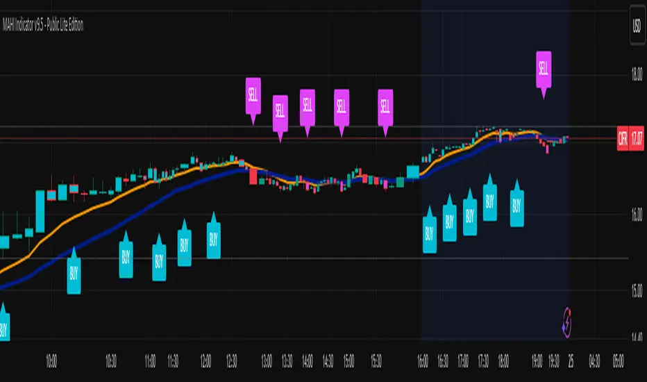
MAHI Indicator v9.5 - Smart Momentum HUD + IntradayMAHI Indicator v9.5 — Smart Momentum HUD (Multi-Framework + Intraday Engine)
A Complete Momentum, Trend, and Setup Framework for Swing, Position & Intraday Traders
MAHI v9.5 is the most advanced version yet — a highly optimized, visual, multi-framework trading system that blends momentum, trend alignment, adaptive setup detection, and now Auto-Intraday Mode for short-term traders.
This indicator acts like a Heads-Up Display (HUD) on your chart: it shows trend strength, squeeze zones, dynamic support/resistance, EMAs, setup validation, and early reversal signals in one clean interface — without clutter.
✔ Core Features
📌 1. Smart Momentum Ribbon
A dynamic EMA-based momentum band that visually shifts as trend strength changes.
Helps identify strong vs. weak momentum zones
Adapts to volatility & trend slope
Works on all timeframes (1m to 1M)
📌 2. EMA 9 → 21 Flip System
A precision trend-switching signal:
EMA 9 → 21 BULL = early bullish momentum
EMA 9 → 21 BEAR = early bearish momentum
More reliable than stand-alone MA crossovers
📌 3. Bullish Setup Engine (Standard + Weak)
Automatically identifies when price is entering a reversal-ready state based on:
Position relative to the ribbon
Candle structure
Momentum compression
Slope + exhaustion conditions
Includes:
Bull Setup (Standard) — Higher probability setup
Bull Setup (Weak) — Early or less developed setup
Setup Invalidated — Confirms that the pattern failed
This prevents false confidence & keeps traders disciplined.
📌 4. Strong Buy / Strong Sell Signals
Only appear when multiple confirmations align:
Ribbon bias
EMA slope
Momentum compression
Trend alignment
Filtered to remove noise — especially in lower timeframes.
📌 5. Multi-Timeframe Trend HUD
Top-right panel summarizing:
Overall Trend (Bullish, Bearish, Neutral)
RSI Condition
Daily vs Weekly Alignment
Trading Mode Suggestions (Buy / Sell / LEAPS / Neutral)
This gives instant context.
📌 6. Auto Intraday Engine (NEW in v9.5)
Automatically switches internal logic when you move into intraday timeframes (1m–30m):
Intraday Enhancements:
Adaptive setup detection
Faster momentum sensitivity
EMAs tuned for scalp/swing precision
Tighter invalidation logic
Reduced false positives
Optional strict filtering
Perfect for scalping, day trading & micro-trends
Works instantly — no settings needed.
Just change the chart timeframe and MAHI adjusts.
📌 7. Dynamic High-Timeframe Support (W & M)
Auto-layers weekly & monthly levels:
Helps identify strong bounce zones
Extremely useful for swing & LEAPS traders
📌 8. Weekly Volume Shelf Projection
Lightweight VWAP-style level based on weekly volume aggregation.
Shows probable bottoming areas during pullbacks.
✔ Who This Indicator Is For
Perfect for:
Day traders
Swing traders
Momentum riders
LEAPS & long-term investors
Beginner traders needing a structured system
MAHI adapts to your timeframe and trading style.
✔ Why MAHI Works
MAHI isn’t a single-signal indicator — it’s a framework.
It combines:
Trend
Momentum
Volatility
Setup pattern detection
Validation & invalidation
Multi-timeframe alignment
Dynamic zones
Intraday optimization
This eliminates guesswork and helps traders avoid the emotional traps that cause most losses.
You don’t just get a signal — you get context.
✔ How to Use It
Follow the ribbon bias
Use EMA 9→21 flips as trend confirmation
Look for Bull Setup tags during pullbacks
Avoid trades when you see Setup Invalidated
Respect weekly/monthly HTF support levels
On intraday charts — rely on auto-optimized mode
For swing entries, combine setups with HTF trend HUD
MAHI gives the map. You choose the path.
✔ Final Notes
This version is heavily optimized for performance, clarity, and high-probability signals.
MAHI does not repaint, and works on all assets including:
Stocks
Crypto
ETFs
Forex
Futures
Tactical Deviation🎯 TACTICAL DEVIATION - Volume-Backed VWAP Deviation Analysis
What Makes This Different?
Unlike basic VWAP indicators, Tactical Deviation combines:
• Multi-timeframe VWAP deviation bands (Daily/Weekly/Monthly)
• Volume spike intelligence - signals only appear with volume confirmation
• Pivot reversal detection at deviation extremes
• Optional multi-VWAP confluence system
• Smart defaults for quality over quantity
This unique combination filters weak setups and identifies high-probability entries at extreme price deviations from fair value.
📊 DEFAULT SETTINGS (Ready to Use)
✅ Daily VWAP with ±2σ deviation bands
✅ Volume spike detection (1.5x average required)
✅ 2σ minimum deviation for signals
❌ Weekly/Monthly VWAPs (enable for multi-timeframe)
❌ Pivot reversal requirement (enable for stronger signals)
❌ Fill zones (optional visual enhancement)
Why: Daily VWAP is most relevant for intraday trading. 2σ bands catch meaningful moves. Volume spikes ensure conviction. Clean chart focuses on what matters.
🚀 HOW TO USE
BASIC USAGE:
• Green triangles (below bars) = Long signals at oversold deviations
• Red triangles (above bars) = Short signals at overbought deviations
SIGNAL QUALITY:
• Normal size, bright colors = Volume spike (best quality)
• Small size, lighter colors = Volume momentum
• Tiny size = No volume confirmation
DEVIATION ZONES:
• ±2σ = Extreme deviation (signals appear here)
• ±1σ to ±2σ = Extended but not extreme
• Within ±1σ = Normal range
TRADING APPROACHES:
Mean Reversion:
→ Enter when price reaches ±2σ with volume spike
→ Target: Return to VWAP or opposite band
→ Stop: Beyond extreme deviation
Trend Continuation:
→ Use bands to identify pullbacks
→ Enter pullback to VWAP in trending market
→ Volume confirms continuation
Reversal Trading:
→ Enable "Require Pivot Reversal" for stronger signals
→ Signals only when deviation + pivot reversal occur
→ Higher probability, fewer signals
⚙️ EXPLORE SETTINGS FOR FULL USE
VWAP SETTINGS:
• Show Weekly/Monthly VWAP = Multi-timeframe context
• Show ±1σ Bands = Normal deviation range
• Show ±3σ Bands = Extreme extremes (rare but powerful)
SIGNAL SETTINGS:
• Min Deviation: 1σ (more signals) | 2σ (default) | 3σ (fewer, extreme only)
• Require Pivot Reversal: OFF (default) | ON (stronger but fewer)
• Volume Spike Threshold: 1.5x (default) | 2.0x+ (major spikes) | 1.2x (more signals)
CONFLUENCE SETTINGS:
• Require Multi-VWAP Confluence: OFF (default) | ON (2+ VWAPs must agree)
• Min VWAPs: 2 (Daily + Weekly/Monthly) | 3 (all must agree)
VISUAL SETTINGS:
• Show Fill Zones = Shaded areas between bands
• Fill Opacity = Transparency adjustment
• Line Widths = Customize thickness
💡 PRO TIPS
1. Start with defaults, then enable features as you learn
2. Volume spike requirement filters weak moves - keep it enabled
3. Enable Weekly/Monthly VWAPs for higher timeframe context
4. Enable confluence for swing trading setups
5. Pivot reversals: ON for reversals, OFF for continuations
6. Check top-right info table for current deviation levels
🎨 VISUAL GUIDE
• Cyan Line = Daily VWAP (fair value)
• Cyan Bands = Daily deviation zones
• Orange Line = Weekly VWAP (if enabled)
• Purple Line = Monthly VWAP (if enabled)
• Green Triangle = Long signal (oversold)
• Red Triangle = Short signal (overbought)
⚠️ IMPORTANT
Educational purposes only. Always use proper risk management. Signals are based on statistical deviation, not guarantees. Volume confirmation improves quality but doesn't guarantee outcomes. Combine with your own analysis.
The unique combination of VWAP deviation analysis, volume profile confirmation, pivot identification, and multi-timeframe confluence in a single clean interface makes Tactical Deviation different from basic VWAP indicators.
Happy Trading! 📈

Multi-Timeframe Sync Detector 🔥 Multi-Timeframe Sync Detector - Never Miss Aligned Trends Again!
📊 WHAT IS THIS INDICATOR?
The Multi-Timeframe Sync Detector is a powerful visual tool that helps traders identify when multiple timeframes are aligned in the same direction. It analyzes Weekly, Daily, and 4-Hour trends simultaneously and alerts you when all three are in sync - the highest probability trading setup.
═══════════════════════════════════════════
✨ KEY FEATURES:
🎯 Real-Time Sync Detection
- Monitors 3 timeframes simultaneously (Weekly, Daily, 4H)
- Works on ANY chart timeframe (1m, 15m, 1H, 4H, Daily, etc.)
- Instant visual feedback when trends align
🌈 Visual Background Colors
- GREEN background = All 3 timeframes BULLISH (Long setups only!)
- RED background = All 3 timeframes BEARISH (Short setups only!)
- GRAY background = No sync (Wait for alignment)
📍 Clean Dashboard Display
- Shows current trend for each timeframe
- Large visual sync status indicator
- Color-coded for instant recognition
- Readable white text on all backgrounds
📊 Bottom Sync Bar
- Thick GREEN line = Bullish sync active
- Thick RED line = Bearish sync active
- Thin GRAY line = No sync detected
🔔 Smart Alerts
- Alert when Bullish Sync starts
- Alert when Bearish Sync starts
- Alert on any sync change
- Never miss a high-probability setup!
🏷️ Dynamic Labels (Optional)
- "🔥 BULLISH SYNC!" label when all 3 align bullish
- "🔥 BEARISH SYNC!" label when all 3 align bearish
- Labels move with the chart for easy tracking
═══════════════════════════════════════════
🎓 HOW TO USE IT:
1️⃣ ADD TO YOUR CHART
Add the indicator to any timeframe chart
2️⃣ WAIT FOR SYNC
Watch for the background to turn GREEN or RED
3️⃣ TRADE IN SYNC DIRECTION
• GREEN = Only take LONG trades
• RED = Only take SHORT trades
• GRAY = Wait, don't trade yet
4️⃣ COMBINE WITH YOUR STRATEGY
Use sync as a filter for your existing strategy
Only take signals when all 3 timeframes agree
═══════════════════════════════════════════
⚙️ CUSTOMIZATION OPTIONS:
📅 Timeframe Settings
- Weekly Timeframe (default: W)
- Daily Timeframe (default: D)
- 4H Timeframe (default: 240)
- Customize to your trading style!
🎨 Visual Options
- Toggle background color on/off
- Toggle dashboard on/off
- Toggle sync labels on/off
- Adjust background colors
═══════════════════════════════════════════
💡 TRADING METHODOLOGY:
The indicator uses a simple but powerful trend detection algorithm:
✅ TREND DETECTION:
- Compares price to 50 EMA
- Analyzes momentum over 20 bars
- Confirms trend direction
✅ SYNC LOGIC:
- ALL 3 timeframes must show same direction
- Weekly + Daily + 4H all BULLISH = Bullish Sync
- Weekly + Daily + 4H all BEARISH = Bearish Sync
- Any mismatch = No Sync
═══════════════════════════════════════════
📈 BEST PRACTICES:
✨ DO:
- Wait for full sync before taking trades
- Use sync as directional filter
- Combine with price action/patterns
- Set alerts for sync changes
- Trade only in sync direction
❌ DON'T:
- Trade against the sync direction
- Force trades during no sync periods
- Ignore the sync status
- Over-leverage just because of sync
═══════════════════════════════════════════
🎯 IDEAL FOR:
- Swing Traders looking for high-probability setups
- Day Traders who want multi-timeframe confirmation
- Trend Followers seeking aligned markets
- Anyone wanting to avoid counter-trend trades
- Traders who use multiple timeframe analysis
═══════════════════════════════════════════
📊 WORKS ON ALL MARKETS:
✅ Forex (EUR/USD, GBP/USD, etc.)
✅ Indices (S&P 500, NASDAQ, DAX, etc.)
✅ Commodities (Gold, Silver, Oil, etc.)
✅ Cryptocurrencies (BTC, ETH, etc.)
✅ Stocks
═══════════════════════════════════════════
🔔 ALERT SETUP:
1. Click the "Alert" button (⏰) in TradingView
2. Select "Sync Detector - Multi-Timeframe"
3. Choose your alert type:
• "Bullish Sync Started"
• "Bearish Sync Started"
• "Sync Changed"
4. Set your notification preferences
5. Never miss a sync event again!
═══════════════════════════════════════════
📚 WHAT MAKES THIS UNIQUE:
Unlike other multi-timeframe indicators that show separate panels or complex data, the Sync Detector provides INSTANT visual clarity:
- ONE glance at background color = Know the market direction
- SIMPLE dashboard = All info at a glance
- CLEAN design = No chart clutter
- DYNAMIC labels = Always visible
═══════════════════════════════════════════
⚡ PERFORMANCE NOTES:
- Lightweight code - won't slow down your charts
- Updates in real-time
- No repainting - what you see is what you get
- Works on all TradingView plans
═══════════════════════════════════════════
🎓 STRATEGY EXAMPLE:
"The Sync & Structure Method"
1️⃣ Wait for Sync (GREEN or RED background)
2️⃣ Identify key support/resistance levels
3️⃣ Wait for price to reach these levels
4️⃣ Look for entry pattern (engulfing, pin bar, etc.)
5️⃣ Enter in sync direction
6️⃣ SL below/above structure
7️⃣ TP at next major level
═══════════════════════════════════════════
💬 FEEDBACK & SUPPORT:
If you find this indicator helpful, please:
- Leave a comment with your experience
- Share it with fellow traders
- Give it a boost! 🚀
═══════════════════════════════════════════
⚠️ DISCLAIMER:
This indicator is a tool to assist in trading decisions. It does not guarantee profits. Always use proper risk management, position sizing, and combine with your own analysis. Past performance does not indicate future results.
═══════════════════════════════════════════

Crypto Schlingel - PVSRA POC EMA Suite v5.903The Chart Indicator Suite combines a wide range of powerful tools that help traders accurately analyze market structures, volatility, and key price zones. With indicators such as POC, pivot points, EMAs, VWAP, Bollinger Bands, and important market levels such as yesterday/weekly high & low, daily open, psy high/low, and ADR, the suite offers a comprehensive overview of trends and market behavior. Supplemented by pvsra candles, long candle detection, and the display of relevant stock market opening hours, it reliably supports traders in making informed trading decisions.
Indicators are configurable
All of the indicators mentioned are fully configurable and can be flexibly adapted to individual trading strategies. Users can freely adjust parameters, display types, and sensitivities to highlight exactly the market information that is relevant to their personal trading style.
The individual fields in the configuration are self-explanatory or are explained in a toolbar, so that the possible settings become clear.
POC
The Point of Control (POC) is a central concept in market profile and volume profile analysis and plays an important role in technical chart analysis. Here is a detailed description of its usefulness and significance:
Definition
The point of control (POC) is the price level at which the most trading volume has taken place within a certain period of time.
It therefore shows the price at which buyers and sellers were most active – the center of market interest.
📊 Use and significance in chart analysis
1. Central support and resistance zone
Since the largest volume was traded at the POC, this price is considered a “fair zone” or equilibrium price.
The market often reacts strongly to the POC:
Above the POC → potential resistance if the price is coming from below.
Below the POC → potential support if the price is falling from above.
Example: If the price returns to the POC, this can be an entry opportunity for traders betting on a market reaction.
2. Interpretation of market acceptance
A price range with high volume (including POC) shows where the market has accepted a fair value.
Low volume, on the other hand, indicates rejection or disinterest.
→ The POC therefore helps to distinguish between accepted price zones and transition areas.
PIVOT POINTS
Pivot points are predefined price levels calculated from the previous day's price data (or a previous time unit).
They help traders identify potential support and resistance zones for the current trading day (or period).
Benefits of pivot points in chart analysis
1. Determining support and resistance areas
The calculated pivot levels (P, S1, S2, R1, R2, etc.) show where the market is likely to react:
Supports (S1, S2, S3) → possible downward turning points.
Resistance (R1, R2, R3) → possible upward turning points.
These zones are often observed by many traders at the same time, making them self-fulfilling marks.
2. Trend determination and market sentiment
If the market opens above the pivot (P) and remains there → signals buying pressure.
If the market trades below the pivot (P) → signals selling pressure.
A break above R1 or below S1 may indicate a strong trend day.
EMA Exponential Moving Average
The EMA is the exponentially weighted moving average of a price.
It shows the average price of a security over a certain period of time, weighted according to recency – that is:
👉 more recent price data has more influence than older data.
This distinguishes it from the simple moving average (SMA), in which all values are weighted equally.
Benefits of the EMA in chart analysis -> Identifying trends
The EMA reacts more quickly to price changes than the SMA and is therefore ideal for:
Identifying trend reversals at an early stage
Confirming trend directions
👉 Rising EMA → Upward trend
👉 Falling EMA → Downward trend
Traders often use combinations such as:
EMA 50 / EMA 200 → Long-term trends
SIGNIFICANCE OF HIGHS AND LOWS
The daily high, daily low, weekly high, and weekly low are objective price zones that show:
Where the market bought (high) or sold (low) the most, and where supply and demand reached their extremes in the past period.
These levels often act as magnetic price zones in ongoing trading, where traders react (entry, profit-taking, or stop setting).
🎯 Use of yesterday's high and low (previous day high/low)
🔹Support and resistance levels
Yesterday's high often acts as resistance when the price comes from below.
Yesterday's low becomes support when the price falls from above.
➡️ Traders watch these levels closely to trade breakouts or reversals.
EMA 9 / EMA 20 → Short-term movements
🎯 Benefits of weekly highs and lows (Weekly High/Low)
Important structural markers in the higher time frame
Weekly highs and lows show medium to long-term market structure.
They are often considered stronger supports/resistances than daily levels.
➡️ For example, if the price breaks above the weekly high, this usually signals institutional interest and may indicate a continuation of the trend.
➡️ Conversely, failure to break above a weekly high may indicate market weakness or a reversal.
DAILY OPEN
The Daily Open is the price at which trading begins on a new day.
It marks the first price after the close of the previous trading session.
👉 In many markets (e.g., Forex, index futures, crypto), this is the starting point of daily price movement, where market direction and sentiment realign.
🎯 Benefits of the Daily Open in chart analysis
Direction indicator (daily bias)
The Daily Open serves as a neutral center line for the current trading day.
Traders use it to assess the market direction (bias):
Price above the Daily Open → bullish day (buyers dominate)
Price below the daily open → bearish day (sellers dominate)
📈 → If the daily open is broken and held above, this indicates upward momentum.
📉 → If it is broken below, this signals weakness.
This simple observation helps traders trade with the daily trend rather than against it.
STOCK MARKET OPENING HOURS
Every major stock exchange has defined trading hours during which institutional capital is active.
Examples (CET):
Asia (Tokyo/ Hong Kong) 1:00 a.m. – 9:00 a.m.
Europe (London/Frankfurt) 08:00 – 17:30
USA (New York) 15:30 – 22:00
Market dynamics change significantly during these time windows, as volume, liquidity, and volatility fluctuate depending on the session.
📈 Benefits in chart analysis
🔹Recognizing volatility and liquidity phases
At the start of a session (e.g., 9:00 a.m. in Frankfurt or 3:30 p.m. in New York), trading volume rises sharply.
This results in strong movements, often with changes in direction or breakouts.
👉 These phases are particularly suitable for:
Breakout strategies
Volume or momentum trades
Example:
If an index (e.g., DAX or S&P 500) reacts strongly at the US opening, this indicates institutional activity that may shape the rest of the day.
PSY HIGH AND PSY LOW
Psy High and Psy Low stand for:
Psychological High → the psychologically significant upper price level of a particular range
Psychological Low → the psychologically significant lower price level
These are often round numbers or striking price zones that market participants unconsciously use as a guide.
Examples:
For EUR/USD: 1.0500, 1.1000, 1.1500
For DAX: 17,000, 17,500, 18,000
For BTC/USD: 60,000, 65,000, 70,000
Traders also refer to such levels as “big figures” or “round numbers.”
📊 Why are psy levels so important?
Because they are based on human perception and market psychology:
👉 People think in round numbers, not in decimals such as 1.1037 or 17.264.
That's why:
Private investors often place their stop losses or take profits just above or below these levels, Institutional traders place large limit orders in these zones, and Algorithms react to the liquidity created there.
→ This results in increased volume, reaction patterns, and price movements at these levels.
ADR (Average Daily Range)
The ADR measures the average daily trading range of a market over a specific period of time – i.e., how many points, pips, or dollars the price typically moves per day.
Example:
If the DAX has moved an average of 180 points per day over the last 14 days, the ADR(14) = 180.
🎯 The benefits of ADR in chart analysis
🔹 Assessment of daily volatility
The ADR shows how much a market typically moves per day.
→ This allows you to see whether the current day is more volatile or calmer than normal.
Interpretation – Meaning
Current range < ADR
→ Market is still moving within normal limits → Potential for further movement
Current range ≈ ADR
→ Daily target largely achieved → lower probability of significant expansion
Current range > ADR
→ Market overextended → increased probability of correction or consolidation
👉 This helps you to plan entries, price targets, and stops realistically.
VWAP (Volume Weighted Average Price)
The VWAP is the volume-weighted average price of a security for a specific period of time – usually per day.
👉 Unlike a simple moving average (e.g., EMA), the VWAP takes into account how much was actually traded – not just where the price was.
It therefore reflects the fair market value, taking into account the trading volume.
🎯 Benefits of VWAP in chart analysis
🔹 Determining the fair average price
The VWAP shows where the majority of the trading volume took place – i.e., the price that the majority of market participants actually paid.
➡️ This is the “fair price of the day.”
Price above VWAP → buyers dominate (bullish)
Price below VWAP → sellers dominate (bearish)
This information is particularly valuable for determining the intraday bias (direction of the day).
BOLLINGER BANDS
Bollinger Bands consist of three lines based on a moving average (usually SMA 20):
Middle band:
→ usually the 20-period SMA (simple moving average)
Upper band:
→ SMA + (2 × standard deviation)
Lower band:
→ SMA − (2 × standard deviation)
👉 This means that the bands “breathe” with volatility – they widen when the market is volatile and contract when the market is calm.
🎯 The benefits of Bollinger Bands in chart analysis
🔹 Measuring market volatility
The main function of Bollinger Bands is to visualize the volatility of a market:
Wide bands → high volatility → strong movement/trend phase
Narrow bands → low volatility → calm market/consolidation
📈 When the bands contract sharply (“Bollinger squeeze”) → often a harbinger of an impending breakout.
KAMA
The KAMA was developed by Perry J. Kaufman.
Unlike normal moving averages such as SMA or EMA, it dynamically adjusts its smoothing to market conditions:
Low volatility / strong trend → reacts faster to price movements
High volatility / sideways movement → reacts slower, reduces false signals
The core idea: adaptability instead of rigid smoothing.
🎯 Benefits of KAMA in chart analysis
🔹 Filtering out market noise
KAMA smooths out unnecessary price fluctuations (noise) that many normal indicators mistakenly interpret as signals.
➡️ This minimizes false signals in sideways phases, while real trends remain visible.
EXTRA LARGE WICKS
A wick (or wick) is the thin line above or below the candle body:
Top → Highest price during the period
Bottom → Lowest price during the period
Long wick → Significant rejection of the price at this extreme zone
Example: A long upper wick means that the price rose high but was then pushed back sharply.
🎯 Benefits of long wicks in chart analysis
🔹 Recognizing rejections and resistance
Long upper wick: Sellers did not allow the higher price → possible downward reversal
Long lower wick: Buyers defended the lower price → possible upward reversal
💡 The market “speaks” through these wicks: It shows where buyers or sellers are not giving in any further.

SMT Pro — Multi-Timeframe Divergence (MD)# SMT Pro - Multi-Timeframe Divergence
## What You Get
SMT Pro automatically identifies Smart Money Technique (SMT) divergences across multiple correlated markets, giving you high-probability reversal signals that institutional traders watch.
**Key Benefits:**
- **Automatic Market Correlation** - The indicator intelligently selects correlated pairs (ES/YM, NQ/ES, GC/XAUUSD) based on your chart symbol, or you can specify custom pairs
- **Clean, Actionable Signals** - Only the most relevant divergences are displayed, eliminating noise through intelligent priority filtering
- **Multi-Timeframe Coverage** - From 1-minute scalping to monthly swing trading, all major timeframes are covered
- **Higher Timeframe Priority** - Advanced algorithm ensures higher timeframe signals always take precedence, preventing conflicting signals
- **Professional Visualization** - Clear color-coded lines and labels show exact divergence levels and timeframes
## What Is SMT?
Smart Money Technique (SMT) occurs when two correlated markets move in opposite directions at key turning points. When one market makes a new high/low while its correlated pair fails to confirm, it signals institutional repositioning and potential reversals.
**Example:**
- ES makes a new higher high
- YM makes a lower high (fails to confirm)
- Result: Bearish SMT divergence = potential reversal down
## Features
- **10 Timeframe Controls**: Monthly, Weekly, Daily, 12H, 4H, 1H, 30min, 15min, 5min, 1min
- **Direction Filter**: Choose Bullish, Bearish, or Both signals
- **Symbol Modes**: Automatic correlation detection or manual pair selection
- **Customizable Colors**: Match your chart theme with adjustable bullish/bearish colors
- **Smart Display**: Labels show the timeframe of each divergence
- **Optimized Performance**: Advanced algorithms ensure fast, reliable signal detection
## How To Use
1. **Add to Chart**: Apply SMT Pro to your primary market chart (e.g., ES, NQ, BTC, EUR)
2. **Configure Symbols**:
- **Automatic Mode** (Recommended): The indicator auto-selects correlated pairs
- **Manual Mode**: Specify custom symbol pairs for analysis
3. **Select Timeframes**: Enable/disable timeframes based on your trading style:
- Scalpers: 1min, 5min, 15min
- Day Traders: 15min, 30min, 1H, 4H
- Swing Traders: 4H, 12H, Daily, Weekly
- Position Traders: Daily, Weekly, Monthly
4. **Interpret Signals**:
- **Blue Lines** = Bullish SMT (potential reversal up)
- **Red Lines** = Bearish SMT (potential reversal down)
- **Labels** = Show timeframe and which correlated symbol triggered the divergence
5. **Trade Confirmation**: Use SMT signals with your existing strategy for entry confirmation, stop placement, and profit targets
## Best Practices
- **Higher Timeframes = Higher Probability**: Weekly and Daily SMTs carry more weight than minute-based signals
- **Confluence Is Key**: Multiple timeframe SMTs at the same level increase trade probability
- **HTF Priority System**: The indicator automatically prioritizes higher timeframe signals, reducing visual clutter
- **Wait for Confirmation**: Let price action confirm the divergence before entering
- **Combine With Price Action**: Use SMT with support/resistance, order blocks, and liquidity concepts
## Performance Notes
- **Optimized for Speed**: Proprietary algorithms ensure real-time signal detection without lag
- **Replay Mode Compatible**: Works perfectly with TradingView's bar replay feature
- **Chart Timeframe Adaptive**: Automatically adjusts internal processing based on your chart's timeframe
## Recommended Settings
**For Scalping (1-5min charts):**
- Enable: 1min, 5min, 15min, 30min
- Disable: Higher timeframes
**For Day Trading (15min-1H charts):**
- Enable: 15min, 30min, 1H, 4H
- Disable: 1min, 5min, Monthly
**For Swing Trading (4H-Daily charts):**
- Enable: 4H, 12H, Daily, Weekly
- Disable: Minute-based timeframes
**For Position Trading (Daily+ charts):**
- Enable: Daily, Weekly, Monthly
- Disable: All intraday timeframes
## Symbol Compatibility
**Automatic Mode Supports:**
- **E-mini Futures**: NQ, ES, YM (automatically paired)
- **Micro E-mini Futures**: MNQ, MES, MYM (automatically paired)
- **Gold Markets**: GC, XAUUSD, XAUGBP (automatically paired)
**Manual Mode:**
- Works with any two correlated instruments
- Supports futures, crypto, forex, stocks, indices
- You specify both symbols manually
## Support
For questions or feedback, contact the author through TradingView.
---
**Version**: 6.0.0 PUBLIC
**Release Date**: November 18, 2025
**Author**: Md Modasshir (MD)
*This indicator implements proprietary algorithms for institutional-grade divergence detection. All signal generation logic is optimized for professional trading environments.*

Major Crypto Relative Strength Portfolio System Majors RSPS - Relative Strength Portfolio System for Major Cryptocurrencies
Overview
Majors RSPS (Relative Strength Portfolio System) is an advanced portfolio allocation indicator that combines relative strength analysis, trend consensus, and macro risk factors to dynamically allocate capital across major cryptocurrency assets. The system leverages the NormalizedIndicators Library to evaluate both absolute trends and relative performance, creating an adaptive portfolio that automatically adjusts exposure based on market conditions.
This indicator is designed for portfolio managers, asset allocators, and systematic traders who want a data-driven approach to cryptocurrency portfolio construction with automatic rebalancing signals.
🎯 Core Concept
What is RSPS?
RSPS (Relative Strength Portfolio System) evaluates each asset on two key dimensions:
Relative Strength: How is the asset performing compared to other major cryptocurrencies?
Absolute Trend: Is the asset itself in a bullish trend?
Assets that show both strong relative performance AND positive absolute trends receive higher allocations. Weak performers are automatically filtered out, with capital reallocated to cash or stronger assets.
Dual-Layer Architecture
Layer 1: Majors Portfolio (Orange Zone)
Evaluates 14 major cryptocurrency assets
Calculates relative strength against all other majors
Applies trend filters to ensure absolute momentum
Dynamically allocates capital based on comparative strength
Layer 2: Cash/Risk Position (Navy Zone)
Evaluates macro risk factors and market conditions
Determines optimal cash allocation
Acts as a risk-off mechanism during adverse conditions
Provides downside protection through dynamic cash holdings
📊 Tracked Assets
Major Cryptocurrencies (14 Assets)
BTC - Bitcoin (Benchmark L1)
ETH - Ethereum (Smart Contract L1)
SOL - Solana (High-Performance L1)
SUI - Sui (Move-Based L1)
TRX - Tron (Payment-Focused L1)
BNB - Binance Coin (Exchange L1)
XRP - Ripple (Payment Network)
FTM - Fantom (DeFi L1)
CELO - Celo (Mobile-First L1)
TAO - Bittensor (AI Network)
HYPE - Hyperliquid (DeFi Exchange)
HBAR - Hedera (Enterprise L1)
ADA - Cardano (Research-Driven L1)
THETA - Theta (Video Network)
🔧 How It Works
Step 1: Relative Strength Calculation
For each asset, the system calculates relative strength by:
RSPS Score = Average of:
- Asset/BTC trend consensus
- Asset/ETH trend consensus
- Asset/SOL trend consensus
- Asset/SUI trend consensus
- ... (all 14 pairs)
- Asset's absolute trend consensus
Key Logic:
Each pair is evaluated using the eth_4d_cal() calibration from NormalizedIndicators
If an asset's absolute trend is extremely weak (≤ 0.1), it receives a penalty score (-0.5)
Otherwise, it gets the average of all its relative strength comparisons
Step 2: Trend Filtering
Assets must pass a trend filter to receive allocation:
Trend Score = Average of:
- Asset/BTC trend (filtered for positivity)
- Asset/ETH trend (filtered for positivity)
- Asset's absolute trend (filtered for positivity)
Only positive values contribute to the trend score, ensuring bearish assets don't receive allocation.
Step 3: Portfolio Allocation
Capital is allocated proportionally based on filtered RSPS scores:
Asset Allocation % = (Asset's Filtered RSPS Score / Sum of All Filtered Scores) × Main Portfolio %
Example:
SOL filtered score: 0.6
BTC filtered score: 0.4
All others: 0
Total: 1.0
SOL receives: (0.6 / 1.0) × Main% = 60% of main portfolio
BTC receives: (0.4 / 1.0) × Main% = 40% of main portfolio
Step 4: Cash/Risk Allocation
The system evaluates macro conditions across 6 factors:
Inverse Major Crypto Trends (40% weight)
When BTC, ETH, SOL, SUI, DOGE, etc. trend down → Cash allocation increases
Evaluates total market cap trends (TOTAL, TOTAL2, OTHERS)
Stablecoin Dominance (10% weight)
USDC dominance vs. major crypto dominances
Higher stablecoin dominance → Higher cash allocation
MVRV Ratios (10% weight)
BTC and ETH Market Value to Realized Value
High MVRV (overvaluation) → Higher cash allocation
BTC/ETH Ratio (15% weight)
Relative performance between two market leaders
Indicates market phase (BTC dominance vs. alt season)
Active Address Ratios (5% weight)
USDC active addresses vs. BTC/ETH active addresses
Network activity comparison
Macro Indicators (15% weight)
Global currency circulation (USD, EUR, CNY, JPY)
Treasury yield curve (10Y-2Y)
High yield spreads
Central bank balance sheets and money supply
Cash Allocation Formula:
Cash % = (Sum of Risk Factors × 0.5) / (Risk Factors + Majors TPI)
When risk factors are elevated, cash allocation increases, reducing exposure to volatile assets.
📈 Visual Components
Orange Zone (Majors Portfolio)
Fill: Light orange area showing aggregate portfolio strength
Line: Average trend power index (TPI) of allocated assets
Baseline: 0 level (neutral)
Interpretation:
Above 0: Bullish allocation environment
Rising: Strengthening portfolio momentum
Falling: Weakening portfolio momentum
Below 0: No allocation (100% cash)
Navy Zone (Cash Position)
Fill: Navy blue area showing cash allocation strength
Line: Risk-adjusted cash allocation signal
Baseline: 0 level
Interpretation:
Higher navy zone: Elevated risk-off signal → More cash
Lower navy zone: Risk-on environment → Less cash
Zero: No cash allocation (100% invested)
Performance Line (Orange/Blue)
Orange: Main portfolio allocation dominant (risk-on mode)
Blue: Cash allocation dominant (risk-off mode)
Tracks: Cumulative portfolio returns with dynamic rebalancing
Allocation Table (Bottom Left)
Shows real-time portfolio composition:
ColumnDescriptionAssetCryptocurrency nameRSPS ValuePercentage allocation (of main portfolio)CashDollar amount (if enabled)
Color Coding:
Orange: Active allocation
Gray: Weak signal (borderline)
Blue: Cash position
Missing: No allocation (filtered out)
⚙️ Settings & Configuration
Required Setup
Chart Symbol
MUST USE: INDEX:BTCUSD or similar major crypto index
Recommended Timeframe: 1D (Daily) or 4D (4-Day)
Why: System needs price data for all 14 majors, BTC provides stable reference
Hide Chart Candles
For clean visualization:
Right-click on chart
Select "Hide Symbol" or set candle opacity to 0
This allows the indicator fills and table to be clearly visible
User Inputs
plot_table (Default: true)
Enable/disable the allocation table
Set to false if you only want the visual zones
use_cash (Default: false)
Enable portfolio dollar value calculations
Shows actual dollar allocations per asset
cash (Default: 100)
Total portfolio size in dollars/currency units
Used when use_cash is enabled
Example: Set to 10000 for a $10,000 portfolio
💡 Interpretation Guide
Entry Signals
Strong Allocation Signal:
✓ Orange zone elevated (> 0.3)
✓ Navy zone low (< 0.2)
✓ Performance line orange
✓ Multiple assets in allocation table
→ Action: Deploy capital to allocated assets per table percentages
Risk-Off Signal:
✓ Orange zone near zero
✓ Navy zone elevated (> 0.4)
✓ Performance line blue
✓ Few or no assets in table (high cash %)
→ Action: Reduce exposure, increase cash holdings
Rebalancing Triggers
Monitor the allocation table for changes:
New assets appearing: Add to portfolio
Assets disappearing: Remove from portfolio
Percentage changes: Rebalance existing positions
Cash % changes: Adjust overall exposure
Market Regime Detection
Risk-On (Bull Market):
Orange zone high and rising
Navy zone minimal
Many assets allocated (8-12)
High individual allocations (15-30% each)
Risk-Off (Bear Market):
Orange zone near zero or negative
Navy zone elevated
Few assets allocated (0-3)
Cash allocation dominant (70-100%)
Transition Phase:
Both zones moderate
Medium number of assets (4-7)
Balanced cash/asset allocation (40-60%)
🎯 Trading Strategies
Strategy 1: Pure RSPS Following
1. Check allocation table daily
2. Rebalance portfolio to match percentages
3. Follow cash allocation strictly
4. Review weekly, act on significant changes (>5%)
Best For: Systematic portfolio managers, passive allocators
Strategy 2: Threshold-Based
Entry Rules:
- Orange zone > 0.4 AND Navy zone < 0.3
- At least 5 assets in allocation table
- Total non-cash allocation > 60%
Exit Rules:
- Orange zone < 0.1 OR Navy zone > 0.5
- Fewer than 3 assets allocated
- Cash allocation > 70%
Best For: Active traders wanting clear rules
Strategy 3: Relative Strength Overlay
1. Use RSPS for broad allocation framework
2. Within allocated assets, overweight top 3 performers
3. Scale position sizes by RSPS score
4. Use individual asset charts for entry/exit timing
Best For: Discretionary traders with portfolio focus
Strategy 4: Risk-Adjusted Position Sizing
For each allocated asset:
Position Size = Base Position × (Asset's RSPS Score / Max RSPS Score) × (1 - Cash Allocation)
Example:
- $10,000 portfolio
- SOL RSPS: 0.6 (highest)
- BTC RSPS: 0.4
- Cash allocation: 30%
SOL Size = $10,000 × (0.6/0.6) × (1-0.30) = $7,000
BTC Size = $10,000 × (0.4/0.6) × (1-0.30) = $4,667
Cash = $10,000 × 0.30 = $3,000
Best For: Risk-conscious allocators
📊 Advanced Usage
Multi-Timeframe Confirmation
Use on multiple timeframes for robust signals:
1D Chart: Tactical allocation (daily rebalancing)
4D Chart: Strategic allocation (weekly review)
Strong Confirmation:
- Both timeframes show same top 3 assets
- Both show similar cash allocation levels
- Orange zones aligned on both
Weak/Conflicting:
- Different top performers
- Diverging cash allocations
→ Wait for alignment or use shorter timeframe
Sector Rotation Analysis
Group assets by type and watch rotation:
L1 Dominance: BTC, ETH, SOL, SUI, ADA high → Layer 1 season
Alt L1s: TRX, FTM, CELO rising → Alternative platform season
Specialized: TAO, THETA, HYPE strong → Niche narrative season
Payment/Stable: XRP, BNB allocation → Risk reduction phase
Divergence Trading
Bullish Divergence:
Navy zone declining (less risk-off)
Orange zone flat or slightly rising
Few assets still allocated but strengthening
→ Early accumulation signal
Bearish Divergence:
Orange zone declining
Navy zone rising
Asset count decreasing in table
→ Distribution/exit signal
Performance Tracking
The performance line (overlay) shows cumulative strategy returns:
Compare to BTC/ETH: Is RSPS outperforming?
Drawdown analysis: How deep are pullbacks?
Correlation: Does it track market or provide diversification?
🔬 Technical Details
Data Sources
Price Data:
COINEX: Primary exchange for alt data
CRYPTO: Alternative price feeds
INDEX: Aggregated index prices (recommended for BTC)
Macro Data:
Dominance metrics (SUI.D, BTC.D, etc.)
MVRV ratios (on-chain valuation)
Active addresses (network activity)
Global money supply and macro indicators
Calculation Methodology
RSPS Scoring:
For each asset, calculate 14 relative trends (vs. all others)
Calculate asset's absolute trend
Average all 15 values
Apply penalty filter for extremely weak trends (≤ 0.1)
Trend Consensus:
Uses eth_4d_cal() from NormalizedIndicators library
Combines 8 normalized indicators per measurement
Returns value from -1 (bearish) to +1 (bullish)
Performance Calculation:
Daily Return = Σ(Asset ROC × Asset Allocation)
Cumulative Performance = Previous Perf × (1 + Daily Return / 100)
Assumes perfect rebalancing and no slippage (theoretical performance).
Filtering Logic
filter() function:
pinescriptfilter(input) => input >= 0 ? input : 0
This zero-floor filter ensures:
Only positive trend values contribute to allocation
Bearish assets receive 0 weight
No short positions or inverse allocations
Anti-Manipulation Safeguards
Null Handling:
All values wrapped in nz() to handle missing data
Prevents calculation errors from data gaps
Normalization:
Allocations always sum to 100%
Prevents over/under-allocation
Conditional Logic:
Assets need positive values on multiple metrics
Single metric cannot drive allocation alone
⚠️ Important Considerations
Required Timeframes
1D (Daily): Recommended for most users
4D (4-Day): More stable, fewer rebalances
Other timeframes: Use at your own discretion, may require recalibration
Data Requirements
Needs INDEX:BTCUSD or equivalent major crypto symbol
All 14 tracked assets must have available data
Macro indicators require specific TradingView data feeds
Rebalancing Frequency
System provides daily allocation updates
Practical rebalancing: Weekly or on significant changes (>10%)
Consider transaction costs and tax implications
Performance Notes
Theoretical returns: No slippage, fees, or execution delays
Backtest carefully: Validate on your specific market conditions
Past performance: Does not guarantee future results
Risk Warnings
⚠️ High Concentration Risk: May allocate heavily to 1-3 assets
⚠️ Volatility: Crypto markets are inherently volatile
⚠️ Liquidity: Some allocated assets may have lower liquidity
⚠️ Correlation: All assets correlated to BTC/ETH to some degree
⚠️ System Risk: Relies on continued availability of data feeds
Not Financial Advice
This indicator is a tool for analysis and research. It does not constitute:
Investment advice
Portfolio management services
Trading recommendations
Guaranteed returns
Always perform your own due diligence and risk assessment.
🎓 Use Cases
For Portfolio Managers
Systematic allocation framework
Objective rebalancing signals
Risk-adjusted exposure management
Performance tracking vs. benchmarks
For Active Traders
Identify strongest assets to focus trading on
Gauge overall market regime (risk-on/off)
Time entry/exit for portfolio shifts
Complement technical analysis with allocation data
For Institutional Allocators
Quantitative portfolio construction
Multi-asset exposure optimization
Drawdown management through cash allocation
Compliance-friendly systematic approach
For Researchers
Study relative strength dynamics in crypto markets
Analyze correlation between majors
Test macro factor impact on crypto allocations
Develop derived strategies and signals
🔧 Setup Checklist
✅ Chart Configuration
Set chart to INDEX:BTCUSD
Set timeframe to 1D or 4D
Hide chart candles for clean visualization
Add indicator from library
✅ Indicator Settings
Enable plot_table (see allocation table)
Set use_cash if tracking dollar amounts
Input your portfolio size in cash parameter
✅ Monitoring Setup
Bookmark chart for daily review
Set alerts for major allocation changes (optional)
Create spreadsheet to track allocations (optional)
Establish rebalancing schedule (weekly recommended)
✅ Validation
Verify all 14 assets appear in table (when allocated)
Check that percentages sum to ~100%
Confirm performance line is tracking
Test cash allocation calculation if enabled
📋 Quick Reference
Signal Interpretation
ConditionOrange ZoneNavy ZoneActionStrong BullHigh (>0.4)Low (<0.2)Full allocationModerate BullMid (0.2-0.4)Low-MidStandard allocationNeutralLow (0.1-0.2)Mid (0.3-0.4)Balanced allocationModerate BearVery Low (<0.1)Mid-HighReduce exposureStrong BearZero/NegativeHigh (>0.5)High cash/exit
Rebalancing Thresholds
Change TypeThresholdActionIndividual asset±5%Consider rebalanceIndividual asset±10%Strongly rebalanceCash allocation±10%Adjust exposureAsset entry/exitAnyAdd/remove position
Color Legend
Orange: Main portfolio strength/allocation
Navy: Cash/risk-off allocation
Blue text: Cash position in table
Orange text: Active asset allocation
Gray text: Weak/borderline allocation
White: Headers and labels
🚀 Getting Started
Beginner Path
Add indicator to INDEX:BTCUSD daily chart
Hide candles for clarity
Enable plot_table to see allocations
Check table daily, note top 3-5 assets
Start with small allocation, observe behavior
Gradually increase allocation as you gain confidence
Intermediate Path
Set up on both 1D and 4D charts
Enable use_cash with your portfolio size
Create tracking spreadsheet
Implement weekly rebalancing schedule
Monitor divergences between timeframes
Compare performance to buy-and-hold BTC
Advanced Path
Modify code to add/remove tracked assets
Adjust relative strength calculation methodology
Customize cash allocation factors and weights
Integrate with portfolio management platform
Develop algorithmic rebalancing system
Create alerts for specific allocation conditions
📖 Additional Resources
Related Indicators
NormalizedIndicators Library: Core calculation engine
Individual asset trend indicators for deeper analysis
Macro indicator dashboards for cash allocation factors
Complementary Analysis
On-chain metrics (MVRV, active addresses, etc.)
Order book liquidity for execution planning
Correlation matrices for diversification analysis
Volatility indicators for position sizing
Learning Materials
Study relative strength portfolio theory
Research tactical asset allocation strategies
Understand crypto market cycles and phases
Learn about risk management in volatile assets
🎯 Key Takeaways
✅ Systematic allocation across 14 major cryptocurrencies
✅ Dual-layer approach: Asset selection + Cash management
✅ Relative strength focused: Invests in comparatively strong assets
✅ Trend filtering: Only allocates to assets in positive trends
✅ Dynamic rebalancing: Automatically adjusts to market conditions
✅ Risk-managed: Increases cash during adverse conditions
✅ Transparent methodology: Clear calculation logic
✅ Practical visualization: Easy-to-read table and zones
✅ Performance tracking: See cumulative strategy returns
✅ Highly customizable: Adjust assets, weights, and factors
📋 License
This code is subject to the Mozilla Public License 2.0 at mozilla.org
Majors RSPS transforms complex multi-asset portfolio management into a systematic, data-driven process. By combining relative strength analysis with trend consensus and macro risk factors, it provides traders and portfolio managers with a robust framework for navigating cryptocurrency markets with discipline and objectivity.WiederholenClaude kann Fehler machen. Bitte überprüfen Sie die Antworten. Sonnet 4.5

MTF Supertrend by Rakesh Sharma📊 MULTI-TIMEFRAME SUPERTREND INDICATOR
Get clear buy and sell signals from the powerful Supertrend indicator across three critical timeframes - all on one chart!
🎯 WHAT IT DOES:
This indicator analyzes the Supertrend across Monthly, Weekly, and Daily timeframes simultaneously, giving you a complete picture of market trends from short-term to long-term perspectives.
✨ KEY FEATURES:
- 📍 Visual Signal Labels: Clear buy/sell labels appear directly on your chart when Supertrend changes direction
- Daily signals (D-BUY/D-SELL) - Small green/red labels
- Weekly signals (W-BUY/W-SELL) - Medium blue/orange labels
- Monthly signals (M-BUY/M-SELL) - Large lime/maroon labels
- 📋 Live Summary Table: Real-time dashboard showing:
- Current trend direction for each timeframe (Bullish ▲ or Bearish ▼)
- Supertrend price levels
- Color-coded for quick reading
- 🎨 Visual Trend Confirmation:
- Supertrend line plotted on current timeframe
- Background color indicating current trend
- ⚙️ Fully Customizable:
- Adjustable ATR Period (default: 10)
- Adjustable Factor (default: 3.0)
- Toggle any timeframe on/off
- Show/hide summary table
🚀 HOW TO USE:
1. **Best Trades**: Look for alignment across multiple timeframes
- All 3 timeframes bullish = Strong buy opportunity
- All 3 timeframes bearish = Strong sell opportunity
2. **Signal Strength**:
- Monthly signals = Strongest, least frequent (major trend changes)
- Weekly signals = Medium strength, moderate frequency
- Daily signals = Most frequent, good for entries/exits
3. **Risk Management**:
- Use Supertrend levels as stop-loss points
- Higher timeframe trends act as confirmation for lower timeframe trades
4. **Settings Optimization**:
- Lower ATR period (7-8) = More sensitive, more signals
- Higher ATR period (12-14) = Less sensitive, fewer false signals
- Lower Factor (2.0-2.5) = Tighter stops, more signals
- Higher Factor (3.5-4.0) = Wider stops, fewer signals
💡 TRADING STRATEGY EXAMPLES:
**Conservative Approach:**
- Only take trades when all 3 timeframes align
- Use monthly trend as overall direction filter
- Enter on daily signals in direction of weekly/monthly trend
**Aggressive Approach:**
- Trade daily signals independently
- Use weekly/monthly as confirmation
- Quick entries and exits
**Swing Trading:**
- Focus on weekly signals
- Use monthly for trend direction
- Use daily for precise entry timing
⚠️ IMPORTANT NOTES:
- This is a trend-following indicator - works best in trending markets
- May generate whipsaws in choppy/sideways markets
- Always use proper risk management and position sizing
- Combine with volume analysis and support/resistance for best results
- Past performance does not guarantee future results
📈 BEST MARKETS:
Works on all markets: Stocks, Forex, Crypto, Commodities, Indices
⏰ BEST TIMEFRAMES:
Can be applied to any chart timeframe, but works best on:
- 1H to 4H charts for intraday trading
- Daily charts for swing trading
- Weekly charts for position trading
🔧 DEFAULT SETTINGS:
- ATR Period: 10
- Factor: 3.0
- All timeframes enabled
- Summary table visible
Feel free to adjust settings based on your trading style and the asset's volatility!
📚 ABOUT SUPERTREND:
Supertrend is a trend-following indicator that uses ATR (Average True Range) to plot dynamic support and resistance levels. It helps identify the current trend direction and potential reversal points.
---
💬 Questions or suggestions? Leave a comment below!
⭐ If you find this indicator helpful, please give it a boost!
Happy Trading! 🎯

macd sma20
### MACD_sma20 – Multi-Timeframe MACD Pullback & SMA20 Dashboard
This script is a complete trading toolkit built around a **MACD pullback strategy** combined with **multi-timeframe SMA20 filters**, volume analysis, and a compact information panel.
It is designed for traders who like to:
* Trade **MACD pullbacks above the moving average**
* Track **key SMA20 levels across multiple timeframes** (Daily, 3-Day, Weekly, Monthly)
* Quickly see whether **current price is above or below those reference levels**
* Use **clean visual signals** for entries and exits, instead of staring at raw indicator values
---
### Core Features
#### 1. MACD Pullback Long Signal (Green Triangle Up)
The script detects a **bullish MACD pullback** pattern:
* MACD line is still **above** the signal line
* Both MACD line and histogram **pull back** for several bars
* Then MACD turns back up again, with price trading **above the local SMA20**
When this “pullback and re-acceleration” is confirmed, a **green triangle below the bar** is plotted as a **long entry signal**.
There is also an optional filter:
* **Weekly SMA20 filter**:
If enabled, long signals are only triggered when **current price is above the Weekly SMA20**, helping you stay on the right side of the higher-timeframe trend.
---
#### 2. Bearish Pullback Confirmation Signal (Red Triangle Down)
On the short side, the script detects a **bearish pullback confirmation** based on:
* A recent **high-volume bearish candle** (large down bar with volume above a multiple of the 20-period volume average)
* At least a minimum number of **negative MACD histogram bars**
* MACD line moving closer to the signal line (loss of momentum)
* Price recovering back up near the **top of that high-volume bearish candle**, then starting to fall again while MACD stays positive
When all conditions align, the script prints a **red triangle above the bar**, indicating a **bearish pullback confirmation** – often a good area to take profits on longs or consider short/hedge setups.
---
#### 3. Signal History Tracking
For both long and short signals, the script internally tracks the **most recent three signals**:
* Timestamp of the signal
* Price at the signal
* Short-term percentage change into the signal
This is mainly for internal use and future expansion, but already gives you a structured signal history if you want to extend or connect the logic later.
---
### Multi-Timeframe SMA20 Dashboard (Bottom-Right Panel)
One of the most useful parts of this script is the **compact dashboard table** in the **bottom-right corner** of the chart. It updates in real time and shows:
1. **Current Price**
2. **Daily SMA20** – value + whether price is above/below
3. **3-Day SMA20** – value + whether price is above/below
4. **Weekly SMA20** – value + whether price is above/below
5. **Monthly SMA20** – value + whether price is above/below
6. **RSI** (current timeframe)
For each timeframe’s SMA20:
* If **price ≥ SMA20**, the status cell is **green** with a ✓
* If **price < SMA20**, the status cell is **red** with a ✗
This gives you, at a glance:
* Is the market in a **short-term uptrend or downtrend** (Daily SMA20)?
* Is the **swing / position trend** healthy (3D & Weekly SMA20)?
* Is the broader **macro structure** supportive (Monthly SMA20)?
You don’t need to manually switch timeframes or add multiple moving averages – the script does all of that for you automatically using `request.security`.
---
### Alerts
The script comes with two built-in alert conditions:
* **MACD回踩转多信号 (MACD pullback bullish signal)**
* **空头回抽确认信号 (Bearish pullback confirmation signal)**
You can attach TradingView alerts to these conditions to get notified whenever a new long or bearish-confirmation setup appears, even when you’re not watching the chart.
---
### How to Use It in Your Trading
1. **Choose your main trading timeframe**
* For intraday swing: 15m / 1h / 4h
* For swing / position: 4h / Daily
2. **Watch the bottom-right SMA20 panel**
* If most higher-timeframe SMA20 rows are **green**, you are trading **with the larger trend**.
* If they are **mixed or mostly red**, you’re either counter-trend or in a choppy transition zone.
3. **Use the green MACD pullback signals**
* Prefer long setups when:
* The **Weekly and Monthly SMA20 rows are green**, and
* The signal appears **above the Daily SMA20**
* This stacks multiple edges: trend + pullback + momentum re-acceleration.
4. **Use the red bearish confirmation signals for risk management**
* Take partial profits on longs when a red signal appears near resistance.
* Consider hedge/short opportunities if higher-timeframe SMA20 rows are already red or turning red.
5. **Use RSI as a context indicator**
* Combine with overbought/oversold zones or your own RSI thresholds for additional confirmation.
---
### Why This Script Is Useful
* **Trend awareness across timeframes**:
You always know where current price sits relative to the Daily / 3-Day / Weekly / Monthly SMA20 – without switching charts.
* **Clear, rule-based signals**:
The MACD logic is explicit and systematic, focused on **pullbacks within trends** rather than random crossovers.
* **Volume-aware bearish logic**:
High-volume bearish candles often mark important supply zones. The script builds this idea directly into the short-side confirmation logic.
* **Visual and intuitive**:
Green/Red triangles + Green/Red table cells make it easy to interpret even if you are not a heavy indicator user.
* **Flexible**:
All key parameters (MACD lengths, SMA length, volume threshold, lookback period, RSI length, weekly filter) are customizable, so you can adapt it to different markets (crypto, stocks, FX) and timeframes.
---
In short, this script is a **multi-timeframe MACD pullback system with an integrated SMA20 dashboard**, suitable for swing traders and position traders who want a structured, visually clean way to align entries with trend and momentum while keeping an eye on higher-timeframe levels.

Bull Bear Indicator# Bull Bear Indicator - TradingView Script Description
## Overview
The Bull Bear Indicator is a powerful visual tool that instantly identifies market sentiment by coloring all candlesticks based on their position relative to a moving average. This indicator helps traders quickly identify bullish and bearish market conditions at a glance.
## Key Features
### 🎨 Visual Bull/Bear Identification
- **Green Candles**: Price is at or above the moving average (Bullish condition)
- **Red Candles**: Price is below the moving average (Bearish condition)
- Complete candle coloring including body, wicks, and borders for maximum clarity
### 📊 Flexible Moving Average Options
- **MA Type**: Choose between Simple Moving Average (MA) or Exponential Moving Average (EMA)
- **Timeframe**: Select Weekly or Daily timeframe for the moving average calculation
- **Customizable Period**: Adjust the MA/EMA period (default: 50)
### 📈 Smooth Moving Average Line
- Displays a smooth blue moving average line on the chart
- Automatically adapts to your selected timeframe and MA type
- Provides clear visual reference for trend identification
## How It Works
The indicator calculates a moving average (MA or EMA) based on your selected timeframe (Weekly or Daily). It then compares the current price to this moving average:
- **Bull Market**: When price ≥ Moving Average → Candles turn **GREEN**
- **Bear Market**: When price < Moving Average → Candles turn **RED**
## Configuration Options
1. **MA Type**: Choose "MA" for Simple Moving Average or "EMA" for Exponential Moving Average
2. **Timeframe**: Select "Weekly" for weekly-based MA or "Daily" for daily-based MA
3. **MA Period**: Set the number of periods for the moving average calculation (default: 50)
## Use Cases
- **Trend Identification**: Quickly identify overall market trend direction
- **Entry/Exit Signals**: Use color changes as potential entry or exit signals
- **Multi-Timeframe Analysis**: Combine with different chart timeframes for comprehensive analysis
- **Visual Clarity**: Reduce chart clutter while maintaining essential trend information
## Best Practices
- Use Weekly MA for longer-term trend identification
- Use Daily MA for shorter-term trend analysis
- Combine with other technical indicators for confirmation
- Adjust the MA period based on your trading style and timeframe
## Technical Details
- Built with Pine Script v6
- Overlay indicator (displays on main chart)
- Optimized for performance
- Compatible with all TradingView chart types
---
**Note**: This indicator is for educational and informational purposes only. Always conduct your own analysis and risk management before making trading decisions.

SRD
SRD v11 - Multi-Timeframe Volume Profile (POC, VAH, VAL)
Key Features
Dual Timeframe Analysis:
📈 Main Analysis (Daily): Calculates and displays the most significant levels based on a user-defined period of daily bars. This is ideal for identifying intraday and short-term trading opportunities.
📊 Strategic Analysis (Weekly): Plots key levels from a weekly perspective, giving you a broader, long-term view of market sentiment and structure. This can be toggled on or off.
Volume Profile Core Levels: The indicator automatically calculates and visualizes the three most important levels derived from volume analysis for both timeframes:
🎯 POC (Point of Control): The price level with the highest traded volume for the specified period. It acts as a powerful magnet for price and a key reference for market equilibrium.
🔴 VAH (Value Area High): The highest price level within the "Value Area" (where ~70% of the volume was traded). It often acts as a significant resistance zone.
🟢 VAL (Value Area Low): The lowest price level within the Value Area. It often serves as a strong support zone.
🟠 24-Hour High: An optional feature that plots the highest price reached in the last 24 hours, providing a crucial reference point for breakout and reversal traders.
Dynamic and Non-Repainting: The levels are calculated based on historical confirmed bars and update automatically as new periods (daily or weekly) close. The lines extend to the right, remaining relevant until a new calculation period begins.
Integrated Alert System: Never miss a key price interaction. The indicator includes a comprehensive alert system for:
Breakouts: Triggers when the price crosses above or below the POC, VAH, or VAL.
Touches: Triggers when the price touches one of these key levels without breaking through it (within a small tolerance).
Unified Alert: A single alert that notifies you of any of the above conditions.
Customization
The SRD v11 is fully customizable to fit your trading style. You can adjust:
Timeframes: Change the base timeframes for both the main (default Daily) and strategic (default Weekly) analysis.
Analysis Periods: Define the number of bars (days or weeks) to include in the Volume Profile calculation.
Visuals: Customize the color, width, and style (solid, dashed, dotted) of every line and label for clear and intuitive visualization.
Toggle Elements: Easily show or hide the strategic (weekly) analysis and the 24-hour high line.
How to Use It >
Identify Key Zones: Use the VAH (resistance) and VAL (support) lines to identify potential entry and exit zones. The area between VAH and VAL is the "Value Area," where the market has found acceptance.
Monitor the POC: The Point of Control is the ultimate level of equilibrium. Watch for price reactions around the POC. A sustained break above or below can signal a new trend.
Combine Timeframes: Use the strategic (weekly) levels as major, long-term points of interest and the main (daily) levels for your day-to-day trading setup. Confluence between levels from different timeframes can indicate extremely strong support or resistance.
Set Alerts: Configure alerts for breakouts or touches to be notified of critical market movements in real-time, even when you are away from the charts.
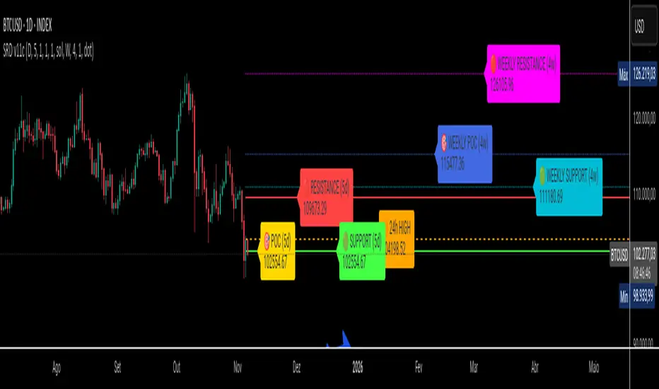
Camarilla NX v2Camarilla Pivot Points (Daily/Weekly)
Overview
The Camarilla Pivot Points indicator is a powerful overlay tool designed for TradingView, based on the Camarilla equation—a mathematical price action method originally discovered by trader Nick Scott in 1989. Unlike traditional pivot points that rely on a central pivot (e.g., (High + Low + Close)/3), Camarilla pivots emphasize the previous period's close and range to generate eight key levels: four resistance (R1–R4) and four support (S1–S4). These levels are particularly useful for identifying potential intraday reversal zones, breakout opportunities, and range-bound trading scenarios.
This custom indicator plots these levels using data from the previous daily (D1) or weekly (W1) candle, ensuring consistency across any timeframe (e.g., 1-minute to monthly charts). It displays historical levels in a stepped manner, allowing traders to visualize how past pivots interacted with price action over time. The levels remain fixed for the entire current period (day or week), updating only at the start of a new one.
Calculation Formula
Camarilla Pivot Points are calculated using the high (H), low (L), and close (C) from the previous period (daily or weekly, as selected). There is no central pivot point; instead, the formula focuses on the range and applies multipliers derived from the "1.1" factor (a constant in the Camarilla equation, representing an approximation of market volatility).
Range = Previous High (H) - Previous Low (L)
Resistance Levels:
R1 = C + (Range × 1.1 / 12)
R2 = C + (Range × 1.1 / 6)
R3 = C + (Range × 1.1 / 4)
R4 = C + (Range × 1.1 / 2)
Support Levels:
S1 = C - (Range × 1.1 / 12)
S2 = C - (Range × 1.1 / 6)
S3 = C - (Range × 1.1 / 4)
S4 = C - (Range × 1.1 / 2)
These multipliers (1/12, 1/6, 1/4, 1/2) create progressively wider levels, with R3/S3 often acting as strong reversal points and R4/S4 as extreme breakout targets. Note: Some variations include additional levels (e.g., R5/S5 for longer holds), but this indicator focuses on the core eight for intraday focus.
Features
Resolution Selection: Choose between "Daily" (based on the previous D1 candle) or "Weekly" (based on the previous W1 candle) via a simple input dropdown. This allows flexibility for short-term scalpers (daily) or swing traders (weekly).
Custom Line Styles: Select from various plot styles, including Line, Line with Breaks, Stepline, Stepline with Breaks, Stepline Diamond, Circles, or Cross. Stepline is the default for clear historical visualization, showing level changes at the start of each new period.
Adjustable Appearance: Customize line width (from 1 to 5) for visibility on busy charts. Separate color inputs for resistance (default: red) and support (default: green) lines enable easy theme matching or emphasis.
Historical Display: Automatically plots past levels in a stepped format, extending back up to 500 bars (configurable via max_bars_back). This helps in backtesting and pattern recognition without recalculating on every bar.
Performance Optimization: Uses efficient Pine Script v6 logic to fetch higher-timeframe data without repainting, ensuring reliable real-time and historical accuracy.
Usage and Strategies
This indicator shines in volatile markets like forex, stocks, or cryptocurrencies, where it helps predict intraday price boundaries. Key strategies include:
Breakout Trading: Buy above R4 or sell below S4 for strong trends, with stops near R3/S3.
Reversal Trading: Fade moves at R3/S3 levels, expecting pullbacks to the inner levels (R1/S1).
Range Trading: Trade bounces between S1–R1 during low-volatility sessions, using S2/R2 as confirmation.
Combination with Other Tools: Pair with volume indicators, RSI, or candlestick patterns for higher-probability setups. For example, a bullish engulfing at S3 could signal a reversal to R3.
Ideal for intraday traders focusing on breakout and reversal strategies, this indicator provides a mathematical edge by highlighting "hidden" support/resistance not visible in standard pivots. Always combine with risk management, as no indicator guarantees profits.

HTF Ranges - AWR/AMR/AYR [bilal]📊 Overview
Professional higher timeframe range indicator for swing and position traders. Calculate Average Weekly Range (AWR), Average Monthly Range (AMR), and Average Yearly Range (AYR) with precision projection levels.
✨ Key Features
📅 Three Timeframe Modes
AWR (Average Weekly Range): Weekly swing targets - Default 4 weeks
AMR (Average Monthly Range): Monthly position targets - Default 6 months
AYR (Average Yearly Range): Yearly extremes - Default 9 years
🎯 Dual Anchor Options
Period Open: Week/Month/Year opening price
RTH Open: First RTH session (09:30 NY) of the period
📐 Projection Levels
100% Range Levels: Upper and lower targets from anchor
Fractional Levels: 33% and 66% zones for partial targets
Custom Mirrored Levels: Set any percentage (0-200%) with automatic mirroring
Example: 25% shows both 25% and 75%
Example: 150% shows both 150% and -50%
📊 Information Table
Active range type (AWR/AMR/AYR)
Average range value for selected period
Current period range and percentage used
Distance remaining to targets (up/down)
Color-coded progress (green/orange/red)
🎨 Fully Customizable
Orange theme by default (differentiates from daily indicators)
Line colors, styles (solid/dashed/dotted), and widths
Toggle labels on/off
Adjustable lookback periods for each timeframe
Independent settings for each range type
⚡ Smart Features
Lines start at actual period open (not fixed lookback)
Automatically tracks current period high/low
Works on any chart timeframe
Real-time range tracking
Alert conditions when targets reached or exceeded
🎯 Use Cases
AWR (Weekly Ranges):
Swing trade targets (3-7 day holds)
Weekly support/resistance zones
Identify weekly trend vs rotation
Compare daily moves to weekly context
AMR (Monthly Ranges):
Position trade targets (2-4 week holds)
Monthly breakout levels
Institutional-level zones
Earnings play targets
AYR (Yearly Ranges):
Major reversal zones
Long-term support/resistance
Identify macro trend strength
Annual high/low projections
💡 Trading Strategies
AWR Strategy (Swing Trading):
Week opens near AWR lower level = potential long setup
Target AWR 66% and 100% levels
Week hits AWR upper in first 2 days = watch for reversal
Use fractional levels as scale-in/scale-out points
AMR Strategy (Position Trading):
Month opens near AMR extremes = fade setup
Month breaks AMR in week 1 = expansion (trend) month
Target opposite AMR extreme for swing positions
Use 33%/66% for partial profit taking
AYR Strategy (Long-term Context):
Price near AYR extremes = major reversal zones
Breaking AYR levels = historic moves (rare)
Use for macro trend confirmation
Great for yearly forecasting and planning
📊 Range Interpretation
<33% Range Used: Early in period, room for expansion
33-66% Range Used: Normal progression
66-100% Range Used: Extended, approaching extremes
>100% Range Used: Expansion period - trending or high volatility
⚙️ Settings Guide
Lookback Periods:
AWR: 4 weeks (standard) - adjust to 8-12 for smoother average
AMR: 6 months (standard) - seasonal patterns
AYR: 9 years (standard) - captures full cycles
Anchor Type:
Period Open: Use for clean week/month/year open reference
RTH Open: Use if you only trade day session, ignores overnight gaps
Custom Levels:
25% = quartile targets
75% = three-quarter targets
80% = "danger zone" for reversals
111% = extended breakout target
🔄 Combine with ADR Indicator
Run both indicators together for complete multi-timeframe analysis:
ADR for intraday precision
AWR/AMR/AYR for swing/position context
See if today's ADR move is significant in weekly/monthly context
Multi-timeframe confluence = highest probability setups
💼 Ideal For
Swing Traders: Use AWR for 3-10 day holds
Position Traders: Use AMR for 2-8 week holds
Long-term Investors: Use AYR for macro context
Index Futures Traders: ES, NQ, YM, RTY
Multi-timeframe Analysis: Combine with daily ADR

ICT ADR/AWR/AMR Levels | Trade Symmetry🌟 ICT ADR/AWR/AMR Levels
📋 Overview
This advanced technical analysis tool calculates and displays Average Daily Range (ADR), Average Weekly Range (AWR), and Average Monthly Range (AMR) levels. The indicator incorporates smart detection technology that automatically maintains monthly level visibility when historical data becomes unavailable.
✨ Key Features
🕒 Precise Time Alignment
True Daily Opens (TDO) aligned with 00:00 UTC
True Weekly Opens (TWO) at 00:00 UTC (configurable Monday/Sunday start)
True Monthly Opens (TMO) at 00:00 UTC on month start
Customizable period start times and parameters
📊 Comprehensive Multi-Timeframe Analysis
Daily Levels (ADR): Base level with multiple extensions including Fibonacci ratios
Weekly Levels (AWR): Weekly range projections and key levels
Monthly Levels (AMR): Monthly range calculations with automatic fallback system
🔄 Intelligent Level Management
Smart Detection: Automatically switches between historical and current monthly levels
Continuous Visibility: Ensures reference levels remain visible regardless of data availability
Seamless Operation: No manual adjustment needed for level transitions
⚙️ Extensive Customization
Adjustable lookback periods for all timeframes
Independent control over each level type and extension
Complete visual customization (colors, styles, widths)
Flexible labeling and display options
Configurable vertical separation lines
🏷️ Advanced Display Options
Clean, organized label placement
Optional price display in labels
Historical period tracking
Overlapping label merging capability
Adjustable label sizing and positioning
🚀 How to Use
Initial Setup: Enable desired timeframes (Daily/Weekly/Monthly)
Range Configuration: Set appropriate averaging periods for each timeframe
Level Selection: Choose which extension levels to display
Visual Settings: Customize colors and styles to match your trading workspace
Automatic Operation: The indicator intelligently manages level transitions
💡 Practical Applications
Identify potential support and resistance areas across multiple timeframes
Establish realistic profit targets based on historical volatility
Plan trade entries and exits around significant time-based levels
Analyze market volatility patterns across different time horizons
Incorporate institutional trading concepts into your analysis
OHLC Tool Multiple TFThis indicator displays Open, High, Low, and Close (OHLC) levels from multiple timeframes directly on your chart. It allows full customization of line styles, colors, and widths for each OHLC component — not only for the base timeframe, but also for higher timeframes like Daily, Weekly, and Monthly.
Key Features:
- 🔹 Per-TF Styling: Customize color, style, and thickness for each OHLC line (O/H/L/C) independently across base, daily, weekly, and monthly timeframes.
- 🔹 Inheritance Toggle: Optionally inherit base timeframe styles for higher timeframes to maintain visual consistency.
- 🔹 Dynamic Labels: Each OHLC line is labeled with its type and price, rounded to your preferred decimal precision.
- 🔹 Precision Control: Set custom decimal formatting for each timeframe to match asset volatility (e.g. 2 decimals for BTC, 3+ for altcoins).
- 🔹 Length Multipliers: Extend line visibility with adjustable multipliers per timeframe.
- 🔹 Toggle Visibility: Enable or disable OHLC lines for Daily, Weekly, and Monthly timeframes independently.
How to Use:
- Select your base timeframe (e.g. 3G, 15m, 1h) and configure its OHLC line styles under Line Display Settings.
- Enable Daily / Weekly / Monthly OHLC under General Settings > Higher TFs.
- Customize each higher timeframe’s OHLC styles under their respective sections (Daily Line Display, Weekly Line Display, etc.).
- Use the inherit toggle to apply base styles to higher timeframes automatically.
- Tune line length multipliers to extend visibility across your chart.
Ideal For:
- Traders who want to track multi-timeframe OHLC levels with visual clarity.
- Analysts who prefer symbolic, rhythmic, or color-coded chart annotations.
- Anyone seeking a clean, customizable OHLC overlay with precision control.

Enhanced Level Breakout Strategy ProEnhanced Level Breakout Strategy Pro — Executive Summary
Level-driven breakout engine with single-position governance, three staged targets, and live USD/INR currency awareness. It operationalizes last session levels and swing structure to generate actionable entries only when price confirms and volume validates.
What it does
Surfaces breakouts of previous day and previous week high/low/open/close.
Confirms with optional volume expansion.
Enters one position at a time. Manages SL + TP1/TP2/TP3 and auto-expires after time.
Tracks outcomes and KPIs, including a rolling 30-day dashboard.
Auto-detects INR vs USD charts and handles live USD/INR conversion for capital displays.
How trades are found
Levels
Uses completed prior Daily and Weekly OHLC as reference rails.
Breakout up: close > prior high/open/close.
Breakout down: close < prior low/open/close.
Volume filter (optional)
Current volume > 20-SMA(volume) × threshold.
Swing context (visual only)
Marks most recent 3–4-bar swing high/low to show nearby structure.
Entry logic
Long if any daily/weekly upside breakout confirms on the closed bar and volume filter passes.
Short if any downside breakout confirms with the same gating.
Single-trade mode by default. You can allow new trades before completion if required.
Risk model and exits
Stop-loss
Long: min(low , low )
Short: max(high , high )
Targets
TP1 = 1.5R, TP2 = 2R, TP3 = 3R.
Hitting TP3 implies TP2 and TP1 are counted as achieved.
Time exit
Force close after 50 bars if no TP/SL.
Labels/lines
Entry, SL, TP1/2/3 plotted only while the trade is active.
Capital and currency enablement
Initial Capital and Risk % per trade drive the on-chart capital panel.
Auto-detects chart currency (INR for NSE/BSE tickers, else USD).
Live USD/INR pull with fallback to manual rate.
Shows position size (float units), investment amount, and risk amount in the selected display currency.
On-chart UX
Level rails
Daily levels on the left (custom color).
Weekly levels on the right (custom color).
Swing tags: SH / SL at the latest swing points.
Signal markers: Entry labels on the confirmation bar.
Two tables
Performance (top-right): trades, win rate, average P/L, TP1/2/3 hit counts and accuracies, 30-day counts and average TP profits, SL stats, configuration flags.
Capital (bottom-left): capital, risk/trade, position size, investment, stop distance, R:R set, conversion rate and source.
KPIs tracked
All-time: total trades, win rate, average P/L, TP1/TP2/TP3 accuracy and average profit, SL accuracy.
Last 30 days: number of trades hitting TP1/TP2/TP3 or SL, plus average TP1/TP2/TP3 profit across those hits.
Configuration levers
Currency: Auto / INR / USD, live or manual USD/INR rate.
Components: toggle daily/weekly levels and entry generation.
Swing: lookback 2–10, show/hide.
Risk: initial capital, risk % per trade.
Filters: volume on/off and threshold.
Display: TP/SL lines, labels, transparent tables, one-trade policy, wait-for-completion.
Styling: independent colors and thickness for daily/weekly/swing levels.
Governance and constraints
One active position unless you opt out.
Entries trigger on bar close to avoid repaint.
Level references are always previous completed sessions.
Arrays capped to manage memory; stats keep recent history efficiently.
Operating procedure
Select timeframe. Add to chart.
Set capital and risk %. Confirm currency mode.
Optional: enable volume filter and set threshold.
Monitor left/right level rails. Trade fires on confirmed breaches.
Manage optional discretion using swing markers and stop distance readout.
Review top-right KPIs for continuous improvement. Iterate thresholds as needed.
Tips
Use higher timeframes for fewer but higher-quality signals.
Keep volume filter on during trend days to avoid weak breaks.
For INR equities, prefer AUTO currency with Live conversion enabled for cleaner dashboards.
If you scale manually, keep single-trade mode enabled to avoid overlapping signals.

COT IndexTHE HIDDEN INTELLIGENCE IN FUTURES MARKETS
What if you could see what the smartest players in the futures markets are doing before the crowd catches on? While retail traders chase momentum indicators and moving averages, obsess over Japanese candlestick patterns, and debate whether the RSI should be set to fourteen or twenty-one periods, institutional players leave footprints in the sand through their mandatory reporting to the Commodity Futures Trading Commission. These footprints, published weekly in the Commitment of Traders reports, have been hiding in plain sight for decades, available to anyone with an internet connection, yet remarkably few traders understand how to interpret them correctly. The COT Index indicator transforms this raw institutional positioning data into actionable trading signals, bringing Wall Street intelligence to your trading screen without requiring expensive Bloomberg terminals or insider connections.
The uncomfortable truth is this: Most retail traders operate in a binary world. Long or short. Buy or sell. They apply technical analysis to individual positions, constrained by limited capital that forces them to concentrate risk in single directional bets. Meanwhile, institutional traders operate in an entirely different dimension. They manage portfolios dynamically weighted across multiple markets, adjusting exposure based on evolving market conditions, correlation shifts, and risk assessments that retail traders never see. A hedge fund might be simultaneously long gold, short oil, neutral on copper, and overweight agricultural commodities, with position sizes calibrated to volatility and portfolio Greeks. When they increase gold exposure from five percent to eight percent of portfolio allocation, this rebalancing decision reflects sophisticated analysis of opportunity cost, risk parity, and cross-market dynamics that no individual chart pattern can capture.
This portfolio reweighting activity, multiplied across hundreds of institutional participants, manifests in the aggregate positioning data published weekly by the CFTC. The Commitment of Traders report does not show individual trades or strategies. It shows the collective footprint of how actual commercial hedgers and large speculators have allocated their capital across different markets. When mining companies collectively increase forward gold sales to hedge thirty percent more production than last quarter, they are not reacting to a moving average crossover. They are making strategic allocation decisions based on production forecasts, cost structures, and price expectations derived from operational realities invisible to outside observers. This is portfolio management in action, revealed through positioning data rather than price charts.
If you want to understand how institutional capital actually flows, how sophisticated traders genuinely position themselves across market cycles, the COT report provides a rare window into that hidden world. But understand what you are getting into. This is not a tool for scalpers seeking confirmation of the next five-minute move. This is not an oscillator that flashes oversold at market bottoms with convenient precision. COT analysis operates on a timescale measured in weeks and months, revealing positioning shifts that precede major market turns but offer no precision timing. The data arrives three days stale, published only once per week, capturing strategic positioning rather than tactical entries.
If you need instant gratification, if you trade intraday moves, if you demand mechanical signals with ninety percent accuracy, close this document now. COT analysis rewards patience, position sizing discipline, and tolerance for being early. It punishes impatience, overleveraging, and the expectation that any single indicator can substitute for market understanding.
The premise is deceptively simple. Every Tuesday, large traders in futures markets must report their positions to the CFTC. By Friday afternoon, this data becomes public. Academic research spanning three decades has consistently shown that not all market participants are created equal. Some traders consistently profit while others consistently lose. Some anticipate major turning points while others chase trends into exhaustion. Bessembinder and Chan (1992) demonstrated in their seminal study that commercial hedgers, those with actual exposure to the underlying commodity or financial instrument, possess superior forecasting ability compared to speculators. Their research, published in the Journal of Finance, found statistically significant predictive power in commercial positioning, particularly at extreme levels. This finding challenged the efficient market hypothesis and opened the door to a new approach to market analysis based on positioning rather than price alone.
Think about what this means. Every week, the government publishes a report showing you exactly how the most informed market participants are positioned. Not their opinions. Not their predictions. Their actual money at risk. When agricultural producers collectively hold their largest short hedge in five years, they are not making idle speculation. They are locking in prices for crops they will harvest, informed by private knowledge of weather conditions, soil quality, inventory levels, and demand expectations invisible to outside observers. When energy companies aggressively hedge forward production at current prices, they reveal information about expected supply that no analyst report can capture. This is not technical analysis based on past prices. This is not fundamental analysis based on publicly available data. This is behavioral analysis based on how the smartest money is actually positioned, how institutions allocate capital across portfolios, and how those allocation decisions shift as market conditions evolve.
WHY SOME TRADERS KNOW MORE THAN OTHERS
Building on this foundation, Sanders, Boris and Manfredo (2004) conducted extensive research examining the behaviour patterns of different trader categories. Their work, which analyzed over a decade of COT data across multiple commodity markets, revealed a fascinating dynamic that challenges much of what retail traders are taught. Commercial hedgers consistently positioned themselves against market extremes, buying when speculators were most bearish and selling when speculators reached peak bullishness. The contrarian positioning of commercials was not random noise but rather reflected their superior information about supply and demand fundamentals. Meanwhile, large speculators, primarily hedge funds and commodity trading advisors, exhibited strong trend-following behaviour that often amplified market moves beyond fundamental values. Small traders, the retail participants, consistently entered positions late in trends, frequently near turning points, making them reliable contrary indicators.
Wang (2003) extended this research by demonstrating that the predictive power of commercial positioning varies significantly across different commodity sectors. His analysis of agricultural commodities showed particularly strong forecasting ability, with commercial net positions explaining up to fifteen percent of return variance in subsequent weeks. This finding suggests that the informational advantages of hedgers are most pronounced in markets where physical supply and demand fundamentals dominate, as opposed to purely financial markets where information asymmetries are smaller. When a corn farmer hedges six months of expected harvest, that decision incorporates private observations about rainfall patterns, crop health, pest pressure, and local storage capacity that no distant analyst can match. When an oil refinery hedges crude oil purchases and gasoline sales simultaneously, the spread relationships reveal expectations about refining margins that reflect operational realities invisible in public data.
The theoretical mechanism underlying these empirical patterns relates to information asymmetry and different participant motivations. Commercial hedgers engage in futures markets not for speculative profit but to manage business risks. An agricultural producer selling forward six months of expected harvest is not making a bet on price direction but rather locking in revenue to facilitate financial planning and ensure business viability. However, this hedging activity necessarily incorporates private information about expected supply, inventory levels, weather conditions, and demand trends that the hedger observes through their commercial operations (Irwin and Sanders, 2012). When aggregated across many participants, this private information manifests in collective positioning.
Consider a gold mining company deciding how much forward production to hedge. Management must estimate ore grades, recovery rates, production costs, equipment reliability, labor availability, and dozens of other operational variables that determine whether locking in prices at current levels makes business sense. If the industry collectively hedges more aggressively than usual, it suggests either exceptional production expectations or concern about sustaining current price levels or combination of both. Either way, this positioning reveals information unavailable to speculators analyzing price charts and economic data. The hedger sees the physical reality behind the financial abstraction.
Large speculators operate under entirely different incentives and constraints. Commodity Trading Advisors managing billions in assets typically employ systematic, trend-following strategies that respond to price momentum rather than fundamental supply and demand. When crude oil rallies from sixty dollars to seventy dollars per barrel, these systems generate buy signals. As the rally continues to eighty dollars, position sizes increase. The strategy works brilliantly during sustained trends but becomes a liability at reversals. By the time oil reaches ninety dollars, trend-following funds are maximally long, having accumulated positions progressively throughout the rally. At this point, they represent not smart money anticipating further gains but rather crowded money vulnerable to reversal. Sanders, Boris and Manfredo (2004) documented this pattern across multiple energy markets, showing that extreme speculator positioning typically marked late-stage trend exhaustion rather than early-stage trend development.
Small traders, the retail participants who fall below reporting thresholds, display the weakest forecasting ability. Wang (2003) found that small trader positioning exhibited negative correlation with subsequent returns, meaning their aggregate positioning served as a reliable contrary indicator. The explanation combines several factors. Retail traders often lack the capital reserves to weather normal market volatility, leading to premature exits from positions that would eventually prove profitable. They tend to receive information through slower channels, entering trends after mainstream media coverage when institutional participants are preparing to exit. Perhaps most importantly, they trade with emotion, buying into euphoria and selling into panic at precisely the wrong times.
At major turning points, the three groups often position opposite each other with commercials extremely bearish, large speculators extremely bullish, and small traders piling into longs at the last moment. These high-divergence environments frequently precede increased volatility and trend reversals. The insiders with business exposure quietly exit as the momentum traders hit maximum capacity and retail enthusiasm peaks. Within weeks, the reversal begins, and positions unwind in the opposite sequence.
FROM RAW DATA TO ACTIONABLE SIGNALS
The COT Index indicator operationalizes these academic findings into a practical trading tool accessible through TradingView. At its core, the indicator normalizes net positioning data onto a zero to one hundred scale, creating what we call the COT Index. This normalization is critical because absolute position sizes vary dramatically across different futures contracts and over time. A commercial trader holding fifty thousand contracts net long in crude oil might be extremely bullish by historical standards, or it might be quite neutral depending on the context of total market size and historical ranges. Raw position numbers mean nothing without context. The COT Index solves this problem by calculating where current positioning stands relative to its range over a specified lookback period, typically two hundred fifty-two weeks or approximately five years of weekly data.
The mathematical transformation follows the methodology originally popularized by legendary trader Larry Williams, though the underlying concept appears in statistical normalization techniques across many fields. For any given trader category, we calculate the highest and lowest net position values over the lookback period, establishing the historical range for that specific market and trader group. Current positioning is then expressed as a percentage of this range, where zero represents the most bearish positioning ever seen in the lookback window and one hundred represents the most bullish extreme. A reading of fifty indicates positioning exactly in the middle of the historical range, suggesting neither extreme optimism nor pessimism relative to recent history (Williams and Noseworthy, 2009).
This index-based approach allows for meaningful comparison across different markets and time periods, overcoming the scaling problems inherent in analyzing raw position data. A commercial index reading of eighty-five in gold carries the same interpretive meaning as an eighty-five reading in wheat or crude oil, even though the absolute position sizes differ by orders of magnitude. This standardization enables systematic analysis across entire futures portfolios rather than requiring market-specific expertise for each contract.
The lookback period selection involves a fundamental tradeoff between responsiveness and stability. Shorter lookback periods, perhaps one hundred twenty-six weeks or approximately two and a half years, make the index more sensitive to recent positioning changes. However, it also increases noise and produces more false signals. Longer lookback periods, perhaps five hundred weeks or approximately ten years, create smoother readings that filter short-term noise but become slower to recognize regime changes. The indicator settings allow users to adjust this parameter based on their trading timeframe, risk tolerance, and market characteristics.
UNDERSTANDING CFTC DATA STRUCTURES
The indicator supports both Legacy and Disaggregated COT report formats, reflecting the evolution of CFTC reporting standards over decades of market development. Legacy reports categorize market participants into three broad groups: commercial traders (hedgers with underlying business exposure), non-commercial traders (large speculators seeking profit without commercial interest), and non-reportable traders (small speculators below reporting thresholds). Each category brings distinct motivations and information advantages to the market (CFTC, 2020).
The Disaggregated reports, introduced in September 2009 for physical commodity markets, provide finer granularity by splitting participants into five categories (CFTC, 2009). Producer and merchant positions capture those actually producing, processing, or merchandising the physical commodity. Swap dealers represent financial intermediaries facilitating derivative transactions for clients. Managed money includes commodity trading advisors and hedge funds executing systematic or discretionary strategies. Other reportables encompasses diverse participants not fitting the main categories. Small traders remain as the fifth group, representing retail participation.
This enhanced categorization reveals nuances invisible in Legacy reports, particularly distinguishing between different types of institutional capital and their distinct behavioural patterns. The indicator automatically detects which report type is appropriate for each futures contract and adjusts the display accordingly.
Importantly, Disaggregated reports exist only for physical commodity futures. Agricultural commodities like corn, wheat, and soybeans have Disaggregated reports because clear producer, merchant, and swap dealer categories exist. Energy commodities like crude oil and natural gas similarly have well-defined commercial hedger categories. Metals including gold, silver, and copper also receive Disaggregated treatment (CFTC, 2009). However, financial futures such as equity index futures, Treasury bond futures, and currency futures remain available only in Legacy format. The CFTC has indicated no plans to extend Disaggregated reporting to financial futures due to different market structures and participant categories in these instruments (CFTC, 2020).
THE BEHAVIORAL FOUNDATION
Understanding which trader perspective to follow requires appreciation of their distinct trading styles, success rates, and psychological profiles. Commercial hedgers exhibit anticyclical behaviour rooted in their fundamental knowledge and business imperatives. When agricultural producers hedge forward sales during harvest season, they are not speculating on price direction but rather locking in revenue for crops they will harvest. Their business requires converting volatile commodity exposure into predictable cash flows to facilitate planning and ensure survival through difficult periods. Yet their aggregate positioning reveals valuable information because these hedging decisions incorporate private information about supply conditions, inventory levels, weather observations, and demand expectations that hedgers observe through their commercial operations (Bessembinder and Chan, 1992).
Consider a practical example from energy markets. Major oil companies continuously hedge portions of forward production based on price levels, operational costs, and financial planning needs. When crude oil trades at ninety dollars per barrel, they might aggressively hedge the next twelve months of production, locking in prices that provide comfortable profit margins above their extraction costs. This hedging appears as short positioning in COT reports. If oil rallies further to one hundred dollars, they hedge even more aggressively, viewing these prices as exceptional opportunities to secure revenue. Their short positioning grows increasingly extreme. To an outside observer watching only price charts, the rally suggests bullishness. But the commercial positioning reveals that the actual producers of oil find these prices attractive enough to lock in years of sales, suggesting skepticism about sustaining even higher levels. When the eventual reversal occurs and oil declines back to eighty dollars, the commercials who hedged at ninety and one hundred dollars profit while speculators who chased the rally suffer losses.
Large speculators or managed money traders operate under entirely different incentives and constraints. Their systematic, momentum-driven strategies mean they amplify existing trends rather than anticipate reversals. Trend-following systems, the most common approach among large speculators, by definition require confirmation of trend through price momentum before entering positions (Sanders, Boris and Manfredo, 2004). When crude oil rallies from sixty dollars to eighty dollars per barrel over several months, trend-following algorithms generate buy signals based on moving average crossovers, breakouts, and other momentum indicators. As the rally continues, position sizes increase according to the systematic rules.
However, this approach becomes a liability at turning points. By the time oil reaches ninety dollars after a sustained rally, trend-following funds are maximally long, having accumulated positions progressively throughout the move. At this point, their positioning does not predict continued strength. Rather, it often marks late-stage trend exhaustion. The psychological and mechanical explanation is straightforward. Trend followers by definition chase price momentum, entering positions after trends establish rather than anticipating them. Eventually, they become fully invested just as the trend nears completion, leaving no incremental buying power to sustain the rally. When the first signs of reversal appear, systematic stops trigger, creating a cascade of selling that accelerates the downturn.
Small traders consistently display the weakest track record across academic studies. Wang (2003) found that small trader positioning exhibited negative correlation with subsequent returns in his analysis across multiple commodity markets. This result means that whatever small traders collectively do, the opposite typically proves profitable. The explanation for small trader underperformance combines several factors documented in behavioral finance literature. Retail traders often lack the capital reserves to weather normal market volatility, leading to premature exits from positions that would eventually prove profitable. They tend to receive information through slower channels, learning about commodity trends through mainstream media coverage that arrives after institutional participants have already positioned. Perhaps most importantly, retail traders are more susceptible to emotional decision-making, buying into euphoria and selling into panic at precisely the wrong times (Tharp, 2008).
SETTINGS, THRESHOLDS, AND SIGNAL GENERATION
The practical implementation of the COT Index requires understanding several key features and settings that users can adjust to match their trading style, timeframe, and risk tolerance. The lookback period determines the time window for calculating historical ranges. The default setting of two hundred fifty-two bars represents approximately one year on daily charts or five years on weekly charts, balancing responsiveness with stability. Conservative traders seeking only the most extreme, highest-probability signals might extend the lookback to five hundred bars or more. Aggressive traders seeking earlier entry and willing to accept more false positives might reduce it to one hundred twenty-six bars or even less for shorter-term applications.
The bullish and bearish thresholds define signal generation levels. Default settings of eighty and twenty respectively reflect academic research suggesting meaningful information content at these extremes. Readings above eighty indicate positioning in the top quintile of the historical range, representing genuine extremes rather than temporary fluctuations. Conversely, readings below twenty occupy the bottom quintile, indicating unusually bearish positioning (Briese, 2008).
However, traders must recognize that appropriate thresholds vary by market, trader category, and personal risk tolerance. Some futures markets exhibit wider positioning swings than others due to seasonal patterns, volatility characteristics, or participant behavior. Conservative traders seeking high-probability setups with fewer signals might raise thresholds to eighty-five and fifteen. Aggressive traders willing to accept more false positives for earlier entry could lower them to seventy-five and twenty-five.
The key is maintaining meaningful differentiation between bullish, neutral, and bearish zones. The default settings of eighty and twenty create a clear three-zone structure. Readings from zero to twenty represent bearish territory where the selected trader group holds unusually bearish positions. Readings from twenty to eighty represent neutral territory where positioning falls within normal historical ranges. Readings from eighty to one hundred represent bullish territory where the selected trader group holds unusually bullish positions.
The trading perspective selection determines which participant group the indicator follows, fundamentally shaping interpretation and signal meaning. For counter-trend traders seeking reversal opportunities, monitoring commercial positioning makes intuitive sense based on the academic research discussed earlier. When commercials reach extreme bearish readings below twenty, indicating unprecedented short positioning relative to recent history, they are effectively betting against the crowd. Given their informational advantages demonstrated by Bessembinder and Chan (1992), this contrarian stance often precedes major bottoms.
Trend followers might instead monitor large speculator positioning, but with inverted logic compared to commercials. When managed money reaches extreme bullish readings above eighty, the trend may be exhausting rather than accelerating. This seeming paradox reflects their late-cycle participation documented by Sanders, Boris and Manfredo (2004). Sophisticated traders thus use speculator extremes as fade signals, entering positions opposite to speculator consensus.
Small trader monitoring serves primarily as a contrary indicator for all trading styles. Extreme small trader bullishness above seventy-five or eighty typically warns of retail FOMO at market tops. Extreme small trader bearishness below twenty or twenty-five often marks capitulation bottoms where the last weak hands have sold.
VISUALIZATION AND USER INTERFACE
The visual design incorporates multiple elements working together to facilitate decision-making and maintain situational awareness during active trading. The primary COT Index line plots in bold with adjustable line width, defaulting to two pixels for clear visibility against busy price charts. An optional glow effect, controlled by a simple toggle, adds additional visual prominence through multiple plot layers with progressively increasing transparency and width.
A twenty-one period exponential moving average overlays the index line, providing trend context for positioning changes. When the index crosses above its moving average, it signals accelerating bullish sentiment among the selected trader group regardless of whether absolute positioning is extreme. Conversely, when the index crosses below its moving average, it signals deteriorating sentiment and potentially the beginning of a reversal in positioning trends.
The EMA provides a dynamic reference line for assessing positioning momentum. When the index trades far above its EMA, positioning is not only extreme in absolute terms but also building with momentum. When the index trades far below its EMA, positioning is contracting or reversing, which may indicate weakening conviction even if absolute levels remain elevated.
The data table positioned at the top right of the chart displays eleven metrics for each trader category, transforming the indicator from a simple index calculation into an analytical dashboard providing multidimensional market intelligence. Beyond the COT Index itself, users can monitor positioning extremity, which measures how unusual current levels are compared to historical norms using statistical techniques. The extremity metric clarifies whether a reading represents the ninety-fifth or ninety-ninth percentile, with values above two standard deviations indicating genuinely exceptional positioning.
Market power quantifies each group's influence on total open interest. This metric expresses each trader category's net position as a percentage of total market open interest. A commercial entity holding forty percent of total open interest commands significantly more influence than one holding five percent, making their positioning signals more meaningful.
Momentum and rate of change metrics reveal whether positions are building or contracting, providing early warning of potential regime shifts. Position velocity measures the rate of change in positioning changes, effectively a second derivative providing even earlier insight into inflection points.
Sentiment divergence highlights disagreements between commercial and speculative positioning. This metric calculates the absolute difference between normalized commercial and large speculator index values. Wang (2003) found that these high-divergence environments frequently preceded increased volatility and reversals.
The table also displays concentration metrics when available, showing how positioning is distributed among the largest handful of traders in each category. High concentration indicates a few dominant players controlling most of the positioning, while low concentration suggests broad-based participation across many traders.
THE ALERT SYSTEM AND MONITORING
The alert system, comprising five distinct alert conditions, enables systematic monitoring of dozens of futures markets without constant screen watching. The bullish and bearish COT signal alerts trigger when the index crosses user-defined thresholds, indicating the selected trader group has reached extreme positioning worthy of attention. These alerts fire in real-time as new weekly COT data publishes, typically Friday afternoon following the Tuesday measurement date.
Extreme positioning alerts fire at ninety and ten index levels, representing the top and bottom ten percent of the historical range, warning of particularly stretched readings that historically precede reversals with high probability. When commercials reach a COT Index reading below ten, they are expressing their most bearish stance in the entire lookback period.
The data staleness alert notifies users when COT reports have not updated for more than ten days, preventing reliance on outdated information for trading decisions. Government shutdowns or federal holidays can interrupt the normal Friday publication schedule. Using stale signals while believing them current creates dangerous false confidence.
The indicator's watermark information display positioned in the bottom right corner provides essential context at a glance. This persistent display shows the symbol and timeframe, the COT report date timestamp, days since last update, and the current signal state. A trader analyzing a potential short entry in crude oil can glance at the watermark to instantly confirm positioning context without interrupting analysis flow.
LIMITATIONS AND REALISTIC EXPECTATIONS
Practical application requires understanding both the indicator's considerable strengths and inherent limitations. COT data inherently lags price action by three days, as Tuesday positions are not published until Friday afternoon. This delay means the indicator cannot catch rapid intraday reversals or respond to surprise news events. Traders using the COT Index for timing entries must accept this latency and focus on swing trading and position trading timeframes where three-day lags matter less than in day trading or scalping.
The weekly publication schedule similarly makes the indicator unsuitable for short-term trading strategies requiring immediate feedback. The COT Index works best for traders operating on weekly or longer timeframes, where positioning shifts measured in weeks and months align with trading horizon.
Extreme COT readings can persist far longer than typical technical indicators suggest, testing the patience and capital reserves of traders attempting to fade them. When crude oil enters a sustained bull market driven by genuine supply disruptions, commercial hedgers may maintain bearish positioning for many months as prices grind higher. A commercial COT Index reading of fifteen indicating extreme bearishness might persist for three months while prices continue rallying before finally reversing. Traders without sufficient capital and risk tolerance to weather such drawdowns will exit prematurely, precisely when the signal is about to work (Irwin and Sanders, 2012).
Position sizing discipline becomes paramount when implementing COT-based strategies. Rather than risking large percentages of capital on individual signals, successful COT traders typically allocate modest position sizes across multiple signals, allowing some to take time to mature while others work more quickly.
The indicator also cannot overcome fundamental regime changes that alter the structural drivers of markets. If gold enters a true secular bull market driven by monetary debasement, commercial hedgers may remain persistently bearish as mining companies sell forward years of production at what they perceive as favorable prices. Their positioning indicates valuation concerns from a production cost perspective, but cannot stop prices from rising if investment demand overwhelms physical supply-demand balance.
Similarly, structural changes in market participation can alter the meaning of positioning extremes. The growth of commodity index investing in the two thousands brought massive passive long-only capital into futures markets, fundamentally changing typical positioning ranges. Traders relying on COT signals without recognizing this regime change would have generated numerous false bearish signals during the commodity supercycle from 2003 to 2008.
The research foundation supporting COT analysis derives primarily from commodity markets where the commercial hedger information advantage is most pronounced. Studies specifically examining financial futures like equity indices and bonds show weaker but still present effects. Traders should calibrate expectations accordingly, recognizing that COT analysis likely works better for crude oil, natural gas, corn, and wheat than for the S&P 500, Treasury bonds, or currency futures.
Another important limitation involves the reporting threshold structure. Not all market participants appear in COT data, only those holding positions above specified minimums. In markets dominated by a few large players, concentration metrics become critical for proper interpretation. A single large trader accounting for thirty percent of commercial positioning might skew the entire category if their individual circumstances are idiosyncratic rather than representative.
GOLD FUTURES DURING A HYPOTHETICAL MARKET CYCLE
Consider a practical example using gold futures during a hypothetical but realistic market scenario that illustrates how the COT Index indicator guides trading decisions through a complete market cycle. Suppose gold has rallied from fifteen hundred to nineteen hundred dollars per ounce over six months, driven by inflation concerns following aggressive monetary expansion, geopolitical uncertainty, and sustained buying by Asian central banks for reserve diversification.
Large speculators, operating primarily trend-following strategies, have accumulated increasingly bullish positions throughout this rally. Their COT Index has climbed progressively from forty-five to eighty-five. The table display shows that large speculators now hold net long positions representing thirty-two percent of total open interest, their highest in four years. Momentum indicators show positive readings, indicating positions are still building though at a decelerating rate. Position velocity has turned negative, suggesting the pace of position building is slowing.
Meanwhile, commercial hedgers have responded to the rally by aggressively selling forward production and inventory. Their COT Index has moved inversely to price, declining from fifty-five to twenty. This bearish commercial positioning represents mining companies locking in forward sales at prices they view as attractive relative to production costs. The table shows commercials now hold net short positions representing twenty-nine percent of total open interest, their most bearish stance in five years. Concentration metrics indicate this positioning is broadly distributed across many commercial entities, suggesting the bearish stance reflects collective industry view rather than idiosyncratic positioning by a single firm.
Small traders, attracted by mainstream financial media coverage of gold's impressive rally, have recently piled into long positions. Their COT Index has jumped from forty-five to seventy-eight as retail investors chase the trend. Television financial networks feature frequent segments on gold with bullish guests. Internet forums and social media show surging retail interest. This retail enthusiasm historically marks late-stage trend development rather than early opportunity.
The COT Index indicator, configured to monitor commercial positioning from a contrarian perspective, displays a clear bearish signal given the extreme commercial short positioning. The table displays multiple confirming metrics: positioning extremity shows commercials at the ninety-sixth percentile of bearishness, market power indicates they control twenty-nine percent of open interest, and sentiment divergence registers sixty-five, indicating massive disagreement between commercial hedgers and large speculators. This divergence, the highest in three years, places the market in the historically high-risk category for reversals.
The interpretation requires nuance and consideration of context beyond just COT data. Commercials are not necessarily predicting an imminent crash. Rather, they are hedging business operations at what they collectively view as favorable price levels. However, the data reveals they have sold unusually large quantities of forward production, suggesting either exceptional production expectations for the year ahead or concern about sustaining current price levels or combination of both. Combined with extreme speculator positioning indicating a crowded long trade, and small trader enthusiasm confirming retail FOMO, the confluence suggests elevated reversal risk even if the precise timing remains uncertain.
A prudent trader analyzing this situation might take several actions based on COT Index signals. Existing long positions could be tightened with closer stop losses. Profit-taking on a portion of long exposure could lock in gains while maintaining some participation. Some traders might initiate modest short positions as portfolio hedges, sizing them appropriately for the inherent uncertainty in timing reversals. Others might simply move to the sidelines, avoiding new long entries until positioning normalizes.
The key lesson from case study analysis is that COT signals provide probabilistic edges rather than deterministic predictions. They work over many observations by identifying higher-probability configurations, not by generating perfect calls on individual trades. A fifty-five percent win rate with proper risk management produces substantial profits over time, yet still means forty-five percent of signals will be premature or wrong. Traders must embrace this probabilistic reality rather than seeking the impossible goal of perfect accuracy.
INTEGRATION WITH TRADING SYSTEMS
Integration with existing trading systems represents a natural and powerful use case for COT analysis, adding a positioning dimension to price-based technical approaches or fundamental analytical frameworks. Few traders rely exclusively on a single indicator or methodology. Rather, they build systems that synthesize multiple information sources, with each component addressing different aspects of market behavior.
Trend followers might use COT extremes as regime filters, modifying position sizing or avoiding new trend entries when positioning reaches levels historically associated with reversals. Consider a classic trend-following system based on moving average crossovers and momentum breakouts. Integration of COT analysis adds nuance. When large speculator positioning exceeds ninety or commercial positioning falls below ten, the regime filter recognizes elevated reversal risk. The system might reduce position sizing by fifty percent for new signals during these high-risk periods (Kaufman, 2013).
Mean reversion traders might require COT signal confluence before fading extended moves. When crude oil becomes technically overbought and large speculators show extreme long positioning above eighty-five, both signals confirm. If only technical indicators show extremes while positioning remains neutral, the potential short signal is rejected, avoiding fades of trends with underlying institutional support (Kaufman, 2013).
Discretionary traders can monitor the indicator as a continuous awareness tool, informing bias and position sizing without dictating mechanical entries and exits. A discretionary trader might notice commercial positioning shifting from neutral to progressively more bullish over several months. This trend informs growing positive bias even without triggering mechanical signals.
Multi-timeframe analysis represents another powerful integration approach. A trader might use daily charts for trade execution and timing while monitoring weekly COT positioning for strategic context. When both timeframes align, highest-probability opportunities emerge.
Portfolio construction for futures traders can incorporate COT signals as an additional selection criterion. Markets showing strong technical setups AND favorable COT positioning receive highest allocations. Markets with strong technicals but neutral or unfavorable positioning receive reduced allocations.
ADVANCED METRICS AND INTERPRETATION
The metrics table transforms simple positioning data into multidimensional market intelligence. Position extremity, calculated as the absolute deviation from the historical mean normalized by standard deviation, helps identify truly unusual readings versus routine fluctuations. A reading above two standard deviations indicates ninety-fifth percentile or higher extremity. Above three standard deviations indicates ninety-ninth percentile or higher, genuinely rare positioning that historically precedes major events with high probability.
Market power, expressed as a percentage of total open interest, reveals whose positioning matters most from a mechanical market impact perspective. Consider two scenarios in gold futures. In scenario one, commercials show a COT Index reading of fifteen while their market power metric shows they hold net shorts representing thirty-five percent of open interest. This is a high-confidence bearish signal. In scenario two, commercials also show a reading of fifteen, but market power shows only eight percent. While positioning is extreme relative to this category's normal range, their limited market share means less mechanical influence on price.
The rate of change and momentum metrics highlight whether positions are accelerating or decelerating, often providing earlier warnings than absolute levels alone. A COT Index reading of seventy-five with rapidly building momentum suggests continued movement toward extremes. Conversely, a reading of eighty-five with decelerating or negative momentum indicates the positioning trend is exhausting.
Position velocity measures the rate of change in positioning changes, effectively a second derivative. When velocity shifts from positive to negative, it indicates that while positioning may still be growing, the pace of growth is slowing. This deceleration often precedes actual reversal in positioning direction by several weeks.
Sentiment divergence calculates the absolute difference between normalized commercial and large speculator index values. When commercials show extreme bearish positioning at twenty while large speculators show extreme bullish positioning at eighty, the divergence reaches sixty, representing near-maximum disagreement. Wang (2003) found that these high-divergence environments frequently preceded increased volatility and reversals. The mechanism is intuitive. Extreme divergence indicates the informed hedgers and momentum-following speculators have positioned opposite each other with conviction. One group will prove correct and profit while the other proves incorrect and suffers losses. The resolution of this disagreement through price movement often involves volatility.
The table also displays concentration metrics when available. High concentration indicates a few dominant players controlling most of the positioning within a category, while low concentration suggests broad-based participation. Broad-based positioning more reliably reflects collective market intelligence and industry consensus. If mining companies globally all independently decide to hedge aggressively at similar price levels, it suggests genuine industry-wide view about price valuations rather than circumstances specific to one firm.
DATA QUALITY AND RELIABILITY
The CFTC has maintained COT reporting in various forms since the nineteen twenties, providing nearly a century of positioning data across multiple market cycles. However, data quality and reporting standards have evolved substantially over this long period. Modern electronic reporting implemented in the late nineteen nineties and early two thousands significantly improved accuracy and timeliness compared to earlier paper-based systems.
Traders should understand that COT reports capture positions as of Tuesday's close each week. Markets remain open three additional days before publication on Friday afternoon, meaning the reported data is three days stale when received. During periods of rapid market movement or major news events, this lag can be significant. The indicator addresses this limitation by including timestamp information and staleness warnings.
The three-day lag creates particular challenges during extreme volatility episodes. Flash crashes, surprise central bank interventions, geopolitical shocks, and other high-impact events can completely transform market positioning within hours. Traders must exercise judgment about whether reported positioning remains relevant given intervening events.
Reporting thresholds also mean that not all market participants appear in disaggregated COT data. Traders holding positions below specified minimums aggregate into the non-reportable or small trader category. This aggregation affects different markets differently. In highly liquid contracts like crude oil with thousands of participants, reportable traders might represent seventy to eighty percent of open interest. In thinly traded contracts with only dozens of active participants, a few large reportable positions might represent ninety-five percent of open interest.
Another data quality consideration involves trader classification into categories. The CFTC assigns traders to commercial or non-commercial categories based on reported business purpose and activities. However, this process is not perfect. Some entities engage in both commercial and speculative activities, creating ambiguity about proper classification. The transition to Disaggregated reports attempted to address some of these ambiguities by creating more granular categories.
COMPARISON WITH ALTERNATIVE APPROACHES
Several alternative approaches to COT analysis exist in the trading community beyond the normalization methodology employed by this indicator. Some analysts focus on absolute position changes week-over-week rather than index-based normalization. This approach calculates the change in net positioning from one week to the next. The emphasis falls on momentum in positioning changes rather than absolute levels relative to history. This method potentially identifies regime shifts earlier but sacrifices cross-market comparability (Briese, 2008).
Other practitioners employ more complex statistical transformations including percentile rankings, z-score standardization, and machine learning classification algorithms. Ruan and Zhang (2018) demonstrated that machine learning models applied to COT data could achieve modest improvements in forecasting accuracy compared to simple threshold-based approaches. However, these gains came at the cost of interpretability and implementation complexity.
The COT Index indicator intentionally employs a relatively straightforward normalization methodology for several important reasons. First, transparency enhances user understanding and trust. Traders can verify calculations manually and develop intuitive feel for what different readings mean. Second, academic research suggests that most of the predictive power in COT data comes from extreme positioning levels rather than subtle patterns requiring complex statistical methods to detect. Third, robust methods that work consistently across many markets and time periods tend to be simpler rather than more complex, reducing the risk of overfitting to historical data. Fourth, the complexity costs of implementation matter for retail traders without programming teams or computational infrastructure.
PSYCHOLOGICAL ASPECTS OF COT TRADING
Trading based on COT data requires psychological fortitude that differs from momentum-based approaches. Contrarian positioning signals inherently mean betting against prevailing market sentiment and recent price action. When commercials reach extreme bearish positioning, prices have typically been rising, sometimes for extended periods. The price chart looks bullish, momentum indicators confirm strength, moving averages align positively. The COT signal says bet against all of this. This psychological difficulty explains why COT analysis remains underutilized relative to trend-following methods.
Human psychology strongly predisposes us toward extrapolation and recency bias. When prices rally for months, our pattern-matching brains naturally expect continued rally. The recent price action dominates our perception, overwhelming rational analysis about positioning extremes and historical probabilities. The COT signal asking us to sell requires overriding these powerful psychological impulses.
The indicator design attempts to support the required psychological discipline through several features. Clear threshold markers and signal states reduce ambiguity about when signals trigger. When the commercial index crosses below twenty, the signal is explicit and unambiguous. The background shifts to red, the signal label displays bearish, and alerts fire. This explicitness helps traders act on signals rather than waiting for additional confirmation that may never arrive.
The metrics table provides analytical justification for contrarian positions, helping traders maintain conviction during inevitable periods of adverse price movement. When a trader enters short positions based on extreme commercial bearish positioning but prices continue rallying for several weeks, doubt naturally emerges. The table display provides reassurance. Commercial positioning remains extremely bearish. Divergence remains high. The positioning thesis remains intact even though price action has not yet confirmed.
Alert functionality ensures traders do not miss signals due to inattention while also not requiring constant monitoring that can lead to emotional decision-making. Setting alerts for COT extremes enables a healthier relationship with markets. When meaningful signals occur, alerts notify them. They can then calmly assess the situation and execute planned responses.
However, no indicator design can completely overcome the psychological difficulty of contrarian trading. Some traders simply cannot maintain short positions while prices rally. For these traders, COT analysis might be better employed as an exit signal for long positions rather than an entry signal for shorts.
Ultimately, successful COT trading requires developing comfort with probabilistic thinking rather than certainty-seeking. The signals work over many observations by identifying higher-probability configurations, not by generating perfect calls on individual trades. A fifty-five or sixty percent win rate with proper risk management produces substantial profits over years, yet still means forty to forty-five percent of signals will be premature or wrong. COT analysis provides genuine edge, but edge means probability advantage, not elimination of losing trades.
EDUCATIONAL RESOURCES AND CONTINUOUS LEARNING
The indicator provides extensive built-in educational resources through its documentation, detailed tooltips, and transparent calculations. However, mastering COT analysis requires study beyond any single tool or resource. Several excellent resources provide valuable extensions of the concepts covered in this guide.
Books and practitioner-focused monographs offer accessible entry points. Stephen Briese published The Commitments of Traders Bible in two thousand eight, offering detailed breakdowns of how different markets and trader categories behave (Briese, 2008). Briese's work stands out for its empirical focus and market-specific insights. Jack Schwager includes discussion of COT analysis within the broader context of market behavior in his book Market Sense and Nonsense (Schwager, 2012). Perry Kaufman's Trading Systems and Methods represents perhaps the most rigorous practitioner-focused text on systematic trading approaches including COT analysis (Kaufman, 2013).
Academic journal articles provide the rigorous statistical foundation underlying COT analysis. The Journal of Futures Markets regularly publishes research on positioning data and its predictive properties. Bessembinder and Chan's earlier work on systematic risk, hedging pressure, and risk premiums in futures markets provides theoretical foundation (Bessembinder, 1992). Chang's examination of speculator returns provides historical context (Chang, 1985). Irwin and Sanders provide essential skeptical perspective in their two thousand twelve article (Irwin and Sanders, 2012). Wang's two thousand three article provides one of the most empirical analyses of COT data across multiple commodity markets (Wang, 2003).
Online resources extend beyond academic and book-length treatments. The CFTC website provides free access to current and historical COT reports in multiple formats. The explanatory materials section offers detailed documentation of report construction, category definitions, and historical methodology changes. Traders serious about COT analysis should read these official CFTC documents to understand exactly what they are analyzing.
Commercial COT data services such as Barchart provide enhanced visualization and analysis tools beyond raw CFTC data. TradingView's educational materials, published scripts library, and user community provide additional resources for exploring different approaches to COT analysis.
The key to mastering COT analysis lies not in finding a single definitive source but rather in building understanding through multiple perspectives and information sources. Academic research provides rigorous empirical foundation. Practitioner-focused books offer practical implementation insights. Direct engagement with data through systematic backtesting develops intuition about how positioning dynamics manifest across different market conditions.
SYNTHESIZING KNOWLEDGE INTO PRACTICE
The COT Index indicator represents the synthesis of academic research, trading experience, and software engineering into a practical tool accessible to retail traders equipped with nothing more than a TradingView account and willingness to learn. What once required expensive data subscriptions, custom programming capabilities, statistical software, and institutional resources now appears as a straightforward indicator requiring only basic parameter selection and modest study to understand. This democratization of institutional-grade analysis tools represents a broader trend in financial markets over recent decades.
Yet technology and data access alone provide no edge without understanding and discipline. Markets remain relentlessly efficient at eliminating edges that become too widely known and mechanically exploited. The COT Index indicator succeeds only when users invest time learning the underlying concepts, understand the limitations and probability distributions involved, and integrate signals thoughtfully into trading plans rather than applying them mechanically.
The academic research demonstrates conclusively that institutional positioning contains genuine information about future price movements, particularly at extremes where commercial hedgers are maximally bearish or bullish relative to historical norms. This informational content is neither perfect nor deterministic but rather probabilistic, providing edge over many observations through identification of higher-probability configurations. Bessembinder and Chan's finding that commercial positioning explained modest but significant variance in future returns illustrates this probabilistic nature perfectly (Bessembinder and Chan, 1992). The effect is real and statistically significant, yet it explains perhaps ten to fifteen percent of return variance rather than most variance. Much of price movement remains unpredictable even with positioning intelligence.
The practical implication is that COT analysis works best as one component of a trading system rather than a standalone oracle. It provides the positioning dimension, revealing where the smart money has positioned and where the crowd has followed, but price action analysis provides the timing dimension. Fundamental analysis provides the catalyst dimension. Risk management provides the survival dimension. These components work together synergistically.
The indicator's design philosophy prioritizes transparency and education over black-box complexity, empowering traders to understand exactly what they are analyzing and why. Every calculation is documented and user-adjustable. The threshold markers, background coloring, tables, and clear signal states provide multiple reinforcing channels for conveying the same information.
This educational approach reflects a conviction that sustainable trading success comes from genuine understanding rather than mechanical system-following. Traders who understand why commercial positioning matters, how different trader categories behave, what positioning extremes signify, and where signals fit within probability distributions can adapt when market conditions change. Traders mechanically following black-box signals without comprehension abandon systems after normal losing streaks.
The research foundation supporting COT analysis comes primarily from commodity markets where commercial hedger informational advantages are most pronounced. Agricultural producers hedging crops know more about supply conditions than distant speculators. Energy companies hedging production know more about operating costs than financial traders. Metals miners hedging output know more about ore grades than index funds. Financial futures markets show weaker but still present effects.
The journey from reading this documentation to profitable trading based on COT analysis involves several stages that cannot be rushed. Initial reading and basic understanding represents the first stage. Historical study represents the second stage, reviewing past market cycles to observe how positioning extremes preceded major turning points. Paper trading or small-size real trading represents the third stage to experience the psychological challenges. Refinement based on results and personal psychology represents the fourth stage.
Markets will continue evolving. New participant categories will emerge. Regulatory structures will change. Technology will advance. Yet the fundamental dynamics driving COT analysis, that different market participants have different information, different motivations, and different forecasting abilities that manifest in their positioning, will persist as long as futures markets exist. While specific thresholds or optimal parameters may shift over time, the core logic remains sound and adaptable.
The trader equipped with this indicator, understanding of the theory and evidence behind COT analysis, realistic expectations about probability rather than certainty, discipline to maintain positions through adverse volatility, and patience to allow signals time to develop possesses genuine edge in markets. The edge is not enormous, markets cannot allow large persistent inefficiencies without arbitraging them away, but it is real, measurable, and exploitable by those willing to invest in learning and disciplined application.
REFERENCES
Bessembinder, H. (1992) Systematic risk, hedging pressure, and risk premiums in futures markets, Review of Financial Studies, 5(4), pp. 637-667.
Bessembinder, H. and Chan, K. (1992) The profitability of technical trading rules in the Asian stock markets, Pacific-Basin Finance Journal, 3(2-3), pp. 257-284.
Briese, S. (2008) The Commitments of Traders Bible: How to Profit from Insider Market Intelligence. Hoboken: John Wiley & Sons.
Chang, E.C. (1985) Returns to speculators and the theory of normal backwardation, Journal of Finance, 40(1), pp. 193-208.
Commodity Futures Trading Commission (CFTC) (2009) Explanatory Notes: Disaggregated Commitments of Traders Report. Available at: www.cftc.gov (Accessed: 15 January 2025).
Commodity Futures Trading Commission (CFTC) (2020) Commitments of Traders: About the Report. Available at: www.cftc.gov (Accessed: 15 January 2025).
Irwin, S.H. and Sanders, D.R. (2012) Testing the Masters Hypothesis in commodity futures markets, Energy Economics, 34(1), pp. 256-269.
Kaufman, P.J. (2013) Trading Systems and Methods. 5th edn. Hoboken: John Wiley & Sons.
Ruan, Y. and Zhang, Y. (2018) Forecasting commodity futures prices using machine learning: Evidence from the Chinese commodity futures market, Applied Economics Letters, 25(12), pp. 845-849.
Sanders, D.R., Boris, K. and Manfredo, M. (2004) Hedgers, funds, and small speculators in the energy futures markets: an analysis of the CFTC's Commitments of Traders reports, Energy Economics, 26(3), pp. 425-445.
Schwager, J.D. (2012) Market Sense and Nonsense: How the Markets Really Work and How They Don't. Hoboken: John Wiley & Sons.
Tharp, V.K. (2008) Super Trader: Make Consistent Profits in Good and Bad Markets. New York: McGraw-Hill.
Wang, C. (2003) The behavior and performance of major types of futures traders, Journal of Futures Markets, 23(1), pp. 1-31.
Williams, L.R. and Noseworthy, M. (2009) The Right Stock at the Right Time: Prospering in the Coming Good Years. Hoboken: John Wiley & Sons.
FURTHER READING
For traders seeking to deepen their understanding of COT analysis and futures market positioning beyond this documentation, the following resources provide valuable extensions:
Academic Journal Articles:
Fishe, R.P.H. and Smith, A. (2012) Do speculators drive commodity prices away from supply and demand fundamentals?, Journal of Commodity Markets, 1(1), pp. 1-16.
Haigh, M.S., Hranaiova, J. and Overdahl, J.A. (2007) Hedge funds, volatility, and liquidity provision in energy futures markets, Journal of Alternative Investments, 9(4), pp. 10-38.
Kocagil, A.E. (1997) Does futures speculation stabilize spot prices? Evidence from metals markets, Applied Financial Economics, 7(1), pp. 115-125.
Sanders, D.R. and Irwin, S.H. (2011) The impact of index funds in commodity futures markets: A systems approach, Journal of Alternative Investments, 14(1), pp. 40-49.
Books and Practitioner Resources:
Murphy, J.J. (1999) Technical Analysis of the Financial Markets: A Guide to Trading Methods and Applications. New York: New York Institute of Finance.
Pring, M.J. (2002) Technical Analysis Explained: The Investor's Guide to Spotting Investment Trends and Turning Points. 4th edn. New York: McGraw-Hill.
Federal Reserve and Research Institution Publications:
Federal Reserve Banks regularly publish working papers examining commodity markets, futures positioning, and price discovery mechanisms. The Federal Reserve Bank of San Francisco and Federal Reserve Bank of Kansas City maintain active research programs in this area.
Online Resources:
The CFTC website provides free access to current and historical COT reports, explanatory materials, and regulatory documentation.
Barchart offers enhanced COT data visualization and screening tools.
TradingView's community library contains numerous published scripts and educational materials exploring different approaches to positioning analysis.

W1 Keyzones Overlay (D1) by Delta 1 / Norman AXLRODW1 Keyzones Overlay (D1) — Description and User Guide
What it does:
This indicator projects weekly key zones (W1) onto your D1 chart. It detects confirmed weekly pivot highs and lows and derives resistance and support zones. Zones are intentionally invisible (no fill, no border). Instead, centered labels are shown at the current bar: “W1 Res” for weekly resistance and “W1 Sup” for weekly support. Two alerts are included: “Approach” (price approaches a zone within a set distance) and “Hit” (price is inside a zone).
Features:
Automatic W1 pivot high/low detection. Configurable zone width (percentage of pivot price). Centered labels placed at the zone midpoint and aligned to the current bar on the right. Invisible zones to keep the chart clean. Alerts for approach and hit. FX pip handling including the JPY 0.01 pip convention.
Inputs:
W1 Pivot Period (default 5): sensitivity of weekly pivot detection; higher values produce fewer, stronger zones.
Max Zones: maximum number of stored and visible zones.
Zone Width (% of price): for example 0.0025 equals 0.25% of price.
Show Labels: toggle to show or hide W1 Res/W1 Sup labels.
Colors: base colors for resistance and support labels (zones remain invisible).
Approach Distance (pips): distance to the top of a zone that triggers the Approach alert; pip size is handled automatically, JPY pairs use 0.01.
How to read it:
Focus on the labels. W1 Res marks an active weekly resistance zone. W1 Sup marks an active weekly support zone. Labels sit at the midpoint of each zone and at the current bar, so key levels are always visible on the right side of the chart. Zones are invisible by design; the internal zone width still governs the alert logic and whether price is considered “inside” the zone. Use the alerts as prompts: “Approach” is an early heads-up, “Hit” signals active interaction with the zone where you can look for confirmation via price action.
Typical use:
Set your directional bias on D1 by noting which weekly levels are nearby. Check confluence with your own levels, moving averages, structure, volume and the calendar. Consider playbook ideas such as rebounds at W1 Sup after confirmation, fades at W1 Res with protective stops, or break-and-retest setups after a clean break.
Best practices:
Use D1 for context and time entries on H1 or M15. Increase the pivot period if you see too many labels. Adjust zone width so it is neither too narrow (false touches) nor too wide (diluted signals). Set a larger approach distance for JPY pairs. Never use the tool in isolation; combine it with price action, regime (trend or range), volatility and event risk.
Alert setup (TradingView):
Create a new alert. In Condition, select this indicator. Choose either “Approach to W1 Keyzone” or “W1 Keyzone Hit.” Pick the frequency (once per bar or once per bar close). Optionally customize the message with symbol and plan. Save.
Notes and limits:
FX pip logic auto-detects JPY pairs (pip equals 0.01). Non-FX defaults to 1.0 for the pip unit. The indicator uses confirmed weekly pivots and does not look ahead; labels update each bar while zones remain stable. Very large Max Zones values over long histories may affect performance. Zones are intentionally invisible; reduce transparency or add border width in the code if you want visible boxes.
Example workflow:
On D1, locate nearby W1 Res or W1 Sup relative to current price. Check the calendar for risk events such as CPI, NFP or central bank decisions. Drop to H1 or M15 and wait for a trigger (rejection or break and retest). Place the stop beyond or behind the zone and plan risk-reward. Manage the trade with partials at the first structure level, move to break even after a retest, and let the remainder run.
FAQ:
Why do I only see labels? This is by design to keep charts clean. The logic still uses the zones internally.
Can I make zones visible? Yes. Reduce transparency and/or increase border width in the code or expose those as inputs.
How large should the approach distance be for JPY pairs? Typically larger than for non-JPY, for example 40 to 80 pips where one pip equals 0.01.
Disclaimer:
This is not financial advice. For educational purposes only. Always do your own research and use strict risk management.
Support / contact:
Questions or suggestions: (mailto:Delta1trading@protonmail.com).

GANN Friday RulesFriday Rules Indicator Description
Purpose:
The Friday Rules indicator identifies and marks specific Friday candlestick patterns based on
weekly price action and candle body-to-wick relationships.
How it Works:
The indicator tracks the weekly high and low from Monday to Friday, then analyzes Friday's
candle to determine its significance and body/wick characteristics.
Signal Types:
🟢 Green F ▲ - Strong Bullish Friday
- Friday makes the weekly high
- Body closes within 1% of the high (minimal upper wick)
- Indicates strong buying pressure with little rejection
🟡 Yellow F ▲ - Weak Bullish Friday
- Friday makes the weekly high
- Body does NOT close near the high (significant upper wick)
- Shows buying interest but with selling pressure/rejection at highs
🔴 Red F ▼ - Strong Bearish Friday
- Friday makes the weekly low
- Body closes within 1% of the low (minimal lower wick)
- Indicates strong selling pressure with little support
🟠 Orange F ▼ - Weak Bearish Friday
- Friday makes the weekly low
- Body does NOT close near the low (significant lower wick)
- Shows selling pressure but with buying support at lows
⚪ White F - Neutral Friday
- Friday does not make weekly high or low
- Regular Friday with no extreme weekly price action
Key Features:
- Resets weekly tracking every Monday
- All signals positioned above the candle for clean visibility
- Arrow direction indicates bullish (▲) vs bearish (▼) bias
- Color coding shows strength: Green/Red = strong, Yellow/Orange = weak, White = neutral
Usage:
Use this indicator to identify significant Friday price action that may influence next week's
trading, weekend sentiment, and weekly closing patterns.

Ticker Info & Look-Ahead Lines (W/D)This versatile Pine Script indicator for trading views clearly displays current chart information and predicts and plots important future timeframe boundaries (next week, the day after tomorrow, etc.).
Key Features of the Indicator 📈
This indicator is divided into three main sections:
1. Ticker/Timeframe Display
Clearly displays the current ticker and timeframe on the chart.
Customization: You can set the display position (top/middle/bottom, left/center/right), font size, default text color, and background color.
Auto Color by Timeframe: The text color automatically changes depending on the timeframe, allowing you to quickly visually grasp the current timeframe.
2. Weekly Look-Ahead Lines
Predicts the start times of the next week and the week after from the time the current bar is determined, and plots them as vertical lines on the chart.
Display Control: You can toggle the visibility of individual lines.
Style: You can set the line color and style (dotted, dashed, solid).
Maximum Number of Lines Displayed: You can control the number of previously drawn lines to retain (consumes two lines per set).
💡 Daily Chart Specific Filter
When viewing a daily chart, this filter hides all past weekly lines and displays only the most recent two (the lines for the following week and the week after). This significantly reduces the visual noise on the daily chart.
3. Daily Look-Ahead Lines
These lines predict the start times of the next and the day after tomorrow from the time the current bar is determined, and are drawn as vertical lines on the chart.
Display Control/Style: As with weekly lines, you can set the visibility, color, and style of lines.
Maximum Number of Lines Displayed: You can control the number of previously drawn lines to retain (consumes two lines per set).
4. Master Timeframe Filter
This is a master ON/OFF switch that centrally manages the automatic hiding of both weekly and daily lines except for the appropriate timeframe.
Auto-hide Daily Lines: When displaying a chart with a timeframe greater than the line's base timeframe, such as a daily, weekly, or monthly chart, the daily lines will be automatically hidden.
Auto-hide Weekly Lines: When displaying a weekly or monthly chart, the weekly lines will be automatically hidden.
This feature allows you to clearly see the leading lines when analyzing shorter timeframes, while preventing the chart from becoming cluttered with lines when switching to longer timeframes (daily or longer).
このインジケーターは、現在のチャート情報を明確に表示し、さらに将来の重要な時間軸の区切り(翌週、明後日など)を予測して描画する機能を持つ、トレーディングビュー用の多機能な Pine Script インジケーターです。
インジケーターの主要機能 (Key Features) 📈
このインジケーターは、以下の3つの主要なセクションに分かれています。
1. 銘柄・時間足情報表示 (Ticker/Timeframe Display)
チャート上に現在の銘柄名 (Ticker) と時間足 (Timeframe) を分かりやすく表示します。
カスタマイズ: 表示位置(上/中/下、左/中央/右)、文字サイズ、デフォルトの文字色、背景色を設定できます。
時間足別自動カラー: 時間足に応じて文字色が自動的に変わるオプションがあり、現在の時間足を視覚的に素早く把握できます。
2. 週足先行ライン (Weekly Look-Ahead Lines)
現在の足が確定した時点から見た、翌週と再来週の開始時刻を予測し、チャートに垂直線として描画します。
表示制御: ラインの表示/非表示を個別に切り替えられます。
スタイル: ラインの色とスタイル(点線、破線、実線)を設定できます。
最大表示本数: 過去に描画されたラインを何本まで保持するかを制御できます(1組あたり2本消費)。
💡 日足チャート限定フィルター (Daily Chart Specific Filter)
特に日足チャートを表示しているときに、過去の週足ラインをすべて非表示にし、直近の2本(翌週と再来週のライン)のみを表示するフィルター機能があります。これにより、日足チャートの視覚的なノイズを大幅に減らせます。
3. 日足先行ライン (Daily Look-Ahead Lines)
現在の足が確定した時点から見た、翌日と明後日の開始時刻を予測し、チャートに垂直線として描画します。
表示制御・スタイル: 週足ラインと同様に、ラインの表示/非表示、色、スタイルを設定できます。
最大表示本数: 過去のライン保持数を制御できます(1組あたり2本消費)。
4. 時間足フィルター一括制御 (Master Timeframe Filter)
週足ラインと日足ラインの両方に対し、適切な時間足以外での自動非表示を一括で管理するマスターON/OFFスイッチです。
日足ラインの自動非表示: 日足、週足、月足チャートなど、ラインの元となる時間足以上のチャートを表示している場合、日足ラインを自動で非表示にします。
週足ラインの自動非表示: 週足、月足チャートを表示している場合、週足ラインを自動で非表示にします。
この機能は、短期足での分析時には先行ラインを明確に見せつつ、長期足(日足以上)に切り替えた際にチャートが線で cluttered になるのを防ぎます。
