SSS50 StatusSSS50 Status Box with Auto Chart Levels and Labels
I made this indicator due to receiving a lot of messages on how to use my other SSS50% indicators. This indicator helps you learn and understand the Sara Strat Snipers 50 Percent Rule. Remember this indicator does not tell you when to buy or sell this is a guide on the setup ONLY.
You Must Use Rob Smith's The Strat Principles and Remember we need TIME in our favour. Ideally we want to see setups go In-Force early on during the candles lifespan (Timeframe).
Using the indicator logic, the SSS50% Rule has FOUR Conditions:
1. SSS50 INVALID = No Trade = The Candle is currently an Inside Bar OR a Green 2UP OR a Red 2DOWN.
2. SSS50 STANDBY = Failed 2* = The Candle is currently a Failed 2UP (Red 2UP) OR a Failed 2DOWN (Green 2DOWN).
3. SSS50 ACTIVE = Outside Bar Possible = The Candle is currently a Failed 2 and has crossed over the Previous Candles 50% level.
4. SSS50 COMPLETE = Outside Bar Complete = The Candle is now an Outside Bar.
How to Use this Indicator?
Add Indicator to your chart and open up the Indicator's Settings.
1. Select Indicators Timeframe.
- Chart = SSS50% rules will be applied to whichever timeframe chart you open.
- Single Timeframe = SSS50% rules will be only applied to one fixed timeframe when viewing on other timeframe charts. For Example: if you select Weekly. The Indicator's Status and Levels/Labels will only be displayed on your chart if the Weekly Candle has a SSS50 Standby, Active or Complete condition.
2. Select Status Box On/Off. If ON - Select View Type.
- Normal View = Detailed View with Price Targets.
- Compact View = Condensed View to reduce chart clutter.
3. Select AUTO or MANUAL Chart Levels/Labels. Select ONE type only or leave both off for no level/label display.
- AUTO = When an SSS50 STANDBY, ACTIVE or COMPLETE Condition occurs the related High, Low and 50% Levels will be displayed.
- MANUAL = When AUTO is OFF, MANUAL will display High, Low and 50% Levels always regardless of SSS50 Conditions.
4. Select AUTO Features.
- Display High/Low and/or 50% Price Labels when using AUTO Chart Mode.
4.1 Select AUTO Colors if required. Default to Traffic Light System.
- INVALID = Red
- STANDBY = Orange
- ACTIVE or COMPLETE = GREEN
5. Select MANUAL Features if AUTO Chart Mode is OFF.
- Display High/Low and/or 50% Price Labels when using MANUAL Chart Mode.
5.1 Select MANUAL Colors if required.
6. Additional Features. Title OR Timeframe available is Normal View. Title AND Timeframe BOTH available in Compact View.
- Show SSS50 Title next to Status Box.
- Show the indicators selected Timeframe next to Status Box. Timeframe will be displayed next to Status Box Only when ONE Individual Timeframe is selected.
7. Color Settings.
- Match your chart's current Background Color to this color.
8. Additional Settings
- Customise Label Offset Locations, Line Types and Line Types.
- Any issues let me know.
- Note I removed the price tags (used in my previous SSS50 indicators) from the right of the line to avoid clutter. Now you can see the current price move through the High, Low and 50% level lines.
- No alerts setup within script, just manually click the plus sign on each level if you wish to add alerts.
In den Scripts nach "weekly" suchen

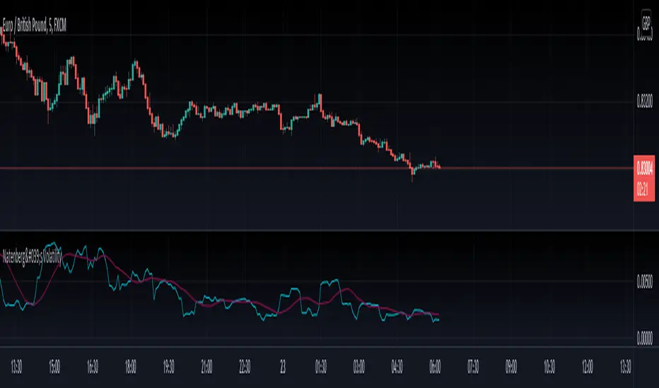
Natenberg's VolatilityThis indicator is historical volatility indicator created by Sheldon Natenberg , as the standard deviation of the logarithmic price changes measured at regular intervals of time.
In Mr. Natenberg's book, Option Volatility & Pricing, he covers volatility in detail and gives the formula for computing historical volatility.
My changes :
I didn't changed formula, i just added smooth version of volatility it can be used as trigger when cross(over/under) non-smoothed volatility.
Note:
There is two formulas for daily and weekly. Indicator showing only daily formula !
Who wants to display the weekly formula change line 17, namely remove "//"
Enjoy!
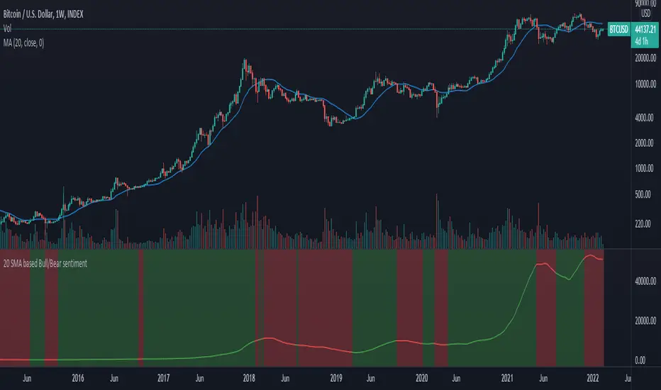
20 SMA based Bull/Bear sentiment indicatorThis script is only doing one thing, plots the 20 SMA and based on whether the asset's price is above or below of the SMA it changes the color of the SMA and the background's color.
Helping it to visualize whether from the 20 SMA's point of view we are in a Bull or a Bear trend.
I created this because I myself use this SMA with Bitcoin on the weekly time frame to identify the macro trend on the weekly.
IMO this is a good crypto market sentiment indicator.
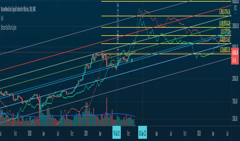
Bitcoin Bull Runs Mid Cycle Aligned This script plots 2 lines which are the 2013 and 2016 bull run. The plots are aligned on their mid cycles to the 2021 mid cycle.
Settings:
You can move the plots on the x and y axis in the settings for the Daily, Weekly and Monthly TFs.
The plot is weird on the Monthly TF, best to use the Daily and Weekly.
If it doesn't load at first you have to zoom out fully and go back to 2013 for it to load. Then it will load.
Anti-Volume Stop LossFINALLY!
As everyone who tried to create, understand, or even find the Buff Pelz Dormeier Anti-volume stop-loss indicator knows that - it's not easy. Personally, I have partially, or perhaps completely figured out, the tips Buff had given in Investing with Volume Analysis book.
AVSL now is ready.
Please do some test and give me a feedback how it works in your trade strategy.
Anti-Volume stop loss - AVSL
from Investing with Volume Analysis book CHAPTER 20 • RISKY BUSINESS 253-256:
"It is important in any risk-management process to predetermine an objective decision point level (a stop loss) to exit, thereby protecting principal in case you are wrong. My objective sell point is determined by using a quantitative formula I refer to as Anti-Volume Stop Loss (AVSL). Having a quantitative, yet intelligent sell point eliminates the emotional struggles involved in deciding when to exit a position.
AVSL is a technical methodology that incorporates the concepts of support, volatility, and, most importantly, the inverse relationship between price and volume. The AVSL combines the concepts of the VPCI (Volume Price Confirmation Indicator) and John Bollinger’s Bollinger Bands to create a trailing stop loss.
AVSL = Lower Bollinger Band – (Price, Length, Standard Deviation)
Where:
Length = Round (3 + VPCI)
Price = Average (Lows × 1 / VPC × 1 / VPR, Length)
Standard Deviation = 2 × (VPCI × VM)
One of the most difficult decisions is determining what one’s maximum loss threshold should be. Some say 2 percent; others say 20 percent. I believe the more volatile a security, the looser the stop should be. A nonvolatile security, such as Coca-Cola, might move 7 percent a year, while a volatile security such as Google might move 7 percent in a day. If you use a 7 percent stop for Coca-Cola, it might take a year to be stopped out while the security underperforms.
However, if you use 7 percent for Google, you can be stopped out intraday, not allowing the investment an opportunity to develop. By using the lower Bollinger Band of the securities lows, the AVSL considers each individual security’s own volatility. Thus, a volatile security would be granted more room of the stocks low while a stable security would have a tighter leash (see Figure 20.7).
The next important step is employing the price-volume relationship into the calculation. Volume gauges the power behind price moves. In accounting for this, when a security is in an uptrend and has positive volume characteristics, it is given more room. However, if the security exhibits contracting volume characteristics, then the stop is tightened. In this way, if a negative news event affects an unhealthy security, the stop is tighter, thus preserving more of your profits.
However, if the negative news event affects a security whose price-volume relationship is healthy, the stop has been loosened, avoiding the temporary whipsaw of an otherwise strong position. In these ways, AVSL lets the market decide when to exit your position.
AVSL tailors each security for support, volatility, and the pricevolume relationship based on an investor’s time frame as calculated from the chart data. For example, my portfolio positions are continually re-evaluated with this AVSL methodology, which yields the possibility of raising the decision point threshold periodically based on the time frame of my investment objective. With my short-term Giddy-up portfolios, I use daily chart data and seek to raise my maximum loss stop on a daily basis.
My intermediate ETF and stock positions are calculated off of weekly data and then re-evaluated weekly. With my longer term stock portfolios, the decision point is calculated off data revised monthly. This analytical approach that uses measurable facts over emotion or gut instincts allows me to maintain my objectivity. Thus objectivity, not emotion, informs my investment decisions."
How look mine AVSL:
Price component = low × 1/VPC × 1/VPR : for VPC > 1 and VPC < -1 | low × 1 × 1/VPR : for 1 > VPC > 0 | low × -1 × 1/VPR : for 0 > VPC > -1
AVSL Price = sma((low × 1/VPC × 1/VPR) , length) / 100
length = round : for VPCI > 0 | round [ absolute ] : for VPCI < 0 | 3 : for VPCI=0
Standard Deviation = mult × VPCI × VM)
AVSL = sma(Actual low price - AWSL Price + Standard Deviation, 26)
It's hard to say is it the same as in Buff Pelz Dormeier book, but I encourage you to modify the script for better results.

[co.n.g] LeathermanThis is a modest approach of assembling my most favorite strategies into a single indicator script!
I extended the functionality of the ART to the maximum in this piece of price action and volume analysis.
The original "Average Range Targets" - though by default turned off t due to heavily re-scaling the chart -
and the previous day's high and low.
What I've added:
high and low of the actual week
high and low of the previous week
open of the day
close of the previous day
VWAP of the daily session - adjustable to any length
VWAP of the weekly session
opening range / inital balance of the session -fixed to 15 Minutes
I've decluttered the chart as good as possible.
KNOWN BUGS:
Sometimes the plotting is incorrect due to rescaling or zooming in and out of the chart.
How to use - a quick price action guide:
The breakout of the open range is often indicating the trend of the day, a false breakout is often seen as a reversal sign.
A price below the VWAP is seen as cheap, a price above as expensive. In contrary to others, I personally prefer to see a rising price on a rising VWAP ;
additionally, I like bounces off or spikes and reversals through the VWAP , either the daily or the weekly.
The highs and lows of the days and weeks are seen as support and resistance . Trade preferably long above and short below those levels.
The ADR is an indication not working perfectly, especially with stocks.
!!! WARNING !!!
Don't rely solely on a single script nor a single indicator!
Always consider the price action, the trend, the overall market and especially the volume.
There is no "Get-Rich-Quick"-scheme, learn to read the chart and trade accordingly.
Enjoy and make money!
Yours,
Constantine
p.s.:
If you like to show your gratitude for my work:
CHEER!

Moving Average Over Timea simple moving average and an exponential moving average that change periods along with temporality: WEEKLY: MA48, EMA24; DAILY: MA21, EMA11; H4: MA30, EMA15; H1: MA120, EMA30.

Trend AnalyzerA simple script that plots difference between 2 moving averages and depicts convergance/divergance in color coded format.
Anything <= 0 is red and shows a bearish trend whereas > 0 is green and shows bullish trend.
Adjust the input parameters as following for your preferred time frame :
4-Hr: Exponential, 15, 30
Daily: Exponential, 10, 20
Weekly: Exponential, 5, 10
Higher Timeframe EMA @ silenThunderrThe Script is Used for Exponential Moving Average which are fixed for Daily and Weekly.
Can Be used in any Timeframe but EMA are fixed to Daily and Weekly only.
One option of Open EMA is kept which can be modified in settings.
Turn On/OFF various EMA's and enjoy the play of EMA's
Its can change colours if selected in the Settings.
OFFSET is also available.
Upslope is White and Downwards is Yellow. (I use Dark Theme hence White u can change the colour to what ever u wish )
All in settings

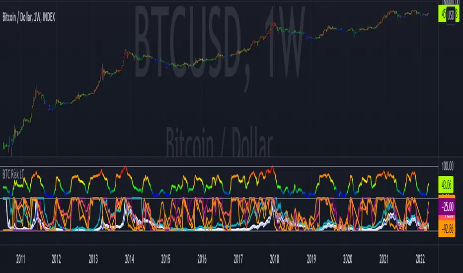
Bitcoin Risk Long Term indicatorOBJECTIVE:
The purpose of this indicator is to synthesize via an average several indicators from a wide choice with in order to simplify the reading of the bitcoin price and that on a long term vision.
Useful for those who want to see things simply, typically to make a smart DCA based on risk.
I originally used this script as a sandbox to understand and test the usefulness of several indicators, and to develop my PineScript skills, but finally the Risk Indicator output seems relevant so I decided to share it.
USAGE:
The selected indicators are the ones that I think give the best market bottoms, but the idea here is that anyone can try and use any set of indicators based on those preferences (post in comments if you find a relevant config)
Most of the indicator inputs are configurable. And some are not taken into account in the calculation of the Risk indicator because I consider them not relevant, this script is also a test more than a final version.
NOTES :
If you have any idea of adding an indicator, modification, criticism, bug found: share them, it is appreciated!
In the future I will create another more versatile Risk indicator that will not be focused on bitcoin in weekly. (this indicator is still usable on other assets and timeframe)
THANKS:
to Benjamin Cowen for inspiring me with his Bitcoin Risk metric
to Lazybear for his Wavetrend Indicator and all the scripts he shares
to Mabonyi for his Bitcoin Logarithmic Growth Curves & Zones script
to VuManChu for his VMC Cypher B Divergence
to the Trading view team for developing TV and PineScript
And to all the community for all the published codes that allowed me to progress and create this script
---- FR ----
OBJECTIF :
L'objectif de cet indicateur est de synthétiser via une moyenne plusieurs indicateurs parmi un large choix avec afin de simplifier la lecture du cours de bitcoin et cela sur une vision longue terme.
Utile pour ceux qui veulent voir les choses simplement, typiquement faire un DCA intelligent en fonction du risque.
À la base j'ai utilisé ce script comme un bac à sable pour comprendre puis tester l'utilité de plusieurs indicateurs, et développer mes compétences PineScript, mais finalement l'output Risk Indicateur me semble pertinent donc autant le partager.
UTILISATION :
Les indicateurs sélectionnés sont ceux qui permettent selon moi d'avoir les meilleurs point bas de marché, mais l'idée ici est que chacun puisse essayer et utiliser n'importe quel ensemble d'indicateur en fonction de ces préférences (poster en commentaire si vous trouvez une configuration pertinente)
La plupart des inputs indicateurs sont paramétrables. Et certains ne sont pas pris en compte dans le calcul du Risk indicateur car je les estime non pertinent, ce script est aussi un essai plus qu'une version finale.
NOTES :
Si vous avez la moindre idée d'ajout d'indicateur, modification, critique, bug trouvé : partagez-les, c'est apprécié !
à l'avenir je créerais un autre Risk indicator plus polyvalent qui ne sera pas focalisé sur bitcoin en weekly. (cet indicateur est tout de même utilisable sur d'autre actif et timeframe)
REMERCIEMENT :
à Benjamin Cowen pour m'avoir inspiré avec son Bitcoin Risk metric
à Lazybear pour son Wavetrend Indicator et globalement tout les scripts qu'il partage
à Mabonyi pour son script Bitcoin Logarithmic Growth Curves & Zones
à VuManChu pour son VMC Cypher B Divergence
à l'équipe Trading view pour avoir développé TV et PineScript
Et à toute la communauté pour tous les codes publiés qui m'ont permis de progresser et de créer ce script
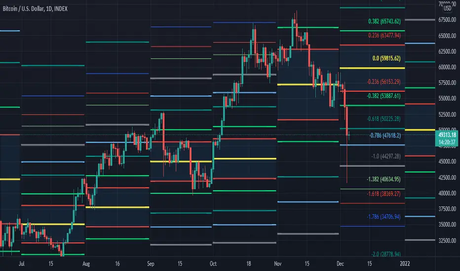
[MF] Auto Fibonacci LevelsDescription:
Automatically draw Fibonacci Pivot levels based on the previous (day's, week's or month's)
Range ( High-Low ). The HLC3 is used as the default Pivot level.
Unlike the "Auto Fibonacci Levels", this variation does not update
Levels on current day even if the price goes past the R3/S3 levels.
Timeframes: 1D, 1W, 1M
Range = (High - Low) - From previous Day, Week or month.
FIB LEVELS:
- Yellow = Pivot and Pivot Zone (HLC3 by default)
- red = R1,S1 Levels 0.236 * Range
- Green = R2,S2 Levels 0.368 * Range
- Lime = R3,S3 Levels 0.618 * Range
- Blue = R4,S4 Levels 0.786 * Range
- Gray = R5,S5 Levels 1.000 * Range
- Lime = R6,S6 Levels 1.236 * Range
- Red = R7,S7 Levels 1.382 * Range
- Blue = R8,S8 Levels 1.618 * Range
- Green = R9,S9 Levels 2.000 * Range
CLASSIC LEVELS:
- Yellow = Pivot and Pivot Zone (HLC3)
- Green = R1,S1 Levels (Pivot*2 - Low), (Pivot*2 - High)
- Lime = R2,S2 Levels ( Pivot + Range), ( Pivot - Range)
- Lime = R3,S3 Levels (High + 2*( Pivot - Low)), (Low - 2*(High - Pivot ))
- Blue = R4,S4 Levels (High + 3*( Pivot - Low)), (Low - 3*(High - Pivot ))
Refrences:
- Auto Daily Fib Levels R3.0 by JustUncleL
- Auto Fib by TheYangGuizi
- Monthly Dynamic Range Levels (Fibonaci) V0 by RicardoSantos
Modifications:
- Added next FIB Levels. (changes during the current cycle)
- Added FIB 0.236 Levels
- Added Option to change the colors of the Fib Levels
- Changed Default colors to the colors of Tradingview
- Upgraded to Version4 Pinescript
Market Sessions — FOREXSOM Editionding for chart screenshots and videos.
Cleaner Interface: Organized settings into clear groups for a smoother user experience.
Bug Fixes: Improved “Only Last…” logic for more stable plotting.
Why I Use and Recommend It:
Easily spot active trading sessions with visual clarity.
Identify key institutional price levels in real time.
Ideal for day traders, swing traders, and anyone applying Smart Money Concepts.
Fully customizable colors and styles to fit any personal workflow.

Simple Trader - LevelsThis indicator plots the below levels in the chart.
Note: This is not a buy/sell recommendation. Reach Simple Trader to understand how to trade these levels.
Current day open,
Prev. day close,
Prev. day high,
Prev. day low.
Prev. week high,
Prev. week low,
Prev. month high,
Prev. month low.

Multi Range VWAP PivotsMulti Range VWAP Pivots turned out to be one of my most accurate pivot indicators to date!
Multi Range VWAP Pivots works by recognizing the high and low of the timeframe selected (D, W, M, 6M, and 12M) and plotting range high to VWAP averages and range low to VWAP averages.
After further examination of each completed range, I came to the conclusion that due to the nature of averages, high and low respectively would need to be completed within the current range, for the averages to actually display pivots correctly. This means that if all averages appear to be "pivoting" correctly after or during a break lower of higher, then we can only assume the most recent break higher or lower could be exhaustion and price will be reverted to the mean (VWAP). OR, this could be the most accurate hindsight indicator on the planet.
*DISCLAIMER*: This indicator repaints. DO NOT backtest or set alerts with this indicator.

Privious Day and Week ValuesThis indicator is designed for price action. It divides the price range in to four zones based on last week values. Besides, it shows yesterday highest and lowest values. The price usually shows reactions to the drawn horizontal lines!
Systemic Net Liquidity (Macro Fuel for Crypto & Stocks)This indicator tracks Systemic Net Liquidity, the single most important macro factor for determining the long-term trend of risk assets like Bitcoin (BTC) and major indices (S&P 500). It measures the amount of actual cash available in the financial system to chase speculative assets, distinguishing between money that is circulating and money that is locked up at the Federal Reserve.
Mechanism (What It Measures)
The script uses direct data from the FRED (Federal Reserve Economic Data) to calculate the true state of market funding:
\text{Net Liquidity} = \text{Fed Assets (WALCL)} - \text{Treasury General Account (TGA)} - \text{Reverse Repo (RRP)}
1. Fed Assets (WALCL): The total balance sheet of the Fed (The overall supply of money).
2. Treasury General Account (TGA): Funds the US Treasury collects via bond issuance. When the TGA rises, liquidity is actively drained from the banking system (A major bearish pressure).
3. Overnight Reverse Repo (RRP): Cash parked by banks and money market funds at the Fed, effectively frozen and not contributing to market activity.
How to Interpret Signals
Treat the Net Liquidity line as the market's "Fuel Gauge":
📈 BULLISH SIGNAL (Liquidity Injection): When the Net Liquidity line is rising, money is flowing back into the system, signalling a tailwind for risk assets.
📉 BEARISH SIGNAL (Liquidity Drain): When the line is falling (often due to high TGA balances), cash is being removed. This signals major friction and pressure on price action.
⚠️ DIVERGENCE WARNING: A strong signal is generated when Price (e.g., BTC) rises, but Net Liquidity falls. This macro divergence strongly suggests a major trend reversal or correction is imminent.
Important Notes
Data Source: Data is directly sourced from FRED and updates daily/weekly. This tool is best used for macro analysis and identifying high-level cycles, not short-term scalping.
Disclaimer: Use this indicator as a confirmation tool within your broader strategy. It is not a standalone trading signal.

Smart RSI Money Flow - Core Bands V1.01SMART RSI – Money Flow Bands (Technical Overview)
1. Background: RSI and Its Behavior on Lower Timeframes
The Relative Strength Index (RSI) originally is a momentum oscillator calculated from average gains and losses over a selected period. In its standard form, RSI is derived solely from price changes; it does not incorporate volume data or order-flow information in its formula.
Because RSI is price-based, its interpretation depends strongly on the timeframe:
• On higher timeframes, each bar aggregates more trading activity, and RSI tends to behave more smoothly.
• On lower timeframes (1-hour down to intraday scalping intervals), price fluctuations are quicker, and RSI becomes more sensitive to short-term noise.
This does not imply that RSI becomes invalid, but that its signals on fast charts can be more reactive and may benefit from additional context such as volume behavior or structural information.
2. Purpose of This Indicator
This indicator extends the classical RSI by adding information that RSI does not include:
• Mapping RSI values into price-based bands instead of the 0–100 oscillator space.
• Retrieving lower timeframe volume data and separating it into buy and sell components.
• Comparing the slope (angle) of price movement with the slope of buy and sell volume.
The goal is to provide a structural interpretation of where price sits relative to RSI conditions and how volume is behaving on a lower timeframe.
3. Technical Differences Compared to Classical RSI
A) Classical RSI
• Input: price only (usually close).
• Output: normalized oscillator between 0 and 100.
• Does not incorporate intra-bar volume distribution.
• Does not separate buy/sell volume.
B) SMART RSI – Money Flow Bands
1) RSI-to-Price Mapping
Converts RSI values into upper/lower price bands using recent price extremes.
2) Lower Timeframe Volume Decomposition
Retrieves LTF data and splits each bar’s volume into buy (close>open) and sell (close

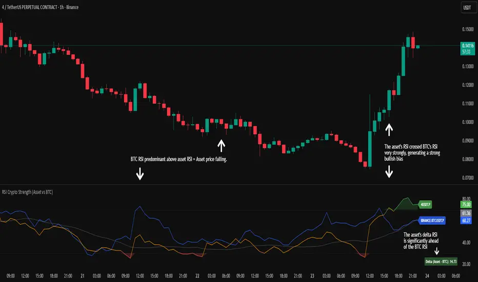
RSI Crypto Strength (Asset vs BTC)The "RSI Crypto Strength" is an advanced analysis tool built on a fundamental pillar of the cryptocurrency market: for an altcoin to achieve exponential bullish performance, it must invariably be and remain stronger than Bitcoin itself.
The primary objective of this indicator is to quantify and reinforce this thesis. It provides a clear and immediate view of the relative strength of any cryptocurrency in direct comparison with the market leader, Bitcoin. This relative strength can be identified on any timeframe. This also reinforces a scenario where a cryptocurrency that is weaker than Bitcoin is prone to sideways movements and downturns.
Key Features
This indicator combines multiple tools into a single solution:
> Dual RSI Plot: Simultaneously visualizes the RSI of the asset on the chart (dynamic) and the RSI of Bitcoin (blue line).
> Strength Delta (Asset vs. BTC): The heart of the indicator. A panel displays the exact difference (Asset RSI - Bitcoin RSI).
- Green: The asset has more RSI strength than Bitcoin.
- Red: The asset has less RSI strength than Bitcoin.
> Dynamic Coloring and Area Fill: The asset's RSI line and the background area automatically change color to highlight critical zones:
- Green (Overbought): RSI above 70.
- Red (Oversold): RSI below 30.
- Orange (Neutral): RSI between 30 and 70.
> Integrated Moving Average: A Moving Average line (gray) is plotted directly on the asset's RSI, serving as a signal line or to smooth momentum. The type (SMA, EMA, WMA, etc.) and period are fully customizable.
> Multi-Timeframe (MTF) Support: You can configure the indicator to display data from a higher timeframe (e.g., "1H") while analyzing a lower timeframe chart (e.g., "5m").
> Customizable Panel and Labels:
- A Delta Panel that can be enabled/disabled and moved to any of the four corners of the indicator.
- Labels at the end of the lines (Asset, BTC, MA) for easy identification, which can also be enabled/disabled.
> Alert-Ready: The indicator exposes the 4 main data sources for creating alerts.
How to Use
> Thesis Validation (Higher Timeframes): This is the primary use. Before looking for entries, use the indicator on timeframes like the H4, Daily, or Weekly. Confirm that the Asset (orange/green line) is consistently above Bitcoin (blue line) and that the Delta is positive. This is your structural strength validation, confirming the asset has potential for an exponential rally.
> Delta Analysis: The "Delta (Asset - BTC)" panel is your immediate strength metric. A positive and rising value indicates the asset is outperforming Bitcoin. A negative and falling value indicates relative weakness.
> Line Crossovers (Timing): On lower timeframes, watch for crossovers between the Asset line and the Bitcoin line. A cross of the Asset line above the Bitcoin line is a clear sign that the asset's momentum is gaining strength.
> Signal Confluence: Look for high-probability scenarios. For example: The Asset's RSI crosses above the Bitcoin RSI while the Delta also crosses above 0.
> Market Extremes: Use the area fill to quickly identify when the asset reaches extreme overbought (>70) or oversold (<30) levels, regardless of what Bitcoin is doing.
Alerts
This indicator is fully prepared for alert creation. When setting up an alert in TradingView, you can select the following data sources from this indicator:
> RSI Asset: Alerts on the RSI value of the asset on the chart.
> RSI Bitcoin: Alerts on the RSI value of Bitcoin.
> Moving Average: Alerts on the value of the Moving Average.
> RSI Delta: Allows creating alerts based on the difference between the two. (e.g., "Alert if RSI Delta crosses above Value 0").
Settings (Inputs)
The indicator offers full customization:
> RSI Length: The calculation period for both RSIs (default 14).
> Indicator Timeframe: Enables Multi-Timeframe functionality.
> Bitcoin Ticker: Allows changing the Bitcoin reference ticker.
> MA Settings: Choose the MA Type (SMA, EMA, WMA, VWMA, etc.) and its period.
> Panels and Labels: Toggles to enable/disable the Delta Panel and Line Labels, plus a selector for the panel's location.
> Colors: All line and highlight colors are fully customizable in the settings.
DISCLAIMER: This script is an analysis tool and does not provide financial advice. All trades carry risk. Use this tool as part of a broader trading strategy and always practice good risk management.
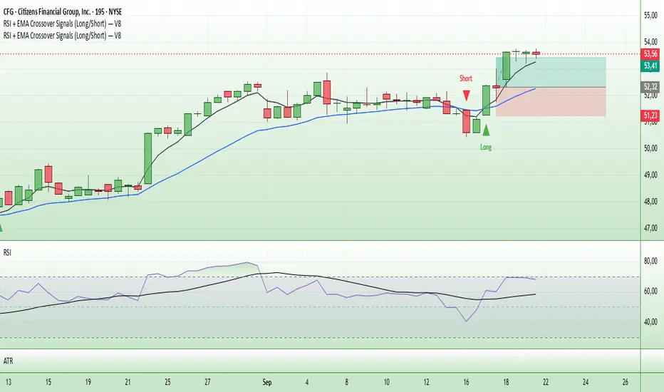
Entry Signals (Long/Short)The indicator visualizes precise entry signals for long and short setups directly on the price chart. Long is marked with a green triangle-up, short with a red triangle-down. To contextualize trend structure, the Fast EMA (5) is plotted in black and the Slow EMA (20) in blue (line width 1). Signals print only at bar close for reproducible execution. Applicable across all timeframes—ideal for top-down analysis from the 195-minute chart through daily to weekly.
Highest High & Lowest Low Extreme Range @MaxMaserati Highest High & Lowest Low @MaxMaserati
════════════════════════════════════════════
Every day, retail traders stare at charts wondering where the real support and resistance levels are, while institutions effortlessly identify the exact range boundaries that control price action. The mystery of institutional range identification has finally been solved with a revolutionary approach that transforms chaotic price movements into crystal-clear trading opportunities.
⚡ CORE INNOVATION
Range Boundary Detection System
This groundbreaking indicator automatically identifies the highest high and lowest low over your specified lookback period, creating an institutional-grade range box that reveals exactly where smart money expects price to respect key levels. No more guessing where the real boundaries are.
Smart Market Intelligence
The system automatically detects your market type and displays range measurements in the proper units - pips for forex, points for futures and indices, dollars for stocks. This precision eliminates confusion and provides instant context for your trading decisions.
Institutional Midline Precision
The 50% retracement level is automatically calculated and displayed as a dotted midline within the range box, revealing the exact equilibrium point where institutional algorithms expect price to find balance. This is where the smart money often makes their move.
Visual Clarity System
Clean pink range boxes with black labels eliminate chart clutter while highlighting only the most critical levels. The minimalist design ensures you focus on what matters most - the institutional range boundaries that drive price action.
Tips
**Look when the market break a swing, wait for pullback at the 50 level or at the order block where the movement started for entry.
**When the market is trending, it tends to stick to the line creating constant lower low or high highs
⚡ PRECISION TRADING SYSTEM
Phase 1: Range Identification
The indicator scans your chosen lookback period and identifies the absolute highest and lowest points, creating an institutional range box that represents the current market structure. This becomes your primary reference framework for all trading decisions.
Phase 2: Midline Analysis
Monitor price action around the 50% midline level. Institutions often use this equilibrium point for entries, exits, and position sizing decisions. When price approaches this level, heightened attention is required.
Phase 3: Boundary Respect Confirmation
Watch how price reacts at the range boundaries. Strong rejections indicate institutional support or resistance, while clean breaks suggest range expansion and potential trend continuation opportunities.
Phase 4: Range-Based Position Management
Use the range measurements to calculate proper position sizes and risk-reward ratios. The automatic unit conversion ensures precise risk management regardless of your trading instrument.
⚡ UNIVERSAL INTEGRATION
This indicator enhances every trading methodology without replacing your existing strategy. ICT traders use it to identify premium and discount ranges. SMC analysts leverage it for market structure confirmation. Supply and demand traders utilize it for zone validation. Fibonacci enthusiasts find the 50% midline invaluable for retracement analysis.
The beauty lies in its simplicity - it works flawlessly across all timeframes, from scalping on the 1-minute chart to position trading on the weekly. Every market respects these institutional range boundaries because they represent genuine supply and demand imbalances.
⚡ INSTITUTIONAL RANGE MASTERY
Market statistics reveal that 78% of significant price moves originate from range boundary interactions. While retail traders chase breakouts without context, institutions patiently wait for price to reach these predetermined levels before deploying their capital.
Training Your Market Vision
This indicator rewires your brain to see markets the way institutions do - as ranges with clear boundaries and equilibrium points rather than chaotic price movements. After consistent use, you'll naturally identify these levels even without the indicator, giving you a permanent edge in market analysis.
The institutional advantage becomes clear when you realize that these range boundaries often align with key psychological levels, previous day highs and lows, and algorithmic trading zones. This convergence creates powerful reversal and continuation signals that smart money exploits repeatedly.
Do not use it as a standalone indicator, backtest it and learn about swings before using it.
Compatible with: Forex | Stocks | Crypto | Futures | Indices
No Repainting | Real-Time Alerts | Multi-Timeframe Analysis

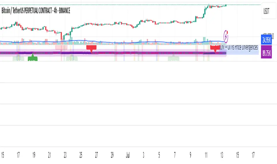
OI Analysis (Smoothed + Pivots + OI Divergence)Description
OI Pivot & Divergence Explorer is a multi-tool indicator for TradingView that blends Open Interest (OI) analysis with price action pivots and OI–price divergences. It helps you:
Visualize OI Trends: A thick, semi-transparent “glow” line shows smoothed OI changes, with a crisp center line for exact values.
Shade Momentum Scenarios: Background highlights flip between four market states—High Conviction, Squeeze, Bear Pressure, Liquidation—based on the confluence of price direction and OI spikes.
Detect Pivot Levels: Internally computes classic pivots on the OI series to mark potential turning points.
Spot OI-Price Divergences: Draws both regular and hidden bullish/bearish divergences between price pivots and corresponding OI pivots, connecting them with colored lines and labeling high-probability reversal setups.
Custom Alerts: Triggers alert conditions for each divergence type, so you can get notified of potentially actionable setups in real time.
Logic & Features
Inputs
Pivot Lookback (default 5): Number of bars on each side to qualify a pivot in both price and OI.
OI Change Smoothing (default 3) & OI Average Length (default 20): Control smoothing of raw OI delta and define the average band for threshold comparisons.
OI Change Threshold (%) (default 0.2%): Minimum relative OI change required to flag a “big” move.
Show OI Divergences (toggle on/off): Enable or disable drawing divergence lines and labels.
Scenario Shading
Computes raw OI delta → smoothed OI delta → compares against average OI.
Combines with price direction (up/down) to classify four states:
↑Price + ↑OI → High Conviction (green)
↑Price + ↓OI → Squeeze (orange)
↓Price + ↑OI → Bear Pressure (red)
↓Price + ↓OI → Liquidation (blue)
Shades the chart background only when the state flips.
Pivot Markers
Finds pivots on the OI series using the same lookback as price pivots.
(Pivot labels are removed from the visible pane; pivots now serve divergence logic.)
OI-Price Divergences
Regular Bullish: Price makes a lower low while OI makes a higher low.
Hidden Bullish: Price makes a higher low while OI makes a lower low.
Regular Bearish: Price makes a higher high while OI makes a lower high.
Hidden Bearish: Price makes a lower high while OI makes a higher high.
Connects each pivot pair with a thin line:
Regular uses dark navy
Hidden uses a lighter blue
Labels each divergence (“Bull Div,” “H Bull Div,” etc.) above or below the OI line for clarity.
How to Use
Add to Chart:
Open Pine Editor → paste the script → Save → “Add to Chart.”
Configure Inputs:
Adjust Pivot Lookback to match your timeframe: shorter (3–5) for intraday, longer (8–12) for daily/weekly.
Tweak OI Change Threshold to filter out noise or capture more subtle OI shifts.
Interpretation:
Background Color: Quick read on whether OI is reinforcing or diverging from price.
Divergence Lines: Look for regular divergences as early reversal signals; hidden divergences often indicate trend continuation or strong pullback entry points.
Alerts: Set up custom alerts on “Regular Bullish OI Divergence,” etc., to get popup/messages/notifications.
Best Practices:
Combine with your favorite price-based indicators (e.g. RSI, VWAP) for confluence.
Validate divergence signals against higher-timeframe pivots to avoid false breakouts.
Use in trending markets for continuation trades (hidden divergences) and in range markets for reversal setups (regular divergences).
Uptrick: Universal Z-Score ValuationOverview
The Uptrick: Universal Z-Score Valuation is a tool designed to help traders spot when the market might be overreacting—whether that’s on the upside or the downside. It does this by combining the Z-scores of multiple key indicators into a single average, letting you see how far the current market conditions have stretched away from “normal.” This average is shown as a smooth line, supported by color-coded visuals, signal markers, optional background highlights, and a live breakdown table that shows the contribution of each indicator in real time. The focus here is on spotting potential reversals, not following trends. The indicator works well across all timeframes and asset classes, from fast intraday charts like the 1-minute and 5-minute, to higher timeframes such as the 4-hour, daily, or even weekly. Its universal design makes it suitable for any market — whether you're trading crypto, stocks, forex, or commodities.
Introduction
To understand what this indicator does, let’s start with the idea of a Z-score. In simple terms, a Z-score tells you how far a number is from the average of its recent history, measured in standard deviations. If the price of an asset is two standard deviations above its mean, that means it’s statistically “rare” or extended. That doesn’t guarantee a reversal—but it suggests the move is unusual enough to pay attention.
This concept isn’t new, but what this indicator does differently is apply the Z-score to a wide set of market signals—not just price. It looks at momentum, volatility, volume, risk-adjusted performance, and even institutional price baselines. Each of those indicators is normalized using Z-scores, and then they’re combined into one average. This gives you a single, easy-to-read line that summarizes whether the entire market is behaving abnormally. Instead of reacting to one indicator, you’re reacting to a statistically balanced blend.
Purpose
The goal of this script is to catch turning points—places where the market may be topping out or bottoming after becoming overstretched. It’s built for traders who want to fade sharp moves rather than follow trends. Think of moments when price explodes upward and starts pulling away from every moving average, volume spikes, volatility rises, and RSI shoots up. This tool is meant to spot those situations—not just when price is stretched, but when multiple different indicators agree that something is overdone.
Originality and Uniqueness
Most indicators that use Z-scores only apply them to one thing—price, RSI, or maybe Bollinger Bands. This one is different because it treats each indicator as a contributor to the full picture. You decide which ones to include, and the script averages them out. This makes the tool flexible but also deeply informative.
It doesn’t rely on complex or hidden math. It uses basic Z-score formulas, applies them to well-known indicators, and shows you the result. What makes it unique is the way it brings those signals together—statistically, visually, and interactively—so you can see what’s happening in the moment with full transparency. It’s not trying to be flashy or predictive. It’s just showing you when things have gone too far, too fast.
Inputs and Parameters
This indicator includes a wide range of configurable inputs, allowing users to customize which components are included in the Z-score average, how each indicator is calculated, and how results are displayed visually. Below is a detailed explanation of each input:
General Settings
Z-Score Lookback (default: 100): Number of bars used to calculate the mean and standard deviation for Z-score normalization. Larger values smooth the Z-scores; smaller values make them more reactive.
Bar Color Mode (default: None): Determines how bars are visually colored. Options include: None: No candle coloring applied. - Heat: Smooth gradient based on the Z-score value. - Latest Signal: Applies a solid color based on the most recent buy or sell signal
Boolean - General
Plot Universal Valuation Line (default: true): If enabled, plots the average Z-score (zAvg) line in the separate pane.
Show Signals (default: true): Displays labels ("𝓤𝓹" for buy, "𝓓𝓸𝔀𝓷" for sell) when zAvg crosses above or below user-defined thresholds.
Show Z-Score Table (default: true): Displays a live table listing each enabled indicator's Z-score and the current average.
Select Indicators
These toggles enable or disable each indicator from contributing to the Z-score average:
Use VWAP Z-Score (default: true)
Use Sortino Z-Score (default: true)
Use ROC Z-Score (default: true)
Use Price Z-Score (default: true)
Use MACD Histogram Z-Score (default: false)
Use Bollinger %B Z-Score (default: false)
Use Stochastic K Z-Score (default: false)
Use Volume Z-Score (default: false)
Use ATR Z-Score (default: false)
Use RSI Z-Score (default: false)
Use Omega Z-Score (default: true)
Use Sharpe Z-Score (default: true)
Only enabled indicators are included in the average. This modular design allows traders to tailor the signal mix to their preferences.
Indicator Lengths
These inputs control how each individual indicator is calculated:
MACD Fast Length (default: 12)
MACD Slow Length (default: 26)
MACD Signal Length (default: 9)
Bollinger Basis Length (default: 20): Used to compute the Bollinger %B.
Bollinger Deviation Multiplier (default: 2.0): Standard deviation multiplier for the Bollinger Band calculation.
Stochastic Length (default: 14)
ATR Length (default: 14)
RSI Length (default: 14)
ROC Length (default: 10)
Zones
These thresholds define key signal levels for the Z-score average:
Neutral Line Level (default: 0): Baseline for the average Z-score.
Bullish Zone Level (default: -1): Optional intermediate zone suggesting early bullish conditions.
Bearish Zone Level (default: 1): Optional intermediate zone suggesting early bearish conditions.
Z = +2 Line Level (default: 2): Primary threshold for bearish signals.
Z = +3 Line Level (default: 3): Extreme bearish warning level.
Z = -2 Line Level (default: -2): Primary threshold for bullish signals.
Z = -3 Line Level (default: -3): Extreme bullish warning level.
These zone levels are used to generate signals, fill background shading, and draw horizontal lines for visual reference.
Why These Indicators Were Merged
Each indicator in this script was chosen for a specific reason. They all measure something different but complementary.
The VWAP Z-score helps you see when price has moved far from the volume-weighted average, often used by institutions.
Sortino Ratio Z-score focuses only on downside risk, which is often more relevant to traders than overall volatility.
ROC Z-score shows how fast price is changing—strong momentum may burn out quickly.
Price Z-score is the raw measure of how far current price has moved from its mean.
RSI Z-score shows whether momentum itself is stretched.
MACD Histogram Z-score captures shifts in trend strength and acceleration.
%B (Bollinger) Z-score indicates how close price is to the upper or lower volatility envelope.
Stochastic K Z-score gives a sense of how high or low price is relative to its recent range.
Volume Z-score shows when trading activity is unusually high or low.
ATR Z-score gives a read on volatility, showing if price movement is expanding or contracting.
Sharpe Z-score measures reward-to-risk performance, useful for evaluating trend quality.
Omega Z-score looks at the ratio of good returns to bad ones, offering a more nuanced view of efficiency.
By normalizing each of these using Z-scores and averaging only the ones you turn on, the script creates a flexible, balanced view of the market’s statistical stretch.
Calculations
The core formula is the standard Z-score:
Z = (current value - average) / standard deviation
Every indicator uses this formula after it’s calculated using your chosen settings. For example, RSI is first calculated as usual, then its Z-score is calculated over your selected lookback period. The script does this for every indicator you enable. Then it averages those Z-scores together to create a single value: zAvg. That value is plotted and used to generate visual cues, signals, table values, background color changes, and candle coloring.
Sequence
Each selected indicator is calculated using your custom input lengths.
The Z-score of each indicator is computed using the shared lookback period.
All active Z-scores are added up and averaged.
The resulting zAvg value is plotted as a line.
Signal conditions check if zAvg crosses user-defined thresholds (default: ±2).
If enabled, the script plots buy/sell signal labels at those crossover points.
The candle color is updated using your selected mode (heatmap or signal-based).
If extreme Z-scores are reached, background highlighting is applied.
A live table updates with each individual Z-score so you know what’s driving the signal.
Features
This script isn’t just about stats—it’s about making them usable in real time. Every feature has a clear reason to exist, and they’re all there to give you a better read on market conditions.
1. Universal Z-Score Line
This is your primary reference. It reflects the average Z-score across all selected indicators. The line updates live and is color-coded to show how far it is from neutral. The further it gets from 0, the brighter the color becomes—cyan for deeply oversold conditions, magenta for overbought. This gives you instant feedback on how statistically “hot” or “cold” the market is, without needing to read any numbers.
2. Signal Labels (“𝓤𝓹” and “𝓓𝓸𝔀𝓷”)
When the average Z-score drops below your lower bound, you’ll see a "𝓤𝓹" label below the bar, suggesting potential bullish reversal conditions. When it rises above the upper bound, a "𝓓𝓸𝔀𝓷" label is shown above the bar—indicating possible bearish exhaustion. These labels are visually clear and minimal so they don’t clutter your chart. They're based on clear crossover logic and do not repaint.
3. Real-Time Z-Score Table
The table shows each indicator's individual Z-score and the final average. It updates every bar, giving you a transparent breakdown of what’s happening under the hood. If the market is showing an extreme average score, this table helps you pinpoint which indicators are contributing the most—so you’re not just guessing where the pressure is coming from.
4. Bar Coloring Modes
You can choose from three modes:
None: Keeps your candles clean and untouched.
Heat: Applies a smooth gradient color based on Z-score intensity. As conditions become more extreme, candle color transitions from neutral to either cyan (bullish pressure) or magenta (bearish pressure).
Latest Signal: Applies hard coloring based on the most recent signal—greenish for a buy, purple for a sell. This mode is great for tracking market state at a glance without relying on a gradient.
Every part of the candle is colored—body, wick, and border—for full visibility.
5. Background Highlighting
When zAvg enters an extreme zone (typically above +2 or below -2), the background shifts color to reflect the market’s intensity. These changes aren’t overwhelming—they’re light fills that act as ambient warnings, helping you stay aware of when price might be reaching a tipping point.
6. Customizable Zone Lines and Fills
You can define what counts as neutral, overbought, and oversold using manual inputs. Horizontal lines show your thresholds, and shaded regions highlight the most extreme zones (+2 to +3 and -2 to -3). These lines give you visual structure to understand where price currently stands in relation to your personal reversal model.
7. Modular Indicator Control
You don’t have to use all the indicators. You can enable or disable any of the 12 with a simple checkbox. This means you can build your own “blend” of market context—maybe you only care about RSI, price, and volume. Or maybe you want everything on. The script adapts accordingly, only averaging what you select.
8. Fully Customizable Sensitivity and Lengths
You can adjust the Z-score lookback length globally (default 100), and tweak individual indicator lengths separately. This lets you tune the indicator’s responsiveness to suit your trading style—slower for longer swings, faster for scalping.
9. Clean Integration with Any Chart Layout
All visual elements are designed to be informative without taking over your chart. The coloring is soft but clear, the labels are readable without being huge, and you can turn off any feature you don’t need. The indicator can work as a full dashboard or as a simple line with a couple of alerts—it’s up to you.
10. Precise, Real-Time Signal Logic
The crossover logic for signals is exact and only fires when the Z-score moves across your defined boundary. No estimation, no delay. Everything is calculated based on current and previous bar data, and nothing repaints or back-adjusts.
Conclusion
The Universal Z-Score Valuation indicator is a tool for traders who want a clear, unbiased way to detect overextension. Instead of relying on a single signal, you get a composite of several market perspectives—momentum, volatility, volume, and more—all standardized into a single view. The script gives you the freedom to control the logic, the visuals, and the components. Whether you use it as a confirmation tool or a primary signal source, it’s designed to give you clarity when markets become chaotic.
Disclaimer
This indicator is for research and educational use only. It does not constitute financial advice or guarantees of performance. All trading involves risk, and users should test any strategy thoroughly before applying it to live markets. Use this tool at your own discretion.
