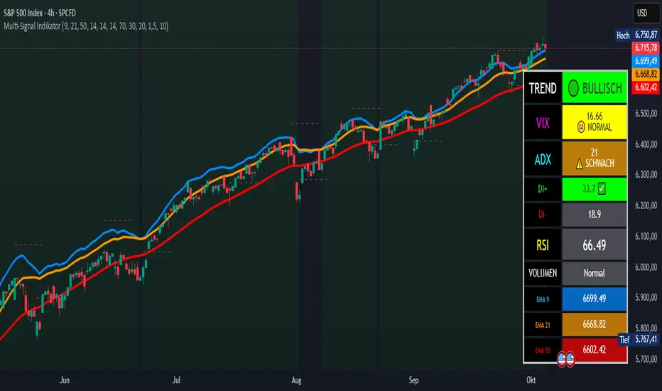
Multi-Signal IndikatorHier ist eine professionelle Beschreibung für deinen Indikator auf Englisch:
Multi-Signal Trading Indicator - Complete Market Analysis
This comprehensive trading indicator combines multiple technical analysis tools into one powerful dashboard, providing traders with all essential market information at a glance.
Key Features:
Trend Analysis: Three EMAs (9, 21, 50) with automatic trend detection and Golden/Death Cross signals
Momentum Indicators: RSI with overbought/oversold zones and visual alerts
Trend Strength: ADX indicator with DI+ and DI- showing the power of bullish and bearish movements
Market Fear Gauge: VIX (Volatility Index) integration displaying market sentiment from calm to panic levels
Volume Confirmation: Smart volume analysis comparing current activity against 20-period average
Support & Resistance: Automatic pivot point detection with dynamic S/R lines
Buy/Sell Signals: Combined signals only trigger when trend, RSI, and volume align perfectly
Visual Dashboard: Color-coded info panel showing all metrics in real-time with intuitive emoji indicators
Perfect for: Day traders, swing traders, and investors who want a complete market overview without cluttering their charts with multiple indicators.
Customizable settings allow you to adjust all parameters to match your trading style.
In den Scripts nach "technical" suchen
GEX Options Flow Pro 100% free
INTRODUCTION
This script is designed to visualize advanced options-derived metrics and levels on TradingView charts, including Gamma Exposure (GEX) walls, gamma flip points, vanna levels, delta-neutral prices (DEX), max pain, implied moves, and more. It overlays dynamic lines, labels, boxes, and an info table to highlight potential support, resistance, volatility regimes, and flow dynamics based on options data.
These visualizations aim to help users understand how options market structure might influence price action, such as areas of potential stability (positive GEX) or volatility (negative GEX). All data is user-provided via pasted strings, as Pine Script cannot fetch external options data directly due to platform limitations (detailed below).
The script is open-source under TradingView's terms, allowing study, modification, and improvement. It draws inspiration from standard options Greeks and exposure metrics (e.g., gamma, vanna, charm) discussed in financial literature like Black-Scholes models and dealer positioning analyses. No external code is copied; all logic is original or based on mathematical formulas.
Disclaimer: This is an educational tool only. It does not provide investment advice, trading signals, or guarantees of performance. Past data is not indicative of future results. Use at your own risk, and combine with your own analysis. Not intended for qualified investors only.
How the Options Levels Are Calculated
Levels are not computed in Pine Script—they rely on pre-calculated values from external tools (e.g., Python scripts using libraries like yfinance for options chains). Here's how they're typically derived externally before pasting into the script:
Fetching Options Data: Retrieve options chain for a ticker: strikes, open interest (OI), volume, implied volatility (IV), expirations (e.g., shortest: 0-7 DTE, short: 7-14 DTE, medium: ~30 DTE, long: ~90 DTE). Get current price and 5-day history for context.
Gamma Walls (Put/Call Walls): Compute gamma for each option using Black-Scholes: gamma = N'(d1) / (S * σ * √T) where S = spot price, K = strike, T = time to expiration (years), σ = IV, N'(d1) = normal PDF. Aggregate GEX at strikes: GEX = sign * gamma * OI * 100 * S^2 * 0.01 (per 1% move, with sign based on dealer positioning: typically short calls/puts = negative GEX). Put Wall: Highest absolute GEX put strike below S (support via dealer buying on dips). Call Wall: Highest absolute GEX call strike above S (resistance via dealer selling on rallies). Secondary/Tertiary: Next highest levels. Historical walls track tier-1 levels over 5 days.
Gamma Flip: Net GEX profile across prices: Sum GEX for all options at hypothetical spots. Flip point: Interpolated price where net GEX changes sign (stable above, volatile below).
Vanna Levels: Vanna = -N'(d1) * d2 / σ. Weighted by OI; highest positive/negative strikes.
DEX (Delta-Neutral Price): Net dealer delta: Sum (delta * OI * 100 * sign), with delta from Black-Scholes. DEX: Price where net delta = 0 (interpolated).
Max Pain: Strike minimizing total intrinsic value for all options holders.
Skew: 25-delta skew: IV difference between 25-delta put and call (interpolated).
Net GEX/Delta: Total signed GEX/delta at current S.
Implied Move: ATM IV * √(DTE/365) for 1σ range.
C/P Ratio: (Call OI + volume) / (Put OI + volume).
Smart Stop Loss: Below lowest support (e.g., Put Wall, gamma flip), buffered by IV * √(DTE/30).
Other Metrics: IV: ATM average. 5-day metrics: Avg volume, high/low.
External tools handle dealer assumptions (e.g., short calls/puts) and scaling (per % move).
Effect as Support and Resistance in Technical Trading
Options levels reflect dealer hedging dynamics:
Put Wall (Gamma Support): High put GEX creates buying pressure on dips (dealers hedge short puts by buying stock). Use for long entries, bounces, or stops below.
Call Wall (Gamma Resistance): High call GEX leads to selling on rallies. Good for trims, shorts, or reversals.
Gamma Flip: Pivot for volatility—above: dampened moves (positive GEX, mean reversion); below: amplified trends (negative GEX, momentum).
Vanna Levels: Sensitivity to IV changes; crosses may signal vol shifts.
DEX: Dealer delta neutral—bullish if price below with positive delta.
Max Pain: Price magnet minimizing option payouts.
Implied Move/Confidence Bands: Expected ranges (1σ/2σ/3σ); breakouts suggest extremes.
Liquidity Zones: Wall ranges as price magnets.
Smart Stop Loss: Protective level below supports, IV-adjusted.
C/P Ratio & Skew: Sentiment (high C/P = bullish; high skew = put demand).
Net GEX: Positive = low vol strategies (e.g., condors); negative = momentum trades.
Combine with TA (e.g., volume, trends). High activity strengthens effects; alerts on crosses/proximities for awareness.
Limitations of the TradingView Platform for Data Pulling
Pine Script is sandboxed:
No API calls or internet access (can't fetch options data directly).
Limited to chart/symbol data; no real-time chains.
Inputs static per load; manual updates needed.
Caching not persistent across sessions.
This ensures lightweight scripts but requires external data sourcing.
Creative Solution for On-Demand Data Pulling
Users can use external tools (e.g., Python scripts with yfinance) to fetch/compute data on demand. Generate a formatted string (ticker,timestamp|term1_data|term2_data|...), paste into inputs. Tools can process multiple tickers, cache for ~15-30 min, and output strings for quick portfolio scanning. Run locally or via custom setups for near-real-time updates without platform violations.
For convenience, a free bot is available on my website that accepts commands like !gex to generate both current data strings (for all expiration terms) and historical walls data on demand. This allows users to easily obtain fresh or cached data (refreshed every ~30 min) for pasting into the indicator—ideal for scanning portfolios without manual coding.
Script Functionality Breakdown
Inputs: Data strings (current/historical); term selector (Shortest/Short/Medium/Long); toggles (historical walls, GEX profile, secondaries, vanna, table, max pain, DEX, stop loss, implied move, liquidity, bands); colors/styles.
Parsing: Extracts term-specific data; validates ticker match; gets timestamp for freshness.
Drawing: Dynamic lines/labels (width/color by GEX strength); boxes (moves, zones, bands); clears on updates.
Info Table: Dashboard with status (freshness emoji), Greeks (GEX/delta with emojis), vol (IV/skew), levels (distances), flow (C/P, vol vs 5D).
Historical Walls: Displays past tier-1 walls on daily+ timeframes.
Alerts: 20+ conditions (e.g., near/cross walls, GEX sign change, high IV).
Performance: Efficient for real-time; smart label positioning.
Release Notes
Initial release: Full features including multi-term support, enhanced table with emojis/sentiment, dynamic visuals, smart stop loss.
Data String Format: TICKER,TIMESTAMP|TERM1_DATA|TERM2_DATA|TERM3_DATA|TERM4_DATA Where each TERM_DATA = val0,val1,...,val30 (31 floats: current_price, prev_close, call_wall_1, call_wall_1_gex, ..., low_5d). Historical: TICKER|TERM1_HIST|... where TERM_HIST = date:cw,pw;date:cw,pw;...
Feedback welcome in comments. Educational only—not advice.

Volume-Confirmed Reversal Engine [AlgoPoint]Volume-Confirmed Reversal Engine v2.0
Overview
A price pattern alone is not enough to signal a high-probability reversal. True market turning points—moments of capitulation or euphoria—are almost always confirmed by a significant spike in volume.
The Volume-Confirmed Reversal Engine is designed to identify these exact moments. It filters out low-conviction price movements and focuses only on reversal patterns that are backed by meaningful volume activity.
How It Works
The indicator's logic is based on a sequential confirmation process:
- High-Volume Anchor Candle: The engine first scans for an "Anchor Candle"—a candle that makes a new high or low over a user-defined look_back period. Critically, this candle's volume must also be significantly higher than the recent average. Low-volume breakouts are ignored.
- Setup Activation & Visualization: When a valid Anchor Candle is detected, the indicator enters a "setup" phase. It visually marks this on your chart by drawing a Setup Box around the high and low of the Anchor Candle, extending it forward for the duration of the confirm_in window.
- Confirmation & Signal: A final signal is only triggered if the price breaks out of the opposite side of the Setup Box within the confirmation window. This action, combined with the initial volume spike, confirms the reversal.
- Setup Box Visualization: See exactly which candle the indicator is watching and the key price levels (the box boundaries) that need to be broken for a signal.
Signal Strength Score (1-4): Every signal now comes with a score, providing insight into its quality based on four factors:
- The base price pattern is met.
- The initial Anchor Candle had high volume.
- The final Confirmation Candle also had high volume.
- The signal is aligned with the long-term macro trend (e.g., a BUY signal above the 200 EMA).
Status Dashboard: A simple panel on your chart tells you what the indicator is doing in real-time ("Scanning for Setups," "Watching Bullish Setup," etc.) and displays a countdown for how many bars are left for a confirmation.
How to Interpret & Use
- The Box: When a colored box appears, it's an early warning that a reversal setup is active. Watch the boundaries of the box for a potential breakout.
- The Score: Use the score to gauge the quality of a signal. A 3/4 or 4/4 score represents a very high-conviction setup where multiple technical factors are aligned.
- The Dashboard: Use the panel to understand the indicator's current state and the time-sensitivity of an active setup.
- The BUY/SELL Labels: These are the final, actionable triggers, appearing only after the full price and volume confirmation process is complete.

Katana_Fox RSI Pro - Advanced Momentum Indicator with Clear BUOverview:
Connors RSI Pro is a sophisticated enhancement of the classic Connors RSI indicator, designed for traders who demand professional-grade tools. This premium version combines multiple momentum components with intelligent signaling and beautiful visualization to give you an edge in the markets.
Key Features:
🎯 Clear BUY/SELL Signal System
BUY signals in green when CRSI crosses above oversold level
SELL signals in red when CRSI crosses below overbought level
Clean, professional labels that are easy to read
Customizable overbought/oversold levels (70/30 default)
🎨 Professional Visualization
Modern color scheme that adapts to market conditions
Customizable background fills for better readability
Smooth, easy-to-read line plotting
⚡ Enhanced Calculations
Triple-component momentum analysis (RSI, UpDown RSI, Percent Rank)
EMA smoothing for reduced noise and false signals
Configurable lengths for each component
🔔 Advanced Alert System
4 distinct alert conditions for various market scenarios
Compatible with TradingView's native alert system
Perfect for automated trading strategies
Input Parameters:
RSI Length (3): Period for standard RSI calculation
UpDown Length (2): Period for UpDown RSI component
ROC Length (100): Period for Rate of Change percentile ranking
Signal Alerts: Toggle BUY/SELL signals on/off
Custom Colors: Choose between classic and modern color schemes
Trading Signals:
BUY (Green Label): Bullish signal when CRSI crosses above oversold level
SELL (Red Label): Bearish signal when CRSI crosses below overbought level
Background Colors: Visual zones indicating momentum strength
Ideal For:
Swing traders seeking momentum reversals
Day traders looking for overbought/oversold conditions
Algorithmic traders needing reliable signals
Technical analysts wanting multi-timeframe confirmation
How to Use:
Oversold Bounce: Enter long when CRSI shows BUY signal above 30
Overbought Rejection: Enter short when CRSI shows SELL signal below 70
Trend Confirmation: Use the 50-level crossover for trend direction
Divergence Trading: Look for price/indicator divergences at extremes
Upgrade your trading arsenal with Connors RSI Pro - where professional analytics meet clear trading signals!

BTC Momentum Strategy Ver2.0 by @AshokTrendThe BTC Momentum Strategy with LazyBear SQZMOM & Custom SL + Angle Filter is a technical trading strategy that blends multiple proven concepts to capture favorable momentum trades in Bitcoin or other assets.
### Core Components
- **LazyBear Squeeze Momentum Indicator (SQZMOM):** This indicator identifies low volatility "squeeze" periods when Bollinger Bands contract inside Keltner Channels, signaling potential explosive moves once the squeeze releases. The strategy uses momentum derived from linear regression on price to judge trade direction—positive momentum favors longs, negative momentum favors shorts.
- **EMA 200 Trend Filter:** The 200-period Exponential Moving Average defines the prevailing trend. Trades are taken long only if price is above the EMA and short if below, reducing risk of countertrend entries.
- **Price Movement Angle Filter:** The strategy calculates the angle of recent price movement over a lookback period. Entries require a price angle greater than 27 degrees for longs and less than -27 degrees for shorts, confirming strong directional momentum and filtering out weak moves.
- **Stop Loss Management:** A custom stop loss in fixed points distance from the entry price manages risk, protecting capital if the market moves against the trade.
- **Trading Time Window:** The strategy trades only during Indian market hours (4:00 AM to 11:00 PM IST), filtering trades to relevant active market sessions.
- **Swing Levels:** Recent swing highs and lows are used as additional confirmation levels for entries and exits, helping to time trade triggers more precisely.
### How Trades Are Executed
- **Long Entry:** When trading hours are active, SQZMOM indicates bullish momentum (momentum histogram positive and squeeze released), price is in an uptrend (above EMA 200), the current close is above recent swing highs, and the price movement angle exceeds 27 degrees, the strategy enters a long position.
- **Short Entry:** When trading hours are active, SQZMOM shows bearish momentum (momentum histogram negative and squeeze released), price is in a downtrend (below EMA 200), the current close is below recent swing lows, and the price movement angle is less than -27 degrees, the strategy enters a short position.
- **Exits:** Positions are closed either when price breaches opposite swing levels, momentum conditions reverse, or trading hours end. Stop losses are also triggered if price moves unfavorably by the defined points.
### Strategy Benefits
- Detects volatility contractions and momentum expansions for potentially strong directional moves.
- Reduces false entries with the EMA trend and angle momentum filters.
- Manages risk actively with stop losses and time-based filters.
- Combines multiple technical tools — momentum, trend, volatility, price structure — for a holistic approach.
This strategy tends to work best on active higher timeframes where trends and momentum have clarity and is designed for disciplined, momentum-focused trading with robust trade management.
Concepts used-
SMC
TRednline Breaout,
Timefram-15M or Higher For better Result.
Note-We are not SEBI-Registered, Graphs, charts, and tables are provided for illustrative purposes only. Investing is subject to market risks. Investors acknowledge and accept the potential loss of some or all of an investment's value.Please consult your financial advisor before taking any decision.
Please whatsapp only=7835983697.

Volume Aggregated Spot & Futures -- Crypto (by plyst & more)📊 Volume Aggregated Spot & Futures - Enhanced Edition
🎯 Overview
Advanced volume aggregation indicator that combines spot and perpetual futures volume across the top 10 cryptocurrency exchanges. This enhanced version builds upon the original work by @HALDRO Project with optimized calculations and expanded functionality.
✨ Key Features
- 📈 Real-time aggregated volume from 10 major exchanges (Binance, Bybit, OKX, Coinbase, Bitget, KuCoin, Kraken, MEXC, Gate.io, HTX)
- 🔄 Multiple visualization modes: Volume, Delta, Cumulative Delta, Spot vs Perp analysis, Liquidations, OBV, and MFI
- 💱 Multi-currency support: Display volume in COIN, USD, or EUR
- 🎨 Clean, single-color bar chart showing total cumulative volume
- 📊 Multiple calculation methods: SUM, AVG, MEDIAN, VARIANCE
- 🎯 Separate spot (USDT, USD, USDC, etc.) and perpetual futures (.P contracts) tracking
🔧 Technical Improvements
✓ Corrected MFI formula for accurate money flow calculations
✓ Optimized volume aggregation logic with proper NA handling
✓ Support for 10 exchanges (up from 9)
✓ Streamlined codebase for better performance
✓ Updated perpetual contract naming conventions (.P format)
📖 Usage
Perfect for analyzing total market volume, identifying liquidation events, tracking buyer/seller pressure through delta analysis, and understanding the spot vs futures market dynamics.
🙏 Credits
Original concept and framework by @HALDRO Project. This version includes mathematical corrections, code optimizations, and expanded exchange support.
⚠️ Note
Aggregated volume is calculated from external exchange data using request.security(). Ensure your plan supports the necessary security calls for optimal performance.

ADX Colored by AO + DI DifferenceADX Colored by AO + DI Difference pepito
he Average Directional Index (ADX) is a technical analysis indicator used in trading to measure the strength of a trend in an asset's price, such as stocks, forex, or cryptocurrencies. Developed by J. Welles Wilder Jr. in 1978, it’s part of the Directional Movement Index (DMI) system.

Smooth Cloud + ZigZag VPOC CORE v6📌 Description
The Smooth Cloud + ZigZag VPOC indicator is designed to help traders visualize market structure and potential confluence zones.
Smooth Cloud: Built from smoothed moving averages (EMA, RMA, or HMA), this cloud highlights the underlying short-term trend by shading bullish and bearish phases.
Pivots (ZigZag style): Marks confirmed swing highs and lows, helping to identify support/resistance and breakout areas without repainting.
VPOC (Volume Point of Control): Plots the price level with the highest traded volume, either from a rolling lookback or anchored to a custom date. This often acts as a magnet or reaction level.
ATR Bands: Optional dynamic bands based on volatility to frame potential extension zones.
Signals & Alerts: Generates long/short labels when price breaks pivot levels in line with trend filters, with optional confluence from HTF trend, VPOC, and ATR.
This tool combines trend context, structure, and volume confluence in a single view to support decision-making.
✅ Notes
This script is intended for technical analysis and educational use only.
It does not provide financial advice or guaranteed outcomes.
Signals are purely analytical and should be combined with independent risk management.

Smooth Cloud + ZigZag VPOC📝 Indicator Description
The Smooth Cloud + ZigZag VPOC Indicator is a custom tool that combines three well-known concepts into one study:
Smooth Cloud Trend Filter – built from two smoothed EMAs, this visual “cloud” highlights the prevailing trend direction.
When the fast line is above the slow line, the background cloud shades teal (bullish bias).
When the fast line is below the slow line, the cloud shades red (bearish bias).
Confirmed ZigZag Pivots – plots non-repainting swing highs and swing lows using pivot confirmation. This helps traders see important structural turning points and potential breakout zones.
VPOC Approximation (Volume Point of Control) – within a lookback window, the indicator marks the price level with the highest traded volume. This level often acts as a magnet for price or an area of confluence.
Signals & Alerts
A long signal appears when price is trending up, breaks above the last confirmed pivot high, and (optionally) is above the VPOC line.
A short signal appears when price is trending down, breaks below the last confirmed pivot low, and (optionally) is below the VPOC line.
Alerts can be enabled to notify when these conditions occur.
Customization
Inputs allow adjusting the EMA lengths, smoothing factor, pivot sensitivity, and VPOC lookback.
Users can toggle on/off the cloud fill, pivot markers, bar coloring, and VPOC line to match their charting style.
✅ Notes (for compliance)
This script is for technical analysis and educational purposes only.
It does not provide financial advice or guaranteed results.
Signals are intended to highlight trend direction and breakout areas — traders should always confirm with their own risk management and strategy.

IDX Utility Set [zidaniee]Purpose
This indicator is not a technical analysis tool. It’s a companion overlay designed to guide your analysis of the uniquely structured Indonesia Stock Exchange (IDX).
Core Features
Centered Ticker Display – Clean, readable ticker shown at the center of the chart.
Company Name – Displays the listed company’s full name.
Active Timeframe – Shows the currently selected timeframe.
Additional Features
ATH & ATL Markers – Labels the All-Time High (ATH) and All-Time Low (ATL) and shows the percentage distance from the latest price to each level, so you can quickly gauge upside/downside room.
IDX Fraction (Tick) Levels – Visualizes Indonesia’s price-fraction (tick) brackets. This matters because tick size changes by price range—very useful for scalpers and fast traders.
ARA/ARB Levels (Realtime) – Plots Auto-Reject Upper (ARA) and Auto-Reject Lower (ARB) levels in real time. Levels refresh in line with IDX trading hours 09:00–16:00 WIB (UTC+7), so your view stays consistent both during and outside market hours. This feature already complies with the latest rules and adjustments set by the Indonesia Stock Exchange (IDX).
Suspension Status – Shows SUSPENDED if the stock is halted/suspended, helping you avoid unnecessary analysis. The suspension check compares today’s date with the last available candle date and accounts for weekends.
Note: WIB = Western Indonesia Time (UTC+7).

Multi-Timeframe MACD with Color Mix (Nikko)Multi-Timeframe MACD with Color Mix (Nikko) Indicator
This documentation explains the benefits of the "Multi-Timeframe MACD with Color Mix (Nikko)" indicator for traders and provides easy-to-follow steps on how to use it. Written as of 05:06 AM +07 on Saturday, October 04, 2025, this guide focuses on helping you, as a trader, get the most out of this tool with clear, practical advice before diving into the technical details.
Benefits for Traders
1. Multi-Timeframe Insight
This indicator lets you see momentum trends across 15-minute, 1-hour, 1-day, and 1-week timeframes all on one chart. This big-picture view helps you catch both quick market moves and long-term trends without flipping between charts, saving you time and giving you a fuller understanding of the market.
2. Visual Momentum Representation
The background changes from red to green based on short-term (15m) momentum, giving you a quick, easy-to-see signal—red means bearish (prices might drop), and green means bullish (prices might rise). The histogram uses a mix of red, green, and blue colors to show the combined strength of the 1-hour, 1-day, and 1-week timeframes, helping you spot strong trends at a glance (e.g., a bright mix for strong momentum, darker for weaker).
3. Enhanced Decision-Making
The background and histogram colors work together to confirm trends across different timeframes, making it less likely you’ll act on a false signal. This helps you feel more confident when deciding when to buy, sell, or hold.
4. Proactive Alert System
You can set alerts to notify you when the percentage of bullish timeframes hits your chosen levels (e.g., below 10% for bearish, above 90% for bullish). This keeps you in the loop on big momentum shifts without needing to watch the chart all day—perfect for when you’re busy.
5. Flexibility and Efficiency
You can turn timeframes on or off, adjust settings like speed of the moving averages, and tweak transparency to fit your trading style—whether you’re a fast scalper or a patient swing trader. Everything is shown on one chart, saving you effort, and the colors make it simple to read, even if you’re new to trading.
How to Use It
Getting Started
Add the Indicator: Load the "Multi-Timeframe MACD with Color Mix (Nikko)" onto your TradingView chart using the Pine Script editor or indicator library.
Pick Your Timeframes: Turn on the timeframes that match your trading—use 15m and 1h for quick trades, or 1d and 1w for longer holds—using the enable_15m, enable_1h, enable_1d, enable_1w, and enable_background options.
Reading the Colors
Background Gradient: Watch for red to signal bearish 15m momentum and green for bullish momentum. Adjust the Background_transparency (default 75%, or 25% opacity) if the chart feels too busy—try lowering it to 50 for clearer candlesticks in fast markets.
Histogram and EMA Colors:
The histogram and its Exponential Moving Average (EMA) line show a mix of red (1-week), green (1-day), and blue (1-hour) based on how strong the momentum is in each timeframe.
Brighter colors mean stronger momentum—white (all bright) shows all timeframes are pushing up hard, while darker shades (like gray or black) mean weaker or mixed momentum.
Turn off a timeframe (e.g., enable_1h = false) to see how it changes the color mix and focus on what matters to you.
Setting Alerts
Set Your Levels: Choose a threshold_low (default 10%) and threshold_high (default 90%) based on your comfort zone or past market patterns to catch big turns.
Get Notifications: Use TradingView alerts to get pings when the market hits your set levels, so you can act without staring at the screen.
Practical Tips
Pair with Other Tools: Use it with support/resistance lines or the RSI to double-check your moves and build a solid plan.
Tweak Settings: Adjust fast_length, slow_length, and signal_smoothing to match your asset’s speed, and bump up the lookback (default 50) for steadier trends in wild markets.
Practice First: Test different timeframe combos on a demo account to find what works best for you.
Understanding the Colors (Simple Explanation)
How Colors Work
The histogram and its EMA line use a color mix based on a simple idea from color theory, like mixing paints with red, green, and blue (RGB):
Red comes from the 1-week timeframe, green from 1-day, and blue from 1-hour.
When all three timeframes show strong upward momentum, they blend into bright white—the brightest color, like a super-bright light telling you the market’s roaring up.
If some timeframes are weak or pulling down, the mix gets darker (like gray or black), warning you the momentum might not be solid.
Brighter is Better
Bright Colors = Strong Opportunity: The brighter the histogram and EMA (closer to white), the more all your chosen timeframes are in agreement that prices are rising. This is your signal to think about buying or holding, as it points to a powerful trend you can ride.
Dark Colors = Caution: A darker mix (toward black) means some timeframes are lagging or bearish, suggesting you might wait or consider selling. It’s like a dim light saying, “Hold on, check again.”
Benefit in Practice: Watching the brightness helps you jump on the best trades fast. For example, a bright white histogram on a green background is like a green traffic light—go for it! A dark gray on red is like a red light—pause and rethink. This quick color check can save you from bad moves and boost your profits when the trend is strong.
Why It Helps
These colors are your fast friend in trading. A bright histogram means all your timeframes are cheering for an uptrend, giving you the confidence to act. A dull one tells you to be careful, helping you avoid traps. It’s like having a color-coded guide to pick the hottest market moments!
Technical Details
Input Parameters
Fast Length (default: 12): Short-term moving average speed.
Slow Length (default: 26): Long-term moving average speed.
Source (default: close): Price data used.
Signal Smoothing (default: 9): Smooths the signal line.
MA Type (default: EMA): Choose EMA or SMA.
Timeframe and Scaling
Timeframes: 15m, 1h, 1d, 1w, with on/off switches.
Lookback Period (default: 50): Sets the data window for trends.
Background Transparency (default: 75%): Controls background see-through level.
MACD Calculation
Per Timeframe: Uses request.security():
MACD Line: ta.ema(src, fast_length) - ta.ema(src, slow_length).
Signal Line: ta.ema(MACD, signal_length).
Histogram: (macd - signal) / 3.0.
Background Gradient
15m Normalization: norm_value = (hist_15m - hist_15m_min) / max(hist_15m_range, 1e-10), limited to 0-1.
RGB Mix: Red drops from 255 to 0, green rises from 0 to 255, blue stays 0.
Apply: color.new(color.rgb(r_val, g_val, b_val), Background_transparency).
Histogram and EMA Colors
Color Assignment:
1h: Blue (#0000FF) if hist_1h >= 0, else black.
1d: Green (#00FF00) if hist_1d >= 0, else black.
1w: Red (#FF0000) if hist_1w >= 0, else black.
Final Color: final_color = color.rgb(min(r, 255), min(g, 255), min(b, 255)).
Plotting: Histogram and EMA use final_color; MACD (#2962FF), signal (#FF6D00).
Alerts
Bullish Percentage: bullish_pct = (bullish_count / bullish_total) * 100, counting hist >= 0.
Triggers: Below threshold_low or above threshold_high.
--------------------------------------------------------------------
Conclusion
The "Multi-Timeframe MACD with Color Mix (Nikko)" is your all-in-one tool to spot trends, confirm moves, and trade smarter with its bright, easy-to-read colors. By using it wisely, you can sharpen your market edge and trade with more confidence.
This README is tailored for traders and reflects the indicator's practical value as of 05:06 AM +07 on October 04, 2025.

Impulse Range Compression & Expansion (IRCE)📌 Impulse Range Compression & Expansion (IRCE) – Visualizing Price Traps Before Breakouts
📖 Overview
The IRCE Indicator is a precision breakout detection tool designed to identify consolidation traps and price coil zones before expansion moves occur. Unlike traditional volatility indicators that rely solely on statistical thresholds (e.g., Bollinger Bands or ATR), IRCE focuses on behavioral price compression, detecting tight-range candle clusters and validating breakouts through body expansion and/or volume surges.
This makes it ideal for traders looking to:
• Catch breakouts from range traps
• Avoid choppy and premature signals
• Spot early-stage momentum moves based on clean price behavior
⸻
⚙️ How It Works
1. Impulse Range Compression Detection
• Measures the high-low range of each candle
• Compares it to a user-defined average range (default 7 bars)
• Flags candles where the range is significantly smaller (e.g., <60% of average)
• Groups these into tight clusters, indicating compression zones or potential “trap ranges”
2. Cluster Box Construction
• When a valid cluster (e.g., 3 or more tight candles) is detected, the indicator:
• Marks the high and low of the cluster
• Draws a shaded box over this “trap zone”
• This helps visually track where price has coiled before a breakout
3. Breakout Confirmation Logic
A breakout from the trap zone is only validated when:
• Price closes above the cluster high (bullish) or below the cluster low (bearish)
• One or both of the following confirm strength:
• Body Expansion: Current candle body is 120%+ of recent average
• Volume Expansion: Volume exceeds recent volume average
4. Optional Trend Filter
• An optional EMA filter (default: 50 EMA) ensures breakout signals align with trend direction
• Helps filter out countertrend noise in ranging markets
5. Signal Cooldown
• Prevents repeated signals by enforcing a cooldown period (e.g., 10 bars) between entries
⸻
🖥️ Visual Elements
• 📦 Yellow compression boxes represent tight price traps
• 🟢 Buy labels appear when price breaks above the trap with confirmation
• 🔴 Sell labels appear when price breaks below with confirmation
• All visuals are non-repainting and updated in real-time
🧠 How to Use
1. Wait for a yellow trap box to appear
2. Watch for a confirmed breakout from the trap zone
3. Take the trade in the direction of the breakout:
• Only if it satisfies body or volume confirmation
• And if trend alignment is enabled, it must match EMA direction
4. Place stops just outside the opposite end of the trap zone
5. Use risk/reward ratios or structure levels for exits
This logic works great on:
• Lower timeframes (scalping breakouts)
• Higher timeframes (detecting price coiling before major moves)
• Any market: Stocks, Crypto, FX, Commodities
⸻
🔒 Technical Notes
• ✅ No repainting
• ✅ No future-looking logic
• ✅ Suitable for both discretionary and systematic traders
• ✅ Built in Pine Script v6

Needle XRThe Didi Index with Full Validation is a technical indicator developed for the TradingView platform, based on the concept of the Didi Index, created by Odir Aguiar (Didi). It uses the relationship between three exponential moving averages (EMAs) of different periods to identify trend reversal or continuation points, known as "needle points." To increase signal reliability, the indicator incorporates validations from four widely used technical indicators: MACD, TRIX, DMI/ADX, and Stochastic. Buy and sell signals are displayed only when all validation conditions are met, ensuring greater accuracy.
The indicator is plotted in a separate panel below the price chart, displaying the Didi Index lines (positive and negative), a central reference line, and clear buy (green triangles) and sell (red triangles) signals.

Brownian Motion Probabilistic Forecasting (Time Adaptive)Probabilistic Price Forecast Indicator
Overview
The Probabilistic Price Forecast is an advanced technical analysis tool designed for the TradingView platform. Instead of predicting a single future price, this indicator uses a Monte Carlo simulation to model thousands of potential future price paths, generating a cone of possibilities and calculating the probability of specific outcomes.
This allows traders to move beyond simple price targets and ask more sophisticated questions, such as: "What is the probability that this stock will increase by 5% over the next 24 hours?"
Core Concept: Geometric Brownian Motion
The indicator's forecasting model is built on the principles of Geometric Brownian Motion (GBM) , a widely accepted mathematical model for describing the random movements of financial asset prices. The core idea is that the next price step is a function of the asset's historical trend (drift), its volatility, and a random "shock."
The formula used to project each price step in the simulation is:
next_price = current_price * exp( (μ - (σ²/2))Δt + σZ√(Δt) )
Where:
μ (mu) represents the drift , which is the average historical return.
σ (sigma) represents the volatility , measured by the standard deviation of historical returns.
Z is a random variable from a standard normal distribution, representing the random "shock" or new information affecting the price.
Δt (delta t) is the time step for each projection.
How It Works
The indicator performs a comprehensive analysis on the most recent bar of the chart:
**Historical Analysis**: It first analyzes a user-defined historical period (e.g., the last 240 hours of price data) to calculate the asset's historical drift (μ) and volatility (σ) from its logarithmic returns.
**Monte Carlo Simulation**: It then runs thousands of simulations (e.g., 2000) of future price paths over a specified forecast period (e.g., the next 24 hours). Each path is unique due to the random shock (Z) applied at every step.
**Probability Distribution**: After all simulations are complete, it collects the final price of each path and sorts them to build a probability distribution of potential outcomes.
**Visualization and Signaling**: Finally, it visualizes this distribution on the chart and generates signals based on the user's criteria.
Key Features & Configuration
The indicator is highly configurable, allowing you to tailor its analysis to your specific needs.
Time-Adaptive Periods
The lookback and forecast periods are defined in hours , not bars. The script automatically converts these hour-based inputs into the correct number of bars based on the chart's current timeframe, ensuring the analysis remains consistent across different chart resolutions.
Forecast Quartiles
You can visualize the forecast as a "cone of probability" on the chart. The indicator draws lines and a shaded area representing the price levels for different quartiles (percentiles) of the simulation results. By default, this shows the range between the 25th and 95th percentiles.
Independent Bullish and Bearish Signals
The indicator allows you to set independent criteria for bullish and bearish signals, providing greater flexibility. You can configure:
A bullish signal for an X% confidence of a Y% price increase.
A bearish signal for a W% confidence of a Z% price decrease.
For example, you can set it to alert you for a 90% chance of a 2% drop, while simultaneously looking for a 60% chance of a 10% rally.
How to Interpret the Indicator
The Forecast Cone : The blue shaded area on the chart represents the probable range of future prices. The width of the cone indicates the expected volatility; a wider cone means higher uncertainty. The price labels on the right side of the cone show the calculated percentile levels at the end of the forecast period.
Green Signal Label : A green "UP signal" label appears when the probability of the price increasing by your target percentage exceeds your defined confidence level.
Red Signal Label : A red "DOWN signal" label appears when the probability of the price decreasing by your target percentage exceeds your confidence level.
This tool provides a statistical edge for understanding future possibilities but should be used in conjunction with other analysis techniques.

Jarass regression linesDouble Linear Regression Ultimate + MA Ribbon (DLRC + MA)
The DLRC + MA indicator is an advanced technical analysis tool that combines double linear regression channels with a moving average ribbon (MA Ribbon). Designed for traders who want to simultaneously track trend, volatility, and potential support/resistance levels.
Key Features:
1. Double Linear Regression Channels:
• Inner Channel – shorter period, more sensitive to recent price movements.
• Outer Channel – longer period, reflects the long-term trend.
• Both channels display upper and lower boundaries and a midline.
• Optional logarithmic scale for price adjustment.
• Real-time R² values to assess regression accuracy.
2. MA Ribbon:
• Up to 4 different moving averages simultaneously.
• Supports SMA, EMA, SMMA (RMA), WMA, VWMA.
• Each MA can be individually enabled/disabled, with customizable period, source, and color.
• Helps identify trend direction and dynamic support/resistance levels.
3. Visualization:
• Channels are filled with semi-transparent colors for clarity.
• Midline for quick trend direction assessment.
• Label displays R² values of the channels in real time.
4. Suitable For:
• Short-term and long-term traders seeking a combination of linear regression analysis and classic trend-following tools.
• Useful for identifying overbought/oversold zones and potential trend reversal points.
Summary:
DLRC + MA combines statistical precision of linear regression with intuitive trend visualization via a MA ribbon. It provides quick insight into market direction, volatility, and potential turning points, all in one chart overlay.
John Bollinger's Bollinger BandsJapanese below / 日本語説明は下記
This indicator replicates how John Bollinger, the inventor of Bollinger Bands, uses Bollinger Bands, displaying Bollinger Bands, %B and Bandwidth in one indicator with alerts and signals.
Bollinger Bands is created by John Bollinger in 1980s who is an American financial trader and analyst. He introduced %B and Bandwidth 30 years later.
🟦 What's different from other Bollinger Bands indicator?
Unlike the default Bollinger Bands or other custom Bollinger Bands indicators on TradingView, this indicator enables to display three Bollinger Bands tools into a single indicator with signals and alerts capability.
You can plot the classic Bollinger Bands together with either %B or Bandwidth or three tools altogether which requires the specific setting(see below settings).
This makes it easy to quantitatively monitor volatility changes and price position in relation to Bollinger Bands in one place.
🟦 Features:
Plots Bollinger Bands (Upper, Basis, Lower) with fill between bands.
Option to display %B or Bandwidth with Bollinger Bands.
Plots highest and lowest Bandwidth levels over a customizable lookback period.
Adds visual markers when Bandwidth reaches its highest (Bulge) or lowest (Squeeze) value.
Includes ready-to-use alert conditions for Bulge and Squeeze events.
📈Chart
Green triangles and red triangles in the bottom chart mark Bulges and Squeezes respectively.
🟦 Settings:
Length: Number of bars used for Bollinger Band middleline calculation.
Basis MA Type: Choose SMA, EMA, SMMA (RMA), WMA, or VWMA for the midline.
StdDev: Standard deviation multiplier (default = 2.0).
Option: Select "Bandwidth" or "%B" (add the indicator twice if you want to display both).
Period for Squeeze and Bulge: Lookback period for detecting the highest and lowest Bandwidth levels.(default = 125 as specified by John Bollinger )
Style Settings: Colors, line thickness, and transparency can be customized.
📈Chart
The chart below shows an example of three Bollinger Bands tools: Bollinger Band, %B and Bandwidth are in display.
To do this, you need to add this indicator TWICE where you select %B from Option in the first addition of this indicator and Bandwidth from Option in the second addition.
🟦 Usage:
🟠Monitor Volatility:
Watch Bandwidth values to spot volatility contractions (Squeeze) and expansions (Bulge) that often precede strong price moves.
John Bollinger defines Squeeze and Bulge as follows;
Squeeze:
The lowest bandwidth in the past 125 period, where trend is born.
Bulge:
The highest bandwidth in the past 125 period where trend is going to die.
According to John Bollinger, this 125 period can be used in any timeframe.
📈Chart1
Example of Squeeze
You can see uptrends start after squeeze(red triangles)
📈Chart2
Example of Bulge
You can see the trend reversal from downtrend to uptrends at the bulge(green triangles)
📈Chart3
Bulge DOES NOT NECESSARILY mean the beginning of a trend in opposite direction.
For example, you can see a bulge happening in the right side of the chart where green triangles are marked. Nevertheless, uptrend still continues after the bulge.
In this case, the bulge marks the beginning of a consolidation which lead to the continuation of the trend. It means that a phase of the trend highlighted in the light blue box came to an end.
Note: light blue box is not drawn by the indicator.
Like other technical analysis methods or tools, these setups do not guarantee birth of new trends and trend reversals. Traders should be carefully observing these setups along with other factors for making decisions.
🟠Track Price Position:
Use %B to see where price is located in relation to the Bollinger Bands.
If %B is close to 1, the price is near upper band while %B is close to 0, the price is near lower band.
🟠Set Alerts:
Receive alerts when Bandwidth hits highest and lowest values of bandwidth, helping you prepare for potential breakout, ending of trends and trend reversal opportunities.
🟠Combine with Other Tools:
This indicator would work best when combined with price action, trend analysis, or
market environmental analysis.
—————————————————————————————
このインジケーターはボリンジャーバンドの考案者であるジョン・ボリンジャー氏が提唱するボリンジャーバンドの使い方を再現するために、ボリンジャーバンド、%B、バンドウィズ(Bandwidth) の3つを1つのインジケーターで表示可能にしたものです。シグナルやアラートにも対応しています。
ボリンジャーバンドは1980年代にアメリカ人トレーダー兼アナリストのジョン・ボリンジャー氏によって開発されました。彼はその30年後に%Bとバンドウィズを導入しました。
🟦 他のボリンジャーバンドとの違い
TradingView標準のボリンジャーバンドや他のボリンジャーバンドとは異なり、このインジケーターでは3つのボリンジャーバンドツールを1つのインジケーターで表示し、シグナルやアラート機能も利用できるようになっています。
一般的に知られている通常のボリンジャーバンドに加え、%Bやバンドウィズを組み合わせて表示でき、設定次第では3つすべてを同時にモニターすることも可能です。これにより、価格とボリンジャーバンドの位置関係とボラティリティ変化をひと目で、かつ定量的に把握することができます。
🟦 機能:
ボリンジャーバンド(アッパーバンド・基準線・ロワーバンド)を描画し、バンド間を塗りつぶし表示。
オプションで%Bまたはバンドウィズを追加表示可能。
バンドウィズの最高値・最安値を、任意の期間で検出して表示。
バンドウィズが指定期間の最高値(バルジ※)または最安値(スクイーズ)に達した際にシグナルを表示。
※バルジは一般的にボリンジャーバンドで用いられるエクスパンションとほぼ同じ意味ですが、定義が異なります。(下記参照)
バルジおよびスクイーズ発生時のアラート設定が可能。
📈 チャート例
下記チャートの緑の三角と赤の三角は、それぞれバルジとスクイーズを示しています。
🟦 設定:
Length: ボリンジャーバンドの基準線計算に使う期間。
Basis MA Type: SMA, EMA, SMMA (RMA), WMA, VWMAから選択可能。
StdDev: 標準偏差の乗数(デフォルト2.0)。
Option: 「Bandwidth」または「%B」を選択(両方表示するにはこのインジケーターを2回追加)。
Period for Squeeze and Bulge: Bandwidthの最高値・最安値を検出する期間(デフォルトはジョン・ボリンジャー氏が推奨する125)。
Style Settings: 色、線の太さ、透明度などをカスタマイズ可能。
📈 チャート例
下のチャートは「ボリンジャーバンド」「%B」「バンドウィズ」の3つを同時に表示した例です。
この場合、インジケーターを2回追加し、最初に追加した方ではOptionを「%B」に、次に追加した方では「Bandwidth」を選択します。
🟦 使い方:
🟠 ボラティリティを監視する:
バンドウィズの値を見ることで、価格変動の収縮(スクイーズ)や拡大(バルジ)を確認できます。
これらはしばしば強い値動きの前兆となります。
ジョン・ボリンジャー氏はスクイーズとバルジを次のように定義しています:
スクイーズ: 過去125期間の中で最も低いバンドウィズ→ 新しいトレンドが生まれる場所。
バルジ: 過去125期間の中で最も高いバンドウィズ → トレンドが終わりを迎える場所。
この「125期間」はどのタイムフレームでも利用可能とされています。
📈 チャート1
スクイーズの例
赤い三角のスクイーズの後に上昇トレンドが始まっているのが確認できます。
📈 チャート2
バルジの例
緑の三角のバルジの箇所で下降トレンドから上昇トレンドへの反転が見られます。
📈 チャート3
バルジが必ずしも反転を意味しない例
下記のチャート右側の緑の三角で示されたバルジの後も、上昇トレンドが継続しています。
この場合、バルジは反転ではなく「トレンド一時的な調整(レンジ入り)」を示しており、結果的に上昇トレンドが継続しています。
この場合、バルジは水色のボックスで示されたトレンドのフェーズの終わりを示しています。
※水色のボックスはインジケーターが描画したものではありません。
また、他のテクニカル分析と同様に、これらのセットアップは必ず新しいトレンドの発生やトレンド転換を保証するものではありません。トレーダーは他の要素も考慮し、慎重に意思決定する必要があります。
🟠 価格とボリンジャーバンドの位置関係を確認する:
%Bを利用すれば、価格がバンドのどこに位置しているかを簡単に把握できます。
%Bが1に近ければ価格はアッパーバンド付近、0に近ければロワーバンド付近にあります。
🟠 アラートを設定する:
バンドウィズが一定期間の最高値または最安値に到達した際にアラートを設定することで、ブレイクアウトやトレンド終了、反転の可能性に備えることができます。
🟠 他のツールと組み合わせる:
このインジケーターは、プライスアクション、トレンド分析、環境認識などと組み合わせて活用すると最も効果的です。

VWAP Multi Sessions + EMA + TEMA + PivotThis indicator combines several technical tools in one, designed for both intraday and swing traders to provide a complete view of market dynamics.
- VWAP Multi Sessions: calculates and plots five independent VWAPs, each based on a specific time range. This allows you to better identify value zones and price evolution during different phases of the trading day.
- Moving Averages (EMA): three strategic EMAs (55, 144, and 233 periods) are included to track the broader trend and highlight potential crossovers.
- TEMA (Triple Exponential Moving Average): two TEMAs (144 and 233 periods) offer a more responsive alternative to EMAs, reducing lag while filtering out some market noise.
- Daily Levels: the previous day’s open, close, high, and low are plotted as key support and resistance references.
- Pivot Point (P): also included is the classic daily pivot from the previous session, calculated as (High + Low + Close) / 3, which acts as a central level around which price often gravitates.
In summary, this indicator combines:
- intraday value references (session VWAPs),
- trend indicators (EMA and TEMA),
- and daily reference points (OHLC and Pivot).
It is particularly suited for intraday, scalping, and swing trading strategies, helping traders anticipate potential reaction zones in the market more effectively.

Hour/Day/Month Optimizer [CHE] Hour/Day/Month Optimizer — Bucketed seasonality ranking for hours, weekdays, and months with additive or compounded returns, win rate, simple Sharpe proxy, and trade counts
Summary
This indicator profiles time-of-day, day-of-week, and month-of-year behavior by assigning every bar to a bucket and accumulating its return into that bucket. It reports per-bucket score (additive or compounded), win rate, a dispersion-aware return proxy, and trade counts, then ranks buckets and highlights the current one if it is best or worst. A compact on-chart table shows the top buckets or the full ranking; a last-bar label summarizes best and worst. Optional hour filtering and UTC shifting let you align buckets with your trading session rather than exchange time.
Motivation: Why this design?
Traders often see repetitive timing effects but struggle to separate genuine seasonality from noise. Static averages are easily distorted by sample size, compounding, or volatility spikes. The core idea here is simple, explicit bucket aggregation with user-controlled accumulation (sum or compound) and transparent quality metrics (win rate, a dispersion-aware proxy, and counts). The result is a practical, legible seasonality surface that can be used for scheduling and filtering rather than prediction.
What’s different vs. standard approaches?
Reference baseline: Simple heatmaps or average-return tables that ignore compounding, dispersion, or sample size.
Architecture differences:
Dual aggregation modes: additive sum of bar returns or compounded factor.
Per-bucket win rate and trade count to expose sample support.
A simple dispersion-aware return proxy to penalize unstable averages.
UTC offset and optional custom hour window.
Deterministic, closed-bar rendering via a lightweight on-chart table.
Practical effect: You see not only which buckets look strong but also whether the observation is supported by enough bars and whether stability is acceptable. The background tint and last-bar label give immediate context for the current bucket.
How it works (technical)
Each bar is assigned to a bucket based on the selected dimension (hour one to twenty-four, weekday one to seven, or month one to twelve) after applying the UTC shift. An optional hour filter can exclude bars outside a chosen window. For each bucket the script accumulates either the sum of simple returns or the compounded product of bar factors. It also counts bars and wins, where a win is any bar with a non-negative return. From these, it derives:
Score: additive total or compounded total minus the neutral baseline.
Win rate: wins as a percentage of bars in the bucket.
Dispersion-aware proxy (“Sharpe” column): a crude ratio that rises when average return improves and falls when variability increases.
Buckets are sorted by a user-selected key (score, win rate, dispersion proxy, or trade count). The current bar’s bucket is tinted if it matches the global best or worst. At the last bar, a table is drawn with headers, an optional info row, and either the top three or all rows, using zebra backgrounds and color-coding (lime for best, red for worst). Rendering is last-bar only; no higher-timeframe data is requested, and no future data is referenced.
Parameter Guide
UTC Offset (hours) — Shifts bucket assignment relative to exchange time. Default: zero. Tip: Align to your local or desk session.
Use Custom Hours — Enables a local session window. Default: off. Trade-off: Reduces noise outside your active hours but lowers sample size.
Start / End — Inclusive hour window one to twenty-four. Defaults: eight to seventeen. Tip: Widen if rankings look unstable.
Aggregation — “Additive” sums bar returns; “Multiplicative” compounds them. Default: Additive. Tip: Use compounded for long-horizon bias checks.
Dimension — Bucket by Hour, Day, or Month. Default: Hour. Tip: Start Hour for intraday planning; switch to Day or Month for scheduling.
Show — “Top Three” or “All”. Default: Top Three. Trade-off: Clarity vs. completeness.
Sort By — Score, Win Rate, Sharpe, or Trades. Default: Score. Tip: Use Trades to surface stable buckets; use Win Rate for skew awareness.
X / Y — Table anchor. Defaults: right / top. Tip: Move away from price clusters.
Text — Table text size. Default: normal.
Light Mode — Light palette for bright charts. Default: off.
Show Parameters Row — Info header with dimension and span. Default: on.
Highlight Current Bucket if Best/Worst — Background tint when current bucket matches extremes. Default: on.
Best/Worst Barcolor — Tint colors. Defaults: lime / red.
Mark Best/Worst on Last Bar — Summary label on the last bar. Default: on.
Reading & Interpretation
Score column: Higher suggests stronger cumulative behavior for the chosen aggregation. Compounded mode emphasizes persistence; additive mode treats all bars equally.
Win Rate: Stability signal; very high with very low trades is unreliable.
“Sharpe” column: A quick stability proxy; use it to down-rank buckets that look good on score but fluctuate heavily.
Trades: Sample size. Prefer buckets with adequate counts for your timeframe and asset.
Tinting: If the current bucket is globally best, expect a lime background; if worst, red. This is context, not a trade signal.
Practical Workflows & Combinations
Trend following: Use Hour or Day to avoid initiating trades during historically weak buckets; require structure confirmation such as higher highs and higher lows, plus a momentum or volatility filter.
Mean reversion: Prefer buckets with moderate scores but acceptable win rate and dispersion proxy; combine with deviation bands or volume normalization.
Exits/Stops: Tighten exits during historically weak buckets; relax slightly during strong ones, but keep absolute risk controls independent of the table.
Multi-asset/Multi-TF: Start with Hour on liquid intraday assets; for swing, use Day. On monthly seasonality, require larger lookbacks to avoid overfitting.
Behavior, Constraints & Performance
Repaint/confirmation: Calculations use completed bars only; table and label are drawn on the last bar and can update intrabar until close.
security()/HTF: None used; repaint risk limited to normal live-bar updates.
Resources: Arrays per dimension, light loops for metric building and sorting, `max_bars_back` two thousand, and capped label/table counts.
Known limits: Sensitive to sample size and regime shifts; ignores costs and slippage; bar-based wins can mislead on assets with frequent gaps; compounded mode can over-weight streaks.
Sensible Defaults & Quick Tuning
Start: Hour dimension, Additive, Top Three, Sort by Score, default session window off.
Too many flips: Switch to Sort by Trades or raise sample by widening hours or timeframe.
Too sluggish/over-smoothed: Switch to Additive (if on compounded) or shorten your chart timeframe while keeping the same dimension.
Overfit risk: Prefer “All” view to verify that top buckets are not isolated with tiny counts; use Day or Month only with long histories.
What this indicator is—and isn’t
This is a seasonality and scheduling layer that ranks time buckets using transparent arithmetic and simple stability checks. It is not a predictive model, not a complete trading system, and it does not manage risk. Use it to plan when to engage, then rely on structure, confirmation, and independent risk management for entries and exits.
Disclaimer
The content provided, including all code and materials, is strictly for educational and informational purposes only. It is not intended as, and should not be interpreted as, financial advice, a recommendation to buy or sell any financial instrument, or an offer of any financial product or service. All strategies, tools, and examples discussed are provided for illustrative purposes to demonstrate coding techniques and the functionality of Pine Script within a trading context.
Any results from strategies or tools provided are hypothetical, and past performance is not indicative of future results. Trading and investing involve high risk, including the potential loss of principal, and may not be suitable for all individuals. Before making any trading decisions, please consult with a qualified financial professional to understand the risks involved.
By using this script, you acknowledge and agree that any trading decisions are made solely at your discretion and risk.
Do not use this indicator on Heikin-Ashi, Renko, Kagi, Point-and-Figure, or Range charts, as these chart types can produce unrealistic results for signal markers and alerts.
Best regards and happy trading
Chervolino

VWAP / ORB / VP & POCThis is an all-in-one technical analysis tool designed to give you a comprehensive view of the market on a single chart. It combines three powerful indicators—VWAP, Opening Range, and Volume Profile—to help you identify key price levels, understand intraday trends, and spot areas of high liquidity.
What It Does
The indicator plots three distinct components on your chart:
Volume-Weighted Average Price (VWAP): A benchmark that shows the average price a security has traded at throughout the day, based on both price and volume. It's often used by institutional traders to gauge whether they are getting a good price. The script also plots standard deviation or percentage-based bands around the VWAP line, which can act as dynamic support and resistance.
Opening Range Breakout (ORB): A tool that highlights the high and low of the initial trading period of a session (e.g., the first 15 minutes). The script draws lines for the opening price, range high, and range low for the rest of the session. It also colors the chart with zones to visually separate price action above, below, and within this critical opening range.
Volume Profile (VP): A powerful study that shows trading activity over a set number of bars at specific price levels. Unlike traditional volume that is plotted over time, this is plotted on the price axis. It helps you instantly see where the most and least trading has occurred, identifying significant levels like the Point of Control (POC)—the single price with the most volume—and the Value Area (VA), where the majority of trading took place.
How to Use It for Trading
The real strength of this indicator comes from finding confluence, where two or more of its components signal the same key level.
Identifying Support & Resistance: The POC, VWAP bands, Opening Range high/low, and session open price are all powerful levels to watch. When price approaches one of these levels, you can anticipate a potential reaction (a bounce or a breakout).
Gauging Intraday Trend: A simple rule of thumb is to consider the intraday trend bullish when the price is trading above the VWAP and bearish when it is trading below the VWAP.
Finding High-Value Zones: The Volume Profile’s Value Area (VA) shows you where the market has accepted a price. Trading within the VA is considered "fair value," while prices outside of it are "unfair." Reversals often happen when the price tries to re-enter the Value Area from the outside.
Settings:
Here’s a breakdown of all the settings you can change to customize the indicator to your liking.
Volume Profile Settings:
Number of Bars: How many of the most recent bars to use for the calculation. A higher number gives a broader profile.
Row Size: The number of price levels (rows) in the profile. Higher numbers give a more detailed, granular view.
Value Area Volume %: The percentage of total volume to include in the Value Area (standard is 70%).
Horizontal Offset: Moves the Volume Profile further to the right to avoid overlapping with recent price action.
Colors & Styles: Customize the colors for the POC line, Value Area, and the up/down volume bars.
VWAP Settings:
Anchor Period: Resets the VWAP calculation at the start of a new Session, Week, Month, Year, etc. You can even anchor it to corporate events like Earnings or Splits.
Source: The price source used in the calculation (default is hlc3, the average of the high, low, and close).
Bands Calculation Mode:
Standard Deviation: The bands are based on statistical volatility.
Percentage: The bands are a fixed percentage away from the VWAP line.
Bands Multiplier: Sets the distance of the bands from the VWAP. You can enable and configure up to three sets of bands.
ORB Settings (Opening Range)
Opening Range Timeframe: The duration of the opening range (e.g., 15 for 15 minutes, 60 for the first hour).
Market Session & Time Zone: Crucial for ensuring the range is calculated at the correct time for the asset you're trading.
Line & Zone Styles: Full customization for the colors, thickness, and style (Solid, Dashed, Dotted) of the High, Low, and Opening Price lines, as well as the background colors for the zones above, below, and within the range.

Ichimoku Cloud Indicator [TradingFinder] Kinko Hyo Cross Alerts🔵 Introduction
The Ichimoku Cloud (Ichimoku Kinko Hyo) is one of the most powerful and complete trading indicators in technical analysis. Originally developed by Japanese journalist Goichi Hosoda, the Ichimoku system combines multiple tools in one indicator, providing traders with instant insights into trend direction, support and resistance levels, and momentum. Unlike simple moving averages (SMA – Simple Moving Average), the Ichimoku Cloud (Kumo – Cloud) integrates dynamic elements that help traders forecast potential price action with greater clarity.
The Ichimoku Indicator (Ichimoku Signal System) is widely used across global markets, from Forex trading (FX – Foreign Exchange) to stocks, indices, and even cryptocurrencies. Its popularity comes from its ability to generate clear buy signals and sell signals based on the interaction of its components: Tenkan Sen (Conversion Line), Kijun Sen (Base Line), Senkou Span A, Senkou Span B, and Chikou Span (Lagging Line). When combined, these lines create the Ichimoku Cloud, which visually represents the balance between price action and market structure.
Ichimoku Cloud Lines Formulas :
Conversion Line (Tenkan Sen / Conversion Line) : Average of the highest high and lowest low over the past 9 periods => (9-PH + 9-PL) ÷ 2
Base Line (Kijun Sen / Base Line) : Average of the highest high and lowest low over the past 26 periods => (26-PH + 26-PL) ÷ 2
Leading Span A (Senkou Span A / Leading Span A) : Average of the Conversion Line and Base Line, plotted 26 periods ahead => (Tenkan Sen + Kijun Sen) ÷ 2
Leading Span B (Senkou Span B / Leading Span B) : Average of the highest high and lowest low over the past 52 periods, plotted 26 periods ahead => (52-PH + 52-PL) ÷ 2
Lagging Span (Chikou Span / Lagging Span) : Current closing price, plotted 26 periods behind.
One of the biggest advantages of the Ichimoku Trading Strategy (Ichimoku Cloud Trading System) is that it allows traders to identify the market condition at a glance. When the price is above the Kumo (Cloud), it indicates a bullish trend (uptrend). When the price is below the Kumo, the market is in a bearish trend (downtrend). And when the price is inside the cloud, the market is ranging (sideways trend). This simplicity and visual clarity make Ichimoku an essential indicator for both beginner traders and professional analysts.
The Ichimoku Cloud Indicator (Ichimoku Technical Analysis Tool) continues to be one of the most reliable charting methods. Traders often consider it superior to basic moving averages (MA – Moving Average) or exponential moving averages (EMA – Exponential Moving Average), because it not only shows trend direction but also highlights potential future support and resistance levels. With its unique combination of trend analysis, price forecasting, and trading signals, Ichimoku remains a core strategy in modern trading systems.
🔵 How to Use
The Ichimoku Cloud is more than just a set of lines; it’s a complete trading system that helps traders identify trends, momentum, and key support and resistance levels. By combining its five lines Conversion Line, Base Line, Leading Span A, Leading Span B, and Lagging Span traders can develop clear buy and sell strategies.
🟣 Identifying Trend Direction
Bullish Trend (Uptrend) : Price is above the cloud (Kumo), and the cloud is green. Leading Span A is above Leading Span B, signaling strong upward momentum.
Bearish Trend (Downtrend) : Price is below the cloud, and the cloud is red. Leading Span A is below Leading Span B, confirming a downward momentum.
Ranging / Sideways Market : Price is inside the cloud, indicating indecision and consolidation. Traders often avoid opening strong positions during these periods.
🟣 Buy Strategies
Conversion/Base Line Crossover : A buy signal occurs when the Conversion Line (Tenkan Sen) crosses above the Base Line (Kijun Sen). The signal is strongest when this crossover happens above the cloud.
Price Above Base Line : If the price moves above the Base Line while in an uptrend, it confirms bullish momentum and provides a favorable entry point.
Cloud Support Pullback : During a pullback in an uptrend, the price may touch or slightly enter the cloud. Traders can use the cloud as a dynamic support zone for buying opportunities.
Lagging Span Confirmation : Ensure the Lagging Span (Chikou Span) is above the price of 26 periods ago to confirm the strength of the bullish trend.
🟣 Sell Strategies
Conversion/Base Line Crossover : A sell signal is generated when the Conversion Line (Tenkan Sen) crosses below the Base Line (Kijun Sen). This signal is strongest when it occurs below the cloud.
Price Below Base Line : If the price falls below the Base Line in a downtrend, it confirms bearish momentum and strengthens the sell setup.
Cloud Resistance Pullback : During a bounce in a downtrend, the cloud acts as a resistance zone. Traders can enter sell positions when price approaches or touches the cloud from below.
Lagging Span Confirmation : The Lagging Span should be below the price of 26 periods ago, confirming downward momentum.
🟣 Cloud Breakout Signals
A strong buy occurs when the price breaks above the cloud from below, signaling a potential trend reversal.
A strong sell occurs when the price breaks below the cloud from above, indicating a shift toward a bearish trend.
🟣 Combining Signals for Stronger Entries
For higher probability trades, combine multiple signals : trend direction (cloud color and position), crossovers (Tenkan/Kijun), and Lagging Span position.
Avoid trading against the overall trend. For example, avoid buying when price is below a red cloud or selling when price is above a green cloud.
🔵 Setting
Tenkan Sen Period : Lookback period for Conversion Line (default: 9).
Kijun Sen Period : Lookback period for Base Line (default: 26).
Span B Period : Lookback period for Leading Span B, forms one Cloud boundary (default: 52).
Shift Lines : Periods forward for Cloud / backward for Lagging Span (default: 26).
Cross Tenkan/Kijun Alert : Alert on Conversion/Base Line crossover.
Cross Price/Tenkan Alert : Alert when price crosses Tenkan Sen.
Cross Price/Kijun Alert : Alert when price crosses Kijun Sen
🔵 Conclusion
The Ichimoku Cloud (Ichimoku Kinko Hyo) is much more than a simple indicator it is a complete trading system that combines trend detection, momentum analysis, and support/resistance identification in one view. By interpreting the position of price relative to the cloud, the interaction between Tenkan Sen (Conversion Line) and Kijun Sen (Base Line), the leading spans (Senkou Span A and B), and the Chikou Span (Lagging Line), traders can identify potential buy and sell opportunities with higher confidence.
The main advantage of the Ichimoku Cloud is its ability to provide a “one-look equilibrium” snapshot of the market. It highlights bullish trends when the price is above the cloud, bearish conditions when the price is below it, and indecision or transition when the price is inside the cloud. Crossovers, cloud breakouts, and confirmations by the Chikou Span strengthen the trading signals.
However, traders should keep in mind the limitations of the Ichimoku system. It is based on historical data and should not be used in isolation. Combining it with other tools such as RSI, volume analysis, or candlestick patterns can significantly improve accuracy and reduce false signals.

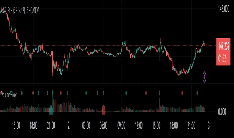
Volume PivotOVERVIEW
Volume Pivot is a technical analysis tool for TradingView designed to identify key turning points in the market by focusing on volume rather than price. It detects peaks and troughs (pivots) in trading volume to pinpoint moments of maximum market interest or exhaustion.
This indicator performs its analysis on both the Current Timeframe (CTF) and a user-defined Higher Timeframe (HTF). This dual-perspective approach allows traders to simultaneously grasp short-term market reactions and long-term structural shifts, leading to more informed and high-conviction trading decisions.
FEATURES
Automatic Pivot Detection
Automatically identifies and plots Volume Pivot Highs (peaks) and Pivot Lows (troughs) based on a user-defined Lookback Length.
Dual Timeframe Display
- CTF Signals : Plotted as tiny circles directly above the corresponding volume bars for immediate, short-term context.
- HTF Signals : Plotted as slightly larger circles at the bottom of the indicator pane, making them easy to distinguish as signals of higher significance.
Flexible HTF Configuration
Customize which higher timeframe to use for analysis based on your current chart timeframe. For example, you can set the indicator to reference the 1-hour chart as the HTF when you are on the 5-minute chart, and the Daily chart as the HTF when you are on the 1-hour chart.
Intuitive Volume Bars
The volume bars are color-coded to show whether volume is increasing (bullish color) or decreasing (bearish color) compared to the previous bar, offering a quick visual gauge of market momentum.
Full Customization
Easily toggle the visibility of CTF and HTF signals and customize the colors for bullish and bearish pivots to match your charting preferences.
MK_OSFT-Momentum Confluence DetectorMOMENTUM CONFLUENCE DETECTOR - Trading Indicator Overview
What This Indicator Does
The Momentum Confluence Detector is a comprehensive Pine Script indicator designed to identify high-probability trading opportunities by detecting momentum bars that align with multiple confluence factors. It combines traditional technical analysis with advanced Smart Money Concepts to filter out noise and highlight the most significant price movements.
CORE FUNCTIONALITY
📊 Momentum Bar Detection Identifies unusual volume and bar size expansion using customizable multipliers
Detects bullish, bearish, and neutral momentum bars based on OHLC relationships
Uses moving averages to establish baseline volume and bar size thresholds
🔄 Multi-Filter Confluence System
The indicator employs up to 5 different filter types to validate momentum signals:
Level Concept Filter - Choose between:
- Support/Resistance Levels : Traditional pivot-based S/R zones with touch counting and break tracking
- Smart Money Concepts : Institutional order flow analysis including Order Blocks, Fair Value Gaps (FVGs), and market structure breaks
Trend Filter : EMA/SMA-based trend direction confirmation with alignment requirements
Breakout Filter : Detects price breakouts beyond recent highs/lows with percentage thresholds
Volatility Filter : ATR expansion confirmation to ensure signals occur during active market conditions
Market Session Filter : Filters signals to specific trading sessions (Tokyo, London, New York)
ADVANCED FEATURES
🎯 Smart Money Concepts Integration
Order Blocks : Identifies institutional supply/demand zones from major and minor structure breaks
Fair Value Gaps (FVGs) : Detects price imbalances and tracks their evolution through partial fills and inversions
Market Structure : Recognizes Break of Structure (BOS) and Change of Character (CHoCH) patterns
Retracement Patterns : Tracks HLH (Higher-Low-Higher) and LHL (Lower-High-Lower) institutional patterns
📈 Support/Resistance System
Multi-timeframe pivot detection (3, 5, 7-bar spans)
Volume-weighted strength calculation for level importance
Dynamic level merging and break tracking
Automatic level type classification (Support/Resistance/Flip zones)
⚙️ Intelligent Filtering Logic
ALL Mode : Requires all enabled filters to pass (high precision)
ANY Mode : Requires at least one filter to pass (higher frequency)
Real-time filter status tracking and visualization
Visual Features
Signal Markers : Clear triangular markers for qualified momentum bars
Unfiltered Signals : Optional display of raw momentum bars for comparison
Level Visualization : Dynamic S/R level boxes and lines with strength indicators
Structure Lines : BOS/CHoCH break visualization with major/minor classification
Fair Value Gaps : Color-coded boxes showing bullish/bearish FVGs with partial fill tracking and IFVG conversion
Order Blocks : Institutional supply/demand zones displayed as colored boxes with major/minor classification
Information Table : Real-time display of signal details and filter status
Session Boxes : Visual representation of active trading sessions
Practical Applications
✅ Swing Trading : Identify high-probability reversal and continuation setups
✅ Day Trading : Spot intraday momentum shifts with institutional backing
✅ Multi-Timeframe Analysis : Combine major and minor structure analysis
✅ Risk Management : Filter out low-quality setups using confluence requirements
✅ Educational : Understand market structure and institutional order flow
Customization Options
Adjustable momentum thresholds for different market conditions
Comprehensive filter settings with individual enable/disable controls
Visual customization for colors, sizes, and display preferences
Alert system with detailed signal information
Performance optimization settings for different chart timeframes
Who Should Use This Indicator
This indicator is suitable for traders who:
Want to combine multiple technical analysis approaches
Seek to understand institutional market behavior
Prefer confluence-based trading setups
Need customizable filtering for different market conditions
Value comprehensive signal validation over high-frequency alerts
The Momentum Confluence Detector transforms complex market analysis into clear, actionable signals by requiring multiple forms of confirmation before highlighting trading opportunities.

SuperTrend Optimizer Remastered[CHE] SuperTrend Optimizer Remastered — Grid-ranked SuperTrend with additive or multiplicative scoring
Summary
This indicator evaluates a fixed grid of one hundred and two SuperTrend parameter pairs and ranks them by a simple flip-to-flip return model. It auto-selects the currently best-scoring combination and renders its SuperTrend in real time, with optional gradient coloring for faster visual parsing. The original concept is by KioseffTrading Thanks a lot for it.
For years I wanted to shorten the roughly two thousand three hundred seventy-one lines; I have now reduced the core to about three hundred eighty lines without triggering script errors. The simplification is generalizable to other indicators. A multiplicative return mode was added alongside the existing additive aggregation, enabling different rankings and often more realistic compounding behavior.
Motivation: Why this design?
SuperTrend is sensitive to its factor and period. Picking a single pair statically can underperform across regimes. This design sweeps a compact parameter grid around user-defined lower bounds, measures flip-to-flip outcomes, and promotes the combination with the strongest cumulative return. The approach keeps the visual footprint familiar while removing manual trial-and-error. The multiplicative mode captures compounding effects; the additive mode remains available for linear aggregation.
Originally (by KioseffTrading)
Very long script (~2,371 lines), monolithic structure.
SuperTrend optimization with additive (cumulative percentage-sum) scoring only.
Heavier use of repetitive code; limited modularity and fewer UI conveniences.
No explicit multiplicative compounding option; rankings did not reflect sequence-sensitive equity growth.
Now (remastered by CHE)
Compact core (~380 lines) with the same functional intent, no compile errors.
Adds multiplicative (compounding) scoring alongside additive, changing rankings to reflect real equity paths and penalize drawdown sequences.
Fixed 34×3 grid sweep, live ranking, gradient-based bar/wick/line visuals, top-table display, and an optional override plot.
Cleaner arrays/state handling, last-bar table updates, and reusable simplification pattern that can be applied to other indicators.
What’s different vs. standard approaches?
Baseline: A single SuperTrend with hand-picked inputs.
Architecture differences:
Fixed grid of thirty-four factor offsets across three ATR offsets.
Per-combination flip-to-flip backtest with additive or multiplicative aggregation.
Live ranking with optional “Best” or “Worst” table output.
Gradient bar, wick, and line coloring driven by consecutive trend counts.
Optional override plot to force a specific SuperTrend independent of ranking.
Practical effect: Charts show the currently best-scoring SuperTrend, not a static choice, plus an on-chart table of top performers for transparency.
How it works (technical)
For each parameter pair, the script computes SuperTrend value and direction. It monitors direction transitions and treats a change from up to down as a long entry and the reverse as an exit, measuring the move between entry and exit using close prices. Results are aggregated per pair either by summing percentage changes or by compounding return factors and then converting to percent for comparison. On the last bar, open trades are included as unrealized contributions to ranking. The best combination’s line is plotted, with separate styling for up and down regimes. Consecutive regime counts are normalized within a rolling window and mapped to gradients for bars, wicks, and lines. A two-column table reports the best or worst performers, with an optional row describing the parameter sweep.
Parameter Guide
Factor (Lower Bound) — Starting SuperTrend factor; the grid adds offsets between zero and three point three. Default three point zero. Higher raises distance to price and reduces flips.
ATR Period (Lower Bound) — Starting ATR length; the grid adds zero, one, and two. Default ten. Longer reduces noise at the cost of responsiveness.
Best vs Worst — Ranks by top or bottom cumulative return. Default Best. Use Worst for stress tests.
Calculation Mode — Additive sums percents; Multiplicative compounds returns. Multiplicative is closer to equity growth and can change the leaderboard.
Show in Table — “Top Three” or “All”. Fewer rows keep charts clean.
Show “Parameters Tested” Label — Displays the effective sweep ranges for auditability.
Plot Override SuperTrend — If enabled, the override factor and ATR are plotted instead of the ranked winner.
Override Factor / ATR Period — Values used when override is on.
Light Mode (for Table) — Adjusts table colors for bright charts.
Gradient/Coloring controls — Toggles for gradient bars and wick coloring, window length for normalization, gamma for contrast, and transparency settings. Use these to emphasize or tone down visual intensity.
Table Position and Text Size — Places the table and sets typography.
Reading & Interpretation
The auto SuperTrend plots one line for up regimes and one for down regimes. Color intensity reflects consecutive trend persistence within the chosen window. A small square at the bottom encodes the same gradient as a compact status channel. Optional wick coloring uses the same gradient for maximum contrast. The performance table lists parameter pairs and their cumulative return under the chosen aggregation; positive values are tinted with the up color, negative with the down color. “Long” labels mark flips that open a long in the simplified model.
Practical Workflows & Combinations
Trend following: Use the auto line as your primary bias. Enter on flips aligned with structure such as higher highs and higher lows. Filter with higher-timeframe trend or volatility contraction.
Exits/Stops: Consider conservative exits when color intensity fades or when the opposite line is approached. Aggressive traders can trail near the plotted line.
Override mode: When you want stability across instruments, enable override and standardize factor and ATR; keep the table visible for sanity checks.
Multi-asset/Multi-TF: Defaults travel well on liquid instruments and intraday to daily timeframes. Heavier assets may prefer larger lower bounds or multiplicative mode.
Behavior, Constraints & Performance
Repaint/confirmation: Signals are based on SuperTrend direction; confirmation is best assessed on closed bars to avoid mid-bar oscillation. No higher-timeframe requests are used.
Resources: One hundred and two SuperTrend evaluations per bar, arrays for state, and a last-bar table render. This is efficient for the grid size but avoid stacking many instances.
Known limits: The flip model ignores costs, slippage, and short exposure. Rapid whipsaws can degrade both aggregation modes. Gradients are cosmetic and do not change logic.
Sensible Defaults & Quick Tuning
Start with the provided lower bounds and “Top Three” table.
Too many flips → raise the lower bound factor or period.
Too sluggish → lower the bounds or switch to additive mode.
Rankings feel unstable → prefer multiplicative mode and extend the normalization window.
Visuals too strong → increase gradient transparency or disable wick coloring.
What this indicator is—and isn’t
This is a parameter-sweep and visualization layer for SuperTrend selection. It is not a complete trading system, not predictive, and does not include position sizing, transaction costs, or risk management. Combine with market structure, higher-timeframe context, and explicit risk controls.
Attribution and refactor note: The original work is by KioseffTrading. The script has been refactored from approximately two thousand three hundred seventy-one lines to about three hundred eighty core lines, retaining behavior without compiler errors. The general simplification pattern is reusable for other indicators.
Metadata
Name/Tag: SuperTrend Optimizer Remastered
Pine version: v6
Overlay or separate pane: true (overlay)
Core idea/principle: Grid-based SuperTrend selection by cumulative flip returns with additive or multiplicative aggregation.
Primary outputs/signals: Auto-selected SuperTrend up and down lines, optional override lines, gradient bar and wick colors, “Long” labels, performance table.
Inputs with defaults: See Parameter Guide above.
Metrics/functions used: SuperTrend, ATR, arrays, barstate checks, windowed normalization, gamma-based contrast adjustment, table API, gradient utilities.
Special techniques: Fixed grid sweep, compounding vs linear aggregation, last-bar UI updates, gradient encoding of persistence.
Performance/constraints: One hundred and two SuperTrend calls, arrays of length one hundred and two, label budget, last-bar table updates, no higher-timeframe requests.
Recommended use-cases/workflows: Trend bias selection, quick parameter audits, override standardization across assets.
Compatibility/assets/timeframes: Standard OHLC charts across intraday to daily; liquid instruments recommended.
Limitations/risks: Costs and slippage omitted; mid-bar instability possible; not suitable for synthetic chart types.
Debug/diagnostics: Ranking table, optional tested-range label; internal counters for consecutive trends.
Disclaimer
The content provided, including all code and materials, is strictly for educational and informational purposes only. It is not intended as, and should not be interpreted as, financial advice, a recommendation to buy or sell any financial instrument, or an offer of any financial product or service. All strategies, tools, and examples discussed are provided for illustrative purposes to demonstrate coding techniques and the functionality of Pine Script within a trading context.
Any results from strategies or tools provided are hypothetical, and past performance is not indicative of future results. Trading and investing involve high risk, including the potential loss of principal, and may not be suitable for all individuals. Before making any trading decisions, please consult with a qualified financial professional to understand the risks involved.
By using this script, you acknowledge and agree that any trading decisions are made solely at your discretion and risk.
Do not use this indicator on Heikin-Ashi, Renko, Kagi, Point-and-Figure, or Range charts, as these chart types can produce unrealistic results for signal markers and alerts.
Best regards and happy trading
Chervolino
