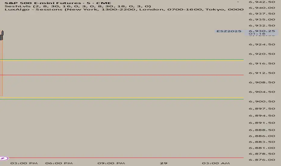
Session LevelsMarks the highs and lows of the previous day New York session and the following Asian and London sessions.
In den Scripts nach "session" suchen
Sessions by SHARK [Kyiv Time]Why Forex Sessions Matter
First of all, it is very convenient for a trader to structure their working hours. The best times to open positions are during the London Kill Zone (KZ) and New York Kill Zone (KZ). Based on what happens within each session, you can build your future analysis while considering the overall context.
We must understand that there are specific times of the day that are more or less volatile. Knowing this will help you determine when you should be looking for trade setups and when you should avoid them.
Trading outside of the Kill Zones can lead to holding positions for too long because market liquidity decreases, which in turn leads to lower volatility.

Sessions by Aegean This script has the full 8 hours for the 3 major sessions and 1 hour for the Frankfurt, Germany session

Trading Sessions v.2 - Max WarrenUpdated to work with Pine updates:
London DST timezone still broken. Will fix later.
As always full customization visually, with London fix I'll add more options.
Keep in mind the render resolution option

Asia / London / Overlap / NY Sessions - Live + Futuresession markers to determine which session you're currently playing at

Session High/Low Rays - Last 3 DaysMarks the Tokyo, London and NYC sessions High and Lows from past 3 days upon session close.

session high and low (only for current day) -HITHVEERits about session highs and lows and only for the current day and main sessions are asia london and newyork

Session Highs and LowsShows the current and previous session highs and lows for the New York, London and Asian sessions

Session Start & Day BackgroundThis indicator visually enhances your TradingView charts by highlighting the start of each new trading day and coloring the background based on the day of the week.
The first candle of each new trading day is marked in gray for better session separation.
The background color changes based on the current day of the week, making it easier to recognize market patterns and trends at a glance.
Works across all markets including Forex, Stocks, and Crypto.
Designed to improve chart readability and market structure visualization.
Ideal for traders who want a clearer overview of daily sessions and better differentiation between trading days! 🚀

Session High and Low IndicatorThis script is meant for stocks that have a pre-market session. It is meant to be used on the 1 min time frame. This script will draw a green line at the high of pre-market, and a red line at the low of pre-market and extend these lines across the regular session day
This makes it easy to see if price action during regular market has broken above pre-market high or broken below pre-market low.
The high/low skips any quick spikes in price action (similar to what happens at 8:30 am every day).


Session Times - Pre-MARKETS + NY/LondonScript developed in order to help traders to understand how is it important to understand candle timings accordingly to sessions.
I created this in a way that the chart won't be polluted by colours and other stuff.
Session HeatmapIntraday Seasonality
Overview
Analyzes historical patterns by time of day. Identifies when volatility, volume, and open interest changes tend to be highest or lowest.
Features
Multiple Metrics: TR (volatility), Volume, and Open Interest changes
Flexible Grouping: View patterns by weekday or month to spot day-of-week or seasonal effects
Heatmap Visualization: Blue (low) to Red (high) color scale for quick pattern recognition
Percentile Mode: Reduces outlier impact by using 5th-95th percentile range
Timezone Support: Display in UTC alongside your local time
Metrics Explained
TR: Volatility - when markets move most
Volume: Liquidity - when participation is highest
OI Increase: When new positions are opened
OI Decrease: When positions are closed
OI Net: Net open interest change
Usage
Set your timezone and preferred slot size (30min/1H)
Choose a date range (relative or custom)
Select a metric to analyze
Use "Group By" to see weekday or monthly patterns
Switch to Percentile color scale if outliers dominate
Notes
Chart timeframe should be equal to or smaller than Slot Size
OI metrics require Binance Perpetual symbols
DST is not automatically adjusted; consider seasonal shifts for US/EU sessions

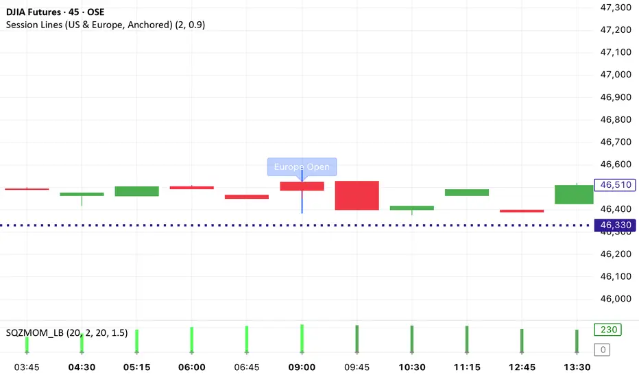
Session Lines (US & Europe, Anchored and Adaptive)A sleek indicator that marks the London (blue) and New York (red) trading sessions with perfectly aligned vertical lines both open and close times.
Lines automatically scale with your chart, adapt to any timeframe, and fade smoothly on higher intervals to keep your layout clean and professional.

Session VolumeThis script tracks and displays 30-minute volume segments during the Regular Trading Hours (RTH) session. It allows traders to visually compare each time block’s volume today vs. the same block from the previous day, helping spot early signs of strength, weakness, or divergence.
Features:
Tracks 13 blocks from 9:30 AM to 4:15 PM ET.
Compares today's volume against historical volume from the same time block yesterday.
Highlights percentage changes per block.
Summary row totals show overall volume trend today vs. yesterday.
This tool is useful for discretionary traders, auction market theorists, and anyone who incorporates market-generated information into their decision-making.


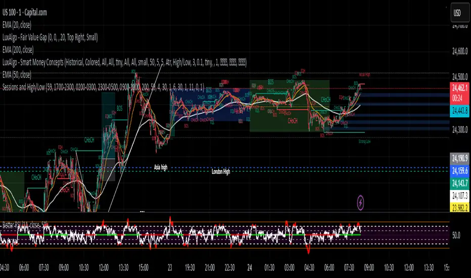
Sessions and High/LowCan be used to mark highs and lows of any sessions you desire can do 4 sessions
Session Breakout, Retest, Reversal + Large Move Alert# Script Description for Publication
## Script Name
**Session Breakout, Retest, Reversal + Large Move Alert**
## Short Description
A professional trading indicator that identifies session breakouts, failed retests, and large intraday price movements across any futures contract with real-time alerts and visual markers.
## Long Description
This comprehensive indicator combines session analysis with dynamic move detection, designed for active traders monitoring ES, NQ, GC, CL, and other futures contracts.
**Core Features:**
**Session Tracking:**
Automatically identifies and marks daily session breakouts and failed retests based on user-defined session times and timezones. The indicator draws visual boxes showing session highs (PH) and lows (PL), with labels marking breakout (BO) and retest failure (RF) points.
**Dynamic Large Move Detection:**
Monitors candles on any chart interval for significant price movements. The threshold is fully customizable per futures contract (default 15 points for ES/NQ/GC). When a candle closes with a move exceeding the threshold, the indicator displays a "BO" label with the exact move size and current chart timeframe.
**Real-Time Alerts:**
Triggers active alerts whenever large moves are detected, allowing traders to receive instant notifications via TradingView's alert system for timely entry or exit opportunities.
**Multi-Timeframe Compatible:**
Works seamlessly on any chart interval (1-minute through daily and beyond) without manual adjustments. The detection threshold automatically applies to the current chart's candles, with labels displaying the active timeframe.
**Universal Futures Support:**
Configurable for any futures contract by adjusting the point threshold input parameter based on each contract's typical volatility.
## Key Inputs
| Input | Default | Purpose |
|-------|---------|---------|
| Session Time | 0400-0930 | Defines trading session hours (pre-market session) |
| Session Timezone | America/New_York | Sets timezone for session detection |
| Point Move Threshold | 15.0 | Minimum point move to trigger alert (adjust per futures: ES=15, GC=15, CL=1.5) |
## How to Use
1. **Add to Chart:** Search for this indicator in TradingView and add it to your futures chart (ES, NQ, GC, CL, etc.)
2. **Configure Inputs:**
- Set session start/end times for your preferred trading session
- Adjust point threshold based on your futures contract
- Verify timezone matches your trading location
3. **Create Alerts:**
- Click "Create Alert" on the chart
- Select "Large Move Alert" from the condition dropdown
- Choose notification method (push, email, or SMS)
- Set desired frequency
4. **Monitor Moves:**
- Watch for "BO" labels appearing on confirmed candles
- Each label shows the threshold value and actual move size
- Combine with your existing trading strategy for confirmation
## Visual Elements
- **Session Box:** Blue shaded area showing session high/low range
- **PH Label:** Green label marking session high (pivot high)
- **PL Label:** Red label marking session low (pivot low)
- **BO ↑/↓ Labels:** Lime/red labels marking session breakouts
- **RF Labels:** Yellow/orange labels marking failed retests
- **Large Move Labels:** Green (bullish) or red (bearish) labels showing threshold breaches with move size
## Ideal For
- Scalpers monitoring quick intraday moves
- Day traders tracking pre-market breakouts
- Futures traders on ES, NQ, GC, CL, and other contracts
- Multi-timeframe traders watching various chart intervals simultaneously
- Alert-based automated trading systems
## Technical Details
- **Pine Script Version:** 5
- **Overlay:** Yes (displays on price chart)
- **Historical Buffer:** 5000 bars (supports 1-minute and lower timeframes)
- **Compatibility:** All futures contracts and chart intervals
## Disclaimer
This indicator is provided for educational and informational purposes only. It is not financial advice. Users should conduct their own research and consult with financial professionals before making trading decisions. Past performance does not guarantee future results.
---

Sessions - Full HeightEN : Full-height background sessions using bgcolor(). Asia, London, and New York sessions with configurable time windows, colors, and timezone. Open-source for learning and reuse.
RU : Индикатор заливает фон сессий на всю высоту графика (Азия, Лондон, Нью-Йорк). Настраиваемые окна времени и цвета.
