Enhanced Market Influence DashboardDescription
The "Enhanced Market Influence Dashboard" (EMID) is a sophisticated trading indicator developed in Pine Script, designed to provide traders with a comprehensive view of the market's influences by analyzing a diverse set of financial instruments. This script integrates various market data, calculates dynamic weights based on volatility, and combines them into a composite score to help traders identify significant market movements.
Concept and Methodology
The EMID indicator aggregates data from multiple financial instruments, including forex pairs, commodities, indices, and ETFs. By calculating the median and volatility of these instruments over user-defined timelines, it dynamically adjusts their weights to reflect current market conditions. The composite score generated from these weighted values helps traders understand the overall market influence and detect significant movements.
Key Features
Market Data Integration: The script fetches real-time data from various symbols such as USD/JPY, Gold, Dollar Index (DXY), US Treasury Rate, VIX Index, Crude Oil, EUR/USD, Emerging Market Index, QYLD ETF, and Nasdaq 100 Futures.
1. Dynamic Weight Calculation: The script calculates dynamic weights for each instrument based on their volatility relative to their simple moving average. This approach ensures that more volatile instruments have a proportionally higher impact on the composite score.
2. Median and Volatility Analysis: It uses the median value and standard deviation over specified timelines to gauge the central tendency and volatility of each instrument.
3. Composite Score Generation: By normalizing the difference between current prices and their respective medians, and applying dynamic weights, the script generates a composite score that reflects the overall market sentiment.
4. Baseline Calculation: A dynamic baseline is computed as the median of the composite score over the lookback period, providing a reference point for identifying significant deviations.
5. Alerts: The script includes alert conditions to notify traders of significant market movements, either above or below the baseline by a threshold value.
Usage
To use the EMID indicator, follow these steps:
1. Input Configuration: Adjust the input parameters to suit your trading strategy. The key inputs include:
-Median Timeline: The period for calculating the median values.
-Volatility Timeline: The period for calculating volatility.
-Base Weights: Set the base weights for each financial instrument according to their perceived influence on the market.
-Adding the Indicator: Apply the EMID indicator to your chart in TradingView. Ensure that the symbols used in the script are relevant to your trading strategy and available in your TradingView subscription.
2. Interpreting the Composite Score: The composite score plotted on the chart gives an aggregated view of market influences. Compare the composite score with the baseline to identify significant market movements.
-A composite score significantly above the baseline indicates a potential market uptrend.
-A composite score significantly below the baseline indicates a potential market downtrend.
-Setting Alerts: Use the alert conditions to set up notifications for significant market movements. These alerts help you stay informed about critical changes in market sentiment.
Underlying Calculations
1. Median Calculation: The median function is applied to each instrument's price data over the specified timeline.
2. Volatility Calculation: Volatility is calculated as the standard deviation divided by the simple moving average over the volatility timeline.
3. Dynamic Weight Application: Base weights are multiplied by the respective volatility values to get dynamic weights.
4. Normalized Scores: The script normalizes the difference between current prices and their medians, then multiplies by the dynamic weights to get individual scores.
5. Composite Score: Summing all normalized and weighted scores results in the composite score.
6. Baseline: The baseline is the median of the composite score over the median timeline.
By integrating multiple market influences and dynamically adjusting weights based on volatility, the EMID indicator provides a robust tool for traders to analyze market conditions and make informed trading decisions.
In den Scripts nach "sentiment" suchen
Funding Rate Aggregated (Lite)Funding Rate Aggregated (Lite) provides traders with a consolidated view of perpetual futures funding rates across multiple major exchanges. Instead of monitoring each market individually, the script aggregates the available data into a single, average funding rate series—streamlining analysis and helping identify market-wide positioning imbalances.
The indicator supports Binance, Bybit, OKX, Bitget, and Coinbase, with user-controlled toggles to enable or disable specific venues. For exchanges offering multiple quote currencies (e.g., USDT, USD, or USDC pairs) inclusion is based on whether their trading activity (volume) is relevant (determined manually, not via code). Each available rate is checked and included in the calculation only if valid, ensuring the average reflects actual market conditions.
From a technical standpoint, the script:
Retrieves real-time funding rate data directly via request.security for the current symbol’s base currency.
Applies standard formatting similar to TradingView's official indicator.
Visualizes the average funding rate with color-coded plotting (green for positive, red for negative), alongside a neutral zero reference line.
Why it is useful:
Funding rates are a direct measure of long/short market bias in perpetual swaps. Persistently high positive rates often indicate overcrowded longs, while negative rates can reveal excessive shorting.
By combining multiple exchanges into one metric, traders gain a more robust signal, reducing noise from isolated exchange-specific anomalies.
This aggregated perspective can assist in timing contrarian trades, spotting funding-driven inefficiencies, and gauging overall market sentiment.
Applications in trading include:
Sentiment analysis: Assess whether perpetual futures traders are leaning heavily long or short.
Cross-exchange confirmation: Ensure that extreme funding isn’t confined to a single venue.
Risk management: Identify periods of elevated funding costs that may erode profitability in longer-term positions.
Strategy filters: Integrate the aggregated rate as a condition for entries/exits, or to adjust position sizing during extremes.
The Lite designation emphasizes simplicity and efficiency: the indicator avoids unnecessary visual and data-driven clutter and focuses on delivering one clear, aggregated signal that can be adapted to a wide range of trading styles.

CNN Fear and Greed Index JD modified from minusminusCNN Fear and Greed Index - www.cnn.com
Modified from minusminus -
See Documentation from CNN's website
CNN's Fear and Greed index is an attempt to quantitatively score the Fear and Greed in the SPX using 7 factors:
Market Momentum- S&P 500 (SPX) and its 125-day moving average
Stock Price Strength -Net new 52-week highs and lows on the NYSE
Stock Price Breadth - McClellan Volume Summation Index
Put and Call options - 5-day average put/call ratio
Market Volatility - VIX and its 50-day moving average
Safe Haven Demand - Difference in 20-day stock and bond returns
Junk Bond Demand - Yield spread: junk bonds vs. investment grade
Each Factor has a weight input for the final calculation initially set to a weight of 1. The final calculation of the index is a weighted average of each factor.
3 Factors have separate functions for calculation : See Code for Clarity
SPX Momentum : difference between the Daily CBOE:SPX index value and it's 125 Day Simple moving average.
Stock Price Strength : Net New 52-week highs and lows on the NYSE.
Function calculates a measure of Net New 52-week highs by:
NYSE 52-week highs (INDEX:MAHN) - all new NYSE Highs (INDEX:HIGH)
measure of Net New 52-week lows by:
NYSE 52-week lows (INDEX:MALN) - all new NYSE Lows (INDEX:LOWN)
Then calculate a ratio of Net New 52-week Highs and Lows over Total Highs and Lows then takes a 5-day moving average of that ratio-See Code
Stock Price Breadth is the McClellan Volume Summation Index :
First Calculate the McClellan Oscillator
Second Calculate the Summation Index
4 Factors are Straight data requests
5 Day Simple Moving Average of the Put-Call Ratio on SPY
50 Day Simple Moving Average of the SPX VIX
Difference between 20 Day Simple Moving Average of SPX Daily Close and 20 Day Simple Moving Average of 10Y Constant Maturity US Treasury Note
Yield Spread between ICE BofA US High Yield Index and ICE BofA US Investment Grade Corporate Yield Index
The Fear and Greed Index is a weighted average of these factors - which is then normalized to scale from 0 to 100 using the past 25 values - length parameter.
3 Zones are Shaded: Red for Extreme Fear, Grey for normal jitters, Green for Extreme Greed.
Disclaimer: This is not financial advice. These are just my ideas, and I am not an investment advisor or investment professional. This code is for informational purposes only and do your own analysis before making any investment decisions. This is an attempt to replicate in spirt an index CNN publishes on their website and in no way shape or form infringes on their content, calculations or proprietary information.
From CNN: www.cnn.com
FEAR & GREED INDEX FAQs
What is the CNN Business Fear & Greed Index?
The Fear & Greed Index is a way to gauge stock market movements and whether stocks are fairly priced. The theory is based on the logic that excessive fear tends to drive down share prices, and too much greed tends to have the opposite effect.
How is Fear & Greed Calculated?
The Fear & Greed Index is a compilation of seven different indicators that measure some aspect of stock market behavior. They are market momentum, stock price strength, stock price breadth, put and call options, junk bond demand, market volatility, and safe haven demand. The index tracks how much these individual indicators deviate from their averages compared to how much they normally diverge. The index gives each indicator equal weighting in calculating a score from 0 to 100, with 100 representing maximum greediness and 0 signaling maximum fear.
How often is the Fear & Greed Index calculated?
Every component and the Index are calculated as soon as new data becomes available.
How to use Fear & Greed Index?
The Fear & Greed Index is used to gauge the mood of the market. Many investors are emotional and reactionary, and fear and greed sentiment indicators can alert investors to their own emotions and biases that can influence their decisions. When combined with fundamentals and other analytical tools, the Index can be a helpful way to assess market sentiment.

VIX Differential(Melon)Simple indy that measures the difference between VIX9D and VIX to try assessing short-term market sentiment. I've liked this recently as a big clue for market bottom reversals.

RH_Previous Session CloseRaghee Horner Previous Session Close (PSC)
The RH_PSC is an automated Previous Session Close (PSC) indicator to show, at a glance, general market sentiment -- whether the market is generally bullish, bearish or neutral --for the current trading session.
The PSC plots the previous session close from the Daily candle, with a customizable table of data to show the previous price, whether or not the current price is above or below that previous close and the percentage move above or below.
It includes the ability to enable only the last session or to plot for all previous sessions continuously.
The data table is configurable for bearish, bullish or sideways coloring and can be moved to different locations to suite users preferences and charts. It can also be fully disabled.
Defaults are to show all previous sessions in a continuous plot and the data table is disabled.
What is “sentiment”?
Market sentiment reflects investors’ overall attitude toward a symbol, influenced by news, economic reports, and perceptions. It can be bullish, bearish, or neutral and significantly affects trading behavior and price movements. Bullish sentiment typically drives prices up, while bearish sentiment can cause them to fall. Understanding market sentiment is key for trend follow-through.
Why does it matter?
Effectively using sentiment allows for quicker, smarter trading decisions. As an active trader, understanding market sentiment is vital for follow-through. It shows real-time investor feelings, affecting price movements. Gauging sentiment helps you:
Anticipate Breakouts.
Time Entries and Exits.
Increase Probability of Continuation.

VIX OscillatorOVERVIEW
Plots an oscillating value as a percentage, derived from the VIX and VIX3M . This can help identify broader market trends and pivots on higher time frames (ie. 1D), useful when making swing trades.
DATA & MATH
The VIX is a real-time index of expected S&P 500 volatility over the next 30 days, derived from option prices with near-term expirations. Similarly, the VIX3M measures expected volatility over the next 90 days.
Dividing one by the other yields an oscillating value, normalizing the relative strength of the expected volatility. Most commonly the VIX is divided by the VIX3M. However, because the VIX is inversely correlated to market sentiment (typically), this indicator divides the VIX3M by the VIX to visually correlate the plot direction with the anticipated market direction. Further, it subtracts 1.1 from the quotient to visually center the plot, and multiplies that difference by 100 to amplify the value as a percentage:
( VIX3M / VIX - 1.1 ) * 100
This variation makes identifying sentiment extremes easier within a buy-low-sell-high paradigm, where values below zero are bearish and values above zero are bullish.
PLOTS
Two plots are used, maximizing data fidelity and convenience. Candles are used to accurately reflect the quantized math and a Linear Regression is used to simplify contextualization. If you're not familiar with what a Linear Regression is, you can think of it like a better moving average. High / Low zones are also plotted to help identify sentiment extremes.
This combination allows you to quickly identify the expected sentiment (bullish / bearish) and its relative value (normal / extreme), which you can then use to anticipate if a trend continuation or pivot is more likely.
INPUTS
Candle colors (rise and fall)
Linear regression colors and length
Zone thresholds and zero line
VIX Z-Score (Inverted)📘 Indicator: VIX Z-Score (Inverted) + Table
🔍 Overview
This indicator calculates the Z-Score of the VIX (Volatility Index) and inverts it to identify potential buying opportunities during periods of fear and caution during periods of extreme optimism. The Z-Score is smoothed and visually displayed alongside a dynamic info table.
⚙️ How It Works
VIX Data: The VIX (ticker: CBOE:VIX) is pulled in real time.
Z-Score Calculation:
𝑍
=
(
𝑉
𝐼
𝑋
−
mean
)
standard deviation
Z=
standard deviation
(VIX−mean)
Over a customizable lookback period (default: 50).
Inversion:
Since high VIX usually means fear (often a contrarian buying signal), we invert the Z-Score:
𝑍
inv
=
−
𝑍
Z
inv
=−Z
Smoothing:
An EMA is applied to reduce noise and false signals.
Clamping:
The Z-Score is linearly scaled and capped between +2 and -2 for easy visualization in the info table.
📊 Z-Score Table (Top-Right)
Range Interpretation Table Color
+1.5 to +2 Extreme fear → Buy zone 🟩 Green
+0.5 to +1.5 Moderate fear 🟨 Lime
–0.5 to +0.5 Neutral ⬜ Gray
–0.5 to –1.5 Growing complacency 🟧 Orange
–1.5 to –2 Extreme optimism → Caution 🟥 Red
The current Z-Score (clamped version) is shown in real time on the right-hand info panel.
🧠 How to Use It
+2 Zone (Table: Green):
Market fear is at an extreme. Historically, such conditions are contrarian bullish—possible entry zones.
–2 Zone (Table: Red):
Indicates extreme optimism and low fear. Often a signal to be cautious or take profits.
Middle range (±0.5):
Market is neutral. Avoid major decisions based solely on sentiment here.
🧪 Best Practices
Combine with price action, volume, or trend filters.
Works well on daily or 4H timeframes.
Not a standalone signal—best used to confirm or fade sentiment extremes.

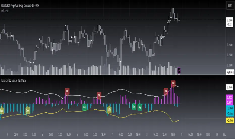
[blackcat] L2 Market Risk MeterOVERVIEW
The L2 Market Risk Meter is designed to evaluate market conditions using various technical indicators including Moving Averages (MA), Moving Average Convergence Divergence (MACD), and Bollinger Bands 📈🔍. By analyzing these elements, the script helps traders identify potential buying opportunities and assess the overall market sentiment more effectively. This comprehensive approach aids in making informed trading decisions by providing clear visual representations of critical market factors 🚀💸.
Key components include the calculation of short-term and long-term moving averages, MACD lines, and Bollinger Bands, which are then used to plot histograms and labels directly on the chart. These visual cues assist traders in quickly interpreting complex market data, thereby enhancing their ability to navigate volatile markets and capitalize on emerging trends ✅✨.
FEATURES
Advanced Technical Analysis:
Utilizes Short and Long Moving Averages (MAs) to capture different trend durations.
Implements MACD for detecting changes in the strength, direction, momentum, and duration of a trend.
Incorporates Bollinger Bands to measure volatility and provide dynamic support/resistance levels.
Comprehensive Visualization:
Generates colored histograms representing positive and negative MACD values.
Displays labels indicating "Safe," "Risk," and "Buy" signals at crucial points on the chart.
Flexible Settings:
Allows customization of the short_ma_period and long_ma_period to tailor the analysis to individual trading styles or asset types.
Provides configurable colors and styles for histograms and labels to suit personal preferences.
Real-Time Feedback:
Updates dynamically as new price data becomes available, ensuring timely insights.
Facilitates rapid identification of shifts in market conditions through clear graphical outputs.
HOW TO USE
Adding the Indicator:
Begin by adding the L2 Market Risk Meter to your chart on TradingView. You can do this via the "Pine Editor" located at the bottom of the screen. Simply copy-paste the script into the editor and click "Add to Chart."
Configuring Parameters:
Adjust the short_ma_period and long_ma_period inputs based on your preferred timeframes and strategies. For example, shorter periods will react faster but may be noisier, while longer periods offer smoother trends but slower reactions.
Interpreting Histograms:
Monitor the plotted histograms closely:
Positive Values: Represent bullish momentum where the closing prices are higher than the moving average.
Negative Values: Suggest bearish pressure when the closing prices fall below the moving average.
Understanding Labels:
Pay attention to generated labels for actionable insights:
"Safe" Zone: Appears when the price crosses from below to above the lower Bollinger Band, suggesting reduced risk.
"Risk" Zone: Indicates heightened caution if the price breaches upward from below the upper Bollinger Band.
"Buy" Signal: Triggered under stringent bullish conditions combining all predefined criteria, signaling an opportune moment to enter long positions.
Integrating with Other Tools:
Use the L2 Market Risk Meter alongside other technical studies and fundamental analyses to corroborate findings and strengthen your trading strategy.
Regular Review:
Periodically revisit and tweak your parameters and interpretations in light of changing market environments and performance evaluations.
LIMITATIONS
Dependency on Historical Data: Since the indicator relies extensively on historical price movements, its predictions about future trends should be viewed cautiously.
Not Standalone Solution: Like any other tool, it does not guarantee profitability and must be part of a holistic trading plan that includes multiple confirmation methods.
Parameter Sensitivity: Optimal performance depends greatly on selecting appropriate MA period lengths; improper choices could lead to misleading signals.
Volatility Assumptions: The effectiveness of Bollinger Bands varies across different market conditions, especially during low volatility phases where bands might fail to expand significantly.
NOTES
Understanding individual components such as MAs, MACDs, and Bollinger Bands is essential before fully depending on this script's output.
Always backtest any new strategy incorporating this meter thoroughly against diverse market scenarios to gauge reliability.
Consider employing supplementary filters like volume spikes or candlestick patterns to validate signals further.
Be mindful of sudden news events or economic releases impacting asset prices independently of underlying trends highlighted here.
THANKS
A big thank you goes out to fellow members of the TradingView community who have contributed invaluable feedback and suggestions throughout the development process of this indicator 🙏. Your input has been instrumental in refining and improving the functionality and usability of the L2 Market Risk Meter. Continue sharing your experiences so we can collectively enhance our trading capabilities!
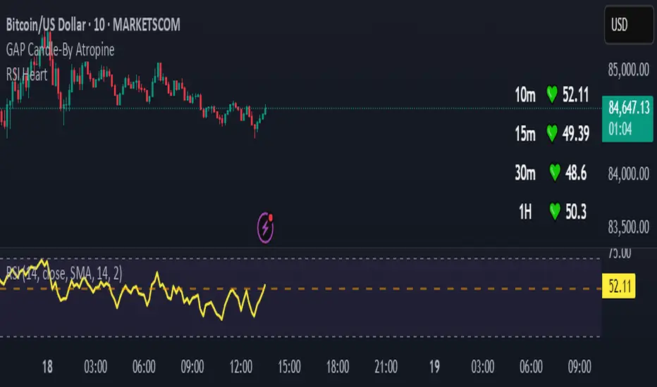
RSI HeartHere's an introduction you can use for your RSI Heart indicator:
---
### RSI Heart Indicator
The **RSI Heart Indicator** provides a visually engaging way to monitor and track the **Relative Strength Index (RSI)** across multiple timeframes (10m, 15m, 30m, and 1H). It not only shows the RSI value but also uses heart-shaped symbols to reflect the current market condition based on RSI levels, making it easier to understand the strength and momentum of a given asset at a glance.
### Key Features:
- **Multi-Timeframe Support**: The indicator pulls the RSI values from multiple timeframes (10 minutes, 15 minutes, 30 minutes, and 1 hour) so you can analyze market strength at different intervals in one view.
- **Heart Symbols**: RSI values are displayed alongside heart emojis (❤️, 💛, 💚) that provide a visual cue for the market condition:
- **❤️ (Overbought or Oversold)**: When RSI is below 27 or above 73.
- **💛 (Near Oversold/Overbought)**: When RSI is between 27-30 or 70-73.
- **💚 (Neutral)**: When RSI is between 30 and 70.
- **Customizable Visibility**: Toggle visibility for each timeframe's RSI using simple on/off settings, giving you control over which timeframes are displayed in your chart.
### How it Can Help:
- **Quick Market Sentiment Analysis**: The heart symbols and RSI values allow you to quickly assess whether an asset is in an overbought or oversold condition.
- **Multi-Timeframe RSI**: By viewing RSI across multiple timeframes, you can gain a more comprehensive understanding of market momentum and strength.
- **Personalized to Your Preferences**: Adjust the settings to only show the timeframes that matter most to you, creating a customized and clean chart view.
This indicator helps traders make more informed decisions by providing a clear, easy-to-read representation of market conditions across various timeframes, all within one indicator.
---
This introduction explains what the indicator does, its features, and how it can benefit traders in a concise and easy-to-understand way.
Crosby Ratio | QuantumResearch ⚖️ Crosby Ratio | QuantumResearch
A Heikin-Ashi Smoothed Momentum Oscillator for Trend Strength & Market Rotation
Inspired by the Original Work of Bitcoin Magazine Pro
🔗 www.bitcoinmagazinepro.com
📘 Overview
The Crosby Ratio, as originally conceptualized by Bitcoin Magazine Pro, is a powerful tool used to evaluate the momentum and directional strength of price movement by analyzing the slope of market trends in degrees.
This enhanced implementation by QuantumResearch builds on the original concept with a Pine Script version tailored for trading charts, integrating Heikin-Ashi smoothing, ATR scaling, and customizable visual modes to fit traders' unique styles.
🧠 What Is the Crosby Ratio?
At its core, the Crosby Ratio uses angular measurement to quantify price movement — translating price trend strength into degrees. This approach allows traders to:
📈 Identify when the market is exhibiting strong upward or downward pressure
🚨 Spot overextended or overheated trend conditions
⚖ Filter out short-term noise and focus on macro momentum
🔍 1. Key Innovations by QuantumResearch
✅ Heikin-Ashi Smoothing: Reduces noise and stabilizes price action before computing momentum angles
✅ Custom atan2() Angular Function: Measures the directional angle between smoothed price changes and ATR-based scaling
✅ Dynamic Threshold Bands: Color-coded zones highlight overbought/oversold momentum regions
✅ Fully Customizable Palette: Choose from 8 visual themes with automatic color adaptation
📊 2. Interpretation Guide
Crosby Value Interpretation
> +18° 🚀 Strong bullish trend acceleration
+13° to +18° 📈 Moderate upward momentum
-9° to +13° ⚖ Neutral/transition phase
-15° to -9° 📉 Moderate bearish pressure
< -15° 🛑 Strong bearish acceleration
The indicator also features background shading when values exceed key thresholds, improving visual clarity during trend inflection points.
📌 Ideal Use Cases
🔄 Rotational Momentum Strategies: Spot the strongest assets during rapid shifts
⚡ Breakout Filtering: Confirm whether breakouts have directional strength
🧘 Noise Reduction: Heikin-Ashi smoothing filters chaotic wicks, especially in crypto
📉 Bearish Exhaustion Detection: Quickly identify when bearish momentum might be overdone
🔗 Original Inspiration & Acknowledgment
This indicator draws its core idea and naming convention from the original Crosby Ratio developed and introduced by Bitcoin Magazine Pro in their excellent write-up:
🔗 The Crosby Ratio – Bitcoin Magazine Pro
Their work on quantifying market sentiment via angle-based momentum inspired this script adaptation for TradingView with added visual features, smoothing techniques, and alerts.
⚠️ Disclaimer
This indicator is a momentum oscillator and should be used in conjunction with other confirmation tools. Market dynamics can vary, and no single metric ensures profitable trades. Always apply proper risk management.

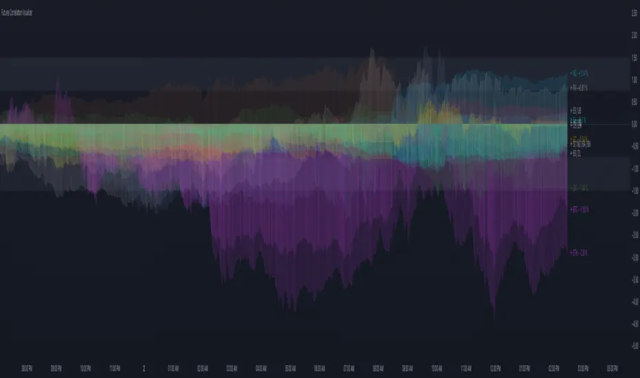
Futures Correlation VisualizerOVERVIEW
This indicator plots the normalized price changes of commonly traded futures. Visualizing data in this way makes studying and understanding market participation and sentiment easier.
Note:
Only 20 symbols can be plotted. The "request" functions are limited to 40 calls , 1 timeframe counts as a call, and 2 timeframes are used per symbol. Normalized values are derived by dividing the charts timeframe by 1D data. A runtime error will occur when more than 20 symbols are enabled. This limitation is unavoidable.
INPUTS
You can configure:
Colors and color scheme
Symbols to plot (most common futures)
Norm. source (todays open / yesterdays close)
Measurement type (%, ‱, Δ)
Label, zone, and zero options
Fear & Greed Index (Zeiierman)█ Overview
The Fear & Greed Index is an indicator that provides a comprehensive view of market sentiment. By analyzing various market factors such as market momentum, stock price strength, stock price breadth, put and call options, junk bond demand, market volatility, and safe haven demand, the Index can depict the overall emotions driving market behavior, categorizing them into two main sentiments: Fear and Greed.
Fear: Indicates a market scenario where investors are scared, possibly leading to a sell-off or a stagnant market. In such conditions, the indicator helps in identifying potential buying opportunities as assets may be undervalued.
Greed: Represents a state where investors are overly confident and buying aggressively, which can lead to inflated asset prices. The indicator in such cases can signal overbought conditions, advising caution or potential short opportunities.
█ How It Works
The Fear & Greed Index is an aggregate of seven distinct indicators, each gauging a specific dimension of stock market activity. These indicators include market momentum, stock price strength, stock price breadth, put and call options, junk bond demand, market volatility, and safe haven demand. The Index assesses the deviation of each individual indicator from its average, in relation to its typical fluctuations. In compiling the final score, which ranges from 0 to 100, the Index assigns equal weight to each indicator. A score of 100 denotes the highest level of Greed, while a score of 0 represents the utmost level of fear.
S&P 500's Momentum: The Index monitors the S&P 500's position relative to its 125-day moving average. Positive momentum (price above the average) signals growing confidence among investors (Greed), while negative momentum (price below the average) indicates rising fear.
Stock Price Strength: By comparing the number of stocks hitting 52-week highs to those at 52-week lows on the NYSE, the Index gauges market breadth. An extreme number of highs indicates Greed, whereas an extreme number of lows suggests Fear.
Stock Price Breadth (Market Volume): Using the McClellan Volume Summation Index, which considers the volume of advancing versus declining stocks, the Index assesses whether the market is broadly participating in a trend, or if a smaller subset of stocks is driving it.
Put and Call Options: The put/call ratio helps gauge investor sentiment. A rising ratio, particularly above 1, indicates increasing fear, as more investors are buying puts to protect against a decline. A falling ratio suggests growing confidence.
Market Volatility (VIX): The VIX measures expected market volatility. Higher values generally indicate Fear, while lower values point to Greed. The Fear & Greed Index compares the VIX to its 50-day moving average to understand its trend.
Safe Haven Demand: The performance of stocks versus bonds over a 20-day period helps understand where investors are putting their money. Bonds outperforming stocks is a sign of Fear, while the opposite suggests Greed.
Junk Bond Demand: By comparing the yields on junk bonds to safer investment-grade bonds, the Index gauges risk appetite. A narrower yield spread suggests Greed (investors are taking more risk), while a wider spread indicates Fear.
The Fear & Greed Index combines these components, scales, and averages them to produce a single value between 0 (Extreme Fear) and 100 (Extreme Greed).
█ How to Use
The Fear & Greed Index serves as a tool to evaluate the prevailing sentiments in the market. Investors, often driven by emotions, can react impulsively, and sentiment indicators like the Fear & Greed Index aim to highlight these emotional states, helping investors recognize personal biases that might impact their investment choices. When integrated with fundamental analysis and additional analytical instruments, the Index becomes a valuable resource for understanding and interpreting market moods and tendencies.
The Fear & Greed Index operates on the principle that excessive fear can result in stocks trading well below their intrinsic values,
while uncontrolled Greed can push prices above what they should be.
-----------------
Disclaimer
The information contained in my Scripts/Indicators/Ideas/Algos/Systems does not constitute financial advice or a solicitation to buy or sell any securities of any type. I will not accept liability for any loss or damage, including without limitation any loss of profit, which may arise directly or indirectly from the use of or reliance on such information.
All investments involve risk, and the past performance of a security, industry, sector, market, financial product, trading strategy, backtest, or individual's trading does not guarantee future results or returns. Investors are fully responsible for any investment decisions they make. Such decisions should be based solely on an evaluation of their financial circumstances, investment objectives, risk tolerance, and liquidity needs.
My Scripts/Indicators/Ideas/Algos/Systems are only for educational purposes!

Generalized Bollinger Bands %B And Bandwidth (Tartigradia)Bollinger Band is simply a representation of the rolling average of price and its standard deviation around the average (called the "basis").
This indicator generalizes the Bollinger Band by implementing many different equations to calculate the Bollinger Bands beyond the standard deviation and sma, and then plot the %B (where the current price falls inside the Bollinger Band), Bandwidth (size of the Bollinger Band) as well as the Bollinger Band itself and a reproduction of the OHLC price candles in a separate pane.
Whereas other Bollinger Bands indicators often just change the basis but not the stdev calculation, the correct way to change the basis is to also change it inside the stdev calculation.
Advanced features such as temporal discounting (ie, newer bars can have more weights), median absolute deviation and multiple sigma bands (eg, 3-sigma) are available.
Up to 3 different Bollinger Bands can be displayed, and the background can be highlighted when price is overbought/oversold (beyond the Bollinger Band of choice). Tip: BB3, which is the bollinger band with standard deviation of 3, which represents 99% of observed values in the lookback period, is a good choice to highlight overbought/oversold conditions.
Three "Sentiment Bars" are provided to see at a glance the sentiments on the price action relative to the Bollinger Bands as reflected by the %B value.
Usage:
Use the %B as a measure of sentiment: bullish if > 0.5, bearish if < 0.5. You can use the Sentiment Bars at the bottom for a quick reference: aqua if bullish, red if bearish, gray if undefined (too close to the middle line).
Use the bandwidth as a measure of volatility: higher is more volatile, lower is less.
When overbought, it can be a good time to sell/short. Use a higher Bollinger Band Multiplier such as 3 or more to reduce false positives.
When oversold, it can be a good time to buy/long. Use a higher Bollinger Band Multiplier such as 3 or more to reduce false positives.
Consider setting a much tighter lookback period of 4 as recommended in backtested works (en.wikipedia.org), use zlma instead of sma, and finally set a higher timeframe for the Bollinger Bands than the one you are currently studying. Then, the Bollinger Bands can help in detecting overbought and oversold regions (price going "out of bands").
Note that I tried to automate the setting of a higher timeframe, but for some reason the output is different when I manually do it using request.security() than when it's in indicator(timeframe=""). If someone has any suggestion as to why it happens, please let me know! (You can try it for yourself by uncommenting the auto_timeframe parameter line).

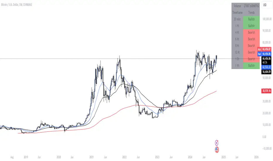
Market Bias IndicatorOverview
This Pine Script™ code generates a "Market Sentiment Dashboard" on TradingView, providing a visual summary of market sentiment across multiple timeframes. This tool aids traders in making informed decisions by displaying real-time sentiment analysis based on Exponential Moving Averages (EMA).
Key Features
Panel Positioning:
Custom Placement: Traders can position the dashboard at the top, middle, or bottom of the chart and align it to the left, centre, or right, ensuring optimal integration with other chart elements.
Customizable Colours:
Sentiment Colours: Users can define colours for bullish, bearish, and neutral market conditions, enhancing the dashboard's readability.
Text Colour: Customizable text colour ensures clarity against various background colours.
Label Size:
Scalable Labels: Adjustable label sizes (from very small to very large) ensure readability across different screen sizes and resolutions.
Market Sentiment Calculation:
EMA-Based Sentiment: The dashboard calculates sentiment using a 9-period EMA. If the EMA is higher than two bars ago, the sentiment is bullish; if lower, it's bearish; otherwise, it's neutral.
Multiple Timeframes: Sentiment is calculated for several timeframes: 30 minute, 1 hour, 4 hour, 6 hour, 8 hour, 12 hour, 1 day, and 1 week. This broad analysis provides a comprehensive view of market conditions.
Dynamic Table:
Structured Display: The dashboard uses a table to organize and display sentiment data clearly.
Real-Time Updates: The table updates in real-time, providing traders with up-to-date market information.
How It Works
EMA Calculation: The script requests EMA(9) values for each specified timeframe and compares the current EMA with the EMA from two bars ago to determine market sentiment.
Colour Coding: Depending on the sentiment (Bullish, Bearish, or Neutral), the corresponding cell in the table is color-coded using predefined colours.
Table Display: The table displays the timeframe and corresponding sentiment, allowing traders to quickly assess market trends.
Benefits to Traders
Quick Assessment: Traders can quickly evaluate market sentiment across multiple timeframes without switching charts or manually calculating indicators.
Enhanced Visualization: The color-coded sentiment display makes it easy to identify trends at a glance.
Multi-Timeframe Analysis: Provides a broad view of short-term and long-term market trends, helping traders confirm trends and avoid false signals.
This dashboard enhances the overall trading experience by providing a comprehensive, customizable, and easy-to-read summary of market sentiment.
Usage Instructions
Add the Script to Your Chart: Apply the "Market Sentiment Dashboard" indicator to your TradingView chart.
Customize Settings: Adjust the panel position, colours, and label sizes to fit your preferences.
Interpret Sentiment: Use the color-coded table to quickly understand the market sentiment across different timeframes and make informed trading decisions.
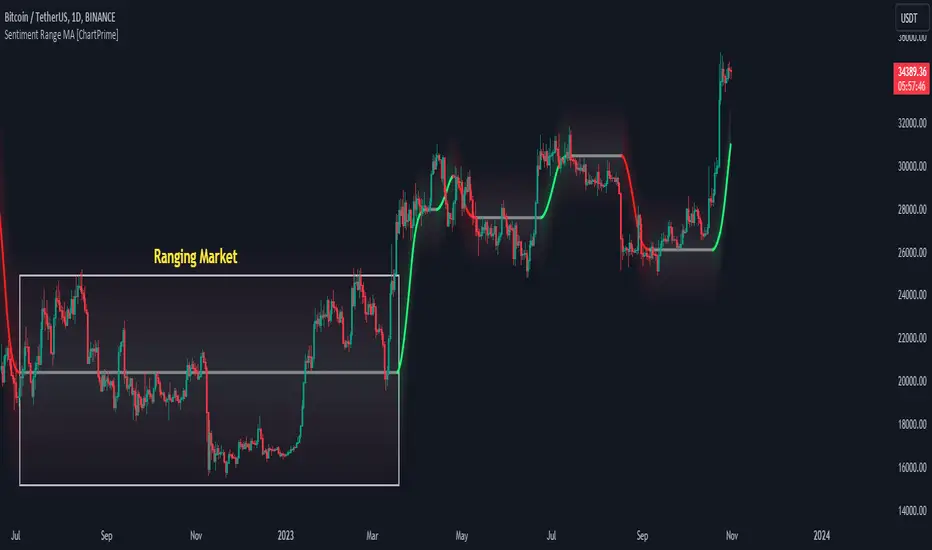
Sentiment Range MA [ChartPrime]The "Sentiment Range MA" provides traders with a dynamic perspective on market activity, emphasizing both stability in chop zones and quick adaptability outside of them.
Key Features:
Chop Zone Stability: In choppy markets, this indicator remains consistent, filtering out the noise to provide a clear view.
Quick Adaptability: Should the price break out of these zones, the indicator recalibrates promptly.
Dynamic Support and Resistance: Adapts based on the latest price action, serving as an evolving reference point.
Emphasis on Recent Levels: The tool factors in the latest notable market levels to stay relevant and timely.
Configurations:
Data Source: Choose your desired metric, though many default to the closing price.
Output Smoothing: Adjust the SR MA's response to market movements.
Trigger Smoothing: Refine boundary definitions based on your market insights.
ATR Period: Set the period for the ATR, influencing the surrounding boundary's width.
Range Multiplier: Control the ATR's effect on the range.
Range Switch: Flip between high-low and open-close values for range determination.
Visuals
Sentiment Range MA Line:
- This is the flowing line that transitions between green and red.
- When it's green, it indicates bullish momentum in the market. This suggests a prevailing upward trend and can be an entry cue for traders who trade with the trend.
- When it turns red, bearish sentiments dominate. It indicates the potential beginning of a downtrend or a continued downtrend. Traders might interpret this as a signal to be cautious, to short the market, or to exit long positions.
The Chop Zone:
- This is the space between the price candles and the Sentiment Range MA line. It represents a region where the price is considered to be moving sideways or without a clear direction. Price movements within the chop zone might not be substantial enough to warrant a trading decision. Only when the price breaks out of this zone do we see the Sentiment Range MA line change color, signaling a potential trading opportunity.
By interpreting these visuals, traders can make more informed decisions based on the prevailing market sentiment and trend. The chart becomes a tool, providing both an overview of the market condition and potential entry or exit points based on the Sentiment Range MA indicator's readings.
Detailed Settings Overview
Understanding the settings of the Sentiment Range MA Indicator can greatly enhance its utility in your trading strategy. Let's dive deeper into each:
Output Smoothing:
Purpose: It refines the SR MA to provide a clearer trend perspective.
Functionality:
- At `0`, it ensures the indicator responds immediately to price deviations from the chop zone.
- At higher values, it transforms the indicator into a volatility-adjusted moving average.
Filtering Modes:
- Single Filtering: Prioritizes speed.
- Double Filtering: Emphasizes stability.
Trigger Smoothing:
Purpose: Used for the range break detection.
Functionality: It dampens the indicator's sensitivity to sudden market volatility, preventing unnecessary triggers.
ATR Length:
Purpose: Governs the retrospective period for the chop zone.
Functionality:
- Higher values offer a more consistent and broad range size, capturing more historical data.
- Lower values allow for a more adaptive and responsive range.
Range Multiplier:
Purpose: Modifies the breadth of the range around the SR MA.
Functionality: Increasing the multiplier will extend the range, giving more leeway before triggering, while decreasing it will narrow the range, making the indicator more responsive to price changes.
Range Style:
Purpose: Decides which candlestick data is factored into the true range calculations.
Options:
- Body: Uses the open and close values.
- Wick: Accounts for the high and low values.
Functionality: Switching between styles lets you prioritize either the overall volatility (Wick) or just the concluded price action for a period (Body).
By fine-tuning these settings, traders can tailor the Sentiment Range MA Indicator to various market conditions and personal trading styles, ensuring optimal decision-making.
Quick Start
Based on the provided chart, here's a brief explanation of the default settings for the Sentiment Range MA Indicator:
Length: Set at ` 20 `.
- This determines the base moving average period. A standard setting, it calculates the average price over the last 20 periods, providing traders with a clear perspective of short-term trends.
ATR Length: Set at ` 200 `.
- This adjusts the lookback period for the Average True Range (ATR), which in turn influences the chop zone calculation. At a setting of 200, it offers a comprehensive view, considering a longer stretch of historical data.
Range Multiplier: Set at ` 6 `.
- This multiplies the ATR value, widening or narrowing the band around the SR MA. A setting of 6 means the range around the SR MA is determined by multiplying the ATR by 6, offering a broader fluctuation zone.
On the chart, the green line represents the bullish sentiment and the red represents the bearish sentiment. Price movements above and below these lines can be used as potential buy or sell signals respectively. Fine-tuning these settings can cater the Sentiment Range MA Indicator to your specific trading strategy and market condition preferences.
Alternative Settings
For traders looking to adapt to faster market conditions or prefer a more agile analysis, here's a brief description of the alternative settings for the Sentiment Range MA Indicator:
Length: Set at ` 3 `.
- This highly responsive setting calculates the average price over the last 3 periods. Ideal for quick market movements, it offers traders insights into very short-term price trends and potentially swift trade opportunities.
ATR Length: Set at ` 50 `.
- This shorter lookback period for the Average True Range (ATR) focuses on more recent market volatility, providing a tighter and more current chop zone calculation. It's suitable for those wanting to respond to recent market shifts.
Range Multiplier: Set at ` 4 `.
- Multiplying the ATR by 4 narrows down the buffer around the SR MA. This creates a tighter sentiment range, possibly resulting in more frequent crossovers and trading signals.
In the provided chart, the green line still denotes bullish momentum while the red symbolizes bearish sentiment. These alternative settings might generate more frequent signals, so traders should ensure their strategy is aligned with this heightened sensitivity.
Wrapping Up
The Sentiment Range MA melds stability and agility, making it a valuable tool in your trading toolkit. As always, before integrating new indicators, take the time to understand its nuances and potential impacts on your strategy.
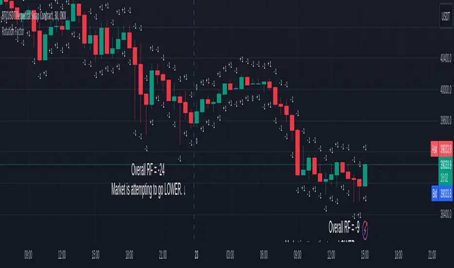
Rotation Factor for TPO and OHLC (Classic)The Rotation Factor objectively measures attempted market direction(or market sentiment) for a given period. It records the cumulative directional attempts of auction rotations within a given period, thus, helping traders determine which way the market is trying to go and which market participant is exerting greater control or influence.
Theory
The premise is that a greater number of bars auctioning higher contrasted to bars auctioning lower indicates that buyers are exerting greater control over price within the given period(usually daily). In this case, the market is attempting to go higher (Market is Bullish). The same is true for a greater number of bars auctioning lower than higher, which, in this case, indicates that the sellers are exerting greater control over price within the given period and that the market is attempting to go lower (Market is Bearish).
Calculation
Each bar is individually measured in relation to the immediate previous bar, and calculations are reset at the beginning of each period.
For every bar, two variables are utilised: One for the highs and another for the lows. During bar start, these variables are initiated at 0.
As the period progresses, these variables are set accordingly: If the high of the current bar is higher than that of the previous bar, then the bar's highs variable is assigned a "+1". If the opposite is true, it is given a "-1". Finally, if both bar highs are equal, it is, instead, assigned a "0". The same is true for the lows: if the low of the current bar is higher than that of the previous low, then the bar's lows variable is assigned a "+1". Similarly, the opposite is given a "-1", while equal lows causes it to be assigned a "0". All highs and lows are then summed together resulting to a total, which becomes the Rotational Factor.
Presentation
Furthermore, this Rotation Factor Indicator is presented as it is calculated, which is the presentation utilised by classic sources (hence the name classic).
Features
1. Customisable Tick Size/Granularity : The calculation tick size/ granularity is customisable which can be accessed through the indicator settings.
2. Customisable Labels : The colour and sizes used by the labels are customisable the better for accessibility.
3. Period Separator : A separator is rendered to represent period borders (start and end). If separators are already present on your chart, you can remove them from the indicator settings.
Works for both split Market Profile(TPO) charts and regular OHLC bars/candle charts
The Rotation Factor is usually used with a Split Market Profile (TPO). However, if no such tool is available, you will still be able to benefit from the Rotation Factor as the price ranges of Split Market Profiles and OHLC bars/candles are one and the same. In such cases, it is recommended that you set your chart to use a 30 minute timeframe and the indicator's period to "daily" to simulate a Split Market Profile.
Note :
The Rotation Factor is, to quote, "by no means not an all-conclusive indication of future market direction.". It only helps determine which way the market is trying to go by objectively measuring the market's directional attempts.
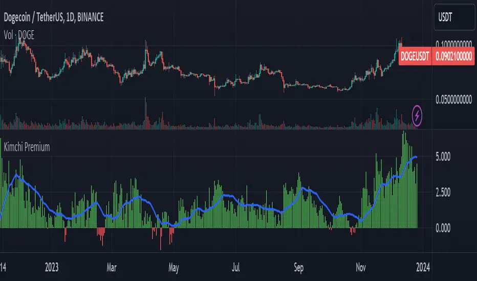
Kimchi Premium / Korean Premium ALL TICKERSKimchi Premium
Due to the isolated nature of Korean crypto markets, Koreans pay a hefty premium on most cryptos. (Usually ranging from 3% to 5%). This is colloquially known as the " Kimchi Premium ".
Uses
The extend of this premium can be used to gauge Korean sentiment towards certain tickers. Most of the insane alt coin rallies that are started by Korean degens are missed by foreign traders entirely. This script seeks to fix that.
Notes
This script automatically detects your current ticker and compares the USDT pair to the KRW pair after adjusting for exchange rate.
Works on all USDT, USDC, BUSD, FDUSD, USD, USDT.P, USDC.P or KRW pairs. Will obviously throw an error if your ticker has no KRW pairing.
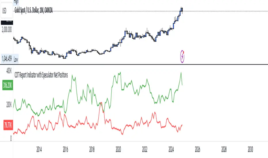
COT Report Indicator with Speculator Net PositionsThe COT Report Indicator with Speculator Net Positions is designed to give traders insights into the behavior of large market participants, particularly speculators, based on the Commitment of Traders (COT) report data. This indicator visualizes the long and short positions of non-commercial traders, allowing users to gauge the sentiment and positioning of large speculators in key markets, such as Gold, Silver, Crude Oil, S&P 500, and currency pairs like EURUSD, GBPUSD, and others.
The indicator provides three essential components:
Net Long Position (Green) - Displays the total long positions held by speculators.
Net Short Position (Purple) - Shows the total short positions held by speculators.
Net Difference (Long - Short) (Yellow) - Illustrates the difference between long and short positions, helping users identify whether speculators are more bullish or bearish on the asset.
Recommended Timeframes:
Best Timeframes: Weekly and Monthly
The COT report data is released on a weekly basis, making higher timeframes like the Weekly and Monthly charts ideal for this indicator. These timeframes provide a more accurate reflection of the underlying trends in speculator positioning, avoiding the noise present in lower timeframes.
How to Use:
Market Sentiment: Use this indicator to gauge the sentiment of large speculators, who often drive market trends. A strong net long position can indicate bullish sentiment, while a high net short position might suggest bearish sentiment.
Trend Reversal Signals: Sudden changes in the net difference between long and short positions may indicate potential trend reversals.
Confirmation Tool: Pair this indicator with your existing analysis to confirm the strength of a trend or identify overbought/oversold conditions based on speculator activity.
Supported Symbols:
This indicator currently supports a range of commodities and currency pairs, including:
Gold ( OANDA:XAUUSD )
Silver ( OANDA:XAGUSD )
Crude Oil ( TVC:USOIL )
Natural Gas ( NYMEX:NG1! )
S&P 500 ( SP:SPX )
Dollar Index ( TVC:DXY )
EURUSD ( FX:EURUSD )
GBPUSD ( FX:GBPUSD )
GBPJPY( FX:GBPJPY )
By providing clear insight into the positions of large speculators, this indicator is a powerful tool for traders looking to align with institutional sentiment and enhance their trading strategy.
Commitment of Trader %R StrategyThis Pine Script strategy utilizes the Commitment of Traders (COT) data to inform trading decisions based on the Williams %R indicator. The script operates in TradingView and includes various functionalities that allow users to customize their trading parameters.
Here’s a breakdown of its key components:
COT Data Import:
The script imports the COT library from TradingView to access historical COT data related to different trader groups (commercial hedgers, large traders, and small traders).
User Inputs:
COT data selection mode (e.g., Auto, Root, Base currency).
Whether to include futures, options, or both.
The trader group to analyze.
The lookback period for calculating the Williams %R.
Upper and lower thresholds for triggering trades.
An option to enable or disable a Simple Moving Average (SMA) filter.
Williams %R Calculation: The script calculates the Williams %R value, which is a momentum indicator that measures overbought or oversold levels based on the highest and lowest prices over a specified period.
SMA Filter: An optional SMA filter allows users to limit trades to conditions where the price is above or below the SMA, depending on the configuration.
Trade Logic: The strategy enters long positions when the Williams %R value exceeds the upper threshold and exits when the value falls below it. Conversely, it enters short positions when the Williams %R value is below the lower threshold and exits when the value rises above it.
Visual Elements: The script visually indicates the Williams %R values and thresholds on the chart, with the option to plot the SMA if enabled.
Commitment of Traders (COT) Data
The COT report is a weekly publication by the Commodity Futures Trading Commission (CFTC) that provides a breakdown of open interest positions held by different types of traders in the U.S. futures markets. It is widely used by traders and analysts to gauge market sentiment and potential price movements.
Data Collection: The COT data is collected from futures commission merchants and is published every Friday, reflecting positions as of the previous Tuesday. The report categorizes traders into three main groups:
Commercial Traders: These are typically hedgers (like producers and processors) who use futures to mitigate risk.
Non-Commercial Traders: Often referred to as speculators, these traders do not have a commercial interest in the underlying commodity but seek to profit from price changes.
Non-reportable Positions: Small traders who do not meet the reporting threshold set by the CFTC.
Interpretation:
Market Sentiment: By analyzing the positions of different trader groups, market participants can gauge sentiment. For instance, if commercial traders are heavily short, it may suggest they expect prices to decline.
Extreme Positions: Some traders look for extreme positions among non-commercial traders as potential reversal signals. For example, if speculators are overwhelmingly long, it might indicate an overbought condition.
Statistical Insights: COT data is often used in conjunction with technical analysis to inform trading decisions. Studies have shown that analyzing COT data can provide valuable insights into future price movements (Lund, 2018; Hurst et al., 2017).
Scientific References
Lund, J. (2018). Understanding the COT Report: An Analysis of Speculative Trading Strategies.
Journal of Derivatives and Hedge Funds, 24(1), 41-52. DOI:10.1057/s41260-018-00107-3
Hurst, B., O'Neill, R., & Roulston, M. (2017). The Impact of COT Reports on Futures Market Prices: An Empirical Analysis. Journal of Futures Markets, 37(8), 763-785.
DOI:10.1002/fut.21849
Commodity Futures Trading Commission (CFTC). (2024). Commitment of Traders. Retrieved from CFTC Official Website.

S&P500 Market Breadth /MA20Introduction
It calculates the percentage of assets trading above their 20-day moving average (MA20), providing a clear view of market breadth and highlighting the strength of an uptrend or downtrend.
Features
• Market Breadth Analysis: The MA20 Market Breadth Indicator tracks the number of assets trading above their 20-day moving average, offering an intuitive view of the proportion of rising versus falling assets. A high breadth suggests a strong uptrend, while low breadth indicates that most assets are in a downtrend.
• Trend Following: This indicator allows traders to easily identify whether the overall market trend is healthy and upward or potentially weakening and downward.
• Simple and Intuitive: The breadth is displayed as a percentage, enabling users to quickly assess market conditions and make informed decisions.
How to Use
1. Assess Market Sentiment: When the MA20 market breadth is above the 50% zone, it indicates that the market is in a broad uptrend, favoring long positions. When it falls below 50%, it signals downward pressure, making it a time for caution or short opportunities.
2. Spot Trend Reversals: Sudden changes in market breadth, such as a sharp decline from a high level, can indicate an upcoming market reversal or correction, signaling traders to adjust their positions.
3. Confirm Trends: Combine the MA20 market breadth with other indicators, such as momentum or volume, to further validate the overall direction of the market.
Applicable Markets
This indicator works across various markets and asset classes, including but not limited to:
• Stock markets (indices and individual stocks)
• Cryptocurrencies
• Forex markets
Conclusion
The MA20 Market Breadth Indicator provides traders with a clear picture of market health, helping to identify broader trends and confirm shifts in market sentiment. It’s an essential tool for traders of all types, particularly those focused on medium to short-term trend following and market reversals.
Disclaimer
This indicator is for educational purposes only. Please use it in conjunction with your own trading strategies and adjust according to your risk tolerance.
This introduction should work well for your TradingView release. You can adjust it as needed for specific features or updates in the indicator.

Emotion Line with Volume Confirmation by langshenHow to Use It?
Add the Indicator:
Copy the code into TradingView's Pine Script editor.
Save and add the indicator to your chart.
Understand the Lines:
Emotion Line (Green): Represents the current market sentiment.
MA Emotion Line (Red): A smoothed version of the Emotion Line.
Horizontal Lines:
20% (Gray): Indicates potential positive sentiment (Attention Zone).
40% (Orange): Suggests strong market sentiment (Entry Zone).
80% (Red): Signals overly optimistic sentiment (Reduce Position Zone).
Interpret the Signals:
When the Emotion Line crosses above 20%, it may indicate a positive shift in sentiment.
When the Emotion Line crosses above 40%, it suggests a strong market sentiment, which could be a potential entry point.
When the Emotion Line crosses above 80%, it may indicate an overbought market, signaling a potential reduction in positions.
When the Emotion Line crosses below the MA Emotion Line, it may indicate a weakening sentiment, signaling an exit.
Customize the Inputs:
N Period: Adjust the period for calculating the Emotion Line (default is 7).
MA Period: Adjust the period for the moving average of the Emotion Line (default is 6).
Logic Explanation
Ray Calculation:
The Ray is a smoothed price value calculated as the simple moving average (SMA) of (2 * close + high + low) / 4.
Close Line (CL):
The CL is derived from the Ray and represents the core price trend.
Directional Change (DlR1):
Measures the absolute difference between the current CL and its value two bars ago (CL ).
Volume in Range (VlR1):
Sums the absolute differences between the current CL and its previous value (CL ) over a specified period.
Efficiency Ratio (ER1):
Calculates the ratio of directional change (DlR1) to volume in range (VlR1), representing the efficiency of price movement.
Cumulative Strength (CS1):
Simplified as the efficiency ratio (ER1).
Cumulative Quotient (CQ1):
Squares the cumulative strength (CS1) to amplify its effect.
Adjusted Moving Average (AMA5):
A dynamic moving average that adjusts based on the CQ1 value, simulating a responsive trend line.
Cost (7-day SMA of AMA5):
The 7-period SMA of the AMA5.
Composite Line (CLX):
The average of AMA5 and Cost.
Emotion Line:
Calculated as the percentage of days where the CLX is higher than its previous value over the last N periods.
MA Emotion Line:
The moving average of the Emotion Line, smoothing out its fluctuations.
Key Features
Trend Identification: Helps identify shifts in market sentiment.
Customizable Periods: Adjust N and M to fit your trading style.
Visual Cues: Horizontal lines provide clear levels for attention, entry, and reduce position signals.
Best Practices
Use this indicator in conjunction with other tools (e.g., RSI, MACD) for confirmation.
Adjust the N and M periods based on your trading timeframe (e.g., shorter periods for scalping, longer periods for swing trading).
Combine the indicator with volume analysis to confirm signals.
This indicator is designed to be simple yet powerful, providing clear insights into market sentiment while adhering to TradingView's coding standards.

Candle Emotion Index (CEI) StrategyThe Candle Emotion Index (CEI) Strategy is an innovative sentiment-based trading approach designed to help traders identify and capitalize on market psychology. By analyzing candlestick patterns and combining them into a unified metric, the CEI Strategy provides clear entry and exit signals while dynamically managing risk. This strategy is ideal for traders looking to leverage market sentiment to identify high-probability trading opportunities.
How It Works
The CEI Strategy is built around three core oscillators that reflect key emotional states in the market:
Indecision Oscillator . Measures market uncertainty using patterns like Doji and Spinning Tops. High values indicate hesitation, signaling potential turning points.
Fear Oscillator . Tracks bearish sentiment through patterns like Shooting Star, Hanging Man, and Bearish Engulfing. Helps identify moments of intense selling pressure.
Greed Oscillator . Detects bullish sentiment using patterns like Marubozu, Hammer, Bullish Engulfing, and Three White Soldiers. Highlights periods of strong buying interest.
These oscillators are averaged into the Candle Emotion Index (CEI):
CEI = (Indecision + Fear + Greed) / 3
This single value quantifies overall market sentiment and drives the strategy’s trading decisions.
Key Features
Sentiment-Based Trading Signals . Long Entry: Triggered when the CEI crosses above a lower threshold (e.g., 0.1), indicating increasing bullish sentiment. Short Entry: Triggered when the CEI crosses above a higher threshold (e.g., 0.2), signaling rising bearish sentiment.
Volume Confirmation . Trades are validated only if volume exceeds a user-defined multiplier of the average volume over the lookback period. This ensures entries are backed by significant market activity.
Break-Even Recovery Mechanism . If a trade moves into a loss, the strategy attempts to recover to break-even instead of immediately exiting at a loss. This feature provides flexibility, allowing the market to recover while maintaining disciplined risk management.
Dynamic Risk Management . Maximum Holding Period: Trades are closed after a user-defined number of candles to avoid overexposure to prolonged uncertainty. Profit-Taking Conditions: Positions are exited when favorable price moves are confirmed by increased volume, locking in gains. Loss Threshold: Trades are exited early if the price moves unfavorably beyond a set percentage of the entry price, limiting potential losses.
Cooldown Period . After a trade is closed, a cooldown period prevents immediate re-entry, reducing overtrading and improving signal quality.
Why Use This Strategy?
The CEI Strategy combines advanced sentiment analysis with robust trade management, making it a powerful tool for traders seeking to understand market psychology and identify high-probability setups. Its unique features, such as the break-even recovery mechanism and volume confirmation, add an extra layer of discipline and reliability to trading decisions.
Best Practices
Combine with Other Indicators . Use trend-following tools (e.g., moving averages, ADX) and momentum oscillators (e.g., RSI, MACD) to confirm signals.
Align with Key Levels . Incorporate support and resistance levels for refined entries and exits.
Multi-Market Compatibility . Apply this strategy to forex, crypto, stocks, or any asset class with strong volume and price action.

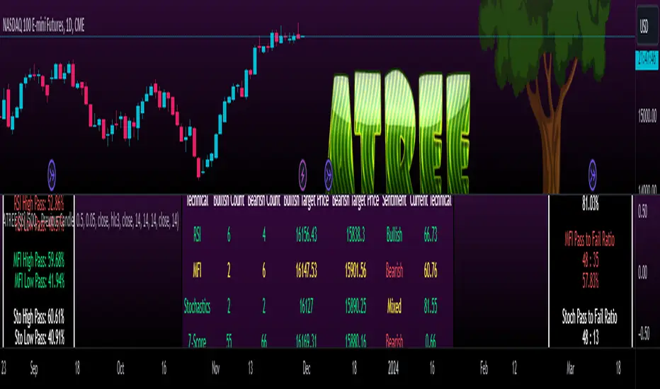
Advanced Technical Range and Expectancy Estimator [SS]Hello everyone,
This indicator is a from of momentum based probability modelling. It is derived from my own approaches to probability modelling but just simplified a bit.
How it works:
The indicator looks at various technical, including stochastics, RSI, MFI and Z-Score, to determine the likely sentiment. All of these, with the exception of Z-Score, are momentum based indicators and can alert us to likely sentiment. However, instead of us making the subjective determination ourselves as to whether the RSI or MFI or Stochastics are bullish, the indicator will look at previous instances of these occurrences, and tally the bullish and bearish follow throughs that happened. It will also calculate the average target price that was hit, under similar conditions, on the same timeframe.
The Z-Score is your "tie breaker". It is not a momentum based indicator and measures something a little different (the standard deviation and over-extension of the stock). For this reason, it provides an alternative assessment and tends to be a bit more reliable in times of low momentum.
Back-test Results:
The indicator back-tests itself over the previous 100 candles. I have limited it to 100 candles for pragmatic considerations (it has to back-test each technical individually and increasing the BT length will slow and potentially error out the indicator) as well as accuracy considerations.
One thing I have noticed in my years of trying to crack the code and develop probability models for tickers, is historical accuracy doesn't always matter because sentiment is always changing. You need to see what it has done over the most recent 100 to 200 candles.
There are two back-test windows, one for the price targets and the other for the sentiment accuracy. The most effective/most accurate will highlight green, the least effective/least accurate will highlight red:
In the image above, you can see that the most accurate predictor of sentiment is Z-Score, with a 90.32% accuracy rate over the past 100 candles.
The most accurate predictor of price is MFI, with a 60% (for bull targets) and 42% (for bear targets)accuracy rate.
Anchoring Points:
The indicator permits you to anchor by two points. The default setting is anchoring by previous candle. If you plan to use this as an oscillator, to see the current prediction for the current candle you are viewing, then you will need to leave this default setting. It will pull the data from the previous candle and give you the data for the current candle you are on.
If you are assess the likely sentiment for the next day after the day has closed off, you will want to anchor by current candle. This will take the current technicals that the day has closed off with and run the assessment for you.
Customizability
You can customize the technicals by source and length of assessment.
They are all defaulted to the traditional settings of these indicators, but if you want to customize your model to try and improve or enhance accuracy in one way or another, you are free and able to do so!
I do suggest leaving the defaults as they seem to work particular well :-).
Thresholds
Thresholds are the tolerance levels that we permit for our technical search range. If you want them to be exactly identical, then you can set it to 0. If you want it to be extremely similar, you can set it to 0.01. This will hone in on the ranges you are interest in and you can see how it affects your accuracy by reviewing the results in the back-test tables.
Keep Static Colour Option
I want to make a quick note on the "Keep Static Colour" option that is in your settings menu.
The primary table that shows you the probability and price targets change colours based on the accuracy of the assessment. This is so, if you are using a mobile device or smaller screen and can't have the back-test results open at the same time, you can see still which are the most reliable results. However, if you have the back-test tables open and you find these colour changes too distracted, you can toggle on the "Keep Static Colour" and it will resort the colour of the table to a solid white:
Show Technicals
The indicator can show you the current technical values if you are using it in place of an oscillator. Its less pivotal as its making the assessment for you, but just for your reference if you want to see what the current MFI, Z-Score or Stochastics etc. are, you have that option as well.
All Timeframes Permitted
You can view Weekly, Monthly, Hourly, 5 minute, 1 minute, its all supported!
That's the indicator in a nutshell.
Hope you enjoy and leave your questions below.
Safe trades everyone!