EMA Market Regime & Real-Time Candle Projection System📌 EMA Market Regime & Real-Time Candle Projection System
EMA Market Regime & Parabolic Projection is a real-time market structure system designed to anticipate candle behavior before it fully forms, by dynamically projecting price levels based on trend strength, acceleration, and market expansion.
Unlike traditional indicators that react after the candle closes, this system continuously adapts to live price data to provide early insight into bullish, bearish, parabolic, and exhaustion phases.
🔍 Core Concept
The system operates on four key dimensions:
Market Structure
Uses a fast and a slow EMA to determine the dominant market regime (bullish or bearish).
Directional Momentum
Measures EMA slope to confirm directional commitment.
Acceleration & Parabolic Detection
Identifies true parabolic movements through acceleration analysis, filtering out weak or range-bound price action.
Expansion Validation
Confirms that movements are supported by genuine market expansion, reducing false signals.
By combining these elements, the indicator projects a dynamic price level in real time, effectively drawing a forward-looking guide that adapts as each candle evolves.
🧠 Real-Time Candle Projection
The projected line represents a dynamic equilibrium level derived from EMA structure and acceleration.
This allows traders to:
Anticipate continuation vs exhaustion
Visualize momentum shifts before candle close
Read potential candle direction and strength in real time
The projection is non-repainting and updates tick-by-tick during the candle’s formation.
🎯 Market Regime Classification
The system automatically classifies the market into distinct states:
Bullish Trend – Positive structure with controlled momentum
Bearish Trend – Negative structure with controlled momentum
Parabolic Expansion – Accelerated trend with strong continuation potential
Parabolic Exhaustion – Loss of acceleration signaling potential reversal or pullback
Neutral / Range – Low momentum and low expansion (no-trade zone)
Each state is visually encoded using subtle, professional coloring, ensuring price candles always remain the primary focus.
🛡️ Professional-Grade Filters
Anti-range and anti-fake breakout filtering
Cooldown logic to prevent repetitive signals
Slope normalization relative to volatility
Designed to remain readable on M1–M5 scalping and higher timeframes
⚙️ Designed For
Scalping & Intraday Trading
Real-time decision-making
Trend continuation & exhaustion timing
Prop-firm and professional trading environments
This system is intended as a market structure and timing tool, not a signal spam indicator.
⚠️ Disclaimer
This indicator does not predict the future and does not provide guaranteed results. It is designed to assist discretionary traders by improving real-time market reading and execution timing.
In den Scripts nach "scalping" suchen

Ichimoku + VWAP + OBV + ATR Full System (NQ Daytrade)This script provides optimized scalping signals for BTC, designed mainly for the 15-minute timeframe.
Long/short entries are generated using VWAP band position and trend confirmation logic.
OBV momentum is used as a secondary filter to validate breakout or reversal conditions.
Exit signals are displayed when volatility compression or mean-reversion conditions occur.
Simple visual markers (triangles and circles) are included for easy decision-making.
롱/숏 삼각형 시그널
동그라미 청산 시그널
VWAP 밴드 기반 방향성
OBV 보조지표
이름 (Name)
BTC Scalping Signal – VWAP + OBV
짧은 설명 (Short Description)
VWAP 밴드와 OBV를 기반으로 방향성, 진입·청산 시그널을 제공하는 스캘핑 지표입니다.
긴 설명 (Long Description)
이 지표는 BTC 단기 스캘핑을 위해 설계된 것으로, 특히 15분봉 환경에 최적화되어 있습니다.
VWAP 밴드의 위치와 추세 판별 로직을 기반으로 롱·숏 진입 신호를 제공합니다.
OBV 모멘텀을 보조 필터로 사용하여 돌파 및 되돌림 가능성을 판단합니다.
시장 변동성이 축소되거나 평균회귀 신호가 감지될 때 청산 시그널을 표시합니다.
삼각형(진입), 원형(청산) 등 직관적 시각 요소를 통해 빠른 의사결정을 지원합니다.

MM SCALP TOOLKIT v6MM SCALP TOOLKIT v6 — What This Indicator Actually Does (Explained Clearly)
The MM SCALP TOOLKIT v6 is a true Swiss-army knife for scalpers.
It combines five different tools into one clean panel, removes clutter from your chart, and automates everything that normally slows a trader down.
“MM” = Money Management
“SCALP” = Short-term precision trading
Below is the exact breakdown of what it does and why it’s valuable.
⸻
1. Automatic Risk Calculation (True Money Management)
This is the strongest feature for both beginners and experienced traders.
The problem:
In scalping, decisions must be made in seconds.
There is no time to calculate position size manually:
• Deposit: $1000
• Risk: 1%
• Stop size: X points
→ “How many units should I open?”
The solution:
The dashboard (right side) calculates the position size for you.
You set these once:
• Account balance
• Risk percentage per trade
The indicator measures current volatility (ATR) and tells you:
“Size ≈ 453 units”
The benefit:
You simply open that size, knowing a stop-loss will cost exactly 1% of your account.
This prevents over-leveraging and account blow-ups.
⸻
2. Session Filter (EU / US Only)
What it does:
It highlights active trading hours and dims the chart during low-volume periods.
Gray = dead zone (no trades)
Bright = London or New York session (good volatility)
The benefit:
You avoid low-volume chop and only take signals during real market activity.
The indicator won’t trigger entries outside your chosen sessions.
⸻
3. Liquidity Sweeps / Stop-Hunts (Smart Money Logic)
What it detects:
When price breaks a previous swing high, grabs liquidity, and then snaps back — a classic stop-hunt.
On the chart you’ll see:
“SWEEP”
The benefit:
This pattern often marks where big players accumulate positions using retail stops.
Shorting after a liquidity grab is far safer than guessing tops.
⸻
4. Trend Filter (EMA Fast / Slow)
Two EMAs act as a simple and effective directional filter.
• Fast EMA above slow → LONG ONLY
• Fast EMA below slow → SHORT ONLY
The benefit:
It prevents you from trading against momentum — the #1 reason scalpers lose money.
This is the “don’t be stupid” filter.
⸻
5. Delta Proxy (Aggression Analysis)
The indicator estimates buy vs sell aggression inside each candle (order-flow style).
Why it’s useful:
If price sweeps liquidity upward but Delta is weak or red → buyers are not supporting the move.
This confirms a potential reversal and strengthens SCALP SHORT signals.
⸻
How to use it (step-by-step):
1. Look at the dashboard:
• Trend: DOWN
• Session: ON
• Delta confirms sell pressure
• Stop-hunt detected above recent swing
2. Watch the chart:
When all conditions align, you will see:
SCALP SHORT (red triangle)
3. Check position size:
Dashboard shows:
“Size ≈ 0.52 BTC”
4. Enter the trade:
Your risk is fixed automatically — always consistent, always safe.
⸻
Summary: Why This Indicator Matters
The MM SCALP TOOLKIT v6 forces you to trade systematically, not emotionally:
✔ Only during high-volume sessions
✔ Only in the direction of trend
✔ Only after liquidity events
✔ Only when Delta confirms
✔ Only with correct position sizing
It’s not “signals for entry” —
it’s a complete risk-managed scalping framework in a single tool.

Exhaustion IndicatorThe ScalpSQZ indicator is designed to identify four critical market states using volatility structure, momentum behavior, and exhaustion conditions. It enhances scalping precision by visually marking transitions between consolidation, squeeze conditions, and momentum reversals through color-coded candles.
1. Squeeze Conditions (Orange Candles)
Orange candles highlight volatility compression, detected when Bollinger Bands contract inside the Keltner Channels. This structure signals that market volatility is tightening and a significant expansion move is likely to follow. The squeeze represents a pre-breakout environment and serves as the earliest warning of a potential directional shift.
2. Consolidation Conditions (Yellow Candles)
Yellow candles identify phases of low directional momentum. These conditions occur when RSI remains near neutral values, MACD histogram activity is minimal, and the Rate of Change stays muted. This combination indicates that the market is balanced and non-trending, often preceding a volatility spike or a new trend. Consolidation helps traders avoid low-probability entries during indecisive price action.
3. Momentum Exhaustion — Overbought Fade (White Candles)
White candles signal potential top-side exhaustion. This occurs when RSI enters overbought territory while the MACD histogram begins to weaken compared to the previous bar. This condition does not necessarily call a reversal but warns that bullish momentum is deteriorating and upside continuation may be limited. It is particularly useful for identifying trend fatigue and tightening stop-loss placement.
4. Momentum Exhaustion — Oversold Fade (Purple Candles)
Purple candles identify bottom-side exhaustion and appear when RSI reaches oversold levels, MACD momentum begins improving, and the current close shows buyer defense relative to the previous low. This condition suggests selling pressure is diminishing and a potential reversal or relief bounce may be forming. Purple candles serve as an early indication of bearish trend exhaustion.
Color Priority System
The indicator follows a fixed hierarchy to ensure clarity:
Squeeze (orange) has the highest priority, followed by consolidation (yellow). Exhaustion signals (white for tops, purple for bottoms) apply only when no squeeze or consolidation conditions are active. This structure ensures that the most critical market states are always highlighted first.
Purpose and Application
ScalpSQZ helps traders identify optimal environments for breakouts, anticipate trend exhaustion, and avoid low-quality trades during choppy or low-momentum conditions. It is suitable for scalping, day trading, and swing trading across any asset class or timeframe.
TradeRaven — VWAP Auto Trend Signal Pro)TradeRaven — VWAP Auto Trend Signal Pro
A next-gen VWAP signal engine built for traders who want speed, accuracy, and true institutional clarity — without needing footprint charts or high-end orderflow tools.
This indicator reads what the market is actually doing and classifies every major behavioural shift into instantly recognisable signal states.
What Makes This Tool Different
Most indicators respond after the move.
This one responds to the behaviour that creates the move.
It interprets the real internal pressure behind each candle —
expansion, contraction, absorption, imbalance, continuation —
and instantly classifies the bar into:
CON — Trend Continuation
REV — Mean Reversion
IGN — Ignition
MON — Monster Displacement
EXH — Exhaustion / Absorption
These aren’t random technical alerts.
They are behavioural state transitions, the same shifts professional traders watch when evaluating momentum, failure, and opportunity.
This is why it feels unusually accurate:
it doesn’t chase price — it reads intention.
Universal Engine — Built for Every Market
Because the model is based on structural behaviour around VWAP, not fixed pattern recognition, it adapts seamlessly across a range of instruments
And it works on:
1–5m scalping
Intra-session day trading
Higher timeframe swing structure
If a market has candles, VWAP, and volume,
the engine knows how to classify the move.
Why VWAP Is the Perfect Anchor
VWAP (Volume-Weighted Average Price — average price weighted by traded volume) is the institutional benchmark for execution and session fairness.
VWAP gives you the map:
Near VWAP → equilibrium (fair value)
Far from VWAP → imbalance (opportunity or risk)
Return to VWAP → reversion / rebalance
Acceleration away → genuine trend commitment
This engine measures how price interacts with that fair-value line and translates the interaction into clear, tradable insights.
VWAP defines the environment.
The engine defines the behaviour.
How the Engine Interprets the Market
Every signal is the result of multi-layer behavioural reading.
The system evaluates:
Trend alignment & slope strength
Compression vs extension from fair value
Expansion velocity (how fast energy is released)
Volatility regime & session volume
Imbalance pressure
Wick rejection at extremes
Structural displacement patterns
This is what gives the signals depth.
They aren’t triggered by simple crossovers.
They only fire when the market shows a true change in internal state.
That’s why the signals feel “alive.”
Sensitivity Modes
Aggressive — fast profiling, more signals
Balanced — the clean default
Sniper — ultra-filtered, higher conviction
These modes shift behavioural thresholds depending on volatility and trend maturity, letting you tailor the tool to your execution style.
Session Filters
Choose the sessions you want the engine active in:
Asia
London
New York
This locks signals to genuine volatility windows instead of low-efficiency zones.
How Traders Use It
1. Start with VWAP Slope
The slope defines the environment:
Upward → pro-trend bias
Downward → sell-side bias
Flat → rotational or mean-reversion conditions
This alone filters most bad trades.
2. Read the Signals as Market Narrative
CON + IGN → Expansion
Ideal for continuation plays and momentum entries.
REV + EXH → Rotation
Perfect for spotting early reversions, failed highs/lows, and areas to reduce risk.
MON → Major Legs
These bars define the session and often mark liquidity breaks or displacement shifts.
You’re not trading signals —
you’re trading the story they reveal.
3. Combine It With Your Own Edge
The engine is designed to enhance:
Orderflow
CVD (Cumulative Volume Delta — measures net aggressive buyers/sellers)
Delta footprint
Market structure
Liquidity plays
Price action scalping
Think of it as orderflow-style clarity
without needing orderflow software.
Why This is a Game Changer
it turns chaos into structure.
it updates instantly.
it shows intention where most indicators show noise.
it helps you understand why the market moves — not just when.
This isn't a traditional “indicator.”
It’s a behavioural engine that maps strength, imbalance, exhaustion, and true momentum in a way that mirrors institutional reading.
In the right hands,
it becomes one of the cleanest, most accurate timing tools you’ll ever use.

Sai Scalper ProSai Scalper Pro – Feature Summary
Trend Engine
- ATR-based trailing stop with Fibonacci levels (61.8%, 78.6%, 88.6%)
- Auto trend detection with swing point tracking
Scalping Detection (0-10 Score)
- Analyzes 7 factors: ATR compression, ADX, Volume, Range, Consolidation, RSI, BB Squeeze
- Smart state machine with hysteresis to prevent false signals
- Adjustable sensitivity & stability settings
Cloud Modes (7 Options)
- Full Zone, Entry Zone, Premium/Discount, Fib Bands, Upper/Middle/Lower Band
Pro Dashboard
- Real-time scalp score with visual meter
- Entry quality rating & zone display
- Suggested TP/SL based on ATR
- Session detection (Sydney/Tokyo/London/NY) with overlap alerts
- 3 styles (Minimal/Pro/Full) × 4 sizes × 9 positions
Alerts
- Scalp ready, Prime conditions (8+), Optimal entry zone
- Direction-specific (Long/Short bias)
Combines trend-following Fibonacci analysis with intelligent ranging detection for optimal scalping opportunities.
XAU Micro ScalperThis indicator is designed for short-term price rotation detection on XAUUSD, especially on the 1-minute timeframe.
It combines three momentum components—Stochastic, RSI, and OBV slope—to highlight potential reversal points and short-term scalping opportunities.
Core Logic
The script generates a signal only when multiple conditions align:
1. Stochastic Reversal (Timing Component)
A basic long/short trigger occurs when the Stochastic oscillator exits oversold (long) or overbought (short).
This represents a potential shift in short-term momentum.
2. RSI “Smart Rotation” Filter (Context Component)
Instead of using fixed oversold/overbought thresholds, the indicator checks whether RSI is turning:
Long: RSI is below a contextual ceiling (default 50) and rising
Short: RSI is above a contextual floor (default 55) and falling
This avoids premature entries during strong trending phases and confirms that momentum is actually rotating.
3. OBV Slope Filter (Volume Confirmation)
The On-Balance Volume trend is compared to its previous value:
Long: OBV slope improving
Short: OBV slope deteriorating
This helps confirm whether volume pressure is shifting in favor of the trade direction.
Both RSI and OBV filters can be enabled or disabled independently via the indicator settings.
Signals
Small circles mark raw Stochastic reversal points (unfiltered).
Green / red triangles represent validated long/short signals where all active filters agree.
Optional candle coloring highlights confirmed entry signals on the chart.
Use Cases
Intraday and scalping strategies on XAUUSD
Identifying short-term momentum reversals
Filtering noisy signals during high-volatility sessions
Studying how volume and momentum align around turning points
Customization
Users can adjust:
RSI contextual thresholds
Lookback periods
OBV slope sensitivity
Stochastic parameters
Activation of RSI and OBV filters
This flexibility allows the indicator to adapt to different market conditions and timeframes.
Disclaimer
This indicator does not provide financial advice or guarantee performance.
Always test any strategy on historical data and use proper risk management.

Momentum Candle by DNDFXMomentum Candle v2 is a simple yet powerful indicator designed to detect strong momentum candles based on candle body size and the ratio between the body and total wick.
This indicator is ideal for traders who focus on:
Momentum trading
Breakout strategies
XAUUSD (Gold) scalping
Supply & Demand / Smart Money Concepts (SMC) confirmation
🔧 How the Indicator Works
The indicator analyzes each candle and classifies it as a Bullish Momentum or Bearish Momentum candle when these conditions are met:
✅ The candle body exceeds the minimum size
✅ The total wick is smaller compared to the body
✅ The Body-to-Wick ratio meets the strength filter
Visual signals include:
Green background for bullish momentum
Red background for bearish momentum
Up/Down triangle markers as entry guidance
⚙️ Customizable Parameters
Min Body Size (Points) – Sets the minimum candle body size
Min Body : Wick Ratio – Controls how dominant the body is compared to the wicks
All parameters can be optimized according to your trading style and timeframe.
✅ Best Use Cases
This indicator is useful for:
Breakout confirmation
Momentum validation
Filtering false breakouts
Scalping and intraday trading on XAUUSD
🧠 Trading Tips
For better accuracy, combine this indicator with:
Support & Resistance
Supply & Demand zones
Break of Structure (BOS) / CHoCH
Best performance on M5 – H1 timeframes.
⚠️ DISCLAIMER
This indicator is a supporting tool, not a guaranteed profit system. Always apply proper risk management. You are fully responsible for your trading decisions.

Nifty levels SHIVAJIonly for nifty levels and only for paper trade----
📊 NIFTY LEVELS – Intraday Trading Indicator
NIFTY LEVELS एक simple और powerful intraday indicator है जो NIFTY के लिए Daily Open आधारित महत्वपूर्ण support & resistance levels automatically plot करता है।
🔹 Indicator क्या दिखाता है
✅ Day Open Level
✅ Major Resistance & Support Levels
✅ Scalping Levels (Intraday Trading के लिए)
✅ Auto update हर नए trading day के साथ
🔹 किसके लिए उपयोगी है
✅ Intraday Traders
✅ Scalpers
✅ Bank Nifty / Nifty Option Traders
✅ Index based price action trading
🔹 कैसे इस्तेमाल करें
📌 Price Day Open के ऊपर हो → Buy bias
📌 Price Day Open के नीचे हो → Sell bias
📌 Big Levels पर reversal या breakout observe करें
📌 Scalping levels से quick entry & exit के लिए सहायता
🔹 Best Timeframe
1 min – 15 min (Intraday)
Index charts (NIFTY

Setup Keltner BandS MMS + RSI SIGNALS
📊 Keltner Bands with RSI Confirmation – TradingView Script
Introduction
This script combines Keltner Channel logic with Relative Strength Index (RSI) confirmation to provide traders with visual signals and alerts for potential reversals. It is designed for scalping and short-term trading strategies, where precision and quick decision-making are essential.
🔧 How It Works
• Keltner Bands (ATR-based):
• Two sets of bands are plotted around a moving average:
• Band 3 (ATR × 3) – more sensitive, suitable for aggressive entries.
• Band 5 (ATR × 5) – wider, used as a filter or confirmation zone.
• Signals are generated when the price crosses back inside the bands from outside.
• RSI Confirmation:
• RSI is calculated with a customizable period (default: 14).
• Overbought and oversold levels (default: 70/30) are used to filter signals.
• A bearish reversal is confirmed only if RSI is above the overbought level.
• A bullish reversal is confirmed only if RSI is below the oversold level.
📌 Functions and Features
• Visual Signals:
• Triangles plotted above/below candles for Keltner-only signals.
• Additional colored triangles for Keltner + RSI confirmed signals.
• Alerts:
• Configurable alerts for both Keltner-only and RSI-confirmed conditions.
• Messages include the type of reversal and the band level.
• Customizable Parameters:
• Moving average length.
• ATR multipliers (3 and 5).
• RSI length and thresholds.
• Colors for band fills and signals.
🎯 Usage
1. Apply the script to your chart in TradingView.
2. Adjust parameters to fit your trading style (scalping, intraday, swing).
3. Watch for signals:
• Red/green/orange/teal triangles → Keltner-only reversals.
• Maroon/lime/purple/blue triangles → RSI-confirmed reversals.
4. Set alerts to receive notifications when conditions are met.
5. Use RSI confirmation to filter out false signals and increase accuracy.
✅ Benefits
• Clear visualization of reversal zones.
• Dual-layer confirmation (Keltner + RSI).
• Flexible for different timeframes and trading styles.
• Ready-to-use alerts for automation or manual trading.

Sessioni Orarie IT + Weekend + Alerts# 📋 DESCRIZIONE ITALIANO
---
# 🇮🇹 Sessioni Orarie Italiane + Weekend + Alert
## 📊 Descrizione
Questo indicatore è stato progettato specificamente per i trader italiani che necessitano di visualizzare orari chiave durante la sessione di trading, identificare i periodi di weekend e **ricevere notifiche automatiche** ai cambi di sessione.
Lo script traccia automaticamente **linee verticali infinite** ai seguenti orari italiani:
- **15:30** - Apertura mercato USA (New York)
- **18:30** - Fine sessione europea / Mid-session USA
Inoltre, evidenzia visualmente tutto il **periodo di weekend** (da Venerdì 20:00 a Domenica 23:00) con uno sfondo colorato personalizzabile.
**🔔 NOVITÀ: Sistema di Alert completo** per non perdere mai l'apertura/chiusura delle sessioni chiave!
---
## ✨ Caratteristiche Principali
### 🕐 Linee Orarie Automatiche
- **15:30 IT** - Linea verticale all'apertura di Wall Street
- **18:30 IT** - Linea verticale di fine sessione europea
- Linee **infinite** che si estendono sopra e sotto il grafico
- Stile completamente **personalizzabile** (colore, larghezza, tipo di linea)
- **Auto-aggiornamento** con gestione automatica ora legale/solare (CET/CEST)
### 🌙 Evidenziazione Weekend
- Sfondo colorato nel periodo: **Venerdì 20:00 → Domenica 23:00**
- Aiuta a identificare rapidamente quando i mercati Forex/Crypto sono meno liquidi
- Colore e trasparenza **completamente personalizzabili**
### 🔔 Sistema Alert Avanzato
- **Alert automatici** per ogni cambio di sessione
- **5 tipi di alert configurabili**:
- 🇺🇸 Apertura New York (15:30 IT)
- 🇪🇺 Fine Sessione Europea (18:30 IT)
- 🌙 Inizio Weekend (Venerdì 20:00 IT)
- ☀️ Fine Weekend (Domenica 23:00 IT)
- ⚠️ Qualsiasi evento (alert combinato)
- **Multi-canale**: Notifiche push, email, popup, webhook
- **Messaggi personalizzati** con emoji e informazioni dettagliate
- **Switch individuale** per ogni tipo di alert
### ⚙️ Caratteristiche Tecniche
- ✅ Funziona su **tutti i timeframe** (da 1 minuto a mensile)
- ✅ Compatibile con **tutti gli strumenti** (Forex, Crypto, Azioni, Indici, Commodities)
- ✅ Fuso orario **Europe/Rome** integrato
- ✅ Gestione automatica DST (Daylight Saving Time)
- ✅ Codice ottimizzato in **Pine Script v6**
- ✅ Label opzionali per identificare gli orari
- ✅ **Alert frequency**: once_per_bar (evita spam di notifiche)
---
## 🎨 Impostazioni Personalizzabili
### Stile Visivo
1. **Colore Linee Orarie** - Scegli il colore che preferisci
2. **Larghezza Linee** - Da 1 a 5 pixel
3. **Stile Linee** - Solid (continua), Dashed (tratteggiata), Dotted (puntinata)
4. **Colore Weekend** - Sfondo personalizzabile con trasparenza
### Alert Settings
1. **Abilita Alert** - Switch master per attivare/disattivare tutti gli alert
2. **Alert ore 15:30** - Notifica apertura New York
3. **Alert ore 18:30** - Notifica fine sessione europea
4. **Alert Inizio Weekend** - Notifica chiusura mercati (Ven 20:00)
5. **Alert Fine Weekend** - Notifica riapertura mercati (Dom 23:00)
---
## 📖 Come Utilizzarlo
### Installazione Base
1. Aggiungi l'indicatore al tuo grafico
2. Le linee appariranno automaticamente alle 15:30 e 18:30 (ora italiana)
3. Il weekend sarà evidenziato con uno sfondo colorato
4. Personalizza colori e stili dalle impostazioni (icona ingranaggio)
### Attivazione Alert
#### Metodo 1: Alert Automatici (Consigliato - Più Semplice)
1. Vai in **Impostazioni** dell'indicatore (icona ingranaggio)
2. Sezione **Alert Settings**
3. Spunta gli alert che vuoi ricevere
4. Gli alert si attivano automaticamente!
#### Metodo 2: Alert Personalizzati (Avanzato)
1. Clicca sul pulsante **⏰ Alert** in alto a destra
2. Seleziona **Condizione** → Nome dell'indicatore
3. Scegli il tipo di alert:
- Apertura NY (15:30)
- Fine EU (18:30)
- Inizio Weekend
- Fine Weekend
- Qualsiasi Sessione
4. Configura le **opzioni di notifica**:
- 📱 Notifica App
- 📧 Email
- 🔊 Popup sonoro
- 🔗 Webhook URL
5. Clicca **Crea**
---
## 🔔 Messaggi Alert
Gli alert includono emoji e informazioni chiare:
**🇺🇸 15:30 IT - APERTURA NEW YORK**
```
Inizio sessione americana
Strumento:
```
**🇪🇺 18:30 IT - FINE SESSIONE EUROPEA**
```
Mid-session USA
Strumento:
```
**🌙 VENERDÌ 20:00 - INIZIO WEEKEND**
```
Mercati in chiusura
Riduzione liquidità prevista
```
**☀️ DOMENICA 23:00 - FINE WEEKEND**
```
Riapertura mercati imminente
Preparati per la nuova settimana
```
---
## 🎯 Ideale Per
- 📈 **Day Traders** che operano sulle sessioni USA/EU
- 🌍 **Forex Traders** che vogliono evidenziare il weekend
- 💹 **Scalpers** che necessitano di riferimenti orari precisi
- ⏰ **Swing Traders** che vogliono evitare gap del weekend
- 🇮🇹 **Trader Italiani** che usano il fuso orario locale
- 📱 **Mobile Traders** che vogliono notifiche push
---
## 💡 Perché Usare Questo Indicatore?
- **Risparmia tempo**: Non devi più calcolare manualmente gli orari con fusi diversi
- **Non perdere sessioni**: Alert automatici ti avvisano sempre
- **Chiarezza visiva**: Identifica immediatamente le sessioni chiave
- **Versatile**: Funziona su qualsiasi mercato e timeframe
- **Preciso**: Aggiornamento automatico con ora legale/solare
- **Multi-dispositivo**: Ricevi notifiche su mobile, desktop, email
---
## 📝 Note Importanti
- Le linee orarie vengono disegnate solo quando la candela corrisponde esattamente all'orario target
- L'evidenziazione weekend copre il periodo da Ven 20:00 a Dom 23:00 (ora italiana)
- Gli alert usano `alert.freq_once_per_bar` per evitare spam di notifiche
- Lo script è ottimizzato per non appesantire il grafico
- Gli alert funzionano anche quando il grafico non è aperto (se configurati correttamente)
---
## 🚀 Casi d'Uso
### Scenario 1: Day Trader Forex
- Attiva alert 15:30 per entrare sulle notizie USA
- Attiva alert 18:30 per chiudere posizioni EU
- Visualizza linee per identificare breakout agli orari chiave
### Scenario 2: Swing Trader
- Attiva alert weekend per chiudere posizioni prima del venerdì sera
- Evidenziazione weekend per evitare gap di apertura
- Alert domenica sera per preparare setup settimanali
### Scenario 3: Scalper Intraday
- Linee orarie come riferimento per volatilità
- Alert 15:30 per sfruttare l'aumento di volume NY
- Personalizza colori per non disturbare l'analisi tecnica
---
## 🔄 Aggiornamenti Futuri
Roadmap pianificata:
- Aggiunta sessione asiatica (Tokyo)
- Sessione londinese personalizzabile
- Statistiche volatilità per sessione
- Alert personalizzabili con messaggi custom
- Integrazione con Discord/Telegram
**Lascia un commento con le tue richieste!**
---
## ⭐ Ti è Piaciuto?
Se trovi utile questo indicatore:
- Lascia una ⭐ **stella**
- 💬 **Commenta** con feedback o richieste
- 🔄 **Condividilo** con altri trader
- 👤 **Seguimi** per altri script utili!
---
## 🏷️ Tags
`sessioni` `orari` `italia` `weekend` `alert` `notifiche` `fuso-orario` `CET` `CEST` `new-york` `forex` `day-trading` `scalping` `swing-trading` `utilità` `automazione`
---
**Versione**: 2.0 (Alert Update)
**Lingua**: Italiano / English
**Licenza**: Mozilla Public License 2.0
**Autore**:
---
**Buon Trading! 📊🇮🇹**
---
---
# 📋 ENGLISH DESCRIPTION
---
# 🌍 Italian Time Sessions + Weekend + Alerts
## 📊 Description
This indicator is specifically designed for traders who need to visualize key Italian time zones during trading sessions, identify weekend periods, and **receive automatic notifications** at session changes.
The script automatically draws **infinite vertical lines** at the following Italian times:
- **15:30 IT** - US Market Open (New York)
- **18:30 IT** - European Session Close / Mid US Session
Additionally, it visually highlights the entire **weekend period** (from Friday 20:00 to Sunday 23:00) with a customizable colored background.
**🔔 NEW: Complete Alert System** to never miss key session openings/closings!
---
## ✨ Main Features
### 🕐 Automatic Time Lines
- **15:30 IT** - Vertical line at Wall Street opening
- **18:30 IT** - Vertical line at European session close
- **Infinite lines** extending above and below the chart
- Fully **customizable** style (color, width, line type)
- **Auto-update** with automatic DST management (CET/CEST)
### 🌙 Weekend Highlighting
- Colored background during: **Friday 20:00 → Sunday 23:00**
- Helps quickly identify when Forex/Crypto markets are less liquid
- Color and transparency **fully customizable**
### 🔔 Advanced Alert System
- **Automatic alerts** for every session change
- **5 configurable alert types**:
- 🇺🇸 New York Open (15:30 IT)
- 🇪🇺 European Session Close (18:30 IT)
- 🌙 Weekend Start (Friday 20:00 IT)
- ☀️ Weekend End (Sunday 23:00 IT)
- ⚠️ Any Event (combined alert)
- **Multi-channel**: Push notifications, email, popup, webhook
- **Custom messages** with emojis and detailed information
- **Individual switch** for each alert type
### ⚙️ Technical Features
- ✅ Works on **all timeframes** (from 1 minute to monthly)
- ✅ Compatible with **all instruments** (Forex, Crypto, Stocks, Indices, Commodities)
- ✅ Integrated **Europe/Rome** timezone
- ✅ Automatic DST (Daylight Saving Time) management
- ✅ Optimized code in **Pine Script v6**
- ✅ Optional labels to identify times
- ✅ **Alert frequency**: once_per_bar (avoids notification spam)
---
## 🎨 Customizable Settings
### Visual Style
1. **Time Lines Color** - Choose your preferred color
2. **Lines Width** - From 1 to 5 pixels
3. **Lines Style** - Solid, Dashed, Dotted
4. **Weekend Color** - Customizable background with transparency
### Alert Settings
1. **Enable Alerts** - Master switch to activate/deactivate all alerts
2. **Alert 15:30** - New York opening notification
3. **Alert 18:30** - European session close notification
4. **Weekend Start Alert** - Market close notification (Fri 20:00)
5. **Weekend End Alert** - Market reopen notification (Sun 23:00)
---
## 📖 How to Use
### Basic Installation
1. Add the indicator to your chart
2. Lines will automatically appear at 15:30 and 18:30 (Italian time)
3. Weekend will be highlighted with a colored background
4. Customize colors and styles from settings (gear icon)
### Alert Activation
#### Method 1: Automatic Alerts (Recommended - Easiest)
1. Go to indicator **Settings** (gear icon)
2. **Alert Settings** section
3. Check the alerts you want to receive
4. Alerts activate automatically!
#### Method 2: Custom Alerts (Advanced)
1. Click **⏰ Alert** button (top right)
2. Select **Condition** → Indicator name
3. Choose alert type:
- NY Open (15:30)
- EU Close (18:30)
- Weekend Start
- Weekend End
- Any Session
4. Configure **notification options**:
- 📱 App Notification
- 📧 Email
- 🔊 Sound Popup
- 🔗 Webhook URL
5. Click **Create**
---
## 🔔 Alert Messages
Alerts include emojis and clear information:
**🇺🇸 15:30 IT - NEW YORK OPEN**
```
US session start
Instrument:
```
**🇪🇺 18:30 IT - EUROPEAN SESSION CLOSE**
```
Mid US session
Instrument:
```
**🌙 FRIDAY 20:00 - WEEKEND START**
```
Markets closing
Reduced liquidity expected
```
**☀️ SUNDAY 23:00 - WEEKEND END**
```
Markets reopening soon
Get ready for the new week
```
---
## 🎯 Ideal For
- 📈 **Day Traders** operating on US/EU sessions
- 🌍 **Forex Traders** who want to highlight weekends
- 💹 **Scalpers** who need precise time references
- ⏰ **Swing Traders** who want to avoid weekend gaps
- 🇮🇹 **European Traders** using Italian timezone
- 📱 **Mobile Traders** who want push notifications
---
## 💡 Why Use This Indicator?
- **Save time**: No more manual timezone calculations
- **Never miss sessions**: Automatic alerts always notify you
- **Visual clarity**: Immediately identify key sessions
- **Versatile**: Works on any market and timeframe
- **Accurate**: Automatic update with DST
- **Multi-device**: Receive notifications on mobile, desktop, email
---
## 📝 Important Notes
- Time lines are drawn only when the candle matches exactly the target time
- Weekend highlighting covers the period from Fri 20:00 to Sun 23:00 (Italian time)
- Alerts use `alert.freq_once_per_bar` to avoid notification spam
- Script is optimized to not overload the chart
- Alerts work even when the chart is not open (if configured correctly)
---
## 🚀 Use Cases
### Scenario 1: Forex Day Trader
- Activate 15:30 alert to enter on US news
- Activate 18:30 alert to close EU positions
- Visualize lines to identify breakouts at key times
### Scenario 2: Swing Trader
- Activate weekend alerts to close positions before Friday evening
- Weekend highlighting to avoid opening gaps
- Sunday evening alert to prepare weekly setups
### Scenario 3: Intraday Scalper
- Time lines as reference for volatility
- 15:30 alert to exploit NY volume increase
- Customize colors to not disturb technical analysis
---
## 🔄 Future Updates
Planned roadmap:
- Asian session addition (Tokyo)
- Customizable London session
- Volatility statistics per session
- Customizable alerts with custom messages
- Discord/Telegram integration
**Leave a comment with your requests!**
---
## ⭐ Did You Like It?
If you find this indicator useful:
- Leave a ⭐ **star**
- 💬 **Comment** with feedback or requests
- 🔄 **Share** with other traders
- 👤 **Follow me** for more useful scripts!
---
## 🏷️ Tags
`sessions` `times` `italy` `weekend` `alerts` `notifications` `timezone` `CET` `CEST` `new-york` `forex` `day-trading` `scalping` `swing-trading` `utility` `automation`
---
**Version**: 2.0 (Alert Update)
**Language**: Italian / English
**License**: Mozilla Public License 2.0
**Author**:
---
**Happy Trading! 📊🌍**

Trinity Supertrend EliteTrinity Supertrend Elite - the one line to rule them all!
This is the smoothest, most respected, and most adaptive super trend line on TradingView today in our humble opinion.
When price is above the line → only longs make sense.
When price is below the line → only shorts make sense.
When the line is solid color → the daily trend agrees (extra confidence).
When the line is faded → you are fighting the higher-timeframe (be careful).
That’s it. One line tells you the entire market bias.
Why this beats every standard SuperTrend and every EMA (34, 50, 200, etc.)
Standard SuperTrend flips too early and too often — you get chopped to death in sideways markets.
Classic EMAs (34, 50, 200) lag so much that by the time they turn, half the move is gone.
The Trinity Baseline fixes both problems at once:
It uses a long, smart ATR + double smoothing (WMA → EMA) so the line is silky smooth and almost never whipsaws.
It adapts itself in real time — tightens in explosive trends, widens in chop, and even listens to the daily chart before committing.
It adds two-candle confirmation so fake flips are virtually eliminated.
It can optionally weigh real volume, making it follow institutional money instead of random noise.
Result: the line price respects like a magnet, often for weeks at a time.
How to use it (simple rules)
Never fight the line
Cyan = long only
Magenta = short only
Flat/sideways line = sit on your hands
Best entries
Pullbacks or bounces directly off the line
Breakouts that happen while the line is solid color (daily agreement)
Best timeframes
<10mins use the scalping the Holy Trinity Line preset
15m–1H for scalping/swing (use “15m–1H God Mode Enabled” preset)
4H–Daily for swing/position (use “4H–Daily Swing King”)
Weekly for long-term holds (use “Weekly Master of the Universe”)
Custom Settings: do you dare change the presets. If you do then we wish you well...
Combine with anything you already like
RSI, MACD, order blocks, liquidity grabs, your own Trinity Impulse oscillator — everything works better when you only take trades in the direction of this line.
Bottom line
If you want the single highest-probability filter that exists in the public TradingView world — one line that removes 80-90 % of losing trades before you even press the button — this is it.
Add it once, pick your preset, and watch how clean your curve becomes.

VV Moving Average Convergence Divergence # VMACDv3 - Volume-Weighted MACD with A/D Divergence Detection
## Overview
**VMACDv3** (Volume-Weighted Moving Average Convergence Divergence Version 3) is a momentum indicator that applies volume-weighting to traditional MACD calculations on price, while using the Accumulation/Distribution (A/D) line for divergence detection. This hybrid approach combines volume-weighted price momentum with volume distribution analysis for comprehensive market insight.
## Key Features
- **Volume-Weighted Price MACD**: Traditional MACD calculation on price but weighted by volume for earlier signals
- **A/D Divergence Detection**: Identifies when A/D trend diverges from MACD momentum
- **Volume Strength Filtering**: Distinguishes high-volume confirmations from low-volume noise
- **Color-Coded Histogram**: 4-color system showing momentum direction and volume strength
- **Real-Time Alerts**: Background colors and alert conditions for bullish/bearish divergences
## Difference from ACCDv3
| Aspect | VMACDv3 | ACCDv3 |
|--------|---------|---------|
| **MACD Input** | **Price (Close)** | **A/D Line** |
| **Volume Weighting** | Applied to price | Applied to A/D line |
| **Primary Signal** | Volume-weighted price momentum | Volume distribution momentum |
| **Use Case** | Price momentum with volume confirmation | Volume flow and accumulation/distribution |
| **Sensitivity** | More responsive to price changes | More responsive to volume patterns |
| **Best For** | Trend following, breakouts | Volume analysis, smart money tracking |
**Key Insight**: VMACDv3 shows *where price is going* with volume weight, while ACCDv3 shows *where volume is accumulating/distributing*.
## Components
### 1. Volume-Weighted MACD on Price
Unlike standard MACD that uses simple price EMAs, VMACDv3 weights each price by its corresponding volume:
```
Fast Line = EMA(Price × Volume, 12) / EMA(Volume, 12)
Slow Line = EMA(Price × Volume, 26) / EMA(Volume, 26)
MACD = Fast Line - Slow Line
```
**Benefits of Volume Weighting**:
- High-volume price movements have greater impact
- Filters out low-volume noise and false moves
- Provides earlier trend change signals
- Better reflects institutional activity
### 2. Accumulation/Distribution (A/D) Line
Used for divergence detection, measuring buying/selling pressure:
```
A/D = Σ ((2 × Close - Low - High) / (High - Low)) × Volume
```
- **Rising A/D**: Accumulation (buying pressure)
- **Falling A/D**: Distribution (selling pressure)
- **Doji Handling**: When High = Low, contribution is zero
### 3. Signal Lines
- **MACD Line** (Blue, #2962FF): The fast-slow difference showing momentum
- **Signal Line** (Orange, #FF6D00): EMA or SMA smoothing of MACD
- **Zero Line**: Reference for bullish (above) vs bearish (below) bias
### 4. Histogram Color System
The histogram uses 4 distinct colors based on **direction** and **volume strength**:
| Condition | Color | Meaning |
|-----------|-------|---------|
| Rising + High Volume | **Dark Green** (#1B5E20) | Strong bullish momentum with volume confirmation |
| Rising + Low Volume | **Light Teal** (#26A69A) | Bullish momentum but weak volume (less reliable) |
| Falling + High Volume | **Dark Red** (#B71C1C) | Strong bearish momentum with volume confirmation |
| Falling + Low Volume | **Light Pink** (#FFCDD2) | Bearish momentum but weak volume (less reliable) |
Additional shading:
- **Light Cyan** (#B2DFDB): Positive but not rising (momentum stalling)
- **Bright Red** (#FF5252): Negative and accelerating down
### 5. Divergence Detection
VMACDv3 compares A/D trend against volume-weighted price MACD:
#### Bullish Divergence (Green Background)
- **Condition**: A/D is trending up BUT MACD is negative and trending down
- **Interpretation**: Volume is accumulating while price momentum appears weak
- **Signal**: Smart money accumulation, potential bullish reversal
- **Action**: Look for long entries, especially at support levels
#### Bearish Divergence (Red Background)
- **Condition**: A/D is trending down BUT MACD is positive and trending up
- **Interpretation**: Volume is distributing while price momentum appears strong
- **Signal**: Smart money distribution, potential bearish reversal
- **Action**: Consider exits, avoid new longs, watch for breakdown
## Parameters
| Parameter | Default | Range | Description |
|-----------|---------|-------|-------------|
| **Source** | Close | OHLC/HLC3/etc | Price source for MACD calculation |
| **Fast Length** | 12 | 1-50 | Period for fast EMA (shorter = more sensitive) |
| **Slow Length** | 26 | 1-100 | Period for slow EMA (longer = smoother) |
| **Signal Smoothing** | 9 | 1-50 | Period for signal line (MACD smoothing) |
| **Signal Line MA Type** | EMA | SMA/EMA | Moving average type for signal calculation |
| **Volume MA Length** | 20 | 5-100 | Period for volume average (strength filter) |
## Usage Guide
### Reading the Indicator
1. **MACD Lines (Blue & Orange)**
- **Blue Line (MACD)**: Volume-weighted price momentum
- **Orange Line (Signal)**: Smoothed trend of MACD
- **Crossovers**: Blue crosses above orange = bullish, below = bearish
- **Distance**: Wider gap = stronger momentum
- **Zero Line Position**: Above = bullish bias, below = bearish bias
2. **Histogram Colors**
- **Dark Green (#1B5E20)**: Strong bullish move with high volume - **most reliable buy signal**
- **Light Teal (#26A69A)**: Bullish but low volume - wait for confirmation
- **Dark Red (#B71C1C)**: Strong bearish move with high volume - **most reliable sell signal**
- **Light Pink (#FFCDD2)**: Bearish but low volume - may be temporary dip
3. **Background Divergence Alerts**
- **Green Background**: A/D accumulating while price weak - potential bottom
- **Red Background**: A/D distributing while price strong - potential top
- Most powerful at key support/resistance levels
### Trading Strategies
#### Strategy 1: Volume-Confirmed Trend Following
1. Wait for MACD to cross above zero line
2. Look for **dark green** histogram bars (high volume confirmation)
3. Enter long on second consecutive dark green bar
4. Hold while histogram remains green
5. Exit when histogram turns light green or red appears
6. Set stop below recent swing low
**Example**:
```
Price: 26,400 → 26,450 (rising)
MACD: -50 → +20 (crosses zero)
Histogram: Light teal → Dark green → Dark green
Volume: 50k → 75k → 90k (increasing)
```
#### Strategy 2: Divergence Reversal Trading
1. Identify divergence background (green = bullish, red = bearish)
2. Confirm with price structure (support/resistance, chart patterns)
3. Wait for MACD to cross signal line in divergence direction
4. Enter on first **dark colored** histogram bar after divergence
5. Set stop beyond divergence area
6. Target previous swing high/low
**Example - Bullish Divergence**:
```
Price: Making lower lows (26,350 → 26,300 → 26,250)
A/D: Rising (accumulation)
MACD: Below zero but starting to curve up
Background: Green shading appears
Entry: MACD crosses signal line + dark green bar
Stop: Below 26,230
Target: 26,450 (previous high)
```
#### Strategy 3: Momentum Scalping
1. Trade only in direction of MACD zero line (above = long, below = short)
2. Enter on dark colored bars only
3. Exit on first light colored bar or opposite color
4. Quick in and out (1-5 minute holds)
5. Tight stops (0.2-0.5% depending on instrument)
#### Strategy 4: Histogram Pattern Trading
**V-Bottom Reversal (Bullish)**:
- Red histogram bars start rising (becoming less negative)
- Forms "V" shape at the bottom
- Transitions to light red → light teal → **dark green**
- Entry: First dark green bar
- Signal: Momentum reversal with volume
**Λ-Top Reversal (Bearish)**:
- Green histogram bars start falling (becoming less positive)
- Forms inverted "V" at the top
- Transitions to light green → light pink → **dark red**
- Entry: First dark red bar
- Signal: Momentum exhaustion with volume
### Multi-Timeframe Analysis
**Recommended Approach**:
1. **Higher Timeframe (15m/1h)**: Identify overall trend direction
2. **Trading Timeframe (5m)**: Time entries using VMACDv3 signals
3. **Lower Timeframe (1m)**: Fine-tune entry prices
**Example Setup**:
```
15-minute: MACD above zero (bullish bias)
5-minute: Dark green histogram appears after pullback
1-minute: Enter on break of recent high with volume
```
### Volume Strength Interpretation
The volume filter compares current volume to 20-period average:
- **Volume > Average**: Dark colors (green/red) - high confidence signals
- **Volume < Average**: Light colors (teal/pink) - lower confidence signals
**Trading Rules**:
- ✓ **Aggressive**: Take all dark colored signals
- ✓ **Conservative**: Only take dark colors that follow 2+ light colors of same type
- ✗ **Avoid**: Trading light colored signals during high volatility
- ✗ **Avoid**: Ignoring volume context during news events
## Technical Details
### Volume-Weighted Calculation
```pine
// Volume-weighted fast EMA
fast_ma = ta.ema(src * volume, fast_length) / ta.ema(volume, fast_length)
// Volume-weighted slow EMA
slow_ma = ta.ema(src * volume, slow_length) / ta.ema(volume, slow_length)
// MACD is the difference
macd = fast_ma - slow_ma
// Signal line smoothing
signal = ta.ema(macd, signal_length) // or ta.sma() if SMA selected
// Histogram
hist = macd - signal
```
### Divergence Detection Logic
```pine
// A/D trending up if above its 5-period SMA
ad_trend = ad > ta.sma(ad, 5)
// MACD trending up if above zero
macd_trend = macd > 0
// Divergence when trends oppose each other
divergence = ad_trend != macd_trend
// Specific conditions for alerts
bullish_divergence = ad_trend and not macd_trend and macd < 0
bearish_divergence = not ad_trend and macd_trend and macd > 0
```
### Histogram Coloring Logic
```pine
hist_color = (hist >= 0
? (hist < hist
? (vol_strength ? #1B5E20 : #26A69A) // Rising: dark/light green
: #B2DFDB) // Positive but falling: cyan
: (hist < hist
? (vol_strength ? #B71C1C : #FFCDD2) // Rising (less negative): dark/light red
: #FF5252)) // Falling more: bright red
```
## Alerts
Built-in alert conditions for divergence detection:
### Bullish Divergence Alert
- **Trigger**: A/D trending up, MACD negative and trending down
- **Message**: "Bullish Divergence: A/D trending up but MACD trending down"
- **Use Case**: Potential reversal or continuation after pullback
- **Action**: Look for long entry setups
### Bearish Divergence Alert
- **Trigger**: A/D trending down, MACD positive and trending up
- **Message**: "Bearish Divergence: A/D trending down but MACD trending up"
- **Use Case**: Potential top or trend reversal
- **Action**: Consider exits or short entries
### Setting Up Alerts
1. Click "Create Alert" in TradingView
2. Condition: Select "VMACDv3"
3. Choose alert type: "Bullish Divergence" or "Bearish Divergence"
4. Configure: Email, SMS, webhook, or popup
5. Set frequency: "Once Per Bar Close" recommended
## Comparison Tables
### VMACDv3 vs Standard MACD
| Feature | Standard MACD | VMACDv3 |
|---------|---------------|---------|
| **Price Weighting** | Equal weight all bars | Volume-weighted |
| **Sensitivity** | Fixed | Adaptive to volume |
| **False Signals** | More during low volume | Fewer (volume filter) |
| **Divergence** | Price vs MACD | A/D vs MACD |
| **Volume Analysis** | None | Built-in |
| **Color System** | 2 colors | 4+ colors |
| **Best For** | Simple trend following | Volume-confirmed trading |
### VMACDv3 vs ACCDv3
| Aspect | VMACDv3 | ACCDv3 |
|--------|---------|--------|
| **Focus** | Price momentum | Volume distribution |
| **Reactivity** | Faster to price moves | Faster to volume shifts |
| **Best Markets** | Trending, breakouts | Accumulation/distribution phases |
| **Signal Type** | Where price + volume going | Where smart money positioning |
| **Divergence Meaning** | Volume vs price disagreement | A/D vs momentum disagreement |
| **Use Together?** | ✓ Yes, complementary | ✓ Yes, different perspectives |
## Example Trading Scenarios
### Scenario 1: Strong Bullish Breakout
```
Time: 9:30 AM (market open)
Price: Breaks above 26,400 resistance
MACD: Crosses above zero line
Histogram: Dark green bars (#1B5E20)
Volume: 2x average (150k vs 75k avg)
A/D: Rising (no divergence)
Action: Enter long at 26,405
Stop: 26,380 (below breakout)
Target 1: 26,450 (risk:reward 1:2)
Target 2: 26,500 (risk:reward 1:4)
Result: High probability setup with volume confirmation
```
### Scenario 2: False Breakout (Avoided)
```
Time: 2:30 PM (slow period)
Price: Breaks above 26,400 resistance
MACD: Slightly positive
Histogram: Light teal bars (#26A69A)
Volume: 0.5x average (40k vs 75k avg)
A/D: Flat/declining
Action: Avoid trade
Reason: Low volume, no conviction, potential false breakout
Outcome: Price reverses back below 26,400 within 10 minutes
Saved: Avoided losing trade due to volume filter
```
### Scenario 3: Bullish Divergence Bottom
```
Time: 11:00 AM
Price: Making lower lows (26,350 → 26,300 → 26,280)
MACD: Below zero but curving upward
Histogram: Red bars getting shorter (V-bottom forming)
Background: Green shading (divergence alert)
A/D: Rising despite price falling
Volume: Increasing on down bars
Setup:
1. Divergence appears at 26,280 (green background)
2. Wait for MACD to cross signal line
3. First dark green bar appears at 26,290
4. Enter long: 26,295 (next bar open)
5. Stop: 26,265 (below divergence low)
6. Target: 26,350 (previous swing high)
Result: +55 points (30 point risk, 1.8:1 reward)
Key: Divergence + volume confirmation = high probability reversal
```
### Scenario 4: Bearish Divergence Top
```
Time: 1:45 PM
Price: Making higher highs (26,500 → 26,520 → 26,540)
MACD: Positive but flattening
Histogram: Green bars getting shorter (Λ-top forming)
Background: Red shading (bearish divergence)
A/D: Declining despite rising price
Volume: Decreasing on up bars
Setup:
1. Bearish divergence at 26,540 (red background)
2. MACD crosses below signal line
3. First dark red bar appears at 26,535
4. Enter short: 26,530
5. Stop: 26,555 (above divergence high)
6. Target: 26,475 (support level)
Result: +55 points (25 point risk, 2.2:1 reward)
Key: Distribution while price rising = smart money exiting
```
### Scenario 5: V-Bottom Reversal
```
Downtrend in progress
MACD: Deep below zero (-150)
Histogram: Series of dark red bars
Pattern Development:
Bar 1: Dark red, hist = -80, falling
Bar 2: Dark red, hist = -95, falling
Bar 3: Dark red, hist = -100, falling (extreme)
Bar 4: Light pink, hist = -98, rising!
Bar 5: Light pink, hist = -90, rising
Bar 6: Light teal, hist = -75, rising (crosses to positive momentum)
Bar 7: Dark green, hist = -55, rising + volume
Action: Enter long on Bar 7
Reason: V-bottom confirmed with volume
Stop: Below Bar 3 low
Target: Zero line on histogram (mean reversion)
```
## Best Practices
### Entry Rules
✓ **Wait for dark colors**: High-volume confirmation is key
✓ **Confirm divergences**: Use with price support/resistance
✓ **Trade with zero line**: Long above, short below for best odds
✓ **Multiple timeframes**: Align 1m, 5m, 15m signals
✓ **Watch for patterns**: V-bottoms and Λ-tops are reliable
### Exit Rules
✓ **Partial profits**: Take 50% at first target
✓ **Trail stops**: Use histogram color changes
✓ **Respect signals**: Exit on opposite dark color
✓ **Time stops**: Close positions before major news
✓ **End of day**: Square up before close
### Avoid
✗ **Don't chase light colors**: Low volume = low confidence
✗ **Don't ignore divergence**: Early warning system
✗ **Don't overtrade**: Wait for clear setups
✗ **Don't fight the trend**: Zero line dictates bias
✗ **Don't skip stops**: Always use risk management
## Risk Management
### Position Sizing
- **Dark green/red signals**: 1-2% account risk
- **Light signals**: 0.5% account risk or skip
- **Divergence plays**: 1% account risk (higher uncertainty)
- **Multiple confirmations**: Up to 2% account risk
### Stop Loss Placement
- **Trend trades**: Below/above recent swing (20-30 points typical)
- **Breakout trades**: Below/above breakout level (15-25 points)
- **Divergence trades**: Beyond divergence extreme (25-40 points)
- **Scalp trades**: Tight stops at 10-15 points
### Profit Targets
- **Minimum**: 1.5:1 reward to risk ratio
- **Scalps**: 15-25 points (quick in/out)
- **Swing**: 50-100 points (hold through pullbacks)
- **Runners**: Trail with histogram color changes
## Timeframe Recommendations
| Timeframe | Trading Style | Typical Hold | Advantages | Challenges |
|-----------|---------------|--------------|------------|------------|
| **1-minute** | Scalping | 1-5 minutes | Fast profits, many setups | Noisy, high false signals |
| **5-minute** | Intraday | 15-60 minutes | Balance of speed/clarity | Still requires quick decisions |
| **15-minute** | Swing | 1-4 hours | Clearer trends, less noise | Fewer opportunities |
| **1-hour** | Position | 4-24 hours | Strong signals, less monitoring | Wider stops required |
**Recommendation**: Start with 5-minute for best balance of signal quality and opportunity frequency.
## Combining with Other Indicators
### VMACDv3 + ACCDv3
- **Use**: Confirm volume flow with price momentum
- **Signal**: Both showing dark green = highest conviction long
- **Divergence**: VMACDv3 bullish + ACCDv3 bearish = examine price action
### VMACDv3 + RSI
- **Use**: Overbought/oversold with momentum confirmation
- **Signal**: RSI < 30 + dark green VMACD = strong reversal
- **Caution**: RSI > 70 + light green VMACD = potential false breakout
### VMACDv3 + Elder Impulse
- **Use**: Bar coloring + histogram confirmation
- **Signal**: Green Elder bars + dark green VMACD = aligned momentum
- **Exit**: Blue Elder bars + light colors = momentum stalling
## Limitations
- **Requires volume data**: Will not work on instruments without volume feed
- **Lagging indicator**: MACD inherently follows price (2-3 bar delay)
- **Consolidation noise**: Generates false signals in tight ranges
- **Gap handling**: Large gaps can distort volume-weighted values
- **Not standalone**: Should combine with price action and support/resistance
## Troubleshooting
**Problem**: Too many light colored signals
**Solution**: Increase Volume MA Length to 30-40 for stricter filtering
**Problem**: Missing entries due to waiting for dark colors
**Solution**: Lower Volume MA Length to 10-15 for more signals (accept lower quality)
**Problem**: Divergences not appearing
**Solution**: Verify volume data available; check if A/D line is calculating
**Problem**: Histogram colors not changing
**Solution**: Ensure real-time data feed; refresh indicator
## Version History
- **v3**: Removed traditional MACD, using volume-weighted MACD on price with A/D divergence
- **v2**: Added A/D divergence detection, volume strength filtering, enhanced histogram colors
- **v1**: Basic volume-weighted MACD on price
## Related Indicators
**Companion Tools**:
- **ACCDv3**: Volume-weighted MACD on A/D line (distribution focus)
- **RSIv2**: RSI with A/D divergence detection
- **DMI**: Directional Movement Index with A/D divergence
- **Elder Impulse**: Bar coloring system using volume-weighted MACD
**Use Together**: VMACDv3 (momentum) + ACCDv3 (distribution) + Elder Impulse (bar colors) = complete volume-based trading system
---
*This indicator is for educational purposes. Past performance does not guarantee future results. Always practice proper risk management and never risk more than you can afford to lose.*

Multi-Timeframe Smart Analysis [Abusuhil]الوصف بالعربي في الاسفل .
📊 Multi-Timeframe Smart Analysis
🇬🇧 ENGLISH DESCRIPTION
Overview
Multi-Timeframe Smart Analysis is a professional trading indicator designed for cryptocurrency and forex markets, combining RSI and MACD with multi-timeframe (MTF) confirmation to generate high-probability trading signals. The indicator provides clear entry points, automatic Fibonacci-based targets, and risk management levels.
Key Features
1. Multi-Timeframe Analysis (MTF)
Analyzes up to 3 higher timeframes simultaneously
Provides trend confirmation from HTF1, HTF2, and HTF3
Real-time dashboard showing current trend status
Optional: Can be disabled to trade based on current timeframe only
2. Smart Signal Generation
Buy Signals: Generated when MACD crosses above signal line with bullish RSI and HTF confirmation
Sell Signals: Generated when MACD crosses below signal line with bearish RSI and HTF confirmation
Anti-spam system: Minimum bars between signals (default: 10 bars)
Optional: Show only last signal to keep chart clean
3. Automatic Risk Management
Entry Line: Displays exact entry price
Stop Loss: Calculated using ATR (default: 1.5x ATR)
Take Profit Levels:
T1: 1.618x ATR (First target)
T2: 2.618x ATR (Second target)
T3: 4.236x ATR (Final target)
4. Visual Dashboard
Shows current timeframe RSI and MACD status
Displays HTF1 and HTF2 trend direction (BULL/BEAR)
Real-time signal status (🟢 BUY / 🔴 SELL / ⚪ WAIT)
Clean, professional interface in top-right corner
5. Customization Options
Multiple signal styles: Label, Triangle, Arrow, Circle
Adjustable signal size: Tiny, Small, Normal, Large
Customizable colors for buy/sell signals
Flexible target extension bars
Toggle all features on/off independently
📋 Recommended Settings by Timeframe
For 1-Minute Chart (Scalping)
HTF1: 5 minutes
HTF2: 15 minutes
HTF3: 1 hour
RSI Length: 14
MACD: 12/26/9
Stop Loss ATR: 1.0
Best for: High-frequency scalping on volatile pairs like BTC/USDT, ETH/USDT
For 5-Minute Chart (Day Trading)
HTF1: 15 minutes
HTF2: 1 hour
HTF3: 4 hours
RSI Length: 14
MACD: 12/26/9
Stop Loss ATR: 1.5
Best for: Intraday trading on major crypto pairs and forex
For 15-Minute Chart (Swing Trading)
HTF1: 1 hour
HTF2: 4 hours
HTF3: 1 day
RSI Length: 14
MACD: 12/26/9
Stop Loss ATR: 1.5
Best for: Short-term swing trades, ideal for crypto and forex
For 1-Hour Chart (Position Trading)
HTF1: 4 hours
HTF2: 1 day
HTF3: 3 days
RSI Length: 14
MACD: 12/26/9
Stop Loss ATR: 2.0
Best for: Medium-term positions, suitable for all markets
For 4-Hour Chart (Swing/Position)
HTF1: 1 day
HTF2: 3 days
HTF3: 1 week
RSI Length: 14
MACD: 12/26/9
Stop Loss ATR: 2.5
Best for: Swing trading with lower frequency, higher accuracy
For Daily Chart (Long-Term)
HTF1: 3 days
HTF2: 1 week
HTF3: 1 month
RSI Length: 14
MACD: 12/26/9
Stop Loss ATR: 3.0
Best for: Position trading and long-term investments
🎯 How to Trade with This Indicator
Entry Rules
For LONG (Buy) Entries:
Wait for 🟢 BUY signal to appear
Verify HTF1 and HTF2 show BULL trend in dashboard
Check RSI is below 70 (not overbought)
Enter at the displayed Entry Line price
Place stop loss at SL level
Set take profit at T1, T2, T3 (scale out)
For SHORT (Sell) Entries:
Wait for 🔴 SELL signal to appear
Verify HTF1 and HTF2 show BEAR trend in dashboard
Check RSI is above 30 (not oversold)
Enter at the displayed Entry Line price
Place stop loss at SL level
Set take profit at T1, T2, T3 (scale out)
Exit Strategy (Recommended)
Conservative Approach:
Close 50% position at T1
Move SL to breakeven
Close 30% at T2
Let 20% run to T3 with trailing stop
Aggressive Approach:
Hold full position to T2
Close 70% at T2
Trail remaining 30% to T3
Quick Scalp:
Close entire position at T1
Re-enter on next signal
⚙️ Settings Guide
Timeframe Settings
Enable Higher Timeframe Analysis: Toggle MTF confirmation on/off
HTF1, HTF2, HTF3: Set your desired higher timeframes
RSI Settings
RSI Length: Period for RSI calculation (default: 14)
RSI Overbought: Upper threshold (default: 70)
RSI Oversold: Lower threshold (default: 30)
Use RSI Filter: Enable/disable RSI confirmation
MACD Settings
Fast Length: Fast EMA period (default: 12)
Slow Length: Slow EMA period (default: 26)
Signal Length: Signal line period (default: 9)
Use MACD Filter: Enable/disable MACD confirmation
Target Settings
Show Price Targets: Toggle target lines on/off
Fib Target 1/2/3: Customize Fibonacci multipliers
Target Extension Bars: How far targets extend (default: 50)
Stop Loss ATR: Stop loss distance multiplier (default: 1.5)
Signal Settings
Show Buy/Sell Signals: Toggle signals independently
Show Only Last Signal: Hide previous signals, show only latest
Signal Style: Choose visual style (Label/Triangle/Arrow/Circle)
Minimum Bars Between Signals: Anti-spam filter (default: 10)
📌 Important Notes
Not a Holy Grail: This indicator is a tool, not a guarantee. Always use proper risk management
Backtest First: Test on historical data before live trading
Combine with Price Action: Use support/resistance levels for additional confirmation
Adjust to Market Conditions: Volatile markets may need wider stops, ranging markets need tighter targets
News Events: Avoid trading during major news releases
Risk Management: Never risk more than 1-2% of your capital per trade
🎓 Best Practices
Start Conservative: Begin with default settings
One Timeframe at a Time: Master one chart before expanding
Journal Your Trades: Track which settings work best for your style
Use Demo Account: Practice before risking real money
Stay Disciplined: Follow your trading plan strictly
🔔 Alert System
The indicator includes built-in alerts:
Buy Signal Alert: Notifies when long opportunity appears
Sell Signal Alert: Notifies when short opportunity appears
To activate alerts:
Click "Create Alert" in TradingView
Select "Multi-Timeframe Smart Analysis"
Choose "Buy Signal" or "Sell Signal"
Set notification preferences
💡 Pro Tips
Confluence Trading: Wait for signals that align with key S/R levels
Trend Trading: In strong trends, prioritize signals in trend direction
Multiple Timeframe Entries: Use HTF for bias, lower TF for precise entry
Partial Profits: Always secure some profit at T1
Trailing Stops: Move SL to breakeven after T1 is hit
⚠️ Risk Disclaimer
Trading cryptocurrencies, forex, and other financial instruments involves substantial risk of loss and is not suitable for all investors. Past performance is not indicative of future results. The indicator provides technical analysis only and should not be considered financial advice. You are solely responsible for your trading decisions. Always conduct your own research and consider consulting with a licensed financial advisor.
📞 Support & Updates
For questions, suggestions, or bug reports, please contact via TradingView messages.
Version: 1.0
Author: Abusuhil
Last Updated: December 2024
📊 التحليل الذكي متعدد الأطر الزمنية
🇸🇦 الوصف بالعربية
نظرة عامة
التحليل الذكي متعدد الأطر الزمنية هو مؤشر تداول احترافي مصمم لأسواق العملات الرقمية والفوركس، يجمع بين مؤشري RSI و MACD مع تأكيد من أطر زمنية أعلى لتوليد إشارات تداول عالية الاحتمالية. يوفر المؤشر نقاط دخول واضحة، أهداف تلقائية مبنية على فيبوناتشي، ومستويات إدارة المخاطر.
المزايا الرئيسية
1. التحليل متعدد الأطر الزمنية (MTF)
يحلل حتى 3 أطر زمنية أعلى في وقت واحد
يوفر تأكيد الاتجاه من HTF1، HTF2، و HTF3
لوحة معلومات فورية تظهر حالة الاتجاه الحالي
اختياري: يمكن تعطيله للتداول بناءً على الإطار الزمني الحالي فقط
2. توليد إشارات ذكية
إشارات الشراء: تُنشأ عندما يعبر MACD فوق خط الإشارة مع RSI صاعد وتأكيد HTF
إشارات البيع: تُنشأ عندما يعبر MACD تحت خط الإشارة مع RSI هابط وتأكيد HTF
نظام مضاد للإزعاج: حد أدنى من الشموع بين الإشارات (افتراضي: 10 شموع)
اختياري: إظهار آخر إشارة فقط للحفاظ على نظافة الشارت
3. إدارة تلقائية للمخاطر
خط الدخول: يعرض سعر الدخول الدقيق
وقف الخسارة: محسوب باستخدام ATR (افتراضي: 1.5x ATR)
مستويات جني الأرباح:
T1: 1.618x ATR (الهدف الأول)
T2: 2.618x ATR (الهدف الثاني)
T3: 4.236x ATR (الهدف النهائي)
4. لوحة معلومات مرئية
تعرض حالة RSI و MACD للإطار الزمني الحالي
تظهر اتجاه HTF1 و HTF2 (صاعد/هابط)
حالة الإشارة الفورية (🟢 شراء / 🔴 بيع / ⚪ انتظار)
واجهة نظيفة واحترافية في الزاوية العلوية اليمنى
5. خيارات التخصيص
أنماط إشارات متعددة: تسمية، مثلث، سهم، دائرة
حجم إشارة قابل للتعديل: صغير جداً، صغير، عادي، كبير
ألوان قابلة للتخصيص لإشارات الشراء/البيع
أشرطة تمديد الهدف مرنة
تبديل جميع الميزات تشغيل/إيقاف بشكل مستقل
📋 الإعدادات الموصى بها حسب الإطار الزمني
لشارت دقيقة واحدة (سكالبينج)
HTF1: 5 دقائق
HTF2: 15 دقيقة
HTF3: 1 ساعة
طول RSI: 14
MACD: 12/26/9
وقف الخسارة ATR: 1.0
الأفضل لـ: السكالبينج عالي التردد على الأزواج المتقلبة مثل BTC/USDT، ETH/USDT
لشارت 5 دقائق (التداول اليومي)
HTF1: 15 دقيقة
HTF2: 1 ساعة
HTF3: 4 ساعات
طول RSI: 14
MACD: 12/26/9
وقف الخسارة ATR: 1.5
الأفضل لـ: التداول اليومي على أزواج العملات الرقمية الرئيسية والفوركس
لشارت 15 دقيقة (التداول المتأرجح)
HTF1: 1 ساعة
HTF2: 4 ساعات
HTF3: 1 يوم
طول RSI: 14
MACD: 12/26/9
وقف الخسارة ATR: 1.5
الأفضل لـ: صفقات التأرجح قصيرة المدى، مثالي للعملات الرقمية والفوركس
لشارت ساعة واحدة (التداول بالمراكز)
HTF1: 4 ساعات
HTF2: 1 يوم
HTF3: 3 أيام
طول RSI: 14
MACD: 12/26/9
وقف الخسارة ATR: 2.0
الأفضل لـ: المراكز متوسطة المدى، مناسب لجميع الأسواق
لشارت 4 ساعات (التأرجح/المراكز)
HTF1: 1 يوم
HTF2: 3 أيام
HTF3: 1 أسبوع
طول RSI: 14
MACD: 12/26/9
وقف الخسارة ATR: 2.5
الأفضل لـ: التداول المتأرجح بتردد أقل ودقة أعلى
للشارت اليومي (طويل المدى)
HTF1: 3 أيام
HTF2: 1 أسبوع
HTF3: 1 شهر
طول RSI: 14
MACD: 12/26/9
وقف الخسارة ATR: 3.0
الأفضل لـ: تداول المراكز والاستثمارات طويلة المدى
🎯 كيفية التداول باستخدام هذا المؤشر
قواعد الدخول
لصفقات الشراء (LONG):
انتظر ظهور إشارة 🟢 شراء
تحقق من أن HTF1 و HTF2 تظهر اتجاه صاعد في لوحة المعلومات
تأكد من أن RSI أقل من 70 (ليس في منطقة التشبع الشرائي)
ادخل عند سعر خط الدخول المعروض
ضع وقف الخسارة عند مستوى SL
اضبط جني الأرباح عند T1، T2، T3 (اخرج تدريجياً)
لصفقات البيع (SHORT):
انتظر ظهور إشارة 🔴 بيع
تحقق من أن HTF1 و HTF2 تظهر اتجاه هابط في لوحة المعلومات
تأكد من أن RSI أعلى من 30 (ليس في منطقة التشبع البيعي)
ادخل عند سعر خط الدخول المعروض
ضع وقف الخسارة عند مستوى SL
اضبط جني الأرباح عند T1، T2، T3 (اخرج تدريجياً)
استراتيجية الخروج (موصى بها)
النهج المحافظ:
أغلق 50% من المركز عند T1
حرك وقف الخسارة إلى نقطة التعادل
أغلق 30% عند T2
دع 20% يعمل حتى T3 مع وقف خسارة متحرك
النهج العدواني:
احتفظ بالمركز الكامل حتى T2
أغلق 70% عند T2
تتبع الـ 30% المتبقية حتى T3
سكالبينج سريع:
أغلق المركز بالكامل عند T1
أعد الدخول عند الإشارة التالية
⚙️ دليل الإعدادات
إعدادات الإطار الزمني
تفعيل تحليل الإطار الزمني الأعلى: تبديل تأكيد MTF تشغيل/إيقاف
HTF1، HTF2، HTF3: اضبط الأطر الزمنية الأعلى المرغوبة
إعدادات RSI
طول RSI: فترة حساب RSI (افتراضي: 14)
RSI في التشبع الشرائي: العتبة العليا (افتراضي: 70)
RSI في التشبع البيعي: العتبة السفلى (افتراضي: 30)
استخدام فلتر RSI: تمكين/تعطيل تأكيد RSI
إعدادات MACD
الطول السريع: فترة المتوسط المتحرك السريع (افتراضي: 12)
الطول البطيء: فترة المتوسط المتحرك البطيء (افتراضي: 26)
طول الإشارة: فترة خط الإشارة (افتراضي: 9)
استخدام فلتر MACD: تمكين/تعطيل تأكيد MACD
إعدادات الأهداف
إظهار أهداف الأسعار: تبديل خطوط الأهداف تشغيل/إيقاف
هدف فيبوناتشي 1/2/3: تخصيص مضاعفات فيبوناتشي
أشرطة تمديد الأهداف: مدى امتداد الأهداف (افتراضي: 50)
وقف الخسارة ATR: مضاعف مسافة وقف الخسارة (افتراضي: 1.5)
إعدادات الإشارات
إظهار إشارات الشراء/البيع: تبديل الإشارات بشكل مستقل
إظهار آخر إشارة فقط: إخفاء الإشارات السابقة، إظهار الأحدث فقط
نمط الإشارة: اختر النمط المرئي (تسمية/مثلث/سهم/دائرة)
الحد الأدنى من الشموع بين الإشارات: فلتر مضاد للإزعاج (افتراضي: 10)
📌 ملاحظات مهمة
ليس الكأس المقدسة: هذا المؤشر أداة، وليس ضماناً. استخدم دائماً إدارة مخاطر مناسبة
اختبار رجعي أولاً: اختبر على البيانات التاريخية قبل التداول المباشر
ادمج مع حركة السعر: استخدم مستويات الدعم/المقاومة لتأكيد إضافي
تكيّف مع ظروف السوق: الأسواق المتقلبة قد تحتاج إلى وقف خسارة أوسع، الأسواق الجانبية تحتاج إلى أهداف أضيق
أحداث الأخبار: تجنب التداول أثناء إصدارات الأخبار الكبرى
إدارة المخاطر: لا تخاطر أبداً بأكثر من 1-2% من رأس مالك لكل صفقة
🎓 أفضل الممارسات
ابدأ بحذر: ابدأ بالإعدادات الافتراضية
إطار زمني واحد في كل مرة: أتقن شارت واحد قبل التوسع
سجل صفقاتك: تتبع أي الإعدادات تعمل بشكل أفضل لأسلوبك
استخدم حساب تجريبي: تدرب قبل المخاطرة بأموال حقيقية
التزم بالانضباط: اتبع خطة تداولك بصرامة
🔔 نظام التنبيهات
يتضمن المؤشر تنبيهات مدمجة:
تنبيه إشارة الشراء: يُعلمك عند ظهور فرصة شراء
تنبيه إشارة البيع: يُعلمك عند ظهور فرصة بيع
لتفعيل التنبيهات:
انقر على "إنشاء تنبيه" في TradingView
اختر "Multi-Timeframe Smart Analysis"
اختر "Buy Signal" أو "Sell Signal"
اضبط تفضيلات الإشعارات
💡 نصائح احترافية
تداول التقاء: انتظر الإشارات التي تتماشى مع مستويات الدعم والمقاومة الرئيسية
تداول الاتجاه: في الاتجاهات القوية، أعط الأولوية للإشارات في اتجاه الترند
مداخل الإطار الزمني المتعدد: استخدم HTF للتحيز، إطار زمني أقل للدخول الدقيق
أرباح جزئية: احفظ دائماً بعض الربح عند T1
وقف خسارة متحرك: حرك وقف الخسارة إلى التعادل بعد الوصول إلى T1
⚠️ إخلاء مسؤولية المخاطر
تداول العملات الرقمية والفوركس وغيرها من الأدوات المالية ينطوي على مخاطر كبيرة للخسارة وليس مناسباً لجميع المستثمرين. الأداء السابق لا يشير إلى النتائج المستقبلية. يوفر المؤشر التحليل الفني فقط ولا ينبغي اعتباره نصيحة مالية. أنت المسؤول الوحيد عن قرارات التداول الخاصة بك. قم دائماً بإجراء بحثك الخاص وفكر في استشارة مستشار مالي مرخص.
📞 الدعم والتحديثات
للأسئلة أو الاقتراحات أو الإبلاغ عن الأخطاء، يرجى التواصل عبر رسائل TradingView.
الإصدار: 1.0
المطور: Abusuhil
آخر تحديث: ديسمبر 2024

Smart Trend Cloud + Dynamic Gate (V 2.3)Smart Trend Cloud + Dynamic Gate
The Smart Trend Cloud + Dynamic Gate is a comprehensive trend-following system designed to filter out market noise and identify high-probability trend entries. Unlike simple Moving Average crossovers which often fail in ranging markets, this indicator employs a multi-stage validation system (The "Gate") combining Volume, Momentum, and Volatility filters to ensure you only trade when the market has conviction.
Key Features:
> Multi-Type Trend Cloud: Choose between HMA (Hull Moving Average), EMA, or ZeroLag EMA to define the trend baseline.
> The "Dynamic Gate" Filter: A crossover alone does not trigger a signal. The move must be validated by Relative Volume or MACD Histogram momentum within a specific window.
> Choppiness Suppression: Integrated ADX filter turns the candles gray during low-volatility consolidation zones to prevent over-trading.
> Stretch Bands: Optional ATR-based bands to highlight when price is over-extended from the mean.
> Live Dashboard: A table on the chart displaying current Trend State, Relative Volume strength, and ADX values.
How logic Works
1. Trend Definition & The Cloud The core trend is defined by the relationship between a Fast and Slow Moving Average.
Visuals: The space between these MA's forms the "Cloud". The cloud color transparency adjusts dynamically based on the strength of the trend (the spread between the MAs).
MA Options:
HMA: Best for scalping (1m/5m) due to low lag.
ZeroLag EMA: Custom calculation to reduce latency while retaining smoothness.
EMA: Standard trend following.
2. The Entry Gate (Validation) To avoid false signals during "whipsaw" price action, this script uses a logic gate. When a MA crossover occurs, it enters a "Pending" state. It only confirms a BULL or BEAR state if one of the following conditions is met within Gate Window bars:
Volume Spike: Relative Volume (Current Vol / Avg Vol) is greater than the defined threshold (default 1.2x).
Momentum Shift: The MACD Histogram confirms the direction of the trend.
3. Consolidation Filter The script calculates the ADX (Average Directional Index). If the ADX is below the Min ADX Strength threshold (default 20), the market is considered "Choppy."
Visual: Bars turn Gray.
Logic: Trend signals are suppressed until volatility expands.
4. Visual Dashboard A panel is located in the top-right corner providing real-time data:
Trend: Current State (Bull, Bear, or Chop).
Vol: Current Relative Volume (Green if > 1.0).
ADX: Current Trend Strength value.
Settings:
Trend Settings:
Adjust MA types and lengths to fit your timeframe.
Entry Gate: Toggle the Volume/Price gate on/off and adjust the Relative Volume requirement.
Consolidation: Enable/Disable the ADX filter to see all signals or only high-strength ones.
Visuals: Toggle the Cloud, Dashboard, or "Stretch Bands" (ATR bands) to declutter your chart.
Recommended Settings by Timeframe
Since different timeframes require different sensitivities to noise, here are the optimized settings for the Smart Trend Cloud:
⚡ 5 Minute Chart (Scalping)
Best for: Catching quick intraday momentum bursts while filtering chop.
MA Type: HMA (Hull Moving Average for speed)
Fast Length: 9
Slow Length: 21
Min Relative Volume: 1.3 (Requires higher volume to confirm entry)
Min ADX: 25 (Stricter chop filter)
⏱️ 15 Minute Chart (Intraday Swing)
Best for: Day trading with a balance of speed and stability.
MA Type: ZeroLag EMA (Reduces noise better than HMA)
Fast Length: 10
Slow Length: 30
Min Relative Volume: 1.2
Min ADX: 20
hrs 1 Hour Chart (Short-Term Swing)
Best for: Capturing the trend of the week.
MA Type: EMA or ZeroLag EMA
Fast Length: 12
Slow Length: 26 (Classic MACD correlation)
Min Relative Volume: 1.1
Min ADX: 20
📅 1 Day Chart (Position Trading)
Best for: Long-term trends and "Golden Cross" style entries.
MA Type: EMA (Standard Institutional Moving Average)
Fast Length: 20
Slow Length: 50
Min Relative Volume: 1.2
Min ADX: 15 (Allows for earlier entries on major trend shifts)
Alerts:
The script includes built-in alertcondition events for:
Trend Start: Bull (Valid trend detected after filtering).
Trend Start: Bear (Valid trend detected after filtering).
Access & Authorization
This is an Invite-Only script.
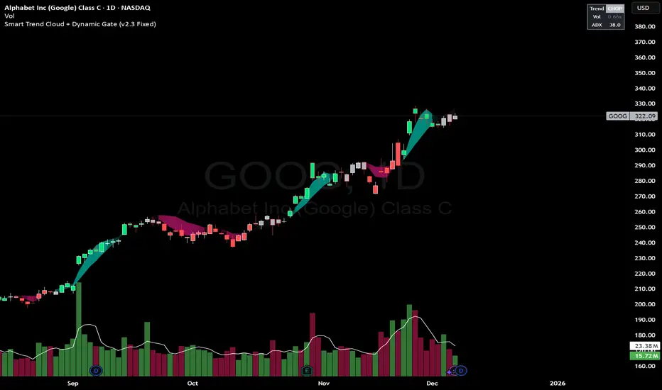
Multiple Moving Averages by BadshahIntroduction Streamline your technical analysis with the Quintuple MA Strategy Suite, a robust all-in-one utility designed to maximize chart efficiency. Instead of cluttering your workspace with multiple individual indicators, this script empowers you to deploy up to five fully customizable Moving Averages simultaneously. Whether you are tracking micro-trends for scalping or major baselines for swing trading, this tool adapts to every timeframe and style.
Core Features
5-in-1 Architecture: Run five independent moving averages at once, saving your precious indicator slots for other tools.
Hybrid Calculation Modes: Instantly toggle any line between Simple Moving Average (SMA) for smooth baselines and Exponential Moving Average (EMA) for weight-sensitive reactions to recent price action.
Smart labeling System: Features an intelligent labeling mechanism that places text tags slightly offset from the current price. This ensures you can instantly identify which line is which (e.g., "EMA 50" vs "SMA 200") without the text obscuring the latest candles.
Granular Control: Every aspect is customizable. You can independently adjust the Length, Source (Close, Open, High, Low, etc.), Color, and Visibility for each of the five MAs.
Practical Use Cases
The "Golden Cross" Setup: Enable MA 3 (50 Length) and MA 5 (200 Length) to automatically visually track major trend reversals.
Ribbon Trading: Enable all five lines with sequential lengths (e.g., 20, 50, 100, 150, 200) to create a "Moving Average Ribbon," visualizing the strength and direction of the trend expansion.
Scalping Cross: Use MA 1 and MA 2 set to fast lengths (like 9 and 21) to catch rapid momentum shifts.
Settings Guide
Show MA: Toggles the visibility of the specific line.
Show Label: Toggles the text tag next to the line (auto-offset by 5 bars).
Type: Select between SMA or EMA calculation.
Length: Define the lookback period for the average.
Disclaimer This script is provided for educational and analytical purposes only. Past performance of indicators does not guarantee future results. Trade responsibly.
