Koko's Capital Flow Channel Koko’s Capital Flow Channel is a structured EMA channel system designed to reduce over-trading and eliminate chase entries. It separates Early Direction signals (clearing bars) from Smart Entries (inside-channel confirmations), helping traders execute with patience and clarity.
Koko’s Capital Flow Channel™ provides a clean, psychology-friendly framework for traders transitioning from fast scalping to higher timeframes.
What it does
This indicator uses an EMA-based channel to define structure and trend flow, then delivers two tiers of signals:
Early Direction Signals (Early BUY / Early SELL)
Trigger on a clearing bar (break/close condition depending on your setting)
Used for directional awareness and early positioning
Smart Entry Signals (BUY-S / SELL-S)
Trigger only when price returns inside the channel and prints a qualifying candle
Designed to reduce impulsive entries and improve execution quality
Why it’s different
Many tools fire signals everywhere. This channel is built to create clarity and restraint:
Less noise
Fewer, higher-quality signals
Built-in structure + intent filters
Optional ATR filtering to avoid low-quality breaks
Best use cases
Daily / swing trading
Trend continuation and pullback entries
Traders learning discipline and consistency
Burned-out scalpers who want calmer, higher-quality setups
Recommended settings
Timeframe: Daily (works on others but Daily is the intended home)
Start with:
Clearing Bar Mode: Cross (or Over/Under “event” logic if enabled)
Candle Body: Body Only
Intent: Bullish/Bearish Candle
ATR Filter: Clearing Bar Strength, ATR(14), Multiplier 1.0
Signal Key
BUY-E / SELL-E = Early Direction signal (clearing bar)
BUY-S / SELL-S = Smart Entry signal (inside-channel confirmation)
5) How to Use It (simple instructions section)
Workflow
Wait for Early BUY-E / SELL-E to confirm flow direction
Only take Smart Entries (BUY-S / SELL-S) when price returns inside the channel
Use the channel boundaries for structure (helps avoid chasing)
Alerts
You can create alerts for:
Early BUY / Early SELL
Smart BUY / Smart SELL
Risk Disclaimer (safe + standard)
Disclaimer: This indicator is for educational and informational purposes only and is not financial advice. Markets involve risk. Always manage risk appropriately and test settings before live use.
In den Scripts nach "scalp" suchen

polymarket 15 min markerHere is a professional and catchy description you can use when publishing this script on TradingView. It highlights the "pro" features we added (MTF capability, custom fonts, and bug fixes).
Title: Current 15m Open – Pro Anchored Level
Description:
What it does: This indicator is a precision tool for intraday traders. It automatically identifies and draws a horizontal line at the opening price of the current 15-minute candle. This level serves as a key pivot for intraday bias—price above is often bullish, price below is often bearish.
Unlike standard indicators, this script is engineered to be Multi-Timeframe (MTF) stable. This means you can view the 15m Open level while scalping on a 1-minute, 5-minute, or even 1-second chart, and the line will remain locked to the correct price without repainting or jumping.
Key Features:
🎯 Precision Anchor: Uses time-based coordinates to ensure the line starts exactly at the 15m candle open, regardless of your current timeframe.
⚡ Zero-Lag MTF: Instantly updates the moment a new 15-minute session begins.
💎 Luxury Visuals: Features a "Fancy Font" hack that uses special Unicode characters to display the label in a bold, professional serif style (customizable in settings).
📐 Smart Positioning: The label floats clearly on the right side of the chart (margin area), ensuring it never obstructs your view of the candles.
🛠 Stability Fixes: Includes custom logic to prevent the "disappearing line" bug that often occurs when viewing the same timeframe as the indicator source.
Settings:
Theme Color: Customize the line and text color to match your chart theme.
Font Style: Choose between "Luxury" (Serif), "Hacker" (Monospace), or "Modern" (Standard).
Text Offset: Adjust how far to the right the label sits.
How to use:
Add to your chart.
Use it as a bias filter: Look for longs above the blue line and shorts below it.
Perfect for scalpers who need to keep the higher-timeframe context visible at all times.

Gamma of Gamma - AnticipationGamma of Gamma — Anticipation Engine
What if you could detect market inflections before they become obvious? Not react to momentum — anticipate the momentum itself.
"Gamma here refers to mathematical acceleration (2nd derivative), NOT options Gamma"
Gamma of Gamma (GoG) operates one abstraction layer above conventional indicators. While RSI tells you what momentum did , GoG tells you what momentum is about to do . This is the difference between chasing price and positioning ahead of it.
Core Innovation: Traditional indicators measure first-order effects (price change) or second-order effects (momentum/acceleration). This system measures the third derivative — the rate of change of acceleration itself. When Gamma-of-Gamma reaches extremes, it signals that pressure dynamics are about to flip — often 2-5 bars before price visibly reacts.
Target Users: Discretionary traders, scalpers, and swing traders who want early positioning signals with statistical rigor. Effective on stocks, crypto, forex, and futures with meaningful volume data.
━━━━━━━━━━━━━━━━━━━━━━━━━━━━━━━━━━━━━━━━━━━
WHY THIRD-DERIVATIVE ANALYSIS?
━━━━━━━━━━━━━━━━━━━━━━━━━━━━━━━━━━━━━━━━━━━
The Hierarchy of Market Information
Most traders operate at the wrong level of abstraction:
• Price → What happened (lagging)
• Momentum → How fast it happened (still lagging)
• Gamma (2nd Derivative) → How momentum is changing (coincident)
• Gamma of Gamma (3rd Derivative) → How FAST that change is changing ( leading )
The third derivative captures inflection acceleration — the mathematical signature of regime transition. When GoG reaches extreme values, the market is telegraphing that current pressure dynamics are unsustainable.
Why This Beats RSI
RSI measures momentum magnitude. GoG measures momentum trajectory .
Consider this scenario: RSI reads 70 (overbought). Is the move exhausted or just getting started? RSI cannot tell you. GoG can — because it measures whether buying pressure is accelerating into the high RSI reading (continuation likely) or decelerating despite high RSI (reversal imminent).
RSI answers: "How strong was the move?"
GoG answers: "Is the move strengthening or weakening right now ?"
The first is historical. The second is predictive.
━━━━━━━━━━━━━━━━━━━━━━━━━━━━━━━━━━━━━━━━━━━
MATHEMATICAL FOUNDATION
━━━━━━━━━━━━━━━━━━━━━━━━━━━━━━━━━━━━━━━━━━━
Layer 1: Cumulative Volume Delta (CVD)
The foundation is order flow approximation:
• Up bar (close > prior close): Volume classified as buying pressure
• Down bar (close < prior close): Volume classified as selling pressure
• CVD = Running sum of signed volume
Interpretation: Rising CVD indicates net aggressive buying. Falling CVD indicates net aggressive selling. CVD divergence from price often precedes reversals.
Layer 2: Gamma (Second Derivative)
Gamma measures acceleration of order flow:
Formula: Gamma = CVD - 2×CVD + CVD
This is the discrete second derivative — the rate of change of the rate of change. When Gamma spikes positive, buying pressure is accelerating . When Gamma spikes negative, selling pressure is accelerating.
Layer 3: Gamma of Gamma (Third Derivative)
GoG measures jerk — the acceleration of acceleration:
Formula: GoG = Gamma - 2×Gamma + Gamma
Critical insight: Extreme GoG readings indicate that current pressure dynamics are reaching an inflection point. The system is "overextended" in its current trajectory and will likely revert or reverse.
Layer 4: Z-Score Normalization
Raw GoG values are normalized against their 50-period distribution:
Formula: GoG_Z = (GoG - Mean_50) / StdDev_50
Benefit: Z-scores are regime-adaptive. A "2.0" reading always means "2 standard deviations from normal" regardless of whether you're trading a penny stock or ES futures. This makes thresholds consistent across instruments and timeframes.
━━━━━━━━━━━━━━━━━━━━━━━━━━━━━━━━━━━━━━━━━━━
SIGNAL GENERATION LOGIC
━━━━━━━━━━━━━━━━━━━━━━━━━━━━━━━━━━━━━━━━━━━
Long Signal (Bullish Anticipation)
Triggers when:
• GoG Z-score < -Threshold (default -2.0)
• Volume > Average Volume × Minimum Multiple (default 1.2×)
Interpretation: Selling pressure acceleration has reached an extreme negative reading. The selling is "exhausting itself" — acceleration is peaking and will soon decelerate. Buyers are likely to step in.
Short Signal (Bearish Anticipation)
Triggers when:
• GoG Z-score > +Threshold (default +2.0)
• Volume > Average Volume × Minimum Multiple (default 1.2×)
Interpretation: Buying pressure acceleration has reached an extreme positive reading. The buying is "exhausting itself" — often occurs at blow-off tops, failed breakouts, or momentum climaxes.
Why Volume Confirmation?
Gamma acceleration in thin liquidity is meaningless noise. The volume filter ensures signals occur only when meaningful participation backs the pressure dynamics. This dramatically reduces false signals during low-activity periods.
━━━━━━━━━━━━━━━━━━━━━━━━━━━━━━━━━━━━━━━━━━━
CONFIDENCE ENGINE
━━━━━━━━━━━━━━━━━━━━━━━━━━━━━━━━━━━━━━━━━━━
Not all signals are equal. The Confidence Engine quantifies signal strength:
Confidence Calculation:
Confidence = 50 + ((|Z-Score| - Threshold) / Threshold) × 100
Capped at 100%
Visual Representation:
• Small orb = Low confidence (50-65%)
• Normal orb = Medium confidence (65-80%)
• Large orb = High confidence (80-100%)
Orb transparency also adjusts — high-confidence signals appear brighter and more prominent. This creates intuitive visual hierarchy where stronger signals demand more attention.
Practical Use:
• High confidence (>80%): Consider larger position size, tighter stops
• Medium confidence (50-80%): Standard position size
• Low confidence (<50%): Reduced size or wait for confirmation
━━━━━━━━━━━━━━━━━━━━━━━━━━━━━━━━━━━━━━━━━━━
INTEGRATED BACKTESTER
━━━━━━━━━━━━━━━━━━━━━━━━━━━━━━━━━━━━━━━━━━━
Every signal system needs accountability. The onboard backtester provides real-time performance tracking:
Core Metrics:
• Total Trades
• Win Rate
• Profit Factor
• Expectancy (average P&L per trade)
• Net P&L
• Max Drawdown
• Average Win / Average Loss
Methodology:
• Positions held for configurable bar count (default 10 bars)
• Forces objective evaluation independent of discretionary exits
• Updates in real-time as new trades complete
Optimizer Mode:
Enable for parameter tuning research:
• Stability Score (0-100 points): Composite evaluation of parameter robustness
• Trade Density : Signals per 1000 bars — monitors over/under-trading
• Parameter Display : Current settings for documentation
• Robustness Rating : ROBUST / STABLE / FRAGILE / OVERFIT
Stability Scoring Breakdown:
• Win Rate ≥55%: +25 points | ≥50%: +15 points | ≥45%: +5 points
• Expectancy >0.5%: +25 points | >0.1%: +15 points | >0%: +5 points
• Total Trades ≥30: +25 points | ≥20: +15 points | ≥10: +5 points
• Profit Factor ≥1.5: +25 points | ≥1.2: +15 points | ≥1.0: +5 points
Target: 60+ points indicates stable parameters. Below 40 suggests overfitting risk.
━━━━━━━━━━━━━━━━━━━━━━━━━━━━━━━━━━━━━━━━━━━
CHART EXECUTION SIGNALS
━━━━━━━━━━━━━━━━━━━━━━━━━━━━━━━━━━━━━━━━━━━
Unique feature: Entry and exit markers display directly on the price chart via force_overlay, even though the indicator runs in a separate pane.
Visual Markers:
• ▲ Green Triangle (below bar): Long entry at exact price level
• ▼ Red Triangle (above bar): Short entry at exact price level
• ✕ Gold X-Cross : Position exit after hold period
Benefit: Immediate visual correlation between GoG signals and price action. Review historical trades without switching between panes.
━━━━━━━━━━━━━━━━━━━━━━━━━━━━━━━━━━━━━━━━━━━
DUAL DASHBOARD SYSTEM
━━━━━━━━━━━━━━━━━━━━━━━━━━━━━━━━━━━━━━━━━━━
Main Dashboard — Real-Time State
Displays:
• Current GoG regime (EXTREME HIGH / EXTREME LOW / NEUTRAL)
• GoG Z-Score (numerical)
• Raw GoG value
• Gamma value
• CVD (Cumulative Volume Delta)
• Volume status (Active/Low with ratio)
• Signal state (Scanning / Long Signal / Short Signal / In Position)
• Confidence meter with visual bar
• Entry price when in position
Backtest Dashboard — Performance Metrics
Displays all backtester metrics in compact format. Switches to Optimizer view when Optimizer Mode enabled.
Both dashboards feature:
• Configurable position (6 locations including Middle Left/Right)
• Adjustable text size (Tiny/Small/Normal/Large)
• Transparency control for visual integration
━━━━━━━━━━━━━━━━━━━━━━━━━━━━━━━━━━━━━━━━━━━
PARAMETER GUIDE
━━━━━━━━━━━━━━━━━━━━━━━━━━━━━━━━━━━━━━━━━━━
Calculation Settings
• GoG Extreme Threshold (default 2.0): Z-score level for signal generation. Higher = fewer but stronger signals. Range: 0.5-5.0
• Gamma Smoothing (default 3): SMA period for Gamma. Lower = more responsive, more noise. Higher = smoother, more lag. Range: 1-20
• GoG Smoothing (default 5): SMA period for GoG. Filters micro-spikes while preserving structural inflections. Range: 1-20
• Min Volume Multiple (default 1.2): Volume must exceed this multiple of 20-period average. Ensures signals have participation backing. Range: 0.5-3.0
Backtester Settings
• Backtest Hold Bars (default 10): Forced holding period for backtester evaluation. Adjust based on timeframe and trading style.
• Parameter Optimizer Mode : Enables extended metrics for tuning research.
Tuning by Timeframe
Scalping (1-5 min):
Threshold: 1.5-2.0 | Gamma Smooth: 2-3 | GoG Smooth: 3-4 | Hold: 5-8 bars
Day Trading (15-60 min):
Threshold: 2.0-2.5 | Gamma Smooth: 3-5 | GoG Smooth: 5-7 | Hold: 8-12 bars
Swing Trading (4H-Daily):
Threshold: 2.5-3.0 | Gamma Smooth: 5-7 | GoG Smooth: 7-10 | Hold: 10-15 bars
━━━━━━━━━━━━━━━━━━━━━━━━━━━━━━━━━━━━━━━━━━━
HOW TO USE: PRACTICAL WORKFLOW
━━━━━━━━━━━━━━━━━━━━━━━━━━━━━━━━━━━━━━━━━━━
Step 1: Identify Regime
Watch the GoG Z-score line. Most of the time it oscillates within the neutral zone (between thresholds). This is "scanning" mode — no actionable signal.
Step 2: Wait for Extreme
When Z-score crosses threshold AND volume confirms, a signal fires. The orb appears in the indicator pane; the triangle appears on price chart.
Step 3: Assess Confidence
Check orb size and dashboard confidence reading:
• Large bright orb + 80%+ confidence = High conviction setup
• Small faint orb + <60% confidence = Requires additional confirmation
Step 4: Execute with Context
GoG signals anticipate — they don't confirm. Use price structure (support/resistance), higher timeframe trend, or other confirmation before entry.
Step 5: Manage Position
Exit markers show backtester exits. For live trading, consider:
• Time-based exit (signal's hold period)
• Opposite signal exit
• Fixed R:R targets
Step 6: Review Performance
Check Backtest Dashboard regularly. If Win Rate drops below 45% or Expectancy goes negative, reassess parameters or market conditions.
━━━━━━━━━━━━━━━━━━━━━━━━━━━━━━━━━━━━━━━━━━━
WHAT THIS INDICATOR IS — AND ISN'T
━━━━━━━━━━━━━━━━━━━━━━━━━━━━━━━━━━━━━━━━━━━
This Indicator IS:
✅ State-transition detector (balance → imbalance)
✅ Early warning system for momentum shifts
✅ Anticipation tool for pre-positioning
✅ Statistical framework with built-in accountability
This Indicator IS NOT:
❌ Mechanical buy/sell system (requires discretion)
❌ Trend-following indicator
❌ Reversal-only indicator
❌ Replacement for risk management
Best Use Cases:
• Detecting early reversals before obvious confirmation
• Anticipating breakouts during volatility compression
• Timing pullback entries in established trends
• Identifying exhaustion at momentum climaxes
Challenging Conditions:
• Extremely low volume environments
• News-driven gaps (no order flow to measure)
• Instruments with unreliable volume data
━━━━━━━━━━━━━━━━━━━━━━━━━━━━━━━━━━━━━━━━━━━
ORIGINALITY STATEMENT
━━━━━━━━━━━━━━━━━━━━━━━━━━━━━━━━━━━━━━━━━━━
Innovation 1: Third-Derivative Order Flow Analysis
While first and second derivatives are common, applying third-derivative (jerk) analysis to cumulative volume delta is novel. This captures inflection points that lower-order analysis misses entirely.
Innovation 2: Z-Score Adaptive Thresholds
Rather than fixed thresholds that require per-instrument tuning, z-score normalization creates self-adapting signal levels that work consistently across any liquid instrument.
Innovation 3: Confidence-Weighted Visual System
Dynamic orb sizing and transparency based on signal strength provides intuitive visual hierarchy. Stronger signals literally appear larger and brighter.
Innovation 4: Integrated Accountability
Built-in backtester with optimizer mode enables parameter validation directly on chart. No external tools or spreadsheets required.
Innovation 5: Dual-Pane Execution Visualization
Force-overlay chart signals bridge the gap between indicator pane and price action, enabling immediate visual trade review.
━━━━━━━━━━━━━━━━━━━━━━━━━━━━━━━━━━━━━━━━━━━
LIMITATIONS & DISCLAIMERS
━━━━━━━━━━━━━━━━━━━━━━━━━━━━━━━━━━━━━━━━━━━
Technical Limitations
• Volume classification uses bar direction (close vs prior close), not tick-level aggressor data. Precision loss estimated 10-15% vs institutional-grade data.
• CVD approximation assumes volume follows price direction. Works well in trending conditions; less precise in choppy markets.
• Backtester uses fixed hold period, not optimal exit logic. Real performance may vary with proper trade management.
Market Limitations
• Requires meaningful volume data. Avoid instruments with reported volume issues.
• Signals may cluster during high-volatility events. Not every signal should be traded.
• Anticipation signals appear early by design. Patience required — price may continue against signal briefly before reversing.
Risk Disclosure
• Trading involves risk of loss. Past performance does not guarantee future results.
• This indicator provides analysis tools, not financial advice.
• Always use proper position sizing and risk management.
• Backtest results are hypothetical and do not include slippage, commissions, or fees.
━━━━━━━━━━━━━━━━━━━━━━━━━━━━━━━━━━━━━━━━━━━
RECOMMENDED SETTINGS BY MARKET
━━━━━━━━━━━━━━━━━━━━━━━━━━━━━━━━━━━━━━━━━━━
Crypto (BTC, ETH, SOL)
Threshold: 1.8-2.2 | Gamma: 3 | GoG: 5 | Volume: 1.3x | TF: 15min-4H
Notes: Higher volatility produces more signals. Consider higher threshold to filter.
Forex Majors (EURUSD, GBPUSD)
Threshold: 2.0-2.5 | Gamma: 4 | GoG: 6 | Volume: 1.2x | TF: 5min-1H
Notes: Lower volatility requires patience. Volume proxy via tick volume works adequately.
Stocks (Large Cap)
Threshold: 2.0-2.5 | Gamma: 3-4 | GoG: 5-6 | Volume: 1.2x | TF: 15min-Daily
Notes: Real volume data provides cleanest signals. Watch for opening/closing auction distortions.
Futures (ES, NQ, CL)
Threshold: 2.0-2.3 | Gamma: 3 | GoG: 5 | Volume: 1.2x | TF: 5min-1H
Notes: Excellent volume data. Session boundaries may produce false signals — consider RTH only.
━━━━━━━━━━━━━━━━━━━━━━━━━━━━━━━━━━━━━━━━━━━
CONCLUSION
━━━━━━━━━━━━━━━━━━━━━━━━━━━━━━━━━━━━━━━━━━━
Gamma of Gamma represents a fundamental shift in signal philosophy: from reacting to momentum to anticipating momentum.
By operating at the third derivative of order flow, this system detects the mathematical signatures of regime transition — the moments when current pressure dynamics become unsustainable and reversal becomes probable.
This is not another oscillator telling you what already happened. This is an anticipation engine positioning you for what's about to happen.
Stop chasing. Start anticipating.
RSI tells you where momentum was. GoG tells you where it's going.
Taking you to school. - Dskyz , Trade with probability. Trade with anticipation. Trade with GoG

Session Range Boxes(MTF)📦 Indicator Name
Session Range Boxes (MTF)
Multi-Timeframe Directional Session Range Visualization
📘 Description
Session Range Boxes (MTF) is a multi-timeframe market structure tool that visually highlights price range behavior across different time sessions using clean, directional range boxes.
Each box represents the High–Low range of a completed or live session, automatically colored based on directional bias:
🟢 Bullish → Session Close > Session Open
🔴 Bearish → Session Close < Session Open
⚪ Neutral → Session Close = Session Open
This allows traders to instantly identify trend strength, balance zones, volatility expansion, and key support/resistance areas across multiple timeframes — all on a single chart.
🔍 What This Indicator Shows
For every enabled timeframe, the indicator:
Draws a range box from session open to session close
Continuously updates live session High & Low
Locks the final color once the session completes
Keeps historical boxes for structure and context
Supported timeframes:
Quarterly
Half-Yearly
Yearly
Monthly
Weekly
Daily
Hourly
30-Minute
15-Minute
5-Minute
⚙️ Default Behavior
By default, the indicator enables:
Weekly
Daily
Hourly
This default setup is intentionally chosen to suit most traders and provides:
Higher-timeframe structure (Weekly)
Swing context (Daily)
Intraday execution levels (Hourly)
🧠 How to Use It Effectively
📈 Higher-Timeframe Analysis (Swing / Positional Trading)
Recommended combinations:
Weekly + Daily
Monthly + Weekly
Use cases:
Identify dominant market bias
Spot compression vs expansion
Define higher-timeframe support & resistance zones
⚡ Intraday Trading (Day Trading)
Recommended combinations:
Daily + Hourly
Hourly + 30-Minute
Use cases:
Track intraday range development
Identify directional day types
Trade breakouts, rejections, or mean-reversion within session ranges
🚀 Scalping & Precision Entries
Recommended combinations:
Hourly + 15-Minute
30-Minute + 5-Minute
Use cases:
Fine-tune entries within larger session ranges
Align lower-timeframe trades with higher-timeframe bias
Spot micro range expansion and contraction
🎨 Customization Options
Bullish / Bearish / Neutral colors
Box fill transparency
Border transparency & color
Maximum historical boxes per timeframe
This allows you to keep charts clean, lightweight, and performance-friendly.
💡 Best Practices
Avoid enabling too many timeframes at once — clarity beats clutter
Use higher-timeframe boxes for bias, lower-timeframe boxes for entries
Combine with:
Market structure
Volume
VWAP
Liquidity concepts
Price action confirmation
Session Range Boxes (MTF) is a clean, powerful visual tool designed to help traders:
Understand session-based price behavior
Align trades across timeframes
Improve structure awareness without clutter
Whether you are a scalper, day trader, or swing trader, this indicator adapts seamlessly to your workflow.

Liquidity OS [PyraTime]Trading the lower timeframes (1m-15m) often feels like navigating a minefield. Charts become cluttered with noise, making it nearly impossible to distinguish random price action from genuine institutional intent. Traders frequently suffer from "Analysis Paralysis," struggling to spot clean setups or reacting too slowly to calculate risk accurately in fast-moving markets.
The Solution: A Clean Operating SystemPyraTime: Liquidity OS was engineered to solve this specific problem. It is not just a signal tool; it is a complete visual operating system designed to declutter your workspace and enforce discipline. By filtering price action through a strict confluence of Structure, Time, and Momentum, it highlights only high-probability liquidity sweeps while automating the complex mental math of risk management.
How to Use This Indicator
This tool is designed for Scalpers and Day Traders utilizing liquidity concepts (ICT/SMC).
Wait for the Signal: The indicator automatically identifies valid "Unicorn" setups—a confluence of a Liquidity Sweep followed by a displacement (Breaker) and a Fair Value Gap.
Verify the Context: Look for the "Elite Glass" Capsule.
Cyan Glass: Bullish Setup (Long Opportunity).
Pink Glass: Bearish Setup (Short Opportunity).
Note: The capsule physically covers messy wicks, forcing your eye to focus solely on the clear path to profit or invalidation.
Consult the Dashboard: Glance at the "Monitor" panel (bottom right). It instantly displays the Position Size required to trade the setup based on your pre-defined account risk (e.g., 1%).
Execute & Focus: Use the visual TP (Take Profit) and SL (Stop Loss) lines provided by the capsule to set your orders. The system automatically dims old trades ("Smart Spotlight") so only the current opportunity competes for your attention.
Key Features
🦁 "Elite Glass" Visual Engine: A proprietary rendering system that displays trade setups as high-transparency, polished capsules. This creates a "Focus-First" environment, reducing chart noise and visual fatigue.
🧠 Smart Spotlight: Automatically manages visual history. The two most recent active zones remain bright, while older setups automatically dim to reduce clutter. Mitigated zones can be set to turn into "Ghosts" or disappear entirely.
🛡️ Risk OS Dashboard: A real-time, persistent monitor that calculates:
Dynamic Position Sizing: Tells you exactly how many units/contracts to trade.
Session Metrics: Tracks Win Rate, Total R, and Expectancy live.
Safety Warnings: Highlights "High Risk" inputs in red if you exceed safety thresholds.
⚡ Logic Filters:
Killzones: Restrict signals to specific sessions (e.g., London/NY) with a custom timezone selector.
Trend Flow: Filters signals to align with the 4H Trend (EMA 50).
Deep Value: Ensures buys occur in Discount and sells in Premium zones.
Specifications & Settings
Risk OS: Customizable Target R:R, Stop Loss Padding (ATR Multiplier), and Risk Per Trade %.
Liquidity Filters: "1m Scalp Mode" (increased sensitivity), Killzone Time/Timezone selector, and Force Reset button.
Visual Interface: Fully customizable colors. Toggles for "Show Midlines" (50% of FVG) and "Show Structure Breaks" (BOS lines) to further reduce noise.
Performance: Built on Pine Script v6 with null-safe execution and optimized garbage collection for zero-lag performance on all timeframes.
Disclaimer: Risk metrics, position sizing, and performance data displayed by this indicator are for informational and educational purposes only. This tool does not execute trades, manage funds, or guarantee future results. Always trade with a regulated broker and verify calculations independently.

Candle Countdown TimerCandle Countdown Timer - Real-Time Bar Close Indicator
Stay ahead of the market with this elegant countdown timer that shows exactly how much time remains until the current candle closes. Perfect for scalpers, day traders, and anyone who needs precise timing for their trading decisions.
✨ Key Features:
Universal Timeframe Support - Automatically adapts to any chart timeframe (1m, 5m, 15m, 1h, 4h, 1D, etc.)
Smart Positioning - Choose between two display modes:
Candle High/Low: Displays above bullish candles, below bearish candles
Current Price: Shows at the closing price level for easy reference
Color-Coded Display - Timer automatically matches your chart's candle colors (green for bullish, red for bearish) for instant visual clarity
Fully Customizable - Adjust font size (8-50), opacity (0-100), and placement to match your trading style and chart setup
Clean, Non-Intrusive Design - Minimal interface that provides critical information without cluttering your chart
📊 Perfect For :
Timing precise entries and exits
Scalping strategies requiring exact candle close timing
Multi-timeframe analysis
Managing time-sensitive trade setups
Avoiding last-second candle close surprises
🎯 How to Use :
Simply add the indicator to your chart and customize the settings to your preference. The countdown automatically updates in real-time, showing hours, minutes, and seconds remaining until the current bar closes.
⚙️ Settings:
Font Size: Numeric input (8-50) for precise size control
Text Opacity: Control visibility from 0 (solid) to 100 (invisible)
Placement: Choose "Candle High/Low" or "Current Price" positioning
💡 Pro Tip:
Use the "Current Price" placement mode when trading on multiple timeframes to keep the countdown at a consistent price level, making it easier to track across different chart configurations.

HaP Williams %R Pro+This indicator combines the classic Williams %R (Percent Range) oscillator with multi-timeframe (MTF) analysis, allowing you to visualize the general market direction on a single chart. Thanks to its advanced dashboard feature, you can instantly monitor overbought/oversold conditions across all periods, ranging from the 1-minute chart to the 1-month chart.
With the AVG F feature added to the table, short-term price movements and momentum changes (specifically for Scalping) can be detected much faster.
🚀 Key Features
Multi-Timeframe (MTF) Support: Simultaneously calculates Williams %R values for 1m, 5m, 15m, 30m, 1h, 2h, 4h, Daily, Weekly, and Monthly periods.
Smart Dashboard: The table located in the corner of the screen displays values and color codes for all timeframes.
AVG S (Slow Average): This is the average of 5m, 15m, 30m, and 1h data. It indicates the general trend direction.
AVG F (Fast Average) : This is the average of 1m, 5m, and 15m data. It is used for instant momentum and scalping entries.
Signal Smoothing: Williams %R data is smoothed with a Simple Moving Average (SMA) to reduce market noise.
Dynamic Coloring: Colors on the dashboard and chart automatically change according to the strength of the trend.
🎨 Color Codes and Meanings
The dashboard and chart lines are colored according to the following logic:
🟢 Bright Green (Lime): If the value is above -20. This is the "Overbought" zone, but it indicates a strong Bullish trend. Momentum is very high.
🌿 Dark Green: If the value is between -20 and -50. The market is in the positive zone; the upward tendency continues.
🔴 Red: If the value is between -50 and -80. The market is in the negative zone; the downward tendency dominates.
🛑 Bright Red: If the value is below -80. This is the "Oversold" zone. Momentum is very low, and the Bearish trend is strong.
💡 How to Use? (Strategy Suggestions)
General Trend Tracking: Look at the AVG S (Slow Average) column in the dashboard. If it is green, the general direction is up; if red, it is down.
Scalp Trades: The AVG F (Fast Average) column is ideal for catching short-term reversals. Entry reliability increases when the AVG F color aligns with AVG S.
Crossovers: Crossovers between the Fast Average (Red Line) and Slow Average (Black Line) on the chart can signal potential trend changes.
Dashboard Harmony: If all boxes (or the vast majority) in the dashboard are the same color (e.g., all green), it indicates a very strong trend in that direction. You should avoid opening positions in the opposite direction.
⚙️ Settings
Williams %R Period: Default is 14; you can change it according to your strategy.
Dashboard Position: You can move the dashboard to the top-right, bottom-right, or bottom-left corner of the screen.
Show Lines: If you want to prevent chart clutter, you can toggle off the lines and use only the dashboard.
Disclaimer: This indicator is a support tool and does not contain definitive buy/sell signals. You should make your investment decisions based on your own analysis and risk management.

Chainbey Ai - HTF Trend Matrix (Clean)Chainbey Ai – HTF Trend Matrix is a professional, higher-timeframe trend detection indicator designed to give traders a clean, reliable market bias, regardless of the chart timeframe they are trading on.
This indicator automatically analyzes multiple higher timeframes (HTFs) and combines:
EMA trend direction
Trend strength (ADX)
Market structure (trend vs range)
Trend disagreement across HTFs
Reversal probability estimation
All results are displayed in a compact table at the bottom-right, making it perfect for scalpers, day traders, and swing traders who need fast, decision-ready information.
🧠 What This Indicator Solves
❌ No more guessing the higher-timeframe trend
❌ No more trading against the main market bias
❌ No more confusion between trend vs range
✅ Clear BULLISH / BEARISH / RANGE bias
✅ Strength score to avoid weak trends
✅ Reversal probability to manage risk
📊 How to Read the Table (User Manual)
🔹 FINAL Row
Example:
FINAL | BEARISH TREND | -46
Text (BEARISH / BULLISH / RANGE) → Overall market bias
Number (-46) → Trend Strength Score
Trend Score Guide:
Score Meaning
0 to ±20 No trend / Choppy
±20 to ±40 Weak trend
±40 to ±70 Healthy trend
±70+ Very strong / extended trend
📌 Negative = Bearish
📌 Positive = Bullish
🔹 REVERSAL – Possibility (%)
Example:
REVERSAL | Possibility | 45%
This shows the chance of trend exhaustion or reversal.
Reversal % Meaning
0–30% Strong trend continuation
30–50% Normal pullback risk
50%+ High reversal probability
70%+ Dangerous to chase trades
📌 Use this to avoid late entries.
🔹 HTF Rows (60 / 240 / D)
Each row shows:
DIR / STRUCT
Direction from EMA trend
Market structure (TREND / RANGE)
ADX
Trend strength
STRONG / MEDIUM / CHOP
📌 If multiple HTFs agree → higher confidence
📌 If HTFs conflict → reduce position size or wait
🛠 Recommended Trading Usage
✅ Best Practices
Trade in the direction of FINAL trend
Enter on pullbacks, not breakouts
Use lower timeframes only for entries
❌ Avoid
Trading against FINAL bias
Chasing trades when reversal % is high
Over-leveraging in CHOP conditions
🎯 Ideal For
Crypto traders (Spot & Futures)
Forex traders
Gold / Commodity traders
Scalping, Intraday & Swing trading
⚠️ Disclaimer
This indicator is a decision-support tool, not financial advice. Always combine it with proper risk management, confirmations, and your trading plan.

MoBo Bands - Momentum Breakout IndicatorDESCRIPTION
MoBo Bands (Momentum Breakout Bands) is a volatility-based breakout detection indicator that helps traders identify potential momentum shifts in the market. The indicator uses dynamic bands calculated from standard deviation to signal when price breaks above or below established ranges, indicating potential bullish or bearish momentum changes.
═════════════════════════════════════════════════════════════
KEY FEATURES
═════════════════════════════════════════════════════════════
- Dynamic upper and lower bands based on standard deviation
- Color-coded bands that change based on breakout direction (green for bullish, red for bearish)
- Visual breakout arrows marking entry points above/below bands
- Optional colored fill zones between bands showing current momentum state
- Customizable displacement for band projection
- Built-in alert system for breakout and breakdown signals
═════════════════════════════════════════════════════════════
HOW IT WORKS
═════════════════════════════════════════════════════════════
The indicator calculates a middle line using a Simple Moving Average (SMA) with upper and lower bands positioned using standard deviation multipliers. When price closes above the upper band, a bullish breakout (green) is signaled. When price closes below the lower band, a bearish breakdown (red) is signaled. The bands and fill zones remain colored until the opposite signal occurs, providing clear visual confirmation of the current momentum state.
═════════════════════════════════════════════════════════════
CUSTOMIZABLE INPUTS
═════════════════════════════════════════════════════════════
CALCULATION PARAMETERS:
- Price Source - Select which price data to use (default: close)
- Length - Period for SMA and standard deviation calculation (default: 10)
- Num Dev Up - Standard deviation multiplier for upper band (default: 0.8)
- Num Dev Down - Standard deviation multiplier for lower band (default: -0.8)
- Displace - Shift bands forward for projection analysis (default: 0)
DISPLAY OPTIONS:
- Colored Mobo - Enable/disable color-coded bands
- Colored Fill - Enable/disable fill zones between bands
- Break Arrows - Show/hide breakout and breakdown arrows
ALERT OPTIONS:
- Show Alerts - Enable/disable alert conditions
═════════════════════════════════════════════════════════════
USAGE GUIDE
═════════════════════════════════════════════════════════════
Watch for price to close outside the bands as potential breakout signals:
BULLISH BREAKOUT: Green arrow appears below the lower band when price closes above the upper band, indicating upward momentum shift.
BEARISH BREAKDOWN: Red arrow appears above the upper band when price closes below the lower band, indicating downward momentum shift.
The bands also serve as dynamic support and resistance levels. When bands are green, momentum is bullish. When bands are red, momentum is bearish.
═════════════════════════════════════════════════════════════
BEST PRACTICES
═════════════════════════════════════════════════════════════
- This indicator works well on liquid futures contracts (MNQ, MES, MYM, MGC, MCL) and major
currency pairs across multiple timeframes
- Lower deviation values (0.5-1.0) produce more frequent signals suitable for scalping
- Higher deviation values (1.5-2.5) filter for stronger breakouts ideal for swing trading
- Combine with volume indicators for additional confirmation
- Use with momentum oscillators to validate breakout strength
- Best results in trending market conditions
- Consider the overall market context and trend direction
════════════════════════════════════════════════════════════
ALERT CONFIGURATION
═════════════════════════════════════════════════════════════
Configure custom alerts for automated notifications:
- "MoBo BreakOUT" - Triggers on bullish breakout signals
- "MoBo BreakDOWN" - Triggers on bearish breakdown signals
Set alerts to "Once Per Bar Close" for confirmed signals and avoid false triggers during bar development.
═════════════════════════════════════════════════════════════
IDEAL FOR
═════════════════════════════════════════════════════════════
- Day traders and scalpers on futures markets
- Swing traders looking for momentum shifts
- Breakout trading strategies
- Trend following systems
- Works on stocks, forex, crypto, and commodities
- Effective across multiple timeframes (1min to daily)
═════════════════════════════════════════════════════════════
Perfect for traders seeking clear visual breakout signals with minimal lag. The color-coded system and arrow markers make it easy to identify momentum changes at a glance.
© 2024 NPR21 | Mozilla Public License 2.0
Open-source script
NPR21
Disclaimer
The information and publications are not meant to be, and do not constitute, financial, investment, trading, or other types of advice or recommendations supplied or endorsed by

VWAP + RVOL (Merged):
📊 VWAP + RVOL (Merged)
VWAP + RVOL (Merged) is a professional intraday trading indicator that combines:
Session VWAP to define institutional direction and fair value
True Intraday Relative Volume (RVOL) to measure real-time volume strength compared to the same minute over previous days
The script is specifically designed for U.S. equities and performs best in:
Premarket momentum
Opening Range Breakout (ORB)
VWAP pullbacks
Scalping & day trading
🔍 What does this indicator provide?
1️⃣ True Intraday RVOL
Calculates minute-accurate relative volume, comparing current volume to the same minute across a user-defined number of prior days
Correctly handles sessions crossing midnight (after-hours & premarket)
Displays RVOL in a separate pane for clean, noise-free analysis
Default RVOL reference levels:
0.5 → Weak volume
1.0 → Normal volume
1.5 → Strong volume
2.0 → Unusual / institutional activity
2️⃣ Session VWAP
True session-based VWAP
Identifies institutional fair value
Acts as a primary directional filter:
Above VWAP → Bullish bias
Below VWAP → Bearish bias
✅ Practical Trading Use
Long Setup:
Price above VWAP
RVOL ≥ 1.5
Light pullback or VWAP retest
Confirmation candle with increasing volume
Avoid trades when:
Price below VWAP
RVOL < 1.0
⚙️ Settings
RVOL Lookback Days – Number of days used for RVOL comparison (default: 5)
RVOL Reference Lines – Toggle RVOL levels on/off
VWAP Source – Price source for VWAP calculation
Hide VWAP on 1D+ – Optional VWAP hiding on higher timeframes
📌 Important Notes
Designed for intraday timeframes only (≥ 1 minute and < 1 day)
Requires volume data from the data provider
Not intended for daily or higher timeframes
🎯 Who is this indicator for?
Momentum traders
Day traders & scalpers
ORB and VWAP pullback strategies
Traders seeking volume confirmation before entry
⚠️ Disclaimer
This indicator is a decision-support tool, not a trading recommendation.
Always apply proper risk management.

Big Notional Volume Bubbles (Lower-TF Order Flow Approximation)Big Notional Volume Bubbles (Lower-TF Order Flow Approximation)
### Overview
This indicator visualizes large notional trading activity by scanning lower-timeframe candles inside each chart bar and highlighting periods where unusually high traded value (volume × price) occurs.
This script is intended to help short-term traders and scalpers identify bursts of aggressive activity, potential absorption zones, and areas of heightened participation, using standard OHLCV data.
Important: This indicator does not access true market order tape or DOM data. It is an approximation based on lower-timeframe OHLCV data provided by TradingView.
What the Indicator Shows
Each bubble represents a lower-timeframe candle where traded notional value exceeds a user-defined threshold.
Bubble size scales with the notional value of that candle.
Green bubbles indicate the lower-timeframe candle closed higher (buy-side pressure approximation).
Red bubbles indicate the lower-timeframe candle closed lower (sell-side pressure approximation).
Bubbles can be plotted at candle closes or wick extremes for contextual analysis.
How It Works
1. Lower-timeframe OHLCV data is requested using `request.security_lower_tf`.
2. Notional value is calculated as volume × price for each micro-candle.
3. The script selects the largest notional events per bar that exceed the minimum threshold.
4. These events are rendered as bubbles on the main price chart.
Intended Use Cases
Scalping and short-term trading
Momentum ignition and continuation analysis
Absorption and failed breakout detection
Effort versus result analysis
Confirmation at key structural levels
Recommended Settings
Lower timeframe: Start with 1 (1 minute). Seconds-based timeframes may not be supported on all feeds.
Minimum notional (USD/USDT):
BTC / ETH: 25,000 – 250,000
Mid-cap assets: 5,000 – 50,000
Adjust based on liquidity and volatility
Max bubbles per bar: 3–8 to avoid visual clutter
Limitations
This indicator does not display individual market orders or aggressor-side execution.
Buy/sell classification is inferred from candle direction, not bid/ask data.
Lower-timeframe data availability depends on the selected symbol and exchange feed.
This tool should not be used as a standalone signal generator.
Best Practices
Use in conjunction with market structure, VWAP, and key price levels.
Focus on price behavior after a bubble appears rather than the bubble itself.
Interpret bubbles as areas of interest, not directional guarantees.

My Price Curtain by @magasineMy Price Curtain by @magasine
Functional Description
My Price Curtain is a high-performance visual analysis tool designed to provide traders with immediate context regarding price positioning relative to institutional benchmarks. Unlike standard moving averages, this indicator creates a "curtain" of data that dynamically colors the chart background and provides real-time performance metrics to identify trend dominance at a glance.
Key Features & Differential Value
Multi-Method Dynamic Benchmarking: Choose between five different calculation methods: SMA, EMA, WMA, RMA, or a manual Fixed Price. This allows you to switch from a standard technical trend (MA) to a "break-even" or "entry point" analysis (Fixed Price) instantly.
Intelligent Visual Feedback: The "Curtain" logic automatically colors the chart background—Green for Bullish dominance and Red for Bearish dominance—reducing cognitive load during fast-paced sessions.
Advanced Statistical Tracking: The indicator includes a built-in Performance Table that tracks the percentage of bars closing above or below the selected benchmark. This helps traders quantify the strength of a trend over the entire visible dataset.
Precision Labeling & Distance Analysis: A dynamic, color-coded label tracks the price on the Y-axis. It calculates and displays the exact percentage distance from the price to the benchmark in real-time, helping to identify overextended moves.
Optional Deviation Zones: Enable visual "Safety Zones" (boxes) that project a user-defined percentage deviation from the average, assisting in identifying potential volatility expansion or exhaustion areas.
Trading Utilities
Trend Confirmation: Use the background color and "Bars Above" percentage to confirm if you are trading with the path of least resistance.
Scalping & Intraday Support: The "Distance" metric is essential for scalpers to avoid entering trades too far from the average (mean reversion risk).
Custom Strategy Benchmark: Use the "Fixed Price" mode to set your specific entry price and see your real-time performance and "curtain" status relative to your position.

AI-based Price action confluence dashboard# **AI-Based Price Action Confluence Dashboard - Publication Guide**
Here's a comprehensive introduction guide for your TradingView indicator publication:
***
## **📊 TITLE**
**AI-Based Price Action Confluence Dashboard**
***
## **🎯 SHORT DESCRIPTION** (For the summary field)
A sophisticated real-time confluence scoring system that analyzes multiple price action signals across 15-minute timeframes, providing traders with an AI-weighted scoring mechanism (0-6 scale) to identify high-probability trade setups through visual signal panels and intelligent path detection.
***
## **📝 FULL DESCRIPTION**
### **Overview**
The AI-Based Price Action Confluence Dashboard is an advanced technical indicator designed to eliminate guesswork in intraday trading by systematically scoring and displaying multiple price action signals in real-time. Unlike traditional single-indicator approaches, this dashboard employs a confluence methodology that combines multiple independent signals to provide stronger trade confirmations and reduce false signals.
This indicator is specifically optimized for **1-minute chart analysis** while monitoring **15-minute price structure**, making it ideal for day traders and scalpers who need precise entry timing with larger timeframe context.
***
### **🔑 Key Features**
**✅ Real-Time AI Confluence Scoring**
- Dynamic scoring system (0-6 points) for both bullish and bearish setups
- Visual meter display shows signal strength at a glance
- Color-coded backgrounds indicate confluence levels (strong, moderate, mixed)
**✅ Multi-Signal Analysis**
The dashboard tracks 6 distinct signal types:
1. **FTFC (First to Finish Close)** - Base & Bonus signals
2. **Long/Short Grab** - Liquidity sweep patterns (Path A)
3. **High/Low Hold** - Extended momentum confirmation (+2 bonus)
4. **2-Up/2-Down** - Clean breakout patterns (Path B)
5. **Breakaway** - First candle gap strategies
**✅ Intelligent Path Detection**
- Mutually exclusive path logic prevents signal conflicts
- Automatically identifies whether price is following a "sweep path" or "clean path"
- Unavailable paths are clearly marked with gray indicators
**✅ Visual Signal Panels**
- 🟢 Green Light = Bullish signal ACTIVE
- 🔴 Red Light = Bearish signal ACTIVE
- 🟡 Yellow Light = Signal BUILDING (conditions partially met)
- ⚪ White Light = Signal OFF
- ▪️ Gray Square = Path UNAVAILABLE (mutually exclusive)
**✅ Comprehensive Alert System**
- 10 different alert conditions covering all major signals
- Strong confluence alerts (5+ points)
- Individual signal completion alerts
- Customizable alert messages
***
### **📐 How It Works**
#### **The Confluence Methodology**
This indicator implements a sophisticated confluence trading approach where multiple independent price action signals are combined to identify high-probability setups. Each signal type contributes points to either the bullish or bearish score, with a maximum of 6 points per direction.
**Scoring Breakdown:**
**BULLISH SIGNALS:**
- FTFC Base (15m close > previous 15m close) = +1
- FTFC Bonus (price clears 15th candle high) = +1
- **PATH A (Sweep):** Long Grab = +1, High Hold Bonus = +2
- **PATH B (Clean):** 2-Up = +1, 2-Up Bonus = +1
- Breakaway (gap above first candle) = +1
**BEARISH SIGNALS:**
- FTFC Base (15m close < previous 15m close) = +1
- FTFC Bonus (price clears 15th candle low) = +1
- **PATH A (Sweep):** Short Grab = +1, Low Hold Bonus = +2
- **PATH B (Clean):** 2-Down = +1, 2-Down Bonus = +1
- Breakaway (gap below first candle) = +1
#### **Path Detection Logic**
The indicator automatically determines which path the market is following:
**PATH A: SWEEP PATH**
- Activated when previous 15m low (bull) or high (bear) is breached
- Indicates liquidity grab before reversal
- Includes powerful +2 bonus for "Hold" confirmations
- Mutually exclusive with Path B
**PATH B: CLEAN PATH**
- Activated when previous 15m low (bull) or high (bear) holds
- Indicates strong directional momentum without sweep
- Cleaner price action but smaller point potential
- Mutually exclusive with Path A
This mutual exclusivity prevents double-counting and ensures signal accuracy.
***
### **🎨 How to Use**
#### **Installation**
1. Add indicator to your 1-minute chart
2. The dashboard appears as a table overlay (default: top right)
3. No additional indicators required - this is a complete system
#### **Reading the Dashboard**
**Top Section - Confluence Meter:**
- Shows current bull/bear scores with visual dot meters
- Background color changes based on confluence strength:
- **Bright Green/Red** = 5+ points (strong directional bias)
- **Medium Green/Red** = 3+ points (moderate bias)
- **Orange** = 3+ points both sides (conflicting signals)
- **Gray** = Low confluence (choppy conditions)
**Signal Panels Section:**
- Each row shows a signal type with bull/bear lights side-by-side
- Active signals (🟢🔴) contribute to the total score
- Building signals (🟡) indicate potential setups forming
- Unavailable paths (▪️) show which exclusive path is blocked
#### **Trading Strategy**
**High-Probability Long Entries:**
- Bull score ≥ 5 AND bear score ≤ 1
- Multiple green lights active in signal panels
- PATH A or PATH B showing full completion
- Consider entry on pullback to key 15m level
**High-Probability Short Entries:**
- Bear score ≥ 5 AND bull score ≤ 1
- Multiple red lights active in signal panels
- PATH A or PATH B showing full completion
- Consider entry on rally to key 15m level
**Avoid Trading When:**
- Both scores are 3+ (conflicting signals)
- No path is showing active/building status
- Score is below 3 on both sides (low confluence)
#### **Risk Management**
- Use 15m swing high/low for stop placement
- Target opposing 15m level or previous session extremes
- Scale out at partial targets when confluence decreases
- Best results when combined with proper position sizing
***
### **⚙️ Customization**
**Dashboard Settings:**
- **Table Location:** Top Left, Top Right, Bottom Left, Bottom Right
- **Text Size:** Tiny, Small, Normal, Large
**Color Scheme:**
- **Bullish Color:** Customize green for bull signals (default: #00cc66)
- **Bearish Color:** Customize red for bear signals (default: #ff4444)
- **Building Color:** Customize yellow for forming signals (default: #ffaa00)
- **Inactive Color:** Customize gray for off signals (default: #555555)
- **Unavailable Color:** Customize dark gray for blocked paths (default: #333333)
All colors can be adjusted to match your chart theme or visual preferences.
***
### **🎯 Best Practices**
1. **Use on 1-minute charts only** - The indicator is calibrated for this timeframe
2. **Trade during liquid sessions** - Best results during NY/London overlap
3. **Wait for 3+ confluence** - Minimum threshold for trade consideration
4. **Watch path transitions** - Signal strength changes when paths flip
5. **Use alerts strategically** - Set alerts for 5+ confluence to catch strong setups
6. **Combine with volume** - High volume confirms signal validity
7. **Respect 15m structure** - Don't fight the larger timeframe bias
***
### **⚠️ Important Notes**
- This indicator is designed for **intraday trading only**
- Requires active monitoring during trading sessions
- Works best on liquid instruments (major forex pairs, indices, large-cap stocks)
- Not suitable for swing trading or position trading
- Past performance does not guarantee future results
- Always use proper risk management and position sizing
***
### **🏷️ Category**
**Oscillators** or **Volatility** (choose based on TradingView categories)
***
### **🏷️ Suggested Tags**
- confluence
- price action
- day trading
- scalping
- intraday
- signals
- dashboard
- multi-timeframe
- 1-minute
- 15-minute
***
### **📜 Disclaimer**
This indicator is a tool for technical analysis and should not be used as the sole basis for trading decisions. All trading involves risk, and you should never risk more than you can afford to lose. The developer assumes no responsibility for trading losses incurred through the use of this indicator. Always practice proper risk management and consider your own risk tolerance before trading.

UNDETECTED FX - 250 Pip LevelsIndicator Description – UNDETECTED FX: 250-Pip Psychological Levels
This indicator automatically plots major 250-pip psychological levels on XAUUSD and highlights the price zones around them. These levels act as strong reaction points where liquidity, reversals, and institutional activity commonly occur.
What the Indicator Does
✔ Plots every 250-pip level starting from a user-defined base (e.g., 4050 → 4075 → 4100 → 4125 → …)
✔ Each level is represented by a thick black horizontal line for maximum visual clarity
✔ Around every 250-pip level, the indicator draws a liquidity zone
Top of zone: +200 pips
Bottom of zone: –200 pips
(configured as ± zoneHalf in settings)
✔ Uses extend: both, so levels stretch across the entire chart and stay fixed, no matter how far you scroll
✔ Zones are filled with a customizable color for clear premium/discount visualization
✔ The indicator never repaints and requires no updates after drawing — all levels are fixed on their price coordinates
Why It’s Useful
🔹 Helps quickly identify institutional levels where gold often reacts
🔹 Acts as a framework for scalping, intraday trading, and swing bias
🔹 Makes it easy to spot liquidity sweeps, rejections, and premium/discount areas
🔹 Clearly shows market structure breaks around key psychological levels
🔹 Forces discipline by creating predefined, fixed levels for trading decisions
Best Use Case
XAUUSD scalpers
Intraday traders who rely on precision entries
Traders who use psychological levels, liquidity grabs, or smart-money concepts
Anyone wanting a clean, non-cluttered chart with high-impact levels only

5MA+TrendMagic + Disparity + Volume Spikes5MA + TrendMagic + Disparity Scalping + Volume Spikes is an all-in-one trend and momentum indicator designed for fast entries, trend confirmation, and volatility detection.
Main Features
Multiple EMAs (9/21/50/100/200) for trend structure
TrendMagic for dynamic trend direction and stop levels
Ultra Fast Disparity Scalper (EMA disparity + RSI + RVI momentum)
Volume Spike Detection with smart filters (valid highs/lows, candle types, color match, session filter)
Gold Volatility Signals using ATR, Bollinger Bands, HV/RV spread
Clear BUY/SELL markers, overheat filters, and full alert support
This tool helps identify early reversals, confirm major trends, and highlight strong volume-driven turning points.

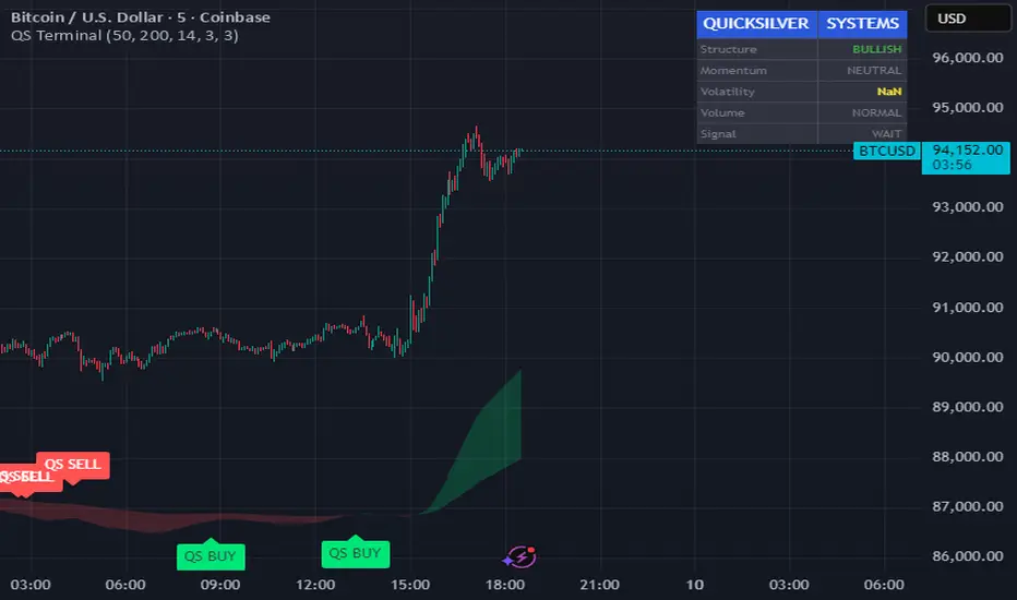
Quicksilver Master Terminal [Institutional]Overview
The Quicksilver Master Terminal is a comprehensive data visualization interface designed to bring institutional-grade market awareness to the retail chart. It replaces the need for multiple cluttered indicators by consolidating Trend, Momentum, Volatility, and Structure into a single Heads-Up Display (HUD).
Designed by Quicksilver Algo Systems, this tool is engineered for precision scalpers and prop firm traders who require instant situational awareness without switching timeframes.
Features
1. The Institutional HUD (Heads-Up Display)
Located in the top-right corner, this live dashboard provides real-time metrics on:
Market Structure: Instantly identifies if the asset is in a Bullish or Bearish regime relative to the 200 EMA.
Momentum Status: Tracks overbought/oversold conditions using smoothed Stochastic logic.
Volatility (ATR): Displays live Average True Range data for precise Stop Loss placement.
Volume Flow: Detects institutional volume spikes (1.5x average).
2. The Trend Cloud
A dynamic visual ribbon that fills the space between the Fast EMA (50) and Slow EMA (200).
Green Cloud: Strong Bullish Trend (Look for Longs).
Red Cloud: Strong Bearish Trend (Look for Shorts).
Cross: Visual warning of trend reversals.
3. Sniper Signal Logic
The script paints "INSTITUTIONAL BUY" and "INSTITUTIONAL SELL" labels only when high-probability confluence occurs:
Exhaustion: Stochastic RSI breaches extreme levels (<20 or >80).
Confirmation: Price action aligns with Heikin Ashi smoothing to filter noise.
Momentum: Fast %K crosses Slow %D.
How to Use
For Scalping (1m - 5m): Wait for the Trend Cloud to align with the Signal. Take "BUY" signals only when the Cloud is Green.
For Risk Management: Use the live "Volatility" number in the HUD to set your Stop Loss (e.g., 1.5x the current Volatility value).
About the Developer
This script is part of the Quicksilver Ecosystem. We build algorithmic solutions focused on capital preservation and risk management for funded traders.
Disclaimer: This tool is for educational market analysis only. Past performance is not indicative of future results.
White Crow**White Crow — cluster reversal signals + market structure**
> Indicator that helps you read market structure (pivots, trend, last extremes) and spot potential reversals through CCI/RSI signal clusters. This is *not* a standalone trading system and does not guarantee any result — it is a tool for filtering and confirming your own market ideas.
---
## 1. Concept
White Crow combines three core blocks:
1. **Pivots & market structure**
Automatically detects **local tops/bottoms** and derives a *Bullish / Bearish / Sideways* bias from them.
In the top-right corner you see a compact panel with current trend and **Last Bottom / Last Top** prices.
2. **Momentum & overbought/oversold zones**
Inside, the indicator uses:
* **CCI** with fixed levels `+100 / -100`;
* an optional **RSI filter** with overbought/oversold levels (`80 / 20`).
These generate basic *Buy / Close* signals.
3. **Cluster signals Buy X / CloseV**
The script tracks **clusters of signals inside a 4-bar window** and highlights rarer, “amplified” events:
* **Buy X** — cluster buy signal (multiple buy conditions in a row);
* **CloseV** — cluster signal for exit/reversal.
**Buy X and CloseV are the strongest and most reliable signals in this indicator** because they are based on repeated conditions rather than a single bar. They work **best on higher timeframes (1H–4H)**, where they reflect meaningful shifts in order flow instead of noise.
> ⚠️ Important: Buy X and CloseV are *only signals*. They must be used as **one of several confirmation factors** for your own view of market structure (support/resistance, trend, price action, volume, etc.), not as standalone reasons to enter or exit trades.
---
## 2. How it works
### 2.1. Pivots and trend detection
* The indicator builds a **zigzag-like structure**:
after a local high, once price retraces down by a given percentage (`pivotSigma`), a **Top** is marked;
after a local low, once price retraces up by the same percentage, a **Bottom** is marked.
* Using the sequence of recent tops and bottoms, the script determines the trend:
* *Bullish* — the last low is higher than the previous one (HL);
* *Bearish* — the last high is lower than the previous one (LH);
* otherwise — *Sideways*.
* The info table shows:
* **Market Trend** — Bullish / Bearish / Sideways;
* **Last Bottom / Last Top** with adaptive decimal precision (works for crypto, FX, stocks, etc.).
### 2.2. Base Buy / Close signals
* **Long condition (Buy):**
* `CCI < -100` (oversold),
* if RSI filter is enabled — `RSI < 20`.
* **Short/Exit condition (Close):**
* `CCI > +100` (overbought),
* if RSI filter is enabled — `RSI > 80`.
These conditions generate the regular **Buy** and **Close** labels on the chart.
### 2.3. Clusters: Buy X and CloseV
To reduce noise, the indicator evaluates not only the current bar, but also the **last 4 bars**:
* `buy_count` — how many times the long condition was true within the last 4 bars;
* `sell_count` — how many times the short condition was true within the last 4 bars.
Then:
* **Buy X** appears when:
* `buy_count ≥ 2` (conditions for Buy were met on at least 2 of the last 4 bars),
* the time filter between two Buy X signals is satisfied (`Min Bars Between Signals`).
* **CloseV** appears when:
* `sell_count ≥ 2`,
* the required number of bars has passed since the previous CloseV.
> ✅ This is why **Buy X / CloseV are stronger and more trustworthy than single Buy/Close signals**, especially on **1H–4H** timeframes: the market confirms the same overbought/oversold condition several times in a row.
### 2.4. Order Blocks
* When `Show Order Blocks` is enabled, the indicator highlights **impulsive candles** whose body exceeds a threshold based on ATR.
* Colored rectangles mark **potential order blocks** (areas where strong buying or selling previously occurred).
## 3. Inputs and customization
Inputs are grouped in TradingView-friendly categories.
### 3.1. Pivot Settings
* `Show Pivots` — enable/disable **Top / Bottom** markers.
* `Sigma (% retracement)` — pivot sensitivity (minimum retracement in % required to confirm a pivot).
* Colors for Top/Bottom — for visual tuning.
**Tip:**
On H1–H4 you can keep near-default values.
On lower timeframes, reduce `Sigma` if you want more detailed local structure.
### 3.2. CCI / RSI Settings
* `CCI Period` — CCI length (short by default for faster reaction).
* `Enable RSI Filter` / `RSI Period` — toggle and length for RSI filter.
* RSI levels are fixed at **20 / 80** to mark strong oversold/overbought zones.
**Usage:**
* For more conservative entries — keep the RSI filter enabled.
* For more frequent signals (e.g. scalping) — you can disable the RSI filter.
### 3.3. Order Blocks
* `Show Order Blocks` — display order block zones.
* `Block Threshold (ATR multiplier)` — how large a candle must be (vs ATR) to be considered significant.
### 3.4. Signals & Filters
* `Show Buy / Show Buy X / Show Close / Show CloseV` — choose which labels you want to see.
* `Enable Time Filter` — enable minimum spacing between amplified signals.
* `Min Bars Between Signals` — how many bars must pass between two Buy X or two CloseV signals.
**Tip:**
If you see too many amplified signals, increase `Min Bars Between Signals`.
If you want more activity, decrease it.
### 3.5. Alerts
* `Buy Alerts / Buy X Alerts / Close Alerts / CloseV Alerts` — choose which signal types should trigger alerts.
* `One Alert Per Bar` — when enabled, alerts are triggered only once per bar (recommended for H1–H4).
Alerts are generated via `alert()`, with messages that include signal type, ticker, timeframe and current price.
---
## 4. How to trade with White Crow
### 4.1. Recommended timeframes
* 📌 **Main focus: 1H–4H.**
On these timeframes:
* pivots and trend are more stable;
* CCI/RSI reflect meaningful swings;
* **Buy X / CloseV clusters** filter out a lot of intrabar noise.
You can still experiment on M1–M15, but expect more signals and more sensitivity to noise.
### 4.2. Reading the signals step by step
1. **Start with context**
* Look at **Market Trend / Last Bottom / Last Top** in the info panel.
* See where price is relative to these points: near resistance, near support, inside a range, etc.
2. **Identify zones of interest**
* Use pivots and order blocks as potential support/resistance areas.
* Wait for price to approach these zones.
3. **Watch the signals**
* **Buy** — early sign of local oversold conditions.
* **Buy X** — amplified cluster signal; more weight than a single Buy.
* **Close** — early warning of potential exhaustion in the current move.
* **CloseV** — amplified cluster exit/reversal signal.
4. **Practical approach**
* In a *Bullish* trend:
* focus on **Buy / Buy X** near bottoms and demand blocks;
* use **Close / CloseV** for partial profit-taking or tightening stops.
* In a *Bearish* trend:
* focus on **Close / CloseV** near tops and supply blocks;
* use **Buy / Buy X** mainly for countertrend scalps with strict risk control.
---
## 5. Important notes and disclaimer
1. **Buy X / CloseV are stronger — but not “magic” signals.**
They are statistically more meaningful than single Buy/Close signals because:
* they require multiple confirmations within a cluster;
* they are time-filtered.
However, **false signals are still possible**, especially in news spikes and low-liquidity conditions.
2. **Best performance on higher timeframes (1H–4H).**
Here, Buy X and CloseV usually reflect genuine shifts in supply/demand rather than micro noise.
3. **This is a confirmation tool, not a complete system.**
Pro Trading White Crow:
* does not manage risk;
* does not define position size or stop-loss;
* does not replace your own analysis.
Always use its signals as **one of several confluence factors** together with structure, trend, price action, volume, and your trading plan.
4. **Educational purpose only.**
This script and description are for educational and analytical purposes only.
They **do not constitute investment advice or a guarantee of profit**.
You are fully responsible for all trading decisions and risk management.
---
---
## White Crow — кластерные сигналы разворота + структура рынка
> Индикатор помогает читать рыночную структуру (пивоты, тренд, последние экстремумы) и находить потенциальные развороты через кластеры сигналов CCI/RSI. Это *не* готовая торговая система и *не* гарантия результата — а инструмент для фильтрации и подтверждения ваших собственных идей по рынку.
---
## 1. Концепция
White Crow объединяет три ключевых блока:
1. **Пивоты и структура рынка**
Автоматически находит **локальные вершины и впадины** и на их основе формирует трендовое смещение: *Bullish / Bearish / Sideways*.
В правом верхнем углу — компактная панель с текущим трендом и ценами **Last Bottom / Last Top**.
2. **Моментум и зоны перегрева**
Внутри используются:
* **CCI** с фиксированными уровнями `+100 / -100`;
* опциональный **фильтр RSI** с уровнями перепроданности/перекупленности (`20 / 80`).
По ним строятся базовые сигналы *Buy / Close*.
3. **Кластерные сигналы Buy X / CloseV**
Скрипт отслеживает **кластеры сигналов внутри окна в 4 бара** и выделяет более редкие, «усиленные» события:
* **Buy X** — кластерный сигнал покупки (несколько buy-условий подряд);
* **CloseV** — кластерный сигнал выхода/разворота.
Именно **Buy X и CloseV являются наиболее сильными и достоверными сигналами индикатора**, так как возникают при повторяющемся выполнении условий, а не на одном баре. Лучше всего они работают **на старших таймфреймах (1–4 часа)**, где отражают реальное смещение баланса спроса/предложения, а не рыночный шум.
> ⚠️ Важно: Buy X и CloseV — *это всего лишь сигналы*. Они должны использоваться **как один из факторов подтверждения** вашего видения структуры рынка (уровни, тренд, price action, объём и т.д.), а не как единственная причина для входа или выхода.
---
## 2. Как это работает
### 2.1. Пивоты и определение тренда
* Индикатор строит **структуру в стиле зигзага**:
после локального максимума, когда цена откатывает вниз на заданный процент (`pivotSigma`), отмечается **Top**;
после локального минимума, когда цена откатывает вверх на тот же процент, отмечается **Bottom**.
* По последовательности последних вершин и впадин определяется тренд:
* *Bullish* — последний минимум выше предыдущего (HL);
* *Bearish* — последний максимум ниже предыдущего (LH);
* иначе — *Sideways*.
* В информационной таблице отображаются:
* **Market Trend** — Bullish / Bearish / Sideways;
* **Last Bottom / Last Top** с адаптивным количеством знаков (подходит под крипту, форекс, акции и т.д.).
### 2.2. Базовые сигналы Buy / Close
* **Условие для Buy (лонг):**
* `CCI < -100` (зона перепроданности),
* при включённом фильтре — `RSI < 20`.
* **Условие для Close (шорт/выход):**
* `CCI > +100` (зона перекупленности),
* при включённом фильтре — `RSI > 80`.
По этим условиям индикатор рисует обычные метки **Buy** и **Close**.
### 2.3. Кластеры: Buy X и CloseV
Чтобы отсеять лишний шум, индикатор оценивает не только текущий бар, но и **4 последних бара**:
* `buy_count` — сколько раз условие на покупку выполнялось за последние 4 бара;
* `sell_count` — сколько раз условие на продажу/выход выполнялось за последние 4 бара.
Далее:
* **Buy X** появляется, когда:
* `buy_count ≥ 2` (минимум на 2 из 4 баров были условия для покупки),
* соблюдён фильтр по времени между усиленными сигналами (`Min Bars Between Signals`).
* **CloseV** появляется, когда:
* `sell_count ≥ 2`,
* прошло достаточно баров с момента предыдущего CloseV.
> ✅ Поэтому **Buy X и CloseV заметно сильнее и надёжнее одиночных Buy/Close**, особенно на **таймфреймах 1–4 часа**: рынок несколько раз подряд подтверждает один и тот же перегрев/разрядку момента.
### 2.4. Order Blocks
* При включённом `Show Order Blocks` индикатор выделяет **импульсные свечи**, чьё тело больше заданного множителя ATR.
* По таким свечам строятся цветные прямоугольники — **потенциальные блоки ордеров** (области поддержек/сопротивлений, где ранее проходил крупный объём).
---
## 3. Настройки и кастомизация
Настройки сгруппированы в привычные разделы TradingView.
### 3.1. Pivot Settings
* `Show Pivots` — включить/выключить метки **Top / Bottom**.
* `Sigma (% retracement)` — чувствительность к пивотам (минимальная глубина отката в процентах).
* Цвета Top/Bottom — визуальная настройка.
**Совет:**
На H1–H4 можно оставить значения близкие к стандартным.
На младших ТФ уменьшайте `Sigma`, если нужна более детальная структура.
### 3.2. CCI / RSI Settings
* `CCI Period` — период CCI (по умолчанию короткий, для более быстрой реакции).
* `Enable RSI Filter` / `RSI Period` — включение и длина RSI-фильтра.
* Уровни RSI фиксированы: **20 / 80**, выделяя сильную перепроданность/перекупленность.
**Использование:**
* Для более консервативной торговли — держите фильтр RSI включённым.
* Для более частых сигналов (скальпинг и т.п.) — можно фильтр отключить.
### 3.3. Order Blocks
* `Show Order Blocks` — отображение блоков ордеров.
* `Block Threshold (ATR multiplier)` — насколько большой должна быть свеча относительно ATR, чтобы считаться значимой.
### 3.4. Signals & Filters
* `Show Buy / Show Buy X / Show Close / Show CloseV` — выбор типов отображаемых меток.
* `Enable Time Filter` — включение минимального интервала между усиленными сигналами.
* `Min Bars Between Signals` — сколько баров должно пройти между двумя Buy X или двумя CloseV.
**Совет:**
Если усиленных сигналов слишком много — увеличьте `Min Bars Between Signals`.
Если хотите больше активности — уменьшите это значение.
### 3.5. Alerts
* `Buy Alerts / Buy X Alerts / Close Alerts / CloseV Alerts` — выбор типов сигналов для алертов.
* `One Alert Per Bar` — при включении алерты отправляются один раз на бар (рекомендуется для H1–H4).
Алерты формируются через `alert()` с сообщением, включающим тип сигнала, тикер, таймфрейм и текущую цену.
---
## 4. Как использовать White Crow в торговле
### 4.1. Рекомендуемые таймфреймы
* 📌 **Основной фокус: 1–4 часа.**
На этих ТФ:
* структура по пивотам и тренд более стабильны;
* CCI/RSI отражают существенные ценовые колебания;
* кластеры **Buy X / CloseV** лучше отсеивают шум.
На M1–M15 индикатор тоже можно применять, но нужно быть готовым к большему количеству сигналов и чувствительности к микродвижениям.
### 4.2. Пошаговое чтение сигналов
1. **Начните с контекста**
* Посмотрите на **Market Trend / Last Bottom / Last Top** в панели.
* Определите, где находитесь относительно этих уровней: у сопротивления, у поддержки, внутри диапазона и т.п.
2. **Найдите зоны интереса**
* Используйте пивоты и order blocks как потенциальные области спроса/предложения.
* Ждите подхода цены к этим зонам.
3. **Отслеживайте сигналы**
* **Buy** — ранний признак локальной перепроданности.
* **Buy X** — усиленный кластерный сигнал, более значимый, чем одиночный Buy.
* **Close** — ранний сигнал возможного ослабления текущего движения.
* **CloseV** — усиленный кластерный сигнал выхода/разворота.
4. **Практическое применение**
* В *бычьем* тренде:
* фокус на **Buy / Buy X** возле впадин и зон спроса;
* **Close / CloseV** использовать для частичной фиксации и подтягивания стопа.
* В *медвежьем* тренде:
* фокус на **Close / CloseV** возле вершин и зон предложения;
* **Buy / Buy X** — для аккуратных контртрендовых входов с жестким риском.
---
## 5. Важные замечания и дисклеймер
1. **Buy X / CloseV сильнее, но не «волшебные» сигналы.**
Они статистически более значимы, чем одиночные Buy/Close, потому что:
* требуют нескольких подтверждений в кластере;
* фильтруются по времени.
Однако **ложные срабатывания всё равно возможны**, особенно на новостях и в условиях низкой ликвидности.
2. **Оптимальная область применения — старшие ТФ (1–4 часа).**
Здесь Buy X и CloseV обычно отражают реальное изменение баланса спроса/предложения, а не шум.
3. **Это инструмент подтверждения, а не полноценная система.**
Pro Trading White Crow:
* не управляет рисками;
* не считает размер позиции и уровень стоп-лосса;
* не заменяет ваше собственное видение рынка.
Всегда используйте его сигналы **как один из факторов согласованности** вместе со структурой, трендом, price action, объёмом и персональным торговым планом.
4. **Образовательный характер.**
Скрипт и описание предназначены для обучения и анализа графиков.
Они **не являются инвестиционной рекомендацией и не гарантируют прибыль**.
Вы самостоятельно принимаете все торговые решения и несёте полную ответственность за риск.
---

Psychologische LevelPSYCHOLOGICAL LEVELS INDICATOR FOR FOREX
This professional indicator automatically visualizes all important psychological price levels on Forex charts. Psychological levels are price zones where traders frequently react, as humans tend to gravitate toward round numbers.
MAIN FEATURES:
Automatic Level Detection: The indicator calculates and draws all relevant psychological levels based on the current currency pair
Visual Zones: Each level is displayed with a solid center line and a colored zone
Forex-Optimized: Automatically accounts for JPY pairs (0.01 pip) and standard pairs (0.0001 pip)
Fully Customizable: Colors, zone width, and line thickness can be individually adjusted
LEVEL TYPES:
00/000 Levels (e.g., 1.1000, 1.1100, 1.2000)
The most important psychological barriers
Traders frequently place stop-loss and take-profit orders at these levels
Strong support and resistance zones
50 Levels (e.g., 1.1050, 1.1150, 1.2050)
Secondary psychological levels
Located exactly midway between 00-levels
Important intermediate zones for profit-taking
25/75 Levels (e.g., 1.1025, 1.1075, 1.2025)
Optional activation for more detailed analysis
Quartile levels for more precise zones
Useful for scalping and short-term strategies
CONFIGURATION OPTIONS:
Zone Width in Pips: Determines the width of the colored zone around the center line (Default: 5 pips)
Zone Color: Fill color of the psychological zones (adjustable transparency)
Line Color: Color of the solid center lines
Line Width: Thickness of the center lines (1-5 pixels)
Level Selection: Individual selection of which level types to display
TRADING APPLICATIONS:
✓ Identification of potential support and resistance zones
✓ Placement of stop-loss and take-profit orders
✓ Recognition of price rejection zones
✓ Support for breakout strategies
✓ Enhanced risk management
✓ Optimization of entry and exit points
SPECIAL FEATURES:
Levels extend across the entire chart (extend.both)
Automatic adjustment to all Forex pairs
Optimized performance through intelligent calculation
Clean design without cluttered chart display
Compatible with all timeframes
SUITABLE FOR:
This indicator is suitable for day traders, swing traders, scalpers, and long-term Forex investors who want to incorporate psychological price levels into their trading strategy.

Asia & London Session Boxes (NY Time) + 4H SwingsAsia & London Session Boxes + 4H Swings
Description
A multi-timeframe session analysis tool designed for forex and futures traders operating on NY time. This indicator visualizes major trading sessions with automatic high/low range boxes while simultaneously tracking 4-hour swing levels, giving you a complete picture of institutional trading activity and key price levels.
How It Works
Session Boxes (NY Time Zone)
Asia Session (20:00 – 00:00 NY): Blue-shaded box marking the complete range from open to close
London Session (02:00 – 06:00 NY): Yellow-shaded box capturing the high-volatility London open
Each session box automatically records the highest high and lowest low during that timeframe, providing instant reference for session extremes and potential supply/demand zones.
4-Hour Swing Levels
Detects swing highs and lows on a 30-minute timeframe for ultra-responsive level identification
Red lines: Swing highs (resistance levels)
Green lines: Swing lows (support levels)
Lines extend to the right for continuous monitoring
Auto-removes touched levels: When price breaches a swing, it automatically deletes that level to keep your chart clean and focused on active levels
Key Features
Session-Based Trading Analysis: Identify which session created important price levels and ranges
Multi-Timeframe Architecture: Analyzes 30-minute swings while tracking 4-hour patterns on your current chart
Smart Level Cleanup: Touched swings automatically remove themselves, eliminating clutter
NY Time Conversion: All times automatically adjust to your NY timezone for consistency
Institutional Perspective: View exactly where institutions are trading during major session hours
Zero Lag Detection: Real-time identification of swing extremes
Ideal For
Forex traders (especially EUR/USD, GBP/USD) targeting session breakouts
Scalpers and swing traders needing precise support/resistance levels
Market structure traders analyzing institutional price action
Session traders looking to trade Asia/London opens
1-minute to 4-hour timeframe charts
Trading Applications
Trade Asia session breakouts into London
Identify liquidity zones from previous sessions
Detect swing extremes for entry/exit planning
Confirm trend direction using multi-session structure
Find support/resistance on intraday pullbacks
Default Settings Optimized For
NASDAQ futures and forex pairs
Scalping and short-term swing trading
NY timezone trading (automatically converts UTC-4)
30-minute swing detection for precise level identification

Delta Signals NO REPINTA (FINAL)📢 New Indicator: Delta Signals NO REPAINT 🔥
Introducing my new indicator based on Order Flow Delta, designed to provide buy and sell signals with absolutely NO repainting — perfect for scalping, day trading, or swing trading.
This tool combines two powerful components:
✅ Order Flow Delta — Measures the real strength between buyers and sellers
✅ Smart Trend Filter — Only shows signals in the direction of the dominant trend
Together, they deliver cleaner, more accurate and more reliable signals, with clear entry markers on the chart and a delta histogram revealing real market pressure.
🚀 What’s Included?
🔹 Buy/Sell signals with NO repaint
🔹 Intelligent delta calculation
🔹 Trend filter using moving average
🔹 Clear labels on entry points
🔹 Visual delta histogram
🔹 Works great on Crypto, Forex, Indices & Stocks
🔹 Very lightweight and fast on TradingView
🎯 Why is it powerful?
Because it doesn't rely on lagging indicators — it reads the actual imbalance between buyers and sellers, often detecting strong moves before traditional indicators do.
This type of analysis is used by professional order flow traders, but now you have it on your TradingView chart in a simple, visual format.
🔥 Perfect for:
Scalpers who need precision
Day traders working breakouts and pullbacks
Swing traders seeking strong confirmations
Traders who want clean, NO-repaint signals
If you want a version with automatic TP/SL, alerts, or full backtesting, I can publish that as well.
Just let me know. 🚀📈

Strat Reversal MTF TableStrat Reversal MTF Table — Your Complete Multi-Timeframe Strat Command Center
Take your Strat trading to the next level with an indicator that shows every reversal, on every timeframe, in one powerful visual dashboard.
Designed for traders who demand speed, clarity, and full Strat alignment, the Strat Reversal MTF Table instantly identifies all major bullish and bearish reversal patterns:
Bullish Patterns
2-1-2
3-1-2
1-3-2
3-2-2
Bearish Patterns
2-1-2
3-1-2
1-3-2
3-2-2
Each signal is displayed with:
Clear pattern name (e.g., “2-1-2 Bull”)
Automatic trigger price
Timeframe label
Color-coded background (Bullish / Bearish / Neutral)
Whether you trade options, equities, futures, or crypto, this indicator makes it effortless to see what’s flipping — and where the strongest setups are emerging.
🔥 Key Features
📊 Multi-Timeframe Scanning (1 min → Daily)
Monitor 7 customizable timeframes at once.
From scalping to swing trading, you always know which timeframe is turning.
⚡ Real-Time OR Close-Confirmed Logic
Choose your style:
Realtime (Wick Mode) → Fast entries
Close-Confirmed → Stronger validation
Ideal for traders who want precision on any timeframe.
🎨 Clean & Customizable Dashboard
Move the table anywhere on the chart
Adjust text size
Choose your own colors
Lightweight and non-intrusive
A perfect blend of simplicity and power.
📩 Instant Alerts, Built In
Get notified instantly when:
Any timeframe reverses
A specific timeframe flips
Multiple reversals fire across the stack
The indicator works great with TradingView’s push notifications, email, and webhooks.
🎯 What This Helps You Do
✔ Catch Strat reversals as they happen
✔ Quickly spot full-timeframe alignment
✔ Improve your entries for options plays
✔ Avoid chop by reading higher-timeframe intent
✔ Trade more confidently with automated trigger levels
This indicator is built for Strat traders who want to trade smarter, faster, and cleaner.
✨ Perfect For
Strat Traders
Options Traders
Futures Scalpers
Intraday & Swing Traders
Quant/Algo-inspired traders
Anyone following Rob Smith’s methodology
DANGHIEU EMA 34/89/200 Ribbon (Scaled HTF)📘 Indicator Description – EMA 34/89/200 Ribbon (Scaled HTF)
The EMA 34/89/200 Ribbon (Scaled HTF) indicator is designed to replicate higher-timeframe EMAs directly on your current chart without switching timeframes.
Using a precise HTF Scaling Algorithm, the script converts EMAs from 1H, 2H, 4H, 6H, 12H, 1D, and even 1W into equivalent lengths on lower timeframes—allowing traders to perform true multi-timeframe trend analysis on a single chart.
The 34-EMA and 89-EMA form a dynamic trend ribbon that changes color based on the relationship between the two moving averages. This helps traders quickly identify trend direction, momentum strength, and potential market reversals. The indicator also includes optional crossover markers (X symbols) to highlight bullish and bearish crossovers for cleaner signal recognition. EMA200 is included as the long-term trend anchor.
This tool is ideal for scalpers, day traders, and swing traders who require higher-timeframe context while trading lower-timeframe entries.
🟦 How to Use the Indicator
1. Choose the Higher Timeframe to Simulate
Use the “HTF to Simulate” dropdown to select the timeframe you want to emulate (e.g., 4H, 2H, 1D, 1W).
The script automatically scales the EMA lengths so they match the selected HTF.
2. Read the Ribbon for Trend Direction
Green Ribbon → EMA34 above EMA89 → Bullish momentum
Red Ribbon → EMA34 below EMA89 → Bearish momentum
The ribbon expands when momentum strengthens and contracts during consolidation.
3. Use EMA Crossovers as Signal Zones
Optional X markers highlight crossover points:
Bullish Crossover → EMA34 crosses above EMA89
Bearish Crossover → EMA34 crosses below EMA89
These crossovers often align with trend shifts or early momentum changes.
4. EMA200 as Trend Filter
The EMA200 acts as the macro trend filter:
Price above EMA200 → only consider long setups
Price below EMA200 → only consider short setups
Combining ribbon trend + EMA200 alignment improves signal accuracy.
5. Multi-Timeframe Trading Strategy
This indicator is powerful for:
Scalping with HTF bias
Pullback entry on lower timeframe during HTF trend
Identifying trend exhaustion when the ribbon flips
Confirming wave structure (Elliott Wave, Dow Theory)
Spotting strong momentum phases and squeeze zones
Example workflow:
Select 4H as HTF simulation.
Trade on 15m or 5m chart.
Enter only when price aligns with the HTF ribbon + EMA200 trend.
Use EMA crossovers as confirmation signals.

Combined JADEVO-ATR VIX AdaptiveCombined JADEVO-ATR VIX Adaptive is a next-generation volatility-aware trading engine that merges the precision of the JADEVO framework with the adaptive power of ATR and VIX-based volatility modeling. Built for scalpers, intraday traders, and advanced algorithmic systems, this tool dynamically adjusts its sensitivity, key levels, and trade signals based on real-time market expansion and contraction.
By combining ATR-driven structure mapping, VIX-influenced volatility filters, and the JADEVO decision core, this indicator identifies high-probability zones, adaptive entry signals, and intelligent profit-taking levels—while filtering out low-quality chop that destroys most scalping systems.
