RSI + ADX + ATR Combo Indicator: RSI + ADX + ATR Combo Filter
This indicator is a confluence filter tool that combines RSI, ADX, and ATR into a single, easy-to-read chart overlay. It is designed to help traders identify low-volatility, non-trending zones with balanced momentum—ideal for strategies that rely on breakouts or reversals.
🔍 Core Components:
RSI (Relative Strength Index)
Standard RSI with custom upper and lower bounds (default: 60 and 40).
Filters out extreme overbought/oversold regions and focuses on price consolidation zones.
ADX (Average Directional Index)
Measures trend strength.
When ADX is below a custom threshold (default: 20), it indicates a weak or range-bound trend.
ATR (Average True Range)
Represents volatility.
Low ATR values (default threshold: 2.5) are used to filter out high-volatility environments, helping refine entries.
🟣 Signal Logic:
A signal is highlighted with a background color when all three conditions are met:
RSI is between lower and upper bounds (e.g., 40 < RSI < 60) ✅
ADX is below the trend threshold (e.g., ADX < 20) ✅
ATR is below the volatility threshold (e.g., ATR < 2.5) ✅
These combined conditions suggest a low-volatility, low-trend strength, and balanced momentum zone—perfect for anticipating breakouts or strong directional moves.
In den Scripts nach "rsi" suchen
RSI/Stochastic With Real Time Candle OverlayThis indicator provides an alternative way to visualize either RSI or Stochastic values by representing them as candle bars in real time, allowing a more detailed view of momentum shifts within each bar. By default, it displays the standard historical plot of the chosen oscillator in the background, but once you are receiving real-time data (or if you keep your chart open through the close), it begins overlaying candles that track the oscillator’s intrabar movements. These candles only exist for as long as the chart remains open; if you refresh or load the chart anew, there is no stored candle history, although the standard RSI or Stochastic line is still fully retained. These candles offer insight into short-term fluctuations that are otherwise hidden when viewing a single line for RSI or Stochastic.
In the settings, there is an option to switch between standard candlesticks and Heiken Ashi. When Heiken Ashi is selected, the indicator uses the Heiken Ashi close once it updates in real time, producing a smoothed view of intrabar price movement for the oscillator. This can help identify trends in RSI or Stochastic by making it easier to spot subtle changes in direction, though some may prefer the unmodified values that come from using regular candles. The combination of these candle styles with an oscillator’s output offers flexibility for different analytical preferences.
Traders who use RSI or Stochastic often focus on entry and exit signals derived from crossing certain thresholds, but they are usually limited to a single reading per bar. With this tool, it becomes possible to watch how the oscillator’s value evolves within the bar itself, which can be especially useful for shorter timeframes or for those who prefer a more granular look at momentum shifts. The visual separation between bullish and bearish candle bodies within the indicator can highlight sudden reversals or confirm ongoing trends in the oscillator, aiding in more precise decision-making. Because the candle overlay is cleared as soon as the bar closes, the chart remains uncluttered when scrolling through historical data, ensuring that only the necessary real-time candle information is displayed.
Overall, this indicator is intended for users who wish to track intrabar changes in RSI or Stochastic, with the added choice of standard or Heiken Ashi candle representation. The real-time candle overlay clarifies short-lived fluctuations, while the standard line plots maintain the usual clarity of past data. This approach can be beneficial for those who want deeper insights into how oscillator values develop in real time, without permanently altering the simplicity of the chart’s historical view.
RSI Bands with Volume and EMAThis script is a comprehensive technical analysis tool designed to help traders identify key market signals using RSI bands, volume, and multiple Exponential Moving Averages (EMAs). It overlays the following on the chart:
RSI Bands: The script calculates and plots two bands based on the Relative Strength Index (RSI), indicating overbought and oversold levels. These bands act as dynamic support and resistance zones:
Resistance Band (Upper Band): Plotted when the RSI exceeds the overbought level, typically indicating a potential sell signal.
Support Band (Lower Band): Plotted when the RSI falls below the oversold level, typically indicating a potential buy signal.
Midline: The average of the upper and lower bands, acting as a neutral reference.
Buy/Sell Labels: Labels are dynamically added to the chart when price reaches the overbought or oversold levels.
A "Buy" label appears when the price reaches the oversold (lower) band.
A "Sell" label appears when the price reaches the overbought (upper) band.
Volume Indicator: The script visualizes trading volume as histograms, with red or green bars representing decreasing or increasing volume, respectively. The volume height is visually reduced for better clarity and comparison.
Exponential Moving Averages (EMAs): The script calculates and plots four key EMAs (12, 26, 50, and 200) to highlight short-term, medium-term, and long-term trends:
EMA 12: Blue
EMA 26: Orange
EMA 50: Purple
EMA 200: Green
The combined use of RSI, volume, and EMAs offers traders a multi-faceted view of the market, assisting in making informed decisions about potential price reversals, trends, and volume analysis. The script is particularly useful for identifying entry and exit points on charts like BTC/USDT, although it can be applied to any asset.
RSI Multi Timeframe Based on Moving Average By Alireza PhoenixHi. I have prepared for you the multi-time frame RSI indicator based on moving average
You can use it in three different time frames
Open the settings and put the value you want in the Time 1 and Time 2 fields
In the fast and slow section, specify the length of the moving period of fast and slow origins as desired
In the offset section, you can add or reduce the time interval as you wish
This indicator shows you the RSI index in three different time frames along with two different lengths of the moving average based on the RSI index.
You can use this indicator in all financial, forex or crypto markets
The crossing of RSI and moving average lines in different time frames and lengths will give you a buy or sell signal.
Whenever the faster line or smaller RSI total frame succeeds in breaking the slower line or the RSI time is higher than the low, a free signal is issued and vice versa.
I do not guarantee that 100% of the issued signals are accurate and correct, and I have coded this indicator only for your convenience.
I hope you can get help from this indicator and make profit
Love From IRAN

RSI Trendlines with BreakoutsA pivot-based breakout indicator that attempts to provide traders with a visual aid for finding breakouts on the RSI. Similar to how we use trendlines on our charts, using them on the Relative Strength Index can also give us a sense of direction in the markets.
This script uses its own pivot-based system that checks for real-time swing levels and triggers a new pivot event after every dip and nth bars. The breakout alerts that are given were not designed to be taken as signals since their purpose is to provide an extra bit of confluence. Because of this, I added no other conditions that try to make the alerts "perfect", but instead, print every breakout that is detected. Despite stating this, I did happen to add a condition that checks the difference in RSI and the breakout value, but that's as far as it'll go.
There are alerts built-in to the script, along with adjustable repainting options.
🔳 Settings
Lookback Range: Lookback period to trigger a new pivot point when conditions are met.
RSI Difference: The difference between the current RSI value and the breakout value. How much higher in value should the current RSI be compared to the breakout value in order to detect a breakout?
RSI Settings
Styling Options
🔳 Repaint Options
On: Allows repainting
Off - Bar Confirmation: Prevents repainting and generates alerts when the bar closes. (1 candle later)
🔳 How it Works
Before a trendline is drawn, the script retrieves the slope between the previous pivot point and the current. Then it adds or subtracts the slope x amount of times (based on the lookback range) from the current pivot value until the current x-axis is reached. By doing this we can get a trendline that will detect a breakout accurately.
The result
When using the RSI Difference condition, the script will print breakouts whenever the condition is true, because of this dotted lines were added to track where the alert was triggered.
🔳 Alerts

RSI Multi Alerts MTFThis indicator won't plot anything to the chart.
Please follow steps below to set your alarms based on RSI oversold and overbought levels:
1) Add indicator to the chart
2) Go to settings
3) Choose up to 8 different symbols to get alert notification
4) Choose up to 4 different timeframes
5) Set overbought and oversold levels
6) Once all is set go back to the chart and click on 3 dots to set alert in this indicator, rename your alert and confirm
7) You can remove indicator after alert is set and it'll keep working as expected
What is does:
This indicator will generate alerts based on symbols, timeframes and RSI levels settings.
It will consider overbought and oversold levels to alert in each symbol and each timeframe selected. Once these levels are achieved it will send an alert with the following information:
- Symbol name (BTC, ETH, LTC)
- Specific RSI level achieved (e.g: RSI 30, RSI 70 or any custom level)
- Timeframe (e.g: 5m, 1h, 1D)
- Current symbol price
This script will request RSI OB/OS information through request.security() function from all different symbols and timeframes settings. It also requests symbols' price (close).
Due to Tradingview limitation (40 requests calls) it can only request information for 8 symbols for this script (8 symbols X 4 timeframes = 32 + 8 symbols' price (close) = 40)
Standard symbols are Binance USDT-M Futures but you can choose any symbol from Tradingview.
Standard timeframes are 5m|15m|1h|4h but you can choose from a list.
Standard overbought and oversold levels are 70 and 30 but you can change it to other integer values.
Feel free to give feedbacks on comments section below.
Enjoy!
Rsi table multi time frame v1.0 by FatBoyThis indicator shows rsi values for different timeframes for two assets and signals with red or green background bullish or bearish signals.
You can change one asset in settings.
Thing that is different from other indicator like this is when it change background color from gray to red or green (red bearish sign, green bullish sign) it is high probability that it will come to trend change for that time frame and it would be good to look for divergence on that timeframe on rsi indicator.
Calculation for trend change is done using bollinger bands and rsi .
When you se change no multiple timeframes it means that you need to go to biggest time frame that changed color.
Biger timeframe it could be automatically bigger price move.
Please do not go blindly in trade when you see red or green color because you need to verify everything with divergence on rsi .
Divergence is when price and rsi line are not matching, like price makes higher hi and rsi makes lower high this is bearish divergence, opposite is for bullish divergence.
Time frames that are shown in table are 1m, 5m, 12m, 24m, 1h, 2h, 4h, 8h, 12h, 24h
One asset is shown witch are you currently looking on chart other you can change.

RSI - colour fillThis script showcases the new (overload) feature regarding the fill() function! 🥳
2 plots could be filled before, but with just 1 colour per bar, now the colour can be a gradient type.
In this example we have 2 plots
- rsiPlot , which plots the rsi value
- centerPlot, which plots the value 50 ('centre line')
Explanation of colour fill in the zone 50-80
Default when rsi > 50
- a bottom value is set at 50 (associated with colour aqua)
- and a top value is set at 80 (associated with colour red)
This zone (bottom -> top value) is filled with a gradient colour (50 - aqua -> 80 - red)
When rsi is towards 80, you see a red coloured zone at the rsi value,
while when rsi is around 50, you'll only see the colour aqua
The same principle is applied in the zone 20-50 when rsi < 50
Cheers!
RSI Candles - Appa SoTradition RSI just shows the line as an indicator when the price candle is changed. So Indicator hasn't been able to offer open price RSI and close price at once. Rsi candles can make the user be able to see RSI open and close price is changed simultaneously with Candle form.
RSI 캔들 형태로 표현하여 open 가격과 close 가격의 RSI 데이타를 동시에 볼 수 있게 표현 하였습니다. - 제작: 압력밥소

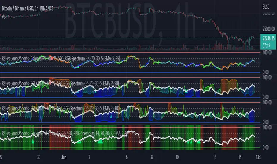
RSI vs BITFINEX BTC Longs/Shorts Margin Ratio Percentage RankThis indicator plots the RSI of the current token with a color based on percentage rank of the RSI of BITFINEX:BTCUSDLONGS divided by BITFINEX:BTCUSDSHORTS, with a plot of the moving average of the RSI. It can optionally plot the RSI in white and the ratio RSI in color, or the ratio as background color. It can also plot the raw ratio rather than the percentage rank if selected.
I was interested in the ratio of BITFINEX:BTCUSDLONGS to BITFINEX:BTCUSDSHORTS as a measure of market sentiment and how that sentiment would magnify RSI changes. The volatility of the BTCUSDLONGS : BTCUSDSHORTS ratio was too low to get a good read, using a percent rank of the RSI of the ratio made the results more visible.
This indicator should be used on a BTC chart.
RSI Local TrendA simple indicator using two RSIs.
Conditions for buy:
RSI(slow) < RSI(fast) and RSI(slow) < long_trigger
Conditions for sell:
RSI(slow) > RSI(fast) and RSI(slow) > short_trigger
It is recommended to use in small timeframes for scalping.
Recommended settings:
slow = 3
fast = 14
long_trigger = 30
short_trigger = 70
In markets where there is very high volatility, it is recommended to change the trigger parameters:
long_trigger = 20
short_trigger = 80

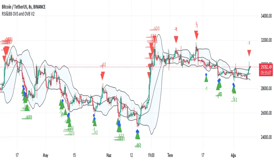
RSI and BBand simultaneously OverSoldENG : This indicator is created by combining the standard period RSI indicator with an Oversold limit of 32, an Overbought limit of 70 and a period of 14 (these values can be changed optionally from the entries and still tabs of the indicator settings) and the Bollinger Band. indicator with a standard deviation of 2 and a period of 20. Also, the RSI Oversold is an upward green triangle where the price simultaneously falls below the BB and the lower limit (Low) (i.e. below 32), where the RSI Overbought (i.e. above 70) at the same time the price rises above the BB and the upper limit (Upper) is a downward red triangle. is indicated by a triangle. An alarm condition is established on these conditions. Source codes are posted visually and written in clear language and with explanations for beginners to learn to pine.
TR : Bu gösterge OverSold sınırı 32, OverBought sınırı 70 ve periodu 14 olan (bu değerler tercihe göre indikatör ayarlarının girdiler ve still sekmelerinden değiştirilebilir) standart periodluk RSI göstergesi ile standart sapma değeri 2, periodu 20 olan Bollinger Bandı göstergesinin birleştirilmesiyle oluşturulmuş olup ilaveten RSI'nin OverSold iken (yani 32 altına düştüğü) aynı anda fiyatın BBand alt sınırı (Lower) altına düştüğü yerleri yukarı yönlü yeşil üçgenle, RSI'nin OverBought iken (yani 70 üstüne çıktığı) aynı anda fiyatın BBand üst sınırı (Upper) üstüne çıktığı yerleri aşağı yönlü kırmızı üçgenle belirtmektedir. Bu şartlar üzerine de alarm kondüsyonu oluşturulmuştur. Kaynak kodları görünür olarak yayınlanmış olup, pine öğrenmeye yeni başlayanlar için anlaşılır dilde ve açıklamalar eklenerek yazılmıştır.
RSI Triple Time FrameThis indicator / study script can display the RSI for current chart timeframe along with the RSI of 1 to 3 other timeframes.
When all 3 additional RSI are at extreme levels (overbought/sold) or crossing the neutral line (50%) at the same moment, background chart color will change accordingly.
This indicates a strong momentum convergence between all selected timeframes, hence producing a stronger signal!
Go to settings to display/modify additional timeframes and/or to enable background colors:
Green = Overbought
Red = Oversold
Yellow = crossover neutral
Orange = crossunder neutral
NB1: For a simple and easy read of the RSI, set all additional TF to current chart TF and switch on desired colors.
NB2: Please note that current chart TF is not taken into consideration to change background color. But you can always set one of the 3 additional TF to the same TF as current chart.
Bonus: If you are also a user of my “MA Bollinger Bands + RSI” strategy script, this is particularly useful to visually detect crossover and crossunder of the RSI neutral line 😉
As always, enjoy!
RSI Effective Volume Reversal IndicatorAbout The Indicator
I want to start with a few short paragraphs of how this indicator came to be and why it's different than 80% of the indicators on this platform. If you are just interested in how the indicator works, you can skip the story, although I recommend at least skimming through it.
Originally, this indicator was developed to be part of a trend-trading strategy that analyzed the three main components - Price , Volume and Strength . It was broken down to 2 indicators - on-chart and off-chart, similarly to my first premium indicator "Trend Indicator for Directional Trading". Despite the similar concept, the current one is miles ahead in almost any regard.
As most of you know, strategies (especially the really good ones) are fairly more complex to use and navigate. You need to input the parameters for generating and tweaking the indicator, then you need to enter your risk management parameters like stop loss, position size, etc. and finally you need to set the exit criteria, like specified percent target, trial stop or an indicator condition. So, what was supposed to be a simple strategy that anyone can use and make money with, turned out to be a very complex one with over 20 parameters to tweak. I know from experience that when it comes to trading, less is more. This is especially true for the indicators.
As a result, I decided to split the project into two separate strategies - one for trend/directional trading and one for volume and strength (the one you are looking at right now). The problem was that as a standalone strategy it didn't perform all that well. And it shouldn't come as a surprise to anyone who has been trading long enough - divergences are one of the biggest tricksters there are - easy to identify only in hindsight. They are the new-trader's doom. I lost a decent amount of money chasing tops and bottoms through divergences and for that reason it's always been somewhat a goal of mine to create an indicator that can assist in this conquest (call it a personal vendetta). This indicator comes as close as I've ever been to this goal.
Right, but I just said a few lines above that this indicator doesn't work that well for divergences? That's true, but only if you completely automate it and let it buy every bullish and sell every bearish divergence. I have extensively tested it on the securities I actively trade (SPX500, Crude Oil, Gas, Gold, Copper) and with the right settings it does generate positive return (what strategy wouldn't with enough optimization, right?), but I would have made so much more money if I didn't fight the trend.
So, I decided to do something else - convert the strategy back to an indicator and use it for discretional trading in which it assists (not explicitly tell) me in making the decisions. And oh boy, did I hit the sweet spot there! It has been notoriously difficult for most scripts and indicators to identify proper support and resistance levels or at least not nearly as good as the human eye can do. This is especially the case with ascending and descending channels. Seeing how well it worked in helping me open longs and shorts at key levels, I decided to strip it from all unnecessary features and simplify the interface for easier navigation (about 300 lines of code less). This brings me to my next point.
How Does It Work?
The indicator relies on two main components in order to identify reversals - RSI module and Effective Volume module, hence the name RSI Effective Volume Reversal Indicator (not very creative, I know). You select which one you want to display via the dropdown menu. Now let me outline how each one works.
RSI module (top) - similarly to the traditional RSI, it is bound between 0 and 100. Oversold area is marked in green (15-25) and overbought area is marked in red (75-85). You can change those as you please, but I found those to be the perfect spots for identifying potential opportunities. This is where the similarities end. As you've noticed, it's not nearly as choppy as the traditional RSI, just the opposite - it's rather smooth, resembling Heikin-Ashi candles. Further, the way the candle is formed can indicate if we are approaching a top or bottom and if you should be looking for an opportunity to open a trade against the trend. Believe it or not, I've been developing and using this indicator for the past 6 months, so there's a lot to be said about the formation of those candles with clear examples, but I will leave those for the guide book that comes along with each purchase/subscription.
Effective Volume (bottom) - As I already have developed quite an extensive indicator that utilizes the effective volume profile, I just grabbed certain elements from it, simplified it and smoothed it via a new custom-made moving average along with some other minor updates. The results from RSI and Effective Volume may seem quite similar, but they actually reveal slightly different information and can be used to complement each other. In terms of coloring - green gradient above 50 and red gradient below 50.
What To Expect
It's important to understand that technical analysis does not predict prices. I am not claiming this indicator to be the crystal ball that will tell you when to long or short with max leverage. All I am saying is that it's a pretty good tool to help you time your trades, show real exhaustion of trends and reveal when a new direction is forming.
This indicator has been, and most likely will continue to be, work in progress. I've been experimenting with tons of features to make it better for the past 6 months and I finally believe it is stable and beneficial enough in order for you to use it. There's always something more that I would like to add and/or change, but I know that if I continue digging and improving, the indicator would have never seen the light of day. That's why I want to add the critical component to it - you. Through your feedback and recommendations, I believe we can make this indicator truly a masterpiece.
With that being said, I do have some future improvements planned, which I will be releasing on the go. Some are major, like updating it to v.5 and adding new features that are only available to the newest version of PineScript, while others are minor, such as color variations and more one-click customizations.
I hope I managed to portray an objective picture (with reasonable amount of words) of something that I've put a lot of work into, so that you can successfully use and make even more money on the markets. Once again, each purchase/subscription of this indicator comes with a guide in which I go into great detail explaining how to use the indicator, so rest assured that you will be able to take full advantage of it.

RSI CCI Correlating Oscillator (RCCO) by empowerTRCCO is pronounced "ree-koh" or "rico".
The RCCO is simply the plot of the values of both the RSI and CCI added together.
The RCCO makes some adjustments though, so that both the RSI and the CCI will fit correctly on the same scale - and so that these adjustments for scale allow reversals to be detected at crossings.
When the CCI crosses from underneath to up above the RSI, this is usually a bullish reversal. Alternatively, when the CCI crosses from above to back under the RSI, that usually signals a bearish trend. Look for the widest swings you can find to ensure good momentum. The larger the volume, the clearer and more decisive the trends. Low volume will lead to ranging and lazy momentum. High volume will create clear and forceful trends. The lowest negative RCCO in a timeframe, and then add some high volume... and you have yourself a good setup for a successful trade.
Because the RSI and CCI are adjusted, you may not recognize their values from having used the respective indicators on their own. The RSI and CCI values are less important. What matters with this indicator are the crossings and the RCCO value. The RCCO value should be negative, preferably, a deeply negative value. Look at the historical chart for the target per your selected timeframe and decide what values work for you.
I hope you enjoy the RCCO and that it can help you become a little más RICO!

RSI Back-calculation■Purpose of this script
Back-calculate the stock price limit based on the RSI formula
■Logic overview
This time, RSI calculation formula by Cutler is adopted.
In this formula, RSI is calculated from the ratio of the sum of price movements and the sum of price increases during a fixed period.
This script back-calculates future stock prices from past stock price data and set RSI values.
Therefore, you can receive the offer of the buy price in the oversold phase and the offer of the sell price in the overbought phase with reference to the RSI index.
■How to use
・Enter the following on the parameters input screen
・sauce (usually close)
・Reference period(14 is optimal by J.W. Wilder)
・RSI target value (Generally, buy below 30 and sell above 70)
・When to ask for stock price (After the latest bar closing price is decided: next. The latest bar is moving: current.)
For example, when selecting a daily chart, before trading hours: , during trading hours:
when selecting a weekly chart, the closing price is not fixed, for example on Wednesday:

RSI :: ALLinDivergence v10.0
Everything you see in this indicator has been designed with a single purpose, to ease your trading with simplify visual technical analysis of the market. It pulls data from 7 different TimeFrames and it can not be more simpler visual representation of its calculations when applied on chart.
When applied on chart, you will see GREEN/RED alternating MTF RSI line and its 70 overbought area and its 30 oversold area. There is a gentle purple colour line in the background which represents RSI line of the current TF (it is not crucial but it helps to know why MTF line turns RED or turns GREEN (crossing of those two).
HOW TO USE IT?
Rule 1.
TIMEFRAMES
Choose the best TimeFrame for the job. I use: 1min, 2min, 3min, 5min, 8min, 13min, 21min, 34min or 56min (golden ratio). You can also pick a different TF but only to up to 1h TF chart as it does not work well with TF over 1h. Smaller TF is used for SCALPING of DAY TRADING higher TF is used for SWING TRADING. You get the picture?
Rule 2
TO ENTER BUY/LONG POSITION: search for HigherLows on RSI MTF GREEN/RED LINE when it is coloured RED. To enter a position it should be confirmed with AALERT :: ALLinDivergence v 10.0 that "GREEN" Divergence is emerging.
TO ENTER SELL/SHORT POSITION: search for LowerHighs on RSI MTF GREEN/RED LINE when it is coloured GREEN. To enter a position it should be confirmed with ALERT :: ALLinDivergence v 10.0 that "RED" Divergence is emerging.
Rule 3
EXIT FROM BUY/LONG POSITION: search for HigherLows on RSI MTF GREEN/RED LINE.
EXIT FROM SELL/SHORT POSITION: search for LowerHighs on RSI MTF GREEN/RED LINE.
Rule 4
CAUTION
Do not rush to enter a position and try to predict what indicator will do next. It does not end well.
Be aware you are not exiting a position in panic that would be too soon or even worse, you get married to bad trade and you are not exiting even though you should exit by many signals you get.
Use risk management strategy to protect your capital.
Follow the rules and make your trading easier and better.

Finnie's RSI with EMA + MFI + Stoch V2RSI seams to be one of the most used indicators by far, and that comes because of merit . With that in mind, the goal of this indicator is to expand upon the tradition RSI or Relative Strength Index we all know and love :) I started by adding an EMA crossover. Which gives you, the users, a general idea of when to buy and sell outside of just watching a line go down and up. To take thinks even further, I decided to add options for both Fast and Slow Stochastic oscillators. Adding STOCH brings in another variable when deciding on an entry, technically its a bit hard to explain but in practice it would go something like this: you notice RSI is down around the level 20 mark and RSI is crossing up above it's EMA , which is BULLISH signal, and you're thinking about going long. As a second confirmation you can look at the STOCH rsi , if it's also crossing above the previously spoken EMA that's another BULLISH signal. This process can be repeated once RSI has risen to find an exit.
V2 changes:
-added MFI
-added overbought(yellow)/oversold(red) visual indicator
-removed K stoch in order to clean the indicator up visually, I haven't regretted it since :)

RSI+ by WilsonThis is a modified version of my RSI Cloud indicator. You can plot 2 moving averages over RSI. You have the option to plot moving average types like SMA, EMA, WMA, VWMA, HullMA, and ALMA. You also have the option to plot histograms based on any of the moving averages. You can fill colors between RSI and moving averages. Option to add alerts, crossover and crossunder signals are also included. I have also included a band to show the position of RSI using three colors. Green color is shown when RSI is above both the plotted moving averages. Red color is shown when RSI is below both the plotted moving averages. And Yellow color is shown when RSI is between the two plotted moving averages. Anyone is free to use the script. Wishing everyone happy and profitable trading.

RSI Multicolor editableEN:
RSI with overbought and oversold area in color and editable level. visually more interesting than the basic version the overbought and oversold areas catch the eye quickly. Depending on the strategies and your personal use of the RSI, you can modify all the lines and add colors to each defined zone.
overbought zone, oversold and editable noise zone
I wanted to have a modifiable RSI like some trading platforms.
please excuse me for my english and my code, i'm just getting started.
FR:
RSI avec zone de surachat et survente en couleur et niveau éditable. visuellement plus intéressant que la version basique les zones de surachat et survente attirent l’œil rapidement. Selon les stratégies et l'utilisation personnel que vous faite du RSI, vous pouvez modifier toutes les lignes et ajouter des couleurs à chaque zone défini.
zone de surachat, survente et zone de bruit éditable
je souhaitais avoir un RSI modifiable comme certaines plateforme de trading.
veuillez m'excuser pour mon anglais et mon code, je débute.
S73 RSI & Stoch RSIRSI and Stoch RSI combined into 1.
Get 2 for the price of 1.
Stoch RSI has two extra h lines, 10 an 90, as well as the traditional 20 and 80.
Remember, High Stoch RSI can mark the strength of a trend, doesn't necessarily mean there will be a change in trend once top and bottom levels are hit.
Click here to see how BTC has been topped out between levels of 90-100 for 14 weeks on the weekly chart.
RSI + Trend Kijun LTThis script is a simple RSI + 1 indication on trend :
- RSI 14 periods that you can personalize :
- period and upper/lower boundary can be customize
- Coloration when RSI exceeds the upper/lower limits
- Indication on long term trend :
- if intraday or daily : weekly trend (haussier / baissier Ⓦ)
- if weekly : monthly trend (haussier / baissier Ⓜ)
- The trend is calculate by the following expression : last confirmed close (not real time) weekly/monthly compared to Kijun-Sen weekly/monthly
Ce script est un simple RSI + 1 indication de tendance :
- RSI 14 périodes que vous pouvez personnaliser :
- Période et limite supérieure/inférieure personnalisables
- Coloration lorsque le RSI dépasse les limites supérieures/inférieures
- Indication de la tendance à long terme :
- si intrajournalier ou journalier : tendance hebdomadaire (haussier / baissier Ⓦ)
- si hebdomadaire : tendance mensuelle (haussier / baissier Ⓜ)
- La tendance est calculée par l'expression suivante : dernière clôture confirmée (pas en temps réel) hebdomadaire/mensuelle par rapport à Kijun-Sen hebdomadaire/mensuelle.
NB : Maybe in futur, possibility to add daily trend when intraday / Peut-être à l'avenir, possibilité d'ajouter une tendance journalière en intrajournalier.
RSI|The Wave PrincipleThe Wave Principle | Modified RSI
30 green | 70 red = Strong Movement (Possible Impulse)
20 cyan | 80 Yellow = Strongest Movement
Support and Resistance Level (Trend Continuation)
Uptrend= 40
Downtrend = 60
Break+Retest = BR
Div = Divergence (Change in trend)
--------------------------------------------
This indicator has been modified from original RSI to fit Wave Principle characteristics:
Uptrend Impulsive Wave over 70 RSI it changes color to red, and > 80 yellow stronger impulse | Usually means continuation, at least once more.
Downtrend Impulsive Wave under 30 RSI it changes color to green, and < 20 cyan stronger impulse | Usually means continuation, at least once more.
Once RSI reached these levels, it doesn't mean trend reversal but a correction is expected. If it shows divergence along with an Ending Diagonal, it's a confirmation for trend reversal.
In a corrective wave, levels 40-60 represents support and resistance levels where price won't go further. Indicating Corrective Waves, not as strong as Impulsives.
Prices can breakout RSI trend lines and retest from the other side before continue the new trend as also described in the Wave Principle.
--------------------------------------------
