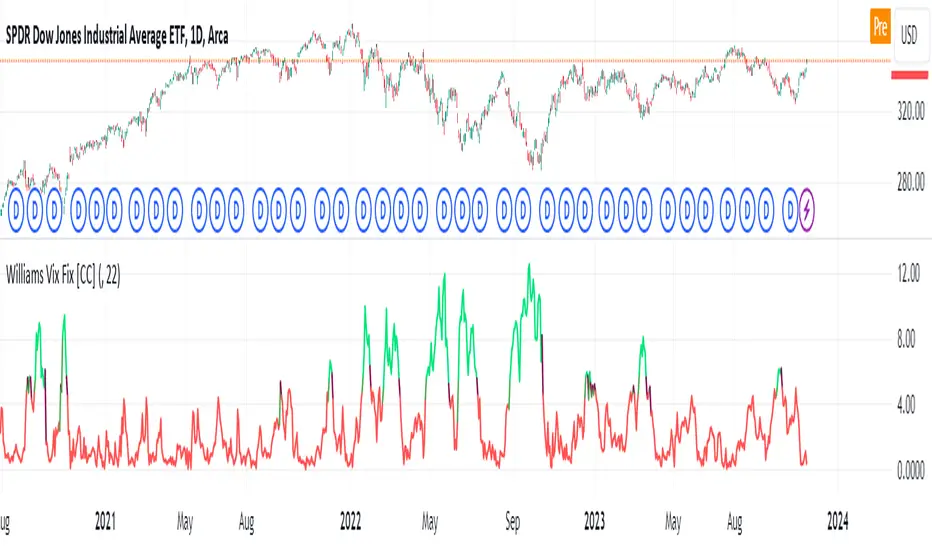
Williams Vix Fix [CC]The Vix Fix indicator was created by Larry Williams and is one of my giant backlog of unpublished scripts which I'm going to start publishing more of. This indicator is a great synthetic version of the classic Volatility Index and can be useful in combination with other indicators to determine when to enter or exit a trade due to the current volatility. The indicator creates this synthetic version of the Volatility Index by a fairly simple formula that subtracts the current low from the highest close over the last 22 days and then divides that result by the same highest close and multiplies by 100 to turn it into a percentage. The 22-day length is used by default since there is a max of 22 trading days in a month but this formula works well for any other timeframe. By itself, this indicator doesn't generate buy or sell signals but generally speaking, you will want to enter or exit a trade when the Vix fix indicator amount spikes and you get an entry or exit signal from another indicator of your choice. Keep in mind that the colors I'm using for this indicator are only a general idea of when volatility is high enough to enter or exit a trade so green colors mean higher volatility and red colors mean low volatility. This is one of the few indicators I have written that don't recommend to buy or sell when the colors change.
This was a custom request from one of my followers so please let me know if you guys have any other script requests you want to see!
In den Scripts nach "one一季度财报" suchen
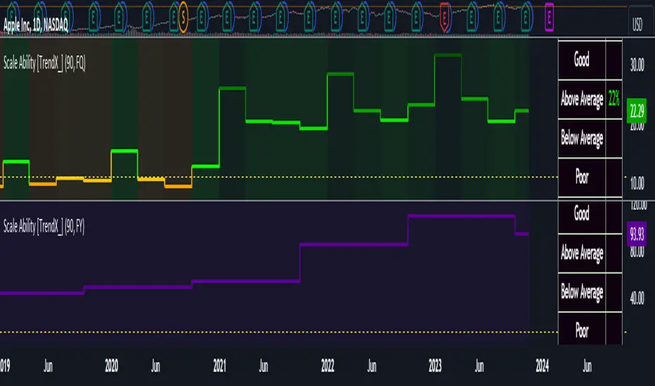
Scale Ability [TrendX_]Scale Ability indicator can indicate a company’s potential for future growth and profitability.
A scalable company is one that can increase its revenue and market share without increasing its costs proportionally, which can benefit from economies of scale. Therefore, the high-scale ability can generate more value for its shareholders - which is important for investment decisions.
Scale Ability indicator consists of 3 financial components:
Cash Flow from Investing Activities to Total Assets Ratio (CFIA / TA)
Net Income to Total Debt Ratio (NI / TD)
Earnings Before Interest, Taxes, Depreciation and Amortization to Equity Ratio (EBITDA / E)
These measures can help investors assess how efficiently and effectively a company uses its resources to generate revenue and profit.
Note:
This can be customizable between Fiscal Quarter (FQ) and Fiscal Year (Fy)
This is suitable for companies in fast-growing industries.
FUNCTION
CFIA / TA Ratio
A company with a net income to total debt of 9% could indicate that it is investing in its assets to keep up with the market demand and the technological changes which can create competitive advantages.
NI/ TD Ratio
A company with a net income to total debt of 9% could show that it is profitable and has a strong financial position, which can easily cover its debt payments.
EBITDA / E Ratio
A company with a net income to total debt of 14% illustrates that it is generating a high return on its equity.
USAGE
Scale index division:
> 43 : Excellent
32 - 43 : Good
12 - 31 : Above Average
= 11 : Average
8 - 10 : Below Average
5 - 7 : Poor
< 4 : Very Poor
DISCLAIMER
This is only a rough estimate, and the actual ratio may differ significantly depending on the stage of the business cycle and the company’s strategy, and the comparison of each company and its peers.
This indicator is not financial advice, it can only help traders make better decisions. There are many factors and uncertainties that can affect the outcome of any endeavor, and no one can guarantee or predict with certainty what will occur.
Therefore, one should always exercise caution and judgment when making decisions based on past performance.
COSTAR [SS]This idea came to me after I wrote the post about Co-Integration and pair trading. I wondered if you could use pair trading principles as a way to determine overbought and oversold conditions in a more neutral way than RSI or Stochastics.
The results were promising and this indicator resulted :-)!
About:
COSTAR provides another, more neutral way to determine whether an equity is overbought or oversold.
Instead of relying on the traditional oscillator based ways, such as using RSI, Stochastics and MFI, which can be somewhat biased and narrow sided, COSTAR attempts to take a neutral, unbiased approached to determine overbought and oversold conditions. It does this through using a co-integrated partner, or "pair" that is closely linked to the underlying equity and succeeds on both having a high correlation and a high t-statistic on the ADF test. It then references this underlying, co-integrated partner as the "benchmark" for the co-integration relationship.
How this succeeds as being "unbiased" and "neutral" is because it is responsive to underlying drivers. If there is a market catalyst or just general bullish or bearish momentum in the market, the indicator will be referencing the integrated relationship between the two pairs and referencing that as a baseline. If there is a sustained rally on the integrated partner of the underlying ticker that is holding, but the other ticker is lagging, it will indicate that the other ticker is likely to be under-valued and thus "oversold" because it is underperforming its benchmark partner.
This is in contrast to traditional approaches to determining overbought and oversold conditions, which rely completely on a single ticker, with no external reference to other tickers and no control over whether the move could potentially be a fundamental move based on an industry or sector, or whether it is a fluke or a squeeze.
The control for this giving "false" signals comes from its extent of modelling and assessment of the degree of integration of the relationship. The parameters are set by default to assess over a 1 year period, both the correlation and the integration. Anything that passes this degree of integration is likely to have a solid, co-integrated state and not likely to be a "fluke". Thus, the reliability of the assessment is augmented by the degree of statistical significance found within the relationship. The indicator is not going to prompt you to rely on a relationship that is statistically weak, and will warn you of such.
The indicator will show you all the information you require regarding the relationship and whether it is reliable or not, so you do not need to worry!
How to Use
The first step to use COSTAR is identifying which ticker has a strong relationship with the current ticker. In the main chart, you will see that SPY is overlaid with VIX. There is a strong, negative correlation between the VIX and SPY. When VIX is entered as the paired ticker, the indicator returns the data as stationary, indicating a compatible match.
Now you have 3 ways of viewing this relationship, 2 of which are going to be directly applicable to trading.
You can view them as
Price to Price Ratio (Not very useful for trading, but if you are curious)
Z-Score: Helpful for trading
Co-integration: Helpful for trading
Here is an example of all three:
Example of Z-Score Chart:
Example of Price Ratio:
Example of Co-Integration Pair:
Using for Trading
As stated above, the two best ways to use this for trading is to either use the Z-Score Chart or the Co-Integrated Pair chart.
The Z-Score chart is based off of the price ratio data and provides an assessment of both the independent and dependent data.
The co-integration shows the dependent (the ticker you are trading) in yellow and the independent (the ticker you are referencing) in teal. When teal is above yellow, you will see it is green. This means, based on your benchmark pair, there is still more up room and the ticker you are trading is actually lagging behind.
When the yellow crosses up, it will turn red. This means that your ticker is out-performing the benchmark pair and you likely will see pullback and a "regression to the mean" through re-integration.
The indicator is capable of plotting out entries and exits, which are guided by the z-score:
How Effective is it?
I created a basic strategy in Pinescript, and the back-test results vary. Trading ES1! using NQ1! as the co-integrated pair, results were around 78% effective.
With VIX, results were around 50% effective, but with a net profit.
Generally, the efficacy surpassed that of both stochastics and RSI.
I will be releasing the strategy version of this in the coming days, still just cleaning up that code and making it more "public use" friendly.
Other Applications
If you are a pair trader, you can technically use this for pair trading as well. That's essentially all this is doing :-).
Tips
If you are trading a ticker such as MSFT, AMD, KO etc., it's best to try to find an ETF or index that has that particular ticker as a large holding and use that as your benchmark. You will see on the indicator whether there is a high correlation and whether the data is indeed stationary.
If the indicator returns "Non-stationary", you can attempt to extend your regression range from 252 to 500. If this fixes the issue, ensure that the correlation is still >= 0.5 or <= -0.5. If this does not work still, you will need to find another pair, as its likely the result of incompatibility and an insignificant relationship.
To help you identify tickers with strong relationships, consider using a correlation heatmap indicator. I have one available and I think there are a couple of other similar ish ones out there. You want to make sure the relationship is stable over time (a correlation of >= 0.50 or <= -0.5 over the past 252 to 500 days).
IMPORTANT: The long and short exits delete the signal after one is signaled. Therefore, when you look back in the chart you will notice there are no signals to exit long or short. That is because they signal as they happen. This is to keep the chart clean.
'Tis all my friends!
Hope you enjoy and let me know your questions and suggestions below!
Side note:
COSTAR stands for Co-integration Statistical Analysis and Regression. ;)

Anticipated Profit Targets (APT)Anticipated Profit Targets (APT)
Purpose:
The Anticipated Profit Targets script is a specialized tool designed to assist traders in visualizing potential exit points for their trades. This is achieved by leveraging the Average True Range (ATR), a renowned measure of market volatility.
How It Works:
ATR Computations: At its core, the script calculates the ATR based on a user-defined number of periods. The ATR captures the range between the high and low prices of an asset over a specific duration, providing a snapshot of its volatility.
Multiplier Application: To fine-tune the profit targets, the ATR is multiplied by a user-defined multiplier. This step adjusts the ATR value, setting the profit targets at a distance from the current price, thus accounting for potential price movements.
Adaptable Timeframes: One of the standout features of this script is its adaptability. Users can select their desired timeframe for the profit target calculations. This flexibility means that a trader can be on a 15-minute chart but visualize profit targets based on the volatility of a 1-hour chart.
Visual Representation: The calculated profit targets are then overlaid onto the current chart. This visual aid provides traders with a clear perspective of potential exit points in relation to ongoing price movements.
Originality and Usefulness:
While the concept of using ATR for setting profit targets isn't new, this script's adaptability across timeframes and its user-centric customization options make it a unique offering. The combination of ATR with dynamic multipliers and timeframe adaptability ensures that traders get a tool tailored to their specific needs, rather than a one-size-fits-all solution.
Usage Guidelines:
After adding the script to the chart, traders can adjust the input parameters to their preferences. The anticipated profit targets will then be displayed, offering potential exit points. It's recommended to use these targets in conjunction with other technical indicators and chart patterns for a holistic trading strategy.
Features:
ATR Periods: The ATR is calculated using a user-defined number of periods. By default, it's set to 14 periods, a standard setting. The ATR gauges the asset's volatility, and adjusting the periods can increase or decrease its sensitivity to recent price fluctuations.
ATR Multiplier: The ATR is multiplied by a user-defined factor to determine the profit targets. With a default multiplier of 1.5, the profit target will be positioned 1.5 times the ATR above (for bullish trades) or below (for bearish trades) the current price.
Target Timeframe: Traders can choose the timeframe for which the profit targets are calculated. This feature enables viewing of profit targets from higher timeframes on the current chart. For instance, while observing a 15-minute chart, one can see the 1-hour profit targets.
Visual Indicators:
1. Two lines are plotted: the bullish target (in green) and the bearish target (in red).
2. At the onset of each new candle in the selected higher timeframe, labels indicating the precise profit target values are displayed.
3. Price scale labels also showcase the profit targets, offering a quick reference for potential exit points.
Customization:
Traders can modify the following parameters:
1. ATR Periods: Adjusting the number of periods can refine the ATR's sensitivity to price changes.
2. Multiplier for ATR: Tweaking this value alters the distance between the profit targets and the current price.
3. Timeframe for Profit Targets: A variety of timeframes are available, granting flexibility in viewing profit targets.
How to Use:
After integrating the script into their chart, traders can modify the input parameters as desired. The anticipated profit targets will then be overlaid on the chart, offering potential exit points. When used alongside other technical indicators and chart patterns, this tool can enhance trading decision-making.
Note: This script is designed for educational purposes and should not be considered as financial advice. Always conduct your own research and consult with a financial advisor before making any trading decisions.

Trend Pinbar PT49 by CuancuanIdea Behind:
Buying the short-term trend that shows a pin-bar candlestick pattern. Meant to be traded on a daily chart / higher timeframe.
To determine the short-term trend we use short EMA such as 8-16-30 and check the slope of each one, and definitely, the shorter one must be above the longer one for an uptrend. Vice versa for a downtrend.
To determine a pin-bar candlestick, I calculate that the body size (open to close) is at maximum a-third of the candle size (high to low). Besides that, I ensure that the close of the candle is above the shortest MA for bullish and below it for bearish.
As extra filters to reduce trade numbers:
1. Longer MA Filter = You can turn it off if you think the higher timeframe filter is unnecessary.
2. Slope Filter = To ensure the slope of the shorter MA is steeper rather than the mid-MA.
3. Size Filter = To check whether the overall candle size (high to low) is bigger than the ATR number. When the size filter is turned on, it removes small insignificant candles.
PS: Don't trade anything live unless you find it comfortable after backtesting it by yourself .

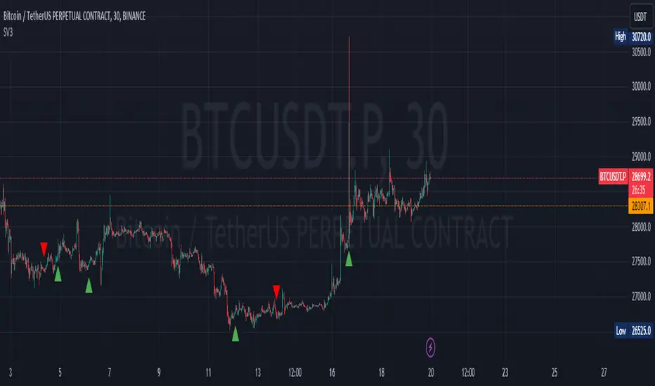
Sequence Volume BarsThis script in TradingView is designed to identify sequences of bars with increasing volume. It creates two indicators: one for bullish trends (green sequence) and another for bearish trends (red sequence).
Green Sequence: The script considers a green sequence when the current closing price is higher than the previous one, and the volume is increasing. When the green sequence approaches a user-defined length, it highlights it on the chart with a green triangle below the bar.
Red Sequence: Similarly, the script looks for a bearish sequence when the current closing price is lower than the previous one, and the volume is increasing. When the red sequence approaches the specified length, it highlights it with a red triangle above the bar.
Both indicators can also send alerts when their respective sequences reach the specified length minus one. This script can be useful for traders seeking entry points based on specific volume patterns in the market.
P.S. I'm not sure how this can be useful to you, but sometimes a pump and dump can be predicted. Maybe you'll come up with ideas on how to refine this concept.
-----------
Этот скрипт для TradingView предназначен для выявления последовательностей баров с ростом объема. Он создает два индикатора: один для бычьих трендов (зеленая последовательность) и другой для медвежьих трендов (красная последовательность).
Зеленая последовательность: Скрипт считает, что происходит зеленая последовательность, если текущая цена закрытия выше предыдущей, а объем увеличивается. Когда зеленая последовательность по длине приближается к заданной пользователем, он выделяет это на графике зеленым треугольником под баром.
Красная последовательность: Аналогично скрипт ищет медвежью последовательность, когда текущая цена закрытия ниже предыдущей, а объем растет. Когда красная последовательность приближается к указанной длине, он выделяет это красным треугольником над баром.
Оба индикатора могут также отправлять предупреждения, когда соответствующая последовательность достигает заданной длины минус один. Этот скрипт может быть полезен для трейдеров, ищущих входные точки, основанные на определенных шаблонах объема в рынке.
Не знаю как вам может это пригодиться, но иногда предсказывается пам и дамп. Может у Вас появится идея как доработать эту идею
Donchian MA Bands [LuxAlgo]The Donchian MA Bands script is a complete trend indicator derived from the popular Donchian channel indicator as well as various customizable moving averages to estimate trend direction and build support/resistance levels & zones.
🔶 USAGE
The indicator outputs various elements, the main ones being a lower dynamic zone (blue by default), an upper dynamic zone (in orange by default), and one support and resistance level/zones (red/green by default).
A prominent lower zone is indicative of an uptrend, while a prominent upper zone is indicative of a downtrend. These zones can be used as support/resistance as well.
Support/resistance zones and levels can be used using a breakout methodology or to determine price bounced if a level was tested multiple times.
The indicator contains various modes affecting the output of the indicator, described below.
🔹 Clouds
Clouds return one upper/lower dynamic zone and look/act similarly to a trailing stop. Price over the lower zone is indicative of an uptrend, and price under the upper zone is indicative of a downtrend.
🔹 Upper Band
The upper band mode returns a dynamic zone closer to prices during an uptrend, and farther away during a downtrend.
This band can act as a support during uptrends.
🔹 Lower Band
The lower band mode returns a dynamic zone closer to prices during an uptrend, and farther away during a downtrend.
This band can act as a resistance during downtrends.
🔹 Bands
Bands return both upper and lower zones, the zones are more apparent depending on the price trend direction, with uptrends being indicated by a more visible lower zone, and downtrends being indicated by a more visible upper zone.
Breakout dots are highlighted when price breakout the indicator displayed extremities, and can be indicative of a confirmed trend reversal.
These breakouts can be more effective for trend following during trending markets. Ranging markets might return breakouts highlighting the top/bottom.
🔶 DETAILS
The core of this script is the highest / lowest mean average (MA) value for a given number of bars back ( Donchian lines).
This is repeated a few times with the obtained values.
When Bands are chosen ( Style ) this will be repeated 1 more time.
The type of mean average can be customized ( Type MA ), as well as the number of bars back ( Length ).
Depending on the choice of bands ( Style ) the script will focus on certain area's of interest.
When the option Clouds , Upper band or Lower band is chosen, an extra feature, support/resistance (S/R), will be shown.
These color-filled areas are visible when there is a difference between the 2nd and 3rd highest/lowest values.
The lines/areas can be used for stop loss, entry, exit,...
You can set the type of MA and Length separately ( Settings -> S/R ).
If you don't need this feature, simply set Type ( Settings -> S/R ) -> NONE
The shape sometimes resembles triangles, indicating a potential direction
Default the average of the highest and lowest values is plotted (Style -> Mid Donchian)
This can act as potential support/resistance or visualization of the trend, the mean average is not plotted but can be (Style -> MA)
🔹 Note
When the option Bands is chosen, an indication is plotted when the closing price breaks above the highest band or breaks below the lower band. This isn't necessarily a buy/sell signal, it is merely a signal that these lines are broken.
Users should decide on their own how they use the bands/lines/areas as entry, exit, trailing stop, stop loss, profit taking,...
🔶 SETTINGS
🔹 Bands
Style: Clouds (default), Upper band, Lower band, Bands
Type MA: choose between SMA, EMA, RMA, HullMA, WMA, VWMA (default), DEMA, TEMA, NONE (off)
Length: Length of moving average and Donchian calculations (default 20)
Colour Bands
🔹 S/R (Support/Resistance, visible with Clouds, Upper band or Lower band)
Type MA: choose between SMA, EMA, RMA, HullMA, WMA, VWMA (default), DEMA, TEMA, NONE (off)
Length: Length of moving average and Donchian calculations (default 20)
Colour S/R

Ehlers SuperSmootherJohn F. Ehlers has provided the SuperSmoother filter in several of his works, including his book "Cyclical Analytics for Traders", Chapter 3.
The SuperSmoother filter is utilized whenever one might typically apply a moving average of any kind. The outcome is that the output signal from the SuperSmoother filter displays significantly less lag compared to an equivalent amount of smoothing from a moving average. The lag difference between a moving average and the SuperSmoother filter becomes even more pronounced when critical periods are extended.
Market data contains noise, and the purpose of smoothing filters is to mitigate this noise. In fact, there are various types of noise inherent in market data. One type of noise is systemic, originating from random trading activities. Another type is aliasing noise, which arises due to the use of discrete data. Aliasing noise dominates the data when considering shorter cycle durations.
It's tempting to perceive market data as a continuous wave, but that's a misconception. Taking the closing price as representative of a bar provides just a single data point. Whether you opt for the midpoint between the high and low instead of the closing price, you're still limited to one sample per bar. Given the discrete nature of this data, certain spectral implications must be considered. For instance, the shortest feasible analysis period (without aliasing) is a two-bar cycle. This is referred to as the Nyquist frequency, at 0.5 cycles per sample.
An ideally sampled two-beat sinusoidal cycle becomes rectified when discretized. However, peak sampling for the cycle isn't always guaranteed, and interference between the sampling rate and the data frequency results in aliasing noise. This noise decreases as the data period lengthens. For example, a four-beat cycle implies four samples per cycle. With more samples, the sampled data provides a better representation of the sinusoidal component. The replica becomes even more accurate for an eight-bar data component. The increased precision of discrete data signifies that aliasing noise decreases as cycle durations expand.
A smoothing filter should possess the selectivity to reduce the aliasing noise below systemic noise levels. Given that aliasing noise increases by 6 dB per octave above the filter's selected cutoff frequency and the SuperSmoother's attenuation rate is 12 dB per octave, the SuperSmoother filter emerges as an effective tool to virtually eliminate aliasing noise in its output signal.
There are already several SuperSmoother indicators on Tradingview, but I like to structure the code and highlight the main components as functions rather than hiding them in the code. I hope this is useful for those who are starting to learn Pine Script.

wosabi Investment assistant and Swing trading CRYPTOThis indicator works to calculate the exponential moving average (EMA) of three symbols. The first is the symbol shown on the chart in front of you, the second is for Bitcoin (it can be changed), and the third is the dollar strength index (DXY), which can be changed.
- The indicator calculates the exponential average of more than one symbol that you choose from the settings
When one of the lines appears in green, this means that the exponential average (EMA) is positive. Each line represents a different value for the averages that can be changed from the default settings to any other appropriate value.
Every five lines represent the averages of the symbol, and the three symbols are separated by a dashed white line to differentiate between the indicators of the three symbols.
Note: The colors have been changed inversely for the third symbol (dxy). When the averages are positive, the color will be red, and if they are negative, the color will be green, as the current settings are suitable for encrypted digital currency symbols that interact inversely with the Dollar Strength Index, and the colors can be changed from the indicator’s settings.
Integrating the values of the three symbols into the Relative Strength Index, which can be changed according to the leading symbols that influence positively or negatively, and this varies from one market to another to give a clearer indication when the negative symbol rises or falls and affects the rest of the symbols.
The current settings are suitable for the digital currency market, and the symbols must be changed for the rest of the markets
Note: The second symbol is the positive influence and the third symbol is the negative influence

Bunch of WillyThe indicator allows you to track overbought/oversold conditions using the Williams indicator on several higher timeframes of the same ticker on one chart. Based on the relative position of the lines of different timeframes and their position relative to the exponential moving average, you can track the occurrence of situations of simultaneous overbought/oversold of several timeframes, which is a cleaner reversal signal than overbought/oversold on just one chart timeframe. So far the script itself does not indicate these points, but perhaps in one of the next updates I will fix this.
In addition, the exponential moving average can be used to determine the direction of the trend.
Индикатор позволяет на одном графике отслеживать перекупленность/перепроданость по индикатору Вильямса на нескольких более высоких таймфреймах того же тикера. Основываясь на взаимном положении линий разных таймфреймов и их положении относительно экспоненциальной скользящей средней можно отслеживать возникновение ситуаций одновременной перекупленности/перепроданности нескольких таймфреймов что является более чистым разворотным сигналом чем перекупленность/перепроданность на одном лишь таймфрейме графика. Пока скрипт сам не обозначает эти моменты, но возможно в одном из следующих обновлений я это исправлю.
Кроме того по экспоненциальной скользящей средней можно определять направление тренда.

Buy Sell Volume SeparateDescription:
The script is designed to provide traders with a unique and comprehensive analysis of trading volume dynamics. Unlike existing scripts, the script offers a distinct advantage by presenting both buy and sell volumes on separate scales, simplifying trading decisions.
Key Features:
1. Dual Volume Scales: The script provides two separate volume scales, one for buy volumes and another for sell volumes. This separation allows to easily distinguish between buying and selling pressure, aiding in more precise trade entries and exits.
2. Clear and Intuitive Chart: The script ensures that the chart it generates is clean and easy to understand. The buy and sell volumes are color-coded for clarity, and you can quickly identify significant volume spikes and trends.
How to Use:
1. Adding the Script: To use the script, simply add it to your TradingView chart.
2. Interpreting Buy and Sell Volumes: On the chart, you will see two separate volume scales—one for buy volumes and one for sell volumes. Green bars represent buying pressure, while red bars indicate selling pressure. Pay attention to the relative strengths and patterns of these bars to gauge market sentiment.
3. Informed Trading Decisions: Armed with insights into both buy and sell volumes, you can make more informed trading decisions. Look for divergences, patterns, or significant volume spikes to identify potential entry and exit points.

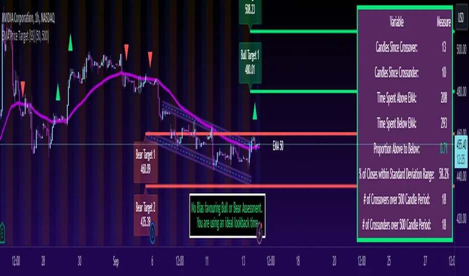
ATR Based EMA Price Targets [SS]As requested...
This is a spinoff of my EMA 9/21 cross indicator with price targets.
A few of you asked for a simple EMA crossover version and that is what this is.
I have, of course, added a bit of extra functionality to it, assuming you would want to transition from another EMA indicator to this one, I tried to leave it somewhat customizable so you can get the same type of functionality as any other EMA based indicator just with the added advantage of having an ATR based assessment added on. So lets get into the details:
What it does:
Same as my EMA 9/21, simply performs a basic ATR range analysis on a ticker, calculating the average move it does on a bullish or bearish cross.
How to use it:
So there are quite a few functions of this indicator. I am going to break them down one by one, from most basic to the more complex.
Plot functions:
EMA is Customizable: The EMA is customizable. If you want the 200, 100, 50, 31, 9, whatever you want, you just have to add the desired EMA timeframe in the settings menu.
Standard Deviation Bands are an option: If you like to have standard deviation bands added to your EMA's, you can select to show the standard deviation band. It will plot the standard deviation for the desired EMA timeframe (so if it is the EMA 200, it will plot the Standard Deviation on the EMA 200).
Plotting Crossovers: You can have the indicator plot green arrows for bullish crosses and red arrows for bearish crosses. I have smoothed out this function slightly by only having it signal a crossover when it breaks and holds. I pulled this over to the alert condition functions as well, so you are not constantly being alerted when it is bouncing over and below an EMA. Only once it chooses a direction, holds and moves up or down, will it alert to a true crossover.
Plotting labels: The indicator will default to plotting the price target labels and the EMA label. You can toggle these on and off in the EMA settings menu.
Trend Assessment Settings:
In addition to plotting the EMA itself and signaling the ATR ranges, the EMA will provide you will demographic information about the trend and price action behaviour around the EMA. You can see an example in the image below:
This will provide you with a breakdown of the statistics on the EMA over the designated lookback period, such as the number of crosses, the time above and below the EMA and the amount the EMA has remained within its standard deviation bands.
Where this is important is the proportion assessment. And what the proportion assessment is doing is its measuring the amount of time the ticker is spending either above or below the EMA.
Ideally, you should have relatively equal and uniform durations above and below. This would be a proportion of between 0.5 and 1.5 Above to Below. Now, you don't have to remember this because you can ask the indicator to do the assessment for you. It will be displayed at the bottom of your chart in a table that you can toggle on and off:
Example of a Uniform Assessment:
Example of a biased assessment:
Keep in mind, if you are using those very laggy EMAs (like the 50, 200, 100 etc.) on the daily timeframe, you aren't going to get uniformity in the data. This is because, stocks are technically already biased to the upside over time. Thus, when you are looking at the big picture, the bull bias thesis of the stock market is in play.
But for the smaller and moderate timeframes, owning to the randomness of price action, you can generally get uniformity in data representation by simply adjusting your lookback period.
To adjust your lookback period, you simply need to change the timeframe for the ATR lookback length. I suggest no less than 500 and probably no more than 1,500 candles, and work within this range. But you can use what the indicator indicates is appropriate.
Of course, all of these charts can be turned off and you are left with a clean looking EMA indicator:
And an example with the standard deviation bands toggled on:
And that, my friends, is the indicator.
Hopefully this is what you wanted, let me know if you have any suggestions.
Enjoy and safe trades!
Alxuse Supertrend 4EMA Buy and Sell for tutorialAll abilities of Supertrend, moreover :
Drawing 4 EMA band & the ability to change values, change colors, turn on/off show.
Sends Signal Sell and Buy in multi timeframe.
The ability used in the alert section and create customized alerts.
To receive valid alerts the replay section , the timeframe of the chart must be the same as the timeframe of the indicator.
Supertrend with a simple EMA Filter can improve the performance of the signals during a strong trend.
For detecting the continuation of the downward and upward trend we can use 4 EMA colors.
In the upward trend , the EMA lines are in order of green, blue, red, yellow from bottom to top.
In the downward trend, the EMA lines are in order of yellow, red, blue, green from bottom to top.
How it works:
x1 = MA1 < MA2 and MA2 < MA3 and MA3 < MA4 and ta.crossunder(MA3, MA4)
x2 = MA1 < MA2 and MA2 < MA3 and MA3 < MA4 and ta.crossunder(MA2, MA3)
x3 = MA1 < MA2 and MA2 < MA3 and MA3 < MA4 and ta.crossunder(MA1, MA2)
y1 = MA4 < MA3 and MA3 < MA2 and MA2 < MA1 and ta.crossover(MA3, MA4)
y2 = MA4 < MA3 and MA3 < MA2 and MA2 < MA1 and ta.crossover(MA2, MA3)
y3 = MA4 < MA3 and MA3 < MA2 and MA2 < MA1 and ta.crossover(MA1, MA2)
Red triangle = x1 or x2 or x3
Green triangle = y1 or y2 or y3
Long = BUY signal and followed by a Green triangle
Exit Long = SELL signal
Short = SELL signal and followed by a Red triangle
Exit Short = BUY signal
It is also possible to get help from the Stochastic RSI and MACD indicators for confirmation.
For receiving a signal with these two conditions or more conditions, i am making a video tutorial that I will release soon.
Supertrend
Definition
Supertrend is a trend-following indicator based on Average True Range (ATR). The calculation of its single line combines trend detection and volatility. It can be used to detect changes in trend direction and to position stops.
The basics
The Supertrend is a trend-following indicator. It is overlaid on the main chart and their plots indicate the current trend. A Supertrend can be used with varying periods (daily, weekly, intraday etc.) and on varying instruments.
The Supertrend has several inputs that you can adjust to match your trading strategy. Adjusting these settings allows you to make the indicator more or less sensitive to price changes.
For the Supertrend inputs, you can adjust atrLength and multiplier:
the atrLength setting is the lookback length for the ATR calculation;
multiplier is what the ATR is multiplied by to offset the bands from price.
When the price falls below the indicator curve, it turns red and indicates a downtrend. Conversely, when the price rises above the curve, the indicator turns green and indicates an uptrend. After each close above or below Supertrend, a new trend appears.
Summary
The Supertrend helps you make the right trading decisions. However, there are times when it generates false signals. Therefore, it is best to use the right combination of several indicators. Like any other indicator, Supertrend works best when used with other indicators such as MACD, Parabolic SAR, or RSI.
Exponential Moving Average
Definition
The Exponential Moving Average (EMA) is a specific type of moving average that points towards the importance of the most recent data and information from the market. The Exponential Moving Average is just like it’s name says - it’s exponential, weighting the most recent prices more than the less recent prices. The EMA can be compared and contrasted with the simple moving average.
Similar to other moving averages, the EMA is a technical indicator that produces buy and sell signals based on data that shows evidence of divergence and crossovers from general and historical averages. Additionally, the EMA tries to amplify the importance that the most recent data points play in a calculation.
It is common to use more than one EMA length at once, to provide more in-depth and focused data. For example, by choosing 10-day and 200-day moving averages, a trader is able to determine more from the results in a long-term trade, than a trader who is only analyzing one EMA length.
It’s best to use the EMA when for trending markets, as it shows uptrends and downtrends when a market is strong and weak, respectively. An experienced trader will know to look both at the line the EMA projects, as well as the rate of change that comes from each bar as it moves to the next data point. Analyzing these points and data streams correctly will help the trader determine when they should buy, sell, or switch investments from bearish to bullish or vice versa.
Short-term averages, on the other hand, is a different story when analyzing Exponential Moving Average data. It is most common for traders to quote and utilize 12- and 26-day EMAs in the short-term. This is because they are used to create specific indicators. Look into Moving Average Convergence Divergence (MACD) for more information. Similarly, the 50- and 200-day moving averages are most common for analyzing long-term trends.
Moving averages can be very useful for traders using technical analysis for profit. It is important to identify and realize, however, their shortcomings, as all moving averages tend to suffer from recurring lag. It is difficult to modify the moving average to work in your favor at times, often having the preferred time to enter or exit the market pass before the moving average even shows changes in the trend or price movement for that matter.
All of this is true, however, the EMA strives to make this easier for traders. The EMA is unique because it places more emphasis on the most recent data. Therefore, price movement and trend reversals or changes are closely monitored, allowing for the EMA to react quicker than other moving averages.
Limitations
Although using the Exponential Moving Average has a lot of advantages when analyzing market trends, it is also uncertain whether or not the use of most recent data points truly affects technical and market analysis. In addition, the EMA relies on historical data as its basis for operating and because news, events, and other information can change rapidly the indicator can misinterpret this information by weighting the current prices higher than when the event actually occurred.
Summary
The Exponential Moving Average (EMA) is a moving average and technical indicator that reflects and projects the most recent data and information from the market to a trader and relies on a base of historical data. It is one of many different types of moving averages and has an easily calculable formula.
The added features to the indicator are made for training, it is advisable to use it with caution in tradings.

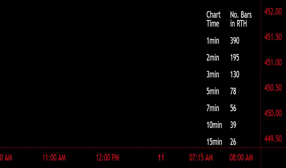
Number of Bars CheatSheetA regular trading day on the New York Stock Exchange (NYSE) consists of two main sessions: the Opening Auction and the Closing Auction, separated by a continuous trading session. Here's a breakdown of the trading day:
1. **Pre-Opening Session**: This session starts at 4:00 AM Eastern Time (ET) and lasts until 9:30 AM ET. During this time, there is limited trading activity, and orders can be entered and canceled. However, most of the trading activity doesn't occur until the regular trading session begins.
2. **Regular Trading Session**: The regular trading session on the NYSE starts at 9:30 AM ET and lasts until 4:00 PM ET. This is the primary trading session where the majority of price bars are formed.
3. **Closing Auction**: After the regular trading session ends at 4:00 PM ET, there is a closing auction period that typically lasts until 4:10 PM ET. During this time, there is a final price discovery process where orders are matched to determine the closing price for each security.
So, during the regular trading session, which is the main focus for most traders and investors, there are a total of 6.5 hours of trading. Trading occurs continuously during this time, with price bars being formed based on the time frame you're looking at. The most common time frames for price bars are one minute, five minutes, 15 minutes, 30 minutes, and one hour, among others. Therefore, the number of price bars in a regular trading day on the NYSE will depend on the time frame you are using for your analysis. For example, if you are using one-minute bars, there will be 6.5 x 60 = 390 price bars in a regular trading day.
Adaptive MA-Bollinger HistogramVisualize two of your favorite moving averages in a fun new way.
This script calculates the distance (or difference) between the price and two moving averages of your choosing and then creates two histograms.
The two histograms are plotted inversely, so if the price is over both moving averages, one will be positive above the centerline while the other still positive will be below the centerline.
(In a future update you will have the option to have them both positive at the same time)
Next, what it does is apply Bollinger Bands (optional) to each of the histograms.
This creates a very interesting effect that can highlight areas of interest you may miss with other indicators.
You have plenty of options for coloring, the type of moving average, Bollinger Band length, and toggling features on and off.
Give it a few minutes of your time to study, and see what information you can learn from watching this indicator by comparing it with the chart.
Here is a full user guide:
Adaptive MA-Bollinger Histogram Indicator User Guide
Welcome to the user guide for the **Adaptive MA-Bollinger Histogram** indicator. This custom indicator is designed to help traders analyze trends and potential reversals in a financial instrument's price movements. The indicator combines two Moving Averages (MA) and Bollinger Bands to provide valuable insights into market conditions.
### Indicator Overview
The Adaptive MA-Bollinger Histogram indicator comprises the following components:
1. **Moving Averages (MA1 and MA2):** The indicator uses two moving averages, namely MA1 and MA2, to track different time periods. MA1 has a user-defined length (default: 50) and MA2 has a longer user-defined length (default: 100). These moving averages can be calculated using different methods such as Simple Moving Average (SMA), Exponential Moving Average (EMA), Weighted Moving Average (WMA), Volume Weighted Moving Average (VWMA), or Smoothed Moving Average (RMA).
2. **Histograms:** The indicator displays histograms based on the differences between the price source and the respective moving averages. Positive values of the histogram for MA1 are plotted in one color (default: green), while negative values are plotted in another color (default: red). Similarly, positive values of the histogram for MA2 are plotted in one color (default: blue), while negative values are plotted in another color (default: yellow). It's important to note that the histogram for MA1 is plotted positively, while the histogram for MA2 is plotted inversely.
3. **Bollinger Bands:** The indicator also features Bollinger Bands calculated based on the differences between the price source and the respective moving averages (dist1 and dist2). Bollinger Bands consist of three lines: the middle band, upper band, and lower band. These bands help visualize the potential volatility and overbought/oversold levels of the instrument's price.
### Understanding the Indicator
- **Histograms:** The histograms highlight the divergence between the price and the two moving averages. When the histogram for MA1 is positive, it indicates that the price is above the MA1. Conversely, when the histogram for MA1 is negative, it suggests that the price is below the MA1. Similarly, the histogram for MA2 is plotted inversely.
- **Bollinger Bands:** The Bollinger Bands consist of three lines. The middle band represents the moving average (MA1 or MA2), while the upper and lower bands are calculated based on the standard deviation of the differences between the price source and the moving average. The bands expand during periods of higher volatility and contract during periods of lower volatility.
### Possible Trading Ideas
1. **Trend Confirmation:** When the histograms for both MA1 and MA2 are consistently positive, it may indicate a strong bullish trend. Conversely, when both histograms are consistently negative, it may suggest a strong bearish trend.
2. **Divergence:** Divergence between price and the histograms could signal potential reversals. For example, if the price is making new highs while the histogram is declining, it might indicate a bearish divergence and a possible upcoming trend reversal.
3. **Bollinger Bands Squeeze:** A narrowing of the Bollinger Bands indicates lower volatility and often precedes a significant price movement. Traders might consider a potential breakout trade when the bands start to expand again.
4. **Overbought/Oversold Levels:** Prices touching or exceeding the upper Bollinger Band could suggest overbought conditions, while prices touching or falling below the lower Bollinger Band could indicate oversold conditions. Traders might look for reversals or corrections in such scenarios.
### Customization
- You can adjust the parameters such as MA lengths, Bollinger Bands length, width, and colors to suit your preferences and trading strategy.
### Conclusion
The **Adaptive MA-Bollinger Histogram** indicator provides a comprehensive view of price trends, divergences, and potential reversal points. Traders can use the information from this indicator to make informed decisions in their trading strategies. However, like any technical tool, it's recommended to combine this indicator with other forms of analysis and risk management techniques for optimal results.

Incomplete Session Candle - Incomplete Timeframe Candle Marker The "Incomplete Session Candle - Incomplete Timeframe Candle Marker" is an advanced tool tailored for technical analysts who understand the importance of accurate timeframes in their charting. While the indicator is not limited to the Indian market, its genesis is rooted in the nuances of trading sessions like those in India, which span 375 minutes from 9:15 AM to 3:30 PM.
Key Features:
Detects if the current timeframe is intraday (minutes or hours).
Calculates the expected duration of the candle for the chosen timeframe.
Highlights candles that don't achieve their expected session duration by placing a cross shape above the bar.
Compatible across various intraday timeframes, aiding traders in spotting discrepancies promptly.
Why We Made This: Not Just for India:
While we looked at the Indian market, this indicator works everywhere. Regular timeframes like 30 minutes, 1 hour, and 2 hours often end with incomplete candles, especially at the end of the trading day. For example:
A 30-minute timeframe makes 13 candles, but the last one is only 15 minutes long.
A 1-hour timeframe shows 7 candles, but the last one is just the last 15 minutes.
By switching to different timeframes like 25 minutes, 75 minutes, and 125 minutes, you get more complete information for better trading decisions. Learn more about this in our article: "Power of 25, 75, and 125-Minute Timeframes in the Indian Market", recognized by Trading View's Editors' Pick.
Benefits:
The indicator extends its benefits even to users without access to certain timeframes. It accommodates traders using a 1-hour timeframe (pertaining to Indian traders). By employing this indicator, traders consistently remain mindful of incomplete candles within their chosen timeframe
For those who utilize concepts like RBR, RBD, DBR, and DBD, this indicator is paramount. An incomplete candle can skew analysis, leading to potential misinterpretations of base or leg candles.
Final thoughts:
In markets like the Indian stock market, adopting such a tool is not just beneficial, but necessary. Whether you have access to unconventional timeframes or are using traditional ones, recognizing and accounting for the limitations of incomplete candles is critical & it's important to know if your candles fit the timeframe properly. This indicator gives you a better view of the market, which helps you make smarter trades.
Lastly, Thank you for your support! Your likes & comments. If you want to give any feedback then you can give in comment section.
Let's conquer the markets together!
