Vaidotas Momentum ScoreHello Traders!
Discover Myfractalrange latest addition on TradingView, Vaidotas Segenis Momentum Score.
How people calculate Momentum is subjective and many people (even professionals) use different Momentum formulas depending on how they view it. This is sometimes confusing for traders.
The purpose of this indicator is to identify periods of strong price momentum relative to historical volatility. Higher momentum scores indicate stronger price trends, while lower scores suggest weaker trends. Traders and investors may use this indicator to identify potential buy or sell signals based on the strength of price movements. The formula Vaidotas uses calculate Momentum Score for different periods based on the price data.
There are 3 different look back periods in the script, you will find them in "Input":
Period 1 : 10 Days
Period 2 : 30 Days
Period 3 : 90 Days
Now let's go over the different steps of the formula:
Step 1 - Calculate the daily normal returns : this gives the daily percentage change in price
Step 2 - Calculate the standard deviation of the daily normal returns over a specific look back period (Default: 100 days) : the standard deviation measures the volatility or dispersion of the returns
Step 4 - Calculate the squared standard deviation multiplied by the square root of the respective period: This is done for three different periods (Period 1, Period 2, Period 3), it amplifies the standard deviation by the square root of the period, which gives more weight to recent price changes.
Step 5 - Calculate the normal returns for each period: This calculates the percentage change in price over the specified period
Step 5 - Calculate the momentum score for each period: This score represents the relative strength or momentum of the price change compared to the expected volatility.
Using the momentum indicator involves interpreting the values and considering certain thresholds to make trading decisions. While there is no definitive rule for all markets and assets, we can provide you with a general guideline on how traders may want to use the indicator and explain the significance of certain values:
1) Strong Trend: When the momentum score is significantly positive (above a certain threshold, such as +2), it suggests a strong upward price trend.
2) Weak Trend: Conversely, when the momentum score is significantly negative (below a certain threshold, such as -2), it indicates a strong downward price trend. Traders may interpret this as a potential signal to enter or maintain a short position, expecting the trend to continue.
3) Lack of Trend: When the momentum score is close to zero, it suggests a lack of significant trend or sideways movement in the price. Values around 0 indicate a potential range-bound market or consolidation.
However, it's important to note that the specific threshold values for defining significant trends or reversals may vary depending on the asset, timeframe, and market conditions. Traders often adjust these thresholds based on their own experience and backtesting results.
Here are a few more examples to illustrate the use of the momentum indicator:
- Example 1 - Strong Uptrend Confirmation :
The momentum score is consistently above +2, indicating a strong upward trend. Traders may consider this as a potential signal to enter or maintain a long position, expecting the trend to continue.
- Example 2 - Reversal Signal :
The momentum score has been positive for an extended period but starts to decline and eventually crosses below -2. This could be seen as a potential reversal signal, suggesting that the uptrend is losing strength and a bearish trend might develop. Traders may consider exiting long positions or even taking short positions based on this reversal signal.
- Example 3 - Sideways Market :
The momentum score fluctuates around 0, without displaying any significant positive or negative values. This indicates a lack of clear trend and suggests that the asset is trading in a range or consolidating. Traders may choose to avoid taking new positions until a stronger trend emerges.
Why is it interesting to use different look back periods?
The use of different look back periods in the momentum indicator formula allows traders to assess momentum across multiple timeframes. By comparing the momentum results for each period, traders can gain a broader perspective on the strength of the trend and potential opportunities. Here's how a trader might use the different look back periods and their corresponding momentum results:
1) Identifying Consistency: Traders can compare the momentum results for different periods to assess the consistency of the trend. If the momentum scores for all periods are consistently positive or negative, it suggests a strong and consistent trend across multiple timeframes. This can provide traders with higher confidence in the trend's strength and potential trading opportunities.
2) Convergence or Divergence: Traders can analyze the relationship between the momentum results for different periods. If the momentum scores for all periods are converging (moving closer together), it indicates a higher degree of agreement across different timeframes and strengthens the signal. Conversely, if the momentum scores for different periods diverge (move apart), it may suggest a weakening or conflicting trend. Traders should exercise caution when the momentum scores diverge as it may signal a potential reversal or market uncertainty.
3) Confirmation of Momentum: Traders can use the momentum results for different periods to confirm the strength of a trend. For example, if the momentum scores for shorter periods (e.g., Period 1) are significantly higher than those for longer periods (e.g., Period 2 and Period 3), it suggests a recent increase in momentum and a potentially stronger trend. This confirmation can assist traders in making more informed trading decisions and timing their entries or exits.
4) Multiple Timeframe Analysis: Traders often employ a multiple timeframe analysis approach to validate their trading decisions. By comparing the momentum results for different periods, traders can assess the alignment of momentum across various timeframes. For instance, if the momentum scores for shorter, medium, and longer periods all indicate a strong trend in the same direction, it reinforces the conviction in the trade.
As a conclusion, the momentum indicator can be useful to traders for several reasons:
1) Identifying Trend Strength: The momentum indicator helps traders assess the strength of a price trend. When the momentum score is high, it suggests that the trend is strong and likely to continue. This information can be valuable for trend-following strategies, as it helps traders identify potentially profitable opportunities and stay on the right side of the market.
2) Spotting Reversals: Momentum indicators can also help traders identify potential trend reversals. When the momentum score diverges from the price movement, it may indicate a weakening trend or an upcoming reversal. Traders can use this signal to adjust their positions or look for opportunities to enter or exit trades.
3) Confirming Breakouts: Breakout traders often use momentum indicators to confirm the validity of a breakout. If a price breaks above a resistance level, and the momentum score also increases significantly, it provides additional confirmation that the breakout is strong and may continue. This helps traders have more confidence in their breakout trades.
4) Setting Stop Loss and Take Profit Levels: By understanding the strength of a price trend through the momentum indicator, traders can set appropriate stop-loss and take-profit levels. A strong momentum score may indicate that a trend is likely to continue, allowing traders to set wider profit targets. Conversely, a weak momentum score may suggest that the trend is losing steam, prompting traders to set tighter stop-loss levels to protect their capital.
4) Divergence Analysis: Momentum indicators can be used in conjunction with other technical indicators to identify divergences. Divergence occurs when the price and momentum indicator move in opposite directions. It can signal potential trend reversals or shifts in market sentiment, providing traders with opportunities to adjust their positions.
It's important to note that while momentum indicators can be useful tools, they should not be relied upon solely for making trading decisions. It's recommended to use them in conjunction with other technical analysis tools and consider other factors such as market conditions, risk management, and fundamental analysis. Remember that the momentum indicator is just one tool among many, and it's important to consider other factors such as volume, trend, volatility, and overall market conditions when making trading decisions. Additionally, using stop-loss orders and proper risk management techniques is crucial to mitigate potential losses.
We hope that you will find these explanations useful, please contact us by private message for access.
Enjoy!
DISCLAIMER: No sharing, copying, reselling, modifying, or any other forms of use are authorised. This script is strictly for individual use and educational purposes only. This is not financial or investment advice. Investments are always made at your own risk and are based on your personal judgement. Myfractalrange is not responsible for any losses you may incur. Please invest wisely.
In den Scripts nach "momentum" suchen
Multi indicators tableThis is a comprehensive trading tool that presents an overview of the market in a tabular format. It consists of five distinct categories of trading indicators : Volatility, Trend, Momentum, Reversal, and Volume. Each category includes a series of indicators that are widely used in the trading communauty.
The Volatility category includes the Average True Range (ATR) and Bollinger Bands indicators. The Trend category comprises the Average Directional Index (ADX), four Exponential Moving Averages (EMAs), Aroon, Parabolic SAR, and the Supertrend. The Momentum category includes the Stochastic Relative Strength Index (StochRSI), Money Flow Index (MFI), Williams %R, Relative Strength Index (RSI), and Commodity Channel Index (CCI). The Reversal category includes Parabolic SAR, Moving Average Convergence Divergence (MACD), and PP Supertrend. Finally, the Volume category includes the Volume Exponential Moving Average (EMA) indicator.
The indicators states are easily readable, the indicator case is colored based on his actual state. A bullish color (green by default), a bearish color (red by default),
a very bullish color (dark green by default), a very bearish color (dark red by default) and a neutral color (gray by default) displayed when the indicator doesn't give us a clear signal. Some indicators do not have a very bullish or very bearish state. Concerning volatility indicators, the bullish color indicates high volatility, the bearish color indicates low volatility, and the neutral color indicates normal volatility.
Most of the indicators displayed in the table are customizable, and traders can choose to hide the categories they don't want to use. The Indicator provides a quick and easily readable view on the market and allows traders to reduce the number of indicators on their chart making it lighter and more readable.

Squeeze mom MTF filtered by Wavetrend with div (Tilt)📋 Description :
This script is based on two famous indicators from @Lazybear : Squeeze Momentum and WaveTrend. fr.tradingview.com
The idea is to use the Wavetrend crossovers and filter them according to the momentum curve.
There is a multi timeframe module with automatic selection of the higher timeframe. The user can also choose his timeframe manually.
There is also a detection of regular and hidden divergences
🛠 Options :
- filtering the cross wave trend according to the momemtum curve
- active or not higher timeframe with automatic or manually timeframe selection
- display or not WaveTrend ans squeeze momentum
- Show a tape that signals when wavetrend is overbought or oversold
- choose colors and apparences
- display a panel for the higher timeframe value

Natural Market River [CC]The Natural Market River was created by Jim Sloman (Ocean Theory pgs 59-62) and this is another momentum indicator that is extremely similar to the previous indicator I published, the Natural Market Mirror . This has almost identical buy and sell signals but different way to handle calculations so I'm going to leave it up to you which one you will prefer. Since this is almost identical, the buy and sell signals work in the same way with both strong signals and normal ones. Buy when the line turns green and sell when it turns red.
Let me know what other indicators you would like to see me publish!

Natural Market Mirror [CC]The Natural Market Mirror was created by Jim Sloman (Ocean Theory pgs 49-57) and this is a continuation of my series from Jim Sloman's indicators. This indicator is also a momentum indicator and is very similar to the previous indicator I published, the Ocean Indicator and of course this indicator is built using ideas from the Ocean indicator. It may just be my opinion but I feel like this indicator provides better buy and sell signals in comparison. I built this using strong buy and sell indicators in addition to normal ones so darker colors are the strong signals and lighter colors are the normal signals. Buy when the line turns green and sell when it turns red.
Let me know what other indicators you would like me to publish!
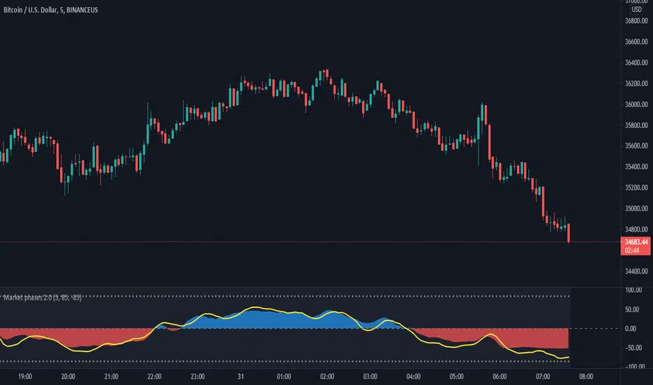
Market phases 2.0The Market Phase 2.0 indicator is designed to display the following features:
1) The TREND OSCILLATOR : This trend oscillator indicates the trend of the stock/instrument. It is calculated on the basis of number of positive candles or negative candles formed during a specific period.
The oscillator oscillates around the zero horizontal line. The trend is considered bullish if the oscillator value is positive and the trend is considered negative if the oscillator value is negative.
2) The MOMENTUM OSCILLATOR:
The momentum oscillator indicates the short term momentum of the stock/instrument. It is calculated on the rate of change of close price for a specific period in the past.
The Momentum oscillator oscillates around the zero horizontal line. If the momentum oscillator has a positive value, the momentum is considered to be on the bullish side and similarly if the momentum oscillator has a negative value, the momentum is considered to be on the bearish side.
3) The SIGNAL LINE: The signal line is represented by the yellow color line. The Signal line combines the value of the Trend oscillator and the Momentum oscillator. The signal also moves around the zero line. There are two dotted lines above and below the zero line.
When the signal line crosses the upper dotted line, it indicates that the stock/instrument has moved on the upper side too quickly or sharply and the ongoing move may not continue for long. It may also be considered as overbought at that point. A red triangle appears at that point.
Similarly, when the signal line crosses the lower dotted line, it indicates that the stock/instrument has moved on the downside too quickly or sharply and the ongoing down move may not continue for long. It may also be considered as oversold at that point. A green triangle appears at that point.
The values for the look back period of the signal line and the values for the upper range and lower range of the indicator can be changed by going to the settings of the indicator.
***Disclaimer: The market movement depends upon a lot of factors which are beyond the scope of this indicator. Hence the indicator may display results not intended on rare occasions.
Trading in the markets involves involves huge risks and one should always follow his/her own research before taking any trading decisions.
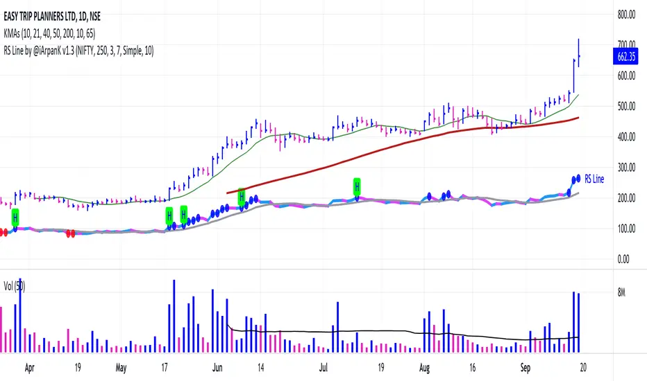
Relative Strength Line by @iArpanKHello Traders!
I'm a Momentum Trader, following the Indian & US markets. Most of us are familiar with the Relative Strength (RS) indicator, popularized by Investor's Business Daily (IBD) and available on their MarketSmith platform. So, here I'm sharing a script that does the same and additionally pops an alert label when the RS line hits a new high (similar to Blue Dot appearance on MarketSmith charts).
User Settings
Inputs tab
Base Symbol : Symbol of the security/index with which you want to compare your current active symbol.
Period : Number of days since which you want to scan for a new high (default is 250 days, which approximately pops alerts for new 52 week high in RS). For example, if you want to look for new 10 days high in RS, set the Period to 10.
Style tab
RS Line : Change color using the palette provided (default is blue).
Alert Label : Show/hide alert labels by checking/unchecking the box. Change color using the palette provided. Change alert label symbol.
Precision : Default is two decimal places. Can be changed as per requirement.
Usage
The indicator consists of two components- the Relative Strength (RS) line & alert labels on new RS highs. Relative strength gives a measure of how the underlying security is performing with respect to a base index or security. For example, how is NSE:DIXON performing w.r.t NSE:NIFTY or how is NASDAQ:AAPL performing w.r.t. the TVC:SPX .
A rising RS line tells us that the underlying entity is outperforming the base entity. Similarly, a declining RS line shows under-performance of the underlying entity. A new high in RS (especially before a new high in price) often gives valuable information about the underlying security's strength w.r.t. the general market, and can tip us off to a possible breakout in the price in near future.
Making RS lists (list of stocks making new high in RS on heavy down days in index) can be very helpful to sort out leaders that are best resisting the decline and are likely to move up aggressively when the market turns favorable.
The concept of RS is extensively used by momentum traders and growth stock traders. When used in conjunction with price & volume action, this can be a very powerful tool in your trading arsenal. You can now easily spot RS trends and new highs visually by simply adding this indicator to your chart!
Conclusion
If you like this script, click on Add to favorite indicators , so that you can easily add this indicator from your favorites tab right away.
Thanks!
Triple Stochastic Momentum Index(TSMI)This script is a stochastic momentum index (SMI) indicator that is designed to view the flow of three stochastic momentums at once.
You can easily see the change in momentum by applying the values used in the triple stochastic form to the basic SMI usage.
이 스크립트는 3가지 stochastic momentum의 흐름을 한번에 볼 수 있도록 만들어진 SMI(stochastic momentum index)지표 입니다.
기본적인 SMI의 사용방식을 triple stochastic형식에서 사용되는 수치를 적용하여 쉽게 모멘텀의 변화를 확인 할 수 있습니다.
MACD Trend Squeezer V2This is a combination of a slightly sped up MACD overlay on top of a modified Bar Trend Squeeze or highly modified Momentum indicator. Helps to see the trend/momentum matched with the characteristics of the MACD and it's historiography. Very user friendly for adjusting color, transparency, depth, lines, size, etc.
MACD is the dark gray line.
Its signal slower line is orange.
Its historiography is the area fill blues and reds
Trend Squeezer / momentum are the Bars in the background.
// Changes from original version \\
Visual depth mostly. Most of the items are adjustable in the settings.
Increased user friendly inputs to adjust colors, lines, data, etc.
(darken / lighten and change background bar colors, increase/decrease line strengths and colors, adjust field data inputs)
The DiamondThe Diamond is a collection of 3 custom oscillators and the RSI. It tries to visualizing how the momentum is increasing and decreasing and gives some buy and sell signals.
Every Line explained:
Orange line: The SMI(Swing Momentum Indicator) it is alternating oscillator between the value -10 and 40 and has its baseline at 10. It showing accumulation and increase of momentum and is used as a trend confirmation
Purple line: The BTD(Buy the Dip) is a modified Version of the SMI. It should be used in Bull or Bearflags to time entries. Also the Horizontal lines can be used as Support or Resistance
Green/Red Band: This one is a custom made stochastic. In its calculation it smoothing Tops/Lows to reduce noise. Also the look is better.
White line: Just a 14-lenght RSI. I use it together with the SMI and BTD to get confirmation
The Indicator is doing best in the crypto market. High market cap Coins/USDT Pairs do better than low market cap and btc pairs. Also it should be only used on timeframes greater than 4h. 6h and daily preferred. On higher time frames you need to adjust the values of the BTD and SMI.
Bearish divergence on both Indicators in a down trending market do give a good short entry.
Bullish divergence on the daily gives good swing entries in a downtrend
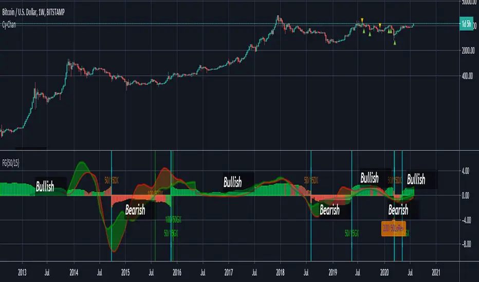
FUSIONGAPS V4 {50/15-Series}Base on the FUSIONGAPS oscillator series, but Only the 50/15 oscillator is plotted, and with Momentum and Acceleration oscillators added.
The thickest line is the FG oscillator: Red/Green coloring indicates if the market is in a Bearish/Bullish period.
The green colored line is the DFG oscillator (DIFFERENTIAL FUSIONGAPS: Price Momentum)
The red colored line is the D2FG oscillator (DOUBLE-DIFFERENTIAL FUSIONGAPS: Price Acceleration)
Indicators:
DeathCrosses ( DX ) and GoldenCrosses ( GX )
Momentum Reversal indicators (D2FG based filter applied to reduce false-positives, but can be manually disabled.)
~ * ~ * ~ * ~ * ~ * ~ * ~ * ~ * ~ * ~ * ~ * ~ * ~ * ~ * ~ * ~ * ~ * ~ * ~ * ~ * ~
Note:
In no way is this intended as a financial/investment/trading advice. You are responsible for your own investment decisions and trades.
Please exercise your own judgement for your own trades base on your own risk-aversion level and goals as an investor or a trader. The use of OTHER indicators and analysis in conjunction (tailored to your own style of investing/trading) will help improve confidence of your analysis, for you to determine your own trade decisions.
~ * ~ * ~ * ~ * ~ * ~ * ~ * ~ * ~ * ~ * ~ * ~ * ~ * ~ * ~ * ~ * ~ * ~ * ~ * ~ * ~
Please check out my other indicators sets and series, e.g.
LIVIDITIUM (dynamic levels),
AEONDRIFT (multi-levels standard deviation bands),
FUSIONGAPS (MA based oscillators),
MAJESTIC (Momentum/Acceleration/Jerk Oscillators),
PRISM (pSAR based oscillator, with RSI/StochRSI as well as Momentum/Acceleration/Jerk indicators),
PDF (parabolic SAR /w HighLow Trends Indicator/Bar-color-marking + Dynamic Fib Retrace and Extension Level)
and more to come.
Constructive feedback and suggestions are welcome.
~ JuniAiko
(=^~^=)v~
Jurik VelocityHello friends,
Meet Velocity, Jurik's ultra-smooth alternative to the traditional momentum indicator. Designed to reveal the true pace of market movement without the typical noise and lag, it offers a more accurate view of acceleration and deceleration in price. Includes an optional normalization mode to ensure the scale remains consistent across all markets.
🛠 How It Works
What's wrong with classical momentum? The standard momentum indicator is often too noisy to be useful. Traders try to fix this by applying moving averages — which smooths it, but at the cost of responsiveness.
Velocity solves this by using Jurik's non-lagging smoothing method that removes noise without delay , maintaining the sharpness of turning points while filtering out irrelevant fluctuations.
Like the classical momentum, Velocity compares the current price with that from N periods ago, but with vastly improved clarity. It helps traders detect early shifts in trend strength, exhaustion points, and potential reversals — all while keeping a steady, normalized scale for cross-market consistency.
🔥 Key Features
Non-lagging Jurik smoothing — clarity and responsiveness without delay
Highlights bullish and bearish velocity peaks for precise timing
Integrated alert conditions for velocity peak events
📸 Visual Examples
Velocity with peaks highlighting
If you'd like access or have any questions, feel free to reach out to me directly via DM.
👋 Good luck and happy trading!
Bezahltes Script

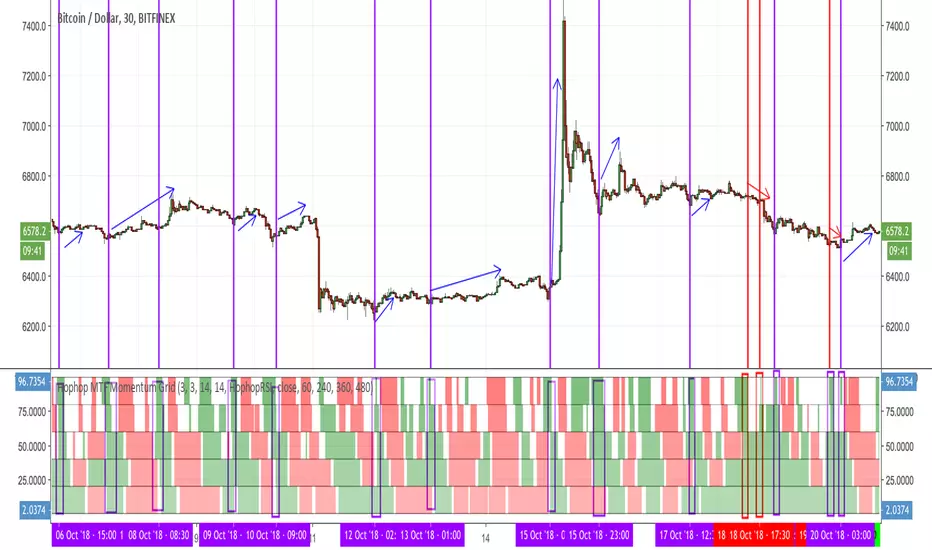
Hophop Multiple Timeframe Momentum GridThis indicator is intended to highlight the over bought and over sold momentums for multiple timeframe
As of now it only supports StochRSI and also a variation of it that is more responsive than StochRsi called HophopRsi, I might consider adding more momentum indicators if it is desired
All the needed variables for StochRsi are included as the original indicator, feel free to change them as you normally do on StochRsi
On top of that you can select up to 4 higher timeframe , just make sure that your current timeframe is the smallest one
The top line of the graph shows the current timeframe momentum
1st line = high timeframe 1
2st line = high timeframe 2
3st line = high timeframe 3
4st line = high timeframe 4
Quick demonstration of the usage:
If you benefit from this indicator and you would like to see more of these, please support me by your tips
BTC Tip: 39bwXN1chms1yHskBaYwz76UhDakc7grJ7
LTC Tip: MGD3U9dBCBVctwnoCa1grU8ompxG6hUhMk
ETH Tip: 0xEE9684a5aceE85036527aB48E596DeE4627bD84b
Compare - Oscillator vs BTC momentumI've made a simple indicator to compare the momentum of a trading pair against the momentum of BTC to the dollar. I use it to see how a pair is affected by BTC's momentum... I wouldnt use it to trade off alone, but it can be a useful tool alongside other indicators.
The time range can be adjusted, but I wouldnt reccomend setting it to anything over 12M, or under 1W.... as I'm not sure if it would work.
Any feedback is welcome!
This is an idea I had after looking at a wonderful visualisation made by BarclayJames, link below:
www.tradingview.com
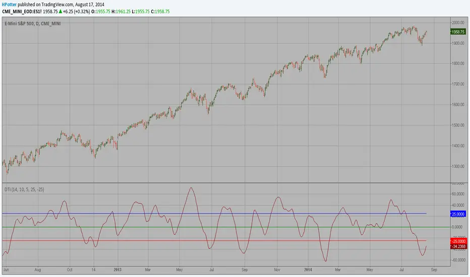
Directional Trend Index (DTI) This technique was described by William Blau in his book "Momentum,
Direction and Divergence" (1995). His book focuses on three key aspects
of trading: momentum, direction and divergence. Blau, who was an electrical
engineer before becoming a trader, thoroughly examines the relationship between
price and momentum in step-by-step examples. From this grounding, he then looks
at the deficiencies in other oscillators and introduces some innovative techniques,
including a fresh twist on Stochastics. On directional issues, he analyzes the
intricacies of ADX and offers a unique approach to help define trending and
non-trending periods.
Directional Trend Index is an indicator similar to DM+ developed by Welles Wilder.
The DM+ (a part of Directional Movement System which includes both DM+ and
DM- indicators) indicator helps determine if a security is "trending." William
Blau added to it a zeroline, relative to which the indicator is deemed positive or
negative. A stable uptrend is a period when the DTI value is positive and rising, a
downtrend when it is negative and falling.
VCAI Stochastic RSI+VCAI Stoch RSI+ is a cleaned-up Stochastic RSI built with V-Core colours for faster, clearer momentum reads and more reliable OB/OS signals.
What it shows:
Purple %K line → bearish momentum strengthening
Yellow %D line → bullish momentum building and smoothing
Soft purple/yellow background bands → OB/OS exhaustion zones, not just raw 80/20 triggers
Midline at 50 → balance point where momentum shifts between bull- and bear-side control
Optional HTF mode → run Stoch RSI from any timeframe while viewing it on your current chart
How to read it:
Both lines rising out of OS → early bullish shift; pullbacks that hold direction favour continuation
Both lines falling from OB → early bearish shift; bounces into the purple OB zone can become fade setups
Lines stacked and moving together → strong, cleaner momentum
Lines crossing repeatedly → low-conviction, choppy conditions
OB/OS shading highlights exhaustion so you focus on moves with context, not every 80/20 tick
Why it’s different:
Classic Stoch RSI is hyper-sensitive and mostly noise.
VCAI Stoch RSI+ applies V-Core’s colour-driven regime logic, controlled OB/OS shading, and optional HTF smoothing so you see momentum structure instead of clutter — making it easier to judge when momentum is genuinely shifting and when it’s just another wiggle.

VCAI RSI Divergence +VCAI RSI Divergence+ is an RSI that shows trend, momentum, and divergence using V-CoresAI colour logic instead of a single white line.
What it shows:
Yellow RSI line → bullish momentum (RSI above its MA; buy-side pressure in control)
Purple RSI line → bearish momentum (RSI below its MA; sell-side pressure in control)
Thin blue line → fast RSI moving average that drives the colour flips
Dashed 70/30 lines → classic OB/OS zones
Background bands → soft purple in OB, soft yellow in OS to mark exhaustion areas
How to read it:
Yellow & rising → momentum shifting bullish; pullbacks into yellow OS band can be accumulation zones
Purple & falling → momentum shifting bearish; pushes into purple OB band can be distribution/sell zones
Hard colour flips (yellow ↔ purple) mark trend regime changes, not minor RSI noise
Divergence mode (on/off)
The divergence engine scans RSI and price pivot structure:
Bullish divergence (yellow) → price lower low + RSI higher low
Bearish divergence (purple) → price higher high + RSI lower high
Lines and tags appear only where a meaningful disagreement between price and RSI exists, giving early context for potential reversals or fade setups.
Together, the momentum colours + optional divergence mapping give a far clearer market read than a standard RSI, with zero clutter and no guesswork.

Market Momentum in Premium & Discount-Delta @MaxMaserati 3.0Market Delta Momentum in Premium & Discount-Delta @MaxMaserati 3.0
══════════════════════════════════════════════════════
Overview
The MMPD 3.0 indicator is an advanced momentum oscillator that combines market structure analysis with institutional order flow concepts. It transforms price action into a normalized 0-100 scale, identifying premium and discount zones where institutional traders typically operate, while simultaneously tracking momentum through specialized body close candles and multi-timeframe synchronization.
This indicator is designed for traders who want to:
══════════════════════════════════════════════════════
Identify high-probability reversal zones using premium/discount analysis
Track momentum divergence between price and the MMPD oscillator
Recognize institutional rejection and acceptance zones
Synchronize multiple timeframes for confluence-based trading decisions
Core Methodology
══════════════════════════════════════════════════════
MMPD Calculation
The Market Delta Momentum indicator uses a proprietary calculation that:
Normalizes price position within a specific period range (0-100 scale)
Applies double smoothing to filter noise
Calculates a balance line (similar to a moving average) to determine bullish/bearish momentum
The relationship between the MMPD line and balance line creates directional candles
Key Zones:
══════════════════════════════════════════════════════
90-100: Extreme Premium (Institutional Selling Zone)
80-90: High Premium (Caution Zone)
65-80: Premium (Bullish Bias)
50-65: Light Premium (Neutral-Bullish)
35-50: Light Discount (Neutral-Bearish)
20-35: Discount (Bearish Bias)
10-20: High Discount (Institutional Buying Zone)
0-10: Extreme Discount (High Probability Buy Zone)
MMM 3.0 Body Close Logic BC and the MMPD 3.0 Body Close Logic MBC
══════════════════════════════════════════════════════
1️⃣ Body Close Analysis (BC & MBC)
Price Body Close (BC)
Bullish BC: Price closes above the previous high AND closes above its open (green candle showing aggressive buying)
Bearish BC: Price closes below the previous low AND closes below its open (red candle showing aggressive selling)
No Body Close (NBC): All other candles - representing consolidation, pause, or loss of momentum
MMPD Body Close (MBC)
Bullish MBC: MMPD closes higher than previous MMPD structure (continuation or reversal momentum)
Bearish MBC: MMPD closes lower than previous MMPD structure (continuation or reversal momentum)
MNBC: MMPD No Body Close - weak or ranging MMPD momentum
BC + MBC Confirmation
When Price BC and MMPD MBC align in the same direction, it signals high-conviction momentum:
Deep Green: Bullish BC + Bullish MBC (Strongest Bullish Signal)
Pale Green: Bullish BC only (Moderate Bullish Signal)
Deep Red: Bearish BC + Bearish MBC (Strongest Bearish Signal)
Pale Pink: Bearish BC only (Moderate Bearish Signal)
2️⃣ Momentum Synchronization System
The indicator compares MBC (MMPD Body Close) momentum against BC (Price Body Close) momentum to identify divergence and synchronization:
Synchronized States:
BULLISH+: High volatility bullish synchronization (BC+MBC aligned, high ATR)
BULLISH-: Low volatility bullish synchronization (BC+MBC aligned, low ATR)
BEARISH+: High volatility bearish synchronization (BC+MBC aligned, high ATR)
BEARISH-: Low volatility bearish synchronization (BC+MBC aligned, low ATR)
SYNCHRONIZED: Both MMPD and Price moving together (standard bullish or bearish move)
Divergence States (Reversal Warnings):
MMPD FAST | PRICE SLOW: MMPD showing strong directional MBC candles while Price shows NBC (pause/consolidation) - Reversal Warning!
If MMPD is bullish MBC but Price is NBC → Potential Bearish Reversal
If MMPD is bearish MBC but Price is NBC → Potential Bullish Reversal
Status Indicators:
BULL / BEAR: Standard synchronized moves
BULL+ / BEAR+: High volatility synchronized moves (aggressive trending)
BULL- / BEAR-: Low volatility synchronized moves (grinding trends)
POT. BULL / POT. BEAR: Potential reversal zones (divergence detected)
BALANCED: Neutral conditions, no clear momentum alignment which is price efficiency
3️⃣ Premium/Discount Breakout Markers
🔴 Red Circle Dots (Premium Exit)
Appears when MMPD closes below 80 after being completely in the 80-100 extreme premium zone
Signals institutional distribution complete, potential reversal or correction
🟢 Green Circle Dots (Discount Exit)
Appears when MMPD closes above 20 after being completely in the 0-20 extreme discount zone
Signals institutional accumulation complete, potential rally or reversal
🔴 Red Squares (Premium Rejection)
Appears on the first candle that fails to touch 80-100 after a Bullish MBC touched that zone
Indicates rejection of premium pricing, bearish signal
🟢 Green Squares (Discount Rejection)
Appears on the first candle that fails to touch 0-20 after a Bearish MBC touched that zone
Indicates rejection of discount pricing, bullish signal
🔻 Red Triangles Down (Bearish Midline Rejection)
Signals potential bearish Resumption
🔺 Green Triangles Up (Bullish Midline Bounce)
Signals potential Bullish Resumption
4️⃣ Multi-Timeframe Dashboard with Candle time to close
The MTF table displays:
6 customizable timeframes (default: 5min, 15min, 1H, 4H, Daily, Weekly)
Premium/Discount Status with color-coded zones for each timeframe
Time to Close (T2C): Live countdown timer for each timeframe candle close
Red warning color when the candle closing time is imminent
4H timeframe auto-detects exchange-specific session starts (ES, NQ, CL, GC, etc.)
Momentum Sync Status: Shows the current synchronization state between MMPD and Price across the chart timeframe
Color Coding:
Premium zones: Green/Cyan colors
Discount zones: Purple/Magenta colors
Intensity increases with extremeness (darker = more extreme)
5️⃣ Delta MMPD Alternative View
Toggle between two oscillator calculations:
MMPD: Original MMPD
Delta MMPD: Volume-weighted delta calculation emphasizing buying/selling pressure
TIPS
══════════════════════════════════════════════════════
Use Multi-Timeframe Confluence: The strongest signals occur when multiple timeframes align in premium/discount zones
Wait for Body Close Confirmation: BC+MBC alignment = highest probability setups
Respect Momentum Sync Warnings: "MMPD FAST | PRICE SLOW" is a critical reversal warning
Trade Premium → Discount or Discount → Premium: Mean reversion from extremes offers best risk/reward
Combine with Price Action: MMPD is a momentum oscillator - always confirm with price structure (support/resistance, trendlines, chart patterns)
Educational Notes
══════════════════════════════════════════════════════
What is Premium/Discount Pricing?
Institutional traders operate based on value zones:
Premium: Price is expensive relative to recent range - institutions distribute (sell)
Discount: Price is cheap relative to recent range - institutions accumulate (buy)
Fair Value (50 line): Equilibrium pricing where institutions pause
MMM 3.0 Body Close Approach Importance
══════════════════════════════════════════════════════
BC (Body Close): Shows price commitment and aggressivity
NBC (No Body Close): Shows indecision, consolidation, or loss of momentum
Consecutive BC candles = strong momentum
NBC candles breaking BC sequence = momentum loss → potential reversal
Momentum Synchronization Theory
══════════════════════════════════════════════════════
When MMPD (momentum) moves aggressively but Price shows NBC (pause), it indicates:
Momentum exhaustion
Smart money distribution/accumulation
Imminent reversal as retail traders get trapped
⚠️ Disclaimer
This indicator is for educational purposes only. Past performance does not guarantee future results. Always practice proper risk management and never risk more than you can afford to lose. Trading involves substantial risk of loss. The creator assumes no responsibility for trading losses incurred using this indicator.

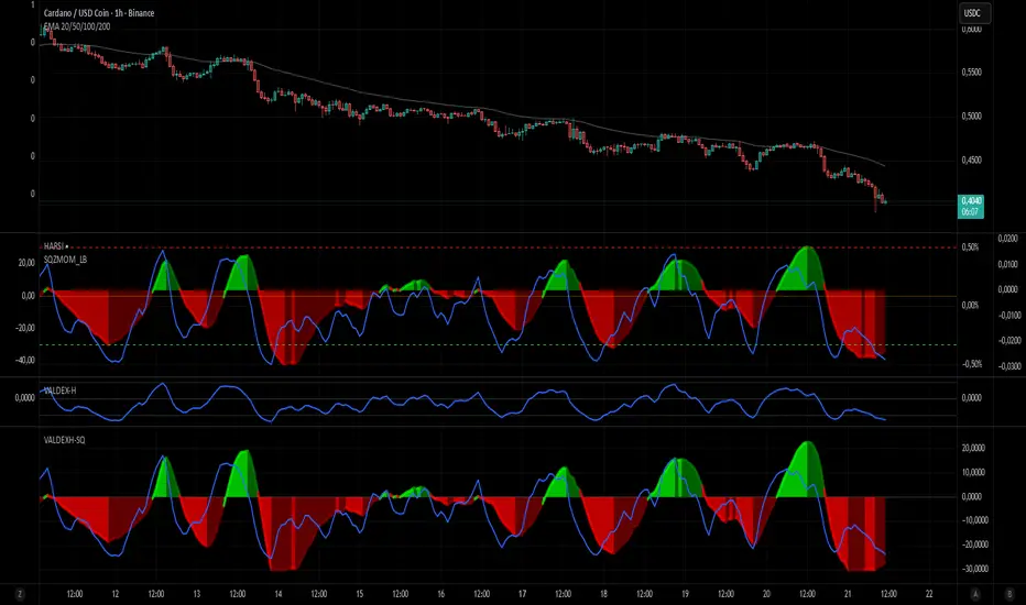
VALDEX-H + Squeeze MomentumVALDEX H-SQ: The Harmonized Momentum & Trend Engine
The VALDEX H-SQ is a powerful combined indicator engineered to provide traders with clear, synchronized signals for both market momentum and trend confirmation, all within a single, visually harmonized pane.
This script fuses two robust components: the Squeeze Momentum Indicator (modified and scaled) and the Heikin-Ashi RSI (HARSI) method, offering a high-contrast view of market dynamics.
⭐ Key Features & Components
📈 Scaled Squeeze Momentum: The primary engine for market compression and release. It clearly shows when volatility has been squeezed out (potential for a large move) and the direction of the momentum acceleration/deceleration.
Bright Colors (Green/Red): Indicate Accelerating Momentum (High confidence entry).
Dark Colors (Dark Green/Dark Red): Indicate Decelerating Momentum (Signal to manage or consider exit).
📊 VALDEX-H Candles (Heikin-Ashi RSI): These unique candles provide clear trend confirmation by plotting the RSI smoothed and translated into a Heikin-Ashi format.
Teal/Green Candles: Confirms a strong Uptrend.
Red/Maroon Candles: Confirms a strong Downtrend.
🔵 RSI Overlay Line: A smoothed RSI line is plotted on top of the Squeeze histogram, offering a precise view of the overall trend strength and potential turning points.
✅ Harmonized Scaling: Both the Squeeze Momentum and the VALDEX-H components have been custom-scaled to the ±30 range, ensuring visual coherence and making it easy to compare the strength of momentum release against the underlying trend.
🔔 How to Use VALDEX H-SQ
The most reliable signals are generated by combining the two components:
LONG Entry Signal (Buy): Look for the Squeeze Momentum crossing above zero with the color switching to Bright Green (Accelerating Positive Momentum) AND the VALDEX-H Candles turning Teal/Green.
SHORT Entry Signal (Sell): Look for the Squeeze Momentum crossing below zero with the color switching to Bright Red (Accelerating Negative Momentum) AND the VALDEX-H Candles turning Red/Maroon.
Exit/Profit Taking: Consider exiting when the Squeeze momentum color shifts from Bright (Accelerating) to Dark (Decelerating), indicating momentum exhaustion.
This is the ultimate tool for traders who demand clarity, precision, and visual harmony in their momentum and trend analysis.
Luminous Glide Momentum Indicator [wjdtks255]This indicator, named "Customized SuperSmoother MA Oscillator," applies a smoothing filter to price data using a SuperSmoother technique to reduce noise and enhance signal clarity. It calculates two moving averages on the smoothed data—a fast and a slow—whose difference forms the oscillator line. A signal line is derived by smoothing the oscillator with another moving average. The histogram visualizes the divergence between the oscillator and signal lines, indicating momentum strength and direction.
How it works
SuperSmoother Filter: Reduces price noise to provide smoother and more reliable signals than raw data.
Fast and Slow Moving Averages: The fast MA reacts quicker to price changes, while the slow MA indicates longer trends.
Oscillator: The difference between the fast and slow MAs signals shifts in momentum.
Signal Line: A smoothed version of the oscillator used to generate crossovers.
Histogram: Displays the distance between the oscillator and signal line, with color changes indicating bullish or bearish momentum.
Trading Strategy
Buy Signal: When the oscillator crosses above the signal line, it suggests increasing upward momentum, signaling a potential buy opportunity.
Sell Signal: When the oscillator crosses below the signal line, it suggests increasing downward momentum, signaling a potential sell opportunity.
Histogram Size and Color: Larger green bars indicate stronger bullish momentum; larger red bars indicate stronger bearish momentum.
Usage Tips
Combine this oscillator with other indicators or price action analysis to confirm trading signals.
Adjust smoothing and moving average lengths according to your trading timeframe and the asset volatility.
Use proper risk management to filter out potential false signals common in oscillators.
[AS] MACD-v & Hist [Alex Spiroglou | S.M.A.R.T. TRADER SYSTEMS] MACD-v & MACD-v Histogram
=======================================
Volatility Normalised Momentum 📈
Twice Awarded Indicator 🏆
=======================================
=======================================
✅ 1. INTRODUCTION TO THE MACD-v ✅
=======================================
I created the MACD-v in 2015,
as a way to deal with the limitations
of well known indicators like the Stochastic, RSI, MACD.
I decided to publicly share a very small part of my research
in the form of a research paper I wrote in 2022,
titled "MACD-v: Volatility Normalised Momentum".
That paper was awarded twice:
1. The "Charles H. Dow" Award (2022),
for outstanding research in Technical Analysis,
by the Chartered Market Technicians Association (CMTA)
2. The "Founders" Award (2022),
for advances in Active Investment Management,
by the National Association of Active Investment Managers (NAAIM)
=======================================
===================================================
❌ 2. WHY CREATE THE MACD-v ?
THE LIMITATIONS OF CONVENTIONAL MOMENTUM INDICATORS
====================================================
Technical Analysis indicators focused on momentum,
come in two general categories,
each with its own set of limitations:
(i) Range Bound Oscillators (RSI, Stochastics, etc)
These usually have a scaling of 0-100,
and thus have the advantage of having normalised readings,
that are comparable across time and securities.
However they have the following limitations (among others):
1. Skewing effect of steep trends
2. Indicator values do not adjust with and reflect true momentum
(indicator values are capped to 100)
(ii) Unbound Oscillators (MACD, RoC, etc)
These are boundless indicators,
and can expand with the market,
without being limited by a 0-100 scaling,
and thus have the advantage of really measuring momentum.
They have the main following limitations (among others):
1. Subjectivity of overbought / oversold levels
2. Not comparable across time
3. Not comparable across securities
=======================================
=======================================
💡 3. THE SOLUTION TO SOLVE THESE LIMITATIONS
=======================================
In order to deal with these limitations,
I decided to create an indicator,
that would be the "Best of two worlds".
A unique & hybrid indicator,
that would have objective normalised readings
(similar to Range Bound Oscillators - RSI)
but would also be able to have no upper/lower boundaries
(similar to Unbound Oscillators - MACD).
This would be achieved by "normalising" a boundless oscillator (MACD)
=======================================
==================================================
⛔ 4. DEEP DIVE INTO THE 5 LIMITATIONS OF THE MACD
==================================================
A Bloomberg study found that the MACD
is the most popular indicator after the RSI,
but the MACD has 5 BIG limitations.
Limitation 1: MACD values are not comparable across Time
The raw MACD values shift
as the underlying security's absolute value changes across time,
making historical comparisons obsolete
e.g S&P 500 maximum MACD was 1.56 in 1957-1971,
but reached 86.31 in 2019-2021 - not indicating 55x stronger momentum,
but simply different price levels.
Limitation 2: MACD values are not comparable across Assets
Traditional MACD cannot compare momentum between different assets.
S&P 500 MACD of 65 versus EUR/USD MACD of -0.5
reflects absolute price differences, not momentum differences
Limitation 3: MACD values cannot be Systematically Classified
Due to limitations #1 & #2, it is not possible to create
a momentum level classification scale
where one can define "fast", "slow", "overbought", "oversold" momentum
making systematic analysis impossible
Limitation 4: MACD Signal Line gives false crossovers in low-momentum ranges
In range-bound, low momentum environments,
most of the MACD signal line crossovers are false (noise)
Since there is no objective momentum classification system (limitation #3),
it is not possible to filter these signals out,
by avoiding them when momentum is low
Limitation 5: MACD Signal Line gives late crossovers in high momentum regimes.
Signal lag in strong trends not good at timing the turning point
— In high-momentum moves, MACD crossovers may come late.
Since there is no objective momentum classification system (limitation #3),
it is not possible to filter these signals out,
by avoiding them when momentum is high
===================================================================
===================================================================
🏆 5. MACD-v : THE SOLUTION TO THE LIMITATIONS OF THE MACD , RSI, etc
====================================================================
MACD-v is a volatility normalised momentum indicator.
It remedies these 5 limitations of the classic MACD,
while creating a tool with unique properties.
Formula: × 100
MACD-V enhances the classic MACD by normalizing for volatility,
transforming price-dependent readings into standardized momentum values.
This resolves key limitations of traditional MACD and adds significant analytical power.
Core Advantages of MACD-V
Advantage 1: Time-Based Stability
MACD-V values are consistent and comparable over time.
A reading of 100 has the same meaning today as it did in the past
(unlike traditional MACD which is influenced by changes in price and volatility over time)
Advantage 2: Cross-Market Comparability
MACD-V provides universal scaling.
Readings (e.g., ±50) apply consistently across all asset classes—stocks,
bonds, commodities, or currencies,
allowing traders to compare momentum across markets reliably.
Advantage 3: Objective Momentum Classification
MACD-V includes a defined 5-range momentum lifecycle
with standardized thresholds (e.g., -150 to +150).
This offers an objective framework for analyzing market conditions
and supports integration with broader models.
Advantage 4: False Signal Reduction in Low-Momentum Regimes
MACD-V introduces a "neutral zone" (typically -50 to +50)
to filter out these low-probability signals.
Advantage 5: Improved Signal Timing in High-Momentum Regimes
MACD-V identifies extremely strong trends,
allowing for more precise entry and exit points.
Advantage 6: Trend-Adaptive Scaling
Unlike bounded oscillators like RSI or Stochastic,
MACD-V dynamically expands with trend strength,
providing clearer momentum insights without artificial limits.
Advantage 7: Enhanced Divergence Detection
MACD-V offers more reliable divergence signals
by avoiding distortion at extreme levels,
a common flaw in bounded indicators (RSI, etc)
====================================================================
=======================================
⚒️ 5. HOW TO USE THE MACD-v: 7 CORE PATTERNS
HOW TO USE THE MACD-v Histogram: 2 CORE PATTERNS
=======================================
>>>>>> BASIC USE (RANGE RULES) <<<<<<
The MACD-v has 7 Core Patterns (Ranges) :
1. Risk Range (Overbought)
Condition: MACD-V > Signal Line and MACD-V > +150
Interpretation: Extremely strong bullish momentum—potential exhaustion or reversal zone.
2. Retracing
Condition: MACD-V < Signal Line and MACD-V > -50
Interpretation: Mild pullback within a bullish trend.
3. Rundown
Condition: MACD-V < Signal Line and -50 > MACD-V > -150
Interpretation: Momentum is weakening—bearish pressure building.
4. Risk Range (Oversold)
Condition: MACD-V < Signal Line and MACD-V < -150
Interpretation: Extreme bearish momentum—potential for reversal or capitulation.
5. Rebounding
Condition: MACD-V > Signal Line and MACD-V > -150
Interpretation: Bullish recovery from oversold or weak conditions.
6. Rallying
Condition: MACD-V > Signal Line and MACD-V > +50
Interpretation: Strengthening bullish trend—momentum accelerating.
7. Ranging (Neutral Zone)
Condition: MACD-V remains between -50 and +50 for 20+ bars
Interpretation: Sideways market—low conviction and momentum.
The MACD-v Histogram has 2 Core Patterns (Ranges) :
1. Risk (Overbought)
Condition: Histogram > +40
Interpretation: Short-term bullish momentum is stretched—possible overextension or reversal risk.
2. Risk (Oversold)
Condition: Histogram < -40
Interpretation: Short-term bearish momentum is stretched—potential for rebound or reversal.
=======================================
=======================================
📈 6. ADVANCED PATTERNS WITH MACD-v
=======================================
Thanks to its volatility normalization,
the MACD-V framework enables the development
of a wide range of advanced pattern recognition setups,
trading signals, and strategic models.
These patterns go beyond basic crossovers,
offering deeper insight into momentum structure,
regime shifts, and high-probability trade setups.
These are not part of this script
=======================================
===========================================================
⚙️ 7. FUNCTIONALITY - HOW TO ADD THE INDICATORS TO YOUR CHART
===========================================================
The script allows you to see :
1. MACD-v
The indicator with the ranges (150,50,0,-50,-150)
and colour coded according to its 7 basic patterns
2. MACD-v Histogram
The indicator The indicator with the ranges (40,0,-40)
and colour coded according to its 2 basic ranges / patterns
3. MACD-v Heatmap
You can see the MACD-v in a Multiple Timeframe basis,
using a colour-coded Heatmap
Note that lowest timeframe in the heatmap must be the one on the chart
i.e. if you see the daily chart, then the Heatmap will be Daily, Weekly, Monthly
4. MACD-v Dashboard
You can see the MACD-v for 7 markets,
in a multiple timeframe basis
=======================================
=======================================
🤝 CONTRIBUTIONS 🤝
=======================================
I would like to thank the following people:
1. Mike Christensen for coding the indicator
@TradersPostInc, @Mik3Christ3ns3n,
2. @Indicator-Jones For allowing me to use his Scanner
3. @Daveatt For allowing me to use his heatmap
=======================================
=======================================
⚠️ LEGAL - Usage and Attribution Notice ⚠️
=======================================
Use of this Script is permitted
for personal or non-commercial purposes,
including implementation by coders and TradingView users.
However, any form of paid redistribution,
resale, or commercial exploitation is strictly prohibited.
Proper attribution to the original author is expected and appreciated,
in order to acknowledge the source
and maintain the integrity of the original work.
Failure to comply with these terms,
or to take corrective action within 48 hours of notification,
will result in a formal report to TradingView’s moderation team,
and will actively pursue account suspension and removal of the infringing script(s).
Continued violations may result in further legal action, as deemed necessary.
=======================================
=======================================
⚠️ DISCLAIMER ⚠️
=======================================
This indicator is For Educational Purposes Only (F.E.P.O.).
I am just Teaching by Example (T.B.E.)
It does not constitute investment advice.
There are no guarantees in trading - except one.
You will have losses in trading.
I can guarantee you that with 100% certainty.
The author is not responsible for any financial losses
or trading decisions made based on this indicator. 🙏
Always perform your own analysis and use proper risk management. 🛡️
=======================================

Hello Crypto! Modern Combo Snapshot
Unified long/short analyzer blending EMA structure, SuperTrend, WaveTrend, QQE, and volume pressure.
Background shading flags “watch” and “ready” states; optional long/short modules let you focus on one side.
Alerts fire when every checklist item aligns, while the side-panel table summarizes trend, momentum, liquidity, and overall score in real time.
Indicator → Trend Analysis
Indicator → Momentum Oscillators
Indicator → Volume Indicators
Tags:
cryptocurrency, bitcoin, altcoins, trend-following, momentum, volume, ema, supertrend, intraday, swing-trading, alerts, checklist, trading-strategy, risk-management
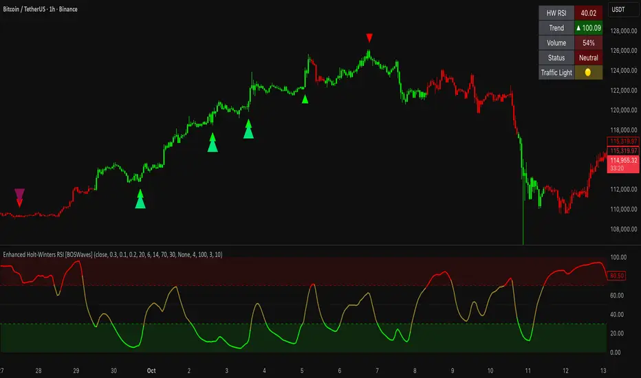
Enhanced Holt-Winters RSI [BOSWaves]Enhanced Holt-Winters RSI – Next-Level Momentum Smoothing & Signal Precision
Overview
The Enhanced Holt-Winters RSI transforms the classic Relative Strength Index into a robust, lag-minimized momentum oscillator through Holt-Winters triple exponential smoothing. By modeling the level, trend, and cyclical behavior of the RSI series, this indicator delivers smoother, more responsive signals that highlight overbought/oversold conditions, momentum shifts, and high-conviction trading setups without cluttering the chart with noise.
Unlike traditional RSI, which reacts to historical data and produces frequent whipsaws, the Enhanced Holt-Winters RSI filters transient price fluctuations, enabling traders to detect emerging momentum and potential reversal zones earlier.
Theoretical Foundation
The traditional RSI measures relative strength by comparing average gains and losses, but suffers from:
Lag in trend recognition : Signals often arrive after momentum has shifted.
Noise sensitivity : High-frequency price movements generate unreliable crossovers.
Limited insight into structural market shifts : Standard RSI cannot contextualize cyclical or momentum patterns.
The Enhanced Holt-Winters RSI addresses these limitations by applying triple exponential smoothing directly to the RSI series. This decomposes the series into:
Level (Lₜ) : Represents the smoothed central tendency of RSI.
Trend (Tₜ) : Captures rate-of-change in smoothed momentum.
Seasonal Component (Sₜ) : Models short-term cyclical deviations in momentum.
By incorporating these elements, the oscillator produces smoothed RSI values that react faster to emerging trends while suppressing erratic noise. Its internal forecast is mathematical, influencing the smoothed RSI output and signals, rather than being directly plotted.
How It Works
The Enhanced Holt-Winters RSI builds its signal framework through several layers:
1. Base RSI Calculation
Computes standard RSI over the selected period as the primary momentum input.
2. Triple Exponential Smoothing (Holt-Winters)
The RSI is smoothed recursively to extract underlying momentum structure:
Level, trend, and seasonal components are combined to produce a smoothed RSI.
This internal smoothing reduces lag and enhances signal reliability.
3. Momentum Analysis
Short-term momentum shifts are tracked via a moving average of the smoothed RSI, highlighting acceleration or deceleration in directional strength.
4. Volume Confirmation (Optional)
Buy/sell signals can be filtered through a configurable volume threshold, ensuring only high-conviction moves trigger alerts.
5. Visual Output
Colored Candles : Represent overbought (red), oversold (green), or neutral (yellow) conditions.
Oscillator Panel : Plots the smoothed RSI with dynamic color coding for immediate trend context.
Signals : Triangular markers indicate bullish or bearish setups, with stronger signals flagged in extreme zones.
Interpretation
The Enhanced Holt-Winters RSI provides a multi-dimensional perspective on price action:
Trend Strength : Smoothed RSI slope and color coding reflect the direction and momentum intensity.
Momentum Shifts : Rapid changes in the smoothed RSI indicate emerging strength or weakness.
Overbought/Oversold Zones : Highlight areas where price is stretched relative to recent momentum.
High-Conviction Signals : Combined with volume filtering, markers indicate optimal entries/exits.
Cycle Awareness : Smoothing reveals structural patterns, helping traders avoid reacting to noise.
By combining these elements, traders gain early insight into market structure and momentum without relying on raw, lag-prone RSI data.
Strategy Integration
The Enhanced Holt-Winters RSI can be applied across trading styles:
Trend Following
Enter when RSI is aligned with price momentum and color-coded signals confirm trend direction.
Strong slope in the smoothed RSI signals trend continuation.
Reversal Trading
Look for RSI extremes with momentum shifts and strong signal markers.
Compression in oscillator values often precedes reversal setups.
Breakout Detection
Oscillator flattening in neutral zones followed by directional expansion indicates potential breakout conditions.
Multi-Timeframe Confluence
Higher timeframes provide directional bias; lower timeframes refine entry timing using smoothed RSI dynamics.
Technical Implementation Details
Input Source : Close, open, high, low, or price.
Smoothing : Holt-Winters triple exponential smoothing applied to RSI.
Parameters :
Level (α) : Controls smoothing of RSI.
Trend (β) : Adjusts responsiveness to momentum changes.
Seasonal Length : Defines cycles for short-term adjustments.
Delta Smoothing : Reduces choppiness in smoothed RSI difference.
Outputs :
Smoothed RSI
Colored candles and oscillator panel
Buy/Sell signal markers (with optional strength filtering)
Volume Filtering : Optional threshold to confirm signals.
Optimal Application Parameters
Asset-Specific Guidance:
Forex : Use moderate smoothing (α, β) to capture medium-term momentum swings while filtering minor price noise. Works best when combined with volume or volatility filters.
Equities : Balance responsiveness and smoothness to identify sustained sector momentum or rotational shifts; ideal for capturing clean directional transitions.
Cryptocurrency : Increase smoothing parameters slightly to stabilize RSI during extreme volatility; optional volume confirmation can help filter false signals.
Futures/Indices : Lower smoothing sensitivity emphasizes macro momentum and structural trend durability over short-term fluctuations.
Timeframe Optimization:
Scalping (1-5m) : Use higher sensitivity (lower smoothing factors) to react quickly to micro-momentum reversals.
Intraday (15m-1h) : Balance smoothing and responsiveness for detecting short-term acceleration and exhaustion zones.
Swing (4h-Daily) : Apply moderate smoothing to reveal underlying directional persistence and cyclical reversals.
Position (Daily-Weekly) : Use stronger smoothing to isolate dominant momentum trends and filter temporary pullbacks.
Integration Guidelines
Combine with trend filters (EMAs, SuperSmoother MA, ATR-based tools) for confirmation.
Use volume and signal strength markers to filter low-conviction trades.
Slope, color, and signal alignment can guide entry, stop placement, and scaling.
Disclaimer
The Enhanced Holt-Winters RSI is a technical analysis tool, not a guaranteed profit system. Effectiveness depends on proper settings, market structure, and disciplined risk management. Always backtest before live trading.