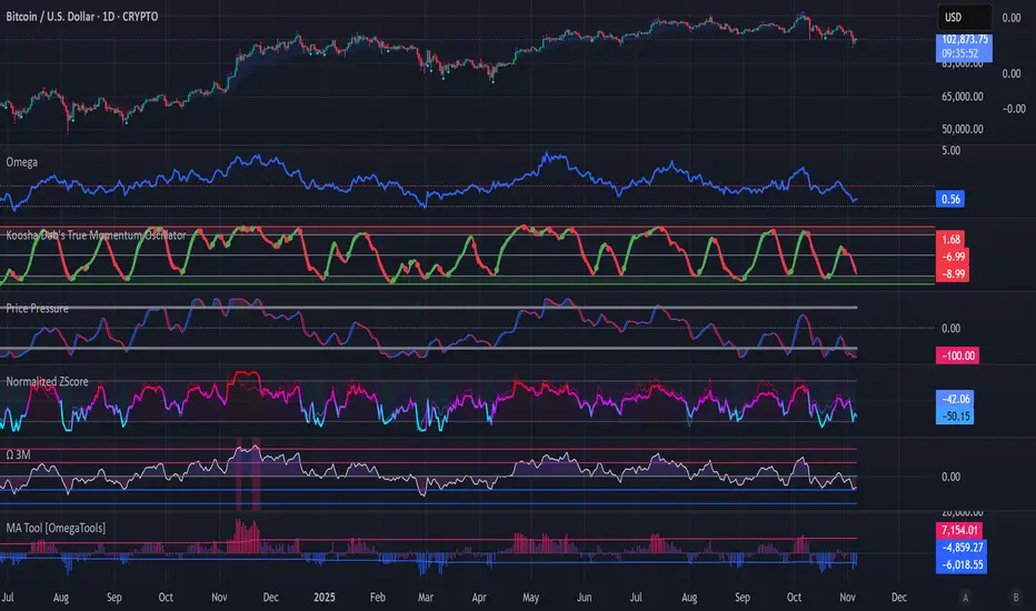
Koosha Dab's True Momentum OscillatorTrue Momentum Oscillator based on code written by SparkyFlary:
tradingview.com/u/SparkyFlary/
Different timeframe calculations added to the code.
In den Scripts nach "momentum" suchen
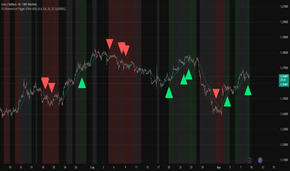
D1 Momentum Trigger (Filter ADX)D1 MOMENTUM TRIGGER + ADX – Added ADX filter to avoid strong trend periods during reversal trades. The ADX period is configurable.
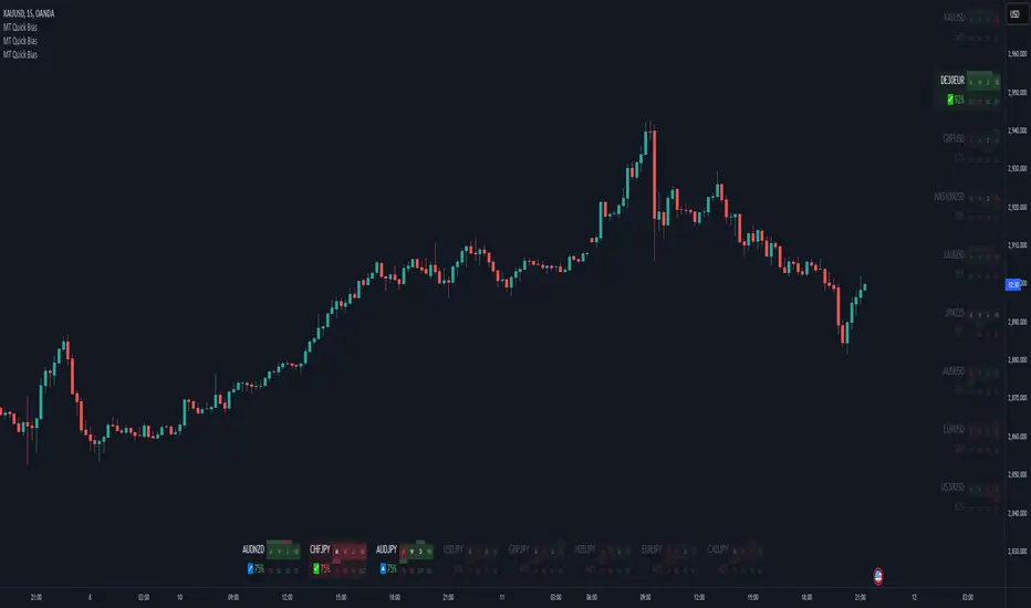
Momentum Theory Quick BiasMomentum Theory Quick Bias is a watchlist screener tool for rapid multi-timeframe analysis. It displays a variety of information from higher timeframes in order to set a directional bias including: breakout levels, peak levels, previous bar closes, and swing points.
✅ 8 Symbol Watchlist Scanner
✅ Quickly Set Directional Bias
✅ For Scalpers, Day Traders, and Swing Traders
--- 📷 INDICATOR GALLERY ---
--- 🚀 QUICK LOOK ---
✔ Multi-Timeframe Analysis
Displays various higher timeframe information in order to read how an asset is moving with one quick glance. Utilizes icons and colors that serve as visual cues.
--- ⚡ FEATURES ---
✔ Breakout Bias
Shows if the current price is above or below the breakout level on the timeframe.
✔ Peak Bias
Shows if the current previous peak has been triggered and where price is relative to it.
✔ Previous Bar Close
Shows how the previous bar closed and whether it's bullish or bearish.
Breakout
Fakeout
Inside
Outside
✔ Swing Point
Shows if the timeframe has currently flipped its breakout level.
✔ Bias Alignment
Shows visual icons if there is bias alignment between the timeframes.
↗️↘️ Breakout Bias Alignment
🔼🔽 Peak Bias Alignment
🔀 Breakout and Peak Bias Alignment, but opposite
✅ Breakout and Peak Bias Alignment
✔ Quick Analysis
Hover over the symbol name to view which timeframe levels are bullish or bearish and if peak levels have been triggered.
--- 🔥 OTHER FEATURES ---
✔ Built-In Presets
Create your own custom watchlist or use one of the built-in ones (using Oanda charts)
It's recommended to use the same source for all assets in your watchlist whenever possible
✔ Customized Layouts
Display the watchlist in a variety of different column arrangements.
✔ Dark and Light Modes
Adjustable theme colors to trade your chart the way you want.
✔ Plug-and-Play
Automatically changes the relevant levels depending on the viewed timeframe. Just fill in your watchlist, add it to your chart, and start trading!
Set the indicator to the following timeframes to view those arrangements:
Month Timeframe - Y / 6M / 3M / M
Week Timeframe - 6M / 3M / M / W
Day Timeframe - 3M / M / W / D
H4 Timeframe - Y / M / W / D
M15 Timeframe - M / W / D / H8
M10 Timeframe - M / W / D / H4
M5 Timeframe - W / D / H8 / H2
M3 Timeframe - W / D / H4 / H1
M2 Timeframe - D / H8 / H2 / M30
M1 Timeframe - D / H4 / H1 / M15
--- 📝 HOW TO USE ---
1) Create your watchlist or use one of the built-in presets and place it on the timeframe you want to see. If no watchlist is created, it automatically sets to the current asset.
2) Alignments will trigger in real-time and push to the top of the column.
It is recommended to place the indicator in a different chart window, so it won't have to refresh every time the asset or timeframe changes.
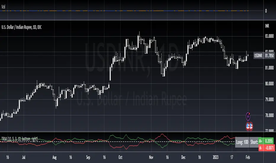
True Range MomentumThe indicator calculates the momentum of bullish and bearish based on the average true range and the highest highs and lowest lows of the historical price.
The indicator displays the strength for either taking a long position, or a short position.
The simplest way to use the indicator is to take a long position when the M+ line crosses above the 0 line. Similarly, to short, the M- line should cross above the 0 line. The exit would be when the respective line crosses below the 0 line.
The contrarian traders should wait for the lines to start rising towards the 0 line and taking an exit. In essence, the line should be going from negative to 0.
The greater the divergence between the M+ and M-, the stronger the trend.
The small table of Long and Short suggests what is in strength. A 100 will show a strong trend in the respective direction. It will be 50-50 when there is no clear direction, ideally identifying a consolidation range.
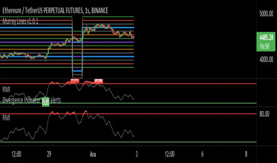
Relative Momentum Index- Fatih Küst alt 80-20 ayarlanmış momentum
Usage:
Add your favorite oscillator, RSI , Klinger , TSI, CMF , or anything else to a chart.
Click the little ... (More) on the oscillator.
Then add this indicator "Divergence Indicator (any oscillator)" on your oscillator of choice.
Click the settings on this indicator and make sure the source is set to the right plot from your oscillator.
Watch for it to plot divergences...
Add this indicator a second time on the price chart (and select the same oscillator plot), but check the box "plot on price (rather than on indicator)""
See you divergence plotted on price (as well as on the oscillator)
Momentum Trend IndexMomentum Trend Index (MTI), is a Trend Filtering system that utilizes momentum via RSI in a special unique way which not many people have done to date within Tradingviews platform and even outside it.
Reduce the noise of the trend to focus on the direction, it holds true through consolidations and volatility spikes.
Use your favourite RSI or Moving Average settings (4,9,13,21,31,50,100,200,etc)
Included in the indicator is an option to plot the Over Sold and Over Bought levels directly to your chart!

Dynamic Momentum Oscillator (DYNAMO) by M.YALCINIn July 1996 Futures magazine, E. Marshall Wall introduces the Dynamic Momentum Oscillator (Dynamo). Please refer to this article for interpretation.
The Dynamo oscillator is a normalizing function that adjusts the values of a standard oscillator for trendiness by taking the difference between the value of the oscillator and a moving average of the oscillator and then subtracting that value from the oscillator midpoint.
Dynamo Oscillator is calculated according to:
Dynamo = Mc - ( MAo - O )
where:
Mc = the midpoint of the oscillator
MAo = a moving average of the oscillator
O = the oscillator
Usage:
This concept can be applied to most oscillators to improve their results.
This example applies it to an RSI oscillator in MetaStock:
50-(Mov(RSI(14),21,S)-RSI(14))
where:
Mc = RSI's midpoint = 50
MAo = Moving average of the RSI = Mov(RSI(14),21,S
O= RSI Oscillator = RSI(14)
Also with this indicator, you can adjust the moving average type and RSI calculation types dynamically.

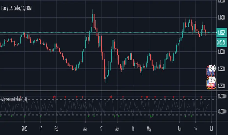
Momentum PinballMomentum Pinball, when you get a buy/sell signal, wait for the next day
enter on the high or low of the first hour and place a stop in the low/high
of the first hour. If the day you get filled closes profitable you can decide to close
the trade buy the end of the day or hold overnight and exit the following morning
Momentum Pinball////////////////////////////////////////////////////////////////////////////////////////////////
//// Momentum Pinball, when you get a buy/sell signal, wait for the next day
//// enter on the high or low of the first hour and place a stop in the low/high
//// of the first hour. If the day you get filled closes profitable you can decide to close
//// the trade buy the end of the day or hold overnight and exit the following morning
////////////////////////////////////////////////////////////////////////////////////////////
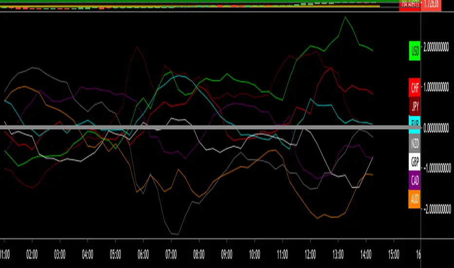
Momentum meter for 8 top currencies. Momentum meter for 8 top currencies.
USD, CAD, CHF, JPY, AUD, NZD, EUR and GBP
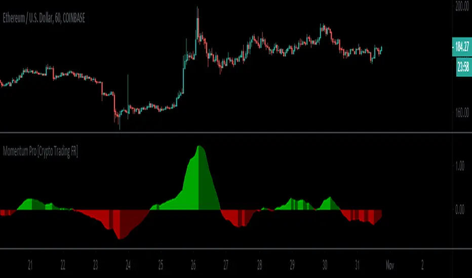
Momentum Pro [Crypto Trading FR]Momentum Pro is a script geared toward identifying price trends.
It is calculated to best fits the set of data being analyzed whatever the timeframe used.
Momentum Pinball IndicatorMomentum Pinball, when you get a buy/sell signal, wait for the next day enter on the high or low of the first hour (depending on the signal) and place a stop in the low/high of the first hour. If the day you get filled closes profitable you can decide to close the trade by the end of the day or hold overnight (if there was a considerable move) and exit the following morning. This strategy is based on the 3 period RSI of the one period ROC

Trader Set - Volume MomentumThis is a Momentum indicator but on "Volume" The formula is heavily tweaked version of TSI with chance of using different averaging types, the period numbers are fixed and user don't need to type anything for them!
Please don't contact me for getting access, these tools are available for my students only. These are part of my "methodology" that I teach. The English version of the website and learning material is under development and I will announce it under each related script when they are ready so that those who are interested can participate in the course.
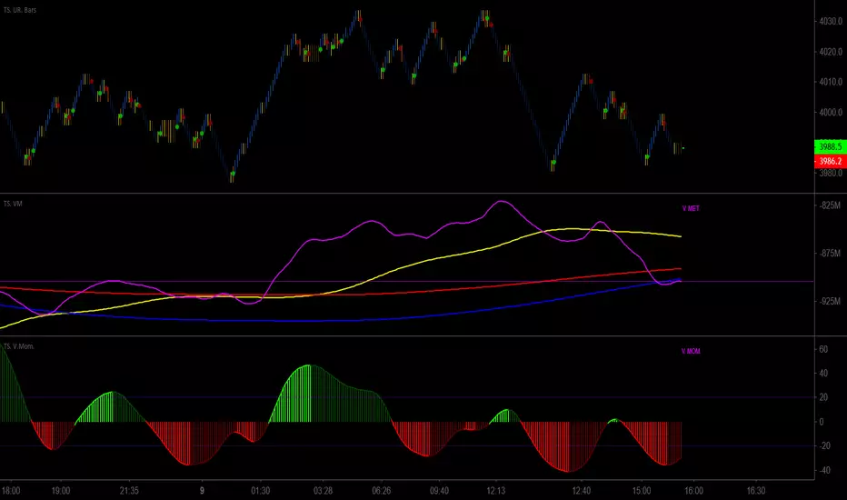
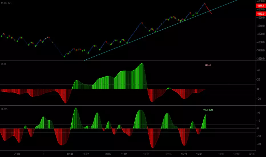
Trader Set - Volatility MomentumThis another one of the tools I missed publishing till today, this is a momentum indicator of volatility index (original formula), it will work hand in hand with volatility index oscillator (will publish right after this one) to easily identify divergences just before the market's direction change !
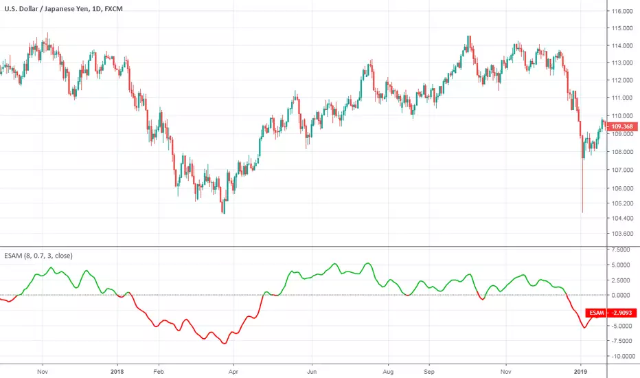
Ehlers Smoothed Adaptive MomentumEhlers Smoothed Adaptive Momentum script.
This indicator was developed and described by John F. Ehlers in his book "Cybernetic Analysis for Stocks and Futures" (2004, Chapter 12: Adapting to the Trend).
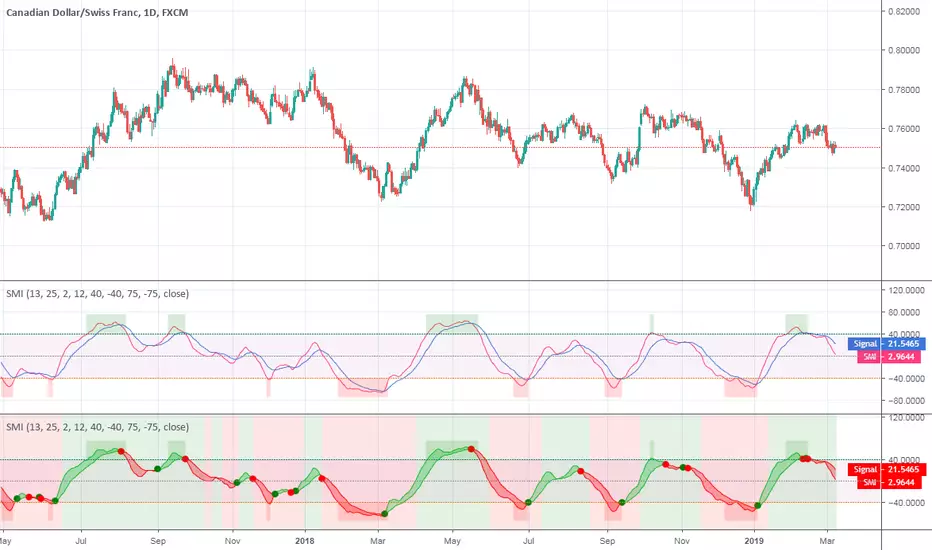
Stochastic Momentum IndexStochastic Momentum Index indicator script. This indicator was originally developed by William Blau (Stocks & Commodities V. 11:1 (11-18)).
Intraday Momentum IndexIntraday Momentum Index indicator script. This indicator was originally developed by Tushar Chande.

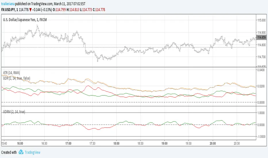
Up/Down Range MomentumThe Up/Down Range breaks the price range into an upward and a downward moving component, so we can easily turn it into a momentum oscillator. This script does just that.
You can find the Up/Down Range (UDR) indicator here:
Momentum Willams %RMomentum of Williams %R, idea from Vaicru a Trading view user, I just plot it. This is a good indicator to find divergence and easy to read; if the price and the momentun going to opposite direction, something is going to happen. Be carefull as it can anticipate inversion too early.

Stochastic Momentum IndexThis is an implementation of the Stochastic Momentum Index from William Blau's his article in Stocks & Commodities .
This also allows the use of various different kinds of moving averages for the signal line. Options for this argument are:
sma (simple moving average)
ema (exponential moving average)
wma (weighted moving average)
trima (triangular moving average)
zlema (zero-lag exponential moving average)
dema (double exponential moving average)
tema (triple exponential moving average)
hma (hull moving average)