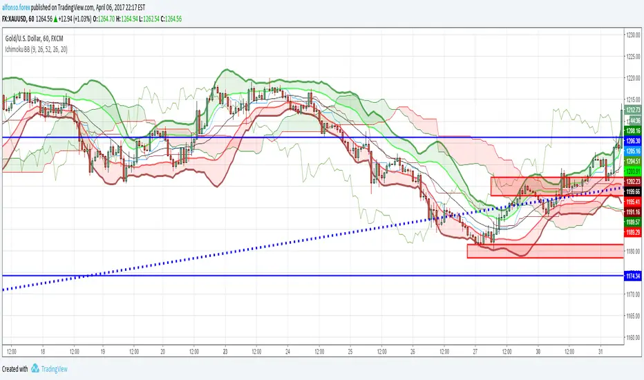
Ichimoku Cloud - Stays on 4 hourichimoku cloud that does not leave the 4 hour + doesnt show up at all above 4 hour
In den Scripts nach "ichimoku" suchen

Ichimoku And DD Bollinger BandsIchimoku System Plus Double Bolliner Bands
Made in Mexico City with Love.
Alexmoku Genesis v0.2.6 — Runtime BulletproofAlexmoku Genesis v0.2.6 – Reinventing Ichimoku with Precision and Intelligence
Built by Alex • Engineered for traders who demand more than lagging clouds
🔬 Overview
Alexmoku Genesis is a ground-up reimagining of the traditional Ichimoku system — retaining its philosophical foundations of harmony, balance, and structure, while infusing it with modern logic, advanced volatility modeling, and AI-aligned signal classification.
This is not your grandfather’s Ichimoku. Genesis transforms it into a forward-sensing, volatility-aware system that adapts in real time and guides discretionary and algorithmic traders alike with smarter signals, predictive structure, and built-in trade intelligence.
⚙️ Core Enhancements
📐 Volatility-Responsive Smoothing
Tenkan-sen and Kijun-sen lengths are dynamically adjusted based on recent price volatility (ATR-based).
Prevents overreaction in choppy markets and improves responsiveness during strong trends.
🌀 Adaptive Cloud Projection
Span A and Span B are still projected 52 periods forward — but cloud width adapts to market rhythm, not just static values.
🕵️ Enhanced Chikou Span (CKS+)
Chikou logic is upgraded to emphasize structure interaction, not just simple price overlay.
Useful for identifying support/resistance echoes and divergence validation.
🌐 Multi-Timeframe Cloud Awareness (Genesis Core)
Internal alignment checks between higher and lower timeframe Kumo positioning.
Future module support for overlaying MTF clouds.
🔖 Signal Classifier Engine (Experimental)
Each major structure event is tagged with signal intent:
📦 prep
🚀 launch
🔁 reversion
🪤 trap
Enables faster discretionary reads or future automation.
🧠 Trust Score Logic (Coming soon)
Future versions will assign numerical trust scores (1–10) to trade setups based on confluence.
🧰 Settings
🔧 Volatility Scaling Factor – Adjusts how reactive the indicator is to volatility. Default: 300.
🌫 Displacement (Kumo) – Cloud projection forward. Default (and required): 52.
⛅ Cloud Display Toggle – Show/hide Kumo visuals without affecting logic.
⚡️ Future expansion modules already scaffolded (MTF overlays, color-coded signal classifiers, Trust Score engine, etc.)
🧘 Philosophy Behind the System
"This isn’t just about catching runners — it’s about becoming the kind of person who can trade with clarity, peace, and precision."
Alexmoku Genesis reflects the W.E.A.L.T.H. System's holistic philosophy:
Wealth
Engineered
Algorithmic
Leveraged
Trading
Holistically
Trading isn't just a strategy. It's a mirror. Genesis is designed to train both your execution and your awareness.
⚠️ Disclaimer
This tool is designed for experienced technical traders and is still in active development. Use judgment and proper risk management. This is not financial advice.

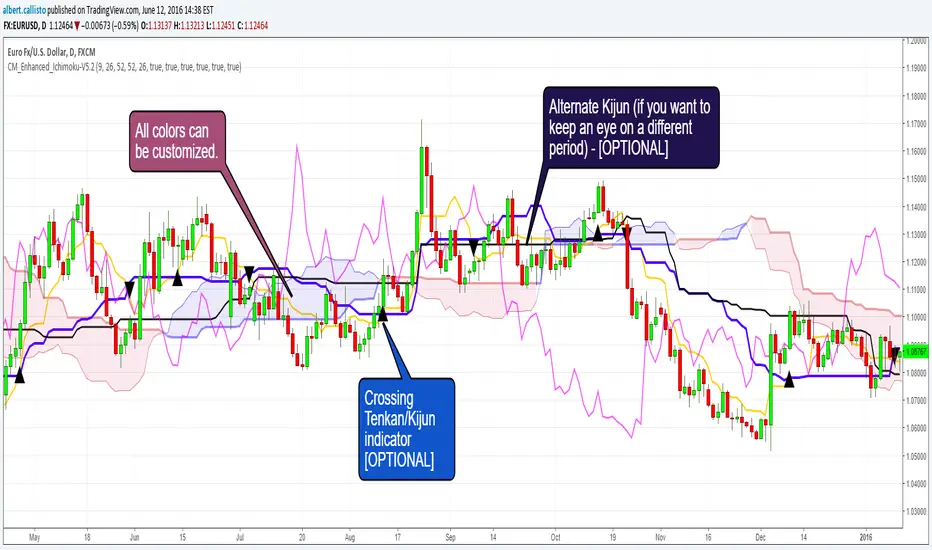
CM_Enhanced_Ichimoku Cloud-V5.2New version of the improved Ichimoku cloud
Original by Chris Moody, great work.
This indicator is a colorized Ichimoku with colors that you can change for any component. Not many changes between 5.1 and 5.2, I fixed some labels and the crossing detection, as well as the default colors.
There's not much more left we can do without radically changing the original Ichimoku. We could implement full-multiframe but you can already do that by adding several times this indicator and changing the periods.
Displayed components:
Kijun-Sen: middle of the highest/lowest prices during the last 26 periods
Tenkan-Sen: middle of the highest/lowest prices during the last 9 periods
Senkou Span A (SSA) : average of Kijun and Tenkan, projected 26 periods ahead
Senkou Span B (SSB): middle of the highest/lowest prices during the last 52 periods, and projected 26 periods ahead
Chikou Span: the closing price projected 26 periods behind.
Kumo: the cloud itself, the area between SSA/SSB.
The script also provides indication of the crossings between Tenkan and Kijun, some trading strategies are based upon that. There is also a separate Kijun with its own period for those you'd like to have this information at another timeframe. I removed the third Kijun that was in version 5.1, I don't think it was widely used and made the configuration screen too crowded. If you really need this, take a look at Donchian indicators, the Kijun is basically a Donchian on 26 periods.
Chris Moody Version (v5):
[DN]DNKUMOThis script draws some of MA line with momentum bar on your chart.
These lines looks like ICHIMOKU. You could use this script like ICHIMOKU, I hope :-)

Macro Risk On/Off SentimentOverview
As an Ichimoku trader, I've always found it crucial to understand the broader market sentiment before entering trades. That's why I developed this Macro Risk On/Off Sentiment Indicator. It's designed to provide a comprehensive view of global market risk sentiment by analysing multiple factors across different asset classes. By combining nine key market indicators, it produces an overall risk sentiment score, giving me a clearer picture of the market's mood before I apply my Ichimoku strategy.
Rationale
While Ichimoku is powerful for identifying trends and potential entry points, I realised it doesn't always capture the broader market context. Markets don't exist in isolation—they're influenced by a myriad of factors including volatility, economic indicators, and cross-asset relationships. By creating this indicator, I aimed to fill that gap, providing myself with a macro view that complements my Ichimoku analysis.
How It Works
The indicator analyses nine different market factors:
VIX (Volatility Index): Measures market expectations of near-term volatility.
S&P 500 Performance: Represents the overall US stock market performance.
US 10-Year Treasury Yield: Indicates bond market sentiment and economic outlook.
Gold Price Movement: Often seen as a safe-haven asset.
US Dollar Index: Measures the strength of the USD against a basket of currencies.
Emerging Markets Performance: Represents risk appetite for higher-risk markets.
High Yield Bond Spreads: Indicates credit market risk sentiment.
Copper/Gold Ratio: An economic growth indicator.
Put/Call Ratio: Measures overall market sentiment based on options trading.
Each factor is assigned a score based on its z-score relative to its recent history, then weighted according to its perceived importance. The overall risk score is a weighted average of these individual scores.
How I Use It
Before applying my Ichimoku strategy, I first check this indicator to gauge the overall market sentiment:
I look at the blue line plotted on the chart, which represents the overall risk score.
I note the background colour: green for risk-on (positive score) and red for risk-off (negative score).
I check the label in the lower-left corner, which provides specific FX pair recommendations and market expectations.
In a risk-on environment (positive score):
I focus on long positions in AUD/JPY, NZD/JPY, EUR/USD, etc.
I look for short opportunities in USD/CAD, USD/NOK, etc.
I expect commodities and yields to rise
In a risk-off environment (negative score):
I focus on long positions in USD/JPY, USD/CHF, USD/CAD
I look for short opportunities in AUD/USD, NZD/USD, EUR/USD
I expect increased volatility and falling yields
The strength of the sentiment is reflected in how close the score is to either 1 (strong risk-on) or -1 (strong risk-off). This helps me gauge how aggressive or conservative I should be with my Ichimoku trades.
Customisation
I've designed this indicator to be flexible. You can modify it to:
Adjust the lookback period and moving average length (both default to 30)
Change the weighting of different factors in the final score calculation
Include or exclude specific factors based on your analysis needs
By combining this Macro Risk On/Off Sentiment Indicator with my Ichimoku analysis, I've found I can make more informed trading decisions, taking into account both the technical setups I see on the chart and the broader market context.

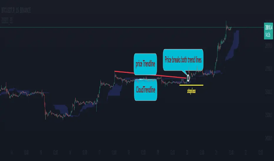
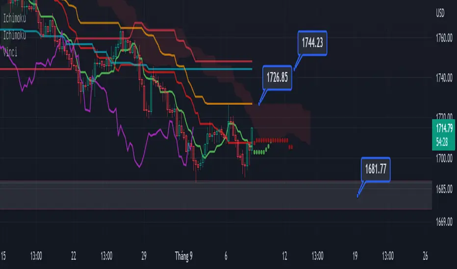
Cloud Trendlines_Pro[vn]👉Hello Trader .
- This is the Kumo cloud trendline indicator (taken from the indicator) in my "trendline analysis" series.
- On the chart of this indicator, there is only 1 pair of trendlines that are closest to the clouds: 1 uptrend line and 1 downtrend line.
- Actually in the process of trading with the trendline of the price I see the price undulating and sometimes the trendline of the price has been broken but also not sure if the price is a real break or a fake break, from which I came up with the idea to include the Ichimoku indicator for analysis. The Ichimoku indicator gives a good "Long" signal when the price breaks above the Kumo cloud and an uptrend when the price is still above the cloud (mathematical formula for creating the cloud of the Kumo cloud). Ichimoku I won't repeat it again), from here I have studied the trend line of the Kumo cloud. Because when the cloud goes up, the price increases, when the cloud goes down, the price decreases, So when the clouds begin to flatten and If the cloud shows signs of crossing its trendline, it is a signal of trend reversal or continuation of the previous trend.
- So, when combining 2 trend lines: price trendline and cloud trendline, it allows me to filter false breakout price signals and give a stoploss very effectively, especially effective with 5m frames. ,15m to create a new trend.
- The best entry signal is when the 2 trendlines are parallel and tend to cluster and the "price candle" breaks the 2 trend lines of the price and the cloud at the same time (it is possible that the price reacts at this point a few candles). ).if in a small time frame we can enter the "Market" order, and on the H1 frame or higher, we can still enter the "Market" order or wait for the retest of these 2 trend lines to place an order.
- If only one of the above 2 trend lines is displayed, the trader can ignore it.
- This cloud trendline method is very effective when the price is in the sideway, the price is bumpy (can't draw the trendline of the price)...but look at the trendline of the cloud if the cloud breaks its trendline. then it is a signal for us to know that the price has come out of the sideway and we can enter an order in the direction of breaking the trendline of the cloud.
- Small timeframes such as 1m, 3m, 5m, 15m I leave the default (cannot be changed) in the setting item 'Length' = 50, the remaining time can be changed, the default is 50
- To adjust, you can go to the setting to set the time according to your needs.
- The color of the Clouds trendline should be the same color as the clouds.
Note:
👉Indicator "Cloud Trendlines_Pro " should be combined with indicator "Trendlines_Pro " to give the best signal
Below are the images taken from my transaction.
-----------------------------------------------------------------------------------------------------------------------------------------------------
Vietnamese
👉Xin chào Trader Việt nam.
- Đây là chỉ báo về đường xu hướng của mây Kumo(lấy từ chỉ báo ) trong chuỗi "phân tích với đường xu hướng" của tôi.
- Trên biểu đồ của chỉ báo này chỉ vẽ ra 1 cặp đường xu hướng đi sát nhất với mây là: 1 đường xu hướng tăng và 1 đường xu hướng giảm.
- Thực ra trong quá trình giao dịch với đường xu hướng của giá tôi thấy giá đi nhấp nhô và có khi đường xu hướng của giá đã bị phá vỡ nhưng cũng không chắc chắn là giá phá vỡ thật hay phá vỡ giả, từ đó tôi nảy ý tưởng đưa chỉ báo Ichimoku vào để phân tích.Chỉ báo Ichimoku cho tín hiệu "Long" tốt khi giá vượt lên đám mây Kumo và xu hướng tăng khi giá vẫn ở trên mây(công thức toán học để tạo lên đám mây của Ichimoku tôi xin không nhắc lại nữa), từ đây tôi đã nghiên cứu ra đường xu hướng của mây Kumo.Vì khi mây hướng lên thì cho giá tăng, mây hướng xuống thì cho giá giảm,Vậy khi mây bắt đầu đang bằng phẳng và mây có dấu hiệu cắt đường xu hướng của nó thì đó là điểm báo đảo chiều xu hướng hay tiếp diễn xu hướng trước đó.
- Như vậy khi kết hợp 2 đường xu hướng là :đường xu hướng của giá và đường xu hướng của mây cho tôi lọc được tín hiệu giá phá vỡ giả và cho điểm stoploss cũng cực hiệu quả, đặt biệt hiệu quả với các khung 5m,15m để tạo lên xu hướng mới.
- Tín hiệu vào lệnh đẹp nhất khi 2 đường xu hướng song song và có xu hướng chụm lại và "cây nến giá" phá vỡ đồng thời 2 đường xu hướng của giá và mây(có thể giá phản ứng tại điểm này vài cây nến).nếu ở khung thời gian nhỏ ta có thể vào lệnh "Thị trường", còn khung H1 trở lên ta có vẫn có thể vào lệnh "Thị trường" hoặc chờ retest lại 2 đường xu hướng này để đặt lệnh.
- Nếu chỉ hiển thị một trong 2 đường xu hướng trên thì trader có thể bỏ qua.
- Phương pháp đường xu hướng cloud này rất hiệu quả khi giá trong vùng sideway ,giá mấp mô(không kẻ được đường xu hướng của giá )...nhưng nhìn vào đường xu hướng của mây nếu mây phá vỡ đường xu hướng của nó thì đó là tín hiệu để ta biết là giá đã ra khỏi vùng sideway và ta có thể vào lệnh theo hướng phá vỡ đường xu hướng của mây.
- Các timeframe nhỏ như 1m, 3m, 5m ,15m tôi để mặc định (không thay đổi được) trong setting mục 'Length' = 50, các thời gian còn lại có thể thay đổi được ,mặc định là 0
- Để điều chỉnh có thể vào setting để thiết lập các thời gian theo nhu cầu.
- Màu của đường xu hướng Mây tôi để cùng màu với mây.
Note:
👉chỉ báo "Cloud Trendlines_Pro " nên kết hợp với chỉ báo "Trendlines_Pro " để cho tín hiệu tốt nhất
Custom Kumo Cloud with RavaAcademy# Custom Kumo Cloud with RavaAcademy
📜 Summary
This script introduces a modified version of the traditional Ichimoku Kumo Cloud. Instead of using the standard formula of (highest high + lowest low) / 2, this indicator calculates its main components—Tenkan-sen, Kijun-sen, and Senkou Span B—using a custom volatility-based averaging mechanism. This mechanism is built on the Average True Range (ATR), making the cloud more responsive to market volatility. The result is a dynamic support and resistance tool that adapts to the current state of the market.
This indicator is designed for traders who appreciate the principles of the Ichimoku system but are looking for a more adaptive and volatility-aware tool for their technical analysis.
---
✨ Key Features
* **ATR-Based Calculations:** All major lines (Tenkan, Kijun, Senkou B) are calculated using a custom function that incorporates ATR. This allows the cloud to expand during high-volatility periods and contract during low-volatility periods.
* **Fully Customizable:** Users can adjust the period and ATR multiplier for each component of the cloud, allowing for fine-tuning to suit different assets and timeframes.
* **Standard Kumo Cloud Logic:** The cloud (Kumo) is formed between Senkou Span A and Senkou Span B, and it changes color based on their crossover, providing clear bullish or bearish signals.
* **Clean Visuals:** The indicator is plotted directly on the price chart (overlay) and can be easily toggled on or off from the settings.
---
🚀 How to Use
The fundamental principles of trading with this custom cloud are similar to the traditional Ichimoku Kumo Cloud.
* **Bullish Signal:**
* The price is trading above the cloud.
* The cloud is green (Senkou Span A is above Senkou Span B).
* The cloud acts as a dynamic support level.
* **Bearish Signal:**
* The price is trading below the cloud.
* The cloud is red (Senkou Span A is below Senkou Span B).
* The cloud acts as a dynamic resistance level.
* **Consolidation / Ranging Market:**
* The price is trading inside the cloud, which often indicates market indecision or a period of consolidation.
Because the calculations are based on volatility, a widening cloud can signal increasing market volatility, while a narrowing cloud suggests decreasing volatility.
---
⚙️ Settings
* **Show Kumo Cloud:** A simple checkbox to turn the visibility of the cloud on or off.
* **Tenkan Period & ATR Multiplier:** Controls the sensitivity of the fastest line (Tenkan). A smaller period or multiplier makes it more responsive.
* **Kijun Period & ATR Multiplier:** Controls the baseline (Kijun). This is typically a medium-term component.
* **Senkou Span B Period & ATR Multiplier:** Controls the slowest and most significant cloud boundary (Senkou B), which forms the foundation of long-term support/resistance.
---
⚠️ Disclaimer
This is a custom indicator and differs from the standard Ichimoku Kinko Hyo. Its signals should be used in conjunction with other forms of analysis and proper risk management. This tool is for educational and analytical purposes and does not constitute financial advice.

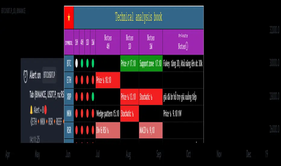
Technical Analysis Notes👉 Hello trader.
- In the process of monitoring the list of trading pairs such as stocks, cryptocurrencies... I often mark signals such as: RSI divergence, MACD, Stochatic, RSI trendline, Trendline..."by hand" , like recording on a drawing board, or excell, notepad... Therefore, taking notes is very limited. In addition, each time frame gives different, inconsistent signals and it is difficult to analyze the trend of a trading pair. somehow.
- After a period of careful research, I created the "Technical Analysis notes" indicator to solve the problems mentioned above, and after using it, I personally found it very effective to mark it. Trading signals as well as trend analysis across time frames from small to large.
- For example: On weekends, I often use automatic scanning indicators (about 200 codes) RSI divergence, RSI trendline, Trendlines, MACD-histogram .. within a week, then mark trading pairs when there are signals. Signals such as RSI cutting its trend line, price breaking through the trend line, Histogram MACD divergence... in the weekly frame, from there look to the D1, H4 frames to see the next signals in those frames to find the direction of intersection. Move in the same direction as the weekly frame signal to trade in the same trend. From that analysis, I limit my ability to go against the trend, and wait patiently for the signals that have been noted before.
- On this board you can monitor 10 transaction codes (in real time)
- On this table I have given 4 different time frames (can be customized in settings)
- I add Kumo Cloud (ichimoku) signals on 4 time frames so that people can easily recognize the trend when the price is above the cloud (green circle), in the cloud (white circle), below the cloud (green circle). red circle)
- I add fast typing mode, shortcut typing depending on each person's description including 16 fast typing modes (for example: "ru:RSI br up" in my understanding means the RSI line has broken above the trend line direction)
- From the above example "ru:RSI br up" the sign ' : ' is the separator that must be present to interpret the word 'ru' as being typed quickly, and 'RSI br up' is the part that explains the content of that word typed quickly.
- In those 16 quick typing boxes (divided into 4 rows), the first 3 rows are colored with custom boxes for each person. The last remaining row is not filled.
- The content of note boxes can be hidden in the settings using the check box.
- In particular, the private notes column cannot be hidden, because it is the column for recording, synthesizing, analyzing, identifying main trends, or waiting points to place orders... (This box is the most important in my opinion. ..)
- Has a super smart warning mode (customizable) when Kumo cloud signals are in the same color on 4 time frames for the most certain trend (green - bullish, red - bearish)
- In the warning section, you can adjust from 4 time frames to 3 time frames, 2 time frames, 1 time frame.
- Alert mode lists exact code names when one or more codes qualify. (eg BTC, ADA, BNB...)
--------------------------------------------------------------------------------------------------------------------
👉 Vietnamess
- Trong quá trình theo dõi danh sách các cặp giao dịch như cổ phiếu, tiền điện tử...tôi thường đánh dấu các tín hiệu như : phân kì RSI, MACD, Stochatic, trendline RSI, Trendline ..."bằng tay", như ghi trên bảng vẽ, hoặc excell, notepad...Vì vậy ghi chép rất hạn chế ngoài ra mỗi khung thời gian cho các tín hiệu khác nhau, không đồng nhất và rất khó để phân tích xu hướng của một cặp giao dịch nào đó.
- Sau một thời gian nghiên cứu kĩ lưỡng tôi có lập lên được chỉ báo "ghi chép Phân tích kĩ thuật " nhằm giải quyết các vấn đề nêu như trên, và sau quá trình dùng, cá nhân tôi thấy rất hiệu quả khi đánh dấu các tín hiệu giao dịch cũng như phân tích xu hướng qua các khung thời gian từ nhỏ đến lớn.
- Ví dụ: Cuối tuần tôi thường dùng chỉ báo quét tự động(khoảng 200 mã) RSI phân kì, RSI trendline, Trendlines , MACD-histogram .. trong khung 1 tuần, sau đó đánh dấu những cặp giao dịch khi có những tín hiệu như RSI cắt đường xu hướng của nó, giá đột phá đường xu hướng, phân kì Histogram MACD.. trong khung tuần, từ đó tìm đến những khung D1,H4 xem các tín hiệu tiếp theo trong các khung đó để tìm hướng giao dịch cùng hướng với tín hiệu khung tuần để giao dịch cùng xu hướng. Từ những phân tích đó tôi hạn chế được đi ngược xu hướng, và kiên nhẫn chờ đợi khi có tín hiệu được đã ghi chú từ trước.
- Trên bảng này có thể theo õi được 10 mã giao dịch(theo thời gian thực)
- Trên bảng này tôi có đưa ra 4 khung thời gian khác nhau(có thể tùy chỉnh trong thiết lập)
- Tôi đưa thêm tín hiệu Mây Kumo( ichimoku) trên 4 khung thời gian để mọi người từ đó dễ dàng nhận biết xu hướng khi giá trên mây(dấu tròn xanh lá) , trong mây(dấu tròn trắng) , dưới mây(dấu tròn đỏ)
- Tôi đưa thêm chế độ gõ nhanh, gõ tắt tùy theo diễn tả của mỗi người gồm 16 chế độ gõ nhanh (ví dụ: "ru:RSI br up" theo ý hiểu của tôi là đường RSI đã phá vỡ lên trên đường xu hướng)
- Từ ví dụ trên "ru:RSI br up" dấu ' : ' là ngăn cách phải có để diễn giải từ 'ru' là gõ nhanh, còn 'RSI br up' là phần diễn giải nội dung của từ gõ nhanh đó
- Trong 16 ô gõ nhanh đó(được chia làm 4 hàng) có 3 hàng đầu được tô màu ô tùy chỉnh cầu mỗi người. hàng cuối cùng còn lại không được tô.
- Nội dung các ô ghi chú có thể được ẩn hiện trong mục cài đặt bằng ô dấu tích.
- Đặc biệt cột ghi chú riêng tư không ẩn được, vì đó là cột ghi chép, tổng hợp , phân tích , nhận định xu hướng chính, hay điểm chờ để đặt lệnh...(ô này theo tôi là quan trọng nhất...)
- Có chế độ cảnh báo siêu thông minh(có thể tùy chỉnh) khi tín hiệu mây Kumo cùng trên 4 khung thời gian cùng màu cho xu hướng chắc chắn nhất(xanh- tăng giá, đỏ- giảm giá)
- Trong mục cảnh báo có thể điều chỉnh từ 4 khung thời gian xuống còn 3 khung thời gian, 2 khung thời gian, 1 khung thời gian.
- Chế độ cảnh báo được liệt kê tên mã chính xác khi một hay nhiều mã đủ điều kiện .(ví dụ BTC , ADA , BNB...)
Kyushu LegsKyushu Legs is part of the Ichimoku strategy. Kyushu Legs shows new candle bars which help to find a change of trend.
Legs Kyushu is created every candle based on close 9 candles before the actual open candle. Also, there is a possibility of changing the settings of counting the Legs Kyushu.
Colors change based on trend: the white candles show that the market is bullish, black candles that the market is bearish.
source of the code:

Ichmoku + GannThe script combines Ichimoku Clouds with Gann levels. Kijunsen is used as basis of calculation of 4 Gann levels above and below it. By default Gann Leves at 360 degrees are plotted but one can choose the desired degrees separation.
Multi time frame Ichimoku TK CrossTK Cross indicators across 5 configurable timeframes (+ current timeframe on the top)
Strong tk crosses are the most opaque.
Weak tk crosses are translucent.
Trends are semi-transparent.
Black means tenkan and kijun are overlapping.


Crypto Multi-setting Ichimoku Cloud by MozzarelloEasy way to switch between Traditional, Single, Double and Crypto 24/7 Settings


Price Equilibrium ImbalancesShows the highest/lowest percentage distance that current price has travelled from Ichimoku Lines & potential reversals/pullbacks when price is statistically far out of equilibrium.

