Price Change AlertsThis purpose of this indicator script is to reduce time traders spend staring on the charts.
For example if you're trading BTCUSD you can set alerts to be trigered by desired delta amount, for example 50. Then you can receive push notifications on your phone (need to install the tradinview app) and on your desktop computer every time price changes by amount of 50. Simple and easy.
To enable alerts do this:
- Click on alerts clock icon in top right corner of the screen
- Click on "Create alert button"
- In Condition dropdown select "alerts"
- In the next dropdown select "Any alert function() call" and click on "Create" button
Script uses repainting on purpose to display daily percentage changes since the previous day's closing and to triger alerts.
In den Scripts nach "change" suchen

Month/Month Percentage % Change, Historical; Seasonal TendencyTable of monthly % changes in Average Price over the last 10 years (or the 10 yrs prior to input year).
Useful for gauging seasonal tendencies of an asset; backtesting monthly volatility and bullish/bearish tendency.
~~User Inputs~~
Choose measure of average: sma(close), sma(ohlc4), vwap(close), vwma(close).
Show last 10yrs, with 10yr average % change, or to just show single year.
Chose input year; with the indicator auto calculating the prior 10 years.
Choose color for labels and size for labels; choose +Ve value color and -Ve value color.
Set 'Daily bars in month': 21 for Forex/Commodities/Indices; 30 for Crypto.
Set precision: decimal places
~~notes~~
-designed for use on Daily timeframe (tradingview is buggy on monthly timeframe calculations, and less precise on weekly timeframe calculations).
-where Current month of year has not occurred yet, will print 9yr average.
-calculates the average change of displayed month compared to the previous month: i.e. Jan22 value represents whole of Jan22 compared to whole of Dec21.
-table displays on the chart over the input year; so for ES, with 2010 selected; shows values from 2001-2010, displaying across 2010-2011 on the chart.
-plots on seperate right hand side scale, so can be shrunk and dragged vertically.
-thanks to @gabx11 for the suggestion which inspired me to write this

Range Volume ChangeI was looking for a way to see if today's premarket volume is higher or lower than the previous day's premarket, but did not find any, hence, I made my own which I share with you now.
I call it 'Range Volume Change' or just RVC.
RVC will show the percentage of change between the selected time range and the previous day for the same time range.
This will allow us to see if the volume is increasing or decreasing today compared to the previous day by a specific time range that we set in PVC settings. It can do more than just premarket, you can use it for any time range of your interest which will work on 24hours assets like crypto and forex.
RVC visualizes the incremental of the volume using increasing size columns giving you a better view of how the volume changes compared to the past. The column shows the accumulated volume from when the time range started.
As an extra feature, it will also show the volume percentage of change outside the time range (can be disabled from settings).
In addition, RVC is also designed to work on real-time data.
Example of BTCUSDT (24-hour asset) with volume 'outside the time range', enabled (purple columns):
Follow for more awesome indicators/strategies: www.tradingview.com

Intrabar Price/Volume Change (experimental)This experimental script shows the intrabar progression of price/volume
It can only be used with live data, when you switch timeframe or ticker, it will start over again.
When you let the script run, you'll get insight of what is going on during the bar progression.
On each tick, when the price goes up, a green line will be drawn,
if it goes down, a red line is drawn. The higher the difference with previous price, the wider the line.
The same with volume (lighter, broader lines), only it will always be drawn in the same direction as price goes.
You can set the max width of the lines, when a spike is larger then previous lines, the rest will be adjusted, so the ratio stays the same
The center line (position can be changed) has 2 colors (only on second and minute timeframes) -> this makes it easy to see the bar progression, each change in color represents a new bar
Lines can be drawn on 2 sides, or at 1 side, also they can be reversed
Many thanks to @LonesomeTheBlue and @LucF for their inspiration, help and guidance!
Cheers!

Volume Price Change RatioMessing around with this two point selecting ability I recently learned about from Tradingview's CAGR. Here is a script that will tell you changes in volume(obv)/price, volume to price change ratio, and the average volume to price change ratio for the length you define in the settings menu. You can use this to compare the ratio of a current pump to an older pump to help assess the strength of a movement. Enjoy!

Percentage change indicatorA measure of the RSI percentage change from the previous bar.
This can be inserted into any script.
The number of bars back can be changed from to chosen length.
It can be applied to a variety of indicators other than RSI.
This will now be incorporated into to my other scripts.
Mozz7

Percentage Change Comparison [BVCC]This script allows you to input 2 different coins and plot % changes against each other.
Look Back is adjustable to account for different time frame windows. Default is 1, so each line will be graphed on a 1:1 ratio with the candle period selected on the chart. raising this number to 24 will plot the change across every 24 candles and so on. It's pretty interesting to move the input dialogue window out of the way and change this number, watching how the % gain comparisons change in real time.
Default coins to compare are set to BTCUSD and ETHUSD @ coinbase.

[code-piece] change plotted color with input()plotted colored moving average.
Plotted color can be changed by indicator's setting dialog.
It's useful for user to be able to change the color according to background color.
1 = red
2 = blue
3 = green
4 = yellow
5 = lime
6 = aqua
7 = orange
8 = white
other = black
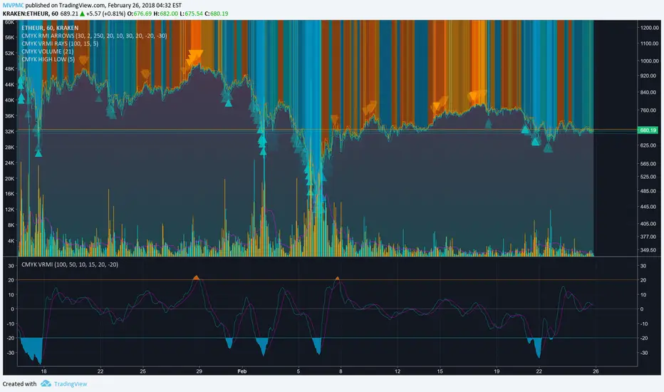
CMYK VRMI◊ Introduction
This script indicates the relative movement of price x volume.
◊ Origin
Based on 'The Relative Momentum Index' by Roger Altman : February, 1993 issue of Technical Analysis of Stocks & Commodities magazine.
While RSI counts up and down days from close to close, the Relative Momentum Index counts up and down days from the close relative to a close x number of days ago.
This results in an RSI that is smoother. The input has been changed to the change of a smoothed close multiplied by a smoothed volume.
The polarity of VRMI indicates bearish/bullish movement.
◊ Adjustments
CMYK color theme applied.
◊ Usage
VRMI indicates the force the market moves with.
◊ Future Prospects
-
◊ ◊ ◊ ◊ ◊ ◊ ◊ ◊ ◊ ◊ ◊ ◊ ◊ ◊ ◊ ◊ ◊ ◊ ◊ ◊ ◊ ◊ ◊ ◊ ◊ ◊ ◊ ◊ ◊ ◊ ◊ ◊ ◊ ◊ ◊ ◊ ◊ ◊ ◊ ◊ ◊ ◊ ◊ ◊ ◊ ◊ ◊ ◊ ◊ ◊ ◊ ◊ ◊ ◊ ◊ ◊ ◊ ◊ ◊ ◊ ◊ ◊ ◊ ◊ ◊ ◊ ◊ ◊ ◊ ◊ ◊ ◊ ◊ ◊ ◊ ◊ ◊ ◊ ◊ ◊ ◊ ◊ ◊ ◊ ◊ ◊ ◊ ◊ ◊ ◊ ◊ ◊ ◊ ◊ ◊ ◊ ◊ ◊ ◊ ◊ ◊ ◊ ◊ ◊ ◊ ◊
50 SMA Slope Change with TrendlineThe 50 MA is a good indicator if medium term price direction whether bull or bear. It shows the 50 MA and the rate of change. A positive slope is green and negative slope is red.
My first script I made and it's nothing special just something I thought would be interesting

US Construction Spending & Manufacturing Employment YoY % ChangeUsage Notes: Timeframe: Use a monthly chart, as TTLCONS and MANEMP are monthly data. Other timeframes result in interpolation.
Data Availability: As of October 2025, TTLCONS is available until July 2025 and MANEMP until August 2025 (automatically via TradingView).
The Unsung Heroes: Why C&M Are the True Indicators
Imagine the economy is a highly sensitive vehicle. Quarterly reported GDP is like a quarterly glance at the odometer—it's slow, often delayed, and clearly refers to the past. Anyone who wants to predict future developments needs something much faster.
This is where construction and manufacturing come into play. These two sectors are the machine builders of the economy and provide us with real-time feedback. They form the backbone of economic forecasting for several important reasons:
1. Monetary policy indicators: Both sectors are highly sensitive to monetary policy developments, such as interest rate changes. If developers are unable to finance large residential or commercial projects and manufacturers postpone capital-intensive factory expansions, for example, declines in construction demand would quickly affect other sectors.
2. The backbone of the secondary sector: These industries constitute the secondary sector of the economy, meaning they are concerned with the actual transformation and production of goods, not just the extraction of raw materials or the provision of intangible services. One could argue that while they only account for about 15% of GDP in the US, their impact is massive and cyclical.
3. The timeliness advantage: Forget quarterly lags. Both construction output and manufacturing employment data are released monthly. This timely, frequent data allows analysts to assess economic momentum much more quickly than if they had to wait for delayed GDP reports.
In the US, some analysts have even titled their articles with the bold claim: "Housing construction is the business cycle." Fluctuations in housing construction are frequent and large, and a decline in activity is almost always accompanied by a subsequent decline in GDP.

Trend Display Table (with Change Alerts)📌 Indicator: Trend Display Table (with Change Alerts)
This indicator helps identify trend direction based on a 15-minute 20 SMA compared against a 10 EMA applied to that SMA.
Trend Logic:
Bullish → 20 SMA crosses above 10 EMA (on SMA values)
Bearish → 20 SMA crosses below 10 EMA (on SMA values)
Neutral → No crossover (trend continues from previous state)
Display:
A compact trend table appears on the chart (top-right), showing the current trend with customizable colors, font size, and background.
Alerts:
Alerts are triggered only when the trend changes (from Bullish → Bearish or Bearish → Bullish).
This prevents repeated alerts on every bar.
✅ Useful for:
Confirming higher timeframe trend bias
Filtering trades in choppy markets
Getting notified instantly when the trend flips

UM Dual MA with Price Bar Color change & Fill
Description
This is a dual moving average indicator with colored bars and moving averages. I wrote this indicator to keep myself on the right side of the market and trends. It plots two moving averages, (length and type of MA are user-defined) and colors the MAs green when trending higher or red when trending lower. The price bars are green when both MAs are green, red when both MAs are red, and orange when one MA is green and the other is red. The idea behind the indicator is to be extremely visual. If I am buying a red bar, I ask myself "why?" If I am selling a green bar, again, "why?"
Recommended Usage
Configure your tow favorite Moving averages. Consider long positions when one or both turn green. Scale into a position with a portion upon the first MA turning green, and then more when the second turns green. Consider scaling out when the bars are orange after an up move.
Orange bars are either areas of consolidation or prior to major turns.
You can also look for MA crossovers.
The indicator works on any timeframe and any security. I use it on daily, hourly, 2 day charts.
Default settings
The defaults are the author's preferred settings:
- 8 period WMA and 16 period WMA.
- Bars are green when both MAs are trending higher, red when both MAs are trending lower, and orange when one MA is trending higher and the other is trending lower.
Moving average types, lengths, and colors are user-configurable. Bar colors are also user-configurable.
Alerts
Alerts can be set by right-clicking the indicator and selecting the dropdown:
- Bullish Trend Both MAs turning green
- Bearish Trend Both MAs turning red
- Mixed Trend, 1 green 1 red MA
Helpful Hints:
Look for bullish areas when both MAs turn green after a sustained downtrend
Look for bearish areas when both MAs turn red
Careful in areas of orange bars, this could be a consolidation or a warning to a potential trend direction change.
Switch up your timeframes, I toggle back and forth between 1 and 2 days.
Stretch your timeframe over a lower time frame; for example, I like the 8 and 16 daily WMA. With most securities I get 16 bars with pre and post market. This translates into 128 and 256 MAs on the hourly chart. This slows down moves and color transitions for better manageability.
Author's Subjective Observations
I like the 128/256 WMA on the hourly charts for leveraged and inverse ETFs such as SPXL/SPXS, TQQQ/SQQQ, TNA/TZA. Or even the volatility ETFs/ETNS: UVXY, VXX.
Here is a one-hour chart example:
I have noticed that as volatility increases, I should begin looking at higher timeframes. This seems counterintuitive, but higher volatility increases the level of noise or swings.
I question myself when I short a green bar or buy a red bar; "Why am I doing this?" The colors help me visually stay on the right side of trend. If I am going to speculate on a market turn, at least do it when the bars are orange (MA trends differ)
My last observation is a 2-day chart of leveraged ETFs with the 8 and 16 WMAs. I frequently trade SPXL, FNGA, and TNA. If you are really dissecting this indicator,
look at a few 2-day charts. 2-day charts seem to catch the major swings nicely up and down. They also weed out the daily sudden big swings such as a panic move from economic data
or tweets. When both the MAs turn red on a 2-day chart the same day or same bar, beware; this could be a rough ride or short opportunity. I found weekly charts too long for my style but good
to review for direction. Less decisions on longer charts equate to less brain damage for myself.
These are just my thoughts, of course you do you and what suits your style best! Happy Trading.

CoT Trend Change MomentumI discovered that whenever there's huge change in long IO or short IO there will be a momentum shift. So, I created this indicator to spot massive explosive volume changes for commercials and non commercials activity. Using standard deviation 2 and -2 as extreme point. Whatever crossing above standard deviation 2 indicating positions are added regardless whether it is long or shorts, whatever crossing below standard deviation -2 means positions are closed.
This is how I use this indicator:
1) In this example , i use only the commercials long and shorts. Whenever the longs exceed stdeviation +2, means that long volume flow in massively, for me this can be indicating potential to the upside. Whenever longs fall below stdeviation-2, for me this can be indicating that commercials are either taking profits for the short positions or accumulating for another bull price.
2) For shorts same logic applied here, when it exceeds stdeviation +2, mean commercials shorts position increase massively, when it exceeds stdeviation-2, means that commercials closed their short positions.
For this script, I use 13 weeks period as lookback, u guys may directly modify the period in the script to set the period that u want.
I've added for non-commercials as well, to ease people who emphasizes on non-commercials positioning analysis process.
I'm still trying to incorporate this with Open Interest Analysis. Hopefully u guys find this indicator useful. Feel free to modify it, to understand it more, my suggestions are u compare date by date the positions, to see the extreme points. The indicator only works in weekly chart, it is non repainted only in weekly chart, meaning that the indicator shows the histogram just as the week open.

Delta price table, BTC Status (track bitcoin price change)If you are trading alt coins which are affected with Bitcoin price movements then this indicator may be useful. It allows you to trade altcoin and track bitcoin price changes simultaneously.
It shows the price change (delta price) for last 60 seconds, 5 minutes, 15 minutes, 30 minutes, 1 hour, 4 hours, 1 day.
If you want any updates, just feel free to write me :)

Global M2 YoY % Change (USD)M2 Global Money Supply in USD terms for nations with historical available past ~10 years, year over year % change.

Sagar sir - N Continuous candle green with +ve % changeThis script will plot labels based on N number of continuous green candle with +ve % change.

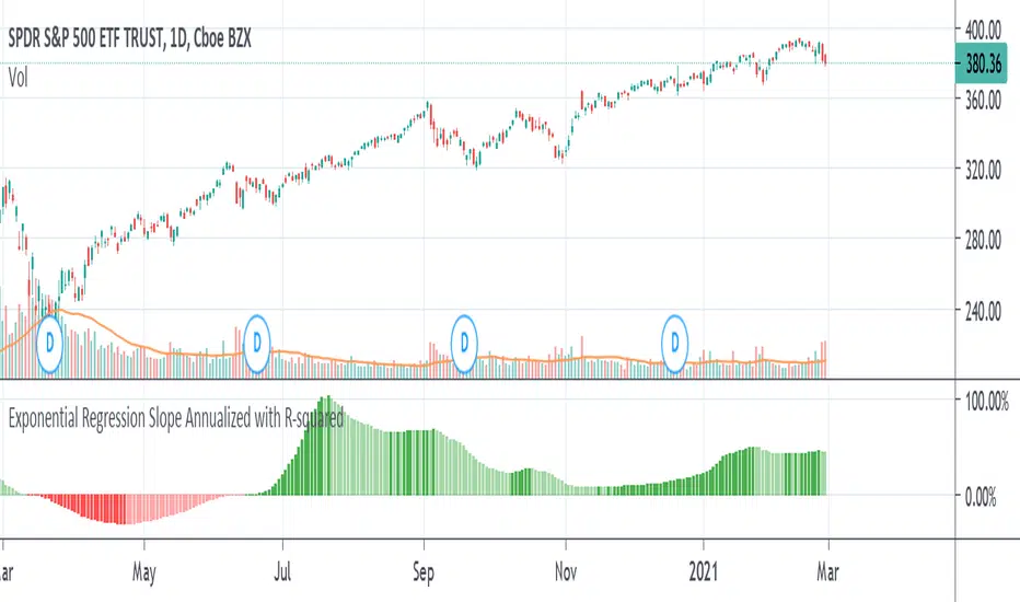
Exponential Regression Slope Annualized with R-squared HistogramMy other indicator shows the linear regression slope of the source. This one finds the exponential regression slope and optionally multiplies it by R-squared and optionally annualizes it. Multiplying by R-squared makes sure that the price movement was significant in order to avoid volatile movements that can throw off the slope value. Annualizing the exponential slope will let you see how much percentage you will make in a year if the price continues at its current pace.
The annualized number is the number of trading days in a year. This and the length might need adjusting for the extra bars that might be in futures or other markets. The number does not have to be a year. For example, it can be a month if you set the number to 20 or so trading days to find how much you would make in a month if price continues at its current pace, etc. This can also be used as an alternative to relative strength or rate of change.
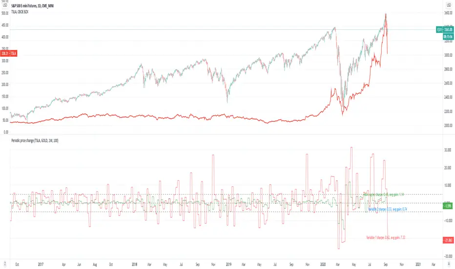
Periodic price change comparisonPeriodic price change.
Application:
Sector rotation analysis by comparing different tickers.
Simple statistical analysis (with lookback period) for knowing how good they were.
If you are a believer in sector rotation, you can add different sector stocks to see which of them are lagged behind and buy them.
In this example, you could see tesla periodically fall behind the market. You can buy it when it is on that zone.
And you can also refer to the sharpe ratio and the average gain rate on the chart to see how good the stocks were.
Terminal : USD Based Stock Markets Change (%)Hello.
This script is a simple USD Based Stock Markets Change (%) Data Terminal.
You can also set the period to look back manually in the menu.
In this way, an idea can be obtained about Countries' Stock Markets.
And you can observe the stock exchanges of relatively positive and negative countries from others.
Features
Value changes on a percentage basis (%)
Stock exchange values are calculated in dollar terms.
Due to the advantage of movement, future data were chosen instead of spot values on the required instruments.
Stock Markets
Usa : S&P 500 Futures
Japan: Nikkei 225 Futures
England: United Kingdom ( FTSE ) 100
Australia: Australia 200
Canada: S&P / TSX Composite
Switzerland: Swiss Market Index
New Zealand: NZX 50 Index
China: SSE Composite (000001)
Denmark: OMX Copenhagen 25 Index
Hong-Kong: Hang Seng Index Futures
India: Nifty 50
Norway: Oslo Bors All Share Index
Russia: MOEX Russia Index
Sweden: OMX Stockholm Index
Singapore: Singapore 30
Turkey: BIST 100
South Africa: South Africa Top 40 Index
Spain: IBEX 35
France: CAC 40
Italy: FTSE MIB Index
Netherlands: Netherlands 25
Germany : DAX
Regards.

LINEdicator - Trendanalysis toolThis indicator creates an trend channel based on an EMA/SMA combo and a Parabolc SAR indicator.
Watch for the peaks and the size of the red/green channel for possible trend change.
Can also be used as an Entry/Exit/Stop-Loss setting tool.

PT Magic - BTC/ETH Trigger Trend ChangesThis Script shows you how BTC/ETH Percentage change in trends affect coins you trade.
- For ETH market please change BTC in Setting for ETH
What you need it PT Magic:
{
"Name": "BTC1h", // UNIQUE market trend name (to be referenced by your triggers below)
"Platform": "CoinMarketCap", // Platform to grab prices from (Allowed values are: CoinMarketCap, Exchange)
"MaxMarkets": 1, // Number of markets/pairs to analyze sorted by 24h volume
"TrendMinutes": 60 // Number of minutes to build a trend (1440 = 24h, 720 = 12h, 60 = 1h)
},
{
"Name": "ETH1h", // UNIQUE market trend name (to be referenced by your triggers below)
"Platform": "CoinMarketCap", // Platform to grab prices from (Allowed values are: CoinMarketCap, Exchange)
"MaxMarkets": 2, // Number of markets/pairs to analyze sorted by 24h volume
"IgnoredMarkets": "BTC",
"TrendMinutes": 60 // Number of minutes to build a trend (1440 = 24h, 720 = 12h, 60 = 1h)
},

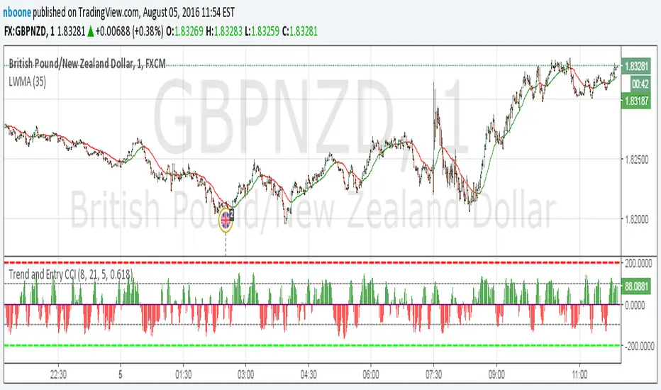
LWMA w/ Color ChangeLinear Weighted MA that changes colors based on slope.
Green = slope up from last bar
Yellow = slope is 0 from last bar
Red = slope down from last bar
This time with the ability to change the period.