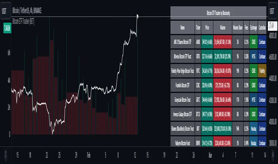
Bitcoin ETF Tracker (BET)Get all the information you need about all the different Bitcoin ETFs.
With the Bitcoin ETF Tracker, you can observe all possible Bitcoin ETF data:
The ETF name.
The ticker.
The price.
The volume.
The share of total ETF volume.
The ETF fees.
The exchange and custodian.
At the bottom of the table, you'll find the day's total volume.
In addition, you can see the volume for the different Exchanges, as well as for the different Custodians.
If you don't want to display these lines to save space, you can uncheck "Show Additional Data" in the indicator settings.
The Idea
The goal is to provide the community with a tool for tracking all Bitcoin ETF data in a synthesized way, directly in your TradingView chart.
How to Use
Simply read the information in the table. You can hover above the Fees and Exchanges cells for more details.
The table takes space on the chart, you can remove the extra lines by unchecking "Show Additional Data" in the indicator settings or reduce text size by changing the "Table Text Size" parameter.
Upcoming Features
As soon as we have a little more history, we'll add variation rates as well as plots to observe the breakdown between the various Exchanges and Custodians.
In den Scripts nach "bitcoin" suchen
BTI - Bitcoin (BTC) Top Indicator [Logue]Bitcoin top indicator. This indicator is a combination of multiple on-chain and seasonality BTC macro cycle top indicators, plus the Pi-Cycle top moving average. Because there is no magic single indicator to detect macro cycle tops in bitcoin, the BTI detects confluence of multiple indicators to select tops of each BTC macro cycle. The individual indicators used for the BTI are:
1) Cumulative Value Days Destroyed (CVDD) - The CVDD was created by Willy Woo and is the ratio of the cumulative value of Coin Days Destroyed in USD and the market age (in days). While this indicator is used to detect bottoms normally, an extension is used to allow detection of BTC tops. When the BTC price goes above the CVDD extension, BTC is generally considered to be overvalued. Because the "strength" of the BTC tops has decreased over the cycles, a logarithmic function for the extension was created by fitting past cycles as log extension = slope * time + intercept. This indicator is triggered when the BTC price is above the CVDD extension.
2) Net Unrealized Profit Loss (NUPL) - The NUPL measures the profit state of the bitcoin network to determine if past transfers of BTC are currently in an unrealized profit or loss state.
Values above zero indicate that the network is in overall profit, while values below zero indicate the network is in overall loss. Highly positive NUPL values indicate overvaluation of the BTC network. Based on decreasing "strength" of BTC tops, a decreasing linear function (trigger = slope * time + intercept) was fit to past cycle tops. Therefore, future trigger values can be calculated over time. This indicator is triggered when the NUPL is above the trigger value.
3) Market Value-Realized Value Z-score (MVRV-Z) - The MVRV-Z measures the value of the bitcoin network by comparing the market cap to the realized value and dividing by the standard deviation of the market cap (market cap – realized cap) / std(market cap)). When the market value is significantly higher than the realized value, the bitcoin network is "overvalued". Very high values have signaled cycle tops in the past. This indicator is triggered when the MVRVZ value is above 55.
4) Puell multiple (PUELL) - PUELL is the ratio between the daily coin issuance in USD and its 365-day moving average. This multiple helps to measure miner profitability. When the PUELL goes to extremely high values relative to historical values, it indicates the profitability of the miners is very high and a top may be near. This indicator triggers when the PUELL is above 3.33.
5) Calendar Seasonality Index (CSI) - The CSI takes advantage of the consistency of BTC cycles. Past cycles have formed macro tops every four years between October 21st and December 12th. Therefore, this indicator triggers at set times that are marked every four years between these two dates.
6) Halving Seasonality Index (HSI) - The HSI, as with the CSI, takes advantage of the consistency of BTC cycles following the major event that is the halving. Aside from the first halving cycle, cycles have formed macro tops approximately 538 days after each halving. Therefore, this indicator triggers at set times that are marked 528 to 548 days (i.e., 538 +- 10 days) after each halving.
7) Polylog Regression (PLR) - The BTC cycle tops and bottoms were separately fit using a polynomial regression for the PLR. The bottom band was fit on much more data than the top band, so is likely to be more reliable. The shape of the regression into the future was estimated, so may not be accurate into the future, but is the best fit of tops and bottoms to date. This indicator is used to estimate when tops and bottoms are near when the price goes into the top or bottom bands. This triggers when the BTC price is inside or above the upper polylog regression channel.
8) Realized Price (RP) - The RP is summation of the value of each BTC when it last moved divided by the total number of BTC in circulation. This gives an estimation of the average "purchase" price of BTC on the bitcoin network based on when it was last transacted. This indicator tells us if the average network participant is in a state of profit or loss. This indicator is normally used to detect BTC bottoms, but an extension can be used to detect when the bitcoin network is "highly" overvalued. Because the "strength" of the BTC tops has decreased over the cycles, a logarithmic function for the extension was created by fitting past cycles as log extension = slope * time + intercept. This indicator triggers when the BTC price is above the realized price extension.
9) Pi-cycle Top (PCT) - The PCT indicator is simply the cross of the 111-day moving average above a 2x multiple of the 350-day moving average of the BTC price. While there is no fundamental reasoning behind why this works, it has worked to indicate previous bitcoin tops by taking advantage of the cyclicality of the BTC price and measurement overextension of BTC price. This indicator triggers when the fast moving average (111-day) crosses above the 2x multiple of the slow moving average (350-day).
10) Transaction Fee Spike (TFS) - Transaction fees on the bitcoin network can signal a mania phase when they increase well above historical values. This mania phase may indicate we are near a top in the BTC price. The daily transaction fee total in USD is divided by the number of daily transactions to calculate the average transaction fee paid on the bitcoin network. The transaction fees increasing above $40 trigger this indicator.
The on-chain indicators (CVDD, NUPL, MVRV-Z, PUELL, RP, and TFS) work together to give a health check of the BTC price as compared to its network health. The seasonality indicators (CSI, HSI, and PLR) work together to map the macro cycles of BTC. The PCT gives a view of the overvaluation of the BTC price. Each of these indicators is weighted evenly when selected and if over 45% of the indicators are triggering on a candle (i.e., at least 5 of 10), the overall BTI indicator prints a clear signal -- a red dot with a white middle portion between the white horizontal lines at the top of the indicator. This signal is meant to indicate when the macro cycle top is likely already hit or is near. Each of the individual indicators used for the BTI are proven macro top indicators over multiple cycles.
Each of the individual indicators are shown in their own rows to visualize which indicators are triggering. You are able to deselect any indicator you do not wish to have considered and select it back again. To prepare you for indicators triggering, the BTI shows dark blue or dark green when the indicator is close to triggering (i.e., generally around 20% from the trigger value, a less intense background will appear, and 10% from the trigger value, a more intense background will appear). The color of the individual indicators turns pink when they are triggered. The background color of the BTI becomes blue when at least 30% of the indicators considered are triggering and it becomes purple/pink when the BTI fully triggers. See the BTC chart above the indicator showing the performance of the indicator in picking out macro top regions (red dots with white middle portion). Because not all daily data for BTC can be shown on one chart, ensure you also play with the indictor yourself. The BLX is most appropriate, but the indicator works on all BTC/USD charts. Because of the limits imposed by TradingView, the indicator doesn't work on time frames lower than 4 h or higher than the weekly.
You can use this indicator to help you understand when the BTC price is more likely topping based on past performance of these indicators. This indicator pairs with the BBI (Bitcoin (BTC) Bottom Indictor) and the BTB (Bitcoin Top and Bottom indicator).
Use this indicator at your own risk. I make no assertions that this indicator will work to detect any future top since we all know that past performance is no guarantee of future results.

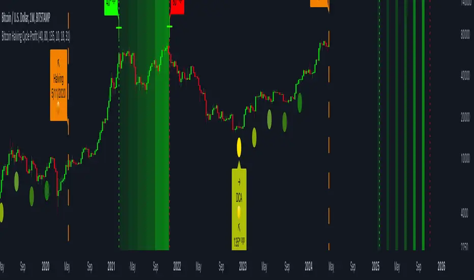
Bitcoin Halving Cycle ProfitThe Bitcoin Halving Cycle Profit indicator, developed by Kevin Svenson , unveils a consistent and predetermined profit-taking cycle triggered by each Bitcoin halving event. This indicator streamlines the analysis of halving occurrences, providing explicit signals for both profit-taking and Dollar-Cost Averaging strategies.
Following each Bitcoin halving event, a fixed number of weeks consistently mark the period of maximum profitability for profit-taking:
🔄 Halving Cycle Profit Timeline Explained:
• 40 Weeks (Post-Halving) = Start of the optimal profit-taking zone.
• 80 Weeks (Post-Halving) = "Last Call" for profit-taking before the onset of a bear market.
• 125 Weeks (Post-Halving) = The optimal timeframe to begin Dollar-Cost Averaging.
(Bitcoin Weekly Chart using Halving Cycle Profit)
One standout feature of this indicator is its inherent clarity and comprehensive labeling. This quality makes it exceptionally easy to discern the locations of key factors and turning points, enhancing your understanding of the market dynamics it highlights.
(Bitcoin Daily Chart using Halving Cycle Profit)
🚀 This indicator doesn't limit its effectiveness to just Bitcoin; it seamlessly integrates with top blue-chip altcoins like Ethereum and most household names in the crypto industry.
( Ethereum Weekly Chart using Halving Cycle Profit)
🛠️ Customizable display options are availible. Users have the flexibility to toggle/adjust labels, lines, and color fills according to their preferences.
📑 In summary, the Bitcoin Halving Cycle Profit indicator is a versatile and user-friendly tool, offering clarity and customization for traders navigating both Bitcoin and top altcoins.
⚠️ It's important to note that while the Bitcoin Halving Cycle Profit indicator provides historical insights, past performance does not guarantee future results. Timing profitability in the cryptocurrency market involves inherent risks, and this indicator should not be construed as financial advice. Users are encouraged to exercise caution, conduct thorough research, and make informed decisions based on their individual risk tolerance and financial goals.
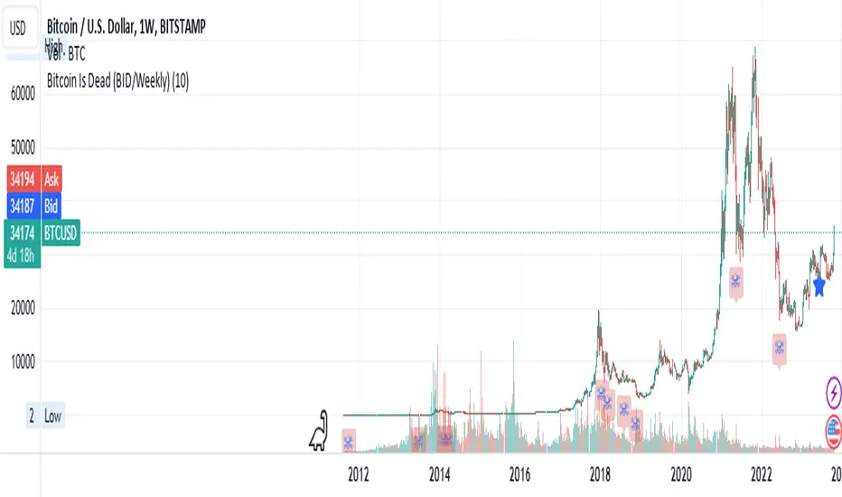
Bitcoin Is Dead (BID/Weekly)Shows two consecutive weekly Bitcoin drops of X% both indicating capitulation which may be relevant to crypto markets, risk-on/risk-off and possibly tech markets.
Suggested usage: set the drop % and apply to weekly charts. Can be used on any chart, not just Bitcoin, but calculates indicator specifically for Bitcoin pricing.
Can be used for entertainment or technical analysis.
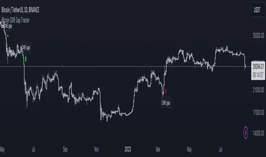
Bitcoin CME Gap TrackerCME Bitcoin Futures Gaps: What Are They and Why Are They Important?
Gaps are breaks between price candles on charts, illustrating the intervals between the closing price of the previous period and the opening price of the next. For Bitcoin on CME, these gaps arise due to the particular workings of this market.
Bitcoin and other cryptocurrencies trade 24/7 without breaks. However, CME Bitcoin Futures, like many other financial instruments on traditional exchanges, have weekends and trading pauses. When the Bitcoin market continues to move during weekends or CME closures, and then CME opens on the subsequent trading day, a price disparity can occur, perceived as a gap.
Several studies suggest that in most cases (approximately 70% and more), the market reverts to "close" these gaps. This phenomenon is observed because large liquidity is concentrated at these gap points. There are many unfilled orders in gap zones, placed at specific prices. When the price reaches these levels, it can swiftly react to this "clustering" of orders, potentially leading to the gap's closure.
Therefore, CME Bitcoin Futures gaps not only reflect crucial psychological moments in the market but can also serve as potential entry or exit points, considering the high liquidity in these zones.
Technical Description:
The script is designed to identify gaps in the Bitcoin Futures chart on CME. It automatically detects gaps that appear on Mondays (since CME is closed on weekends) and are larger than the user-specified percentage.
Key Features:
Identification of the weekday to detect gaps that arose on Monday.
Calculation of positive and negative gaps by comparing the highs and lows of the previous candles with the current ones.
Graphical representation of the gaps using lines and labels on the chart.
User Guide:
Add this script to your TradingView chart.
You can adjust the "Show gaps larger than %" parameter to determine the minimum gap size of interest.
Gaps will be automatically displayed on your chart with lines and labels.
Bitcoin Relative Value IndicatorThis script retrieves the close price data for Bitcoin, DXY, CPIAUCSL, M2 money supply, and SPX and calculates the average of the four data points. It then calculates the relative value of Bitcoin by dividing the Bitcoin close price by the average of the four data points. The script determines whether the relative value is increasing or decreasing and plots the relative value on the chart using a green line if it's increasing and a red line if it's decreasing.

Bitcoin Market Buy vs Sell StrengthThis indicator compares Bitcoin's market capitalization (based on distribution) with the market capitalization based on the price at which Bitcoin was actually traded.
This indicator utilized the fact that if Bitcoin's mining volume and price increase rate do not show an appropriate ratio
, for example, the increase in bitcoin mining volume is weak, while if the price increase rate is sharp
, we can interpret that Bitcoin's price is not in the general range and is overvalued.
How to use?
The red solid line is that value, and when the red solid line rises, bitcoin traders' selling starts to increase.
Conversely, if this indicator falls after reaching the red box, the buying trend will increase and the price will show an upward trend.
In the Options window, you can select the Slow or Fast mode depending on the sensitivity, and this indicator is available only at "D"frame chart.
This indicator applies only to Bitcoin and is available to all users without restriction (the source must be revealed)

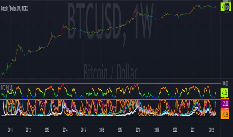
Bitcoin Risk Long Term indicatorOBJECTIVE:
The purpose of this indicator is to synthesize via an average several indicators from a wide choice with in order to simplify the reading of the bitcoin price and that on a long term vision.
Useful for those who want to see things simply, typically to make a smart DCA based on risk.
I originally used this script as a sandbox to understand and test the usefulness of several indicators, and to develop my PineScript skills, but finally the Risk Indicator output seems relevant so I decided to share it.
USAGE:
The selected indicators are the ones that I think give the best market bottoms, but the idea here is that anyone can try and use any set of indicators based on those preferences (post in comments if you find a relevant config)
Most of the indicator inputs are configurable. And some are not taken into account in the calculation of the Risk indicator because I consider them not relevant, this script is also a test more than a final version.
NOTES :
If you have any idea of adding an indicator, modification, criticism, bug found: share them, it is appreciated!
In the future I will create another more versatile Risk indicator that will not be focused on bitcoin in weekly. (this indicator is still usable on other assets and timeframe)
THANKS:
to Benjamin Cowen for inspiring me with his Bitcoin Risk metric
to Lazybear for his Wavetrend Indicator and all the scripts he shares
to Mabonyi for his Bitcoin Logarithmic Growth Curves & Zones script
to VuManChu for his VMC Cypher B Divergence
to the Trading view team for developing TV and PineScript
And to all the community for all the published codes that allowed me to progress and create this script
---- FR ----
OBJECTIF :
L'objectif de cet indicateur est de synthétiser via une moyenne plusieurs indicateurs parmi un large choix avec afin de simplifier la lecture du cours de bitcoin et cela sur une vision longue terme.
Utile pour ceux qui veulent voir les choses simplement, typiquement faire un DCA intelligent en fonction du risque.
À la base j'ai utilisé ce script comme un bac à sable pour comprendre puis tester l'utilité de plusieurs indicateurs, et développer mes compétences PineScript, mais finalement l'output Risk Indicateur me semble pertinent donc autant le partager.
UTILISATION :
Les indicateurs sélectionnés sont ceux qui permettent selon moi d'avoir les meilleurs point bas de marché, mais l'idée ici est que chacun puisse essayer et utiliser n'importe quel ensemble d'indicateur en fonction de ces préférences (poster en commentaire si vous trouvez une configuration pertinente)
La plupart des inputs indicateurs sont paramétrables. Et certains ne sont pas pris en compte dans le calcul du Risk indicateur car je les estime non pertinent, ce script est aussi un essai plus qu'une version finale.
NOTES :
Si vous avez la moindre idée d'ajout d'indicateur, modification, critique, bug trouvé : partagez-les, c'est apprécié !
à l'avenir je créerais un autre Risk indicator plus polyvalent qui ne sera pas focalisé sur bitcoin en weekly. (cet indicateur est tout de même utilisable sur d'autre actif et timeframe)
REMERCIEMENT :
à Benjamin Cowen pour m'avoir inspiré avec son Bitcoin Risk metric
à Lazybear pour son Wavetrend Indicator et globalement tout les scripts qu'il partage
à Mabonyi pour son script Bitcoin Logarithmic Growth Curves & Zones
à VuManChu pour son VMC Cypher B Divergence
à l'équipe Trading view pour avoir développé TV et PineScript
Et à toute la communauté pour tous les codes publiés qui m'ont permis de progresser et de créer ce script
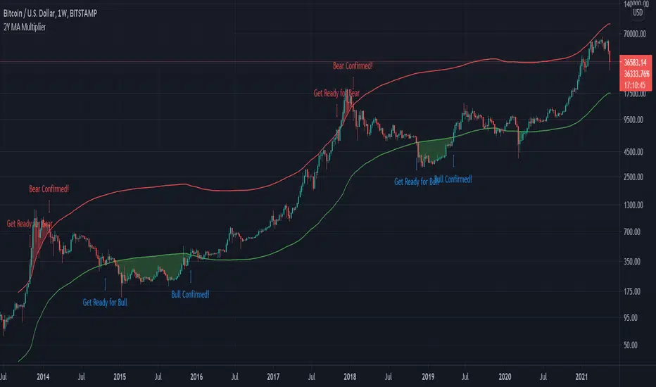
Bitcoin 2-Year MA Multiplier by GodtrixHi guys, I found this tool very useful and accurate, but can't find it on Trading View, so I made one for myself and everyone here ;)
Alert is available too.
Indicator Overview
The 2-Year MA Multiplier is intended to be used as a long term investment tool.
It highlights periods where buying or selling Bitcoin during those times would have produced outsized returns.
To do this, it uses a moving average (MA) line, the 2yr MA, and also a multiplication of that moving average line, 2yr MA x5.
Note: the x5 multiplication is of the price values of the 2yr moving average, not of its time period.
Buying Bitcoin when price drops below the 2yr MA (green line) has historically generated outsized returns. Selling Bitcoin when price goes above the 2yr MA x 5 (red line) has been historically effective for taking profit.
Why This Happens
As Bitcoin is adopted, it moves through market cycles. These are created by periods where market participants are over-excited causing the price to over-extend, and periods where they are overly pessimistic where the price over-contracts. Identifying and understanding these periods can be beneficial to the long term investor.
This tool is a simple and effective way to highlight those periods.
Credit to & Created By
Philip Swift
Date Created
July 2017
BITSTAMP:BTCUSD
Bitcoin Market Cap Gained per Dollar Invested (@BTC_JackSparrow)A model that estimates how much Bitcoin's market cap moves per dollar invested
The higher the market cap of Bitcoin goes per dollar invested, the more likely it is that profit taking will happen and a sign of supply running out
Once supply has run out, the market has effectively completed a full accumulation to distribution profit taking cycle, aka the top
Parabolic moves see strong overvaluation of the explicit fully dilluted market cap vs the realised market cap
Realised market cap in this indicator is not its strict interpretation, but a twisted Gann based interpretation given lack of more detailed on-chain data
Cycles are governed by mathematical supply ownership boundaries between strong and weak hands
The sheer beauty of this indicator shows how organic and effective Bitcoin oscillates supply ownership (full speed adoption with mathematical supply boundaries), whilst following the Golden Ratio with precision

Bitcoin future premiumsThis shows the actual premium or the deviation between chosen active bitcoin futures and the bitcoin perpetual price as a representation of the underlying bitcoin price.
It's centered around zero meaning the futureprice and the perpetual contract are the same.
This simple indicator can for example be used to indentify sentiment in the market.
Please make sure you fill out active contracts in the settings for this indicator to work.
Bitcoin Fat Volume IndicatorBitcoin Fat Volume Indicator
The script displays aggregate sums of Bitcoin dollar and Tether market volumes separately as follows:
USD markets (blue): gemini, coinbase, okcoin, kraken, bitfinex, bitstamp, btce, mtgox
Tether markets (orange): huobi, binance, bittrex, poloniex, hitbtc
The indicator should work on all time frames on any chart so long as volume data exists. Obviously for full history use Bitcoin Liquid Index.
The indicator is slow that's why I'm not including other stable coins or fiat markets at present.
Use settings to turn off Tether or USD bars as desired.

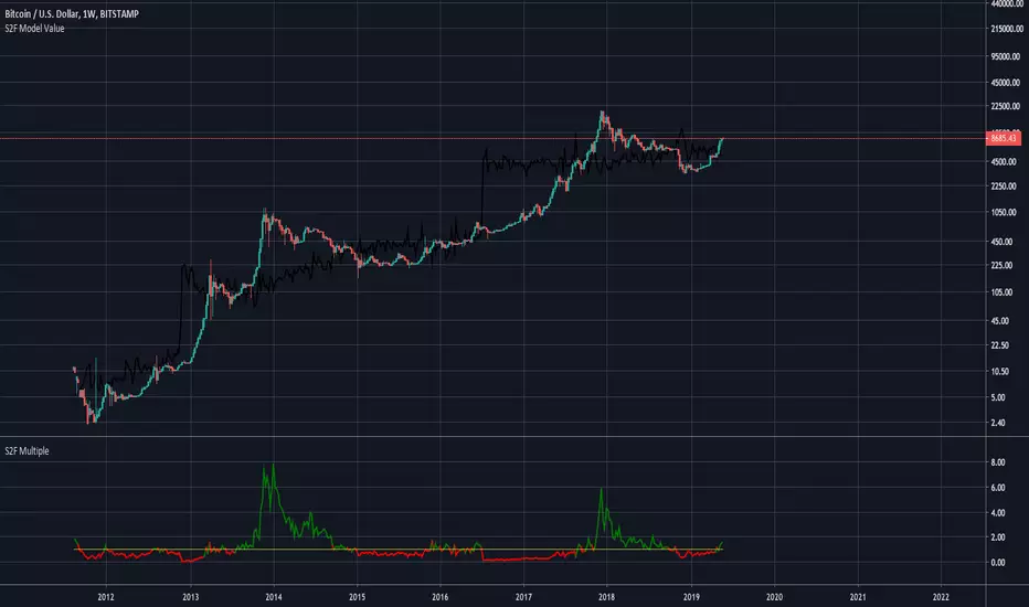
Bitcoin Stock To Flow Model Value (fixed)This indicator shows the Bitcoin value based on the Stock To Flow Model by planB
Fixed version of the original script by yomofoV:
Split up into 2 seperate indicators so you can put it into two seperate panes. This is the S2F Model Value.
You can find the S2F Multiple indicator here:
Exponential Bollinger BandsThese Bollinger Bands are exponential because the variance is calculated using the exponential moving average, rather than just adding the normal standard deviation to the ema. This may be more useful because the exponential standard deviation should be more sensitive to near term increases or decreases in volatility.
Please do not forget that Bollinger Bands should always be combined with another method of analysis. Bollinger Bands just provide an easy way to gauge where the price could range in. At 2 standard deviations of a continuously random variable, more than 98% of data points are in this range. I am however going to test this in excel to get the average number of data points that stay in the range for Bitcoin. I will upload my findings when I complete that. Please monitor this description if your interested.
Bitcoin Weekend FadeThis indicator is a tool for setting a bias based on weekend price movements, with the assumption that the crypto market often experiences stronger moves over the weekend due to thinner order books. It helps identify potential fade opportunities, suggesting that price movements from Saturday and Sunday may reverse during the weekdays.
How to use:
Sets a bias based on weekend price action.
Sets a bias based on weekend price action.
Use weekday price action for confirmation before acting on the bias.
Best suited for range-bound markets, where the price tends to revert to the mean.
Avoid fading high-timeframe breakouts, as they often indicate strong trends.

Bitcoin Power Law Bayesian Fit with Residual HistogramTitle: Bayesian Bitcoin Power Law Indicator with Residuals Histogram
Description:
This Pine Script implements a Bitcoin (BTC) price indicator based on a power-law relationship between BTC price and time, modeled using Bayesian regression.
Bayesian regression is one of the most robust regression methods.
The indicator provides a robust framework for understanding BTC price trends, highlighting key statistical levels, based on deviation from the power law trend and visualizing the bimodal nature of BTC price behavior through a residual distribution histogram (distribution of the deviation from the Bayesian power law trend).
Features:
Power Law Model with Confidence Levels:
Models BTC price as a power-law function of time using Bayesian regression, displaying the median trendline.
Includes multiple confidence intervals to reflect statistical uncertainty.
Plots a support power-law line, set at 2 standard deviations below the median trend, serving as a critical lower bound for price expectations.
Bimodal Residual Histogram:
Displays a histogram in a lower panel, illustrating the distribution of model residuals (difference between actual BTC price and the power-law model) over a default 100-day window (user-configurable). This is one of the most innovative components of this indicator because it highlights the current shape of the distribution of recent deviations.
Highlights the bimodal nature of BTC price behavior, with two distinct regimes:
Core Power Law: Represents periods (approximately 2 years) when BTC price closely follows the power-law trend, typically when below the median power-law line.
Turbulent Flow BTC: Captures periods when BTC price is above the median power-law line, exhibiting more chaotic, bull-run behavior.
The histogram provides a range of possible prices based on the observed residual distribution, aiding in probabilistic price forecasting.
These analogies with fluid dynamics are part of the power law framework based on parallels in financial physics.
Purpose:
This indicator is designed for traders and analysts seeking to understand BTC price dynamics through a statistically grounded power-law model. The confidence levels and support line offer clear benchmarks for trend and support analysis, while the bimodal histogram provides insight into whether BTC is in a stable "Core Power Law" phase or a volatile "Turbulent Flow" phase, enabling better decision-making based on market regime.
Usage Notes:
Use the histogram to determine whether BTC is in the Core Power Law (below the power-law trend) or Turbulent Flow (above the trend) regime to contextualize price behavior.
Adjust the residual window (default 100 days) to analyze different timeframes for the distribution.
The support power-law line (2 standard deviations below) serves as a critical level for identifying potential price floors.

Bitcoin Global Premium Index (Coinbase + Korea)This indicator is designed to analyze regional investor sentiment and capital flow, by comparing the price premium of Bitcoin on two major regional exchanges:
Coinbase (USA) – representing North American demand.
Upbit (Korea) – representing South Korean retail and institutional sentiment.
It calculates how much higher or lower BTC is trading on those exchanges compared to the global reference price (Binance), and shows you who is leading the market sentiment.
🧠 Core Idea:
When a specific region is paying more for BTC than the global average, it indicates strong local demand, often driven by investor emotion (FOMO) or institutional activity.
🧮 How the Indicator Works:
✅ 1. Price Inputs:
Reference Price: Binance BTC/USDT (used as global baseline).
Coinbase Price: BTC/USD from Coinbase.
Korea Price: BTC/KRW from Upbit, converted to USD using your manual KRW/USD rate.
✅ 2. Premium Calculation:
For both Coinbase and Korea:
text
Copy
Edit
Premium (%) = ((Local Price - Global Price) / Global Price) * 100
This shows how much more (or less) BTC costs in each region.
✅ 3. Smoothing:
Both premium values are smoothed using a Simple Moving Average (default 20-period) to reduce noise.
🎨 Visual Components on the Chart:
Element Description
Orange Line Coinbase Premium – how much Americans are overpaying or underpaying.
Teal Line Korea Premium – how much Koreans are overpaying or underpaying.
Green Background USA (Coinbase) is leading the market sentiment.
Blue Background Korea (Upbit) is leading the market sentiment.
Gray Line at 0% Neutral level – no premium.
Dashed Lines Thresholds to detect meaningful deviations (e.g., +0.5%, -0.5%).
📈 How to Use It:
🟢 When Coinbase Premium > Korea Premium and > Threshold:
Market is being driven by U.S. buyers.
Often indicates institutional entry or strong bullish sentiment from the West.
May suggest a long-term bullish trend forming.
🔵 When Korea Premium > Coinbase Premium and > Threshold:
Market is being driven by Korean retail or whales.
Can indicate local FOMO or speculative mania.
Historically, high Korean premium has preceded market tops.
🛑 When both premiums fall below 0%:
Market is cooling down or experiencing capital outflow.
May signal incoming correction.
⚙️ Customizable Inputs:
krwUsdRate: Manually adjust the exchange rate for accuracy (default: 1350).
maLen: Adjust the smoothing period to reduce noise or respond faster.
threshold: Define what is considered a "significant" premium or discount.

Bitcoin Aggregated Volume Profile «NoaTrader»If you use volume profile for analyzing Bitcoin, you may know that sometimes the decisions of big CEXs like Binance can change the volume of each symbol and so the analysis perceived from the data (which may not be valid anymore); Like when Binance decided to transfer the free transaction fee promotion from BTCUSDT to BTCTUSD pair or the new introduced BTCFDUSD pair with volume market share as much as BTCTUSD after only 1 month (according to the coinmarketcap's data).
This indicator tries to solve that problem for using volume profile. So, it collects all the volumes of different pairs from different exchanges and then uses all of them to calculate the volume profile.
Also, there is an option to compare the current symbols volume to the whole volume profile which is a Boolean option in the settings (the picture above)
The aggregated volume data includes:
BINANCE:BTCUSDT
BINANCE:BTCTUSD
BINANCE:BTCBUSD
BINANCE:BTCFDUSD
BINANCE:BTCDAI
BINANCE:BTCEUR
BITSTAMP:BTCUSDT
BITSTAMP:BTCUSD
COINBASE:BTCUSDT
COINBASE:BTCUSD
COINBASE:BTCEUR
HUOBI:BTCUSDT
KUCOIN:BTCUSDT
KRAKEN:XBTUSD
KRAKEN:XBTEUR
BITFINEX:BTCUSD
BYBIT:BTCUSDT
KRAKEN:BTCUSD
OKX:BTCUSDT
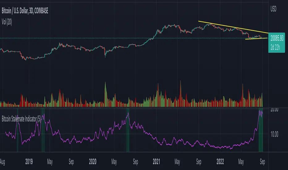
Bitcoin Stalemate IndicatorThe Bitcoin Stalemate Indicator examines periods in the market defined by a combination of high volume and low price volatility. These periods are a bit like a tug-of-war with both sides applying a lot of force but the rope moving very little. Periods of high volume and low volatility suggest both sides of the trade are stuck in a stalemate. This indicator may be useful in identifying psychologically important price levels.
The mechanics of the indicator are fairly simple: the indicator takes the volume and divides it by the candle’s size over it’s close for that same period.
volume / ((high - low) / close)
Candles that move very little but with high volume will produce higher reads and vice versa. Finally a smoothing average is applied to clean up the noise.
Volume profiles from the top 6 exchanges are averaged in order to avoid a single exchange’s popularity acting as an overriding factor. Single exchanges can be isolated but are of lesser use. Heat map functionality is only active when all exchanges are selected.
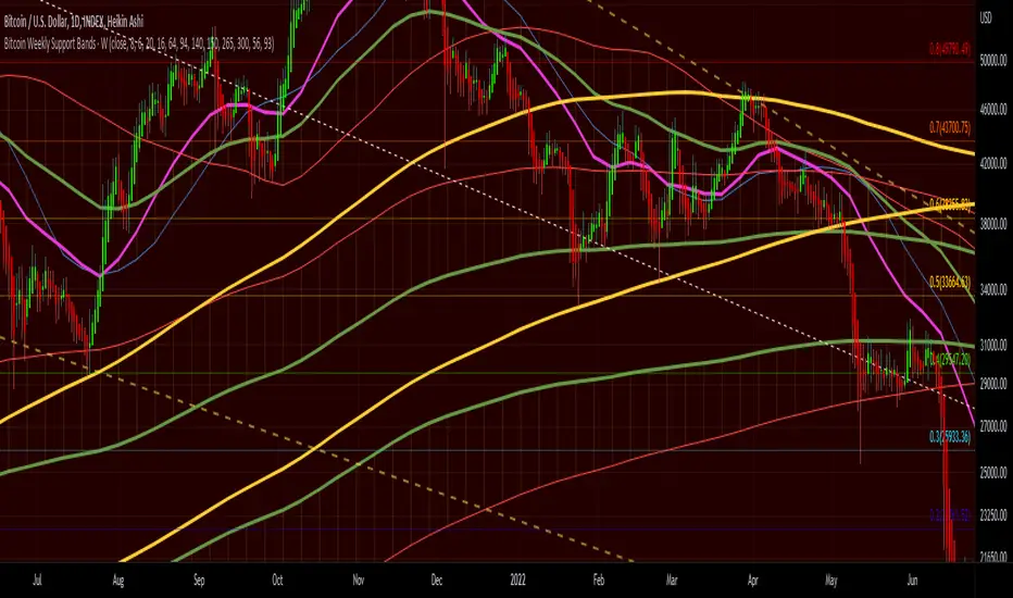
Bitcoin Weekly Support BandsMy first ever attempt at a custom script. I took Benjamin Cowen's concept of the Bitcoin Bull Market Support Band and applied it to the 100 week and 200 week moving averages. I also added in the 300 week sma. I mainly wanted to have all these in one indicator.
Bitcoin Bottom Detector: W TimeframeUse this indicator in the weekly time frame:
One of the most widely used indicators for identifying the Bitcoin market bottom is the 200-week moving average. This indicator works based on the ratio of price to the value of the 200-week moving average. When the indicator enters the lower blue part (overflow area), it indicates the bitcoin is in the bottom of the market.

Bitcoin Price Temperature: Weekly TimeframeUse this oscillator at weekly timeframes:
The Bitcoin Price Temperature (BPT) is an oscillator that models the number of standard deviations the price has moved away from the 4-yr moving average. This seeks to establish a mean reversion model based on the cyclical nature of Bitcoin halving and investment cycles. The BPT bands then establish price levels that coincide with specific standard deviation multiples to identify fair and extreme valuations.
Coined By:
DilutionProof
Interpretation:
Values above 6 indicate extremely high price areas: (TOP OF THE MARKET)
Areas below 0.2 indicate extremely low price areas: (BOTTOM OF THE MARKET)

Bitcoin Spot PremiumPlots the difference between the Bitcoin Spot price and the average of 7 Futures prices.
The idea being that Spot leads the market, and when Spot is priced significantly higher than Futures, price should increase. And vice-versa.
Possible uses:
Sharp changes could indicate a reversal is coming
A consistently large premium can be used as additional validation of trend continuation
Divergences may help identify trend exhaustion
If you find a strategy that works well with this indicator, I'd love to know. Enjoy!
