Real Time UVXY Spike Level TrackerKey Features
Real Time All-Time Low Tracking: Continuously updates the ATL using daily timeframe data.
Multiple Spike Levels: Displays +20%, +50%, +75%, and +100% levels above the ATL.
Real-Time Spike Percentage: Shows current distance from ATL in an easy-to-read table.
Understanding the Chart Lines
Red Line (ATL): The all-time low baseline. This is your reference point for measuring volatility spikes.
Yellow Line (+20%): First level of moderate volatility increase. Minor market stress or routine volatility expansion.
Blue Line (+50%): Significant volatility event. Indicates elevated market concern or technical dislocation.
Purple Line (+75%): Major volatility spike. Typically coincides with substantial market selloffs or uncertainty.
Fuchsia Line (+100%): Extreme volatility event. Rare occurrences associated with market crashes, black swan events, or severe panic.
The Data Table Displays: Current Spike %: Real-time percentage showing how far price is above the ATL (highlighted in green)
Level Column: Each spike threshold level
Price Column: Exact price at each level for quick reference
Understanding UVXY spike levels is valuable for several reasons:
Market Timing & Entry/Exit Points UVXY typically experiences extreme spikes during market panics or crashes. Knowing historical spike levels helps you:
Identify extreme fear levels - When UVXY hits unusually high levels, it often signals peak panic and potential market bottoms
Avoid chasing volatility - Understanding what constitutes an "extreme" spike prevents buying in after the move is already exhausted Mean Reversion Trading
UVXY has a strong tendency to decay over time due to its leveraged structure and the contango in VIX futures. Spike levels matter because:
High probability reversals - When UVXY reaches extreme levels (say 2-3x normal), there's historically been a high probability of reversion
Risk/reward assessment - You can better evaluate whether a short position or volatility-selling strategy makes sense Leveraged ETF enthusiasts and volatility traders often use specific spike percentages as triggers to open short positions. For example, some traders might short when UVXY spikes 5-50%+ in a week or reaches certain percentage thresholds, betting on the inevitable decay back down
In den Scripts nach "Volatility" suchen

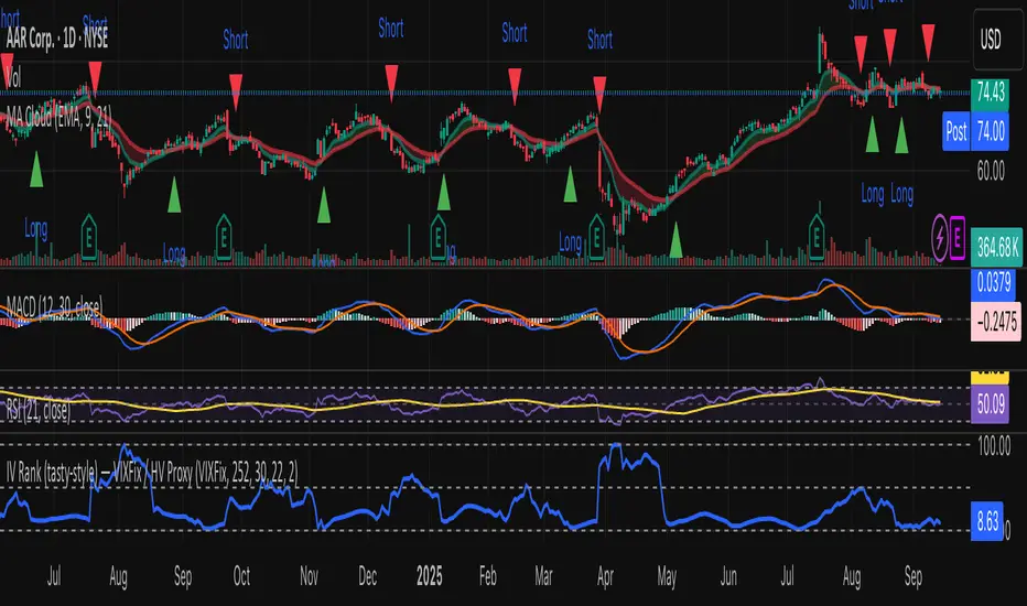
IV Rank (tasty-style) — VIXFix / HV ProxyIV Rank (tasty-style) — VIXFix / HV Proxy
Overview
This indicator replicates tastytrade’s IV Rank calculation—but built entirely inside TradingView.
Because TradingView does not expose live option-chain implied volatility, the script lets you choose between two widely used price-based IV proxies:
VIXFix (Williams VIX Fix): a fast-reacting volatility estimate derived from price extremes.
HV(30): 30-day annualized historical volatility of daily log returns.
The goal is to approximate the “rich vs. cheap” option volatility environment that traders use to decide whether to sell or buy premium.
Formula
IV Rank answers the question: Where is current implied volatility relative to its own 1-year range?
𝐼
𝑉
𝑅
=
𝐼
𝑉
𝑐
𝑢
𝑟
𝑟
𝑒
𝑛
𝑡
−
𝐼
𝑉
1
𝑦
𝐿
𝑜
𝑤
𝐼
𝑉
1
𝑦
𝐻
𝑖
𝑔
ℎ
−
𝐼
𝑉
1
𝑦
𝐿
𝑜
𝑤
×
100
IVR=
IV
1yHigh
−IV
1yLow
IV
current
−IV
1yLow
×100
IVcurrent: Current value of the chosen IV proxy.
IV1yHigh/Low: Highest and lowest proxy values over the user-defined lookback (default 252 trading days ≈ 1 year).
IVR = 0 → Current IV equals its 1-year low
IVR = 100 → Current IV equals its 1-year high
IVR ≈ 50 → Current IV sits mid-range
How to Use
High IV Rank (≥50–60%)
Options are relatively expensive → short-premium strategies (credit spreads, iron condors, straddles) may be more attractive.
Low IV Rank (≤20%)
Options are relatively cheap → long-premium strategies (debit spreads, calendars, diagonals) may offer better risk/reward.
Combine with your own analysis, liquidity checks, and risk management.
Inputs & Customization
IV Source: Choose “VIXFix” or “HV(30)” as the volatility proxy.
IVR Lookback: Rolling window for 1-year high/low (default 252 trading days).
VIXFix Parameters: Length and stdev multiplier to fine-tune sensitivity.
Info Label: Optional on-chart label displays current IV proxy, 1-year high/low, and IV Rank.
Alerts: Optional alerts when IVR crosses 50, falls below 20, or rises above 80.
Notes & Limitations
This indicator does not pull real option-chain IV.
It provides a close structural analogue to tastytrade’s IV Rank using price-derived proxies for markets where options data is not directly available.
For live option IV, use broker platforms or third-party data feeds alongside this script.
Tags: IV Rank, Implied Volatility, Tastytrade, VIXFix, Historical Volatility, Options, Premium Selling, Debit Spreads, Market Volatility
ROC+ADX Trend & Momentum System### Code Analysis: ROC+ADX Trend & Momentum System (v5 Pine Script)
#### **Core Function**
This Pine Script indicator integrates **Rate of Change (ROC)** and **Average Directional Index (ADX)** to build a professional trend-momentum trading system, which identifies trend strength, momentum changes, price divergences and generates actionable long/short trading signals for financial markets (stocks, crypto, forex). It features coordinated visual display, adaptive volatility adjustment and a comprehensive scoring mechanism for trend evaluation.
#### **Key Features (Concise)**
1. **Hybrid Indicator Logic**
Combines **ROC (12/6-period, EMA-smoothed)** (measures price momentum) and **ADX (14-period)** (identifies trend strength/direction, with +DI/-DI for trend bias), forming a dual-dimension analysis of trend + momentum.
2. **Adaptive Dynamic Threshold**
Adjusts momentum thresholds in real time based on **14-period ATR volatility**; higher market volatility raises thresholds, lower volatility lowers them, ensuring signal accuracy across different market conditions.
3. **Multi-Category Trading Signals**
Generates 4 core signal types: trend breakout (long/short), momentum boost/drop, trend reversal, and price-ROC bullish/bearish divergence, all filtered by ADX trend validity.
4. **Comprehensive Trend Scoring System**
Calculates a **0-100 trend score** (integrates ADX strength, ROC momentum, direction consistency, momentum persistence) and classifies trend intensity into 5 levels (Extreme/Strong/Medium/Weak/None).
5. **Coordinated Visual Display**
Supports scalable unified display for ROC & ADX values (custom scale factors), with color-coded lines, momentum histograms, heatmap background and reference lines for intuitive trend judgment.
6. **Informative Dashboard & Alerts**
Embeds a top-right info panel showing real values (ROC, ADX, volatility), trend level and active signals; includes multi-tier alert conditions for all key signals (breakout, reversal, divergence).
7. **High Customizability**
Full input configurability for all core parameters (periods, thresholds, scale factors) and visual toggles (show/hide ROC/ADX, signals, heatmap, reference lines).
#### **Technical Highlights**
- Uses EMA smoothing for ROC/ADX to reduce false signals;
- Identifies ROC momentum & acceleration for precise trend phase judgment;
- ADX grading (strong/weak/oscillation) filters invalid signals in sideways markets;
- Color-coded elements (lines, histograms, heatmap) reflect real-time trend/momentum status;
- Non-overlay layout ensures clear separation from price charts, optimized for multi-screen analysis.

RV − IV Spread Alert (SPY vs VIX)Realized vs Implied Volatility Spread (RV − IV) for the S&P 500 / SPY.
Plots the daily difference between 30-day realized volatility (SPY) and implied volatility (VIX) in basis points.
Key insight from the research: when the spread turns and stays above ≈ +50 bps, forward returns historically degrade and volatility of returns rises sharply — a useful early-warning regime flag.
Features:
- Clean daily plot of RV − IV in bps
- Horizontal lines at 0, −50 bps and +50 bps
- Red background when spread > +50 bps
- Built-in alert condition that fires once per bar close when spread closes above +50 bps
- Optional “all-clear” alert when it drops back below
Use on SPY or ES1! daily chart. Perfect for anyone wanting a simple notification when the market enters the “risk-on” volatility regime highlighted by Machina Quanta and the original Bali & Hovakimian (2007) paper.

BB Expansion Oscillator (BEXO)BB Expansion Oscillator (BEXO) is a custom indicator designed to measure and visualize the expansion and contraction phases of Bollinger Bands in a normalized way.
🔹 Core Features:
Normalized BB Width: Transforms Bollinger Band Width into a 0–100 scale for easier comparison across different timeframes and assets.
Signal Line: EMA-based smoothing line to detect trend direction shifts.
Histogram: Highlights expansion vs contraction momentum.
OB/OS Zones: Detects Over-Expansion and Over-Contraction states to spot potential volatility breakouts or squeezes.
Dynamic Coloring & Ribbon: Visual cues for trend bias and crossovers.
Info Table: Displays real-time values and status (Expansion, Contraction, Over-Expansion, Over-Contraction).
Background Highlighting: Optional visual aid for trend phases.
🔹 How to Use:
When BEXO rises above the Signal Line, the market is in an Expansion phase → potential trend continuation.
When BEXO falls below the Signal Line, the market is in a Contraction phase → potential consolidation or trend weakness.
Overbought/Over-Expansion zone (above OB level): Signals high volatility; watch for possible reversal or breakout exhaustion.
Oversold/Over-Contraction zone (below OS level): Indicates a squeeze or low volatility; often precedes strong breakout moves.
🔹 Best Application:
Identify volatility cycles (squeeze & expansion).
Filter trades by volatility conditions.
Combine with price action, volume, or momentum indicators for confirmation.
⚠️ Disclaimer:
This indicator is for educational and research purposes only. It should not be considered financial advice. Always combine with proper risk management and your own trading strategy.

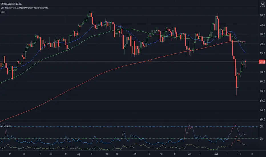
VIX SPX & XJOVix is a volatility indicator that lets traders know when to be cautious.
This indicator shows the volatility for the US market as well as the Australian market on seperate lines.
Blue lines are Vix for SPX (S&P 500)
If blue indicator goes above 30, high volatility is present and caution should be taken.
Green lines are Vix for XJO (ASX 200)
If green indicator goes above 20, high volatility is present and caution should be taken.
Sortino RatioThe Sortino ratio is a variation of the Sharpe ratio that differentiates harmful volatility from total overall volatility using the asset's standard deviation of negative portfolio returns—downside deviation—instead of the total standard deviation of portfolio returns. The Sortino ratio takes an asset or portfolio's return and subtracts the risk-free rate and then divides that amount by the asset's downside deviation. The ratio was named after Frank A. Sortino.
What Can the Sortino Ratio Tell You?
The Sortino ratio is useful for investors, analysts, and portfolio managers to evaluate an investment's return for a given level of bad risk. Since this ratio uses only the downside deviation as its risk measure, it addresses the problem of using total risk, or standard deviation, which is important because upside volatility is beneficial to investors and isn't a factor most investors worry about.
The Difference Between the Sortino Ratio and the Sharpe Ratio
The Sortino ratio improves upon the Sharpe ratio by isolating downside or negative volatility from total volatility by dividing excess return by the downside deviation instead of the total standard deviation of a portfolio or asset.
The Sharpe ratio punishes the investment for good risk, which provides positive returns for investors. However, determining which ratio to use depends on whether the investor wants to focus on total or standard deviation or just downside deviation.
CONCLUSION: THE HIGHER THE RATIO, THE BETTER IT IS.
Note: The default risk-free rate is based on the Malaysian rate. Please change based on your country rate.
Note: The default length is based on 1 year Malaysia trading day (11/6/2020 - 11/6/2021).
Note: Sortino ratio is good for assessing a long-term investment, and thus, please use a longer time frame to get a better risk assessment.
Please let me know if this script contains any mistake. Cheers!

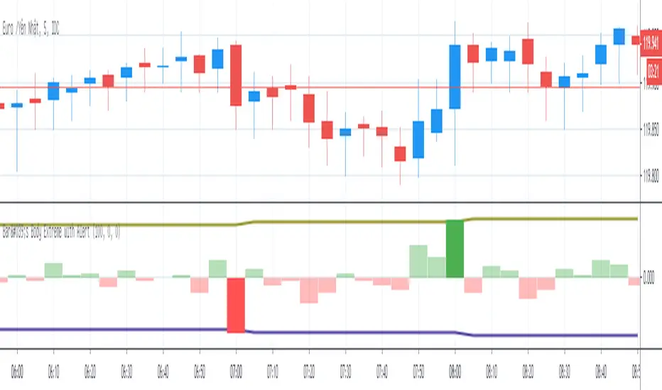
Bar's Body Extreme with AlertBar's Body Extreme with Alert measure volatility of bar's body and caculate extreme level in specified periods or custom level with alert. Detail options below:
1. Default Extreme Level
* Default level is the +/- highest volatility of bar's body in 100 periods
* Periods of bar to calculate default extreme adjustable
2. Custom Extreme
* Default Extreme Top auto disable if Custom Extreme Top >0
* Default Extreme Bottom auto disable if Custom Extreme Bottom <0
3. Alert
* Extreme alert: body's volatility > Extreme top level or body's volatility < Extreme bottom level
* Extreme Top Alert: body's volatility > Extreme top level
* Extreme Bottom Alert: body's volatility < Extreme bottom level
Defense Mode Dashboard ProWhat it is
A one‑look market regime dashboard for ES, NQ, YM, RTY, and SPY that tells you when to play defense, when you might have an offense cue, and when to chill. It blends VIX, VIX term structure, ATR 5 over 60, and session gap signals with clean alerts and a compact table you can park anywhere.
Why traders like it
Because it filters out the noise. Regime first, tactics second. You avoid trading size into landmines and lean in when volatility cooperates.
What it measures
Volatility stress with VIX level and VIX vs 20‑SMA
Term structure using VX1 vs VX2 with two modes
Diff mode: VX1 minus VX2
Ratio mode: VX1 divided by VX2
Realized volatility using ATR5 over ATR60 with optional smoothing
Session risk from RTH opening gaps and overnight range, normalized by ATR
How to use in 30 seconds
Pick a preset in the inputs. ES, NQ, YM, RTY, SPY are ready.
Leave thresholds at defaults to start.
Add one TradingView alert using “Any alert() function call”.
Trade smaller or stand aside when the header reads DEFENSE ON. Consider leaning in only when you see OFFENSE CUE and your playbook agrees.
Defaults we recommend
VIX triggers: 22 and 1.25× the 20‑SMA
Term mode: Diff with tolerance 0.00. Use Ratio at 1.00+ for choppier markets
ATR 5/60 defense: 1.25. Offense cue: 0.85 or lower
ATR smoothing: 1. Try 2 to 3 if you want fewer flips
Gap mode: RTH. Turn Both on if you want ON range to count too
RTH wild gap: 0.60× ATR5. ON wild range: 0.80× ATR5
Alert cadence: Once per RTH session
Snooze: Quick snooze first 30 minutes on. Fire on snooze exit off, unless you really want the catch‑up ping
New since the last description
Multi‑asset presets set symbols and RTH windows for ES, NQ, YM, RTY, SPY
Term ratio mode with near‑flat warning when ratio is between 1.00 and your trigger
ATR smoothing for the 5 over 60 ratio
RTH keying for cadence, so “Once per RTH session” behaves like a trader expects
Snooze upgrades with quick snooze tied to the first N minutes of RTH and an optional fire‑on‑snooze‑exit
Compact title merge and user color controls for labels, values, borders, and background
Exposed series for integrations: DefenseOn(1=yes) and OffenseCue(1=yes)
Debug toggle to visualize gap points, ON range, and term readings
Stronger NA handling with a clear “No core data” row when feeds are missing
Notes
Dynamic alerts require “Any alert() function call”.
Works on any chart timeframe. Daily reads and 1‑minute anchors handle the regime logic.

[blackcat] L1 Extreme Shadows█ OVERVIEW
The Pine Script provided is an indicator designed to detect market volatility and extreme shadow conditions. It calculates various conditions based on simple moving averages (SMAs) and plots the results to help traders identify potential market extremes. The primary function of the script is to provide visual cues for extreme market conditions without generating explicit trading signals.
█ LOGICAL FRAMEWORK
Structure:
1 — Input Parameters:
• No user-defined input parameters are present in this script.
2 — Calculations:
• Calculate Extreme Shadow: Checks if the differences between certain SMAs and prices exceed predefined thresholds.
• Calculate Buy Extreme Shadow: Extends the logic by incorporating additional SMAs to identify stronger buy signals.
• Calculate Massive Bullish Sell: Detects massive bullish sell conditions using longer-term SMAs.
3 — Plotting:
• The script plots the calculated conditions using distinct colors to differentiate between various types of extreme shadows.
Data Flow:
• The close price is passed through each custom function.
• Each function computes its respective conditions based on specified SMAs and thresholds.
• The computed values are then summed and returned.
• Finally, the aggregated values are plotted on the chart using the plot function.
█ CUSTOM FUNCTIONS
1 — calculate_extreme_shadow(close)
• Purpose: Identify extreme shadow conditions based on 8-period and 14-period SMAs.
• Functionality: Computes the difference between the 8-period SMA and the close price, and the difference between the 14-period SMA and the 4-period SMA, relative to the 6-period SMA. Returns 2 if both conditions exceed 0.04; otherwise, returns 0.
• Parameters: close (price series)
• Return Value: Integer (0 or 2)
2 — calculate_buy_extreme_shadow(close)
• Purpose: Identify more robust buy signals by evaluating multiple SMAs.
• Functionality: Considers the 8-period SMA along with additional SMAs (21, 42, 63, 84, 105) and combines multiple conditions to provide a comprehensive buy signal.
• Parameters: close (price series)
• Return Value: Integer (sum of conditions, ranging from 0 to 14)
3 — calculate_massive_bullish_sell(close)
• Purpose: Detect massive bullish sell conditions using longer-term SMAs.
• Functionality: Evaluates conditions based on the 8-period SMA and longer-term SMAs (88, 44, 22, 11, 5), returning a sum of conditions meeting specified thresholds.
• Parameters: close (price series)
• Return Value: Integer (sum of conditions, ranging from 0 to 10)
█ KEY POINTS AND TECHNIQUES
• Advanced Pine Script Features:
• Multiple Nested Conditions: Uses nested conditions to assess complex market scenarios.
• Combination of Conditions: Combines multiple conditions to provide a more reliable signal.
• Optimization Techniques:
• Thresholds: Employs specific thresholds (0.04 and 0.03) to filter out noise and highlight significant market movements.
• SMA Comparisons: Compares multiple SMAs to identify trends and extreme conditions.
• Unique Approaches:
• Combining Multiple Time Frames: Incorporates multiple time frames to offer a holistic view of the market.
• Visual Distinction: Utilizes different colors and line widths to clearly differentiate between various extreme shadow conditions.
█ EXTENDED KNOWLEDGE AND APPLICATIONS
• Potential Modifications:
• User-Defined Thresholds: Allow users to customize thresholds to align with personal trading strategies.
• Additional Indicators: Integrate other technical indicators like RSI or MACD to improve the detection of extreme market conditions.
• Entry and Exit Signals: Enhance the script to generate clear buy and sell signals based on identified extreme shadow conditions.
• Application Scenarios:
• Volatility Analysis: Analyze market volatility and pinpoint times of extreme price action.
• Trend Following: Pair with trend-following strategies to capitalize on significant market moves.
• Risk Management: Adjust position sizes or stop-loss levels based on detected extreme conditions.
• Related Pine Script Concepts:
• Custom Functions: Demonstrates how to create reusable functions for simplified and organized code.
• Plotting Techniques: Shows effective ways to visualize data using color and styling options.
• Multiple Time Frame Analysis: Highlights the benefits of analyzing multiple time frames for a broader market understanding.

MA FilterMA Filter is a volatility indicator inspired by the Braid Filter and WAE indicators.
Calculation:
Is absolute value of > m*ATR(n2) ?
where...
n - sma length
m - atr multiplier
n2 - atr length
If yes, high volatility, histogram is orange, trading is allowed.
If no, low volatility, histogram is grey, trading is not allowed.
Enjoy ;)

ATR% The average true range / close price of previous barThe ATR% is an indicator to measure the increased volatility comparing with the past period.
1. Default is 14 bars, but we can switch to 21 or 7.
2. For the smoothing method, by default using simple moving average, but EMA, WMA and RMA is an option.
3. if over 1.5%, we consider the volatility increased significantly.
4. Combine ATR%, Stock screening (notional and volatility ) with 1-3 min chart, it's very easy to catch the sudden price movement for Japan Equities. hope you find it useful.

Variation OscillatorThe Variation Oscillator is a volatility-type indicator.
This indicator is based on a statistical measure known as coefficient of variation (COV).
COV is a standardized measure of dispersion for a set of values.
COV = 100 * standard deviation / mean
This oscillator measures the difference between COV and its sma and plots this difference.
Formula: Oscillator value = COV - sma of COV
The oscillator is positive when COV is greater than its sma.
The oscillator is negative when COV is lesser than its sma.
How to interpret the indicator's values:
Positive : the current volatility is higher than normal and trading is permitted.
Negative : the current volatility is lower than normal and trading is NOT permitted.
Recommended settings:
Cov = 10
Sma = between 20 and 100
*** If you're reading this and you find this indicator interesting, hit the like button and follow me!
*** Also comments are welcomed!
Happy trading!

VIX Stoch RSI Oscillator [HUD Box + Compression]vix stoch rsi Oscillator
watch volatility without switching charts,
gives signal based off fib levels 0-100 / volatility,
emoji box to show signal,
HUD Box: emoji-coded tactical feedback
bounce 100 "💥 Expansion" :
bounce 0.8 "🔴 Overbought" :
bounce 0.618 "📉 Distribution" :
bounce 0.5 "🧠 Midline" :
bounce 0.382 "📈 Accumulation" :
bounce 0.2 "🟢 Oversold" :
bounce0.0 "💣 Expansion" : "⚪ Neutral"
Tiger EMA/STOCH
This logic checks if the oscillator is trending above or below its 48-period EMA,
If above, it paints the line GREEN🟢 (bullish),
If below, it paints it RED🔴 (bearish),
If compression is active, it overrides both with purple🟣 to highlight tactical squeeze conditions,
⚠️WARNING⚠️
ALWAYS REMEMBER THIS CHART IS VIX/USD
IN MOST CASES SPY MOVES VICE VERSA
I AM NOT RESPOSIBLE FOR YOUR OWN ACTIONS/TRADE IDEAS
AMEX:USD
TVC:VIX
SP:SPX

ATR % + Pump Detector📘 **ATR % + Pump Detector (Fixed 0.10%)**
This indicator combines two powerful volatility tools in one:
- **ATR % Display (Blue):**
Calculates the Average True Range as a percentage of price. Triggers an alert when ATR % exceeds **0.10%**, signaling rising volatility and potential breakout conditions.
- **Pump % Detector (Red):**
Measures the percentage change from **open to close** of the current candle. Triggers alerts when the move exceeds **+0.10%** (pump) or **–0.10%** (dump), helping you catch sudden price spikes in real time.
🔹 **Top-right display** shows both metrics in a clean table
🔹 Works on **any timeframe**
🔹 Ideal for **momentum trading, breakout entries**, or filtering low-vol setups
Enhanced High-Low Difference IndicatorEnhanced High-Low Difference Indicator
The "Enhanced High-Low Difference Indicator" is a powerful tool that highlights market volatility by tracking the difference between the high and low prices of a bar. Key features include:
Customizable Threshold: Set your own threshold for the high-low difference to filter out minor fluctuations.
Visual Highlights: Bars that exceed the threshold are highlighted with customizable color and opacity settings for easy identification.
Optional Labels: Display the exact high-low difference on the bars when the threshold is exceeded, with fully customizable label color and size.
High-Low Difference Line: Optionally plot a line that tracks the high-low difference of each bar for visual reference.
Alerts: Receive real-time alerts when the high-low difference exceeds your specified threshold.
Threshold Reference Line: Plot the threshold value as a horizontal reference line on the chart.
This indicator is ideal for traders looking to identify volatility spikes and make informed trading decisions based on price action.

Short-term bubble indicator Script measures the average daily change in price over the previous 90 days and compares it to the average daily change over a longer time period. Assesses if recent volatility is more / less than historical volatility to indicate if the ticker is overbought / oversold.

Alpha Dynamic Momentum Index Pine@v=4- What Is Dynamic Momentum Index?
- The dynamic momentum index is a technical indicator used to determine if an asset is overbought or oversold. It can be used to generate trade signals in trending and ranging markets.
- The dynamic momentum index was developed by Tushar Chande and Stanley Kroll and is similar to the relative strength index (RSI). The main difference between the two is that the RSI uses a fixed number of time periods (usually 14) in its calculation, while the dynamic momentum index uses different time periods as volatility changes, typically between five and 30.
- The number of time periods used in the dynamic momentum index decreases as volatility in the underlying security increases, making this indicator more responsive to changing prices than the RSI. This is particularly useful when an asset's price moves quickly as it approaches key support or resistance levels. Because the indicator is more sensitive, traders can potentially find earlier entry and exit points than with the RSI, but it could also be more prone to whipsaws and false signals.

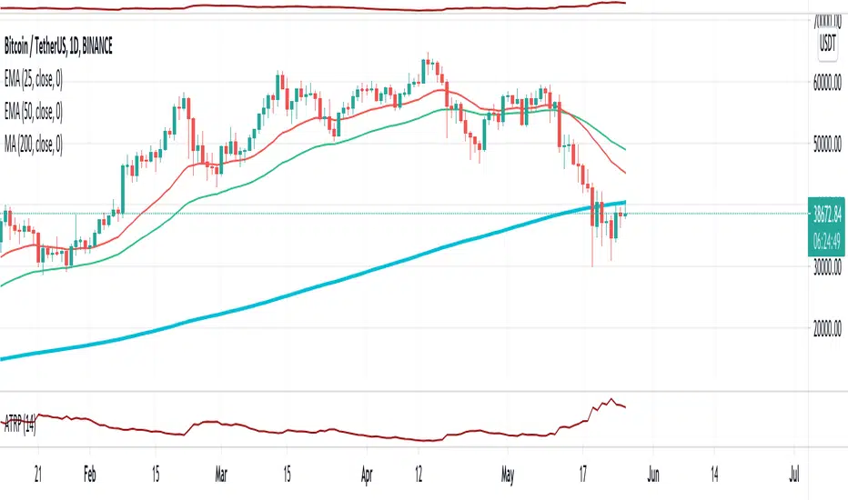
Average True Range NormalizedThis is a modified version of ATR. Instead of having volatility reading as unit price, we have percentage of the current price. Let say currently ATR is at 200 and the current close is 2000. Then this ATR will output 10.0 (10.0% volatility reading).

Average True Range Percentage (ATRP)What is ATRP?
Average True Range Percentage (ATRP) expresses the Average True Range (ATR) indicator as a percentage of a bar’s closing price.
How does this indicator work?
ATRP is used to measure volatility just as the Average True Range (ATR) indicator is. ATRP allows securities to be compared, where ATR does not.
ATR measures volatility at an absolute level, meaning lower priced stock will have lower ATR values than higher price stocks.
ATRP displays the indicator as a percentage, to allow for securities trading at different prices per share to be compared.
Reference: www.fidelity.com
Bvol24hPercentage of the Bitcoin volatility 24h index.
Higher volatility periods tend to create local tops/bottoms.
Enjoy :)

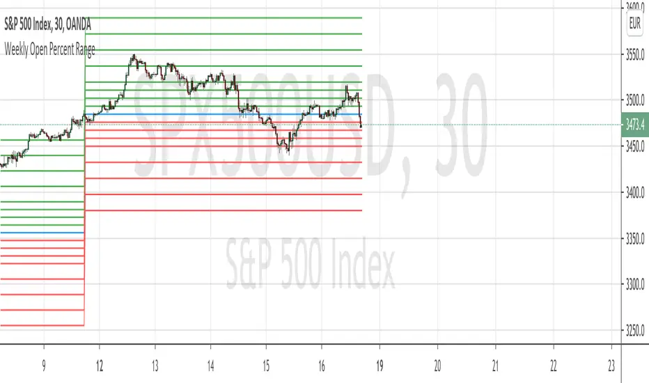
Weekly Open Percent RangeA simple take on finding percentage gain/drop range in a week for ranging or trending market instrument.
This script is hard coded to plot 0 to 3%, -3% range for the week base on instrument weekly open price.
Best to use with measured volatility indicator to gauge the movement of price. Anytime the price goes above the range level then it is likely to be trending. Highly volatile instruments will not find this indicator useful. It is best for heavy instruments like Forex or Indices where range % in a week in a non-volatile move is really quite small that these act as resistances and support.
Range Levels:
3%
2.5%
2%
1.5%
1%
0.75%
0.5%
0.25%
0%
-.25%
-.5%
-.75%
-1%
-1.5%
-2%
-2.5%
-3%
The next step for this indicator is to consider volatility range of instrument and to include this in the percentage zone levels instead of hard coding these.
Intraday (green), overnight (red), sum (blue) We know the volatility has some autocorrelation with yesterday's value.
So we could to guess the daily volatility for the next trading day.
