sVPSA - standardized Volume Price Spread AnalysisDear Analysts and Traders,
I want to introduce my new indicator - sVPSA - standardized Volume Price Spread Analysis. For me, this script is helpfully in Technical Analysis mainly with Wyckoff and VSA methodologies. Maybe You are in circle of people who used my previous script - normalized Volume Price Spread Analysis. I work with him a lot of time, but I come to a conclusion that I can do better...
Theory concept...
What is a big volume? How big was this spread? It was extreme high or just high? How to do an answer for this and a lot other questions related to this subject? My thoughts was directed to statistics. In my first script I used to x/max normalized data. It was good, but susceptible for high deviation events. So, I choose standardization method with smaller sensitivity on violent events - z-Score standardization Description of z-Score formula:
Z = (x-mean)/standard deviation
Probability of event are descriptive by probability density function - The Normal Distribution.
en.wikipedia.org
en.Wikipedia.org
This is base of script methodology, let’s go deeper in indicator.
X axis is time, date. Y axis is standard deviation. Narrow bar represent price spread, wide one is volume. Colors are corresponding to deviation, blue < sigma, green > sigma, red > 2*sigma and fuchsia > 3*sigma. Appearance is full editable.
Data collection starts from left to right. There is two possibilities to use, constans number of bars or visible data range, also indicator permit to overscore linear regression from data. There is a possibility to set an alert.
Short introduction how put an interpretation on visualized data.
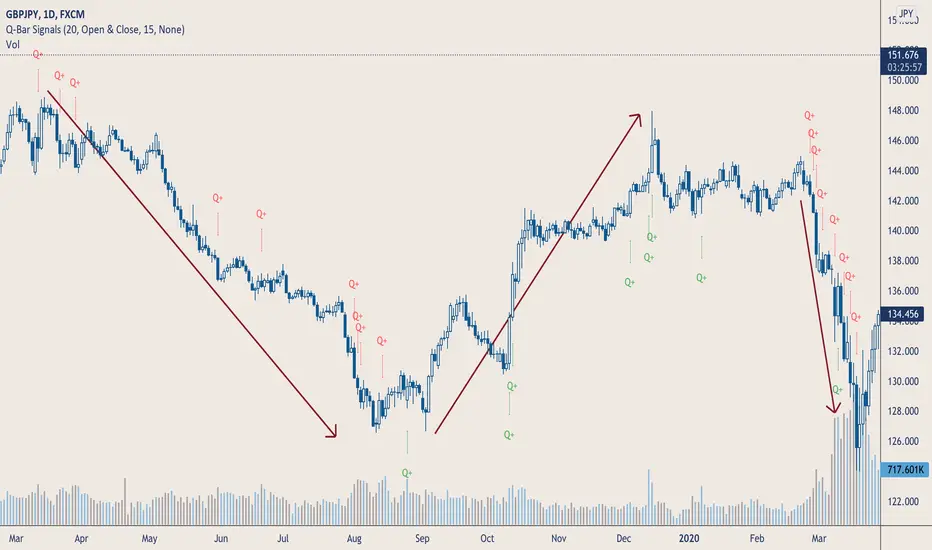
For this example I used constans value of data collection, 52 bars. So, from left I see great, fuchsia volume bar with low spread. This record respond Celsius withdrawals pause. This is bar with the biggest volume on presented chart, more than four sigmas. Spread value is near one sigma. I should consider this via one of Wyckoffs laws - effort vs result. I see a three bars in turn, they tenor tells me that bear market is possible near end. Accumulation structure near new year, spring test and bullish momentum bar near march are approval of this idea. Next high spread bars have volume near mean value. Effort is low but result is great. Interesting is last bar, with -2,8 deviation of volume. I see the lowest volume value on chart, so he’s deviation is strong to negative side. This script require a little of practise and can be a potent tool in Technical Analysis.
If You have a concept how to improve my script or You experience bug, please, send me feedback.
I hope that You consider my work as useful.
I wish You great trades and faultless analysis.
CatTheTrader
In den Scripts nach "VOLUME BAR" suchen
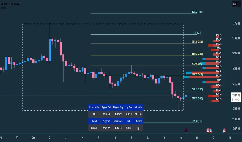
VIPER DOPING - A Volume Profile to estimate trend probabilityDESCRIPTION :
VIPER DOPING uses volume analysis to help trader to understand trading keys below:
Support and Resistance
Profit and Loss
Estimate candle direction
Trend
Biggest Buy and Sell on level prices
HOW TO USE:
The volume bar will have buy and sell colors, by default the buy color is blue and the sell is red. The size of bar is important matter, the biggest bar size means that price level has strong volume or transaction and the smallest bar size indicates the lowest transaction or volume. How to read it?
The bar above the candle is the resistance
The bar below the candle is the support
If you want long the market, find the biggest or bigger support, which is below the candle
If you want short the market, find the biggest or bigger resistance which is above the candle
Trading style and the maximum range (total candle), default is 60. This setup to analyze volumes in specific candle range. Please check the following recommendation based on trading style:
Scalping: 30 - 60 candles, recommendation timeframe: 5m - 1h
Day Trading: 50 - 120 candles, recommendation timeframe: 30m - 4h
Swing Trading: 100- 240 candles, recommendation timeframe: 1h- 3D
The white box is to visualize trading area by total candle. Every line has the meaning:
The left line is the start candle
The right line is the end candle
The top line is the highest price of volume profile
The bottom line is the lowest price of volume profile
The fibonacci line will help you to confirm and compare of supports and resistances with the volume profile lines.
The TABLE CELLS
it contains information to help trader to understand the recent situation of market and to take strategy of trading:
Total Candle : the maximum candles are used to analyze the volume from previous active candle
Biggest Sell : the horizontal price area which has the largest of sell volume of the last total candle
Biggest Buy : the horizontal price area which has the largest of buy volume of the last total candle
Buy Rate : the ratio of buy and sell volume of the last total candle
Support: the closest price to be the support from the active candle, auto changed if support to be invalid
Resistance : the closest price to be the resistance from the active candle, auto changed if support to be invalid
PnL : the percentage profit if you trade using the support and resistance prices and it can be used for Risk Management. Wisely the risk is 50% of the profit, example if the profit 1% the your risk should be 0.5% from entry.
Estimate : to analize the next direction of candle or target, it will be changed automatically by volume condition.
CONFIGURATION:
Table Position : You can change the table position to top or bottom, to left, right or center
Calculation : You can include the active candle in volume calculation or you can choose the behind active candle. If you use active candle, there could be possible repainting.
The volume profile configuration is about appearance configuration, to setup the thickness, colors, position.
The fibonacci configuration is about appearance configuration, to setup the thickness, extend lines, label styles.
Multi-VolumeThis indicator displays volume in several formats:
Volume Bar Format:
Normal Volume: Shows the normal volume bar colors based on each candle's price direction
Up/Down Volume: Breaks down each volume bar into buying volume (volume added when price goes up) and selling volume (volume added when price goes down)
Volume Pressure: Breaks down each volume bar based on the length of the candle and its "pressure wick". See below for more information.
Flip Down Volume:
The down volume bar will be displayed below the center line.
Show Delta:
When selected with "Up/Down Volume" or "Volume Pressure", a small line will be displayed at the net volume (difference between up and down volume).
Projected Volume:
Instead of current volume, it will show expected volume at end of candle based on volume per second.
Volume Pressure:
On a green candle:
The red part represents the upper wick, the volume as the price comes back down from its high
The green part represents the rest of the candle, the volume as the price goes up from its low to the close
On a red candle:
The green part represents the lower wick, the volume as the price comes back up from its low
The red part represents the rest of the candle, the volume as the price goes down from its high to the close
To Update to Latest Version:
To update to the latest version, just close the indicator and add it again.
Q-Bar SignalsHello Traders & Q Zoners
I introduce to you my latest indicator “Q-Bar Signals”. This indicator compares candlestick sizes as well as volume levels to check if latest candle is greater in both size and volume to a user-defined set of bars back.
Condition 1: For bullish candles, the indicator will measure the candlestick size of x number of bearish candles back and take the average size. It then takes the size of the bullish candle and if it is bigger than the average of x number of bearish candles, then it will display a green “Q” below that bullish candle. The opposite signal is true for bearish candles, displaying a red “Q” above the candlestick when the bearish candle is larger in size than the average number of bullish candles back.
Condition 2: The second part of this indicator compares volume. If a candlestick has met the first condition, it will also measure the volume of that candlestick and compare it to the volumes of a user-defined number of bars back. If the candlestick is bullish, it will look at the last x number of bearish volume bars and check if the bullish volume is higher than the highest volume of the bearish candles. If the condition is met, a green “Q+” will appear below the candle for bullish candles, and a red “Q+” will appear above the candle for bearish candles.
The user has a few different input options as well as alerts:
- Number of bars back to measure candlestick size from and take its average
- The candlestick measurement method: Between high to low, between open to close, or between the high/low to close (bullish candles measured between low to close, bearish candles measured between high to close)
- Number of bars back to check highest volume from and compare to current candlestick volume.
- Option to show only Q signals or both Q+ signals.
- Alerts for when signal first appears.
The signal waits for the candle to close and will then display signal and/or alert on the very opening of the next bar.
Tooltips have been added to the Q and Q+ labels which will display information containing the candlestick sizes and volume sizes to show you how the calculation is being performed and how big the differences are.
This indicator is meant to be used in conjunction with other tools and methods to help traders spot significant changes in price action and volume spikes.
Enjoy!
CAT Volume AccumulationThis indicator colors volume bars depending on change in price and volume. It helps traders to identify volume accumulation patterns.
The main interest for us is clusters of the blue bars and large green bars.
The blue volume bars are up days with unusually high trading volume .
Green bars are up days with normal trading volume .
Red bars are down days with elevated trading volume . It is not advisable to buy a stock on a day like that.
It makes sense to wait until a red down down is followed by a gray day, when price stop making lower low and trading volume dries down. That is a signal that bears lost momentum.
If we see a cluster of several blue bars that tells us there are institutional buyers building a position out there.
If we get a pullback that follows that volume accumulation pattern represented by several blue and large green bars that increases our chances for continuation of the move higher after a pullback.
Relative Volume (rVol), Better Volume, Average Volume ComparisonThis is the best version of relative volume you can find a claim which is based on the logical soundness of its calculation.
I have amalgamated various volume analysis into one synergistic script. I wasn't going to opensource it. But, as one of the lucky few winners of TradingClue 2. I felt obligated to give something back to the community.
Relative volume traditionally compares current volume to prior bar volume or SMA of volume. This has drawbacks. The question of relative volume is "Volume relative to what?" In the traditional scripts you'll find it displays current volume relative to the last number of bars. But, is that the best way to compare volume. On a daily chart, possibly. On a daily chart this can work because your units of time are uniform. Each day represents a full cycle of volume. However, on an intraday chart? Not so much.
Example: If you have a lookback of 9 on an hourly chart in a 24 hour market, you are then comparing the average volume from Midnight - 9 AM to the 9 AM volume. What do you think you'll find? Well at 9:30 when NY exchanges open the volume should be consistently and predictably higher. But though rVol is high relative to the lookback period, its actually just average or maybe even below average compared to prior NY session opens. But prior NY session opens are not included in the lookback and thus ignored.
This problem is the most visibly noticed when looking at the volume on a CME futures chart or some equivalent. In a 24 hour market, such as crypto, there are website's like skew can show you the volume disparity from time of day. This led me to believe that the traditional rVol calculation was insufficient. A better way to calculate it would be to compare the 9:30 am 30m bar today to the last week's worth of 9:30 am 30m bars. Then I could know whether today's volume at 9:30 am today is high or low based on prior 9:30 am bars. This seems to be a superior method on an intraday basis and is clearly superior in markets with irregular volume
This led me to other problems, such as markets that are open for less than 24 hours and holiday hours on traditional market exchanges. How can I know that the script is accurately looking at the correct prior relevant bars. I've created and/or adapted solutions to all those problems and these calculations and code snippets thus have value that extend beyond this rVol script for other pinecoders.
The Script
This rVol script looks back at the bars of the same time period on the viewing timeframe. So, as we said, the last 9:30 bars. Averages those, then divides the: . The result is a percentage expressed as x.xxx. Thus 1.0 mean current volume is equal to average volume. Below 1.0 is below the average and above 1.0 is above the average.
This information can be viewed on its own. But there are more levels of analysis added to it.
Above the bars are signals that correlate to the "Better Volume Indicator" developed by, I believe, the folks at emini-watch and originally adapted to pinescript by LazyBear. The interpretation of these symbols are in a table on the right of the indicator.
The volume bars can also be colored. The color is defined by the relationship between the average of the rVol outputs and the current volume. The "Average rVol" so to speak. The color coding is also defined by a legend in the table on the right.
These can be researched by you to determine how to best interpret these signals. I originally got these ideas and solid details on how to use the analysis from a fellow out there, PlanTheTrade.
I hope you find some value in the code and in the information that the indicator presents. And I'd like to thank the TradingView team for producing the most innovative and user friendly charting package on the market.
(p.s. Better Volume is provides better information with a longer lookback value than the default imo)
Credit for certain code sections and ideas is due to:
LazyBear - Better Volume
Grimmolf (From GitHub) - Logic for Loop rVol
R4Rocket - The idea for my rVol 1 calculation
And I can't find the guy who had the idea for the multiples of volume to the average. Tag him if you know him
Final Note: I'd like to leave a couple of clues of my own for fellow seekers of trading infamy.
Indicators: indicators are like anemometers (The things that measure windspeed). People talk bad about them all the time because they're "lagging." Well, you can't tell what the windspeed is unless the wind is blowing. anemometers are lagging indicators of wind. But forecasters still rely on them. You would use an indicator, which I would define as a instrument of measure, to tell you the windspeed of the markets. Conversely, when people talk positively about indicators they say "This one is great and this one is terrible." This is like a farmer saying "Shovels are great, but rakes are horrible." There are certain tools that have certain functions and every good tool has a purpose for a specific job. So the next time someone shares their opinion with you about indicators. Just smile and nod, realizing one day they'll learn... hopefully before they go broke.
How to forecast: Prediction is accomplished by analyzing the behavior of instruments of measure to aggregate data (using your anemometer). The data is then assembled into a predictive model based on the measurements observed (a trading system). That predictive model is tested against reality for it's veracity (backtesting). If the model is predictive, you can optimize your decision making by creating parameter sets around the prediction that are synergistic with the implications of the prediction (risk, stop loss, target, scaling, pyramiding etc).
<3

Unusual Time Frame VolumeThis script plots the ratio of each volume bar to the average daily volume of that specific bar (at that specific time of day).
You can see what the volume at the 09:30 (or whenever) bar looks like compared to the average volume at the same time during the previous X number of days.
The output can be read like a normal volume chart; however, you can see at a glance whether these is more volume than "normal" for that time of day.
A value of "2" would be 2x the "normal" volume; a value of "0.5" would be half.
Thus, if bars exceed the value of "1", you know that there is more volume than normal.
If the bar exceeds an adjustable threshold, it will change the color of the bar to yellow; otherwise it will be orange for values exceeding "1".
As a consequence to this approach, the plot is effectively normalized such that it obviates the need to scale up or down as volume changes throughout the day.
Notes:
If the settings are not set appropriately for your mode and time frame, the output will be incorrect/invalid!
Make sure you set the "Asset Mode" and "Time Frame (minutes)" to values that match your asset and chart setting. For example, if you are trading Futures on a 2m chart, set the Asset Mode to Futures and Time Frame to 2m. If you are trading crypto on a 5m chart, set the Asset Mode to 24/7 and Time Frame to 5m.
If you choose a "Look-back (Days)" setting that is too far back given the time frame, the script will produce an error. I suggest playing with settings from 1 (compares volume to the previous day's volume) to the highest number that doesn't break the script. For example, at a 2m time frame, the maximum look-back will be 6-7 depending on which mode you are using. Longer time frames allow larger look-back values. I find that the default value (6 Days) does a decent job in general.

Welkin Advanced Volume Study (for VSA)This is a translation of Welkin's Advanced Volume Study Indicator originally written for ThinkOrSwim. This version is simpler than Welkin's and attempts to streamline that basic functionality for beginners to Volume Spread Analysis.
This can be used to replace the built-in volume bar with a more advanced version that is designed to facilitate Volume Spread Analysis. The basic idea is to clearly call out areas of high and low volume that help a trader determine where to "Smart Money" may be attempting to move the market. Volume is an incredible powerful tool for the retail trader; learn how to use it.
Grey bar are Below Average volume .
Blue bars are Average Volume , from a 20sma of volume .
Orange bars are 2-sigma (or 2 standard deviations) above average.
Magenta bars are 3-sigma (3 standard deviations) above average.
The plotted lines represent these levels.
Yellow bars have relatively higher volume compared to the previous bar.
The study can also apply these same colors to the price candles themselves, as well as showing buying and selling pressure of the volume bars.

Smart Money Concepts [Riz]Smart Money Concepts is a comprehensive technical analysis tool for identifying institutional trading patterns and market structure. This indicator combines Smart Money Concepts (SMC), ICT methodology, and Wyckoff principles into one professional tool.
✨ KEY FEATURES
📊 VOLUMETRIC ORDER BLOCKS
• Visual representation of supply/demand zones with volume distribution
• Horizontal volume bars showing buy/sell composition inside each Order Block
• Automatic mitigation tracking
• Breaker Block detection (invalidated OBs acting as reversal zones)
• Strength rating system: ★ Weak, ★★ Medium, ★★★ Strong
• ATR-based size filtering to show only significant zones
📈 MARKET STRUCTURE DETECTION
• Break of Structure (BOS) and Change of Character (CHoCH) identification
• Higher Highs (HH), Higher Lows (HL), Lower Highs (LH), Lower Lows (LL) labels
• Internal structure pivots (iH/iL) for intraday analysis
• Auto-adjusting swing length based on timeframe
• Configurable confirmation methods (Close vs Wick-based)
💎 FAIR VALUE GAPS (FVG)
• Automatic detection of bullish and bearish imbalances
• Configurable mitigation percentage (default 50%)
• Visual tracking until gaps are filled
• Separate color schemes for clarity
💧 LIQUIDITY ANALYSIS
• Buy Side Liquidity (BSL) identification at swing highs
• Sell Side Liquidity (SSL) identification at swing lows
• Automatic sweep detection with visual confirmation
• Real-time alerts when liquidity is taken
⚖️ PREMIUM & DISCOUNT ZONES
• Dynamic range calculation based on configurable lookback period
• Equilibrium (EQ) level identification
• Previous Day High (PDH) and Previous Day Low (PDL) levels
• Helps identify favorable entry zones
📊 REAL-TIME DASHBOARD
• Live statistics on all detected patterns
• Active Order Blocks and FVGs count
• BOS/CHoCH occurrence tracking
• Liquidity sweep counters
• Recent market activity indicators
• Current trend bias display
• Fully customizable position and size
⚙️ CUSTOMIZATION OPTIONS
All aspects are fully customizable:
• Swing Length (1-50 bars) with auto-adjust for timeframe
• Max Active Order Blocks (10-100)
• Volume bar position (Left/Right) with mirror option
• Volume bar width percentage (10-50%)
• ATR size filter for Order Blocks
• Strength rating method (Touches/Age/Distance/Volume/Combined)
• All colors and transparency levels
• Dashboard position (9 locations available)
• Comprehensive alert system for all events
🎓 HOW IT WORKS
ORDER BLOCKS: Identified at the last candle before a Break of Structure. These represent institutional supply and demand zones. Volume is estimated based on candle characteristics and displayed as horizontal bars.
MARKET STRUCTURE: Tracks pivot highs and lows to determine if price is making Higher Highs/Higher Lows (bullish structure) or Lower Highs/Lower Lows (bearish structure). BOS indicates trend continuation, while CHoCH signals potential trend reversal.
LIQUIDITY: Swing highs represent Buy Side Liquidity where short positions have their stop losses. Swing lows represent Sell Side Liquidity where long positions have stop losses. The indicator tracks when these levels are "swept" by price.
FAIR VALUE GAPS: Three-candle patterns where the current candle's range doesn't overlap with the candle two bars ago, creating price imbalances that often get filled later.
📚 BEST PRACTICES
• Use on all timeframes - Auto-adjust feature optimizes settings automatically
• Look for confluence - Best setups occur when multiple concepts align (e.g., Order Block + liquidity sweep + discount zone)
• Consider risk/reward - Use Premium/Discount zones to identify favorable entry areas
• Respect market context - Order Blocks in the direction of overall trend tend to be more reliable
• Volume matters - Higher volume percentages in the expected direction may indicate stronger zones
⚠️ IMPORTANT NOTES
EDUCATIONAL TOOL: This indicator is designed for analysis and education, not as trading signals or investment advice.
VOLUME ESTIMATION: Buy/sell volume distribution is estimated based on candle characteristics since true buy/sell volume data is not available in Pine Script.
NO GUARANTEES: Past performance is not indicative of future results. All trading involves substantial risk.
RISK MANAGEMENT: Always use proper risk management and seek additional confirmation before making trading decisions.
OBJECT LIMITS: On very fast timeframes (1m, 5m) in highly volatile markets, the indicator may approach Pine Script's 500-object limit. Reduce max OBs/FVGs in settings if needed.
🔧 TECHNICAL SPECIFICATIONS
• Pine Script Version: v6
• Indicator Type: Overlay (displays on price chart)
• Maximum Objects: Optimized to stay within Pine Script limits
• Performance: Efficient rendering with configurable history management
• Updates: Real-time on every bar close
📖 METHODOLOGY
This indicator combines concepts from:
• Inner Circle Trader (ICT) methodology
• Smart Money Concepts (SMC) framework
• Wyckoff market analysis principles
• Order flow and volume spread analysis
⚖️ DISCLAIMER
This indicator is for educational and informational purposes only. It is not financial advice. Trading financial instruments carries substantial risk and may not be suitable for all investors. Past performance is not indicative of future results. Always conduct your own research and consult with a licensed financial advisor before making any investment decisions. The author assumes no responsibility for any losses incurred from using this indicator.

Volume MA Breakout T3 [Teyo69]🧭 Overview
Volume MA Breakout T3 highlights volume bars that exceed a dynamic moving average threshold. It helps traders visually identify volume breakouts—periods of significant buying or selling pressure—based on user-selected MA methods (SMA, EMA, DEMA).
🔍 Features
Volume Highlighting: Green bars indicate volume breakout above the MA; red bars otherwise.
Custom MA Options: Choose between SMA, EMA, or Double EMA for volume smoothing.
Dynamic Threshold: The moving average line adjusts based on user-defined length and method.
⚙️ Configuration
Length: Number of bars used for the moving average calculation (default: 14).
Method: Type of moving average to use:
"SMA" - Simple Moving Average
"EMA" - Exponential Moving Average
"Double EMA" - Double Exponential Moving Average
📈 How to Use
Apply to any chart to visualize volume behavior relative to its MA.
Look for green bars: These suggest volume is breaking out above its recent average—potential signal of momentum.
Red bars indicate normal/subdued volume.
⚠️ Limitations
Does not provide directional bias—use with price action or trend confirmation tools.
Works best with additional context (e.g., support/resistance, candle formations).
🧠 Advanced Tips
Use shorter MAs (e.g., 5–10) in volatile markets for more responsive signals.
Combine with OBV, MFI, or accumulation indicators for confluence.
📌 Notes
This is a volume-based filter, not a signal generator.
Useful for breakout traders and volume profile enthusiasts.
📜 Disclaimer
This script is for educational purposes only. Always test in a simulated environment before live trading. Not financial advice.
CM Volume Projection Indicator with ATRCM Volume Projection Indicator
Description:
Elevate your trading analysis with the CM Volume Projection Indicator, a pioneering tool crafted for Trading View charts. This closed-source indicator redefines volume analysis by delivering dynamic, real-time volume forecasts, offering traders a nuanced understanding of market momentum across diverse timeframes and assets.
Key Features:
Dynamic Volume Projection: Utilizes a proprietary algorithm to generate both original and adjusted volume projections, blending current bar elapsed time with historical averages. This creates a tailored forecast that adapts to market conditions, surpassing the limitations of static volume bars.
Percentage-Based Time Adjustment: Incorporates a customizable time factor based on the percentage of remaining candle duration (default 16.67%), enabling precise scaling across timeframes. This innovative approach minimizes overestimation by adjusting projections dynamically as the candle nears completion.
Volume Change Percentage: Introduces a unique metric by comparing current volume to the proportional volume at the same elapsed time in the previous candle, capturing intrabar momentum shifts that traditional indicators, reliant on full candle data, overlook.
Adaptive Spike Factor: Enhances responsiveness by adjusting projections based on volume spikes relative to a moving average, while stabilizing low-volume periods, ensuring reliability in volatile markets.
Fully Customizable Settings: Offers user-controlled adjustments via the strategy bar—including historical averaging period, minimum adjustment factor, spike threshold, moving average type (SMA or EMA), cap threshold percentage, and scaling factor—allowing tailored application without script access.
Visual Customization: Provides color-coded bars and labels for clear interpretation, with optional debug and elapsed time displays for advanced analysis.
How It Works and Adds Value:
The CM Volume Projection Indicator combines a linear scaling of previous candle volume (proportional to elapsed time) with a dynamic cap based on the remaining time percentage, refined by a squared time factor and volatility adjustments. This synergy creates an original intrabar forecasting model that:
Forecasts in Real-Time: Provides forward-looking projections, aiding anticipation of volume trends within the current candle, adaptable to any timeframe.
Delivers Intrabar Precision: Tracks momentum shifts by comparing elapsed-time volumes, offering a granularity static indicators like OBV or volume bars cannot match.
Adapts Across Timeframes: Uses percentage-based caps to ensure consistency, reducing misleading spikes during volatile periods, a step beyond traditional moving average-based tools.
Empowers Strategy: Integrates current volume, moving averages, and adaptive adjustments into a versatile metric, giving traders a strategic edge in diverse market conditions.
Ideal For:
Day traders and scalpers seeking real-time volume insights across short timeframes.
Swing traders analyzing momentum shifts within candles on various durations.
Technical analysts customizing indicators for diverse assets and market environments.
This indicator enhances market analysis as a valuable additional tool, success depends on your strategy and risk management. Explore its potential by adjusting settings via the strategy bar to suit your trading style and leverage its innovative projections in today’s dynamic markets.
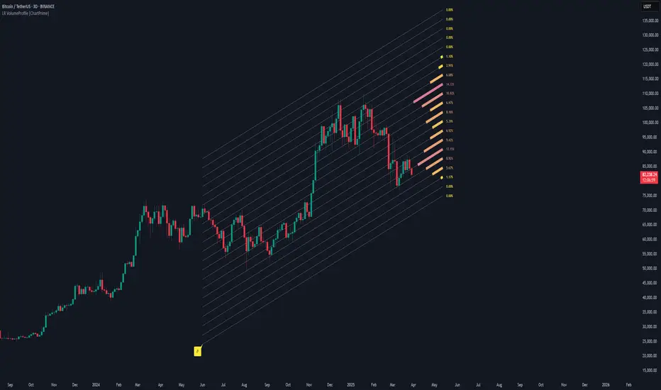
Linear Regression Volume Profile [ChartPrime]LR VolumeProfile
This indicator combines a Linear Regression channel with a dynamic volume profile, giving traders a powerful way to visualize both directional price movement and volume concentration along the trend.
⯁ KEY FEATURES
Linear Regression Channel: Draws a statistically fitted channel to track the market trend over a defined period.
Volume Profile Overlay: Splits the channel into multiple horizontal levels and calculates volume traded within each level.
Percentage-Based Labels: Displays each level's share of total volume as a percentage, offering a clean way to see high and low volume zones.
Gradient Bars: Profile bars are colored using a gradient scale from yellow (low volume) to red (high volume), making it easy to identify key interest areas.
Adjustable Profile Width and Resolution: Users can change the width of profile bars and spacing between levels.
Channel Direction Indicator: An arrow inside a floating label shows the direction (up or down) of the current linear regression slope.
Level Style Customization: Choose from solid, dashed, or dotted lines for visual preference.
⯁ HOW TO USE
Use the Linear Regression channel to determine the dominant price trend direction.
Analyze the volume bars to spot key levels where the majority of volume was traded—these act as potential support/resistance zones.
Pay attention to the largest profile bars—these often mark zones of institutional interest or price consolidation.
The arrow label helps quickly assess whether the trend is upward or downward.
Combine this tool with price action or momentum indicators to build high-confidence trading setups.
⯁ CONCLUSION
LR Volume Profile is a precision tool for traders who want to merge trend analysis with volume insight. By integrating linear regression trendlines with a clean and readable volume distribution, this indicator helps traders find price levels that matter the most—backed by volume, trend, and structure. Whether you're spotting high-volume nodes or gauging directional flow, this toolkit elevates your decision-making process with clarity and depth.
[E5 Trading] Relative VolumeRelative Volume Overview
The E5 Trading Relative Volume indicator enhances volume analysis in several ways:
First, volume has been normalized to a percentage value, enabling standard thresholds for strong, average, and weak volume.
Second, each candle's volume is evaluated against its history to identify statistically significant bull and bear volume bars that may indicate whale (or institutional) buying and selling.
Relative Volume Thresholds
Volume has been normalized to a percentage value based on a user-defined period. Default (50).
This enables using standard thresholds across all assets to determine strong, average, and weak volume.
Price moves with strong relative volume are more meaningful to technical analysis than equivalent price moves with weak relative volume.
Use as confluence with price breakouts...trends can often be identified early when price breakouts are supported by strong relative volume.
Similarly, price breakouts supported by weak relative volume will likely reverse.
Volume Power Bars
Identify whale buying and selling with Volume Power Bars and follow the smart money!
Bull | Bear Volume Power Bars show statistically significant Bull and Bear Volume Bars that may indicate whale (or institutional) buying and selling. Default (On).
Trends often follow the direction of Volume Power Bars.

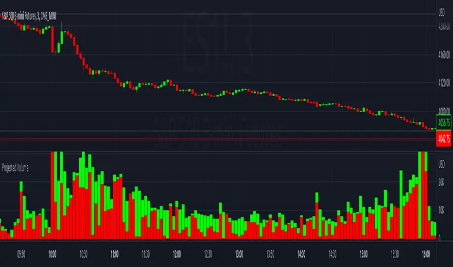
Projected VolumeThe indicator projects what each candle's final volume will be based on the amount of volume per second so far.
Options:
Disable Projected Volume: Show current volume Instead of projecting the final volume
Show Volume Pressure: Adds a visual representation of the volume from the candle wick that is moving against the current direction.
When Volume Pressure is enabled:
On a green candle:
The red part represents the upper wick, the volume as the price comes back down from its high
The green part represents the rest of the candle, the volume as the price goes up from its low to the close
On a red candle:
The green part represents the lower wick, the volume as the price comes back up from its low
The red part represents the rest of the candle, the volume as the price goes down from its high to the close
If Volume Bars Overlap with Chart:
By default, the volume bars are overlayed in the same chart pane as the candles, with the scale on the left side. If they overlap and interfere with the candles, you can fix with these options:
To move indicator to a new pane below the chart:
Select the indicator and click on the 3 dots "..."
Select Move To > New Pane Below
Select Pin to Scale > Pin to Scale A (this will move the scale to the right side)
To adjust volume bar scale:
Go to the scale on the left/right side, hold down the mouse and drag it up/down to make the volume bars longer/shorter
To move the entire volume block up/down on the chart, click on the volume bars and hold down the mouse, then drag it up/down
To update to the latest version, just close the indicator and add it again.
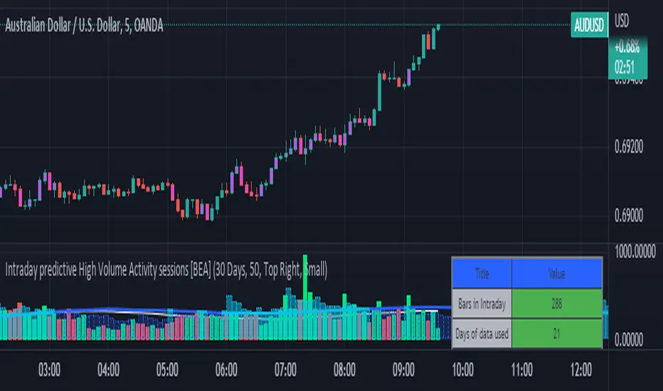
Intraday predictive High Volume Activity sessions [BEA]Idea:
This indicator is designed to know the high traded volume sessions in advance before the day starts.
The predictive volume bars will be plotted in advance once a new trading session starts.
Logic Used:
The basic idea is to store each bar volume / Volume MA data for the selected time. So, the first bar of each data is stored for all selected historical days.
Once the data is stored, I am taking average of each bar data for the selected Historical days.
How to Use:
This gives me an idea of the volume behavior throughout the days based on historical data. So I decide my time of trading for that specific times sessions where the traded volume activity is high.
The bars which are more than the Moving average ( Highlighted Volume bars plotted in future ) is the time session to focus.
Designed only for intraday timeframes.
Here in the image, you can see the session in advance for high traded volume activity.
Try it test it , let me know if it can be improved further.
Have a happy trading.
DISCLAIMER
Any and all liability for risks resulting from investment transactions or other asset dispositions carried out by the user based on information received or a market analysis is expressly excluded by me.
All the information made available here is generally provided to serve as an example only, without obligation and without specific recommendations for action. It does not constitute and cannot replace investment advice. We therefore recommend that you contact your personal financial advisor before carrying out specific transactions and investments.
Do your own research, this is not a financial advice.
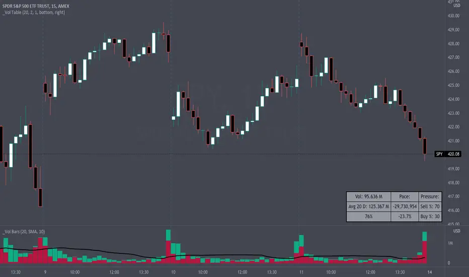
Volume Pace & Pressure TableHave you ever wanted to know if a particular tickers volume is above or below average while still in the trading day? This indicator displays an easy-to-read table that informs the user exactly what is occurring in intraday volume. And a whole lot more!
Description
This indicator displays a variable table with either two or three columns and always three rows. It packs everything a user needs to know about volume in one small table. The table shows:
Current trading days volume
Average daily volume
Volume Pace
Volume Pressure (Buying & Selling)
Volume Pace
Volume Pace is a mathematical calculation invented by the author, Infinity_Trading . The problem was to figure out a way to know if the current days volume was below average or above average while still in the trading day. Calculations like Percent Daily Volume don’t work during the intraday trading hours. For example, say SPY has a 20-day volume average of 100 million shares. If in the first hour SPY has only traded 10 million shares then dividing the current volume into the average daily volume doesn’t tell the user anything when there is still 5.5 hours of trading left in the trading day. There had to be a better way! The solution was to chop up the trading day into evenly divisible time periods (i.e. <= 30 minutes). The Volume Pace algorithm takes the average daily volume and chops it up into small time periods based upon the charts current timeframe. This is the average volume per smaller time period. Then use the current days volume and the number of time periods that have occurred in the trading day so far (at the current moment in time i.e. the current candlestick) to form a calculation that returns the volume above or below the average volume up to that point in time.
Volume Pace Equations
Intraday Vol. Pace = Today’s Current Vol. - ( ( Average Daily Vol. / Time periods in trading day ) * Time periods that have occurred so far in trading day )
Postday Vol. Pace = Today’s Trading Vol. - Average Daily Vol.
^ Vol. = Volume (because TradingViews pine tags are dumb)
Volume Pace Definitions
Volume Pace is the difference in cumulative volume between todays current volume and the average daily volume up to same time of the day
Volume Pace Usage
If the Volume Pace is a positive number then it means that up to the current trading time the volume is that amount greater than the average daily volume over that same intraday time span.
If the Volume Pace is a negative number then it means that up to the current trading time the volume is that amount smaller than the average daily volume over that same intraday time span.
If the Volume Pace is positive during the intraday then the volume is on track to be an above average volume trading day.
If the Volume Pace is negative during the intraday then the volume is on track to be a below average volume trading day.
The Percent Volume Pace is the percent increase or decrease of the current volume compared to the average volume up to the same time of day. Or the Percent Volume Pace is the Volume Pace expressed as a percentage.
After the trading day is complete the Volume Pace will be the difference between the Daily Volume and the Average Daily Volume. And the same thing applies to the Percent Volume Pace.
Volume Pressure
The author, Infinity_Trading, did not invent the calculations for Volume Pressure but the definitions and explanations of Volume Pressure are their own creations. In specific terms, Volume Pressure is a mathematical calculation that uses the direction and distances of individual candlesticks bodies and wicks to assign a numerical value to volume.
buyingPressure = vol * (close - low) / (high - low)
sellingPressure = vol * (high - close) / (high - low)
^ vol = Volume (because TradingViews pine tags are dumb)
The author wants to make clear that volume “pressure” isn’t a real thing. Trades in any market require a buyer and a seller. So there is always an equal number of buyers and sellers. Thus, the idea that there are more buyers or more sellers isn’t rooted in reality. BUT the author believes that the calculation and understanding of “volume pressure” takes a very complex subject (price moment in a market) and condenses into something that intuitively makes sense to humans (pressure) and places it onto something that is already on everyone’s charts (volume bars).
The calculation for Buying Pressure is really calculating the upward distance between the low and the close of the candle. While Selling Pressure is measuring the downward distance from the high to the close. And both are using volume bars to express these measurements. So if an individual candle goes down then the red Selling Pressure will be more on the stacked bar chart than the green Buying Pressure. And vice versa for candles that went up. If a Volume Pressure bar is completely one color then it means, for a downward candle, the low and close were equivalent, and for an upward candle, the high and the close were the same. Lastly, the Buying & Selling Pressure will always add up to 100%.
Inputs and Style
In the Input section the user can set the number of days to use for all of the average calculations. All aspects of the table can be controlled. The background color, text color, border widths, and border colors. Also, the table can be moved to 9 unique locations around the chart for complete user control. Also, the user can use their cursor to hover over each cell in the table to reveal a tooltip definition of the calculation in the cell.
Special Notes
The volume table won’t display when the chart timeframe is weekly or monthly because the logic uses “daily” volume.
The Volume Pace column in the table disappears when the timeframe is greater than 30 minutes. Because for Volume Pace to work the time periods must be equally divisible into 6.5 hours (the duration of trading day).
[VDB]Advanced BankNifty VolumeNSE:BANKNIFTY Index is traded significantly along with NIFTY and having a VOLUME indicator is very helpful for those who follow it extensively as it is used to measure the relative significance of a price move. Given TradingView doesn’t provide the VOLUME on Index chart, many end up using BANKNIFTY FUTURE chart for volume information. This indicator helps providing that VOLUME information.
Get VOLUME You Prefer –
FUTURE : This extracts VOLUME data from BANKNIFTY FUTURE chart.
INDEX : VOLUME is calculated by the weighted sum (Composite method) of underlying stock’s spot volume for all the 12 stocks of the Bank Nifty Index.
INPUTS :
Volume Moving Average in added to show the LINE and also used in calculation to change volume bars color if that input is selected.
Color Bars Based on Average VOLUME : Selecting this helps changing the Color of VOLUME bars to lighter color if volume < average volume.
Color Bars Based on Previous Close : Selecting this input changes the Color of VOLUME bars based on “Previous Close” than “Current Open”.
BANKS & WEIGHTAGE : Here all 12 underlying banking stocks of Bank Nifty Index are listed along with their weightage in the index.
IMPORTANT NOTE : Changing any settings of the indicator leads to its complete recalculation. The result may differ from the expected one. Weightage of each stock changes by end of every month. Always to refer NSE NIFTY BANK composition and weightage from NSE website.
DISCLAIMER : This indicator has been created for educational reference only and do not constitute investment advice. This indicator should not be relied upon as a substitute for extensive independent market research before making your actual trading decisions. Market data or any other content is subject to change at any time without notice. Liability for any loss or damage, including without limitation any loss of profit, which may arise directly or indirectly from use of this indicator is accountability of user.
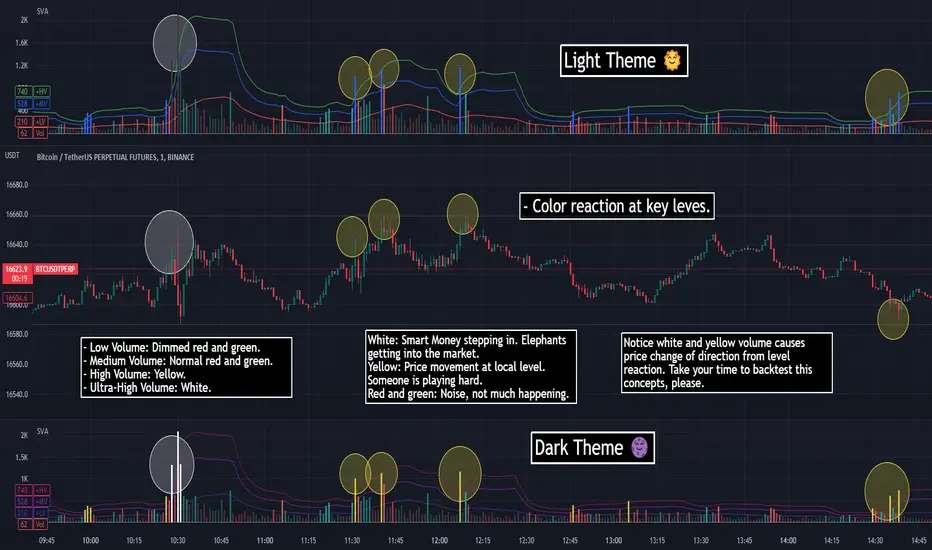
SVA - Simple Volume Analyzer, by BlueJayBird [bjb] ENGLISH & SPANISH
------------------------------------- ENSLIGH
The idea was initially inspired in the concepts shared by @LazyBear on his indicator "Better Volume Indicator" (). But I found it somewhat complicated and dull. So I came up with this.
Concept:
It changes the color of volume bars based on surrounding volume changes.
Volume changes are plotted as volume MAs lines in the volume pane.
Whenever the volume is higher than these MAs, the bar changes color.
For this reason, the bar color change is RELATIVE TO the surroundings, because the color change depends on how far the MA has been extended due to sudden (or not) changes in the volume.
BAR COLORS:
Weak Green and Red: Low volume. The calm before or after the storm.
Normal Green and Red: Mid volume. Still low volume, you may get bored.
Yellow: High volume. Players are playing hard and harder.
White: Ultra-High Volume. The elephants stepped in.
NOTES:
SVA works better at lower timeframes. Though as far as I can tell, it works pretty well as far as 1D timeframe.
------------------------------------- SPANISH
La idea estuvo inicialmente inspirada en los conceptos expuestos por @LazyBear en su indicador "Better Volume Indicator" (). Pero lo encontré un poco complicado y falto de claridad. Así que me inventé este.
Conceptp:
Cambia el color de las barras basándose en los últimos cambios de volumen.
Los cambios de volumen son ploteados como lineas de medias móviles (MAs, es decir "Moving Averages") en la sección del volumen (chart pane).
En cualquier momento que el volumen es mayor que estos MAs, el color de las barras cambia.
Por esta razon, el cambio de color de las barras es RELATIVO a lo que está sucediendo alrededor, ya que el cambio de color depende de qué tan lejos el MA se haya extendido por causa de los últimos cambios (o no) de volumen.
BAR COLORS:
Verde y rojo apagados: Volumen bajo (Low Volume). La calma antes de la tormenta.
Verde y rojo normales: Volumen medio (Mid volume). Volumen todavía bajo. Es posible que te aburras.
Amarillo: Volumen alto (High Volume). Los jugadores están jugando duro.
Blanco: Volumen ultra-alto (Ultra-High Volume). Los elefantes entran a la cancha.
NOTAS:
SVA funciona mejor en temporalidades menores. Pero por lo que he visto, funciona bien hasta la temporalidad de 1D.
Volume Average % Cross - Default Volume Average Percentage Cross Indicator - Default
This version is specialized for notifications on your volume bars. If you wish to see notifications on your chart please choose "Volume Average Percentage Cross Indicator - Chart".
What is the Volume Average % Cross - Chart Indicator you might ask yourself - what is it for?
I will tell you!
Use Case:
In my Indicator you have an Input to set the period for the volume average period.
Once the volume average period is calculated it is now necessary to choose the percentage value.
What is the percentage value?
The percentage value multiplies the past volume bar with a positive percentage value and a negative percentage value. I give this calculation the name "VolPercentage".
If the volume average is below the negative VolPercentage Value it means that the last volume bar is stronger than the volume average period by the percentage you set the percentage value input at.
If the volume average is above the positive VolPercentage Value it means that the last volume bar is weaker than the volume average period by the percentage you set the percentage value input at.
That means that if for example the percentage value would be 20 it would require the volume average to be 20% above the past volume bar.
That means that if for example the percentage value would be 20 it would require the volume average to be 20% lower than the past volume bar.
Once I uploaded my 100 Indicators I will accurately describe each indicator with videos, this will be huge!
Interpretation:
Volume is the amount of market participants who bought in a candlestick bar a set amount of shares at varying prices from within the bar itself.
If volume decreases it means that there has been fewer market participants and if it increases it means that there is an increase of market participants.
If this is used with candlestick patterns it helps tremendously to identify strong or weak doji candlesticks .

VSA + Volume Oscillator [@TradersVenue]Volume is very crucial while trading, as it indicates the participants interest in the script. Focus is to look for the high volume candles which had a significant price action to initiate a trade on the scrip. This volume indicator combines the VSA signals along with volume and highlights price action using different symbols.
Highlights:
Major Sign of Strength (SoS) - Downthrust Bar supported by momentum & in the direction of trend (Green Star Under the candle)
Any candle highlighted with a Green star is a solid breakout candle where price volume action indicates that participants wants the price to move up. This is normally a wide range bar with ultra high volume closing near the upper part of the candle. Also the trend and momentum favours the breakout which is identified using MA & RSI to support the bullish case.
Major Sign of Weakness (SoW) - Upthrust Bar supported by momentum & in the direction of trend (Red Star Under the candle)
Any candle highlighted with a Red star is a solid breakdown candle where price volume action indicates that participants wants the price to move down. This is normally a wide range bar with ultra high volume closing near the lower part of the candle. Also the trend and momentum favours the breakout which is identified using MA & RSI to support the bullish case.
Normally prefer trading the scrip in the direction of breakout or breakdown after noticing a starcandle. Apart from that there are some important VSA signals for which quick cheet sheet is given below.
Sign of Strength (SoS) - Green Star/Circle/Square
Sign of Weakness (SoW) - Red Star/Circle/Square
Circle represents - Stopping Volume (SV) if green, Supply Overcomes Demand (SoD) if red.
Square represents a TrendReversal (TR), if green bullish, if red bearish
Apart from that you can view the volumes either in the form of oscillator which is calculated basis the standard deviation or normal volumes. Deep Green/Green volume bars represent high volume green candle. Deep Red/Red candle represents high volume sell candle. Pink and blue candles are those where volume action is low or negligible to take any trade basis that. Prefer using the indicator with default settings.
Price action is least lagging indicator as compared to other indicators. And as usual no indicator has 100% success rate. So I urge all users not to consider this as a holy grail. This indicator need to be used along with the VSA signal indicator (which can be plotted on the chart) and RSI indicator which is provided as full VSA trading setup for swing trades. The overall usage will be provided through a demo to the subscribing users. In order to gain access to this indicator you may contact me using the below signature.

Footprint Imbalance Reversal ZonesThe script detects blowouts and displays buy and sell volume as levels.
Green lines = bullish zones (potential support / buying pressure)
Red lines = bearish zones (potential resistance / selling pressure)
---------------
Trade ideas:
---------------
Price approaching a green zone → potential bounce/support.
Price approaching a red zone → potential rejection/resistance.
Combine with other indicators or price action for confirmation.
-----------------
Configuration
-----------------
Inputs:
Imbalance Threshold (%) → higher = only very strong imbalances trigger zones
Bars to form cluster → number of consecutive imbalance bars needed
Zone Extend Bars → how far each zone line extends into the future
Minimum bar volume → ignore low-volume bars for cleaner zones
Use tick-rule volume estimate → leave true if no real bid/ask data
Max saved zones → max number of zones stored (oldest removed if exceeded)
------
Tips
------
Best used on intraday or short-term charts where volume imbalances are meaningful.
Adjust Minimum bar volume to filter out low-volume noise.
Combine with candlestick patterns, RSI, or moving averages for higher-probability trades.
For long-term charts, consider increasing Bars to form cluster to capture stronger levels.
Combine with price action, candlestick patterns, or other indicators for better trade signals.

Volume (standard) + Brightness by Intensity (Min–Max / MA)Volume Brightness Indicator
Quick Description
This indicator is an enhanced version of TradingView’s standard volume. The volume bars are colored just like the original (green/red or a single custom color), but with one key upgrade: brightness and transparency adjust automatically based on volume intensity.
High volume → bars appear more opaque and bright.
Low volume → bars appear more transparent and faded.
This makes it easier to spot which candles actually carry meaningful volume at a glance.
Features
Bar colors: by candle direction (green/red) or a single chosen color.
Volume moving average: optional, customizable (SMA or EMA).
Brightness methods:
Min–Max: compares volume against a historical window (with optional log scale).
MA-based: compares volume against its moving average, with an adjustable cap.
Custom transparency: define how opaque high-volume and low-volume bars appear.
How to Use
Copy the script into Pine Editor and save it.
Add it to your chart; it will display in its own panel, like the standard volume.
In Settings, choose your preferred brightness method and adjust transparency ranges.
Toggle the volume MA if you want a clear reference line.
Key Idea
The indicator does not add new data. It highlights volume intensity visually, making it easier to identify accumulation or spikes without losing the simplicity of the classic volume.

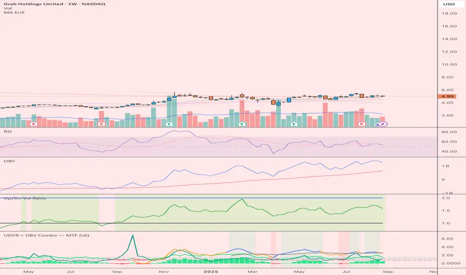
UDVR + OBV Combo — MTF (v6)The UDVR + OBV Combo is a multi-timeframe volume analysis tool that blends the Up/Down Volume Ratio with a normalized On-Balance Volume signal. It highlights when accumulation or distribution truly supports price action, adds higher-timeframe context, and shades the background when both indicators align. Use it to confirm breakouts, spot divergences, and filter trades with the backing of real volume flows.
1.Up/Down Volume Ratio (UDVR)
•Compares the rolling sum of up-volume (bars where price closed higher) vs down-volume (bars where price closed lower).
•A ratio > 1.0 = more accumulation (bullish pressure).
•A ratio < 1.0 = more distribution (bearish pressure).
•Optional histogram shows deviations from the 1.0 baseline.
•Customizable handling of equal closes (count as up, down, split, or ignore).
•Configurable lookback length and optional EMA smoothing.
2. On-Balance Volume (OBV)
•Classic cumulative OBV implemented natively (adds volume on up-bars, subtracts on down-bars).
•Normalized with a z-score so it can be compared across different symbols/timeframes.
•Includes an EMA signal line for slope detection.
•Alignment of OBV vs its EMA highlights rising or waning participation.
3. Multi-Timeframe Support
•Both UDVR and OBV can be plotted from a higher timeframe (HTF) (e.g. Daily UDVR shown on a 1h chart).
•Lets you see big-money accumulation/distribution while trading intraday.
•Shaded background when current TF and HTF agree (both bullish or both bearish).
How to read it
• Bullish confirmation = UDVR > 1 (accumulation) and OBV above EMA (rising participation).
• Bearish confirmation = UDVR < 1 (distribution) and OBV below EMA (falling participation).
• Mixed signals (e.g. UDVR > 1 but OBV falling) = caution; price may lack conviction.
• Divergences : If price makes a new high but OBV or UDVR does not, it’s a warning of weakening trend.
• Higher timeframe context : set HTF = Daily or Weekly and watch how short-term signals align with institutional flows. A long trade on the 15m chart is stronger when Daily UDVR is also above 1.
Inputs
•UDVR Lookback: number of bars for rolling volume sums.
•Smoothing EMA: smooths UDVR for stability.
•Equal Close Handling: decide how equal closes affect UDVR.
•Signal Band: optional UDVR extreme thresholds.
•Show Histogram: toggle UDVR histogram around baseline.
•Higher Timeframe UDVR: overlay Daily/Weekly UDVR on lower timeframe charts.
•OBV EMA length: slope proxy for normalized OBV.
•OBV Normalization window: controls z-score sensitivity.
•Higher Timeframe OBV: overlay higher timeframe OBV.
Alerts
•UDVR Bullish/Bearish cross at the 1.0 baseline.
•OBV slope up/down when OBV crosses its EMA.
•Alignment signals when UDVR and OBV agree (both confirm bullish or bearish conditions).
Why it’s useful
•Combines trend, momentum, and participation in one place.
•Helps avoid false breakouts by checking if volume supports the move.
•Lets you spot accumulation/distribution shifts before they show up in price.
•Gives a higher timeframe context so you’re not trading against the “big picture.”
Once applied, the indicator creates a dedicated pane below price with the following components:
UDVR Line (green/red)
• Green when UDVR > 1.0 (more up-volume than down-volume → accumulation).
• Red when UDVR < 1.0 (more down-volume → distribution).
UDVR Baseline and Bands
• Grey baseline at 1.0 = balance between buying and selling volume.
• Optional upper/lower bands (default 1.5 and 0.67) highlight extreme imbalances.
• Shaded areas between baseline and bands provide visual context for strength/weakness.
UDVR Histogram (optional)
• Columns around the baseline showing (UDVR – 1.0).
• Quick way to gauge how far above/below balance the ratio is.
Higher-Timeframe UDVR (teal line)
• Overlays the UDVR from a higher timeframe (e.g. Daily) on your intraday chart.
• Lets you see whether institutional flows support your shorter-term signals.
OBV Normalized (blue/orange line)
• Classic OBV, but normalized with a z-score so it stays readable across assets.
• Blue when OBV is above its EMA (rising participation).
• Orange when below its EMA (waning participation).
OBV EMA (grey line)
• Signal line showing the slope of OBV.
• Crosses between OBV and this line mark shifts in participation.
Higher-Timeframe OBV (purple line, optional)
• Plots OBV from a higher timeframe for additional context.
Background Shading
• Light green = both UDVR > 1 and OBV > OBV-EMA (bullish alignment).
• Light red = both UDVR < 1 and OBV < OBV-EMA (bearish alignment).