Quantum Currency ArrayThe Currency Array indicator has been developed to measure and display quickly and easily, the speed at which currency pairs are rising and falling. Just like the Quantum Currency Matrix, the Quantum Currency Array indicator displays the complete array of 28 currency pairs derived from the 8 major currency pairs as featured in the Quantum Currency Strength Indicator (CSI):
- US Dollar
- Euro
- British Pound
- Swiss Franc
- Japanese Yen
- Canadian Dollar
- Australian Dollar
- New Zealand Dollar
In displaying all the pairs in an array this gives an instant view of the relative trend strength and displays this relationship in a visual and intuitive manner in three ways. Each one shows a different perspective and insight into the complex world of currency strength concepts.
Ranked list
First, the indicator displays 28 major currency pairs in a ranked list ordered by the strength of the trend. The currency pair with the greatest momentum and steepest uptrend appears at the top of the list while the one with the greatest momentum and steepest downtrend appears at the bottom. All the other pairs are then ranked accordingly, and color coded from red at the bottom, to yellow and into green at the top of the ranking table. Currency pairs in congestion appear in the middle of the table.
In the ranked list, alongside the ranks of currency pairs is a second column that provides signals as to whether a particular currency pair is approaching an overbought or an oversold state. These are then signaled in two ways. First a signal the currency pair is approaching such a state, and second when it has arrived in this condition. These are coded as follows:
- (OB) – This signal appears as a dark shade of blue which means that the currency pair is APPROACHING an OVERBOUGHT state.
- OB – This signal appears as a bright shade of blue which means that the currency pair is IN an OVERBOUGHT state.
- (OS) – This signal appears as a dark shade of red which means that he currency pair is APPROACHING an OVERSOLD state.
- OS – This signal appears as a bright shade of red which means that the currency pair is IN an OVERSOLD state.
Once any of these signals appears beside a currency pair, it indicates the potential change in direction of the trend, which can then be considered further by analysis of the chart. For example, if the EURGBP is seen at the very top of the list and beside it is an OB signal, it means that although the uptrend is seemingly strong, the bullish strength driving it may be reaching an exhaustion point, starting to diminish with a possible change in direction in due course.
Currency Array
Secondly, it displays the same 28 major currency pairs as lines in a graph that diffuse out into the array and with varying magnitudes depending on the strength and inclination of each currency pair’s trend. This means the order in which they appear vertically follows the same ranking in the table alongside, but as a graphical display, instantly, visually and numerically revealing the actual steepness of each currency pair’s trend. As you would expect the currency pair with the fastest and steepest uptrend also has the steepest UPWARD line in the graph. Likewise, the fastest and steepest downtrend also has the steepest DOWNWARD line in the graph. Currency pairs with the least steepness in their trend (and in congestion) are found closest to the 0 level of the graph and appear horizontal.
You can also see each line in the array has one of 2 different line styles. Its style depends on the state of its corresponding currency pair as defined above.
- Dashed – This means the currency pair is trending, but not close to an overbought or oversold condition.
- Solid – This means the currency pair is at an overbought or oversold condition.
One of the most powerful features of the array when watching trends develop in real time is not only considering one pair, but how pairs move together ‘en masse.’ This can give you huge confidence when taking a position in the market, as you will see all the currency pairs for that complex “marching together” stretching higher or stretching lower and reflecting market sentiment for that currency and its associated pairs. This is immensely powerful, and will give you the confidence, not only to take a position, but then to hold it to maximize your profits from the trend.
Currency filter
The Currency Array indicator allows you to filter the currency pairs relevant to the currency you are analysing. Just like the Quantum Currency Matrix indicator, an input is provided in the indicator settings window which you can click to select a currency.
- USD selects all currency pairs that contain the US Dollar.
- EUR selects all currency pairs that contain the Euro.
- GBP selects all currency pairs that contain the British Pound.
- CHF selects all currency pairs that contain the Swiss Franc.
- JPY selects all currency pairs that contain the Japanese Yen.
- CAD selects all currency pairs that contain the Canadian Dollar.
- AUD selects all currency pairs that contain the Australian Dollar.
- NZD selects all currency pairs that contain the New Zealand Dollar.
Click the Filter option box and select a currency in the list to apply a filter. If you like to undo a filter, simply select NONE. When a certain currency filter is in effect, the currency pairs that include the selected currency in the table appear in color. Meanwhile, all currency pairs that include the selected currency in the array are the only ones displayed.
Divergence
And this leads on to the third aspect of the Currency Array indicator which is this – it will give you an instant heads-up to divergence across a currency complex, and the easiest example here is with the Japanese yen which is the counter currency for the major and cross pairs. On the array we should expect to see all the currency pairs on one side of the mid point or the other. After all, if the flow of sentiment for the Yen is universal, then we would expect to see all the currency pairs aligned accordingly, whether selling or buying the Japanese Yen. If not, then we have some divergence, and the flow of sentiment is not universal. If you are trading a pair which is perhaps counter to broad sentiment, then this is a high risk proposition. The Currency Array will tell you this instantly and visually and across all the timeframes with a single click and on ONE chart. No need to try to scan 28 charts. It is all here for you.
Dynamic graded color coding
One of the coolest features we have introduced across all our indicators is the dynamic graded color coding, found in both the ranked list and the graph which makes analysis intuitive and fast. You can probably see instantly just from the images how easy it is, but here is a walkthrough.
The currency pairs appear as a color in the range of a green-yellow-red gradient (in that order). Simply put, the color of each currency pair varies depending on its value, in this case the steepness of the trend:
- Green shades – the steepness of the currency pair’s trend is positive and is well above the fulcrum of zero.
- Yellow shades – the steepness of the currency pair’s trend is relatively flat and around the fulcrum of 0. It can either be positive or negative but trails the numbers closest to 0.
- Red shades – the steepness of the currency pair’s trend is negative and is well below the fulcrum of zero.
The same color gradation applies on the array itself. It is important to note the yellow levels are not precisely in the middle of the list (rank 14 of 28). The gradation of color is dynamic and hence the transition of colors will depend entirely on the steepness of the trend of each currency pair as explained above. As with all our other indicators, this is dynamic and is constantly shifting in real time to reflect the ebb and flow of sentiment across the timeframes.
Getting Started
Here are some further details on the Currency Array indicator to help you get started:
- Your Quantum Currency Array indicator can be applied to any chart for any currency pair. The chart does not influence or affect the appearance or performance of the indicator. For example you can apply the indicator to a EURUSD, a GBPUSD, or a USDCHF, or any other pair. The indicator will display in an identical way on each chart.
- The indicator occupies its own indicator window in the chart. We recommend expanding the indicator vertically to get a complete view.
- The indicator works in all timeframes.
- When you first apply the indicator, please allow a few seconds for the data to build in history.
Currency Dashboard
By itself, the Quantum Currency Array indicator is a powerful trading tool for identifying trading opportunities, quickly, easily, and on ONE chart. However, it was developed as part of what we like to call the Quantum Currency Dashboard which consists of the following indicators:
- Quantum Currency Strength Indicator (CSI)
- Quantum Currency Matrix
- Quantum Currency Array
- Quantum Currency Heatmap
These four indicators then provide a unique and compact insight into all the various aspects of strength and weakness for both currencies and currency pairs, from trend and momentum to overbought and oversold. What is unique is that using four charts, you are then able to monitor the myriad combinations of strength, weakness, momentum, congestion and divergence across the entire forex complex at a click of a button. And even more powerfully, giving you the confidence to get in and stay in for maximum profits. No more missed opportunities, no more struggling with multiple charts, and no more trader regret, whatever your trading style or approach.
In den Scripts nach "Table" suchen

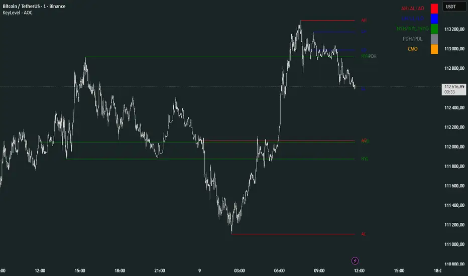
KeyLevel - AOCKeyLevel - AOC
✨ Features📈 Session Levels: Tracks high, low, and open prices for Asian, London, and New York sessions.📅 Multi-Timeframe Levels: Plots previous day, week, month, quarter, and yearly open/high/low levels.⚙️ Preset Modes: Choose Scalp, Intraday, or Swing presets for tailored level displays.🎨 Customizable Visuals: Adjust colors, line styles, and label abbreviations for clarity.🖼️ Legend Table: Displays a color-coded legend for quick reference to session and period levels.🔧 Flexible Settings: Enable/disable specific sessions or levels and customize UTC offsets.
🛠️ How to Use
Add to Chart: Apply the "KeyLevel - AOC" indicator on TradingView.
Configure Inputs:
Preset: Select Scalp, Intraday, or Swing, or use custom settings.
Session Levels: Toggle Asian, London, NY sessions and their open/high/low lines.
Period Levels: Enable/disable previous day, week, month, quarter, or yearly levels.
Visuals: Adjust colors, line widths, and label abbreviations.
Legend: Show/hide the legend table for level identification.
Analyze: Monitor key levels for support/resistance and session-based price action.
Track Trends: Use levels to identify breakouts, reversals, or consolidation zones.
🎯 Why Use It?
Dynamic Levels: Tracks critical price levels across multiple timeframes for comprehensive analysis.
Session Focus: Highlights key session price points for intraday trading strategies.
Customizable: Tailor displayed levels and visuals to match your trading style.
User-Friendly: Clear lines, labels, and legend table simplify price level tracking.
📝 Notes
Ensure timeframe compatibility (e.g., avoid daily charts for session levels).
Use M5 or higher timeframes for accurate session tracking; some levels disabled on M5.
Combine with indicators like RSI or MACD for enhanced trading signals.
Adjust UTC offset if session times misalign with your broker’s timezone.
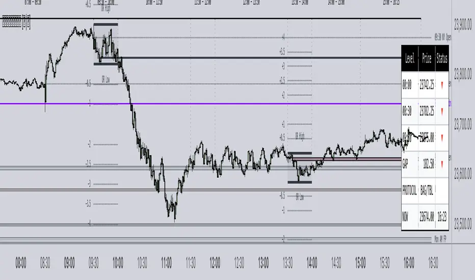
𝙵𝚛𝚊𝚖𝚎𝚠𝚘𝚛𝚔|[𝙰|𝛺]This indicator was designed and coded by me, providing a clean and efficient adaptation of the teachings from Inner Circle Trading (ICT). The tool is intended to display various data points that help streamline and simplify your trading process. However, it does not generate signals or recommendations for trade execution.
It is designed to automatically display different components according to the timeframe you are analyzing. From the Hourly chart down to the seconds, you will be able to visualize a wide range of time-based data points in one indicator.
On the Hourly timeframe, the indicator begins with the Weekly Profile using the True Day . You will be able to visualize Monday’s price extended throughout the entire week, as well as each individual day of the week separately.
You can also visualize the equilibrium and quadrants of each individual day, if desired.
ICT 3-Day Protocol: This feature extends the highs and lows of the previous two days up to the current candle. These levels can serve as potential draws on liquidity or reference points for identifying opportunities on lower timeframes.
M15 Timeframe
On this timeframe, you will be able to visualize the previously mentioned elements, with the addition of the Asian and London sessions. These are included to help outline the potential intraday profile, as well as the highs and lows of these sessions, since they represent relevant data points.
You will also have the option to display projections of these ranges. These projections are useful for anticipating potential price manipulation and distribution levels, using Midnight Open as the reference point for the Daily PO3 .
You will also be able to visualize different Opens , including:
• 00:00
• 08:30
• 09:30
• 13:30
• Previous day’s Settlement Price
These levels represent relevant data points that can be used to frame implied discount or premium conditions relative to the Time of Day .
M1 and Seconds
On this timeframe, you will be able to see the previously mentioned elements, along with additional features.
Market Session Dividers: These are included to provide a clear and organized visual reference of which session the market is currently in, as well as the separation between one session and another.**
Opening Ranges: This feature allows you to visualize the Opening Range of the AM and PM sessions, along with their respective projections. You can also choose whether to extend these ranges over time or keep them limited to their formation period.
First Presentations: This feature allows you to visualize the initial imbalance of the Regular Trading Hours session, including both the AM and PM sessions.
Additionally, an option is included in the menu to indicate if the current day has high-impact news before the 09:30 open, allowing you to consider including the formation of the First Presented Gap from 09:29, as recommended by ICT.
You can also enable alerts to be notified each time a First Presentation is formed.
Table: This feature displays a table with the various Openings mentioned earlier. It shows the price and indicates whether the market is at a Discount or Premium relative to these levels using an arrow.
The table also displays the size of the Opening Range Gap and, with an arrow, indicates whether it is a Premium or Discount Gap.
It provides different possible protocols based on the gap size and other elements taught by ICT to help anticipate certain market scenarios.
Additionally, it shows the current time and changes the color of the time indicator depending on whether you are within a macro session or not. This keeps your chart clean while still allowing you to know if the market is in a macro session.
All elements of the indicator are customizable . You can personalize virtually every component to suit your preferences.
The Engineer.
Multi Timeframe Indian Stocks TrendsThis script, "Multi Timeframe Indian Stocks Trends," is designed for swing trading in the Indian stock market, with a specific focus on Nifty50. It provides a comprehensive view of trends across multiple timeframes: 1-hour, 4-hour, Daily, Weekly, and Monthly.
Key Features:
Multi-Timeframe Analysis: Gain insights into trends across 1H, 4H, D, W, and M timeframes, helping you make informed swing trading decisions.
Trend Calculation Methods: Choose between two popular trend calculation methods:
Supertrend: A widely used indicator that identifies trend direction and provides potential entry and exit points.
EMA (Exponential Moving Average): Utilizes the relationship between a fast and slow EMA to determine trend direction.
Customizable Trend Table: A clear and concise table displays the trend direction for each selected timeframe, making it easy to grasp the overall market sentiment.
Nifty50 Reference: The script is tailored for Indian stocks and includes a reference to Nifty50, allowing you to gauge the broader market trend.
Visual Customization: Adjust the colors of the trend table, background, and text to suit your preferences.
Adjustable Settings: Fine-tune the parameters for Supertrend (ATR Length, Factor) and EMA (Fast EMA, Slow EMA) to optimize the indicator for your trading style.
This script is ideal for traders who want to:
Identify swing trading opportunities in Indian stocks.
Confirm trends across various timeframes.
Utilize either Supertrend or EMA for trend analysis.
Have a quick and clear overview of market trends.
By providing a multi-timeframe perspective and customizable trend analysis, this script empowers traders to make more confident and well-informed swing trading decisions in the Indian stock market.

ORB Breakout Traffic Signal (5/15/30)ORB Breakout Traffic Signal (5/15/30)
This indicator visualizes Opening Range Breakouts (ORB) for the first 5, 15, and 30 minutes of the US regular trading session (09:30–16:00 ET).
It provides a compact, easy-to-read traffic signal table on your chart to show whether price is breaking out, breaking down, or consolidating inside the range.
🔑 Features
Auto-anchors at 09:30 ET (converted to your local time automatically).
Tracks ORB High/Low for:
5-minute window (09:30–09:34)
15-minute window (09:30–09:44)
30-minute window (09:30–09:59)
Displays results in a compact table:
↑ (green) → price has broken above the ORB high
↓ (red) → price has broken below the ORB low
• (gray) → price remains inside the ORB range (optional; can be disabled)
Customizable:
Toggle which ORBs to show (5m, 15m, 30m)
Choose table position (top/bottom left/right)
Adjustable text size
Option to plot the ORB High/Low lines on your chart
📌 Usage
Designed for intraday traders watching US equities/ETFs/futures.
Works best on 1-minute or 5-minute charts with Extended Hours turned OFF (so the session starts exactly at 09:30 ET).
Helps you quickly spot early breakouts (5m), mid-session trends (15m), or confirmed directional moves (30m).
⚠️ Notes
Signals only update during the RTH session
Outside market hours, the last locked ORB and signal remain displayed until the next open.
This tool is for analysis/visualization only; not a buy/sell signal. Always combine with your own trading strategy and risk management.
👉 Perfect for traders who want a quick visual confirmation of whether price is breaking out of the opening range or stuck inside it.

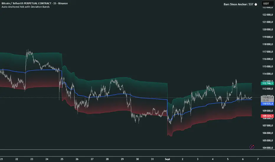
Auto-Anchored MA with Deviation BandsAuto-Anchored MA with Deviation Bands
✨ Features
📈 Auto-Anchored MA: Calculates moving averages (EMA, SMA, EWMA, WMA, VWAP, TEMA) anchored to user-defined periods (Hour, Day, Week, etc.).📏 Deviation Bands: Plots upper/lower bands using Percentage or Standard Deviation modes for volatility analysis.⚙️ Customizable Timeframes: Choose anchor periods from Hour to Year for flexible trend analysis.🎨 Visuals: Displays MA and bands with gradient fills, customizable colors, and adjustable display bars.⏱️ Countdown Table: Shows bars since the last anchor for easy tracking.🛠️ Smoothing: Applies smoothing to bands for cleaner visuals.
🛠️ How to Use
Add to Chart: Apply the indicator on TradingView.
Configure Inputs:
Anchor Settings: Select anchor period (e.g., Day, Week).
MA Settings: Choose MA type (e.g., VWAP, TEMA).
Deviation Settings: Set deviation mode (Percentage/Std Dev) and multipliers.
Display Settings: Adjust bars to display, colors, and gradient fill.
Analyze: View MA, deviation bands, and countdown table on the chart.
Track Trends: Use bands as dynamic support/resistance and monitor anchor resets.
🎯 Why Use It?
Dynamic Analysis: Auto-anchors MA to key timeframes for adaptive trend tracking.
Volatility Insight: Deviation bands highlight potential breakouts or reversals.
Customizable: Tailor MA type, timeframe, and visuals to your trading style.
User-Friendly: Clear visuals and countdown table simplify analysis.
📝 Notes
Ensure sufficient bars for accurate MA and deviation calculations.
Gradient fill enhances readability but can be disabled for simplicity.
Best used with complementary indicators like RSI or Bollinger Bands for robust strategies.
Happy trading! 🚀📈
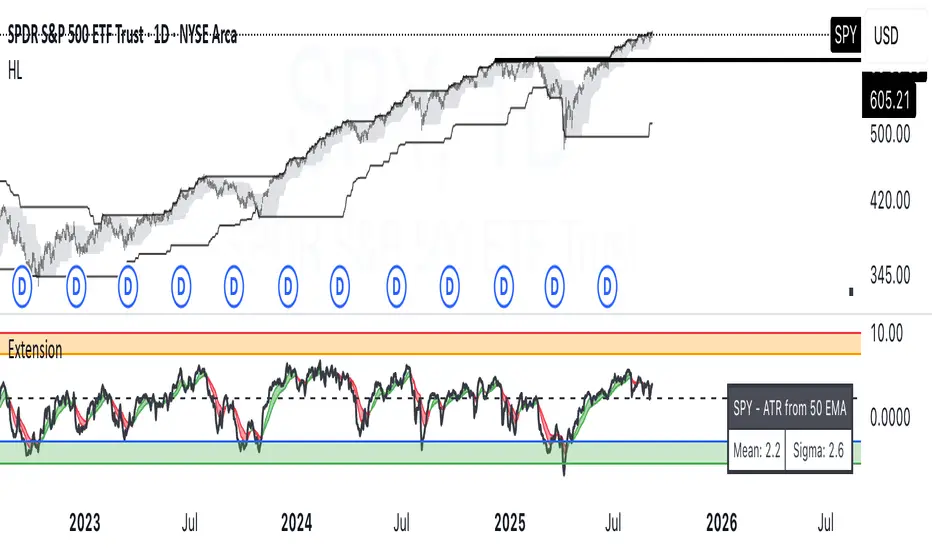
ATR Extension from Moving Average, with Robust Sigma Bands
# ATR Extension from Moving Average, with Robust Sigma Bands
**What it does**
This indicator measures how far price is from a selected moving average, expressed in **ATR multiples**, then overlays **robust sigma bands** around the long run central tendency of that extension. Positive values mean price is extended above the MA, negative values mean price is extended below the MA. The signal adapts to volatility through ATR, which makes comparisons consistent across symbols and regimes.
**Why it can help**
* Normalizes distance to an MA by ATR, which controls for changing volatility
* Uses the **bar’s extreme** against the MA, not just the close, so it captures true stretch
* Computes a **median** and **standard deviation** of the extension over a multi-year window, which yields simple, intuitive bands for trend and mean-reversion decisions
---
## Inputs
* **MA length**: default 50, options 200, 64, 50, 20, 9, 4, 3
* **MA timeframe**: Daily or Weekly. The MA is computed on the chosen higher timeframe through `request.security`.
* **MA type**: EMA or SMA
* **Years lookback**: 1 to 10 years, default 5. This sets the sample for the median and sigma calculation, `years * 365` bars.
* **Line width**: visual width of the plotted extension series
* **Table**: optional on-chart table that displays the current long run **median** and **sigma** of the extension, with selectable text size
**Fixed parameters in this release**
* **ATR length**: 20 on the daily timeframe
* **ATR type**: classic ATR. ADR percent is not enabled in this version.
---
## Plots and colors
* **Main plot**: “Extension from 50d EMA” by default. Value is in **ATR multiples**.
* **Reference lines**:
* `median` line, black dashed
* +2σ orange, +3σ red
* −2σ blue, −3σ green
---
## How it is calculated
1. **Moving average** on the selected higher timeframe: EMA or SMA of `close`.
2. **Extreme-based distance** from MA, as a percent of price:
* If `close > MA`, use `(high − MA) / close * 100`
* Else, use `(low − MA) / close * 100`
3. **ATR percent** on the daily timeframe: `ATR(20) / close * 100`
4. **ATR multiples**: extension percent divided by ATR percent
5. **Robust center and spread** over the chosen lookback window:
* Center: **median** of the ATR-multiple series
* Spread: **standard deviation** of that series
* Bands: center ± 1σ, 2σ, 3σ, with 2σ and 3σ drawn
This design yields an intuitive unit scale. A value of **+2.0** means price is about 2 ATR above the selected MA by the most stretched side of the current bar. A value of **−3.0** means roughly 3 ATR below.
---
## Practical use
* **Trend continuation**
* Sustained readings near or above **+1σ** together with a rising MA often signal healthy momentum.
* **Mean reversion**
* Spikes into **±2σ** or **±3σ** can identify stretched conditions for fade setups in range or late-trend environments.
* **Regime awareness**
* The **median** moves slowly. When median drifts positive for many months, the market spends more time extended above the MA, which often marks bullish regimes. The opposite applies in bearish regimes.
**Notes**
* The MA can be set to Weekly while ATR remains Daily. This is deliberate, it keeps the normalization stable for most symbols.
* On very short intraday charts, the extension remains meaningful since it references the session’s extreme against a higher-timeframe MA and a daily ATR.
* Symbols with short histories may not fill the lookback window. Bands will adapt as data accrues.
---
## Table overlay
Enable **Table → Show** to see:
* “ATR from \”
* Current **median** and **sigma** of the extension series for your lookback
---
## Recommended settings
* **Swing equities**: 50 EMA on Daily, 5 to 7 years
* **Index trend work**: 200 EMA on Daily, 10 years
* **Position trading**: 20 or 50 EMA on Weekly MA, 5 to 10 years
---
## Interpretation examples
* Reading **+2.7** with price above a rising 50 EMA, near prior highs
* Strong trend extension, consider pyramiding in trend systems or waiting for a pullback if you are a mean-reverter.
* Reading **−2.2** into multi-month support with flattening MA
* Stretch to the downside that often mean-reverts, size entries based on your system rules.
---
## Credits
The concept of measuring stretch from a moving average in ATR units has a rich community history. This implementation and its presentation draw on ideas popularized by **Jeff Sun**, **SugarTrader**, and **Steve D Jacobs**. Thanks to each for their contributions to ATR-based extension thinking.
---
## License
This script and description are distributed under **MPL-2.0**, consistent with the header in the source code.
---
## Changelog
* **v1.0**: Initial public release. Daily ATR normalization, EMA or SMA on D or W timeframe, robust median and sigma bands, optional table.
---
## Disclaimer
This tool is for educational use only. It is not financial advice. Always test on your own data and strategies, then manage risk accordingly.
EMA Percentile Rank [SS]Hello!
Excited to release my EMA percentile Rank indicator!
What this indicator does
Plots an EMA and colors it by short-term trend.
When price crosses the EMA (up or down) and remains on that side for three subsequent bars, the cross is “confirmed.”
At the moment of the most recent cross, it anchors a reference price to the crossover point to ensure static price targets.
It measures the historical distance between price and the EMA over a lookback window, separately for bars above and below the EMA.
It computes percentile distances (25%, 50%, 85%, 95%, 99%) and draws target bands above/below the anchor.
Essentially what this indicator does, is it converts the raw “distance from EMA” behavior into probabilistic bands and historical hit rates you can use for targets, stop placement, or mean-reversion/continuation decisions.
Indicator Inputs
EMA length: Default is 21 but you can use any EMA you prefer.
Lookback: Default window is 500, this is length that the percentiles are calculated. You can increase or decrease it according to your preference and performance.
Show Accumulation Table: This allows you to see the table that shows the hits/price accumulation of each of the percentile ranges. UCL means upper confidence and LCL means lower confidence (so upper and lower targets).
About Percentiles
A percentile is a way of expressing the position of a value within a dataset relative to all the other values.
It tells you what percentage of the data points fall at or below that value.
For example:
The 25th percentile means 25% of the values are less than or equal to it.
The 50th percentile (also called the median) means half the values are below it and half are above.
The 99th percentile means only 1% of the values are higher.
Percentiles are useful because they turn raw measurements into context — showing how “extreme” or “typical” a value is compared to historical behavior.
In the EMA Percentile Rank indicator, this concept is applied to the distance between price and the EMA. By calculating percentile distances, the script can mark levels that have historically been reached often (low percentiles) or rarely (high percentiles), helping traders gauge whether current price action is stretched or within normal bounds.
Use Cases
The EMA Percentile Rank indicator is best suited for traders who want to quantify how far price has historically moved away from its EMA and use that context to guide decision-making.
One strong use case is target setting after trend shifts: when a confirmed crossover occurs, the percentile bands (25%, 50%, 85%, 95%, 99%) provide statistically grounded levels for scaling out profits or placing stops, based on how often price has historically reached those distances. This makes it valuable for traders who prefer data-driven risk/reward planning instead of arbitrary point targets. Another use case is identifying stretched conditions — if price rapidly tags the 95% or 99% band after a cross, that’s an unusually large move relative to history, which could signal exhaustion and prompt mean-reversion trades or protective actions.
Conversely, if the accumulation table shows price frequently resides in upper bands after bullish crosses, traders may anticipate continuation and hold positions longer . The indicator is also effective as a trend filter when combined with its EMA color-coding : only taking trades in the trend’s direction and using the bands as dynamic profit zones.
Additionally, it can support multi-timeframe confluence (if you align your chart to the timeframes of interest), where higher-timeframe trend direction aligns with lower-timeframe percentile behavior for higher-probability setups. Swing traders can use it to frame pullbacks — entering near lower percentile bands during an uptrend — while intraday traders might use it to fade extremes or ride breakouts past the median band. Because the anchor price resets only on EMA crosses, the indicator preserves a consistent reference for ongoing trades, which is especially helpful for managing swing positions through noise .
Overall, its strength lies in transforming raw EMA distance data into actionable, probability-weighted levels that adapt to the instrument’s own volatility and tendencies .
Summary
This indicator transforms a simple EMA into a distribution-aware framework: it learns how far price tends to travel relative to the EMA on either side, and turns those excursions into percentile bands and historical hit rates anchored to the most recent cross. That makes it a flexible tool for targets, stops, and regime filtering, and a transparent way to reason about “how stretched is stretched?”—with context from your chosen market and timeframe.
I hope you all enjoy!
And as always, safe trades!

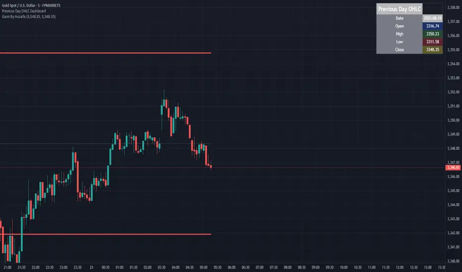
Previous Day OHLC Dashboard (Last N Days)Indicator: Previous Day OHLC Dashboard (Multi-Day)
This indicator displays a dashboard-style table on your chart that shows the Open, High, Low, and Close (OHLC) of the previous trading days. It’s designed to help traders quickly reference key daily levels that often act as important support and resistance zones.
🔑 Features:
Dashboard Table: Shows OHLC data for the last N trading days (default = 3, up to 10).
Customizable Appearance:
Change the position of the dashboard (Top-Right, Top-Left, Bottom-Right, Bottom-Left).
Adjust text size (Tiny → Huge).
Customize colors for header, labels, and each OHLC column.
Yesterday’s OHLC Lines (optional): Plots horizontal lines on the chart for the previous day’s Open, High, Low, and Close.
Intraday & Multi-Timeframe Compatible: Works on all timeframes below Daily — values update automatically from the daily chart.
📊 Use Cases:
Quickly identify yesterday’s key levels for intraday trading.
Track how current price reacts to previous day’s support/resistance.
Keep a multi-day reference for trend bias and range context.
⚙️ How it Works:
The indicator pulls daily OHLC values using request.security() with lookahead_on to ensure prior day’s values are extended across the next session.
These values are displayed in a compact table for quick reference.
Optionally, the most recent daily levels (D-1) are plotted as chart lines.
✅ Perfect for day traders, scalpers, and swing traders who rely on yesterday’s price action to plan today’s trades.
Strat Failed 2-Up/2-Down Scanner v2**Strat Failed 2-Up/2-Down Scanner**
The Strat Failed 2-Up/2-Down Scanner is designed for traders using The Strat methodology, developed by Rob Smith, to identify key reversal patterns in any market and timeframe. This indicator detects two specific candlestick patterns: Failed 2-Up (bearish) and Failed 2-Down (bullish), which signal potential reversals when a directional move fails to follow through.
**What It Does**
- **Failed 2-Up**: Identifies a bearish candle where the low and high are higher than the previous candle’s low and high, but the close is below the open, indicating a failed attempt to continue an uptrend. These are marked with a red candlestick, a red downward triangle above the bar, and a table entry.
- **Failed 2-Down**: Identifies a bullish candle where the high and low are lower than the previous candle’s high and low, but the close is above the open, signaling a failed downtrend. These are marked with a green candlestick, a green upward triangle below the bar, and a table entry.
- A table in the top-right corner displays the signal type ("Failed 2-Up" or "Failed 2-Down") and the ticker symbol for quick reference.
- Alerts are provided for both patterns, making the indicator compatible with TradingView’s screener for automated scanning.
**How It Works**
The indicator analyzes each candlestick’s high, low, and close relative to the previous candle:
- Failed 2-Up: `low > low `, `high > high `, `close < open`.
- Failed 2-Down: `high < high `, `low < low `, `close > open`.
When these conditions are met, the indicator applies visual markers (colored bars and triangles) and updates the signal table. Alert conditions trigger notifications for integration with TradingView’s alert system.
**How to Use**
1. Apply the indicator to any chart (stocks, forex, crypto, etc.) on any timeframe (e.g., 1-minute, hourly, daily).
2. Monitor the chart for red (Failed 2-Up) or green (Failed 2-Down) candlesticks with corresponding triangles.
3. Check the top-right table for the latest signal and ticker.
4. Set alerts by selecting “Failed 2-Up Detected” or “Failed 2-Down Detected” in TradingView’s alert menu to receive notifications (e.g., via email or app).
5. Use the signals to identify potential reversal setups in conjunction with other Strat-based analysis, such as swing levels or time-based strategies.
**Originality**
Unlike other Strat indicators that may focus on swing levels or complex candlestick combinations, this scanner specifically targets Failed 2-Up and Failed 2-Down patterns with clear, minimalist visualizations (bars, triangles, table) and robust alert functionality. Its simplicity makes it accessible for both novice and experienced traders using The Strat methodology.
**Ideal For**
Day traders, swing traders, and scalpers looking to capitalize on reversal signals in trending or ranging markets. The indicator is versatile for any asset class and timeframe, enhancing trade decision-making with The Strat’s pattern-based approach.

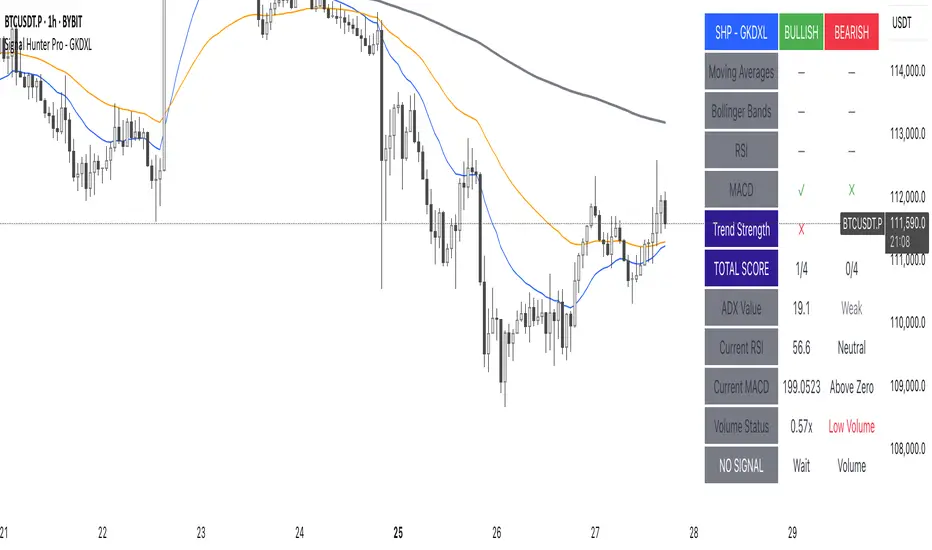
Signal Hunter Pro - GKDXLSignal Hunter Pro - GKDXL combines four powerful technical indicators with trend strength filtering and volume confirmation to generate reliable BUY/SELL signals. This indicator is perfect for traders who want a systematic approach to market analysis without the noise of conflicting signals.
🔧 Core Features
📈 Multi-Indicator Signal System
Moving Averages: EMA 20, EMA 50, and SMA 200 for trend analysis
Bollinger Bands: Dynamic support/resistance with price momentum detection
RSI: Enhanced RSI logic with smoothing and multi-zone analysis
MACD: Traditional MACD with signal line crossovers and zero-line analysis
🎛️ Advanced Filtering System
ADX Trend Strength Filter: Only signals when trend strength exceeds threshold
Volume Confirmation: Ensures signals occur with adequate volume participation
Multi-Timeframe Logic: Works on any timeframe from 1m to 1D and beyond
🚨 Intelligent Signal Generation
Requires 3 out of 4 indicators to align for signal confirmation
Separate bullish and bearish signal conditions
Real-time signal strength scoring (1/4 to 4/4)
Built-in alert system for automated notifications
⚙️ Customizable Parameters
📊 Technical Settings
Moving Averages: Adjustable EMA and SMA periods
Bollinger Bands: Configurable length and multiplier
RSI: Customizable length, smoothing, and overbought/oversold levels
MACD: Flexible fast, slow, and signal line settings
🎯 Risk Management
Risk Percentage: Set your risk per trade (0.1% to 10%)
Reward Ratio: Configure risk-to-reward ratios (1:1 to 1:5)
ADX Threshold: Control minimum trend strength requirements
🖥️ Display Options
Indicator Visibility: Toggle individual indicators on/off
Information Table: Optional detailed status table (off by default)
Volume Analysis: Real-time volume vs. average comparison
🎨 Visual Elements
📈 Chart Indicators
EMA Lines: Blue (20) and Orange (50) exponential moving averages
SMA 200: Gray long-term trend line
Bollinger Bands: Upper/lower bands with semi-transparent fill
Clean Interface: Minimal visual clutter for clear analysis
📋 Information Table (Optional)
Real-time indicator status with ✓/✗/— symbols
Current signal strength and direction
ADX trend strength measurement
Volume confirmation status
No-signal reasons when conditions aren't met
🔔 Alert System
📢 Three Alert Types
BUY Signal: Triggered when 3+ indicators align bullishly
SELL Signal: Triggered when 3+ indicators align bearishly
General Alert: Any signal detection for broader monitoring
📱 Alert Messages
Clear, actionable alert text
Includes indicator name for easy identification
Compatible with webhook integrations
🎯 How It Works
📊 Signal Logic
Indicator Assessment: Each of the 4 indicators is evaluated as Bullish/Bearish/Neutral
Consensus Building: Counts aligned indicators (minimum 3 required)
Filter Application: Applies trend strength and volume filters
Signal Generation: Generates BUY/SELL when all conditions are met
🔍 Indicator States
Moving Averages: Price position, EMA alignment, and crossovers
Bollinger Bands: Price relative to bands and momentum shifts
RSI: Multi-zone analysis with momentum and crossover detection
MACD: Signal line crossovers and zero-line positioning
🎉 Why Choose Signal Hunter Pro?
✅ Multi-Indicator Confirmation reduces false signals
✅ Trend Strength Filtering improves win rate
✅ Volume Confirmation ensures market participation
✅ Customizable Parameters adapt to any trading style
✅ Clean Visual Design doesn't clutter your charts
✅ Professional Alert System for automated trading
✅ No Repainting - reliable historical signals
✅ Works on All Timeframes from scalping to investing
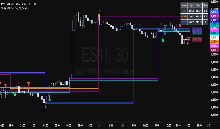
ES 30 Second Futures Session Opening Range30 Second Futures Session Open Range Pro
Overview
This Pine Script indicator is designed for futures traders who utilize opening range breakout strategies across multiple global trading sessions. The indicator provides comprehensive session-based opening range analysis with precise 30-second data sampling and advanced 15-point interval projections.
Key Features
Multi-Session Opening Range Analysis
RTH (Regular Trading Hours): 8:30 AM CT - New York session opening range
Globex (Asian Session): 5:00 PM CT - Asian market session opening range
Europe Session: 2:00 AM CT - European market session opening range
Core Functionality
High/Low/Mid Lines: Displays opening range boundaries and midpoint for each session
Customizable Colors: Full color customization for each session's lines
Price Labels: Optional price display on all levels with session identification
Statistics Table: Real-time table showing high, low, and range width for active sessions
Advanced 15-Point Interval System
RTH-Specific Feature: Plots 5 levels above and below RTH opening range at 15-point intervals
Projection Levels: +15, +30, +45, +60, +75 above RTH high and corresponding negative levels below RTH low
Customizable Labels: Toggle price display and session names on interval lines
Color-Coded: Separate colors for upside and downside projections
Enhanced Trading Tools
Breakout Detection: Automatic identification of opening range breakouts with visual signals
Alert System: Built-in alerts for all session breakouts (up and down)
Range Boxes: Optional visual boxes highlighting opening ranges
Multiple Timeframe Support: Works across various chart timeframes
Display Options
Label Customization: Multiple size options (Tiny, Small, Normal, Large)
Session Toggle: Individual on/off controls for each session
Transparency Controls: Adjustable transparency for range boxes
Professional Styling: Clean, professional appearance suitable for live trading
Trading Applications
This indicator is particularly valuable for:
Gap Trading: Identifying key levels after overnight gaps
Breakout Trading: Clear visual confirmation of range breakouts
Support/Resistance: Using opening ranges as dynamic S/R levels
Session Transition: Understanding how price behaves across global sessions
Position Sizing: Using 15-point intervals for precise entry and exit strategies
Technical Specifications
Version: Pine Script v5
Overlay: True (plots directly on price chart)
Max Lines: 500 (accommodates extensive level plotting)
Timezone: America/Chicago (Central Time)
Data Frequency: 30-second precision for opening range calculation
Usage Notes
Designed for various futures contracts (ES, NQ, YM, RTY, etc.)
Best performance on intraday timeframes (30s, 1m, 5m, 15m, 30m)
Opening ranges calculated based on precise 30-second intervals at session starts
All alerts are customizable through TradingView's alert system
Customization Options
The indicator offers extensive customization including:
Color schemes for each session
Label display preferences
Line transparency and thickness
Statistical table positioning
Alert message customization
NQ 65 Point Futures Session 30 Second Opening RangeNQ 65 Point Futures Session Open Range Pro
Overview
This Pine Script indicator is designed specifically for NASDAQ-100 E-mini (NQ) futures traders who utilize opening range breakout strategies across multiple global trading sessions. The indicator provides comprehensive session-based opening range analysis with advanced 65-point interval projections.
Key Features
Multi-Session Opening Range Analysis
RTH (Regular Trading Hours): 8:30 AM CT - New York session opening range
Globex (Asian Session): 5:00 PM CT - Asian market session opening range
Europe Session: 2:00 AM CT - European market session opening range
Core Functionality
High/Low/Mid Lines: Displays opening range boundaries and midpoint for each session
Customizable Colors: Full color customization for each session's lines
Price Labels: Optional price display on all levels with session identification
Statistics Table: Real-time table showing high, low, and range width for active sessions
Advanced 65-Point Interval System
RTH-Specific Feature: Plots 5 levels above and below RTH opening range at 65-point intervals
Projection Levels: +65, +130, +195, +260, +325 above RTH high and corresponding negative levels below RTH low
Customizable Labels: Toggle price display and session names on interval lines
Color-Coded: Separate colors for upside and downside projections
Enhanced Trading Tools
Breakout Detection: Automatic identification of opening range breakouts with visual signals
Alert System: Built-in alerts for all session breakouts (up and down)
Range Boxes: Optional visual boxes highlighting opening ranges
Multiple Timeframe Support: Works across various chart timeframes
Display Options
Label Customization: Multiple size options (Tiny, Small, Normal, Large)
Session Toggle: Individual on/off controls for each session
Transparency Controls: Adjustable transparency for range boxes
Professional Styling: Clean, professional appearance suitable for live trading
Trading Applications
This indicator is particularly valuable for:
Gap Trading: Identifying key levels after overnight gaps
Breakout Trading: Clear visual confirmation of range breakouts
Support/Resistance: Using opening ranges as dynamic S/R levels
Session Transition: Understanding how price behaves across global sessions
Risk Management: Using 65-point intervals for position sizing and target setting
Technical Specifications
Version: Pine Script v5
Overlay: True (plots directly on price chart)
Max Lines: 500 (accommodates extensive level plotting)
Timezone: America/Chicago (Central Time)
Data Frequency: 30-second precision for opening range calculation
Usage Notes
Designed specifically for NQ futures but may work on other instruments
Best performance on intraday timeframes (1m, 5m, 15m, 30m)
Opening ranges calculated based on first 30 seconds of each session
All alerts are customizable through TradingView's alert system
Customization Options
The indicator offers extensive customization including:
Color schemes for each session
Label display preferences
Line transparency and thickness
Statistical table positioning
Alert message customization

MasterEdge v4 — Trend & Momentum Presets with Filters & ATR RiskMasterEdge v4 — Trend & Momentum with Filters & ATR Risk
MasterEdge v4 is a multi‑timeframe trend and momentum indicator designed to help you stay on the right side of the market while controlling risk. It combines two classic signal engines—Donchian channel breakouts (à la Turtle Traders) and moving‑average crosses—with a suite of filters and risk tools to reduce false signals and keep you disciplined.
## Core features
- **Auto/manual presets:** Automatically adjusts look‑back lengths and thresholds based on the instrument (crypto, forex, indices, etc.) and chart timeframe, or lets you set them manually.
- **Higher‑timeframe bias:** Uses a non‑repainting higher‑timeframe EMA to determine whether the market is trending up or down and gates signals accordingly. You can choose the HTF yourself or let the auto‑engine pick one.
- **Dual signal modes:**
- *Donchian (Turtle)* mode enters on breakouts of an N‑bar channel and exits on a shorter channel.
- *MA Cross* mode buys when a fast EMA/SMA crosses above a slow EMA/SMA and sells on the opposite cross.
- **Advanced filters:** RSI momentum and ADX trend‑strength filters help avoid trades during choppy conditions. Optional volume and HTF‑slope filters require participation and higher‑timeframe momentum. A configurable **quality score** combines these filters so you only take higher‑probability setups.
- **ATR risk rails & position sizing:** Visual stop‑loss and target rails are calculated from ATR to adapt to volatility. An optional position‑size suggestion uses your account size and risk percentage to estimate how much to trade (for informational purposes only).
- **Session gating & status table:** Restrict signals to specific trading sessions. A live table shows your current settings, filter status, quality score and recommended position size, so you always know why a signal fired—or didn’t.
- **Alerts:** Separate long and short alerts with static JSON payloads let you hook the indicator into your notification or webhook workflow.
## How to use
1. **Select auto or manual:** Use the *Preset Mode* input. Auto mode adjusts lengths and thresholds to the ticker and timeframe; manual mode lets you set them explicitly.
2. **Choose a signal mode:** Pick between Donchian breakout or MA cross. Donchian is often better for lower‑timeframe breakouts; MA crosses smooth out noise on higher timeframes.
3. **Enable filters:** Turn on RSI, ADX, volume and/or slope filters and set your desired quality‑score threshold. Higher thresholds yield fewer, cleaner signals.
4. **Define risk:** If you want visual risk guides and position‑size suggestions, leave ATR rails on and input your account size, risk percentage and value per point.
5. **Timeframe pairing:** For intraday trading, try a 5 min chart with a 60 min bias; for swing trading, use a 1 h chart with a 4 h bias. The auto‑engine selects sensible higher‑timeframe defaults, but you can override them.
6. **Confirm signals:** The indicator plots green triangles below bars for long signals and red triangles above bars for short signals. The status table updates each bar with filter states and whether a signal is active.
**Disclaimer:** This script is for educational and analysis purposes only and is not financial advice. Always test on a demo account before trading live and tailor the settings to your strategy, risk tolerance and market behaviour.

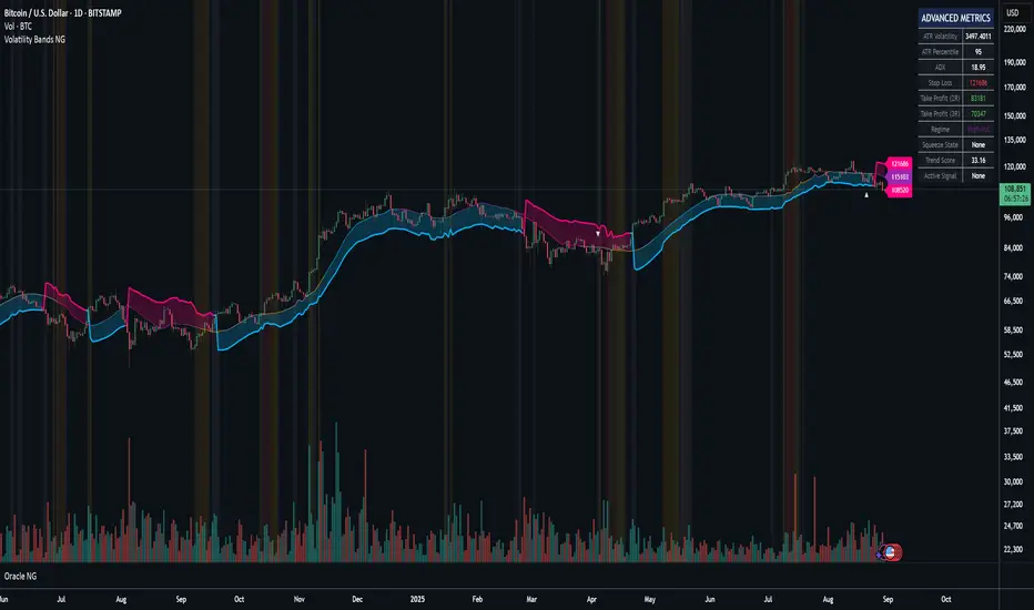
Volatility Bands NGThe Volatility Bands indicator is a sophisticated trading system that combines adaptive filtering technology with volatility-based band mechanics to identify high-probability trading opportunities. At its core, this indicator employs an Adaptive Gaussian Filter that dynamically adjusts to market conditions, providing smoother and more responsive trend detection than traditional moving averages.
Credit at @BigBeluga for his work on gaussian bands.
Key Technologies & Features:
Adaptive Gaussian Filter: Uses a weighted Gaussian distribution that automatically adjusts its sigma parameter based on current market volatility, creating a self-optimizing smoothing mechanism
Integrated ATR Model: Combines traditional ATR with volume-adjusted and momentum-weighted true range calculations (90% ATR + 1% Volume-Adjusted TR + 9% Momentum-Weighted TR) for superior volatility measurement
Trend State Machine: Tracks trend direction, strength (0-100%), and duration using a sophisticated scoring algorithm that weighs momentum (40%), direction consistency (40%), and volatility normalization (20%)
Market Regime Detection: Automatically identifies whether the market is Trending, Choppy, or in Low Volatility mode
Squeeze Detection System: Identifies compression periods using Bollinger Bands vs Keltner Channels methodology, alerting to potential explosive moves
Multi-Factor Confirmation: Validates signals using volume spikes and Money Flow Index (MFI) to filter out false breakouts
Automatic Risk Management: Calculates real-time stop-loss and take-profit levels (2R and 3R) based on current volatility
Primary Trading Strategies:
1. Trend Following with Confirmations
Enter LONG when price crosses above the lower band (bullish trend line) with green arrows showing confirmations
Enter SHORT when price crosses below the upper band (bearish trend line) with red arrows showing confirmations
Look for "✓" symbol indicating both volume and momentum confirmation for highest probability trades
2. Squeeze Breakout Strategy
Monitor orange background highlighting (squeeze active)
Prepare for breakout when squeeze releases (orange diamond appears)
Combine with trend direction for directional bias
Best used in ranging markets transitioning to trending
3. Retest Entry Strategy (Enable "Show Retest Signals")
After initial trend signal, wait for price to pull back to the adaptive filter line
Enter on retest signals (secondary arrows) for better risk/reward
Particularly effective in strong trending markets
4. Market Regime Adaptation
Trending Regime: Use standard trend-following entries with wider stops
Chop Regime: Focus on squeeze plays and avoid trend signals
Low Vol Regime: Tighten stops and reduce position sizes
Risk Management Guidelines:
Use the automatically calculated Stop Loss levels displayed in the info table
Scale out at 2R and 3R take profit levels
Reduce position size when Trend Score < 50%
Increase position size on confirmed signals (✓) with Trend Score > 70%
Advanced Filtering:
Combine trend direction with Market Regime for optimal entries
Use MFI levels (default 40/60) to avoid overbought/oversold entries
Monitor "Duration" in the info table - fresh trends (< 10 bars) often have more momentum
⚡ TL;DR
BUY: Green arrow + price above blue line + trend score > 50%
SELL: Red arrow + price below blue line + trend score < 50%
Best Signals: Arrows with "✓" symbol (full confirmation)
Avoid: Signals during orange squeeze periods (wait for release)
Exit: Use table's stop-loss (red) and take-profit levels (green)
Optimal Settings (already defaulted):
Adaptive Period: ON
Adaptive Sigma: ON
Require Confirmation: ON
Show Squeeze: ON
The indicator does the heavy lifting - just follow the arrows with confirmations and respect the risk levels shown in the table. Works best on 15m+ timeframes for crypto and 1H+ for forex/stocks.
🎯 Pro Tip: The indicator shines in trending markets. When the info table shows "Trending" regime with 70%+ trend score, increase position confidence.
If you’ve found value in Oracle NG and would like to support further development, feel free to donate:
BTC: bc1q2n4up8wzgqdsw9j3dzcn5jaelddu52t7ahydy6
ETH: 0x9b72b42326836528cA608c90811487E5244D7744
AVAX C-Chain: 0x9b72b42326836528cA608c90811487E5244D7744
ATAI Volume Pressure Analyzer V 1.0 — Pure Up/DownATAI Volume Pressure Analyzer V 1.0 — Pure Up/Down
Overview
Volume is a foundational tool for understanding the supply–demand balance. Classic charts show only total volume and don’t tell us what portion came from buying (Up) versus selling (Down). The ATAI Volume Pressure Analyzer fills that gap. Built on Pine Script v6, it scans a lower timeframe to estimate Up/Down volume for each host‑timeframe candle, and presents “volume pressure” in a compact HUD table that’s comparable across symbols and timeframes.
1) Architecture & Global Settings
Global Period (P, bars)
A single global input P defines the computation window. All measures—host‑TF volume moving averages and the half‑window segment sums—use this length. Default: 55.
Timeframe Handling
The core of the indicator is estimating Up/Down volume using lower‑timeframe data. You can set a custom lower timeframe, or rely on auto‑selection:
◉ Second charts → 1S
◉ Intraday → 1 minute
◉ Daily → 5 minutes
◉ Otherwise → 60 minutes
Lower TFs give more precise estimates but shorter history; higher TFs approximate buy/sell splits but provide longer history. As a rule of thumb, scan thin symbols at 5–15m, and liquid symbols at 1m.
2) Up/Down Volume & Derived Series
The script uses TradingView’s library function tvta.requestUpAndDownVolume(lowerTf) to obtain three values:
◉ Up volume (buyers)
◉ Down volume (sellers)
◉ Delta (Up − Down)
From these we define:
◉ TF_buy = |Up volume|
◉ TF_sell = |Down volume|
◉ TF_tot = TF_buy + TF_sell
◉ TF_delta = TF_buy − TF_sell
A positive TF_delta indicates buyer dominance; a negative value indicates selling pressure. To smooth noise, simple moving averages of TF_buy and TF_sell are computed over P and used as baselines.
3) Key Performance Indicators (KPIs)
Half‑window segmentation
To track momentum shifts, the P‑bar window is split in half:
◉ C→B: the older half
◉ B→A: the newer half (toward the current bar)
For each half, the script sums buy, sell, and delta. Comparing the two halves reveals strengthening/weakening pressure. Example: if AtoB_delta < CtoB_delta, recent buying pressure has faded.
[ 4) HUD (Table) Display /i]
Colors & Appearance
Two main color inputs define the theme: a primary color and a negative color (used when Δ is negative). The panel background uses a translucent version of the primary color; borders use the solid primary color. Text defaults to the primary color and flips to the negative color when a block’s Δ is negative.
Layout
The HUD is a 4×5 table updated on the last bar of each candle:
◉ Row 1 (Meta): indicator name, P length, lower TF, host TF
◉ Row 2 (Host TF): current ↑Buy, ↓Sell, ΔDelta; plus Σ total and SMA(↑/↓)
◉ Row 3 (Segments): C→B and B→A blocks with ↑/↓/Δ
◉ Rows 4–5: reserved for advanced modules (Wings, α/β, OB/OS, Top
5) Advanced Modules
5.1 Wings
“Wings” visualize volume‑driven movement over C→B (left wing) and B→A (right wing) with top/bottom lines and a filled band. Slopes are ATR‑per‑bar normalized for cross‑symbol/TF comparability and converted to angles (degrees). Coloring mirrors HUD sign logic with a near‑zero threshold (default ~3°):
◉ Both lines rising → blue (bullish)
◉ Both falling → red (bearish)
◉ Mixed/near‑zero → gray
Left wing reflects the origin of the recent move; right wing reflects the current state.
5.2 α / β at Point B
We compute the oriented angle between the two wings at the midpoint B:
β is the bottom‑arc angle; α = 360° − β is the top‑arc angle.
◉ Large α (>180°) or small β (<180°) flags meaningful imbalance.
◉ Intuition: large α suggests potential selling pressure; small β implies fragile support. HUD cells highlight these conditions.
5.3 OB/OS Spike
OverBought/OverSold (OB/OS) labels appear when directional volume spikes align with a 7‑oscillator vote (RSI, Stoch, %R, CCI, MFI, DeMarker, StochRSI).
◉ OB label (red): unusually high sell volume + enough OB votes
◉ OS label (teal): unusually high buy volume + enough OS votes
Minimum votes and sync window are user‑configurable; dotted connectors can link labels to the candle wick.
5.4 Top3 Volume Peaks
Within the P window the script ranks the top three BUY peaks (B1–B3) and top three SELL peaks (S1–S3).
◉ B1 and S1 are drawn as horizontal resistance (at B1 High) and support (at S1 Low) zones with adjustable thickness (ticks/percent/ATR).
◉ The HUD dedicates six cells to show ↑/↓/Δ for each rank, and prints the exact High (B1) and Low (S1) inline in their cells.
6) Reading the HUD — A Quick Checklist
◉ Meta: Confirm P and both timeframes (host & lower).
◉ Host TF block: Compare current ↑/↓/Δ against their SMAs.
◉ Segments: Contrast C→B vs B→A deltas to gauge momentum change.
◉ Wings: Right‑wing color/angle = now; left wing = recent origin.
◉ α / β: Look for α > 180° or β < 180° as imbalance cues.
◉ OB/OS: Note labels, color (red/teal), and the vote count.
◉Top3: Keep B1 (resistance) and S1 (support) on your radar.
Use these together to sketch scenarios and invalidation levels; never rely on a single signal in isolation.
[ 7) Example Highlights (What the table conveys) /i]
◉ Row 1 shows the indicator name, the analysis length P (default 55), and both TFs used for computation and display.
◉ B1 / S1 blocks summarize each side’s peak within the window, with Δ indicating buyer/seller dominance at that peak and inline price (B1 High / S1 Low) for actionable levels.
◉ Angle cells for each wing report the top/bottom line angles vs. the horizontal, reflecting the directional posture.
◉ Ranks B2/B3 and S2/S3 extend context beyond the top peak on each side.
◉ α / β cells quantify the orientation gap at B; changes reflect shifting buyer/seller influence on trend strength.
Together these visuals often reveal whether the “wings” resemble a strong, upward‑tilted arm supported by buyer volume—but always corroborate with your broader toolkit
8) Practical Tips & Tuning
◉ Choose P by market structure. For daily charts, 34–89 bars often works well.
◉ Lower TF choice: Thin symbols → 5–15m; liquid symbols → 1m.
◉ Near‑zero angle: In noisy markets, consider 5–7° instead of 3°.
◉ OB/OS votes: Daily charts often work with 3–4 votes; lower TFs may prefer 4–5.
◉ Zone thickness: Tie B1/S1 zone thickness to ATR so it scales with volatility.
◉ Colors: Feel free to theme the primary/negative colors; keep Δ<0 mapped to the negative color for readability.
Combine with price action: Use this indicator alongside structure, trendlines, and other tools for stronger decisions.
Technical Notes
Pine Script v6.
◉ Up/Down split via TradingView/ta library call requestUpAndDownVolume(lowerTf).
◉ HUD‑first design; drawings for Wings/αβ/OBOS/Top3 align with the same sign/threshold logic used in the table.
Disclaimer: This indicator is provided solely for educational and analytical purposes. It does not constitute financial advice, nor is it a recommendation to buy or sell any security. Always conduct your own research and use multiple tools before making trading decisions.

ST-Stochastic DashboardST-Stochastic Dashboard: User Manual & Functionality
1. Introduction
The ST-Stochastic Dashboard is a comprehensive tool designed for traders who utilize the Stochastic Oscillator. It combines two key features into a single indicator:
A standard, fully customizable Stochastic Oscillator plotted directly on your chart.
A powerful Multi-Timeframe (MTF) Dashboard that shows the status of the Stochastic %K value across three different timeframes of your choice.
This allows you to analyze momentum on your current timeframe while simultaneously monitoring for confluence or divergence on higher or lower timeframes, all without leaving your chart.
Disclaimer: In accordance with TradingView's House Rules, this document describes the technical functionality of the indicator. It is not financial advice. The indicator provides data based on user-defined parameters; all trading decisions are the sole responsibility of the user. Past performance is not indicative of future results.
2. How It Works (Functionality)
The indicator is divided into two main components:
A. The Main Stochastic Indicator (Chart Pane)
This is the visual representation of the Stochastic Oscillator for the chart's current timeframe.
%K Line (Blue): This is the main line of the oscillator. It shows the current closing price in relation to the high-low range over a user-defined period. A high value means the price is closing near the top of its recent range; a low value means it's closing near the bottom.
%D Line (Black): This is the signal line, which is a moving average of the %K line. It is used to smooth out the %K line and generate trading signals.
Overbought Zone (Red Area): By default, this zone is above the 75 level. When the Stochastic lines are in this area, it indicates that the asset may be "overbought," meaning the price is trading near the peak of its recent price range.
Oversold Zone (Blue Area): By default, this zone is below the 25 level. When the Stochastic lines are in this area, it indicates that the asset may be "oversold," meaning the price is trading near the bottom of its recent price range.
Crossover Signals:
Buy Signal (Blue Up Triangle): A blue triangle appears below the candles when the %K line crosses above the Oversold line (e.g., from 24 to 26). This suggests a potential shift from bearish to bullish momentum.
Sell Signal (Red Down Triangle): A red triangle appears above the candles when the %K line crosses below the Overbought line (e.g., from 76 to 74). This suggests a potential shift from bullish to bearish momentum.
B. The Multi-Timeframe Dashboard (Table on Chart)
This is the informational table that appears on your chart. Its purpose is to give you a quick, at-a-glance summary of the Stochastic's condition on other timeframes.
Function: The script uses TradingView's request.security() function to pull the %K value from three other timeframes that you specify in the settings.
Efficiency: The table is designed to update only on the last (most recent) bar (barstate.islast) to ensure the script runs efficiently and does not slow down your chart.
Columns:
Timeframe: Displays the timeframe you have selected (e.g., '5', '15', '60').
Stoch %K: Shows the current numerical value of the %K line for that specific timeframe, rounded to two decimal places.
Status: Interprets the %K value and displays a clear status:
OVERBOUGHT (Red Background): The %K value is above the "Upper Line" setting.
OVERSOLD (Blue Background): The %K value is below the "Lower Line" setting.
NEUTRAL (Black/Dark Background): The %K value is between the Overbought and Oversold levels.
3. Settings / Parameters in Detail
You can access these settings by clicking the "Settings" (cogwheel) icon on the indicator name.
Stochastic Settings
This group controls the behavior and appearance of the main Stochastic indicator plotted in the pane.
Stochastic Period (length)
Description: This is the lookback period used to calculate the Stochastic Oscillator. It defines the number of past bars to consider for the high-low range.
Default: 9
%K Smoothing (smoothK)
Description: This is the moving average period used to smooth the raw Stochastic value, creating the %K line. A higher value results in a smoother, less sensitive line.
Default: 3
%D Smoothing (smoothD)
Description: This is the moving average period applied to the %K line to create the %D (signal) line. A higher value creates a smoother signal line that lags further behind the %K line.
Default: 6
Lower Line (Oversold) (ul)
Description: This sets the threshold for the oversold condition. When the %K line is below this value, the dashboard will show "OVERSOLD". It is also the level the %K line must cross above to trigger a Buy Signal triangle.
Default: 25
Upper Line (Overbought) (ll)
Description: This sets the threshold for the overbought condition. When the %K line is above this value, the dashboard will show "OVERBOUGHT". It is also the level the %K line must cross below to trigger a Sell Signal triangle.
Default: 75
Dashboard Settings
This group controls the data and appearance of the multi-timeframe table.
Timeframe 1 (tf1)
Description: The first timeframe to be displayed in the dashboard.
Default: 5 (5 minutes)
Timeframe 2 (tf2)
Description: The second timeframe to be displayed in the dashboard.
Default: 15 (15 minutes)
Timeframe 3 (tf3)
Description: The third timeframe to be displayed in the dashboard.
Default: 60 (1 hour)
Dashboard Position (table_pos)
Description: Allows you to select where the dashboard table will appear on your chart.
Options: top_right, top_left, bottom_right, bottom_left
Default: bottom_right
4. How to Use & Interpret
Configuration: Adjust the Stochastic Settings to match your trading strategy. The default values (9, 3, 6) are common, but feel free to experiment. Set the Dashboard Settings to the timeframes that are most relevant to your analysis (e.g., your entry timeframe, a medium-term timeframe, and a long-term trend timeframe).
Analysis with the Dashboard: The primary strength of this tool is confluence. Look for situations where multiple timeframes align. For example:
If the dashboard shows OVERSOLD on the 15-minute, 60-minute, and your current 5-minute chart, a subsequent Buy Signal on your 5-minute chart may carry more weight.
Conversely, if your 5-minute chart shows OVERSOLD but the 60-minute chart is strongly OVERBOUGHT, it could indicate that you are looking at a minor pullback in a larger downtrend.
Interpreting States:
Overbought is not an automatic "sell" signal. It simply means momentum has been strong to the upside, and the price is near its recent peak. It could signal a potential reversal, but the price can also remain overbought for extended periods in a strong uptrend.
Oversold is not an automatic "buy" signal. It means momentum has been strong to the downside. While it can signal a potential bounce, prices can remain oversold for a long time in a strong downtrend.
Use the signals and dashboard states as a source of information to complement your overall trading strategy, which should include other forms of analysis such as price action, support/resistance levels, or other indicators.

Guitar Hero [theUltimator5]The Guitar Hero indicator transforms traditional oscillator signals into a visually engaging, game-like display reminiscent of the popular Guitar Hero video game. Instead of standard line plots, this indicator presents oscillator values as colored segments or blocks, making it easier to quickly identify market conditions at a glance.
Choose from 8 different technical oscillators:
RSI (Relative Strength Index)
Stochastic %K
Stochastic %D
Williams %R
CCI (Commodity Channel Index)
MFI (Money Flow Index)
TSI (True Strength Index)
Ultimate Oscillator
Visual Display Modes
1) Boxes Mode : Creates distinct rectangular boxes for each bar, providing a clean, segmented appearance. (default)
This visual display is limited by the amount of box plots that TradingView allows on each indictor, so it will only plot a limited history. If you want to view a similar visual display that has minor breaks between boxes, then use the fill mode.
2) Fill Mode : Uses filled areas between plot boundaries.
Use this mode when you want to view the plots further back in history without the strict drawing limitations.
Five-Level Color-Coded System
The indicator normalizes all oscillator values to a 0-100 scale and categorizes them into five distinct levels:
Level 1 (Red): Very Oversold (0-19)
Level 2 (Orange): Oversold (20-29)
Level 3 (Yellow): Neutral (30-70)
Level 4 (Aqua): Overbought (71-80)
Level 5 (Lime): Very Overbought (81-100)
Customization Options
Signal Parameters
Signal Length: Primary period for oscillator calculation (default: 14)
Signal Length 2: Secondary period for Stochastic %D and TSI (default: 3)
Signal Length 3: Tertiary period for TSI calculation (default: 25)
Display Controls
Show Horizontal Reference Lines: Toggle grid lines for better level identification
Show Information Table: Display current signal type, value, and normalized value
Table Position: Choose from 9 different screen positions for the info table
Display Mode: Switch between Boxes and Fills visualization
Max Bars to Display: Control how many historical bars to show (50-450 range)
Normalization Process
The indicator automatically normalizes different oscillator ranges to a consistent 0-100 scale:
Williams %R: Converts from -100/0 range to 0-100
CCI: Maps typical -300/+300 range to 0-100
TSI: Transforms -100/+100 range to 0-100
Other oscillators: Already use 0-100 scale (RSI, Stochastic, MFI, Ultimate Oscillator)
This was designed as an educational tool
The gamified approach makes learning about oscillators more engaging for new traders.

Jitendra: MTF AIO Technical Indicators with Trend ▲▼Jitendra: MTF AIO Technical Indicators with Trend ▲▼
Why We Designed this Indicator
we build this indicator to Analysis Multi-timeframe Technical Data in dashboard to get Better and Quick Data in which Time Frame where it is in Momentum or in Swing,
By combining multiple technical indicators with trend direction arrows and displaying them in a customizable table.
It also optionally plots some indicators EMA, VWAP, Supertrend, Bollinger Bands on the chart.
Traders who want a compact technical summary across multiple timeframes without switching charts.
Quickly assess trend strength, momentum, divergence, volume pressure in one glance.
Combine with price action to make higher-confidence entries/exits.
How to Use This Indicator
In setting there are Two parts
First Part - for Plot Multi EMA, Bollinger Band, Supertrend 10,2 & 10, 3 factorial
Second Part- To get Data on Table for Quick Analysis
Chart Plots With Enable Disable Toggle in Setting
VWAP (optional)
4 EMAs (lengths configurable)
Bollinger Bands (optional)
Two separate Supertrend indicators with custom ATR period and multiplier
Indicators Data in Table
For each selected timeframe:
VWAP position (price above/below)
MACD value + trend arrow
MACD Histogram (optional)
RSI value + arrow (rising/falling)
ADX value + arrow (strength rising/falling)
+DI / -DI values + trend arrows
RSI Divergence detection (regular + hidden)
EMA levels (up/down relative to price)
EMA crossover (EMA1 vs EMA2 arrow)
Stochastic %K
Volume Matrix:
Raw volume
20 SMA volume
Volume % change from SMA
Multi-Timeframe Support
Current timeframe + up to 5 user-defined timeframes (e.g., 1H, 4H, Daily, Weekly, Monthly)
Customizable Toggles
Enable/disable any indicator
Choose which EMAs to show
Show/hide trend arrows
Choose which volume metrics to display
Choose table position (top_left, top_right, etc.)
Choose table text size
Trend Arrows & Colors
Green ▲ = bullish / rising trend
Red ▼ = bearish / falling trend
Gray – = neutral/no change
Background colors indicate overbought/oversold, trend strength, or volume surge.
Indicator Data Fetch PINE CODE Short Summary
request.security() → pulls data from the selected timeframe (tf).
Each indicator’s calculation can be wrapped inside request.security() so the values are computed on that timeframe.
//@version=5
// === 1. VWAP ===
vwap_htf = request.security(syminfo.tickerid, tf, ta.vwap)
// === 2. MACD ===
macd_src = request.security(syminfo.tickerid, tf, close)
macd_val = ta.ema(macd_src, 12) - ta.ema(macd_src, 26)
macd_sig = ta.ema(macd_val, 9)
macd_hist = macd_val - macd_sig
// === 3. RSI ===
rsi_htf = request.security(syminfo.tickerid, tf, ta.rsi(close, 14))
// === 4. ADX & DI ===
adx_htf = request.security(syminfo.tickerid, tf, ta.adx(14))
plusDI = request.security(syminfo.tickerid, tf, ta.plus_di(14))
minusDI = request.security(syminfo.tickerid, tf, ta.minus_di(14))
// === 5. Supertrend ===
= request.security(syminfo.tickerid, tf, ta.supertrend(3, 7))
// === 6. Bollinger Bands ===
basis = ta.sma(close, 20)
dev = ta.stdev(close, 20)
bb_up = request.security(syminfo.tickerid, tf, basis + dev * 2)
bb_low = request.security(syminfo.tickerid, tf, basis - dev * 2)
// === 7. Stochastic ===
k = ta.sma(ta.stoch(close, high, low, 14), 3)
d = ta.sma(k, 3)
stochK = request.security(syminfo.tickerid, tf, k)
stochD = request.security(syminfo.tickerid, tf, d)
// === 8. EMA ===
ema20 = request.security(syminfo.tickerid, tf, ta.ema(close, 20))
ema50 = request.security(syminfo.tickerid, tf, ta.ema(close, 50))
// === 9. Historical Volatility (HV) ===
logReturns = math.log(close / close )
hv = request.security(syminfo.tickerid, tf, ta.stdev(logReturns, 20) * math.sqrt(252))
plot(vwap_htf, "VWAP")
plot(macd_val, "MACD", color=color.blue)
plot(rsi_htf, "RSI", color=color.purple)

Strong Economic Event Indicator (mtbr)Description:
This indicator is designed for traders to visualize entry levels, targets (TP1, TP2, TP3), and stop loss around key economic events for the selected asset, defaulting to XAUUSD. It provides a clear reference for potential market movements based on the event's surprise and direction (Bullish, Bearish, or Neutral).
Key Features:
Customizable Event Selection:
Select from a list of major economic events including ISM Services PMI, CPI, Non-Farm Payrolls, Fed Rate Decision, and more.
Set the exact year, month, day, hour, and minute for the event so that lines and labels appear at the correct bar.
Surprise Calculation and Direction:
Automatically calculates the difference between Actual and Forecast.
Displays the market direction in the table as Bullish, Bearish, or Neutral.
Price Levels in Pips Relative to Entry:
Entry, three targets (TP1, TP2, TP3), and Stop Loss can be set in pips relative to the entry price.
Directional logic ensures that levels adjust automatically according to Bullish or Bearish surprise.
Each line and label is independent and updates only when its corresponding input changes.
Chart Visualization:
Colored lines and labels:
Entry → Blue
TPs → Green
Stop Loss → Red
Vertical event line → Orange (dashed), highlighting the event release moment.
Integrated Informative Table:
Displays:
Selected economic event
Entry price
TP1, TP2, TP3 levels
Market direction status
Color-coded: green for Bullish, red for Bearish, gray for Neutral.
How to use the script:
Add the indicator to the chart of your preferred asset (default is XAUUSD).
Select the economic event from the drop-down list.
Set the event date and time in the input panel.
Enter the Entry Price and pip values for TP1, TP2, TP3, and Stop Loss according to your strategy.
The indicator will automatically draw lines and labels on the chart and update the table with event details and market direction.
Whenever an input value changes, only the corresponding line and label will update, leaving other levels intact.
Important Notes:
This indicator is visual and educational only; it does not place trades automatically.
Make sure the event timezone is correct to match your local release time.
Use in combination with your own trading strategy and risk management.
TradingView Publication Compliance:
Full instructions for usage
Explanation of inputs and settings
Description of line and label behavior
Educational disclaimer (no automated trading)

VWAP Multi-TimeframeThis is a multi-timeframe VWAP indicator that provides volume weighted average price calculations for the following time periods:
15min
30min
1H
2H
4H
6H
8H
12H
1D
1W
1M
3M
6M
1Y
You can use the lower timeframes for short term trend control areas and use the longer timeframes for long term trend control areas. Trade in the direction of the trend and watch for price reactions that you can trade when price gets close to or touches any of these levels.
This indicator will provide a data plot value of 1 for bullish when price is above all VWAPs that are turned on, -1 for bearish when price is below all VWAPs that are turned on and 0 for neutral when price is not above or below all VWAPs. Use this 1, -1, 0 value as a filter on your signal generating indicators so that you can prevent signals from coming in unless they are in the same direction as the VWAP trend.
Features
Trend direction value of 1, -1 or 0 to send to external indicators so you can filter your signal generating indicators using the VWAP trend.
Trend table that shows you whether price is above or below all of the major VWAPs. This includes the daily, weekly, monthly and yearly VWAPs.
Trend coloring between each VWAP and the close price of each candle so you can easily identify the trend direction.
Customization
Set the source value to use for all of the VWAP calculations. The default is HLC3.
Turn on or off each VWAP.
Change the color of each VWAP line.
Change the thickness of each VWAP line.
Turn on or off labels for each VWAP or turn all labels on or off at once.
Change the offset length from the current bar to the label text.
Change the label text color.
Turn on or off trend coloring for each VWAP.
Change the color for up trends and down trends.
Turn on or off the trend direction display table.
Change the location of the trend direction display table.
Adjust the background and text colors on the trend direction display table.
How To Use The Trend Direction Filtering Feature
The indicator will provide a data plot value of 1 for bullish when price is above all of the VWAPs that are turned on, a value of -1 for bearish when price is below all of the VWAPS that are turned on and a value of 0 for neutral when price is above and below some of the VWAPs that are turned on.
The name of the value to use with your external indicators will show up as: VWAP Multi-Timeframe: Trend Direction To Send To External Indicators
Make sure to use that as your source on your external indicators to get the correct values.
This 1, -1 or 0 value can then be used by another external indicator to tell the indicator what is allowed to do. For instance if you have another indicator that provides buy and sell signals, you can use this trend direction value to prevent your other indicator from giving a sell signal when the VWAP trend is bullish or prevent your other indicator from giving a buy signal when the VWAP trend is bearish.
You will need to program your other indicators to use this trend filtering feature, but this indicator is already set up with this filtering code so you can use it with any other indicator that you choose to filter(if you know how to customize pine script).
Markets You Can Use This Indicator On
This indicator uses volume and price to calculate values, so it will work on any chart that provides volume and price data.

StratNinjaTableAuthor’s Instructions for StratNinjaTable
Purpose:
This indicator is designed to provide traders with a clear and dynamic table displaying The Strat candle patterns across multiple timeframes of your choice.
Usage:
Use the input panel to select which timeframes you want to monitor in the table.
Choose the table position on the chart (top left, center, right, or bottom).
The table will update each bar, showing the candle type, direction arrow, and remaining time until the candle closes for each selected timeframe.
Hover over or inspect the table to understand current market structure per timeframe using The Strat methodology.
Notes:
The Strat pattern is displayed as "1", "2U", "2D", or "3" based on the relationship of current and previous candle highs and lows.
The timer updates in real-time and adapts to daily, weekly, monthly, and extended timeframes.
This script requires Pine Script version 6. Please use it on supported platforms.
MFI or other indicators are not included in this base version but can be integrated separately if desired.
Credits:
Developed and inspired by shayy110 — thanks for your foundational work on The Strat in Pine Script.
Disclaimer:
This script is for educational and informational purposes only. Always verify signals and manage risk accordingly.
Time Window Optimizer [theUltimator5]The Time Window Optimizer is designed to identify the most profitable 30-minute trading windows during regular market hours (9:30 AM - 4:00 PM EST). This tool helps traders optimize their intraday strategies by automatically discovering time periods with the highest historical performance or allowing manual selection for custom analysis. It also allows you to select manual timeframes for custom time period analysis.
🏆 Automatic Window Discovery
The core feature of this indicator is its intelligent Auto-Find Best 30min Window system that analyzes all 13 possible 30-minute time slots during market hours.
How the Algorithm Works:
Concurrent Analysis: The indicator simultaneously tracks performance across all 13 time windows (9:30-10:00, 10:00-10:30, 10:30-11:00... through 15:30-16:00)
Daily Performance Tracking: For each window, it captures the percentage change from window open to window close on every trading day
Cumulative Compounding: Daily returns are compounded over time to show the true long-term performance of each window, starting from a normalized value of 1.0
Dynamic Optimization: The system continuously identifies the window with the highest cumulative return and highlights it as the optimal choice
Statistical Validation: Performance is validated through multiple metrics including average daily returns, win rates, and total sample size
Visual Representation:
Best Window Line: The top-performing window is displayed as a thick colored line for easy identification
All 13 Lines (optional): Users can view performance lines for all time windows simultaneously to compare relative performance
Smart Coloring: Lines are color-coded (green for gains, red for losses) with the best performer highlighted in a user-selected color
📊 Comprehensive Performance Analysis
The indicator provides detailed statistics in an information table:
Average Daily Return: Mean percentage change per trading session
Cumulative Return: Total compounded performance over the analysis period
Win Rate: Percentage of profitable days (colored green if ≥50%, red if <50%)
Buy & Hold Comparison: Shows outperformance vs. simple buy-and-hold strategy
Sample Size: Number of trading days analyzed for statistical significance
🛠️ User Settings
imgur.com
Auto-Optimization Controls:
Auto-Find Best Window: Toggle to enable/disable automatic optimization
Show All 13 Lines: Display all time window performance lines simultaneously
Best Window Line Color: Customize the color of the top-performing window
Manual Mode:
imgur.com
Custom Time Window: Set any desired time range using session format (HHMM-HHMM)
Crypto Support: Built-in timezone offset adjustment for cryptocurrency markets
Chart Type Options: Switch between candlestick and line chart visualization
Visual Customization:
imgur.com
Background Highlighting: Optional background color during active time windows
Candle Coloring: Custom colors for bullish/bearish candles within the time window
Table Positioning: Flexible placement of the statistics table anywhere on the chart
🔧 Technical Features
Market Compatibility:
Stock Markets: Optimized for traditional market hours (9:30 AM - 4:00 PM EST)
Cryptocurrency: Includes timezone offset adjustment for 24/7 crypto markets
Exchange Detection: Automatically detects crypto exchanges and applies appropriate settings
Performance Optimization:
Efficient Calculation: Uses separate arrays for each time block to minimize computational overhead
Real-time Updates: Dynamically updates the best-performing window as new data becomes available
Memory Management: Optimized data structures to handle large datasets efficiently
💡 Use Cases
Strategy Development: Identify the most profitable trading hours for your specific instruments
Risk Management: Focus trading activity during historically successful time periods
Performance Comparison: Evaluate whether time-specific strategies outperform buy-and-hold
Market Analysis: Understand intraday patterns and market behavior across different time windows
📈 Key Benefits
Data-Driven Decisions: Base trading schedules on historical performance data
Automated Analysis: No manual calculation required - the algorithm does the work
Flexible Implementation: Works in both automated discovery and manual selection modes
Comprehensive Metrics: Multiple performance indicators for thorough analysis
Visual Clarity: Clear, color-coded visualization makes interpretation intuitive
This indicator transforms complex intraday analysis into actionable insights, helping traders optimize their time allocation and improve overall trading performance through systematic, data-driven approach to market timing.