Statistcal Daily Profile & Ranges# Statistical Daily Profile & Ranges - TradingView Publication Guide
## Overview
The **Statistical Daily Profile & Ranges** indicator is a comprehensive tool designed to analyze intraday session behavior and daily range characteristics. It combines Average Daily Range (ADR) projection levels with detailed session-by-session statistics and probability-based trading insights derived from historical price action patterns.
## What This Indicator Does
This indicator provides traders with three core analytical components:
1. **ADR Projection Levels** - Dynamic support/resistance levels based on historical daily ranges
2. **Session Range Analysis** - Visual boxes and statistical breakdowns for four key trading sessions
3. **Dynamic Probability Display** - Real-time probability statistics based on overnight session relationships
## How It Works
### Average Daily Range (ADR) Calculation
The indicator calculates the average daily range over a user-defined lookback period (default: 10 days) and projects this range from each day's opening price. This creates two key levels:
- **ADR High**: Opening price + average daily range
- **ADR Low**: Opening price - average daily range
- **ADR Median**: The opening price (middle of the projected range)
These levels are recalculated at the start of each trading day and extend forward, providing dynamic support and resistance zones based on recent volatility characteristics.
### Session Tracking & Statistics
The indicator monitors four distinct trading sessions (times in Eastern Time):
1. **Asia Session** (8:00 PM - 2:00 AM)
2. **London Session** (2:00 AM - 8:00 AM)
3. **NY Open** (8:00 AM - 9:00 AM)
4. **NY Initial Balance** (9:30 AM - 10:30 AM)
For each session, the indicator:
- Draws a colored box showing the session's high-to-low range
- Tracks the opening price, high, and low
- Stores historical data for statistical analysis
- Calculates average ranges by day of week (Monday through Friday)
The session statistics are displayed in a customizable table showing average point ranges for each session across different weekdays, helping traders identify which sessions and days typically produce the most movement.
### Dynamic Probability System
The indicator analyzes the relationship between the Asia and London sessions to determine the current market setup. After the London session closes, it automatically detects one of four possible conditions:
**1. London Engulfs Asia**
- London session breaks both above Asia's high AND below Asia's low
- This indicates strong momentum during the European session
- Most common occurrence pattern
**2. Asia Engulfs London**
- Asia session range completely contains the London session range
- Indicates consolidation during London hours
- Relatively rare pattern (occurs approximately 5.36% of the time)
**3. London Partially Engulfs Upwards**
- London breaks above Asia's high but stays above Asia's low
- Suggests bullish momentum continuation from Asia into London
**4. London Partially Engulfs Downwards**
- London breaks below Asia's low but stays below Asia's high
- Suggests bearish momentum continuation from Asia into London
Once a condition is detected, the indicator displays a probability table showing historically observed outcomes for that specific setup, including:
- Probability of NY session taking out key levels (Asia high/low, London high/low)
- Probability of NY session engulfing the entire overnight range
- Directional bias for NY Cash session (9:30 AM - 4:00 PM)
## How to Use This Indicator
### Initial Setup
1. Add the indicator to your chart (works on any intraday timeframe below Daily)
2. Adjust the **ADR Days** setting (default: 10) to control the lookback period for range calculation
3. Adjust the **Session Lookback Days** setting (default: 50) to determine how much historical data feeds the statistics tables
### Reading the ADR Levels
- Use the **ADR High** and **ADR Low** lines as potential profit targets or areas where price may encounter resistance
- The **ADR Median** line represents the opening price and can act as a pivot point for intraday directional bias
- If price reaches the ADR High early in the session, it suggests strong bullish momentum; conversely for ADR Low
- These levels adapt daily based on recent volatility, making them more responsive than static levels
### Interpreting Session Boxes
- **Session boxes** visually highlight when each trading session is active and its price range
- Larger boxes indicate higher volatility during that session
- Compare current session ranges to the statistical averages shown in the table
- Sessions that are unusually quiet or active relative to historical averages may signal compression or expansion
### Using the Session Statistics Table
- The table shows average point ranges for each session broken down by weekday
- Identify which sessions typically produce the most movement on specific days
- For example, if London on Thursdays averages 40 points while Mondays average 25 points, you can adjust position sizing or expectations accordingly
- The **Total** column shows the overall average across all days
- Sample sizes (shown in brackets if enabled) indicate data reliability
### Trading with the Probability Table
The probability table updates dynamically after the London session closes and shows statistically probable outcomes based on 12 years of NQ futures data.
**Important Limitations:**
- **These probabilities are derived from NQ (Nasdaq E-mini futures) data only**
- **Do NOT apply these probability statistics to other instruments** (ES, stocks, forex, etc.)
- The probabilities represent historical frequencies, not guarantees
- Always combine with your own analysis, risk management, and market context
**How to Apply the Probabilities:**
When **London Engulfs Asia**:
- Watch for NY session to take out London's extremes (72.33% probability for high, 71.12% for low)
- Slight bullish bias in NY Cash session (54.80% vs 45.20%)
- Lower probability of complete overnight engulfment (44.13%)
When **Asia Engulfs London** (rare - 5.36% occurrence):
- Higher probability NY takes Asia's high (75.86%)
- Moderately high probability NY takes Asia's low (65.52%)
- Slight increase in bullish bias (58.42% vs 41.58%)
- Recognize this as an unusual setup
When **London Partially Engulfs Upwards**:
- Very high probability NY takes London high (81.51%)
- Strong probability NY takes London low (64.45%)
- Moderate probability NY takes Asian low (53.16%)
- Slight bullish bias (55.52%)
When **London Partially Engulfs Downwards**:
- Very high probability NY takes London low (75.29%)
- Strong probability NY takes London high (68.80%)
- Moderate probability NY takes Asian high (56.44%)
- Slight bullish bias maintained (52.99%)
### Practical Trading Applications
**Scenario 1: Range Projection**
If the ADR is 500 points and the market opens at 25,000:
- ADR High: 25,500 (potential resistance/target)
- ADR Low: 24,500 (potential support/target)
- Monitor how price interacts with these levels throughout the day
**Scenario 2: Session-Based Trading**
Using the statistics table, you notice London on Wednesdays averages 35 points. During a Wednesday London session:
- If London has already moved 30 points, the session may be exhausting its typical range
- If London has only moved 15 points with an hour remaining, there may be expansion potential
- Adjust stop losses and targets based on typical session behavior
**Scenario 3: Probability-Based Setup**
It's 8:05 AM ET and the indicator shows "London Partially Engulfs Upwards":
- You now know there's an 81.51% historical probability NY will take out London's high
- There's a 53.16% probability NY will reach down to Asia's low
- The NY Cash session has a slight bullish bias (55.52%)
- Consider this alongside your technical analysis for directional bias and level targeting
## Customization Options
### Visual Settings
- **Line Width**: Adjust thickness of ADR levels
- **ADR Color/Style**: Customize appearance of ADR projection lines (solid, dashed, dotted)
- **Median Line**: Toggle visibility and customize appearance separately
- **Session Box Colors**: Customize each session's box color independently
- **Show Session Boxes**: Toggle session box visibility on/off
### Label Settings
- **ADR Labels**: Show/hide labels for ADR High and ADR Low, adjust size
- **Median Label**: Separate control for median line label
- **Session Labels**: Show/hide session name labels, adjust size
- **Label Colors**: Customize text colors for all labels
### Table Settings
- **Session Stats Table**: Position (9 locations available), size (Tiny to Huge), toggle on/off
- **Sample Sizes**: Show/hide the number of historical samples used for each calculation
- **Probabilities Table**: Separate position and size controls, toggle on/off
### Session Times
- Each session's time range can be customized to fit different markets or preferences
- All times are in Eastern Time (America/New_York timezone)
## Technical Notes
### Data Requirements
- The indicator requires sufficient historical data based on your lookback settings
- Minimum recommended: 50+ days of intraday data for reliable statistics
- Works on any timeframe below Daily (1-minute, 5-minute, 15-minute, etc.)
### Calculation Methodology
- **ADR Calculation**: Simple average of absolute daily high-low ranges
- **Session Statistics**: Mean average of ranges for each session filtered by day of week
- **Condition Detection**: Boolean logic comparing session high/low relationships
- All calculations update in real-time as new bars form
### Probability Data Source
The probability statistics displayed in the dynamic table are derived from:
- **Dataset**: 12 years of NQ (Nasdaq E-mini futures) historical data
- **Methodology**: Frequency analysis of outcomes following specific setup conditions
- **Time Period**: Multiple market cycles including various volatility regimes
**Critical Warning**: These probabilities are specific to NQ and reflect that instrument's behavior patterns. Market microstructure, participant behavior, and volatility characteristics differ significantly across instruments. Do not apply these NQ-derived probabilities to other markets (ES, RTY, YM, individual stocks, forex, commodities, etc.).
## Best Practices
1. **Combine with Other Analysis**: Use this indicator as one component of a complete trading methodology, not a standalone system
2. **Respect Risk Management**: Probabilities are not certainties; always use proper position sizing and stop losses
3. **Context Matters**: High-impact news events, holiday trading, and extreme volatility can invalidate typical patterns
4. **Verify Statistics**: Monitor your own results and compare to the displayed probabilities
5. **Adapt Session Times**: If trading instruments with different active hours, adjust session times accordingly
6. **Regular Calibration**: Periodically review if the session averages and probabilities remain relevant to current market conditions
## Understanding Originality
This indicator is original in its approach to combining three analytical frameworks into a single tool:
1. **Dynamic ADR Projection**: Unlike static pivot points, these levels adapt daily based on recent volatility
2. **Session-Specific Statistics**: Goes beyond simple volume profiles by quantifying average ranges for specific time windows across weekdays
3. **Conditional Probability Display**: Automatically detects overnight session relationships and displays relevant probability data rather than showing all scenarios simultaneously
The conditional logic system that determines which probability set to display is a key differentiator—traders only see the statistics relevant to the current market setup, reducing information overload and improving decision-making clarity.
## Summary
The **Statistical Daily Profile & Ranges** indicator provides traders with a comprehensive framework for understanding daily range potential, session-specific behavior patterns, and probability-based setup analysis. By combining ADR projection levels with detailed session statistics and dynamic probability displays, traders gain multiple perspectives on potential price movement within the trading day.
The indicator is most effective when used to:
- Set realistic profit targets based on average daily range
- Identify which sessions typically produce movement on specific weekdays
- Understand probability-weighted outcomes for different overnight setup conditions (NQ only)
- Visualize session ranges and compare them to historical averages
Remember that all statistical analysis reflects historical patterns, and market behavior can change. Always combine indicator signals with sound risk management, proper position sizing, and your own market analysis.
In den Scripts nach "Table" suchen

RS Rating Multi-TimeframeRS Rating Multi-Timeframe (IBD-Style Relative Strength)
Short Description:
IBD-style Relative Strength Rating (1-99) comparing any stock's performance vs the S&P 500 across multiple timeframes.
Full Description:
Overview
This indicator calculates an IBD-style Relative Strength (RS) Rating that measures a stock's price performance relative to the S&P 500 over the past 12 months. The rating scale ranges from 1 (weakest) to 99 (strongest), telling you how a stock ranks against all other stocks in terms of relative performance.
How It Works
The RS Rating uses a weighted formula based on quarterly performance:
Last 63 days (1 quarter): 40% weight
Last 126 days (2 quarters): 20% weight
Last 189 days (3 quarters): 20% weight
Last 252 days (4 quarters): 20% weight
This weighting emphasizes recent performance while still accounting for longer-term strength.
Rating Interpretation
90-99 (Elite): Top 10% of all stocks - exceptional relative strength
80-89 (Excellent): Top 20% - strong leadership candidates
50-79 (Average): Middle of the pack
30-49 (Below Average): Underperforming the market
1-29 (Weak): Bottom 30% - avoid or consider shorting
Features
Multi-Timeframe: Works on any timeframe from 1-hour to weekly (always uses daily data for calculation)
Moving Average: Optional EMA or SMA of the RS Rating to smooth signals
Visual Zones: Color-coded zones for quick identification of strength/weakness
Signal Markers: Triangles appear when RS crosses key levels (80 and 30)
Info Table: Displays current RS Rating, change, MA value, and raw score
Alerts: Built-in alerts for key crossover events
Settings
Show Moving Average: Toggle MA line on/off
MA Length: Period for the moving average (default: 10)
MA Type: Choose between EMA or SMA
Benchmark Index: Change the comparison index (default: SP:SPX)
Show Rating Table: Toggle the info table on/off
How To Use
Buy candidates: Look for stocks with RS Rating above 80, ideally rising
Avoid: Stocks with RS Rating below 30 or falling rapidly
Confirmation: Use RS above its moving average as additional confirmation
Divergence: Watch for RS making new highs before price (bullish) or new lows before price (bearish)
Credits
RS Rating calculation methodology inspired by Investor's Business Daily (IBD) and adapted from Fred6724's RS Rating script. Percentile calibration based on analysis of ~6,600 US stocks.
Tags: relative strength, RS rating, IBD, momentum, CAN SLIM, benchmark, SPX, market leaders, stock ranking
Category: Relative Strength

RSI HTF Hardcoded (A/B Presets) + Regimes [CHE]RSI HTF Hardcoded (A/B Presets) + Regimes — Higher-timeframe RSI emulation with acceptance-based regime filter and on-chart diagnostics
Summary
This indicator emulates a higher-timeframe RSI on the current chart by resolving hardcoded “HTF-like” lengths from a time-bucket mapping, avoiding cross-timeframe requests. It computes RSI on a resolved length, smooths it with a resolved moving average, and derives a histogram-style difference (RSI minus its smoother). A four-state regime classifier is gated by a dead-band and an acceptance filter requiring consecutive bars before a regime is considered valid. An on-chart table reports the active preset, resolved mapping tag, resolved lengths, and the current filtered regime.
Pine version: v6
Overlay: false
Primary outputs: RSI line, SMA(RSI) line, RSI–SMA histogram columns, reference levels (30/50/70), regime-change alert, info table
Motivation
Cross-timeframe RSI implementations often rely on `request.security`, which can introduce repaint pathways and additional update latency. This design uses deterministic, on-series computation: it infers a coarse target bucket (or uses a forced bucket) and resolves lengths accordingly. The dead-band reduces noise at the decision boundaries (around RSI 50 and around the RSI–SMA difference), while the acceptance filter suppresses rapid flip-flops by requiring sustained agreement across bars.
Differences
Baseline: Standard RSI with a user-selected length on the same timeframe, or HTF RSI via cross-timeframe requests.
Key differences:
Hardcoded preset families and a bucket-based mapping to resolve “HTF-like” lengths on the current chart.
No `request.security`; all calculations run on the chart’s own series.
Regime classification uses two independent signals (RSI relative to 50 and RSI–SMA difference), gated by a configurable dead-band and an acceptance counter.
Always-on diagnostics via a persistent table (optional), showing preset, mapping tag, resolved lengths, and filtered regime.
Practical effect: The oscillator behaves like a slower, higher-timeframe variant with more stable regime transitions, at the cost of delayed recognition around sharp turns (by design).
How it works
1. Bucket selection: The script derives a coarse “target bucket” from the chart timeframe (Auto) or uses a user-forced bucket.
2. Length resolution: A chosen preset defines base lengths (RSI length and smoothing length). A bucket/timeframe mapping resolves a multiplier, producing final lengths used for RSI and smoothing.
3. Oscillator construction: RSI is computed on the resolved RSI length. A moving average of RSI is computed on the resolved smoothing length. The difference (RSI minus its smoother) is used as the histogram series.
4. Regime classification: Four regimes are defined from:
RSI relative to 50 (bullish above, bearish below), with a dead-band around 50
Difference relative to 0 (positive/negative), with a dead-band around 0
These two axes produce strong/weak bull and bear states, plus a neutral state when inside the dead-band(s).
5. Acceptance filter: The raw regime must persist for `n` consecutive bars before it becomes the filtered regime. The alert triggers when the filtered regime changes.
6. Diagnostics and visualization: Histogram columns change shade based on sign and whether the difference is rising/falling. The table displays preset, mapping tag, resolved lengths, and the filtered regime description.
Parameter Guide
Source — Input series for RSI — Default: Close — Smoother sources reduce noise but add lag.
Preset — Base lengths family — Default: A(14/14) — Switch presets to change RSI and smoothing responsiveness.
Target Bucket — Auto or forced bucket — Default: Auto — Force a bucket to lock behavior across chart timeframe changes.
Table X / Table Y — Table anchor — Default: right / top — Move to avoid covering content.
Table Size — Table text size — Default: normal — Increase for presentations, decrease for dense layouts.
Dark Mode — Table theme — Default: enabled — Match chart background for readability.
Show Table — Toggle diagnostics table — Default: enabled — Disable for a cleaner pane.
Epsilon (dead-band) — Noise gate for decisions — Default: 1.0 — Raise to reduce flips near boundaries; lower to react faster.
Acceptance bars (n) — Bars required to confirm a regime — Default: 3 — Higher reduces whipsaw; lower increases reactivity.
Reading
Histogram (RSI–SMA):
Above zero indicates RSI is above its smoother (positive momentum bias).
Below zero indicates RSI is below its smoother (negative momentum bias).
Darker/lighter shading indicates whether the difference is increasing or decreasing versus the previous bar.
RSI vs SMA(RSI):
RSI’s position relative to 50 provides broad directional bias.
RSI’s position relative to its smoother provides momentum confirmation/contra-signal.
Regimes:
Strong bull: RSI meaningfully above 50 and difference meaningfully above 0.
Weak bull: RSI above 50 but difference below 0 (pullback/transition).
Strong bear: RSI meaningfully below 50 and difference meaningfully below 0.
Weak bear: RSI below 50 but difference above 0 (pullback/transition).
Neutral: inside the dead-band(s).
Table:
Use it to validate the active preset, the mapping tag, the resolved lengths, and the filtered regime output.
Workflows
Trend confirmation:
Favor long bias when strong bull is active; favor short bias when strong bear is active.
Treat weak regimes as pullback/transition context rather than immediate reversals, especially with higher acceptance.
Structure + oscillator:
Combine regimes with swing structure, breakouts, or a baseline trend filter to avoid trading against dominant structure.
Use regime change alerts as a “state change” notification, not as a standalone entry.
Multi-asset consistency:
The bucket mapping helps keep a consistent “feel” across different chart timeframes without relying on external timeframe series.
Behavior/Constraints
Intrabar behavior:
No cross-timeframe requests are used; values can still evolve on the live bar and settle at close depending on your chart/update timing.
Warm-up requirements:
Large resolved lengths require sufficient history to seed RSI and smoothing. Expect a warm-up period after loading or switching symbols/timeframes.
Latency by design:
Dead-band and acceptance filtering reduce noise but can delay regime changes during sharp reversals.
Chart types:
Intended for standard time-based charts. Non-time-based or synthetic chart types (e.g., Heikin-Ashi, Renko, Kagi, Point-and-Figure, Range) can distort oscillator behavior and regime stability.
Tuning
Too many flips near decision boundaries:
Increase Epsilon and/or increase Acceptance bars.
Too sluggish in clean trends:
Reduce Acceptance bars by one, or choose a faster preset (shorter base lengths).
Too sensitive on lower timeframes:
Choose a slower preset (longer base lengths) or force a higher Target Bucket.
Want less clutter:
Disable the table and keep only the alert + plots you need.
What it is/isn’t
This indicator is a regime and visualization layer for RSI using higher-timeframe emulation and stability gates. It is not a complete trading system and does not provide position sizing, risk management, or execution rules. Use it alongside structure, liquidity/volatility context, and protective risk controls.
Disclaimer
The content provided, including all code and materials, is strictly for educational and informational purposes only. It is not intended as, and should not be interpreted as, financial advice, a recommendation to buy or sell any financial instrument, or an offer of any financial product or service. All strategies, tools, and examples discussed are provided for illustrative purposes to demonstrate coding techniques and the functionality of Pine Script within a trading context.
Any results from strategies or tools provided are hypothetical, and past performance is not indicative of future results. Trading and investing involve high risk, including the potential loss of principal, and may not be suitable for all individuals. Before making any trading decisions, please consult with a qualified financial professional to understand the risks involved.
By using this script, you acknowledge and agree that any trading decisions are made solely at your discretion and risk.
Best regards and happy trading
Chervolino.

Tchwella Stocks Custom WatermarkThis Pine Script v5 indicator adds a customizable watermark to TradingView charts, displaying key stock information while allowing for flexible positioning and formatting.
📌 Features & Functionality:
✅ Custom Positioning:
• Fixed to the top-left corner.
• Adjustable spacing ensures the text is properly aligned.
✅ Displayed Information (Configurable):
• Company Name & Market Cap (Optional: Shows dynamically calculated market cap)
• Stock Ticker & Timeframe
• Industry & Sector
✅ Customization Options:
• Font Size: Huge, Large, Normal, Small
• Text Color & Transparency: Adjustable
• Proper Left Alignment for a clean, structured display
• Vertical Offset Tweaks to move text down for better visibility
✅ Optimized Table Layout:
• Uses table.new() for persistent placement.
• Added an empty row to fine-tune positioning, ensuring the watermark doesn’t overlap key chart areas.
🔧 Use Case:
Designed for traders who want a clear, customizable stock watermark to enhance their charting experience without obstructing price action.
Feb 1
Release Notes
Updated version: now you can decide your location for the watermark
Micha Stocks Custom Watermark (MSWM) – TradingView Script
This Pine Script v5 indicator adds a customizable watermark to TradingView charts, displaying key stock information while allowing for flexible positioning and formatting.
📌 Features & Functionality:
✅ Custom Positioning:
• Fixed to the top-left corner.
• Adjustable spacing ensures the text is properly aligned.
✅ Displayed Information (Configurable):
• Company Name & Market Cap (Optional: Shows dynamically calculated market cap)
• Stock Ticker & Timeframe
• Industry & Sector
✅ Customization Options:
• Font Size: Huge, Large, Normal, Small
• Text Color & Transparency: Adjustable
• Proper Left Alignment for a clean, structured display
• Vertical Offset Tweaks to move text down for better visibility
✅ Optimized Table Layout:
• Uses table.new() for persistent placement.
• Added an empty row to fine-tune positioning, ensuring the watermark doesn’t overlap key chart areas.
🔧 Use Case:
Designed for traders who want a clear, customizable stock watermark to enhance their charting experience without obstructing price action.
Feb 7
Release Notes
Micha Stocks Custom Watermark – Updated Version 🚀
This updated Micha Stocks Custom Watermark script enhances your TradingView experience by adding an ATR-based volatility signal alongside the existing customizable stock watermark.
🆕 New Features & Improvements:
✅ ATR (14-Day) with Dynamic Volatility Indicator
• Displays the ATR value and its percentage relative to price.
• Includes a color-coded volatility signal:
• 🔴 High Volatility (Above user-defined Red Threshold)
• 🟡 Moderate Volatility (Between Red & Yellow Thresholds)
• 🟢 Low Volatility (Below user-defined Yellow Threshold)
✅ Fully Customizable ATR Thresholds
• Users can set their own ATR % levels for Red, Yellow, and Green signals.
✅ Improved Watermark Customization
• Users can still adjust the position, size, and color of the watermark.
• Includes Company Name, Ticker, Market Cap, Industry, and Sector.
• ATR can be turned on/off in settings for flexibility.
🔧 How to Use:
1️⃣ Go to Indicator Settings → Enable or Disable ATR Display
2️⃣ Adjust ATR % Thresholds to fit your volatility preference
3️⃣ Customize Text Position, Color, and Size to match your chart setup
This update makes it easier to quickly assess market volatility while keeping a clean and professional chart layout.
💡 Why Use This Indicator?
• Effortlessly track key stock info without cluttering your chart.
• Quickly identify volatile conditions using ATR percentage signals.
• Adjust settings on the fly to match your trading strategy.
📢 Update Now & Enjoy a Smarter Charting Experience!

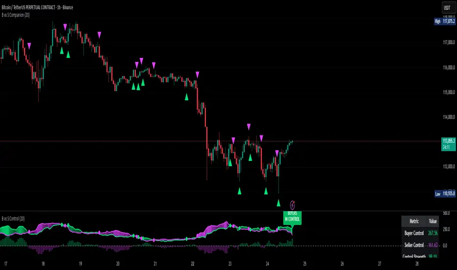
Buyer vs Seller ControlBuyer vs Seller Control Analysis
Technical indicator measuring market participation through candlestick wick analysis
Overview:
This indicator analyzes the relationship between closing prices and candlestick wicks to measure buying and selling pressure. It calculates two key metrics and displays their moving averages to help identify market sentiment shifts.
Calculation Method:
The indicator measures two distinct values for each candle:
Buyer Control Value: Distance from candle low to closing price (close - low)
Seller Control Value: Distance from candle high to closing price (high - close)
Both values are then smoothed using a Simple Moving Average (default period: 20) to reduce noise and show clearer trends.
Visual Components:
Lime Line: 20-period SMA of buyer control values
Fuchsia Line: 20-period SMA of seller control values
Area Fill: Colored region between the two lines
Histogram: Difference between buyer and seller control SMAs
Zero Reference Line: Horizontal line at zero level
Information Table: Current numerical values (optional display)
Interpretation:
When the lime line (buyer control) is above the fuchsia line (seller control), it indicates that recent candles have been closing closer to their highs than to their lows on average.
When the fuchsia line is above the lime line, recent candles have been closing closer to their lows than to their highs on average.
Fill Color Logic:
Lime (green) fill appears when buyer control SMA > seller control SMA
Fuchsia (red) fill appears when seller control SMA > buyer control SMA
Fill transparency adjusts based on the magnitude of difference between the two SMAs
Stronger differences result in more opaque fills
Settings:
Moving Average Period: Adjustable from 1-200 periods (default: 20)
Show Info Table: Toggle to display/hide the numerical values table
Technical Notes:
The indicator works on any timeframe
Values are displayed in the same units as the underlying asset's price
The histogram shows the mathematical difference between the two SMA lines
Transparency calculation uses a 50-period lookback for dynamic scaling
This indicator provides a quantitative approach to analyzing candlestick patterns by focusing on where prices close relative to their intraday ranges.
Kelly Optimal Leverage IndicatorThe Kelly Optimal Leverage Indicator mathematically applies Kelly Criterion to determine optimal position sizing based on market conditions.
This indicator helps traders answer the critical question: "How much capital should I allocate to this trade?"
Note that "optimal position sizing" does not equal the position sizing that you should have. The Optima position sizing given by the indicator is based on historical data and cannot predict a crash, in which case, high leverage could be devastating.
Originally developed for gambling scenarios with known probabilities, the Kelly formula has been adapted here for financial markets to dynamically calculate the optimal leverage ratio that maximizes long-term capital growth while managing risk.
Key Features
Kelly Position Sizing: Uses historical returns and volatility to calculate mathematically optimal position sizes
Multiple Risk Profiles: Displays Full Kelly (aggressive), 3/4 Kelly (moderate), 1/2 Kelly (conservative), and 1/4 Kelly (very conservative) leverage levels
Volatility Adjustment: Automatically recommends appropriate Kelly fraction based on current market volatility
Return Smoothing: Option to use log returns and smoothed calculations for more stable signals
Comprehensive Table: Displays key metrics including annualized return, volatility, and recommended exposure levels
How to Use
Interpret the Lines: Each colored line represents a different Kelly fraction (risk tolerance level). When above zero, positive exposure is suggested; when below zero, reduce exposure. Note that this is based on historical returns. I personally like to increase my exposure during market downturns, but this is hard to illustrate in the indicator.
Monitor the Table: The information panel provides precise leverage recommendations and exposure guidance based on current market conditions.
Follow Recommended Position: Use the "Recommended Position" guidance in the table to determine appropriate exposure level.
Select Your Risk Profile: Conservative traders should follow the Half Kelly or Quarter Kelly lines, while more aggressive traders might consider the Three-Quarter or Full Kelly lines.
Adjust with Volatility: During high volatility periods, consider using more conservative Kelly fractions as recommended by the indicator.
Mathematical Foundation
The indicator calculates the optimal leverage (f*) using the formula:
f* = μ/σ²
Where:
μ is the annualized expected return
σ² is the annualized variance of returns
This approach balances potential gains against risk of ruin, offering a scientific framework for position sizing that maximizes long-term growth rate.
Notes
The Full Kelly is theoretically optimal for maximizing long-term growth but can experience significant drawdowns. You should almost never use full kelly.
Most practitioners use fractional Kelly strategies (1/2 or 1/4 Kelly) to reduce volatility while capturing most of the growth benefits
This indicator works best on daily timeframes but can be applied to any timeframe
Negative Kelly values suggest reducing or eliminating market exposure
The indicator should be used as part of a complete trading system, not in isolation
Enjoy the indicator! :)
P.S. If you are really geeky about the Kelly Criterion, I recommend the book The Kelly Capital Growth Investment Criterion by Edward O. Thorp and others.

regressionUtilitiesLibrary "regressionUtilities"
get_linear_regression(bar_index_array, prices_array, stdDev_mult)
: Generates the linear regression channel for an array of values.
Parameters:
bar_index_array (array) : (array): Array with bar indexes
prices_array (array) : (array): Array with prices
stdDev_mult (float) : (float): Standard deviation multiple for the channels
Returns: : Returns x1, x2, y1_mid, y2_mid, y1_up, y2_up, y1_dn, y2_dn, m, b, R2, stdDev
get_optimal_linearRegression_channel(max_length, min_length, source, stdDev_mult, show_data_table, tableYpos, tableXpos, table_textSize, barsToRight, plot_labels, include_levels)
: Gets the best fitting linear regression using optimum length
Parameters:
max_length (int) : (int): Maximum bar length
min_length (int) : (int): Minimum bar length
source (float) : (float): Source for the regression
stdDev_mult (float) : (float): Array with prices
show_data_table (bool) : (bool): Activates and shows the data table
tableYpos (string)
tableXpos (string)
table_textSize (string)
barsToRight (int)
plot_labels (bool)
include_levels (bool)
Returns: : Returns three line objects that conform the regression channel, plus the optimal length and maximum r2
get_regressionChannel_data(max_length, min_length, source, stdDev_mult, plot_linearRegression, plot_labels, include_levels, barsToRight)
: Gets data for the linear regression channel
Parameters:
max_length (int) : (int): Maximum length for the linear regression.
min_length (int) : (int): Minimum length for the linear regression.
source (float) : (float): Source for the linear regression
stdDev_mult (float) : (float): Multiple for the standar deviations for the linear regression channel.
plot_linearRegression (bool)
plot_labels (bool)
include_levels (bool)
barsToRight (int)
Returns: : Returns a maps with the regression levels, the direction flag and the datatable map.
get_regressionChannel_data_v2(max_length, min_length, source, stdDev_mult, plot_linearRegression, plot_labels, include_levels, barsToRight)
Parameters:
max_length (int)
min_length (int)
source (float)
stdDev_mult (float)
plot_linearRegression (bool)
plot_labels (bool)
include_levels (bool)
barsToRight (int)
get_cuadratic_regression(x_array, y_array, bars_to_project, max_length)
: Gets the best fitting linear regression using optimum length
Parameters:
x_array (array) : (array): Maximum bar length
y_array (array) : (array): Minimum bar length
bars_to_project (int) : (int): Array with prices
max_length (int)
Returns: : Returns three line objects
Indicator DashboardThis script creates an 'Indicator Dashboard' designed to assist you in analyzing financial markets and making informed decisions. The indicator provides a summary of current market conditions by presenting various technical analysis indicators in a table format. The dashboard evaluates popular indicators such as Moving Averages, RSI, MACD, and Stochastic RSI. Below, we'll explain each part of this script in detail and its purpose:
### Overview of Indicators
1. **Moving Averages (MA)**:
- This indicator calculates Simple Moving Averages (“SMA”) for 5, 14, 20, 50, 100, and 200 periods. These averages provide a visual summary of price movements. Depending on whether the price is above or below the moving average, it determines the market direction as either “Bullish” or “Bearish.”
2. **RSI (Relative Strength Index)**:
- The RSI helps identify overbought or oversold market conditions. Here, the RSI is calculated for a 14-period window, and this value is displayed in the table. Additionally, the 14-period moving average of the RSI is also included.
3. **MACD (Moving Average Convergence Divergence)**:
- The MACD indicator is used to determine trend strength and potential reversals. This script calculates the MACD line, signal line, and histogram. The MACD condition (“Bullish,” “Bearish,” or “Neutral”) is displayed alongside the MACD and signal line values.
4. **Stochastic RSI**:
- Stochastic RSI is used to identify momentum changes in the market. The %K and %D lines are calculated to determine the market condition (“Bullish” or “Bearish”), which is displayed along with the calculated values for %K and %D.
### Table Layout and Presentation
The dashboard is presented in a vertical table format in the top-right corner of the chart. The table contains two columns: “Indicator” and “Status,” summarizing the condition of each technical indicator.
- **Indicator Column**: Lists each of the indicators being tracked, such as SMA values, RSI, MACD, etc.
- **Status Column**: Displays the current status of each indicator, such as “Bullish,” “Bearish,” or specific values like the RSI or MACD.
The table also includes rounded indicator values for easier interpretation. This helps traders quickly assess market conditions and make informed decisions based on multiple indicators presented in a single location.
### Detailed Indicator Status Calculations
1. **SMA Status**: For each moving average (5, 14, 20, 50, 100, 200), the script checks if the current price is above or below the SMA. The status is determined as “Bullish” if the price is above the SMA and “Bearish” if below, with the value of the SMA also displayed.
2. **RSI and RSI Average**: The RSI value for a 14-period is displayed along with its 14-period SMA, which provides an average reading of the RSI to smooth out volatility.
3. **MACD Indicator**: The MACD line, signal line, and histogram are calculated using standard parameters (12, 26, 9). The status is shown as “Bullish” when the MACD line is above the signal line, and “Bearish” when it is below. The exact values for the MACD line, signal line, and histogram are also included.
4. **Stochastic RSI**: The %K and %D lines of the Stochastic RSI are used to determine the trend condition. If %K is greater than %D, the condition is “Bullish,” otherwise it is “Bearish.” The actual values of %K and %D are also displayed.
### Conclusion
The 'Indicator Dashboard' provides a comprehensive overview of multiple technical indicators in a single, easy-to-read table. This allows traders to quickly gauge market conditions and make more informed decisions. By consolidating key indicators like Moving Averages, RSI, MACD, and Stochastic RSI into one dashboard, it saves time and enhances the efficiency of technical analysis.
This script is particularly useful for traders who prefer a clean and organized overview of their favorite indicators without needing to plot each one individually on the chart. Instead, all the crucial information is available at a glance in a consolidated format.

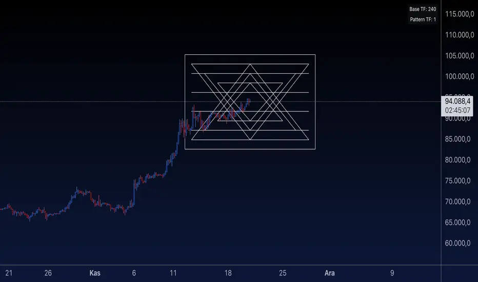
Sri Yantra MTF - AynetSri Yantra MTF - Aynet Script Overview
This Pine Script generates a Sri Yantra-inspired geometric pattern overlay on price charts. The pattern is dynamically updated based on multi-timeframe (MTF) inputs, utilizing high and low price ranges, and adjusting its size relative to a chosen multiplier.
The Sri Yantra is a sacred geometric figure used in various spiritual and mathematical contexts, symbolizing the interconnectedness of the universe. Here, it is applied to visualize structured price levels.
Scientific and Technical Explanation
Multi-Timeframe Integration:
Base Timeframe (baseRes): This is the primary timeframe for the analysis. The opening price and ATR (Average True Range) are calculated from this timeframe.
Pattern Timeframe (patternRes): Defines the granularity of the pattern. It ensures synchronization with price movements on specific time intervals.
Geometric Construction:
ATR-Based Scaling: The script uses ATR as a volatility measure to dynamically size the geometric pattern. The sizeMult input scales the pattern relative to price volatility.
Pattern Width (barOffset): Defines the horizontal extent of the pattern in terms of bars. This ensures the pattern is aligned with price movements and scales appropriately.
Sri Yantra-Like Geometry:
Outer Square: A bounding box is drawn around the price level.
Triangles: Multiple layers of triangles (primary, secondary, and tertiary) are calculated and drawn to mimic the structure of the Sri Yantra. These triangles converge and diverge based on price levels.
Horizontal Lines: Added at key levels to provide additional structure and aesthetic alignment.
Dynamic Updates:
The pattern recalculates and redraws itself on the last bar of the selected timeframe, ensuring it adapts to real-time price data.
A built-in check identifies new bars in the chosen timeframe (patternRes), ensuring accurate updates.
Information Table:
Displays the selected base and pattern timeframes in a table format on the top-right corner of the chart.
Allows traders to see the active settings for quick adjustments.
Key Inputs
Style Settings:
Pattern Color: Customize the color of the geometric patterns.
Size Multiplier (sizeMult): Adjusts the size of the pattern relative to price movements.
Line Width: Controls the thickness of the geometric lines.
Timeframe Settings:
Base Resolution (baseRes): Timeframe for calculating the pattern's anchor (default: daily).
Pattern Resolution (patternRes): Timeframe granularity for the pattern’s formation.
Geometric Adjustments:
Pattern Width (barOffset): Horizontal width in bars.
ATR Multiplier (rangeSize): Vertical size adjustment based on price volatility.
Scientific Concepts
Volatility Representation:
ATR (Average True Range): A standard measure of market volatility, representing the average range of price movements over a defined period. Here, ATR adjusts the vertical height of the geometric figures.
Geometric Symmetry:
The script emulates symmetry similar to the Sri Yantra, aligning with the principles of sacred geometry, which often appear in nature and mathematical constructs. Symmetry in financial data visualizations can aid in intuitive interpretation of price movements.
Multi-Timeframe Fusion:
Synchronizing patterns with multiple timeframes enhances the relevance of overlays for different trading strategies. For example, daily trends combined with hourly patterns can help traders optimize entries and exits.
Visual Features
Outer Square:
Drawn to encapsulate the geometric structure.
Represents the broader context of price levels.
Triangles:
Three layers of interlocking triangles create a fractal pattern, providing a visual alignment to price dynamics.
Horizontal Lines:
Emphasize critical levels within the pattern, offering visual cues for potential support or resistance areas.
Information Table:
Displays the active timeframe settings, helping traders quickly verify configurations.
Applications
Trend Visualization:
Patterns overlay on price movements provide a clearer view of trend direction and potential reversals.
Volatility Mapping:
ATR-based scaling ensures the pattern adjusts to varying market conditions, making it suitable for different asset classes and trading strategies.
Multi-Timeframe Analysis:
Integrates higher and lower timeframes, enabling traders to spot confluences between short-term and long-term price levels.
Potential Enhancements
Add Fibonacci Levels: Overlay Fibonacci retracements within the pattern for deeper price level insights.
Dynamic Alerts: Include alert conditions when price intersects key geometric lines.
Custom Labels: Add text descriptions for critical intersections or triangle centers.
This script is a unique blend of technical analysis and sacred geometry, providing traders with an innovative way to visualize market dynamics.
Stationarity Test: Dickey-Fuller & KPSS [Pinescriptlabs]
📊 Kwiatkowski-Phillips-Schmidt-Shin Model Indicator & Dickey-Fuller Test 📈
This algorithm performs two statistical tests on the price spread between two selected instruments: the first from the current chart and the second determined in the settings. The purpose is to determine if their relationship is stationary. It then uses this information to generate **visual signals** based on how far the current relationship deviates from its historical average.
⚙️ Key Components:
• 🧪 ADF Test (Augmented Dickey-Fuller):** Checks if the spread between the two instruments is stationary.
• 🔬 KPSS Test (Kwiatkowski-Phillips-Schmidt-Shin):** Another test for stationarity, complementing the ADF test.
• 📏 Z-Score Calculation:** Measures how many standard deviations the current spread is from its historical mean.
• 📊 Dynamic Threshold:** Adjusts the trading signal threshold based on recent market volatility.
🔍 What the Values Mean:
The indicator displays several key values in a table:
• 📈 ADF Stationarity:** Shows "Stationary" or "Non-Stationary" based on the ADF test result.
• 📉 KPSS Stationarity:** Shows "Stationary" or "Non-Stationary" based on the KPSS test result.
• 📏 Current Z-Score:** The current Z-score of the spread.
• 🔗 Hedge Ratio:** The relationship coefficient between the two instruments.
• 🌐 Market State:** Describes the current market condition based on the Z-score.
📊 How to Interpret the Chart:
• The main chart displays the Z-score of the spread over time.
• The green and red lines represent the upper and lower thresholds for trading signals.
• The area between the **Z-score** and the thresholds is filled when a trading signal is active.
• Additional charts show the **statistics of the ADF and KPSS tests** and their critical values.
**📉 Practical Example: NVIDIA Corporation (NVDA)**
Looking at the chart for **NVIDIA Corporation (NVDA)**, we can see how the indicator applies in a real case:
1. **Main Chart (Top):**
• Shows the **historical price** of NVIDIA on a weekly scale.
• A general **uptrend** is observed with periods of consolidation.
2. **KPSS & ADF Indicator (Bottom):**
• The lower chart shows the KPSS & ADF Model indicator applied to NVIDIA.
• The **green line** represents the Z-score of the spread.
• The **green shaded areas** indicate periods where the Z-score exceeded the thresholds, generating trading signals.
3. **📋 Current Values in the Table:**
• **ADF Stationarity:** Non-Stationary
• **KPSS Stationarity:** Non-Stationary
• **Current Z-Score:** 3.45
• **Hedge Ratio:** -164.8557
• **Market State:** Moderate Volatility
4. **🔍 Interpretation:**
• A Z-score of **3.45** suggests that NVIDIA’s price is significantly above its historical average relative to **EURUSD**.
• Both the **ADF** and **KPSS** tests indicate **non-stationarity**, suggesting **caution** when using mean reversion signals at this moment.
• The market state "Moderate Volatility" indicates noticeable deviation, but not extreme.
---
**💡 Usage:**
• **When Both Tests Show Stationarity:**
• **🔼 If Z-score > Upper Threshold:** Consider **buying the first instrument** and **selling the second**.
• **🔽 If Z-score < Lower Threshold:** Consider **selling the first instrument** and **buying the second**.
• **When Either Test Shows Non-Stationarity:**
• Wait for the relationship to become **stationary** before trading.
• **Market State:**
• Use this information to evaluate **general market conditions** and adjust your trading strategy accordingly.
**Mirror Comparison of the Same as Symbol 2 🔄📊**
**📊 Table Values:**
• **Extreme Volatility Threshold:** This value is displayed when the **Z-score** exceeds **100%**, indicating **extreme deviation**. It signals a potential **trading opportunity**, as the spread has reached unusually high or low levels, suggesting a **reversion or correction** in the market.
• **Mean Reversion Threshold:** Appears when the **Z-score** begins returning towards the mean after a period of **high or extreme volatility**. It indicates that the spread between the assets is returning to normal levels, suggesting a phase of **stabilization**.
• **Neutral Zone:** Displayed when the **Z-score** is near **zero**, signaling that the spread between assets is within expected limits. This indicates a **balanced market** with no significant volatility or clear trading opportunities.
• **Low Volatility Threshold:** Appears when the **Z-score** is below **70%** of the dynamic threshold, reflecting a period of **low volatility** and market stability, indicating fewer trading opportunities.
Español:
📊 Indicador del Modelo Kwiatkowski-Phillips-Schmidt-Shin & Prueba de Dickey-Fuller 📈
Este algoritmo realiza dos pruebas estadísticas sobre la diferencia de precios (spread) entre dos instrumentos seleccionados: el primero en el gráfico actual y el segundo determinado en la configuración. El objetivo es determinar si su relación es estacionaria. Luego utiliza esta información para generar señales visuales basadas en cuánto se desvía la relación actual de su promedio histórico.
⚙️ Componentes Clave:
• 🧪 Prueba ADF (Dickey-Fuller Aumentada): Verifica si el spread entre los dos instrumentos es estacionario.
• 🔬 Prueba KPSS (Kwiatkowski-Phillips-Schmidt-Shin): Otra prueba para la estacionariedad, complementando la prueba ADF.
• 📏 Cálculo del Z-Score: Mide cuántas desviaciones estándar se encuentra el spread actual de su media histórica.
• 📊 Umbral Dinámico: Ajusta el umbral de la señal de trading en función de la volatilidad reciente del mercado.
🔍 Qué Significan los Valores:
El indicador muestra varios valores clave en una tabla:
• 📈 Estacionariedad ADF: Muestra "Estacionario" o "No Estacionario" basado en el resultado de la prueba ADF.
• 📉 Estacionariedad KPSS: Muestra "Estacionario" o "No Estacionario" basado en el resultado de la prueba KPSS.
• 📏 Z-Score Actual: El Z-score actual del spread.
• 🔗 Ratio de Cobertura: El coeficiente de relación entre los dos instrumentos.
• 🌐 Estado del Mercado: Describe la condición actual del mercado basado en el Z-score.
📊 Cómo Interpretar el Gráfico:
• El gráfico principal muestra el Z-score del spread a lo largo del tiempo.
• Las líneas verdes y rojas representan los umbrales superior e inferior para las señales de trading.
• El área entre el Z-score y los umbrales se llena cuando una señal de trading está activa.
• Los gráficos adicionales muestran las estadísticas de las pruebas ADF y KPSS y sus valores críticos.
📉 Ejemplo Práctico: NVIDIA Corporation (NVDA)
Observando el gráfico para NVIDIA Corporation (NVDA), podemos ver cómo se aplica el indicador en un caso real:
Gráfico Principal (Superior): • Muestra el precio histórico de NVIDIA en escala semanal. • Se observa una tendencia alcista general con períodos de consolidación.
Indicador KPSS & ADF (Inferior): • El gráfico inferior muestra el indicador Modelo KPSS & ADF aplicado a NVIDIA. • La línea verde representa el Z-score del spread. • Las áreas sombreadas en verde indican períodos donde el Z-score superó los umbrales, generando señales de trading.
📋 Valores Actuales en la Tabla: • Estacionariedad ADF: No Estacionario • Estacionariedad KPSS: No Estacionario • Z-Score Actual: 3.45 • Ratio de Cobertura: -164.8557 • Estado del Mercado: Volatilidad Moderada
🔍 Interpretación: • Un Z-score de 3.45 sugiere que el precio de NVIDIA está significativamente por encima de su promedio histórico en relación con EURUSD. • Tanto la prueba ADF como la KPSS indican no estacionariedad, lo que sugiere precaución al usar señales de reversión a la media en este momento. • El estado del mercado "Volatilidad Moderada" indica una desviación notable, pero no extrema.
💡 Uso:
• Cuando Ambas Pruebas Muestran Estacionariedad:
• 🔼 Si Z-score > Umbral Superior: Considera comprar el primer instrumento y vender el segundo.
• 🔽 Si Z-score < Umbral Inferior: Considera vender el primer instrumento y comprar el segundo.
• Cuando Alguna Prueba Muestra No Estacionariedad:
• Espera a que la relación se vuelva estacionaria antes de operar.
• Estado del Mercado:
• Usa esta información para evaluar las condiciones generales del mercado y ajustar tu estrategia de trading en consecuencia.
Comparativo en Espejo del Mismo Como Símbolo 2 🔄📊
📊 Valores de la Tabla:
• Umbral de Volatilidad Extrema: Este valor se muestra cuando el Z-score supera el 100%, indicando desviación extrema. Señala una posible oportunidad de trading, ya que el spread entre los activos ha alcanzado niveles inusualmente altos o bajos, lo que podría indicar una reversión o corrección en el mercado.
• Umbral de Reversión a la Media: Aparece cuando el Z-score comienza a volver hacia la media tras un período de alta o extrema volatilidad. Indica que el spread entre los activos está regresando a niveles normales, sugiriendo una fase de estabilización.
• Zona Neutral: Se muestra cuando el Z-score está cerca de cero, señalando que el spread entre activos está dentro de lo esperado. Esto indica un mercado equilibrado con ninguna volatilidad significativa ni oportunidades claras de trading.
• Umbral de Baja Volatilidad: Aparece cuando el Z-score está por debajo del 70% del umbral dinámico, reflejando un período de baja volatilidad y estabilidad del mercado, indicando menos oportunidades de trading.

ChartUtilsLibrary "ChartUtils"
Library for chart utilities, including managing tables
initTable(rows, cols, bgcolor)
Initializes a table with specific dimensions and color
Parameters:
rows (int) : (int) Number of rows in the table
cols (int) : (int) Number of columns in the table
bgcolor (color) : (color) Background color of the table
Returns: (table) The initialized table
updateTable(tbl, is_price_below_avg, current_investment_USD, strategy_position_size, strategy_position_avg_price, strategy_openprofit, strategy_opentrades, isBullishRate, isBearishRate, mlRSIOverSold, mlRSIOverBought)
Updates the trading table
Parameters:
tbl (table) : (table) The table to update
is_price_below_avg (bool) : (bool) If the current price is below the average price
current_investment_USD (float) : (float) The current investment in USD
strategy_position_size (float) : (float) The size of the current position
strategy_position_avg_price (float) : (float) The average price of the current position
strategy_openprofit (float) : (float) The current open profit
strategy_opentrades (int) : (int) The number of open trades
isBullishRate (bool) : (bool) If the current rate is bullish
isBearishRate (bool) : (bool) If the current rate is bearish
mlRSIOverSold (bool) : (bool) If the ML RSI is oversold
mlRSIOverBought (bool) : (bool) If the ML RSI is overbought
updateTableNoPosition(tbl)
Updates the table when there is no position
Parameters:
tbl (table) : (table) The table to update

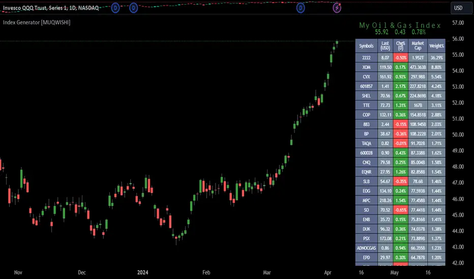
Index Generator [By MUQWISHI]▋ INTRODUCTION :
The “Index Generator” simplifies the process of building a custom market index, allowing investors to enter a list of preferred holdings from global securities. It aims to serve as an approach for tracking performance, conducting research, and analyzing specific aspects of the global market. The output will include an index value, a table of holdings, and chart plotting, providing a deeper understanding of historical movement.
_______________________
▋ OVERVIEW:
The image can be taken as an example of building a custom index. I created this index and named it “My Oil & Gas Index”. The index comprises several global energy companies. Essentially, the indicator weights each company by collecting the number of shares and then computes the market capitalization before sorting them as seen in the table.
_______________________
▋ OUTPUTS:
The output can be divided into 3 sections:
1. Index Title (Name & Value).
2. Index Holdings.
3. Index Chart.
1. Index Title , displays the index name at the top, and at the bottom, it shows the index value, along with the daily change in points and percentage.
2. Index Holdings , displays list the holding securities inside a table that contains the ticker, price, daily change %, market cap, and weight %. Additionally, a tooltip appears when the user passes the cursor over a ticker's cell, showing brief information about the company, such as the company's name, exchange market, country, sector, and industry.
3. Index Chart , display a plot of the historical movement of the index in the form of a bar, candle, or line chart.
_______________________
▋ INDICATOR SETTINGS:
(1) Naming the index.
(2) Entering a currency. To unite all securities in one currency.
(3) Table location on the chart.
(4) Table’s cells size.
(5) Table’s colors.
(6) Sorting table. By securities’ (Market Cap, Change%, Price, or Ticker Alphabetical) order.
(7) Plotting formation (Candle, Bar, or Line)
(8) To show/hide any indicator’s components.
(9) There are 34 fields where user can fill them with symbols.
Please let me know if you have any questions.
arraysLibrary "arraymethods"
Supplementary array methods.
delete(arr, index)
remove int object from array of integers at specific index
Parameters:
arr : int array
index : index at which int object need to be removed
Returns: void
delete(arr, index)
remove float object from array of float at specific index
Parameters:
arr : float array
index : index at which float object need to be removed
Returns: float
delete(arr, index)
remove bool object from array of bool at specific index
Parameters:
arr : bool array
index : index at which bool object need to be removed
Returns: bool
delete(arr, index)
remove string object from array of string at specific index
Parameters:
arr : string array
index : index at which string object need to be removed
Returns: string
delete(arr, index)
remove color object from array of color at specific index
Parameters:
arr : color array
index : index at which color object need to be removed
Returns: color
delete(arr, index)
remove line object from array of lines at specific index and deletes the line
Parameters:
arr : line array
index : index at which line object need to be removed and deleted
Returns: void
delete(arr, index)
remove label object from array of labels at specific index and deletes the label
Parameters:
arr : label array
index : index at which label object need to be removed and deleted
Returns: void
delete(arr, index)
remove box object from array of boxes at specific index and deletes the box
Parameters:
arr : box array
index : index at which box object need to be removed and deleted
Returns: void
delete(arr, index)
remove table object from array of tables at specific index and deletes the table
Parameters:
arr : table array
index : index at which table object need to be removed and deleted
Returns: void
delete(arr, index)
remove linefill object from array of linefills at specific index and deletes the linefill
Parameters:
arr : linefill array
index : index at which linefill object need to be removed and deleted
Returns: void
popr(arr)
remove last int object from array
Parameters:
arr : int array
Returns: int
popr(arr)
remove last float object from array
Parameters:
arr : float array
Returns: float
popr(arr)
remove last bool object from array
Parameters:
arr : bool array
Returns: bool
popr(arr)
remove last string object from array
Parameters:
arr : string array
Returns: string
popr(arr)
remove last color object from array
Parameters:
arr : color array
Returns: color
popr(arr)
remove and delete last line object from array
Parameters:
arr : line array
Returns: void
popr(arr)
remove and delete last label object from array
Parameters:
arr : label array
Returns: void
popr(arr)
remove and delete last box object from array
Parameters:
arr : box array
Returns: void
popr(arr)
remove and delete last table object from array
Parameters:
arr : table array
Returns: void
popr(arr)
remove and delete last linefill object from array
Parameters:
arr : linefill array
Returns: void
shiftr(arr)
remove first int object from array
Parameters:
arr : int array
Returns: int
shiftr(arr)
remove first float object from array
Parameters:
arr : float array
Returns: float
shiftr(arr)
remove first bool object from array
Parameters:
arr : bool array
Returns: bool
shiftr(arr)
remove first string object from array
Parameters:
arr : string array
Returns: string
shiftr(arr)
remove first color object from array
Parameters:
arr : color array
Returns: color
shiftr(arr)
remove and delete first line object from array
Parameters:
arr : line array
Returns: void
shiftr(arr)
remove and delete first label object from array
Parameters:
arr : label array
Returns: void
shiftr(arr)
remove and delete first box object from array
Parameters:
arr : box array
Returns: void
shiftr(arr)
remove and delete first table object from array
Parameters:
arr : table array
Returns: void
shiftr(arr)
remove and delete first linefill object from array
Parameters:
arr : linefill array
Returns: void
push(arr, val, maxItems)
add int to the end of an array with max items cap. Objects are removed from start to maintain max items cap
Parameters:
arr : int array
val : int object to be pushed
maxItems : max number of items array can hold
Returns: int
push(arr, val, maxItems)
add float to the end of an array with max items cap. Objects are removed from start to maintain max items cap
Parameters:
arr : float array
val : float object to be pushed
maxItems : max number of items array can hold
Returns: float
push(arr, val, maxItems)
add bool to the end of an array with max items cap. Objects are removed from start to maintain max items cap
Parameters:
arr : bool array
val : bool object to be pushed
maxItems : max number of items array can hold
Returns: bool
push(arr, val, maxItems)
add string to the end of an array with max items cap. Objects are removed from start to maintain max items cap
Parameters:
arr : string array
val : string object to be pushed
maxItems : max number of items array can hold
Returns: string
push(arr, val, maxItems)
add color to the end of an array with max items cap. Objects are removed from start to maintain max items cap
Parameters:
arr : color array
val : color object to be pushed
maxItems : max number of items array can hold
Returns: color
push(arr, val, maxItems)
add line to the end of an array with max items cap. Objects are removed and deleted from start to maintain max items cap
Parameters:
arr : line array
val : line object to be pushed
maxItems : max number of items array can hold
Returns: line
push(arr, val, maxItems)
add label to the end of an array with max items cap. Objects are removed and deleted from start to maintain max items cap
Parameters:
arr : label array
val : label object to be pushed
maxItems : max number of items array can hold
Returns: label
push(arr, val, maxItems)
add box to the end of an array with max items cap. Objects are removed and deleted from start to maintain max items cap
Parameters:
arr : box array
val : box object to be pushed
maxItems : max number of items array can hold
Returns: box
push(arr, val, maxItems)
add table to the end of an array with max items cap. Objects are removed and deleted from start to maintain max items cap
Parameters:
arr : table array
val : table object to be pushed
maxItems : max number of items array can hold
Returns: table
push(arr, val, maxItems)
add linefill to the end of an array with max items cap. Objects are removed and deleted from start to maintain max items cap
Parameters:
arr : linefill array
val : linefill object to be pushed
maxItems : max number of items array can hold
Returns: linefill
unshift(arr, val, maxItems)
add int to the beginning of an array with max items cap. Objects are removed from end to maintain max items cap
Parameters:
arr : int array
val : int object to be unshift
maxItems : max number of items array can hold
Returns: int
unshift(arr, val, maxItems)
add float to the beginning of an array with max items cap. Objects are removed from end to maintain max items cap
Parameters:
arr : float array
val : float object to be unshift
maxItems : max number of items array can hold
Returns: float
unshift(arr, val, maxItems)
add bool to the beginning of an array with max items cap. Objects are removed from end to maintain max items cap
Parameters:
arr : bool array
val : bool object to be unshift
maxItems : max number of items array can hold
Returns: bool
unshift(arr, val, maxItems)
add string to the beginning of an array with max items cap. Objects are removed from end to maintain max items cap
Parameters:
arr : string array
val : string object to be unshift
maxItems : max number of items array can hold
Returns: string
unshift(arr, val, maxItems)
add color to the beginning of an array with max items cap. Objects are removed from end to maintain max items cap
Parameters:
arr : color array
val : color object to be unshift
maxItems : max number of items array can hold
Returns: color
unshift(arr, val, maxItems)
add line to the beginning of an array with max items cap. Objects are removed and deleted from end to maintain max items cap
Parameters:
arr : line array
val : line object to be unshift
maxItems : max number of items array can hold
Returns: line
unshift(arr, val, maxItems)
add label to the beginning of an array with max items cap. Objects are removed and deleted from end to maintain max items cap
Parameters:
arr : label array
val : label object to be unshift
maxItems : max number of items array can hold
Returns: label
unshift(arr, val, maxItems)
add box to the beginning of an array with max items cap. Objects are removed and deleted from end to maintain max items cap
Parameters:
arr : box array
val : box object to be unshift
maxItems : max number of items array can hold
Returns: box
unshift(arr, val, maxItems)
add table to the beginning of an array with max items cap. Objects are removed and deleted from end to maintain max items cap
Parameters:
arr : table array
val : table object to be unshift
maxItems : max number of items array can hold
Returns: table
unshift(arr, val, maxItems)
add linefill to the beginning of an array with max items cap. Objects are removed and deleted from end to maintain max items cap
Parameters:
arr : linefill array
val : linefill object to be unshift
maxItems : max number of items array can hold
Returns: linefill
flush(arr)
remove all int objects in an array
Parameters:
arr : int array
Returns: int
flush(arr)
remove all float objects in an array
Parameters:
arr : float array
Returns: float
flush(arr)
remove all bool objects in an array
Parameters:
arr : bool array
Returns: bool
flush(arr)
remove all string objects in an array
Parameters:
arr : string array
Returns: string
flush(arr)
remove all color objects in an array
Parameters:
arr : color array
Returns: color
flush(arr)
remove and delete all line objects in an array
Parameters:
arr : line array
Returns: line
flush(arr)
remove and delete all label objects in an array
Parameters:
arr : label array
Returns: label
flush(arr)
remove and delete all box objects in an array
Parameters:
arr : box array
Returns: box
flush(arr)
remove and delete all table objects in an array
Parameters:
arr : table array
Returns: table
flush(arr)
remove and delete all linefill objects in an array
Parameters:
arr : linefill array
Returns: linefill
Price Cross Time Custom Range Interactive█ OVERVIEW
This indicator was a time-based indicator and intended as educational purpose only based on pine script v5 functions for ta.cross() , ta.crossover() and ta.crossunder() .
I realised that there is some overlap price with the cross functions, hence I integrate them into Custom Range Interactive with value variance and overlap displayed into table.
This was my submission for Pinefest #1 , I decided to share this as public, I may accidentally delete this as long as i keep as private.
█ INSPIRATION
Inspired by design, code and usage of CAGR. Basic usage of custom range / interactive, pretty much explained here . Credits to TradingView.
█ FEATURES
1. Custom Range Interactive
2. Label can be resize and change color.
3. Label show tooltip for price and time.
4. Label can be offset to improve readability.
5. Table can show price variance when any cross is true.
6. Table can show overlap if found crosss is overlap either with crossover and crossunder.
7. Table text color automatically change based on chart background (light / dark mode).
8. Source 2 is drawn as straight line, while Source 1 will draw as label either above line for crossover, below line for crossunder and marked 'X' if crossing with Source 2's line.
9. Cross 'X' label can be offset to improve readability.
10. Both Source 1 and Source 2 can select Open, Close, High and Low, which can be displayed into table.
█ LIMITATIONS
1. Table is limited to intraday timeframe only as time format is not accurate for daily timeframe and above. Example daily timeframe will give result less 1 day from actual date.
2. I did not include other sources such external source or any built in sources such as hl2, hlc3, ohlc4 and hlcc4.
█ CODE EXPLAINATION
I pretty much create custom function with method which returns tuple value.
method crossVariant(float price = na, chart.point ref = na) =>
cross = ta.cross( price, ref.price)
over = ta.crossover( price, ref.price)
under = ta.crossunder(price, ref.price)
Unfortunately, I unable make the labels into array which i plan to return string value by getting the text value from array label, hence i use label.all and add incremental int value as reference.
series label labelCross = na, labelCross.delete()
var int num = 0
if over
num += 1
labelCross := label.new()
if under
num += 1
labelCross := label.new()
if cross
num += 1
labelCross := label.new()
I realised cross value can be overlap with crossover and crossunder, hence I add bool to enable force overlap and add additional bools.
series label labelCross = na, labelCross.delete()
var int num = 0
if forceOverlap
if over
num += 1
labelCross := label.new()
if under
num += 1
labelCross := label.new()
if cross
num += 1
labelCross := label.new()
else
if cross and over
num += 1
labelCross := label.new()
if cross and under
num += 1
labelCross := label.new()
if cross and not over and not under
num += 1
labelCross := label.new()
█ USAGE / EXAMPLES

Major and Minor Trend Indicator by Nikhil34a V 2.2Title: Major and Minor Trend Indicator by Nikhil34a V 2.2
Description:
The Major and Minor Trend Indicator v2.2 is a comprehensive technical analysis script designed for use with the TradingView platform. This powerful tool is developed in Pine Script version 5 and helps traders identify potential buying and selling opportunities in the stock market.
Features:
SMA Trend Analysis: The script calculates two Simple Moving Averages (SMAs) with user-defined lengths for major and minor trends. It displays these SMAs on the chart, allowing traders to visualize the prevailing trends easily.
Surge Detection: The indicator can detect buying and selling surges based on specific conditions, such as volume, RSI, MACD, and stochastic indicators. Both Buying and Selling surges are marked in black on the chart.
Option Buy Zone Detection: The script identifies the option buy zone based on SMA crossovers, RSI, and MACD values. The buy zone is categorized as "CE Zone" or "PE Zone" and displayed in the table along with the trigger time.
Two-Day High and Low Range: The script calculates the highest high and lowest low of the previous two trading days and plots them on the chart. The area between these points is shaded in semi-transparent green and red colors.
Crossover Analysis: The script analyzes moving average crossovers on multiple timeframes (2-minute, 3-minute, and 5-minute) and displays buy and sell signals accordingly.
Trend Identification: The script identifies the major and minor trends as either bullish or bearish, providing valuable insights into the overall market sentiment.
Usage:
Customize Major and Minor SMA Periods: Adjust the lengths of major and minor SMAs through input parameters to suit your trading preferences.
Enable/Disable Moving Averages: Choose which SMAs to display on the chart by toggling the "showXMA" input options.
Set Surge and Option Buy Zone Thresholds: Modify the surgeThreshold, volumeThreshold, RSIThreshold, and StochThreshold inputs to refine the surge and buy zone detection.
Analyze Crossover Signals: Monitor the crossover signals in the table, categorized by timeframes (2-minute, 3-minute, and 5-minute).
Explore Market Bias and Distance to 2-Day High/Low: The table provides information on market bias, current price movement relative to the previous two-day high and low, and the option buy zone status.
Additional Use Cases:
Surge Indicator:
The script includes a Surge Indicator that detects sudden buying or selling surges in the market. When a buying surge is identified, the "BSurge" label will appear below the corresponding candle with black text on a white background. Similarly, a selling surge will display the "SSurge" label in white text on a black background. These indicators help traders quickly spot strong buying or selling activities that may influence their trading decisions. These surges can be used to identify sudden premium dump zones.
Option Buy Zone:
The Option Buy Zone is an essential feature that identifies potential zones for buying call options (CE Zone) or put options (PE Zone) based on specific technical conditions. The indicator evaluates SMA crossovers, RSI, and MACD values to determine the current market sentiment. When the option buy zone is triggered, the script will display the respective zone ("CE Zone" or "PE Zone") in the table, highlighted with a white background. Additionally, the time when the buy zone was triggered will be shown under the "Option Buy Zone Trigger Time" column.
Price Movement Relative to 2-Day High/Low:
The script calculates the highest high and lowest low of the previous two trading days (high2DaysAgo and low2DaysAgo) and plots these points on the chart. The area between these two points is shaded in semi-transparent green and red colors. The green region indicates the price range between the highpricetoconsider (highest high of the previous two days) and the lower value between highPreviousDay and high2DaysAgo. Similarly, the red region represents the price range between the lowpricetoconsider (lowest low of the previous two days) and the higher value between lowPreviousDay and low2DaysAgo.
Entry Time and Current Zone:
The script identifies potential entry times for trades within the option buy zone. When a valid buy zone trigger occurs, the script calculates the entryTime by adding the durationInMinutes (user-defined) to the startTime. The entryTime will be displayed in the "Entry Time" column of the table. Depending on the comparison between optionbuyzonetriggertime and entryTime, the background color of the entry time will change. If optionbuyzonetriggertime is greater than entryTime, the background color will be yellow, indicating that a new trigger has occurred before the specified duration. Otherwise, the background color will be green, suggesting that the entry time is still within the defined duration.
Current Zone Indicator:
The script further categorizes the current zone as either "CE Zone" (call option zone) or "PE Zone" (put option zone). When the market is trending upwards and the minor SMA is above the major SMA, the currentZone will be set to "CE Zone." Conversely, when the market is trending downwards and the minor SMA is below the major SMA, the currentZone will be "PE Zone." This information is displayed in the "Current Zone" column of the table.
These additional use cases empower traders with valuable insights into market trends, buying and selling surges, option buy zones, and potential entry times. Traders can combine this information with their analysis and risk management strategies to make informed and confident trading decisions.
Note:
The script is optimized for identifying trends and potential trade opportunities. It is crucial to perform additional analysis and risk management before executing any trades based on the provided signals.
Happy Trading!

Price Legs: Average Heights; 'Smart ATR'Price Legs: Average Heights; 'Smart ATR'. Consol Range Gauge
~~ Indicator to show small and large price legs (based on short and long input pivot lengths), and calculating the average heights of these price legs; counting legs from user-input start time ~~
//Premise: Wanted to use this as something like a 'Smart ATR': where the average/typical range of a distinct & dynamic price leg could be calculated based on a user-input time interval (as opposed to standard ATR, which is simply the average range over a consistent repeating period, with no regard to market structure). My instinct is that this would be most useful for consolidated periods & range trading: giving the trader an idea of what the typical size of a price leg might be in the current market state (hence in the title, Consol Range gauge)
//Features & User inputs:
-Start time: confirm input when loading indicator by clicking on the chart. Then drag the vertical line to change start time easily.
-Large Legs (toggle on/off) and user-input pivot lookback/lookforward length (larger => larger legs)
-Small Legs (toggle on/off) and user-input pivot lookback/lookforward length (smaller => smaller legs)
-Display Stats table: toggle on/off: simple view- shows the averages of large (up & down), small (up & down), and combined (for each).
-Extended stats table: toggle on/off option to show the averages of the last 3 legs of each category (up/down/large/small/combined)
-Toggle on/off Time & Price chart text labels of price legs (time in mins/hours/days; price in $ or pips; auto assigned based on asset)
-Table position: user choice.
//Notes & tips:
-Using custom start time along with replay mode, you can select any arbitrary chunk of price for the purpose of backtesting.
-Play around with the pivot lookback lengths to find price legs most suitable to the current market regime (consolidating/trending; high volatility/ low volatility)
-Single bar price legs will never be counted: they must be at least 2 bars from H>>L or L>>H.
//Credits: Thanks to @crypto_juju for the idea of applying statistics to this simple price leg indicator.
Simple View: showing only the full averages (counting from Start time):
View showing ONLY the large legs, with Time & Price labels toggled ON:

Swing Counter [theEccentricTrader]█ OVERVIEW
This indicator counts the number of confirmed swing high and swing low scenarios on any given candlestick chart and displays the statistics in a table, which can be repositioned and resized at the user's discretion.
█ CONCEPTS
Green and Red Candles
• A green candle is one that closes with a high price equal to or above the price it opened.
• A red candle is one that closes with a low price that is lower than the price it opened.
Swing Highs and Swing Lows
• A swing high is a green candle or series of consecutive green candles followed by a single red candle to complete the swing and form the peak.
• A swing low is a red candle or series of consecutive red candles followed by a single green candle to complete the swing and form the trough.
Peak and Trough Prices (Basic)
• The peak price of a complete swing high is the high price of either the red candle that completes the swing high or the high price of the preceding green candle, depending on which is higher.
• The trough price of a complete swing low is the low price of either the green candle that completes the swing low or the low price of the preceding red candle, depending on which is lower.
Peak and Trough Prices (Advanced)
• The advanced peak price of a complete swing high is the high price of either the red candle that completes the swing high or the high price of the highest preceding green candle high price, depending on which is higher.
• The advanced trough price of a complete swing low is the low price of either the green candle that completes the swing low or the low price of the lowest preceding red candle low price, depending on which is lower.
Green and Red Peaks and Troughs
• A green peak is one that derives its price from the green candle/s that constitute the swing high.
• A red peak is one that derives its price from the red candle that completes the swing high.
• A green trough is one that derives its price from the green candle that completes the swing low.
• A red trough is one that derives its price from the red candle/s that constitute the swing low.
Historic Peaks and Troughs
The current, or most recent, peak and trough occurrences are referred to as occurrence zero. Previous peak and trough occurrences are referred to as historic and ordered numerically from right to left, with the most recent historic peak and trough occurrences being occurrence one.
Upper Trends
• A return line uptrend is formed when the current peak price is higher than the preceding peak price.
• A downtrend is formed when the current peak price is lower than the preceding peak price.
• A double-top is formed when the current peak price is equal to the preceding peak price.
Lower Trends
• An uptrend is formed when the current trough price is higher than the preceding trough price.
• A return line downtrend is formed when the current trough price is lower than the preceding trough price.
• A double-bottom is formed when the current trough price is equal to the preceding trough price.
█ FEATURES
Inputs
• Start Date
• End Date
• Position
• Text Size
• Show Sample Period
• Show Plots
• Show Lines
Table
The table is colour coded, consists of three columns and nine rows. Blue cells denote neutral scenarios, green cells denote return line uptrend and uptrend scenarios, and red cells denote downtrend and return line downtrend scenarios.
The swing scenarios are listed in the first column with their corresponding total counts to the right, in the second column. The last row in column one, row nine, displays the sample period which can be adjusted or hidden via indicator settings.
Rows three and four in the third column of the table display the total higher peaks and higher troughs as percentages of total peaks and troughs, respectively. Rows five and six in the third column display the total lower peaks and lower troughs as percentages of total peaks and troughs, respectively. And rows seven and eight display the total double-top peaks and double-bottom troughs as percentages of total peaks and troughs, respectively.
Plots
I have added plots as a visual aid to the swing scenarios listed in the table. Green up-arrows with ‘HP’ denote higher peaks, while green up-arrows with ‘HT’ denote higher troughs. Red down-arrows with ‘LP’ denote higher peaks, while red down-arrows with ‘LT’ denote lower troughs. Similarly, blue diamonds with ‘DT’ denote double-top peaks and blue diamonds with ‘DB’ denote double-bottom troughs. These plots can be hidden via indicator settings.
Lines
I have also added green and red trendlines as a further visual aid to the swing scenarios listed in the table. Green lines denote return line uptrends (higher peaks) and uptrends (higher troughs), while red lines denote downtrends (lower peaks) and return line downtrends (lower troughs). These lines can be hidden via indicator settings.
█ HOW TO USE
This indicator is intended for research purposes and strategy development. I hope it will be useful in helping to gain a better understanding of the underlying dynamics at play on any given market and timeframe. It can, for example, give you an idea of any inherent biases such as a greater proportion of higher peaks to lower peaks. Or a greater proportion of higher troughs to lower troughs. Such information can be very useful when conducting top down analysis across multiple timeframes, or considering entry and exit methods.
What I find most fascinating about this logic, is that the number of swing highs and swing lows will always find equilibrium on each new complete wave cycle. If for example the chart begins with a swing high and ends with a swing low there will be an equal number of swing highs to swing lows. If the chart starts with a swing high and ends with a swing high there will be a difference of one between the two total values until another swing low is formed to complete the wave cycle sequence that began at start of the chart. Almost as if it was a fundamental truth of price action, although quite common sensical in many respects. As they say, what goes up must come down.
The objective logic for swing highs and swing lows I hope will form somewhat of a foundational building block for traders, researchers and developers alike. Not only does it facilitate the objective study of swing highs and swing lows it also facilitates that of ranges, trends, double trends, multi-part trends and patterns. The logic can also be used for objective anchor points. Concepts I will introduce and develop further in future publications.
█ LIMITATIONS
Some higher timeframe candles on tickers with larger lookbacks such as the DXY , do not actually contain all the open, high, low and close (OHLC) data at the beginning of the chart. Instead, they use the close price for open, high and low prices. So, while we can determine whether the close price is higher or lower than the preceding close price, there is no way of knowing what actually happened intra-bar for these candles. And by default candles that close at the same price as the open price, will be counted as green. You can avoid this problem by utilising the sample period filter.
The green and red candle calculations are based solely on differences between open and close prices, as such I have made no attempt to account for green candles that gap lower and close below the close price of the preceding candle, or red candles that gap higher and close above the close price of the preceding candle. I can only recommend using 24-hour markets, if and where possible, as there are far fewer gaps and, generally, more data to work with. Alternatively, you can replace the scenarios with your own logic to account for the gap anomalies, if you are feeling up to the challenge.
The sample size will be limited to your Trading View subscription plan. Premium users get 20,000 candles worth of data, pro+ and pro users get 10,000, and basic users get 5,000. If upgrading is currently not an option, you can always keep a rolling tally of the statistics in an excel spreadsheet or something of the like.
█ NOTES
I feel it important to address the mention of advanced peak and trough price logic. While I have introduced the concept, I have not included the logic in my script for a number of reasons. The most pertinent of which being the amount of extra work I would have to do to include it in a public release versus the actual difference it would make to the statistics. Based on my experience, there are actually only a small number of cases where the advanced peak and trough prices are different from the basic peak and trough prices. And with adequate multi-timeframe analysis any high or low prices that are not captured using basic peak and trough price logic on any given time frame, will no doubt be captured on a higher timeframe. See the example below on the 1H FOREXCOM:USDJPY chart (Figure 1), where the basic peak price logic denoted by the indicator plot does not capture what would be the advanced peak price, but on the 2H FOREXCOM:USDJPY chart (Figure 2), the basic peak logic does capture the advanced peak price from the 1H timeframe.
Figure 1.
Figure 2.
█ RAMBLINGS
“Never was there an age that placed economic interests higher than does our own. Never was the need of a scientific foundation for economic affairs felt more generally or more acutely. And never was the ability of practical men to utilize the achievements of science, in all fields of human activity, greater than in our day. If practical men, therefore, rely wholly on their own experience, and disregard our science in its present state of development, it cannot be due to a lack of serious interest or ability on their part. Nor can their disregard be the result of a haughty rejection of the deeper insight a true science would give into the circumstances and relationships determining the outcome of their activity. The cause of such remarkable indifference must not be sought elsewhere than in the present state of our science itself, in the sterility of all past endeavours to find its empirical foundations.” (Menger, 1871, p.45).
█ BIBLIOGRAPHY
Menger, C. (1871) Principles of Economics. Reprint, Auburn, Alabama: Ludwig Von Mises Institute: 2007.

arraymethodsLibrary "arraymethods"
Supplementary array methods.
delete(arr, index)
remove int object from array of integers at specific index
Parameters:
arr : int array
index : index at which int object need to be removed
Returns: void
delete(arr, index)
remove float object from array of float at specific index
Parameters:
arr : float array
index : index at which float object need to be removed
Returns: float
delete(arr, index)
remove bool object from array of bool at specific index
Parameters:
arr : bool array
index : index at which bool object need to be removed
Returns: bool
delete(arr, index)
remove string object from array of string at specific index
Parameters:
arr : string array
index : index at which string object need to be removed
Returns: string
delete(arr, index)
remove color object from array of color at specific index
Parameters:
arr : color array
index : index at which color object need to be removed
Returns: color
delete(arr, index)
remove line object from array of lines at specific index and deletes the line
Parameters:
arr : line array
index : index at which line object need to be removed and deleted
Returns: void
delete(arr, index)
remove label object from array of labels at specific index and deletes the label
Parameters:
arr : label array
index : index at which label object need to be removed and deleted
Returns: void
delete(arr, index)
remove box object from array of boxes at specific index and deletes the box
Parameters:
arr : box array
index : index at which box object need to be removed and deleted
Returns: void
delete(arr, index)
remove table object from array of tables at specific index and deletes the table
Parameters:
arr : table array
index : index at which table object need to be removed and deleted
Returns: void
delete(arr, index)
remove linefill object from array of linefills at specific index and deletes the linefill
Parameters:
arr : linefill array
index : index at which linefill object need to be removed and deleted
Returns: void
popr(arr)
remove last int object from array
Parameters:
arr : int array
Returns: int
popr(arr)
remove last float object from array
Parameters:
arr : float array
Returns: float
popr(arr)
remove last bool object from array
Parameters:
arr : bool array
Returns: bool
popr(arr)
remove last string object from array
Parameters:
arr : string array
Returns: string
popr(arr)
remove last color object from array
Parameters:
arr : color array
Returns: color
popr(arr)
remove and delete last line object from array
Parameters:
arr : line array
Returns: void
popr(arr)
remove and delete last label object from array
Parameters:
arr : label array
Returns: void
popr(arr)
remove and delete last box object from array
Parameters:
arr : box array
Returns: void
popr(arr)
remove and delete last table object from array
Parameters:
arr : table array
Returns: void
popr(arr)
remove and delete last linefill object from array
Parameters:
arr : linefill array
Returns: void
shiftr(arr)
remove first int object from array
Parameters:
arr : int array
Returns: int
shiftr(arr)
remove first float object from array
Parameters:
arr : float array
Returns: float
shiftr(arr)
remove first bool object from array
Parameters:
arr : bool array
Returns: bool
shiftr(arr)
remove first string object from array
Parameters:
arr : string array
Returns: string
shiftr(arr)
remove first color object from array
Parameters:
arr : color array
Returns: color
shiftr(arr)
remove and delete first line object from array
Parameters:
arr : line array
Returns: void
shiftr(arr)
remove and delete first label object from array
Parameters:
arr : label array
Returns: void
shiftr(arr)
remove and delete first box object from array
Parameters:
arr : box array
Returns: void
shiftr(arr)
remove and delete first table object from array
Parameters:
arr : table array
Returns: void
shiftr(arr)
remove and delete first linefill object from array
Parameters:
arr : linefill array
Returns: void
push(arr, val, maxItems)
add int to the end of an array with max items cap. Objects are removed from start to maintain max items cap
Parameters:
arr : int array
val : int object to be pushed
maxItems : max number of items array can hold
Returns: int
push(arr, val, maxItems)
add float to the end of an array with max items cap. Objects are removed from start to maintain max items cap
Parameters:
arr : float array
val : float object to be pushed
maxItems : max number of items array can hold
Returns: float
push(arr, val, maxItems)
add bool to the end of an array with max items cap. Objects are removed from start to maintain max items cap
Parameters:
arr : bool array
val : bool object to be pushed
maxItems : max number of items array can hold
Returns: bool
push(arr, val, maxItems)
add string to the end of an array with max items cap. Objects are removed from start to maintain max items cap
Parameters:
arr : string array
val : string object to be pushed
maxItems : max number of items array can hold
Returns: string
push(arr, val, maxItems)
add color to the end of an array with max items cap. Objects are removed from start to maintain max items cap
Parameters:
arr : color array
val : color object to be pushed
maxItems : max number of items array can hold
Returns: color
push(arr, val, maxItems)
add line to the end of an array with max items cap. Objects are removed and deleted from start to maintain max items cap
Parameters:
arr : line array
val : line object to be pushed
maxItems : max number of items array can hold
Returns: line
push(arr, val, maxItems)
add label to the end of an array with max items cap. Objects are removed and deleted from start to maintain max items cap
Parameters:
arr : label array
val : label object to be pushed
maxItems : max number of items array can hold
Returns: label
push(arr, val, maxItems)
add box to the end of an array with max items cap. Objects are removed and deleted from start to maintain max items cap
Parameters:
arr : box array
val : box object to be pushed
maxItems : max number of items array can hold
Returns: box
push(arr, val, maxItems)
add table to the end of an array with max items cap. Objects are removed and deleted from start to maintain max items cap
Parameters:
arr : table array
val : table object to be pushed
maxItems : max number of items array can hold
Returns: table
push(arr, val, maxItems)
add linefill to the end of an array with max items cap. Objects are removed and deleted from start to maintain max items cap
Parameters:
arr : linefill array
val : linefill object to be pushed
maxItems : max number of items array can hold
Returns: linefill
unshift(arr, val, maxItems)
add int to the beginning of an array with max items cap. Objects are removed from end to maintain max items cap
Parameters:
arr : int array
val : int object to be unshift
maxItems : max number of items array can hold
Returns: int
unshift(arr, val, maxItems)
add float to the beginning of an array with max items cap. Objects are removed from end to maintain max items cap
Parameters:
arr : float array
val : float object to be unshift
maxItems : max number of items array can hold
Returns: float
unshift(arr, val, maxItems)
add bool to the beginning of an array with max items cap. Objects are removed from end to maintain max items cap
Parameters:
arr : bool array
val : bool object to be unshift
maxItems : max number of items array can hold
Returns: bool
unshift(arr, val, maxItems)
add string to the beginning of an array with max items cap. Objects are removed from end to maintain max items cap
Parameters:
arr : string array
val : string object to be unshift
maxItems : max number of items array can hold
Returns: string
unshift(arr, val, maxItems)
add color to the beginning of an array with max items cap. Objects are removed from end to maintain max items cap
Parameters:
arr : color array
val : color object to be unshift
maxItems : max number of items array can hold
Returns: color
unshift(arr, val, maxItems)
add line to the beginning of an array with max items cap. Objects are removed and deleted from end to maintain max items cap
Parameters:
arr : line array
val : line object to be unshift
maxItems : max number of items array can hold
Returns: line
unshift(arr, val, maxItems)
add label to the beginning of an array with max items cap. Objects are removed and deleted from end to maintain max items cap
Parameters:
arr : label array
val : label object to be unshift
maxItems : max number of items array can hold
Returns: label
unshift(arr, val, maxItems)
add box to the beginning of an array with max items cap. Objects are removed and deleted from end to maintain max items cap
Parameters:
arr : box array
val : box object to be unshift
maxItems : max number of items array can hold
Returns: box
unshift(arr, val, maxItems)
add table to the beginning of an array with max items cap. Objects are removed and deleted from end to maintain max items cap
Parameters:
arr : table array
val : table object to be unshift
maxItems : max number of items array can hold
Returns: table
unshift(arr, val, maxItems)
add linefill to the beginning of an array with max items cap. Objects are removed and deleted from end to maintain max items cap
Parameters:
arr : linefill array
val : linefill object to be unshift
maxItems : max number of items array can hold
Returns: linefill
flush(arr)
remove all int objects in an array
Parameters:
arr : int array
Returns: int
flush(arr)
remove all float objects in an array
Parameters:
arr : float array
Returns: float
flush(arr)
remove all bool objects in an array
Parameters:
arr : bool array
Returns: bool
flush(arr)
remove all string objects in an array
Parameters:
arr : string array
Returns: string
flush(arr)
remove all color objects in an array
Parameters:
arr : color array
Returns: color
flush(arr)
remove and delete all line objects in an array
Parameters:
arr : line array
Returns: line
flush(arr)
remove and delete all label objects in an array
Parameters:
arr : label array
Returns: label
flush(arr)
remove and delete all box objects in an array
Parameters:
arr : box array
Returns: box
flush(arr)
remove and delete all table objects in an array
Parameters:
arr : table array
Returns: table
flush(arr)
remove and delete all linefill objects in an array
Parameters:
arr : linefill array
Returns: linefill
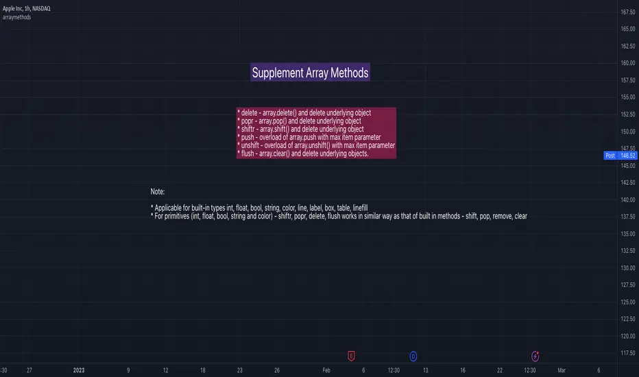
Gold Profit Target SystemGOLD PROFIT TARGET SYSTEM
Track Real Profits, Exit With Confidence
Best on Daily or Weekly - copy and mod as you see fit. Have fun!
WHAT THIS INDICATOR DOES:
This indicator tracks your gold position from entry and shows color-coded profit targets as the price rises. Instead of guessing when to exit, you see exact profit levels in real-time: 1%, 2%, 3%, 4%, 5%, 10%, 15%, 20%, 25%, and 25%+.
Simple concept: BUY on the signal, SELL at YOUR chosen profit level.
HOW IT WORKS - 3 SIMPLE STEPS:
STEP 1: Wait for BUY Signal
• Green triangle (▲) appears below the composite line
• Triggered when inverse assets (DXY, rates, etc.) show strong correlation and are falling
• Entry price is automatically recorded
• Position tracking begins
STEP 2: Watch Profit Targets Appear
• As gold rises, color-coded symbols appear above the composite line
• Each symbol represents a profit milestone
• The info table shows your current profit
• You decide when to exit based on YOUR target
STEP 3: Exit at Your Chosen Level
• Conservative? Exit at 5-10%
• Moderate? Exit at 10-15%
• Aggressive? Hold for 20%+
• The indicator just shows the levels - YOU make the call
THE COMPOSITE LINE - WHAT IT MEANS:
The main line is a weighted composite of inverse-correlated assets:
• DXY (US Dollar Index)
• Real Interest Rates (10Y TIPS)
• US 10-Year Treasury Yield
• US 2-Year Treasury Yield
• Bitcoin (optional)
• Copper (optional)
Line Position:
• Below -30 (Bright Green): Very strong inverse correlation - excellent BUY conditions
• Below 0 (Green): Inverse correlation present - moderate BUY conditions
• Above 0 (Red): Inverse assets rising - neutral to bearish
• Above 30 (Bright Red): Strong inverse rally - bearish for gold
What Causes BUY Signals:
When the composite line is negative (inverse assets falling) AND shows strong correlation (>0.3), this suggests gold is likely to rise. The indicator records your entry and begins tracking profits.
COLOR-CODED PROFIT TARGETS:
EARLY PROFITS (Green Circles):
• 1% - Very Light Green (#c8e6c9) - First confirmation
• 2% - Light Green (#a5d6a7) - Building profit
• 3% - Green (#81c784) - Good profit
• 4% - Medium Green (#66bb6a) - Strong profit
• 5% - Dark Green (#4caf50) - Solid profit!
EXCELLENT PROFIT (Yellow Diamond):
• 10% - Yellow (#ffd54f) - Double digits, excellent trade!
OUTSTANDING PROFIT (Orange Diamonds):
• 15% - Orange (#ffb74d) - Exceptional profit, consider partial exit
EXCEPTIONAL PROFIT (Red Diamonds):
• 20% - Light Red (#ff8a65) - Rare territory, strong exit consideration
• 25% - Red (#f44336) - Extraordinary profit, very rare!
PEAK PROFIT (Purple Star):
• 25%+ - Purple (#9c27b0) - Once in a blue moon! The home run trade!
STOP LOSS (Red X):
• Default -5% - Protection against losses
• Position auto-resets if stop is hit
THE PROFIT BAR (Histogram):
Below the composite line, you'll see a colored histogram when in position:
Bar Color = Your Current Profit Tier
• Light green bar = 1-2% profit
• Green bar = 3-5% profit
• Yellow bar = 10% profit
• Orange bar = 15% profit
• Red bar = 20-25% profit
• Purple bar = 25%+ profit
• Red negative bar = Currently at a loss
Bar Height = Current Profit %
The taller the bar, the larger your profit. Negative bars extend downward when you're at a loss.
THE INFORMATION TABLE:
The table (top-right by default) shows everything at a glance:
Position: ✓ IN (green) or ✗ OUT (gray)
Shows whether you're currently holding a position
Entry Price: Your recorded buy price
Example: 2,100.50
Current Price: Gold's current price
Example: 2,142.75
Current P/L: YOUR PROFIT %
This is the most important metric - shows exactly how much you're up (or down)
Color matches your current profit tier
Example: +2.01% in light green
Profit Tier: Current milestone reached
Shows which profit level you've hit: "1%", "2%", "5%", "10%", etc.
Next Target: The next profit level to watch
Tells you what milestone is coming up next
Bars Held: How long you've been in the trade
Helps track holding time
Composite: Current correlation strength
Shows the underlying composite correlation value
REFERENCE LINES:
Zero Line (Gray):
The center line. Above = bearish for gold, Below = bullish for gold
Strong Bull Line (Green dashed at -30):
When composite crosses below -30, very strong BUY conditions
Strong Bear Line (Red dashed at +30):
When composite crosses above +30, strong bearish conditions
BACKGROUND SHADING:
Very Light Green Background:
You're in profit (position open and above entry price)
Very Light Red Background:
You're at a loss (position open and below entry price)
No Background:
No position currently open
SYMBOLS ON CHART:
▲ Green Triangle Below Line: BUY SIGNAL
Enter long position here. Entry price recorded.
● Small Green Circles Above Line: 1-5% Profits
Early profit targets. Light green to dark green progression.
◆ Diamonds Above Line: 10-25% Profits
Major profit milestones. Yellow → Orange → Red progression.
★ Purple Star Above Line: 25%+ Profit
The holy grail! Peak profit achieved.
✖ Red X Below Line: STOP LOSS HIT
Trade went against you. Position resets (if auto-reset enabled).
PROFIT-TAKING STRATEGIES:
Strategy 1: Fixed Target (Simple)
Pick one target (e.g., 10%) and always exit there.
Best for: Beginners, disciplined traders
Strategy 2: Scaled Exit (Advanced)
Exit in portions:
• 5% profit → Sell 25%
• 10% profit → Sell 25% (50% total out)
• 15% profit → Sell 25% (75% total out)
• 20%+ profit → Let final 25% ride
Best for: Risk management, maximizing upside
Strategy 3: Trailing Stop
• Hit 10%? Set stop at 5%
• Hit 15%? Set stop at 10%
• Lock in profits while letting winners run
Best for: Trend followers, bull markets
Strategy 4: Adaptive
• Strong uptrend → wait for 15-20%
• Choppy market → exit at 5-10%
• Weakening trend → exit at any profit
Best for: Experienced traders
SETTINGS YOU CAN CUSTOMIZE:
Profit Target Levels:
Change any profit % to match your strategy
• Conservative: Lower targets (0.5%, 1%, 2%, 3%, 5%)
• Aggressive: Higher targets (2%, 5%, 10%, 20%, 30%)
Assets to Include:
• Enable/disable Bitcoin
• Enable/disable Copper
• Toggle which inverse assets to track
Display Options:
• Show all targets or just current tier
• Show/hide profit bar
• Show/hide composite line
• Move table position
Stop Loss:
• Set your risk tolerance (default 5%)
• Enable/disable auto-reset on stop loss
Correlation Periods:
• Adjust for your timeframe
• Hourly: 14/30/60
• Daily: 20/50/100
• Weekly: 10/20/50
ALERTS AVAILABLE:
Set alerts for any profit milestone:
Critical Alerts:
• "BUY Signal" - Entry notification
• "5% Profit Target" - First major milestone
• "10% Profit Target" - Decision point
• "Stop Loss Hit" - Risk protection
Optional Alerts:
• 1%, 2%, 3%, 4% - Early confirmations
• 15%, 20%, 25% - Major milestones
• Individual levels for your strategy
BEST TIMEFRAMES:
Daily Chart (Recommended):
Best for swing traders holding 3-10 days
Use default settings (20/50/100 periods)
Target 5-15% profits
4-Hour Chart:
Good for active swing traders
Adjust periods to 14/30/60
Target 3-10% profits
Hourly Chart:
For day traders and scalpers
Use shorter periods (14/30/60)
Target 1-5% profits
Adjust profit levels lower (0.5%, 1%, 2%, 3%)
WHY THIS INDICATOR IS DIFFERENT:
Most indicators tell you WHEN to enter.
This one tells you WHEN TO EXIT with profit.
Most indicators use vague signals.
This one shows EXACT profit percentages.
Most indicators leave exit decisions to you.
This one gives CLEAR, COLOR-CODED milestones.
Most indicators don't track your P/L.
This one shows your profit in text you can't miss.
QUICK START GUIDE:
1. Add indicator to gold chart (XAUUSD, GLD, GC1!)
2. Wait for green triangle (▲) BUY signal
3. Watch your profit grow in the table
4. Exit when you hit YOUR target (5%, 10%, 15%, etc.)
5. Repeat
That's it. Simple. Effective. Profitable.
IMPORTANT NOTES:
• This is for LONG positions only - not for shorting gold
• Position tracking begins only after a BUY signal
• The indicator shows levels - YOU decide when to exit
• Always use stop losses (default 5% is reasonable)
• Past performance doesn't guarantee future results
• Not financial advice - use for educational purposes
PRO TIPS:
Tip 1: Don't get greedy - 10-15% is an excellent profit for most trades
Tip 2: Purple stars (25%+) are RARE - don't wait for them on every trade
Tip 3: The profit bar color change is your visual cue - green→yellow→orange→red
Tip 4: Combine with resistance levels - "10% profit + resistance = exit"
Tip 5: Set alerts for YOUR target level so you never miss it
Tip 6: The giant P/L number in the table removes emotion from decisions
EXAMPLE TRADE:
Day 1: ▲ BUY signal at $2,100
Table shows: Position ✓ IN | Entry: 2,100
Day 2: Current P/L: +1.8%
First green circle appears (1% target hit)
Table tier: "1%"
Day 4: Current P/L: +5.2%
Dark green circle appears (5% target hit)
Profit bar is dark green
Decision point: Exit 50% here?
Day 7: Current P/L: +10.5%
Yellow diamond appears (10% target hit!)
Table shows: +10.5% in yellow text
Decision point: Exit remaining 50%?
Result: Average exit ~7.5% over 7 days. Excellent swing trade!
WORKS ON:
• Gold Spot (XAUUSD)
• Gold Futures (GC1!)
• Gold ETFs (GLD, IAU)
• Any gold instrument
Inverse Assets Tracked:
• DXY (US Dollar Index)
• Real Interest Rates (TIPS)
• US Treasury Yields (2Y, 10Y)
• Bitcoin (optional)
• Copper (optional)
THE BOTTOM LINE:
Stop guessing when to take profits.
Start SEEING your profit levels in real-time.
The indicator shows you the targets.
YOU choose when to cash out.
That's YOUR edge.
Developed for traders who want clear, actionable profit targets instead of vague signals.

Market Health Indicator# Market Health Indicator - Documentation
## Overview
The Market Health Indicator is a Pine Script technical analysis tool designed for TradingView that evaluates overall market conditions by analyzing the relationship between price and three Exponential Moving Averages (EMAs), as well as the relationships between the EMAs themselves. The indicator provides a quantitative score and actionable investment recommendations.
---
## Purpose
This indicator helps traders and investors:
- Assess the overall health and trend strength of a market or security
- Make informed decisions about position sizing
- Identify bullish, bearish, or neutral market conditions
- Determine when to increase, reduce, or exit positions
---
## Scoring Methodology
### Scoring System
The indicator evaluates **6 conditions**, each contributing either **+1** or **-1** to the total score:
#### Price vs EMA Conditions (3 conditions)
1. **Price vs EMA 21**
- Price > EMA 21 → +1
- Price < EMA 21 → -1
2. **Price vs EMA 50**
- Price > EMA 50 → +1
- Price < EMA 50 → -1
3. **Price vs EMA 100**
- Price > EMA 100 → +1
- Price < EMA 100 → -1
#### EMA Relationship Conditions (3 conditions)
4. **EMA 21 vs EMA 100**
- EMA 21 > EMA 100 → +1
- EMA 21 < EMA 100 → -1
5. **EMA 21 vs EMA 50**
- EMA 21 > EMA 50 → +1
- EMA 21 < EMA 50 → -1
6. **EMA 50 vs EMA 100**
- EMA 50 > EMA 100 → +1
- EMA 50 < EMA 100 → -1
### Total Score Range
- **Minimum Score**: -6 (all conditions bearish)
- **Maximum Score**: +6 (all conditions bullish)
---
## Market Health Status
Based on the total score, the indicator assigns one of five market health statuses:
| Score Range | Status | Interpretation |
|-------------|--------|----------------|
| 4 to 6 | **Strong Bullish** | All or most conditions favor upward momentum |
| 2 to 3 | **Bullish** | Majority of conditions are positive |
| -1 to 1 | **Neutral** | Mixed signals, no clear directional bias |
| -3 to -2 | **Bearish** | Majority of conditions are negative |
| -6 to -4 | **Strong Bearish** | All or most conditions favor downward momentum |
---
## Investment Level Recommendations
The indicator provides position sizing recommendations based on the score:
| Score Range | Investment Level | Action |
|-------------|-----------------|--------|
| 4 to 6 | **100% Invested** | Maximum exposure - strong bullish conditions |
| 2 to 3 | **75% Invested** | High exposure - moderately bullish conditions |
| 0 to 1 | **50% Invested** | Moderate exposure - neutral to slightly positive conditions |
| Below 0 | **Exit Weak Stocks** | Reduce exposure - bearish conditions, exit underperforming positions |
---
## Installation & Setup
### Installation Steps
1. Open TradingView and navigate to any chart
2. Click on **Pine Editor** at the bottom of the screen
3. Copy the entire Pine Script code
4. Paste it into the Pine Editor
5. Click **"Add to Chart"**
### Configuration Options
The indicator includes two customizable settings accessible via the settings gear icon:
#### 1. Table Position
Choose where the indicator table appears on your chart:
- **Top**: top_left, top_center, top_right
- **Middle**: middle_left, middle_center, middle_right
- **Bottom**: bottom_left, bottom_center, bottom_right
**Default**: top_right
#### 2. Table Size
Adjust the text size of the indicator table:
- **tiny**: Smallest text size
- **small**: Small text size
- **normal**: Standard text size (default)
- **large**: Large text size
- **huge**: Largest text size
**Default**: normal
---
## Understanding the Display
### Table Components
The indicator displays a table with the following rows:
1. **Header Row (Colored)**
- Left cell: Market Health status
- Right cell: Current score out of 6
- Color indicates market condition (green = bullish, yellow = neutral, red = bearish)
2. **Investment Level Row (Blue)**
- Shows recommended position sizing based on current score
- Helps with portfolio management decisions
3. **Column Headers (Gray)**
- "Condition" - describes each evaluation criteria
- "Score" - shows the +1 or -1 value
4. **Condition Rows (6 rows)**
- Each row shows one of the 6 scoring conditions
- Left column: condition description
- Right column: score value (+1 in green or -1 in red)
---
## Interpretation Guidelines
### Strong Bullish (Score 4-6)
**Characteristics:**
- Price trading above all major EMAs
- EMAs aligned in bullish order (21 > 50 > 100)
- Strong upward momentum
**Action:**
- Maintain full exposure (100% invested)
- Consider adding to winning positions
- Look for pullbacks as buying opportunities
### Bullish (Score 2-3)
**Characteristics:**
- Price above most EMAs
- Generally positive EMA alignment
- Moderate upward trend
**Action:**
- Maintain high exposure (75% invested)
- Hold existing positions
- Be selective with new entries
### Neutral (Score -1 to 1)
**Characteristics:**
- Mixed signals from price and EMAs
- No clear trend direction
- Market indecision
**Action:**
- Reduce exposure to 50%
- Wait for clearer signals
- Focus on risk management
- Consider range-bound strategies
### Bearish (Score -2 to -3)
**Characteristics:**
- Price below most EMAs
- Generally negative EMA alignment
- Moderate downward trend
**Action:**
- Exit weak positions
- Reduce overall exposure
- Raise cash levels
- Protect capital
### Strong Bearish (Score -4 to -6)
**Characteristics:**
- Price trading below all major EMAs
- EMAs aligned in bearish order (21 < 50 < 100)
- Strong downward momentum
**Action:**
- Exit weak stocks immediately
- Minimal to no long exposure
- Preserve capital
- Wait for market conditions to improve
---
## Best Practices
### Usage Tips
1. **Timeframe Selection**
- Works on all timeframes
- Higher timeframes (daily, weekly) provide more reliable signals
- Lower timeframes (intraday) may generate more frequent signals but with higher noise
2. **Combine with Other Analysis**
- Use as a component of a comprehensive trading strategy
- Complement with support/resistance levels
- Consider volume and other momentum indicators
- Factor in fundamental analysis for longer-term positions
3. **Position Sizing**
- Treat investment level recommendations as guidelines, not rigid rules
- Adjust based on your risk tolerance and account size
- Consider your overall portfolio allocation
4. **Risk Management**
- Always use stop losses regardless of indicator reading
- Don't ignore risk management during "Strong Bullish" periods
- The indicator shows trend, not specific entry/exit points
### Limitations
- **Lagging Nature**: EMAs are lagging indicators, so signals may come after trend changes have begun
- **Whipsaw Risk**: In choppy, sideways markets, the indicator may generate mixed signals
- **Not a Standalone System**: Should be used as part of a broader trading strategy
- **No Predictive Power**: Shows current conditions, not future direction
- **Market Context**: May need adjustment during extreme market conditions or unusual volatility
---
## Technical Details
### EMA Calculations
The indicator uses three standard Exponential Moving Averages:
- **EMA 21**: Short-term trend (approximately 1 month of trading days)
- **EMA 50**: Medium-term trend (approximately 2.5 months)
- **EMA 100**: Long-term trend (approximately 5 months)
EMAs give more weight to recent prices compared to Simple Moving Averages (SMAs), making them more responsive to price changes.
### Update Frequency
- The indicator recalculates on every bar close
- Real-time updates during the current bar formation
- Table displays the most recent completed bar data
### Performance
- Lightweight indicator with minimal computational overhead
- Suitable for use with multiple charts simultaneously
- No historical data storage required beyond standard EMA calculations
---
## Frequently Asked Questions
**Q: Can I change the EMA periods (21, 50, 100)?**
A: The current version uses fixed EMA periods. Modifying these would require editing the Pine Script code directly.
**Q: Does this indicator work on all assets?**
A: Yes, it works on stocks, forex, cryptocurrencies, commodities, and indices - any asset with price data.
**Q: Can I use this for day trading?**
A: Yes, but it's designed for swing trading and position trading. For day trading, consider using lower timeframes and being aware of increased signal noise.
**Q: What if the score keeps changing?**
A: Frequent score changes indicate a choppy or transitional market. Consider waiting for a more stable reading before taking action.
**Q: Should I exit ALL positions when score is negative?**
A: The recommendation is to "Exit Weak Stocks" - focus on underperforming positions. Strong stocks may still be held with appropriate stop losses.
**Q: Can I get alerts based on score changes?**
A: The current version doesn't include alerts, but this functionality could be added with Pine Script modifications.
---
## Version History
**Version 1.0**
- Initial release
- 6-condition scoring system
- Investment level recommendations
- Customizable table position and size
- Overlay on main chart
---
## Support & Feedback
For questions, suggestions, or issues with the indicator:
- Review this documentation thoroughly
- Test the indicator on historical data before live trading
- Adjust settings to match your chart layout preferences
- Always paper trade new strategies before risking real capital
---
## Disclaimer
This indicator is provided for educational and informational purposes only. It does not constitute financial advice, investment advice, trading advice, or any other type of advice. Trading and investing involve substantial risk of loss. Past performance is not indicative of future results. Always do your own research and consult with a qualified financial advisor before making investment decisions.

Multi-Metric Market Regime Detector - [KK]This indicator identifies current market behavioral regimes by synthesizing six complementary analytical methodologies. Rather than generating trading signals, it provides contextual analysis to help traders understand market conditions and adapt their strategies accordingly.
Markets cycle through distinct behavioral states - trending efficiently, consolidating in ranges, compressing before breakouts, or transitioning between states. This tool quantifies these conditions using only price action data (OHLC), enabling traders to filter strategies based on current market structure.
Core Methodology
The indicator combines six independent metrics into a weighted composite classification system:
Efficiency Ratio (30% weight)
Measures the signal-to-noise ratio of price movement by comparing net price displacement to total path traveled. High efficiency indicates clean directional movement; low efficiency indicates choppy, noisy conditions.
Choppiness Index (25% weight)
Quantifies whether the market is trending or consolidating by comparing cumulative True Range to actual price range. Values below 38.2 suggest trending behavior; values above 61.8 suggest range-bound consolidation.
Volatility Analysis (20% weight)
Detects compression and expansion cycles using the relationship between Bollinger Bands and Keltner Channels. Compression phases (squeeze conditions) often precede significant directional moves.
Fractal Efficiency Proxy (10% weight)
Analyzes path complexity by comparing net displacement to cumulative range, providing insight into the smoothness versus randomness of price action.
Market Structure (15% weight)
Examines pivot point sequences to identify structural trends. Higher Highs and Higher Lows indicate bullish structure; Lower Lows and Lower Highs indicate bearish structure.
Wick-to-Body Ratio Analysis (qualitative)
Identifies rejection and indecision patterns by measuring the proportion of candle wicks to bodies, highlighting potential reversal zones or liquidity events.
Regime Classifications
The composite scoring system produces four distinct regime states:
TRENDING : High efficiency, low choppiness, clear directional structure. Favorable conditions for momentum and trend-following strategies.
CHOPPY/RANGE : Low efficiency, high choppiness, mean-reverting behavior. Favorable conditions for range trading and counter-trend setups.
COMPRESSION : Volatility squeeze detected, market coiling. Anticipate expansion; reduce position size until breakout confirmation.
TRANSITION : Mixed signals, conflicting metrics, unclear direction. Recommended to reduce exposure and wait for regime clarity.
Visual Features
Regime-Colored Candles (enabled by default)
Candles are colored according to the current regime state for immediate visual identification. Green indicates trending, gray indicates choppy, orange indicates compression, and yellow indicates transition.
Comprehensive Metrics Table (top right)
Displays real-time values for all six metrics along with individual regime assessments and the final composite classification with score.
Regime Guide Table (middle right)
Quick reference guide showing recommended strategies and actions to avoid for each regime state.
Chart Label ( optional)
Summary label displaying current regime and key metric values.
Background Coloring (optional)
Alternative visualization using background colors instead of candle coloring.
Indicator Plots (optional)
Displays Efficiency Ratio and Choppiness Index with threshold reference lines.
Customization Options
All calculation parameters are adjustable:
- Efficiency Ratio lookback period and thresholds
- Choppiness Index length and classification thresholds
- Volatility analysis parameters (BB/KC multipliers and lengths)
- Pivot detection sensitivity (left/right bars)
- Text size controls for both tables (Tiny to Huge)
- Visual element toggles (candles, background, label, tables, plots)
The indicator automatically detects chart theme (dark/light) and adjusts text colors for optimal readability.
Practical Application
This is a context tool, not a signal generator. Use it to:
- Filter trend-following strategies to trending regimes only
- Identify range-bound conditions for mean-reversion setups
- Anticipate breakout opportunities during compression phases
- Reduce exposure during transitional periods with mixed signals
- Improve risk management by matching position size to regime clarity
The indicator works on all timeframes and instruments using only OHLC data. Higher timeframes generally provide more stable regime classifications.
Alert Conditions
Four alert types are available:
- Efficiency Ratio crosses trend threshold
- Choppiness Index enters range territory
- Volatility squeeze released
- Regime state change detected
Technical Notes
Built with Pine Script v5. Uses up to 500 bars of historical data for stable calculations. All metrics are calculated in real-time with no repainting on confirmed pivots. Compatible with all chart themes through adaptive text coloring.
Disclaimer
This indicator is provided for educational and informational purposes only. It does not constitute financial advice or trading recommendations. Past performance and theoretical analysis do not guarantee future results. Always conduct independent research and implement appropriate risk management. Trading financial instruments involves substantial risk of loss.
Usage Philosophy
The goal is not to trade more frequently, but to think more clearly about market conditions. Use this tool to develop deeper intuition about market structure and to enforce discipline by avoiding low-probability setups during unfavorable regime conditions.

Unmitigated MTF High Low Pro - Cave Diving Bookmap Heatmap Plot
Unmitigated MTF High Low Pro - Cave Diving Bookmap Heatmap Plot
---
## 📖 Table of Contents
1. (#what-this-indicator-does)
2. (#core-concepts)
3. (#visual-components)
4. (#the-cave-diving-framework)
5. (#how-to-use-it-for-trading)
6. (#settings--customization)
7. (#best-practices)
8. (#common-scenarios)
---
## What This Indicator Does
The **Unmitigated MTF High Low v2.0** tracks unmitigated (untouch) high and low levels across multiple timeframes, helping you identify key support and resistance zones that the market hasn't revisited yet. Think of it as a sophisticated memory system for price action - it remembers where price has been, and more importantly, where it *hasn't been back to*.
### Why "Unmitigated" Matters
In futures trading, especially on instruments like NQ and ES, the market has a tendency to revisit levels where liquidity was left behind. An "unmitigated" level is one that hasn't been touched since it was formed. These levels often act as magnets for price, and understanding their age and proximity gives you a significant edge in:
- **Entry timing** - Waiting for price to approach tested levels
- **Exit planning** - Taking profits before ancient resistance/support
- **Risk management** - Avoiding entries when approaching multiple old levels
- **Liquidity mapping** - Visualizing where orders likely cluster
---
## Core Concepts
### 1. **Sessions & Age**
The indicator uses **New York trading sessions** (6:00 PM to 5:59 PM NY time) as the primary time measurement. This aligns with how futures markets naturally segment their activity.
**Age Categories:**
- 🟢 **New (0-1 sessions)** - Fresh levels, recently formed
- 🟡 **Medium (2-3 sessions)** - Tested by time, gaining significance
- 🔴 **Old (4-6 sessions)** - Highly significant, survived multiple days
- 🟣 **Ancient (7+ sessions)** - Extreme significance, major support/resistance
The longer a level remains unmitigated, the more significant it becomes. Think of it like compound interest - time adds weight to these zones.
### 2. **Multi-Timeframe Tracking**
You can set the indicator to track high/low levels from any timeframe (default is 15 minutes). This means you're watching for unmitigated 15-minute highs and lows while trading on, say, a 1-minute or 5-minute chart.
**Why this matters:**
- Higher timeframe levels have more weight
- You can see multiple timeframe structure simultaneously
- Helps you avoid fighting larger timeframe momentum
### 3. **Mitigation**
A level becomes "mitigated" (deactivated) when price touches it:
- **High levels** are mitigated when price reaches or exceeds them
- **Low levels** are mitigated when price reaches or goes below them
Once mitigated, the level disappears from view. The indicator only shows you the untouch levels that still matter.
---
## Visual Components
### 📊 The Dashboard Table
Located in the corner of your chart (configurable), the table shows:
```
┌─────────┬───────────┬────────┬─────┬───────┐
│ Level │ Price │ Points │ Age │ % │
├─────────┼───────────┼────────┼─────┼───────┤
│ ↑↑↑↑↑ │ 21,450.25 │ +45.50 │ 8 │ +0.21%│ ← 5th High (Ancient)
│ ↑↑↑↑ │ 21,430.00 │ +25.25 │ 5 │ +0.12%│ ← 4th High (Old)
│ ↑↑↑ │ 21,420.50 │ +15.75 │ 3 │ +0.07%│ ← 3rd High (Medium)
│ ↑↑ │ 21,412.00 │ +7.25 │ 1 │ +0.03%│ ← 2nd High (New)
│ ↑ ⚠️ │ 21,408.25 │ +3.50 │ 0 │ +0.02%│ ← 1st High (Proximity Alert!)
├─────────┼───────────┼────────┼─────┼───────┤
│ 15 mins │ 🟢 │ Δ 8.75 │ 2U │ │ ← Status Row
├─────────┼───────────┼────────┼─────┼───────┤
│ ↓ ⚠️ │ 21,399.50 │ -5.25 │ 0 │ -0.02%│ ← 1st Low (Proximity Alert!)
│ ↓↓ │ 21,395.00 │ -9.75 │ 2 │ -0.05%│ ← 2nd Low (Medium)
│ ↓↓↓ │ 21,385.25 │ -19.50 │ 4 │ -0.09%│ ← 3rd Low (Old)
│ ↓↓↓↓ │ 21,370.00 │ -34.75 │ 6 │ -0.16%│ ← 4th Low (Old)
│ ↓↓↓↓↓ │ 21,350.75 │ -54.00 │ 9 │ -0.25%│ ← 5th Low (Ancient)
├─────────┼───────────┼────────┼─────┼───────┤
│ 📊 15↑ / 12↓ │ ← Statistics (optional)
└─────────┴───────────┴────────┴─────┴───────┘
```
**Reading the Table:**
- **Level Column**: Number of arrows indicates position (1-5), color shows age
- **Price**: The actual price level
- **Points**: Distance from current price (+ for highs, - for lows)
- **Age**: Number of full sessions since creation
- **%**: Percentage distance from current price
- **⚠️**: Proximity alert - price is within threshold distance
- **Status Row**: Shows timeframe, direction (🟢 bullish/🔴 bearish), tunnel width (Δ), and Strat pattern
### 📈 Visual Elements on Chart
**1. Level Lines**
- Horizontal lines showing each unmitigated level
- **Color-coded by age**: Bright colors = new, darker = older, deep purple/teal = ancient
- **Line style**: Customizable (solid, dashed, dotted)
- Automatically turn **yellow** when price gets close (proximity alert)
**2. Price Labels**
- Show the exact price and age: "21,450.25 (8d)"
- Fixed at small size for clean readability
- Positioned with configurable offset from current bar
**3. Bands (Optional)**
- Shaded zones between pairs of unmitigated levels
- Default: Between 1st and 2nd levels (the "tunnel")
- Can switch to 1st-3rd, 2nd-3rd, or disable entirely
- **Upper band** (pink/maroon) - Between unmitigated highs
- **Lower band** (blue/teal) - Between unmitigated lows
- These represent the "no man's land" or consolidation zones
---
## The Cave Diving Framework
This indicator is designed around the **Cave Diving Trading Framework** - a psychological and technical approach that maps cave diving safety protocols to futures trading risk management.
### 🤿 The Core Metaphor
**Cave diving has clear danger zones based on depth and overhead environment. Your trading should too.**
#### Shallow Water (New Levels, 0-1 Sessions)
- **Light**: Bright colors (bright red highs, bright green lows)
- **Psychology**: Fresh territory, recently tested
- **Trading**: Be aware but not overly concerned
- **Cave Diving Parallel**: You can see the surface, easy exit
#### Penetration Depth (Medium Levels, 2-3 Sessions)
- **Light**: Medium intensity colors
- **Psychology**: Building significance, market memory forming
- **Trading**: Start respecting these levels for entries/exits
- **Cave Diving Parallel**: Deeper in, need to track your line back
#### Deep Dive Zone (Old Levels, 4-6 Sessions)
- **Light**: Dark colors (deep maroon, dark blue)
- **Psychology**: Highly tested support/resistance
- **Trading**: Major decision points, plan accordingly
- **Cave Diving Parallel**: Significant overhead, careful navigation required
#### Overhead Environment (Ancient Levels, 7+ Sessions)
- **Light**: Very dark, purple/deep teal
- **Psychology**: Extreme caution required, major liquidity zones
- **Trading**: These are your "turn back" signals - don't fight ancient levels
- **Cave Diving Parallel**: Maximum danger, no room for error
### 🎯 The Proximity Alert System
Just like a cave diver's depth gauge that warns at critical thresholds, the proximity alerts (⚠️) tell you when you're entering a danger zone. When price gets within your configured threshold (default 5 points), the indicator:
- Highlights the level in **yellow** on the chart
- Shows **⚠️** in the table
- Signals: "You're entering a high-significance zone - adjust your position accordingly"
This prevents the trading equivalent of going deeper into a cave without checking your air supply.
---
## How to Use It for Trading
### 🎯 Entry Strategies
**1. The "Bounce Setup" (Mean Reversion)**
- Wait for price to approach an old or ancient unmitigated level
- Look for confluence: multiple levels nearby, bands narrowing
- Enter when price shows rejection (reversal candle patterns)
- **Example**: Price drops to a 6-session-old low, shows bullish engulfing → Long entry
**2. The "Break and Retest" (Trend Following)**
- Wait for price to break through an unmitigated level (mitigates it)
- Enter on the retest of the newly broken level
- **Example**: Price breaks above 4-session-old high → Wait for pullback to that level → Long entry
**3. The "Tunnel Trade" (Range Trading)**
- When bands are active, trade the range between 1st-2nd levels
- Short near upper band resistance, long near lower band support
- Exit at opposite side or when bands break
### 🚨 Risk Management Rules
**The Ancient Level Rule**
> Never fight ancient levels (7+ sessions). If you're long and approaching an ancient high, take profits. If you're short and approaching an ancient low, take profits.
These levels have survived a full trading week without being touched - there's likely significant liquidity and institutional interest there.
**The Proximity Exit Rule**
> When you see ⚠️ proximity alerts on multiple levels above/below your position, tighten stops or scale out.
This is your "overhead environment" warning. You're in dangerous territory.
**The New Level Filter**
> Be cautious taking positions based solely on new levels (0-1 sessions). Wait for them to age or combine with other confluence.
Fresh levels haven't been tested by time. They're like unconfirmed support/resistance.
### 📊 Reading Market Structure
**Bullish Structure (🟢 in status row)**
- Unmitigated lows are aging and holding
- Price respecting the lower band
- Old lows below acting as strong support
- **Bias**: Look for long entries at lower levels
**Bearish Structure (🔴 in status row)**
- Unmitigated highs are aging and holding
- Price respecting the upper band
- Old highs above acting as strong resistance
- **Bias**: Look for short entries at higher levels
**The Tunnel Compression**
- When the Δ (delta) in the status row is small, levels are tight
- This often precedes a breakout
- **Trading**: Wait for breakout direction, then trade the break
### 🔄 Strat Integration
The indicator shows Strat patterns in the status row:
- **1** - Inside bar (consolidation)
- **2U** - Broke high only (bullish)
- **2D** - Broke low only (bearish)
- **3** - Broke both (wide range, volatility)
Use these with the unmitigated levels:
- **2U near old high** → Potential resistance, watch for rejection
- **2D near old low** → Potential support, watch for bounce
- **3 pattern** → High volatility, respect wider stops
---
## Settings & Customization
### 📅 Session & Timeframe Settings
**HL Interval** (Default: 15 minutes)
- The timeframe for high/low calculation
- **Lower (1m, 5m)**: More levels, more noise, good for scalping
- **Higher (30m, 1H, 4H)**: Fewer levels, stronger significance, good for swing trading
- **Recommendation for NQ/ES**: 15m or 30m for day trading, 1H for swing trading
**Session Age Threshold** (Default: 2)
- How many sessions before a level is considered "old"
- Lower = more levels classified as old
- Higher = stricter definition of significance
### 📊 Level Display Options
**Show Level Lines**
- Toggle: Display horizontal lines for each level
- **Turn off** if you prefer a cleaner chart and only want the table
**Show Level Labels**
- Toggle: Display price labels on the chart
- **Turn off** for minimal visual clutter
**Label Offset**
- Distance (in bars) from current price bar to place labels
- Increase if labels overlap with price action
**Level Line Width & Style**
- Customize visual appearance
- **Thin solid**: Minimal distraction
- **Thick dashed**: High visibility
### 🎨 Age-Based Color Coding
Customize colors for each age category (high and low separately):
- **New (0-1 sessions)**: Default bright red/green
- **Medium (2-3 sessions)**: Default medium intensity
- **Old (4+ sessions)**: Default dark red/blue
- **Ancient (7+ sessions)**: Default deep purple/teal
**Color Strategy Tips:**
- Keep ancient levels in highly contrasting colors
- Use opacity (transparency) if you want subtler lines
- Match your chart's color scheme for aesthetic coherence
### 🎯 Band Settings
**Band Mode**
- **1st-2nd** (Default): The primary "tunnel" between most recent levels
- **1st-3rd**: Wider band, more room for price action
- **2nd-3rd**: Band between less immediate levels
- **Disabled**: No bands, lines only
**Band Colors & Borders**
- Customize fill color and border separately
- **Tip**: Keep bands very transparent (90-95% transparency) to avoid obscuring price action
### ⚠️ Proximity Alert Settings
**Enable Proximity Alerts**
- Toggle: Turn on/off the warning system
- When enabled, levels within threshold distance show ⚠️ and turn yellow
**Alert Threshold** (Default: 5.0 points)
- Distance in points to trigger the alert
- **For NQ**: 5-10 points is reasonable
- **For ES**: 2-5 points is reasonable
- **For MES/MNQ**: Scale down proportionally
**Alert Highlight Color**
- The color lines/labels turn when proximity is triggered
- Default: Yellow (high visibility)
### 📋 Table Settings
**Show Table**
- Toggle: Display the dashboard table
**Table Location**
- Top Left, Top Right, Bottom Left, Bottom Right
- Choose based on your chart layout and other indicators
**Text Size**
- Tiny, Small, Normal, Large
- **Recommendation**: Normal for 1080p monitors, Small for 4K
**Show % Distance**
- Toggle: Add percentage distance column to table
- Useful for comparing relative distances across different price ranges
**Show Statistics Row**
- Toggle: Show total count of unmitigated highs/lows
- Format: "📊 15↑ / 12↓" (15 unmitigated highs, 12 unmitigated lows)
- Useful for gauging overall market structure
### ⚡ Performance Settings
**Enable Level Cleanup**
- Automatically remove very old levels to maintain performance
- **Keep on** unless you want unlimited history
**Max Lookback Levels** (Default: 10,000)
- Maximum number of levels to track
- 10,000 ≈ 6+ months of 15-minute bars
- **Increase** if you want more history
- **Decrease** if experiencing performance issues
**Max Boxes Per Band** (Default: 245)
- TradingView limit is 500 total boxes
- With 2 bands, 245 each = 490 total (safe maximum)
---
## Best Practices
### 🎯 Position Management
**1. Scaling In Near Old Levels**
```
Price approaching 5-session-old low:
- First position: 30% size at proximity alert (⚠️)
- Second position: 40% size at exact level
- Third position: 30% size if it shows strong rejection
```
**2. Scaling Out Near Ancient Levels**
```
Holding long position, approaching 8-session-old high:
- Exit 50% at proximity alert (⚠️)
- Exit 30% at exact level
- Trail stop on remaining 20%
```
### 🧠 Trading Psychology Integration
Drawing from principles in *The Mountain Is You*, this indicator helps you:
**1. Recognize Self-Sabotage Patterns**
- **The Premature Entry**: Entering before price reaches your planned level
- **Solution**: Set alerts at unmitigated levels, wait for proximity warnings
- **The Profit-Taking Problem**: Exiting too early from fear
- **Solution**: Identify the next unmitigated level and commit to holding until proximity alert
- **The Loss Holding**: Refusing to exit losing trades
- **Solution**: When price breaks through and mitigates your entry level, it's telling you the structure changed
**2. Building Better Habits**
The color-coded age system trains your brain to:
- Respect levels that have proven themselves over time
- Distinguish between noise (new levels) and structure (old levels)
- Make decisions based on objective data, not fear or greed
**3. Emotional Regulation**
The proximity alerts serve as:
- **Circuit breakers** - Forcing you to re-evaluate before dangerous zones
- **Permission to act** - Giving you objective signals to exit without second-guessing
- **Validation** - Confirming when you're in alignment with market structure
### 📝 Pre-Market Routine
**Daily Setup Checklist:**
1. ✅ Identify the 3 nearest unmitigated highs above current price
2. ✅ Identify the 3 nearest unmitigated lows below current price
3. ✅ Note which are ancient (7+) - these are your "no-go" zones
4. ✅ Check the tunnel width (Δ in status row) - tight or wide?
5. ✅ Set alerts at the 1st high and 1st low for proximity warnings
6. ✅ Plan: "If we go up, I exit at ___. If we go down, I enter at ___."
### 🔄 Timeframe Confluence
**Multi-Timeframe Strategy:**
Run the indicator on **three instances**:
- **15-minute** (short-term structure)
- **1-hour** (intermediate structure)
- **4-hour** (major structure)
**Strong Setup**: When all three timeframes show unmitigated levels converging at the same price zone.
**Example:**
- 15m: Old low at 21,400
- 1H: Ancient low at 21,398
- 4H: Ancient low at 21,395
- **Result**: 21,395-21,400 is a monster support zone
### ⚠️ What This Indicator Doesn't Do
**Not a Crystal Ball**
- It doesn't predict where price will go
- It shows you where price *hasn't been* and how long it's been avoided
- The trading decisions are still yours
**Not an Entry Signal Generator**
- It provides context and structure
- You need to combine it with your entry methodology (price action, indicators, order flow, etc.)
**Not Foolproof**
- Ancient levels get broken
- Proximity alerts can trigger early in strong trends
- The market doesn't "owe" you a reversal at any level
---
## Common Scenarios
### Scenario 1: "Level Cluster Ahead"
**Situation**: You're long at 21,400. The table shows:
- 1st High: 21,425 (2 sessions old)
- 2nd High: 21,428 (3 sessions old)
- 3rd High: 21,435 (6 sessions old)
**Interpretation**: There's a resistance cluster just 25-35 points away. The 6-session-old level is particularly significant.
**Action**:
- Set first profit target at 21,420 (before the cluster)
- Set second target at 21,426 (between 1st and 2nd)
- Trail remaining position, but be ready to exit on rejection at 21,435
**Cave Diving Analogy**: You're approaching an overhead section with limited clearance. Lighten your load (reduce position) before entering.
---
### Scenario 2: "Ancient Level Approaches"
**Situation**: The market is grinding higher. You see ⚠️ appear next to a 9-session-old high at 21,500.
**Interpretation**: This level has survived over a week without being touched. Massive potential liquidity zone.
**Action**:
- If long, this is your absolute exit zone. Take profits before or at level.
- If looking to short, wait for clear rejection (price taps and reverses)
- Don't try to buy the breakout until it clearly breaks and retests
**Cave Diving Analogy**: Your dive computer is beeping - you've reached your planned turn-back depth. No matter how interesting it looks ahead, honor your plan.
---
### Scenario 3: "Mitigated Levels Create New Structure"
**Situation**: Price breaks and mitigates the 1st High. The previous 2nd High becomes the new 1st High.
**Interpretation**: The structure just shifted. What was the 2nd level is now most relevant.
**Action**:
- Watch how price reacts to the newly-mitigated level
- If it holds below (acts as resistance), bearish
- If it reclaims and holds above (acts as support), bullish
- The NEW 1st High is your next target/resistance
**Cave Diving Analogy**: You've passed through a restriction - the cave layout ahead is different now. Update your mental map.
---
### Scenario 4: "Tight Tunnel, Upcoming Breakout"
**Situation**: The Δ in the status row shows 3.25 points (very tight). Bands are converging.
**Interpretation**: Price is consolidating between very close unmitigated levels. Breakout likely.
**Action**:
- Don't try to predict direction
- Set alerts above 1st High and below 1st Low
- When break occurs, trade the retest
- Expect volatility - use wider stops
**Cave Diving Analogy**: You're in a narrow passage. Movement will be sudden and directional once it starts.
---
### Scenario 5: "Imbalanced Structure"
**Situation**: The statistics row shows "📊 22↑ / 7↓"
**Interpretation**: There are many more unmitigated highs than lows. This suggests:
- Price has been declining (hitting lows, leaving highs behind)
- Potential bullish reversal zone (lots of overhead supply mitigated)
- Or continued bearish structure (resistance everywhere above)
**Action**:
- Look at the age of those 22 highs
- If mostly new (0-2 sessions): Just a recent downmove, not significant yet
- If many old/ancient: Strong overhead resistance, be cautious on longs
- Compare to price action: Is price respecting the remaining lows?
**Cave Diving Analogy**: You've swam deeper than your starting point - most of your markers are above you now. Are you planning the ascent or going deeper?
---
## Final Thoughts: The Philosophy
This indicator is built on a simple but powerful principle: **The market has memory, and that memory has weight.**
Every unmitigated level represents:
- Liquidity left behind
- Orders waiting to be filled
- Institutional interest potentially parked
- Psychological significance for participants
The longer a level remains unmitigated, the more "charged" it becomes. When price finally revisits it, something significant usually happens - either a strong reversal or a definitive break.
Your job as a trader isn't to predict which outcome will occur. Your job is to:
1. **Recognize** when you're approaching these charged zones
2. **Respect** them by adjusting position size and risk
3. **React** appropriately based on how price behaves at them
4. **Remember** that ancient levels (like ancient wisdom) deserve extra reverence
The Cave Diving Framework embedded in this indicator serves as a constant reminder: Trading, like cave diving, requires rigorous respect for environmental hazards, meticulous planning, and the discipline to turn back when your limits are reached.
**Every proximity alert is the market asking you**: *"Do you really want to go deeper?"*
Sometimes the answer is yes - when your setup, confluence, and risk management all align.
Often, the answer should be no - and that's the trader avoiding the accident that would have happened to the gambler.
---
### 🎯 Quick Reference Card
**Color System:**
- 🟢 Bright colors = New (0-1 sessions) = Shallow water
- 🟡 Medium colors = Medium (2-3 sessions) = Penetration depth
- 🔴 Dark colors = Old (4-6 sessions) = Deep dive zone
- 🟣 Deep dark colors = Ancient (7+ sessions) = Overhead environment
**Symbols:**
- ↑ ↑↑ ↑↑↑ ↑↑↑↑ ↑↑↑↑↑ = High levels (1st through 5th)
- ↓ ↓↓ ↓↓↓ ↓↓↓↓ ↓↓↓↓↓ = Low levels (1st through 5th)
- ⚠️ = Proximity alert (danger zone)
- 🟢 = Bullish structure
- 🔴 = Bearish structure
- Δ = Tunnel width (distance between 1st high and 1st low)
**Critical Rules:**
1. Never fight ancient levels (7+ sessions)
2. Respect proximity alerts (⚠️)
3. Scale out near old/ancient resistance
4. Wait for confluence when entering
5. Let mitigated levels prove their new role
---
**Remember**: The indicator gives you structure. The trading edge comes from your discipline in respecting that structure.
Trade safe, trade smart, and always know your exit before your entry. 🎯
---
*"You don't become your best self by denying your patterns. You become your best self by recognizing them, understanding them, and choosing differently." - Adapted from The Mountain Is You*
In trading: You don't become profitable by ignoring market structure. You become profitable by recognizing it, understanding it, and choosing your entries accordingly.

MLExtensionsLibrary "MLExtensions"
A set of extension methods for a novel implementation of a Approximate Nearest Neighbors (ANN) algorithm in Lorentzian space.
normalizeDeriv(src, quadraticMeanLength)
Returns the smoothed hyperbolic tangent of the input series.
Parameters:
src (float) : The input series (i.e., the first-order derivative for price).
quadraticMeanLength (int) : The length of the quadratic mean (RMS).
Returns: nDeriv The normalized derivative of the input series.
normalize(src, min, max)
Rescales a source value with an unbounded range to a target range.
Parameters:
src (float) : The input series
min (float) : The minimum value of the unbounded range
max (float) : The maximum value of the unbounded range
Returns: The normalized series
rescale(src, oldMin, oldMax, newMin, newMax)
Rescales a source value with a bounded range to anther bounded range
Parameters:
src (float) : The input series
oldMin (float) : The minimum value of the range to rescale from
oldMax (float) : The maximum value of the range to rescale from
newMin (float) : The minimum value of the range to rescale to
newMax (float) : The maximum value of the range to rescale to
Returns: The rescaled series
getColorShades(color)
Creates an array of colors with varying shades of the input color
Parameters:
color (color) : The color to create shades of
Returns: An array of colors with varying shades of the input color
getPredictionColor(prediction, neighborsCount, shadesArr)
Determines the color shade based on prediction percentile
Parameters:
prediction (float) : Value of the prediction
neighborsCount (int) : The number of neighbors used in a nearest neighbors classification
shadesArr (array) : An array of colors with varying shades of the input color
Returns: shade Color shade based on prediction percentile
color_green(prediction)
Assigns varying shades of the color green based on the KNN classification
Parameters:
prediction (float) : Value (int|float) of the prediction
Returns: color
color_red(prediction)
Assigns varying shades of the color red based on the KNN classification
Parameters:
prediction (float) : Value of the prediction
Returns: color
tanh(src)
Returns the the hyperbolic tangent of the input series. The sigmoid-like hyperbolic tangent function is used to compress the input to a value between -1 and 1.
Parameters:
src (float) : The input series (i.e., the normalized derivative).
Returns: tanh The hyperbolic tangent of the input series.
dualPoleFilter(src, lookback)
Returns the smoothed hyperbolic tangent of the input series.
Parameters:
src (float) : The input series (i.e., the hyperbolic tangent).
lookback (int) : The lookback window for the smoothing.
Returns: filter The smoothed hyperbolic tangent of the input series.
tanhTransform(src, smoothingFrequency, quadraticMeanLength)
Returns the tanh transform of the input series.
Parameters:
src (float) : The input series (i.e., the result of the tanh calculation).
smoothingFrequency (int)
quadraticMeanLength (int)
Returns: signal The smoothed hyperbolic tangent transform of the input series.
n_rsi(src, n1, n2)
Returns the normalized RSI ideal for use in ML algorithms.
Parameters:
src (float) : The input series (i.e., the result of the RSI calculation).
n1 (simple int) : The length of the RSI.
n2 (simple int) : The smoothing length of the RSI.
Returns: signal The normalized RSI.
n_cci(src, n1, n2)
Returns the normalized CCI ideal for use in ML algorithms.
Parameters:
src (float) : The input series (i.e., the result of the CCI calculation).
n1 (simple int) : The length of the CCI.
n2 (simple int) : The smoothing length of the CCI.
Returns: signal The normalized CCI.
n_wt(src, n1, n2)
Returns the normalized WaveTrend Classic series ideal for use in ML algorithms.
Parameters:
src (float) : The input series (i.e., the result of the WaveTrend Classic calculation).
n1 (simple int)
n2 (simple int)
Returns: signal The normalized WaveTrend Classic series.
n_adx(highSrc, lowSrc, closeSrc, n1)
Returns the normalized ADX ideal for use in ML algorithms.
Parameters:
highSrc (float) : The input series for the high price.
lowSrc (float) : The input series for the low price.
closeSrc (float) : The input series for the close price.
n1 (simple int) : The length of the ADX.
regime_filter(src, threshold, useRegimeFilter)
Parameters:
src (float)
threshold (float)
useRegimeFilter (bool)
filter_adx(src, length, adxThreshold, useAdxFilter)
filter_adx
Parameters:
src (float) : The source series.
length (simple int) : The length of the ADX.
adxThreshold (int) : The ADX threshold.
useAdxFilter (bool) : Whether to use the ADX filter.
Returns: The ADX.
filter_volatility(minLength, maxLength, useVolatilityFilter)
filter_volatility
Parameters:
minLength (simple int) : The minimum length of the ATR.
maxLength (simple int) : The maximum length of the ATR.
useVolatilityFilter (bool) : Whether to use the volatility filter.
Returns: Boolean indicating whether or not to let the signal pass through the filter.
backtest(high, low, open, startLongTrade, endLongTrade, startShortTrade, endShortTrade, isEarlySignalFlip, maxBarsBackIndex, thisBarIndex, src, useWorstCase)
Performs a basic backtest using the specified parameters and conditions.
Parameters:
high (float) : The input series for the high price.
low (float) : The input series for the low price.
open (float) : The input series for the open price.
startLongTrade (bool) : The series of conditions that indicate the start of a long trade.
endLongTrade (bool) : The series of conditions that indicate the end of a long trade.
startShortTrade (bool) : The series of conditions that indicate the start of a short trade.
endShortTrade (bool) : The series of conditions that indicate the end of a short trade.
isEarlySignalFlip (bool) : Whether or not the signal flip is early.
maxBarsBackIndex (int) : The maximum number of bars to go back in the backtest.
thisBarIndex (int) : The current bar index.
src (float) : The source series.
useWorstCase (bool) : Whether to use the worst case scenario for the backtest.
Returns: A tuple containing backtest values
init_table()
init_table()
Returns: tbl The backtest results.
update_table(tbl, tradeStatsHeader, totalTrades, totalWins, totalLosses, winLossRatio, winrate, earlySignalFlips)
update_table(tbl, tradeStats)
Parameters:
tbl (table) : The backtest results table.
tradeStatsHeader (string) : The trade stats header.
totalTrades (float) : The total number of trades.
totalWins (float) : The total number of wins.
totalLosses (float) : The total number of losses.
winLossRatio (float) : The win loss ratio.
winrate (float) : The winrate.
earlySignalFlips (float) : The total number of early signal flips.
Returns: Updated backtest results table.
