Pine Script® Indikator
In den Scripts nach "GOLD" suchen

Pine Script® Strategie
dmw_3SMACross3 SMA set to 5 10 20 used to find the crossing points for pattern reversals or breakouts.
Pine Script® Indikator

Lysergik's Stochastic SynergyThis indicator shows the average Stochastic RSI output of the 15m, 1h, 2h, 4h, and Daily Stochastic RSI. It will change in its behavior depending on the time-frame you're using, but for many markets it works best on the 30m time-frame and the daily time-frame.
It is best used along with Lysergik's Fib Cross, which will allow you to avoid false signals in the stochastic synergy indicator. If your MA cross (50, 200) indicates a direction change opposite of the stochastic RSI synergy indicator then that is a signal to wait for more price action to determine your entry/exit points.
Using the Lysergik's Fib Cross, the same applies, but remember that a golden cross (white cross symbol) followed directly by a golden ratio cross (gold cross symbol) is even further indication that the stochastic RSI needs more breathing room before reversing.
This indicator is fully adjustable for you to back-test against charts and refine the indicator to your market.
The inputs in respective order are as follows:
RSI Length, Stoch Length, Smooth K, Smooth D, Upper Limit, Lower Limit, Basis
Enjoy and remember only make trades on your own terms.
Happy trading/investing! :)
Pine Script® Indikator

SynergySynergy
This indicator was developed for use in an investigation/tutorial using Pine Script to analyse Gold and US Dollar Index correlation.
The first indicator shall measure the percentage change between the open and close of each bar and compare it to the same percentage change of an alternative asset. Additionally, we shall color the background when the two assets move in the same direction. This should allow us to more easily see when the two assets move together and spot trends in their moment.
The yellow bars show use the percentage change in the price of gold. The blue bars show the percentage change in the price of the US Dollar index. If the bar is above zero, it means that the asset closed up. Conversely, if it is below zero, it means the asset closed down. Finally, the grey bars show bars in which the two assets closed in the same direction.
It can be used in conjunction with a second indicator (to be published soon) that provides statistics generated from this indicator.
The full free post can be found here: backtest-rookies.com
Pine Script® Indikator

BO Willians EMA'sBo Williams is a North America/Brazilian trader. He created a trading software called PHI CUBE.
This ema ratios are very used in Brazil. They a based in the Golden Number PHI.
"There is a special ratio that can be used to describe the proportions of everything from nature's smallest building blocks, such as atoms, to the most advanced patterns in the universe, such as unimaginably large celestial bodies. Nature relies on this innate proportion to maintain balance, but the financial markets also seem to conform to this "golden ratio." Here, we take a look at some technical analysis tools that have been developed to take advantage of it.
The Mathematics
Mathematicians, scientists and naturalists have known this ratio for centuries. It's derived from something known as the Fibonacci sequence, named after its Italian founder, Leonardo Fibonacci (whose birth is assumed to be around 1175 A.D. and death around 1250 A.D.). Each term in this sequence is simply the sum of the two preceding terms (1, 1, 2, 3, 5, 8, 13, etc.).
But this sequence is not all that important; rather, it is the quotient of the adjacent terms that possesses an amazing proportion, roughly 1.618, or its inverse 0.618. This proportion is known by many names: the golden ratio, the golden mean, PHI and the divine proportion, among others. So, why is this number so important? Well, almost everything has dimensional properties that adhere to the ratio of 1.618, so it seems to have a fundamental function for the building blocks of nature. "
More here www.goldennumber.net
Pine Script® Indikator

EMA 50, 100 and 200Draw a set of 3 EMA: 50, 100 and 200. It highlight with a circle the crossing of EMA(50) with other EMAs
Pine Script® Indikator

IV/HV ratio 1.0 [dime]This script compares the implied volatility to the historic volatility as a ratio.
The plot indicates how high the current implied volatility for the next 30 days is relative to the actual volatility realized over the set period. This is most useful for options traders as it may show when the premiums paid on options are over valued relative to the historic risk.
The default is set to one year (252 bars) however any number of bars can be set for the lookback period for HV.
The default is set to VIX for the IV on SPX or SPY but other CBOE implied volatility indexes may be used. For /CL you have OVX/HV and for /GC you have GVX/HV.
Note that the CBOE data for these indexes may be delayed and updated EOD
and may not be suitable for intraday information. (Future versions of this script may be developed to provide a realtime intraday study. )
There is a list of many volatility indexes from CBOE listed at:
www.cboe.com
(Some may not yet be available on Tradingview)
RVX Russell 2000
VXN NASDAQ
VXO S&P 100
VXD DJIA
GVX Gold
OVX OIL
VIX3M 3-Month
VIX6M S&P 500 6-Month
VIX1Y 1-Year
VXEFA Cboe EFA ETF
VXEEM Cboe Emerging Markets ETF
VXFXI Cboe China ETF
VXEWZ Cboe Brazil ETF
VXSLV Cboe Silver ETF
VXGDX Cboe Gold Miners ETF
VXXLE Cboe Energy Sector ETF
EUVIX FX Euro
JYVIX FX Yen
BPVIX FX British Pound
EVZ Cboe EuroCurrency ETF Volatility Index
Amazon VXAZN
Apple VXAPL
Goldman Sachs VXGS
Google VXGOG
IBM VXIBM
Pine Script® Indikator

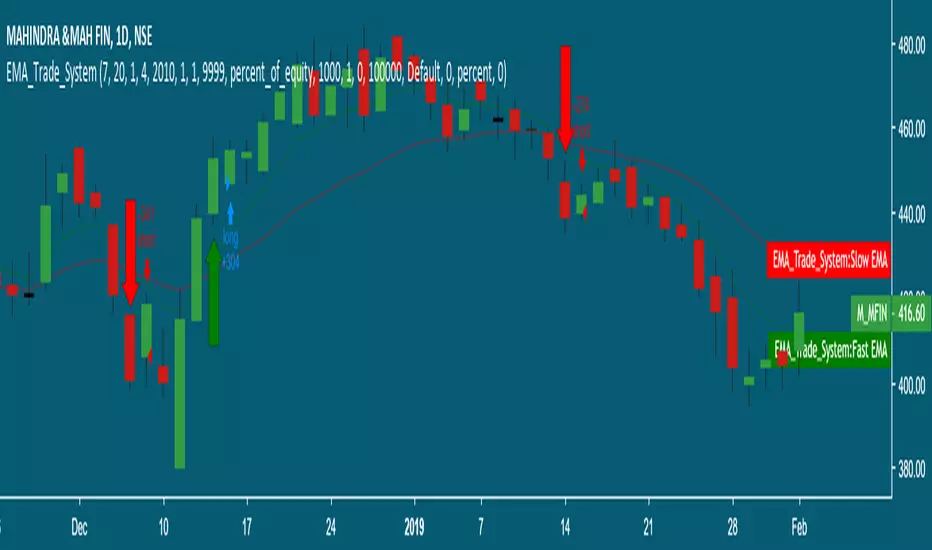
Moving Average Cross Strategy Simply define your fast and slow M then backtest the strategy.
*First script, work in progress. Will allow you to combine two TV indicators into one.
Pine Script® Strategie

MA Cross 50/200 - Moving Averageindicates short-term 50-day moving average AND long-term 200-day moving average CROSS
@GateTicker
Pine Script® Indikator

Multi-Timeframe Probability Zones [DW]This is an experimental study based on multi-timeframe price action and a simple average.
Use it to quickly identify MTF support and resistance, and high probability price levels.
NOTE: Because higher timeframe levels are not certain until the interval is closed, refresh your chart as new levels are drawn.
Pine Script® Indikator

Line Break StrategyLine Break Strategy
Entry rule:
Long on a bullish line and short on a bearish line.
Backtest:
Profit factors are shown below for three-line break.
Daily time frame, FXCM broker.
EURUSD: 1.267, USDJPY: 1.039, GBPUSD: -0.816, AUDUSD: -0.959
S&P500: -0.783, Nikkei225: 1.099
CrudeOil: 1.03, Gold: 1.196
BTCUSD: -0.883
Reference:
Steve Nison, Beyond Candlesticks - New Japanese Charting Techniques Revealed
Note:
This strategy doesn't work properly on the linebreak chart.
A good example is shown below. The entry prices are not always correct.
If you have signal, but the next candle moves in the opposite direction, the entry price is drawn at the Open of the new candle instead of the Close of the previous candle.
The results of backtest are unreliable due to this reason.
Pine Script® Strategie

Earnings MultiplesMultiplies Quarterly Earnings x 13, x 21, x 34, x 55, x 89, x 144, x 233.
Yes its a fibonacci sequence.
"Goldilocks zone" seems to be in the 55x - 89x area.
Also when companies become profitable, the indicator looks like a "starburst".
Pine Script® Indikator
EMA & SMA with FRACTAL DEVIATION BANDS by @XeL_ArjonaEMA & SMA with FRACTAL DEVIATION BANDS
Ver. 1.0.25.08.2015
By Ricardo M Arjona @XeL_Arjona
DISCLAIMER:
DISCLAIMER:
The Following indicator/code IS NOT intended to be a formal investment advice or recommendation by the author, nor should be construed as such. Users will be fully responsible by their use regarding their own trading vehicles/assets. The embedded code and ideas within this work are FREELY AND PUBLICLY available on the Web for NON LUCRATIVE ACTIVITIES and must remain as is.
WHAT IS THIS?
This is the adaptation of the FRACTAL DEVIATION BANDS to be used on Traditional Moving Averages (Simple & Exponential).
ALL NEW IDEAS OR MODIFICATIONS to these indicator(s) are Welcome in favor to deploy a better and more accurate readings. I will be very glad to be notified at Twitter or TradingVew accounts at: @XeL_Arjona
Any important addition to this work MUST REMAIN PUBLIC by means of CreativeCommons CC & TradingView.
2015
Pine Script® Indikator

Harmonic Frequency Visualizer [BackQuant]Harmonic Frequency Visualizer
Overview
Harmonic Frequency Visualizer is a cycle-analysis and cross-asset resonance tool that uses a simplified Discrete Fourier Transform (DFT) to measure how strongly specific cycle periods are present in price. It is not a “trend indicator” and it is not trying to predict direction by itself. Its job is to quantify rhythm: which repeating periods (in bars) are currently dominant, whether those cycles are expanding or contracting (phase direction), and whether multiple instruments are sharing the same dominant periods at the same time (resonance).
This indicator has two main output modes:
Spectrum : a frequency “snapshot” showing amplitude at each tested period for up to five instruments.
Spectrogram : a history heatmap showing how the spectrum evolves through time (for the chart instrument).
Spectrum
Spectrogram
On top of that, it produces a Dominant Cycle Oscillator derived from the dominant cycle’s phase, which gives a continuous cycle position metric (peak/trough style zones) without repainting.
This is designed for traders who want cycle context the same way they want volatility context: not as a magic signal, but as structure.
What “frequency” and “cycles” mean in trading terms
A cycle period (say 21 bars) means: “a repeating pattern that tends to complete one full oscillation every 21 bars.” If price contains such a pattern, the DFT will detect a strong correlation between price and a 21-bar sine/cosine wave.
Markets do not have perfectly stable periodic motion, but they often show:
Mean-reverting swings around value.
Trend pulses with pullback cadence.
Volatility clustering that creates rhythmic expansions and contractions.
Cycle tools are trying to measure those repeating components, and DFT is the standard mathematical way to do it.
Where DFT comes from (the core idea)
The Discrete Fourier Transform comes from Fourier analysis, a foundational signal processing concept:
Fourier’s idea : any sufficiently well-behaved signal can be expressed as a sum of sine and cosine waves at different frequencies, each with:
An amplitude (how strong that wave is).
A phase (where you are within the wave cycle).
In continuous math you get the Fourier Transform. In sampled data (like candles) you use the Discrete Fourier Transform. It converts a time series (price over time) into a frequency description (strength of different cycles).
In markets:
Time domain: candles and price series.
Frequency domain: cycle periods and their strengths.
Why sine and cosine, not just sine
A sine wave alone cannot represent every phase alignment cleanly. DFT uses both cosine and sine components because together they form an orthogonal basis that can represent any phase shift.
You can think of it like this:
Cosine component captures “in-phase” alignment with the cycle.
Sine component captures “quadrature” (90-degree shifted) alignment.
Combining them gives full information: amplitude + phase.
Mathematically, a single frequency component can be written as:
A * cos(ωt + φ)
But DFT estimates A and φ by separately accumulating cosine and sine projections.
How this script implements the DFT (and what it is actually measuring)
This is not a full-spectrum FFT across every frequency. It is a targeted DFT across a fixed set of cycle periods:
Tested periods
The script tests 8 predefined periods:
5, 8, 13, 21, 34, 55, 89, 120
These are Fibonacci-like cycle candidates commonly used in cycle/market structure work. The point is not that Fibonacci is magic. The point is that these represent a reasonable spread from short to long rhythms without needing hundreds of frequencies (which would be heavy in Pine).
Normalization step (important)
Before computing the DFT, the script normalizes the series:
mn = SMA(src, lookback)
sd = stdev(src, lookback)
norm = (src - mn) / sd (if sd != 0)
Why normalize:
DFT amplitude depends on the scale of the input series.
If you compare BTC and TLT raw prices, the magnitude is meaningless.
Z-score normalization makes amplitude more comparable across instruments and regimes.
So the spectrum is measuring “cyclical structure in standardized deviations,” not raw dollars.
Projection onto cosine and sine
For each tested period P:
ω = 2π / P (angular frequency for that period)
Compute:
- sCos = Σ(norm * cos(ωk))
- sSin = Σ(norm * sin(ωk))
Interpretation:
You are correlating the last window of normalized price with a cosine wave of period P.
And also correlating it with a sine wave of period P.
If the price has a strong P-bar rhythm, these sums grow in magnitude.
Window length detail
The script uses:
window = min(lookback - 1, 99)
So even if lookback is 200, the internal DFT accumulation caps at 100 bars for performance stability. This is a deliberate trade: stable computation in Pine, while still letting you define normalization lookback and overall context.
Amplitude computation
Once sCos and sSin are computed:
raw magnitude = sqrt(sCos² + sSin²)
This is the length of the vector (sCos, sSin). That vector length is the standard way to combine the orthogonal components into one strength metric.
Then it scales it into a 0–100 “display amplitude”:
amp = sqrt(sCos² + sSin²) / lookback * 100 * sensitivity
amp is capped to 100
So:
Higher amplitude means stronger alignment with that cycle period.
Sensitivity is a user control to amplify or damp the display scaling.
Important: amplitude here is not a probability, and it is not guaranteed “signal quality.” It is a standardized “how much of that cycle exists in the recent window” metric.
Phase computation
Phase is computed using atan2(sSin, sCos). That matters because:
A simple atan(sin/cos) fails in different quadrants.
atan2 correctly resolves the angle from -π to +π.
Phase tells you where you are within the cycle:
Two cycles can have same amplitude but opposite phase.
Phase is what lets you infer “approaching peak vs trough” behavior.
Dominant cycle selection
The script chooses the dominant cycle as the period with the highest amplitude among the tested periods:
domIdx = argmax(amp )
domAmp = max amplitude
domPhase = phase at domIdx
This dominant cycle is used for:
Spectrogram history matrix (chart symbol).
Dominant cycle oscillator.
Data window outputs (dominant period, oscillator value).
Spectrum View: what you see and how to read it
In Spectrum mode, the indicator draws a frequency snapshot for up to five instruments. Each instrument gets a spectrum line (or bars/area depending on style) plotted across the 8 periods on the x-axis, with amplitude (0–100) on the y-axis.
X-axis meaning
Each x position corresponds to a period (5 → 120 bars). You are not looking at “frequency in Hz.” You are looking at “period in bars,” which is more intuitive in trading.
Y-axis meaning
Amplitude is a scaled measure of how strongly that period is present in the recent normalized data. Higher means stronger.
Plot styles
Waveform: connects amplitude points into a continuous shape, best for seeing spectrum shape.
Bars: draws vertical bars per period, best for quick comparison.
Area: similar to waveform but filled toward baseline for emphasis.
Dominant peaks and phase direction labels
The script highlights dominant cycles per symbol (if enabled):
If max amplitude > 20, it labels that peak with the symbol name.
If Show Phase Direction is enabled, it appends ▲ or ▼.
Phase direction logic:
rising = sin(phase) < 0
▲ means cycle is in a “rising” phase segment
▼ means cycle is in a “falling” phase segment
This is not “price will rise now.” It is “the dominant cycle’s instantaneous phase suggests you are on the upward vs downward half of that oscillation.” In real markets, you use this as context, not as a standalone trade trigger.
It also draws small ▲/▼ markers on secondary peaks (amp > 15) to show phase direction of other meaningful cycles, giving you a richer picture than “one dominant period.”
Resonance Zones: cross-asset harmonic alignment
Resonance is where this tool becomes more than a single-chart curiosity.
What resonance means here
A resonance zone is flagged when at least 3 out of 5 instruments have strong amplitude at the same tested period. Mechanically:
For each period i:
- Count instruments with amp > 30
- If count >= 3, mark resonance at that period
When resonance is detected:
A vertical highlight box is drawn behind that period.
A ⚡ marker is printed at the top.
Interpretation:
Multiple assets are expressing a similar cycle length at the same time.
This can indicate macro rhythm, shared liquidity timing, or cross-market synchronization.
This is especially useful when your instrument set includes:
Rates proxy (TLT), commodities (oil, gold), and crypto indices.
You can visually spot when markets are “vibrating” together at a shared period.
Resonance is not automatically bullish or bearish. It is telling you “cycle length agreement,” which can help with timing models and contextual trade planning.
Spectrogram View: frequency over time
Spectrum mode is a snapshot. Spectrogram mode adds time evolution.
What a spectrogram is
A spectrogram is a 2D heatmap where:
Rows = different periods (frequency bands).
Columns = time history (bars ago → now).
Color = amplitude strength.
This allows you to see:
Which cycles are persistent vs fleeting.
When dominant cycle shifts occur (energy moves from one period to another).
Cycle regime transitions (short cycles dominating in chop vs longer cycles dominating in trend).
How the script builds the spectrogram matrix
It maintains a matrix with:
NUM_PERIODS rows (8 periods)
histBars columns (history length)
Each bar:
Remove the oldest column.
Append the newest amplitude array from chartSpec.
So the spectrogram is always a rolling history of the chart symbol’s cycle amplitudes. It does not attempt to store five symbols (too heavy), it focuses on the active chart for time evolution.
Heat coloring
Amplitude values map to a custom gradient:
Low = dark blue
Mid = blue/cyan to orange
High = yellow
This makes dominant energy bands visually obvious. A stable bright band means persistent cycle dominance.
Dominant Cycle Oscillator: phase mapped to a 0–100 oscillator
The oscillator is derived from the dominant cycle phase (chart symbol):
oscRaw = cos(domPhase)
oscValue = 50 + 50 * oscRaw (maps -1..1 into 0..100)
Interpretation:
When cos(phase) ≈ +1, oscillator near 100 (cycle peak zone).
When cos(phase) ≈ -1, oscillator near 0 (cycle trough zone).
Midline 50 corresponds to the quarter-cycle transition points.
It also colors the oscillator by phase direction:
oscRising = sin(domPhase) < 0
Rising phase = green-ish
Falling phase = red-ish
This gives you a clean timing reference:
The dominant period tells you the cycle length.
The oscillator tells you where you are within that cycle.
It is not forecasting price. It is telling you the current phase position of the strongest detected cycle component.
Alerts and practical timing usage
Alerts are based on the oscillator:
Cross above 80: dominant cycle entering peak zone.
Cross below 20: dominant cycle entering trough zone.
Cross 50: midline cross (phase transition).
In practice, you use these as “timing context” alerts, for example:
If your trend model is bullish and cycle oscillator enters trough zone, it can hint at a favorable pullback timing window.
If you are mean-reversion trading and cycle peak zone aligns with resistance, that confluence matters.
Again: cycle timing needs structure confirmation. The oscillator alone is not a trade system.
Multi-instrument design and non-repaint behavior
The indicator requests five external instruments via request.security. It uses:
close with lookahead_on
This forces the data to be “previous confirmed close” so the spectral calculations do not repaint intra-bar. That matters because cycle measures can change drastically within a bar if you let them use live values.
So:
Spectra for external symbols are based on confirmed historical closes.
Chart symbol spectrogram and oscillator are also stable in the sense they depend on confirmed series values (dominant phase updates bar-to-bar).
Key parameters and how they change behavior
Analysis Lookback
Affects normalization and the DFT window cap:
Higher lookback stabilizes mean/stdev normalization and reduces random shifts.
Lower lookback makes the tool more reactive but more prone to regime noise.
Because the inner DFT accumulation caps at 100 bars, very high lookback mostly affects normalization rather than the raw projection length.
Sensitivity
Scales displayed amplitude:
Higher sensitivity makes peaks stand out more.
Lower sensitivity compresses amplitude.
It is a display control, not a physics constant.
View Mode
Spectrum: cross-asset snapshot comparison, resonance detection.
Spectrogram: time evolution of cycle energy for chart symbol.
Show Phase Direction
Adds ▲/▼ markers derived from sin(phase). Useful for quick cycle position intuition, but do not treat ▲ as “buy.”
Show Resonance Zones
Marks periods where many instruments share strong energy. Useful for macro rhythm alignment.
Highlight Dominant Cycles
Labels peaks. If you disable it, the chart becomes cleaner but less informative.
Spectrogram History
Controls how many columns are stored. Higher makes a longer heatmap but costs more drawing.
Limitations and what not to assume
This tool is honest DSP applied to market data, but market data is not a stationary sine wave generator. Key limitations:
Cycles drift. Dominant period can shift as regime changes.
The tool only tests 8 candidate periods. If the true dominant period is 30, it will express as energy near 34 or distributed across neighbors.
Normalization helps comparability, but does not make amplitude “absolute truth.”
DFT assumes a stable frequency over the window. Markets often violate that.
Phase-based oscillators are timing aids, not predictors.
This is why the indicator is best used as:
Context for entries/exits, not a standalone system.
A way to see when cycle energy concentrates or disperses.
A way to detect when multiple markets share a timing rhythm.
How to use it properly (workflows)
1) Cycle regime identification
If short periods (5–13) dominate, market is often choppy, reactive, and mean-reverting.
If mid periods (21–55) dominate, market often shows swing structure.
If long periods (89–120) dominate, market can be in slower macro drift, trend legs, or compressed volatility regimes.
2) Timing layer for an existing strategy
Use your trend model to decide direction.
Use dominant cycle oscillator to decide timing within that direction.
Use spectrogram to avoid trading when dominant period is unstable or flipping rapidly.
3) Cross-asset confirmation
If you see resonance at a period, watch whether your main instrument is also showing strength there.
Resonance can justify holding a cycle-based timing thesis with more confidence because it is not isolated.
4) Expectation management
If the spectrum is flat (no peaks above threshold), that is information:
No clean dominant cycle, randomness dominates.
Cycle-based timing will be unreliable.
Summary
Harmonic Frequency Visualizer uses a targeted Discrete Fourier Transform across predefined cycle periods to measure amplitude and phase of cyclical components in price. It supports multi-instrument spectrum comparison, resonance detection when several markets share strong energy at the same periods, and a spectrogram heatmap for the chart instrument showing how cycle dominance evolves over time. A dominant cycle oscillator maps phase into a 0–100 timing readout with alerts for peak/trough/midline transitions. It is a cycle context engine designed to complement trend, structure, and risk models, not replace them.
Pine Script® Indikator

Clouds and Diamonds════════════════════════════════════════════════════════════════════════════════
CLOUDS AND DIAMONDS INDICATOR
════════════════════════════════════════════════════════════════════════════════
OVERVIEW
--------
A visual trend analysis tool displaying four moving average "clouds" on your
chart, each representing a different time horizon. Helps identify trend
direction and current trend state at a glance.
THE CLOUDS
----------
Each cloud is formed by the space between an EMA and SMA of the same period.
Color-coded by "metal" for quick timeframe identification:
Cloud | Default | Color | Purpose
------------|---------|--------|----------------------
Period 1 | 21 | Pink | Short-term trends
Period 2 | 50 | Bronze | Medium-term trends
Period 3 | 100 | Silver | Longer-term trends
Period 4 | 200 | Gold | Major long-term trends
Cloud border colors indicate trend direction:
- Green border = Bullish (EMA above SMA)
- Red border = Bearish (EMA below SMA)
THE SIGNALS
-----------
At the end of the chart, each cloud displays its current trend state:
Signal | Shape | Meaning
----------|-------|----------------------------------------
Diamond | * | Currently bullish (EMA above SMA)
X-Cross | X | Currently bearish (EMA below SMA)
Note: Markers appear only on the last bar, providing a clean summary of current
trend conditions across all timeframes. Signal sizes increase with period
length — larger signals represent longer-term trends.
HOW TO USE IT
-------------
1. Identify the trend — Look at cloud border colors. Multiple green = strong
uptrend; multiple red = downtrend.
2. Check the end-of-chart signals — Diamonds = bullish, X = bearish. Multiple
diamonds across timeframes = strong bullish alignment.
3. Weigh by timeframe — A diamond on Gold (200) carries more weight than
Pink (21). Look for multi-timeframe confirmation.
4. Gauge trend strength — Price above all clouds = strong trend. Clouds
converging or price entering them = momentum slowing.
QUICK REFERENCE
---------------
Green cloud borders Bullish trend for that timeframe
Red cloud borders Bearish trend for that timeframe
Diamond (at end) Currently bullish
X-Cross (at end) Currently bearish
Larger marker Longer-term timeframe
All diamonds Strong bullish alignment
All X-crosses Strong bearish alignment
Mixed signals Consolidation or transition
════════════════════════════════════════════════════════════════════════════════
Pine Script® Indikator

Dollar Ladder RulerDollar Ladder Ruler — Intraday Price Levels
A clean, automatic price ladder overlay that draws consistent horizontal dollar-based levels around the current price to help visualize psychological support/resistance zones and intraday reaction areas.
Designed specifically for SPY, QQQ, large-cap stocks, and options scalping.
Levels drawn
• $0.50 → thin white dashed
• $1.00 → thin white solid
• $2.50 → medium bold
• $5.00 → thick bold
• $10.00 → thick gold (major levels)
Why this is useful
• Highlights psychological whole/half dollar magnets
• Makes bounces/rejections obvious
• Great for scalping, 0DTE, and day trading
• Automatically recenters around current price
• No manual drawing required
• Lightweight + updates in real time
Best used on
• 1m–5m charts
• SPY / QQQ / high-liquidity tickers
• Intraday trading
Adjust Range Above/Below Price ($) to control how many levels are shown.
Pine Script® Indikator

CDLTRD Strategy [JustUncleL] v0.1his strategy is a heavily modified and automated version of the excellent Candlestick Trend Indicator v0.5 originally created by JustUncleL.
I have engineered this specific version for Prop Firm Challenges and funded accounts, focusing on capital preservation while capturing high-probability trend moves.
It retains JustUncleL's core Hull Moving Average (HMA) trend ribbon and candlestick pattern recognition, but adds a sophisticated "Defender" layer to filter out chop and manage risk automatically.
🚀 Key Features:
Trend & Pattern Entry: Trades are only taken in the direction of the Hull MA (20). It looks for high-quality reversals like Engulfing candles, Harami, Piercing Lines, and Pin Bars (Original logic by JustUncleL).
The "Defender" Shield (ADX Filter): The strategy includes an ADX filter (default > 20) to completely ignore choppy, sideways markets where most trend strategies lose money.
Prop Firm Risk Management:
Daily Circuit Breaker: If the account hits a max daily drawdown (default 1.5%), the strategy hard-stops trading for the day to protect your evaluation.
Time Enforcement: Automatically closes all positions at 1:00 PM (NY Time) to avoid end-of-day volatility and overnight holding rules.
Aggressive Breakeven: Includes a "Move to Breakeven" trigger. Once a trade is 0.5% in profit, the Stop Loss automatically moves to the entry price to secure a risk-free trade.
Ghost Automation Ready: This script generates pre-formatted JSON alert messages for Ghost automation (Buy, Sell, Exit), making it plug-and-play for automated trading.
⚙️ Recommended Settings:
Timeframe: 30 Minute (Optimized for MGC/Gold & MNQ)
Stop Loss: 1.0% (Fixed)
Breakeven Trigger: 0.5%
Contracts: Set your fixed contract size in the inputs.
Credits:
Original Indicator: JustUncleL (Candlestick Trend Indicator v0.5)
Strategy Logic & Automation: Modified by MeliMillionaire
Pine Script® Strategie

Silver Future Trap Hunter (4H Structure + 30mins EXE)Why This Strategy is Popular
In the current market (SMC/ICT era), "Liquidity Sweeps" are the gold standard. Most retail traders get stopped out because they trade 30m patterns without looking at where the "Big Money" is resting. This script bridges that gap by:
Visualizing 4H Ranges: It shows you exactly where the big players are looking to trap retail traders.
Noise Filtering: It grays out "useless" candles, keeping your mind clear for the high-probability setups.
Safety HUD: It uses a multi-timeframe RSI filter to ensure you aren't buying the top of a Daily trend.
Unlock the Power of 4H Institutional Structure on your 30m Chart! ⚔️
Are you tired of getting "wicked out" on lower timeframes? The 30m Trap Hunter is a professional-grade indicator designed to help you trade in harmony with high-timeframe (HTF) institutional order flow while executing on the 30-minute chart.
This isn't just a signal generator; it’s a full Trading HUD and Structure Visualizer.
Key Features:
Dynamic 4H Box Structure: Automatically draws the current 4-hour range and Equilibrium (50% EQ) level. Stay on the right side of the "Premium vs. Discount" zones.
Liquidity Sweep Alerts: Detects when the price "sweeps" a 4H High or Low and closes back inside—signaling a classic "Trap" and potential reversal.
Momentum Breakouts: Identifies high-velocity closes beyond structural levels for trend followers.
Smart Noise Filter: Automatically grays out candles that don't align with the 4H trend, reducing overtrading and psychological fatigue.
Integrated Safety HUD: A bottom-right dashboard that scans Daily and 4H RSI. It tells you instantly if a trade is "SAFE" or "RISKY" based on higher-timeframe overextension.
How to Trade with It:
The Trap: Wait for a "SWEEP" label at the 4H High/Low. Ensure the HUD shows "SAFE" for the direction you want to trade.
The Trend: If the 4H box is teal (Bullish) and candles are colored (not gray), look for long entries at the EQ line or the 4H Low.
The Filter: If the HUD says "RISKY," tighten your stops or wait for a better HTF alignment.
Technical Settings:
Interval: Optimized for 30m (4H Structure), but fully customizable.
Visuals: Clean, aesthetic borders and "Ghost Lines" to track previous liquidity zones.
Stop trading the noise. Start hunting the traps. 🎯
Pine Script® Indikator

Premium / Discount Screener for Range today with VWAPPremium / Discount Screener – Today’s Range Midpoint + VWAP Deviation
This open-source overlay indicator is a clean, real-time visual screener that shows whether current price is trading at a **premium** (overvalued relative to today's range + VWAP) or **discount** (undervalued), helping traders quickly assess intraday location bias.
Core Concept
Intraday traders often use the developing daily range and VWAP as reference points for value:
- Price significantly above the midpoint of today's high/low → premium zone → potential mean-reversion sells or overextended rallies
- Price significantly below the midpoint → discount zone → potential mean-reversion buys or oversold bounces
- VWAP deviation adds context (institutional fair value proxy)
This script combines both references and flags extreme deviations with color-coded labels and background tint.
How It Works
1. Tracks today's high/low (resets at new day)
2. Calculates midpoint = (Today's High + Today's Low) / 2
3. Tracks session VWAP (hlc3-based, resets daily)
4. Computes two deviation percentages:
- Distance from midpoint (%)
- Distance from VWAP (%)
5. Classifies status based on user-defined threshold (default 0.5% from midpoint):
- Premium (red): close > midpoint + threshold
- Discount (green): close < midpoint – threshold
- Fair/Neutral (gray): within threshold band
Visual Output
- Last-bar label (toggleable) showing:
- Status: PREMIUM / DISCOUNT / FAIR
- % distance from midpoint
- % distance from VWAP
- Background tint:
- Light red → premium zone
- Light green → discount zone
- No tint → neutral/fair
Why this is useful
- Provides instant visual context for bias without needing complex zone drawing
- Helps filter entries: e.g., look for longs in discount + bullish structure, shorts in premium + bearish structure
- VWAP deviation adds institutional reference — price far from VWAP often signals exhaustion or absorption
- Lightweight and non-repainting — ideal for fast decision-making on lower timeframes
How to Use
- Best on **5m–1h timeframes** for intraday trading (forex majors, indices, gold, futures, high-volume stocks)
- Recommended symbols: EURUSD, GBPUSD, XAUUSD, NAS100, ES1!, NQ1!, SPY
- Typical workflow:
1. Wait for price to reach deep discount/premium zone
2. Confirm with price action, structure (BOS/CHOCH), or order blocks
3. Avoid trading near "Fair" zone unless strong catalyst/breakout
- Tune threshold:
- Lower (0.2–0.4%) for very volatile instruments (crypto, gold)
- Higher (0.6–1.0%) for less volatile pairs (EURUSD, major indices)
Inputs
- Show Premium/Discount Label: toggle last-bar text label
- Alert Threshold % from Midpoint: default 0.5% (sensitivity for premium/discount classification)
Publishing Recommendation
- Publish with a clean chart (e.g., 15m–1h XAUUSD, EURUSD or NQ during active session)
- Show a period where price moves into premium and discount zones (label + background tint visible)
- No extra indicators/drawings needed for basic use
This is a simple, educational location bias tool — fully open-source. It highlights relative value zones — not trade signals. Trading involves significant risk of loss. Use discretion and proper risk management.
Feedback welcome — especially suggestions for adding PD high/low lines or session open!
Pine Script® Indikator

PD Location Screener (NY Session)PD Location Screener (NY Session) – Premium / Discount / Equilibrium Bias
This open-source overlay indicator is a lightweight visual screener that shows where current price is located relative to the **previous day's range** (PD high/low/midpoint), helping traders quickly identify:
- Discount zones (below 25% of PD range → potential buy bias)
- Premium zones (above 75% of PD range → potential sell bias)
- Equilibrium / neutral (near midpoint → balanced / choppy)
Core Concept
Many intraday traders use the previous day's range as a reference framework:
- Price below the midpoint (especially in the lower 25%) is considered **discount** → undervalued relative to yesterday → higher probability of mean-reversion buys or continuation if momentum builds
- Price above the midpoint (especially in the upper 25%) is considered **premium** → overvalued → higher probability of mean-reversion sells or fading
- Near the midpoint → equilibrium → often choppy or awaiting directional catalyst
This script adds a **NY session filter** (default 08:30–16:00 NY time) so the PD range calculation only includes bars during active New York hours — useful for avoiding thin Asian-range noise and focusing on high-liquidity period behavior.
Why this is useful
- Provides instant visual context for bias without cluttering the chart
- Helps filter trades: e.g., look for longs in discount + bullish structure, shorts in premium + bearish structure
- Session filter makes it particularly effective for NY/London overlap strategies (forex, indices, gold, futures)
How It Works
1. Tracks daily high/low only during NY session (optional toggle)
- Resets at new day
- Updates only when inSession = true
2. Calculates:
- Midpoint = (PD High + PD Low) / 2
- PD Range = PD High – PD Low
- Discount threshold = PD Low + 25% of range
- Premium threshold = PD Low + 75% of range
3. Bias flags:
- Discount: close < midpoint → green triangle below bar
- Premium: close > midpoint → red triangle above bar
4. Optional last-bar label:
- "DISCOUNT ZONE" (green)
- "PREMIUM ZONE" (red)
- "EQUILIBRIUM" (gray)
Visual Output
- Green triangle below bar → price in discount (buy bias area)
- Red triangle above bar → price in premium (sell bias area)
- Last-bar label (toggleable) showing current location
How to Use
- Best on **5m–1h timeframes** for intraday trading (forex majors, indices, gold, futures)
- Recommended pairs: EURUSD, GBPUSD, XAUUSD, NAS100, ES1!, NQ1!
- Typical workflow:
1. Wait for price to reach discount zone + bullish price action / structure → consider longs
2. Wait for premium zone + bearish price action → consider shorts
3. Avoid entries near equilibrium unless strong breakout catalyst
- Combine with:
- Order blocks, FVGs, liquidity sweeps
- Higher-timeframe trend filter
- Session open/high/low
- Toggle "Use NY Session Only" off if you want full 24h range (e.g., crypto or Asian-focused pairs)
Inputs
- Use NY Session Only: true = only NY hours count toward PD range (recommended)
- NY Session: default "0830-1600" (adjust if broker timezone differs)
- Show Location Labels: toggle last-bar text label
Publishing Recommendation
- Publish with a clean chart (e.g., 15m–1h XAUUSD or EURUSD during NY session)
- Show a period where price moves from discount → equilibrium → premium (triangles visible)
- No extra indicators/drawings needed
This is a simple, educational location bias tool — fully open-source. It highlights relative value zones — not trade signals. Trading involves significant risk of loss. Use discretion and proper risk management.
Feedback welcome — especially suggestions for adding PD open or 50% retracement lines!
Pine Script® Indikator

TDL Adaptive Session Zones Pro🔷 What This Indicator Does
TDL Adaptive Session Zones Pro maps high-probability reaction areas where price is statistically more likely to pause, reverse, or accelerate — based on real historical session data, not arbitrary levels.
Unlike static support and resistance tools, these zones automatically adapt to changing market volatility every session. When volatility contracts, zones tighten. When it expands, zones widen. The result is a dynamic framework that reflects how the market is actually behaving right now.
This indicator is built for intraday traders who want structure and context — not signals.
🔷 Core Components
1️⃣ Adaptive Percentile Zones (Session-Based S/R)
The engine of this indicator. It works by:
• Collecting historical intraday session ranges over a configurable lookback period (default 20 sessions)
• Calculating percentile distances (25th, 50th, 75th, 100th by default) from that data
• Projecting those distances symmetrically above and below the current session open
• Resetting and recalculating every session automatically
🟩 Lower zones → Statistically derived support reaction areas
🟥 Upper zones → Statistically derived resistance reaction areas
Outer zones (higher percentile) represent more extreme price extensions and carry greater significance when tested. Inner zones represent typical intraday range behavior.
The key insight: instead of drawing arbitrary lines, these zones tell you where price has historically found the edges of its range — adjusted for current conditions.
2️⃣ Strike / Round Number Levels (Liquidity Reference)
Plots round-number price levels at configurable intervals (50, 100, etc.) from the session open. These levels frequently act as liquidity concentration areas in index futures and options markets.
• Configurable interval spacing
• Min/Max distance controls
• Optional mid-strike gap levels (dotted)
• Session-bounded display
Useful for NQ, ES, and index derivatives where options strike prices create natural liquidity clusters.
3️⃣ Previous Day OHLC Reference
Plots Previous Day Open, High, Low, and Close as intraday reference levels — widely observed by both retail and institutional participants.
• All four levels with distinct color coding
• Configurable line style (solid, dashed, dotted)
• Clean labels for quick identification
4️⃣ Opening Range Breakout (ORB)
Captures the high and low of the first N minutes of the session (configurable: 5 to 60 minutes). The opening range provides useful context when combined with the adaptive percentile zones.
• Configurable time window
• Filled range visualization
• Session-bounded display
🔷 Optional Validation Filters
All filters are off by default and designed to help observe cleaner price behavior near important zones.
🔹 Candle Structure Validation
Filters out candles with excessive range (ATR multiple), small bodies (body/range %), or extreme wick imbalance. Helps isolate price action reflecting healthy market participation near key levels.
🔹 Rejection Wick Detection
Identifies candles with significant wick-to-body ratios (hammer-type structure), independent of candle color. Useful for spotting potential rejection behavior when price interacts with zone boundaries.
🔹 Volume Participation Filter
Highlights periods where volume exceeds the average by a configurable multiplier. Includes a confirmation window (number of bars following the spike) to allow for delayed reaction observation.
🔹 Daily Pivot
Classic pivot point (H+L+C)/3 plotted as a session-fixed reference level for additional market structure context.
🔹 Higher Timeframe Trend
Background color overlay based on a configurable HTF moving average. Supports SMA, EMA, WMA, and VWMA. Provides directional context without enforcing bias on the intraday analysis.
🔷 Confluence Highlight System
When price arrives near any key zone (percentile, strike, OHLC, ORB, or pivot) AND all enabled validation filters align on the same candle, that candle is highlighted in yellow.
⚠️ The yellow highlight is NOT a buy or sell signal. It indicates that price behavior appears structurally meaningful at an important market location based on your selected filter combination.
Three alertcondition() calls are included: Bullish confluence, Bearish confluence, and Any confluence — ready for TradingView alerts.
🔷 Session Volatility Gauge
Real-time dashboard (table overlay) showing what percentage of the median daily range has been consumed in the current session.
States:
• LOW (< 40%) — Session range is compressed relative to history
• BUILDING (40-70%) — Range is developing, room for expansion
• HEALTHY (70-100%) — Normal range consumption
• EXTENDED (> 100%) — Session exceeds typical range, potential exhaustion
This helps gauge whether the session still has room to move or is approaching statistical limits.
🔷 Zone Touch Tracker
Counts fresh touches on each percentile zone during the current session. A "touch" is registered when price enters a zone's proximity after being outside it. More touches on a zone suggest greater significance.
Displayed as a table overlay with per-zone counts for both resistance and support zones. Resets automatically each session.
🔷 Recommended Settings
NQ / ES Futures (5m–15m):
• Session: 0930-1600, Timezone: America/New_York
• Percentiles: 25 / 50 / 75 / 100 (default)
• Strike Interval: 100
• ORB: 15 minutes
Stocks (5m–15m):
• Strike Interval: 5 or 10
• Consider tightening percentiles (20 / 45 / 65 / 85) for lower-volatility names
Gold Futures (5m):
• Strike Interval: 10 or 25
• Adjust session window to your active trading hours
🔷 How To Use
1. Apply to an intraday chart (1m to 15m recommended)
2. Observe where price interacts with the adaptive percentile zones
3. Optionally enable one or more validation filters to highlight structurally clean candles at key zones
4. Use the Session Volatility Gauge to assess how much range has been consumed
5. Enable the Zone Touch Tracker to identify high-significance levels
6. Apply your own analysis, execution method, and risk management
This is a context and structure tool. It shows you WHERE you are within the session's statistical range — the trading decisions are yours.
🔷 Technical Notes
• Works on any intraday timeframe; designed for 1m to 15m
• Requires sufficient historical data for percentile calculations (minimum ~5 sessions)
• Session detection works correctly with extended hours both on and off
• All zone levels are session-bounded and reset automatically
• Open source — inspect, learn from, or adapt the code as you see fit
⚠️ Disclaimer
This script is provided for educational and informational purposes only. It does not generate buy or sell signals and does not constitute financial advice. Past performance of any trading methodology is not indicative of future results. Always apply independent analysis and proper risk management.
Pine Script® Indikator

Macro Regime Dashboard HOW TO READ THE MACRO REGIME DASHBOARD
Think of this as a weather report for markets, not a trade signal generator.
1 START WITH THE REGIME (TOP ROW)
MACRO REGIME
RISK-ON → tailwinds for equities & beta
MIXED → chop, fakeouts, smaller size
RISK-OFF → capital preservation first
This answers:
“Should I be pressing risk right now?”
Rule of thumb
Stay aligned with the regime
Don’t fight it with individual stock ideas
2 THE SCORE (SECOND ROW)
Regime Score
Range: roughly –5 to +5
+3 to +5 → strong risk-on
+1 to +2 → mild tailwind
–1 to +1 → transition / no edge
–2 to –5 → defensive environment
This answers:
“How confident is this environment?”
Position sizing rule
|Score| ≥ 3 → full size allowed
|Score| = 1–2 → reduced size
|Score| = 0 → mostly wait
3 EQUITIES ROW (SPY vs MA)
Equities
Risk+ → SPY above trend MA
Risk- → SPY below trend MA
This is your market participation check.
Interpretation
Risk-ON + Equities Risk+ = trends work
Risk-OFF + Equities Risk- = avoid longs
Mixed + Equities flipping = chop zone
4 CREDIT ROW (HYG / IEF)
Credit
Risk+ → credit spreads tightening
Risk- → credit stress building
This is the canary in the coal mine.
Very important rule
If Credit = Risk-, be skeptical of rallies
Credit usually breaks before equities
5 VOLATILITY ROW (VIX)
Volatility
Low → trend-following works
High → mean reversion, hedging, patience
This answers:
“Is the market calm or nervous?”
Trade adjustment
Low vol → options selling, swing trades
High vol → smaller size, wider stops, hedges
6 RATES ROW (10Y YIELD)
Rates
Risk+ → yields falling
Risk- → yields rising
This tells you who wins inside equities.
Mapping
Falling rates → tech, growth, duration
Rising rates → value, energy, financials
7 USD ROW (DXY)
USD
Risk+ → USD weakening
Risk- → USD strengthening
This controls global liquidity.
Mapping
Weak USD → commodities, EM, gold
Strong USD → US assets outperform, EM struggles
8 200 MA CONTEXT (LONG TREND)
Bull / Bear Context
Bull → regime shifts resolve upward
Bear → rallies fail more often
This is your macro gravity.
Rule
In Bear context → be quicker to de-risk
In Bull context → give trades more room
9 TILT (BOTTOM ROW)
Tilt
This is your portfolio bias, not a trade.
Examples:
Growth / Equities / EM
Cash / Defensives / Hedges
Reduce size / wait
This answers:
“What should my book look like this week?”
EXAMPLE: STRONG RISK-ON
Regime: RISK-ON
Score: +4
Credit: Risk+
Vol: Low
Action
Full size allowed
Favor trend trades
Reduce hedges
EXAMPLE: RISK-OFF
Regime: RISK-OFF
Score: –3
Credit: Risk-
Vol: High
Action
Raise cash
Defensive ETFs
Avoid dip-buying
EXAMPLE: MIXED / TRANSITION
Score near 0
Credit flat
Vol rising
Action
Smaller size
Pairs trades
Wait for confirmation
Pine Script® Indikator
