Pine Script® Indikator
In den Scripts nach "Cycle" suchen

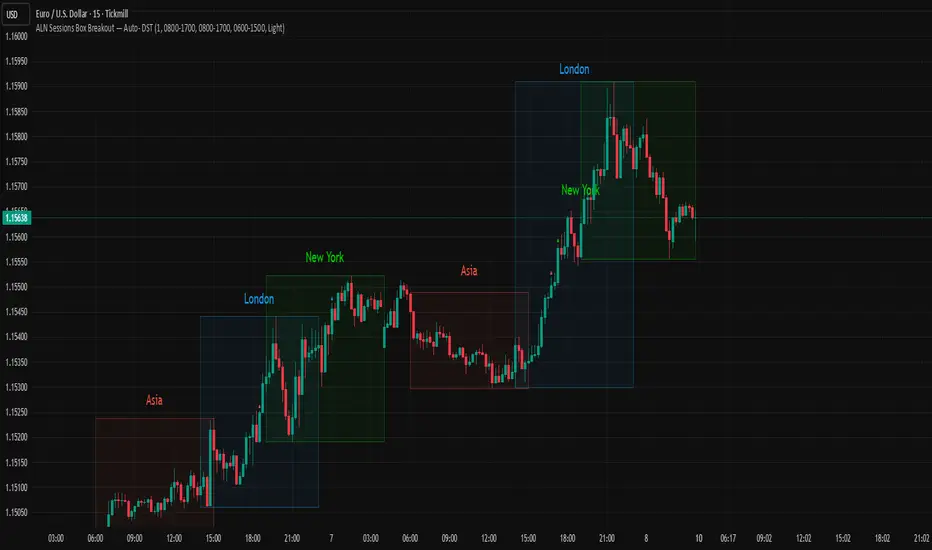
ALN Sessions Box Breakout — Auto- DSTDevoleper: Sheikh Rakib
What it does
This indicator draws session range boxes for Asia (Dhaka), London, and New York using each market’s own local time (DST-aware). After a session closes, it watches for the first close above the session high or below the session low and then marks that breakout once per session with clear chart markers and optional alerts.
Key features
Auto-DST, per-city timezones
London session uses Europe/London
New York session uses America/New_York
Asia session uses Asia/Dhaka
Your chart timezone doesn’t matter—the sessions track real local hours.
Clean range boxes with adjustable opacity and optional outlines.
Session labels that auto-center at the end of each session.
One-shot breakout signals per session:
Triangle up when price closes above the session high.
Triangle down when price closes below the session low.
Built-in alerts for: session starts and each breakout direction.
Inputs
London / New York / Asia (Dhaka)
Show Session: toggle each session on/off
Time Range: default London 08:00–17:00 (local), New York 08:00–17:00 (local), Asia 06:00–15:00 (Dhaka)
Colour: box color for each session
Settings
Show Session Labels
Show Range Outline
Opacity Preset: Dark / Medium / Light
(UTC Offset input is kept for display, not used in session detection.)
Visuals & alerts
Boxes extend from session open to close, continually updating the high/low.
When the session ends, the final high/low are locked in, the label is centered, and the indicator begins monitoring for a breakout.
Alerts
Session start: Asia/London/New York
Breakouts: “High Breakout” (close > high) and “Low Breakout” (close < low) for each session
Create alerts from the TradingView alert dialog and choose the desired alertcondition.
Logic notes (how signals fire)
While a session is open, its box grows to contain all highs/lows.
On the first bar after close, the script starts listening for a breakout:
Close > session high → one up signal (fires once)
Close < session low → one down signal (fires once)
When the next same session begins, internal flags reset and a new box starts—so signals are inherently scoped to the period between that session’s close and its next open.
Tips
Use on intraday timeframes (e.g., 1m–30m) for clearer box structure.
If you only want specific markets, toggle others off for a cleaner chart.
For systematic entries, combine with your trend/volatility filters and use the breakout alerts as triggers or confirmations—this script doesn’t place trades.
Disclaimer: Market timing and risk management are your responsibility. Past session behavior does not guarantee future performance.
Pine Script® Indikator

ALN Sessions Box — Auto- DSTDevoleper: Sheikh Rakib
What it does
Draws candle-synced high/low range boxes for the three major sessions—Asia (Dhaka view), London, and New York—on any timeframe. London and New York are DST-aware (times auto-shift on DST changes). Boxes update live with session high/low and close exactly on the session’s final bar.
Key features
Auto-DST: Uses Europe/London and America/New_York time zones, so session windows auto-adjust when DST turns on/off.
Asia (BDT) window: Default 06:00–15:00 Asia/Dhaka (no DST).
Candle-linked boxes: Top/bottom track session High/Low; right edge finalizes on the session end bar—clean breakout zones.
Clean UI: Optional labels, outline toggle, and three opacity presets (Dark/Medium/Light).
Plug & play: Drop in, customize colors/times, done.
Inputs you can tweak
Time Range (LOCAL) for each session
Defaults: Asia 06:00–15:00 (Asia/Dhaka), London 08:00–17:00 (Europe/London), New York 08:00–17:00 (America/New_York)
For equities, switch New York to 09:30–16:00—DST handling remains automatic.
Colour per session, Show Session Labels, Show Range Outline, Opacity Preset.
UTC Offset input is retained for compatibility but not used for session detection.
Quick BDT reference (for the default 08:00–17:00 local windows)
London → DST ON (BST): 13:00–22:00 BDT · DST OFF (GMT): 14:00–23:00 BDT
New York → DST ON (EDT): 18:00–03:00 BDT (next day) · DST OFF (EST): 19:00–04:00 BDT (next day)
Asia (Dhaka) → 06:00–15:00 BDT (no DST)
Tips
If you see dotted vertical lines, that’s TradingView Session breaks (Chart Settings → Appearance). Turn off if you prefer a cleaner view.
Some symbols don’t trade during parts of a session—adjust Time Range as needed.
Labels are placed inside the box; adjust opacity/colors to suit your theme.
A sharp, professional session map for spotting breakouts, reversals, and volatility windows at a glance.
Pine Script® Indikator
24h Change Shows TF‑independent 24‑hour % change in the status line. The value is computed strictly on fixed 1‑minute data—last confirmed 1m close vs. the 1m close 1,440 minutes earlier—so changing chart timeframes does not affect the result. Updates once per minute; for best parity with an exchange, use the matching symbol/price type (Last vs. Mark/Index) and ensure ≥1,440 minutes of history.
Pine Script® Indikator

Market Sessions — VerticalA clean visual guide to global market sessions.
This indicator plots vertical lines at the opening and closing times of the four major forex sessions:
London, New York, Tokyo, and Sydney.
Fully customizable — toggle each session on/off, choose separate colors for open/close, and enable/disable labels.
Supports both Local (auto-DST) and GMT (fixed) modes — switch between realistic market-clock times or the standardized UTC schedule used by most trading resources.
Helps you visually identify session overlaps (e.g., London–New York) where volatility typically increases.
Ideal for forex, indices, and commodities traders who trade around session opens.
Default session times (GMT mode):
Sydney 21:00 – 06:00 GMT
Tokyo 00:00 – 09:00 GMT
London 08:00 – 17:00 GMT
New York 13:00 – 22:00 GMT
Tip: Set Anchor times by → Local (auto-DST) if you want the lines to follow each region’s real-world daylight-saving adjustments automatically.
Clean, lightweight, and built for traders who want precise, minimal clutter — just the key time windows that move the market.
Pine Script® Indikator

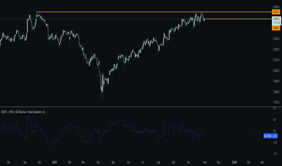
HAR-Z + OLS Residual + Impact stochastic indicators ibeqfpb wepgbwep gbipwbgw wqbgiwgbw ghbdns ,eltjv jjdhbnb p nj,j. xjve , yfv
Pine Script® Indikator
No FOMO! Trade only during ICT Macros**🚫 Crush FOMO. Trade ONLY during ICT's macro windows**
Tired of jumping into impulsive trades the moment price twitches? **No FOMO** paints your chart **blood-red** and slams a **giant 🚫 countdown** the instant you drift outside the **42-15 minute sweet spot** (or any custom intrahour rule you set).
- **Instant visual lockdown** – entire chart turns crimson between 16–41 min.
- **Loud alert on open/close** – push + sound so you never miss the gate.
- **One-click timezone picker** – EST, GMT, Tokyo… works globally.
- **Zero lag, lightweight** – runs on 1-min charts without slowing you down.
**Proven to kill revenge trades & over-trading in <7 days.**
Add to chart → watch discipline skyrocket.
*Free | Open-source | Works on every plan*
👉 **Tag a friend who needs this.**
Pine Script® Indikator

DSS Bressert by MaxCapDSS Bressert by MaxCap is an enhanced version of the Double Smoothed Stochastic (DSS) oscillator, originally developed by Robert Bressert.
It is designed to identify overbought/oversold market conditions and detect momentum shifts using a double-smoothing stochastic calculation.
⸻
⚙️ How It Works
This indicator applies a two-stage stochastic calculation with double exponential smoothing to reduce noise and provide smoother trend signals.
1. Phase 1 (MIT):
A standard stochastic is calculated over the selected Stochastic_period, measuring the current close relative to the high-low range.
This value is then smoothed using an exponential moving average (EMA).
2. Phase 2 (DSS):
A second stochastic is applied on the smoothed MIT line using the same stochastic period, followed by another EMA smoothing step.
The result is a smooth and responsive momentum oscillator that filters out market noise.
This double-smoothing technique allows DSS to remain responsive to price changes while avoiding false reversals that are common with the traditional stochastic.
⸻
🎨 Visualization
• The orange line represents the main DSS value.
• Blue dots appear when DSS is rising (bullish momentum).
• Red dots appear when DSS is falling (bearish momentum).
• The horizontal levels 20 and 80 mark oversold and overbought zones, respectively.
⸻
🧠 Signal Interpretation
• DSS > 80: Overbought zone — possible downward reversal.
• DSS < 20: Oversold zone — possible upward rebound.
• DSS rising after crossing above 20: Bullish signal.
• DSS falling after crossing below 80: Bearish signal.
• Color change (blue ↔ red) may indicate a momentum shift.
⸻
⚙️ Input Parameters
Parameter Description Default Value
EMA Period EMA smoothing period 8
Stochastic Period Period for stochastic calculation 13
⸻
💡 Advantages
• Smoother and more reliable than a standard stochastic.
• Reduces market noise and false signals.
• Accurately reflects real momentum shifts.
• Color-coded visualization for clearer signal reading.
⸻
Pine Script® Indikator

Smart Money vs Retail (COT Flow) 0213Smart Money vs Retail (COT Flow) 0213
Smart Money vs Retail (COT Flow) 0213
Smart Money vs Retail (COT Flow) 0213
Pine Script® Indikator

Pine Script® Indikator

Pine Script® Indikator

Pine Script® Indikator

Pine Script® Indikator

Session Anchor Lines (Asia, London, NY)it draws a line at each session open ( in relative to the 4 HR candle )
Pine Script® Indikator
Pine Script® Indikator
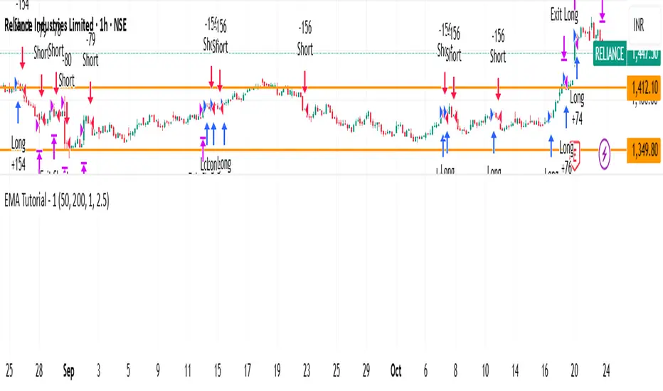
EMA Tutorial - 1Buy when in downtrend and close above EMA_50
Buy when in uptrend and below EMA_50
adjust ema length and risk reward for other stocks. Works good with nifty. Need to perform stress test on it
Pine Script® Strategie
Countdown, Trading Volume, Price, Time Period"Volume and Price Countdown Code: This code will display colors according to the closing status of different timeframes."
Pine Script® Indikator

Swing High/Low ExtensionsSwing High/Low — Extensions (2 Plots + Drawings + Touch Signal)
What it does
This indicator finds Swing Highs/Lows using a symmetric length (same bars left & right), then creates horizontal extension levels that run to the right and stop at the first price touch (“extend until future intersection”).
It outputs:
Two plots showing the most recent active High/Low extension (great for alerts & strategy logic).
Line drawings for every detected swing (historical levels stay on the chart and end at the touch bar).
A hidden TouchSignal used to color bars and trigger alerts without distorting the price scale.
The design mirrors Sierra Chart’s “Swing High and Low” with “Extend Swings Until Future Intersection”, but implemented natively in Pine.
How it determines swings
Uses ta.pivothigh() / ta.pivotlow() with length bars left and right.
A swing is confirmed only after there are length bars to the right of the center.
How extensions/lines end
High extensions end when High ≥ level.
Low extensions end when Low ≤ level.
The corresponding line drawing is frozen on the touch bar; the most recent active line continues to extend each new bar.
Inputs
Swing Strength (Bars Left = Right) – symmetric pivot length.
Offset as Percentage – 1 = +1%; positive values push levels outward (High up / Low down), negative pull them inward.
Draw “Extend…Until Future Intersection” Lines – toggle line drawings on/off.
Line Width (Plots + Drawings) – thickness for plots and drawings.
HighExt Color / LowExt Color – colors for the two plots and drawings.
Touch Color – color to paint bars on the touch bar (doesn’t affect scale).
HighExt/LowExt Line Style – choose line style (Solid/Dashed/Dotted) for drawings.
Color Bars on Touch? – enable/disable bar coloring.
Bar Color on High Touch / Low Touch – separate bar colors for each side.
Bar Color Transparency (0..100) – opacity for the bar painting.
Plots
HighExt – latest active high extension only.
LowExt – latest active low extension only.
(Internally there is also a hidden “TouchSignal” plot used for bar coloring & alerts; it’s not displayed to keep the chart scale clean.)
Alerts
Three built-in alertconditions:
Any Extension Touched — triggers when either side is hit.
High Extension Touched — only high level touch.
Low Extension Touched — only low level touch.
Create alerts from the indicator’s “More” (⋯) menu → Add alert → choose one of the conditions.
Styling
Drawings use your selected style (Solid/Dashed/Dotted), color, and width.
Existing historical lines adopt new styles when the script recalculates.
Bar coloring highlights the exact touch candle; disable it if you prefer clean candles.
Notes & tips
Scale-safe: the TouchSignal is hidden (display=none), so it won’t distort the Y-axis.
Performance: TradingView limits scripts to ~500 line objects; this script uses max_lines_count=500. If you hit the cap on long histories, either increase timeframe or disable drawings and rely on the two plots + alerts.
Works on any symbol/timeframe; levels are rounded to the instrument’s minimum tick.
Intended use
For discretionary levels, alerting, and rule-based entries that react to first touch of recent swing extensions. Not financial advice—use at your own risk.
Pine Script® Indikator

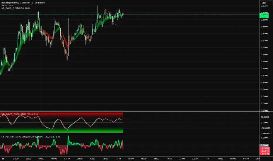
NF_PLASMA_SURGE 🧩 NF_PLASMA_SURGE (NightFury Systems)
Author: Lachin M. Akhmedov (aka NightFury)
⚙️ A volumetric impulse oscillator detecting real candle energy through body density, directional momentum, and normalized volatility thrust.
🧠 Core Concept:
Not another RSI. Not another MACD.
NF_PLASMA_SURGE isolates true directional impulse by measuring the physics of price:
Body Energy → how much of each candle’s range is real movement.
Volume Thrust → amplifies strong participation only.
Volatility Normalization → filters emotional spikes and fake momentum.
⚡ Outputs:
Toxic Green = Real buy impulse (surge ignition)
Red Inferno = Real sell impulse (energy drain)
⚡ marks = Charged bursts detected (|z| > threshold)
💫 Synergy:
Designed to integrate with NF_CYBER_FURY as its ignition companion —
Cyber powers the reactor; Plasma lights the core.
🧩 Recommended Stack:
NF_CYBER_FURY + NF_PLASMA_SURGE = The NightFury Reactor System
Pine Script® Indikator
OPEX VIXEX datesUpdated ohlocracy's OPEX script till 2030
These dates are for standard equity, index, and ETF options expiration managed by OCC, with monthly expirations usually on the third Friday and weekly expirations on other Fridays, except holidays which cause adjustments to Thursdays or nearby trading days.
Quarterly options expiration dates in the US stock market are on the last trading day of the quarter, usually the last business day of March, June, September, and December.
These dates are the last trading day of each quarter, accounting for weekends and holidays when the market is closed. When the last calendar day falls on a weekend, the expiration is set to the last prior trading day.
The VIX monthly expiration is on the Wednesday prior to the stock market monthly opex (third Friday). When holidays affect these days, the expiration shifts to the business day before.
Pine Script® Indikator

Session times for London (UTC 07:00–16:00 UTC)Session times for London (UTC 07:00–16:00 UTC). Shows the trading hours for the London Session Mon-Fri
Pine Script® Indikator

Wyckoff Stage Approximator (MTF Alerts)Wyckoff Stage Approximator (MTF Context)
This indicator is a powerful tool designed for traders who use a top-down, multi-timeframe approach based on Wyckoff principles. Its primary function is to identify the market's current stage—consolidation (Stage 1) or trend (Stage 2)—on a higher Context (C) timeframe and project that analysis onto your lower Validation (V) and Entry (E) charts.
This ensures you are always trading in alignment with the "big picture" trend, preventing you from taking low-probability trades based on lower-timeframe noise.
Core Concept: Top-Down Analysis
The script solves a common problem for multi-timeframe traders: losing sight of the primary trend. By locking the background color to your chosen Context timeframe (e.g., 15-minute), you are constantly reminded of the market's true state.
🟡 Yellow Background (Stage 1): The Context timeframe is in consolidation. This is a time to be patient and wait for a clear directional bias to emerge.
🟢 Green Background (Stage 2 - Markup): The Context timeframe is in a confirmed uptrend. This is your green light to look for bullish pullback opportunities on your lower timeframes.
🔴 Red Background (Stage 2 - Markdown): The Context timeframe is in a confirmed downtrend. This is your signal to look for bearish rally opportunities.
How It Works
The indicator uses a combination of moving averages and trend strength to objectively define each stage:
Trend Alignment: It checks if the 5 EMA, 10 EMA, and 20 EMA are properly stacked above or below the 50 SMA to determine the potential trend direction.
Trend Strength: It uses the ADX to measure the strength of the trend. A trend is only confirmed as Stage 2 if the ADX is above a user-defined threshold (default is 23), filtering out weak or choppy moves.
Stage Definition: Any period that is not a confirmed, strong Stage 2 Markup or Markdown is classified as a Stage 1 consolidation phase.
Key Features
Multi-Timeframe (MTF) Projection: Select your master "Context" timeframe, and its analysis will be displayed on any chart you view.
Customizable Inputs: Easily adjust the moving average lengths and ADX threshold to fit your specific strategy and the asset you are trading.
Clear Visual Cues: The intuitive background coloring makes it easy to assess the market environment at a glance.
Stage Transition Alerts: Set up specific alerts to be notified the moment your Context timeframe shifts from a Stage 1 consolidation to a Stage 2 trend, ensuring you never miss a potential setup.
How to Use This Indicator
Add the indicator to your chart.
In the settings, set the "Context Timeframe" to your highest timeframe (e.g., "15" for 15-minute).
Create alerts for the "Stage 1 -> Stage 2" conditions.
When you receive an alert, it signals that a potential trend is beginning on your Context chart.
Switch to your lower Validation and Entry timeframes. The background color will confirm the higher-timeframe trend, giving you the confidence to look for your specific entry patterns.
Disclaimer: This tool is designed for confluence and environmental analysis. It is not a standalone signal generator. It should be used in conjunction with your own price action, volume, or order flow analysis to validate trade entries.
Pine Script® Indikator
MANOLES MINDSETBEST STRATEGY AT SUPPORTS “This indicator combines Bollinger Bands, RSI, Stochastic RSI, MACD, and a Moving Average to identify potential buy/sell points. It also includes alert conditions for trade signals.”
Pine Script® Indikator
