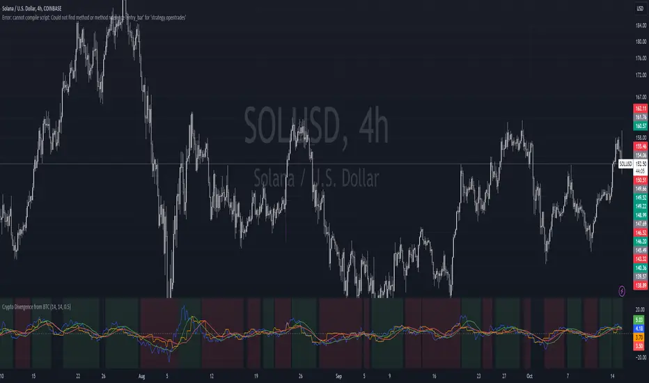
Crypto Divergence from BTCThis script is used to indicate when price action of a crypto coin is diverging significantly from that of BTC.
Explanation of the Script:
Inputs:
roc_length: The period used for calculating the Rate of Change.
ma_length: The period used for the moving average of the ROC.
threshold: The percentage difference that indicates a divergence.
Price Data:
The script retrieves the current asset's price and Bitcoin's price.
ROC Calculation:
The ROC for both the current asset and BTC is calculated based on the defined roc_length.
Moving Averages:
Simple moving averages (SMA) of the ROC values are calculated to smooth out the data.
Divergence Detection:
The indicator checks if the current asset's ROC MA is significantly higher or lower than Bitcoin's ROC MA based on the specified threshold.
Plotting:
The script plots the ROC values and their moving averages.
It also highlights the background in green when a bullish divergence is detected (when the asset is moving up while BTC is lagging) and in red for a bearish divergence.
In den Scripts nach "BTC" suchen
ALT to BTC EvaluationThis custom TradingView indicator, titled "Price Relative to BTC Index", allows users to visualize the price of any selected asset relative to Bitcoin. It achieves this by comparing the closing price of the current ticker to the closing price of Bitcoin as measured by a prominent BTC index. The resulting relative price is then plotted on the chart, providing a clear and direct visual representation of how the asset is performing in comparison to Bitcoin. The plot is displayed in blue with a line width of 2, ensuring that it stands out on your trading charts. This indicator is especially useful for traders looking to assess market sentiment and relative strength between Bitcoin and other assets in real-time.

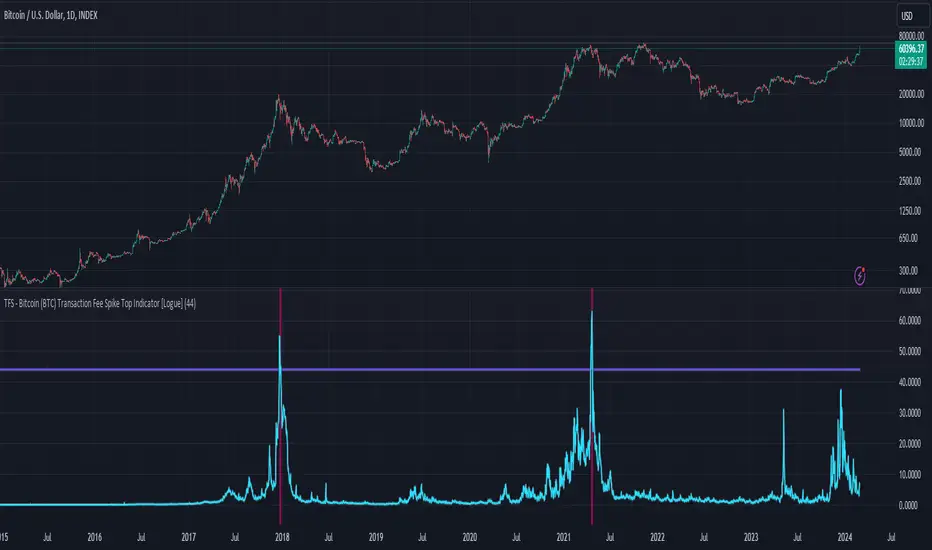
TFS - Bitcoin (BTC) Transaction Fee Spike Top Indicator [Logue]Transaction Fee Spike (TFS) - For bitcoin (BTC), transaction fees on the bitcoin network can signal a mania phase when they increase well above historical values. This mania phase may indicate we are near a top in the BTC price. The transaction fee in USD is directly retrieved from Glassnode. The default trigger for this indicator fires when the transaction fees increase above $44/transaction.
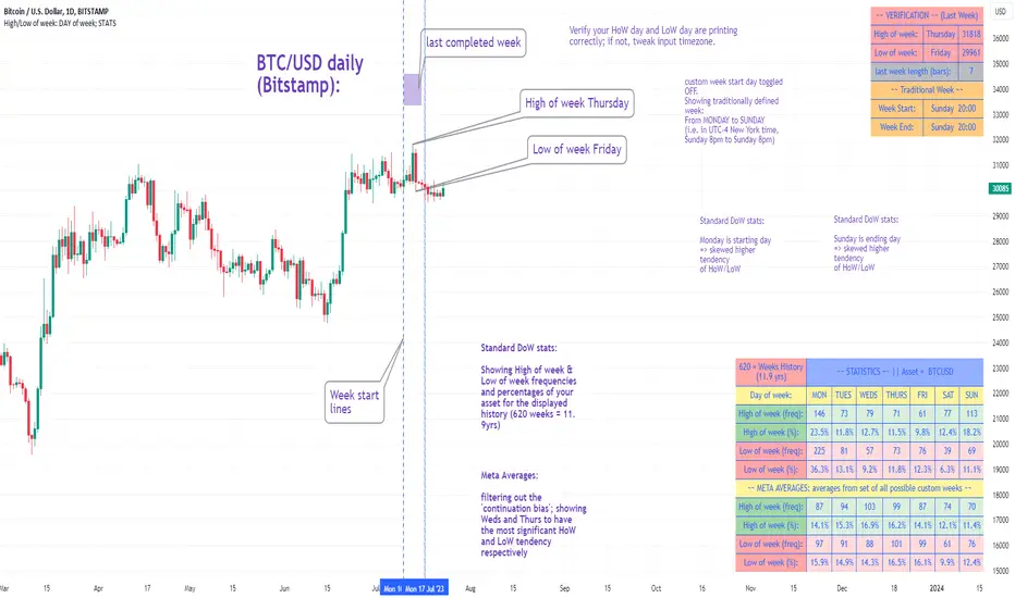
High/Low of week: Stats & Day of Week tendencies// Purpose:
-To show High of Week (HoW) day and Low of week (LoW) day frequencies/percentages for an asset.
-To further analyze Day of Week (DoW) tendencies based on averaged data from all various custom weeks. Giving a more reliable measure of DoW tendencies ('Meta Averages').
-To backtest day-of-week tendencies: across all asset history or across custom user input periods (i.e. consolidation vs trending periods).
-Education: to see how how data from a 'hard-defined-week' may be misleading when seeking statistical evidence of DoW tendencies.
// Notes & Tips:
-Only designed for use on DAILY timeframe.
-Verification table is to make sure HoW / LoW DAY (referencing previous finished week) is printing correctly and therefore the stats table is populating correctly.
-Generally, leaving Timezone input set to "America/New_York" is best, regardless of your asset or your chart timezone. But if misaligned by 1 day =>> tweak this timezone input to correct
-If you want to use manual backtesting period (e.g. for testing consolidation periods vs trending periods): toggle these settings on, then click the indicator display line three dots >> 'Reset Points' to quickly set start & end dates.
// On custom week start days:
-For assets like BTC which trade 7 days a week, this is quite simple. Pick custom start day, use verification table to check all is well. See the start week day & time in said verification table.
-For traditional assets like S&P which trade only 5 days a week and suffer from occasional Holidays, this is a bit more complicated. If the custom start day input is a bank holiday, its custom 'week' will be discounted from the data set. E.g.1: if you choose 'use custom start day' and set it to Monday, then bank holiday Monday weeks will be discounted from the data set. E.g.2: If you choose 'use custom start day' and set it to Thursday, then the Holiday Thursday custom week (e.g Thanksgiving Thursday >> following Weds) would be discounted from the data set.
// On 'Meta Averages':
-The idea is to try and mitigate out the 'continuation bias' that comes from having a fixed week start/end time: i.e. sometimes a market is trending through the week start/end time, so the start/end day stats are over-weighted if one is trying to tease out typical weekly profile tendencies or typical DoW tendencies. You'll notice this if you compare the stats with various custom start days ('bookend' start/end days are always more heavily weighted). I wanted to try to mitigate out this 'bias' by cycling through all the possible new week start/end days and taking an average of the results. i.e. on BTC/USD the 'meta average' for Tuesday would be the average of the Tuesday HoW frequencies from the set of all 7 possible custom weeks(Mon-Sun, Tues-Mon, Weds-Tues, etc etc).
// User Inputs:
~Week Start:
-use custom week start day (default toggled OFF); Choose custom week start day
-show Meta Averages (default toggled ON)
~Verification Table:
-show table, show new week lines, number of new week lines to show
-table formatting options (position, color, size)
-timezone (only for tweaking if printed DoW is misaligned by 1 day)
~Statistics Table:
-show table, table formatting options (position, color, size)
~Manual Backtesting:
-Use start date (default toggled OFF), choose start date, choose vline color
-Use end date (defautl toggled OFF), choose end date, choose vline color
// Demo charts:
NQ1! (Nasdaq), Full History, Traditional week (Mon>>Friday) stats. And Meta Averages. Annotations in purple:
NQ1! (Nasdaq), Full History, Custom week (custom start day = Wednesday). And Meta Averages. Annotations in purple:
GBTC Cost Equivalent per BTCGBTC Cost Equivalent per BTC, dynamically updates BTC holdings per share of GBTC daily
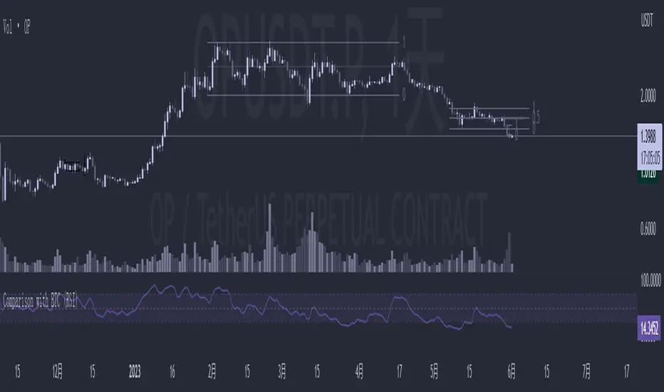
Comparison with BTC (RSI)显示当前品种与BTC汇率对的RSI值
以此判断强势或弱势品种以及超买超卖
——————————
Display the RSI value of the exchange rate between the current variety and BTC
Use this to determine strong or weak varieties, as well as overbought and oversold
Reversal Magic BTC [Loxx]What is Reversal Magic BTC ?
Reversal Magic BTC is an indicator that probes momentum and volatility for extreme values up/down to determine where possible reversals may occur for BTCUSD or BTCUSDT pairs. This is a highly specialized indicator tuned only to BTCUSD or BTCUSDT pairs and it only works on the daily timeframe. If you try to use this on any other ticker or any other timeframe other than the daily, then you'll see the indicator pop up with an error next to its name.
Settings
This indicator has two very simple settings:
1) High/Low period to probe highs and lows over the last XX candles
2) Volatility period to calculate the average volatility over the last XX candles
█ How do you use this?
Reversal trading
Ideally you would pair this indicator with a volatility indicator that shows volatility levels from closing price and then set a take profit level at 1x sigma up or down, and stoploss at 1.5x sigma up or down depending on the direction of the trade. Please note: reversal trading is extremely risky as a trend has not yet been established to confirm market direction.
The following indicators are ideal for this scenario
Profit Bands
Multi-Panel: Trade-Volatility-Probability
Swing Trading
This indicator can also be used as an exit indicator to be paired with a trend trading system where you would exit at the extremes up or down.
MTF Dots BTC-Pair [Auto] [Moto]Hello traders,
Rsi is pretty commonly used and for some good reasons. When I'm trading, I don't always want to use the USDT/USDTPERP rsi, I want to see the correlated BTC pair Rsi of that asset
This script is similar to my MTF Dots and MTF Dots Cor scripts, but with an important and crucial distinction.
This shows user input oversold and overbought RSI metrics for multiple simultaneous timeframes comparatively to a perpetual futures contracts respective BTC pair automatically.
IMPORTANT: As of posting, the script will only show relevant information if the observed chart is a Binance perp chart. Any other chart and the script will not show data.
For example, if a user is on the BINANCE:SOLUSDTPERP chart, the script will show oversold and overbought Rsi data points for BINANCE:SOLBTC. If observing the BINANCE:ZRXUSDTPERP chart, it will give metrics for BINANCE:ZRXBTC Rsi.
There are six time frames, set to "Chart" resolution by default, which have individual period, overbought and oversold levels of strength.
DM for access,
Thanks
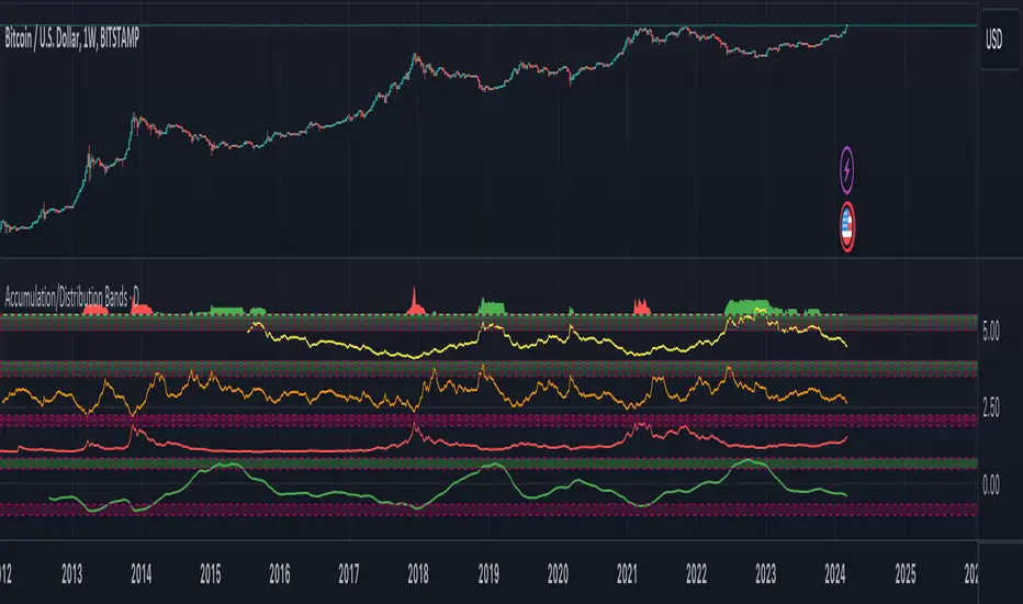
Accumulation/Distribution Bands & Signals (BTC, 1D, BITSTAMP) This is an accumulation/distribution indicator for BTC/USD (D) based on variations of 1400D and 120D moving averages and logarithmic regression. Yellow plot signals Long Term Accumulation, which is based on 1400D (200W) ALMA, orange plot signals Mid Term Accumulation and is based on 120D ALMA, and finally the red plot signals Long Term Distribution that's based on log regression. It should be noted that for red plot to work BTC 1D BITSTAMP graph must be used, because the function of the logarithmic regression was modified according to the x axis of the BITSTAMP data.
Signal bands have different coefficients; long term accumulation (yellow) and and the log regression (red) plots have the highest coefficients and mid term accumulation (orange) has the lowest coefficients. Coefficients are 6x, 3x and 1.5x for the red (sell) and yellow (buy) plots and 1x, 2x and 3x for the orange (buy) plot. Selling coefficient for the yellow and the orange plots are respectively 2x and 1x. Buy and sell signals are summed up accordingly and plotted at the top of the highest band.
Acknowledgement: Credits for the logarithmic regression function are due @memotyka9009 and Benjamin Cowen
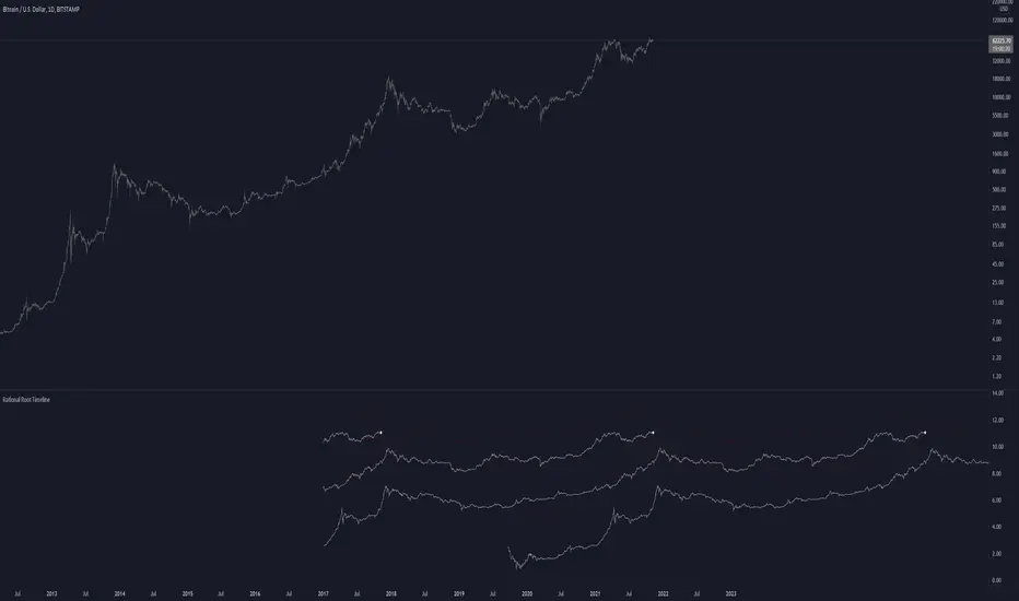
Rational Root TimelineThis script is based on RationalRoot's spiral btc chart. Since I dont know how to make spirals in pinescript I just flattened it out into a readable chart. All this shows is the log price for btc over a 4 year timeframe. I found it interesting how well things line up with this idea. The white circle just shows the current day price location. You need to be on the Daily timeframe to view this correctly.
Glassnode SOPR for BTCThe indicator SOPR by Glassnode is used. The SMA is also used to smooth the values of the SOPR indicator.
For:
- Only for BTC/USD or BTC/USDT
- Time frame 1d or more
Lines :
- Blue line is SMA of SOPR
- Black line is always 1.00
- Red line is 1 plus user percentage
- Lime line is 1 minus the user percentage
Background:
- If the indicator is above the red line then the red background is displayed
- If the indicator is below the lime line the lime background is displayed
Usage:
- When the SMA of SOPR is above the red line there is a high probability of a market top.
- When the SMA of SOPR is below the lime line, there is a high probability of a market bottom (these are good prices to buy bitcoin for a long-term position).

Binance Futures BasisCONCEPT
The futures basis for multiple coins based on the Binance coin margin quarterly futures contracts.
If you need a run down of what the futures basis is, check out this short educational post (click on the chart):
In short: the futures basis is the premium at which futures contracts are trading compared to the spot market.
FEATURES
Futures basis for the following coins:
BTC
ETH
LTC
BNB
ADA
DOT
BCH
LINK
There's also an average futures basis which is an average premium of all the coins I just listed.
As you can see there's also a zero line which you can turn on in the settings.
This is quite useful for when the futures start trading in or close to backwardation.
It's possible to show all the premiums at the same time.
This makes it easy to look for outliers.
You can choose the candle source too.
By default it's set on "close" which probably makes the most sense.
All data will be based on candle closes.
However if you're looking at higher timeframes sometimes crucial info is lost when you keep it on "close".
As you can see in this BTC futures basis example with "close" as a candle source you don't seen anything peculiar even though there were two violent liquidation cascades that temporarily had a huge impact on the futures basis.
If you then select "ohlc4" for example which uses an average value of each candle you can clearly see the impact that those drops had.
Basically when you're looking at most recent data I prefer candle close, but when looking at higher timeframes for historic data the ohlc4 option is more useful.
At the time of publishing this indicator it's using the September quarterly futures contracts (which is the closest expiration).
I'll update this every time the expiration happens.
However, in the settings you'll find the code for these futures contracts.
If you want to take a look at the next expiration for example, which is December right now, you can just fill in the Binance code of those contracts and it'll re-calculate everything and print the futures basis for the December futures.
This way you can also update the indicator yourself each time contracts expire (to make sure the indicator keeps working just in case I were to disappear or something).
The code for the current (September) contracts is U2021.
The code for the next expiration (December) is Z2021.
This will become out dated of course.
TRADING
You can find more info on how it's useful for trading in the educational post I linked.
Some short notes...
This premium works very similar to the perpetuals basis or funding.
Simply put a high premium could be a sign that the market is overbought and a very low premium could be a sign that the market is oversold.
Backwardation (below 0) is very rare and usually only happens after a violent crash. Historically those are good buying opportunities.
Divergences also often work really well.
If you want access send me a private message so we can discuss it.
Cheers.

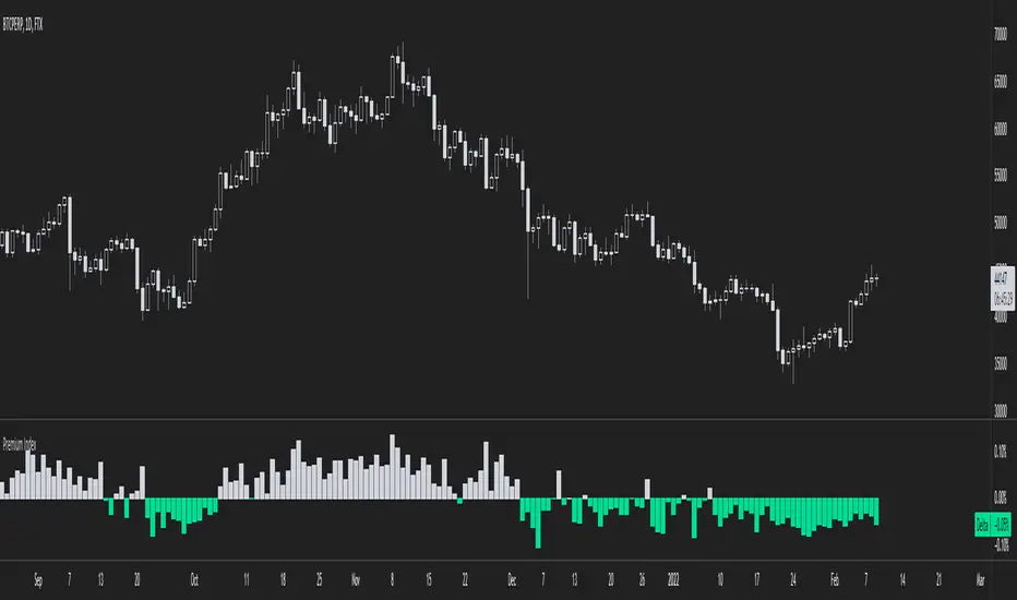
Binance Premium IndexCONCEPT
An indicator with official Binance premium index data for BTC and a bunch of altcoins.
The premium index is based on the difference in price between the perpetual swap contract last price and the price of a volume weighted spot index.
Simply put: it shows you for each coin whether the spot market is trading higher than the Binance perp or not.
FEATURES
Premium index for:
BTC
ETH
LTC
BNB
ADA
DOGE
DOT
UNI
SOL
LINK
There's also an average premium based on the premiums of all these coins combined.
You can also choose in the settings to display all the premiums at the same time.
This makes it easy to find outliers.
There are two extra features that need some explaining.
First of all: the clamp.
It doesn't happen often, but sometimes as a result of massive liquidation cascades there's temporarily a huge spot premium (or derivs premium, but usually spot premium).
In such a scenario the value of the premium dwarfs all other historical data and the indicator becomes nearly unreadable.
The clamp option allows you to put a cap on how extreme the values can get so that the indicator becomes easier to read again.
In the settings you can also change what you want the max value to be.
When you select the option that shows all premiums you'll definitely run into this problem as well.
But you can put a clamp on these too.
The second option is more straight forward: smoothing.
The premium can sometimes be a bit all over the place. It's possible to display the data as a smoothed moving average.
Here's an example of the raw data of the global average premium.
Now with smoothing. Looks a lot more clean.
TRADING
This premium index data is what the funding rate is based on.
Thus it has a direct impact on the perpetual swap contract.
If there's a spot premium (negative values in green) funding will be negative and shorts will have to pay longs.
If there's a derivatives premium (positive values in grey) funding will be positive and longs will have to pay shorts.
Simply put, a spot premium is usually bullish and a derivatives premium is usually bearish.
A lot of people look at this stuff when it comes to bitcoin, but for altcoins it's also definitely relevant.
So here's an indicator with the premium index for 10 different coins.
I don't use more than 10 coins because otherwise the indicator will become very slow.
If you want access to the indicator send me a private message so we can discuss it.
Cheers.
Tether DataCONCEPT
A toolkit with a bunch of different metrics for the widely used stablecoin called tether (USDT).
It's very easy to use, just select in the settings what data you want to look at.
FEATURES
Value index.
The "index" setting shows a volume weighted index of different exchanges to give the most accurate average USDT/USD price.
Market cap.
Very straight forward. This shows you the current tether market cap.
Market cap changes.
This gives you a better visualization of increases (or sometimes decreases) in the tether market cap.
Dominance
This shows tether dominance in the market, same concept as bitcoin dominance.
It compares the USDT mcap to the total crypto mcap and then shows the dominance percentage wise.
It's considered bearish when USDT dominance goes up because it means people want to get out of coins and flee to something more stable.
BTC buying power.
This compares the tether market cap and compares it to the bitcoin market cap to give you an idea of how much BTC buying power has in theory.
The higher this ratio the more bitcoin could be bought with all the tether available.
You'll notice that this often looks very similar to the dominance metric.
Exchanges.
The tether price of multiple exchanges.
In the settings you can select which ones you want the indicator to show.
TRADING
I can't tell you exactly how useful this indicator is for trading, I don't have strong opinions on it.
Some people think a high tether price and dominance is bearish.
Some think the market cap increasing (because of new prints) is bullish.
The buying power metric can give you an idea of how much dry powder there is in the market.
The exchanges metric shows you where you can get the cheapest USDT...
Just some ideas.
This indicator is free so if you add it to your favourites you can start using it immediately (it's possible that you have to refresh Tradingview before it actually works).
Source code is visible for learning purposes.
Cheers.
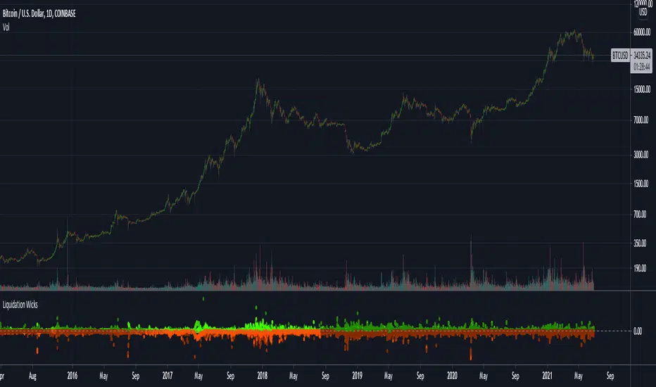
Liquidation Wicks BTCThis script shows the variance between the various btc intruments to find when liquidation cause extreme wicks and price disparity between exchanges
The red dots indicate the difference of the LOWS
and the green dots indicate the difference of the HIGHS
The indicator only works for BTC but it doesn't matter what chart its used on
3GBH - RSI vs BTC's RSIThis indicator compared the RSI of the pair you're viewing to BTC's RSI.
- Currently based against 'BTCUSD', more BTC pairs will be added in the near future.
-----
Included in this indicator:
- RSI of current pair
- RSI of 'BTCUSD'
- EMA of current pair RSI
- EMA of 'BTCUSD' RSI
-----
See what your pair is doing versus BTC.
EMA's to help with Technical Analysis.
-----
Help decide whether to look for a SHORT or LONG entry. ( Shows if 'Table' is On )
-----
User-friendly.
You can change all the inputs, they are labelled for ease-of-use.
You can toggle On/Off any or all of the options.

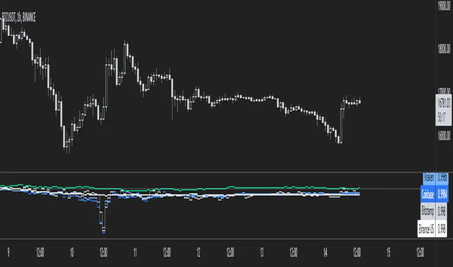
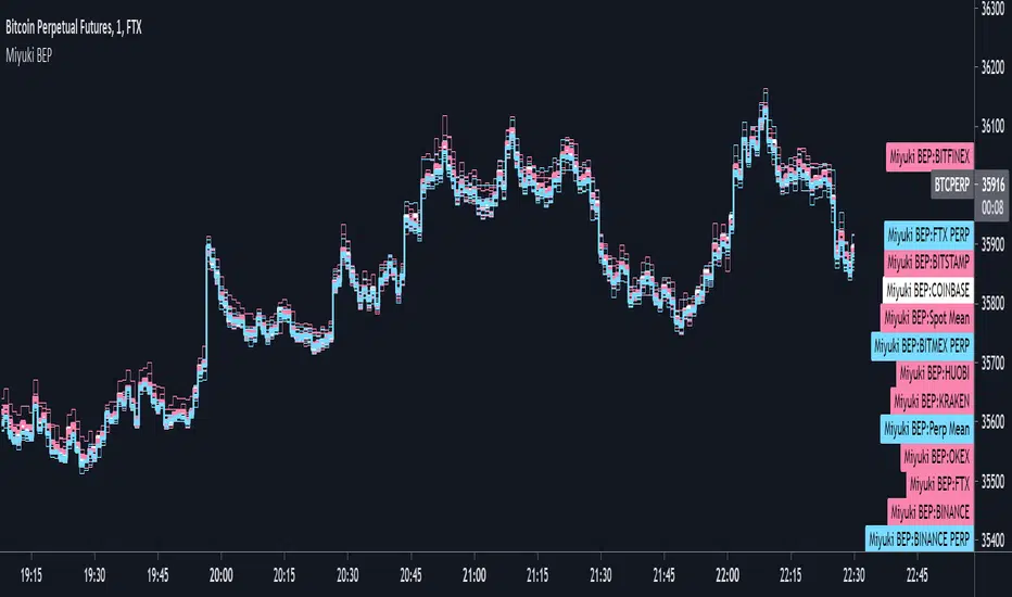
Miyuki BTC Exchange PremiumThis is a simple indicator to display the difference between different BTC exchanges on the chart. It works similarly to my BTC Spot Perp Delta indicator.
There are options to choose which spot and perp exchanges should be included in the mean calculations. It also includes the following options -
- COLOUR BY EXCHANGE: colour each exchange its own colour, or according to if its a spot or perp market
- PLOT EACH EXCHANGE: an option to plot every exchange
- PLOT MEANS: an option to plot the spot and perp means
- PLOT CME: an option to plot the CME price
I find its best used on the lowest timeframes. It can be a good way to visualise the spread between exchanges.
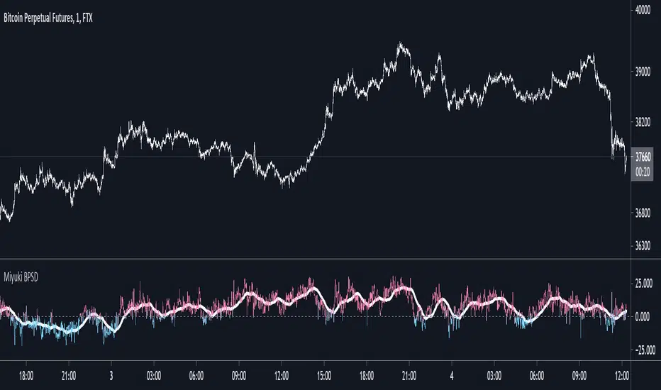
Miyuki BTC Perp Spot DeltaThis is a simple indicator to display the difference between the mean BTC spot price and the mean BTC perp price.
There are options to choose which spot and perp exchanges should be included in the mean calculations. It also includes the following options -
- FLIP: flip the display
- DOLLARS/PERCENT: show the difference in dollar terms or percentage terms
- MOVING AVERAGE: show an adjustable length simple moving average based on the difference
- HORIZONTAL LINES: show up to 3 horizonal lines to indicate the extent of the spread
I find its best used on the lowest timeframes.
Bitcoin Logarithmic Regression RainbowI know there are a lot of BTC rainbows out there, I just wanted to publish my version with my fittings to the BTC price.
The grey channel at the bottom encloses the March 2020 Corona dump.
For best experience USE WEEKLY TIMEFRAME .

Woobull BTC Top CapA close approximation of Willy Woo's Top Cap indicator.
Top Cap is BTC's market cap cumulative average x 35
Since trading view lacks the data from 2010 to 2014 that is used for the calculation, initial values are taken from Willy Woo's chart.
The indicator must be applied to a CRYPTOCAP:BTC chart and daily timeframe

Bitfinex Spot PremiumOverview
A tool to display the spot price premium of Bitfinex coins vs the other big 3 exchanges.
Premium is calculated against:
- Coinbase
- Binance
- FTX
The average is calculated through volume weighting. The absolute difference between the Bitfinex spot price and the calculated average is then displayed on the histogram.
Interacting with the tool
Colours: Green bars indicate a positive premium (Bitfinex spot price is greater than the average), Red bars indicate a negative premium. The ability to grey out smaller premiums is also enabled with the "Grey Small Vals" checkbox, this can be used to further emphasise larger premiums.
Ticker: The ticker input allows you to detect the Bitfinex premium for any coin traded within all 4 exchanges (Bitfinex, Coinbase, Binance, FTX). Just input the coins ticker symbol, for example, "BTC", "ETH", "UNI".
Indicator Ideology
Bitfinex is known for being the home of crypto "smart money". Therefore, positive premiums indicate stronger buying from "smart money". Although this premium is a good sign of bullish/ bearish market conditions, for example, consecutive days of a negative Bitfinex premium have been pretty good at indicating short term tops in BTC, this indicator should only be used as a confirmation signal.

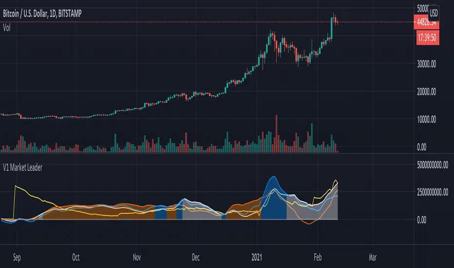
V1 Market Leader
This script aims to identify who the current market leader is between 3 participants, BTC , ETH and ALTS & ETH combined.
Colour coded so you can identify what is what in the settings - Default setting are: BTC = Orange, ETH = Blue and ALTS & ETH = White.
There is also a line to identify the market movement in relation to amount of Tether currently in circulation - Default setting is: Tether = Yellow.
This script can be used on any timeframe but I recommend 12H or greater.
Lines can be turned on and off in settings for cleaner look.
Bitcoin Bulls and Bears by @dbtrBitcoin 🔥 Bulls & Bears 🔥
v1.0
This free-of-charge BTC market analysis indicator helps you better understand what's going with Bitcoin from a high-level perspective. At a glance, it will give you an immediate understanding of Bitcoin’s historic price channel dating back to 2011, past and current market cycles, as well as current key support levels.
Usage
Use this indicator with any BTCUSD pairs , ideally with a long price history (such as BNC:BLX )
We recommend to use this indicator in log mode, combined with Weekly or Monthly timeframe.
Features
🕵🏻♂️ Historic price channel curve since 2011
🚨 Bull & bear market cycles (dynamic)
🔥 All-time highs (dynamic)
🌟 Weekly support (dynamic, based on 20 SMA )
💪 Long-term support (channel bottom)
🔝 Potential future price targets (dynamic)
❎ Overbought RSI coloring
📏 Log/non-log support
🌚 Dark mode support
Remarks
With exception of the price channel curve, anything in this indicator is calculated dynamically , including bull/bear market cycles (based on a tweaked 20SMA), ATHs, and so on. As a result, historic market cycles may not be 100% accurately reflected and may also differ slightly in between various time-frames (closest result: Monthly). The indicator may even consider periods of heavy ups/downs as their own market cycles, even though they weren’t. Due to its dynamic nature, this indicator can however adapt to the future and helps you quickly identify potential changes in market structure, even if the indicator is no longer updated.
On top of that bullmarket cycles (colored in green) feature an ingrained RSI: the darker the green color, the more the RSI is overbought and close to a correction (darkest color in the chart = 90 Weekly RSI). In comparison with past bull cycles, it helps you easily spot potential reversal zones.
Thanks
Thanks to @quantadelic and @mabonyi which both have worked on the BTC "growth zones" indicator including the price channel, of which I have used parts of the code as well as the actual price channel data.
Follow me
Follow me here on TradingView to be notified as soon as new free and premium indicators and trading strategies are published. Inquire me for any other requests.
Enjoy & happy trading!
