In den Scripts nach "200元+股票大盘" suchen
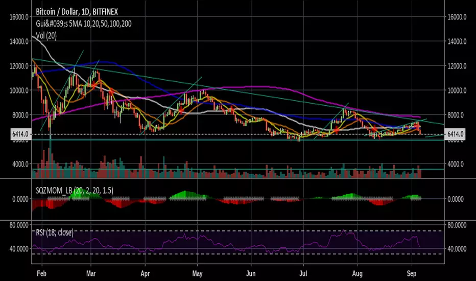
Gui's 5MA 10,20,50,100,2005 Simple Moving Averages for the 10, 20, 50, 100 and 200 day and a cross for whatever you want to read:P
Use it well! Buy high and sell low. Jk:P
Thank you!
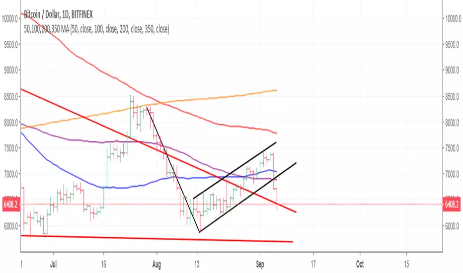
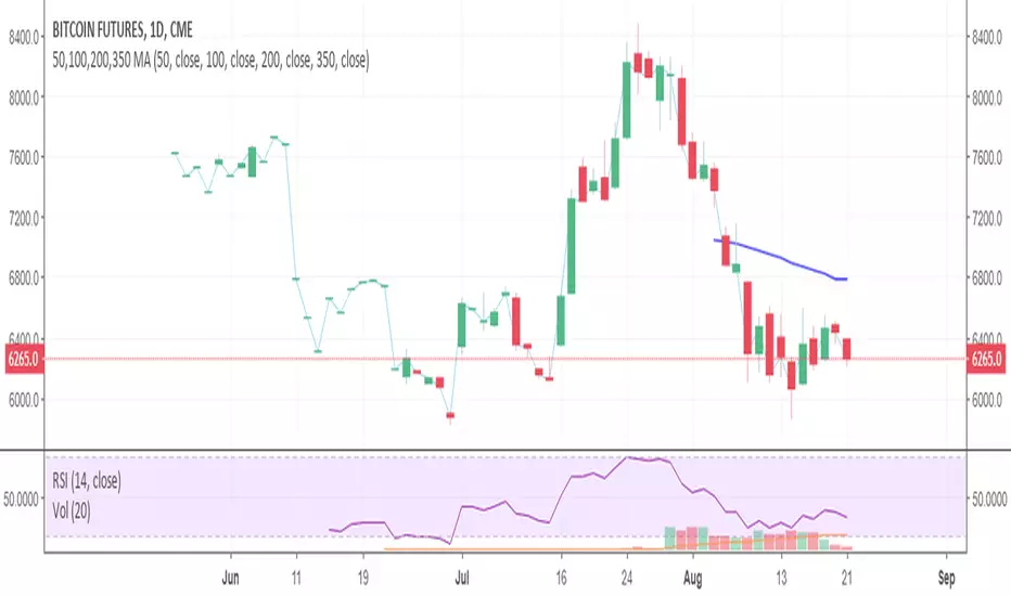
50,100,200,350 MAThis will display the 50, 100 & 200 moving average (MA) on your charts (also known as Simply Moving Average). When looking at these on a daily chart the 350ma is a representation of the 50 week moving average.
Hope this helps
Good Luck
Simon McCabe
Twitter: @simoncmccabe

Philakone 4EMAs + 3MAs (200+100+50)Hi guys ^^
This script combine all Philakone EMAs plus i added death and golden cross MAs which is ( 200 MA + 50 MA ) plus 100 MA
You can fully customize all moving averages MA EMA show or hide or change color or thickness and ofc 0.79% play with source code :)
BTC tip :
3BMEXA9mJMhMBJR9MR3t7othh7BijxUNW7
Thanks ^^

4EMA (8,12,26,55) + Death Cross (100,200) + Bollinger BandsThree indicators in one.
4 Exponential moving averages : 8, 12, 26, 55
Exponential moving average - Death cross: 100, 200
Bollinger Bands

5 Moving Average Exponential 7-15-30-50-2005 Moving Average Exponential. Crypto EMA. 7 is a fast support or resistance, 15 confirmation support or resistance. 30 Important support and resistance. 50 institutional support or resistance. 200 general trend, support and resistance.
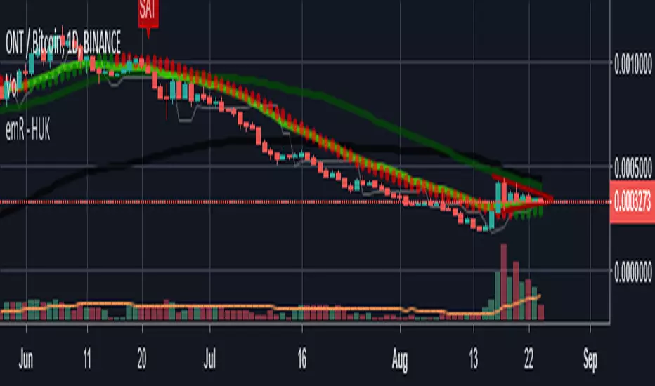
HUK ElasticVolume/50 MOVING AVERAGE e 50/200/20 Coral TrendElastic Volume Default Settings : 50 lenght!
Moving Average Default Settings:50 / 200
EMA Default Settings :20
Coral Trend Default Settings :21/0,4
Thank you ! emR Huk ..
50,100,200,350 MAThis is the 50,100 & 200 day simple moving average plus the 350 day which is equivalent to the 50 week moving average. GL Simon McCabe
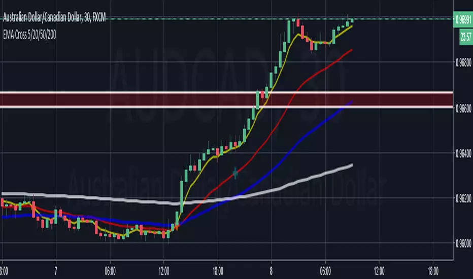
Delphiguy EMA Cross 5/20/50/200A simple Indicator for EMA 5, 20, 50, 200.
It shows gives potential trades on the crossover of the 5/20, and 50/200
It also shows price trend via the 200EMA
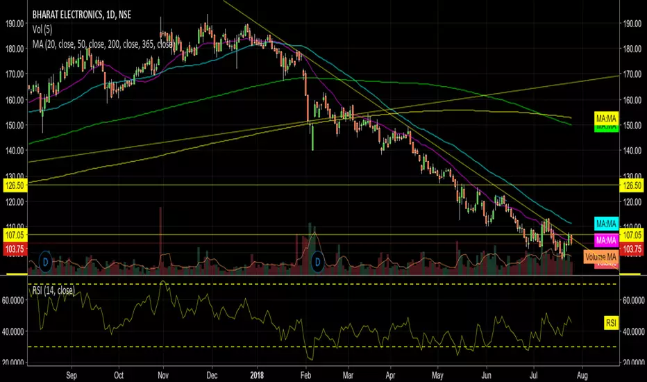
Anupam's MAs (20,50,200,365)This shows Multiple MAs of 20, 50, 200 and 365 as one common Indicator, thus it can save 4 Different Indicator inputs for Free users.

ALL Philakone's EMA's (8,13,21,55,100, 200)These are Philakone's EMA's. I added the 100 day in there as I didn't see that anyone had done that.
The 100 might be the same color as the 200 looking at the code, I changed it on my chart, but just make sure you check the colors.


Philakone 4EMAs + 2MAs (200+50)Hi guys ^^
This is script combined all EMAs philakone use plus i added death and golden cross MA which is 200 MA + 50 MA
you can customize it hide show change colors all
and you can change the code add it do what ever you like
if you like this and want to support
BTC
3BMEXA9mJMhMBJR9MR3t7othh7BijxUNW7
Thanks ^^

crashm111 3-200 Moving Average RibbonAll the moving averages bewteen 3 and 200 in increments of 5.
with the ability to change colours
and change between simple and exponential.
It provides an easy and fast way to determine the trend direction and possible reversals.


Philakone EMA (8,13,21,55,200)Philakone's EMAs all in one indicator, including his recently added 200 line he uses in his recent analysis. :)

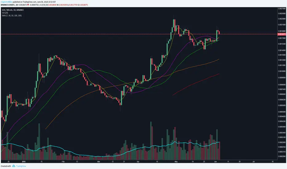
Simple Moving Averages (7, 30, 50, 100, 200)7, 30, 50, 100, 200 simple moving averages, bundled in one indicator (for users who are using the free TradingView service and can only load limited number of indicators at any given time).
You can turn each moving average on or off at will and change the colors.