Ticker conversion -> $The same idea as my Volume $
Tickers in BTC/ETH,... currency get converted into $
Cheers!
In den Scripts nach "文华财经tick价格" suchen

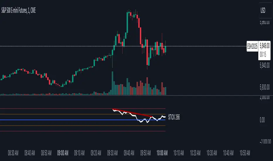
TICK Charting & DivergencesOverview
The TICK index measures the number of NYSE stocks making an uptick versus a downtick. This indicator identifies divergences between price action and TICK readings, potentially signaling trend reversals.
Key Features
Real-time TICK monitoring during market hours (9:30 AM - 4:00 PM ET)
Customizable smoothing factor for TICK values
Regular and hidden divergences detection
Reference lines at ±500 and ±1000 levels
Current TICK value display
TICK Internals Interpretation
Above +1000: Strong buying pressure, potential exhaustion
Above +500: Moderate buying pressure
Below -500: Moderate selling pressure
Below -1000: Strong selling pressure, potential exhaustion
Best Practices
Use in conjunction with support/resistance levels, market trend direction, and time of day.
Higher probability setups with multiple timeframe confirmation, divergence at key price levels, and extreme TICK readings (±1000).
Settings Optimization
Smoothing Factor: 1-3 (lower for faster signals)
Pivot Lookback: 5-10 bars (adjust based on timeframe)
Range: 5-60 bars (wider for longer-term signals)
Warning Signs
Multiple failed divergences
Choppy price action
Low volume periods
Major news events pending
Remember: TICK divergences are not guaranteed signals. Always use proper risk management and combine with other technical analysis tools.
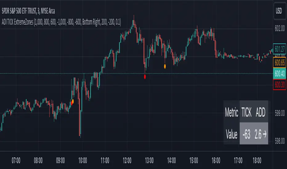
TICK Extreme Zones Indicator OverlayOverview :
The TICK Extreme Zones Indicator Overlay is designed to gauge the overall market trend using the TICK index. By determining the number of bullish (values above 0) and bearish (values below 0) TICK closes within a user-specified lookback period, it provides an insight into the prevailing market sentiment. This insight can be beneficial for traders looking to identify potential entry or exit points based on the market's strength or weakness.
Key Features :
Lookback Period : This is a user-defined time frame in minutes. The indicator counts the number of bullish and bearish TICK closes within this period.
Market Trend Label : Based on the TICK values, the indicator determines if the market is:
Uptrending: Majority of TICK values are positive.
Downtrending: Majority are negative.
Neutral/Rangebound: Equal positive and negative closes.
Zones : These represent certain threshold levels in the TICK values.
Positive Zones:
Dark Blue: 1000
Light Blue: 800 & 600
Negative Zones:
Red: -1000
Yellow: -800 & -600
Touch Detection Method : Detects intraday touches and can be toggled on/off based on the user's preference.
Usage Guidelines :
Trending Market :
In a trending market, the TICK index can remain consistently above or below zero.
For a market moving upwards, it's advisable to consider entering a trade when the indicator returns to zero instead of waiting for it to return to -1000.
Using Exponential Moving Averages (EMAs) can provide additional confirmation of the trend.
Rangebound Market :
For sideways markets, consider initiating a long position when the TICK index goes below -1000 and exit the position when the index reaches +1000.
It's beneficial to pair these readings with significant support and resistance levels to make more informed trading decisions.
Divergence :
Divergence between the TICK index and price can be a good measure of the underlying market strength.
If a stock's price is making lower lows, but the TICK index is making higher lows, it might indicate weakening selling momentum.
Notes:
- Always use this indicator in conjunction with other technical analysis tools.
- Proper risk management practices are crucial when using any trading tool or strategy.
Ticker Info & Look-Ahead Lines (W/D)This versatile Pine Script indicator for trading views clearly displays current chart information and predicts and plots important future timeframe boundaries (next week, the day after tomorrow, etc.).
Key Features of the Indicator 📈
This indicator is divided into three main sections:
1. Ticker/Timeframe Display
Clearly displays the current ticker and timeframe on the chart.
Customization: You can set the display position (top/middle/bottom, left/center/right), font size, default text color, and background color.
Auto Color by Timeframe: The text color automatically changes depending on the timeframe, allowing you to quickly visually grasp the current timeframe.
2. Weekly Look-Ahead Lines
Predicts the start times of the next week and the week after from the time the current bar is determined, and plots them as vertical lines on the chart.
Display Control: You can toggle the visibility of individual lines.
Style: You can set the line color and style (dotted, dashed, solid).
Maximum Number of Lines Displayed: You can control the number of previously drawn lines to retain (consumes two lines per set).
💡 Daily Chart Specific Filter
When viewing a daily chart, this filter hides all past weekly lines and displays only the most recent two (the lines for the following week and the week after). This significantly reduces the visual noise on the daily chart.
3. Daily Look-Ahead Lines
These lines predict the start times of the next and the day after tomorrow from the time the current bar is determined, and are drawn as vertical lines on the chart.
Display Control/Style: As with weekly lines, you can set the visibility, color, and style of lines.
Maximum Number of Lines Displayed: You can control the number of previously drawn lines to retain (consumes two lines per set).
4. Master Timeframe Filter
This is a master ON/OFF switch that centrally manages the automatic hiding of both weekly and daily lines except for the appropriate timeframe.
Auto-hide Daily Lines: When displaying a chart with a timeframe greater than the line's base timeframe, such as a daily, weekly, or monthly chart, the daily lines will be automatically hidden.
Auto-hide Weekly Lines: When displaying a weekly or monthly chart, the weekly lines will be automatically hidden.
This feature allows you to clearly see the leading lines when analyzing shorter timeframes, while preventing the chart from becoming cluttered with lines when switching to longer timeframes (daily or longer).
このインジケーターは、現在のチャート情報を明確に表示し、さらに将来の重要な時間軸の区切り(翌週、明後日など)を予測して描画する機能を持つ、トレーディングビュー用の多機能な Pine Script インジケーターです。
インジケーターの主要機能 (Key Features) 📈
このインジケーターは、以下の3つの主要なセクションに分かれています。
1. 銘柄・時間足情報表示 (Ticker/Timeframe Display)
チャート上に現在の銘柄名 (Ticker) と時間足 (Timeframe) を分かりやすく表示します。
カスタマイズ: 表示位置(上/中/下、左/中央/右)、文字サイズ、デフォルトの文字色、背景色を設定できます。
時間足別自動カラー: 時間足に応じて文字色が自動的に変わるオプションがあり、現在の時間足を視覚的に素早く把握できます。
2. 週足先行ライン (Weekly Look-Ahead Lines)
現在の足が確定した時点から見た、翌週と再来週の開始時刻を予測し、チャートに垂直線として描画します。
表示制御: ラインの表示/非表示を個別に切り替えられます。
スタイル: ラインの色とスタイル(点線、破線、実線)を設定できます。
最大表示本数: 過去に描画されたラインを何本まで保持するかを制御できます(1組あたり2本消費)。
💡 日足チャート限定フィルター (Daily Chart Specific Filter)
特に日足チャートを表示しているときに、過去の週足ラインをすべて非表示にし、直近の2本(翌週と再来週のライン)のみを表示するフィルター機能があります。これにより、日足チャートの視覚的なノイズを大幅に減らせます。
3. 日足先行ライン (Daily Look-Ahead Lines)
現在の足が確定した時点から見た、翌日と明後日の開始時刻を予測し、チャートに垂直線として描画します。
表示制御・スタイル: 週足ラインと同様に、ラインの表示/非表示、色、スタイルを設定できます。
最大表示本数: 過去のライン保持数を制御できます(1組あたり2本消費)。
4. 時間足フィルター一括制御 (Master Timeframe Filter)
週足ラインと日足ラインの両方に対し、適切な時間足以外での自動非表示を一括で管理するマスターON/OFFスイッチです。
日足ラインの自動非表示: 日足、週足、月足チャートなど、ラインの元となる時間足以上のチャートを表示している場合、日足ラインを自動で非表示にします。
週足ラインの自動非表示: 週足、月足チャートを表示している場合、週足ラインを自動で非表示にします。
この機能は、短期足での分析時には先行ラインを明確に見せつつ、長期足(日足以上)に切り替えた際にチャートが線で cluttered になるのを防ぎます。

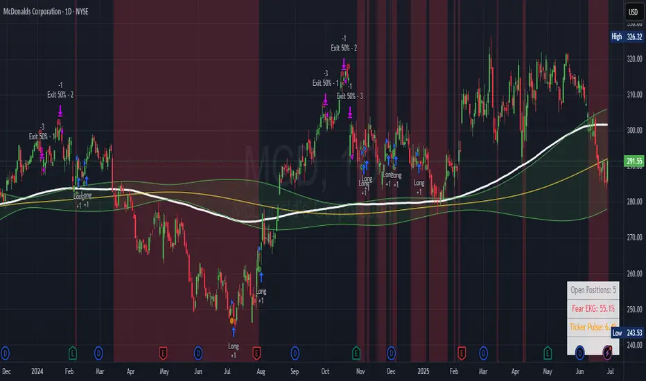
Ticker Pulse Meter + Fear EKG StrategyDescription
The Ticker Pulse Meter + Fear EKG Strategy is a technical analysis tool designed to identify potential entry and exit points for long positions based on price action relative to historical ranges. It combines two proprietary indicators: the Ticker Pulse Meter (TPM), which measures price positioning within short- and long-term ranges, and the Fear EKG, a VIX-inspired oscillator that detects extreme market conditions. The strategy is non-repainting, ensuring signals are generated only on confirmed bars to avoid false positives. Visual enhancements, such as optional moving averages and Bollinger Bands, provide additional context but are not core to the strategy's logic. This script is suitable for traders seeking a systematic approach to capturing momentum and mean-reversion opportunities.
How It Works
The strategy evaluates price action using two key metrics:
Ticker Pulse Meter (TPM): Measures the current price's position within short- and long-term price ranges to identify momentum or overextension.
Fear EKG: Detects extreme selling pressure (akin to "irrational selling") by analyzing price behavior relative to historical lows, inspired by volatility-based oscillators.
Entry signals are generated when specific conditions align, indicating potential buying opportunities. Exits are triggered based on predefined thresholds or partial position closures to manage risk. The strategy supports customizable lookback periods, thresholds, and exit percentages, allowing flexibility across different markets and timeframes. Visual cues, such as entry/exit dots and a position table, enhance usability, while optional overlays like moving averages and Bollinger Bands provide additional chart context.
Calculation Overview
Price Range Calculations:
Short-Term Range: Uses the lowest low (min_price_short) and highest high (max_price_short) over a user-defined short lookback period (lookback_short, default 50 bars).
Long-Term Range: Uses the lowest low (min_price_long) and highest high (max_price_long) over a user-defined long lookback period (lookback_long, default 200 bars).
Percentage Metrics:
pct_above_short: Percentage of the current close above the short-term range.
pct_above_long: Percentage of the current close above the long-term range.
Combined metrics (pct_above_long_above_short, pct_below_long_below_short) normalize price action for signal generation.
Signal Generation:
Long Entry (TPM): Triggered when pct_above_long_above_short crosses above a user-defined threshold (entryThresholdhigh, default 20) and pct_below_long_below_short is below a low threshold (entryThresholdlow, default 40).
Long Entry (Fear EKG): Triggered when pct_below_long_below_short crosses under an extreme threshold (orangeEntryThreshold, default 95), indicating potential oversold conditions.
Long Exit: Triggered when pct_above_long_above_short crosses under a profit-taking level (profitTake, default 95). Partial exits are supported via a user-defined percentage (exitAmt, default 50%).
Non-Repainting Logic: Signals are calculated using data from the previous bar ( ) and only plotted on confirmed bars (barstate.isconfirmed), ensuring reliability.
Visual Enhancements:
Optional moving averages (SMA, EMA, WMA, VWMA, or SMMA) and Bollinger Bands can be enabled for trend context.
A position table displays real-time metrics, including open positions, Fear EKG, and Ticker Pulse values.
Background highlights mark periods of high selling pressure.
Entry Rules
Long Entry:
TPM Signal: Occurs when the price shows strength relative to both short- and long-term ranges, as defined by pct_above_long_above_short crossing above entryThresholdhigh and pct_below_long_below_short below entryThresholdlow.
Fear EKG Signal: Triggered by extreme selling pressure, when pct_below_long_below_short crosses under orangeEntryThreshold. This signal is optional and can be toggled via enable_yellow_signals.
Entries are executed only on confirmed bars to prevent repainting.
Exit Rules
Long Exit: Triggered when pct_above_long_above_short crosses under profitTake.
Partial exits are supported, with the strategy closing a user-defined percentage of the position (exitAmt) up to four times per position (exit_count limit).
Exits can be disabled or adjusted via enable_short_signal and exitPercentage settings.
Inputs
Backtest Start Date: Defines the start of the backtesting period (default: Jan 1, 2017).
Lookback Periods: Short (lookback_short, default 50) and long (lookback_long, default 200) periods for range calculations.
Resolution: Timeframe for price data (default: Daily).
Entry/Exit Thresholds:
entryThresholdhigh (default 20): Threshold for TPM entry.
entryThresholdlow (default 40): Secondary condition for TPM entry.
orangeEntryThreshold (default 95): Threshold for Fear EKG entry.
profitTake (default 95): Exit threshold.
exitAmt (default 50%): Percentage of position to exit.
Visual Options: Toggle for moving averages and Bollinger Bands, with customizable types and lengths.
Notes
The strategy is designed to work across various timeframes and assets, with data sourced from user-selected resolutions (i_res).
Alerts are included for long entry and exit signals, facilitating integration with TradingView's alert system.
The script avoids repainting by using confirmed bar data and shifted calculations ( ).
Visual elements (e.g., SMA, Bollinger Bands) are inspired by standard Pine Script practices and are optional, not integral to the core logic.
Usage
Apply the script to a chart, adjust input settings to suit your trading style, and use the visual cues (entry/exit dots, position table) to monitor signals. Enable alerts for real-time notifications.
Designed to work best on Daily timeframe.
Ticker Pulse Meter BasicPairs nicely with the Contrarian 100 MA located here:
and the Enhanced Stock Ticker with 50MA vs 200MA located here:
Description
The Ticker Pulse Meter Basic is a dynamic Pine Script v6 indicator designed to provide traders with a visual representation of a stock’s price position relative to its short-term and long-term ranges, enabling clear entry and exit signals for long-only trading strategies. By calculating three normalized metrics—Percent Above Long & Above Short, Percent Above Long & Below Short, and Percent Below Long & Below Short—this indicator offers a unique "pulse" of market sentiment, plotted as stacked area charts in a separate pane. With customizable lookback periods, thresholds, and signal plotting options, it empowers traders to identify optimal entry points and profit-taking levels. The indicator leverages Pine Script’s force_overlay feature to plot signals on either the main price chart or the indicator pane, making it versatile for various trading styles.
Key Features
Pulse Meter Metrics:
Computes three percentages based on short-term (default: 50 bars) and long-term (default: 200 bars) lookback periods:
Percent Above Long & Above Short: Measures price strength when above both short and long ranges (green area).
Percent Above Long & Below Short: Indicates mixed momentum (orange area).
Percent Below Long & Below Short: Signals weakness when below both ranges (red area).
Flexible Signal Plotting:
Toggle between plotting entry (blue dots) and exit (white dots) signals on the main price chart (location.abovebar/belowbar) or in the indicator pane (location.top/bottom) using the Plot Signals on Main Chart option.
Entry/Exit Logic:
Long Entry: Triggered when Percent Above Long & Above Short crosses above the high threshold (default: 20%) and Percent Below Long & Below Short is below the low threshold (default: 40%).
Long Exit: Triggered when Percent Above Long & Above Short crosses above the profit-taking level (default: 95%).
Visual Enhancements:
Plots stacked area charts with semi-transparent colors (green, orange, red) for intuitive trend analysis.
Displays threshold lines for entry (high/low) and profit-taking levels.
Includes a ticker and timeframe table in the top-right corner for quick reference.
Alert Conditions: Supports alerts for long entry and exit signals, integrable with TradingView’s alert system for automated trading.
Technical Innovation: Combines normalized price metrics with Pine Script v6’s force_overlay for seamless signal integration on the price chart or indicator pane.
Technical Details
Calculation Logic:
Uses confirmed bars (barstate.isconfirmed) to calculate metrics, ensuring reliability.
Short-term percentage: (close - lowest(low, lookback_short)) / (highest(high, lookback_short) - lowest(low, lookback_short)).
Long-term percentage: (close - lowest(low, lookback_long)) / (highest(high, lookback_long) - lowest(low, lookback_long)).
Derived metrics:
pct_above_long_above_short = (pct_above_long * pct_above_short) * 100.
pct_above_long_below_short = (pct_above_long * (1 - pct_above_short)) * 100.
pct_below_long_below_short = ((1 - pct_above_long) * (1 - pct_above_short)) * 100.
Signal Plotting:
Entry signals (long_entry) use ta.crossover to detect when pct_above_long_above_short crosses above entryThresholdhigh and pct_below_long_below_short is below entryThresholdlow.
Exit signals (long_exit) use ta.crossover for pct_above_long_above_short crossing above profitTake.
Signals are plotted as tiny circles with force_overlay=true for main chart or standard plotting for the indicator pane.
Performance Considerations: Optimized for efficiency by calculating metrics only on confirmed bars and using lightweight plotting functions.
How to Use
Add to Chart:
Copy the script into TradingView’s Pine Editor and apply it to your chart.
Configure Settings:
Short Lookback Period: Adjust the short-term lookback (default: 50 bars) for sensitivity.
Long Lookback Period: Set the long-term lookback (default: 200 bars) for broader context.
Entry Thresholds: Modify high (default: 20%) and low (default: 40%) thresholds for entry conditions.
Profit Take Level: Set the exit threshold (default: 95%) for profit-taking.
Plot Signals on Main Chart: Check to display signals on the price chart; uncheck for the indicator pane.
Interpret Signals:
Long Entry: Blue dots indicate a strong bullish setup when price is high relative to both lookback ranges and weakness is low.
Long Exit: White dots signal profit-taking when strength reaches overbought levels.
Use the stacked area charts to assess trend strength and momentum.
Set Alerts:
Create alerts for Long Entry and Long Exit conditions using TradingView’s alert system.
Customize Visuals:
Adjust colors and thresholds via TradingView’s settings for better visibility.
The ticker table displays the symbol and timeframe in the top-right corner.
Example Use Cases
Swing Trading: Use entry signals to capture short-term bullish moves within a broader uptrend, exiting at profit-taking levels.
Trend Confirmation: Monitor the green area (Percent Above Long & Above Short) for sustained bullish momentum.
Market Sentiment Analysis: Use the stacked areas to gauge bullish vs. bearish sentiment across timeframes.
Notes
Testing: Backtest the indicator on your chosen market and timeframe to validate its effectiveness.
Compatibility: Built for Pine Script v6 and tested on TradingView as of June 20, 2025.
Limitations: Signals are long-only; adapt the script for short strategies if needed.
Enhancements: Consider adding a histogram for the difference between metrics or additional thresholds for nuanced trading.
Acknowledgments
Inspired by public Pine Script examples and designed to simplify complex market dynamics into a clear, actionable tool. For licensing or support, contact Chuck Schultz (@chuckaschultz) on TradingView. Share feedback in the comments, and happy trading!

TICK Bias Timer with EMA Position📌 Description
This indicator tracks the time in minutes that the Exponential Moving Average (EMA) of the NYSE USI:TICK remains above or below the zero line. It serves as a powerful market breadth confirmation tool to support your intraday directional bias.
Rather than focusing on momentary TICK spikes, this tool emphasizes duration and persistence of buying/selling pressure across the entire NYSE – helping traders stay on the right side of the flow.
🔧 Features
✅ Measures how long the EMA of TICK stays above or below 0
✅ Visual plots of upward and downward pressure duration (in minutes)
✅ Background color changes based on EMA position relative to 0
✅ Automatic daily reset at a customizable time (e.g. 15:30 for RTH open)
✅ Gap filter to avoid spikes during overnight or weekend sessions
✅ Clean, minimalist design – built for real-time decision making
🎯 How to Use
EMA > 0 for 10+ minutes → sustained bullish breadth → intraday bullish bias
EMA < 0 for 10+ minutes → sustained bearish breadth → intraday bearish bias
Frequent flip between sides → uncertain or choppy market → trade with caution
Can be used in confluence with Volume Profile, VWAP, price action, and Bookmap to reinforce trade setups.
💡 Ideal For:
Scalpers looking for flow confirmation
Day traders who want to filter fake strength/weakness
Professionals using TICK, USI:ADD , USI:VOLD , and other internals for decision-making

Ticker vs IndexI was exploring a simple idea how I can visualize the ticker performance against the underlying Index (or any other ticker) performance.
how it works:
When the line is moving up (blue zone), the ticker is performing better than the underlying index (e.g. SPX)(configurable).
When the line is moving down (red zone), the ticker is performing worse than the underlying index.
How to use it:
Use as confirmation always in conjunction with other (main) indicators, avoid "buy" when indicator is in the red zone
Also, crossing over the zero line is often an indication for an upcoming upward move
Try to different SMA length - default is 20 but 10 was often showing better results
(No financial advise, for testing purposes only)
TICK OscillatorOscillator that makes it easy to see when TICK is hitting extreme readings or establishing a bullish/bearish divergence vs the indices.
- Green coloration means a reading of >+400
- Red coloration means a reading of <-400
- Orange means a reading in between -400 and +400
This was inspired by John F Carter's book "Mastering The Trade", where I first learned about utilizing TICK in my trading.

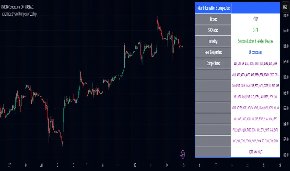
Ticker Industry and Competitor LookupThe Ticker Industry and Competitor Lookup is a comprehensive indicator that provides instant access to industry classification data and competitive intelligence for any ticker symbol. Built using the advanced SIC_TICKER_DATA library, this tool delivers professional-grade sector analysis with enterprise-level performance. It's a simple yet great tool for competitor research, sector studies, portfolio diversification, and investment decision-making.
This indicator is a simple tool built on based on our SIC_TICKER_DATA library to demonstrate the use cases of the library. In this case, you enter a ticker and it displays the sector, SIC or Standard Industrial Classification which is a SEC identifier, and more importantly, the competitors that are listed to be in the exact same SIC by SEC.
There isn't much to say about the indicator itself but we strongly recommend checking out the SIC_TICKER_DATA library we just published to learn more about the types of indicators you can build using it.
TICK high/low/emaTeal = Highest Tick of the period
Red = Lowest tick of the period
Yellow ema of ohlc/4

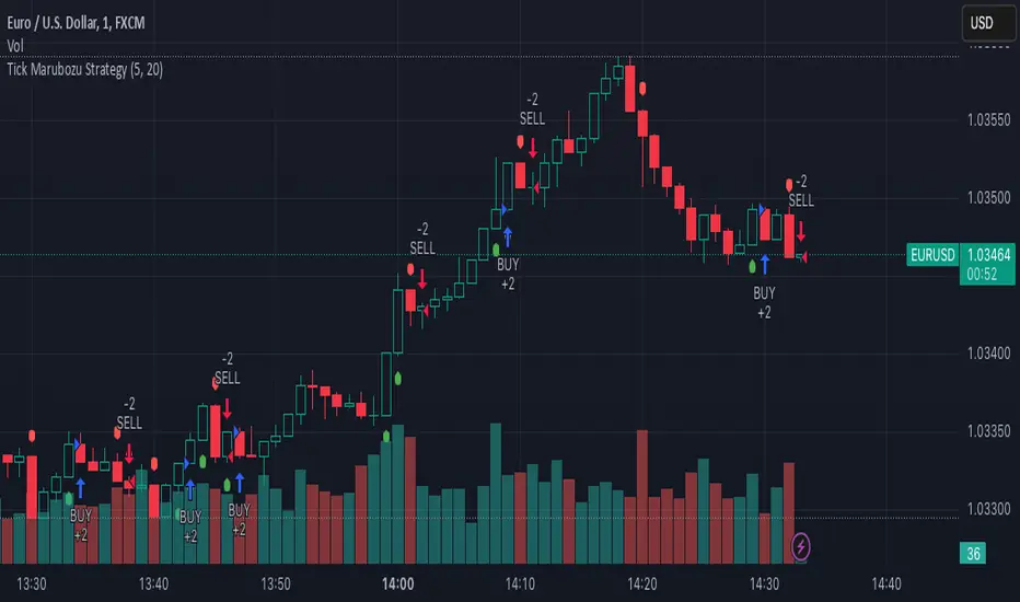
Tick Marubozu StrategyStrategy Concept:
This strategy identifies Marubozu candles on a tick chart (customizable pip size) with high volume to signal strong market momentum.
Bearish Marubozu → Strong selling pressure → Enter a SELL trade
Bullish Marubozu → Strong buying pressure → Enter a BUY trade
Entry Conditions:
Marubozu Definition:
Open price ≈ High for a bearish Marubozu (minimal wick at the top).
Open price ≈ Low for a bullish Marubozu (minimal wick at the bottom).
Customizable body size (in pips).
High Volume Confirmation:
The volume of the Marubozu candle must be above the moving average of volume (e.g., 20-period SMA).
Trade Direction:
Bearish Marubozu with High Volume → SELL
Bullish Marubozu with High Volume → BUY
Exit Conditions:
Time-Based Expiry: Since it's for binary options, the trade duration is pre-defined (e.g., 1-minute expiry).
Reversal Candle: If a strong opposite Marubozu appears, it may indicate a trend shift.
TICK Strength Background ShadeThis indicator shades the background of each candle based on the strength off the current TICK.US chart. User can define the strength levels, which are by default set to 1-299 (lightest), 300-599, and 600+ (darkest). Best used on lower timeframe charts to help identify whether or not to remain in a trend, or if a trend is possibly reversing when you start to see the opposite color begin to appear following a trend.

TICK gapUsed with the "Cumulative TICK", highlights a gap up candle in yellow and a gap down candle in white, then plots a line 500 points away, signalling a counter trend entry.

Multi-ticker Daily Pivot AlertDescription:
The Big Tech Daily Pivot Alert is a powerful TradingView indicator designed to monitor daily pivot points for major tech and market-leading tickers. It provides real-time alerts when prices approach their daily pivot levels, helping traders identify potential trading opportunities during the U.S. market hours.
Key Features:
Multi-Ticker Monitoring: Tracks the daily pivot points for top tech and market tickers, including NVDA, TSLA, AMZN, NFLX, SPY, QQQ, GOOGL, MSFT, META, and AAPL.
Daily Pivot Calculations: Uses yesterday's high, low, and close prices to calculate the pivot point for each ticker.
Real-Time Alerts: Sends instant alerts when the open, high, low, or current price is near the pivot point (within 0.25% tolerance).
Time-Sensitive Alerts: Operates exclusively during U.S. market hours (6:00 AM to 1:00 PM PST) on weekdays (Monday to Friday).
Customizable Alert Format: Alerts are sent as JSON payloads for seamless integration with platforms like Discord or other webhook-supported systems.
How It Works:
The indicator calculates the daily pivot point for each ticker using the formula:
Pivot Point = (High + Low + Close) / 3
It continuously monitors the open, high, low, and current prices of each ticker on a 1-minute timeframe.
If any value approaches the pivot point within a configurable threshold (default: 0.25%), it triggers an alert with detailed information for all tickers meeting the criteria.
Who Should Use It:
Day Traders: Spot potential price reversal or breakout levels based on pivot point testing.
Swing Traders: Identify key levels of support and resistance to inform trading decisions.
Tech and Market Enthusiasts: Stay updated on critical price levels for major tech and market tickers.
Instructions:
Add the indicator to your chart.
Configure your webhook endpoint to receive alerts (e.g., Discord or Slack).
Monitor alerts for actionable opportunities when prices test pivot points.

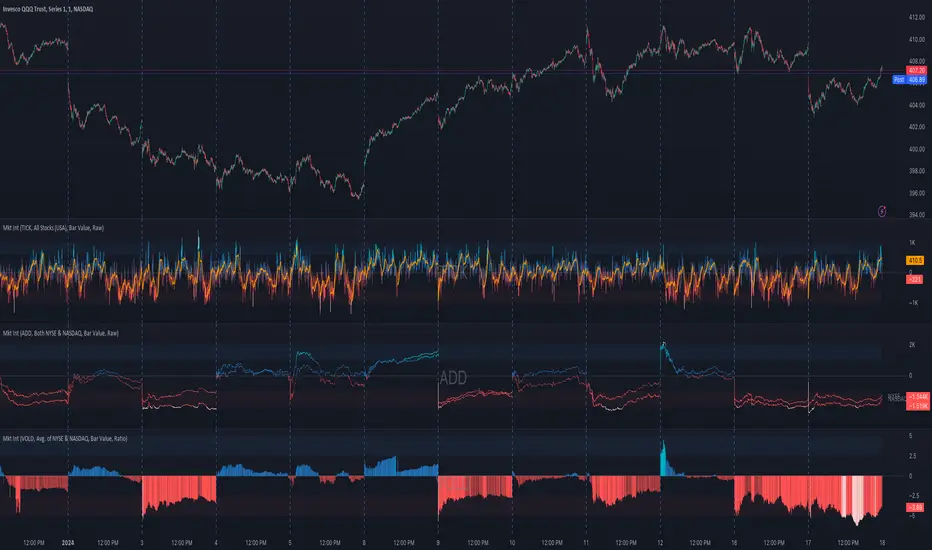
Market Internals (TICK, ADD, VOLD, TRIN, VIX)OVERVIEW
This script allows you to perform data transformations on Market Internals, across exchanges, and specify signal parameters, to more easily identify sentiment extremes.
Notable transformations include:
1. Cumulative session values
2. Directional bull-bear Ratios and Percent Differences
3. Data Normalization
4. Noise Reduction
This kind of data interaction is very useful for understanding the relationship between two mutually exclusive metrics, which is the essence of Market Internals: Up vs. Down. Even so, they are not possible with symbol expressions alone. And the kind of symbol expression needed to produce baseline data that can be reliably transformed is opaque to most traders, made worse by the fact that prerequisite symbol expressions themselves are not uniform across symbols. It's very nuanced, and if this last bit was confusing … exactly.
All this to say, rather than forcing that burden onto you, I've baked the baseline symbol expressions into the indicator so: 1) the transform functions consistently ingest the baseline data in the correct format and 2) you don't have to spend time trying to figure it all out. Trading is hard. There's no need to make it harder.
INPUTS
Indicator
Allows you to specify the base Market Internal and Exchange data to use. The list of Market Internals is simplified to their fundamental representation (TICK, ADD, VOLD, TRIN, VIX, ABVD, TKCD), and the list of Exchange data is limited to the most common (NYSE, NASDAQ, All US Stocks). There are also options for basic exchange combinations (Sum or Average of NYSE & NASDAQ).
Mode
Short for "Plot Mode", this is where you specify the bars style (Candles, Bars, Line, Circles, Columns) and the source value (used for single value plots and plot color changes).
Scale
This is the first and second data transformation grouped together. The default is to show the origin data as it might appear on a chart. You can then specify if each bar should retain it's unique value (Bar Value) or be added to a running total (Cumulative). You can also specify if you would like the data to remain unaltered (Raw) or converted to a directional ratio (Ratio) or a percentage (Percent Diff). These options determine the scale of the plot.
Both Ratio and Percent Diff. convert a given symbol into a positive or negative number, where positive numbers are bullish and negative numbers are bearish.
Ratio will divide Bull values by Bear values, then further divide -1 by the quotient if it is less than 1. For example, if "0.5" was the quotient, the Ratio would be "-2".
Percent Diff. subtracts Bear values from Bull values, then divides that difference by the sum of Bull and Bear values multiplied by 100. If a Bull value was "3" and Bear value was "7", the difference would be "-4", the sum would be "10", and the Percent Diff. would be "-40", as the difference is both bearish and 40% of total.
Ratio Norm. Threshold
This is the third data transformation . While quotients can be less than 1, directional ratios are never less than 1. This can lead to barcode-like artifacts as plots transition between positive and negative values, visually suggesting the change is much larger than it actually is. Normalizing the data can resolve this artifact, but undermines the utility of ratios. If, however, only some of the data is normalized, the artifact can be resolved without jeopardizing its contextual usefulness.
The utility of ratios is how quickly they communicate proportional differences. For example, if one side is twice as big as the other, "2" communicates this efficiently. This necessarily means the numerical value of ratios is worth preserving. Also, below a certain threshold, the utility of ratios is diminished. For example, an equal distribution being represented as 0, 1, 1:1, 50/50, etc. are all equally useful. Thus, there is a threshold, above which we want values to be exact, and below which the utility of linear visual continuity is more important. This setting accounts for that threshold.
When this setting is enabled, a ratio will be normalized to 0 when 1:1, scaled linearly toward the specified threshold when greater than 1:1, and then retain its exact value when the threshold is crossed. For example, with a threshold of "2", 1:1 = 0, 1.5:1 = 1, 2:1 = 2, 3:1 = 3, etc.
With all this in mind, most traders will want to set the ratios threshold at a level where accuracy becomes more important than visual continuity. If this level is unknown, "2" is a good baseline.
Reset cumulative total with each new session
Cumulative totals can be retained indefinitely or be reset each session. When enabled, each session has its own cumulative total. When disabled, the cumulative total is maintained indefinitely.
Show Signal Ranges
Because everything in this script is designed to make identifying sentiment extremes easier, an obvious inclusion would be to not only display ranges that are considered extreme for each Market Internal, but to also change the color of the plot when it is within, or beyond, that range. That is exactly what this setting does.
Override Max & Min
While the min-max signal levels have reasonable defaults for each symbol and transformation type, the Override Max and Override Min options allow you to … (wait for it) … override the max … and min … signal levels. This may be useful should you find a different level to be more suitable for your exact configuration.
Reduce Noise
This is the fourth data transformation . While the previous Ratio Norm. Threshold linearly stretches values between a threshold and 0, this setting will exponentially squash values closer to 0 if below the lower signal level.
The purpose of this is to compress data below the signal range, then amplify it as it approaches the signal level. If we are trying to identify extremes (the signal), minimizing values that are not extreme (the noise) can help us visually focus on what matters.
Always keep both signal zones visible
Some traders like to zoom in close to the bars. Others prefer to keep a wider focus. For those that like to zoom in, if both signals were always visible, the bar values can appear squashed and difficult to discern. For those that keep a wider focus, if both signals were not always visible, it's possible to lose context if a signal zone is vertically beyond the pane. This setting allows you to decide which scenario is best for you.
Plot Colors
These define the default color, within signal color, and beyond signal color for Bullish and Bearish directions.
Plot colors should be relative to zero
When enabled, the plot will inherit Bullish colors when above zero and Bearish colors when below zero. When disabled and Directional Colors are enabled (below), the plot will inherit the default Bullish color when rising, and the default Bearish color when falling. Otherwise, the plot will use the default Bullish color for all directions.
Directional colors
When the plot colors should be relative to zero (above), this changes the opacity of a bars color if moving toward zero, where "100" percent is the full value of the original color and "0" is transparent. When the plot colors are NOT relative to zero, the plot will inherit Bullish colors when rising and Bearish colors when falling.
Differentiate RTH from ETH
Market Internal data is typically only available during regular trading hours. When this setting is enabled, the background color of the indicator will change as a reminder that data is not available outside regular trading hours (RTH), if the chart is showing electronic trading hours (ETH).
Show zero line
Similar to always keeping signal zones visible (further up), some traders prefer zooming in while others prefer a wider context. This setting allows you to specify the visibility of the zero line to best suit your trading style.
Linear Regression
Polynomial regressions are great for capturing non-linear patterns in data. TradingView offers a "linear regression curve", which this script is using as a substitute. If you're unfamiliar with either term, think of this like a better moving average.
Symbol
While the Market Internal symbol will display in the status line of the indicator, the status line can be small and require more than a quick glance to read properly. Enabling this setting allows you to specify if / where / how the symbol should display on the indicator to make distinguishing between Market Internals more efficient.
Speaking of symbols, this indicator is designed for, and limited to, the following …
TICK - The TICK subtracts the total number of stocks making a downtick from the total number of stocks making an uptick.
ADD - The Advance Decline Difference subtracts the total number of stocks below yesterdays close from the total number of stocks above yesterdays close.
VOLD - The Volume Difference subtracts the total declining volume from the total advancing volume.
TRIN - The Arms Index (aka. Trading Index) divides the ratio of Advancing Stocks / Volume by the ratio of Declining Stocks / Volume. Given the inverse correlation of this index to market movement, when transforming it to a Ratio or Percent Diff., its values are inverted to preserve the bull-bear sentiment of the transformations.
VIX - The CBOE Volatility Index is derived from SPX index option prices, generating a 30-day forward projection of volatility. Given the inverse correlation of this index to market movement, when transforming it to a Ratio or Percent Diff., its values are inverted and normalized to the sessions first bar to preserve the bull-bear sentiment of the transformations. Note: If you do not have a Cboe CGIF subscription , VIX data will be delayed and plot unexpectedly.
ABVD - The Above VWAP Difference is an unofficial index measuring all stocks above VWAP as a percent difference. For the purposes of this indicator (and brevity), TradingViews PCTABOVEVWAP has has been shortened to simply be ABVD.
TKCD - The Tick Cumulative Difference is an unofficial index that subtracts the total number of market downticks from the total number of market upticks. Where "the TICK" (further up) is a measurement of stocks ticking up and down, TKCD is a measurement of the ticks themselves. For the purposes of this indicator (and brevity), TradingViews UPTKS and DNTKS symbols have been shorted to simply be TKCD.
INSPIRATION
I recently made an indicator automatically identifying / drawing daily percentage levels , based on 4 assumptions. One of these assumptions is about trend days. While trend days do not represent the majority of days, they can have big moves worth understanding, for both capitalization and risk mitigation.
To this end, I discovered:
• Article by Linda Bradford Raschke about Capturing Trend Days.
• Video of Garrett Drinon about Trend Day Trading.
• Videos of Ryan Trost about How To Use ADD and TICK.
• Article by Jason Ruchel about Overview of Key Market Internals.
• Including links to resources outside of TradingView violates the House Rules, but they're not hard to find, if interested.
These discoveries inspired me adopt the underlying symbols in my own trading. I also found myself wanting to make using them easier, the net result being this script.
While coding everything, I also discovered a few symbols I believe warrant serious consideration. Specifically the Percent Above VWAP symbols and the Up Ticks / Down Ticks symbols (referenced as ABVD and TKCD in this indicator, for brevity). I found transforming ABVD or TKCD into a Ratio or Percent Diff. to be an incredibly useful and worthy inclusion.
ABVD is a Market Breadth cousin to Brian Shannon's work, and TKCD is like the 3rd dimension of the TICKs geometry. Enjoy.
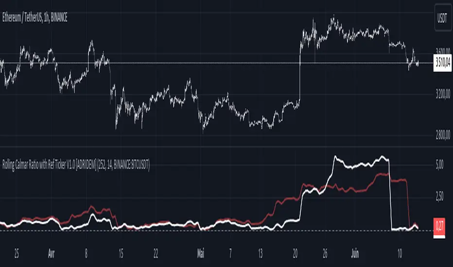
Rolling Calmar Ratio with Ref Ticker V1.0 [ADRIDEM]Overview
The Rolling Calmar Ratio with Ref Ticker script is designed to offer a comprehensive view of the Calmar ratios for a selected reference ticker and the current ticker. This script helps investors compare risk-adjusted returns between two assets over a rolling period, providing insights into their relative performance and risk. Below is a detailed presentation of the script and its unique features.
Unique Features of the New Script
Reference Ticker Comparison : Allows users to compare the Calmar ratio of the current ticker with a reference ticker, providing a relative performance analysis. Default ticker is BTCUSDT but can be changed.
Customizable Rolling Window : Enables users to set the length for the rolling window, adapting to different market conditions and timeframes. The default value is 252 bars, which approximates one year of trading days, but it can be adjusted as needed.
Smoothing Option : Includes an option to apply a smoothing simple moving average (SMA) to the Calmar ratios, helping to reduce noise and highlight trends. The smoothing length is customizable, with a default value of 14 bars.
Visual Indicators : Plots the smoothed Calmar ratios for both the reference ticker and the current ticker, with distinct colors for easy comparison. Additionally, a horizontal line helps identify key levels.
Dynamic Background Color : Adds a gray-blue transparent background between the Calmar ratio levels of 0 and 1, highlighting the critical region where risk-adjusted returns are assessed.
Originality and Usefulness
This script uniquely combines the analysis of Calmar ratios for a reference ticker and the current ticker, providing a comparative view of their risk-adjusted returns. The inclusion of a customizable rolling window and smoothing option enhances its adaptability and usefulness in various market conditions.
Signal Description
The script includes several features that highlight potential insights into the risk-adjusted returns of the assets:
Reference Ticker Calmar Ratio : Plotted as a red line, this represents the smoothed Calmar ratio for the user-selected reference ticker.
Current Ticker Calmar Ratio : Plotted as a white line, this represents the smoothed Calmar ratio for the current ticker.
Horizontal Lines and Background Color : A line at 0 helps to quickly identify the regions of positive and negative risk-adjusted returns.
These features assist in identifying relative performance differences and confirming the strength or weakness of risk-adjusted returns between the two tickers.
Detailed Description
Input Variables
Length for Rolling Window (`length`) : Defines the range for calculating the rolling Calmar ratio. Default is 252.
Smoothing Length (`smoothing_length`) : The number of periods for the smoothing SMA. Default is 14.
Reference Ticker (`ref_ticker`) : The ticker symbol for the reference asset. Default is "BINANCE:BTCUSDT".
Functionality
Calmar Ratio Calculation : The script calculates the cumulative returns and maximum drawdown for both the reference ticker and the current ticker. These values are used to compute the Calmar ratio.
```pine
ref_cumulativeReturn = (ref_close / ta.valuewhen(ta.lowest(ref_close, length) == ref_close, ref_close, 0)) - 1
ref_rollingMax = ta.highest(ref_close, length)
ref_drawdown = (ref_close - ref_rollingMax) / ref_rollingMax
ref_maxDrawdown = ta.lowest(ref_drawdown, length)
ref_calmarRatio = ref_cumulativeReturn / math.abs(ref_maxDrawdown)
current_cumulativeReturn = (close / ta.valuewhen(ta.lowest(close, length) == close, close, 0)) - 1
current_rollingMax = ta.highest(close, length)
current_drawdown = (close - current_rollingMax) / current_rollingMax
current_maxDrawdown = ta.lowest(current_drawdown, length)
current_calmarRatio = current_cumulativeReturn / math.abs(current_maxDrawdown)
```
Smoothing : A simple moving average is applied to the Calmar ratios to smooth the data.
```pine
smoothed_ref_calmarRatio = ta.sma(ref_calmarRatio, smoothing_length)
smoothed_current_calmarRatio = ta.sma(current_calmarRatio, smoothing_length)
```
Plotting : The script plots the smoothed Calmar ratios for both the reference ticker and the current ticker, along with a horizontal line.
```pine
plot(smoothed_ref_calmarRatio, title="Ref Ticker Calmar Ratio", color=color.rgb(255, 82, 82, 50), linewidth=2)
plot(smoothed_current_calmarRatio, title="Current Ticker Calmar Ratio", color=color.white, linewidth=2)
h0 = hline(0, "Zero Line", color=color.gray)
fill(h0, h1, color=color.rgb(33, 150, 243, 90), title="Background")
```
How to Use
Configuring Inputs : Adjust the detection length and smoothing length as needed. Set the reference ticker to the desired asset for comparison.
Interpreting the Indicator : Use the plotted Calmar ratios and horizontal line to assess the relative risk-adjusted returns of the reference and current tickers.
Signal Confirmation : Look for differences in the Calmar ratios to identify potential performance advantages or weaknesses. The horizontal line helps to highlight key levels of risk-adjusted returns.
This script provides a detailed comparative view of risk-adjusted returns, aiding in more informed decision-making by highlighting key differences between the reference ticker and the current ticker.
Rolling Sortino Ratio with Ref Ticker V1.0 [ADRIDEM]Overview
The Rolling Sortino Ratio with Ref Ticker script is designed to offer a comprehensive view of the Sortino ratios for a selected reference ticker and the current ticker. This script helps investors compare risk-adjusted returns between two assets over a rolling period, providing insights into their relative performance and risk. Below is a detailed presentation of the script and its unique features.
Unique Features of the New Script
Reference Ticker Comparison : Allows users to compare the Sortino ratio of the current ticker with a reference ticker, providing a relative performance analysis. Default ticker is BTCUSDT but can be changed.
Customizable Rolling Window : Enables users to set the length for the rolling window, adapting to different market conditions and timeframes. The default value is 252 bars, which approximates one year of trading days, but it can be adjusted as needed.
Smoothing Option : Includes an option to apply a smoothing simple moving average (SMA) to the Sortino ratios, helping to reduce noise and highlight trends. The smoothing length is customizable, with a default value of 4 bars.
Visual Indicators : Plots the smoothed Sortino ratios for both the reference ticker and the current ticker, with distinct colors for easy comparison. Additionally, horizontal lines and a shaded background help identify key levels.
Dynamic Background Color : Adds a gray-blue transparent background between the Sortino ratio levels of 0 and 1, highlighting the critical region where risk-adjusted returns are assessed.
Originality and Usefulness
This script uniquely combines the analysis of Sortino ratios for a reference ticker and the current ticker, providing a comparative view of their risk-adjusted returns. The inclusion of a customizable rolling window and smoothing option enhances its adaptability and usefulness in various market conditions.
Signal Description
The script includes several features that highlight potential insights into the risk-adjusted returns of the assets:
Reference Ticker Sortino Ratio : Plotted as a red line, this represents the smoothed Sortino ratio for the user-selected reference ticker.
Current Ticker Sortino Ratio : Plotted as a white line, this represents the smoothed Sortino ratio for the current ticker.
Horizontal Lines and Background Color : Lines at 0 and 1, along with a shaded background between these levels, help to quickly identify the regions of positive and strong risk-adjusted returns.
These features assist in identifying relative performance differences and confirming the strength or weakness of risk-adjusted returns between the two tickers.
Detailed Description
Input Variables
Length for Rolling Window (`length`) : Defines the range for calculating the rolling Sortino ratio. Default is 252.
Smoothing Length (`smoothing_length`) : The number of periods for the smoothing SMA. Default is 4.
Annual Risk-Free Rate (`riskFreeRate`) : The annual risk-free rate used in the Sortino ratio calculation. Default is 0.02 (2%).
Reference Ticker (`ref_ticker`) : The ticker symbol for the reference asset. Default is "BINANCE:BTCUSDT".
Functionality
Sortino Ratio Calculation : The script calculates the daily returns, mean return, and downside deviation for both the reference ticker and the current ticker. These values are used to compute the annualized Sortino ratio.
```pine
ref_dailyReturn = ta.change(ref_close) / ref_close
ref_meanReturn = ta.sma(ref_dailyReturn, length)
ref_downsideDeviation = ta.stdev(math.min(ref_dailyReturn, 0), length)
ref_annualizedReturn = ref_meanReturn * length
ref_annualizedDownsideDev = ref_downsideDeviation * math.sqrt(length)
ref_sortinoRatio = (ref_annualizedReturn - riskFreeRate) / ref_annualizedDownsideDev
```
Smoothing : A simple moving average is applied to the Sortino ratios to smooth the data.
```pine
smoothed_ref_sortinoRatio = ta.sma(ref_sortinoRatio, smoothing_length)
smoothed_current_sortinoRatio = ta.sma(current_sortinoRatio, smoothing_length)
```
Plotting : The script plots the smoothed Sortino ratios for both the reference ticker and the current ticker, along with horizontal lines and a shaded background.
```pine
plot(smoothed_ref_sortinoRatio, title="Ref Ticker Sortino Ratio", color=color.rgb(255, 82, 82, 50), linewidth=2)
plot(smoothed_current_sortinoRatio, title="Current Ticker Sortino Ratio", color=color.white, linewidth=2)
h0 = hline(0, "Zero Line", color=color.gray)
h1 = hline(1, "One Line", color=color.gray)
fill(h0, h1, color=color.rgb(33, 150, 243, 90), title="Background")
```
How to Use
Configuring Inputs : Adjust the detection length, smoothing length, and risk-free rate as needed. Set the reference ticker to the desired asset for comparison.
Interpreting the Indicator : Use the plotted Sortino ratios and background shading to assess the relative risk-adjusted returns of the reference and current tickers.
Signal Confirmation : Look for differences in the Sortino ratios to identify potential performance advantages or weaknesses. The background shading helps to highlight key levels of risk-adjusted returns.
This script provides a detailed comparative view of risk-adjusted returns, aiding in more informed decision-making by highlighting key differences between the reference ticker and the current ticker.

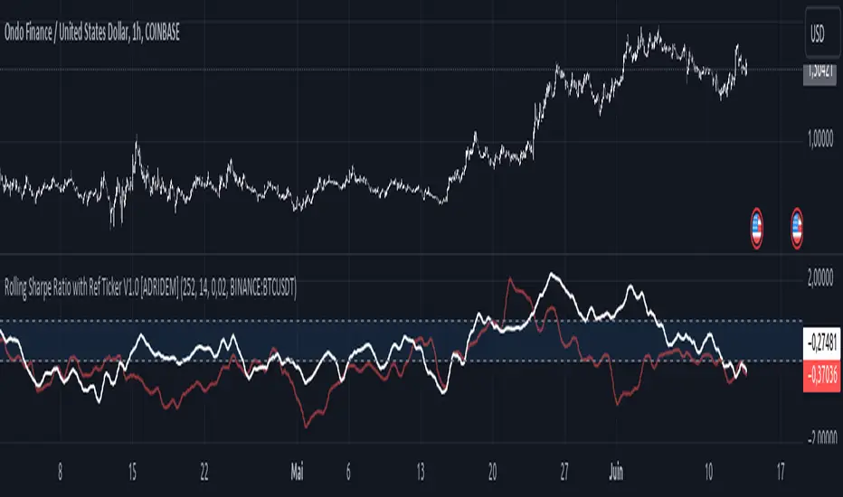
Rolling Sharpe Ratio with Ref Ticker V1.0 [ADRIDEM]Overview
The Rolling Sharpe Ratio with Ref Ticker script is designed to offer a comprehensive view of the Sharpe ratios for a selected reference ticker and the current ticker. This script helps investors compare risk-adjusted returns between two assets over a rolling period, providing insights into their relative performance and risk. Below is a detailed presentation of the script and its unique features.
Unique Features of the New Script
Reference Ticker Comparison : Allows users to compare the Sharpe ratio of the current ticker with a reference ticker, providing a relative performance analysis. Default ticker is BTCUSDT but can be changed.
Customizable Rolling Window : Enables users to set the length for the rolling window, adapting to different market conditions and timeframes. The default value is 252 bars, which approximates one year of trading days, but it can be adjusted as needed.
Smoothing Option : Includes an option to apply a smoothing simple moving average (SMA) to the Sharpe ratios, helping to reduce noise and highlight trends. The smoothing length is customizable, with a default value of 4 bars.
Visual Indicators : Plots the smoothed Sharpe ratios for both the reference ticker and the current ticker, with distinct colors for easy comparison. Additionally, horizontal lines and a shaded background help identify key levels.
Dynamic Background Color : Adds a gray-blue transparent background between the Sharpe ratio levels of 0 and 1, highlighting the critical region where risk-adjusted returns are assessed.
Originality and Usefulness
This script uniquely combines the analysis of Sharpe ratios for a reference ticker and the current ticker, providing a comparative view of their risk-adjusted returns. The inclusion of a customizable rolling window and smoothing option enhances its adaptability and usefulness in various market conditions.
Signal Description
The script includes several features that highlight potential insights into the risk-adjusted returns of the assets:
Reference Ticker Sharpe Ratio : Plotted as a red line, this represents the smoothed Sharpe ratio for the user-selected reference ticker.
Current Ticker Sharpe Ratio : Plotted as a white line, this represents the smoothed Sharpe ratio for the current ticker.
Horizontal Lines and Background Color : Lines at 0 and 1, along with a shaded background between these levels, help to quickly identify the regions of positive and strong risk-adjusted returns.
These features assist in identifying relative performance differences and confirming the strength or weakness of risk-adjusted returns between the two tickers.
Detailed Description
Input Variables
Length for Rolling Window (`length`) : Defines the range for calculating the rolling Sharpe ratio. Default is 252.
Smoothing Length (`smoothing_length`) : The number of periods for the smoothing SMA. Default is 4.
Annual Risk-Free Rate (`riskFreeRate`) : The annual risk-free rate used in the Sharpe ratio calculation. Default is 0.02 (2%).
Reference Ticker (`ref_ticker`) : The ticker symbol for the reference asset. Default is "BINANCE:BTCUSDT".
Functionality
Sharpe Ratio Calculation : The script calculates the daily returns, mean return, and standard deviation for both the reference ticker and the current ticker. These values are used to compute the annualized Sharpe ratio.
```pine
ref_dailyReturn = ta.change(ref_close) / ref_close
ref_meanReturn = ta.sma(ref_dailyReturn, length)
ref_stdDevReturn = ta.stdev(ref_dailyReturn, length)
ref_annualizedReturn = ref_meanReturn * length
ref_annualizedStdDev = ref_stdDevReturn * math.sqrt(length)
ref_sharpeRatio = (ref_annualizedReturn - riskFreeRate) / ref_annualizedStdDev
```
Smoothing : A simple moving average is applied to the Sharpe ratios to smooth the data.
```pine
smoothed_ref_sharpeRatio = ta.sma(ref_sharpeRatio, smoothing_length)
smoothed_current_sharpeRatio = ta.sma(current_sharpeRatio, smoothing_length)
```
Plotting : The script plots the smoothed Sharpe ratios for both the reference ticker and the current ticker, along with horizontal lines and a shaded background.
```pine
plot(smoothed_ref_sharpeRatio, title="Ref Ticker Sharpe Ratio", color=color.rgb(255, 82, 82, 50), linewidth=2)
plot(smoothed_current_sharpeRatio, title="Current Ticker Sharpe Ratio", color=color.white, linewidth=2)
h0 = hline(0, "Zero Line", color=color.gray)
h1 = hline(1, "One Line", color=color.gray)
fill(h0, h1, color=color.rgb(33, 150, 243, 90), title="Background")
```
How to Use
Configuring Inputs : Adjust the detection length, smoothing length, and risk-free rate as needed. Set the reference ticker to the desired asset for comparison.
Interpreting the Indicator : Use the plotted Sharpe ratios and background shading to assess the relative risk-adjusted returns of the reference and current tickers.
Signal Confirmation : Look for differences in the Sharpe ratios to identify potential performance advantages or weaknesses. The background shading helps to highlight key levels of risk-adjusted returns.
This script provides a detailed comparative view of risk-adjusted returns, aiding in more informed decision-making by highlighting key differences between the reference ticker and the current ticker.
Compare (RSI) Ticker 3x by fikiraHi!
Here I've created an indicator which compares 1 Ticker with 1 or 2 other Tickers.
The basis is RSI (Source & Length is adjustable), but the main objective is NOT to concentrate on the RSI, but on the comparison between the 2 or 3 Tickers.
I've used RSI because in this way high priced Tickers (for example BTC, now $8500) can easily be compared with low priced Tickers (for example BTT, now $0,00042)
In this example I have NEO/USDT (Binance) as my initial Ticker, you can see the candlesticks of NEO/USDT.
In the "Compare" indicator, the 'close' of NEO appears as a white line.
The second line (blue) is a chosen second Ticker, in this case BTC/USDT (Binance)
In "Settings" > "Inputs" you can enable/disable the second or third Ticker
- The second Ticker has multiple choices
- The third you can type any Ticker you want, for example CRYPTOCAP:BNB, BINANCE:ETHUSDT, NASDAQ_DLY:NDX or whatever,
just start typing and you'll see the possibilities (You also can choose between "Cryptocurrencies", "Index", "Forex", ...)
You can also plot 2 EMA's, a Short and a Long period (Length is adjustable).
The EMA's have the same colour as the Tickers (Ticker 1 = white, 2 = blue, 3 = red, of course all adjustable)
- EMA Ticker 1 crossover Ticker 2/3 > Green cloud
- EMA Ticker 1 crossunder Ticker 2/3 > Red cloud
For example:
NEO/USDT (1, white) & BTC/USDT (2, blue) with Long Period EMA
NEO/USDT (1, white) & BNB/USDT (3, red) with Long Period EMA
NEO/USDT (1, white) & BNB/USDT (3, red) with Short Period EMA
When the second chosen Ticker is the same as the first Ticker, of course you will be seeing lines
(because there is no difference between the 2 Tickers, the EMA is visible though)
Example :
Both BTC/USDT
(The second indicator is my "Compare (RSI) MACD", a MACD of this indicator, which in this case is obviously flat)

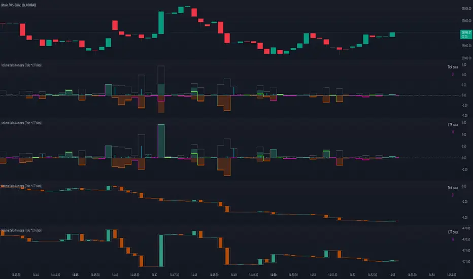
Volume Delta Compare [Ticks ~ LTF data]
The "Volume Delta Compare " publication shows 2 different techniques to show into-depth details of Volume, using Tick and Lower-Time-Frame (LTF) data.
🔶 USAGE
Check for divergences between price and volume movement
Check details (why and when a ΔV developed)
Or if you want to see a lot of data stacked on each other )
🔶 CONCEPTS
🔹 Tick vs. LTF data
a Tick is an measure of (upward or downward) movement in price OR volume.
We can use this data by using varip in the code.
Advantage:
• Detail, detail, detail
• Accurate, per tick
Disadvantage:
• Only realtime
• Can reset 'easily' -> loss of data
• Will reset when settings are changed
LTF data, through the request.security_lower_tf() function, measures the OHLCV data per LTF bar
Advantage:
• Access to history when loading a chart
• No 'loss' of data when chart resets
Disadvantage:
• Less detailed
• Less accurate
This script makes it possible to compare the 2 techniques and enables you to show different values.
🔹 Values
There are mainly 3 important values:
• UP volume (uV): volume when price rises
• DOWN volume (dV): volume when price falls
• NEUTRAL volume (nV): volume when price stays the same
From this, additional data is calculated:
• Volume Delta (ΔV): uV minus dV
• Cumulative Delta Volume (cΔV): sum of ΔV
One typical nV is at open: at that moment there isn't a base price to compare with,
so when the first trade doesn't fully fill the first supply (up or down), volume will rise, but price just is 'open', no movement -> no uV or dV.
• Tick data: every volume changement per tick will be added to the concerning variable (uV, dV or nV)
• LTF data: every volume changement of each bar will be added to the concerning variable (uV, dV or nV)
-> this can easily give a difference, for example (Tick vs. 1 minute LTF), when most of the ticks caused a rise of price, but at the last few seconds, a few ticks causes the close to come below open, with Tick data this could give more UP Volume, while LTF data will show 1 value of DOWN Volume.
🔶 EXAMPLES
🔹 Details
In these examples you can see:
• grey line: Total volume (higher precision)
• UP/DOWN/NEUTRAL Volume
• green columns: uV
• orange columns: dV
• blue pillars: nV
• coloured stepline: reflects ΔV
• close > open and positive ΔV -> green
• close > open but negative ΔV -> fuchsia
• close < open and negative ΔV -> orange
• close < open but positive ΔV -> bright lime green
• Right side -> indication of used data (Tick/LTF data) + last ΔV
• labels (can be disabled)
Above 0 (only with Tick data): data from EVERY tick (ΔV ):
• first the amount of Volume (0 when the amount is very minimal)
• between brackets: price movement
Below 0:
• Σ V: sum of uV, dV and nV, for that bar
• Σ up: sum of uV for that bar
• Σ dn: sum of dV for that bar
• Σ nt: sum of nV for that bar
• Σ P: sum of price movement, for that bar (only at Tick data)
(At the right you'll see a new bar just started)
Here is a detail of the first second at opening:
🔹 Cumulative Volume Delta (CVD)
Difference CVD based on Tick vs. LTF data :
(horizontal lines added for reference)
🔶 FEATURES
🔹 Minimal plotting of na values
Data window and status line only show what is applicable (tick or LTF data) to diminish clutter of data values:
The Tick option has a label above 0 which includes details of every Tick.
If data is added every tick, that label on a 10 minute chart will be filled beyond limitations pretty quickly (string max_length = 4096 limit).
To prevent the script stopping to execute, at a certain limit, this label will stop updating and show the message "Too much data".
The label below the 0-line won't reach that limit, so it will keep on updating.
Timeframes closer to 1 second will have less risk to reach that 4096 limit. Details will remain to show in this case.
🔹 Automatic label colour adaption when changing between dark/light mode values
Label background/text-colour will adapt according to the dark/light-mode by using chart.fg_color / chart.bg_color
🔶 SETTINGS
🔹 Data from: Ticks vs. LTF data
🔹 LTF: Lower Time-Frame for when LTF option is chosen: 1, 5, 10, 15, 30 Seconds or 1 minute
🔹 Also start when bar already has data: only for tick data -> when disabled calculations only start on a new bar.
🔹 CVD, Only show Cumulative Delta Volume: enable to just display CVD
🔹 Colours: colour at the right is for price/volume direction divergences
🔹 Label: choose what you want to display + size labels
🔹 0-line: The label under the 0-line sometimes goes below the chart. this can be adjusted with this setting.
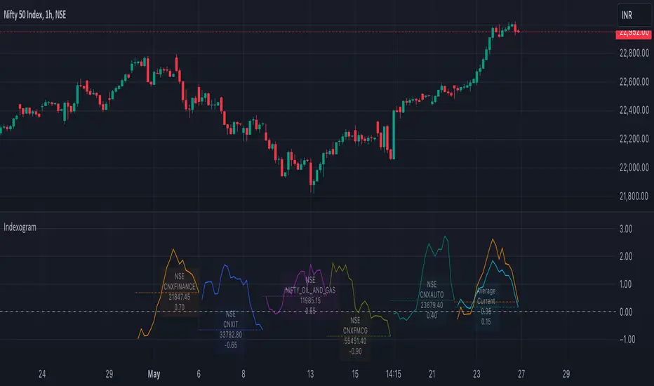
IndexogramIndexogram is a platform designed to help traders analyze the Commitment of Traders (COT) report data. It specifically focuses on the Rate Of Change (ROC) of the COT data, visualized using a unique polyline plotting technique.
Commitments of Traders % Rate Of Change (%ROC):
The COT %ROC indicates the momentum of trader positions over a specified period. This measure is crucial for understanding shifts in market sentiment and potential future price movements.
Unique Polyline Plotting Technique:
Unlike traditional line or bar charts, the polyline plotting technique used in Indexogram offers a more nuanced and detailed view of the %ROC data.
Multiple Ticker Monitoring:
Indexogram allows the setup of up to five different tickers. Traders can assign different weightages to these tickers, enabling a customized and weighted view of their %ROC data. This feature is beneficial for tracking a diversified portfolio or comparing different assets.
Average ROI Plot:
An additional feature is the Average ROI plot, which provides the average return on investment (ROI) of the five selected tickers. This plot helps traders quickly assess the overall performance of their monitored assets.
Strategy for Traders
Diversified Monitoring:
By setting up five different tickers with varying weightages, traders can diversify their monitoring efforts across different assets or markets. This diversification helps in reducing risk and identifying opportunities in different sectors or asset classes.
Weightage Customization:
Assign weightages based on market conditions or personal trading strategy. For example, if a trader believes that commodities are likely to outperform equities in the near term, they can assign a higher weightage to commodities-related tickers.
Analyzing %ROC Trends:
Use the polyline plots to identify significant %ROC trends. A rising %ROC might indicate increasing momentum and a potential buying opportunity, while a falling %ROC could signal decreasing momentum and a potential selling opportunity.
Average ROI Analysis:
Use the Average ROI plot to gauge the overall performance of the selected assets. If the average ROI is positive and trending upwards, it indicates a generally favorable market condition for the monitored assets.
Tactical Adjustments:
Regularly review and adjust the selected tickers and their weightages based on changing market conditions, news, and personal insights. This flexibility allows traders to adapt their strategy in response to new information.
Important Notes:
Indexogram is a tool to identify potential tradings, not a guaranteed predictor of future price movements.
composite_ticker_cleanerLibrary "composite_ticker_cleaner"
Extract a clean symbol from a composite ticker. E.g., (BINANCE:BTCUSD+KRAKEN:BTCUSD)/2 as input will return BTCUSD or BINANCE:BTCUSD
composite_ticker_cleaner_extract_first(symbol, keepexchange)
Extract the first symbol out of the supplied string (usually ticker.standard(syminfo.tickerid) )
Parameters:
symbol : string input string to search in
keepexchange : bool (optional) Keep exchange in the returned ticker? By default, we only return the symbol without the exchange.
Returns: first occurrence of a symbol
composite_ticker_cleaner_extract_first(keepexchange)
Extract the first symbol out of the current tickerid (as provided by ticker.standard(syminfo.tickerid) )
Parameters:
keepexchange : bool (optional) Keep exchange in the returned ticker? By default, we only return the symbol without the exchange.
Returns: first occurrence of a symbol in the current tickerid
This is inspired by the work I did on this indicator:
I needed a similar functionality in another script, so instead of duplicating code, I thought generalizing the process in a library could be helpful for me and others, and will be easier to maintain and upgrade with new features if I need to.
