MMPD @MaxMaserati 2.0The MMPD @MaxMaserati 2.0 is a powerful TradingView indicator (Pine Script v6) designed to reveal institutional price action when paired with MMM 2.0 and MMPB 2.0 as part of the Max Maserati Method (MMM) System. It analyzes momentum across multiple timeframes, helping you understand whether the market is overbought (premium) or oversold (discount). With vibrant candle colors, a consistency table, momentum dots, and renamed lines for clarity, it provides an intuitive way to read market dynamics.
Key Features
Multi-Timeframe Analysis: Evaluates six user-defined timeframes to ensure signal consistency.
Candle Classifications: Colors candles to reflect momentum and institutional activity (e.g., Strong Bullish, Bearish Reversal).
Consistency Table: Displays candle types and market conditions across timeframes with a summary bias.
Momentum Dots: Visual dots indicate alignment strength across momentum, balance, and trend direction.
Premium/Discount Zones: Highlights overbought (red fill) and oversold (green fill) areas.
Renamed Lines: Clear labels like "Momentum Line," "Balance Line," and "Trend Direction Line" for better usability.
Input Parameters
Timeframe Settings: Six timeframes (htf1 to htf6, default: 45s, 1m, 5m, 15m, 60m, daily) for multi-timeframe analysis.
Display Settings:
Use Closed Candle Data: Default true, ensures reliability by using closed candles.
Show Momentum Line: Default true, displays the momentum indicator.
Show Balance Line: Default true, shows the market’s directional balance.
Show Trend Direction Line: Default false, optional trend slope.
Trend Direction Length: Default 10, range 3-50, adjusts trend slope sensitivity.
Show Premium/Discount Fill: Default true, highlights overbought/oversold zones.
Visual Settings: Customize colors (e.g., Bullish Color, Bearish Color) and candle opacity (default 20, range 0-100).
Threshold Settings:
Percentage Threshold: Default 60%, sets minimum strength for bullish/bearish classifications.
Premium Threshold: Default 65, defines overbought zone.
Discount Threshold: Default 35, defines oversold zone.
Core Components
1. Candle Types
MMPD classifies candles based on price action, syncing with MMM 2.0’s structure and MMPB 2.0’s blocks:
Strong Bullish: Institutional buying, often at MMPB eBreaks.
Bullish Resumption: Buyers continuing after a pause, tied to MMM’s C3/C4.
Bullish Reversal: Buyers flipping bearish moves, great at MMPB discount zones.
Weak Bullish: Mild bullishness, confirm with MMM’s PO4.
Bullish Pullback: Buyers resting, a setup for MMM’s resumption.
Strong Bearish: Heavy selling, often at MMPB premium eBlocks.
Bearish Resumption: Sellers pushing on, aligned with MMM’s bearish PO4.
Bearish Reversal: Sellers dominating, great at MMPB premium zones.
Weak Bearish: Soft selling, check MMM’s MC2.
Bearish Pullback: Sellers pausing, potential MMPB short entries.
Neutral: No clear direction, use MMM’s structure.
Trap: Warning of a fake-out, cross-check with MMM.
HVC Bullish: Explosive up-move, align with MMM’s C4.
HVC Bearish: Sharp drop, confirm with MMPB’s bearish blocks.
2. Candle Colors
Colors enhance readability, tying to MMM and MMPB:
Bright Green: Strong Bullish/Resumption—big buying.
Cyan: Bullish Reversal—buyers flipping bearish moves.
Green: Weak Bullish/standard bullish close.
Light Green: Bullish Pullback—buyers pausing.
Magenta: Strong Bearish/Resumption—big selling.
Bright Red: Bearish Reversal—sellers taking over.
Red: Weak Bearish/standard bearish close.
Light Red: Bearish Pullback—sellers resting.
Teal: HVC Bullish—high-energy surge.
Dark Red: HVC Bearish—sharp drop.
Orange: Trap—potential fake-out.
Gray: Neutral—no clear bias.
3. Market Conditions
MMPD flags pricing levels:
Extreme Premium (>90): Overbought, likely reversal.
Premium (65-90): Pricey, cautious longs.
Neutral (35-65): Balanced market.
Discount (10-35): Bargain, buying opportunity.
Extreme Discount (<10): Deeply undervalued.
4. Consistency Table
A top-right table summarizes:
Timeframes: Your six chosen timeframes.
MMPD Type: Candle type, colored to match.
MMPD Level: Premium/discount/neutral, with red/green backgrounds.
Summary: Bias (Bullish, Bearish, Premium, Discount) and action (Cheap, Expensive, Neutral).
5. Visual Elements
Momentum Line: Tracks momentum, colored per candle type
Balance Line: Green (bullish) or magenta (bearish), shows market direction.
Trend Direction Line: Optional, green up, magenta down.
Momentum Dots: Green (bullish) or magenta (bearish) circles:
3 dots (Normal, at 0/100): Strong alignment of momentum, balance, and trend.
2 dots (Small, at 1/99): Moderate alignment.
1 dot (Tiny, at 2/98): Weak alignment.
Premium/Discount Fills: Red (>65), green (<35).
Candles: Custom candles, colored to reflect momentum.
How to Use It
Setup: Add to TradingView with MMM 2.0 and MMPB 2.0. Set timeframes (e.g., 45s to daily), tweak thresholds, and enable visuals.
Read the Table: Look for alignment (5+ timeframes Bullish/Discount or Bearish/Premium).
Summary guides bias and action
Interpret Candles: Bright Green/Cyan for bullish setups, Magenta/Bright Red for bearish, Orange for traps.
Use Dots: Three green dots signal strong bullish alignment; three magenta dots signal bearish alignment.
Combine with MMM/MMPB: MMM for structure, MMPB for entries—MMPD confirms momentum and pricing.
Why It’s Special
Institutional Insight: Spots big-player moves with MMM and MMPB.
Clear Visuals: Dots and renamed lines make momentum easy to read.
Versatile: Works for scalping or swings, across markets.
Protective: Trap signals and premium/discount zones keep you sharp.
Notes
Lag: Uses closed candles by default—pair with MMM for real-time.
Best in Trends: Shines in moving markets, less clear in chop.
Learning Curve: Takes time to sync with MMM and MMPB.
Customize: Adjust inputs for your market.
Final Thought
“Analyze, wait, repeat.” MMPD @MaxMaserati 2.0, with MMM 2.0 and MMPB 2.0, helps you master price action. It’s your guide to seeing the market like the pros.
Built on the Max Maserati Method for educational and trading purposes.
In den Scripts nach " TABLE " suchen

NFP High/Low Levels PlusNFP High/Low Levels Plus
Description:
This indicator stores the 12 most recent NFP (Non-Farm-Payroll) days and their values.
Values are captured from 0830 (NFP Release) until close of market
The High and Low values for each NFP month are drawn on the chart with horizontal lines.
- Labels indicating the month's high or low line are placed after the line
- Optionally the high/low price can be displayed additionally
Support and Resistance boxes can be drawn at the closest NFP level above and below the
current price.
- Boxes will automatically update as prices cross the NFP value
Macro Indicator
- This option displays a small table in the top right corner that says "Up" or " Down"
- The Macro Indicator can be used to judge the potential direction for the current month
- Macro direction is calculated by the following:
- UP: If two consecutive days both open and close above the most recent NFP High level
- DOWN: If two consecutive days both open and close below the most recent NFP Low level
Micro Indicator
- This option displays a small table in the top right corner that says "Up" or " Down"
- The Micro Indicator can be used to judge the potential direction for low timeframes 1H or
lower
- Micro direction is calculated by the following:
- UP: If two consecutive 10m candles close above the 20EMA
- DOWN: If two consecutive 10m candles close below the 20EMA
NFP Session Bars
- This feature draws an arrow at the bottom of the chart for each candle that falls within the
NFP session day
- This is useful for identifying NFP Days
Support / Resistance Table
- This displays a table bottom center showing the nearest high and low NFP line level
What is an NFP Day and why is it useful to add to my chart?
- NFP Days are one of the most important data releases monthly
- NFP (Non-Farm-Payroll) is the official release of 80% of the US workforce employed in
manufacturing, construction, and goods
- It does not include those who work on farms, private households, non-profit and
government workers
- Historically these high/low levels for the day create strong support and resistance levels
- Having them displayed on the chart can help identify potential strong levels and pivot points
Full Indicator with all options enabled and identified
Easily update NFP Release Days in the indicator settings
Modify various options: Show/Hide lines, labels, directional indicator tables, values tables
Adjust line width, offsets, colors, font sizes, box widths
Enable individual Directional Indicators and modify colors
Example of full indicator enabled
You can find a list of the NFP Release Schedule on the official US Bureau of Labor Statistics website. This is useful for updating the indicator settings with the correct dates

TMS By TradeINskiTMS (Trade Management System) By TradeINski
First Things First
- Disclaimer: This indicator will not give any buy or sell signal this is just a supporting tool to improve efficiency in my trading.
- Apply Indicators and then open indicator settings and read the following simultaneously to understand better.
- Default color settings are best suited for light themes. Which is also my personal preference.
Users can change most of the default options in settings according to their personal preference in settings.
- When we open settings we can see 3 tabs that are {Inputs tab} {Style tab} {Visibility tab} each tab have its own options, Understand and use it accordingly.
- Background Color grading that is “Green” background means parameter favorable, “Red” not favorable for my trading, “Nah” and black means no sufficient data for calculation especially IPO stocks and other colors are not just for color grading but also have some significance.
Indicator will be only visible in the intraday time frame as its primary TF is lower time frame.
Contents
Table - Trade Management System
Capital
Risk (%)
Stop Loss (%)
RQBC - Real Time Quantity Based On PDC
%DC - Distance From PDC
RQBL - Real Time Quantity Based On LOD
%DL / %DH - Distance From LOD/ HOD
R_VOL
Markers - Intraday levels
Q - Quantity Based on SL
QL - Quantity Based On LOD
E @ - Entry % Distance From PDC
L1 - Line 1 % Distance From PDC
L2 - Line 2 % Distance From PDC
Low of the Day
Table - Trade Management System
Capital
- Capital is nothing but your account size in number. Default value is 1000000.
- Eg. Capital is 10L then enter 1000000.
{Input Tab}
- “Check Mark” Users can show or hide from the table.
- “Capital” Default “1000000”.
- Color Code of the cell is the default Blue color.
- Note - If Currency is INR then output is in Cr’s and other currency is in thousands K & M for millions.
Risk (%)
- Risk in percentage is the percentage of risk per trade you're willing to take from the deployed capital. Default 0.50%.
- Eg. 10L capital 0.5% Risk (%) ie. 5000 is the risk per trade.
{Input Tab}
- “Check Mark” Users can show or hide from the table.
- “Risk (%)” Default “0.50”.
- Color Code of the cell is the default Blue color.
Stop Loss (%)
- Percentage stop loss willing to take or decided for each specific trade from enter level. Default value is 2%
- Eg. Planned SL for specific trade is 2%.
{Input Tab}
- “Check Mark” Users can show or hide intraday markers.
- “Stop Loss (%)” Default “2%”.
- “Color” Users can change as per their preference. Default color is Red.
RQBC - Real Time Quantity Based On PDC (Previous Day Close)
- Here quantity is calculated real time based on four factors i.e account size, risk (%) and current close and with respect to previous day close. This helps in deciding ideal position size quickly.
- Eg. RQBC is 10 as per Account size, Risk (%), Current close and with respect to Previous day close.
{Input Tab}
- “Check Mark” Users can show or hide from the table.
- “RQBC - Real Time Quantity Based On PDC”. Color code of the cell changes as per % change of the stock i.e Green & Red accordingly.
%DC - Distance From PDC (Previous Day Close)
- This is exact same logic as % change ie. based on two factors which are the previous day close and current close and then % change or move is calculated.
- Eg. Stock has moved 3.5% ie. % change is 3.5%
{Input Tab}
- “Check Mark” Users can show or hide from the table.
- “%DC - Distance from PDC”. Color code of the cell changes as per % change of the stock i.e Green & Red accordingly.
RQBL - Real Time Quantity Based On LOD (Low of the Day)
- Here quantity is calculated realtime based on four factors i.e account size, risk (%) and current close with respect to the low of the day that is today's low. This helps in deciding ideal position size based on the current low of the day quickly.
- Eg. Stock has moved 2.7% from the low of the day which most of the time differs from %DC that is % change.
{Input Tab}
- “Check Mark” Users can show or hide from the table.
- “RQBL - Real Time Quantity Based On LOD”. Color code of the cell changes as per %Change of the stock i.e Green & Red accordingly.
%DL / %DH - Distance From LOD (Low Of The Day) / HOD (High Of The Day)
- This is similar to % change but based on two factors which are the low of the day and current close for %DL that is when %change is positive and when % change is negative %DH is calculated based on current close and high of the day. In both cases, % move is calculated.
- Eg. Stock has moved 3.5% from low of the day then its %DL and for %DH vice versa considering high of the day.
{Input Tab}
- “Check Mark” Users can show or hide from the table.
- “%DL / %DH - Distance from LOD / HOD”. Color code of the cell changes as per % change of the stock i.e Green & Red accordingly.
R_VOL - Relative Volume
- Value shown in terms of percentage, Is how much volume is present today with respect to average volume and average volume period is 50.
- Eg. If R_VOL is less than 100% that means specific day volume is less than average volume and if RVOL is more than average volume then specific day volume is more than average volume.
{Inputs Tab}
- “Check Mark” Users can show or hide from the table.
- “R_VOL” Period “50” - Users have the option to choose accordingly.
- “Op” Means output “Drop down” User can choose between complete & Percentage only Play around to notice the difference.
{Note}
- The Following settings for the complete table.
- Position “Drop Down”. Users can choose accordingly.
- Size “Drop Down”. Users can choose accordingly.
MARKER - INTRADAY LEVELS
{Note}
- The Following settings are for all the intraday markers .
- “Line Type” “Drop Down”. Users can choose accordingly.
- Width ”↕” “1”. Mini = 1 & Max = 4. Users can choose accordingly.
- Label Size “Drop Down”. Users can choose accordingly.
Q - Quantity Based On SL (Stop Loss)
- Here Quantity is calculated based on four factors and marked on an intraday time frame and those factors are capital, Risk (%), Stop loss (%) and E @ ie. Entry level. Objective is based on different factors determining ideal position size quickly.
- Eg. Q is 25 based on capital, Risk(%), Stop loss (%) & Entry (%) Ie E @.
{Inputs Tab}
“Check Mark” Users can show or hide intraday markers.
“Q - Quantity Based On SL”. Color of the marker can be changed from the color settings of E @.
{Output}
- “Q - 25” is marked on E @ - Entry % Distance From PDC.
- Marker is colored green by default.
QL - Quantity Based On LOD (Low Of The Day)
- Here Quantity is calculated based on four factors and marked on an intraday time frame and those factors are capital, Risk (%), LOD ie. low of the day and E @ ie. Entry level. Objective is based on different factors determining ideal position size.
- Eg. Q is 25 based on capital, Risk(%), LOD & Entry (%) Ie E @.
{Inputs Tab}
- “Check Mark” Users can show or hide intraday markers.
- “Q - Quantity Based On LOD”. Color of the marker can be changed from the color settings of E @.
{Output}
- “QL - 25” is marked on E @ - Entry %Distance From PDC.
- Marker is colored green by default.
E @ - Entry % Distance From PDC (Previous Day Close)
- Here Entry Price Level is determined and marked, that is how far from previous day close in percentage that is nothing but saying after how much % change you're willing to enter.
- Eg. Enter after 2% Move then the marker shows its price along with “Q” & “QL”.
{Inputs Tab}
- “Check Mark” Users can show or hide intraday markers.
- E - Entry % Distance From PDC.
- “E @ - Entry (%)” Default “2”. Users have the option to change accordingly.
- “Green Color”. Users can choose as per their preference.
{Output}
- “E @ ” “Default 2%” : “Price” / “Q - ” Calculated Quantity based on SL / “QL - “ Calculated quantity based on LOD. Green Color Label.
L1 - Line 1 % DIstance from PDC (Previous Day Close)
- Here Line 1 is the level which is determined by how far from previous day close in percentage that is nothing but saying at what % change the marker should be shown. This acts as a visual support level. Logic is in the live market the price is nearing the entry level and be vigilant to take action.
- Eg. Support level is 1.5% that is 1.5% away from PDC.
{Inputs Tab}
- “Check Mark” Users can show or hide intraday markers.
- L1 - Line 1 % Distance From PDC.
- “L1 - Line 1 (%)” Default “1.5”. Users have the option to change accordingly.
- “Gray Color”. Users can choose as per their preference.
{Output}
- “L1” “Default 1.5%” : “Price”. Gray Color label.
L2 - Line 2 % Distance from PDC (Previous Day Close)
- Here Line 2 is the level which is determined by how far from previous day close in percentage that is nothing but saying at what % change the marker should be shown. This acts as a visual support level. Logic is in the live market the price is nearing the entry level and be vigilant to take action.
- Eg. Support level is 1% that is 1% away from PDC.
{Inputs Tab}
- “Check Mark” Users can show or hide intraday markers.
- L2 - Line 2 % Distance From PDC.
- “L2 - Line 2 (%)” Default “1.5”. Users have the option to change accordingly.
- “Gray Color”. Users can choose as per their preference.
{Output}
- “L2” “Default 1%” : “Price”. Gray Color label.
Low Of The Day
- Here the current low of the day is marked and its price is shown in the intraday label.
Eg. Stock low of the day is 100 then it marks 100.
{Inputs Tab}
- “Check Mark” Users can show or hide intraday markers.
- Low Of the Day
- “Fuchsia Color”. Users can choose as per their preference.
{Output}
- “LOD” : “Price”. Fuchsia Color label.

Overbought / Oversold Screener## Introduction
**The Versatile RSI and Stochastic Multi-Symbol Screener**
**Unlock a wealth of trading opportunities with this customizable screener, designed to pinpoint potential overbought and oversold conditions across 17 symbols, with alert support!**
## Description
This screener is suitable for tracking multiple instruments continuously.
With the screener, you can see the instant RSI or Stochastic values of the instruments you are tracking, and easily catch the moments when they are overbought / oversold according to your settings.
The purpose of the screener is to facilitate the continuous tracking of multiple instruments. The user can track up to 17 different instruments in different time intervals. If they wish, they can set an alarm and learn overbought oversold according to the values they set for the time interval of the instruments they are tracking.**
Key Features:
Comprehensive Analysis:
Monitors RSI and Stochastic values for 17 symbols simultaneously.
Automatically includes the current chart's symbol for seamless integration.
Supports multiple timeframes to uncover trends across different time horizons.
Personalized Insights:
Adjust overbought and oversold thresholds to align with your trading strategy.
Sort results by symbol, RSI, or Stochastic values to prioritize your analysis.
Choose between Automatic, Dark, or Light mode for optimal viewing comfort.
Dynamic Visual Cues:
Instantly highlights oversold and overbought symbols based on threshold levels.
Timely Alerts:
Stay informed of potential trading opportunities with alerts for multiple oversold or overbought symbols.
## Settings
### Display
**Timeframe**
The screener displays the values according to the selected timeframe. The default timeframe is "Chart". For example, if the timeframe is set to "15m" here, the screener will show the RSI and stochastic values for the 15-minute chart.
** Theme **
This setting is for changing the theme of the screener. You can set the theme to "Automatic", "Dark", or "Light", with "Automatic" being the default value. When the "Automatic" theme is selected, the screener appearance will also be automatically updated when you enable or disable dark mode from the TradingView settings.
** Position **
This option is for setting the position of the table on the chart. The default setting is "middle right". The available options are (top, middle, bottom)-(left, center, right).
** Sort By **
This option is for changing the sorting order of the table. The default setting is "RSI Descending". The available options are (Symbol, RSI, Stoch)-(Ascending, Descending).
It is important to note that the overbought and oversold coloring of the symbols may also change when the sorting order is changed. If RSI is selected as the sorting order, the symbols will be colored according to the overbought and oversold threshold values specified for RSI. Similarly, if Stoch is selected as the sorting order, the symbols will be colored according to the overbought and oversold threshold values specified for Stoch.
From this perspective, you can also think of the sorting order as a change in the main indicator.
### RSI / Stochastic
This area is for selecting the parameters of the RSI and stochastic indicators. You can adjust the values for "length", "overbought", and "oversold" for both indicators according to your needs. The screener will perform all RSI and stochastic calculations according to these settings. All coloring in the table will also be according to the overbought and oversold values in these settings.
### Symbols
The symbols to be tracked in the table are selected from here. Up to 16 symbols can be selected from here. Since the symbol in the chart is automatically added to the table, there will always be at least 1 symbol in the table. Note that the symbol in the chart is shown in the table with "(C)". For example, if SPX is open in the chart, it is shown as SPX(C) in the table.
## Alerts
The screener is capable of notifying you with an alarm if multiple symbols are overbought or oversold according to the values you specify along with the desired timeframe. This way, you can instantly learn if multiple symbols are overbought or oversold with one alarm, saving you time.

[ADOL_]Trend_Oscillators_MTF
ENG) Trend_Oscillator_MTF
introduction)
This is a trend analyzer implemented in the form of an oscillator.
An oscillator is a technical analysis tool that identifies the direction of market trends and determines the time period. Making it an oscillator means creating range. By setting the upper and lower limits like this, the unlimited expansion area that can appear on the chart is limited. As a limited area is created, we can identify oversold and overbought areas, which is good for checking momentum.
Through oscillatorization, you can find overbought, oversold, and current trend areas.
It adopts MTF and is a simple but functional indicator.
To use multiple time frames, use the timeframe.multiplier function.
A table was created using the table.new function, and various information windows were installed on the right side of the chart.
I hope this can be a destination for many travelers looking for good landmarks.
- 8 types of moving averages can be selected (in addition to independently developed moving averages), trend area display, signal display, up to 3 multi-time chart overlapping functions, information table display, volatility and whipsaw search, and alerts are possible.
- You can set various time zones in Timeframe. With three timeframes, you can check the conditions overlapping time at a glance.
principle)
Set up two moving averages with different speeds and make the relative difference.
Create the speed difference between the two moving averages using methods such as over = crossover(fast, slow) and under = crossunder(fast, slow).
The point at which the difference in relative speed decreases is where the possibility of inflection is high. Through the cross code, you can find out when the speed difference becomes 0.
Simply crossing the moving average is easy. To fine-tune the speed difference, it is necessary to re-establish the relationship between functions.
Painting the green and red areas is designed to be painted when the three time frames overlap.
Using the code of fill(fast, slow, color = fast>= slow? color.green: color.red, transp = 80, title = "fillcolor")
You can color and distinguish areas.
MA: You can select the MA_type. This is a necessary option because the profit/loss ratio for each item varies depending on the type of moving average.
Start: The starting value to set the oscillator range.
End: This is the last value to set the oscillator range.
Lenght: This is the number of candles used to calculate the calculation formula in the oscillator.
Timeframe: Set the time to overlap with up to 3 time frames.
repaint: You can choose whether to apply repaint. The default is OFF.
The coding for repaint settings for the indicator was written using the recommended method recommended by TradingView.
reference :
security(syminfo.tickerid, tf, src)
Trading method)
With the Multi-Time-Frame (MTF) function, the time zone set in the indicator is displayed the same in any chart time zone.
The repaint problem that occurred when using MTF was resolved by referring to TradingView's recommended code.
User can decide whether to repaint or not. The default is OFF.
- signal
Buy and Sell signals are displayed when there are 3 stacks. Even if there is no triple overlap, you can decide to buy or sell at the point where the short-term line and long-term line intersect.
Entry is determined through Buy and Sell signals, and exit is determined through BL (BuyLoss) and SL (SellLoss).
BL and SL can also be applied as entry.
You can judge overlap by the color of the lines. When two conditions overlap, it is orange, and when one condition overlaps, it is blue.
- Divergence
Divergence is a signal that arises from a discrepancy between the oscillator and the actual price.
Divergence can be identified because the range is set with conditions that have upper and lower limits.
- trend line
As shown in the picture, draw a downward trend line connecting the high points in the same area.
As shown in the picture, an upward trend line is drawn connecting the low points in the same area.
It can be used to view trend line breakout points that candles cannot display.
- Find a property for sale by amplitude
When the low point in the red area and the high point in the green area occur, the difference is regarded as one amplitude and the range is set.
Here, one amplitude becomes a pattern value that can go up or down, and this pattern value acts as support/resistance. It was developed in a unique way that is different from traditional methods and has a high standard of accuracy. This works best when using that indicator. Use 1, 2, 3, or 4 multiples of the amplitude range.
A multiple of 2 is a position with a high probability of a retracement.
- Whipsaw & volatility search section
Whipsaw refers to a trick that causes frequent trading in a convergence zone or confuses the trend in the opposite direction before it occurs. Whip saws are usually seen as having technical limitations that are difficult to overcome.
To overcome this problem, the indicator was created to define a section where whipsaw and volatility can appear. If a whipsaw & volatility indicator section occurs, a big move may occur later.
Alert)
Buy, Sell, BuyLoss, SellLoss, Whipsaw alert
Disclaimer)
Scripts are for informational and educational purposes only. Use of the script does not constitute professional and/or financial advice. You are solely responsible for evaluating the risks associated with your script output and use of the script.
KOR) 트렌드_오실레이터_MTF
소개)
이것은 오실레이터 형태로 구현된 트렌드 분석기 입니다.
오실레이터는 시장의 추세방향을 확인하고 기간을 결정하는 기술적 분석 도구입니다. 오실레이터로 만드는 것은 범위가 생기는 것을 의미합니다. 이렇게 상한과 하한을 정함으로써, 차트에서 나타날 수 있는 무제한적인 확장영역이 제한됩니다. 제한된 영역이 만들어짐에 따라 우리는 과매도와 과매수 구간을 식별할 수 있게 되며, 모멘텀을 확인하기 좋습니다.
오실레이터화를 통해, 과매수와 과매도, 현재의 트렌드 영역을 잘 찾을 수 있습니다.
MTF를 채택했으며, 단순하지만, 기능적으로 훌륭한 지표입니다.
멀티타임프레임을 사용하기 위해 timeframe.multiplier 함수를 사용합니다.
table.new 함수를 사용하여 table을 만들고, 차트 우측에 여러가지 정보창을 갖췄습니다.
좋은 지표를 찾는 많은 여행자들에게 이곳이 종착지가 될 수 있기를 바랍니다.
- 이평선 종류 8종 선택(독자적으로 개발한 이평선 추가), 추세영역표시, 시그널 표기, 최대 3개 멀티타임차트 중첩기능, 정보테이블 표시, 변동성과 휩쏘찾기, 얼러트가 가능합니다.
- Timeframe에서 다양한 시간대를 설정할 수 있습니다. 3개의 Timeframe을 통해 시간을 중첩한 조건을 한눈에 확인할 수 있습니다.
원리)
속도가 다른 두 개의 이평선을 설정하고 상대적인 차이를 만듭니다.
over = crossover(fast, slow) , under = crossunder(fast, slow) 와 같은 방법으로 두개의 이평선의 속도차이를 만듭니다.
상대적 속도의 차이가 줄어드는 시점은 변곡의 가능성이 높은 자리입니다. cross code를 통해 속도차가 0이 되는 시점을 알 수 있습니다.
단순히 이평선을 교차하는 것은 쉽습니다. 세밀하게 속도차이를 조정하는데 함수간의 관계를 다시 설정할 필요가 있습니다.
초록색과 빨간색의 영역을 칠하는 것은 3가지 타임프레임이 중첩될 때 칠하도록 만들어졌습니다.
fill(fast, slow, color = fast>= slow? color.green: color.red, transp = 80, title = "fillcolor") 의 코드를 사용하여
영역을 색칠하고 구분할 수 있습니다.
MA : MA_유형을 선택할 수 있습니다. 이평선의 종류에 따라 종목당 손익비가 달라지므로 꼭 필요한 옵션입니다.
Start : 오실레이터 범위를 설정할 시작값입니다.
End : 오실레이터 범위를 설정할 마지막값입니다.
Lenght : 오실레이터에서 계산식을 산출하기 위한 캔들의 개수입니다.
Timeframe : 최대 3개의 타임프레임으로 중첩할 시간을 설정합니다.
repaint : 리페인팅을 적용할지 선택할 수 있습니다. 기본값은 OFF 입니다.
해당 지표의 리페인트 설정에 관한 코딩은 트레이딩뷰에서 권장하는 추천 방법으로 작성되었습니다.
참고 :
security(syminfo.tickerid, tf, src)
매매방법)
Multi-Time-Frame(MTF) 기능으로 지표에서 설정한 시간대가 어느 차트 시간대에서나 동일하게 표시됩니다.
MTF 사용시 발생하는 리페인트 문제는 트레이딩뷰의 권장코드를 참고하여 해결했습니다.
사용자가 리페인트 여부를 결정할 수 있습니다. 기본값은 OFF 입니다.
- 시그널
시그널의 Buy와 Sell은 3중첩일 경우 표시됩니다. 3중첩이 아니라도 단기선과 장기선이 교차되는 시점에서 매매를 결정할 수 있습니다.
Buy와 Sell 시그널에서 진입을 결정하고 BL(BuyLoss)와 SL(SellLoss) 에서 exit를 결정합니다.
BL과 SL을 진입으로 응용할 수도 있습니다.
라인의 컬러로 중첩을 판단할 수 있습니다. 2개의 조건이 중첩되면 오렌지, 1개의 조건이 중첩되면 블루컬러입니다.
- 다이버전스
다이버전스는 오실레이터와 실제 가격의 불일치에서 발생하는 신호입니다.
상한과 하한이 있는 조건으로 범위를 설정하였기 때문에 다이버전스를 식별가능합니다.
- 추세선
그림과 같이 같은 영역의 고점을 이어 하락추세선을 긋습니다.
그림과 같이 같은 영역의 저점을 이어 상승추세선을 긋습니다.
캔들이 표시할 수 없는 추세선돌파 지점을 볼 수 있게 활용가능합니다.
- 진폭으로 매물대 찾기
빨간색 영역의 저점과 초록색 영역의 고점이 발생할 때, 그 차이를 하나의 진폭으로 보고 범위를 설정합니다.
여기서 하나의 진폭은 위나 아래로 갈 수 있는 패턴값이 되며, 이 패턴값은 지지/저항으로 작용합니다. 전통적인 방식에 없는 독창적인 방식으로 개발된 것으로 정확성 높은 기준입니다. 이것은 해당 지표를 사용할 때 가장 잘 맞습니다. 진폭 범위의 1배수,2배수,3배수,4배수 자리를 사용합니다.
2배수 자리는 다시 돌아오는 되돌림 확률이 높은 위치입니다.
- 휩쏘&변동성 찾기 구간
휩쏘는 수렴구간에서 잦은 매매를 유발하거나, 추세가 발생하기 전에 반대방향으로 혼란을 주는 속임수를 의미합니다. 휩쏘는 보통 극복하기 어려운 기술적 한계로 여겨집니다.
해당지표에서는 이를 극복하기 위해 휩쏘와 변동성이 나타날 수 있는 구간을 정의하도록 만들었습니다. 휩쏘&변동성 표시 구간이 발생하면 이후 큰 움직임이 발생할 수 있습니다.
얼러트)
Buy, Sell, BuyLoss, SellLoss, Whipsaw alert
면책조항)
스크립트는 정보 제공 및 교육 목적으로만 사용됩니다. 스크립트의 사용은 전문적 및/또는 재정적 조언으로 간주되지 않습니다. 스크립트 출력 및 스크립트 사용과 관련된 위험을 평가하는 책임은 전적으로 귀하에게 있습니다.
Crypto Map Dashboard v1.0🔰Overview
Charts are an essential part of working with data, as they are a way to condense large amounts of data into an easy to understand format. Visualizations of data can bring out insights to someone looking at the data for the first time, as well as convey findings to others who won’t see the raw data. There are countless chart types out there, each with different use cases. Often, the most difficult part of creating a data visualization is figuring out which chart type is best for the task at hand.
What are the types of metrics, features, or other variables that you plan on plotting? Although it depended on some multiple factors!
But my choices of the chart type for this Crypto datas was Pie chart or Donut char for crypto dominances ,and Colum (Bar) chart for Total MarketCaps .
The audiences that I plan on presenting this for them could be all tradingviewrs , especially crypto lovers ,or those who just aim to have an initial exploration for themselves ,like me!
so this indicator mostly could be an educational indicator script for pine coders !
We can use the " Crypto Map Dashboard " indicator to Get an quick overview of the crypto market and monitor where the smart money Flow changing by comparing the dominances and totals Caps .
In general, it consists of 4 parts:
✅1 =>> Table1 : If you like to see and compare and monitor the changes of dominances of (Bitcoin, Ethereum, Usdt , Usdc , etc.) and their market cap in different times you can see the table on The upper-right corner.
✅2 =>> Table2: Also, in the table lower-right corner, you can see the changes of the totals(Total, Total2 , Total3 and TotalDefi) in the same time periods.
✅3 =>> pie chart or donut chart: By viewing this , you understand better about Table1 Datas, that it depicts exactly how Dominance is distributed and specialized.
✅4 =>> column chart (bar chart) : And in the last you can clearly compare the total marketcaps and see how far they are from their ATHs.
You also can even notice the entry and exit of liquidity from the crypto market!
I must also mention that I am definitely still a beginner compared to more experienced pine coders, and there may be some bugs in my codes and calculations, but I am an open person and I welcome your comments ,Also Let me know if you have any questions.
Lots of Love to all tradingviewers and pineCoder ,Cheers!💚❤️💙

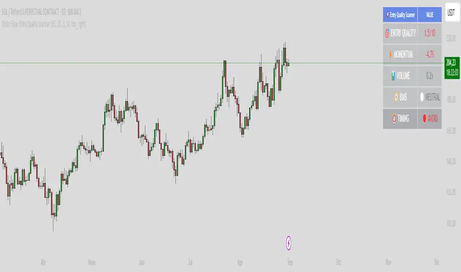
Order Flow Entry Quality ScannerOrder Flow Entry Quality Scanner
The order flow entry quality scanner is an educational technical analysis indicator designed to help traders evaluate the quality of potential entry points based on multiple technical factors. This indicator combines momentum, volume, delta analysis, and trend evaluation to provide an objective scoring system for market conditions.
Key Features
Comprehensive scoring system (0-10)
- momentum analysis: Evaluates price acceleration over recent bars
- volume delta: Measures buying vs selling pressure
- volume analysis: Compares current volume with historical averages
- vwap position: Determines price position relative to vwap
Advanced filters
- rsi filter: Optional to avoid overbought/oversold conditions
- value area filter: Helps identify fair price zones
- confluence analysis: Detects when multiple factors align
Clear visualization
- information table: Shows key metrics in real-time
- color coding: Intuitive system (green=favorable, yellow=caution, red=avoid)
- timing signals: Indicates when to consider, wait, or avoid entries
Configurable Parameters
Main configuration
- signal sensitivity (0-100): Adjusts overall scanner sensitivity
- volume periods(5-50): Defines period for volume analysis
- momentum bar (2-10): Number of bars for momentum calculation
Advanced filters
- rsi filter: Enable/disable rsi filtering
- rsi period (5-30): rsi period configuration
- value area filter: Enable value area analysis
Visual options
- show table: Enable/disable information table
- table position: Select chart location
Technical Calculations
Delta analysis
Calculates the difference between bullish and bearish volume based on tick direction to estimate buying/selling pressure.
Momentum acceleration
Measures the rate of price change over a specific period to identify acceleration or deceleration in movement.
Relative volume
Compares current volume with moving average to identify unusual activity.
Price efficiency
Evaluates how efficiently price moves within the bar's range.
Alert System
The indicator includes alerts for:
- High-quality bullish entries
- High-quality bearish entries
- Bullish factor confluence
- Bearish factor confluence
Recommended Usage
This indicator is an educational tool for technical analysis. It does not constitute financial advice nor guarantees results. Users should:
- Use it as part of a broader trading strategy
- Combine with other analysis methods
- Practice proper risk management
- Perform backtesting before live use
- Consider market conditions and fundamental news
Disclaimer
- educational purposes only: This indicator is designed for technical analysis learning
- no guarantees: Past results do not guarantee future performance
- risk warning: Trading involves risk of capital loss
- own decision: Trading decisions are solely the user's responsibility
- complementary analysis: Should be used alongside other analysis methods
- Works on all timeframes
- Compatible with all financial instruments
Always remember to do your own research and consult with financial professionals before making investment decisions.
Extended CANSLIM Indicator❖ Extended CANSLIM Indicator.
The Extended CANSLIM indicator is an indicator that concentrates all the tools usually used by CANSLIM traders.
It shows a table where all the stock fundamental information is shown at once first for the last quarter and then up to 5 years back.
The fundamental data is checked against well known CANSLIM validation criteria and is shown over 4 state levels.
1. Good = Value is CANSLIM Compliant.
2. Acceptable = Value is not CANSLIM compliant but still good. value is shown with a lighter background color.
3. Warning = Value deserves special attention. Value is shown over orange background color.
3. Stop = Value is non CANSLIM compliant or indicates a stop trading condition. Value is shown over red background color.
The indicator has also a set of technical tools calculated on price or index and shown directly on the chart.
❖ Fundamental data shown in the table.
The table is arranged in 4 sets of data:
1. Table Header, showing Indicator and Company data.
2. CANSLIM.
3. 3Rs: RS Rating, Revenue and ROE.
4. Extra Data: Piotroski score, ATR, Trend Days, D to E, Avg Vol and Vol today.
Sets 3 and 4 can be hidden from the table.
❖ Indicator and Compay Data.
The table header shows, Indicator name and version.
It then displays Company Name, sector and industry, human size and its capitalization.
❖ CANSLIM Data.
Displays either genuine CANSLIM data from TradinView or custom data as best effort when that data cannot be obtained in TV.
C = EPS diluted growth, Quarterly YoY.
>= 25% = Good, >= 0% = Acceptable, < 0% = Stop
A = EPS diluted growth, Annual YoY.
>= 25% = Good, >= 0% = Acceptable, < 0% = Stop
N = New High as best effort (Cust).
Always Good
S = Float shares as best effort.
Always Good
L = One year performance relative to S&P 500 (Cust),
Positive : 0% .. 50% = Neutral, 50%+ = Leader, 80%+ = Leader+, 100%+ = Leader++
Negative : 0% .. -10% = Laggard, -10% .. -30% = Laggard+, -30%+ = Laggard++
>= 50% = Good, >= 0% = Acceptable, >= -10% Warning, < -10% = Stop
I = Accumulation/Distribution days over last 25 days as a clue for institutional support (Cust).
A delta is calculated by subtracting Distribution to Accumulation days.
> 0 = Good, = 0 = Acceptable, < 0 = Warning, < -5 = Stop
M = Market direction and exposure measured on S&500 closing between averages (Cust).
Varies from 0% Full Bear to 100% Full Bull
>= 80% = Good, >= 60% = Acceptable, >= 40% = Warning, < 40% = Stop
❖ Extra non CANSLIM Data.
RS = RS Rating.
>= 90 = Good, >= 80 = Accept, >= 50 = Warning, < 50 = Stop
Rev. = Revenue Growth Quarterly YoY.
>= 0% = Good, <0% = Stop
ROE = Return on Equity, Quarterly YoY.
>= 17% = Good, >= 0% = Acceptable, < 0% = Stop
Piotr. = Piotroski Score, www.investopedia.com (TV)
>= 7 = Good, >= 4 = Acceptable, < 4 = Stop
ATR = Average True Range over the last 20 days (Cust).
0% - 2% = Acceptable, 2% - 4% = Ideal, 4% - 6% = Warning, 5%+ = Stop.
Trend Days = Days since EMA150 is over EMA200 (Cust).
Always Good
D. to E. = Days left before Earnings. Maybe not a good idea buying just before earnings (Cust).
>= 28 = Good, >= 21 = Acceptable, >= 14 = Warning, < 14 = Stop
Avg Vol. = 50d Average Volume (Cust).
>= 100K = Good, < 100K = Acceptable
Vol. Today = Today's percentage volume compared to 50d average (Cust).
Always Good.
❖ Historical Data.
Optionally selectable historical data can be displayed for C, A, Revenue and ROE up to 20 quarters if available.
Quarterly numbers can also be displayed for A, C and Revenue.
Information can be shown in Chronological or Reverse Chronological order (default).
Increasing growth quarters are shown in white, while diminuing ones are shown in Yellow.
Transition from Losing to Profitable quarters are shown with an exclamation mark ‘!’
Finally, losing quarters are shown between parenthesis.
❖ MAs on chart.
Displays 200, 100, 50 and 20 days MAs on chart.
The MAs are also automatically scaled in the 1W time frame.
❖ New 52 Week High on chart.
A sun is shown on the chart the first time that a new 52 week high is reached.
The N cell shows a filled sun when a 52 week high is no older than a month, an lighter sun when it’s no older than a quarter or a moon otherwise.
❖ Pocket Pivots on chart.
Small triangles below the price are signaling pocket pivots.
❖ Bases on chart, formerly Darvas Boxes.
Draw bases as defined by Darvas boxes, both top or bottom of bases can be selected to be shown in order to only show resistance or support.
❖ Market exposure/direction indicator.
When charting S&P500 (SPX), Nasdaq 100 Index (NDX), Nasdaq composite (IXIC) or Dow Jownes Index (DJIA), the indicator switches to Market Exposure indicator, showing also Accumulation/Distribution days when volume information is available. This indication which varies from 0% to 100% is what is shown under the M letter in the CANSLIM table which is calculated on the S&P500.
❖ Follow Through Days indicator.
If you are an adept of the Low-cheat entry, then you will be highly interested by the Follow Through days indicator as measured in the S&P 500 and shown as diamonds on the chart.
The follow-through days are calculated on S&P500 but shown in current stock chart so you don’t need to chart the S&P 500 to know that a follow through day occurred.
Follow Through days show correctly on Daily time frame and most are also shown on the Weekly time frame as well.
They are also classified according to the market zone in which they occur:
0%-5% from peak = Pullback : FT day is not shown.
5%-10% from peak = Minor Correction : Minor FT days is shown.
10%-20% from peak = Correction : Intermediate FT days us shown
20+% from peak = Bear Market : Makor FT days is shown
❖ RS Line and Rating indicator.
A RS Line and Rating indicator can be added to the chart.
Relative Strength Rating Accuracy.
Please note that the RS Rating is not 100% accurate when compared to IBD values.
❖ Earning Line indicator.
An Earning Line indicator can be added to the chart.
❖ ATR Bands and ATR Trade calculator.
The motivation for this calculator came from my own need to enter trades on volatile stocks where the simple 7% Stop Loss rule doest not work.
It simply calculates the number of shares you can buy at any moment based on current stock price and using the lower ATR band as a stop loss.
A few words about the ATR Bands.
On this indicator the ATR bands are not drawn as a classical channel that follows the price.
The lower band is drawn as a support until it’s broken on a closing basis. It can’t be in a down trend.
The upper band is drawn as a resistance until it’s broken on a closing basis. It can’t be in an up trend.
The idea is that when price starts to fall down from a peak, it should not violate its lower band ATR and that means that we can use that level as a Stop Loss.
You must look back for the stock volatility and find out which ATR multiplier works well meaning that the ATR bands are not violated on normal pullbacks. By default, the indicator uses 5x multiplier.
❖ Extra things, visual features and default settings.
The first square cell of current quarter displays a check mark ‘V’ if the CANSLIM criteria is OK or acceptable or a cross ‘X’ otherwise.
The first square cell of historical C and Rev show respectively the count of last consecutive positive quarters.
There are different color themes from “Forest” to “Space” you can chose from to best fit your eyes.
You also have different table sizes going from “Micro” to “Huge” for better adjustment to the size of your display.
The default settings view show: Pocket Pivots, FT Days, MA50, RS Line and ATR Bands.
That's all, Enjoy!

📊 The Final Masterpiece (Sorted Columns)This script, written in Pine Script (version 5), is a TradingView indicator designed to create a portfolio dashboard directly on the chart. Its main purpose is to monitor the performance of up to four different stocks in real-time.
Here is a detailed description of its features:
Main Functionality
The script creates a floating table on the chart that summarizes the key information of a stock portfolio. This table is not anchored to a specific bar but remains in a fixed position chosen by the user.
Sections and Settings
1. Global Settings:
Available Cash: Allows you to enter an amount of available cash.
Capital Gain Tax (%): Lets you set a percentage for capital gains tax, which will be used to calculate the net profit/loss.
Table Position: Provides a drop-down menu to place the table in one of the nine available positions on the chart (e.g., top right, bottom center, etc.).
2. Color Settings:
This section offers extensive customization for the table's appearance.
You can change the background and text colors for the headers, data rows, and the totals row.
It also allows you to define specific colors to highlight profits (green) and losses (red) and to adjust their transparency.
3. Inputs for each Stock:
The script is pre-configured to handle up to four stocks.
For each stock, the user can:
Enable or disable its display in the table using a toggle (🟢 Enable Stock).
Enter the Ticker (e.g., "AAPL", "MSFT") to retrieve the real-time price.
Specify a descriptive name (e.g., "Apple").
Enter the quantity of shares owned and the buy price.
Define buy and sell commissions, both fixed and as a percentage.
Choose a background color for that specific stock's row.
How It Works
1. Price Retrieval:
It uses the request.security() function to get the daily ("D") closing price for each of the entered tickers. This function allows loading data from other symbols or timeframes different from the one currently displayed on the chart.
2. Financial Calculations:
The script performs a series of calculations for each enabled stock:
Position Cost: Calculates the total cost of the investment, including purchase commissions.
Current Value: Multiplies the number of shares by the current market price.
Gross Profit/Loss (P/L): The difference between the current value and the position cost, after deducting selling commissions.
Net Profit/Loss (Net P/L): Applies the capital gains tax (set in the global settings) only if there is a profit.
Return on Investment (ROI %): Calculates the net profit/loss as a percentage of the total position cost.
3. Table Creation and Management:
The table is created using table.new().
All calculations and table updates are performed only on the last bar of the chart (if barstate.islast). This optimizes the script's performance by preventing it from recalculating and redrawing the table on every historical bar.
The table is populated dynamically: only the rows for stocks that have been enabled by the user are displayed.
The cells for "Net P/L" and "ROI %" are colored green or red depending on whether the value is positive or negative.
Finally, a totals row is added, summarizing the total cost, total value, total net P/L, and total ROI of the portfolio. This row also displays the available cash entered by the user.
In summary, "The Final Masterpiece" is a customizable portfolio indicator that provides a clear and immediate overview of one's stock positions directly on TradingView, calculating costs, values, profits, and returns in real-time while accounting for commissions and taxes.

Straddle Charts - Live (Enhanced)Track options straddles with ease using the Straddle Charts - Live (Enhanced) indicator! Originally inspired by @mudraminer, this Pine Script v5 tool visualizes live call, put, and straddle prices for instruments like BANKNIFTY. Plotting call (green), put (red), and straddle (black) prices in a separate pane, it offers real-time insights for straddle strategy traders.
Key Features:
Live Data: Fetches 1-minute (customizable) option prices with error handling for invalid symbols.
Price Table: Displays call, put, straddle prices, and percentage change in a top-left table.
Volatility Alerts: Highlights bars with straddle price changes above a user-defined threshold (default 5%) with a yellow background and concise % labels.
Robust Design: Prevents plot errors with na checks and provides clear error messages.
How to Use: Input your call/put option symbols (e.g., NSE:NIFTY250814C24700), set the timeframe, and adjust the volatility threshold. Monitor straddle costs and volatility for informed trading decisions.
Perfect for options traders seeking a simple, reliable tool to track straddle performance. Check it out and share your feedback!

kaka-Buff横盘系统与CVD和LVP
作用:此指标用于识别市场横盘(震荡)区间,检测累积成交量差额(CVD)背离(基于分形和参考方法),并标记基于大成交量K线的关键价格水平(Large Volume Price, LVP)。它通过结合横盘信号、成交量背离和关键价格水平,帮助交易者识别潜在的趋势反转或延续。指标还绘制可自定义的指数移动平均线(EMA)以辅助趋势分析。主要功能:横盘检测:使用EMA标准差(STD)、平均真实波幅(ATR)、平均方向指数(ADX)和布林带宽度(BB宽度)识别低波动性的横盘区间。
分形CVD背离:通过分形枢轴点和成交量差额计算,检测看涨(“+RD”)和看跌(“-RD”)背离,以标签形式显示在图表上。
参考CVD背离:在成交量分布区域(VAH、VAL、POC)内识别简单的CVD背离(基于价格和成交量差额高/低点),以绿色/红色三角形显示。
大成交量价格(LVP):在回看周期(可自主设置长度)内标记最大成交量K线的最高/最低价,绘制线和标签,指示关键支撑/阻力位。
EMA线:绘制20、50、100和200周期的EMA,带开关控制和可自定义颜色,用于趋势可视化。
表格:以可自定义的表格(字体大小/颜色均可调节)显示横盘指标(EMA STD、ATR、ADX、BB宽度)和整体横盘状态。
警报:提供横盘进入/退出、分形CVD背离、参考CVD背离和LVP价格突破的警报。
Consolidation System with CVD and LVP
Purpose: This indicator identifies market consolidation zones, detects Cumulative Volume Delta (CVD) divergences (both fractal-based and reference-based), and marks significant price levels based on large volume bars (Large Volume Price, LVP). It helps traders identify potential trend reversals or continuations by combining consolidation signals, volume-based divergence, and key price levels. The indicator also plots customizable Exponential Moving Averages (EMAs) to aid in trend analysis.Key Features:Consolidation Detection: Uses EMA Standard Deviation (STD), Average True Range (ATR), Average Directional Index (ADX), and Bollinger Bands (BB) width to identify low-volatility consolidation zones.
Fractal CVD Divergence: Detects bullish ("+RD") and bearish ("-RD") divergences using fractal pivot points and a volume delta calculation, displayed as labels on the chart.
Reference CVD Divergence: Identifies simpler CVD divergences (based on price and volume delta highs/lows) within volume profile zones (VAH, VAL, POC), shown as green/red triangles.
Large Volume Price (LVP): Marks the high/low of the highest volume bar within a lookback period with lines and labels, indicating key support/resistance levels.
EMA Lines: Plots EMA 20, 50, 100, and 200 with toggle switches and customizable colors for trend visualization.
Table: Displays consolidation metrics (EMA STD, ATR, ADX, BB width) and overall consolidation status in a customizable table.
Alerts: Provides alerts for consolidation entry/exit, fractal CVD divergences, reference CVD divergences, and LVP price crossings.

ZenAlgo - DeltaThis indicator visualizes cumulative delta volume across multiple exchanges and trading pairs, with optional moving averages, divergence detection, and contextual labeling. It aggregates buy and sell volume from both spot and perpetual markets, applying normalization and visual encoding to highlight volume flow dynamics over time.
Volume Aggregation Logic
The script starts by collecting volume data from up to nine exchanges. It distinguishes between spot (e.g., USDT, USD) and perpetual markets (e.g., USDT.P, USD.P) using dynamically constructed tickers based on the asset's base currency. For each enabled exchange, it fetches volume using request.security , filtering out invalid or zero-volume responses.
Each set of volume data (spot1, spot2, perp1, perp2) is then processed through a reducer function that combines the values using a selected method—sum, average, median, or variance. These processed volumes are further categorized and summed into total spot and perp volume streams, forming the basis for downstream delta computations.
Delta Calculation
For each bar, the script decomposes the candlestick into wick and body proportions, calculating how much of the total volume might be attributed to upward or downward pressure. This estimation weights the volume by the visual structure of the candle—larger bodies and upper wicks in bullish candles suggest buying pressure; inverse logic applies for bearish candles.
These estimated buy and sell volumes are then subtracted to derive per-bar delta. A cumulative delta series is computed by summing this bar-by-bar delta across a user-defined window length.
Divergences on Delta
Fractal logic is applied to detect local highs and lows in the cumulative delta series. These points serve as anchors for divergence comparisons:
Regular divergences identify price making higher highs (or lower lows) while delta makes lower highs (or higher lows).
Hidden divergences look for the opposite (price pullback vs delta continuation).
The same logic is applied independently to:
Raw cumulative delta
A primary delta moving average
A secondary, slower moving average
Each can be configured with different lookback lengths and moving average types (SMA, EMA, WMA, HMA, RMA).
The divergence logic gains additional value when used in tandem with the delta moving averages and contextual temperature state. For example, a divergence detected on the slower delta average while the temperature band is in an “Extreme Hot” or “Cold” zone may indicate a more meaningful exhaustion event. This layered approach allows users to filter weaker divergences and focus on those that align with broader delta context.
Gradient and Temperature Context
A third moving average (e.g., WMA(50)) is used to provide a contextual "temperature" state of the delta environment. Based on deviations from its own mean and standard deviation, this third MA is classified into zones:
"Extreme Hot", "Hot", "Warm"
"Neutral"
"Cool", "Cold", "Extreme Cold"
These zones are encoded using color and transparency gradients in the chart’s background. This helps identify periods where delta conditions are statistically stretched or compressed relative to recent history.
EMA Cross Conditions
The script tracks crossover events between the short and long EMAs of delta, especially when these align with a directional shift in cumulative delta (e.g., zero-line cross). If confirmed by volume skew (more buy than sell or vice versa), specific visual markers are plotted.
Labels and Informational Lines
Dynamic labels are rendered on the latest bar showing:
Cumulative delta and last divergence
EMA values and associated divergence
"Slow MA" value and its temperature state
These labels float next to the latest values, using thematic or neutral colors based on user preference.
Buy/Sell Pressure Tables
Two optional tables display breakdowns of:
Buy vs Sell volume
Their percentage contribution
Net delta value
Market condition label (e.g., "Full Bull", "Bearish")
These are calculated over the selected lookback period and color-coded accordingly.
An experimental table compares raw and aggregated spot/perpetual volume contributions and their percentage skew.
Background Highlight Logic
Background colors are conditionally rendered based on buy/sell volume dominance. Several thresholds exist:
2x or 3x buy volume dominance → greenish tones
2x or 3x sell volume dominance → reddish tones
Combined with temperature overlays, this highlights areas of potentially high conviction from either side.
Cross Conditions
The script detects situations where cumulative delta crosses under buy/sell volume thresholds. Visual dots mark:
Negative delta intersecting rising sell volume
Positive delta intersecting rising buy volume
This provides additional cues when short-term volume shifts might contradict recent cumulative flow.
How to Interpret Values
Cumulative Delta (AggDelta): Tracks net buy vs sell pressure over time. A rising delta suggests persistent buying pressure, and vice versa.
Temperature State: Places delta flow into historical context. “Extreme Hot” implies sustained positive flow, possibly overextended; “Cold” signals inverse.
EMA Lines: Short- and long-term smoothing of delta for trend and divergence detection.
Cross Events: Represent moments when short EMA crosses over delta or long EMA, often signaling a directional momentum change.
Tables and Labels: Quantify volume dominance and flow state, helping assess if flow aligns with price structure.
How to Best Use
For context: Observe overall slope and temperature of the third MA. High deviations often precede cooling or reversal.
For confluence: Look for alignment between price structure (e.g., higher highs) and delta divergence to identify exhaustion or continuation.
For short-term timing: Watch EMA crosses and volume conditions (e.g., buy volume increasing while delta crosses above zero).
Added Value Compared to Other Free Indicators
Multi-exchange Aggregation: Includes spot and perp data across major exchanges with flexible inclusion settings.
Granular Delta Estimation: Uses candle body/wick proportions rather than simple up/down tick assumptions.
Context-Aware Visualization: Integrates volume gradient, statistical deviation zones, and divergence overlays in one compact view.
Highly Customizable: Users can fine-tune divergence, moving average, color scheme, and table display independently.
Integrated View with Synergistic Logic: Unlike using several isolated scripts, this indicator unifies delta flow, divergence, volume dominance, and statistical context into one coherent framework. This synergy reduces the need to reconcile signals from different sources and allows for clearer judgment when multiple conditions align.
Limitations and Disclaimers
Delta Approximation: Calculated using heuristic candle shape assumptions; not a tick-level order book delta.
Exchange Coverage: Relies on availability of correct tickers and historical volume data via TradingView’s request.security .
Visual Lag: Cumulative delta and divergence patterns may develop over several bars and are not predictive on their own.
No Entry Signals: This indicator does not provide trading signals, nor does it evaluate risk or price targets.
Additional Limitations
This indicator estimates delta from candle shape and volume distribution heuristics. In low-liquidity markets or on lower timeframes, this estimation may misrepresent actual flow dynamics, especially during volatile spikes or news-driven moves. Divergence patterns may appear with delay or persist without price reaction, particularly in ranging or algorithmically driven markets. Users should combine these tools with broader context and price action awareness rather than relying on isolated delta events.

Superdupermegadeduper signals by BrenFX🚀 Superdupermegadeduper Signals by BrenFX
Overview
The Superdupermegadeduper Signals indicator is a comprehensive trading system that combines multiple advanced technical analysis concepts to identify high-probability trading opportunities. This indicator integrates supply/demand zone analysis, dynamic trendline detection, and multi-confirmation signal generation to provide traders with precise entry, stop-loss, and take-profit levels.
🎯 Key Features
Supply & Demand Zone Detection
Intelligent Zone Identification: Automatically detects high-probability supply and demand zones based on price action and touch frequency
Customizable Zone Strength: Set minimum touches required for zone validation (2-10 touches)
Visual Zone Display: Clear visual representation with customizable colors and transparency
Zone Extension: Projects zones forward for future reference
Dynamic Trendline Analysis
Multi-Touch Trendline Detection: Identifies significant support and resistance trendlines with configurable minimum touch requirements
Automatic Trendline Drawing: Draws and extends trendlines automatically with custom colors
Deviation Tolerance: Configurable deviation percentage for trendline validation
Breakout & Retest Signals: Detects trendline breakouts and subsequent pullback retests
Advanced Signal Generation
Dual Signal Types:
Zone Reversal Signals: Based on supply/demand zone interactions
Trendline Breakout Signals: Based on trendline breaks with pullback confirmation
Multi-Confirmation System:
Volume confirmation (optional)
RSI filter integration
Candlestick pattern confirmation
Pullback verification
Professional Trade Management
Multiple Stop Loss Methods:
ATR-based dynamic stops
Zone-based stops
Fixed point stops
Automatic Level Calculation: Entry, stop-loss, and take-profit levels calculated automatically
Real-Time Trade Table: Live display of current trade levels and parameters
Customizable Table Position: Place trade information anywhere on your chart
Alert System
Comprehensive Alerts: Get notified instantly when signals are generated
Detailed Alert Messages: Include entry price, stop-loss, and take-profit levels
Frequency Control: Once-per-bar alert frequency to avoid spam
📊 How It Works
Signal Logic
Zone Analysis: The indicator scans for areas where price has repeatedly found support or resistance
Trendline Detection: Identifies significant trend lines by connecting pivot points with multiple touches
Confirmation Process: Multiple filters ensure signal quality:
Price action confirmation (multiple bullish/bearish candles)
Volume above average (optional)
RSI oversold/overbought conditions (optional)
Entry Timing: Signals are generated when all confirmations align
Buy Signals Generated When:
Price reaches a demand zone with bullish reversal confirmation, OR
Price breaks above resistance trendline and retests successfully
Sell Signals Generated When:
Price reaches a supply zone with bearish reversal confirmation, OR
Price breaks below support trendline and retests successfully
⚙️ Configuration Options
Supply/Demand Settings
Zone Strength: Minimum touches required (2-10)
Lookback Period: Historical bars to analyze (10-100)
Zone Extension: Forward projection length (1-20 bars)
Trendline Settings
Lookback Period: Historical analysis range (20-200 bars)
Minimum Touches: Required pivot connections (2-5)
Deviation Tolerance: Allowable price variance (0.01-1.0%)
Signal Filters
Reversal Confirmation: Required confirmation candles (1-5)
Pullback Confirmation: Retest validation period (1-5)
Volume Filter: Above-average volume requirement
RSI Filter: Overbought/oversold confirmation
Trade Management
Stop Loss Methods: ATR, Zone-based, or Fixed points
ATR Multiplier: Risk adjustment (0.5-5.0x)
Take Profit: Fixed point target (1.0-50.0 points)
📈 Best Practices
Recommended Settings
For Scalping: Lower zone strength (2-3), shorter lookback periods
For Swing Trading: Higher zone strength (4-6), longer lookback periods
For Trend Following: Enable trendline signals, use ATR-based stops
Risk Management
Always use the provided stop-loss levels
Consider position sizing based on stop-loss distance
Monitor the trade table for real-time level updates
Use alerts to avoid missing opportunities
🎨 Visual Elements
Supply Zones: Red semi-transparent rectangles
Demand Zones: Green semi-transparent rectangles
Resistance Lines: Red trendlines
Support Lines: Green trendlines
Buy Signals: Green "BUY" labels below bars
Sell Signals: Red "SELL" labels above bars
Trade Table: Comprehensive trade information display
💡 Tips for Success
Combine with Market Structure: Use on clean trends and at key support/resistance levels
Multiple Timeframe Analysis: Confirm signals on higher timeframes
Volume Confirmation: Enable volume filter for higher quality signals
Risk Management: Never risk more than 1-2% per trade
Backtesting: Test settings on historical data before live trading
⚠️ Important Notes
This indicator works best in trending markets
Signals are more reliable when multiple confirmations align
Always consider fundamental analysis and market conditions
Past performance does not guarantee future results
Practice proper risk management at all times
🔧 Technical Specifications
Pine Script Version: 6
Overlay: Yes
Max Objects: 500 boxes, 500 lines
Performance: Optimized for real-time analysis
Compatibility: Works on all timeframes and instruments
Developed by BrenFX | Advanced Trading Signals for Professional Traders
Remember: Trading involves risk. This indicator is a tool to assist in analysis and should not be the sole basis for trading decisions. Always use proper risk management and consider your financial situation before trading.
Quantum Yield MatrixQuantum Yield Matrix is a sophisticated Pine Script™ v6 indicator designed to empower traders with a dynamic visualization of compound returns across global markets. It generates a customizable table showcasing daily percentage changes, cumulative compound returns, and performance differentials for a user-selected index and up to 10 stocks within a defined date range. The table automatically updates when the date range is modified, ensuring seamless flexibility for analysis. Ideal for portfolio evaluation, benchmark comparisons, and multi-exchange tracking, this tool operates independently of external data sources.
Key Features
Multi-Exchange Support: Integrates data from major exchanges, including BIST (Turkey), NYSE and NASDAQ (USA), SSE (China Shanghai Composite), XETR (Germany DAX), NSE (India NIFTY), and TVC (Japan Nikkei and other indices). Users select a single exchange per analysis, with automatic prefixing for accurate symbol resolution (e.g., NASDAQ:NDX).
Performance Metrics: Computes daily returns ((close - previous close) / previous close), aggregates compound returns over the period, and provides:Total return percentages.
Stock-versus-index performance differences (e.g., alpha insights).
A bottom summary comparing the watchlist’s average return to the index.
Visual Table Design: Features a color-coded table (green for positive returns, red for negative, gray for totals) with date headers for intuitive readability. Missing data is elegantly handled with "No Data" in gray cells, ensuring robust calculations.
Dynamic Customization: Allows full adjustment of exchange, index symbol (e.g., NDX for NASDAQ), stock symbols (e.g., AAPL, TSLA), and date range. The table dynamically recalculates when the date range changes, making it perfect for backtesting or forward-looking analysis.
Purpose and BenefitsQuantum Yield Matrix delivers a quantum leap in yield analysis by organizing complex return data into a clear, matrix-like table. It simplifies portfolio performance evaluation against benchmarks, highlighting outperforming assets at a glance. Whether assessing a NASDAQ tech portfolio against NDX or exploring emerging market stocks, this tool saves time, enhances decision-making, and fosters cross-market awareness for diversified strategies in today’s interconnected global economy.
How It Works
Setup: In the indicator settings, select an exchange (default: NASDAQ), input the index symbol (e.g., NDX), and up to 10 stock symbols (defaults: AAPL, TSLA, MSFT, etc.). Define the analysis period with start and end dates. Adjusting the date range instantly updates the table.
Data Retrieval: Leverages TradingView’s request.security function to fetch daily closing prices for each symbol, respecting the chosen exchange prefix (e.g., "NASDAQ:NDX").
Calculations:Daily returns are calculated as percentage changes.
Compound returns accumulate multiplicatively (starting from 1.0, multiplied by (1 + daily return)).
Comparisons subtract index returns from each stock’s total, with averages summarized at the bottom.
Rendering: Constructs a detailed table at the top-center of the chart and a summary table at the bottom. The script aligns with the chart’s timeframe but aggregates data to daily ("D") for consistency.
Edge Cases: If data is unavailable (e.g., due to exchange-specific holidays), cells display "No Data," preserving the integrity of compound return calculations.
Important Usage Note: For optimal results, set your chart symbol to match the analyzed exchange, such as NASDAQ:NDX for US data. The indicator relies on the chart’s bars, so mismatched symbols (e.g., a BIST symbol for US data) may skip non-trading days (e.g., July 15, a Turkish holiday).
Use daily or higher timeframes for best performance.
Disclaimer
This indicator is provided for educational and informational purposes only and does not constitute financial, investment, or trading advice. Past performance is not indicative of future results, and all trading involves risk of loss. Users are solely responsible for their decisions. The script is original, uses only built-in Pine Script functions, and complies with TradingView’s publishing rules—no external libraries, exaggerated claims, or guarantees are implied. Always verify data accuracy and consult professionals before acting on insights.
Feedback is welcome—feel free to fork and enhance!

My Ultimate Reversal Probability Signal (Adaptive)Adaptive indicator combining RSI, T3, ZigZag, Torben, TDI, POB, and reversal probability (credit to original Author) to identify potential trend reversals with customizable settings.
My Ultimate Reversal Probability Signal (Adaptive)
Overview:
This advanced technical indicator is designed to help traders identify potential trend reversals by combining multiple analytical methods into a single, customizable tool. It integrates adaptive RSI, T3 Moving Average, ZigZag Multi-Scale, Torben Moving Median, Trend Direction Index (TDI), Point of Balance (POB) Oscillator, and a Trend Reversal Probability model. The indicator provides clear visual signals and a detailed table for real-time market analysis, making it suitable for traders of all experience levels.
Key Features:
Adaptive RSI: Dynamically adjusts RSI length based on market volatility, with customizable min/max lengths (5–50).
T3 Moving Average: Smooths price data with adaptive length (5–50) for trend detection.
ZigZag Multi-Scale: Identifies key swing points with adaptive length (3–20) and plots an average line.
Torben Moving Median: Provides robust trend bands using a median-based approach (5–50).
Trend Direction Index (TDI): Assesses future trend direction with adaptive length (3–7) and ADX integration.
Point of Balance (POB) Oscillator: Measures market equilibrium with adaptive length (5–50).
Trend Reversal Probability: Estimates reversal likelihood using a statistical model based on SMA crossovers.
Reversal Zones: Highlights overbought/oversold conditions with RSI-based zones (default: 70/30).
Future Trend Visualization: Projects potential price movements using volume delta analysis.
Comprehensive Table: Displays real-time values for RSI length, T3 length, ZigZag length, Torben length, TDI length, POB length, Delta1, and reversal probability.
Backtesting Metrics: Tracks win rate, profit factor, and total trades within a user-defined date range.
Customizable Settings: Extensive input options for enabling/disabling components, adjusting lengths, and tweaking volatility influence.
How It Works:
The indicator combines multiple signals to generate buy/sell conditions, visualized as upward (▲) or downward (▼) arrows on the chart. Each component (RSI, T3, etc.) can be enabled or disabled via the settings panel, allowing traders to tailor the tool to their strategy. The adaptive lengths adjust dynamically based on market conditions, ensuring relevance across different timeframes and assets. A table in the bottom-left corner provides a snapshot of key metrics, including the newly added Delta1 (volume delta for the first period), enhancing decision-making.
Usage Tips:
Timeframes: Works on any timeframe, but higher timeframes (e.g., 1H, 4H, Daily) may reduce noise.
Assets: Suitable for stocks, forex, cryptocurrencies, and commodities.
Confirmation: Combine with price action or other indicators for stronger signals.
Settings: Adjust RSI overbought/oversold levels (default 70/30) and enable/disable components to match your trading style.
Backtesting: Use the built-in win rate and profit factor metrics to evaluate performance within a custom date range.
Settings:
Main Settings: ATR period (14), RSI length (min 5, max 50, default 14).
Signal Filtering: Enable/disable T3, ZigZag, VolDelta, Torben, TDI, POB, Reversal Probability, and Reversal Zones.
T3 Settings: Adaptive/static length (5–50), volume factor (0.7), volatility influence (0.3).
VolDelta Settings: Adaptive/static length (3–20), volatility influence (0.3).
Torben Settings: Adaptive/static length (5–50), volatility influence (0.3).
Trend Reversal Settings: Adaptive/static length (5–50), SMA periods (5/34).
TDI Settings: Adaptive/static length (3–7), ATR/ADX periods (14), smoothing factor (0.5).
POB Settings: Adaptive/static length (5–50), volatility influence (0.3).
Colors: Customize up/down colors and volatility band display.
Backtest Date Range: Set start/end dates for performance metrics.
Visual Elements:
Plots: T3 line, ZigZag average line, Torben bands, volatility bands, reversal zones.
Shapes: Buy (▲) and sell (▼) signals, T3 crossover markers (🞛).
Boxes: Volume delta-based future trend boxes (drawn on the last bar).
Table: Displays adaptive lengths, Delta1, and reversal probability.
Labels: Optional reversal labels for overbought/oversold conditions.
Intended Audience:
Day traders seeking precise reversal signals.
Swing traders analyzing multi-timeframe trends.
Technical analysts combining multiple indicators.
Beginners learning adaptive indicator mechanics.
Disclaimer:
This indicator is for educational and analytical purposes only. It does not guarantee profits or predict future market movements. Always conduct your own research, use proper risk management, and consider market conditions before trading. The author is not responsible for any financial losses incurred.
Feedback:
I welcome your feedback and suggestions to improve this indicator. Please share your experience in the comments or contact me directly. Happy trading!

Overheat Oscillator with DivergenceIndicator Description
The Overheat Oscillator with Divergence is an advanced technical indicator designed for the TradingView platform, assisting traders in identifying potential market reversal points by analyzing price momentum and volume, as well as detecting divergences. The indicator combines trend strength assessment with signal smoothing to provide clear indications of market overheat or oversold conditions. An optional divergence detection feature allows for the identification of discrepancies between price movement and the oscillator's value, which may signal upcoming trend changes.
The indicator is displayed in a separate panel below the price chart and offers visual cues through a color gradient, horizontal reference lines, and a dynamic market sentiment table. Users can customize numerous parameters, such as calculation periods, sentiment thresholds, line colors, and visualization styles, making the indicator a versatile tool for various trading strategies.
How the Indicator Works
The indicator is based on the following key components:
Oscillator Calculations
The indicator analyzes price candles, assigning a score based on their nature. A bullish candle (when the closing price is higher than the opening price) receives a score of +1.0, while a bearish candle (when the closing price is lower than the opening price) receives a score of -1.0. This scoring reflects the strength of price movement over a given period.
The score is modified by a volume multiplier (default: 2.0) if the candle's volume exceeds the volume's simple moving average (SMA, default: calculated over 20 candles). This ensures that candles with higher volume have a greater impact on the oscillator's value, better capturing significant market movements driven by increased trading activity. For example, a bullish candle with high volume may receive a score of +2.0 instead of +1.0, amplifying the bullish signal.
The scores are summed over a specified number of candles (default: 20), normalized to a 0–100 range, and then smoothed using a simple moving average (SMA, default: 5 periods) to reduce noise and improve signal clarity.
Color Gradient
The oscillator's values are visualized using a color gradient that changes based on the oscillator's level:
Green: Market cooldown (values below the Gradient Min threshold).
Yellow: Neutral sentiment (values between Gradient Min and Gradient Yellow).
Orange: Elevated activity (values between Gradient Yellow and Gradient Orange).
Red: Market overheat (values above Gradient Orange).
The color gradient is applied as the background in the oscillator panel, facilitating quick assessment of market sentiment.
Reference Levels
The indicator displays customizable horizontal lines for key thresholds (e.g., Overheat Threshold, Oversold Threshold, Gradient Min, Yellow, Orange, Max). These lines are visible only at the height of the last few oscillator candles, preventing chart clutter and helping users focus on current values.
Users can also define three custom horizontal lines with selectable styles (solid, dotted, dashed) and colors. These lines serve as auxiliary tools, e.g., for marking personal support/resistance levels, but do not affect the oscillator's signals or background colors.
Market Sentiment
The indicator displays sentiment labels in a table located in the top-right corner of the panel, dynamically updating based on the oscillator's value:
Cooled: Values below Gradient Yellow (default: 35).
Neutral: Values between Gradient Yellow and Gradient Orange (default: 60).
Excited: Values between Gradient Orange and Overheat Threshold (default: 70).
Overheated: Values above Overheat Threshold (default: 70).
The Overheat Threshold and Oversold Threshold are critical for displaying the "Overheated" and "Cooled" labels in the sentiment table, enabling users to quickly identify extreme market conditions. The labels update when key thresholds are crossed, and their colors match the oscillator's gradient.
Divergence Detection
The indicator offers optional detection of regular bullish and bearish divergences:
Bullish Divergence: Occurs when the price forms a lower low, but the oscillator forms a higher low, suggesting a weakening downtrend.
Bearish Divergence: Occurs when the price forms a higher high, but the oscillator forms a lower high, suggesting a weakening uptrend.
Divergences are marked on the chart with labels ("Bull" for bullish, "Bear" for bearish) and lines indicating pivot points. They are calculated with a delay equal to the Lookback Right setting (default: 5 candles), meaning signals appear after pivot confirmation in the specified lookback period. The indicator also generates alerts for users when a divergence is detected.
Indicator Settings
Main Settings (SETTINGS)
Period Length: Specifies the number of candles used for oscillator calculations (default: 20).
Volume SMA Period: The period for the volume's simple moving average (default: 20).
Volume Multiplier: Multiplier applied to candle scores when volume exceeds the average (default: 2.0).
SMA Length: The period for smoothing the oscillator with a simple moving average (default: 5).
Thresholds (THRESHOLDS)
Overheat Threshold: Level indicating market overheat (default: 70). This value determines when the sentiment table displays the "Overheated" label, signaling a potential peak in an uptrend.
Oversold Threshold: Level indicating market cooldown (default: 30). This value determines when the sentiment table displays the "Cooled" label, signaling a potential bottom in a downtrend.
Gradient Min (Green): Lower threshold for the green gradient (default: 20).
Gradient Yellow Threshold: Threshold for the yellow gradient (default: 35).
Gradient Orange Threshold: Threshold for the orange gradient (default: 60).
Gradient Max (Red): Upper threshold for the red gradient (default: 70).
Visualization (VISUALIZATION)
Signal Line Color: Color of the oscillator line (default: dark red, RGB(5, 0, 0)).
Show Reference Lines: Enables/disables the display of threshold lines (default: enabled).
Divergence Settings (DIVERGENCE SETTINGS)
Calculate Divergence: Enables/disables divergence detection (default: disabled).
Lookback Right: Number of candles back for pivot analysis (default: 5).
Lookback Left: Number of candles to the left for pivot analysis (default: 5).
Line Style (STYLE)
Custom Line 1, 2, 3 Value: Levels for custom horizontal lines (default: 70, 50, 30).
Custom Line 1, 2, 3 Color: Colors for custom lines (default: black, RGB(0, 0, 0)).
Custom Line 1, 2, 3 Style: Line styles (solid, dotted, dashed; default: dashed, dotted, dashed).
How to Use the Indicator
Adding to the Chart
Add the indicator to your TradingView chart by searching for "Overheat Oscillator with Divergence."
Configure the settings according to your trading strategy.
Signal Interpretation
Overheated: Values above the Overheat Threshold (default: 70) in the sentiment table may indicate a potential uptrend peak.
Cooled: Values below the Oversold Threshold (default: 30) in the sentiment table may suggest a potential downtrend bottom.
Divergences:
Bullish: Look for "Bull" labels on the chart, indicating potential upward reversals (calculated with a Lookback Right delay).
Bearish: Look for "Bear" labels, indicating potential downward reversals (calculated with a Lookback Right delay).
Customization
Experiment with settings such as period length, volume multiplier, or gradient thresholds to tailor the indicator to your trading style (e.g., scalping, medium-term trading).
Usage Examples
Scalping: Set a shorter period (e.g., Period Length = 10, SMA Length = 3) and monitor rapid sentiment changes and divergences on lower timeframes (e.g., 5-minute charts).
Medium-Term Trading: Use default settings or increase Period Length (e.g., 30) and SMA Length (e.g., 7) for more stable signals on hourly or daily charts.
Reversal Detection: Enable divergence detection and observe "Bull" or "Bear" labels in conjunction with overheat/cooled levels in the sentiment table.
Notes
The indicator performs best when used in conjunction with other technical analysis tools, such as support/resistance lines, moving averages, or Fibonacci levels.
Divergences may serve as early signals but do not always guarantee immediate trend reversals—confirmation with other indicators is recommended.
Test different settings on historical data to find the optimal configuration for your chosen market and timeframe.

Angular Volatility📘 Angular Volatility – Technical Indicator for Trend Intensity Analysis
Angular Volatility is an advanced technical analysis tool developed specifically for cryptocurrency markets on the Binance platform. Its primary objective is to detect structural shifts in price dynamics with greater precision by analyzing the combined behavior of market volume and the angular slope of a customizable moving average.
Unlike conventional indicators that operate directly over the price chart, this script displays all of its metrics within a dedicated secondary window, allowing a cleaner and more isolated view of critical movements such as acceleration, pause, or potential reversals. In addition, it includes a robust system for volatility intensity classification, automated alerts, and a live technical info table that summarizes key real-time values.
🎯 What does Angular Volatility analyze?
Angular Volatility measures the interaction between traded volume and the angle of a moving average selected by the user from six types (SMA, EMA, WMA, HMA, ALMA, and SWMA). From these variables, the system generates:
- Angular Volatility Index: A composite value representing the product of volume and angular slope, reflecting the true strength behind a move.
- Angular Oscillator: A standalone line that displays the directional angle (in degrees) of the selected moving average, limited between ±90°.
- Volatility Intensity Levels: Automatic classification of peaks into four levels—moderate, elevated, high, and extreme—displayed with distinct colors and geometric shapes.
- Technical Data Table: A real-time panel showing both the current angle of the moving average and the current value of the Angular Volatility Index in a compact, user-friendly format.
- Custom Alerts System: Five built-in alert conditions allow users to monitor key volatility events without needing to watch the chart constantly.
⚙️ Configuration Parameters
The script includes multiple configuration sections that allow users to fine-tune both its analytical precision and visual appearance:
- High Volume Detection: Adjustable historical depth and sensitivity to identify significant volume spikes.
- Initial Moving Average Settings: Selection of MA type, length, offset, and dynamic coloring based on slope angle.
- Volatility Index Options: Fully customizable visuals, synced with the angle values set in the moving average section.
- Volatile Intensity Styling: Choose which levels to display, customize their colors and icons, and optionally color the main chart candles for quick interpretation.
- Information Table: Options to show/hide the table, adjust size and position, and customize background/text colors.
🧠 Compatibility and Technical Recommendations
This indicator was developed to operate exclusively on Binance using the following timeframes only: 1m – 5m – 15m – 30m – 1h – 4h – 1D.
This restriction is deliberate, ensuring consistency in the mathematical model used to calculate angular data. Using this script on other platforms or timeframes may result in inaccurate readings or logic errors, as asset types like stocks, forex, or indices behave differently in terms of volume structure and slope normalization.
If applied to unsupported markets or timeframes, the script will automatically display a warning message without calculating or drawing technical values.
🔬 Practical Example
The following case study—applied to the BTC chart on a 1-hour timeframe—demonstrates how volatility intensity levels behave in structured scenarios such as channel breakdowns, rebound phases, false breakouts, and high-energy consolidation zones:
🔻 Letter A: Downward breakout and full intensity sequence
- The price was moving within a fairly uniform descending channel, which ends with a false breakout to the upside—quickly invalidated as a market trap.
- The true breakout occurs to the downside through a strong red candle, categorized by the system as moderate intensity (gray).
- This candle is followed by a Doji, then a smaller red candle also marked as moderate intensity, followed by a larger red candle showing high intensity (white), and finally a stronger red candle painted yellow, indicating extreme intensity.
- This full sequence (moderate → moderate → high → extreme) marks a technical climax, after which the price begins a progressive reversal.
- Although the drop unfolds over five red candles, the subsequent recovery takes place over 18 candles, mostly green and smaller in size, forming a “V” shape: sharp decline followed by a steady upward climb.
- This entire section is enclosed within an oval labeled A, with the four intensity levels clearly reflected on both the main chart and the Angular Volatility panel.
🔼 Letter B: Ascending channel and breakout with increasing bullish pressure
- After the rebound described in section A, the price begins forming a new ascending channel, marked with the letter B. This channel starts right where the previous range ends, with a very slight upward offset—nearly indistinguishable.
- In the final stage of this channel, a green candle classified as moderate intensity (gray) attempts a breakout. It is followed by a stronger green candle, painted brown, indicating elevated intensity and confirming bullish acceleration.
- Both candles and the corresponding peak on the Angular Volatility indicator are enclosed in an oval labeled B, representing a second wave of directional energy.
⛓️ Letter C: Resistance zone and consolidation following extreme volatility
- The upward movement continues until it reaches a resistance level, where a large green candle emerges, painted yellow to denote extreme intensity.
- Unlike the previous case in section A, this movement does not trigger a sharp reversal, but rather a technical pause followed by sideways consolidation, forming a horizontal range.
- This zone is marked on the chart with an oval labeled C, representing a classic case of stopping volume and range formation.
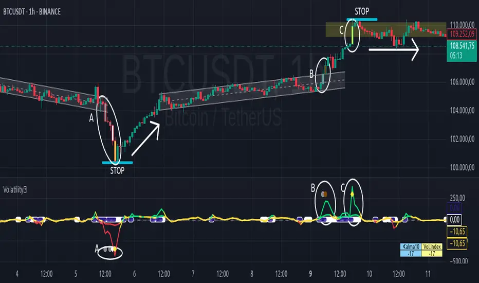
Floor and Roof Indicator with SignalsFloor and Roof Indicator with Trading Signals
A comprehensive support and resistance indicator that identifies premium and discount zones with automated signal generation.
Key Features:
Dynamic Support/Resistance Zones: Calculates floor (support) and roof (resistance) levels using price action and volatility
Premium/Discount Zone Identification: Highlights areas where price may find resistance or support
Customizable Signal Frequency: Control how often signals are displayed (every Nth occurrence)
Visual Signal Table: Optional table showing the last 5 long and short signal prices
Multiple Timeframe Compatibility: Works across all timeframes
Technical Details:
Uses ATR-based calculations for dynamic zone width adjustment
Combines Bollinger Bands with highest/lowest price analysis
Smoothing options for cleaner signal generation
Fully customizable colors and display options
How to Use:
Floor Zones (Blue): Potential support areas where long positions may be considered
Roof Zones (Pink): Potential resistance areas where short positions may be considered
Signal Crosses: Visual markers when price interacts with key levels
Signal Table: Track recent signal prices for analysis
Settings:
Length: Period for calculations (default: 200)
Smooth: Smoothing factor for cleaner signals
Zone Width: Adjust the thickness of support/resistance zones
Signal Frequency: Control signal display frequency
Visual Options: Customize colors and table position
Alerts Available:
Long signal alerts when price touches discount zones
Short signal alerts when price reaches premium zones
Educational Purpose: This indicator is designed to help traders identify potential support and resistance areas. Always combine with proper risk management and additional analysis.
This description focuses on the technical aspects and educational value while avoiding any language that could be interpreted as financial advice or guaranteed profits.
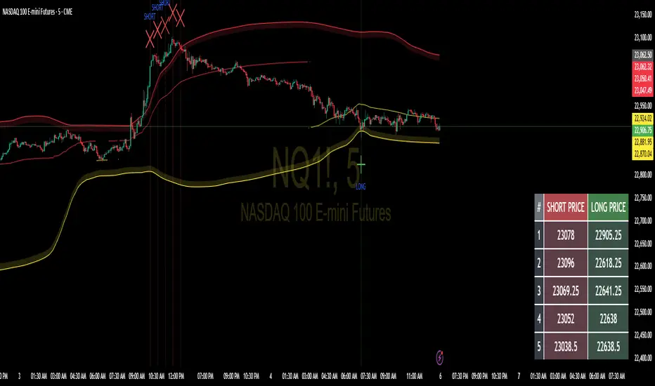
ItsGuarantee Instrument Net Change Real-TimeDescription of the Indicator
The "ItsGuarantee Instrument Net Change Real-Time" is a Pine Script (version 5) indicator developed for TradingView to provide real-time net price change metrics for a financial instrument across three timeframes: Year-to-Date (YTD), Month-to-Date (MTD), and Day-to-Date (DTD). It calculates the difference between the instrument's current closing price and its opening price at the start of the year, month, and day, respectively. These net changes are displayed in a customizable table overlaid on the chart, enabling traders to quickly assess the instrument's performance over these periods without manual calculations.
Key Features:
Real-Time Net Change Calculation:
YTD Net Change: Measures the difference between the current price and the opening price on January 1, 2025 (or the specified year).
MTD Net Change: Calculates the difference between the current price and the opening price at the beginning of the current month.
DTD Net Change: Computes the difference between the current price and the opening price of the current trading day.
Customizable Table Display:
The table's position on the chart can be adjusted via a user input dropdown, with options including "top_right," "top_left," "middle_right," "middle_left," "bottom_right," or "bottom_left."
The table is structured with two columns ("Metric" and "Value") and four rows (a header row followed by three rows for the net change metrics).
It features a clean design with a gray header and white cells, accented by a border for improved readability.
Overlay on Chart:
The indicator operates in overlay=true mode, meaning the table is displayed directly on the price chart rather than in a separate pane, allowing traders to view performance metrics alongside price action seamlessly.
Error Handling:
If data for a specific timeframe (e.g., the yearly open price) is unavailable (na), the table displays "N/A" instead of a numerical value, ensuring the indicator remains functional even with incomplete data.
How It Works:
Inputs:
The script defines the starting year for the YTD calculation (default is 2025) and includes an input for the table's position on the chart.
A switch statement maps the user-selected table position (e.g., "top_right") to the corresponding Pine Script position constant (e.g., position.top_right).
Data Retrieval:
The current price is sourced using the close variable, which updates in real-time as new price data becomes available.
Historical opening prices for the year, month, and day are retrieved using request.security, pulling data from the specified timeframes ("12M" for yearly, "M" for monthly, "D" for daily). The barmerge parameters ensure accurate data alignment without gaps or lookahead bias.
Net Change Calculations:
YTD Net Change = Current Price - Yearly Open Price (January 1, 2025)
MTD Net Change = Current Price - Monthly Open Price (start of the current month)
DTD Net Change = Current Price - Daily Open Price (start of the current trading day)
The na function checks for missing data to prevent errors during calculations.
Table Creation and Population:
A table is created using table.new with 2 columns and 4 rows, positioned according to the user's input.
The first row serves as a header with "Metric" and "Value" labels, styled with a gray background and white text for contrast.
The subsequent rows display the YTD, MTD, and DTD net changes in dollars, formatted to two decimal places using str.tostring. If a value is unavailable, it displays "N/A."
Use Case for Traders:
This indicator is highly practical for traders and investors who need to monitor an instrument's performance across different timeframes without performing manual calculations. Specific use cases include:
Day Traders: The DTD net change provides a snapshot of intraday performance, helping traders make quick decisions based on daily price movements.
Swing Traders: The MTD net change offers insights into short-term trends within the month, aiding in the identification of potential swing opportunities.
Long-Term Investors: The YTD net change allows for tracking yearly performance, which is valuable for portfolio management, performance evaluation, or tax-related purposes (e.g., assessing gains/losses in 2025).
The table's overlay format ensures that these metrics are always visible on the chart, providing a convenient reference point during technical analysis. It complements other tools like momentum indicators or moving averages, offering a comprehensive view of both price performance and trend dynamics.
Potential Enhancements:
Percentage Change: The indicator currently displays net changes in dollar terms. Adding percentage changes (e.g., YTD % change = (YTD Net Change / Year Open Price) * 100) could provide a more normalized perspective on performance.
Color Coding: Incorporating conditional formatting (e.g., green for positive net changes, red for negative) would make the table more visually intuitive for quick decision-making.
Dynamic Year Input: Allowing users to dynamically input the starting year (instead of hardcoding 2025) would enhance the indicator's flexibility for use in future years.
Additional Timeframes: Including other periods like Quarter-to-Date (QTD) could align with business reporting practices, as highlighted in related sources like Sisense (2025), which discusses the importance of QTD metrics for trend analysis.
Connection to the Original Post:
The "ItsGuarantee Instrument Net Change Real-Time" indicator connects directly to the theme of the original X post by @ItsGuarantee
about "Instrument Speed & Close Momentum." While the post likely refers to a momentum-based indicator (focusing on the rate of price changes to assess trend strength), this net change table provides a complementary perspective by quantifying price performance over specific timeframes. Momentum indicators, as noted in the Investopedia (2025) web results, are useful for identifying overbought or oversold conditions, while net change metrics (YTD, MTD, DTD) offer a straightforward way to track overall price movement, supporting trend confirmation or portfolio monitoring. The "ItsGuarantee" branding ties this indicator to the creator's suite of tools, emphasizing real-time, actionable insights for traders.

PowerHouse SwiftEdge AI v2.10 with Custom Filters & AI AnalysisPowerHouse SwiftEdge AI v2.10 with Custom Filters & AI Analysis
Overview
PowerHouse SwiftEdge AI v2.10 is an advanced TradingView Pine Script indicator designed to identify high-probability trading setups by combining pivot-based structure analysis, multi-timeframe trend detection, and adaptive AI-driven signal filtering. The script integrates Change of Character (CHoCH) and Break of Structure (BOS) signals with customizable momentum, volume, breakout, and trend filters to enhance trade precision. Additionally, it offers an optional AI Market Analysis module that predicts future price trends across multiple timeframes, providing traders with a comprehensive market outlook.
The script is highly customizable, allowing users to tailor inputs to their trading style, whether for scalping, swing trading, or long-term strategies. It is suitable for all asset classes, including stocks, forex, crypto, and commodities, and performs optimally on timeframes ranging from 1-minute to daily charts.
Key Features
Pivot-Based Signal Generation:
Identifies pivot highs and lows to detect CHoCH (reversal patterns) and BOS (continuation patterns).
Signals are plotted as "Buy" or "Sell" labels with optional "Get Ready" pre-signals to prepare traders for potential setups.
Take-profit (TP) levels are automatically calculated based on user-defined points, with optional TP box visualization.
Multi-Timeframe Trend Analysis:
Analyzes trends across seven timeframes (1M, 5M, 15M, 30M, 1H, 4H, D) using EMA and VWAP to determine bullish, bearish, or neutral conditions.
Displays a futuristic AI-Trend Matrix dashboard showing trend direction, strength, and confidence levels for quick decision-making.
Customizable Signal Filters:
Momentum Filter: Ensures signals align with significant price changes, adjusted dynamically using ATR-based volatility.
Higher Timeframe Trend Filter: Requires signals to align with the trend of a user-selected higher timeframe (e.g., 1H).
Lower Timeframe Trend Filter: Prevents signals that conflict with the trend of a user-selected lower timeframe (e.g., 5M).
Volume Filter: Optionally requires above-average volume to confirm signals.
Breakout Filter: Optionally requires price to break previous highs/lows for signal validation.
Repeated Signal Restriction: Prevents consecutive signals in the same trend direction until the trend changes on a user-defined timeframe.
AI-Driven Adaptivity:
Incorporates Cumulative Volume Delta (CVD) to assess buying/selling pressure and classify market volatility (Low, Medium, High).
Uses ATR to dynamically adjust momentum thresholds, ensuring signals adapt to current market conditions.
Optional AI Market Analysis module predicts trends across multiple timeframes by combining trend, momentum, and volatility scores.
Visual Elements:
Plots CHoCH and BOS levels as horizontal lines with distinct colors (aqua for CHoCH sell, lime for CHoCH buy, fuchsia for BOS sell, teal for BOS buy).
Draws dynamic support and resistance trendlines based on short and long-term price action, colored by trend strength.
Displays TP levels and pivot highs/lows for easy reference.
How It Works
The script combines several technical analysis concepts to create a robust trading system:
Market Structure Analysis:
Pivot highs and lows are identified using a user-defined lookback period (Pivot Length).
CHoCH occurs when price crosses below a pivot high (bearish reversal) or above a pivot low (bullish reversal).
BOS occurs when price breaks a previous pivot low (bearish continuation) or pivot high (bullish continuation).
Trend and Momentum Integration:
Trends are determined by comparing price to EMA and VWAP on multiple timeframes.
Momentum is calculated as the percentage price change, with thresholds adjusted by ATR to account for volatility.
"Get Ready" signals appear when momentum approaches the threshold, preparing traders for potential CHoCH or BOS signals.
Signal Filtering:
Filters ensure signals align with user-defined criteria (e.g., trend direction, volume, breakouts).
The Restrict Repeated Signals option prevents over-signaling by requiring a trend change on a specified timeframe before generating a new signal in the same direction.
AI Market Analysis:
The optional AI module calculates a score for each timeframe based on trend direction, momentum, and volatility (ATR compared to its SMA).
Scores are translated into predictions (▲ for bullish, ▼ for bearish, — for neutral), displayed in a dedicated table.
CVD and Volatility Context:
CVD tracks buying vs. selling pressure by accumulating volume based on price direction.
Volatility is classified using CVD magnitude, influencing the script’s visual cues and signal sensitivity.
Why This Combination?
The integration of pivot-based structure analysis, multi-timeframe trend filtering, and AI-driven adaptivity addresses common trading challenges:
Precision: CHoCH and BOS signals focus on key market turning points, reducing noise from minor price fluctuations.
Context: Multi-timeframe analysis ensures trades align with broader market trends, improving win rates.
Adaptivity: ATR and CVD adjustments make the script responsive to changing market conditions, avoiding static thresholds that fail in volatile or quiet markets.
Customization: Extensive input options allow traders to adapt the script to their preferred markets, timeframes, and risk profiles.
Predictive Insight: The AI Market Analysis module provides forward-looking trend predictions, helping traders anticipate market moves.
This combination creates a self-contained system that balances responsiveness with reliability, making it suitable for both novice and experienced traders.
How to Use
Add to Chart:
Apply the indicator to your TradingView chart for any asset and timeframe.
Recommended timeframes: 5M to 1H for scalping/day trading, 4H to D for swing trading.
Configure Inputs:
Pivot Length: Adjust (default 5) to control sensitivity to pivot highs/lows. Lower values for faster signals, higher for stronger confirmations.
Momentum Threshold: Set the minimum price change (default 0.01%) for signals. Increase for stricter conditions.
Take Profit Points: Define TP distance (default 10 points). Adjust based on asset volatility.
Signal Filters: Enable/disable filters (momentum, trend, volume, breakout) to match your strategy.
Higher/Lower Timeframe: Select timeframes for trend alignment (e.g., 1H for higher, 5M for lower).
AI Market Analysis: Enable for predictive trend insights across timeframes.
Get Ready Signals: Enable to see pre-signals for potential setups.
Interpret Signals:
Buy/Sell Labels: Act on green "Buy" or red "Sell" labels, confirming with TP levels and trend direction.
Get Ready Labels: Yellow "Get Ready BUY" or orange "Get Ready SELL" indicate potential setups; prepare but wait for confirmation.
CHoCH/BOS Lines: Use aqua/lime (CHoCH) and fuchsia/teal (BOS) lines as key support/resistance levels.
AI-Trend Matrix: Check the top-right dashboard for trend strength (%), confidence (%), and timeframe-specific trends.
AI Market Analysis Table: If enabled, view predictions (▲/▼/—) for each timeframe to anticipate market direction.
Trading Tips:
Combine signals with other indicators (e.g., RSI, MACD) for additional confirmation.
Use higher timeframe trend alignment for higher-probability trades.
Adjust TP and signal distance based on asset volatility and trading style.
Monitor the AI-Trend Matrix for trend strength; values above 50% or below -50% indicate strong directional bias.
Originality
PowerHouse SwiftEdge AI v2.10 stands out due to its unique blend of:
Adaptive Signal Generation: ATR-based momentum thresholds and CVD-driven volatility context ensure signals remain relevant across market conditions.
Multi-Timeframe Synergy: The script’s ability to filter signals based on both higher and lower timeframe trends provides a rare balance of precision and context.
AI-Powered Insights: The AI Market Analysis module offers predictive capabilities not commonly found in traditional indicators, simulating institutional-grade analysis.
Visual Clarity: The futuristic dashboard and color-coded trendlines make complex data accessible, enhancing usability for all trader levels.
Unlike standalone pivot or trend indicators, this script integrates multiple layers of analysis into a cohesive system, reducing false signals and providing actionable insights without requiring external tools or research.
Limitations
False Signals: No indicator is foolproof; signals may fail in choppy or low-volume markets. Use filters to mitigate.
Timeframe Sensitivity: Performance varies by timeframe and asset. Test settings thoroughly.
AI Predictions: The AI Market Analysis is based on historical data and simplified scoring; it’s not a guaranteed forecast.
Resource Usage: Enabling all filters and AI analysis may slow performance on lower-end devices.

ULTIMATE Price Action Oscillator with Volume-Based S/R - MehtaULTIMATE Price Action Oscillator with Volume-Based S/R (UPO-PRO-VOL)
Key Features:
Smart Oscillator: Combines price action momentum with customizable smoothing.
Volume-Confirmed S/R: Identifies high-confidence Support/Resistance levels when price crosses above-average volume.
Real-Time Tracking: Displays S/R levels with timestamps (IST) in a clean table.
Visual Alerts: Dashed lines + labels mark key levels for easy spotting.
⚠️ STRONG DISCLAIMER
❌ This indicator is for educational purposes only.
❌ Not financial advice. Trading involves risk—always conduct your own analysis.
❌ No guarantee of accuracy. Past performance ≠ future results.
❌ Adjust settings carefully. Test in a demo account first.
❌ Volume thresholds may vary by asset. Customize Volume Threshold Multiplier as needed.
📝 How to Use:
S/R Signals: Green "S" = Support (oscillator crosses up with high volume). Red "R" = Resistance (oscillator crosses down with high volume).
Table: Tracks latest S/R prices and formation time (IST).
Tweak Settings: Adjust Oscillator Length, Smoothing, and Volume Threshold for your trading style.
Tip: Combine with trend analysis for higher-probability trades!
Script Settings (Default):
Oscillator Length: 5 (Can be adjusted upto a maximum value of 200)
Smoothing: 3
S/R Lookback: 100 bars
Volume Threshold: 1.5x avg volume

Volume Delta & Order Block Suite [QuantAlgo]Upgrade your volume analysis and order flow trading with Volume Delta & Order Block Suite by QuantAlgo, a sophisticated technical indicator that leverages advanced volume delta calculations, along with dynamic order block detection to provide deep insights into market participant behavior. By calculating the distribution of volume between buyers and sellers and tracking pivotal volume zones, the indicator helps traders understand the underlying forces driving price movements. It is particularly valuable for those looking to identify high-probability trading opportunities based on volume imbalances and key price levels where significant activity has occurred.
🟢 Technical Foundation
The Volume Delta & Order Block Suite utilizes sophisticated volume analysis techniques to estimate buying and selling pressure within each price candle. The core volume delta calculation employs a formula that estimates buy volume as: Volume × (Close - Low) ÷ (High - Low) , with sell volume calculated as the remainder of total volume. This approach assumes that when price closes near the high of a candle, most volume represents buying pressure, and when price closes near the low, most volume represents selling pressure.
For order block detection, the indicator implements a multi-step process involving volume pivot identification and price state tracking. It first detects significant volume pivot points using the ta.pivothigh function with a user-defined pivot period. It then tracks the market's order state based on whether the high exceeds the highest high or the low falls below the lowest low. When a volume pivot occurs, the indicator creates order blocks based on price levels at that pivot point. These blocks are continuously monitored for invalidation based on subsequent price action.
🟢 Key Features & Signals
1. Volume Delta Representation on Candles
The Volume Delta visualization on candles shows the buy/sell distribution directly on price bars, creating an immediate visual representation of volume pressure.
When buyers are dominant, candles are colored with the bullish theme color (default: green/teal).
Similarly, when sellers are dominant, candles are colored with the bearish theme color (default: red).
This visualization provides immediate insights into underlying volume pressure without requiring separate indicators, helping traders quickly identify which side of the market is in control.
2. Buy/Sell Pressure Information Table
The Volume Analysis Table provides a comprehensive breakdown of volume metrics across multiple timeframes, helping traders identify shifts in market behavior.
The table is organized into four timeframe columns:
Current Volume
1 Bar Before
1 Day Before
1 Week Before
For each timeframe, the table displays:
Buy volume: The estimated buying volume based on price action
Sell volume: The estimated selling volume based on price action
Total volume: The sum of buy and sell volume
Delta: The difference between buy and sell volume (positive when buyers are dominant, negative when sellers are dominant)
Additionally, the table shows both absolute values and percentage distributions, with trend indicators (Up, Down, or Neutral) at the bottom row of each timeframe column.
This multi-timeframe approach helps traders:
→ Identify volume imbalances between buyers and sellers
→ Track changes in volume delta across different periods
→ Compare current conditions with historical patterns
→ Detect potential reversals by watching for shifts in delta direction
The delta values are particularly useful as they provide a clear indication of market dominance – positive delta (Up) when buyers are dominant, and negative delta (Down) when sellers are dominant.
3. Order Blocks and Their Confluence
Order blocks represent significant price zones where volume pivots occur, potentially indicating areas of significant market participant activity.
The indicator identifies two types of order blocks:
Bullish Order Blocks (support): Highlighted with a green/teal color, these represent potential support areas where price might bounce when revisited
Bearish Order Blocks (resistance): Highlighted with a red color, these represent potential resistance areas where price might reverse when revisited
Each order block is visualized as a colored rectangle with a dashed line showing the average price within the block. The blocks are extended to the right until they are invalidated.
Order blocks can serve as key reference points for trading decisions, for example:
Support/resistance identification
Stop loss placement (beyond the opposite edge of the block)
Potential reversal zones
Target areas for profit-taking
When price approaches an order block, traders should look for confluence with the volume delta on candles and the information in the volume analysis table. Strong setups occur when all three components align – for example, when price approaches a bearish order block with increasing sell volume shown on the candles and in the volume table.
🟢 Practical Usage Tips
→ Volume Analysis and Interpretation: The indicator visualizes the buy/sell volume ratio directly on price candles using color intensity, allowing traders to immediately identify which side (buyers or sellers) is dominant. This information helps in assessing the strength behind price movements and potential continuation or reversal signals.
→ Order Block Trading Strategies: The indicator highlights significant price zones where volume pivots occur, marking these as potential support (bullish order blocks) or resistance (bearish order blocks). Traders can use these levels to identify potential reversal points, stop placement, and profit targets.
→ Multi-timeframe Volume Comparison: Through its comprehensive volume analysis table, the indicator enables traders to compare volume patterns across current, recent, daily, and weekly timeframes. This helps in identifying shifts in market behavior and confirming the strength of ongoing trends.
🟢 Pro Tips
Adjust Pivot Period based on your timeframe:
→ Lower values (3-5) for more frequent order blocks
→ Higher values (7-10) for stronger, less frequent order blocks
Fine-tune Mitigation Method based on your trading style:
→ "Wick" for more conservative invalidation
→ "Close" for more lenient order block survival
Look for confluence between components:
→ Strong volume delta in the expected direction when price touches an order block
→ Corresponding patterns in the volume analysis table
→ Overall market context aligning with the expected direction
Use for multiple trading approaches:
→ Support/resistance trading at order blocks
→ Trend confirmation with volume delta
→ Reversal detection when volume delta changes direction
→ Stop loss placement using order block boundaries
Combine with:
→ Trend analysis using trend-following indicators for trade confirmation
→ Multiple timeframe analysis for strategic context

AstroTrading_DragonCombine1. Table Setup and User Inputs
Table Position and Font Size:
The script begins by asking the user to select a table position (e.g. Top Right) and a font size (Small, Medium, Large, Huge) via input options.
pinescript
Kopyala
positionInput = input.string("Sağ Üst Köşe", title="Tablo Konumu", options= )
fontSizeInput = input.string("Orta", title="Yazı Punto Büyüklüğü", options= )
Table Creation:
A table is created using table.new with 6 rows and 4 columns. The location of the table is determined by the selected input. This table will later display the name, entry, target, and stop levels for each of the five strategies.
2. Variable Declarations
The script defines several persistent variables to store levels for each indicator. These include:
Entry, target, and stop levels for each of the five sub-indicators (labeled as _1, _2, _3, _4, and _5).
Examples include targetLevel_1, fibLow_1, lastEntry_1, lastTarget_1, etc.
3. Indicator 1 – AstroTrading_AlphaBalance
Logic:
This part examines the previous candle’s high and low to compute its range. It then defines two conditions:
conditionUp_1: When the current close exceeds the previous high by at least 50% of the previous range.
conditionDown_1: When the current close falls below the previous low by 50% of the previous range.
Action:
Depending on whether the move is upward or downward, the script sets:
For an upward move:
fibLow_1 is set to the current low.
The entry level is taken as the current high.
The target is computed by taking the high and subtracting –0.786 times the range (this negative multiplier inverts the move).
The stop is set at the previous low.
For a downward move, similar logic applies with reversed roles.
Purpose:
This module generates a primary signal (AlphaBalance) based on extreme candle movements relative to the prior candle’s range.
4. Indicator 2 – AstroTrading_CandleElongation
Higher Timeframe Data:
The script uses the request.security function to obtain high, low, close, and open values from a user-specified timeframe.
Fibonacci Extension Calculation:
A function fiboExtension calculates two Fibonacci extension levels (approximately 0.786 and 1.618 multipliers) based on three price points.
Signal Conditions:
It checks if the previous candle (two bars ago) meets certain criteria relative to its open, and if the current candle’s close confirms an elongation move.
Output:
If conditions are met, the script sets:
candleEntry_2 to the lower Fibonacci level,
candleTarget_2 to the higher Fibonacci extension,
candleStop_2 to the current low (for a bullish setup) or high (for bearish).
Purpose:
This sub-indicator looks to capture significant candle elongation moves by using Fibonacci extension levels to define entry, target, and stop.
5. Indicator 3 – AstroTrading_FlaGama
Similar to a Flag Formation:
Like the previous “FlaGama” indicator, it checks if the current close is more than 50% beyond the previous candle’s high (conditionUp_3) or below the previous low (conditionDown_3).
Bar Coloring:
If either condition is met, the bar is colored orange to signal an extreme move.
Signal Generation:
Depending on the move’s direction:
Bullish Setup:
Calculates a Fibonacci level at 78.6% from the current low to high.
Sets the entry at this Fibonacci level.
The target is computed by adding the difference between the current high and the Fibonacci level to the current high.
The stop is set at the current low.
Bearish Setup:
Mirrors the Fibonacci calculation to derive a level for short entry.
The target is set below the current low, and the stop is at the current high.
Purpose:
The FlaGama section provides confirmation signals when extreme moves occur, helping traders decide on potential reversals.
6. Indicator 4 – AstroTrading_HermDown
EMA Crossover:
An EMA (111-period) is calculated. A crossover of the EMA above the close triggers a “kesilme” (cutoff) event.
First Candle Identification:
Once a crossover is detected, the next candle’s close is monitored. If that candle’s close remains below the cutoff level, it is considered the “first candle” of the HermDown setup.
Fibonacci Retracement:
It then calculates the highest high over the last 30 bars and derives a target level (fibNeg0618_4) at about 48.6% retracement from that high.
Signal Levels:
The entry is the cutoff close, the target is the calculated Fibonacci level, and the stop is the low of the cutoff candle.
Purpose:
This module aims to capture bearish reversals (HermDown) when the price drops sharply below an EMA, using Fibonacci retracement as a guide.
7. Indicator 5 – AstroTrading_HermUp
EMA Crossunder:
Similarly, an EMA (111-period) is used. A crossunder (EMA crossing below the close) signals a potential bullish reversal.
First Candle Confirmation:
The next candle’s close is checked to confirm the move.
Fibonacci Level:
A Fibonacci extension (approximately 61.8% of the distance from the cutoff close to the high) is computed to serve as the target.
Signal Levels:
The entry is set at the cutoff close, the target is the Fibonacci level, and the stop is set at the low.
Purpose:
This section captures bullish reversal signals (HermUp) when the price moves above an EMA.
8. Displaying Levels in a Table
Aggregating Data:
The script gathers the entry, target, and stop levels from all five sub-indicators.
Table Layout:
The table displays five rows (one for each indicator) with four columns:
Indicator name (e.g., “AlphaBalance”, “CandleElongation”, “FlaGama”, “HermDown”, “HermUp”)
Entry level
Target level
Stop level
Color Coding:
Entry cells have a blue background.
Target cells are colored green if above the current close or red if below.
Stop cells are given a gray background.
Purpose:
This consolidated view allows traders to quickly assess all key levels from different strategies on the chart.
Summary
The “AstroTrading_DragonCombine” indicator is a multi-faceted tool that merges five distinct trading setups into one comprehensive display. Each sub-indicator utilizes a unique method—ranging from extreme candle moves and Fibonacci extensions to EMA crossovers—to determine entry, target, and stop levels. These levels are then neatly summarized in a table overlay on the chart. By combining these approaches, traders can gain a broader perspective on market conditions and potential reversal points, enhancing their decision-making process while adhering to sound risk management principles.
This explanation is written to meet TradingView’s script publication standards, providing a clear, objective, and detailed overview of the indicator’s functionality and logic.