Balanced 0DTE Scalper [Clean]Balanced 0DTE Scalper is a professional-grade execution system designed specifically for the high-velocity world of 0DTE (Zero Days to Expiration) options trading on indices like SPY, QQQ, and IWM.
Unlike standard indicators that repaint or lag, this system uses Non-Repainting Multi-Timeframe Logic to align the institutional trend (15m) with precision entry triggers (5m). It is engineered to solve the two biggest killers of 0DTE traders: Theta Decay (holding too long) and Choppy Markets (trading without trend).
How It Works
1. The "Safety Belt" (15-Minute Trend Filter) Before any trade is taken, the system checks the confirmed 15-minute Trend and ADX (Strength).
No Repainting: It strictly uses the previous closed 15m bar to determine bias. Once a signal prints, it stays printed.
Regime Detection: It automatically blocks trades during low-volume "chop" (Low ADX) to save you from theta burn.
2. Precision Entry Triggers (5-Minute) Once the 15m trend gives the "Green Light," the system hunts for 5m setups using a confluence of:
EMA Crossovers: For immediate momentum.
VWAP Filter: Ensuring you are on the right side of institutional volume.
RSI Check: To avoid buying tops or selling bottoms.
3. Aggressive Risk Management (The "Profit Locker") 0DTE profits can vanish in seconds. This script manages the trade for you visually:
Dynamic Trailing Stop: Trails price based on candle Highs/Lows (not closes), allowing it to lock in profits at the peak of a spike.
Time Stop: If a trade stalls for 60 minutes (12 bars), the system triggers a "Time Exit." In 0DTE, time is money—if it's not working, get out.
Visual Levels: Automatically draws your Stop Loss, Target 1 (Conservative), and Target 2 (Runner) lines on the chart.
Features & Dashboard
Live Dashboard: Monitors Trend Bias, ADX Strength, RSI, and Open PnL in real-time.
On-Chart Tickets: Prints a "CALL OPEN" or "PUT OPEN" label with the exact Entry Price, Stop Loss, and Strike Suggestion.
Session Filters: Automatically avoids the first 10 minutes (Open Volatility) and the last 15 minutes (Close Chaos).
Settings Guide
Risk Mode:
Balanced (Default): The recommended blend of Trend + Momentum.
Conservative: Requires a very strong ADX trend. Fewer trades, higher win rate.
Aggressive: Ignores ADX strength. Good for FOMC/CPI days only.
Strike Suggestion: Automatically calculates the nearest Strike Price (ATM/OTM) for SPY/QQQ based on your settings.
Disclaimer
This tool is for educational purposes only. 0DTE options trading involves extreme risk of capital loss. Past performance (even with non-repainting logic) is not indicative of future results. Always manage your risk.
Indikatoren und Strategien

52-Week Range Dashboardthis shows the diff in % between the 52 week high and low
this is called coiling method, you may observe whenever the diff in % between 52 week high and low price is 30% or below, that's the time the script will show a move.
Thank you
have a great day

Anurag - Balanced 0DTE Scalper QQQ SPYBalanced 0DTE Scalper is a professional-grade execution system designed specifically for the high-velocity world of 0DTE (Zero Days to Expiration) options trading on indices like SPY, QQQ, and IWM.
Unlike standard indicators that repaint or lag, this system uses Non-Repainting Multi-Timeframe Logic to align the institutional trend (15m) with precision entry triggers (5m). It is engineered to solve the two biggest killers of 0DTE traders: Theta Decay (holding too long) and Choppy Markets (trading without trend).
How It Works
1. The "Safety Belt" (15-Minute Trend Filter) Before any trade is taken, the system checks the confirmed 15-minute Trend and ADX (Strength).
No Repainting: It strictly uses the previous closed 15m bar to determine bias. Once a signal prints, it stays printed.
Regime Detection: It automatically blocks trades during low-volume "chop" (Low ADX) to save you from theta burn.
2. Precision Entry Triggers (5-Minute) Once the 15m trend gives the "Green Light," the system hunts for 5m setups using a confluence of:
EMA Crossovers: For immediate momentum.
VWAP Filter: Ensuring you are on the right side of institutional volume.
RSI Check: To avoid buying tops or selling bottoms.
3. Aggressive Risk Management (The "Profit Locker") 0DTE profits can vanish in seconds. This script manages the trade for you visually:
Dynamic Trailing Stop: Trails price based on candle Highs/Lows (not closes), allowing it to lock in profits at the peak of a spike.
Time Stop: If a trade stalls for 60 minutes (12 bars), the system triggers a "Time Exit." In 0DTE, time is money—if it's not working, get out.
Visual Levels: Automatically draws your Stop Loss, Target 1 (Conservative), and Target 2 (Runner) lines on the chart.
Features & Dashboard
Live Dashboard: Monitors Trend Bias, ADX Strength, RSI, and Open PnL in real-time.
On-Chart Tickets: Prints a "CALL OPEN" or "PUT OPEN" label with the exact Entry Price, Stop Loss, and Strike Suggestion.
Session Filters: Automatically avoids the first 10 minutes (Open Volatility) and the last 15 minutes (Close Chaos).
Settings Guide
Risk Mode:
Balanced (Default): The recommended blend of Trend + Momentum.
Conservative: Requires a very strong ADX trend. Fewer trades, higher win rate.
Aggressive: Ignores ADX strength. Good for FOMC/CPI days only.
Strike Suggestion: Automatically calculates the nearest Strike Price (ATM/OTM) for SPY/QQQ based on your settings.
Disclaimer
This tool is for educational purposes only. 0DTE options trading involves extreme risk of capital loss. Past performance (even with non-repainting logic) is not indicative of future results. Always manage your risk.

Trend Regime Bands (EMA 50 / 150 / 200)📘 Trend Regime Bands – EMA 50·150·200
Overview
Trend Regime Bands is a visual trend-context indicator designed to help users quickly understand whether the market is in a bullish or bearish regime. The indicator uses the alignment of EMA 50, EMA 150, and EMA 200 to determine overall trend direction, while additional EMAs are used only to create color-based bands for visual context. No buy or sell signals are generated.
How Trend Direction Is Determined
Trend direction is derived exclusively from the relative positioning of: EMA 50 (short-term trend) , EMA 150 (medium-term trend) , EMA 200 (long-term trend) . Bullish regime: EMA 50 ≥ EMA 150 ≥ EMA 200 . Bearish regime: EMA 50 < EMA 150 < EMA 200. These three EMAs act as the decision framework for the indicator.
What the Color Bands Represent : The indicator displays two visual bands on the chart:
Fast Band (Momentum Context) - Built using faster EMAs, Represents short-term momentum and pullback behavior. Brighter color intensity reflects stronger momentum
Slow Band (Regime Context) - Built using slower EMAs. Represents broader trend structure and regime stability.Deeper color intensity reflects stronger trend alignment
The color of both bands follows the trend direction determined by EMA 50/150/200:
Green shades indicate a bullish regime. Red shades indicate a bearish regime. Color intensity increases or decreases smoothly based on trend strength.
How to Use This Indicator
Use the bands to understand market context, not as entry or exit signals. Strong, bright bands suggest a well-established trend. Lighter bands indicate weaker or transitioning trends. The indicator works across intraday, swing, and higher timeframes. This tool is best used alongside price action, support/resistance, or other confirmation methods.
Important Notes
This indicator does not provide buy or sell signals. It does not predict future price movement. It is intended solely as a visual trend-regime and context tool
Summary
Trend Regime Bands offers a clean, distraction-free way to visualize bullish and bearish market regimes using EMA structure and color intensity, helping traders maintain directional awareness and discipline.

Liquidity Sweep by NKLiquidity Sweep (OC-Based) + Doji Acceptance
🔹 Designed for 4H Crypto Trading
This indicator highlights high-probability liquidity sweep candles using a body-based comparison (Open/Close) rather than traditional high/low sweeps, making it cleaner and more reliable in volatile crypto markets.
It is specifically optimized for the 4-hour timeframe, where each day consists of 6 candles, allowing clear identification of institutional stop-hunts and failed breakouts.
---
🔍 Core Concept
Liquidity is often taken above recent candle bodies (opens & closes) rather than just wicks.
This script detects those events and confirms them using candle structure, wick dominance, and doji behavior.
The indicator marks candles where:
* Liquidity is swept
* Price is rejected
* Directional intent is visible
---
🔴 Bearish Liquidity Sweep (Sell Signal)
A candle is highlighted as bearish when ALL of the following conditions are met:
1️⃣ Liquidity Sweep (Body-Based)
* Current candle HIGH is greater than ALL
* Opens of the last X candles
* Closes of the last X candles
(Wicks of previous candles are ignored to reduce noise)
2️⃣ Wick Dominance
* Upper wick > Lower wick
3️⃣ Rejection Confirmation (ANY ONE)
* Candle closes red, OR
* Candle is a Gravestone-type Doji, defined as:
* Very small candle body
* Strong upper wick
* Body color is irrelevant
---
🟢 Bullish Liquidity Sweep (Buy Signal)
A candle is highlighted as bullish when ALL of the following conditions are met:
1️⃣ Liquidity Sweep (Body-Based)
* Current candle LOW is lower than ALL
* Opens of the last X candles
* Closes of the last X candles
2️⃣ Wick Dominance
* Lower wick > Upper wick
3️⃣ Rejection Confirmation (ANY ONE)
* Candle closes green, OR
* Candle is a Dragonfly-type Doji, defined as:
* Very small candle body
* Strong lower wick
* Body color is irrelevant
---
## ⚙️ Inputs
* Liquidity Lookback (X candles)
Number of previous candles used to define the liquidity range.
* Doji Body % of Candle Range
Controls how small the candle body must be to qualify as a doji.
---
🎨 Visuals
* 🔴 Red candle + down arrow → Bearish liquidity sweep
* 🟢 Green candle + up arrow → Bullish liquidity sweep
* Indicator is plotted directly on price
---
✅ Key Features
* Uses Open & Close levels instead of highs/lows
* Filters weak signals using wick dominance
* Accepts both body-based and doji-based rejections
* No repainting
* Works on all markets, optimized for crypto
* Best used at:
* Range highs & lows
* Previous day high / low
* Consolidation extremes
---
❌ What This Indicator Does NOT Do
* No trend bias
* No RSI / EMA / CPR filters
* No session-based filtering
* No multi-timeframe logic
* No entry/exit automation

Supply & Demand Zones (Volume-Based)📌 Supply & Demand Zones (Volume-Based) — Indicator Description
Overview
This indicator visually highlights potential supply and demand price zones using historical candle structure combined with relative volume behavior.The zones are intended to help users observe areas of increased market activity where price has previously reacted. This tool is designed for visual analysis only.
How the Zones Are Identified
Demand zones are highlighted when price shows a strong bullish reaction following a bearish candle.Supply zones are highlighted when price shows a strong bearish reaction following a bullish candle.Relative volume is used as context, not as a predictive input, to classify zones into higher or lower activity levels.Zones automatically invalidate when price structurally breaks them.
About the Percentage Display
The percentage shown on a zone represents normalized relative volume strength at the time the zone was formed.This value is not a probability, not a success rate, and not a performance metric.It should not be interpreted as a prediction or trading signal.Percentages are displayed only for active zones and are removed once a zone is invalidated.
How This Indicator Is Intended to Be Used
As a visual reference tool for identifying historical supply and demand areas.As a contextual overlay alongside other forms of technical analysis.To observe how price behaves when revisiting previously active zones.This indicator does not suggest trade direction, entry timing, or exit levels.
Important Notes & Limitations
All zones are derived from historical price and volume data.Market conditions change, and historical zones may lose relevance over time.No trading decisions should be made based solely on this indicator.Users are encouraged to apply their own analysis and risk management.
Disclaimer
This indicator is provided for educational and informational purposes only.It does not constitute trading, investment, or financial advice.The author assumes no responsibility for decisions made using this tool.

Custom Psych Levels V1.0 Theo SignalDesigned for Index Traders (US30, NAS100, SPX, etc.)
This script is especially effective on indices such as US30, where price reacts strongly to round numbers and psychological zones. By default, levels adapt to index volatility and scale, making them ideal for:
intraday bias
pullback reactions
breakout continuation
mean reversion back to balance
Key Features
Rolling 5-Level Structure: Always centered on current price, no chart clutter.
Market- Aware Magnitude: Automatically adjusts spacing for indices, forex, and crypto.
Higher- Timeframe Anchoring: Optionally anchor levels to 1H, 4H, or Daily closes while trading lower timeframes like 5m.
Session & Daily Resets: Re-anchor levels at New York session open or new trading day.
Center Line Emphasis: Highlight the equilibrium level with custom color, thickness, and style for balance or decision-making.
Clean Professional Display: Only relevant levels near price are shown.
Trading Use Cases
This indicator is best used as a framework, not a signal generator. It excels when combined with:
momentum confirmation
liquidity sweeps
volume expansion
break-and-retest structures
session highs/lows
Traders can use the center line as balance, outer levels as reaction or target zones, and band shifts as confirmation of expanding price acceptance.

Volatility Regimes | GainzAlgo📊 OVERVIEW
This is a comprehensive ATR-based trading system designed for professional traders who need advanced volatility analysis, precise trade management, and intelligent market-regime detection.
The indicator combines multiple proven volatility concepts into one powerful, highly customizable tool.
⚙️ CORE FEATURES
1️⃣ ATR BANDS (Dynamic Support & Resistance)
- Three levels of ATR-based bands plotted around price
- Band 1 (1× ATR): Closest support/resistance, primary TP target
- Band 2 (2× ATR): Secondary TP target, stronger S/R zone
- Band 3 (3× ATR): Extended TP target, major S/R level
- Bands adapt to volatility in real time
- Dotted lines mark TP points on the latest candle
2️⃣ VOLATILITY REGIME DETECTION (Market Phase Analysis)
Automatically classifies the market into four distinct volatility regimes:
🟢 COMPRESSION
ATR < 70% of baseline
Low-volatility consolidation, market is coiling
Best for: Preparing breakouts, tightening stops
🟠 EXPANSION
ATR 115–140% of baseline
Volatility breakout, early trend formation
Best for: Breakout entries, momentum trades
🔴 HIGH VOLATILITY
ATR > 140% of baseline
Strong sustained trend, maximum participation
Best for: Trend following, trailing stops
🟣 EXHAUSTION
Declining ATR after high volatility
Trend maturity, potential pause or reversal
Best for: Profit taking, reducing exposure
Additional details:
- Uses ATR Ratio (Current ATR / Long-term Baseline)
- Non-repainting logic with historical confirmation
- Background shading + regime labels for instant clarity
- Diamond markers highlight regime changes
3️⃣ DYNAMIC STOP-LOSS SYSTEM
- Automatically calculates optimal stop distance using ATR
- Adapts to current market volatility
- Separate logic for bullish and bearish trades
- Default 2× ATR multiplier (adjustable 0.5× – 5×)
- Visual cross markers display stop levels
- Tighter stops in low volatility, wider in high volatility
4️⃣ MULTIPLE TAKE-PROFIT LEVELS (TP1 / TP2 / TP3)
- Three progressive profit targets for scaling out
- TP1 (1.5× ATR): First partial profit
- TP2 (2.5× ATR): Secondary scale-out
- TP3 (4.0× ATR): Final target or runner
- Dashed lines with labels on the current bar
- Automatically aligns with trend direction
- Fully customizable multipliers
5️⃣ SUPPORT & RESISTANCE LEVELS
- Dynamic S/R detection using price extremes
- ATR-weighted significance filtering
- Adjustable lookback period (10–100 bars)
- Circle markers for visual clarity
- Updates in real time as new highs/lows form
6️⃣ RISK MANAGEMENT CALCULATOR
- Real-time position-size calculation
- Based on account size, risk percentage, and ATR stop distance
- Formula: Position Size = Risk Amount ÷ Stop Distance
- Example: $10,000 account, 1% risk, $50 stop = 200 shares
- Displays position size and dollar risk directly on chart
- Ensures consistent risk across all trades
7️⃣ ATR PERCENTILE RANKING
- Shows where current ATR ranks historically (0–100%)
- Above 80%: Extremely high volatility
- 20–80%: Normal volatility
- Below 20%: Extremely low volatility
- Adjustable lookback (50–500 bars)
- Alerts trigger at above 90% and below 10% extremes
- Adds context to all regime-based decisions
8️⃣ VOLATILITY CONTRACTION PATTERN
- Detects tight consolidation (volatility squeeze)
- Requires consecutive bars of low ATR
- Default: 7 bars below 50% of average ATR
- Yellow triangle alert when pattern completes
- Often precedes strong breakout moves
- Works on all timeframes
9️⃣ TREND DETECTION SIGNALS
- Up and down arrows on trend change with rising ATR
- Combines price direction with volatility confirmation
- Smoothing filters reduce false signals
- Green arrow for bullish, red arrow for bearish
🔟 VOLATILITY BREAKOUT SIGNALS
- Circle markers when ATR exceeds threshold
- Default threshold: 1.5× ATR average
- Indicates surge in market activity
- Can signal the start of new trends
🧠 RECOMMENDED SETTINGS BY TRADING STYLE
Day Trading (1m–15m)
ATR Length: 14
Regime Baseline: 30
SL Multiplier: 1.5–2.0
TP: 1.5 / 2.5 / 4.0
Risk: 0.5–1%
Swing Trading (1H–4H)
ATR Length: 14
Regime Baseline: 50
SL Multiplier: 2.0–2.5
TP: 2.0 / 3.5 / 6.0
Risk: 1–2%
Position Trading (Daily)
ATR Length: 14–21
Regime Baseline: 100
SL Multiplier: 2.5–3.0
TP: 3.0 / 5.0 / 8.0
Risk: 2–3%
Scalping (15s–5m)
ATR Length: 10
Regime Baseline: 20
SL Multiplier: 1.0–1.5
TP: 1.0 / 1.5 / 2.5
Risk: 0.5–1%
🧭 HOW TO USE
1. Identify the current volatility regime
2. Wait for entry confirmation (breakouts, trend arrows, contraction patterns)
3. Set stop loss using dynamic ATR-based levels
4. Scale out at TP1, TP2, TP3 or use ATR bands
5. Use the risk calculator for consistent position sizing
6. Monitor regime changes and manage exposure accordingly
🚨 ALERT SYSTEM
Alerts included for volatility breakouts, trend changes, regime transitions, ATR band crosses, contraction pattern completion, and ATR percentile extremes.
All alerts are fully configurable in TradingView.
🎨 VISUAL GUIDE
Background colors: Volatility regimes
Solid lines: ATR bands
Dotted lines: Latest TP points
Dashed lines: Take-profit levels
Cross markers: Stop-loss levels
Circles: Support, resistance, and breakouts
Arrows: Trend direction
Diamonds: Regime changes
Triangles: Contraction alerts
Labels: Regime info, ATR percentile, position size
🛠️ CUSTOMIZATION
- Toggle any feature on or off
- Adjust all thresholds and multipliers
- Customize colors
- Configure alerts
- Set account size and risk parameters
⚠️ IMPORTANT NOTES
- This indicator provides analytical tools, not trading signals
- Always apply proper risk management
- Backtest before live use
- ATR adapts to volatility, not direction
If you find this indicator useful, please leave a rating and comment ⭐

XAUUSD Time Structure (VN, Auto DST, Clean)A clean, line-only session timing tool for XAUUSD in Vietnam time (Asia/Ho_Chi_Minh). Draws faint vertical dotted lines for key time boundaries: Asia range, EU pre-market, London decision, and NYMEX expansion. Includes automatic DST switching for London and New York. For educational purposes only.

15M Swing Sweep Lines + SMT (ES vs NQ)15M Swing Sweep Lines (NY Killzones)Visualize liquidity sweeps of 15-minute swing highs/lows exclusively during high-impact London & New York killzones.This ICT-inspired indicator detects when price sweeps (wicks beyond) the most recent confirmed 15-minute swing high or low — classic signs of liquidity raids or stop hunts — but only if the sweep happens during key "killzone" sessions where institutional activity is typically highest.Key Features15M Swing Detection: Uses confirmed pivot highs/lows (length 2) on the 15-minute timeframe for reliable structure points.
Killzone Filters (New York time):London Killzone: 3:00 AM – 4:59 AM
New York Killzone: 9:30 AM – 10:59 AM (captures the high-volatility NY open overlap)
Sweep Visualization:Bearish Sweep (high > last 15M swing high): Thick red horizontal line from the swing point to the sweep bar.
Bullish Sweep (low < last 15M swing low): Thick green horizontal line from the swing point to the sweep bar.
Lines use xloc.bar_time for precise placement and extend only to the bar where the sweep occurs.
No duplicates: Prevents multiple lines for the same swing sweep.
Non-repainting logic with lookahead_off for clean, trustworthy signals.
Why Killzones MatterMany ICT/SMC traders focus on these windows because they often feature aggressive manipulation, equal highs/lows sweeps, and the setup for strong directional moves. This tool helps you instantly spot when buy-side or sell-side liquidity has been raided on the 15M structure during these prime times.Ideal ForConfirming potential reversals or inducements after liquidity grabs.
Adding confluence to entries during London or NY sessions.
Futures traders (ES, NQ, etc.) looking for clean visual cues of smart money engineering.
Lightweight, overlay-friendly, and focused — add it to your chart for clearer insight into 15M liquidity sweeps when it matters most. Perfect companion for killzone-based strategies!

tncylyv - Improved Delta Volume BubbleThis script is a specialized modification and structural upgrade of the excellent "Delta Volume Bubble " by tncylyv.
While the original tool provided a fantastic foundation for statistical volume analysis, this "Zero Float" Edition was built to solve specific visual challenges faced by active traders—specifically the issue of indicators "floating" or disconnecting from price when zooming in on lower timeframes.
The Straight Improvements
This version turns a "Signal Indicator" into a complete "Trading System" with five specific upgrades:
1. Visual Stability (The "Zero Float" Fix)
Original: Used complex coordinates that could desynchronize, causing bubbles to drift or float away from candles on fast charts (1m/5m).
My Upgrade: Implemented "Magnetic Anchoring." Labels and bubbles are now physically locked to the candle wicks. They never drift, overlap, or float, no matter how much you zoom or resize the chart.
2. Cognitive Load (The HUD)
Original: Displayed raw numbers inside colored circles, requiring you to memorize color codes.
My Upgrade: Replaced numbers with Semantic Text Labels (e.g., "ABSORB", "SQUEEZE", "MOMENTUM"). You can read the market intent instantly without decoding it.
3. Regime Adaptation (AI Engine)
Original: Used a fixed threshold (e.g., Z-Score > 2.0).
My Upgrade: Added an Adaptive Learning Window. The script scans recent volatility to automatically raise the threshold during choppy markets (filtering noise) and lower it during quiet sessions (catching subtle entries).
4. Market Memory (Smart Structure)
Original: Signals disappeared into history.
My Upgrade: Draws Support/Resistance Rails extending from major volume events. This helps you visualize exactly where institutions are defending their positions.
5. Robust Data Handling
My Upgrade: Added a Hybrid Fallback Engine. If granular 1-minute data isn't available (e.g., on historical charts), the script seamlessly switches to an estimation model so the indicator never "breaks" or disappears.
Core Logic
Z-Score Normalization: We don't look at raw volume; we look at statistical anomalies (Standard Deviations).
Absorption: Detects "Effort vs. Result"—high volume with tiny price movement (Trapped Traders).
Squeeze: Highlights areas where a breakout is imminent due to volatility compression.
Credits
Original Concept & Code: tncylyv (Delta Volume Bubble ). This script would not exist without his brilliant groundwork.
Modifications: Visual Anchoring, HUD Text System, AI Thresholding, and Structure Rails added in this edition.
This script is open-source to keep the spirit of the original author alive. Use it to understand the "Why" behind the move.

IFVG BIASIFVG Bias Dashboard (15M / 30M / 1H / 4H)A clean, multi-timeframe ICT-inspired directional bias dashboard based on Implied Fair Value Gaps (IFVG).This indicator tracks the current bullish or bearish bias derived from the most recent valid Implied Fair Value Gap on four key higher timeframes: 15-minute, 30-minute, 1-hour, and 4-hour. It displays the results in an easy-to-read table directly on your chart — perfect for quickly assessing alignment across timeframes without switching charts.How It Works (ICT-Style IFVG Logic)Detects classic three-candle IFVGs:Bullish IFVG: Current low > high two bars ago (aggressive buying leaving an inefficiency).
Bearish IFVG: Current high < low two bars ago (aggressive selling).
When an IFVG forms, it sets the bias to match its direction (Bullish = +1, Bearish = -1).
The bias remains persistent until either:A new IFVG forms in the opposite direction, or
Price closes beyond the opposite boundary of the current IFVG (mitigation/invalidation), which flips the bias.
This creates a simple yet effective "last valid IFVG" bias that only changes on meaningful price action.
FeaturesMulti-timeframe analysis via request.security() on 15M, 30M, 1H, and 4H.
Compact table in the top-right corner showing:Timeframe (TF)
Current Bias: "Bullish" (solid green background) or "Bearish" (solid red background)
No repainting on historical bars; table updates only on the last confirmed bar.
Lightweight and overlay-friendly — does not draw boxes or lines, focusing purely on bias direction.
Ideal ForICT / Smart Money Concepts (SMC) traders looking for higher-timeframe confluence.
Confirming trend direction before taking lower-timeframe entries.
Spotting potential bias shifts when an IFVG is mitigated on higher timeframes.
A straightforward tool for staying aligned with institutional order flow inefficiencies across multiple timeframes. Add it to your chart and instantly see where the bias stands!

HTF Fractal Boxes by TAAKOWhat This Indicator Does
This indicator displays higher timeframe (HTF) candlesticks as an overlay on your current chart, allowing you to see larger timeframe price action without switching charts.
Key Features:
Shows the last 3 completed HTF candles (configurable)
Displays a 4th candle with dashed lines showing the current forming HTF bar
Each candle includes full OHLC data: body (open/close) and wicks (high/low)
Candles are color-coded: green for bullish, red for bearish, blue for neutral
Positioned on the right side of your chart for easy reference
Automatically scales with your Y-axis price movements

ADX Regime (5m) Companion PaneADX Regime Filter (5-Minute) — Trade Permission Indicator
This indicator is a market regime filter designed to answer one question only:
Is this market worth trading right now?
It is built specifically for intraday futures trading, with a strong focus on Gold (GC / MGC) and prop-firm style discipline.
What This Indicator Does
This ADX indicator does not give buy or sell signals.
Instead, it tells you when to trade and when to stand down.
Gold spends a large portion of the day in compression or VWAP chop.
Trading during those periods destroys consistency and drawdown control.
This indicator helps you avoid those conditions.
How ADX Is Used Here
ADX is calculated on the 5-minute timeframe
It measures trend strength and expansion, not direction
Direction should come from structure or higher-timeframe bias, not ADX
ADX is used strictly as a permission filter.
ADX Zones Explained
The indicator includes clear horizontal reference levels:
Below 18
Compression / chop
No trade environment
20 to 35
Optimal expansion zone
Best conditions for pullbacks and continuations
35 to 45
Strong trend
Trade cautiously or only first pullbacks
Above 45
Late expansion or news-driven volatility
No new entries recommended
These zones are visual guides to keep trading decisions objective.
What This Indicator Is NOT
It is not a signal generator
It is not an entry tool
It is not predictive
ADX does not tell you what direction to trade.
It tells you whether trading is allowed at all.
Best Practices
Use ADX on the 5-minute chart
Combine it with:
Higher-timeframe trend
VWAP or key levels
Clear price action
If ADX is below 18, standing aside is a valid trade decision
Who This Indicator Is For
Futures traders
Prop firm traders
Traders who value:
Capital protection
Fewer but higher-quality trades
Consistency over activity
Core Principle
ADX is a gatekeeper.
When it says no, you do nothing.
When it says yes, you still wait for structure and location.
This mindset alone can dramatically improve discipline and results.

GC/MGC VWAP Pullback + ADX Regime (Prop-Safe)GC / MGC VWAP Pullback + ADX Regime Strategy (Prop-Safe)
This strategy is designed specifically for Gold futures (GC & MGC) and prop firm trading, where capital preservation, consistency, and avoiding chop matter more than trade frequency.
The core philosophy is simple:
Only trade gold when it is expanding, aligned, and at the right location.
Strategy Concept
Gold moves in bursts, not constantly.
Most losses come from trading compression, VWAP chop, or late momentum.
This strategy filters those environments out and trades only:
Strong intraday momentum
Clear higher-timeframe direction
First pullbacks to VWAP
Clean price rejection with follow-through
It intentionally produces fewer but higher-quality trades.
Market Regime Filter (ADX)
ADX is evaluated on the 5-minute chart
This is the trade permission filter
ADX zones:
Below 18 → No trade (compression / chop)
20–35 → Optimal trading zone
35–45 → Caution (strong trend, reduced opportunity)
Above 45 → No new entries (late expansion / news risk)
ADX does not determine direction.
It only determines whether trading is allowed.
Direction Filter (Higher Timeframe)
Direction comes from the 1-Hour chart
EMA 20 above EMA 50 → Long bias only
EMA 20 below EMA 50 → Short bias only
Optional slope confirmation for additional strictness
No counter-trend trades.
Entry Logic (5-Minute Chart)
Trades are taken using a VWAP pullback continuation model.
Long Setup
ADX between 20–35
1H EMA 20 > EMA 50
Price pulls back to VWAP
Bullish rejection candle at VWAP
Entry on break of the rejection candle high
Short Setup
ADX between 20–35
1H EMA 20 < EMA 50
Price pulls back to VWAP from below
Bearish rejection candle at VWAP
Entry on break of the rejection candle low
All entries use stop orders, not market orders, to ensure follow-through.
Risk Management
Stop loss is placed beyond the rejection candle
Partial profit at 1R
Final target at 2R
No pyramiding
One clean setup is preferred over multiple trades
This structure aligns well with prop firm rules, trailing drawdowns, and consistency requirements.
What This Strategy Avoids
VWAP chop
Range-bound sessions
Overtrading
Late entries after news spikes
Counter-trend setups
If conditions are not ideal, no trade is the correct trade.
Best Use Case
Instruments: GC, MGC
Timeframe: 5-minute
Style: Intraday, prop-firm friendly
Ideal for traders who value:
Discipline
Structure
Capital protection

Kalman Hull Kijun [BackQuant]Kalman Hull Kijun
A trend baseline that merges three ideas into one clean overlay, Kalman filtering for noise control, Hull-style responsiveness, and a Kijun-like Donchian midline for structure and bias.
Context and lineage
This indicator sits in the same family as two related scripts:
Kalman Price Filter
This is the foundational building block. It introduces the Kalman filter concept, a state-estimation algorithm designed to infer an underlying “true” signal from noisy measurements, originally used in aerospace guidance and later adopted across robotics, economics, and markets.
Kalman Hull Supertrend
This is the original script made, which people loved. So it inspired me to create this one.
Kalman Hull Kijun uses the same core philosophy as the Supertrend variant, but instead of building a Supertrend band system, it produces a single structural baseline that behaves like a Kijun-style reference line.
What this indicator is trying to solve
Most trend baselines sit on a bad trade-off curve:
If you smooth hard, the line reacts late and misses turns.
If you react fast, the line whipsaws and tracks noise.
Kalman Hull Kijun is designed to land closer to the middle:
Cleaner than typical fast moving averages in chop.
More responsive than slow averages in directional phases.
More “structure aware” than pure averages because the baseline is range-derived (Kijun-like) after filtering.
Core idea in plain language
The plotted line is a Kijun-like baseline, but it is not built from raw candles directly.
High level flow:
Start with a chosen price stream (source input).
Reduce measurement noise using Kalman-style state estimation.
Add Hull-style responsiveness so the filtered stream stays usable for trend work.
Build a Kijun-like baseline by taking a Donchian midpoint of that filtered stream over the base period.
So the output is a single baseline that is intended to be:
Less jittery than a simple fast MA.
Less laggy than a slow MA.
More “range anchored” than standard smoothing lines.
How to read it
1) Trend and bias (the primary use)
Price above the baseline, bullish bias.
Price below the baseline, bearish bias.
Clean flips across the baseline are regime changes, especially when followed by a hold or retest.
2) Retests and dynamic structure
Treat the baseline like dynamic S/R rather than a signal generator:
In uptrends, pullbacks that respect the baseline can act as continuation context.
In downtrends, reclaim failures around the baseline can act as continuation context.
Repeated back-and-forth around the line usually means compression or chop, not clean trend.
3) Extension vs compression (using the fill)
The fill is meant to communicate “distance” and “pressure” visually:
Large separation between price and baseline suggests expansion.
Price compressing into the baseline suggests rebalancing and decision points.
Inputs and what they change
Kijun Base Period
Controls the structural memory of the baseline.
Higher values track broader swings and reduce flips.
Lower values track tighter swings and react faster.
Kalman Price Source
Defines what data the filter is estimating.
Close is usually the cleanest default.
HL2 often “feels” smoother as an average price.
High/Low sources can become more reactive and less stable depending on the market.
Measurement Noise
Think of this as the main smoothness knob:
Higher values generally produce a calmer filtered stream.
Lower values generally produce a faster, more reactive stream.
Process Noise
Think of this as adaptability:
Higher values adapt faster to changing conditions but can get twitchy.
Lower values adapt slower but stay stable.
Plotting and UI (what you see on chart)
1) Adaptive line coloring
Baseline turns bullish color when price is above it.
Baseline turns bearish color when price is below it.
This makes the state readable without extra panels.
2) Gradient “energy” fill
Bull fill appears between price and baseline when above.
Bear fill appears between price and baseline when below.
The goal is clarity on separation and control, not decoration.
3) Rim effect
A subtle band around price that only appears on the active side.
Helps highlight directional control without hiding candles.
4) Candle painting (optional)
Candles can be colored to match the current bias.
Useful for scanning many charts quickly.
Disable if you prefer raw candles.
Alerts
Long state alert when price is above the baseline.
Short state alert when price is below the baseline.
Best used as a bias or regime notification, not a standalone entry trigger.
Where it fits in a workflow
This is a context layer, it pairs well with:
Market structure tools, BOS/MSB, OBs, FVGs.
Momentum triggers that need a regime filter.
Mean reversion tools that need “do not fade trends” context.
Limitations
No baseline eliminates chop whipsaws, tuning only manages the trade-off.
Settings should not be copy pasted across assets without checking behavior.
This does not forecast, it estimates and smooths state, then expresses it as a structural baseline.
Disclaimer
Educational and informational only, not financial advice.
Not a complete trading system.
If you use it in any trading workflow, do proper backtesting, forward testing, and risk management before any live execution.

Buying Opportunity Score V2.2Buying Opportunity Indicator V2.2
What This Indicator Does
This indicator identifies potential buying opportunities during market fear and pullbacks by combining multiple technical signals into a single composite score (0-100). Higher scores indicate more fear/oversold conditions are present simultaneously.
Why These Components?
Market bottoms typically occur when multiple fear signals align. This indicator combines five complementary measurements that each capture different aspects of market stress:
1. VIX Level (30 points) - Measures implied volatility/fear. VIX spikes during selloffs as traders buy protection. Thresholds based on historical percentiles (VIX 25+ is ~85th percentile historically).
2. Price Drawdown (30 points) - Distance from 52-week high. Larger drawdowns create better risk/reward for mean reversion entries. A 10%+ drawdown from highs historically presents better entry points than buying at all-time highs.
3. RSI 14 (12 points) - Classic momentum oscillator measuring oversold conditions. RSI below 30 indicates short-term selling exhaustion.
4. Bollinger Band Position (13 points) - Statistical measure of price extension. Price below the lower band (2 standard deviations) indicates statistically unusual weakness.
5. VIX Timing (15 points) - Bonus points when VIX is declining from a recent peak. This helps avoid catching falling knives by waiting for fear to subside.
How The Score Works
- Each component contributes points based on severity
- Components are weighted by predictive value from historical analysis
- Score of 70+ means multiple fear signals are present
- Score of 80+ means extreme fear across most components
How To Use
1. Apply to SPY, QQQ, or IWM on daily timeframe
2. Monitor the Current Score in the statistics table
3. Scores below 50 = normal conditions, no action needed
4. Scores 60-69 = elevated fear, monitor closely
5. Scores 70+ = consider entering long positions
6. Scores 80+ = strongest historical entry points
Important Limitations
- This is a research tool, not financial advice
- Past patterns may not repeat in the future
- Signals are infrequent (typically 2-4 per year reaching 70+)
- Works best on broad market ETFs; not validated for individual stocks
- Always use proper position sizing and risk management
- The indicator identifies conditions that have historically been favorable, but cannot predict future returns
Statistics Table
The table shows:
- Current Score with context message
- Chart Results: Rolling 1Y/3Y/5Y statistics from your loaded chart data
Alerts
Multiple alert options available for different score thresholds.
Open Source
Code is fully visible for review and educational purposes.

Relative Volume Context [Alturoi]Relative Volume Context is an advanced volume analysis indicator designed to help traders understand whether current volume is truly unusual—or simply normal for that moment in time.
Unlike traditional volume or basic relative volume tools, this indicator models expected volume based on historical time-based behavior (minutes, hours, days, sessions) and compares it directly to what is happening now.
The result is clear, structured insight into:
Unusual participation
Abnormal activity
Quiet vs active market conditions
When volume confirms price —and when it doesn’t
This tool is built for day traders and swing traders who want volume context , not just volume bars.
📌 What Problem This Indicator Solves
Raw volume is deceptive.
High volume at the open, low volume at lunch, and rising volume into the close are normal market behaviors —yet most indicators treat them as equal.
Relative Volume Context fixes this by asking a better question:
“Is today’s volume high or low compared to what normally happens at this exact time?”
By conditioning volume expectations on time and session structure , the indicator filters out noise and highlights moments where participation genuinely deviates from the norm.
🧩 How Relative Volume Context Works (Conceptually)
At its core, the indicator compares:
Actual Volume
Expected Volume for this time bucket
A time bucket can include combinations such as:
Minute of the hour
Hour of the trading day
Day of the week or month
Broader calendar structure (months / quarters)
Expected volume is calculated using historical data for that same bucket , creating a fair, apples-to-apples comparison.
This produces several meaningful outputs:
Expected Volume: the typical volume level for the current time context.
Difference: actual minus expected.
Surprise (%): a normalized measure of how large the deviation is relative to expectation.
Z-Score (Mean mode): a statistical measure of how extreme current volume is compared to its historical distribution.
Sample Size & Confidence: transparency into how much historical data supports the expectation.
🧠 Built for Clarity and Performance
Efficient data handling for intraday charts
Adaptive period selection (Auto Selection)
Optional forecast of expected future volume
Clean HUD showing context, confidence, and interpretation
🛠 How to Use It (Best Practices)
Use it with price , not instead of price.
Treat high readings as context , not automatic signals.
Combine with structure, levels, and market conditions.
Pay attention to Confidence / N before trusting extreme readings.
Avoid over-interpreting early history with low sample sizes.
👥 Who This Indicator Is For
Day traders trading U.S. equities
Swing traders monitoring participation and follow-through
Traders who value context over hype
Users who want transparency, not black-box signals
Subscribe to Alturoi ’s private, invite-only indicators designed to support informed trading decisions.
Volume is most powerful when it explains why price is moving—not when it’s used in isolation.
📊 Understanding the HUD: What Each Metric Actually Means
The HUD is designed to answer one core question:
“Is this volume unusual in a way I should care about?”
Raw volume on its own is misleading. Each field in the HUD exists to remove a specific form of self‑deception and replace it with context you can reason about.
🧭 Bucket — Unusual compared to when?
Volume has a strong time structure. A spike at 9:31 AM means nothing unless it’s compared to other 9:31 AM bars — not lunch hours, not overnight, not Fridays.
The bucket defines the comparison group:
Same minute of the hour
Same hour of the day
Same day of the week, month, or quarter
Without this, expected volume becomes a global average — statistically wrong and operationally misleading.
⚙️ Method (Mean vs Percentile) — What kind of “normal” am I using?
Different methods answer different trading questions:
Mean: fast, stable, symmetric, and enables Z‑scores. Best when volume distributions are smooth.
Percentile: robust to outliers and news spikes. Answers how rare this volume is historically.
Mean measures deviation from equilibrium. Percentile measures rarity. If you don’t know the method, you can’t interpret the signal correctly.
🔢 N (Sample Size) — Is this statistic even trustworthy?
Statistics without sample size are vibes.
N = 12 → noise dressed as math
N = 200 → structure
Two identical surprise readings with different N values are not the same signal. This single number prevents false confidence.
📐 Confidence — How much weight should I give this?
Confidence is a human‑readable compression of N:
Low → exploratory only
Medium → usable with context
High → structurally reliable
This isn’t judgment — it’s statistical humility.
📊 Expected — Expected relative to what baseline?
Expected volume is the anchor of everything else.
Without seeing it:
You can’t tell whether surprise comes from a low or high base
You can’t sanity‑check the model
If Expected looks wrong, the signal is wrong — full stop.
⭐ Surprise (%) — How large is the deviation in practical terms?
Raw differences don’t scale. Surprise % normalizes across symbols, timeframes, and regimes.
A +80% surprise on SPY at 10:15 matters. A +5% surprise usually doesn’t. This is the actionability metric.
📐 Z‑Score — Is this statistically extreme or just mildly off?
Z‑score adds distribution context:
0.5σ → normal fluctuation
2σ → uncommon
3σ → rare, regime‑relevant
Two bars can share the same % surprise but have very different Z‑scores if volatility differs. Z tells you whether the market itself considers this bar “weird.”
The deeper point
Most volume indicators stop at: “Volume is high.”
Relative Volume Context forces the harder, more honest question:
“High compared to what, how rare, and how reliable is that comparison?”
That’s the difference between decorative indicators and decision‑support instruments .
🔍 Why This Matters for Day & Swing Traders
Relative Volume Context is not a signal generator . It is a decision-support tool .
Practical uses include:
Identifying unusual participation during breakouts or breakdowns
Distinguishing real interest from routine session volume
Avoiding false confidence in moves occurring on “normal” volume
Spotting regime shifts or news reactions (participation shocks)
Understanding when low volume truly signals lack of interest
Used correctly, it helps traders answer:
“Is this move being supported by abnormal activity, or is it just time-of-day noise?”
Disclaimer: This indicator is provided for educational and informational purposes only and does not constitute financial or investment advice. Trading involves risk, and past market behavior does not guarantee future results. Always use proper risk management and independent judgment.

ATR-Normalized VWMA DeviationThis indicator measures how far price deviates from the Volume-Weighted Moving Average ( VWMA ), normalized by market volatility ( ATR ). It identifies significant price reversal points by combining price structure and volatility-adjusted deviation behavior.
The core idea is to use VWMA as a dynamic trend anchor, then measure how far price travels away from it relative to recent volatility . This helps highlight when price has stretched too far and may be due for a reversal or pullback.
How it works:
VWMA deviation is calculated as the difference between price and the VWMA.
That deviation is divided by ATR (Average True Range) to normalize for current volatility.
The script tracks the highest and lowest normalized deviations over the chosen lookback period.
It also tracks price structure (highest/lowest highs/lows) over the same period.
A reversal signal is generated when a historical extreme in deviation aligns with a price structure extreme, and a confirmed reversal candle forms.
You get visual signals and color highlights where these conditions occur.
Settings explained:
Lookback period defines how many bars the script uses to find recent extremes.
ATR length controls how volatility is measured.
VWMA length controls how the volume-weighted moving average is calculated.
Signal filters help refine entries based on price vs deviation behavior.
Display options let you customize how signals and levels appear on the chart.
This indicator is especially useful for spotting potential turning points where price has moved far from VWMA relative to volatility, suggesting possible exhaustion or overextension.
Tips for use:
Combine with broader trend context (higher timeframe support/resistance).
Use with risk management rules (position sizing, stops) — signals are guides, not guaranteed entries.
Adjust lookback and ATR settings based on your trading timeframe and asset volatility.

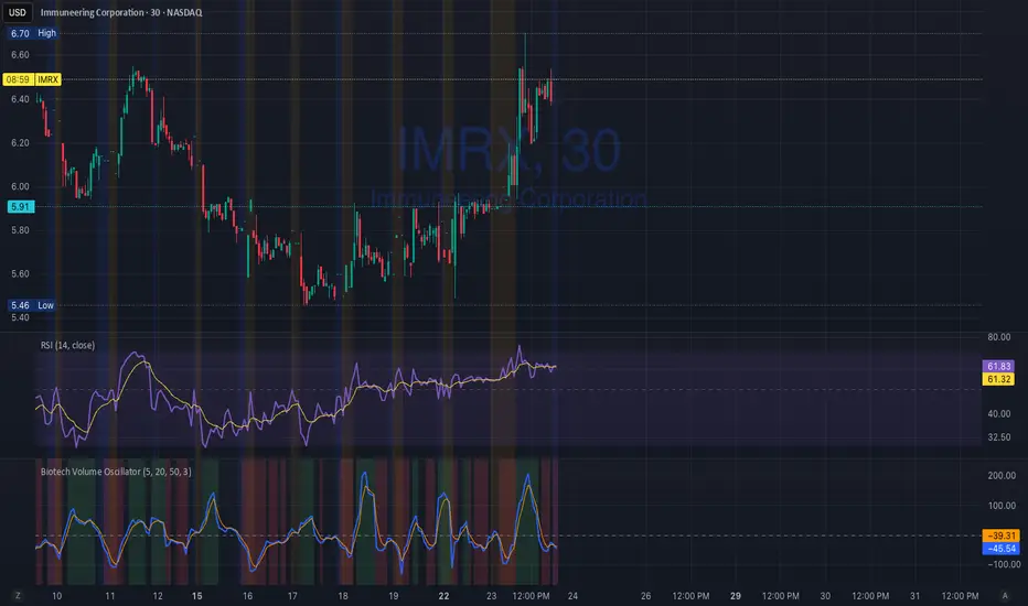
Biotech Volume Oscillator1️⃣ What This Indicator Is (In One Sentence)
It tells you whether people are actually showing up to trade the stock, or if price is just drifting around on low interest.
That’s it.
It does not predict price.
It tells you whether a move is real or fragile.
2️⃣ What the Lines Mean
You see two lines:
🔵 Blue Line = Live Participation
Fast
Reacts immediately
Shows what traders are doing right now
Think:
“Is anyone actually trading this candle?”
🟠 Orange Line = Accepted Participation
Slower
Smoothed
Shows what the market has decided is normal
Think:
“Is this level of activity sticking?”
3️⃣ What the Numbers Mean (Very Important)
The numbers are percentages vs normal volume for this stock.
Around 0
Volume is normal
Nothing special happening
+10 to +25
Healthy interest
Traders are paying attention
Moves can continue
Above +25
Abnormal participation
News, hype, or institutions involved
Moves here tend to be fast
Below –20
Participation drying up
Drift, chop, fake breakouts
Below –30
Nobody is home
Price can move, but it’s fragile
Breakouts usually fail
4️⃣ How to Use It (Step-by-Step)
Step 1: Ignore Price for a Second
Look only at the oscillator.
Ask:
“Is this above zero or below zero?”
Step 2: Look at Direction
Rising oscillator → interest increasing
Falling oscillator → interest fading
Step 3: Compare Blue vs Orange
✅ Good / Healthy
Blue above orange
Both rising
→ New participation is entering
⚠️ Warning
Price rising
Blue flat or falling
Orange flat
→ Float, not conviction
🚨 Distribution
Blue rolls over from high levels
Orange follows
Price still looks “fine”
→ Selling into strength
Market Risk Regime Dashboard (SPX/VIX)Market Risk Regime Dashboard (SPX–VIX)
Market Risk Regime Dashboard (SPX–VIX) is a context and confirmation tool designed to classify market conditions as Risk-On, Risk-Off, or Neutral by analyzing the real-time relationship between the S&P 500 Index (SPX) and the CBOE Volatility Index (VIX).
Rather than predicting price direction, this script focuses on identifying market environment and participation conditions that often influence trade quality, position sizing, and strategy selection.
Core Concept: SPX vs VIX Risk Regimes
The indicator operates on a well-documented market relationship:
SPX reflects equity risk appetite and directional participation
VIX reflects implied volatility and risk aversion
The script classifies conditions as:
Risk-On → SPX bullish and VIX falling
Risk-Off → SPX bearish and VIX rising
Neutral → Any mixed or non-aligned condition
This alignment is visualized using:
Background color on the chart
A compact dashboard table
Optional alerts
Trend Strength via Normalized EMA Distance (n-Value)
To quantify trend strength, the script computes a normalized trend metric (“n-value”) for SPX:
A fast EMA and slow EMA are calculated on SPX
The absolute distance between the EMAs is measured
That distance is normalized by an ATR-based volatility measure
The result is a dimensionless value that expresses trend strength relative to volatility, allowing comparisons across timeframes.
Higher n-values indicate stronger directional conditions, while lower values suggest compression or range behavior.
Dashboard Display
A movable on-chart table summarizes:
SPX directional bias (Bullish / Bearish / Neutral)
VIX behavior (Rising / Falling)
SPX n-value trend strength
This allows traders to quickly assess market context without switching symbols or charts.
Strong Candle Detection (SPX)
The script identifies strong directional candles on SPX using objective criteria:
Candle body must represent a minimum percentage of total range
Close must occur near the extreme (high for bullish, low for bearish)
Direction must align with candle body
When detected:
A triangle marker is plotted
The chart bar is optionally colored
Additional alerts can trigger when strong candles align with Risk-On or Risk-Off regimes
These signals are intended to highlight initiative participation, not standalone entries.
Visual & Alert Features
Background color reflects current risk regime:
Green = Risk-On
Red = Risk-Off
Gray = Neutral
Alerts available for:
Risk-On alignment
Risk-Off alignment
Neutral conditions
Strong candles aligned with risk regime
Elevated normalized trend strength (n-value range)
Alerts can be used for situational awareness rather than execution triggers.
How Traders Typically Use This Script
Filter trades based on broader market risk context
Adjust aggressiveness or size during Risk-On vs Risk-Off regimes
Confirm directional conviction when price action aligns with volatility behavior
Avoid forcing trades during neutral or conflicting environments
This script is not a trading system and does not provide entries or exits. It is a contextual decision-support tool designed to improve alignment between price action and market risk conditions.

Biotech Volume Oscillator
This oscillator is percentage-based, not raw volume.
Key Levels (Rules of Thumb)
Above +25 → abnormal participation (real interest)
+10 to +25 → constructive, but not decisive
Around 0 → drift / float
Below –25 → participation drying up
These levels work well for:
Small-cap biotech
Catalyst setups
Pre-data ramps
How You’d Use This With RSI (Your Exact Setup)
Bullish / Valid Move
RSI above 50
RSI purple > yellow
Biotech Volume Osc above +10 and rising
➡️ Move has sponsorship
Fake / Suspect Move
Price up
RSI flat or diverging
Volume Osc near 0 or falling
➡️ Float + headline + thin liquidity
Distribution Signal (Very Useful)
Price makes higher high
RSI fails to confirm
Volume Osc rolls over from +25
➡️ Selling into strength
➡️ Excellent context for sell orders like your 7.75
SVP + candle + Max volume [midst]
SVP + DALY CANDLE + MAX VOLUME
A comprehensive trading indicator that combines Session Volume Profile (SVP), Higher Timeframe (HTF) Candles, and Intrabar Max Volume Price Detection into one powerful tool. Perfect for traders who want to understand price action, volume distribution, and key levels all in one place.
KEY FEATURES
Session Volume Profile
• Real-time volume distribution across price levels for the current session
• Point of Control (POC) - identifies the price with the highest traded volume
• Value Area High (VAH) & Low (VAL) - shows where 70% of the volume occurred (customizable percentage)
• Color-coded volume bars - distinguish between up volume (bullish) and down volume (bearish)
• Value area highlighting - clearly see the most important price zones
Higher Timeframe Candle Display
• Visual daily (or custom timeframe) candle overlaid on your current chart
• OHLC labels - see Open, High, Low, and Close prices clearly marked
• Fully customizable colors - separate colors for bullish/bearish bodies, borders, and wicks
• Adjustable positioning - move the candle and labels to your preferred location
Max Volume Price Detection
• Identifies the exact price level with maximum volume within each bar
• Uses Lower Timeframe (LTF) data for precise volume analysis (Premium+ required)
• Simple mode fallback - works on all TradingView plans
• Previous max volume marker - displays previous bar's max volume as a reference dot
• Real-time calculation - updates as each bar forms
ATR Table
• Dynamic ATR-based stop levels - automatically calculates potential stop-loss levels
• Multiple smoothing methods - RMA, SMA, EMA, WMA
• Customizable multiplier - adjust for your risk tolerance
• Clean table display - shows ATR value, high stop, and low stop
PERFECT FOR
Day traders analyzing intrabar volume distribution
Swing traders wanting HTF context on lower timeframes
Volume profile traders looking for key support/resistance levels
Price action traders seeking high-probability entry zones
HOW TO USE
Volume Profile Analysis
POC often acts as a magnet for price. VAH/VAL are key support/resistance levels. High volume nodes indicate strong price acceptance, while low volume nodes suggest potential breakout zones.
HTF Candle Context
See daily range while trading on 5m-1h charts. Daily open often acts as pivot point. Daily high/low are key levels to watch.
Max Volume Price
Black line shows where most volume traded in each bar. Previous max volume (dot) helps identify institutional activity. Clusters of max volume create strong support/resistance. Can possibly indicate a Wick bounce
ATR Stops
Use ATR-based levels for logical stop placement. Adjust multiplier based on market volatility.
SETTINGS & CUSTOMIZATION
Positioning
Control the global offset to move both candle and profile together. Fine-tune with individual offsets for candle and profile spacing.
Volume Profile
Adjustable number of rows (50-500) for granular or simplified view. Customizable width and placement (left/right). Value Area percentage control. Full color customization for all volume components.
HTF Candle
Any timeframe selection (default: Daily). Full color customization for bull/bear candles. Adjustable candle width. Toggle OHLC labels on/off. Control label distance and line widths.
Max Volume Price
Choose between Simple (all plans) or LTF mode (Premium+). Auto or manual LTF resolution. Custom color and line width. Toggle current and previous markers independently.
TECHNICAL NOTES
Maximum 5000 bars lookback for volume calculations
Works on all timeframes
LTF max volume requires TradingView Premium or higher
Optimized for performance with efficient array operations
For best results, use on liquid instruments with reliable volume data
Most effective on intraday charts (5min-1hour) for day trading and scalping strategies
For Entertainment and information only
Created by midst
