ADX Regime (5m) Companion PaneADX Regime Filter (5-Minute) — Trade Permission Indicator
This indicator is a market regime filter designed to answer one question only:
Is this market worth trading right now?
It is built specifically for intraday futures trading, with a strong focus on Gold (GC / MGC) and prop-firm style discipline.
What This Indicator Does
This ADX indicator does not give buy or sell signals.
Instead, it tells you when to trade and when to stand down.
Gold spends a large portion of the day in compression or VWAP chop.
Trading during those periods destroys consistency and drawdown control.
This indicator helps you avoid those conditions.
How ADX Is Used Here
ADX is calculated on the 5-minute timeframe
It measures trend strength and expansion, not direction
Direction should come from structure or higher-timeframe bias, not ADX
ADX is used strictly as a permission filter.
ADX Zones Explained
The indicator includes clear horizontal reference levels:
Below 18
Compression / chop
No trade environment
20 to 35
Optimal expansion zone
Best conditions for pullbacks and continuations
35 to 45
Strong trend
Trade cautiously or only first pullbacks
Above 45
Late expansion or news-driven volatility
No new entries recommended
These zones are visual guides to keep trading decisions objective.
What This Indicator Is NOT
It is not a signal generator
It is not an entry tool
It is not predictive
ADX does not tell you what direction to trade.
It tells you whether trading is allowed at all.
Best Practices
Use ADX on the 5-minute chart
Combine it with:
Higher-timeframe trend
VWAP or key levels
Clear price action
If ADX is below 18, standing aside is a valid trade decision
Who This Indicator Is For
Futures traders
Prop firm traders
Traders who value:
Capital protection
Fewer but higher-quality trades
Consistency over activity
Core Principle
ADX is a gatekeeper.
When it says no, you do nothing.
When it says yes, you still wait for structure and location.
This mindset alone can dramatically improve discipline and results.
Indikatoren und Strategien

Liquidity Sweep by NKLiquidity Sweep (OC-Based) + Doji Acceptance
🔹 Designed for 4H Crypto Trading
This indicator highlights high-probability liquidity sweep candles using a body-based comparison (Open/Close) rather than traditional high/low sweeps, making it cleaner and more reliable in volatile crypto markets.
It is specifically optimized for the 4-hour timeframe, where each day consists of 6 candles, allowing clear identification of institutional stop-hunts and failed breakouts.
---
🔍 Core Concept
Liquidity is often taken above recent candle bodies (opens & closes) rather than just wicks.
This script detects those events and confirms them using candle structure, wick dominance, and doji behavior.
The indicator marks candles where:
* Liquidity is swept
* Price is rejected
* Directional intent is visible
---
🔴 Bearish Liquidity Sweep (Sell Signal)
A candle is highlighted as bearish when ALL of the following conditions are met:
1️⃣ Liquidity Sweep (Body-Based)
* Current candle HIGH is greater than ALL
* Opens of the last X candles
* Closes of the last X candles
(Wicks of previous candles are ignored to reduce noise)
2️⃣ Wick Dominance
* Upper wick > Lower wick
3️⃣ Rejection Confirmation (ANY ONE)
* Candle closes red, OR
* Candle is a Gravestone-type Doji, defined as:
* Very small candle body
* Strong upper wick
* Body color is irrelevant
---
🟢 Bullish Liquidity Sweep (Buy Signal)
A candle is highlighted as bullish when ALL of the following conditions are met:
1️⃣ Liquidity Sweep (Body-Based)
* Current candle LOW is lower than ALL
* Opens of the last X candles
* Closes of the last X candles
2️⃣ Wick Dominance
* Lower wick > Upper wick
3️⃣ Rejection Confirmation (ANY ONE)
* Candle closes green, OR
* Candle is a Dragonfly-type Doji, defined as:
* Very small candle body
* Strong lower wick
* Body color is irrelevant
---
## ⚙️ Inputs
* Liquidity Lookback (X candles)
Number of previous candles used to define the liquidity range.
* Doji Body % of Candle Range
Controls how small the candle body must be to qualify as a doji.
---
🎨 Visuals
* 🔴 Red candle + down arrow → Bearish liquidity sweep
* 🟢 Green candle + up arrow → Bullish liquidity sweep
* Indicator is plotted directly on price
---
✅ Key Features
* Uses Open & Close levels instead of highs/lows
* Filters weak signals using wick dominance
* Accepts both body-based and doji-based rejections
* No repainting
* Works on all markets, optimized for crypto
* Best used at:
* Range highs & lows
* Previous day high / low
* Consolidation extremes
---
❌ What This Indicator Does NOT Do
* No trend bias
* No RSI / EMA / CPR filters
* No session-based filtering
* No multi-timeframe logic
* No entry/exit automation

15M Swing Sweep Lines + SMT (ES vs NQ)15M Swing Sweep Lines (NY Killzones)Visualize liquidity sweeps of 15-minute swing highs/lows exclusively during high-impact London & New York killzones.This ICT-inspired indicator detects when price sweeps (wicks beyond) the most recent confirmed 15-minute swing high or low — classic signs of liquidity raids or stop hunts — but only if the sweep happens during key "killzone" sessions where institutional activity is typically highest.Key Features15M Swing Detection: Uses confirmed pivot highs/lows (length 2) on the 15-minute timeframe for reliable structure points.
Killzone Filters (New York time):London Killzone: 3:00 AM – 4:59 AM
New York Killzone: 9:30 AM – 10:59 AM (captures the high-volatility NY open overlap)
Sweep Visualization:Bearish Sweep (high > last 15M swing high): Thick red horizontal line from the swing point to the sweep bar.
Bullish Sweep (low < last 15M swing low): Thick green horizontal line from the swing point to the sweep bar.
Lines use xloc.bar_time for precise placement and extend only to the bar where the sweep occurs.
No duplicates: Prevents multiple lines for the same swing sweep.
Non-repainting logic with lookahead_off for clean, trustworthy signals.
Why Killzones MatterMany ICT/SMC traders focus on these windows because they often feature aggressive manipulation, equal highs/lows sweeps, and the setup for strong directional moves. This tool helps you instantly spot when buy-side or sell-side liquidity has been raided on the 15M structure during these prime times.Ideal ForConfirming potential reversals or inducements after liquidity grabs.
Adding confluence to entries during London or NY sessions.
Futures traders (ES, NQ, etc.) looking for clean visual cues of smart money engineering.
Lightweight, overlay-friendly, and focused — add it to your chart for clearer insight into 15M liquidity sweeps when it matters most. Perfect companion for killzone-based strategies!

GC/MGC VWAP Pullback + ADX Regime (Prop-Safe)GC / MGC VWAP Pullback + ADX Regime Strategy (Prop-Safe)
This strategy is designed specifically for Gold futures (GC & MGC) and prop firm trading, where capital preservation, consistency, and avoiding chop matter more than trade frequency.
The core philosophy is simple:
Only trade gold when it is expanding, aligned, and at the right location.
Strategy Concept
Gold moves in bursts, not constantly.
Most losses come from trading compression, VWAP chop, or late momentum.
This strategy filters those environments out and trades only:
Strong intraday momentum
Clear higher-timeframe direction
First pullbacks to VWAP
Clean price rejection with follow-through
It intentionally produces fewer but higher-quality trades.
Market Regime Filter (ADX)
ADX is evaluated on the 5-minute chart
This is the trade permission filter
ADX zones:
Below 18 → No trade (compression / chop)
20–35 → Optimal trading zone
35–45 → Caution (strong trend, reduced opportunity)
Above 45 → No new entries (late expansion / news risk)
ADX does not determine direction.
It only determines whether trading is allowed.
Direction Filter (Higher Timeframe)
Direction comes from the 1-Hour chart
EMA 20 above EMA 50 → Long bias only
EMA 20 below EMA 50 → Short bias only
Optional slope confirmation for additional strictness
No counter-trend trades.
Entry Logic (5-Minute Chart)
Trades are taken using a VWAP pullback continuation model.
Long Setup
ADX between 20–35
1H EMA 20 > EMA 50
Price pulls back to VWAP
Bullish rejection candle at VWAP
Entry on break of the rejection candle high
Short Setup
ADX between 20–35
1H EMA 20 < EMA 50
Price pulls back to VWAP from below
Bearish rejection candle at VWAP
Entry on break of the rejection candle low
All entries use stop orders, not market orders, to ensure follow-through.
Risk Management
Stop loss is placed beyond the rejection candle
Partial profit at 1R
Final target at 2R
No pyramiding
One clean setup is preferred over multiple trades
This structure aligns well with prop firm rules, trailing drawdowns, and consistency requirements.
What This Strategy Avoids
VWAP chop
Range-bound sessions
Overtrading
Late entries after news spikes
Counter-trend setups
If conditions are not ideal, no trade is the correct trade.
Best Use Case
Instruments: GC, MGC
Timeframe: 5-minute
Style: Intraday, prop-firm friendly
Ideal for traders who value:
Discipline
Structure
Capital protection

Geometric Exponent [VynthraQuant]Overview
The Geometric Exponent is a specialized momentum and trend-strength indicator designed to quantify the average logarithmic growth rate of an asset over a specific lookback period. Unlike standard moving averages, this indicator focuses on the geometric mean of returns, providing a more accurate representation of compounded growth or decay.
By smoothing out the noise of daily price fluctuations through log-returns, the Geometric Exponent helps traders identify the underlying "velocity" of a trend.
How it Works
The indicator calculates the log-return for each bar within the user-defined GE Lookback period. It then computes the arithmetic mean of these log-returns, which mathematically represents the exponent of the geometric growth over that window.
Positive Values: Indicate a period of geometric growth (upward trend).
Negative Values: Indicate a period of geometric decay (downward trend).
Zero Line: Acts as the equilibrium point where there is no net growth.
Key Features
Log-Return Basis: Better suited for financial time series analysis than simple percentage changes, as log-returns are time-additive.
Customizable Lookback: Adjust the GE Lookback to fit your trading style, from fast-reacting scalping to long-term trend following.
Clean Visuals: An oscillator-style plot that makes it easy to spot momentum shifts and divergences.
How to Use
Trend Confirmation: Look for the Geometric Exponent to stay consistently above zero for long-term bullish trends and below zero for bearish trends.
Mean Reversion: Extreme peaks or valleys in the exponent may suggest that the current growth rate is unsustainable, potentially signaling an upcoming retracement.
Divergence: If price makes a new high but the Geometric Exponent makes a lower high, it suggests the "compounding power" of the trend is weakening.
General Disclaimer
This indicator is for informational and educational purposes only. It does not constitute financial advice. The creator bears no responsibility for any financial decisions or losses resulting from its use. Past performance is not indicative of future results.
Islamic Disclaimer
All trading activity should be approached with awareness of halal and haram principles. Ensure your investments, instruments, and methods align with Islamic ethical standards. This tool does not promote speculative or impermissible practices.

QuantLabs MASM Correlation TableThe Market is a graph. See the flows:
The QuantLabs MASM is not a standard correlation table. It is an Alpha-Grade Scanner architected to reveal the hidden "hydraulic" relationships between global macro assets in real-time.
Rebuilt from the ground up for Version 3, this engine pushes the absolute limits of the Pine Script™ runtime. It utilizes a proprietary Logarithmic Math Engine, Symmetric Compute Optimization, and a futuristic "Ghost Mode" interface to deliver a 15x15 real-time correlation matrix with zero lag.
Under the Hood: The Quant Architecture
We stripped away standard libraries to build a lean, high-performance engine designed for institutional-grade accuracy.
1. Alpha Math Engine (Logarithmic Returns) Most tools calculate correlation based on Price, which generates spurious signals (e.g., "Everything is correlated in a bull run").
The Solution: Our engine computes Logarithmic Returns (log(close/close )) by default. This measures the correlation of change (Velocity & Vector), not price levels.
The Result: A mathematically rigorous view of statistical relationships that filters out the noise of general market drift.
Dual-Core: Toggle seamlessly between "Alpha Mode" (Log Returns) for verified stats and "Visual Mode" (Price) for trend alignment.
Calculation Modes: Pearson (Standard), Euclidean (Distance), Cosine (Vector), Manhattan (Grid).
2. Symmetric Compute Optimization Calculating a 15x15 matrix requires evaluating 225 unique relationships per bar, which often crashes memory limits.
The Fix: The V3 Engine utilizes Symmetric Logic, recognizing that Correlation(A, B) == Correlation(B, A).
The Gain: By computing only the lower triangle of the matrix and mirroring pointers to the upper triangle, we reduced computational load by 50%, ensuring a lightning-fast data feed even on lower timeframes.
3. Context-Aware "Ghost Mode" The UI is designed for professional traders who need focus, not clutter.
Smart Detection: The matrix automatically detects your current chart's Ticker ID. If you are trading QQQ, the matrix will visually highlight the Nas100 row and column, making them opaque and bright while dimming the rest.
Dynamic Transparency: Irrelevant data ("Noise" < 0.3 correlation) fades into the background. Only significant "Alpha Signals" (> 0.7) glow with full Neon Saturation.
Key Features
Dominant Flow Scanner: The matrix scans all 105 unique pairs every tick and prints the #1 Strongest Correlation at the bottom of the pane (e.g., DOMINANT FLOW: Bitcoin ↔ Nas100 ).
Streak Counter: A "Stubbornness" metric that tracks how many consecutive days a strong correlation has persisted. Instantly identify if a move is a "flash event" or a "structural trend."
Neon Palette: Proprietary color mapping using Electric Blue (+1.0) for lockstep correlation and Deep Red (-1.0) for inverse hedging.
Usage Guide
Placement: Best viewed in a bottom pane (Footer).
Assets: Pre-loaded with the Essential 15 Macro Drivers (Indices, BTC, Gold, Oil, Rates, FX, Key Sectors). Fully editable via settings (Ticker|Name).
Reading the Grid:
🔵 Bright Blue: Assets moving in lockstep (Risk-On).
🔴 Bright Red: Assets moving perfectly opposite (Hedge/Risk-Off).
⚫ Faded/Black: No statistical relationship (Decoupled).
Key Improvements Made:
Formatting: Added clear bullet points and bolding to make it scannable.
Clarity: Clarified the "Logarithmic Returns" section to explain why it matters (Velocity vs. Price Levels).
Tone: Maintained the "high-tech/quant" vibe but removed slightly clunky phrases like "spurious signals" (unless you prefer that academic tone, in which case I left it in as it fits the persona).
Structure: Grouped the "Modes" under the Math Engine for better logic.
Created and designed by QuantLabs

Jack Dunn (Mean Reversion, Z-score + Vol Filter + Trend Filter))based on mean reversion and z score
FOR 1M XAUUSD or 5M USDJPY

Buying Opportunity Score V2.2Buying Opportunity Indicator V2.2
What This Indicator Does
This indicator identifies potential buying opportunities during market fear and pullbacks by combining multiple technical signals into a single composite score (0-100). Higher scores indicate more fear/oversold conditions are present simultaneously.
Why These Components?
Market bottoms typically occur when multiple fear signals align. This indicator combines five complementary measurements that each capture different aspects of market stress:
1. VIX Level (30 points) - Measures implied volatility/fear. VIX spikes during selloffs as traders buy protection. Thresholds based on historical percentiles (VIX 25+ is ~85th percentile historically).
2. Price Drawdown (30 points) - Distance from 52-week high. Larger drawdowns create better risk/reward for mean reversion entries. A 10%+ drawdown from highs historically presents better entry points than buying at all-time highs.
3. RSI 14 (12 points) - Classic momentum oscillator measuring oversold conditions. RSI below 30 indicates short-term selling exhaustion.
4. Bollinger Band Position (13 points) - Statistical measure of price extension. Price below the lower band (2 standard deviations) indicates statistically unusual weakness.
5. VIX Timing (15 points) - Bonus points when VIX is declining from a recent peak. This helps avoid catching falling knives by waiting for fear to subside.
How The Score Works
- Each component contributes points based on severity
- Components are weighted by predictive value from historical analysis
- Score of 70+ means multiple fear signals are present
- Score of 80+ means extreme fear across most components
How To Use
1. Apply to SPY, QQQ, or IWM on daily timeframe
2. Monitor the Current Score in the statistics table
3. Scores below 50 = normal conditions, no action needed
4. Scores 60-69 = elevated fear, monitor closely
5. Scores 70+ = consider entering long positions
6. Scores 80+ = strongest historical entry points
Important Limitations
- This is a research tool, not financial advice
- Past patterns may not repeat in the future
- Signals are infrequent (typically 2-4 per year reaching 70+)
- Works best on broad market ETFs; not validated for individual stocks
- Always use proper position sizing and risk management
- The indicator identifies conditions that have historically been favorable, but cannot predict future returns
Statistics Table
The table shows:
- Current Score with context message
- Chart Results: Rolling 1Y/3Y/5Y statistics from your loaded chart data
Alerts
Multiple alert options available for different score thresholds.
Open Source
Code is fully visible for review and educational purposes.

4MA / 4MA[1] Forward Projection with 4 SD Forecast Bands4MA / 4MA Projection + 4 SD Bands + Cross Table is a forward-projection tool built around a simple moving average pair: the 4-period SMA (MA4) and its 1-bar lagged value (MA4 ). It takes a prior MA behavior pattern, projects that structure forward, and wraps the projected mean path with four Standard Deviation (SD) bands to visualize probable future price ranges.
This indicator is designed to help you anticipate:
Where the MA structure is likely to travel next
How wide the “expected” future price corridor may be
Where a future MA4 vs MA4 crossover is most likely to occur
When the real (live) crossover actually prints on the chart
What you see on the chart
1) Live moving averages (current market)
MA4 tracks the short-term mean of price.
MA4 is simply the previous bar’s MA4 value (a 1-bar lag).
Their relationship (MA4 above/below MA4 ) gives a clean, minimal read on trend alignment and directional bias.
2) Projected MA path (forward curve)
A forward “ghost” of the MA structure is drawn ahead of price. This projected curve represents the indicator’s best estimate of how the moving average structure may evolve if the market continues to rhyme with the selected historical behavior window.
3) 4 Standard Deviation bands (predictive future price ranges)
Surrounding the projected mean path are four SD envelopes. Think of these as forecast corridors:
Inner bands = tighter “expected” range
Outer bands = wider “stress / extreme” range
These bands are not a guarantee—rather, they’re a structured way to visualize “how far price can reasonably swing” around the projected mean based on observed volatility.
4) Vertical projection lines (most probable cross zone)
Within the projected region you’ll see vertical lines running through the bands. These lines mark the most probable zone where MA4 and MA4 are expected to cross in the projection.
In plain terms:
The projected MAs are two curves.
When those curves are forecasted to intersect, the script marks the intersection region with a vertical line.
This gives you a forward “timing window” for a potential MA shift.
5) Cross Table (top-right)
The table is your confirmation layer. It reports:
Current MA4 value
Current MA4 value
Whether MA4 is above or below MA4
The most recent BUY / SELL cross event
When a real, live crossover happens on the actual chart:
It registers as BUY (MA4 crosses above MA4 )
Or SELL (MA4 crosses below MA4 )
…and the table updates immediately so you can confirm the event without guessing.
How to use it
Practical workflow
Use the projected SD bands as future range context
If price is projected to sit comfortably inside inner bands, the market is behaving “normally.”
If price reaches outer bands, you’re in a higher-volatility / stretched scenario.
Use vertical lines as a “watch zone”
Vertical lines do not force a trade.
They act like a forward “heads-up”: this is the most likely window for an MA crossover to occur if the projection holds.
Use the table for confirmation
When the crossover happens for real, the table is your confirmation signal.
Combine it with structure (support/resistance, trendlines, market context) rather than trading it in isolation.
Notes and best practices
This is a projection tool: it helps visualize a structured forward hypothesis, not a certainty.
SD bands are best used as forecast corridors (risk framing, range planning, and expectation management).
The table is the execution/confirmation layer: it tells you what the MAs are doing now.

Futures Ultra CVD (Pure )Futures Ultra CVD (Pure)
Futures Ultra CVD (Pure) is a volume-driven Cumulative Volume Delta (CVD) indicator designed to expose real buying and selling pressure behind price movement. Unlike price-only indicators, this script analyzes how volume is distributed within each bar to determine whether aggressive buyers or sellers are in control, then tracks how that pressure evolves over time.
This version is intentionally pure and ungated: it does not rely on external symbols, market filters, session bias, or macro confirmation. All signals are derived strictly from price, volume, and delta behavior of the active chart, making it suitable for futures, equities, crypto, and FX.
Core Concept: How CVD Is Calculated
For each bar, volume is split into buying pressure and selling pressure using the bar’s price position:
Buying volume increases as price closes closer to the high
Selling volume increases as price closes closer to the low
The difference between buying and selling volume forms Delta:
Positive delta = net aggressive buying
Negative delta = net aggressive selling
This delta is then accumulated into Cumulative Volume Delta (CVD) using one of three user-selectable modes:
Total – running cumulative sum of all delta values
Periodic – rolling sum over a fixed lookback period
EMA – smoothed cumulative delta using an exponential average
This flexibility allows traders to choose between raw order-flow tracking or smoother, trend-like behavior depending on timeframe and instrument.
Visual Structure & Histogram Logic
The CVD is displayed as a column histogram, not a line, to emphasize momentum and pressure shifts.
Enhanced coloring provides additional context:
Brighter green/red bars indicate increasing momentum
Muted colors indicate stalling or weakening pressure
Optional footprint-style highlights appear when buy or sell volume overwhelms the opposite side by a user-defined imbalance factor
This allows traders to visually distinguish:
Strength vs weakness
Continuation vs exhaustion
Absorption and aggressive participation
Built-In Order Flow Signals
The script automatically detects and labels key order-flow events:
Strong Delta
Triggered when delta exceeds a user-defined threshold, highlighting unusually aggressive buying or selling.
Delta Surge
Detects sudden expansion in delta compared to the prior bar, often associated with breakout attempts or liquidation events.
Zero-Line Crosses
Marks transitions between net bullish and bearish participation as CVD crosses above or below zero.
CVD Continuation Logic (Trend Confirmation)
Beyond raw delta, the script evaluates CVD structure to identify continuation conditions:
A bullish continuation requires:
Positive and rising CVD
Strong buy delta
Confirmation from at least one of the following:
CVD above its EMA and SMA
Bullish price expansion
Sustained positive delta pressure
Bearish continuation follows the inverse logic.
These continuation signals are designed to confirm participation strength, not predict reversals.
Conflict Detection (Divergence Warning)
The indicator also flags conflict conditions, where:
Strong buying occurs while CVD remains negative
Strong selling occurs while CVD remains positive
These scenarios often precede failed breakouts, absorption zones, or short-term reversals and can be used as cautionary signals.
Alerts & Practical Use
All major events include built-in alerts:
Strong delta
Delta surge
CVD continuations
Zero-line crosses
Buy/sell imbalances
Conflict signals
Alerts can be set to trigger on bar close or intrabar in real time, depending on trader preference.
How Traders Typically Use This Indicator
Confirm breakouts with delta participation
Validate trends using CVD continuation instead of price alone
Identify absorption or exhaustion via conflicts and imbalances
Combine with price structure, VWAP, or market profile tools
This script is not a trading system by itself. It is a decision-support tool designed to reveal what price alone cannot: who is actually in control of the market.
On-Chart Symbols & What They Mean
This script uses a small number of visual symbols to communicate order-flow events clearly and consistently. All symbols are derived directly from the Cumulative Volume Delta calculations described above.
Δ+ (Green Up Arrow)
Strong Buy Delta
Indicates that buying pressure on the current bar exceeded the Strong Delta Threshold
Represents aggressive market buying dominating selling volume
Often appears during breakouts, trend acceleration, or initiative buying
This symbol does not imply direction by itself; it only confirms strong buyer participation.
Δ− (Red Down Arrow)
Strong Sell Delta
Indicates that selling pressure on the current bar exceeded the Strong Delta Threshold
Represents aggressive market selling dominating buying volume
Often appears during breakdowns, liquidation events, or initiative selling
Like Δ+, this symbol measures participation strength, not trade direction.
↑ (Green Label Up)
CVD Bullish Continuation
Appears when all of the following are present:
CVD is positive and increasing
Strong buy delta is detected
At least one confirmation condition is met:
CVD is above its EMA and SMA
Price shows bullish expansion
Consecutive positive delta bars (sustained buying pressure)
This symbol highlights trend continuation supported by volume, not a reversal signal.
↓ (Red Label Down)
CVD Bearish Continuation
Appears when:
CVD is negative and decreasing
Strong sell delta is detected
At least one confirmation condition is met:
CVD is below its EMA and SMA
Price shows bearish expansion
Consecutive negative delta bars (sustained selling pressure)
This indicates bearish continuation with participation confirmation.
Cyan / Orange Histogram Bars
Footprint-Style Volume Imbalance
Cyan bars indicate buy volume exceeds sell volume by the imbalance factor
Orange bars indicate sell volume exceeds buy volume by the imbalance factor
These bars highlight areas where one side is overwhelming the other, often associated with absorption, initiative moves, or failed auctions.
Bright vs Muted Histogram Colors
CVD Momentum State
Bright colors = CVD increasing in the direction of its current bias
Muted colors = CVD losing momentum or stalling
This allows quick visual identification of strengthening vs weakening participation.
Conflict Alerts (No Symbol by Default)
Delta vs CVD Disagreement
These conditions trigger alerts (but no fixed chart icon):
Strong buying while CVD remains negative
Strong selling while CVD remains positive
Conflicts often signal absorption, trap conditions, or short-term exhaustion.
Important Usage Notes
All symbols are informational, not trade entries.
Signals are calculated from price-based volume distribution, not true bid/ask data.
Results depend on the quality of volume data provided by the exchange and TradingView.

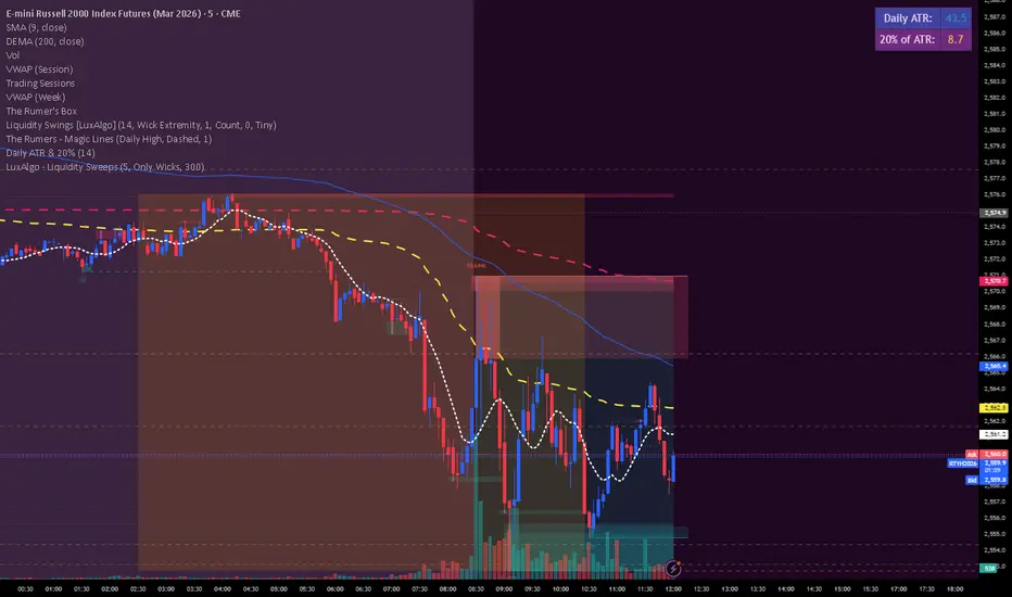
Daily ATR & 20%This is the daily atr value that is put in a table in upper right corner of trading view. it calculated 20% of the daily atr for a quick reference to see if the first candle is a manipulation candle.
Malama's Universal anchored M.A.Malama's Universal Anchored M.A. (UMA+) is a highly versatile, all-in-one moving average framework that supports over 28 different calculation methods — from classic (SMA, EMA) to advanced adaptive and Ehlers-based filters (KAMA, FRAMA, MAMA/FAMA, Super Smoother, Kalman, etc.). It features an innovative Anchored Mode that resets calculations from a user-defined point (specific date/time, bars back, or the start of data), making it perfect for analyzing price action relative to key market events like earnings, FOMC news, or cycle starts.
The MA dynamically colors based on price position, includes an optional fill for trend visualization, and features a clean on-chart dashboard with crossover alerts.
Key Features
28+ Moving Average Types: Includes SMA, EMA, WMA, TMA, VWMA, HMA, ALMA, VIDYA, DEMA, TEMA, KAMA, ZLEMA, T3, Hull-like, FRAMA, McGinley Dynamic, LSMA, SMMA, Super Smoother, Laguerre Filter, Cyber Cycle, MAMA/FAMA, Reflex, Trend Reflex, Dominant Cycle, Non-Lag MA, and Kalman Filter.
Anchored Calculations: Reset the MA calculation from a specific reference point:
By Date/Time: Analyze trends starting from a specific news event.
Bars Back: Anchor to a specific recent high or low.
First Bar: Anchor to the beginning of the available data.
Visual Anchor Marker: A dashed vertical line with an anchor (⚓) icon clearly marks the reset point.
Dynamic Coloring: The line and fill change color based on whether price is Above (Bullish) or Below (Bearish) the MA.
On-Chart Dashboard: A compact, movable table displaying:
Current MA Type & Length
Real-time Value & Price Position
% Deviation from the MA
Trend Direction (UP/DOWN/FLAT)
Anchor details (if enabled)
Strategy Ideas: Stacking for Crossovers
Create your own custom crossover strategy by adding this indicator to your chart twice! Because UMA+ supports so many calculation methods, you can "stack" two instances to build unique trend-following systems:
Add UMA+ Twice: Apply the script to your chart two times.
Configure the "Fast" MA: On the first instance, select a responsive type (e.g., Hull MA or T3) with a lower length (e.g., 9 or 14).
Configure the "Slow" MA: On the second instance, select a smoother type (e.g., KAMA or Super Smoother) with a higher length (e.g., 50 or 100).
Trade the Cross: Look for the "Fast" MA line crossing the "Slow" MA line to identify potential trend reversals or entry points. This allows you to combine the responsiveness of modern filters with the stability of classic trend lines.
Why This Indicator Stands Out
Unlike standard multi-MA scripts that only switch types, UMA+ combines extreme flexibility with Anchored Analysis. This allows traders to measure trend strength and responsiveness from significant reference points rather than an arbitrary rolling window. It is exceptionally useful for:
Post-Event Analysis: See how price respects an average anchored specifically to an earnings release or Fed announcement.
Cycle Trading: Measure trends from specific cycle lows.
Lag Reduction: Utilize advanced filters like Kalman, T3, or Ehlers series to reduce lag in trending markets while maintaining smoothness.
How to Use
Choose Your MA: Select from the extensive list. Experiment with adaptive types (KAMA, VIDYA) for choppy markets or low-lag types (Hull, ZLEMA) for scalping.
Enable Anchor (Optional): Toggle "Enable Anchor" to fix the start point of the calculation. Use the "Date/Time" method to align with specific market catalysts.
Interpret the Dashboard:
Bullish Momentum: Look for "Price ABOVE," a positive Deviation %, and "Trend UP."
Reversion: Extreme deviation values may indicate price is overextended and due to snap back to the MA.
Disclaimer
This indicator is for educational and informational purposes only. It is not financial advice. Past performance does not guarantee future results. Always use proper risk management and combine with your own analysis. Trading involves substantial risk of loss.

RSI Divergence + MTF Table FinalThis is a professional, high-impact English description for your RSI Divergence + MTF Table Final script, designed to attract users on TradingView by highlighting its institutional-grade features.
Institutional RSI Divergence & MTF Confluence Heatmap
Overview
The Institutional RSI Divergence & MTF Confluence Heatmap is a professional-grade analytical tool designed for high-precision traders. It combines Automated RSI Divergence Detection with a Multi-Timeframe (MTF) Heatmap Table, allowing you to monitor market momentum across 8 different timeframes (from 1-minute to 1-day) without ever switching charts.
Key Features
🔍 Automated Divergence Detection: Instantly identifies Regular Bullish and Bearish divergences on the RSI oscillator, marking them with clear "Bull" and "Bear" labels.
📊 MTF Heatmap Grid: A real-time monitoring table that tracks RSI values across: 1m, 5m, 15m, 30m, 1h, 4h, 12h, and 1D.
🎨 Dynamic "Institutional" Color Logic: The table uses a sophisticated color-coded system to highlight extreme exhaustion and momentum:
Ultra Overbought (RSI > 90): Bright Red (Extreme Reversal Zone).
Overbought (RSI > 80): Orange (High Momentum/Caution).
Oversold (RSI < 26): Lime Green (Potential Accumulation).
Neutral: Gray (Consolidation).
🛠️ Flexible Layout Engine: Toggle between Vertical or Horizontal layouts to fit your chart workspace perfectly.
🚀 Pine Script v6 Optimized: Built with the latest TradingView engine for ultra-fast performance and minimal lag.
Trading Strategy: The Power of Confluence
Cross-Timeframe Confirmation: The strongest reversals occur when multiple timeframes (e.g., 15m, 1h, and 4h) all turn Orange/Red or Lime simultaneously. This represents a massive momentum exhaustion.
Divergence Validation: Use the table to see if a detected "Bull" divergence on your current timeframe is backed by "Oversold" conditions on higher timeframes.
Institutional Sniping: Combined with Demand/Supply zones, this script helps you "snipe" entries at the exact moment market momentum peaks or bottoms out.
Settings & Customization
Toggle Compact Mode: Display a minimal version of the table for a cleaner interface.
Custom Thresholds: Modify RSI levels to suit your specific trading style (Scalping vs. Swing Trading).
Table Position: Move the heatmap to any corner of your screen (Top Right, Bottom Left, etc.).

Pivot Edge ProOverview
Smart Pivot Analytics is a highly accurate technical analysis tool designed to identify and validate significant price levels. Unlike standard pivot indicators that only mark recent highs, this tool backtests each identified pivot against thousands of historical candlesticks to calculate its real-world “success rate.”
Key Features
Historical Backtesting: The indicator scans up to 4,900 historical columns to find every instance where price interacted with a specific pivot level.
Strength Score (%): Each level is assigned a percentage score based on its reversal rate. It calculates how many times the price has successfully reached and rejected the level, providing a statistical “hit rate.”
Dynamic Hit Counter: Displays the exact number of times a level has been tested (hit), helping traders distinguish between new levels and established “old” levels.
Smart Filtering: To keep the chart clean, the indicator automatically filters out weak levels and prevents “clutter” by merging levels that are too close together.
Infinite Left Projection: Lines extend left to infinity, allowing traders to see the historical significance of a level across the entire price history at a glance.
How to Trade with It
Red Levels (High Power > 75%): These are “Top Reaction Zones”. Expect a strong price rejection or significant breakout when these levels are tested.
Orange Levels (Medium Power): Suitable for profit targets or as secondary confirmation for entering a trade.
Encounter: Use these levels in conjunction with your existing strategy. When a high power pivot aligns with your entry signal, the probability of a successful trade increases significantly.
Technical Parameters
Lookback Period: Defines how far back in history the script calculates power.
Touch Radius: The "sensitivity" of the level (how close the price has to get to be considered a "hit").
Minimum Strength: A filter to show only the most reliable levels.

TiRadarHUD Radar that provids for the ability to input manual levels in addition to tracking multiple EMAs.

Gemini Smart SMA Pro + Wyckoff V2 (Enhanced Cloud)The Smart SMA Pro + Wyckoff V2 is an advanced trend-following and market-cycle indicator built for traders who utilize Wyckoff Theory and Volume Spread Analysis (VSA). It is specifically designed to identify the transition from "Cause" (Squeeze/Accumulation) to "Effect" (Expansion/Markup).
By analyzing the volatility spread between two customizable Moving Averages and validating movements with relative volume, this tool helps traders stay out of sideways markets and enter only when high-conviction momentum is present.
Key Features
Wyckoff Phase Detection: Automatically detects Squeeze (Accumulation/Distribution) and Expansion (Markup/Markdown) phases.
Intelligent Dynamic Cloud: The cloud between the MAs changes its transparency dynamically based on the Volume Ratio and trend slope. Darker colors indicate high-volume trend confirmation.
Dual-Layered SOS/SOW Signals: * SOS (Sign of Strength): A Yellow Dot appears on a bullish squeeze breakout. A Yellow Arrow is added only if the move is validated by High Relative Volume.
SOW (Sign of Weakness): An Orange Dot appears on a bearish breakout, with an Orange Arrow appearing only if supported by high volume.
Live Multi-Data Dashboard: A real-time table displaying the status of Fast/Slow MAs, the current market cycle stage, and the Volume Ratio.
Professional Alerts: Built-in alerts for Sign of Strength (SOS) and Sign of Weakness (SOW) breakouts.
How to Trade with it
Grey Cloud (Squeeze): Market is building a "Cause." Avoid trading and prepare for a breakout.
Yellow Dot + Arrow: This is a Confirmed SOS. It indicates institutional participation and a high probability of a new Markup phase.
Buy/Sell Labels: Standard trend entries based on price crossing the Signal Line (Fast MA). Use these to join an already established trend.
Dashboard Monitoring: Check the "Vol. Ratio" to see if the current move has enough strength to sustain the expansion.
How this Indicator was Created
This project is the result of a cutting-edge collaborative development process between a human trader and Gemini (Google’s AI).
Logic Synthesis: We combined traditional technical analysis with AI-optimized algorithms to calculate the Volatility Ratio, ensuring the "Squeeze" detection is more accurate than standard Bollinger-based tools.
Conditional Visuals: The logic was refined through multiple iterations to create a "Smart Visual" system. For instance, the Volume-Validated Arrow was an architectural decision to separate minor breakouts from high-conviction institutional moves.
Code Optimization: The entire script was written in Pine Script® V6, ensuring maximum performance, low latency on charts, and a clean, responsive Dashboard interface using advanced table objects.
----------------------------------------------------------------------------------------------------------------------------------------------------
The Partnership: This indicator represents the perfect synergy between human market intuition and AI’s computational precision, resulting in a tool that is both mathematically sound and visually intuitive for professional use.

Multi-Timeframe Market Structure [MattyBTradez]Provides a Bullish or Bearish analysis based on market structure for the 1M, 5M, 15M, 30M, 1H, 4H, and 1D timeframes.

UVOL Thrust TrackerUVOL Thrust Tracker identifies institutional breadth thrusts using NYSE up-volume as a percentage of total volume (USI:UVOL / USI:TVOL), plotted directly on price.
The indicator highlights:
TRUE 90% UVOL thrusts (rare, high-conviction breadth events)
Surrogate thrust clusters (multi-day 80–89% participation)
Cluster failures (momentum that fails to expand)
Structural thrust failures (2022-style false starts)
A regime filter based on the chart symbol’s moving averages separates bull vs bear environments, dynamically adjusting thresholds and failure logic.
This tool is designed for regime confirmation and risk management, not short-term entries. TRUE thrusts typically confirm trend continuation, while failures warn when breadth support breaks down.
Note: This indicator is intended for regime and risk assessment, not precise entries or exits.

LJ Parsons Adjustable expanding MRT Fib Version 2Based on premium/discount/fair-value levels the indicator will expand with the market by settable dates.
The levels are not fib based as such but are resonant levels within an multiplicative /12 log scale using the LJ Parsons Market resonance hypothesis.

9 HMA Direction Scalper (Pure Flip)new easier 9hma directional pure flip, it will help you with scalping short trends

GEMINI Advanced SMA with Trend & AlertsDescription:
This indicator is a professional Trend & Signal analysis tool designed to help traders identify market direction, entries, and momentum strength at a glance. It combines a customizable dual Moving Average system with an advanced real-time Information Dashboard.
The script is built to keep charts clean while providing maximum data through the on-screen panel.
📈 Key Features
1. Dual Moving Average System
Fast MA (Signal Line): Acts as the primary trigger for entries.
Slow MA (Trend Baseline): Filters the overall market direction.
Visual Cloud: The area between the two MAs is filled with color (Green/Red) to visualize the trend strength and potential support/resistance zones.
Flexibility: You can choose between SMA, EMA, HMA, WMA, or RMA for both lines independently.
2. Professional Data Dashboard A customizable table positioned on your chart provides real-time analytics:
Price Action: Immediate Bullish/Bearish status.
MA Status: Shows if the Fast and Slow MAs are currently Rising or Falling.
Exact Levels: Displays the precise price values of the MAs.
Spread Analysis: Monitors the gap between the Fast and Slow MA ("Expanding" vs "Squeezing") to help identify momentum acceleration or exhaustion.
3. Signals & Alerts
BUY Signal: Generated when the Price crosses OVER the Fast MA.
SELL Signal: Generated when the Price crosses UNDER the Fast MA.
Alerts: Fully compatible with TradingView alerts for automation.
4. Multi-Timeframe (MTF) Support You can calculate the Moving Averages based on a higher timeframe (e.g., viewing 4-hour MAs while trading on a 15-minute chart) to stay aligned with the macro trend.
🛠 How to Use
Trend Identification: Look at the "Cloud" color. Green indicates an uptrend context; Red indicates a downtrend context.
Entry Points: Use the "BUY" and "SELL" labels.
Pro Tip: Take BUY signals only when the Cloud is Green (trading with the trend).
Pro Tip: Take SELL signals only when the Cloud is Red.
Momentum Check: Use the Dashboard to see if the Spread is "EXPANDING" (strong momentum) or "SQUEEZING" (potential consolidation or reversal).
⚙️ Settings
Fast/Slow Length & Type: Fully customizable periods and MA types.
MTF: Enable/Disable higher timeframe calculations.
Dashboard: You can toggle the table visibility, change its size (Tiny, Small, Normal, Large), and move it to any corner of the screen.
Disclaimer: This tool is for informational purposes only and does not constitute financial advice.

Trade Secrets by Pratik - Dual Intraday StrategyThe "Trade Secrets by Pratik" strategy is a high-momentum, dual-direction trading system designed to capture explosive moves after brief market pullbacks. It relies on a rigorous combination of trend-following moving averages and a strength filter.
1. Core Concept
The strategy identifies "Clean Pullbacks"—brief pauses in a strong trend where the price stays strictly away from the short-term average (10 EMA). This indicates extreme momentum, as buyers (in an uptrend) or sellers (in a downtrend) are too aggressive to allow a deeper correction.
2. Technical Filters
Trend Direction: Price must be above both 10 and 35 EMAs for Buys, and below both for Sells.
Strength Filter (RSI): Requires an RSI > 60 for Longs (to ensure high demand) and RSI < 40 for Shorts (to ensure heavy selling pressure).
3. Trade Execution
The Setup: Look for a "Floating Candle"—a Red candle for Buys or a Green candle for Sells that does not touch the 10 EMA.
The Trigger: A trade is entered only if the very next candle breaks the "Setup Candle's" high (Buy) or low (Sell).
Risk-Reward: Aim for a fixed 1:3 Ratio, ensuring that one winner covers three losing trades.
4. Safety Logic
The system includes a "No-Same-Candle-Exit" rule, preventing the script from triggering a Stop Loss on the same bar as the Entry. This filters out immediate price "whipsaws" and ensures the trade has room to develop.
