SVP + candle + Max volume [midst]
SVP + DALY CANDLE + MAX VOLUME
A comprehensive trading indicator that combines Session Volume Profile (SVP), Higher Timeframe (HTF) Candles, and Intrabar Max Volume Price Detection into one powerful tool. Perfect for traders who want to understand price action, volume distribution, and key levels all in one place.
KEY FEATURES
Session Volume Profile
• Real-time volume distribution across price levels for the current session
• Point of Control (POC) - identifies the price with the highest traded volume
• Value Area High (VAH) & Low (VAL) - shows where 70% of the volume occurred (customizable percentage)
• Color-coded volume bars - distinguish between up volume (bullish) and down volume (bearish)
• Value area highlighting - clearly see the most important price zones
Higher Timeframe Candle Display
• Visual daily (or custom timeframe) candle overlaid on your current chart
• OHLC labels - see Open, High, Low, and Close prices clearly marked
• Fully customizable colors - separate colors for bullish/bearish bodies, borders, and wicks
• Adjustable positioning - move the candle and labels to your preferred location
Max Volume Price Detection
• Identifies the exact price level with maximum volume within each bar
• Uses Lower Timeframe (LTF) data for precise volume analysis (Premium+ required)
• Simple mode fallback - works on all TradingView plans
• Previous max volume marker - displays previous bar's max volume as a reference dot
• Real-time calculation - updates as each bar forms
ATR Table
• Dynamic ATR-based stop levels - automatically calculates potential stop-loss levels
• Multiple smoothing methods - RMA, SMA, EMA, WMA
• Customizable multiplier - adjust for your risk tolerance
• Clean table display - shows ATR value, high stop, and low stop
PERFECT FOR
Day traders analyzing intrabar volume distribution
Swing traders wanting HTF context on lower timeframes
Volume profile traders looking for key support/resistance levels
Price action traders seeking high-probability entry zones
HOW TO USE
Volume Profile Analysis
POC often acts as a magnet for price. VAH/VAL are key support/resistance levels. High volume nodes indicate strong price acceptance, while low volume nodes suggest potential breakout zones.
HTF Candle Context
See daily range while trading on 5m-1h charts. Daily open often acts as pivot point. Daily high/low are key levels to watch.
Max Volume Price
Black line shows where most volume traded in each bar. Previous max volume (dot) helps identify institutional activity. Clusters of max volume create strong support/resistance. Can possibly indicate a Wick bounce
ATR Stops
Use ATR-based levels for logical stop placement. Adjust multiplier based on market volatility.
SETTINGS & CUSTOMIZATION
Positioning
Control the global offset to move both candle and profile together. Fine-tune with individual offsets for candle and profile spacing.
Volume Profile
Adjustable number of rows (50-500) for granular or simplified view. Customizable width and placement (left/right). Value Area percentage control. Full color customization for all volume components.
HTF Candle
Any timeframe selection (default: Daily). Full color customization for bull/bear candles. Adjustable candle width. Toggle OHLC labels on/off. Control label distance and line widths.
Max Volume Price
Choose between Simple (all plans) or LTF mode (Premium+). Auto or manual LTF resolution. Custom color and line width. Toggle current and previous markers independently.
TECHNICAL NOTES
Maximum 5000 bars lookback for volume calculations
Works on all timeframes
LTF max volume requires TradingView Premium or higher
Optimized for performance with efficient array operations
For best results, use on liquid instruments with reliable volume data
Most effective on intraday charts (5min-1hour) for day trading and scalping strategies
For Entertainment and information only
Created by midst
Indikatoren und Strategien

Futures Ultra CVD (Pure )Futures Ultra CVD (Pure)
Futures Ultra CVD (Pure) is a volume-driven Cumulative Volume Delta (CVD) indicator designed to expose real buying and selling pressure behind price movement. Unlike price-only indicators, this script analyzes how volume is distributed within each bar to determine whether aggressive buyers or sellers are in control, then tracks how that pressure evolves over time.
This version is intentionally pure and ungated: it does not rely on external symbols, market filters, session bias, or macro confirmation. All signals are derived strictly from price, volume, and delta behavior of the active chart, making it suitable for futures, equities, crypto, and FX.
Core Concept: How CVD Is Calculated
For each bar, volume is split into buying pressure and selling pressure using the bar’s price position:
Buying volume increases as price closes closer to the high
Selling volume increases as price closes closer to the low
The difference between buying and selling volume forms Delta:
Positive delta = net aggressive buying
Negative delta = net aggressive selling
This delta is then accumulated into Cumulative Volume Delta (CVD) using one of three user-selectable modes:
Total – running cumulative sum of all delta values
Periodic – rolling sum over a fixed lookback period
EMA – smoothed cumulative delta using an exponential average
This flexibility allows traders to choose between raw order-flow tracking or smoother, trend-like behavior depending on timeframe and instrument.
Visual Structure & Histogram Logic
The CVD is displayed as a column histogram, not a line, to emphasize momentum and pressure shifts.
Enhanced coloring provides additional context:
Brighter green/red bars indicate increasing momentum
Muted colors indicate stalling or weakening pressure
Optional footprint-style highlights appear when buy or sell volume overwhelms the opposite side by a user-defined imbalance factor
This allows traders to visually distinguish:
Strength vs weakness
Continuation vs exhaustion
Absorption and aggressive participation
Built-In Order Flow Signals
The script automatically detects and labels key order-flow events:
Strong Delta
Triggered when delta exceeds a user-defined threshold, highlighting unusually aggressive buying or selling.
Delta Surge
Detects sudden expansion in delta compared to the prior bar, often associated with breakout attempts or liquidation events.
Zero-Line Crosses
Marks transitions between net bullish and bearish participation as CVD crosses above or below zero.
CVD Continuation Logic (Trend Confirmation)
Beyond raw delta, the script evaluates CVD structure to identify continuation conditions:
A bullish continuation requires:
Positive and rising CVD
Strong buy delta
Confirmation from at least one of the following:
CVD above its EMA and SMA
Bullish price expansion
Sustained positive delta pressure
Bearish continuation follows the inverse logic.
These continuation signals are designed to confirm participation strength, not predict reversals.
Conflict Detection (Divergence Warning)
The indicator also flags conflict conditions, where:
Strong buying occurs while CVD remains negative
Strong selling occurs while CVD remains positive
These scenarios often precede failed breakouts, absorption zones, or short-term reversals and can be used as cautionary signals.
Alerts & Practical Use
All major events include built-in alerts:
Strong delta
Delta surge
CVD continuations
Zero-line crosses
Buy/sell imbalances
Conflict signals
Alerts can be set to trigger on bar close or intrabar in real time, depending on trader preference.
How Traders Typically Use This Indicator
Confirm breakouts with delta participation
Validate trends using CVD continuation instead of price alone
Identify absorption or exhaustion via conflicts and imbalances
Combine with price structure, VWAP, or market profile tools
This script is not a trading system by itself. It is a decision-support tool designed to reveal what price alone cannot: who is actually in control of the market.
On-Chart Symbols & What They Mean
This script uses a small number of visual symbols to communicate order-flow events clearly and consistently. All symbols are derived directly from the Cumulative Volume Delta calculations described above.
Δ+ (Green Up Arrow)
Strong Buy Delta
Indicates that buying pressure on the current bar exceeded the Strong Delta Threshold
Represents aggressive market buying dominating selling volume
Often appears during breakouts, trend acceleration, or initiative buying
This symbol does not imply direction by itself; it only confirms strong buyer participation.
Δ− (Red Down Arrow)
Strong Sell Delta
Indicates that selling pressure on the current bar exceeded the Strong Delta Threshold
Represents aggressive market selling dominating buying volume
Often appears during breakdowns, liquidation events, or initiative selling
Like Δ+, this symbol measures participation strength, not trade direction.
↑ (Green Label Up)
CVD Bullish Continuation
Appears when all of the following are present:
CVD is positive and increasing
Strong buy delta is detected
At least one confirmation condition is met:
CVD is above its EMA and SMA
Price shows bullish expansion
Consecutive positive delta bars (sustained buying pressure)
This symbol highlights trend continuation supported by volume, not a reversal signal.
↓ (Red Label Down)
CVD Bearish Continuation
Appears when:
CVD is negative and decreasing
Strong sell delta is detected
At least one confirmation condition is met:
CVD is below its EMA and SMA
Price shows bearish expansion
Consecutive negative delta bars (sustained selling pressure)
This indicates bearish continuation with participation confirmation.
Cyan / Orange Histogram Bars
Footprint-Style Volume Imbalance
Cyan bars indicate buy volume exceeds sell volume by the imbalance factor
Orange bars indicate sell volume exceeds buy volume by the imbalance factor
These bars highlight areas where one side is overwhelming the other, often associated with absorption, initiative moves, or failed auctions.
Bright vs Muted Histogram Colors
CVD Momentum State
Bright colors = CVD increasing in the direction of its current bias
Muted colors = CVD losing momentum or stalling
This allows quick visual identification of strengthening vs weakening participation.
Conflict Alerts (No Symbol by Default)
Delta vs CVD Disagreement
These conditions trigger alerts (but no fixed chart icon):
Strong buying while CVD remains negative
Strong selling while CVD remains positive
Conflicts often signal absorption, trap conditions, or short-term exhaustion.
Important Usage Notes
All symbols are informational, not trade entries.
Signals are calculated from price-based volume distribution, not true bid/ask data.
Results depend on the quality of volume data provided by the exchange and TradingView.

Risk Adjusted Geometric Exponent [VynthraQuant]RAGE Index (Risk-Adjusted Geometric Exponent)
Overview
The RAGE Index is a quantitative momentum oscillator that measures the efficiency and quality of an asset's price trend. Standing for Risk-Adjusted Geometric Exponent , this indicator goes beyond simple price action by evaluating the average logarithmic growth rate relative to the asset's volatility.
In institutional finance, it is not just about how much an asset moves, but how it moves. RAGE identifies trends that exhibit high compounding growth with minimal "noise" or volatility.
The Logic Behind RAGE
The indicator is built on two core quantitative pillars:
1. Geometric Exponent (GE): Instead of simple percentage changes, we calculate the geometric mean of log-returns. This represents the true compounding "velocity" of the price.
2. Volatility Normalization: We divide the GE by the standard deviation of returns (Volatility) over a specific lookback period.
How to Interpret the RAGE Index
* The Zero Line: The most critical level. When RAGE crosses above 0, the asset has entered a state of positive geometric growth. Below 0, the asset is in a state of efficient decay.
* Trend Quality: A rising RAGE value indicates that the trend is becoming more "efficient", growth is increasing while volatility is staying low or decreasing.
* Color-Coded Candles: The script features a `force_overlay` function that colors the candles on your main chart.
* Bullish Color: Efficient growth detected (Long bias).
* Bearish Color: Efficient decay detected (Short bias).
Key Features
* Logarithmic Accuracy: Uses log-returns to ensure time-additivity and eliminate the bias found in standard percentage calculations.
* Adaptive to Volatility: Unlike a standard RSI or MACD, RAGE penalizes "choppy" price action, helping you stay out of sideways markets.
* Optimized Performance: Written in Pine Script v6 with high-efficiency math to ensure fast loading even on lower timeframes.
Settings
* GE Lookback: The window used to calculate the average growth rate.
* Volatility Lookback: The window used to measure the "risk" or noise of the price action.
General Disclaimer
This indicator is for informational and educational purposes only. It does not constitute financial advice. The creator bears no responsibility for any financial decisions or losses resulting from its use. Past performance is not indicative of future results.
Islamic Disclaimer
All trading activity should be approached with awareness of halal and haram principles. Ensure your investments, instruments, and methods align with Islamic ethical standards. This tool does not promote speculative or impermissible practices.

Geometric Exponent [VynthraQuant]Overview
The Geometric Exponent is a specialized momentum and trend-strength indicator designed to quantify the average logarithmic growth rate of an asset over a specific lookback period. Unlike standard moving averages, this indicator focuses on the geometric mean of returns, providing a more accurate representation of compounded growth or decay.
By smoothing out the noise of daily price fluctuations through log-returns, the Geometric Exponent helps traders identify the underlying "velocity" of a trend.
How it Works
The indicator calculates the log-return for each bar within the user-defined GE Lookback period. It then computes the arithmetic mean of these log-returns, which mathematically represents the exponent of the geometric growth over that window.
Positive Values: Indicate a period of geometric growth (upward trend).
Negative Values: Indicate a period of geometric decay (downward trend).
Zero Line: Acts as the equilibrium point where there is no net growth.
Key Features
Log-Return Basis: Better suited for financial time series analysis than simple percentage changes, as log-returns are time-additive.
Customizable Lookback: Adjust the GE Lookback to fit your trading style, from fast-reacting scalping to long-term trend following.
Clean Visuals: An oscillator-style plot that makes it easy to spot momentum shifts and divergences.
How to Use
Trend Confirmation: Look for the Geometric Exponent to stay consistently above zero for long-term bullish trends and below zero for bearish trends.
Mean Reversion: Extreme peaks or valleys in the exponent may suggest that the current growth rate is unsustainable, potentially signaling an upcoming retracement.
Divergence: If price makes a new high but the Geometric Exponent makes a lower high, it suggests the "compounding power" of the trend is weakening.
General Disclaimer
This indicator is for informational and educational purposes only. It does not constitute financial advice. The creator bears no responsibility for any financial decisions or losses resulting from its use. Past performance is not indicative of future results.
Islamic Disclaimer
All trading activity should be approached with awareness of halal and haram principles. Ensure your investments, instruments, and methods align with Islamic ethical standards. This tool does not promote speculative or impermissible practices.

QuantLabs MASM Correlation TableThe Market is a graph. See the flows:
The QuantLabs MASM is not a standard correlation table. It is an Alpha-Grade Scanner architected to reveal the hidden "hydraulic" relationships between global macro assets in real-time.
Rebuilt from the ground up for Version 3, this engine pushes the absolute limits of the Pine Script™ runtime. It utilizes a proprietary Logarithmic Math Engine, Symmetric Compute Optimization, and a futuristic "Ghost Mode" interface to deliver a 15x15 real-time correlation matrix with zero lag.
Under the Hood: The Quant Architecture
We stripped away standard libraries to build a lean, high-performance engine designed for institutional-grade accuracy.
1. Alpha Math Engine (Logarithmic Returns) Most tools calculate correlation based on Price, which generates spurious signals (e.g., "Everything is correlated in a bull run").
The Solution: Our engine computes Logarithmic Returns (log(close/close )) by default. This measures the correlation of change (Velocity & Vector), not price levels.
The Result: A mathematically rigorous view of statistical relationships that filters out the noise of general market drift.
Dual-Core: Toggle seamlessly between "Alpha Mode" (Log Returns) for verified stats and "Visual Mode" (Price) for trend alignment.
Calculation Modes: Pearson (Standard), Euclidean (Distance), Cosine (Vector), Manhattan (Grid).
2. Symmetric Compute Optimization Calculating a 15x15 matrix requires evaluating 225 unique relationships per bar, which often crashes memory limits.
The Fix: The V3 Engine utilizes Symmetric Logic, recognizing that Correlation(A, B) == Correlation(B, A).
The Gain: By computing only the lower triangle of the matrix and mirroring pointers to the upper triangle, we reduced computational load by 50%, ensuring a lightning-fast data feed even on lower timeframes.
3. Context-Aware "Ghost Mode" The UI is designed for professional traders who need focus, not clutter.
Smart Detection: The matrix automatically detects your current chart's Ticker ID. If you are trading QQQ, the matrix will visually highlight the Nas100 row and column, making them opaque and bright while dimming the rest.
Dynamic Transparency: Irrelevant data ("Noise" < 0.3 correlation) fades into the background. Only significant "Alpha Signals" (> 0.7) glow with full Neon Saturation.
Key Features
Dominant Flow Scanner: The matrix scans all 105 unique pairs every tick and prints the #1 Strongest Correlation at the bottom of the pane (e.g., DOMINANT FLOW: Bitcoin ↔ Nas100 ).
Streak Counter: A "Stubbornness" metric that tracks how many consecutive days a strong correlation has persisted. Instantly identify if a move is a "flash event" or a "structural trend."
Neon Palette: Proprietary color mapping using Electric Blue (+1.0) for lockstep correlation and Deep Red (-1.0) for inverse hedging.
Usage Guide
Placement: Best viewed in a bottom pane (Footer).
Assets: Pre-loaded with the Essential 15 Macro Drivers (Indices, BTC, Gold, Oil, Rates, FX, Key Sectors). Fully editable via settings (Ticker|Name).
Reading the Grid:
🔵 Bright Blue: Assets moving in lockstep (Risk-On).
🔴 Bright Red: Assets moving perfectly opposite (Hedge/Risk-Off).
⚫ Faded/Black: No statistical relationship (Decoupled).
Key Improvements Made:
Formatting: Added clear bullet points and bolding to make it scannable.
Clarity: Clarified the "Logarithmic Returns" section to explain why it matters (Velocity vs. Price Levels).
Tone: Maintained the "high-tech/quant" vibe but removed slightly clunky phrases like "spurious signals" (unless you prefer that academic tone, in which case I left it in as it fits the persona).
Structure: Grouped the "Modes" under the Math Engine for better logic.
Created and designed by QuantLabs

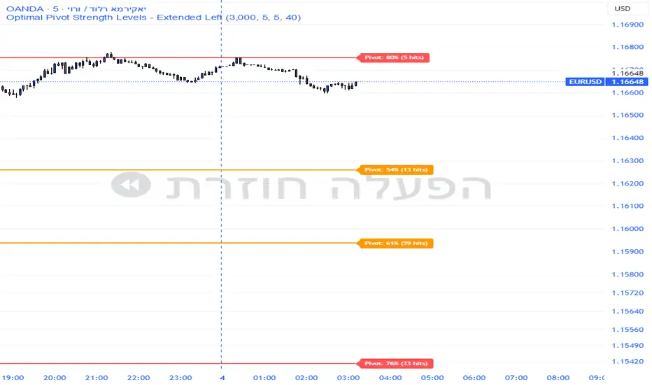
Pivot Edge ProOverview
Smart Pivot Analytics is a highly accurate technical analysis tool designed to identify and validate significant price levels. Unlike standard pivot indicators that only mark recent highs, this tool backtests each identified pivot against thousands of historical candlesticks to calculate its real-world “success rate.”
Key Features
Historical Backtesting: The indicator scans up to 4,900 historical columns to find every instance where price interacted with a specific pivot level.
Strength Score (%): Each level is assigned a percentage score based on its reversal rate. It calculates how many times the price has successfully reached and rejected the level, providing a statistical “hit rate.”
Dynamic Hit Counter: Displays the exact number of times a level has been tested (hit), helping traders distinguish between new levels and established “old” levels.
Smart Filtering: To keep the chart clean, the indicator automatically filters out weak levels and prevents “clutter” by merging levels that are too close together.
Infinite Left Projection: Lines extend left to infinity, allowing traders to see the historical significance of a level across the entire price history at a glance.
How to Trade with It
Red Levels (High Power > 75%): These are “Top Reaction Zones”. Expect a strong price rejection or significant breakout when these levels are tested.
Orange Levels (Medium Power): Suitable for profit targets or as secondary confirmation for entering a trade.
Encounter: Use these levels in conjunction with your existing strategy. When a high power pivot aligns with your entry signal, the probability of a successful trade increases significantly.
Technical Parameters
Lookback Period: Defines how far back in history the script calculates power.
Touch Radius: The "sensitivity" of the level (how close the price has to get to be considered a "hit").
Minimum Strength: A filter to show only the most reliable levels.
Box Theory [Interactive Zones] PyraTimeThis script combines Nicholas Darvas’s "Box Theory" with modern Supply and Demand (Premium/Discount) concepts. It automatically identifies the most recent Swing High and Swing Low to delineate the current trading range.
The purpose of this tool is to visualize market structure and help traders identify when price is relatively expensive (Premium) or cheap (Discount) within a defined range.
Visual Guide: What You Are Seeing
The Box: Represents the active trading range defined by the most recent significant Swing High and Swing Low.
Red Zone (Premium): The top 25% of the range. Mathematically, prices here are considered "expensive" relative to the current structure.
Green Zone (Discount): The bottom 25% of the range. Prices here are considered "cheap" relative to the current structure.
Grey Zone (Equilibrium): The middle 50% of the range. This is the area of fair value where price often consolidates.
Dashed Line (EQ): The exact 50% midpoint of the range.
Tutorial: How to Trade Using This Indicator
Method 1: Mean Reversion (Range Trading) This method applies when the market is moving sideways.
Identify Structure: Wait for a box to form.
Wait for Extremes: Do not trade when price is in the middle (Grey/White area). Wait for price to enter the Red or Green zones.
Entry Trigger:
Shorts: When price enters the Red Zone, look for a rejection (wicks leaving the zone) or a lower timeframe breakdown. Target the EQ (Midline) as your first take profit.
Longs: When price enters the Green Zone, look for support formation. Target the EQ (Midline) as your first take profit.
Method 2: Trend Continuation (Breakouts) This method applies when the market is trending strongly.
Breakout: Monitor the alerts. A close outside the box indicates a potential shift in market structure.
Retest: After a breakout up, the old "Red Zone" (Resistance) often flips to become new Support. Wait for price to pull back to the top of the old box before entering.
Configuration Guide (Settings)
Pivot Left/Right Bars (Sensitivity):
Default (20/20): Best for Swing Trading. It filters out market noise and only draws boxes based on major structural points.
Lower (5/5): Best for Scalping. It will create smaller, more frequent boxes but increases the risk of false signals.
Zone Percentage:
Default (25%): Standard deviation for Supply/Demand zones.
Alternative (15%): Use this for "sniping" entries at the absolute extremes of the range.
Multi-Timeframe (MTF):
Enable "Use Higher Timeframe" to see Daily or Weekly ranges while trading on lower timeframes (like the 15m or 1H). This helps keep your intraday trades aligned with the major trend.
Technical Note on "Lag" This indicator uses Pivots to draw the box. A pivot is only confirmed after a certain number of bars have passed (the "Pivot Right Bars" setting).
Example: If "Pivot Right Bars" is set to 20, the box will update 20 bars after the actual high or low occurred. This is necessary to confirm that the point was indeed a Swing High/Low. Do not treat the box lines as predictive; they are reactive to confirmed structure.

Adaptive Scaled LevelsThis indicator allows users to manually define a list of price levels (e.g., round or psychological numbers) and automatically scales them to fit any asset's current price range using an intelligent anchor point. It then plots dynamic horizontal zones ideal for identifying potential supply/demand or reaction areas.
How It Works (Technical Methodology)
Manual Price List Input
Users enter a comma-separated list of price levels via a text area input (default example: 50,100,...,1400). These act as a "template" grid – often round numbers, psychological levels, or custom targets.
Auto-Scaling Logic (Core Innovation)
When enabled:
Calculates the average of the input list.
Determines a smart anchor price:
Default (Lock = 0): Close price of the highest-volume bar in the last user-defined lookback period (default 200 bars), fetched from a selectable timeframe (default Daily) via request.security().
Override: User can manually lock the anchor to any fixed price.
Computes a scale factor = Anchor / List Average.
Multiplies every input level by this factor to adapt the entire grid to the current market (e.g., scales low-price templates to BTC's 60k+ range).
Zone Construction
For each scaled level:
Creates a horizontal box centered on the level.
Height = Level × user-defined percentage (default 0.5%) for volatility-adjusted thickness.
Zones extend infinitely to the right for continuous reference.
Supply/Demand Coloring
Levels above current close: Supply color (default light gray) – potential resistance/overhead supply.
Levels below current close: Demand color (default cyan) – potential support/underlying demand.
Visual Elements
Transparent filled boxes with borders.
Optional labels showing "S" (Supply) or "D" (Demand) plus exact price.
Clean, non-cluttering design – redraws only on last bar for performance.
How to Use
This tool is perfect for plotting adaptive psychological/round number grids across any asset without manual adjustment.
Common Template: Use evenly spaced round numbers (e.g., 100 increments) as input – the script handles scaling.
BTC/ETH/Crypto: Enable auto-scaling with Daily timeframe anchor for high-volume alignment (often near fair value).
Forex/Stocks: Lower zone height % for tighter zones; use shorter lookback or lock anchor for stability.
Trading Applications:
Anticipate reactions/bounces at scaled levels (confluence with price action, volume, or order blocks).
Supply zones (above price): Potential short entries or take-profit targets.
Demand zones (below price): Potential long entries or stop-loss placement below.
Override anchor for specific analysis (e.g., lock to all-time high).
Best Practices: Combine with trend direction, higher-timeframe structure, or liquidity concepts for higher-probability setups.
Highly versatile – works on any timeframe/asset, especially volatile ones like cryptocurrencies where fixed levels quickly become irrelevant.
Disclaimer
This indicator is a technical analysis tool and should be used in conjunction with other forms of analysis. Past performance does not guarantee future results. Always use proper risk management.

Position Avg Line + P/L Table - SightLine LabsPosition Avg – SLL is a lightweight position-tracking indicator designed to display a persistent average price level on the chart along with a real-time position summary table.
This script is non-trading and does not generate signals, entries, or exits. It is intended strictly for position awareness and visual reference.
What this indicator does:
Plots a persistent horizontal average price line (dashed by default)
Displays a live position statistics table showing:
Shares owned
Average price
Current price
Unrealized profit/loss in dollars
Unrealized profit/loss in percent
Updates automatically as price changes
Works across all timeframes
Does not depend on broker integration or strategy logic
Key features:
Average Price Line:
User-defined average price input
Persistent across the entire chart
Adjustable color and width
Visibility toggle
Position Table:
Six selectable table positions:
Top Left, Top Center, Top Right, Bottom Left, Bottom Center, Bottom Right
Adjustable text size (Tiny through Huge)
Optional table background fill
Optional inner grid lines
Optional outer frame border
Independent color control for:
Header background
Header text
Value text
Positive and negative P/L values
Chart Overlay Options:
Optional chart background tint
Does not modify the global chart theme
Inputs overview:
Position Settings:
Shares Owned
Average Price
Visual Settings:
Show or hide average price line
Line color and width
Table Settings:
Table position
Table text size
Color Settings:
Header background and text colors
Value text color
Positive and negative P/L colors
Optional table background, grid, and frame colors
How to use:
Add the indicator to a chart
Open the settings panel
Enter the number of shares and the average price
Adjust table position, size, and colors as desired
Use the average price line and table as a visual reference for trade and risk management
Notes and limitations:
This indicator does not place trades
It does not connect to any broker
All values are manually entered
Unrealized P/L is calculated using the chart’s current price
Commissions, fees, and slippage are not included
Disclaimer:
This script is provided for educational and informational purposes only. It does not constitute financial advice, investment recommendations, or trade signals. All trading decisions are the sole responsibility of the user.
Developed by SightLine Labs.

Option Price SR (csgnanam)## ⚖️ Disclaimer
This script is provided for **educational and analytical purposes only**.
It does not constitute financial advice.
Use proper risk management and trade responsibly.
---
## 📌 Indicator Concept & Trading Logic
This is a rule-based reference indicator designed to interpret **option price behavior** using **previous-day derived equilibrium levels**.
The indicator helps traders classify the market into **range-bound, breakout, or invalid trade zones** by observing how **ATM Call (CE) and Put (PE)** prices react around these levels.
All levels are **fixed for the trading day** and recalculated only on the next session.
---
## 📊 Core Levels Explained
The indicator plots the following **daily-anchored reference levels**:
* **PDH / PDL** – Previous Day High / Low of the option
* **PDC** – Previous Day Close
* **100% AVG (Breakout Zone)**
Average of previous-day CE and PE prices for the same strike
* **75% AVG (Midzone)**
Balance / decision zone
* **50% AVG (Support Zone)**
Lower acceptance / decay boundary
These levels act as **reaction zones**, not prediction lines.
---
## 🧠 Market Interpretation Logic
### 1️⃣ Range-Bound Market Condition
* When **both ATM CE and ATM PE** are **trading within the 100% AVG (Breakout) level**,
the market has a **high probability of remaining range-bound**.
* Premium expansion is limited on both sides.
* Ideal environment for **non-directional strategies**.
---
### 2️⃣ Breakout Validation
* A **true directional move** requires **asymmetry** between CE and PE.
* If **one side moves into breakout**, the **opposite side must stay suppressed**.
**Example:**
* If **CE breaks down below Midzone**,
then **PE must be above Breakout or at least above Midzone**.
* The same logic applies inversely for PE breakdowns.
This confirms **capital rotation**, not random premium decay.
---
### 3️⃣ Midzone (75%) – Reversal Watch Area
* The **Midzone** is a **high-probability reaction area**.
* Many intraday reversals initiate from this level.
* Price acceptance or rejection here defines:
* Continuation
* Mean reversion
* Failed breakout
This zone should be **closely monitored for structure and volume behavior**.
---
### 4️⃣ Support Zone (50%) – Trade Invalidation
* When an option price trades **below the Support (50%) level**:
* That option side becomes **non-tradable**
* Premium strength is lost
* Risk increases significantly
Trades **below support** are considered **low probability** and should be avoided.
---
## ⚠️ Important Usage Notes
* This indicator is **not a buy/sell signal generator**
* It is a **context and decision-filter tool**
* Best used in combination with:
* Price action
* Structure
* Spot/index behavior
* Time-of-day context
All levels are **session-anchored** and do **not repaint intraday**.
---
## 🎯 Intended Use Case
* Intraday option traders
* ATM / near-ATM focus
* Range vs directional market identification
* Premium behavior analysis
* Trade filtering and risk control
---

Trend Stress Quant [MarkitTick]💡This indicator combines a liquidity-based stress model with a dynamic linear regression channel to identify potential market exhaustion points and assess trend quality. By merging volume impact analysis with statistical deviation, this tool aims to highlight moments where price action may be overextended relative to the underlying liquidity conditions.
● Originality and Utility
Standard volatility indicators often rely solely on price range (like Bollinger Bands). This script introduces a Stress Engine that normalizes the relationship between Price Range (True Range) and Volume. This helps distinguish between healthy price movements and liquidity-stress events (illiquidity). Furthermore, instead of using a fixed-length channel, this tool offers a Dynamic Mode that anchors the regression channel to recent pivot points, ensuring the statistical analysis aligns with the current market structure rather than an arbitrary timeframe.
● Methodology
The script operates on two distinct mathematical models:
• Illiquidity Stress Engine
The core formula calculates a raw illiquidity metric based on the log-normal distribution of the ratio between True Range and Volume. A Z-Score (standard score) is then derived from this data over a specific lookback period. High Z-Scores indicate that price is moving disproportionately fast relative to the available volume, often a signature of panic selling or euphoric buying (exhaustion).
• Linear Regression Channel
The script calculates an Ordinary Least Squares (OLS) regression line (the line of best fit) to determine the mean price trend.
Standard Deviation Bands are plotted parallel to this mean.
Pearson Correlation Coefficient (R) is calculated to quantify the strength of the linear trend. Values closer to 1 or -1 indicate a strong trend, while values near 0 indicate a chaotic or ranging market.
📑 How to Use
Traders can utilize the visual outputs for mean reversion or trend continuation context:
• Exhaustion Signals (SE / BE Labels)
SE (Seller Exhaustion): Appears when the market is in a downtrend, but the Stress Engine detects a statistical anomaly (High Z-Score) on a down candle. This suggests panic selling may be peaking.
BE (Buyer Exhaustion): Appears when the market is in an uptrend, but the Stress Engine detects high stress on an up candle, suggesting a potential blow-off top.
• Regression Channel
The dashed middle line represents the fair value (mean) of the current trend.
The outer bands represent statistical extremes. Price interacting with the outer bands (default 2 Standard Deviations) while coincident with an Exhaustion Signal provides a high-confluence area of interest.
• Metrics Dashboard
A dashboard displays the current Trend Regime, Exhaustion Status, and Channel Width (volatility percentage).
● Settings
• Exhaustion Model
Trend Filter Length: Sets the baseline EMA to determine if the market is bullish or bearish.
Stress Threshold (Sigma): The Z-Score required to trigger an exhaustion signal (default is 2.0).
• Channel Configuration
Dynamic Pivot Mode: If enabled, automatically calculates the channel length based on recent pivots. If disabled, uses the Fixed Length.
Standard Deviations: Controls the width of the inner and outer channel bands.
📖This guide explains how to interpret and utilize signals for trading:
The script is designed primarily for Mean Reversion and Exhaustion trading strategies.
● The Core Strategy: Volatility Exhaustion
The script uses a "Stress Engine" to identify when price movement is statistically overextended relative to the available liquidity (Volume).
• Setup A: The "Seller Exhaustion" (Bullish Bounce)
Look for this setup during a downtrend to catch a temporary bottom or a reversal.
Trend Condition: The dashboard shows Bearish (Price is below the trend filter).
Trigger: The label SE (Seller Exhaustion) appears below a candle.
Why? This indicates that selling pressure was intense but likely panic-driven (High Z-Score/Stress) and may be drying up.
Confluence: Ideally, this signal appears when the price is touching or piercing the Lower Channel Band (dotted or solid lines).
Action: Traders often use this as a signal to close Short positions or enter a speculative Long (counter-trend) targeting the middle line.
• Setup B: The "Buyer Exhaustion" (Bearish Pullback)
Look for this setup during an uptrend to catch a local top.
Trend Condition: The dashboard shows Bullish .
Trigger: The label BE (Buyer Exhaustion) appears above a candle.
Why? This indicates euphoric buying on low liquidity or extreme volatility that is statistically unsustainable.
Confluence: Look for price rejection at the Upper Channel Band.
Action: Traders often use this to close Long positions or enter a Short targeting the mean.
● The Filter: Trend & Correlation
The script includes a Linear Regression Channel that quantifies the quality of the trend.
• Channel Slope
If the channel is angling steeply up or down, the trend is strong.
• Pearson R (Correlation)
The script calculates the Pearson R coefficient.
Weak Correlation: If the channel turns Gray/Neutral (or the fill becomes weak), it means the correlation is below the threshold (default 0.5).
Trading Rule: Avoid trading exhaustion signals when the channel is Gray/Neutral, as the market is likely chopping sideways with no clear direction.
● Risk Management & Targets
• Stop Loss
Since this is a volatility tool, a common technique is to place stops just outside the Outer Deviation Band (the widest line). If price expands beyond the outer band with no exhaustion signal, the trend may be entering a "runaway" phase.
• Take Profit
Target 1: The Middle Regression Line (The dashed center line). Prices tend to revert to this mean after an exhaustion event.
Target 2: The opposite channel band (e.g., if you bought at the bottom, hold until the top).
● Summary of Dashboard Metrics
The table on your chart provides a quick snapshot:
Trend Regime: Tells you if you should fundamentally look for Shorts (Bearish) or Longs (Bullish).
Seller/Buyer Status: Alerts you if the current bar is EXHAUSTED or Normal .
Channel Width %: Indicates volatility. If the width is very low (percentage is small), a breakout might be imminent (squeezing). If high, be careful of chop.
⚙️ Indicator settings
• Signal Parameters
Exhaustion & Stress Model: Controls signal sensitivity.
Trend Filter: Decides if the market is Bullish or Bearish.
Stress Threshold (Sigma): Higher values (e.g., 2.5) make the script stricter, showing fewer but potentially stronger signals.
• Channel Configuration
Dynamic Pivot Mode: If ON, the channel length auto-adjusts to recent market pivots. If OFF, it uses the Fixed Length you set.
Channel Bands: Adjusts the channel width.
Outer Deviation: The boundary for "extreme" moves. Price hitting this often signals a reversal.
• Quality Filter
Filter Weak Correlations: If enabled, the channel turns gray during choppy/sideways markets to warn you not to trust trend signals.
• Visuals
Display Options: Toggles the "Stats" dashboard and adjusts volatility coloring.
● Disclaimer
All provided scripts and indicators are strictly for educational exploration and must not be interpreted as financial advice or a recommendation to execute trades. I expressly disclaim all liability for any financial losses or damages that may result, directly or indirectly, from the reliance on or application of these tools. Market participation carries inherent risk where past performance never guarantees future returns, leaving all investment decisions and due diligence solely at your own discretion.

Adaptive ML Trailing Stop [BOSWaves]Adaptive ML Trailing Stop – Regime-Aware Risk Control with KAMA Adaptation and Pattern-Based Intelligence
Overview
Adaptive ML Trailing Stop is a regime-sensitive trailing stop and risk control system that adjusts stop placement dynamically as market behavior shifts, using efficiency-based smoothing and pattern-informed biasing.
Instead of operating with fixed ATR offsets or rigid trailing rules, stop distance, responsiveness, and directional treatment are continuously recalculated using market efficiency, volatility conditions, and historical pattern resemblance.
This creates a live trailing structure that responds immediately to regime change - contracting during orderly directional movement, relaxing during rotational conditions, and applying probabilistic refinement when pattern confidence is present.
Price is therefore assessed relative to adaptive, condition-aware trailing boundaries rather than static stop levels.
Conceptual Framework
Adaptive ML Trailing Stop is founded on the idea that effective risk control depends on regime context rather than price location alone.
Conventional trailing mechanisms apply constant volatility multipliers, which often results in trend suppression or delayed exits. This framework replaces static logic with adaptive behavior shaped by efficiency state and observed historical outcomes.
Three core principles guide the design:
Stop distance should adjust in proportion to market efficiency.
Smoothing behavior must respond to regime changes.
Trailing logic benefits from probabilistic context instead of fixed rules.
This shifts trailing stops from rigid exit tools into adaptive, regime-responsive risk boundaries.
Theoretical Foundation
The indicator combines adaptive averaging techniques, volatility-based distance modeling, and similarity-weighted pattern analysis.
Kaufman’s Adaptive Moving Average (KAMA) is used to quantify directional efficiency, allowing smoothing intensity and stop behavior to scale with trend quality. Average True Range (ATR) defines the volatility reference, while a K-Nearest Neighbors (KNN) process evaluates historical price patterns to introduce directional weighting when appropriate.
Three internal systems operate in tandem:
KAMA Efficiency Engine : Evaluates directional efficiency to distinguish structured trends from range conditions and modulate smoothing and stop behavior.
Adaptive ATR Stop Engine : Expands or contracts ATR-derived stop distance based on efficiency, tightening during strong trends and widening in low-efficiency environments.
KNN Pattern Influence Layer : Applies distance-weighted historical pattern outcomes to subtly influence stop placement on both sides.
This design allows stop behavior to evolve with market context rather than reacting mechanically to price changes.
How It Works
Adaptive ML Trailing Stop evaluates price through a sequence of adaptive processes:
Efficiency-Based Regime Identification : KAMA efficiency determines whether conditions favor trend continuation or rotational movement, influencing stop sensitivity.
Volatility-Responsive Scaling : ATR-based stop distance adjusts automatically as efficiency rises or falls.
Pattern-Weighted Adjustment : KNN compares recent price sequences to historical analogs, applying confidence-based bias to stop positioning.
Adaptive Stop Smoothing : Long and short stop levels are smoothed using KAMA logic to maintain structural stability while remaining responsive.
Directional Trailing Enforcement : Stops advance only in the direction of the prevailing regime, preserving invalidation structure.
Gradient Distance Visualization : Gradient fills reflect the relative distance between price and the active stop.
Controlled Interaction Markers : Diamond markers highlight meaningful stop interactions, filtered through cooldown logic to reduce clustering.
Together, these elements form a continuously adapting trailing stop system rather than a fixed exit mechanism.
Interpretation
Adaptive ML Trailing Stop should be interpreted as a dynamic risk envelope:
Long Stop (Green) : Acts as the downside invalidation level during bullish regimes, tightening as efficiency improves.
Short Stop (Red) : Serves as the upside invalidation level during bearish regimes, adjusting width based on efficiency and volatility.
Trend State Changes : Regime flips occur only after confirmed stop breaches, filtering temporary price spikes.
Gradient Depth : Deeper gradient penetration indicates increased extension from the stop rather than imminent reversal.
Pattern Influence : KNN weighting affects stop behavior only when historical agreement is strong and remains neutral otherwise.
Distance, efficiency, and context outweigh isolated price interactions.
Signal Logic & Visual Cues
Adaptive ML Trailing Stop presents two primary visual signals:
Trend Transition Circles : Display when price crosses the opposing trailing stop, confirming a regime change rather than anticipating one.
Stop Interaction Diamonds : Indicate controlled contact with the active stop, subject to cooldown filtering to avoid excessive signals.
Alert generation is limited to confirmed trend transitions to maintain clarity.
Strategy Integration
Adaptive ML Trailing Stop fits within trend-following and risk-managed trading approaches:
Dynamic Risk Framing : Use adaptive stops as evolving invalidation levels instead of fixed exits.
Directional Alignment : Base execution on confirmed regime state rather than speculative reversals.
Efficiency-Based Tolerance : Allow greater price fluctuation during inefficient movement while enforcing tighter control during clean trends.
Pattern-Guided Refinement : Let KNN influence adjust sensitivity without overriding core structure.
Multi-Timeframe Context : Apply higher-timeframe efficiency states to inform lower-timeframe stop responsiveness.
Technical Implementation Details
Core Engine : KAMA-based efficiency measurement with adaptive smoothing
Volatility Model : ATR-derived stop distance scaled by regime
Machine Learning Layer : Distance-weighted KNN with confidence modulation
Visualization : Directional trailing stops with layered gradient fills
Signal Logic : Regime-based transitions and controlled interaction markers
Performance Profile : Optimized for real-time chart execution
Optimal Application Parameters
Timeframe Guidance:
1 - 5 min : Tight adaptive trailing for short-term momentum control
15 - 60 min : Structured intraday trend supervision
4H - Daily : Higher-timeframe regime monitoring
Suggested Baseline Configuration:
KAMA Length : 20
Fast/Slow Periods : 15 / 50
ATR Period : 21
Base ATR Multiplier : 2.5
Adaptive Strength : 1.0
KNN Neighbors : 7
KNN Influence : 0.2
These suggested parameters should be used as a baseline; their effectiveness depends on the asset volatility, liquidity, and preferred entry frequency, so fine-tuning is expected for optimal performance.
Parameter Calibration Notes
Use the following adjustments to refine behavior without altering the core logic:
Excessive chop or overreaction : Increase KAMA Length, Slow Period, and ATR Period to reinforce regime filtering.
Stops feel overly permissive : Reduce the Base ATR Multiplier to tighten invalidation boundaries.
Frequent false regime shifts : Increase KNN Neighbors to demand stronger historical agreement.
Delayed adaptation : Decrease KAMA Length and Fast Period to improve responsiveness during regime change.
Adjustments should be incremental and evaluated over multiple market cycles rather than isolated sessions.
Performance Characteristics
High Effectiveness:
Markets exhibiting sustained directional efficiency
Instruments with recurring structural behavior
Trend-oriented, risk-managed strategies
Reduced Effectiveness:
Highly erratic or event-driven price action
Illiquid markets with unreliable volatility readings
Integration Guidelines
Confluence : Combine with BOSWaves structure or trend indicators
Discipline : Follow adaptive stop behavior rather than forcing exits
Risk Framing : Treat stops as adaptive boundaries, not forecasts
Regime Awareness : Always interpret stop behavior within efficiency context
Disclaimer
Adaptive ML Trailing Stop is a professional-grade adaptive risk and regime management tool. It does not forecast price movement and does not guarantee profitability. Results depend on market conditions, parameter selection, and disciplined execution. BOSWaves recommends deploying this indicator within a broader analytical framework that incorporates structure, volatility, and contextual risk management.

SD-Range Oscillator | QuantEdgeBSD-Range Oscillator | QuantEdgeB
🔍 Overview
SD-Range Oscillator | QuantEdgeB (SDRO) is a normalized momentum oscillator that compresses a low-lag trend core into a 0–100 style range using standard-deviation (SD) bands. It builds a smooth baseline from a fast triple-smoothed average, wraps it with ±2×SD volatility bounds, then normalizes the core value inside that envelope. Clear Long/Short regimes trigger when the normalized value crosses user-defined thresholds, with optional labels, regime-colored candles, and intuitive filled zones.
✨ Key Features
1.⚡ Low-Lag Core (Triple-Smooth Engine)
- Uses a fast, low-lag triple-smoothed average as the oscillator’s primary signal input.
- Helps keep momentum readings responsive while filtering noise.
2. 📏 SD Volatility Envelope (±2×SD)
- Builds a volatility channel around a smoothed baseline using standard deviation.
- Automatically adapts to changing market turbulence.
3. 🧮 Normalized Range Output
- Converts the core signal into a normalized value by mapping it between the upper/lower SD bounds.
- Makes readings consistent across assets and timeframes.
4. 🎯 Threshold-Based Regimes
- Long when the normalized value exceeds the Long threshold.
- Short when it falls below the Short threshold.
- Includes an additional safety filter to reduce “forced” longs when price is already extended near the upper envelope.
5. 🎨 Visual Clarity & Zones
- Regime-colored oscillator line and candles.
- Filled SD bands around the baseline for quick volatility context.
- Optional highlight fills between the oscillator and thresholds to show active long/short phases.
- Extra OB/OS background zones for quick overextension awareness.
6. 🔔 Signals & Alerts
- Optional “Long/Short” labels on confirmed regime flips.
- Alert conditions fire on long/short regime crossovers.
💼 Use Cases
• Momentum Confirmation: Validate breakouts by requiring SDRO to hold above the Long threshold.
• Mean-Reversion Awareness: Watch for extreme normalized readings near upper/lower bounds.
• Regime Filtering: Use SDRO state (Long/Short/Neutral) to filter trades from other systems.
• Cross-Market Comparison: Normalization makes it easier to compare momentum across different tickers.
🎯 For Who
• Trend traders who want a clean momentum filter with adaptive volatility context.
• System builders needing a simple regime variable (1 / -1 / neutral) to gate entries.
• Discretionary traders who like visual confirmation (fills, candle coloring, threshold zones).
• Multi-asset traders who benefit from normalized, comparable oscillator readings.
⚙️ Default Settings
• TEMA Period: 7
• Base Length (SMMA): 25
• Long Threshold: 55
• Short Threshold: 45
• SD Multiplier: 2× (fixed in code)
• Color Mode: Alpha
• Color Transparency: 60
• Labels: Off by default
📌 Conclusion
SD-Range Oscillator | QuantEdgeB blends a low-lag triple-smoothed core with an adaptive SD envelope to produce a normalized, easy-to-read momentum signal. With clear threshold regimes, volatility-aware context, and strong visuals (fills + candle coloring), SDRO helps separate meaningful momentum shifts from noise across any asset or timeframe.
🔹 Disclaimer: Past performance is not indicative of future results. Always backtest and align settings with your risk tolerance and objectives before live trading.
🔹 Strategic Advice: Always backtest, optimize, and align parameters with your trading objectives and risk tolerance before live trading.

Momentum Echo Oscillator [Community Edition]Concept: The Momentum Echo Oscillator (MEO) is a modern take on classical momentum oscillators. Most indicators only look at the "now". MEO introduces the concept of Momentum Echoes—historical momentum harmonics that are weighted and blended back into the current price velocity.
Why use MEO? Standard momentum tools (like ROC or RSI) can be very "jittery" or noisy. By integrating historical echoes, MEO provides a smoother, more rhythmic representation of price flow, making it easier to spot genuine trend reversals.
Key Elements:
Primary Momentum: The immediate speed of price.
Echo Harmonics: Two adjustable lookback points that act as a "memory" for the indicator, filtering out false breakouts.
Dynamic Histogram: Visualizes the gap between the Echo Engine and the Trigger Line, highlighting acceleration and deceleration.
Settings:
Echo Weight: Adjust how much "memory" you want the indicator to have.
Smoothing: Clean up the signals for higher timeframes.
This is an open-source tool for the TradingView community. Enjoy!

ICT ORB Killzones by MaxN (15 / 30m)Trading session London, Asia, New York
orb 15/30 min selectable breakout zones with buy/sell signals

ICT ORB Killzones by MaxN (15 / 30m)Trading session open/close with first 15/30 min orbs
will just have to adjust time zones to your current time line
GMT +0
I use
Asia 23.00 - 06.00
London 07.00 - 16.00
New York 12.00 - 22.00

TwinSmooth ATR Bands | QuantEdgeBTwinSmooth ATR Bands | QuantEdgeB
🔍 Overview
TwinSmooth ATR Bands | QuantEdgeB is a dual-smoothing, ATR-adaptive trend filter that blends two complementary smoothing engines into a single baseline, then builds dynamic ATR bands around it to detect decisive breakouts. When price closes above the upper band it triggers a Long regime; when it closes below the lower band it flips to Short—otherwise it stays neutral. The script enhances clarity with regime-colored candles, an active-band fill, and an optional on-chart backtest table.
✨ Key Features
1. 🧠 Twin-Smooth Baseline (Dual Engine Blend)
- Computes two separate smoothed baselines (a slower “smooth” leg + a faster “responsive” leg).
- Blends them into a single midpoint baseline for balanced stability + speed.
- Applies an extra EMA smoothing pass to produce a clean trend_base.
2. 📏 ATR Volatility Bands
- Builds upper/lower bands using ATR × multiplier around the trend_base.
- Bands expand in volatile conditions and contract when markets quiet down—auto-adapting without manual tweaks.
3. ⚡ Clear Breakout Regime Logic
- Long when close > upperBand.
- Short when close < lowerBand.
- Neutral otherwise (no forced signals inside the band zone).
4. 🎨 Visual Clarity
- Plots only the active band (lower band in long regime, upper band in short regime).
- Fills between active band and price for instant regime context.
- Colors candles to match the current state (bullish / bearish / neutral).
- Multiple color palettes + transparency control.
💼 Use Cases
• Trend Confirmation Filter: Use the regime as a higher-confidence trend gate for entries from other indicators.
• Breakout/Breakdown Trigger: Trade closes outside ATR bands to catch momentum expansions.
• Volatility-Aware Stops/Targets: Bands naturally reflect volatility, making them useful as adaptive reference levels.
• Multi-Timeframe Alignment: Confirm higher-timeframe regime before executing on lower timeframes.
🎯 For Who
• Trend Traders who want clean regime shifts without constant whipsaw.
• Breakout Traders who prefer confirmation via ATR expansion rather than raw MA crossovers.
• System Builders needing a simple, robust “state engine” (Long / Short / Neutral) to plug into larger strategies.
• Analysts who want quick on-chart validation with a backtest table.
⚙️ Default Settings
• SMMA Length (Base Smooth Leg): 24
• TEMA Length (Base Responsive Leg): 8
• EMA Extra Smoothing: 14
• ATR Length: 14
• ATR Multiplier: 1.1
• Color Mode: Alpha
• Color Transparency: 30
• Backtest Table: On (toggleable)
• Backtest Start Date: 09 Oct 2017
• Labels: Off by default
📌 Conclusion
TwinSmooth ATR Bands | QuantEdgeB merges a dual-speed smoothing core into a single trend baseline, then wraps it with ATR-based bands to deliver clean, volatility-adjusted breakout signals. With regime coloring, active-band plotting, and optional backtest stats, it’s a compact, readable tool for spotting momentum shifts and trend continuation across any market and timeframe.
🔹 Disclaimer: Past performance is not indicative of future results. Always backtest and align settings with your risk tolerance and objectives before live trading.
🔹 Strategic Advice: Always backtest, optimize, and align parameters with your trading objectives and risk tolerance before live trading.

Lot Size Calculator (Entry + SL) GOLDLot Size Calculator (Entry + SL)
This indicator helps traders calculate the correct position size (lots) based on risk management, using a fixed account balance and risk percentage per trade.
By providing an Entry Price and Stop-Loss Price, the script automatically computes:
Dollar risk per trade
Stop-loss distance
Risk per unit
Total position size in units
Final position size in lots (rounded to broker-compatible steps)
How It Works
Define your Account Balance.
Set your Risk % per trade (e.g., 1%).
Choose your Entry Price:
Manual input, or
Use the current market price.
Enter your Stop-Loss Price.
The indicator calculates the maximum lot size so that your loss at SL equals your predefined risk.
Key Features
Uses TradingView’s syminfo.pointvalue for accurate instrument pricing
Supports any market (Forex, indices, commodities, crypto)
Custom units per lot (FX standard, mini, micro, or custom CFD contracts)
roker-friendly lot rounding
Clean table display for quick decision-making
Ideal for traders who:
Follow strict fixed-percentage risk management
Want consistent position sizing
Trade multiple instruments with different contract sizes
This tool ensures every trade risks the same percentage of capital, regardless of stop-loss distance.

Market Acceptance Zones [Interakktive]Market Acceptance Zones (MAZ) identifies statistical price acceptance — areas where the market reaches agreement and price rotates rather than trends.
Unlike traditional support/resistance tools, MAZ does not assume where price "should" react. Instead, it highlights regions where multiple internal conditions confirm balance: directional efficiency drops, effort approximately equals result, volatility contracts, and participation remains stable.
This is a market-state diagnostic tool, not a signal generator.
█ WHAT THE ZONES REPRESENT
MAZ (ATF) — Chart Timeframe Acceptance
A MAZ marks an area where price displayed rotational behaviour and the auction temporarily agreed on value. These zones often act as compression regions, fair-price areas, or boundaries of consolidation where impulsive follow-through is less likely.
Use ATF MAZs to:
- Identify rotational environments
- Avoid chasing price inside balance
- Frame consolidation prior to expansion
MAZ • HTF / MAZ • 2/3 — Multi-Timeframe Acceptance (AMTF)
When Multi-Timeframe mode is enabled, MAZ evaluates acceptance on:
- The chart timeframe
- Two higher structural timeframes
If the minimum consensus threshold is met (default: 2 of 3), the zone is classified as AMTF. These zones represent stronger agreement and typically decay more slowly than single-timeframe acceptance.
AMTF zones are structurally stronger and are useful for:
- Higher-quality rotation areas
- Pullback framing within trends
- Context alignment across timeframes
H • MAZ — Historic Acceptance Zones
Historic MAZs represent older acceptance that has transitioned out of active relevance. These zones are hidden by default and can be enabled to provide long-term memory context.
█ AUTO MULTI-TIMEFRAME LOGIC
When MTF Mode is set to Auto, MAZ uses a deterministic structural mapping based on the current chart timeframe:
- 5m → 15m + 1H
- 15m → 1H + 4H
- 1H → 4H + 1D
- 4H → 1D + 1W
- 1D → 1W + 1M
This ensures consistent higher-timeframe context without manual configuration. Advanced users may switch to Manual mode to define custom timeframes.
█ ZONE LIFECYCLE
MAZ zones are dynamic and maintain an internal lifecycle:
- Active — Acceptance remains relevant
- Aging — Acceptance quality is degrading
- Historic — Retained only for memory context
Zones track price interaction and re-acceptance, which can stabilise or strengthen them. Weak or stale zones are automatically removed to keep the chart clean.
█ HOW TRADERS USE MAZ
MAZ is designed to provide structure, not entries.
Common applications include:
- Avoiding chop when price is inside acceptance
- Framing expansion after clean breaks from MAZ
- Identifying higher-quality rotational pullbacks (AMTF zones)
- Defining objective invalidation using zone boundaries
█ SETTINGS OVERVIEW
Market Acceptance Zones — Core
- Acceptance Lookback
- ATR Length
- Zone Frequency (Conservative / Balanced / Aggressive)
Market Acceptance Zones — Zones
- Maximum Zones
- Fade & Stale Bars
- Historic Zone Visibility (default OFF)
Market Acceptance Zones — Timeframes
- MTF Mode (Off / Auto / Manual)
- Manual Higher Timeframes
- Minimum Consensus Requirement
Market Acceptance Zones — Visuals
- Neon / Muted Theme
- Zone Labels & Consensus Detail
- Optional Midline Display
█ DISCLAIMER
This indicator is a market context and diagnostic tool only.
It does not generate trade signals, entries, or exits.
Past acceptance behaviour does not guarantee future price action.
Always combine with independent analysis and proper risk management.

Next-Gen Market Signal Dashboard Key Features:
Trend Detection: EMA50 and EMA200 highlight bullish and bearish trends with subtle background coloring.
Momentum Indicators: RSI, MACD, and Stochastic Oscillator confirm signal strength and market momentum.
Volatility Filter: ATR ensures signals are only triggered during active market conditions.
Visual Signals: Animated triangles and colored backgrounds for LONG (green) and SHORT (red) signals.
Take Profit / Stop Loss: Automatic, elegant TP and SL lines to guide trades.
Compact Multi-Indicator Panel: Displays RSI, MACD, Stochastic, and ATR with color-coded strength indicators.
Mini-Guide: Integrated panel explanations help quickly interpret signals without confusion.
Alerts: Built-in alerts for all LONG and SHORT signals.

RSI Divergence Strategy BTCRSI Divergence Strategy | Clean
Type: Backtestable strategy
Logic: Uses divergences between price and RSI to generate signals.
LONG: Price makes a lower low, RSI makes a higher low → bullish divergence
SHORT: Price makes a higher high, RSI makes a lower high → bearish divergence
TP / SL: Automatic, based on configurable percentage and Risk/Reward ratio.
Display:
RSI visible in a separate panel
LONG/SHORT signals indicated by small triangles in the RSI panel
Goal: Identify price reversals using relative strength (RSI) and backtest precise trades.

HS:- HA+BIAS📝 Daily Bias + Heikin Ashi Step Line (Notes)
1️⃣ Indicator Purpose
Combines Daily Market Bias with Heikin Ashi Average
Displays HA average as a STEP LINE WITH BREAKS
HA line changes color based on bias
Works on any timeframe
Bias logic is always calculated from Daily data
2️⃣ Heikin Ashi Calculation
Uses Heikin Ashi candles internally
Does not change chart candles
Formula used:
HA Average = (HA Open + HA Close) / 2
Provides a smoother price reference than normal candles
3️⃣ Daily Reference Levels
Uses previous day:
High
Low
These levels define market structure
Fetched using Daily timeframe regardless of chart timeframe
4️⃣ Positive Bias Condition (Bullish)
Bias becomes POSITIVE only when both conditions are true:
Today Close > Previous Day High
Today Low > Previous Day Low
📌 Indicates strong bullish control
5️⃣ Negative Bias Condition (Bearish)
Bias becomes NEGATIVE only when both conditions are true:
Today Close < Previous Day Low
Today High < Previous Day High
📌 Indicates strong bearish control
6️⃣ Bias Hold Rule (Most Important)
Bias does NOT flip frequently
Bias remains unchanged until:
Both opposite conditions are satisfied
Prevents false signals during sideways markets
Bias Values:
+1 → Positive
-1 → Negative
0 → Neutral
7️⃣ Bias Memory Concept
Bias is stored using a state variable
Previous bias is carried forward when no condition is met
Ensures stable trend direction

Dragon Flow Arrows (LITE)🚀 DRAGON FLOW ARROWS | Smart Trend Engine + Clean Reversal Arrows
A lightweight but highly-optimized trend system designed for clean charts, powerful visual signals, and no-noise directional flow. Built for traders who want simplicity, clarity, and professional-level momentum-filtered signals without over-complication.
🔥 Dragon Channel (Clean 3-Line Ribbon)
A smooth adaptive channel formed from ATR + EMA, giving you structural trend zones without clutter.
✅ Dragon Flow Gradient
A horizontal, color-shifted flow:
🟢 Bull flow → green glow
🔴 Bear flow → red glow
Automatic blend based on trend direction
Smooth visual transitions (no vertical stripes)
✅ Momentum-Filtered Arrows
BUY/SELL arrows only print when:
Price breaks outside the Dragon Channel
Momentum confirms (RSI + MACD filters)
Trend flips → one clean arrow per direction
✅ Smart Header Panel
At the top of your chart:
📌 Trend: Uptrend / Downtrend / Neutral
⚡ Impulse Strength: Weak / Normal / Strong
📊 How to Use
Entry:
- BUY Setup
Price moving above baseline
Dragon Flow turns bullish (cyan side)
Arrow appears below channel
- SELL Setup
Price breaks below baseline
Dragon Flow turns bearish (magenta side)
Arrow pops above channel
Exit / Filter:
Opposite arrow
Flow color shift
Trend panel flips
Works on Forex, Crypto, Stocks, Indices — all timeframes (just adjust the channel length).
Happy trading!
