[COG] NautilusOverview
This indicator combines multiple technical analysis tools to identify high-probability entry points in trending markets. It uses moving average crossovers for trend direction, Bollinger Bands for mean reversion opportunities, and optional filters to reduce false signals and avoid choppy market conditions.
What Makes This Indicator Unique
Heiken Ashi Toggle:
All calculations can be performed on either regular or Heiken Ashi candles with a single click
Multi-Layer Filtering System: Four independent filters work together to improve signal quality
First Entry Detection: Automatically identifies and labels the first signal after a trend change
Anti-Overtrading Protection: Built-in cooldown mechanism prevents signal spam
Core Components
1. Trend Detection (EMA/SMA Crossover)
The indicator uses a 15-period EMA and 50-period SMA to determine market direction. Buy signals only occur when EMA > SMA, and sell signals only when EMA < SMA.
// Trend Detection
bullishTrend = ema15 > sma50
bearishTrend = ema15 < sma50
2. Bollinger Bands Mean Reversion
Entry signals trigger when price touches or penetrates the Bollinger Bands, indicating potential reversal or pullback opportunities within the established trend.
//Bollinger Band Touch Detection
lowerBandTouch = selectedLow <= bbLower
upperBandTouch = selectedHigh >= bbUpper
// Base Entry Conditions
baseBuySignal = bullishTrend and lowerBandTouch and bullishClose
baseSellSignal = bearishTrend and upperBandTouch and bearishClose
3. Candle Confirmation
Signals require a bullish candle close (close > open) for buy signals and bearish candle close (close < open) for sell signals, ensuring momentum alignment.
// Candle Close Type
bullishClose = selectedClose > selectedOpen
bearishClose = selectedClose < selectedOpen
Optional Filters (All Toggleable)
Filter 1: StochRSI Momentum
Ensures entries occur during oversold/overbought conditions. Buy signals require StochRSI < 20, sell signals require StochRSI > 80.
// StochRSI Calculation
rsi = ta.rsi(stochRSISource, rsiLength)
stochRSI_K = ta.sma(ta.stoch(rsi, rsi, rsi, stochRSILength), stochKSmooth)
// Filter Conditions
stochRSIOversoldCondition = stochRSI_K < stochRSIOversold
stochRSIOverboughtCondition = stochRSI_K > stochRSIOverbought
Filter 2: MA Separation (Anti-Chop)
Blocks signals when moving averages are too close together, indicating sideways/choppy market conditions. Default threshold is 1% separation.
// Calculate percentage separation between EMA and SMA
maSeparationPct = (math.abs(ema15 - sma50) / sma50) * 100
// MA separation filter condition
maSeparationValid = maSeparationPct >= maSeparationThreshold
Why this matters: When the 15 EMA and 50 SMA are very close (< 1% apart), the market is typically consolidating. Signals in these conditions have lower win rates.
Filter 3: Cooldown Period
Prevents over-trading by blocking new signals for a specified number of bars (default: 10) after a signal occurs. Buy and sell cooldowns are tracked separately.
// Variables to track the bar index of the last signal
var int lastBuySignalBar = na
var int lastSellSignalBar = na
// Calculate bars since last signal
barsSinceLastBuy = na(lastBuySignalBar) ? 999999 : bar_index - lastBuySignalBar
// Cooldown filter condition
buyCooldownValid = barsSinceLastBuy >= cooldownBars
// Update tracking when signal fires
if buySignal
lastBuySignalBar := bar_index
Advanced Features
Heiken Ashi Mode
Toggle between regular candles and Heiken Ashi candles for all calculations. Heiken Ashi candles smooth price action and can reduce false signals in volatile markets.
// Fetch Heiken Ashi OHLC values
= request.security(
ticker.heikinashi(syminfo.tickerid),
timeframe.period,
)
// Select which OHLC to use based on toggle
selectedClose = useHeikenAshi ? haClose : close
First Entry Detection
Automatically identifies and labels the first signal after a trend change with "1. Trend Cycle Entry" text. This helps traders distinguish between fresh trend entries and continuation signals.
// Detect trend changes
trendChangedToBullish = bullishTrend and not bullishTrend
// Reset tracking when trend changes
if trendChangedToBullish
hadBuySignalInCurrentBullTrend := false
// Identify first signal in new trend
isFirstBuyInTrendCycle = buySignal and not hadBuySignalInCurrentBullTrend
How Signals Are Generated
The indicator uses a layered approach where each condition must be satisfied:
// Apply all filters
buySignal = enableBuySignals and baseBuySignal and
(not enableStochRSIFilter or stochRSIOversoldCondition) and
(not enableMASeparationFilter or maSeparationValid) and
(not enableCooldownFilter or buyCooldownValid)
Buy Signal Requirements:
✅ 15 EMA above 50 SMA (bullish trend)
✅ Candle low touches or goes below lower Bollinger Band
✅ Candle closes bullish (green)
✅ (Optional) StochRSI < 20
✅ (Optional) MA separation > threshold %
✅ (Optional) Cooldown period expired
Sell Signal Requirements:
✅ 15 EMA below 50 SMA (bearish trend)
✅ Candle high touches or goes above upper Bollinger Band
✅ Candle closes bearish (red)
✅ (Optional) StochRSI > 80
✅ (Optional) MA separation > threshold %
✅ (Optional) Cooldown period expired
Customization Options
Moving Averages:
Adjustable EMA length (default: 15)
Adjustable SMA length (default: 50)
Source selection (Close, Open, High, Low, HL2, HLC3, OHLC4)
Bollinger Bands:
Adjustable length (default: 20)
MA type selection (SMA, EMA, SMMA, WMA, VWMA)
Adjustable standard deviation multiplier (default: 2.0)
StochRSI Filter:
Adjustable RSI length (default: 14)
Adjustable Stochastic length (default: 14)
Customizable oversold/overbought levels (default: 20/80)
MA Separation Filter:
Adjustable minimum separation percentage (default: 1.0%)
Cooldown Filter:
Adjustable cooldown period in bars (default: 10)
Visual Settings:
Customizable colors for all elements
Adjustable line widths
Toggle first entry labels on/off
How to Use
Basic Setup: Apply the indicator to your chart. By default, it shows moving averages, Bollinger Bands, and entry signals.
Choose Your Mode: Enable Heiken Ashi mode if you prefer smoother signals and are willing to accept some lag.
Enable Filters: Start with all filters disabled to see raw signals. Then enable filters one by one:
Start with MA Separation filter to avoid choppy markets
Add StochRSI filter to catch better momentum conditions
Add Cooldown filter to prevent over-trading
Adjust Parameters: Tune the parameters based on your timeframe and trading style:
Lower timeframes: Consider shorter cooldown periods
Higher timeframes: May want tighter MA separation requirements
Watch for First Entry Labels: The "1. Trend Cycle Entry" label highlights the highest-probability signals occurring right after trend changes.
Important Notes
⚠️ This indicator does not repaint. All signals appear on closed candles only.
⚠️ Past performance is not indicative of future results. This indicator should be used as part of a complete trading strategy with proper risk management.
⚠️ Filters reduce signal frequency: Enabling multiple filters will significantly reduce the number of signals. This is intentional to improve quality over quantity.
⚠️ Heiken Ashi mode considerations: While HA mode smooths signals, it can also introduce lag. Test both modes on your preferred timeframe.
Best Practices
Always backtest on your preferred timeframe before live trading
Start conservative with tighter filters, then loosen if needed
Pay special attention to "First Entry" signals for highest probability setups
Use appropriate position sizing and stop losses
Consider market conditions: trending vs ranging
Disclaimer
This indicator is for educational purposes only and should not be considered financial advice. Trading involves substantial risk of loss. Always do your own research and consider your risk tolerance before trading.
P-signal

Breaker Blocks Signals [AlgoAlpha]🟠 OVERVIEW
This script automates the detection of Breaker Blocks, a popular smart money concept used to identify high-probability reversal zones. It monitors price action for aggressive impulses—measured through a normalized Z-Score—to identify Orderblocks. When these blocks are "broken" or invalidated by price moving through them, they transform into Breaker Blocks. These zones act as "flipped" support or resistance, offering traders specific areas to look for retests and trend continuations. By handling the complex management of zone life-cycles and mitigation, this script provides a clean, real-time map of institutional supply and demand shifts.
🟠 CONCEPTS
The indicator relies on the relationship between price momentum and structural invalidation. It first identifies "impulsive" candles by calculating a Z-Score of price distance covered over a specific window. A Z-Score above 4 marks an "Algorithmically Significant" move. When such a move occurs, the script identifies the last opposite-colored candle (the Orderblock) and draws a gray zone. The transformation happens when price closes entirely through one of these gray zones. This "mitigation" is what triggers the creation of a Breaker Block: an old bearish supply zone becomes a bullish demand zone, and vice versa. This transition reflects a shift in market regime where previous trapped participants are forced to exit, often leading to price rejections at these newly formed levels.
🟠 FEATURES
Automated Breaker Transformation : Instantly flips mitigated Orderblocks into colored Breaker Blocks (Bullish/Bearish).
Rejection Markers : Small arrow icons appear when price enters a Breaker Block and shows signs of respect/reversal.
Comprehensive Alerts : Notifications for both the formation of new breakers and real-time price rejections.
🟠 USAGE
Setup : Add the script to your chart. It is effective on most timeframes, but many traders prefer the 15m or 1h for intraday structure. Use the "Z-Score Window" to adjust sensitivity; 100 is standard, but lower values (e.g., 50) will find more frequent, smaller impulses.
Read the chart : Gray boxes are "Pending" blocks. If price closes above a gray bearish box, it turns into a Bullish Breaker (Green). If price closes below a gray bullish box, it turns into a Bearish Breaker (Red). Look for price to return to these colored zones; the "▲" and "▼" symbols indicate the script has detected a rejection from that level.
Settings that matter : Prevent Overlap is useful for avoiding "cluttered" zones in ranging markets. Max Box Age is critical; it ensures that very old, irrelevant zones are removed from your chart after a set number of bars, keeping your technical analysis current and focused on recent price action.

ZION Trend Strike [wjdtks255]🚀 ZION Trend Strike
This is an advanced trend-following signal indicator designed to work in perfect harmony with the ZION Momentum Flow. It filters market noise and provides precise entry/exit points based on momentum synergy.
Key Features:
Trend Strike Signals: Provides clear BUY/SELL labels when price action aligns with momentum energy.
Dynamic Trend Guide: A color-switching EMA line that helps you visualize the current trend direction at a glance.
Synergy Optimization: Best used as a set with ZION Momentum Flow to avoid false breakouts.
Multilingual Input: Easy-to-use settings menu with both English and Korean labels.

Multi-Signal the FlasherTitle: Multi-Signal Flasher - External Signal Alert System
Short Description: Visual screen flash alerts triggered by external indicator signals. Supports 4 signal sources with separate Long/Short flash colors.
Description:
This indicator provides a powerful visual alert system that flashes your entire chart when external indicator signals fire. Perfect for traders who need unmissable alerts when their custom signals trigger.
Features
4 External Signal Sources - Connect up to 4 different indicators
Long/Short Classification - Assign each signal as Long or Short for different colored flashes
OR Logic - Any enabled signal firing triggers the flash
Customizable Flash Colors - Separate color schemes for Long and Short signals
Adjustable Cycles - Control how many times the colors alternate
On-Screen Message - Displays "LONG SIGNAL!" or "SHORT SIGNAL!" during flash
How It Works
The indicator monitors your selected external signal sources. The trigger fires when a signal transitions from no value to a value >= 1, the chart flashes with alternating colors to grab your attention.
Signals set to Long → Flash with Long colors (default: green/purple)
Signals set to Short → Flash with Short colors (default: red/yellow)
Setup
Add your signal indicators to the chart first
Add this indicator
In settings, enable Signal 1-4 as needed
Select each signal's plot from the dropdown
Set each signal as Long or Short
Check "Enable the Flasher" to arm the system
Customize colors and messages to your preference
Important Notes
⚠️ Seizure Warning - This indicator flashes colors rapidly. User discretion is advised for those with photosensitive epilepsy.
Flashes only occur in real-time - historical bars will not trigger flashes
The trigger fires when a signal transitions from no value to a value >= 1. not while signal persists
Color cycling depends on feed updates
Use Cases
Multi-indicator confluence alerts
Separate long/short signal systems
High-visibility scalping alerts
Any system where missing a signal is costly
Credits:
Original "the Flasher" code by @allanster
Core flash function and table-based color cycling system
Modified by @m4ybee
Multi-signal source support (4 inputs)
External indicator integration via input.source()
Long/Short signal classification
OR logic signal combining
Separate color schemes for Long/Short

All-In-One Trading Toolkit [wjdtks255]Title: All-In-One Trading Toolkit
Description: This professional toolkit integrates 5 essential indicators into one seamless interface to enhance your market analysis. It provides a comprehensive view of trend, momentum, and volatility.
Features:
Bollinger Bands: Tracks price volatility and potential reversal zones.
Ichimoku Cloud: Visualizes long-term trend support and resistance.
RSI Dashboard: Real-time momentum monitoring in the top-right corner.
MACD Signals: Direct Buy/Sell shape indicators on the chart for instant decision making.
Volume Profile: Identifies key price levels with high trading activity.
Strategy:
Entry: Follow the MACD crossover signals (Green/Red triangles) when they align with the Ichimoku Cloud direction.

Apex Wallet - Lorentzian Classification: Adaptive Signal SuiteOverview The Apex Wallet Lorentzian Classification is a high-performance signal engine that utilizes an adaptive multi-feature approach to identify high-probability entry points. It synthesizes five distinct technical features—RSI, CCI, ADX, MFI, and ROC—to calculate a weighted trend bias.
Dynamic Adaptation The core strength of this indicator is its ability to automatically recalibrate its internal periods based on your selected Trading Mode.
Scalping: Uses ultra-fast periods (e.g., RSI 7, ADX 10) for quick reaction on 1m to 5m charts.
Day-Trading: Balanced settings (e.g., RSI 14, ADX 14) optimized for 15m to 1h timeframes.
Swing-Trading: Smooth, long-term filters (e.g., RSI 21, ADX 20) to capture major market shifts.
Logic & Signal Flow
Feature Extraction: The script calculates five momentum and volatility features using the current close price.
Signal Summation: Each feature contributes to a global signal score based on established technical thresholds.
EMA Smoothing: The raw signal is processed through an EMA filter to eliminate market noise and false breakouts.
Execution: Clear BUY and SELL labels are printed directly on the chart when the smoothed score crosses specific conviction levels.
Key Features:
Zero-Configuration: No need to manually adjust lengths; simply pick your trading style.
Clean Visuals: High-fidelity labels (BUY/SELL) with integrated alert conditions for automation.
Prop-Firm Ready: Ideal for traders needing fast confirmation for high-conviction trades.

EMA Buy/Sell & Smart Zones(5Min TF only)### **Indicator Title:**
**EMA Buy/Sell & Smart Zones**
---
### **Description:**
**EMA Buy/Sell & Smart Zones** is a specialized intraday trading tool designed to combine trend analysis with precise market structure zones. This script utilizes a custom tracking algorithm to identify the **specific candle** that formed the previous session's high or low, allowing it to plot accurate Supply and Demand zones for the current trading day.
This indicator has been rigorously tested on the **Nifty Index** and is optimized for use on the **5-minute timeframe**.
### **Key Features**
**1. Smart Session Wick Zones ("True Wick" Logic)**
The indicator automatically scans every candle of the previous session to locate the exact price action that formed the day's extremes.
* **Smart High Zone:** Identifies the specific candle that made yesterday's High and plots a zone from that High down to that candle's Open or Close (based on body direction).
* **Smart Low Zone:** Identifies the specific candle that made yesterday's Low and plots a zone from that Low up to that candle's Open or Close.
* **Close Range:** Highlights the High-Low range of the very last candle of the previous session to show the closing sentiment.
*All zones automatically stop extending at the end of the current session, ensuring the chart remains clean and historically accurate.*
**2. EMA Trend System**
The script plots three key Exponential Moving Averages to define market direction:
* **EMA 21:** Captures short-term momentum.
* **EMA 63:** Defines the medium-term trend.
* **EMA 1575:** Establishes the long-term baseline.
**3. Buy/Sell Signals**
Clear signals are generated on the chart based on specific criteria:
* **BUY Signal:** Generated when a green candle closes above the EMA 21 and EMA 63.
* **SELL Signal:** Generated when a red candle closes below the EMA 21 and EMA 63.
* *Note: The logic includes a filter to alternate signals (Buy -> Sell -> Buy), preventing clutter during choppy markets.*
### **How to Use**
* **Recommended Timeframe:** **5 Minutes**.
* **Recommended Markets:** Indices (Nifty, Bank Nifty) and high-volume stocks.
* **Workflow:**
* Use the **Smart Zones** (Red/Green boxes) to identify potential rejection areas or breakout targets.
* Use the **Buy/Sell Labels** as confirmation triggers when price is reacting near these zones or trending strongly above/below the EMAs.
### **Settings & Customization**
* **Visibility Control:** Toggle each box type (High, Low, Close) and text labels on or off individually.
* **Color Customization:** Fully adjustable colors for all EMAs, Zone Backgrounds, Borders, and Text Labels to suit your chart theme.
* **Label Size:** Adjust the text size of the zone labels directly from the settings menu.
---
**Disclaimer:** This tool is for educational purposes and should be used to assist your analysis. Always manage your risk appropriately.

Alpha Hunter Integrated MACD & Oscillator [wjdtks255]Indicator Title: Alpha Hunter Integrated MACD & Oscillator Pro
Short Description
A high-precision hybrid oscillator that integrates MACD dynamics with a secondary-smoothed histogram to eliminate market noise and capture trend reversals with minimal lag.
Detailed Description
Overview
The Alpha Hunter Integrated MACD & Oscillator is designed to overcome the inherent lag of standard MACD indicators. By applying an exponential moving average (EMA) filter to the histogram itself and incorporating a momentum direction check, this tool identifies high-probability entry points while filtering out "whipsaws" commonly found in choppy markets.
Key Technical Pillars
Dual-Smoothed Histogram: Unlike standard oscillators, this script smooths the raw histogram values using a secondary filtering period. This reveals the true underlying momentum before price action fully shifts.
Momentum Directional Filter: Entry signals are only triggered when the MACD line’s slope aligns with the crossover, ensuring you don't enter against a stalling trend.
Dynamic Trend Clouds: The visual fill between the MACD and Signal lines acts as a "Trend Cloud," providing immediate visual feedback on the strength and duration of the current trend.
The Winning Trading Strategy (How to Use)
To maximize win rates, it is highly recommended to use this indicator as a Confirmation Oscillator alongside a Long-term Trend Filter (like a 200 EMA) on your main chart.
1. Long Setup (Buy)
Context: Price must be trading above the 200 EMA on the main chart.
Signal: A green "BUY" triangle and label appear on the oscillator.
Confirmation: The Histogram should be green and rising.
Exit: Exit at a pre-defined Take Profit (TP) box or when a bearish MACD crossunder occurs.
2. Short Setup (Sell)
Context: Price must be trading below the 200 EMA on the main chart.
Signal: A red "SELL" triangle and label appear on the oscillator.
Confirmation: The Histogram should be red and falling.
Exit: Exit at the designated Stop Loss (SL) or when a bullish MACD crossover occurs.
Input Parameters & Optimization
Fast/Slow/Signal: Default 12, 26, 9. (Standard for most markets).
Signal Smoothing: Set to 5 for a balance of speed and reliability. Increase to 8+ for swing trading on higher timeframes.
Recommended Timeframes: 15m, 1h, and 4h for the best signal-to-noise ratio.
Author's Note
This indicator is a "No-Repaint" script. Signals are confirmed at the close of the candle to ensure reliability during live trading. Always use proper risk management.

5 Layer Script P4 Potential Reversals Package This script is a context based potential reversal framework designed to highlight areas where directional risk may shift, not to predict exact tops or bottoms.
The script focuses on identifying exhaustion, failed continuation, and structural hesitation after price has completed an expansion or interacted with key higher-timeframe levels. It is intended to alert traders to possible inflection zones, where confirmation should be actively monitored.
How it works
-Detects conditions associated with loss of momentum or displacement failure
-Highlights potential reversal zones only after price interaction occurs
-Requires context and confirmation — no blind reversal signals
-No repainting once a zone or marker is confirmed
How to use it
-Use as an early warning tool, not an entry system
-Best applied after: Liquidity runs, Range extremes and Higher timeframe midpoint or boundary interaction
Look for confirmation such as:
-Market structure shifts
-Reaction at FVGs
-Signal Package confirmation
Entries should be executed on lower timeframes with risk defined but can be utilized on bigger timeframes as a swing if confirmed
Best practices
-Counter-trend setups require strong higher-timeframe confluence
-Not every highlighted zone will result in a reversal
-Works best during active sessions when liquidity is present
-Avoid using during low-volume or compressed ranges
This package is intentionally non-predictive and confirmation-dependent, designed to keep traders aligned with risk awareness rather than anticipation. However some signals can be treated as entries if "YOUVE IDENTIFIED THE RISK"- Mark Douglas

Next Candle PredictorAdvanced TradingView Indicator for Precise Buy and Sell Signals
Overview:
The Predicta Futures - Next Candle Predictor is a cutting-edge TradingView indicator designed to forecast the next candle's direction in futures and cryptocurrency markets. Leveraging a multi-indicator confluence strategy, this tool provides traders with actionable long and short prediction percentages, enhanced by dynamic ADX-based thresholds and visual projection candles. Ideal for scalping, day trading, or swing trading on platforms like MEXC or Binance futures, it combines Supertrend, MACD, RSI, Stochastic, ADX, and volume analysis to deliver high-probability buy and sell signals while minimizing false positives.
Key Features:
* Multi-Indicator Confluence Scoring: Integrates Supertrend for trend direction, EMAs (8, 21, 50) for alignment, MACD for momentum crossovers, RSI for overbought/oversold conditions, Stochastic for divergence detection, ADX for trend strength, and volume ratios for confirmation. A customizable confluence score (0-6) ensures signals meet user-defined criteria, reducing whipsaws in volatile markets.
* Dynamic Prediction Thresholds: ADX-driven adjustments lower the required prediction percentage (e.g., 60% in strong trends) for "PERFECT TIME" entries, adapting to market conditions like ranging or trending phases.
* Visual Analysis Table: A sleek, color-coded dashboard displays progress bars for each indicator, prediction percentages, and status (e.g., "PERFECT TIME" or "WAIT"). Supports long and short analyses with intuitive ASCII bars for quick scans.
* Projection Candles: Simulates potential next-candle outcomes with volatility-scaled (via Bollinger Bands width) green long and red short candles, aiding in visualizing price targets.
Buy/Sell Signals and Alerts: Generates labeled "BUY" and "SELL" arrows on EMA crossovers within confirmed trends, with separate alerts for basic signals and high-confluence "PERFECT TIME" opportunities.
* Customizable Inputs: Adjust ATR periods, Supertrend factors, minimum confluence scores, and volume ratios to tailor the indicator for stocks, forex, or crypto perpetual futures.
How It Works:
This TradingView script calculates long and short scores using weighted contributions from key indicators, normalizing them into prediction percentages. A confluence check—factoring trend, EMA alignment, MACD, Stochastic, volume, and ADX—triggers "PERFECT TIME" only when conditions align robustly. For example:
In a downtrend (Supertrend red), with bearish MACD and Stochastic, and sufficient volume, the indicator highlights short opportunities.
Dynamic thresholds ensure aggressive entries in strong trends (ADX >25) and conservative ones in weak trends.
Backtested for reliability, it excels in identifying reversals and continuations, making it a must-have for traders seeking an edge in futures trading strategies.
Usage Instructions:
1. Add the indicator to your TradingView chart.
2. Customize settings via the inputs panel (e.g., set minConfluence to 5 for stricter signals).
3. Monitor the analysis table for predictions and confluence scores.
4. Act on "BUY/SELL" labels or "PERFECT TIME" alerts, combining with your risk management.
5. Enable projection candles for visual forecasting of the next bar.
Compatible with all timeframes, from 1-minute scalping to daily swings. Note: This is not financial advice; always verify signals with additional analysis.
Rate and review if it boosts your trades!
Thank you!

ATR-Normalized VWMA DeviationThis indicator measures how far price deviates from the Volume-Weighted Moving Average ( VWMA ), normalized by market volatility ( ATR ). It identifies significant price reversal points by combining price structure and volatility-adjusted deviation behavior.
The core idea is to use VWMA as a dynamic trend anchor, then measure how far price travels away from it relative to recent volatility . This helps highlight when price has stretched too far and may be due for a reversal or pullback.
How it works:
VWMA deviation is calculated as the difference between price and the VWMA.
That deviation is divided by ATR (Average True Range) to normalize for current volatility.
The script tracks the highest and lowest normalized deviations over the chosen lookback period.
It also tracks price structure (highest/lowest highs/lows) over the same period.
A reversal signal is generated when a historical extreme in deviation aligns with a price structure extreme, and a confirmed reversal candle forms.
You get visual signals and color highlights where these conditions occur.
Settings explained:
Lookback period defines how many bars the script uses to find recent extremes.
ATR length controls how volatility is measured.
VWMA length controls how the volume-weighted moving average is calculated.
Signal filters help refine entries based on price vs deviation behavior.
Display options let you customize how signals and levels appear on the chart.
This indicator is especially useful for spotting potential turning points where price has moved far from VWMA relative to volatility, suggesting possible exhaustion or overextension.
Tips for use:
Combine with broader trend context (higher timeframe support/resistance).
Use with risk management rules (position sizing, stops) — signals are guides, not guaranteed entries.
Adjust lookback and ATR settings based on your trading timeframe and asset volatility.

Entry Scanner Conservative Option AKeeping it simple,
Trend,
RSI,
Stoch RSI,
MACD, checked.
Do not have entry where there is noise on selection, look for cluster of same entry signals.
If you can show enough discipline, you will be profitable.
CT

SCOTTGO Advanced MACD🌟 Custom MACD: Enhanced Visuals & Crossover Signals
This indicator is a highly customized version of the traditional Moving Average Convergence Divergence (MACD) oscillator, designed to provide clear, immediate visual confirmation of signal line crossovers and zero-line crossings.
Core Features:
MACD Crossover Shadow Fill: The area between the MACD line and the Signal line is filled with a customizable shadow. This instantly visualizes whether the MACD is above (bullish crossover) or below (bearish crossover) the Signal line.
Signal Crossover Markers (Arrows & Dots):
Crossover Dot: A small, configurable solid dot is plotted exactly at the point where the MACD and Signal lines intersect, providing pinpoint accuracy for the crossover event.
Crossover Arrows: Customizable up (green) and down (red) arrows are plotted using a small numerical offset from the crossover point, ensuring visibility without cluttering the indicator lines.
Zero-Line Crossing Markers: Distinct, small markers (circles/diamonds) are used to signal when the MACD line crosses the zero line, indicating a shift in momentum relative to the baseline.
Customizable MA Type: The user can select either Exponential Moving Average (EMA) or Simple Moving Average (SMA) for both the MACD oscillator calculation and the signal line calculation.
This indicator is ideal for traders who rely on MACD crossovers and require precise, configurable visual feedback directly on the chart.

VCAI RSI Divergence +VCAI RSI Divergence+ is an RSI that shows trend, momentum, and divergence using V-CoresAI colour logic instead of a single white line.
What it shows:
Yellow RSI line → bullish momentum (RSI above its MA; buy-side pressure in control)
Purple RSI line → bearish momentum (RSI below its MA; sell-side pressure in control)
Thin blue line → fast RSI moving average that drives the colour flips
Dashed 70/30 lines → classic OB/OS zones
Background bands → soft purple in OB, soft yellow in OS to mark exhaustion areas
How to read it:
Yellow & rising → momentum shifting bullish; pullbacks into yellow OS band can be accumulation zones
Purple & falling → momentum shifting bearish; pushes into purple OB band can be distribution/sell zones
Hard colour flips (yellow ↔ purple) mark trend regime changes, not minor RSI noise
Divergence mode (on/off)
The divergence engine scans RSI and price pivot structure:
Bullish divergence (yellow) → price lower low + RSI higher low
Bearish divergence (purple) → price higher high + RSI lower high
Lines and tags appear only where a meaningful disagreement between price and RSI exists, giving early context for potential reversals or fade setups.
Together, the momentum colours + optional divergence mapping give a far clearer market read than a standard RSI, with zero clutter and no guesswork.

Swing Trading IndicatorThis script is a swing‑trading dashboard designed for BTC, ETH, S&P 500 (for now). It combines weekly RSI, USDT.D, VIX, moving averages and Fisher Transform into a single visual tool, with background highlights, an on‑chart info table and ready‑made alerts to help you time high‑probability swing entries and manage risk.
1. Overview
The indicator is intended to work on daily timeframe.
Signals are context‑aware: BTC and ETH get USDT.D conditions, SPX gets VIX and EMA‑100 logic, and all non‑ETH symbols can also use Fisher Transform as a mean‑reversion filter.
2. Conditions and background highlights
Each component sets a boolean condition and, when active, paints a background layer:
Weekly RSI condition
True when weekly RSI is below its symbol‑specific threshold.
USDT.D conditions
BTC: triggered when USDT.D is above the user threshold and the chart symbol is BTC.
ETH: same logic for ETH, but tracked separately..
VIX condition (SPX only)
True when VIX high is at or above the VIX threshold while the chart is SPX.
EMA condition (BTC & SPX)
BTC: daily close below EMA‑200.
SPX: daily close below EMA‑100.
Fisher Transform condition (non‑ETH)
Fisher Transform on the chart timeframe, using the configured period.
True when Fisher value is below the Fisher threshold.
3. Intended use and notes
This indicator is designed as a confluence tool for swing traders, not a standalone buy/sell system. It works best on assets that are in a clear uptrend, where the main idea is to accumulate during corrections within that broader bullish structure.
During larger market shocks, deep corrections, or black‑swan events, trend‑based and mean‑reversion filters can produce false signals, because volatility and correlations often behave abnormally in those periods. For that reason, this script should always be combined with independent risk management, higher‑timeframe trend analysis, and your own discretion.

Trend Tracer [AlgoAlpha]🟠 OVERVIEW
This tool builds a two-stage trend model that reacts to structure shifts while also showing how strong or weak the move is. It uses a mid-price band (from the highest high and lowest low over a lookback) and applies two Supertrend passes on top of it. The first pass smoothens the basis. The second pass refines that direction and produces the final trail used for signals. A gradient fill between the two trails uses RSI of price-to-trail distance to show when price is stretched or cooling off. The aim is to give traders a simple way to read trend alignment, pressure, and early turns without guessing.
🟠 CONCEPTS
The script starts with a mid-range basis. This is the average of the rolling highest high and lowest low. It acts as a stable structure reference instead of raw close or typical price. From there, two Supertrend layers are applied:
• The first Supertrend uses a shorter ATR period and lower factor. It reacts faster and sets the main regime.
• The second Supertrend uses a slightly longer ATR and higher factor. It filters noise, waits for confirmed continuation, and generates the signal line.
The interaction between these trails matters. The outer Supertrend provides context by defining the broader regime. The inner Supertrend provides timing by flipping earlier and marking possible shifts. The gradient fill uses RSI of (close − supertrend value) to display when price stretches away from the trail. This shows strength, exhaustion, or compression within the trend.
🟠 FEATURES
Bullish and bearish flip markers placed at recent highs/lows
Rejection signals off the trend tracer line
Alerts for bullish and bearish trend changes
🟠 USAGE
Setup : Add the script to your chart. Timeframe is flexible; lower timeframes show more flips while higher ones give cleaner swings. Adjust Length to change how wide the basis range is. Use the two ATR settings and factors to match the volatility of the market you trade.
Read the chart : When the refined trail (stv_) sits above price the regime is bearish; when below, it is bullish. The wide trail (stv) confirms the larger move. Watch the gradient fill: darker colors appear when price is stretched from the trail and lighter colors appear when the move is weakening. Flip markers ▲ or ▼ highlight the first clean shift of the refined trail.
Settings that matter : Increasing the Main Factor slows main-trend flips and filters chop. Increasing the Signal Factor delays the timing trail but reduces noise. Shortening Length makes the basis more reactive. ATR periods change how sensitive each Supertrend pass is to volatility.
Gravestone Doji ScannerSpeaks for itself. Set it on the chart. Use Arrow Keys to move through the watchlist.

Support Line [by rukich]🟠 OVERVIEW
The indicator displays a floating line that acts as a support level. It's important to remember that any support level can be broken.
🟠 COMPONENTS
The indicator is based on the percentage difference between the closes of the n-th bar back and the current bar. The resulting percentage is smoothed to remove noise.
The indicator is displayed as a green-red line (the colors don’t carry meaning — they are used just for visual variety). When the price touches the support level, the bar background turns green.
For convenience, there is a label on the right side of the indicator showing the current value of the line.
🟠 HOW TO USE
The indicator includes several settings that can be adjusted, though optimal defaults are provided.
Settings:
Timeframe — specifies which timeframe’s data is used to calculate the line.
Candles back — specifies how many bars back from the current one are used.
The indicator should be used according to general support-zone logic. Since no support zone guarantees a price bounce, the optimal approach is to confirm the reaction after the price touches the line.
Example of use:
In the current example, the Timeframe in the indicator settings is set to 1 hour, and the currently open chart is 5 minutes. This means that on the 5-minute chart we see a 1-hour line. After the price touches the support line, you need to see a confirmation of the reaction to understand whether the support zone is holding the price.
In the examples, reaction confirmation is shown through: the formation of an M5 shift and the invalidation of an FVG M5- (the latter is more risky than the M5 shift):
🟠 CONCLUSION
The indicator shows a floating support zone, and when tested, you should confirm the reaction on a lower timeframe.

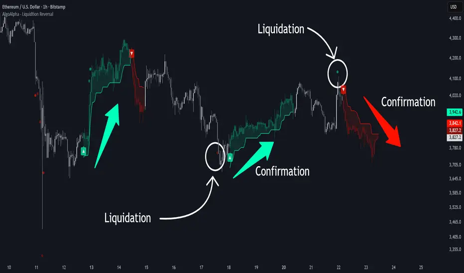
Liquidation Reversal Signals [AlgoAlpha]🟠 OVERVIEW
This tool detects potential liquidation-driven reversals by combining z-score analysis of up/down volume with the classic Supertrend. It watches for abnormal surges in directional volume (on a lower timeframe) and links them to trend flips on the main chart. When both align within a short window, it flags a probable reversal caused by forced liquidations. The goal is to help traders identify exhaustion points where aggressive liquidation moves may mark the end of a trend leg.
🟠 CONCEPTS
The logic revolves around Z-score normalization of up and down volume to locate statistical extremes. When up-volume z-scores exceed a threshold during a bearish Supertrend, it implies trapped shorts being squeezed; the opposite applies for long liquidations. The script tracks these liquidation spikes and monitors whether a Supertrend regime change follows soon after. If confirmed within the allowed timeout, a colored signal marks the event.
In essence:
Z-score outliers = potential forced liquidations.
Supertrend = structural regime context.
Combined = statistically confirmed reversal signals, not random flips.
This pairing reduces false positives by ensuring that both volatility structure and order-flow extremes agree before flagging a reversal.
🟠 FEATURES
Z-score detection for liquidation spikes with adjustable lookback and threshold.
Confirmation logic linking liquidations to Supertrend flips.
Alerts for liquidation spikes and confirmed reversal starts.
On-chart “No Volume” warning to avoid misreads on illiquid assets.
🟠 USAGE
Setup : Add the script to your main chart. Choose a lower timeframe (default 15m) to capture more granular liquidation flows. Adjust Z-Score Length to control how far back the script measures normal behavior and Threshold to decide what counts as extreme. Keep Timeout Bars low (e.g. 20–50) for faster reversals, or higher for slower markets.
Read the chart :
• Circles appear below bars when long liquidations occur; above bars for short liquidations.
• A Supertrend flip with a recent liquidation spike will display an arrow and color shift.
• Fills between candles and trend lines show which side dominates: green for bullish reversal, red for bearish.
• Candle color fades based on the magnitude of liquidation pressure.
Settings that matter :
• Z-Score Length : Longer smooths noise but delays signal; shorter reacts faster.
• Z-Score Threshold : Higher means only extreme liquidations trigger; lower finds smaller squeezes.
• Timeout Bars : Defines how long after a liquidation the Supertrend flip remains valid.
• Lower Timeframe : Determines the precision of volume readings; too low may increase noise.
Volume Sentiment Breakout Channels [AlgoAlpha]🟠 OVERVIEW
This tool visualizes breakout zones based on volume sentiment within dynamic price channels . It identifies high-impact consolidation areas, quantifies buy/sell dominance inside those zones, and then displays real-time shifts in sentiment strength. When the market breaks above or below these sentiment-weighted channels, traders can interpret the event as a change in conviction, not just a technical breakout.
🟠 CONCEPTS
The script builds on two layers of logic:
Channel Detection : A volatility-based algorithm locates price compression areas using normalized highs and lows over a defined lookback. These “boxes” mark accumulation or distribution ranges.
Volume Sentiment Profiling : Each channel is internally divided into small bins, where volume is aggregated and signed by candle direction. This produces a granular sentiment map showing which levels are dominated by buyers or sellers.
When a breakout occurs, the script clears the previous box and forms a new one, letting traders visually track transitions between phases of control. The colored gradients and text updates continuously reflect the internal bias—green for net-buying, red for net-selling—so you can see conviction strength at a glance.
🟠 FEATURES
Volume-weighted sentiment map inside each box, with gradient color intensity proportional to participation.
Dynamic text display of current and overall sentiment within each channel.
Real-time trail lines to show active bullish/bearish trend extensions after breakout.
🟠 USAGE
Setup : Add the script to your chart and enable Strong Closes Only if you prefer cleaner breakouts. Use shorter normalization length (e.g., 50–80) for fast markets; longer (100–200) for smoother transitions.
Read Signals : Transparent boxes mark active sentiment channels. Green gradients show buy-side dominance, red shows sell-side. The middle dashed line is the equilibrium of the channel. “▲” appears when price breaks upward, “▼” when it breaks downward.
Understanding Sentiment : The sentiment profile can be used to show the probability of the price moving up or down at respective price levels.

Statistical Price Deviation Index (MAD/VWMA)SPDI is a statistical oscillator designed to detect potential price reversal zones by measuring how far price deviates from its typical behavior within a defined rolling window.
Instead of using momentum or moving averages like traditional indicators, SPDI applies robust statistics - a rolling median and Mean Absolute Deviation (MAD) - to calculate a normalized measure of price displacement. This normalization keeps the output bounded (from −1 to +1 by default), producing a stable and consistent oscillator that adapts to changing volatility conditions.
The second line in SPDI uses a Volume-Weighted Moving Average (VWMA) instead of a simple price median. This creates a complementary oscillator showing statistically weighted deviations based on traded volume. When both oscillators align in their extremes, strong confluence reversal signals are generated.
How It Works
For each bar, SPDI calculates the median price of the last N bars (default 100).
It then measures how far the current bar’s midpoint deviates from that rolling median.
The Mean Absolute Deviation (MAD) of those distances defines a “normal” range of fluctuation.
The deviation is normalized and compressed via a tanh mapping, keeping the oscillator in fixed boundaries (−1 to +1).
The same logic is applied to the VWMA line to gauge volume-weighted deviations.
How to Use
The blue line (Price MAD) represents pure price deviation.
The green line (VWMA Disp) shows the volume-weighted deviation.
Overbought (red) zones indicate statistically extreme upward deviation -> potential short-term overextension.
Oversold (green) zones indicate statistically extreme downward deviation -> potential rebound area.
Confluence signals (both lines hitting the same extreme) often mark strong reversal points.
Settings Tips
Lookback length controls how much historical data defines “normal” behavior. Larger = smoother, smaller = more sensitive.
Smoothing (RMA length) can reduce noise without changing the overall statistical logic.
Output scale can be set to either −1..+1 or 0..100, depending on your visual preference.
Alerts and color fills are fully customizable in the Style tab.
Summary:
SPDI transforms raw price and volume data into a statistically bounded deviation index. When both Price MAD and VWMA Disp reach joint extremes, it highlights probable market turning points - offering traders a clean, data-driven way to spot potential reversals ahead of time.

Magracia Entry-Exit 5 Min Time frame//------------------------------------------------------------------------------------------------------
// 🧭 Indicator Description
//------------------------------------------------------------------------------------------------------
// 📘 Overview:
// This indicator is a modified version of the LuxAlgo pattern logic designed to detect
// high-probability **RBD (Rally–Base–Drop)** and **DBR (Drop–Base–Rally)** reversal structures
// directly on the current candle. It automatically identifies potential BUY and SELL zones,
// plots corresponding trade signals, and dynamically calculates **Take Profit (TP)** and **Stop Loss (SL)** levels.
//
// The goal of this tool is to give clear, visually guided trade entries and exits that
// follow price structure and momentum changes without repainting historical data.
//
//------------------------------------------------------------------------------------------------------
// 🧩 How It Works:
// • **RBD (Rally–Base–Drop)** → Indicates a bearish reversal (SELL signal)
// • **DBR (Drop–Base–Rally)** → Indicates a bullish reversal (BUY signal)
// • Optional **RBR / DBD** continuation patterns can be toggled on for trend continuation setups.
// • When a signal is detected, the script automatically places:
// ▫ A BUY or SELL marker at the candle
// ▫ Dynamic TP (green dotted line) and SL (red dotted line) levels
// ▫ An EXIT marker when either TP or SL is reached
//
//------------------------------------------------------------------------------------------------------
// ⚙️ Inputs:
// • Enable or disable individual pattern types (RBD, RBR, DBD, DBR)
// • Toggle continuation patterns (RBR/DBD)
// • Customize Take Profit and Stop Loss percentages
// • Adjust rally/drop bar colors for easier pattern visualization
//
//------------------------------------------------------------------------------------------------------
// 🧠 Usage Tips:
// • Works best on volatile pairs and short–term timeframes (1m to 15m)
// • Can be combined with volume or trend filters for stronger confirmation
// • When used on higher timeframes (e.g., 4H+), increase TP/SL percentage range
//
//------------------------------------------------------------------------------------------------------
// ⚠️ Notes:
// • Signals are plotted **in real-time on the current candle** (not delayed).
// • This indicator is for visual and educational use only and does not guarantee profitability.
// • For optimal results, combine it with proper risk management and confirmation indicators.
//
//------------------------------------------------------------------------------------------------------
// © Gideon (CC BY-NC-SA 4.0 Licensed)
//------------------------------------------------------------------------------------------------------
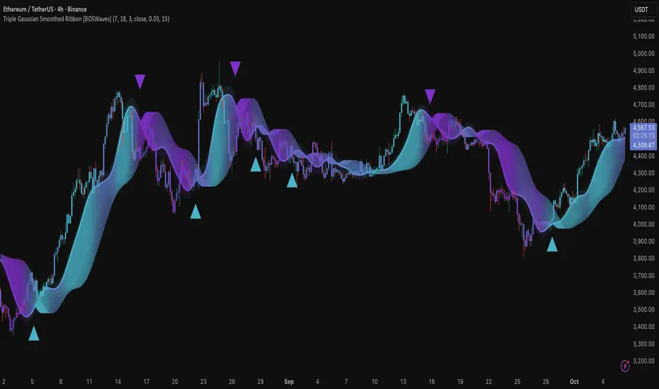
Triple Gaussian Smoothed Ribbon [BOSWaves]Triple Gaussian Smoothed Ribbon – Adaptive Gaussian Framework
Overview
The Triple Gaussian Smoothed Ribbon is a next-generation market visualization framework built on the principles of Gaussian filtering - a mathematical model from digital signal processing designed to remove noise while preserving the integrity of the underlying trend.
Unlike conventional moving averages that suffer from phase lag and overreaction to volatility spikes, Gaussian smoothing produces a symmetrical, low-lag curve that isolates meaningful directional shifts with exceptional clarity.
Developed under the Adaptive Gaussian Framework, this indicator extends the classical Gaussian model into a multi-stage smoothing and visualization system. By layering three progressive Gaussian filters and rendering their interactions as a gradient-based ribbon field, it translates market energy into a coherent, visually structured trend environment. Each ribbon layer represents a progressively smoothed component of price motion, producing a high-fidelity gradient field that evolves in sync with real-time trend strength and momentum.
The result is a uniquely fluid trend and reversal detection system - one that feels organic, adapts seamlessly across timeframes, and reveals hidden transitions in market structure long before traditional indicators confirm them.
Theoretical Foundation
The Gaussian filter, derived from the Gaussian function developed by Carl Friedrich Gauss in 1809, operates on the principle of weighted symmetry, assigning higher importance to central price data while tapering influence toward historical extremes following a bell-curve distribution. This symmetrical design minimizes phase distortion and smooths without introducing lag spikes — a stark contrast to exponential or linear filters that sacrifice temporal accuracy for responsiveness.
By cascading three Gaussian stages in sequence, the indicator creates a multi-frequency decomposition of price action:
The first stage captures immediate trend transitions.
The second absorbs mid-term volatility ripples.
The third stabilizes structural directionality.
The final composite ribbon reflects the market’s dominant frequency - a smoothed yet reactive trend spine - while an independent, heavier Gaussian smoothing serves as a reference layer to gauge whether the primary motion leads or lags relative to broader market structure.
This multi-layered Gaussian framework effectively replicates the behavior of a signal-processing filter bank: isolating meaningful cyclical movements, suppressing random noise, and revealing phase shifts with minimal delay.
How It Works
Triple Gaussian Core
Price data is passed through three successive Gaussian smoothing stages, each refining the trend further and removing higher-frequency distortions.
The result is a fluid, continuously adaptive baseline that responds naturally to directional changes without overshooting or flattening key inflection points.
Adaptive Ribbon Architecture
The indicator visualizes its internal dynamics through a five-layer gradient ribbon. Each layer represents a progressively delayed Gaussian curve, creating a color field that dynamically shifts between bullish and bearish tones.
Expanding ribbons indicate accelerating momentum and trend conviction.
Compressing ribbons reflect consolidation and volatility contraction.
The smooth color gradient provides a real-time depiction of energy buildup or dissipation within the trend, making it visually clear when the market is entering a state of expansion, transition, or exhaustion.
Momentum-Weighted Opacity
Ribbon transparency adjusts according to normalized momentum strength.
As trend force builds, colors intensify and layers become more opaque, signifying conviction.
When momentum wanes, ribbons fade - an early visual cue for potential reversals or pauses in trend continuation.
Candle Gradient Integration
Optional candle coloring ties the chart’s candles to the prevailing Gaussian gradient, allowing traders to view raw price action and smoothed wave dynamics as a unified system.
This integration produces a visually coherent chart environment that communicates directional intent instantly.
Signal Detection Logic
Directional cues emerge when the smoother, broader Gaussian curve crosses the faster-reacting Gaussian line, marking structural inflection points in the filtered trend.
Bullish shifts : short-term momentum transitions upward through the long-term baseline after a localized trough.
Bearish shifts : momentum declines through the baseline following a local peak.
To maintain integrity in choppy markets, the framework applies a trend-strength and separation filter, which blocks weak or overlapping conditions where movement lacks conviction.
Interpretation
The Triple Gaussian Smoothed Ribbon provides a layered, intuitive read on market structure:
Trend Continuation : Expanding ribbons with deep color intensity confirm directional strength.
Reversal Phases : Color gradients flip direction, indicating a phase shift or exhaustion point.
Compression Zones : Tight, pale ribbons reveal equilibrium phases often preceding breakouts.
Momentum Divergence : Fading color intensity despite continued price movement signals weakening conviction.
These transitions mirror the natural ebb and flow of market energy - captured through the Gaussian filter’s ability to represent smooth curvature without distortion.
Strategy Integration
Trend Following
Engage during strong directional expansions. When ribbons widen and color gradients intensify, the trend is accelerating with high confidence.
Reversal Identification
Monitor for full gradient inversion and fading momentum opacity. These conditions often precede transitional phases and early reversals.
Breakout Anticipation
Flat, compressed ribbons signal low volatility and energy buildup. A sudden gradient expansion with renewed opacity confirms breakout initiation.
Multi-Timeframe Alignment
Use higher timeframes to establish directional bias and lower timeframes for entry during compression-to-expansion transitions.
Technical Implementation Details
Triple Gaussian Stack : Sequential smoothing stages produce low-lag, high-purity signals.
Adaptive Ribbon Rendering : Five-layer Gaussian visualization for gradient-based trend depth.
Momentum Normalization : Opacity dynamically tied to trend strength and volatility context.
Consolidation Filter : Suppresses false signals in low-energy or range-bound conditions.
Integrated Candle Mode : Optional color synchronization with underlying gradient flow.
Alert System : Built-in notifications for bullish and bearish transitions.
This structure blends the precision of digital signal processing with the readability of visual market analysis, creating a clean but information-rich framework.
Optimal Application Parameters
Asset Recommendations
Cryptocurrency : Higher smoothing and sigma for stability under volatility.
Forex : Balanced parameters for cycle identification and reduced noise.
Equities : Moderate Gaussian length for responsive yet stable trend reads.
Indices & Futures : Longer smoothing periods for structural confirmation.
Timeframe Recommendations
Scalping (1 - 5m) : Use shorter smoothing for fast reactivity.
Intraday (15m - 1h) : Mid-length Gaussian chain for balance.
Swing (4h - 1D) : Prioritize clarity and opacity-driven trend phases.
Position (Daily - Weekly) : Longer smoothing to capture macro rhythm.
Performance Characteristics
Most Effective In :
Trending markets with recurring volatility cycles.
Transitional phases where early directional confirmation is crucial.
Less Effective In:
Ultra-low volume markets with erratic tick data.
Random, micro-chop conditions with no structural flow.
Integration Guidelines
Pair with volatility or volume expansion tools for enhanced breakout confirmation.
Use ribbon compression to anticipate volatility shifts.
Align entries with gradient expansion in the dominant color direction.
Scale position size relative to opacity strength and ribbon width.
Disclaimer
The Triple Gaussian Smoothed Ribbon – Adaptive Gaussian Framework is designed as a signal visualization and trend interpretation tool, not a standalone trading system. Its accuracy depends on appropriate parameter tuning, contextual confirmation, and disciplined risk management. It should be applied as part of a comprehensive technical or algorithmic trading strategy.