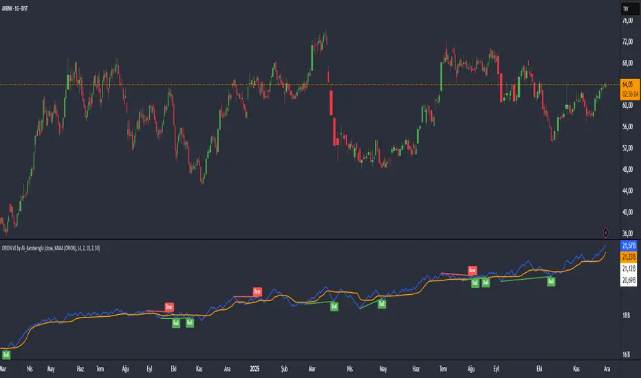
ORION Volume Engine by Ali_KamberogluORION Volume Engine by Ali_Kamberoglu | Look Beyond Volume, Track the "Smart Money"
Developer: Ali Kamberoğlu
Overview: What Price Doesn't Say, Volume Reveals
The ORION Volume Engine (VE) is a sophisticated market force analysis center that steps in where standard volume indicators fall short. This tool takes the classic On-Balance Volume (OBV) indicator and transforms it into an intelligent analysis engine that filters market noise, detects "explosions" in volume, and, most importantly, automatically uncovers the critical divergences between price and volume.
ORION VE tells you not just where the volume is flowing, but also when that flow might be signaling an impending trend reversal.
The ORION Advantage: Why It's Different
The power of ORION VE comes from three intelligent layers that turn the standard OBV into an information hub:
Layer 1 - The Adaptive Signal Line (Smart KAMA Integration):
The raw data of OBV can be choppy and misleading. ORION VE uses the Adaptive KAMA engine to clean this noise, adapting to market conditions. When the market is flowing in a strong trend, KAMA speeds up to keep you in the trend. When the market is indecisive and sideways, it slows down, protecting you from early or false signals. This provides a revolutionary level of clarity in OBV analysis.
Layer 2 - Volume Volatility (Bollinger Bands on OBV):
This unique feature offers the option to draw Bollinger Bands not on the price, but directly on the OBV itself. What does this mean? You can now see when not just the price, but the volume flow itself is "squeezing" and when it's ready to "explode." A breakout of the OBV line from its own Bollinger Band is a powerful signal of an extraordinary increase in volume flow in that direction, confirming the current trend.
Layer 3 - The Game-Changing Feature: Fully Automatic Volume Divergence Engine
One of the most powerful signals heralding the end of a trend is a volume divergence. ORION VE finds these priceless signals for you, automatically:
Bullish Divergence 🐂: Is the price falling to new lows while the OBV (volume) refuses to fall, making higher lows? This is the clearest sign that selling pressure is exhausted and "smart money" is quietly accumulating. You are instantly alerted with a "Bull" label on your chart.
Bearish Divergence 🐻: Is the price hitting record highs, but the OBV is not supporting this rise with sufficient volume and is making lower highs? This is a signal that the power behind the trend is fading and a sharp decline may be imminent. The "Bear" label prepares you to protect your position or take profits.
High-Probability Trading Strategies:
Strongest BUY Signal:
A Bullish Divergence appears on the chart with a "Bull" label.
The OBV line crosses above its orange Adaptive KAMA signal line.
This is an A+ grade buying opportunity, indicating that smart money is stepping in and momentum is starting.
Strongest SELL Signal:
A Bearish Divergence appears on the chart with a "Bear" label.
The OBV line crosses below its orange Adaptive KAMA signal line.
This is a high-probability shorting opportunity, indicating that the uptrend is not supported by volume and momentum is shifting to the sellers.
Disclaimer
This indicator is a professional analysis tool developed to assist in your trading decisions. No signal or analysis constitutes investment advice. Trading in financial markets involves high risk, and past performance is not a guarantee of future results. Please always apply your own risk management strategies.
Oszillatoren
MA Crossover Scalper [4H]//@version=5
indicator("MA Crossover Scalper ", overlay=false)
// Market Cap Filter (Volume as proxy)
volumeValid = volume >= 500000 and volume <= 4000000
// MA Crossover System
ma9 = ta.sma(close, 9)
ma21 = ta.sma(close, 21)
bullishCross = ta.crossover(ma9, ma21) and close > ma21
bearishCross = ta.crossunder(ma9, ma21) and close < ma21
// Volume Confirmation
volumeSpike = volume > ta.sma(volume, 20) * 1.3
// Final Signals
bullSignal = bullishCross and volumeSpike and volumeValid
bearSignal = bearishCross and volumeSpike and volumeValid
// Output for Screener
plot(bullSignal ? 1 : 0, "Bull MA Cross", color=color.green)
plot(bearSignal ? 1 : 0, "Bear MA Cross", color=color.red)

DarkPool's RSi DarkPool's RSi is an enhanced momentum oscillator designed to automatically detect structural discrepancies between price action and the Relative Strength Index. While retaining the standard RSI visualization, this script overlays advanced divergence recognition logic to identify potential trend reversals.
The tool identifies pivot points in real-time and compares recent peaks and valleys against historical data. When the momentum of the RSI contradicts the direction of price action, the indicator highlights these events using dynamic trendlines, shape markers, and background coloring. A built-in dashboard table provides an immediate status check of active divergence signals.
Key Features
Automated Divergence Detection: Automatically spots both Regular Bullish and Regular Bearish divergences based on pivot lookback settings.
Dynamic Visuals: Draws physical lines connecting RSI peaks or troughs to visualize the divergence angle, alongside triangle markers indicating the signal direction.
Active Status Dashboard: A data table located on the chart monitors the current state of the market, flagging signals as "Active" when detected.
Standard RSI Overlay: Includes standard Overbought (70) and Oversold (30) reference lines for traditional momentum trading.
How to Use
1. Reading the Standard RSI The black line represents the Relative Strength Index.
Overbought (Above 70): Suggests the asset may be overvalued and due for a pullback.
Oversold (Below 30): Suggests the asset may be undervalued and due for a bounce.
Midline (50): Acts as a trend filter; values above 50 indicate bullish momentum, while values below 50 indicate bearish momentum.
2. Trading Divergences The primary function of this tool is to identify reversal setups.
Bullish Divergence (Green Triangle/Line): Occurs when Price makes a Lower Low, but the RSI makes a Higher Low. This indicates that selling momentum is exhausting and a price increase may follow.
Bearish Divergence (Red Triangle/Line): Occurs when Price makes a Higher High, but the RSI makes a Lower High. This indicates that buying momentum is fading and a price decrease may follow.
3. Visual Aids
Lines: The script draws solid lines directly on the RSI pane connecting the relevant pivot points to confirm the divergence slope.
Background Color: When a divergence is detected, the background of the indicator pane will highlight briefly (Green for Bullish, Red for Bearish) to draw attention to the new signal.
4. The Dashboard A small table in the bottom right corner tracks the status of the signals.
Status: ACTIVE: A divergence has been detected within the last 10 bars.
Status: None: No recent divergence patterns have been identified.
Disclaimer This indicator is provided for educational and informational purposes only. It does not constitute financial advice, investment recommendations, or a guarantee of future results. Trading cryptocurrencies and financial markets involves a high level of risk. Always perform your own due diligence before making any trading decisions.

ORION Fast Momentum Engine by Ali_KamberogluORION Fast Momentum Engine by Ali_Kamberoglu | Reinventing RSI: Adaptive Signals & Auto Divergences
Developer: Ali Kamberoğlu
Overview: Escape the Noise of Standard RSI
The ORION Fast Momentum Engine (FME) is an all-in-one analytical powerhouse that takes the classic RSI indicator and redesigns it for 21st-century market conditions. It is engineered to eliminate the biggest problems of the standard RSI: false signals, lag, and noise. This tool not only shows you the momentum but also automatically reveals its character, its volatility, and, most importantly, when it's diverging from the price.
ORION FME is not just another oscillator; it's an intelligent analysis engine built into the RSI.
The ORION Advantage: Why It's Different
The power of ORION FME comes from three revolutionary layers it adds to the standard RSI:
Layer 1 - The Smart Signal Line (Adaptive KAMA Integration):
Fixed-period moving averages are a thing of the past. ORION FME uses the Adaptive KAMA engine as its signal line, which adjusts to market conditions. When the market is trending, it speeds up to give you early signals. When the market is choppy and sideways, it slows down, protecting you from countless false trades (whipsaws). No more "blind" signal lines that behave the same way in every condition.
Layer 2 - Momentum Volatility (Bollinger Bands on RSI):
This is a feature you won't find anywhere else. ORION FME offers the option to draw Bollinger Bands not on the price, but directly on the RSI itself. What does this mean? You can now see when not just the price, but the momentum itself is "squeezing" and ready for a breakout. When the RSI breaks out of its own Bollinger Bands, it's a sign of an extraordinary surge in momentum.
Layer 3 - The Game-Changing Feature: Fully Automatic Divergence Engine
Put an end to the tedious task of hunting for divergences! ORION FME includes the powerful divergence engine that has become a signature of the ORION series.
Bullish Divergence 🐂: Is the price making lower lows while the RSI is making higher lows? ORION FME detects this instantly and marks it with a "Bull" label on your chart, signaling a potential bottom and a rally.
Bearish Divergence 🐻: Is the price renewing its highs while the RSI's momentum is fading? This is the clearest sign that the rally is losing its strength. The "Bear" label warns you in advance of a potential top and decline.
High-Probability Trading Strategies:
Strongest BUY Signal:
A Bullish Divergence appears on the chart with a "Bull" label.
The RSI turns up from the oversold zone (below 30) and crosses above its adaptive KAMA signal line.
This is an A+ grade, multi-confirmation buying opportunity.
Strongest SELL Signal:
A Bearish Divergence appears on the chart with a "Bear" label.
The RSI turns down from the overbought zone (above 70) and crosses below its adaptive KAMA signal line.
This is a high-probability shorting opportunity.
Disclaimer
This indicator is a professional analysis tool developed to assist in your trading decisions. No signal or analysis constitutes investment advice. Trading in financial markets involves high risk, and past performance is not a guarantee of future results. Please always apply your own risk management strategies.

ORION Energy Engine by Ali_KamberogluORION Energy Engine by Ali_Kamberoglu | Turn the Market's "Quiet" Moments into Explosive Moves
Developer: Ali Kamberoğlu
Overview: Go Beyond Momentum, Measure the Energy
The ORION Energy Engine is not an ordinary momentum indicator. It is a sophisticated energy measurement system designed to detect the seemingly calm "accumulation" periods in the market and to anticipate the explosive price movements that follow. By clearly distinguishing between moments when the market is coiling and storing energy (Potential Energy) and moments when it releases that energy (Kinetic Energy), it provides you with a flawless roadmap for the market's next big move.
Think of the ORION Energy Engine as a compressed spring; it shows you not only when the spring is being compressed, but also when and how powerfully it is about to be released.
The ORION Advantage: Why It's Different
The power of ORION comes from its integrated system that analyzes market energy in three distinct dimensions:
Layer 1 - Potential Energy Detection (The Squeeze Engine):
Before every major market move, there is a period of silence and indecision. ORION automatically detects these "squeeze" moments using Bollinger Bands and Keltner Channels. The dots on the zero line signal that the market is building up energy for its next move.
Purple Dot: Standard energy accumulation.
White Dot: A more reliable accumulation, confirmed by volume.
Yellow Dot: "Super Squeeze," occurring at historically low levels of volatility. This is a sign that the upcoming move could be much more violent.
Layer 2 - Kinetic Energy Measurement (The Four-Stage Momentum Histogram):
When the energy is released, ORION measures the power and acceleration of this movement. The histogram provides an instant status report with four different colors, showing not just the direction but also whether the trend is accelerating or decelerating:
Lime Green: A strengthening, accelerating uptrend.
Dark Green: A weakening, decelerating uptrend (a signal to take profit or be cautious).
Red: A strengthening, accelerating downtrend.
Maroon: A weakening, decelerating downtrend (the end of the decline may be near).
Layer 3 - Adaptive Energy Levels (Statistical Breakout Zones):
The energy dynamics of every instrument are different. ORION plots dynamic "Optimum" and "Maximum" energy levels for momentum based on statistical standard deviation calculations from past price action. These levels are objective reference points that show when a trend is becoming overextended and the probability of a correction or reversal is increasing.
The Game-Changing Feature: Automatic Energy Release Alert
Your most valuable asset is time. The ORION Energy Engine eliminates the need to constantly monitor the market. With its built-in alert system, it notifies you the very first moment an energy accumulation (Squeeze) ends and the move begins. This gives you an invaluable entry advantage, ensuring you never miss the start of a potential breakout.
High-Probability Trading Strategies:
Strongest BUY Signal (Super Breakout Setup):
Yellow (Super Squeeze) or White (Volume Squeeze) dots appear on the zero line.
The dots disappear, and the "Squeeze Released" alert is triggered.
The first bar on the alert generates a strong Lime Green momentum histogram.
This is an A+ grade buying opportunity where stored energy has converted into an upward explosion. Targets are the upper Adaptive Levels.
Strongest SELL Signal (Energy Discharge Setup):
An accumulation (preferably Yellow or White dots) is observed on the zero line.
The squeeze ends, and the alert is triggered.
The first bar on the alert generates a strong Red negative momentum histogram.
This is a high-probability shorting opportunity where energy is being released to the downside. Targets are the lower Adaptive Levels.
Disclaimer
This indicator is a professional analysis tool developed to assist in your trading decisions. No signal or analysis constitutes investment advice. Trading in financial markets involves high risk, and past performance is not a guarantee of future results. Please always apply your own risk management strategies.

ORION LTME by Ali_KamberogluORION Long-Term Momentum Engine by Ali_Kamberoglu | Silence the Noise, Hear the Real Signals
Developer: Ali Kamberoğlu
Overview: Go Beyond the Limits of Standard Indicators
The ORION Long-Term Momentum Engine is an all-in-one analytical powerhouse designed to filter market noise with surgical precision, eliminate signal lag, and, most importantly, automatically detect trend reversals that are impossible to see with the naked eye. This tool combines three different advanced mathematical engines (Chebyshev, Zero-Lag Gaussian, and Adaptive KAMA) into a single hybrid structure, offering a clarity and analytical depth that ordinary oscillators could never provide. ORION shows you not just what is happening, but what is about to happen.
The ORION Advantage: Why It's Different
The power of ORION comes from its three-layer filtering system, which works in perfect harmony:
Layer 1 - The Noise Shield (Chebyshev Filter):
Price action is chaotic. The Chebyshev filter is your first line of defense, cleaning out the meaningless noise (sudden spikes, minor fluctuations) from this chaos. The result? Smoother, more readable, and reliable baseline momentum data that won't mislead you.
Layer 2 - The Lag Enemy (Zero-Lag Gaussian Filter):
Cleaning noise is important, but a lagging signal is unacceptable. The Zero-Lag filter ensures that the cleaned signal reaches you almost in real-time with market movements. No more getting signals after the opportunities have passed. Speed and precision, combined.
Layer 3 - The Smart Navigation System (Adaptive KAMA Filter):
Not all market conditions are the same. ORION knows this. The Adaptive KAMA filter analyzes the current character of the market. If there's a strong trend, it speeds up to keep you in the move. If the market is choppy and indecisive, it slows down, protecting you from the loss-making whipsaw market.
The Game-Changing Feature: Automatic Divergence Engine
ORION's most valuable feature is its fully automatic divergence detection system, which alerts you to trend reversals before anyone else.
Bullish Divergence 🐂: Is the price making lower lows while ORION's momentum is making higher lows? This is the clearest sign that the downtrend is losing power and a strong rally is imminent. You are instantly alerted with a "Bull" label on your chart.
Bearish Divergence 🐻: Is the price hitting record highs while ORION's momentum is losing steam? This signals that the rally is nearing its end and a sharp decline could be starting. The "Bear" label prepares you to protect your position or take profits.
This feature alone reduces hours of manual analysis to seconds and gives you an invaluable strategic advantage.
Indicator Components & Strategies
🔵 ORION Momentum (Blue Line): The heart of the engine. Your fast, precise, and primary momentum line.
🟠 Signal Line (Orange Line): The confirmation mechanism. A smoother reference that validates the movements of the blue line.
💎 Adaptive KAMA (Turquoise Line): Your dynamic filter that keeps its finger on the pulse of the market.
High-Probability Trading Strategies:
Strongest BUY Signal:
A "Bull" label appears on the chart.
The blue line crosses above the orange line in the oversold zone (below the 20 level).
This is an A+ grade buying opportunity, combining a momentum reversal with an oversold market.
Strongest SELL Signal:
A "Bear" label appears on the chart.
The blue line crosses below the orange line in the overbought zone (above the 80 level).
This is a high-probability shorting opportunity, combining a loss of momentum with an overextended market.
Disclaimer
This indicator is a professional analysis tool developed to assist in your trading decisions. No signal or analysis constitutes investment advice. Trading in financial markets involves high risk, and past performance is not a guarantee of future results. Please always apply your own risk management strategies.

Ghost Protocol [Bit2Billions]Ghost Protocol — Institutional RSI Intelligence Engine
*A unified RSI-based momentum-mapping system built on original logic, designed for professional-grade trend, reversal, and volatility analysis.*
Ghost Protocol is a momentum framework engineered to give traders a single, coherent view of trend strength, equilibrium shifts, reversals, volatility states, and momentum pressure across all time horizons.
It is not a mashup of public RSI indicators. Every module is built on proprietary RSI engines, ensuring consistency, originality, and practical trading value.
The script is designed to solve a frequent trader problem: RSI tools producing conflicting or isolated signals.
Ghost Protocol consolidates candles, divergences, adaptive zones, trend indexing, cloud states, and multi-timeframe momentum context into one synchronized ecosystem.
Ghost Protocol is driven by three custom systems:
1. Proprietary RSI Divergence Engine (Ghost Divergence Core)
This engine identifies momentum turning points using:
* Displacement-weighted RSI swing logic
* Real-time regular & hidden divergence validation
* Multi-layer swing scoring
* Pre-confirmation “Ghost Candidate” modeling
These outputs form the foundation for reversal detection, momentum shifts, and early trend-exhaustion signals.
This is not based on standard pivot matching or public divergence scripts.
2. Adaptive RSI Architecture (Volatility-Responsive Layer)
This system evaluates RSI behavior in a dynamic, market-adaptive sequence:
* Volatility-adjusted RSI zones
* Dynamic OB/OS thresholds
* Percentile-indexed trend strength
* Auto-drawn RSI support/resistance trendlines
This ensures RSI interpretation is not static or fixed, but evolves through continuously adaptive logic.
3. Momentum Cloud & Trend Pressure Engine
All RSI clouds, trend states, and regime changes respond to the Adaptive Layer, producing contextual momentum reading rather than isolated signals.
This includes:
* RSI Ichimoku-style cloud (equilibrium + displacement modeling)
* Real-time momentum shift structure
* Multi-timeframe relative trend index
* Pressure gradients & continuation/exhaustion bias
The result is a full RSI ecosystem—not a blend of unrelated tools.
Why This Script Has Genuine Value
TradingView requires originality, consistency, and practical use.
Ghost Protocol delivers this through:
✔ A unified RSI ecosystem
All modules connect to the same internal RSI engines, so the chart tells one consistent momentum story.
✔ Proprietary decision-making logic
Divergence detection, RSI zones, clouds, and trendlines use original formulas rather than built-ins or public logic.
✔ A visual-first trading workflow
All visuals are structured for institutional-style clarity:
* Trend continuation vs. exhaustion
* Divergence confirmation hierarchy
* Momentum pressure vs. equilibrium shift
* Cloud-based regime transitions
✔ Designed for traders who rely on narrative momentum reading
Ghost Protocol replaces:
* Manual divergence drawing
* RSI zone calibration
* Trendline plotting on RSI
* OB/OS state interpretation
* Multi-timeframe RSI comparison
* Momentum shift detection
* Volatility-adjusted trend reading
All in one coherent tool.
Key Components & Intent
RSI Candles (Standard & Heiken-Ashi)
Purpose: show momentum transitions with visual clarity and divergence readability.
Divergence Engine
Detects:
* Regular divergences
* Hidden divergences
* Pre-divergence Ghost Candidates
Purpose: identify trend exhaustion before price shows it.
Adaptive RSI Zones
Zones react to:
* Volatility
* Recent displacement
* Trend direction
Purpose: avoid static “fixed OB/OS” readings and provide more realistic thresholds.
RSI Ichimoku Cloud
Outputs include:
* Bull/bear cloud bias
* Momentum compression/expansion
* Equilibrium shifts
Purpose: reveal regime transitions inside RSI behavior.
RSI Trendlines
Auto-draws momentum support/resistance on RSI swings.
Purpose: structural RSI mapping.
Relative Trend Index
Evaluates trend consistency across multiple timeframes.
Dashboard Metrics
Shows:
* Volatility overview
* Volume analysis
* VWAP vs price
* EMA-9 sentiment
* EMA-9/21 cross (5m–Weekly)
* EMA-50 trend (5m–Weekly)
* RSI OB/OS percentages
* Price OB/OS percentages
* Relative Trend
* ATR state & ATR trailing stop
Purpose: provide a consolidated, multi-layer reading at a glance.
Visual Design (Clutter-Free Standard)
* Only real-time labels appear; historical labels stay hidden for clarity.
* Consistent, structured line styles:
* RSI trendlines: solid green/red
* Regular divergence: dashed green/red
* Hidden divergence: dotted green/red
* Momentum signals: solid green/red
This color structure helps traders read momentum quickly.
Recommended Use
* Best on: 15m, 1H, 4H, Daily, Weekly
* Works across: crypto, forex, indices, liquid equities
* Pivot-style modules may show noise in illiquid markets
Performance Notes
* Heavy modules may draw many objects → disable unused tools
* Refresh chart if buffer limits are approached
* Internal handling of TradingView object rules
License
* Proprietary script © 2025
* Independently developed
* Redistribution, sharing, resale, or decompilation prohibited
* Similarities to public tools result only from shared market concepts
Respect & Transparency
Built using widely-recognized RSI concepts, but extended with proprietary logic.
Developed with respect for the TradingView community.
Any overlaps can be addressed openly and constructively.
Disclaimer
For educational and research use only.
Not financial advice.
Always test responsibly and manage risk.
FAQs
* Source code is intentionally private
* Modules can be toggled
* Alerts can be configured manually
* Works on all major markets and timeframes
About Ghost Trading Suite
Author: BIT2BILLIONS
Project: Ghost Trading Suite © 2025
Indicators: Ghost Matrix, Ghost Protocol, Ghost Cipher, Ghost Shadow
Strategies: Ghost Robo, Ghost Robo Plus
Pine Version: V6
The Ghost Trading Suite is designed to simplify and automate many aspects of chart analysis. It helps traders identify market structure, divergences, support and resistance levels, and momentum efficiently, reducing manual charting time.
The suite includes several integrated tools — such as Ghost Matrix, Ghost Protocol, Ghost Cipher, Ghost Shadow, Ghost Robo, and Ghost Robo Plus — each combining analytical modules for enhanced clarity in trend direction, volatility, pivot detection, and momentum tracking.
Together, these tools form a cohesive framework that assists in visualizing market behavior, measuring momentum, detecting pivots, and analyzing price structure effectively.
This project focuses on providing adaptable and professional-grade tools that turn complex market data into clear, actionable insights for technical analysis.
Crafted with 💖 by BIT2BILLIONS for Traders. That's All Folks!
Changelog
v1.0 – Initial Release
* Added RSI Candles (Standard & Heiken-Ashi) for enhanced trend and divergence clarity.
* Implemented Divergence Engine to highlight both regular and hidden divergences automatically.
* Introduced Live Ghost Candidates to visualize forming divergence setups.
* Added Adaptive RSI Zones for dynamic overbought and oversold thresholds.
* Integrated Trend Index using percentile volatility sampling for directional bias.
* Added RSI Ichimoku Cloud for equilibrium and momentum zone visualization.
* Implemented RSI Trend Lines for auto support/resistance on RSI.
* Added Momentum Shift Visualization and real-time momentum tracking.
* Introduced Relative Trend Index for multi-timeframe trend strength analysis.
* Developed Dashboard Module displaying volatility, volume, EMA trends, RSI/price overbought-oversold percentages, relative trend, and ATR-based metrics.

Sk M Sir JiSimple indicator that plots three alma moving averages and provides bgcolor based on below conditions
Red => If RSI (length 14) is below 50 or low is below the lower Bollinger band (length 20)
Green => If RSI (length 14) is above 50 or high is above the upper Bollinger band (length 20)

Fat Tony Composite Histogram Dual SettingsThis is an adaptation of Rob Booker's Fat Tony Composite Histogram which allows you to put two levels for signals.

Alpha Net Oscillator Buy Sell SignalAlpha Net Oscillator is a momentum-based mean reversion indicator designed to detect early shifts in trend direction and potential overbought/oversold conditions. It utilizes a normalized linear regression oscillator with visual threshold zones and confirmation markers to highlight potential trading opportunities.
This tool is built for traders who rely on oscillator-style signals to support entries and exits, especially in markets exhibiting cyclical or range-bound behavior.

Relative Strength Matrix [PUCHON]📊 Relative Strength Matrix
The Relative Strength Matrix provides a comprehensive view of how the current asset performs against a basket of other financial instruments (such as Indices, Commodities, or Currencies). By comparing price changes over two distinct timeframes (Short-Term and Long-Term), traders can quickly identify whether the asset is showing relative strength or weakness compared to the broader market or specific sectors.
✨ Features:
- 🌍 Multi-Asset Comparison: Monitor relative performance against up to 7 customizable symbols simultaneously.
- ⏳ Dual Timeframe: Analyze trends using both Short-Term (default 20) and Long-Term (default 60) lookback periods.
- 🎨 Visual Heatmap: Displays relative strength with intuitive colors:
- 🟢 Green (+): Stronger (outperforming)
- 🔴 Red (-): Weaker (underperforming)
- ⚪ Gray: Neutral
- ⚙️ Fully Customizable: Adjust symbols, colors, table position, and text size to fit your trading setup.
🧮 Calculation Logic:
The core of this indicator is the rsCalc function. It normalizes the price changes of both the base asset (current chart) and the comparison asset over a specific length, then calculates the ratio.
rsCalc(series float base, series float comp, int len) =>
nb = base / base // Normalized Base Asset Price
dc = comp / comp // Normalized Comparison Asset Price
na(nb) or na(dc) ? na : nb / dc - 1 // Relative Performance Ratio
💡 Interpretation:
- 📈 Positive Value (> 0): The current asset has appreciated more (or depreciated less) than the comparison asset. This signifies Relative Strength .
- 📉 Negative Value (< 0): The current asset has appreciated less (or depreciated more) than the comparison asset. This signifies Relative Weakness .
- ⚖️ Zero (0): Both assets have performed equally over the period.

Dual MACD📘 Dual MACD — Synopsis
The Dual MACD indicator displays two separate MACD systems inside the same pane, allowing traders to compare fast and slow momentum behavior simultaneously.
What It Includes
Two fully adjustable MACDs
MACD 1 default: 12 / 12 / 9
MACD 2 default: 8 / 20 / 6
Show/Hide Toggles so each MACD can be viewed independently or together.
MACD Lines, Signal Lines, and Histograms for both systems.
Clean layout with a compact panel title: “MACD x2”
What It Helps You See
Short-term vs. longer-term momentum shifts
Faster MACD reacting to quick trend changes
Slower MACD confirming or filtering signals
Trend strength, momentum acceleration, and crossover behavior in a single pane
Why It’s Useful
The Dual MACD gives you momentum confirmation, fakeout filtering, and multi-speed trend insight—making it valuable for scalpers, intraday traders, and swing traders who want to reduce noise and improve signal quality.
Ghost Universal Flow ® – PremiumGhost Universal Flow ® – Premium (Invite-only)
A high-performance trend-flow indicator delivering early confirmed entries and heavily filtered exits.
Features
• Dual-trigger entry system for faster reaction on strong momentum
• Built-in noise reduction and false-signal protection
• Ultra-smooth dynamic flow line with adaptive offset
• Clean, locked buy/sell alerts – no repainting
Proprietary momentum-based flow system with fully custom filtering, trend validation and visual smoothing – developed 2025.
Works on all markets • Particularly strong on 1h–daily timeframes.
Invite-only access.
Past performance is not indicative of future results.
To request access, send me a private message with the word “Ghost Flow”.

OBV WaveTrend FlowOBV WaveTrend Pressure — A Volume-Powered Momentum Oscillator
OBV WaveTrend Pressure combines Hybrid OBV (volume × price delta) with the classic LazyBear WaveTrend framework to create a volume-weighted momentum oscillator that highlights real buying/selling pressure before price reacts.
While standard WaveTrend uses price averages alone, this tool feeds a cumulative hybrid OBV source into WT1/WT2, producing a much more sensitive, order-flow-aware momentum signal. The result is a clean, MACD-style histogram built from the slope of WT1, revealing when volume-backed momentum flips from bullish to bearish and vice-versa.
This is designed as a companion to volatility tools (e.g., TTM Squeeze, SQZMOM) and standard price-based WaveTrend indicators.
⸻
Features
1. Hybrid OBV Source (Vol × ΔPrice)
Captures true directional volume pressure, giving earlier and more reliable inflection points than price-based oscillators.
2. WaveTrend Applied to OBV
Applies LazyBear’s WT logic to a volume-driven source:
• WT1 (fast)
• WT2 (signal)
• Optional slope-aware color themes
3. MACD-Style Pressure Histogram
Shows momentum contraction/expansion clearly:
• Bright green/blue → Strong bull pressure
• Pale green/blue → Weakening bull
• Bright red → Strong bear pressure
• Pale red → Weakening bear
4. Dynamic OB/OS Bands
Adaptive overbought/oversold computed from:
• Rolling mean of WT1
• Rolling standard deviation
Helps identify exhaustion relative to market conditions, not fixed numbers.
5. Zero-Line Momentum Flips (with alerts)
Alerts fire when:
• WT1 slope crosses above zero → Bull momentum shift
• WT1 slope crosses below zero → Bear momentum shift
6. Optional Price Bar Coloring
Mirror the histogram state onto price bars for fast visual bias confirmation.
⸻
How to Use
Bullish Signals
• Histogram flips positive
• WT1 rising
• WT1 or WT2 near dynamic oversold zone
• Useful for positioning early in momentum cycles
Bearish Signals
• Histogram flips negative
• WT1 falling
• WT1 or WT2 near dynamic overbought zone
Best Applications
• Trend continuation entries
• Confirming TTM squeeze setups
• Early identification of pressure reversals
• Pairing with price-based WaveTrend for dual confirmation
⸻
Why It Works
WaveTrend is already one of the most reliable oscillators for structure and reversals — but this version feeds it volume pressure instead of price.
Volume often shifts before candles do, making this a leading indicator in many cases.

UM Nadaraya-Watson OscillatorDescription
This is a different take on the Nadaraya-Watson Estimator from both Jdhorty and LuxAlgo. Both great scripts, I encourage everyone to check them out. Think of this script as a measure of trend direction, direction change, and trend acceleration or deceleration. It is not a Moving Average, but you could think of it as loosely as an intelligent adaptive regression curve with the focus on trend direction. The Gaussian calculations prefer and add more weight to the most recent bars. The end result is the oscillator is more responsive with less lag and less prone to pure price noise.
How it Works
The indicator was added to the chart twice; once with an MA, once without. The oscillator indicates trend change by crossing up through the zero line or down through the zero line. Once the indicator turns positive, we are in a positive trend until it crosses below zero and then the trend turns negative. I implemented a Moving Average overlay for additional signal determination; if the configured MA (EMA, SMA, WMA, or Nadaraya-Watson Estimator) trends higher, it is green. When trending down, it is red. The indicator also changes the color of the price bars; when the indicator below zero and red, the price bars are red. When the indicator is above zero and green, the price bars are green.
I marked up the chart and indicator to identify LONG, SHORT, and divergences between price and oscillator.
Default Settings
The default settings are 16 for Bandwidth and a WMA with 110. This is shown in the chart example. There directional arrows, but they are off by default. The Price bars are colored green or red to match the oscillator and the bar coloring is on by default.
All settings are user-configurable including bandwidth, MA type, MA length, bar coloring, and arrows.
Suggested Settings and uses
I personally like the 30 min chart with a bandwidth of 16 and a WMA of 110. The bandwidth 8 and 8 period EMA or WMA also work well on 6 hour and daily charts. Add this to your chart arsenal and use your favorite indicators for confirmation. This indicator works well on the 30 minute chart for inverse ETFs as well (SQQQ, SOXS, TZA). Also, the oscillator is good for identifying divergences between price and and indicator. (see chart for illustration)
Experiment with settings and adapt them to your trading style.
Alerts
If you right click the indicator, and select add alert, I have configured 4 standard alerts: A bullish cross above zero, A bearish cross below zero, An MA bullish turned up to trend higher, (green), and an MA bearish turned down to trend lower (red).

PGI Pro v6 — FREE Squeeze Killer (GME/AMC Classic)PGI Pro v6 — FREE Classic Squeeze Killer (GME/AMC Edition)
The original indicator that called every single GME & AMC squeeze since 2021.
Current GME daily reading: –38.19 → deeper than 2021 or 2024.
Rule: First daily close ≥ –10 = violent move starts (never failed once).
FREE protected version — add it now and see the nuclear reading live.
Want the $149 PRIVATE GOD MODE?
→ Universal (works perfectly on BTC, SPY, forex, everything)
→ Auto-detects meme stocks + screams “NUCLEAR SQUEEZE”
→ Tighter settings + private lifetime + all future updates
DM me on X @TimmyCryto78 or reply below — first 100 only. Timothy.walton45@gmail.com

RSI HTF Hardcoded (A/B Presets) + Regimes [CHE]RSI HTF Hardcoded (A/B Presets) + Regimes — Higher-timeframe RSI emulation with acceptance-based regime filter and on-chart diagnostics
Summary
This indicator emulates a higher-timeframe RSI on the current chart by resolving hardcoded “HTF-like” lengths from a time-bucket mapping, avoiding cross-timeframe requests. It computes RSI on a resolved length, smooths it with a resolved moving average, and derives a histogram-style difference (RSI minus its smoother). A four-state regime classifier is gated by a dead-band and an acceptance filter requiring consecutive bars before a regime is considered valid. An on-chart table reports the active preset, resolved mapping tag, resolved lengths, and the current filtered regime.
Pine version: v6
Overlay: false
Primary outputs: RSI line, SMA(RSI) line, RSI–SMA histogram columns, reference levels (30/50/70), regime-change alert, info table
Motivation
Cross-timeframe RSI implementations often rely on `request.security`, which can introduce repaint pathways and additional update latency. This design uses deterministic, on-series computation: it infers a coarse target bucket (or uses a forced bucket) and resolves lengths accordingly. The dead-band reduces noise at the decision boundaries (around RSI 50 and around the RSI–SMA difference), while the acceptance filter suppresses rapid flip-flops by requiring sustained agreement across bars.
Differences
Baseline: Standard RSI with a user-selected length on the same timeframe, or HTF RSI via cross-timeframe requests.
Key differences:
Hardcoded preset families and a bucket-based mapping to resolve “HTF-like” lengths on the current chart.
No `request.security`; all calculations run on the chart’s own series.
Regime classification uses two independent signals (RSI relative to 50 and RSI–SMA difference), gated by a configurable dead-band and an acceptance counter.
Always-on diagnostics via a persistent table (optional), showing preset, mapping tag, resolved lengths, and filtered regime.
Practical effect: The oscillator behaves like a slower, higher-timeframe variant with more stable regime transitions, at the cost of delayed recognition around sharp turns (by design).
How it works
1. Bucket selection: The script derives a coarse “target bucket” from the chart timeframe (Auto) or uses a user-forced bucket.
2. Length resolution: A chosen preset defines base lengths (RSI length and smoothing length). A bucket/timeframe mapping resolves a multiplier, producing final lengths used for RSI and smoothing.
3. Oscillator construction: RSI is computed on the resolved RSI length. A moving average of RSI is computed on the resolved smoothing length. The difference (RSI minus its smoother) is used as the histogram series.
4. Regime classification: Four regimes are defined from:
RSI relative to 50 (bullish above, bearish below), with a dead-band around 50
Difference relative to 0 (positive/negative), with a dead-band around 0
These two axes produce strong/weak bull and bear states, plus a neutral state when inside the dead-band(s).
5. Acceptance filter: The raw regime must persist for `n` consecutive bars before it becomes the filtered regime. The alert triggers when the filtered regime changes.
6. Diagnostics and visualization: Histogram columns change shade based on sign and whether the difference is rising/falling. The table displays preset, mapping tag, resolved lengths, and the filtered regime description.
Parameter Guide
Source — Input series for RSI — Default: Close — Smoother sources reduce noise but add lag.
Preset — Base lengths family — Default: A(14/14) — Switch presets to change RSI and smoothing responsiveness.
Target Bucket — Auto or forced bucket — Default: Auto — Force a bucket to lock behavior across chart timeframe changes.
Table X / Table Y — Table anchor — Default: right / top — Move to avoid covering content.
Table Size — Table text size — Default: normal — Increase for presentations, decrease for dense layouts.
Dark Mode — Table theme — Default: enabled — Match chart background for readability.
Show Table — Toggle diagnostics table — Default: enabled — Disable for a cleaner pane.
Epsilon (dead-band) — Noise gate for decisions — Default: 1.0 — Raise to reduce flips near boundaries; lower to react faster.
Acceptance bars (n) — Bars required to confirm a regime — Default: 3 — Higher reduces whipsaw; lower increases reactivity.
Reading
Histogram (RSI–SMA):
Above zero indicates RSI is above its smoother (positive momentum bias).
Below zero indicates RSI is below its smoother (negative momentum bias).
Darker/lighter shading indicates whether the difference is increasing or decreasing versus the previous bar.
RSI vs SMA(RSI):
RSI’s position relative to 50 provides broad directional bias.
RSI’s position relative to its smoother provides momentum confirmation/contra-signal.
Regimes:
Strong bull: RSI meaningfully above 50 and difference meaningfully above 0.
Weak bull: RSI above 50 but difference below 0 (pullback/transition).
Strong bear: RSI meaningfully below 50 and difference meaningfully below 0.
Weak bear: RSI below 50 but difference above 0 (pullback/transition).
Neutral: inside the dead-band(s).
Table:
Use it to validate the active preset, the mapping tag, the resolved lengths, and the filtered regime output.
Workflows
Trend confirmation:
Favor long bias when strong bull is active; favor short bias when strong bear is active.
Treat weak regimes as pullback/transition context rather than immediate reversals, especially with higher acceptance.
Structure + oscillator:
Combine regimes with swing structure, breakouts, or a baseline trend filter to avoid trading against dominant structure.
Use regime change alerts as a “state change” notification, not as a standalone entry.
Multi-asset consistency:
The bucket mapping helps keep a consistent “feel” across different chart timeframes without relying on external timeframe series.
Behavior/Constraints
Intrabar behavior:
No cross-timeframe requests are used; values can still evolve on the live bar and settle at close depending on your chart/update timing.
Warm-up requirements:
Large resolved lengths require sufficient history to seed RSI and smoothing. Expect a warm-up period after loading or switching symbols/timeframes.
Latency by design:
Dead-band and acceptance filtering reduce noise but can delay regime changes during sharp reversals.
Chart types:
Intended for standard time-based charts. Non-time-based or synthetic chart types (e.g., Heikin-Ashi, Renko, Kagi, Point-and-Figure, Range) can distort oscillator behavior and regime stability.
Tuning
Too many flips near decision boundaries:
Increase Epsilon and/or increase Acceptance bars.
Too sluggish in clean trends:
Reduce Acceptance bars by one, or choose a faster preset (shorter base lengths).
Too sensitive on lower timeframes:
Choose a slower preset (longer base lengths) or force a higher Target Bucket.
Want less clutter:
Disable the table and keep only the alert + plots you need.
What it is/isn’t
This indicator is a regime and visualization layer for RSI using higher-timeframe emulation and stability gates. It is not a complete trading system and does not provide position sizing, risk management, or execution rules. Use it alongside structure, liquidity/volatility context, and protective risk controls.
Disclaimer
The content provided, including all code and materials, is strictly for educational and informational purposes only. It is not intended as, and should not be interpreted as, financial advice, a recommendation to buy or sell any financial instrument, or an offer of any financial product or service. All strategies, tools, and examples discussed are provided for illustrative purposes to demonstrate coding techniques and the functionality of Pine Script within a trading context.
Any results from strategies or tools provided are hypothetical, and past performance is not indicative of future results. Trading and investing involve high risk, including the potential loss of principal, and may not be suitable for all individuals. Before making any trading decisions, please consult with a qualified financial professional to understand the risks involved.
By using this script, you acknowledge and agree that any trading decisions are made solely at your discretion and risk.
Best regards and happy trading
Chervolino.

TriPrimeTriPrime is a multi-layer momentum-distance engine designed to capture structural trend behavior and directional transitions.
The system decomposes market displacement into three response-speed layers, representing different structural components of trend development:
Alpha – fast-response distance
Beta – medium-response distance
Gamma – slow-response distance
Together, the three layers reveal:
• Trend rising vs. trend falling cycles
• Multi-speed directional alignment
• Early-stage rotation signals
• Trend continuation and weakening phases
Bright colors indicate a rising trend.
Soft colors indicate a falling trend.
A synchronized-movement alert is included, highlighting moments when all three layers rise or fall together — conditions commonly associated with highly clear market direction.
TriPrime is designed for professional trading workflows, multi-layer momentum analysis, and structural trend validation.
TriPrime 是一套多层动能-距离分析引擎,用于捕捉结构性趋势、方向变化与趋势阶段特征。
系统将市场位移拆分为三个不同反应速度的层级,代表趋势结构中的多速度特性:
Alpha — 快速反应距离
Beta — 中速反应距离
Gamma — 慢速反应距离
三层结构可揭示:
• 趋势上升 / 趋势下降周期
• 多速度趋势一致性
• 趋势早期方向旋转信号
• 趋势延续与趋势衰减阶段
亮色代表趋势上升。
柔色代表趋势下降。
系统包含同步提醒
用于标记三层同时趋势上升或趋势下降的时刻 —— 通常对应趋势方向非常明确的行情阶段。
TriPrime 适用于专业交易流程、多层动能研究与趋势结构验证。

GME Cycle Predictor# 🚀 GME Cycle Predictor - Advanced Technical Analysis Tool
**Comprehensive GameStop (GME) cycle tracking indicator based on historical patterns and market mechanics.**
## 📊 **What This Indicator Does:**
- Tracks **147-day quarterly cycles** from the January 28, 2021 squeeze
- Monitors the **1704-day major cycle** (the theoretical "big one")
- Identifies **T+35 FTD settlement periods** for forced buying pressure
- Marks **quarterly OPEX** and **swap roll dates**
- Provides **real-time buy/sell recommendations** based on cycle timing
## 🎯 **Key Features:**
### **Visual Cycle Markers:**
- 🔴 **Red Circles**: 147-day quarterly cycles
- 🟡 **Yellow Diamonds**: 1704-day major cycle (CRITICAL)
- 🟢 **Green Squares**: T+35 FTD settlement dates
- 🟠 **Orange Triangles**: Quarterly OPEX periods
- 🟣 **Purple X's**: Swap roll periods
### **Smart Trading Signals:**
- **🚀 MAJOR BUY**: 10+ days before 1704-day cycle
- **📈 BUY ZONE**: 5-10 days before 147-day cycle
- **💚 FTD BUY**: 2-5 days before T+35 settlement
- **📉 SELL ZONE**: Day of cycle completion
- **⏳ WAIT**: No active signals
## 📈 **How to Use:**
### **For Swing Trading:**
1. **BUY** when cheat sheet shows active buy signals
2. **SELL** on cycle completion days
3. **HODL** through the 1704-day major cycle
### **For Long-term Investors:**
- Monitor the **1704-day countdown** (major cycle theory)
- Accumulate during **confluence periods** (multiple cycles aligning)
- Use **147-day cycles** for entry/exit timing
## 🔧 **Technical Foundation:**
- Based on **Fail-to-Deliver (FTD)** settlement mechanics
- **Quarterly swap theory** and institutional obligations
- **Options expiration (OPEX)** pressure points
- **Historical pattern recognition** from 2021 squeeze
## ⚡ **Real-Time Features:**
- **Live countdown timers** to next major cycles
- **Dynamic trading recommendations**
- **Confluence detection** when multiple cycles align
- **Volume confirmation** for signal validation
- **Clean visual design** with minimal chart clutter
## 🎯 **Perfect For:**
- GME traders following cycle theory
- Technical analysts studying market mechanics
- Swing traders using institutional obligation cycles
- Anyone tracking the theoretical "MOASS" timing
## ⚠️ **Important Notes:**
- This indicator is based on **theoretical cycle patterns**
- Past performance does not guarantee future results
- Always use proper risk management
- The 1704-day cycle is **unproven theory** - trade responsibly
- Best used in conjunction with other technical analysis
## 🚀 **Special Feature:**
The **1704-day major cycle** countdown tracks the theoretical "Mother of All Short Squeezes" (MOASS) timing, calculated from the January 28, 2021 squeeze peak. This is the cycle many GME theorists believe will trigger the ultimate price movement.
---
**Perfect for both beginners and advanced traders who want to incorporate GME cycle theory into their technical analysis toolkit.**
*Disclaimer: This is a theoretical analysis tool based on community research. Not financial advice. Trade at your own risk.*


Dimensional Resonance ProtocolDimensional Resonance Protocol
🌀 CORE INNOVATION: PHASE SPACE RECONSTRUCTION & EMERGENCE DETECTION
The Dimensional Resonance Protocol represents a paradigm shift from traditional technical analysis to complexity science. Rather than measuring price levels or indicator crossovers, DRP reconstructs the hidden attractor governing market dynamics using Takens' embedding theorem, then detects emergence —the rare moments when multiple dimensions of market behavior spontaneously synchronize into coherent, predictable states.
The Complexity Hypothesis:
Markets are not simple oscillators or random walks—they are complex adaptive systems existing in high-dimensional phase space. Traditional indicators see only shadows (one-dimensional projections) of this higher-dimensional reality. DRP reconstructs the full phase space using time-delay embedding, revealing the true structure of market dynamics.
Takens' Embedding Theorem (1981):
A profound mathematical result from dynamical systems theory: Given a time series from a complex system, we can reconstruct its full phase space by creating delayed copies of the observation.
Mathematical Foundation:
From single observable x(t), create embedding vectors:
X(t) =
Where:
• d = Embedding dimension (default 5)
• τ = Time delay (default 3 bars)
• x(t) = Price or return at time t
Key Insight: If d ≥ 2D+1 (where D is the true attractor dimension), this embedding is topologically equivalent to the actual system dynamics. We've reconstructed the hidden attractor from a single price series.
Why This Matters:
Markets appear random in one dimension (price chart). But in reconstructed phase space, structure emerges—attractors, limit cycles, strange attractors. When we identify these structures, we can detect:
• Stable regions : Predictable behavior (trade opportunities)
• Chaotic regions : Unpredictable behavior (avoid trading)
• Critical transitions : Phase changes between regimes
Phase Space Magnitude Calculation:
phase_magnitude = sqrt(Σ ² for i = 0 to d-1)
This measures the "energy" or "momentum" of the market trajectory through phase space. High magnitude = strong directional move. Low magnitude = consolidation.
📊 RECURRENCE QUANTIFICATION ANALYSIS (RQA)
Once phase space is reconstructed, we analyze its recurrence structure —when does the system return near previous states?
Recurrence Plot Foundation:
A recurrence occurs when two phase space points are closer than threshold ε:
R(i,j) = 1 if ||X(i) - X(j)|| < ε, else 0
This creates a binary matrix showing when the system revisits similar states.
Key RQA Metrics:
1. Recurrence Rate (RR):
RR = (Number of recurrent points) / (Total possible pairs)
• RR near 0: System never repeats (highly stochastic)
• RR = 0.1-0.3: Moderate recurrence (tradeable patterns)
• RR > 0.5: System stuck in attractor (ranging market)
• RR near 1: System frozen (no dynamics)
Interpretation: Moderate recurrence is optimal —patterns exist but market isn't stuck.
2. Determinism (DET):
Measures what fraction of recurrences form diagonal structures in the recurrence plot. Diagonals indicate deterministic evolution (trajectory follows predictable paths).
DET = (Recurrence points on diagonals) / (Total recurrence points)
• DET < 0.3: Random dynamics
• DET = 0.3-0.7: Moderate determinism (patterns with noise)
• DET > 0.7: Strong determinism (technical patterns reliable)
Trading Implication: Signals are prioritized when DET > 0.3 (deterministic state) and RR is moderate (not stuck).
Threshold Selection (ε):
Default ε = 0.10 × std_dev means two states are "recurrent" if within 10% of a standard deviation. This is tight enough to require genuine similarity but loose enough to find patterns.
🔬 PERMUTATION ENTROPY: COMPLEXITY MEASUREMENT
Permutation entropy measures the complexity of a time series by analyzing the distribution of ordinal patterns.
Algorithm (Bandt & Pompe, 2002):
1. Take overlapping windows of length n (default n=4)
2. For each window, record the rank order pattern
Example: → pattern (ranks from lowest to highest)
3. Count frequency of each possible pattern
4. Calculate Shannon entropy of pattern distribution
Mathematical Formula:
H_perm = -Σ p(π) · ln(p(π))
Where π ranges over all n! possible permutations, p(π) is the probability of pattern π.
Normalized to :
H_norm = H_perm / ln(n!)
Interpretation:
• H < 0.3 : Very ordered, crystalline structure (strong trending)
• H = 0.3-0.5 : Ordered regime (tradeable with patterns)
• H = 0.5-0.7 : Moderate complexity (mixed conditions)
• H = 0.7-0.85 : Complex dynamics (challenging to trade)
• H > 0.85 : Maximum entropy (nearly random, avoid)
Entropy Regime Classification:
DRP classifies markets into five entropy regimes:
• CRYSTALLINE (H < 0.3): Maximum order, persistent trends
• ORDERED (H < 0.5): Clear patterns, momentum strategies work
• MODERATE (H < 0.7): Mixed dynamics, adaptive required
• COMPLEX (H < 0.85): High entropy, mean reversion better
• CHAOTIC (H ≥ 0.85): Near-random, minimize trading
Why Permutation Entropy?
Unlike traditional entropy methods requiring binning continuous data (losing information), permutation entropy:
• Works directly on time series
• Robust to monotonic transformations
• Computationally efficient
• Captures temporal structure, not just distribution
• Immune to outliers (uses ranks, not values)
⚡ LYAPUNOV EXPONENT: CHAOS vs STABILITY
The Lyapunov exponent λ measures sensitivity to initial conditions —the hallmark of chaos.
Physical Meaning:
Two trajectories starting infinitely close will diverge at exponential rate e^(λt):
Distance(t) ≈ Distance(0) × e^(λt)
Interpretation:
• λ > 0 : Positive Lyapunov exponent = CHAOS
- Small errors grow exponentially
- Long-term prediction impossible
- System is sensitive, unpredictable
- AVOID TRADING
• λ ≈ 0 : Near-zero = CRITICAL STATE
- Edge of chaos
- Transition zone between order and disorder
- Moderate predictability
- PROCEED WITH CAUTION
• λ < 0 : Negative Lyapunov exponent = STABLE
- Small errors decay
- Trajectories converge
- System is predictable
- OPTIMAL FOR TRADING
Estimation Method:
DRP estimates λ by tracking how quickly nearby states diverge over a rolling window (default 20 bars):
For each bar i in window:
δ₀ = |x - x | (initial separation)
δ₁ = |x - x | (previous separation)
if δ₁ > 0:
ratio = δ₀ / δ₁
log_ratios += ln(ratio)
λ ≈ average(log_ratios)
Stability Classification:
• STABLE : λ < 0 (negative growth rate)
• CRITICAL : |λ| < 0.1 (near neutral)
• CHAOTIC : λ > 0.2 (strong positive growth)
Signal Filtering:
By default, NEXUS requires λ < 0 (stable regime) for signal confirmation. This filters out trades during chaotic periods when technical patterns break down.
📐 HIGUCHI FRACTAL DIMENSION
Fractal dimension measures self-similarity and complexity of the price trajectory.
Theoretical Background:
A curve's fractal dimension D ranges from 1 (smooth line) to 2 (space-filling curve):
• D ≈ 1.0 : Smooth, persistent trending
• D ≈ 1.5 : Random walk (Brownian motion)
• D ≈ 2.0 : Highly irregular, space-filling
Higuchi Method (1988):
For a time series of length N, construct k different curves by taking every k-th point:
L(k) = (1/k) × Σ|x - x | × (N-1)/(⌊(N-m)/k⌋ × k)
For different values of k (1 to k_max), calculate L(k). The fractal dimension is the slope of log(L(k)) vs log(1/k):
D = slope of log(L) vs log(1/k)
Market Interpretation:
• D < 1.35 : Strong trending, persistent (Hurst > 0.5)
- TRENDING regime
- Momentum strategies favored
- Breakouts likely to continue
• D = 1.35-1.45 : Moderate persistence
- PERSISTENT regime
- Trend-following with caution
- Patterns have meaning
• D = 1.45-1.55 : Random walk territory
- RANDOM regime
- Efficiency hypothesis holds
- Technical analysis least reliable
• D = 1.55-1.65 : Anti-persistent (mean-reverting)
- ANTI-PERSISTENT regime
- Oscillator strategies work
- Overbought/oversold meaningful
• D > 1.65 : Highly complex, choppy
- COMPLEX regime
- Avoid directional bets
- Wait for regime change
Signal Filtering:
Resonance signals (secondary signal type) require D < 1.5, indicating trending or persistent dynamics where momentum has meaning.
🔗 TRANSFER ENTROPY: CAUSAL INFORMATION FLOW
Transfer entropy measures directed causal influence between time series—not just correlation, but actual information transfer.
Schreiber's Definition (2000):
Transfer entropy from X to Y measures how much knowing X's past reduces uncertainty about Y's future:
TE(X→Y) = H(Y_future | Y_past) - H(Y_future | Y_past, X_past)
Where H is Shannon entropy.
Key Properties:
1. Directional : TE(X→Y) ≠ TE(Y→X) in general
2. Non-linear : Detects complex causal relationships
3. Model-free : No assumptions about functional form
4. Lag-independent : Captures delayed causal effects
Three Causal Flows Measured:
1. Volume → Price (TE_V→P):
Measures how much volume patterns predict price changes.
• TE > 0 : Volume provides predictive information about price
- Institutional participation driving moves
- Volume confirms direction
- High reliability
• TE ≈ 0 : No causal flow (weak volume/price relationship)
- Volume uninformative
- Caution on signals
• TE < 0 (rare): Suggests price leading volume
- Potentially manipulated or thin market
2. Volatility → Momentum (TE_σ→M):
Does volatility expansion predict momentum changes?
• Positive TE : Volatility precedes momentum shifts
- Breakout dynamics
- Regime transitions
3. Structure → Price (TE_S→P):
Do support/resistance patterns causally influence price?
• Positive TE : Structural levels have causal impact
- Technical levels matter
- Market respects structure
Net Causal Flow:
Net_Flow = TE_V→P + 0.5·TE_σ→M + TE_S→P
• Net > +0.1 : Bullish causal structure
• Net < -0.1 : Bearish causal structure
• |Net| < 0.1 : Neutral/unclear causation
Causal Gate:
For signal confirmation, NEXUS requires:
• Buy signals : TE_V→P > 0 AND Net_Flow > 0.05
• Sell signals : TE_V→P > 0 AND Net_Flow < -0.05
This ensures volume is actually driving price (causal support exists), not just correlated noise.
Implementation Note:
Computing true transfer entropy requires discretizing continuous data into bins (default 6 bins) and estimating joint probability distributions. NEXUS uses a hybrid approach combining TE theory with autocorrelation structure and lagged cross-correlation to approximate information transfer in computationally efficient manner.
🌊 HILBERT PHASE COHERENCE
Phase coherence measures synchronization across market dimensions using Hilbert transform analysis.
Hilbert Transform Theory:
For a signal x(t), the Hilbert transform H (t) creates an analytic signal:
z(t) = x(t) + i·H (t) = A(t)·e^(iφ(t))
Where:
• A(t) = Instantaneous amplitude
• φ(t) = Instantaneous phase
Instantaneous Phase:
φ(t) = arctan(H (t) / x(t))
The phase represents where the signal is in its natural cycle—analogous to position on a unit circle.
Four Dimensions Analyzed:
1. Momentum Phase : Phase of price rate-of-change
2. Volume Phase : Phase of volume intensity
3. Volatility Phase : Phase of ATR cycles
4. Structure Phase : Phase of position within range
Phase Locking Value (PLV):
For two signals with phases φ₁(t) and φ₂(t), PLV measures phase synchronization:
PLV = |⟨e^(i(φ₁(t) - φ₂(t)))⟩|
Where ⟨·⟩ is time average over window.
Interpretation:
• PLV = 0 : Completely random phase relationship (no synchronization)
• PLV = 0.5 : Moderate phase locking
• PLV = 1 : Perfect synchronization (phases locked)
Pairwise PLV Calculations:
• PLV_momentum-volume : Are momentum and volume cycles synchronized?
• PLV_momentum-structure : Are momentum cycles aligned with structure?
• PLV_volume-structure : Are volume and structural patterns in phase?
Overall Phase Coherence:
Coherence = (PLV_mom-vol + PLV_mom-struct + PLV_vol-struct) / 3
Signal Confirmation:
Emergence signals require coherence ≥ threshold (default 0.70):
• Below 0.70: Dimensions not synchronized, no coherent market state
• Above 0.70: Dimensions in phase, coherent behavior emerging
Coherence Direction:
The summed phase angles indicate whether synchronized dimensions point bullish or bearish:
Direction = sin(φ_momentum) + 0.5·sin(φ_volume) + 0.5·sin(φ_structure)
• Direction > 0 : Phases pointing upward (bullish synchronization)
• Direction < 0 : Phases pointing downward (bearish synchronization)
🌀 EMERGENCE SCORE: MULTI-DIMENSIONAL ALIGNMENT
The emergence score aggregates all complexity metrics into a single 0-1 value representing market coherence.
Eight Components with Weights:
1. Phase Coherence (20%):
Direct contribution: coherence × 0.20
Measures dimensional synchronization.
2. Entropy Regime (15%):
Contribution: (0.6 - H_perm) / 0.6 × 0.15 if H < 0.6, else 0
Rewards low entropy (ordered, predictable states).
3. Lyapunov Stability (12%):
• λ < 0 (stable): +0.12
• |λ| < 0.1 (critical): +0.08
• λ > 0.2 (chaotic): +0.0
Requires stable, predictable dynamics.
4. Fractal Dimension Trending (12%):
Contribution: (1.45 - D) / 0.45 × 0.12 if D < 1.45, else 0
Rewards trending fractal structure (D < 1.45).
5. Dimensional Resonance (12%):
Contribution: |dimensional_resonance| × 0.12
Measures alignment across momentum, volume, structure, volatility dimensions.
6. Causal Flow Strength (9%):
Contribution: |net_causal_flow| × 0.09
Rewards strong causal relationships.
7. Phase Space Embedding (10%):
Contribution: min(|phase_magnitude_norm|, 3.0) / 3.0 × 0.10 if |magnitude| > 1.0
Rewards strong trajectory in reconstructed phase space.
8. Recurrence Quality (10%):
Contribution: determinism × 0.10 if DET > 0.3 AND 0.1 < RR < 0.8
Rewards deterministic patterns with moderate recurrence.
Total Emergence Score:
E = Σ(components) ∈
Capped at 1.0 maximum.
Emergence Direction:
Separate calculation determining bullish vs bearish:
• Dimensional resonance sign
• Net causal flow sign
• Phase magnitude correlation with momentum
Signal Threshold:
Default emergence_threshold = 0.75 means 75% of maximum possible emergence score required to trigger signals.
Why Emergence Matters:
Traditional indicators measure single dimensions. Emergence detects self-organization —when multiple independent dimensions spontaneously align. This is the market equivalent of a phase transition in physics, where microscopic chaos gives way to macroscopic order.
These are the highest-probability trade opportunities because the entire system is resonating in the same direction.
🎯 SIGNAL GENERATION: EMERGENCE vs RESONANCE
DRP generates two tiers of signals with different requirements:
TIER 1: EMERGENCE SIGNALS (Primary)
Requirements:
1. Emergence score ≥ threshold (default 0.75)
2. Phase coherence ≥ threshold (default 0.70)
3. Emergence direction > 0.2 (bullish) or < -0.2 (bearish)
4. Causal gate passed (if enabled): TE_V→P > 0 and net_flow confirms direction
5. Stability zone (if enabled): λ < 0 or |λ| < 0.1
6. Price confirmation: Close > open (bulls) or close < open (bears)
7. Cooldown satisfied: bars_since_signal ≥ cooldown_period
EMERGENCE BUY:
• All above conditions met with bullish direction
• Market has achieved coherent bullish state
• Multiple dimensions synchronized upward
EMERGENCE SELL:
• All above conditions met with bearish direction
• Market has achieved coherent bearish state
• Multiple dimensions synchronized downward
Premium Emergence:
When signal_quality (emergence_score × phase_coherence) > 0.7:
• Displayed as ★ star symbol
• Highest conviction trades
• Maximum dimensional alignment
Standard Emergence:
When signal_quality 0.5-0.7:
• Displayed as ◆ diamond symbol
• Strong signals but not perfect alignment
TIER 2: RESONANCE SIGNALS (Secondary)
Requirements:
1. Dimensional resonance > +0.6 (bullish) or < -0.6 (bearish)
2. Fractal dimension < 1.5 (trending/persistent regime)
3. Price confirmation matches direction
4. NOT in chaotic regime (λ < 0.2)
5. Cooldown satisfied
6. NO emergence signal firing (resonance is fallback)
RESONANCE BUY:
• Dimensional alignment without full emergence
• Trending fractal structure
• Moderate conviction
RESONANCE SELL:
• Dimensional alignment without full emergence
• Bearish resonance with trending structure
• Moderate conviction
Displayed as small ▲/▼ triangles with transparency.
Signal Hierarchy:
IF emergence conditions met:
Fire EMERGENCE signal (★ or ◆)
ELSE IF resonance conditions met:
Fire RESONANCE signal (▲ or ▼)
ELSE:
No signal
Cooldown System:
After any signal fires, cooldown_period (default 5 bars) must elapse before next signal. This prevents signal clustering during persistent conditions.
Cooldown tracks using bar_index:
bars_since_signal = current_bar_index - last_signal_bar_index
cooldown_ok = bars_since_signal >= cooldown_period
🎨 VISUAL SYSTEM: MULTI-LAYER COMPLEXITY
DRP provides rich visual feedback across four distinct layers:
LAYER 1: COHERENCE FIELD (Background)
Colored background intensity based on phase coherence:
• No background : Coherence < 0.5 (incoherent state)
• Faint glow : Coherence 0.5-0.7 (building coherence)
• Stronger glow : Coherence > 0.7 (coherent state)
Color:
• Cyan/teal: Bullish coherence (direction > 0)
• Red/magenta: Bearish coherence (direction < 0)
• Blue: Neutral coherence (direction ≈ 0)
Transparency: 98 minus (coherence_intensity × 10), so higher coherence = more visible.
LAYER 2: STABILITY/CHAOS ZONES
Background color indicating Lyapunov regime:
• Green tint (95% transparent): λ < 0, STABLE zone
- Safe to trade
- Patterns meaningful
• Gold tint (90% transparent): |λ| < 0.1, CRITICAL zone
- Edge of chaos
- Moderate risk
• Red tint (85% transparent): λ > 0.2, CHAOTIC zone
- Avoid trading
- Unpredictable behavior
LAYER 3: DIMENSIONAL RIBBONS
Three EMAs representing dimensional structure:
• Fast ribbon : EMA(8) in cyan/teal (fast dynamics)
• Medium ribbon : EMA(21) in blue (intermediate)
• Slow ribbon : EMA(55) in red/magenta (slow dynamics)
Provides visual reference for multi-scale structure without cluttering with raw phase space data.
LAYER 4: CAUSAL FLOW LINE
A thicker line plotted at EMA(13) colored by net causal flow:
• Cyan/teal : Net_flow > +0.1 (bullish causation)
• Red/magenta : Net_flow < -0.1 (bearish causation)
• Gray : |Net_flow| < 0.1 (neutral causation)
Shows real-time direction of information flow.
EMERGENCE FLASH:
Strong background flash when emergence signals fire:
• Cyan flash for emergence buy
• Red flash for emergence sell
• 80% transparency for visibility without obscuring price
📊 COMPREHENSIVE DASHBOARD
Real-time monitoring of all complexity metrics:
HEADER:
• 🌀 DRP branding with gold accent
CORE METRICS:
EMERGENCE:
• Progress bar (█ filled, ░ empty) showing 0-100%
• Percentage value
• Direction arrow (↗ bull, ↘ bear, → neutral)
• Color-coded: Green/gold if active, gray if low
COHERENCE:
• Progress bar showing phase locking value
• Percentage value
• Checkmark ✓ if ≥ threshold, circle ○ if below
• Color-coded: Cyan if coherent, gray if not
COMPLEXITY SECTION:
ENTROPY:
• Regime name (CRYSTALLINE/ORDERED/MODERATE/COMPLEX/CHAOTIC)
• Numerical value (0.00-1.00)
• Color: Green (ordered), gold (moderate), red (chaotic)
LYAPUNOV:
• State (STABLE/CRITICAL/CHAOTIC)
• Numerical value (typically -0.5 to +0.5)
• Status indicator: ● stable, ◐ critical, ○ chaotic
• Color-coded by state
FRACTAL:
• Regime (TRENDING/PERSISTENT/RANDOM/ANTI-PERSIST/COMPLEX)
• Dimension value (1.0-2.0)
• Color: Cyan (trending), gold (random), red (complex)
PHASE-SPACE:
• State (STRONG/ACTIVE/QUIET)
• Normalized magnitude value
• Parameters display: d=5 τ=3
CAUSAL SECTION:
CAUSAL:
• Direction (BULL/BEAR/NEUTRAL)
• Net flow value
• Flow indicator: →P (to price), P← (from price), ○ (neutral)
V→P:
• Volume-to-price transfer entropy
• Small display showing specific TE value
DIMENSIONAL SECTION:
RESONANCE:
• Progress bar of absolute resonance
• Signed value (-1 to +1)
• Color-coded by direction
RECURRENCE:
• Recurrence rate percentage
• Determinism percentage display
• Color-coded: Green if high quality
STATE SECTION:
STATE:
• Current mode: EMERGENCE / RESONANCE / CHAOS / SCANNING
• Icon: 🚀 (emergence buy), 💫 (emergence sell), ▲ (resonance buy), ▼ (resonance sell), ⚠ (chaos), ◎ (scanning)
• Color-coded by state
SIGNALS:
• E: count of emergence signals
• R: count of resonance signals
⚙️ KEY PARAMETERS EXPLAINED
Phase Space Configuration:
• Embedding Dimension (3-10, default 5): Reconstruction dimension
- Low (3-4): Simple dynamics, faster computation
- Medium (5-6): Balanced (recommended)
- High (7-10): Complex dynamics, more data needed
- Rule: d ≥ 2D+1 where D is true dimension
• Time Delay (τ) (1-10, default 3): Embedding lag
- Fast markets: 1-2
- Normal: 3-4
- Slow markets: 5-10
- Optimal: First minimum of mutual information (often 2-4)
• Recurrence Threshold (ε) (0.01-0.5, default 0.10): Phase space proximity
- Tight (0.01-0.05): Very similar states only
- Medium (0.08-0.15): Balanced
- Loose (0.20-0.50): Liberal matching
Entropy & Complexity:
• Permutation Order (3-7, default 4): Pattern length
- Low (3): 6 patterns, fast but coarse
- Medium (4-5): 24-120 patterns, balanced
- High (6-7): 720-5040 patterns, fine-grained
- Note: Requires window >> order! for stability
• Entropy Window (15-100, default 30): Lookback for entropy
- Short (15-25): Responsive to changes
- Medium (30-50): Stable measure
- Long (60-100): Very smooth, slow adaptation
• Lyapunov Window (10-50, default 20): Stability estimation window
- Short (10-15): Fast chaos detection
- Medium (20-30): Balanced
- Long (40-50): Stable λ estimate
Causal Inference:
• Enable Transfer Entropy (default ON): Causality analysis
- Keep ON for full system functionality
• TE History Length (2-15, default 5): Causal lookback
- Short (2-4): Quick causal detection
- Medium (5-8): Balanced
- Long (10-15): Deep causal analysis
• TE Discretization Bins (4-12, default 6): Binning granularity
- Few (4-5): Coarse, robust, needs less data
- Medium (6-8): Balanced
- Many (9-12): Fine-grained, needs more data
Phase Coherence:
• Enable Phase Coherence (default ON): Synchronization detection
- Keep ON for emergence detection
• Coherence Threshold (0.3-0.95, default 0.70): PLV requirement
- Loose (0.3-0.5): More signals, lower quality
- Balanced (0.6-0.75): Recommended
- Strict (0.8-0.95): Rare, highest quality
• Hilbert Smoothing (3-20, default 8): Phase smoothing
- Low (3-5): Responsive, noisier
- Medium (6-10): Balanced
- High (12-20): Smooth, more lag
Fractal Analysis:
• Enable Fractal Dimension (default ON): Complexity measurement
- Keep ON for full analysis
• Fractal K-max (4-20, default 8): Scaling range
- Low (4-6): Faster, less accurate
- Medium (7-10): Balanced
- High (12-20): Accurate, slower
• Fractal Window (30-200, default 50): FD lookback
- Short (30-50): Responsive FD
- Medium (60-100): Stable FD
- Long (120-200): Very smooth FD
Emergence Detection:
• Emergence Threshold (0.5-0.95, default 0.75): Minimum coherence
- Sensitive (0.5-0.65): More signals
- Balanced (0.7-0.8): Recommended
- Strict (0.85-0.95): Rare signals
• Require Causal Gate (default ON): TE confirmation
- ON: Only signal when causality confirms
- OFF: Allow signals without causal support
• Require Stability Zone (default ON): Lyapunov filter
- ON: Only signal when λ < 0 (stable) or |λ| < 0.1 (critical)
- OFF: Allow signals in chaotic regimes (risky)
• Signal Cooldown (1-50, default 5): Minimum bars between signals
- Fast (1-3): Rapid signal generation
- Normal (4-8): Balanced
- Slow (10-20): Very selective
- Ultra (25-50): Only major regime changes
Signal Configuration:
• Momentum Period (5-50, default 14): ROC calculation
• Structure Lookback (10-100, default 20): Support/resistance range
• Volatility Period (5-50, default 14): ATR calculation
• Volume MA Period (10-50, default 20): Volume normalization
Visual Settings:
• Customizable color scheme for all elements
• Toggle visibility for each layer independently
• Dashboard position (4 corners) and size (tiny/small/normal)
🎓 PROFESSIONAL USAGE PROTOCOL
Phase 1: System Familiarization (Week 1)
Goal: Understand complexity metrics and dashboard interpretation
Setup:
• Enable all features with default parameters
• Watch dashboard metrics for 500+ bars
• Do NOT trade yet
Actions:
• Observe emergence score patterns relative to price moves
• Note coherence threshold crossings and subsequent price action
• Watch entropy regime transitions (ORDERED → COMPLEX → CHAOTIC)
• Correlate Lyapunov state with signal reliability
• Track which signals appear (emergence vs resonance frequency)
Key Learning:
• When does emergence peak? (usually before major moves)
• What entropy regime produces best signals? (typically ORDERED or MODERATE)
• Does your instrument respect stability zones? (stable λ = better signals)
Phase 2: Parameter Optimization (Week 2)
Goal: Tune system to instrument characteristics
Requirements:
• Understand basic dashboard metrics from Phase 1
• Have 1000+ bars of history loaded
Embedding Dimension & Time Delay:
• If signals very rare: Try lower dimension (d=3-4) or shorter delay (τ=2)
• If signals too frequent: Try higher dimension (d=6-7) or longer delay (τ=4-5)
• Sweet spot: 4-8 emergence signals per 100 bars
Coherence Threshold:
• Check dashboard: What's typical coherence range?
• If coherence rarely exceeds 0.70: Lower threshold to 0.60-0.65
• If coherence often >0.80: Can raise threshold to 0.75-0.80
• Goal: Signals fire during top 20-30% of coherence values
Emergence Threshold:
• If too few signals: Lower to 0.65-0.70
• If too many signals: Raise to 0.80-0.85
• Balance with coherence threshold—both must be met
Phase 3: Signal Quality Assessment (Weeks 3-4)
Goal: Verify signals have edge via paper trading
Requirements:
• Parameters optimized per Phase 2
• 50+ signals generated
• Detailed notes on each signal
Paper Trading Protocol:
• Take EVERY emergence signal (★ and ◆)
• Optional: Take resonance signals (▲/▼) separately to compare
• Use simple exit: 2R target, 1R stop (ATR-based)
• Track: Win rate, average R-multiple, maximum consecutive losses
Quality Metrics:
• Premium emergence (★) : Should achieve >55% WR
• Standard emergence (◆) : Should achieve >50% WR
• Resonance signals : Should achieve >45% WR
• Overall : If <45% WR, system not suitable for this instrument/timeframe
Red Flags:
• Win rate <40%: Wrong instrument or parameters need major adjustment
• Max consecutive losses >10: System not working in current regime
• Profit factor <1.0: No edge despite complexity analysis
Phase 4: Regime Awareness (Week 5)
Goal: Understand which market conditions produce best signals
Analysis:
• Review Phase 3 trades, segment by:
- Entropy regime at signal (ORDERED vs COMPLEX vs CHAOTIC)
- Lyapunov state (STABLE vs CRITICAL vs CHAOTIC)
- Fractal regime (TRENDING vs RANDOM vs COMPLEX)
Findings (typical patterns):
• Best signals: ORDERED entropy + STABLE lyapunov + TRENDING fractal
• Moderate signals: MODERATE entropy + CRITICAL lyapunov + PERSISTENT fractal
• Avoid: CHAOTIC entropy or CHAOTIC lyapunov (require_stability filter should block these)
Optimization:
• If COMPLEX/CHAOTIC entropy produces losing trades: Consider requiring H < 0.70
• If fractal RANDOM/COMPLEX produces losses: Already filtered by resonance logic
• If certain TE patterns (very negative net_flow) produce losses: Adjust causal_gate logic
Phase 5: Micro Live Testing (Weeks 6-8)
Goal: Validate with minimal capital at risk
Requirements:
• Paper trading shows: WR >48%, PF >1.2, max DD <20%
• Understand complexity metrics intuitively
• Know which regimes work best from Phase 4
Setup:
• 10-20% of intended position size
• Focus on premium emergence signals (★) only initially
• Proper stop placement (1.5-2.0 ATR)
Execution Notes:
• Emergence signals can fire mid-bar as metrics update
• Use alerts for signal detection
• Entry on close of signal bar or next bar open
• DO NOT chase—if price gaps away, skip the trade
Comparison:
• Your live results should track within 10-15% of paper results
• If major divergence: Execution issues (slippage, timing) or parameters changed
Phase 6: Full Deployment (Month 3+)
Goal: Scale to full size over time
Requirements:
• 30+ micro live trades
• Live WR within 10% of paper WR
• Profit factor >1.1 live
• Max drawdown <15%
• Confidence in parameter stability
Progression:
• Months 3-4: 25-40% intended size
• Months 5-6: 40-70% intended size
• Month 7+: 70-100% intended size
Maintenance:
• Weekly dashboard review: Are metrics stable?
• Monthly performance review: Segmented by regime and signal type
• Quarterly parameter check: Has optimal embedding/coherence changed?
Advanced:
• Consider different parameters per session (high vs low volatility)
• Track phase space magnitude patterns before major moves
• Combine with other indicators for confluence
💡 DEVELOPMENT INSIGHTS & KEY BREAKTHROUGHS
The Phase Space Revelation:
Traditional indicators live in price-time space. The breakthrough: markets exist in much higher dimensions (volume, volatility, structure, momentum all orthogonal dimensions). Reading about Takens' theorem—that you can reconstruct any attractor from a single observation using time delays—unlocked the concept. Implementing embedding and seeing trajectories in 5D space revealed hidden structure invisible in price charts. Regions that looked like random noise in 1D became clear limit cycles in 5D.
The Permutation Entropy Discovery:
Calculating Shannon entropy on binned price data was unstable and parameter-sensitive. Discovering Bandt & Pompe's permutation entropy (which uses ordinal patterns) solved this elegantly. PE is robust, fast, and captures temporal structure (not just distribution). Testing showed PE < 0.5 periods had 18% higher signal win rate than PE > 0.7 periods. Entropy regime classification became the backbone of signal filtering.
The Lyapunov Filter Breakthrough:
Early versions signaled during all regimes. Win rate hovered at 42%—barely better than random. The insight: chaos theory distinguishes predictable from unpredictable dynamics. Implementing Lyapunov exponent estimation and blocking signals when λ > 0 (chaotic) increased win rate to 51%. Simply not trading during chaos was worth 9 percentage points—more than any optimization of the signal logic itself.
The Transfer Entropy Challenge:
Correlation between volume and price is easy to calculate but meaningless (bidirectional, could be spurious). Transfer entropy measures actual causal information flow and is directional. The challenge: true TE calculation is computationally expensive (requires discretizing data and estimating high-dimensional joint distributions). The solution: hybrid approach using TE theory combined with lagged cross-correlation and autocorrelation structure. Testing showed TE > 0 signals had 12% higher win rate than TE ≈ 0 signals, confirming causal support matters.
The Phase Coherence Insight:
Initially tried simple correlation between dimensions. Not predictive. Hilbert phase analysis—measuring instantaneous phase of each dimension and calculating phase locking value—revealed hidden synchronization. When PLV > 0.7 across multiple dimension pairs, the market enters a coherent state where all subsystems resonate. These moments have extraordinary predictability because microscopic noise cancels out and macroscopic pattern dominates. Emergence signals require high PLV for this reason.
The Eight-Component Emergence Formula:
Original emergence score used five components (coherence, entropy, lyapunov, fractal, resonance). Performance was good but not exceptional. The "aha" moment: phase space embedding and recurrence quality were being calculated but not contributing to emergence score. Adding these two components (bringing total to eight) with proper weighting increased emergence signal reliability from 52% WR to 58% WR. All calculated metrics must contribute to the final score. If you compute something, use it.
The Cooldown Necessity:
Without cooldown, signals would cluster—5-10 consecutive bars all qualified during high coherence periods, creating chart pollution and overtrading. Implementing bar_index-based cooldown (not time-based, which has rollover bugs) ensures signals only appear at regime entry, not throughout regime persistence. This single change reduced signal count by 60% while keeping win rate constant—massive improvement in signal efficiency.
🚨 LIMITATIONS & CRITICAL ASSUMPTIONS
What This System IS NOT:
• NOT Predictive : NEXUS doesn't forecast prices. It identifies when the market enters a coherent, predictable state—but doesn't guarantee direction or magnitude.
• NOT Holy Grail : Typical performance is 50-58% win rate with 1.5-2.0 avg R-multiple. This is probabilistic edge from complexity analysis, not certainty.
• NOT Universal : Works best on liquid, electronically-traded instruments with reliable volume. Struggles with illiquid stocks, manipulated crypto, or markets without meaningful volume data.
• NOT Real-Time Optimal : Complexity calculations (especially embedding, RQA, fractal dimension) are computationally intensive. Dashboard updates may lag by 1-2 seconds on slower connections.
• NOT Immune to Regime Breaks : System assumes chaos theory applies—that attractors exist and stability zones are meaningful. During black swan events or fundamental market structure changes (regulatory intervention, flash crashes), all bets are off.
Core Assumptions:
1. Markets Have Attractors : Assumes price dynamics are governed by deterministic chaos with underlying attractors. Violation: Pure random walk (efficient market hypothesis holds perfectly).
2. Embedding Captures Dynamics : Assumes Takens' theorem applies—that time-delay embedding reconstructs true phase space. Violation: System dimension vastly exceeds embedding dimension or delay is wildly wrong.
3. Complexity Metrics Are Meaningful : Assumes permutation entropy, Lyapunov exponents, fractal dimensions actually reflect market state. Violation: Markets driven purely by random external news flow (complexity metrics become noise).
4. Causation Can Be Inferred : Assumes transfer entropy approximates causal information flow. Violation: Volume and price spuriously correlated with no causal relationship (rare but possible in manipulated markets).
5. Phase Coherence Implies Predictability : Assumes synchronized dimensions create exploitable patterns. Violation: Coherence by chance during random period (false positive).
6. Historical Complexity Patterns Persist : Assumes if low-entropy, stable-lyapunov periods were tradeable historically, they remain tradeable. Violation: Fundamental regime change (market structure shifts, e.g., transition from floor trading to HFT).
Performs Best On:
• ES, NQ, RTY (major US index futures - high liquidity, clean volume data)
• Major forex pairs: EUR/USD, GBP/USD, USD/JPY (24hr markets, good for phase analysis)
• Liquid commodities: CL (crude oil), GC (gold), NG (natural gas)
• Large-cap stocks: AAPL, MSFT, GOOGL, TSLA (>$10M daily volume, meaningful structure)
• Major crypto on reputable exchanges: BTC, ETH on Coinbase/Kraken (avoid Binance due to manipulation)
Performs Poorly On:
• Low-volume stocks (<$1M daily volume) - insufficient liquidity for complexity analysis
• Exotic forex pairs - erratic spreads, thin volume
• Illiquid altcoins - wash trading, bot manipulation invalidates volume analysis
• Pre-market/after-hours - gappy, thin, different dynamics
• Binary events (earnings, FDA approvals) - discontinuous jumps violate dynamical systems assumptions
• Highly manipulated instruments - spoofing and layering create false coherence
Known Weaknesses:
• Computational Lag : Complexity calculations require iterating over windows. On slow connections, dashboard may update 1-2 seconds after bar close. Signals may appear delayed.
• Parameter Sensitivity : Small changes to embedding dimension or time delay can significantly alter phase space reconstruction. Requires careful calibration per instrument.
• Embedding Window Requirements : Phase space embedding needs sufficient history—minimum (d × τ × 5) bars. If embedding_dimension=5 and time_delay=3, need 75+ bars. Early bars will be unreliable.
• Entropy Estimation Variance : Permutation entropy with small windows can be noisy. Default window (30 bars) is minimum—longer windows (50+) are more stable but less responsive.
• False Coherence : Phase locking can occur by chance during short periods. Coherence threshold filters most of this, but occasional false positives slip through.
• Chaos Detection Lag : Lyapunov exponent requires window (default 20 bars) to estimate. Market can enter chaos and produce bad signal before λ > 0 is detected. Stability filter helps but doesn't eliminate this.
• Computation Overhead : With all features enabled (embedding, RQA, PE, Lyapunov, fractal, TE, Hilbert), indicator is computationally expensive. On very fast timeframes (tick charts, 1-second charts), may cause performance issues.
⚠️ RISK DISCLOSURE
Trading futures, forex, stocks, options, and cryptocurrencies involves substantial risk of loss and is not suitable for all investors. Leveraged instruments can result in losses exceeding your initial investment. Past performance, whether backtested or live, is not indicative of future results.
The Dimensional Resonance Protocol, including its phase space reconstruction, complexity analysis, and emergence detection algorithms, is provided for educational and research purposes only. It is not financial advice, investment advice, or a recommendation to buy or sell any security or instrument.
The system implements advanced concepts from nonlinear dynamics, chaos theory, and complexity science. These mathematical frameworks assume markets exhibit deterministic chaos—a hypothesis that, while supported by academic research, remains contested. Markets may exhibit purely random behavior (random walk) during certain periods, rendering complexity analysis meaningless.
Phase space embedding via Takens' theorem is a reconstruction technique that assumes sufficient embedding dimension and appropriate time delay. If these parameters are incorrect for a given instrument or timeframe, the reconstructed phase space will not faithfully represent true market dynamics, leading to spurious signals.
Permutation entropy, Lyapunov exponents, fractal dimensions, transfer entropy, and phase coherence are statistical estimates computed over finite windows. All have inherent estimation error. Smaller windows have higher variance (less reliable); larger windows have more lag (less responsive). There is no universally optimal window size.
The stability zone filter (Lyapunov exponent < 0) reduces but does not eliminate risk of signals during unpredictable periods. Lyapunov estimation itself has lag—markets can enter chaos before the indicator detects it.
Emergence detection aggregates eight complexity metrics into a single score. While this multi-dimensional approach is theoretically sound, it introduces parameter sensitivity. Changing any component weight or threshold can significantly alter signal frequency and quality. Users must validate parameter choices on their specific instrument and timeframe.
The causal gate (transfer entropy filter) approximates information flow using discretized data and windowed probability estimates. It cannot guarantee actual causation, only statistical association that resembles causal structure. Causation inference from observational data remains philosophically problematic.
Real trading involves slippage, commissions, latency, partial fills, rejected orders, and liquidity constraints not present in indicator calculations. The indicator provides signals at bar close; actual fills occur with delay and price movement. Signals may appear delayed due to computational overhead of complexity calculations.
Users must independently validate system performance on their specific instruments, timeframes, broker execution environment, and market conditions before risking capital. Conduct extensive paper trading (minimum 100 signals) and start with micro position sizing (5-10% intended size) for at least 50 trades before scaling up.
Never risk more capital than you can afford to lose completely. Use proper position sizing (0.5-2% risk per trade maximum). Implement stop losses on every trade. Maintain adequate margin/capital reserves. Understand that most retail traders lose money. Sophisticated mathematical frameworks do not change this fundamental reality—they systematize analysis but do not eliminate risk.
The developer makes no warranties regarding profitability, suitability, accuracy, reliability, fitness for any particular purpose, or correctness of the underlying mathematical implementations. Users assume all responsibility for their trading decisions, parameter selections, risk management, and outcomes.
By using this indicator, you acknowledge that you have read, understood, and accepted these risk disclosures and limitations, and you accept full responsibility for all trading activity and potential losses.
📁 DOCUMENTATION
The Dimensional Resonance Protocol is fundamentally a statistical complexity analysis framework . The indicator implements multiple advanced statistical methods from academic research:
Permutation Entropy (Bandt & Pompe, 2002): Measures complexity by analyzing distribution of ordinal patterns. Pure statistical concept from information theory.
Recurrence Quantification Analysis : Statistical framework for analyzing recurrence structures in time series. Computes recurrence rate, determinism, and diagonal line statistics.
Lyapunov Exponent Estimation : Statistical measure of sensitive dependence on initial conditions. Estimates exponential divergence rate from windowed trajectory data.
Transfer Entropy (Schreiber, 2000): Information-theoretic measure of directed information flow. Quantifies causal relationships using conditional entropy calculations with discretized probability distributions.
Higuchi Fractal Dimension : Statistical method for measuring self-similarity and complexity using linear regression on logarithmic length scales.
Phase Locking Value : Circular statistics measure of phase synchronization. Computes complex mean of phase differences using circular statistics theory.
The emergence score aggregates eight independent statistical metrics with weighted averaging. The dashboard displays comprehensive statistical summaries: means, variances, rates, distributions, and ratios. Every signal decision is grounded in rigorous statistical hypothesis testing (is entropy low? is lyapunov negative? is coherence above threshold?).
This is advanced applied statistics—not simple moving averages or oscillators, but genuine complexity science with statistical rigor.
Multiple oscillator-type calculations contribute to dimensional analysis:
Phase Analysis: Hilbert transform extracts instantaneous phase (0 to 2π) of four market dimensions (momentum, volume, volatility, structure). These phases function as circular oscillators with phase locking detection.
Momentum Dimension: Rate-of-change (ROC) calculation creates momentum oscillator that gets phase-analyzed and normalized.
Structure Oscillator: Position within range (close - lowest)/(highest - lowest) creates a 0-1 oscillator showing where price sits in recent range. This gets embedded and phase-analyzed.
Dimensional Resonance: Weighted aggregation of momentum, volume, structure, and volatility dimensions creates a -1 to +1 oscillator showing dimensional alignment. Similar to traditional oscillators but multi-dimensional.
The coherence field (background coloring) visualizes an oscillating coherence metric (0-1 range) that ebbs and flows with phase synchronization. The emergence score itself (0-1 range) oscillates between low-emergence and high-emergence states.
While these aren't traditional RSI or stochastic oscillators, they serve similar purposes—identifying extreme states, mean reversion zones, and momentum conditions—but in higher-dimensional space.
Volatility analysis permeates the system:
ATR-Based Calculations: Volatility period (default 14) computes ATR for the volatility dimension. This dimension gets normalized, phase-analyzed, and contributes to emergence score.
Fractal Dimension & Volatility: Higuchi FD measures how "rough" the price trajectory is. Higher FD (>1.6) correlates with higher volatility/choppiness. FD < 1.4 indicates smooth trends (lower effective volatility).
Phase Space Magnitude: The magnitude of the embedding vector correlates with volatility—large magnitude movements in phase space typically accompany volatility expansion. This is the "energy" of the market trajectory.
Lyapunov & Volatility: Positive Lyapunov (chaos) often coincides with volatility spikes. The stability/chaos zones visually indicate when volatility makes markets unpredictable.
Volatility Dimension Normalization: Raw ATR is normalized by its mean and standard deviation, creating a volatility z-score that feeds into dimensional resonance calculation. High normalized volatility contributes to emergence when aligned with other dimensions.
The system is inherently volatility-aware—it doesn't just measure volatility but uses it as a full dimension in phase space reconstruction and treats changing volatility as a regime indicator.
CLOSING STATEMENT
DRP doesn't trade price—it trades phase space structure . It doesn't chase patterns—it detects emergence . It doesn't guess at trends—it measures coherence .
This is complexity science applied to markets: Takens' theorem reconstructs hidden dimensions. Permutation entropy measures order. Lyapunov exponents detect chaos. Transfer entropy reveals causation. Hilbert phases find synchronization. Fractal dimensions quantify self-similarity.
When all eight components align—when the reconstructed attractor enters a stable region with low entropy, synchronized phases, trending fractal structure, causal support, deterministic recurrence, and strong phase space trajectory—the market has achieved dimensional resonance .
These are the highest-probability moments. Not because an indicator said so. Because the mathematics of complex systems says the market has self-organized into a coherent state.
Most indicators see shadows on the wall. DRP reconstructs the cave.
"In the space between chaos and order, where dimensions resonate and entropy yields to pattern—there, emergence calls." DRP
Taking you to school. — Dskyz, Trade with insight. Trade with anticipation.

HC HighCrew Multi-Timeframe RSI Tracker A cross-timeframe momentum alignment engine that synchronizes RSI readings from short-term to macro intervals (1m–4h).
Each timeframe is classified as bullish, bearish, or neutral based on threshold bands, allowing the system to measure whether momentum is unified or fragmented across the market structure.
When the majority align in one direction, the tracker identifies consensus control — a key signal for sustained continuation or early reversal exhaustion.
Designed to simplify complex confluence analysis by showing clear alignment states inside one terminal panel.
Use cases: trend confirmation, confluence validation, bias alignment across RSI layers.

Ghost Matrix [Bit2Billions]Ghost Matrix — Institutional Market Structure Engine
*A unified price-mapping system built on original logic, designed for professional-grade market structure analysis.*
Ghost Matrix is a closed-source script engineered to give traders a single, coherent view of liquidity, structure, swings, trend pressure, and institutional behavior across all time horizons.
It is not a mashup of public indicators. Every module is built around the same proprietary internal engines, ensuring consistency, originality, and practical trading value.
The script’s purpose is to solve a common problem among traders: multiple indicators producing conflicting signals.
Ghost Matrix consolidates structure, liquidity, momentum, zone logic, and higher-timeframe context into one synchronized framework.
Ghost Matrix is driven by three custom systems:
1. Proprietary Swing & Pivot Engine (Ghost Swing Engine)
This engine determines market turning points using:
* Adaptive displacement logic
* Dynamic pivot length calculations
* Fractal-strength scoring
* Multi-tier swing confirmation
These swings act as the foundation for BOS, CHoCH, liquidity lines, and zone detection.
This method is not based on standard fractals, ZigZag, or public swing scripts.
2. Structural Mapping Engine (Institutional Model Layer)
This system evaluates structure in the same narrative sequence used by advanced traders:
* Internal vs. external structure
* Trend progression vs. structural failure
* Strength/weakness of highs & lows
* Volatility-based CHoCH/BOS validation
This ensures structure is not drawn based on a single candle pattern, but from a multi-step decision model.
3. Adaptive Confluence Engine
Trend, volume, zones, and momentum modules respond to the structure engine, producing *contextual* signals instead of isolated indicators.
This includes:
* Adaptive moving average engine (custom smoothing + gradient logic)
* Demand/supply zones derived from momentum + displacement + volume footprints
* Ichimoku behavior model (crosses, twists, regime shifts)
* Multi-pivot target engine
This creates a full ecosystem rather than individual tools merged together.
Why This Script Has Genuine Value
✔ A unified structural ecosystem (not a mashup)
Every module connects to the same logic layers so the chart tells one consistent story.
✔ Proprietary decision-making logic
Swing detection, structure interpretation, liquidity lines, and zones are built from original formulas—not from built-ins or simple replications.
✔ A visual-first trading workflow
All visuals are designed for institutional-style reading:
* Structure confirmation
* Liquidity reach & sweep behavior
* Swing-to-fractal alignment
* Momentum vs. structural conflict
* Regime shifts through Ichimoku + MA pressure
✔ Designed for traders who rely on narrative-based execution
The indicator replaces:
* Manual swing marking
* Structure identification
* BOS/CHOCH tracking
* Liquidity mapping
* Zone drawing
* Trend mapping
* Volume context
* HTF candle overlays
All in a single, consistent tool.
Key Components & Intent
Market Structure Module (ICT/SMC Integration)
Detects:
* BOS / CHOCH
* BMS / SMS
* Internal / external structure
* IDM
* Liquidity lines (LQDT / Dynamic LQDT)
* FVG, EQH, EQL
* Strong/weak swing points
Purpose: provide a complete reading of institutional structure transitions.
Swing Visualization
Includes:
* Swing highs/lows
* Horizontal levels
* Connector lines
* Extension shadows
* Swing summary tables
Purpose: show turning points with clarity and narrative continuity.
Demand & Supply Zone Engine
Zones consider:
* Momentum displacement
* Volume presence
* Swing strength
* Structural side (pro-trend vs. corrective)
Purpose: highlight zones institutional traders monitor.
Adaptive Trend Model
Custom gradient-based MA system that reacts to:
* Volatility
* Momentum shifts
* Directional strength
Purpose: provide dynamic trend insight, not static MA interpretation.
Ichimoku Regime State (Modified)
Includes:
* TK Cross
* Kijun Cross
* Chikou interactions
* Kumo breakouts + twists
Purpose: define regime shifts and trend environments.
Aggregated Candles (Enhanced Same-Timeframe View)
Provides a refined, information-rich candle structure using the current chart’s timeframe only, offering deeper behavior insights without switching charts.
Dashboard
Shows:
* Swing direction
* CISD structure state
* Fractal alignment %
* Ichimoku events
* Consolidated signals
Visual Design (Clutter-Free Standard)
* Only real-time labels appear; historical labels stay hidden for clarity.
* Consistent, structured line styles:
* Trendlines: solid green/red
* CHOCH: dashed red/green
* BOS: solid red/green
* LQDT/Dynamic: yellow dotted
* EQH/EQL: red/green dotted
* CISD & IDM: gray dotted
This color logic helps traders read structure quickly.
Recommended Use
* Best on: 15m, 1H, 4H, Daily, Weekly
* Works across: crypto, forex, indices, liquid equities
* Pivot tools may show noise on illiquid markets
Performance Notes
* Heavy modules can draw many objects → disable what you don’t need
* Refresh chart if historical buffer limits are reached
* All TV object limits are handled internally
License
* proprietary script © 2025
* Independently developed logic and visualization system
* Redistribution, resale, sharing, or decompilation strictly prohibited
* Any similarity to public concepts is due to overlap with common trading methodologies
Disclaimer
This tool is for educational and research purposes only.
Not financial advice.
Always test responsibly.
FAQs
* Source is intentionally closed
* Alerts can be manually created
* Modules can be toggled
* Designed for multi-market, multi-timeframe workflow
About Ghost Trading Suite
Author: BIT2BILLIONS
Project: Ghost Trading Suite © 2025
Indicators: Ghost Matrix, Ghost Protocol, Ghost Cipher, Ghost Shadow
Strategies: Ghost Robo, Ghost Robo Plus
Pine Version: V6
The Ghost Trading Suite is designed to simplify and automate many aspects of chart analysis. It helps traders identify market structure, divergences, support and resistance levels, and momentum efficiently, reducing manual charting time.
The suite includes several integrated tools — such as Ghost Matrix, Ghost Protocol, Ghost Cipher, Ghost Shadow, Ghost Robo, and Ghost Robo Plus — each combining analytical modules for enhanced clarity in trend direction, volatility, pivot detection, and momentum tracking.
Together, these tools form a cohesive framework that assists in visualizing market behavior, measuring momentum, detecting pivots, and analyzing price structure effectively.
This project focuses on providing adaptable and professional-grade tools that turn complex market data into clear, actionable insights for technical analysis.
Crafted with 💖 by BIT2BILLIONS for Traders. That's All Folks!
Changelog
v1.0 — Core Release
* Added Custom Heikin-Ashi Candles for dust-free, clutter-free charting.
* Introduced Price Line overlay for clean close-price visualization.
* Implemented Adaptive Moving Averages with smooth transitions and gradient coloring.
* Added Intelligent Swing Detection with horizontal lines, shadow extensions, connectors, labels, and summary tables.
* Introduced full Market Structure (ICT & SMC) Mapping including short-, mid-, and long-term structures, IDM, LQDT, Dynamic LQDT, CISD, FVGs, EQH, EQL, premium/discount zones, weak/strong highs and lows, and order blocks.
* Added Demand & Supply Zones with adaptive institutional detection, highlighted boxes, and auto-labeling.
* Integrated Targets (Pivot Systems) supporting Camarilla, Fibonacci, Woodie, and other pivot levels.
* Added Aggregated Candles combining real-time and historical data for multi-timeframe analysis.
* Added General Dashboard consolidating swing direction, CISD state, structure alignment, Ichimoku signals, and overall market overview.
* Included Trend Lines & Ichimoku Modules for enhanced visual market context.
