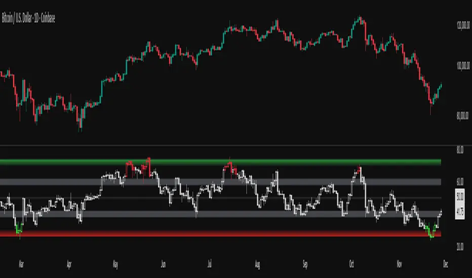
DarkPool's Squeeze Momentum @author LazyBearDarkPool's Squeeze Momentum Pro is a comprehensive overhaul of the classic volatility indicator, designed for the modern trader who requires deeper market insight. While staying true to the core logic of the original TTM Squeeze, this version introduces advanced features like automatic divergence detection, dynamic moving average selection, and main-chart integration to help you time entries and exits with precision.
Credit: This script is built upon the foundational "Squeeze Momentum Indicator" originally developed by LazyBear. This version expands on that legacy with enhanced visualization, alert systems, and divergence logic.
Key Features
1. Advanced Divergence Detection
The indicator automatically scans for Regular Bullish and Regular Bearish divergences between price action and momentum.
Bullish Divergence (Green "BULL" Label): Occurs when Price makes a Lower Low, but Momentum makes a Higher Low. This often precedes a bullish reversal.
Bearish Divergence (Red "BEAR" Label): Occurs when Price makes a Higher High, but Momentum makes a Lower High. This often precedes a bearish reversal.
2. Multi-Mode Squeeze Detection
The central dots on the zero line tell you the state of market volatility:
Red Dot (Squeeze ON): Volatility is compressed. The Bollinger Bands are inside the Keltner Channels. The market is "coiling" and preparing for an explosive move. Do not trade yet—wait for the fire.
Grey Dot (Squeeze OFF): The squeeze has "fired." Volatility is expanding, and price is moving.
Blue Dot (Wide Bands): Volatility is extremely high. The bands are exceptionally wide, often indicating the end of a trend or a period of high risk.
3. "Ghost" Histogram & Visual Depth
The momentum histogram features a "Ghost" fill (transparent background) to help visualize the volume of momentum without cluttering the screen.
Bright Green: Strong Bullish Momentum (Rising).
Dark Green: Weakening Bullish Momentum (Fading).
Bright Red: Strong Bearish Momentum (Falling).
Dark Red: Weakening Bearish Momentum (Recovering).
4. Dynamic Candle Coloring
Enabled by default, this feature colors the candles on your main chart to match the momentum histogram. This allows you to instantly gauge the trend strength without looking down at the oscillator pane.
5. Adaptive Calculation Engines
Unlike standard versions fixed to SMA, you can now select the moving average algorithm that drives the Bollinger Bands and Keltner Channels:
SMA: Standard, stable signals.
EMA: More reactive to recent price action.
WMA/RMA: Weighted options for specific strategies.
🛠 How to Operate
The "Squeeze & Fire" Strategy
Identify the Squeeze: Look for a series of Red Dots on the zero line. This indicates the market is resting and building energy.
The Trigger: Wait for the dot to turn Gray AND for the histogram to expand clearly in one direction.
Long Signal: Squeeze fires (Red -> Gray) + Histogram turns Green.
Short Signal: Squeeze fires (Red -> Gray) + Histogram turns Red.
The "Divergence Reversal" Strategy
Watch for "BULL" or "BEAR" labels appearing near the peaks or valleys of the histogram.
Confirmation: A divergence is a warning. Wait for the histogram color to change (e.g., from Bright Red to Dark Red) before entering a reversal trade.
⚙️ Settings Guide
Basis MA Type: Choose between SMA, EMA, WMA, or RMA to tune the sensitivity of the squeeze.
BB/KC Settings: Fully customizable Length and Multipliers to adapt to different assets (Crypto, Forex, or Stocks).
Pivot Lookback: Controls how strict the divergence detection is. Higher numbers = fewer, more significant signals.
Colour Main Chart Candles: Toggle this OFF if you prefer your standard candle colours.
Disclaimer
Trading involves a high level of risk and is not suitable for all investors. This indicator is a tool for technical analysis and does not constitute financial advice. Past performance is not indicative of future results. Always use proper risk management and do not trade based solely on a single indicator.
Oszillatoren

RSI adaptive zones [AdaptiveRSI]This script introduces a unified mathematical framework that auto-scales oversold/overbought and support/resistance zones for any period length. It also adds true RSI candles for spotting intrabar signals.
Built on the Logit RSI foundation, this indicator converts RSI into a statistically normalized space, allowing all RSI lengths to share the same mathematical footing.
What was once based on experience and observation is now grounded in math.
✦ ✦ ✦ ✦ ✦
💡 Example Use Cases
RSI(14): Classic overbought/oversold signals + divergence
Support in an uptrend using RSI(14)
Range breakouts using RSI(21)
Short-term pullbacks using RSI(5)
✦ ✦ ✦ ✦ ✦
THE PAST: RSI Interpretation Required Multiple Rulebooks
Over decades, RSI practitioners discovered that RSI behaves differently depending on trend and lookback length:
• In uptrends, RSI tends to hold higher support zones (40–50)
• In downtrends, RSI tends to resist below 50–60
• Short RSIs (e.g., RSI(2)) require far more extreme threshold values
• Longer RSIs cluster near the center and rarely reach 70/30
These observations were correct — but lacked a unifying mathematical explanation.
✦ ✦ ✦ ✦ ✦
THE PRESENT: One Framework Handles RSI(2) to RSI(200)
Instead of using fixed thresholds (70/30, 90/10, etc.), this indicator maps RSI into a normalized statistical space using:
• The Logit transformation to remove 0–100 scale distortion
• A universal scaling based on 2/√(n−1) scaling factor to equalize distribution shapes
As a result, RSI values become directly comparable across all lookback periods.
✦ ✦ ✦ ✦ ✦
💡 How the Adaptive Zones Are Calculated
The adaptive framework defines RSI zones as statistical regimes derived from the Logit-transformed RSI .
Each boundary corresponds to a standard deviation (σ) threshold, scaled by 2/√(n−1), making RSI distributions comparable across periods.
This structure was inspired by Nassim Nicholas Taleb’s body–shoulders–tails regime model:
Body (±0.66σ) — consolidation / equilibrium
Shoulders (±1σ to ±2.14σ) — trending region
Tails (outside of ±2.14σ) — rare, high-volatility behavior
Transitions between these regimes are defined by the derivatives of the position (CDF) function :
• ±1σ → shift from consolidation to trend
• ±√3σ → shift from trend to exhaustion
Adaptive Zone Summary
Consolidation: −0.66σ to +0.66σ
Support/Resistance: ±0.66σ to ±1σ
Uptrend/Downtrend: ±1σ to ±√3σ
Overbought/Oversold: ±√3σ to ±2.14σ
Tails: outside of ±2.14σ
✦ ✦ ✦ ✦ ✦
📌 Inverse Transformation: From σ-Space Back to RSI
A final step is required to return these statistically normalized boundaries back into the familiar 0–100 RSI scale. Because the Logit transform maps RSI into an unbounded real-number domain, the inverse operation uses the hyperbolic tangent function to compress σ-space back into the bounded RSI range.
RSI(n) = 50 + 50 · tanh(z / √(n − 1))
The result is a smooth, mathematically consistent conversion where the same statistical thresholds maintain identical meaning across all RSI lengths, while still expressing themselves as intuitive RSI values traders already understand.
✦ ✦ ✦ ✦ ✦
Key Features
Mathematically derived adaptive zones for any RSI period
Support/resistance zone identification for trend-aligned reversals
Optional OHLC RSI bars/candles for intrabar zone interactions
Fully customizable zone visibility and colors
Statistically consistent interpretation across all markets and timeframes
Inputs
RSI Length — core parameter controlling zone scaling
RSI Display : Line / Bar / Candle visualization modes
✦ ✦ ✦ ✦ ✦
💡 How to Use
This indicator is a framework , not a binary signal generator.
Start by defining the question you want answered, e.g.:
• Where is the breakout?
• Is price overextended or still trending?
• Is the correction ending, or is trend reversing?
Then:
Choose the RSI length that matches your timeframe
Observe which adaptive zone price is interacting with
Interpret market behavior accordingly
Example: Long-Term Trend Assesment using RSI(200)
A trader may ask: "Is this a long term top?"
Unlikely, because RSI(200) holds above Resistance zone , therefore the trend remains strong.
✦ ✦ ✦ ✦ ✦
👉 Practical tip:
If you used to overlay weekly RSI(14) on a daily chart (getting a line that waits 5 sessions to recalculate), you can now read the same long-horizon state continuously : set RSI(70) on the daily chart (~14 weeks × 5 days/week = 70 days) and let the adaptive zones update every bar .
Note: It won’t be numerically identical to the weekly RSI due to lookback period used, but it tracks the same regime on a standardized scale with bar-by-bar updates.
✦ ✦ ✦ ✦ ✦
Note: This framework describes statistical structure, not prediction. Use as part of a complete trading approach. Past behavior does not guarantee future outcomes.
framework ≠ guaranteed signal
---
Attribution & License
This indicator incorporates:
• Logit transformation of RSI
• Variance scaling using 2/√(n−1)
• Zone placement derived from Taleb’s body–shoulders–tails regime model and CDF derivatives
• Inverse TANH(z) transform for mapping z-scores back into bounded RSI space
Released under CC BY-NC-SA 4.0 — free for non-commercial use with credit.
© AdaptiveRSI
Signal Vision - Divergence vs ES1!Signal Vision – Divergence vs ES1!
This TradingView indicator tracks the divergence between a chart’s RSI and the ES1 RSI. It plots an oscillator showing the difference between the two RSIs, helping identify when the asset is overperforming or underperforming the S&P 500 futures.

Multi Indicator Strategy with RSI Divergence - Voting SystemThe indicator works on any timeframe. It has a built-in trailing stop. It shows trend movements well. Adjustments are required for each asset. I recommend setting the trailing stop to 0.003, 0.002, and 0.1 for proper operation.

RSI Divergence Pro | Instant & Confirmed RSI Divergence Pro 是一个专为实盘交易打造的专业级背离系统,它的设计目标很明确:更快、更准、更稳定。在长期交易美股、A 股与加密货币的过程中,我发现市面上大多数背离指标都有明显缺陷:传统背离确认太慢,动不动延迟 3~8 根 K;快速背离虽然及时,但基本都重绘,复盘好看、实盘没法用;复杂的背离工具则逻辑混乱,视觉杂乱,很难在实盘中形成稳定的执行体系。因此,我希望创建一个真正能反映市场动能变化、适用于实盘、且结构清晰的背离系统。最终形成了 RSI Divergence Pro:即时背离(预测模型)与确认背离(零重绘)双引擎架构。
这个指标由两个核心引擎构成。第一个是即时背离,它基于 RSI 的二阶动能变化来捕捉拐点,无需等待枢轴成型,因此信号非常提前。它能在 K 线创新低但 RSI 不再同步时提醒你,也能在市场动能逐渐衰竭的早期阶段发出信号。即时背离以虚线呈现,可能重绘,但这种“重绘本质上是预判”,可以让你比传统背离提前 1~5 根 K 观察到趋势反转的可能性。第二个是确认背离,它采用“左宽右窄”的不对称枢轴结构:左端保持足够的结构宽度,确保信号含金量;右端使用极窄宽度,让确认信号比传统枢轴快很多。同时确认背离完全不重绘,非常适合实盘与策略回测,所有信号都以实线表现,稳定可靠。
除了核心结构,RSI Divergence Pro 提供了清晰直观的视觉呈现:背离连线、可选文字标签、右端短尾增强设计,使得信号的方向性更明确。它支持所有周期,从 1 分钟到周线都可以使用,同时包含四种提醒触发(即时多、即时空、确认多、确认空),适合自动化或半自动化交易体系。它的逻辑充分考虑了实际交易中“反应速度”与“信号可靠性”的平衡,因此尤其适用于短线交易者、波段交易者、结构分析者以及基于 RSI 建模的量化策略用户。
它带来的价值并不仅仅是“画背离线”,而是在帮助交易者理解市场深层的动能变化。无论是避免追高杀跌、确认趋势衰竭、识别顶部底部结构,还是减少情绪化操作——背离在交易系统中扮演的是风险过滤器和反转预警器的角色。即时背离让你看到别人看不到的早期信号,而确认背离为执行提供可靠依据,从而形成一个可复制、可执行的交易框架。
需要强调的是,即时背离属于预测模型,会因为动能变化而重绘,这是正常的;确认背离则完全不重绘,可以放心用于实盘与回测。背离是信号,不是指令,需结合趋势与结构判断使用。
总结来说,RSI Divergence Pro 的核心价值在于“快、稳、清晰、专业”。它不是为了炫技,而是为了让你在市场结构变化的关键位置更早、更准地获得信息。如果你长期依赖 RSI 或动能分析,它会成为一个真正值得加入工具库的专业级指标。
RSI Divergence Pro is a professional-grade divergence system designed specifically for real trading. Its purpose is simple: to be faster, more accurate, and more stable than traditional divergence tools. After years of trading equities and crypto, I realized that most divergence indicators share the same major weaknesses: classic divergence signals come far too late, often 3–8 bars after the structure forms; fast divergence tools repaint heavily, making them unsuitable for live trading; and more complex indicators are visually cluttered and difficult to execute in real time. I wanted a tool that reveals momentum shifts clearly, works in live markets, and helps traders build a consistent execution framework. That led to the creation of RSI Divergence Pro, a dual-engine system that combines predictive divergence with fully confirmed, non-repainting divergence.
The first engine is Instant Divergence. It is built on RSI momentum inflection rather than pivot structures, allowing signals to appear far earlier. It detects moments when price makes a new low but RSI no longer follows, or when momentum begins to weaken before it becomes visually obvious. Instant signals are drawn with dashed lines and may repaint, because they are predictive by design. This enables early detection 1–5 bars ahead of traditional divergence tools, giving traders an informational edge in momentum reversal scenarios.
The second engine is Confirmed Divergence. It uses an asymmetric pivot model with a wider left side and a narrow right side. The left width preserves structural integrity, while the small right width accelerates signal confirmation, making it significantly faster than standard pivot divergence. All confirmed divergences are fully non-repainting and displayed with solid lines, making them ideal for both live trading and backtesting.
Beyond the core logic, RSI Divergence Pro includes clean and intuitive visual elements: divergence lines, optional labels, and mini stub extensions to highlight direction and momentum. It supports all timeframes—from 1-minute scalping to weekly swing analysis—and provides four types of alert conditions (instant bull, instant bear, confirmed bull, confirmed bear). It is especially suitable for scalpers, swing traders, structural traders, and quantitative traders who rely on RSI-based momentum modeling.
The true value of this tool is not simply drawing divergence lines. It helps traders understand deeper momentum shifts within market structure. It prevents chasing tops and bottoms, identifies trend exhaustion, provides context for reversals, and reduces emotional trading. Instant divergence shows what most traders cannot see, while confirmed divergence provides stable validation, forming a consistent and repeatable execution framework.
It is important to clarify that instant divergence repaints by design—this is part of its predictive nature. Confirmed divergence does not repaint at all and is safe for strategy testing. Divergence is a signal, not a command, and should be interpreted alongside market structure and trend context.
In summary, RSI Divergence Pro focuses on what matters: speed, stability, clarity, and professional-level reliability. It is not built to be flashy but to help traders receive actionable information at the exact moments when momentum and structure begin to shift. For traders who rely on RSI or momentum analysis, this indicator is a powerful addition to any serious trading toolkit.

Divergence Scanner
Scanner and Indication (Divergence Scanner & Signal)An advanced experimental indicator designed to detect instances of Divergence between price action and key oscillator metrics (e.g., RSI or MACD).The primary function of this script is for Screener use. It plots a numerical value (a value greater than zero) on the chart when a confirmed bullish or bearish divergence signal appears."

Adaptive Trend Mapper-ATM (Arjo)Adaptive Trend Mapper (ATM) is a multi-factor trend, momentum, and compression-analysis tool designed to help traders visually map the strength and direction of market pressure.
Instead of simply combining existing indicators, ATM creates a new composite framework that blends momentum imbalance, directional strength, volatility contraction, and adaptive smoothing into a single, unified model.
Originality and usefulness
Adaptive Trend Mapper (ATM) does not replicate any one indicator.
It generates two custom indices— Bull Pressure Index and Bear Pressure Index —derived from a mathematical combination of RSI, inverse-RSI, and ADX. These indices behave differently from traditional oscillators:
They represent directional pressure on a 0–100 scale , not momentum.
They are designed to converge/diverge, forming a basis for the built-in Squeeze Detection Engine.
They can be optionally step-compressed , making the movement easier to read on fast or small charts.
The script also integrates a custom SuperSmoother trend model (not TradingView’s built-in function), which acts as an adaptive trend curve on the chart.
All calculations are combined intentionally—not as a mashup—to create a framework that allows traders to understand trend strength, compression phases, and micro-trend shifts in one place.
How the Indicator Works
1. Bull & Bear Pressure Indices:
These indices measure directional imbalance:
Bull Index = ADX strength weighted against inverse-RSI
Bear Index = ADX strength weighted against normal RSI
This produces two opposing pressure curves that rise or fall depending on whether buyers or sellers dominate.
You can optionally smooth these using:
SMA / EMA / WMA / RMA via the “Smoothing Settings” panel.
2. Squeeze & Compression Detection:
A squeeze is detected when:
ADX stays below a user-defined threshold
Bull–Bear Index difference shrinks
Average difference is falling (convergence)
This is a volatility-contraction model inspired by squeeze logic but applied to directional pressure, not Bollinger Bands/Keltner Channels .
3. Adaptive Trend Curve (SuperSmoother Engine)
The indicator applies a two-pole SuperSmoother filter to the price, then smooths it again using EMA.
The slope color flips between bullish and bearish and is displayed using:
A thin SuperSmoother curve
A thicker band for visual context
4. EMA-50 Trend Context:
An optional EMA-50 helps identify broad directional bias .
5. Step-Based Scaling
You can quantize the Bull/Bear indices using custom step intervals.
This makes the indicator easier to read on noisy intraday charts.
How to Use the Indicator
1. Trend Analysis
A rising Bull Index shows strengthening upward pressure
A rising Bear Index shows strengthening downward pressure
Wide divergence between the indices signals a strong trend
2. Compression / Squeeze Analysis
Yellow background = volatility compression + pressure convergence
Breakouts from this zone often precede directional expansion
3. Trendline Reading
SuperSmoother line color flip = micro trend shift
EMA-50 slope gives macro-trend direction
Perfect for combining trend and momentum maps on the same chart
4. Visual Interpretation
Cyan/teal → strong bullish pressure
Purple/red/orange → various levels of bearish control
Neutral/teal background → weak ADX
Yellow background → squeeze zone
Open-Source Notes
This script uses:
TradingView built-in RSI, ADX/DMI, and smoothing functions
A SuperSmoother implementation based on known DSP filter coefficients
All remaining logic, signal methods, composite indices, and compression model are original developments by ARJO .
The script is published open-source to comply with TradingView’s reuse policy.
Disclaimer
This tool is for educational and analytical purposes only.
It does not generate buy or sell signals.
Always use proper risk management.
Happy Trading (ARJO)

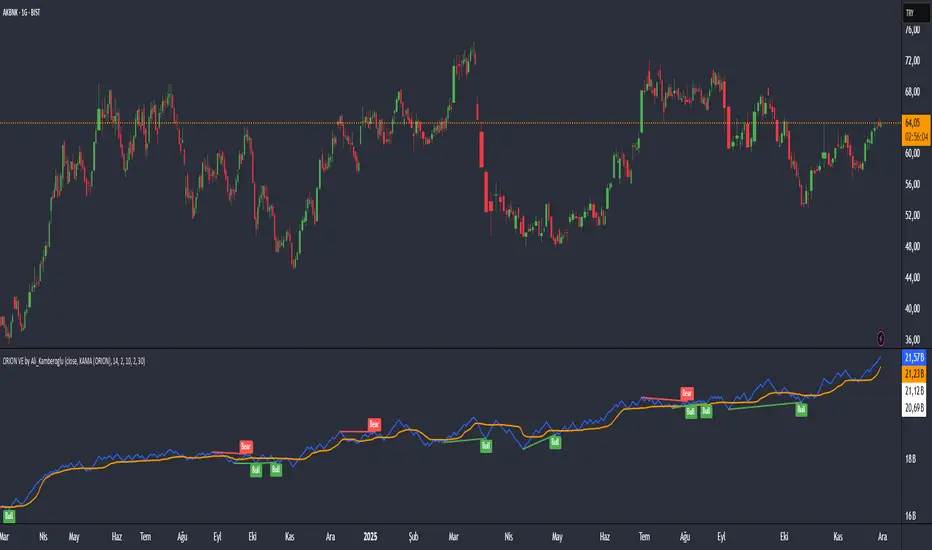
ORION Trend Engine by Ali_KamberogluORION Trend Engine by Ali_Kamberoglu | Decode the DNA of a Trend: Adaptive Strength & Direction
Developer: Ali Kamberoğlu
Overview: Go Beyond the Limits of Standard ADX
The ORION Trend Engine (TE) is a complete command center designed to analyze not just the existence of a market trend, but also its strength, direction, acceleration, and potential within a single, integrated system. It was developed to solve the chronic problems of the classic ADX indicator, such as lag, noise, and difficulty in interpretation.
This tool combines two separate panels into one intelligent engine:
Trend Strength Panel: Shows when the market is entering a strong trend or moving sideways.
Directional Bias Oscillator Panel: Clearly visualizes which direction (Buy/Sell) is dominating the trend.
ORION TE provides an analytical framework not just to know if there is a trend, but to decide whether to enter it, when to stay in it, and when to exit.
The ORION Advantage: Why It's Different
1. The Smart Trend Engine (Adaptive KAMA Integration):
The standard ADX uses a slow-reacting average. ORION TE revolutionizes this by offering the option to use the Adaptive KAMA engine in the ADX calculation, which adapts to market conditions. What does this mean?
Faster Response: When a strong trend begins, KAMA speeds up, notifying you of the trend's start much earlier.
Noise Filter: When the market is choppy and indecisive, KAMA slows down, protecting you from countless false "trend start" signals.
2. The Directional Compass (Normalized DI Oscillator):
Interpreting DI+ and DI- lines can be complex. ORION TE solves this problem with the DI Oscillator:
Clear Signals: This oscillator shows the net dominance between Buyers (positive values) and Sellers (negative values).
ADX Filter: The oscillator only generates signals when there is significant trend strength in the market (when ADX is above a certain threshold). This completely eliminates meaningless crossovers in sideways markets.
Strength Indicator: The histogram bars change color based on the trend's strength. Bright colors (Lime/Red) indicate a strong trend, while dark colors (Green/Maroon) signify a weakening trend.
3. Multi-Stage Trend Analysis (Dynamic Levels):
Saying "there is a trend" is not enough. ORION TE analyzes the trend's strength across four different levels:
No Trend (Gray): No direction in the market.
Trend Potential (Yellow): A trend is starting to form, pay attention.
Strategic Trend (Blue): The main trend with sufficient strength for trading.
Strong & Peak Trends: Zones where the trend is at its strongest, but may also show signs of exhaustion.
High-Probability Trading Strategies:
Strongest BUY Signal (Trend Ignition):
The ADX line turns from Yellow to Blue (Strategic Trend Begins).
Simultaneously, the DI Oscillator histogram is in positive territory and crosses above its white signal line.
This is an A+ grade entry opportunity, confirming both trend strength and buyer momentum.
Strongest SELL Signal (Trend Ignition):
The ADX line turns Blue.
Simultaneously, the DI Oscillator histogram is in negative territory and crosses below its white signal line.
This is a strong downtrend initiation signal, as sellers take control.
Important Visual Notice
The Signal line (white) and some level lines in the indicator are designed for optimal visibility on dark-themed charts.
If you are using a light-themed (white) chart background, these white elements may not be visible. For the best experience, you have two options:
Recommended: Set your chart background to a dark color in TradingView's settings.
Alternative: Go into the indicator settings, and under "5. Visual Settings," change the color of the DI Oscillator (Signal) line and other white levels to a darker color that contrasts with your chart.
Disclaimer
This indicator is a professional analysis tool developed to assist in your trading decisions. No signal or analysis constitutes investment advice. Trading in financial markets involves high risk, and past performance is not a guarantee of future results. Please always apply your own risk management strategies.

ORION Volume Engine by Ali_KamberogluORION Volume Engine by Ali_Kamberoglu | Look Beyond Volume, Track the "Smart Money"
Developer: Ali Kamberoğlu
Overview: What Price Doesn't Say, Volume Reveals
The ORION Volume Engine (VE) is a sophisticated market force analysis center that steps in where standard volume indicators fall short. This tool takes the classic On-Balance Volume (OBV) indicator and transforms it into an intelligent analysis engine that filters market noise, detects "explosions" in volume, and, most importantly, automatically uncovers the critical divergences between price and volume.
ORION VE tells you not just where the volume is flowing, but also when that flow might be signaling an impending trend reversal.
The ORION Advantage: Why It's Different
The power of ORION VE comes from three intelligent layers that turn the standard OBV into an information hub:
Layer 1 - The Adaptive Signal Line (Smart KAMA Integration):
The raw data of OBV can be choppy and misleading. ORION VE uses the Adaptive KAMA engine to clean this noise, adapting to market conditions. When the market is flowing in a strong trend, KAMA speeds up to keep you in the trend. When the market is indecisive and sideways, it slows down, protecting you from early or false signals. This provides a revolutionary level of clarity in OBV analysis.
Layer 2 - Volume Volatility (Bollinger Bands on OBV):
This unique feature offers the option to draw Bollinger Bands not on the price, but directly on the OBV itself. What does this mean? You can now see when not just the price, but the volume flow itself is "squeezing" and when it's ready to "explode." A breakout of the OBV line from its own Bollinger Band is a powerful signal of an extraordinary increase in volume flow in that direction, confirming the current trend.
Layer 3 - The Game-Changing Feature: Fully Automatic Volume Divergence Engine
One of the most powerful signals heralding the end of a trend is a volume divergence. ORION VE finds these priceless signals for you, automatically:
Bullish Divergence 🐂: Is the price falling to new lows while the OBV (volume) refuses to fall, making higher lows? This is the clearest sign that selling pressure is exhausted and "smart money" is quietly accumulating. You are instantly alerted with a "Bull" label on your chart.
Bearish Divergence 🐻: Is the price hitting record highs, but the OBV is not supporting this rise with sufficient volume and is making lower highs? This is a signal that the power behind the trend is fading and a sharp decline may be imminent. The "Bear" label prepares you to protect your position or take profits.
High-Probability Trading Strategies:
Strongest BUY Signal:
A Bullish Divergence appears on the chart with a "Bull" label.
The OBV line crosses above its orange Adaptive KAMA signal line.
This is an A+ grade buying opportunity, indicating that smart money is stepping in and momentum is starting.
Strongest SELL Signal:
A Bearish Divergence appears on the chart with a "Bear" label.
The OBV line crosses below its orange Adaptive KAMA signal line.
This is a high-probability shorting opportunity, indicating that the uptrend is not supported by volume and momentum is shifting to the sellers.
Disclaimer
This indicator is a professional analysis tool developed to assist in your trading decisions. No signal or analysis constitutes investment advice. Trading in financial markets involves high risk, and past performance is not a guarantee of future results. Please always apply your own risk management strategies.
MA Crossover Scalper [4H]//@version=5
indicator("MA Crossover Scalper ", overlay=false)
// Market Cap Filter (Volume as proxy)
volumeValid = volume >= 500000 and volume <= 4000000
// MA Crossover System
ma9 = ta.sma(close, 9)
ma21 = ta.sma(close, 21)
bullishCross = ta.crossover(ma9, ma21) and close > ma21
bearishCross = ta.crossunder(ma9, ma21) and close < ma21
// Volume Confirmation
volumeSpike = volume > ta.sma(volume, 20) * 1.3
// Final Signals
bullSignal = bullishCross and volumeSpike and volumeValid
bearSignal = bearishCross and volumeSpike and volumeValid
// Output for Screener
plot(bullSignal ? 1 : 0, "Bull MA Cross", color=color.green)
plot(bearSignal ? 1 : 0, "Bear MA Cross", color=color.red)

DarkPool's RSi DarkPool's RSi is an enhanced momentum oscillator designed to automatically detect structural discrepancies between price action and the Relative Strength Index. While retaining the standard RSI visualization, this script overlays advanced divergence recognition logic to identify potential trend reversals.
The tool identifies pivot points in real-time and compares recent peaks and valleys against historical data. When the momentum of the RSI contradicts the direction of price action, the indicator highlights these events using dynamic trendlines, shape markers, and background coloring. A built-in dashboard table provides an immediate status check of active divergence signals.
Key Features
Automated Divergence Detection: Automatically spots both Regular Bullish and Regular Bearish divergences based on pivot lookback settings.
Dynamic Visuals: Draws physical lines connecting RSI peaks or troughs to visualize the divergence angle, alongside triangle markers indicating the signal direction.
Active Status Dashboard: A data table located on the chart monitors the current state of the market, flagging signals as "Active" when detected.
Standard RSI Overlay: Includes standard Overbought (70) and Oversold (30) reference lines for traditional momentum trading.
How to Use
1. Reading the Standard RSI The black line represents the Relative Strength Index.
Overbought (Above 70): Suggests the asset may be overvalued and due for a pullback.
Oversold (Below 30): Suggests the asset may be undervalued and due for a bounce.
Midline (50): Acts as a trend filter; values above 50 indicate bullish momentum, while values below 50 indicate bearish momentum.
2. Trading Divergences The primary function of this tool is to identify reversal setups.
Bullish Divergence (Green Triangle/Line): Occurs when Price makes a Lower Low, but the RSI makes a Higher Low. This indicates that selling momentum is exhausting and a price increase may follow.
Bearish Divergence (Red Triangle/Line): Occurs when Price makes a Higher High, but the RSI makes a Lower High. This indicates that buying momentum is fading and a price decrease may follow.
3. Visual Aids
Lines: The script draws solid lines directly on the RSI pane connecting the relevant pivot points to confirm the divergence slope.
Background Color: When a divergence is detected, the background of the indicator pane will highlight briefly (Green for Bullish, Red for Bearish) to draw attention to the new signal.
4. The Dashboard A small table in the bottom right corner tracks the status of the signals.
Status: ACTIVE: A divergence has been detected within the last 10 bars.
Status: None: No recent divergence patterns have been identified.
Disclaimer This indicator is provided for educational and informational purposes only. It does not constitute financial advice, investment recommendations, or a guarantee of future results. Trading cryptocurrencies and financial markets involves a high level of risk. Always perform your own due diligence before making any trading decisions.

ORION Fast Momentum Engine by Ali_KamberogluORION Fast Momentum Engine by Ali_Kamberoglu | Reinventing RSI: Adaptive Signals & Auto Divergences
Developer: Ali Kamberoğlu
Overview: Escape the Noise of Standard RSI
The ORION Fast Momentum Engine (FME) is an all-in-one analytical powerhouse that takes the classic RSI indicator and redesigns it for 21st-century market conditions. It is engineered to eliminate the biggest problems of the standard RSI: false signals, lag, and noise. This tool not only shows you the momentum but also automatically reveals its character, its volatility, and, most importantly, when it's diverging from the price.
ORION FME is not just another oscillator; it's an intelligent analysis engine built into the RSI.
The ORION Advantage: Why It's Different
The power of ORION FME comes from three revolutionary layers it adds to the standard RSI:
Layer 1 - The Smart Signal Line (Adaptive KAMA Integration):
Fixed-period moving averages are a thing of the past. ORION FME uses the Adaptive KAMA engine as its signal line, which adjusts to market conditions. When the market is trending, it speeds up to give you early signals. When the market is choppy and sideways, it slows down, protecting you from countless false trades (whipsaws). No more "blind" signal lines that behave the same way in every condition.
Layer 2 - Momentum Volatility (Bollinger Bands on RSI):
This is a feature you won't find anywhere else. ORION FME offers the option to draw Bollinger Bands not on the price, but directly on the RSI itself. What does this mean? You can now see when not just the price, but the momentum itself is "squeezing" and ready for a breakout. When the RSI breaks out of its own Bollinger Bands, it's a sign of an extraordinary surge in momentum.
Layer 3 - The Game-Changing Feature: Fully Automatic Divergence Engine
Put an end to the tedious task of hunting for divergences! ORION FME includes the powerful divergence engine that has become a signature of the ORION series.
Bullish Divergence 🐂: Is the price making lower lows while the RSI is making higher lows? ORION FME detects this instantly and marks it with a "Bull" label on your chart, signaling a potential bottom and a rally.
Bearish Divergence 🐻: Is the price renewing its highs while the RSI's momentum is fading? This is the clearest sign that the rally is losing its strength. The "Bear" label warns you in advance of a potential top and decline.
High-Probability Trading Strategies:
Strongest BUY Signal:
A Bullish Divergence appears on the chart with a "Bull" label.
The RSI turns up from the oversold zone (below 30) and crosses above its adaptive KAMA signal line.
This is an A+ grade, multi-confirmation buying opportunity.
Strongest SELL Signal:
A Bearish Divergence appears on the chart with a "Bear" label.
The RSI turns down from the overbought zone (above 70) and crosses below its adaptive KAMA signal line.
This is a high-probability shorting opportunity.
Disclaimer
This indicator is a professional analysis tool developed to assist in your trading decisions. No signal or analysis constitutes investment advice. Trading in financial markets involves high risk, and past performance is not a guarantee of future results. Please always apply your own risk management strategies.

ORION Energy Engine by Ali_KamberogluORION Energy Engine by Ali_Kamberoglu | Turn the Market's "Quiet" Moments into Explosive Moves
Developer: Ali Kamberoğlu
Overview: Go Beyond Momentum, Measure the Energy
The ORION Energy Engine is not an ordinary momentum indicator. It is a sophisticated energy measurement system designed to detect the seemingly calm "accumulation" periods in the market and to anticipate the explosive price movements that follow. By clearly distinguishing between moments when the market is coiling and storing energy (Potential Energy) and moments when it releases that energy (Kinetic Energy), it provides you with a flawless roadmap for the market's next big move.
Think of the ORION Energy Engine as a compressed spring; it shows you not only when the spring is being compressed, but also when and how powerfully it is about to be released.
The ORION Advantage: Why It's Different
The power of ORION comes from its integrated system that analyzes market energy in three distinct dimensions:
Layer 1 - Potential Energy Detection (The Squeeze Engine):
Before every major market move, there is a period of silence and indecision. ORION automatically detects these "squeeze" moments using Bollinger Bands and Keltner Channels. The dots on the zero line signal that the market is building up energy for its next move.
Purple Dot: Standard energy accumulation.
White Dot: A more reliable accumulation, confirmed by volume.
Yellow Dot: "Super Squeeze," occurring at historically low levels of volatility. This is a sign that the upcoming move could be much more violent.
Layer 2 - Kinetic Energy Measurement (The Four-Stage Momentum Histogram):
When the energy is released, ORION measures the power and acceleration of this movement. The histogram provides an instant status report with four different colors, showing not just the direction but also whether the trend is accelerating or decelerating:
Lime Green: A strengthening, accelerating uptrend.
Dark Green: A weakening, decelerating uptrend (a signal to take profit or be cautious).
Red: A strengthening, accelerating downtrend.
Maroon: A weakening, decelerating downtrend (the end of the decline may be near).
Layer 3 - Adaptive Energy Levels (Statistical Breakout Zones):
The energy dynamics of every instrument are different. ORION plots dynamic "Optimum" and "Maximum" energy levels for momentum based on statistical standard deviation calculations from past price action. These levels are objective reference points that show when a trend is becoming overextended and the probability of a correction or reversal is increasing.
The Game-Changing Feature: Automatic Energy Release Alert
Your most valuable asset is time. The ORION Energy Engine eliminates the need to constantly monitor the market. With its built-in alert system, it notifies you the very first moment an energy accumulation (Squeeze) ends and the move begins. This gives you an invaluable entry advantage, ensuring you never miss the start of a potential breakout.
High-Probability Trading Strategies:
Strongest BUY Signal (Super Breakout Setup):
Yellow (Super Squeeze) or White (Volume Squeeze) dots appear on the zero line.
The dots disappear, and the "Squeeze Released" alert is triggered.
The first bar on the alert generates a strong Lime Green momentum histogram.
This is an A+ grade buying opportunity where stored energy has converted into an upward explosion. Targets are the upper Adaptive Levels.
Strongest SELL Signal (Energy Discharge Setup):
An accumulation (preferably Yellow or White dots) is observed on the zero line.
The squeeze ends, and the alert is triggered.
The first bar on the alert generates a strong Red negative momentum histogram.
This is a high-probability shorting opportunity where energy is being released to the downside. Targets are the lower Adaptive Levels.
Disclaimer
This indicator is a professional analysis tool developed to assist in your trading decisions. No signal or analysis constitutes investment advice. Trading in financial markets involves high risk, and past performance is not a guarantee of future results. Please always apply your own risk management strategies.

ORION LTME by Ali_KamberogluORION Long-Term Momentum Engine by Ali_Kamberoglu | Silence the Noise, Hear the Real Signals
Developer: Ali Kamberoğlu
Overview: Go Beyond the Limits of Standard Indicators
The ORION Long-Term Momentum Engine is an all-in-one analytical powerhouse designed to filter market noise with surgical precision, eliminate signal lag, and, most importantly, automatically detect trend reversals that are impossible to see with the naked eye. This tool combines three different advanced mathematical engines (Chebyshev, Zero-Lag Gaussian, and Adaptive KAMA) into a single hybrid structure, offering a clarity and analytical depth that ordinary oscillators could never provide. ORION shows you not just what is happening, but what is about to happen.
The ORION Advantage: Why It's Different
The power of ORION comes from its three-layer filtering system, which works in perfect harmony:
Layer 1 - The Noise Shield (Chebyshev Filter):
Price action is chaotic. The Chebyshev filter is your first line of defense, cleaning out the meaningless noise (sudden spikes, minor fluctuations) from this chaos. The result? Smoother, more readable, and reliable baseline momentum data that won't mislead you.
Layer 2 - The Lag Enemy (Zero-Lag Gaussian Filter):
Cleaning noise is important, but a lagging signal is unacceptable. The Zero-Lag filter ensures that the cleaned signal reaches you almost in real-time with market movements. No more getting signals after the opportunities have passed. Speed and precision, combined.
Layer 3 - The Smart Navigation System (Adaptive KAMA Filter):
Not all market conditions are the same. ORION knows this. The Adaptive KAMA filter analyzes the current character of the market. If there's a strong trend, it speeds up to keep you in the move. If the market is choppy and indecisive, it slows down, protecting you from the loss-making whipsaw market.
The Game-Changing Feature: Automatic Divergence Engine
ORION's most valuable feature is its fully automatic divergence detection system, which alerts you to trend reversals before anyone else.
Bullish Divergence 🐂: Is the price making lower lows while ORION's momentum is making higher lows? This is the clearest sign that the downtrend is losing power and a strong rally is imminent. You are instantly alerted with a "Bull" label on your chart.
Bearish Divergence 🐻: Is the price hitting record highs while ORION's momentum is losing steam? This signals that the rally is nearing its end and a sharp decline could be starting. The "Bear" label prepares you to protect your position or take profits.
This feature alone reduces hours of manual analysis to seconds and gives you an invaluable strategic advantage.
Indicator Components & Strategies
🔵 ORION Momentum (Blue Line): The heart of the engine. Your fast, precise, and primary momentum line.
🟠 Signal Line (Orange Line): The confirmation mechanism. A smoother reference that validates the movements of the blue line.
💎 Adaptive KAMA (Turquoise Line): Your dynamic filter that keeps its finger on the pulse of the market.
High-Probability Trading Strategies:
Strongest BUY Signal:
A "Bull" label appears on the chart.
The blue line crosses above the orange line in the oversold zone (below the 20 level).
This is an A+ grade buying opportunity, combining a momentum reversal with an oversold market.
Strongest SELL Signal:
A "Bear" label appears on the chart.
The blue line crosses below the orange line in the overbought zone (above the 80 level).
This is a high-probability shorting opportunity, combining a loss of momentum with an overextended market.
Disclaimer
This indicator is a professional analysis tool developed to assist in your trading decisions. No signal or analysis constitutes investment advice. Trading in financial markets involves high risk, and past performance is not a guarantee of future results. Please always apply your own risk management strategies.

Ghost Protocol [Bit2Billions]Ghost Protocol — Institutional RSI Intelligence Engine
*A unified RSI-based momentum-mapping system built on original logic, designed for professional-grade trend, reversal, and volatility analysis.*
Ghost Protocol is a momentum framework engineered to give traders a single, coherent view of trend strength, equilibrium shifts, reversals, volatility states, and momentum pressure across all time horizons.
It is not a mashup of public RSI indicators. Every module is built on proprietary RSI engines, ensuring consistency, originality, and practical trading value.
The script is designed to solve a frequent trader problem: RSI tools producing conflicting or isolated signals.
Ghost Protocol consolidates candles, divergences, adaptive zones, trend indexing, cloud states, and multi-timeframe momentum context into one synchronized ecosystem.
Ghost Protocol is driven by three custom systems:
1. Proprietary RSI Divergence Engine (Ghost Divergence Core)
This engine identifies momentum turning points using:
* Displacement-weighted RSI swing logic
* Real-time regular & hidden divergence validation
* Multi-layer swing scoring
* Pre-confirmation “Ghost Candidate” modeling
These outputs form the foundation for reversal detection, momentum shifts, and early trend-exhaustion signals.
This is not based on standard pivot matching or public divergence scripts.
2. Adaptive RSI Architecture (Volatility-Responsive Layer)
This system evaluates RSI behavior in a dynamic, market-adaptive sequence:
* Volatility-adjusted RSI zones
* Dynamic OB/OS thresholds
* Percentile-indexed trend strength
* Auto-drawn RSI support/resistance trendlines
This ensures RSI interpretation is not static or fixed, but evolves through continuously adaptive logic.
3. Momentum Cloud & Trend Pressure Engine
All RSI clouds, trend states, and regime changes respond to the Adaptive Layer, producing contextual momentum reading rather than isolated signals.
This includes:
* RSI Ichimoku-style cloud (equilibrium + displacement modeling)
* Real-time momentum shift structure
* Multi-timeframe relative trend index
* Pressure gradients & continuation/exhaustion bias
The result is a full RSI ecosystem—not a blend of unrelated tools.
Why This Script Has Genuine Value
TradingView requires originality, consistency, and practical use.
Ghost Protocol delivers this through:
✔ A unified RSI ecosystem
All modules connect to the same internal RSI engines, so the chart tells one consistent momentum story.
✔ Proprietary decision-making logic
Divergence detection, RSI zones, clouds, and trendlines use original formulas rather than built-ins or public logic.
✔ A visual-first trading workflow
All visuals are structured for institutional-style clarity:
* Trend continuation vs. exhaustion
* Divergence confirmation hierarchy
* Momentum pressure vs. equilibrium shift
* Cloud-based regime transitions
✔ Designed for traders who rely on narrative momentum reading
Ghost Protocol replaces:
* Manual divergence drawing
* RSI zone calibration
* Trendline plotting on RSI
* OB/OS state interpretation
* Multi-timeframe RSI comparison
* Momentum shift detection
* Volatility-adjusted trend reading
All in one coherent tool.
Key Components & Intent
RSI Candles (Standard & Heiken-Ashi)
Purpose: show momentum transitions with visual clarity and divergence readability.
Divergence Engine
Detects:
* Regular divergences
* Hidden divergences
* Pre-divergence Ghost Candidates
Purpose: identify trend exhaustion before price shows it.
Adaptive RSI Zones
Zones react to:
* Volatility
* Recent displacement
* Trend direction
Purpose: avoid static “fixed OB/OS” readings and provide more realistic thresholds.
RSI Ichimoku Cloud
Outputs include:
* Bull/bear cloud bias
* Momentum compression/expansion
* Equilibrium shifts
Purpose: reveal regime transitions inside RSI behavior.
RSI Trendlines
Auto-draws momentum support/resistance on RSI swings.
Purpose: structural RSI mapping.
Relative Trend Index
Evaluates trend consistency across multiple timeframes.
Dashboard Metrics
Shows:
* Volatility overview
* Volume analysis
* VWAP vs price
* EMA-9 sentiment
* EMA-9/21 cross (5m–Weekly)
* EMA-50 trend (5m–Weekly)
* RSI OB/OS percentages
* Price OB/OS percentages
* Relative Trend
* ATR state & ATR trailing stop
Purpose: provide a consolidated, multi-layer reading at a glance.
Visual Design (Clutter-Free Standard)
* Only real-time labels appear; historical labels stay hidden for clarity.
* Consistent, structured line styles:
* RSI trendlines: solid green/red
* Regular divergence: dashed green/red
* Hidden divergence: dotted green/red
* Momentum signals: solid green/red
This color structure helps traders read momentum quickly.
Recommended Use
* Best on: 15m, 1H, 4H, Daily, Weekly
* Works across: crypto, forex, indices, liquid equities
* Pivot-style modules may show noise in illiquid markets
Performance Notes
* Heavy modules may draw many objects → disable unused tools
* Refresh chart if buffer limits are approached
* Internal handling of TradingView object rules
License
* Proprietary script © 2025
* Independently developed
* Redistribution, sharing, resale, or decompilation prohibited
* Similarities to public tools result only from shared market concepts
Respect & Transparency
Built using widely-recognized RSI concepts, but extended with proprietary logic.
Developed with respect for the TradingView community.
Any overlaps can be addressed openly and constructively.
Disclaimer
For educational and research use only.
Not financial advice.
Always test responsibly and manage risk.
FAQs
* Source code is intentionally private
* Modules can be toggled
* Alerts can be configured manually
* Works on all major markets and timeframes
About Ghost Trading Suite
Author: BIT2BILLIONS
Project: Ghost Trading Suite © 2025
Indicators: Ghost Matrix, Ghost Protocol, Ghost Cipher, Ghost Shadow
Strategies: Ghost Robo, Ghost Robo Plus
Pine Version: V6
The Ghost Trading Suite is designed to simplify and automate many aspects of chart analysis. It helps traders identify market structure, divergences, support and resistance levels, and momentum efficiently, reducing manual charting time.
The suite includes several integrated tools — such as Ghost Matrix, Ghost Protocol, Ghost Cipher, Ghost Shadow, Ghost Robo, and Ghost Robo Plus — each combining analytical modules for enhanced clarity in trend direction, volatility, pivot detection, and momentum tracking.
Together, these tools form a cohesive framework that assists in visualizing market behavior, measuring momentum, detecting pivots, and analyzing price structure effectively.
This project focuses on providing adaptable and professional-grade tools that turn complex market data into clear, actionable insights for technical analysis.
Crafted with 💖 by BIT2BILLIONS for Traders. That's All Folks!
Changelog
v1.0 – Initial Release
* Added RSI Candles (Standard & Heiken-Ashi) for enhanced trend and divergence clarity.
* Implemented Divergence Engine to highlight both regular and hidden divergences automatically.
* Introduced Live Ghost Candidates to visualize forming divergence setups.
* Added Adaptive RSI Zones for dynamic overbought and oversold thresholds.
* Integrated Trend Index using percentile volatility sampling for directional bias.
* Added RSI Ichimoku Cloud for equilibrium and momentum zone visualization.
* Implemented RSI Trend Lines for auto support/resistance on RSI.
* Added Momentum Shift Visualization and real-time momentum tracking.
* Introduced Relative Trend Index for multi-timeframe trend strength analysis.
* Developed Dashboard Module displaying volatility, volume, EMA trends, RSI/price overbought-oversold percentages, relative trend, and ATR-based metrics.

Sk M Sir JiSimple indicator that plots three alma moving averages and provides bgcolor based on below conditions
Red => If RSI (length 14) is below 50 or low is below the lower Bollinger band (length 20)
Green => If RSI (length 14) is above 50 or high is above the upper Bollinger band (length 20)

Fat Tony Composite Histogram Dual SettingsThis is an adaptation of Rob Booker's Fat Tony Composite Histogram which allows you to put two levels for signals.

Alpha Net Oscillator Buy Sell SignalAlpha Net Oscillator is a momentum-based mean reversion indicator designed to detect early shifts in trend direction and potential overbought/oversold conditions. It utilizes a normalized linear regression oscillator with visual threshold zones and confirmation markers to highlight potential trading opportunities.
This tool is built for traders who rely on oscillator-style signals to support entries and exits, especially in markets exhibiting cyclical or range-bound behavior.

Relative Strength Matrix [PUCHON]📊 Relative Strength Matrix
The Relative Strength Matrix provides a comprehensive view of how the current asset performs against a basket of other financial instruments (such as Indices, Commodities, or Currencies). By comparing price changes over two distinct timeframes (Short-Term and Long-Term), traders can quickly identify whether the asset is showing relative strength or weakness compared to the broader market or specific sectors.
✨ Features:
- 🌍 Multi-Asset Comparison: Monitor relative performance against up to 7 customizable symbols simultaneously.
- ⏳ Dual Timeframe: Analyze trends using both Short-Term (default 20) and Long-Term (default 60) lookback periods.
- 🎨 Visual Heatmap: Displays relative strength with intuitive colors:
- 🟢 Green (+): Stronger (outperforming)
- 🔴 Red (-): Weaker (underperforming)
- ⚪ Gray: Neutral
- ⚙️ Fully Customizable: Adjust symbols, colors, table position, and text size to fit your trading setup.
🧮 Calculation Logic:
The core of this indicator is the rsCalc function. It normalizes the price changes of both the base asset (current chart) and the comparison asset over a specific length, then calculates the ratio.
rsCalc(series float base, series float comp, int len) =>
nb = base / base // Normalized Base Asset Price
dc = comp / comp // Normalized Comparison Asset Price
na(nb) or na(dc) ? na : nb / dc - 1 // Relative Performance Ratio
💡 Interpretation:
- 📈 Positive Value (> 0): The current asset has appreciated more (or depreciated less) than the comparison asset. This signifies Relative Strength .
- 📉 Negative Value (< 0): The current asset has appreciated less (or depreciated more) than the comparison asset. This signifies Relative Weakness .
- ⚖️ Zero (0): Both assets have performed equally over the period.

Dual MACD📘 Dual MACD — Synopsis
The Dual MACD indicator displays two separate MACD systems inside the same pane, allowing traders to compare fast and slow momentum behavior simultaneously.
What It Includes
Two fully adjustable MACDs
MACD 1 default: 12 / 12 / 9
MACD 2 default: 8 / 20 / 6
Show/Hide Toggles so each MACD can be viewed independently or together.
MACD Lines, Signal Lines, and Histograms for both systems.
Clean layout with a compact panel title: “MACD x2”
What It Helps You See
Short-term vs. longer-term momentum shifts
Faster MACD reacting to quick trend changes
Slower MACD confirming or filtering signals
Trend strength, momentum acceleration, and crossover behavior in a single pane
Why It’s Useful
The Dual MACD gives you momentum confirmation, fakeout filtering, and multi-speed trend insight—making it valuable for scalpers, intraday traders, and swing traders who want to reduce noise and improve signal quality.
Ghost Universal Flow ® – PremiumGhost Universal Flow ® – Premium (Invite-only)
A high-performance trend-flow indicator delivering early confirmed entries and heavily filtered exits.
Features
• Dual-trigger entry system for faster reaction on strong momentum
• Built-in noise reduction and false-signal protection
• Ultra-smooth dynamic flow line with adaptive offset
• Clean, locked buy/sell alerts – no repainting
Proprietary momentum-based flow system with fully custom filtering, trend validation and visual smoothing – developed 2025.
Works on all markets • Particularly strong on 1h–daily timeframes.
Invite-only access.
Past performance is not indicative of future results.
To request access, send me a private message with the word “Ghost Flow”.

OBV WaveTrend FlowOBV WaveTrend Pressure — A Volume-Powered Momentum Oscillator
OBV WaveTrend Pressure combines Hybrid OBV (volume × price delta) with the classic LazyBear WaveTrend framework to create a volume-weighted momentum oscillator that highlights real buying/selling pressure before price reacts.
While standard WaveTrend uses price averages alone, this tool feeds a cumulative hybrid OBV source into WT1/WT2, producing a much more sensitive, order-flow-aware momentum signal. The result is a clean, MACD-style histogram built from the slope of WT1, revealing when volume-backed momentum flips from bullish to bearish and vice-versa.
This is designed as a companion to volatility tools (e.g., TTM Squeeze, SQZMOM) and standard price-based WaveTrend indicators.
⸻
Features
1. Hybrid OBV Source (Vol × ΔPrice)
Captures true directional volume pressure, giving earlier and more reliable inflection points than price-based oscillators.
2. WaveTrend Applied to OBV
Applies LazyBear’s WT logic to a volume-driven source:
• WT1 (fast)
• WT2 (signal)
• Optional slope-aware color themes
3. MACD-Style Pressure Histogram
Shows momentum contraction/expansion clearly:
• Bright green/blue → Strong bull pressure
• Pale green/blue → Weakening bull
• Bright red → Strong bear pressure
• Pale red → Weakening bear
4. Dynamic OB/OS Bands
Adaptive overbought/oversold computed from:
• Rolling mean of WT1
• Rolling standard deviation
Helps identify exhaustion relative to market conditions, not fixed numbers.
5. Zero-Line Momentum Flips (with alerts)
Alerts fire when:
• WT1 slope crosses above zero → Bull momentum shift
• WT1 slope crosses below zero → Bear momentum shift
6. Optional Price Bar Coloring
Mirror the histogram state onto price bars for fast visual bias confirmation.
⸻
How to Use
Bullish Signals
• Histogram flips positive
• WT1 rising
• WT1 or WT2 near dynamic oversold zone
• Useful for positioning early in momentum cycles
Bearish Signals
• Histogram flips negative
• WT1 falling
• WT1 or WT2 near dynamic overbought zone
Best Applications
• Trend continuation entries
• Confirming TTM squeeze setups
• Early identification of pressure reversals
• Pairing with price-based WaveTrend for dual confirmation
⸻
Why It Works
WaveTrend is already one of the most reliable oscillators for structure and reversals — but this version feeds it volume pressure instead of price.
Volume often shifts before candles do, making this a leading indicator in many cases.

UM Nadaraya-Watson OscillatorDescription
This is a different take on the Nadaraya-Watson Estimator from both Jdhorty and LuxAlgo. Both great scripts, I encourage everyone to check them out. Think of this script as a measure of trend direction, direction change, and trend acceleration or deceleration. It is not a Moving Average, but you could think of it as loosely as an intelligent adaptive regression curve with the focus on trend direction. The Gaussian calculations prefer and add more weight to the most recent bars. The end result is the oscillator is more responsive with less lag and less prone to pure price noise.
How it Works
The indicator was added to the chart twice; once with an MA, once without. The oscillator indicates trend change by crossing up through the zero line or down through the zero line. Once the indicator turns positive, we are in a positive trend until it crosses below zero and then the trend turns negative. I implemented a Moving Average overlay for additional signal determination; if the configured MA (EMA, SMA, WMA, or Nadaraya-Watson Estimator) trends higher, it is green. When trending down, it is red. The indicator also changes the color of the price bars; when the indicator below zero and red, the price bars are red. When the indicator is above zero and green, the price bars are green.
I marked up the chart and indicator to identify LONG, SHORT, and divergences between price and oscillator.
Default Settings
The default settings are 16 for Bandwidth and a WMA with 110. This is shown in the chart example. There directional arrows, but they are off by default. The Price bars are colored green or red to match the oscillator and the bar coloring is on by default.
All settings are user-configurable including bandwidth, MA type, MA length, bar coloring, and arrows.
Suggested Settings and uses
I personally like the 30 min chart with a bandwidth of 16 and a WMA of 110. The bandwidth 8 and 8 period EMA or WMA also work well on 6 hour and daily charts. Add this to your chart arsenal and use your favorite indicators for confirmation. This indicator works well on the 30 minute chart for inverse ETFs as well (SQQQ, SOXS, TZA). Also, the oscillator is good for identifying divergences between price and and indicator. (see chart for illustration)
Experiment with settings and adapt them to your trading style.
Alerts
If you right click the indicator, and select add alert, I have configured 4 standard alerts: A bullish cross above zero, A bearish cross below zero, An MA bullish turned up to trend higher, (green), and an MA bearish turned down to trend lower (red).
