Total Returns indicator by PtahXPtahX Total Returns – True Total-Return View for Any Symbol
Most charts only show price. This script shows what your position actually did once you include dividends and, optionally, inflation.
What this indicator does
1. Builds a Total Return series
You choose how dividends are treated:
* Reinvest (default): All gross dividends are automatically reinvested into more shares on the ex-dividend bar.
* Cash: Dividends are kept as cash added on top of your initial position.
* Ignore: Price only, like a regular chart.
This answers: “If I bought once at the start and held, how much would that position be worth now, given this dividend policy?”
2. Optional inflation-adjusted (real) returns
You can also plot a real total-return line, which adjusts for inflation using a CPI series.
This answers: “How did my purchasing power change after inflation?”
3. Stats window and exponential trendline
You can pick the time window:
* Since inception (full available history)
* YTD
* Last 1 Year
* Last 5 Years
* Custom start date
For that window, the script:
* Normalizes Total Return to 1.0 at the window start.
* Fits an exponential trendline (pink) to the normalized series.
* Displays a stats table in the bottom-right showing:
• Overall Return (%) over the selected range
• CAGR (compound annual growth rate, % per year)
• Trendline growth (% per year)
• R² of the trendline (fit quality)
• A separate “Since inception” block (overall return and CAGR from the first bar on the chart)
How to use it
1. Add the indicator to your chart.
2. Open the settings:
Total Return & Dividends
* Dividend mode
• Reinvest: closest to a true total-return curve (default).
• Cash: price plus cash dividends.
• Ignore: price only.
* Plot inflation-adjusted TR line
• Turn this on if you want to see a real (CPI-adjusted) total-return line.
Inflation / Real Returns
* Inflation country code and field code
• Leave defaults if you just want a standard CPI series.
* Use real TR for stats & trendline
• On: stats and trendline use the inflation-adjusted curve.
• Off: stats use the nominal (non-adjusted) total return.
Stats Range & Trendline
* Stats range: Since inception, YTD, 1 Year, 5 Years, or Custom date.
* Custom date: set year, month, and day if you choose “Custom date”.
* Plot TR exponential trendline: show or hide the pink curve.
* Show stats table / Show Overall Return / Show Trendline stats: toggle what appears in the table.
3. Zoom and change timeframe as usual. The stats range is based on calendar time (YTD, 1Y, 5Y, etc.), not bar count, so the numbers stay meaningful as you change resolutions.
How to read the outputs
* Teal line: Nominal Total Return (using your chosen dividend mode).
* Orange line (if enabled): Real (inflation-adjusted) Total Return.
* Pink line (if enabled): Exponential trendline for the selected stats window.
On the right edge, small labels show the latest value of each active line.
In the bottom-right stats table:
* Overall Return: total percentage gain or loss over the chosen stats range.
* CAGR: the smoothed annual rate that would turn 1.0 into the current value over that range.
* Exponential Trendline: the average trendline growth per year and the R².
• R² near 1 means prices follow a clean exponential path.
• Lower R² means more noise or sideways movement around the trend.
* Range: which window those stats apply to (YTD, 1Y, 5Y, etc.).
* Since inception: overall return and CAGR from the first bar on the chart up to the latest bar, independent of the current stats range.
Use this when you want to compare true performance, not just price – especially for dividend-heavy ETFs, funds, and income strategies.
NAV

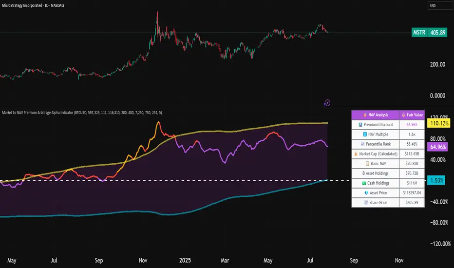
Market to NAV Premium Arbitrage Alpha IndicatorBitcoin treasury companies such as Microstrategy are known for trading at significant premiums. but how big exactly is the premium? And how can we measure it in real time?
I developed this quantitative tool to identify statistical mispricings between market capitalization and net asset value (NAV), specifically designed for arbitrage strategies and alpha generation in Bitcoin-holding companies, such as MicroStrategy or Sharplink Gaming, or SPACs used primarily to hold cryptocurrencies, Bitcoin ETFs, and other NAV-based instruments. It can probably also be used in certain spin-offs.
KEY FEATURES:
✅ Real-time Premium/Discount Calculation
• Automatically retrieves market cap data from TradingView
• Calculates precise NAV based on underlying asset holdings (for example Bitcoin)
• Formula: (Market Cap - NAV) / NAV × 100
✅ Statistical Analysis
• Historical percentile rankings (customizable lookback period)
• Standard deviation bands (2σ) for extreme value detection (close to these values might be seen as interesting points to short or go long)
• Smoothing period to reduce noise
✅ Multi-Source Market Cap Detection
• You can add the ticker of the NAV asset, but if necessary, you can also put it manually. Priority system: TradingView data → Calculated → Manual override
✅ Advanced NAV Modeling
• Basic NAV: Asset holdings + cash.
• Adjusted NAV: Includes software business value, debt, preferred shares. If the company has a lot of this kind of intrinsic value, put it in the "cash" field
• Support for any underlying asset (BTC, ETH, etc.)
TRADING APPLICATIONS:
🎯 Pairs Trading Signals
• Long/Short opportunities when premium reaches statistical extremes
• Mean reversion strategies based on historical ranges
• Risk-adjusted position sizing using percentile ranks
🎯 Arbitrage Detection
• Identifies when market pricing significantly deviates from fair value
• Quantifies the magnitude of mispricing for profit potential
• Historical context for timing entry/exit points
CONFIGURATION OPTIONS:
• Underlying Asset: Any symbol (default: COINBASE:BTCUSD) NEEDS MANUAL INPUT
• Asset Quantity: Precise holdings amount (for example, how much BTC does the company currently hold). NEEDS MANUAL INPUT
• Cash Holdings: Additional liquid assets. NEEDS MANUAL INPUT
• Market Cap Mode: Auto-detect, calculated, or manual
• Advanced Adjustments: Business value, debt, preferred shares
• Display Settings: Lookback period, smoothing, custom colors
IT CAN BE USED BY:
• Quantitative traders focused on statistical arbitrage
• Institutional investors monitoring NAV-based instruments
• Bitcoin ETF and MSTR traders seeking alpha generation
• Risk managers tracking premium/discount exposures
• Academic researchers studying market efficiency (as you can see, markets are not efficient 😉)
Discount to Net Asset ValueOverview
This indicator helps investors and analysts identify when a company’s stock is trading below or above its intrinsic value. A persistent discount may highlight potential value opportunities, while a sustained premium could signal overvaluation or strong market sentiment. By visually shading the background and plotting the discount/premium percentage, users can quickly screen for undervalued stocks, confirm fundamental research, and make more informed buy or sell decisions.
Usage
Calculates the Net Asset Value discount (or premium) for any symbol.
By default the indicator uses the current chart symbol’s TOTAL_ASSETS, TOTAL_LIABILITIES, and TOTAL_SHARES_OUTSTANDING.
You can select another symbol by checking “Use Custom Symbol” and entering the ticker of the other symbol. This is useful for comparing the Discount to NAV across symbols.
Shows the percentage discount (or premium) of market capitalization relative to net asset value.
Recommended timeframes: daily bars or higher.
Reporting Periods:
• FQ = Fiscal Quarter
• FY = Fiscal Year
• TTM = Trailing Twelve Months
Note: NAV is pulled on the chosen reporting period (FQ, FY, TTM).
By default the background is shaded red to illustrate a discount to NAV and green to illustrate a premium to NAV. This can be toggled in the settings.

Nav Premium/DiscountCalculates the Nav Premium/Discount for an asset given it's underlying value. I use it with ETHE/ETHUSD and GBTC/BTCUSD
