Warpath Structure + Liquidity ToolWarpath visually organizes the key elements required to trade Gold professionally:
1. Market Structure Clarity
Automatically labels HH / HL / LH / LL on major pivot points (current chart timeframe)
Makes directional bias immediately obvious
Helps prevent counter-trend trading in strong expansions
2. Liquidity Sweep Detection (Wick-Only)
Highlights true liquidity sweeps using wick behavior (no breakout guessing)
Marks the sweep wick with user-defined colors
Draws a swept-zone box that extends forward to show where liquidity was taken
Designed to identify fuel vs reversal behavior in trends
3. Key Session Levels
Automatically plots:
Asian High / Low
London High / Low
New York High / Low
Previous Day High / Low
Includes Equal Highs / Equal Lows from:
current timeframe
higher timeframes (1H / 4H / Daily)
These levels represent where price is likely to react, not where trades should be forced.
4. HTF Bias Dashboard (Minimal & Clean)
Small dashboard in the corner showing:
15M bias
1H bias
4H bias
Daily bias
Keeps higher-timeframe alignment visible without clutter
5. Premium / Discount & Market State Awareness
Uses previous session equilibrium (50%) with a neutral buffer
Helps frame:
premium vs discount
neutral vs expansion environments
Designed for context, not entry signals
6. Continuation Reload Awareness (Strong Trend Environments)
Built to handle markets that:
remain overbought
stay in premium
sweep buy-side liquidity repeatedly
Supports compression → expansion continuation behavior
Prevents missed participation during multi-day trends without abandoning discipline
Multitimeframe

FlexMAShadeThis provides a flexible moving average that can be changes with shading to indicate the direction of the general trend

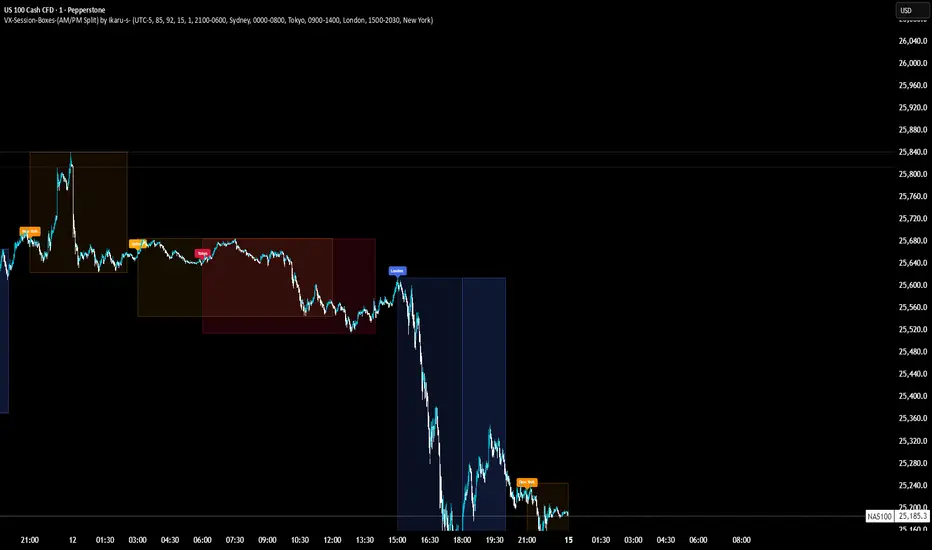
VX-Session-Boxes-(AM/PM Split)(Customizable) by Ikaru-s-VX-Session-Boxes-(AM/PM Split) is a session-based visualization tool for TradingView that highlights major market sessions directly on the chart using dotted range boxes and an optional AM/PM split.
The indicator allows traders to visually separate market behavior across different sessions while keeping the chart clean and readable.
🔹 Key Features
Custom Session Definitions
Define up to 4 independent sessions using TradingView’s session format (HHMM-HHMM + weekdays).
Timezone-Aware
All sessions are calculated using a user-defined timezone (IANA or UTC offset), ensuring accurate session alignment across markets.
Dotted Session Boxes
Each session is drawn as a dotted box based on the session’s high/low range, providing a clear view of volatility and price structure.
AM / PM Split Visualization
Sessions can be visually split into AM and PM parts:
Separate box shading for AM and PM
Optional dotted vertical split line at the AM → PM transition (12:00 in the selected timezone)
Session Labels
Optional labels at the start of each session for quick identification (e.g. Sydney, Tokyo, London, New York).
Fully Customizable Visuals
Adjustable opacity, border width, and visibility toggles for boxes, split lines, and labels.
🔹 Use Cases
Session-based market analysis (Asia / London / New York)
Identifying session ranges and volatility expansion
Observing price behavior differences between AM and PM
Studying session transitions and liquidity shifts
🔹 Notes
Session boxes are based on session high and low, not full chart height.
AM/PM split is based on 12:00 (noon) in the selected timezone.
Designed for clarity and performance on intraday timeframes.
🔹 Compatibility
Pine Script® v6
Works on all intraday timeframes
Overlay indicator (draws directly on the price chart)
Nuclear Chain Reaction TradingThis is an aggressive pyramiding strategy mimicking a nuclear chain reaction

EMA Cross + 12 Indicator Dashboard (Candle Filter)🚀 Ultimate EMA Trend Intelligence + 12-Factor Dashboard
Stop trading blind crossovers. Most moving average strategies fail because they lack context. This script solves that by fusing a robust 6-EMA Trend System with a powerhouse “Consensus Engine” that tracks 12 leading indicators simultaneously.
Unlike standard indicators that repaint or react too fast, this tool utilizes a strict “2-Candle Confirmation Protocol” to filter out market noise and bull/bear traps.
🔥 Why This Indicator Give You an Edge:
🛡️ The “Fakeout Shield” (2-Candle Filter): Every signal is double-checked against the previous bar’s momentum. If the trend isn’t sustained, the signal doesn’t fire. No more getting trapped by wicks.
📊 Institutional-Grade Dashboard: Get a real-time HUD (Heads-Up Display) directly on your chart. Instantly see the bias of RSI, MACD, ADX, Bollinger Bands, Volume, and more without cluttering your screen with oscillating lines.
🎯 High-Probability Confluence: A Buy/Sell signal is ONLY generated when the EMAs cross AND a “Council of 12” indicators agrees on the direction (fully adjustable consensus threshold).
🧠 Smart Volume Integration: Volume must exceed 1.5x the average to validate a move, ensuring you’re trading with the smart money, not against it.
🛠️ Key Features:
6-EMA Ribbon Logic: Covers short-term (9/26) to long-term (60/85/200) trends.
Zero-Repaint Signals: Once a candle closes and the label appears, it stays.
Fully Customizable: Adjust the strictness (e.g., require 8 out of 12 indicators to agree) to fit your trading style—from Scalping to Swing Trading.
Ready to trade with clarity? Add this to your chart and let the consensus guide you.

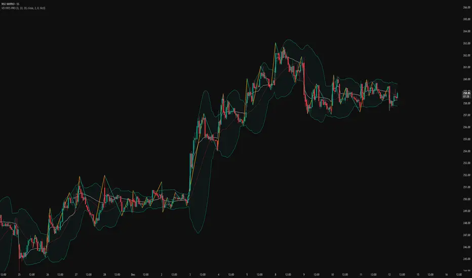
VD FRFS PROVD FRFS PRO
This trader centric, multi-functional indicator built on Pine Script v6 that seamlessly integrates four of the most critical price and volatility tools into a single overlay. Designed for day traders, swing traders, and institutional analysts, this tool provides a comprehensive view of volatility, trend, volume-based pricing, and structure, all without chart clutter.
Overview & Concept
The VD FRFS PRO is engineered for efficiency and clarity. Instead of layering four separate indicators, which can lead to performance issues and confusion, this script combines the calculations into one, allowing traders to execute complex technical analysis rapidly.
It serves as a powerful foundation for strategies that require:
1. Volatility Assessment (Bollinger Bands)
2. Volume-Weighted Fair Value (VWAP)
3. Price Structure & Swings (Zig Zag)
4. Dynamic Trend Filtering (Configurable SMA)
Customization & Settings
All inputs are logically grouped for ease of use in the indicator's settings menu.
Bollinger Bands Settings
BB Length: Period for the Basis SMA and StdDev calculation (default: 20).
BB Source: Price series for the calculation (default: `close`).
BB StdDev Multiplier: Multiplier for the Standard Deviation (default: 2.0).
BB Offset: Shifts the bands horizontally (default: 0).
VWAP Settings
VWAP Source: Price series for the VWAP calculation (default: `hlc3`).
Zig Zag Settings
Zig Zag High/Low Length: Lookback period for determining swing points (default: 3).
SMA Settings
SMA Period: Lookback period for the configurable SMA (default: 20).
Show SMA: Checkbox to toggle the visibility of this SMA (default: `true`).
Disclaimer
Feel free to reach out for suggestions and modification requests.

RSI Multi-TimeFrame [PACHI]This will show a Table with multiple time frames RSI levels.
> 68 the table cell will be red for given timeframe to indicate overbought
< 35 the table cell will be green for given timeframe to indicate oversold
there are few settings you can play with. if you have any suggestions, let me know.
// Pachi

Al Brooks - Bar CountIndicator Purpose:
This indicator displays bar counts on the chart to help traders identify important time nodes and cycle transitions
Features smart session filtering with automatic futures/stock detection and appropriate trading session counting
Core Features:
Smart asset detection: Auto-detect futures and stocks
Session filter toggle: Choose all-day or session-specific counting
Auto timezone handling: Chicago time for futures, NY time for stocks
Flexible display control: Customizable display frequency and label size
Session Settings:
8:30-15:15 (CT) / Futures mode: Chicago time 8:30-15:15 (CT)
9:30-16:00 (ET) / Stock mode: New York time 9:30-16:00 (ET)
All-day mode: Count from first bar of the day
Timeframe Correspondence:
Multiples of 3: Correspond to 15-minute chart update cycles
Multiples of 12: Correspond to 1-hour chart update cycles
18: Key nodes, important time turning points

Short-Term Bubble Risk [Phantom] Short-Term Bubble Risk
Concept
This indicator visualizes short-term market risk by measuring how far price is stretched relative to its recent weekly trend.
Instead of focusing on absolute price levels, it looks at price behavior.
A similar reading means similar market conditions, whether price is high or low.
The goal is to help identify areas of potential accumulation and potential distribution in a clear, visual way.
How It Works
The indicator compares the weekly closing price to a weekly moving average and displays the deviation as a histogram.
When price is far below its average, risk is considered lower
When price is far above its average, risk is considered higher
The zero line represents fair value, where price equals its weekly average.
Features
Color-coded histogram showing short-term risk levels
Designed to work across different assets and price ranges
Optional bar coloring on the main chart using weekly risk data
Safe to use on any timeframe (risk is calculated on weekly data)
Settings
# Moving Average Length (Weeks):
Adjusts how sensitive the indicator is to price changes
# Color Visibility Toggles:
Allows hiding or showing specific risk zones
# Bar Coloring:
Option to color chart candles based on weekly risk levels
Usage
This indicator is best used as a risk lens, not a timing tool.
Common uses include:
Identifying potential accumulation zones during weakness
Spotting overextended conditions during strong moves
Comparing short-term risk across different assets
Adding context to trend-following or DCA strategies
Trade Ideas
# Lower-risk zones (cool colors):
Can support accumulation or patience during downtrends
# Higher-risk zones (warm colors):
Can signal caution, reduced exposure, or profit-taking
Always combine with:
Trend direction
Market structure
Higher-timeframe context
Limitations
This indicator does not predict tops or bottoms
High risk can remain high during strong trends
Low risk does not guarantee immediate reversals
It should not be used as a standalone trading system.
Disclaimer
This indicator is for educational and informational purposes only.
It is not financial advice.
Always do your own research and manage risk appropriately.

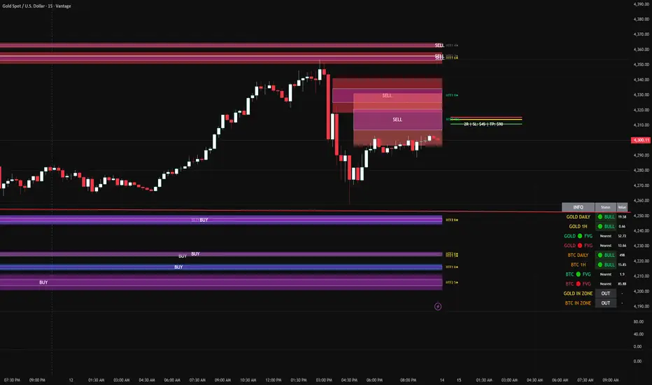
FVG DUAL HTF ALERTS FINAL DG FVG Dual HTF - Advanced Fair Value Gap Detector with Confluence & Strength Analysis
Professional-grade Fair Value Gap (FVG) detection system designed for precision trading on Gold and other instruments.
🎯 Key Features
Dual Higher Timeframe Analysis
HTF1 & HTF2 Detection: Simultaneously monitors two higher timeframes (default: 15min & 60min) for Fair Value Gaps
Multi-timeframe Confluence: Automatically detects when FVGs align across multiple timeframes for high-probability setups
Customizable Timeframes: Choose from 5min, 15min, 60min, 4H, or Daily for each HTF
Intelligent Strength Scoring System (0-11 Scale)
Our proprietary algorithm rates each FVG based on:
Gap size relative to ATR
Volume analysis vs. average
Current timeframe confluence (★ symbol indicates FVG exists on your chart timeframe)
Session timing (London & New York priority)
HTF confluence bonus
Color-Coded Ratings:
🟢 Lime (8-11): Premium strength - highest probability setups
🟡 Yellow (5-7): Good strength - solid opportunities
⚪ Gray (0-4): Weak strength - proceed with caution
Sweet Spot Entry Zones
Inner Box Technology: Highlights the optimal 10% entry zone within each FVG
BUY/SELL Labels: Clear visual cues for directional bias
Automatic Entry/Stop/Target Lines: Shows precise risk-reward setups on the 3 nearest FVGs
Position Sizing Calculator: Displays dollar values based on your lot size
Advanced Fill Methods
Choose how FVGs are invalidated:
Wick Sweep: Most conservative - requires price to sweep through the gap
Any Touch: Price touches the FVG boundary
Midpoint Reached: 50% fill required
Body Beyond: Strictest - candle body must close through the gap
Comprehensive Market Intelligence Table
Real-time monitoring of:
Gold Daily & Hourly Bias (with pip movement)
BTC Daily & Hourly Bias (optional)
Distance to nearest Bull/Bear FVGs
IN ZONE Indicator: 🔥 Alerts when price enters premium sweet spots
Shows strength rating and HTF source
Color-coded: Premium / Good / Weak / Out
Professional Alert System
HTF1 & HTF2 Zone Entry Alerts
Sweet Spot Entry Alerts (BUY/SELL)
High-Strength FVG Alerts (8+ rating)
Combined "ANY HTF" alerts for maximum flexibility
📊 Default Configuration
Optimized for Gold (XAU/USD) on 3-minute charts
Session Focus: London (8am-12pm GMT) & New York (1:30pm-4pm GMT)
Risk Management: Built-in R:R calculator with customizable stops and targets
🎨 Customization Options
Multiple color schemes for bull/bear zones
Adjustable inner box percentage
Confluence highlighting (bright colors when HTF1 & HTF2 align)
Show/hide individual components
BTC correlation tracking (optional)
⚙️ Technical Specifications
Maximum Display: Up to 50 FVGs per type (HTF1 Bull/Bear, HTF2 Bull/Bear)
Fill Tracking: Monitors touched vs. untouched zones
Lookback Period: Configurable (default: 100 bars for current TF confluence)
Body Close Requirement: Optional strict mode for cleaner signals
📈 Best Used For
Gold (XAU/USD) day trading
Institutional order flow analysis
High-probability reversal setups
Multi-timeframe confirmation strategies
Risk-reward optimization
🔒 Access & Support
This is a private indicator. Contact the owner for details about access and usage.
Disclaimer: This indicator is a tool for technical analysis. Past performance does not guarantee future results. Always use proper risk management and trade responsibly.
Short Version (if space is limited):
FVG Dual HTF - Professional Fair Value Gap System
Advanced FVG detector with dual higher timeframe analysis, intelligent strength scoring (0-11), and multi-timeframe confluence detection. Features sweet spot entry zones, automatic R:R lines, real-time IN ZONE alerts, and comprehensive market intelligence table.
Highlights:
🎯 Dual HTF monitoring (15m/60m default)
⭐ Strength scoring with current TF confluence (★)
📊 Color-coded ratings: Lime (8+) / Yellow (5-7) / Gray (<5)
🎨 Sweet spot inner boxes with BUY/SELL signals
🔔 Professional alert system
💰 Built-in position sizing calculator
📈 Gold Daily/Hourly + BTC bias tracking
Optimized for Gold and BTC. Multiple fill methods, customizable colors, and extensive settings.
Contact owner for access details.
Previous CandleThis indicator tracks the direction of the previous closed candle across multiple timeframes and displays it in a bottom-right dashboard table on your chart.
It is useful for top-down analysis, helping traders quickly see short-term and higher-timeframe candle momentum

Great Pyramid Harmonic Core Geometry V1 [QTI]Short Summary
Unlocking Ancient Market Geometry: This indicator maps critical support and resistance levels using the immutable geometric constants of the Great Pyramid of Giza, anchored to the Previous Day's High and Low (PDH/PDL).
Key Concepts & Philosophy:
This is not a standard Fibonacci tool. The Great Pyramid Harmonic Core Geometry system establishes a fixed, non-repainting structure based on the previous day’s range (PDL to PDH) and projects highly reliable levels derived from sacred geometry and ancient architecture.
The premise is that the forces driving market liquidity and price movement follow the same universal constants found in geometric perfection. We use these precise ratios—not arbitrary percentages—to define zones of high probability reversal and continuation.
The Harmonic Core (0.0 to 1.0):-
The range between the PDL (0%) and PDH (100%) is the trading day's energy core. Critical retracement levels within this core are projected using the following constants:
EQ (50%): The perfect geometric mean.
Kepler (61.8%) & Pi Inverse (31.8%): Classic Golden Mean and Pi-related support/resistance.
Isis (70.7%) & Osiris (29.3%): Derived from the square root of two ($\sqrt{2}$), relating to the cross-sectional area of the pyramid.
Horus (79.4%): A crucial level derived from the cube root of 0.5 ($\sqrt {0.5}$), often representing the center of volume mass or "Eye of Horus" apex.
KC Floor (25%): The King's Chamber floor height.
Thuban (57.7%): Derived from the space diagonal of a cube ($1/\sqrt{3}$).
The External Expansions (Beyond 1.0):-
These expansion targets are designed to predict extreme liquidity sweeps and continuation targets outside the core range:
Seqed Trap: 1.272, Pyramid Slope Tangent, A high-probability liquidity grab zone.
Isis Ext: 1.414, $\sqrt{2}$ Expansion, Standard diagonal extension target.
Phi Ext: 1.618, $\Phi$ (Golden Mean), Major expansion and trend exhaustion target.
Theban Ext: 1.732, $\sqrt{3}$ Expansion, The "Space Diagonal" of the liquidity cube.
Phi Squared: 2.618, $\Phi^2$, The second golden expansion, for high-level targets.
Pi Approx: 3.14, $\approx \pi$, The terminal geometric boundary and ultimate target ceiling.
Features & Customization:
1 - Dual Visualization Modes (Highly Recommended):
- Historical Trails: Shows light plots across the entire chart history for robust backtesting.
- Today's Structure (Recommended for Live Trading): Renders high-precision line and box objects that only persist for the current trading day, keeping the chart clean and focused on actionable levels.
2 - Full Customization: You can adjust the width, color, and visibility for every single level, line, box, and label across the Core, Apex, Base, and External Zones.
3 - Comprehensive Alerts: Includes 13 dedicated structural alerts for all major events:
- Breakouts/Breakdowns of PDH, PDL, and EQ.
- Entering/Exiting the Apex (Short) and Base (Long) structural zones.
- Hitting the high-level Phi Squared (2.618) and Pi Approx (3.14) extreme targets.
Usage Notes (Strategic Realism)
- Best Used On: Intraday timeframes (1m, 5m, 15m) for surgical entries and exits.
- Anchor: Levels are fixed until the start of the next daily session, providing reliable, non-repainting structure for the entire day.
- Overlay: Set overlay = true to display levels directly on your price candles.

Optimal Daily MA Suite [MTF]Title: Optimal Daily MA Suite
Description: This is a comprehensive Multi-Timeframe (MTF) analysis suite designed to streamline chart layouts. Instead of loading multiple separate indicators to track various trend lines, this single tool allows traders to overlay higher-timeframe Moving Averages and key support/resistance levels directly onto their intraday charts.
Utility & Workflow: Swing traders and day traders often need to monitor "Big Picture" Daily Moving Averages (like the Daily 200 SMA or Daily 50 EMA) while executing trades on lower timeframes like the 15m or 1H. This tool automates that process, ensuring the major trend context is always visible without cluttering the indicator list.
Key Features:
Multi-Timeframe Engine: By default, all MAs are calculated on the Daily ("D") timeframe, regardless of the chart's current timeframe. This creates a stable "anchor" for trend analysis. The timeframe is fully customizable in the settings (e.g., set to "W" for Weekly analysis).
10 Customizable Slots: Toggle up to 10 different Moving Averages on/off individually.
Flexible Calculation Types: Supports SMA, EMA, WMA, VWMA, RMA (SMMA), and SWMA for every single line.
Trend Cloud Crossovers: Includes two dedicated "Cloud" setups to visualize crossovers (e.g., Golden Cross or Death Cross) with fill shading between the fast and slow lines.
Price Action Crossovers: Optional markers to highlight when the closing price crosses specific MAs.
Contextual Levels: Includes Previous Day High (PDH) and Previous Day Low (PDL) markers for immediate intraday support/resistance context.
How to Use:
Settings: Open the settings menu to select your "Indicator Timeframe" (Default: Daily).
Customization: Enable only the MAs relevant to your strategy (e.g., Enable MA 8 for the 50 SMA and MA 10 for the 200 SMA).
Clouds: Use the "Crossover Set" inputs to define a Bullish/Bearish trend cloud between two moving averages of your choice.
Technical Note: This script uses request.security with lookahead=barmerge.lookahead_off to ensure no repainting of historical data while providing accurate higher-timeframe values on closed bars.
Credits: Standard Moving Average calculations based on TradingView built-in functions.

POI Zones with Imbalance- Ahmed AwadHighlights Point of Interest (POI) zones on the chart where a significant price imbalance occurs between the candle’s open and close. The indicator draws semi-transparent orange zones to mark potential buy or sell areas, helping traders spot strong price moves and key levels. Adjustable imbalance threshold and transparency for flexibility.

SMT Divergence - Time & Calendar CyclesOverview
This indicator is a tool designed to detect SMT Divergences across multiple market structures.
It operates on a Dual-Layer Logic, which filters, ranks, and renders divergences based on specific, adjustable Time Cycles (e.g., 90-minute, or 30-minute rolling windows) and Calendar Cycles (e.g., Daily, or Weekly structure).
1. Core Concept: Automated SMT Detection
SMT Divergences occur when correlated instruments fail to confirm each other's price action at key structural pivots. For example, if the Nasdaq (NQ) makes a higher high while the S&P 500 (ES) fails to do so, that can be considered a SMT Divergence , this discrepancy in correlation could indicate a potential shift in structural momentum and a weakening of the prevailing trend.
This indicator automates this analysis by comparing the Main Chart against up to three user-defined Comparison Symbols. It supports:
Direct Correlation: Identifies standard divergences between positively correlated assets where one fails to confirm the other's new high or low (e.g., NQ vs. ES).
Inverse Correlation: Accounts for negative correlation to detect failures in symmetry, such as when the Main Chart makes a Higher High but the Inverse Symbol fails to make the expected Lower Low (e.g., EURUSD vs. DXY).
Cross Symbol vs. Symbol: Logic that cross-verifies comparison symbols against each other to find internal market weakness, even if the main chart is currently neutral (e.g., Symbol 1 vs. Symbol 2).
2. How It Works: Technical Architecture
To accurately map market structure, the indicator uses a specific technical method to handle data synchronization and structure storage:
A. Data Synchronization
The tool utilizes 'request.security' targeting the current chart's resolution (native timeframe) to retrieve comparison data of the other symbol. This method enforces strict bar-by-bar alignment between the main symbol and the comparison symbol, preventing the access of future data (lookahead bias) and ensuring historical data integrity.
B. Pivot Arrays
The script identifies significant swing points and stores them in custom arrays. It iterates through these arrays to compare the current price structure against historical structures stored in memory.
The array storage and comparison logic operates in two distinct modes depending on the cycle type:
2.1 Time Cycles (Intraday Analysis)
Targeting specific, adjustable time windows like 90-minute or 30-minute cycles.
Session Bound: These cycles are strictly bound to a user-defined trading session (e.g., 09:30 - 16:00).
Continuous Roll: They repeat continuously throughout the window until the session ends.
Session Reset: At the start of every new session, calculation data resets to ensure signals reflect only the current session, while preserving all historical lines on the chart.
2.2 Calendar Cycles (Macro Analysis)
Targeting Higher Timeframe (HTF) structural analysis (Daily, Weekly, Monthly, Quarterly, and Yearly).
Persistent Data: Unlike Time Cycles, Calendar Cycles utilize persistent data arrays that survive session resets.
Calculation Mode: "Exchange Session" prevents ghost lines on Futures, while "Input Timezone" enforces strict midnight resets for Crypto/CFDs.
3. The Unified SMT Visualization
The indicator provides a Composite Visualization , unifying micro (Intraday) and macro (Calendar) analysis by simultaneously projecting divergence signals onto a single chart view.
Live vs. Historical Logic:
The Live Feed (Dynamic State): This is the only component where repainting occurs. Signals within the current active cycle are temporary and self-correcting:
Updates: If the price pushes to a new extreme within the open cycle, the SMT line automatically redraws to the new High/Low.
Invalidation: If the Comparison Symbol eventually breaks its structure ("catches up") before the cycle closes, the divergence is no longer valid, and the signal is removed.
Example: In a 90-minute Time Cycle, a signal might form at minute 30. If the Comparison Symbol confirms the move at minute 45, the signal is invalidated. If the divergence holds until minute 90, it becomes permanent.
The Historian (Permanent Record):
Once a cycle closes, the final state is locked. Validated signals are transferred to the historical array and will never change (non-repainting).
4. Key Features & Capabilities
4.1 Multi-Symbol & Correlation
Triple-Check Logic: Capable of comparing the Main Chart against Symbol 1, Symbol 2, and Symbol 3 simultaneously.
Cross-Symbol Check: The script can optionally validate Symbol 1 against Symbol 2 (e.g., checking ES vs. YM) and plot the result on your main chart, providing a broader market view.
4.2 Structural Range Validation
The script includes strict validation logic to ensure high-quality data. It automatically verifies that the detected highs and lows are the true extremes of the cycle range.
Lookback Cycles: Users define the exact number of preceding historical cycles the current structure must be compared against (e.g., comparing against the last 9 cycles), allowing for customization of structural depth.
4.3 Professional Drawing & Chart Management
Visual Collision Detection: The script uses Coordinate Tracking to store the start and end points of every rendered divergence. If a lower timeframe cycle attempts to draw over an existing higher-priority structure, the logic compares their coordinates and suppresses the lower-priority signal to prevent visual clutter.
Data Integrity: The script automatically validates cycle duration to ensure signals do not span across abnormal time gaps or missing data.
Memory Optimization: The script actively manages internal memory to prevent execution limits, allowing for deep backtesting history even on lower timeframes.
4.4 Structural Parameters
Furthest / Nearest Mode: Determines which specific pivot to target when multiple candidates exist within the same search window.
Furthest: Targets the extreme point furthest back in time within the cycle range (captures the widest possible structure).
Nearest: Targets the most recent valid pivot (captures the tightest, most immediate structure).
Anchor Mode: Controls exactly where the divergence line connects:
Structural: Always connects to the Main Chart's pivot High/Low.
Snap to Aggressor: The precision method. The line "snaps" to the exact candle where the structure was broken first, whether on the Main Chart or the Comparison Symbol.
Cycle Boundary Overlap: Controls how the transition candle is handled between time cycles (Overlap On vs. Clean Start).
4.5 Full Customization
Adaptive & Custom Coloring: Labels automatically adjust to background brightness for optimal readability. Includes a manual override for user-defined color preferences.
Visual Control: Fully customizable line styles, widths, and colors for every individual cycle.
5. How To Use This Tool
Configuration: Set your Timezone and Session Start/End times in the settings. This ensures "Time Cycles" align with your specific market.
Select Symbols: Input your comparison symbols (e.g., ES, YM, or inversely DXY). Crucial: Ensure the "Inverse" toggle is checked for negatively correlated assets.
Cycle Selection: Enable the specific cycles relevant to your strategy (e.g., Daily + 90-minutes).
Render History: Scroll the chart back to the beginning of your available price history after loading the indicator or changing timeframes to process maximum historical data.
Interpretation:
Bearish SMT: Price makes a Higher High, but the correlated asset makes a Lower High. This divergence could indicate a potential shift in structural momentum and a weakening of the prevailing uptrend.
Bullish SMT: Price makes a Lower Low, but the correlated asset makes a Higher Low. This divergence could indicate a potential shift in structural momentum and a weakening of the prevailing downtrend.
Disclaimer
This indicator is designed for educational purposes only. It does not constitute financial advice or a recommendation to trade. Trading involves risk, and past performance does not guarantee future results.

Oscillation filterDescription: This is a customized technical indicator designed to assist traders in analyzing overbought and oversold conditions in volatile or trending markets. It plots overbought and oversold conditions of different colors as distinctions for multiple periods.
Working principle: This indicator calculates the oscillation index value of the given parameter and projects it onto a chart to visualize the fluctuation limit. It helps identify oscillations, trend reversals and manage risks under various market conditions.
Access: This is an invitation-only script. To request access or permission, please refer to X: @Dev0x_AI for communication.
震荡过滤器

Bassi MA Entry Helper MTF EMA , VWMA Swing , ADX , SMA200 , TPBassi MA Entry Helper is an advanced multi-timeframe confluence system designed to identify high-probability entries using trend, volume, market structure, and volatility filters.
It is built for traders who want cleaner signals, fewer false entries, and strong multi-confirmation setups.
Key Features
Multi-Timeframe EMA Crossovers – HTF signal engine
SMA200 Trend Filter – prevents counter-trend trades
VWMA Swing Confirmation – volume-validated micro-swings
ADX Filter – only trade when the trend has strength
Fractal Structure Mapping – identifies swing highs/lows
Retracement Filter – confirms pullbacks before entries
TP/SL Automation – ATR or percentage based
Clean Entry Labels – main & additional entry signals
Highly Customizable – mode, timeframe, filters, visuals
This script is ideal for:
Scalping • Intraday • Swing • Trend continuation • Volume-based setups • Multi-timeframe alignment
How It Works
Main Buy/Sell Signals
Triggered when:
✔ Fast EMA crosses Slow EMA (HTF)
✔ Price aligned with trend
✔ SMA200 filter valid
✔ VWMA confirmation (optional)
✔ ADX strong
✔ Retracement valid (optional)
Additional Buy/Sell Signals
Triggered when VWMA crosses Slow EMA during trend continuation.
TP/SL System
You can choose between:
%-based take-profit & stop-loss
ATR-based dynamic levels
Automatically projects clean visual levels on your chart.
Notes
This indicator does not repaint and is suitable for both real-time and historical analysis.
Always combine signals with proper risk management.
Initial Release – v1.0
Added multi-timeframe EMA engine
Added SMA200 trend filter
Added VWMA swing entries
Added ADX strength filter
Added retracement filter
Added fractal swing detection
Added TP/SL auto plotting
Added main & additional entry labels
Performance optimized
GYD-VOLinesCalculate support and resistance lines through the volume of large-level cycles, so that when subsequent candlesticks reach these lines, they can serve as a reference for trading decisions! The larger the cycle, the better the support and resistance effect!
通过大级别周期的成交量计算出支撑阻力线,以便后续K线表达到这里的时候,为交易决策做参考!越大周期的线,撑压效果越好!

Horizontal LineA horizontal line divided based on grid distance, suitable for traders who use Open Interest (OI) for market analysis. This grid system helps users clearly identify key price levels, such as areas where significant contract accumulation occurs, potential reversal zones, or regions where heavy buying and selling activity is expected.

USOIL BOS Retest Overlay (HTF + Blocks + Profit Zone + Lot Size)This is a test overlay that should show entry positions and lot sizes to take based on R20 000 account. This was made purely for USOIL

Prime -Hub Prime -Hub is a comprehensive, all-in-one technical analysis toolkit designed for professional Intraday and Swing traders on Nifty, BankNifty, and Stocks. This script consolidates three powerful institutional logic systems into a single, clean interface, replacing the need for multiple indicators.
Disclaimer: This tool is for educational and analytical purposes only. Past performance does not guarantee future results. Trading involves substantial risk.

VD FRFS PRO
VD FRFS PRO
This trader centric, multi-functional indicator built on **Pine Script™ v6** that seamlessly integrates four of the most critical price and volatility tools into a single overlay. Designed for day traders, swing traders, and institutional analysts, this tool provides a comprehensive view of volatility, trend, volume-based pricing, and structure, all without chart clutter.
Overview & Concept
The VD FRFS PRO is engineered for efficiency and clarity. Instead of layering four separate indicators, which can lead to performance issues and confusion, this script combines the calculations into one, allowing traders to execute complex technical analysis rapidly.
It serves as a powerful foundation for strategies that require:
1. Volatility Assessment (Bollinger Bands)
2. Volume-Weighted Fair Value (VWAP)
3. Price Structure & Swings (Zig Zag)
4. Dynamic Trend Filtering (Configurable SMA)
Customization & Settings
All inputs are logically grouped for ease of use in the indicator's settings menu.
Bollinger Bands
BB Length: Period for the Basis SMA and StdDev calculation (default: 20).
BB Source: Price series for the calculation (default: `close`).
BB StdDev Multiplier: Multiplier for the Standard Deviation (default: 2.0).
BB Offset: Shifts the bands horizontally (default: 0).
VWAP Settings
VWAP Source: Price series for the VWAP calculation (default: `hlc3`).
Zig Zag Settings
Zig Zag High/Low Length: Lookback period for determining swing points (default: 3).
SMA Settings
SMA Period: Lookback period for the configurable SMA (default: 20).
Show SMA: Checkbox to toggle the visibility of this SMA (default: `true`).
Disclaimer
Feel free to reach out for suggestions and modification requests.